Disclaimer: This is my original work with details sourced from reading the comic book and doing personal research. Anyone who wants to use this article, in part or in whole, needs to secure first my permission and agree to cite me as the source and author. Let it be known that any unauthorized use of this article will constrain the author to pursue the remedies under R.A. No. 8293, the Revised Penal Code, and/or all applicable legal actions under the laws of the Philippines.
Welcome back superhero enthusiasts, 20th century pop culture enthusiasts and comic book collectors! Today we go back to the mid-1980s to take a close look at one of the many tales published through the original Superman monthly series (first launched in 1939).
For the newcomers reading this, the original multiverse of DC Comics formally ended with Crisis on Infinite Earths (1985-1986). That being said, a lot of DC’s monthly comic book series had respective tales the reflect the closing period of the old multiverse (which lasted for decades) and the Superman monthly series of the era was part of the trend.
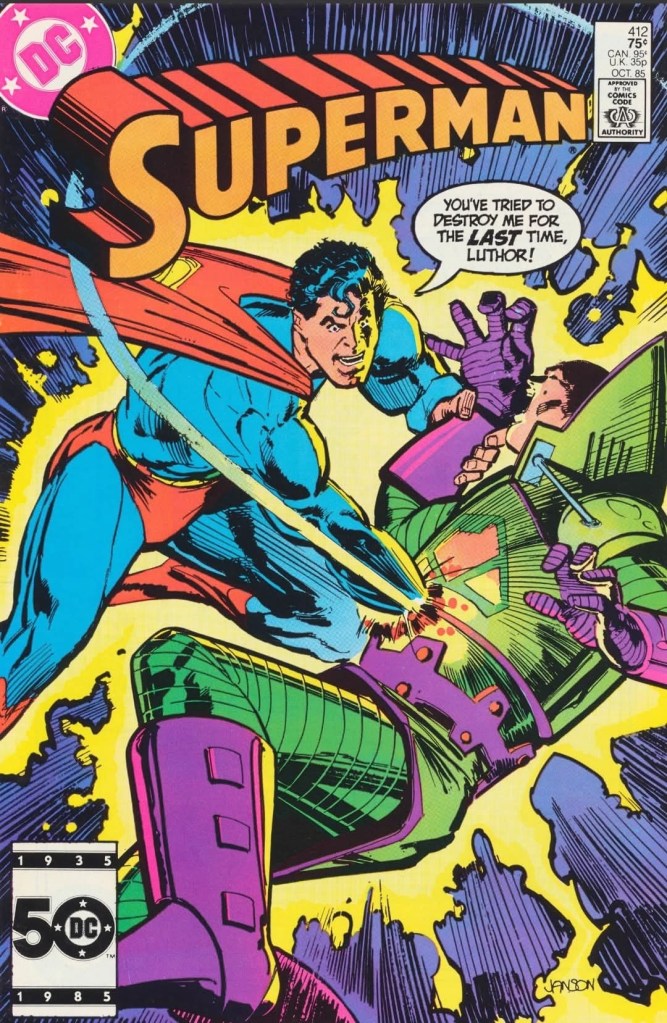
With those details laid down, here is a look back at Superman #412, published in 1985 by DC Comics with a story written by Cary Bates and drawn by Curt Swan.
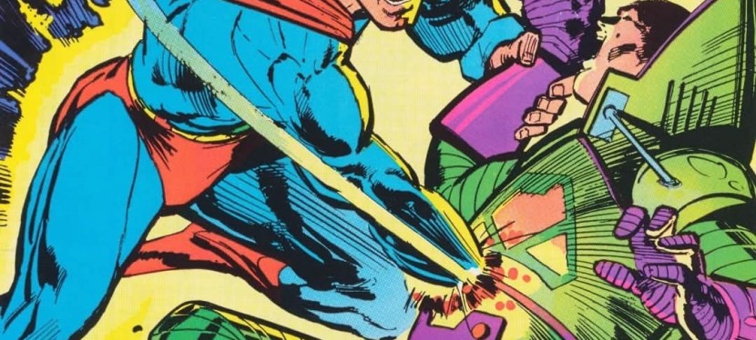
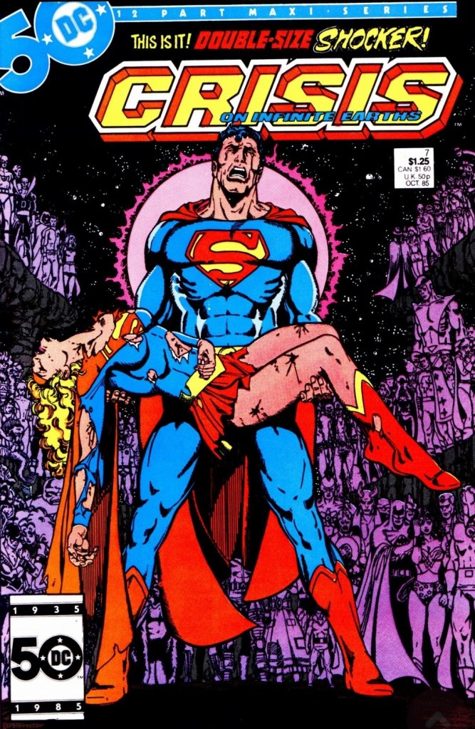
The cover.
Early story
The story begins at the unemployment bureau in Metropolis. Clark Kent, who recently lost his jobs with WGBS and the Daily Planet, stands in line and waits for his turn. Being unemployed, Clark feels troubled and other people nearby recognize him.
As his turn at the counter starts, Clark senses something and decides to get out quickly. He enters the emergency exit, changes into Superman and flies out of the building. It turns out a high-rise building accident has occurred and already several pieces of sharp glass have been falling down. To prevent further harm, Superman uses his heat vision to convert the falling glass and collectively turn them into a growing molten ball. He brings the giant molten ball to the top of the building (still in construction/expansion) and meets the hard-hat workers before flying away.
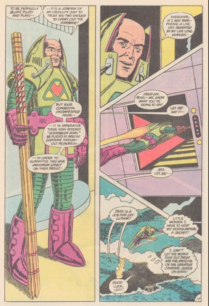
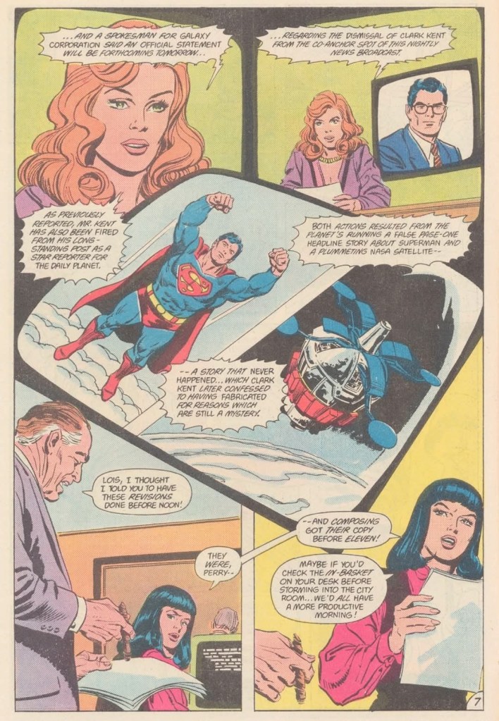
Elsewhere, Lana Lang announces news to TV viewers regarding the dismissal her of close friend Clark Kent which was the result of the fake headline news story about Superman and the NASA satellite. In another location, Lex Luthor is very pleased watching the same broadcast knowing his plan of ruining Superman succeeded and got Clark Kent as a fake news casualty. Luthor is not done with Superman yet…
Quality
Lex Luthor here is ruthless, strategic and obsessed with defeating Superman.
I really like this Superman tale. This is a story about Superman who is still dedicated to doing acts of good by helping people with problems even though he is socially in deep trouble being unemployed as Clark Kent. Not only is the unemployment aspect relevant, the consequences of fake news and their negative effect on people made this tale more socially relevant with today’s world of fake news and unethical journalism.
Going back to Superman, it is clear that the embarrassment and unemployment of his civilian identity impacted him as a superhero. This is evident when Lana Lang accused him of betraying Clark Kent resulting in a fake news story that led to the firing by WGBS and the Daily Planet. Lana, who does not realize Superman and Clark are the same person, blamed the Man of Steel that the firing of Clark is so devastating to her as she cares for him so much (note: Clark and Lana were romantically involved during their teenage years at Smallville).
The powerful writing by Cary Bates does not end there. In this comic book, you will see Lex Luthor execute his other plans to ruin Superman whom he personally accused over the loss of his family and his own world Lexor (click here and here for references). This is a Luthor who is not simply being evil but also someone who is well organized, strategic and even fearless. By this stage, the criminal mad scientist Luthor has accumulated a lot of resources to have his own headquarters, technologies and a dedicated staff. In some ways, Luthor in this comic book eerily resembled his financial tycoon version in the post-Crisis era (click here and here for relevance).
I should also state that the personal encounter between Superman and Luthor here is a great pay-off to the build-up that preceded it. You readers should see it for yourselves because to reveal more in this review will ruin it.
Conclusion
As Lana Lang delivers the news to TV viewers regarding Clark Kent and Superman, tension is brewing over at the Daily Planet.
Superman #412 (1985) is undeniably a great Superman story published during the very late stage of the original multiverse (note: Superman #423 was one of the final tales of Superman of this particular era. Superman #424 was part of the post-Crisis era). The portrayal of Superman being disturbed by the huge setback he suffered as a civilian is really compelling to see and his encounter with Lex Luthor really brought the tension and suspense to high levels. At the same time, the consequences of Superman’s actions (including those of his civilian form as Clark Kent) are very evident and nicely dramatized by the Bates-Swan team. You really feel that the creators were wrapping up their Superman stories and decided to move this series to a new direction knowing that the original multiverse will end. This is a must-read tale!
Overall, Superman #412 (1985) is highly recommended.
Welcome back readers, fellow geeks and electronic gaming fans!
In this edition of the Retro Gaming Ads Blast (RGAB) series, we will take a look at another batch of retro gaming print ads from the 1980s and 1990s.
For the newcomers reading this, Retro Gaming Ads Blast (RGAB) looks back at the many print ads of games (console, arcade, computer and handheld) that were published in comic books, magazines, flyers and newspapers long before smartphones, social media, the worldwide web and streaming became popular. To put things in perspective, people back in the 1980s and 1990s were more trusting of print media for information and images about electronic games and related products.
With those details laid down, here is the newest batch of retro gaming print ads for you to see and enjoy…
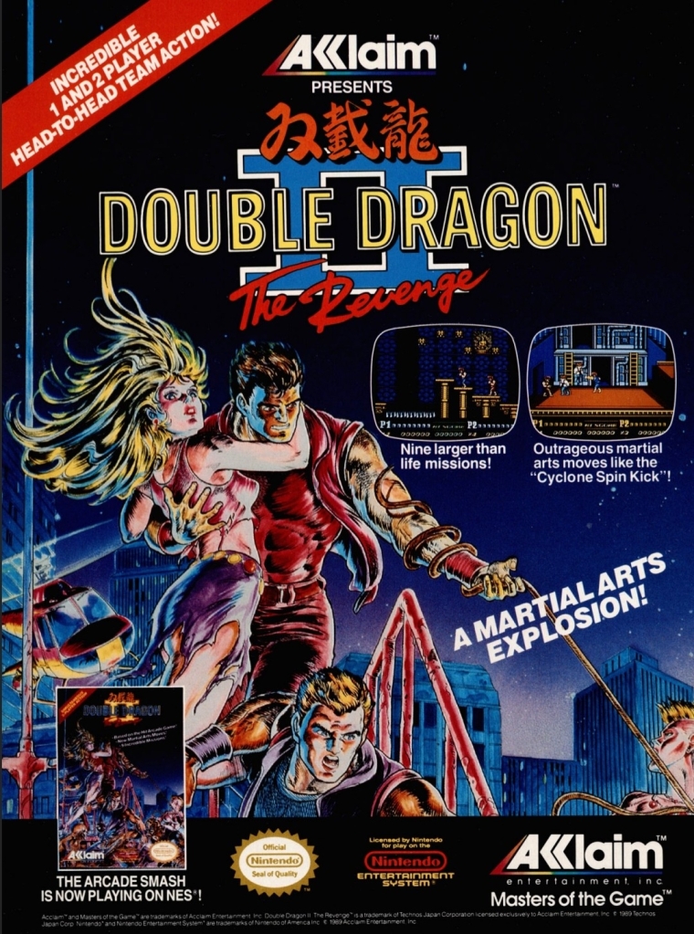
1. Double Dragon II: The Revenge print ad
Nice looking art used to promote the game.
The beat-them-up sub-genre of gaming was already popular in the 1980s and one of the most defining game franchises of this type of game was the Double Dragon series which proved to be popular with Nintendo Entertainment System (NES in America) and Family Computer (Famicom in Japan) gamers. As the first game was a very big hit on Nintendo’s consoles, the sequel Double Dragon II: The Revenge was promoted in America with strong confidence on the part of publisher Acclaim that it would become another massive hit. This print ad had a very nice looking comic books-style art that not only captured the concept of the game but also visualized the heroes Billy and Jimmy with enough details to focus on. I can say this was an eye-catching ad.
2. X-Men: Children of the Atom print ad
Great looking ad but the line “100% direct conversion” is not true at all.
Developed by Capcom in cooperation with Marvel, X-Men: Children of the Atom was a huge hit in the video arcades and it was not surprising that it got released on the Sega Saturn by Acclaim. Acclaim organized an aggressive promotional campaign by pouncing on the fans’ love and knowledge of the X-Men and the high fun factor of Capcom’s game. What this print ad got wrong, however, was the line “100% direct conversion of the #1 arcade smash!” which was wrong and misleading. In reality, the Sega Saturn version of the game had about one-third of the animation frames cut due to the console’s smaller RAM capacity.
As the years passed by, the Sega Saturn became the more suitable console for home ports of Capcom’s further 2D fighting games as Sony’s PlayStation had even more severe limitations and a graphics processor that was not suitable for 2D graphics. By the end of 2000, Capcom’s 2D fighting games on PlayStation all were inferior to the Sega Saturn versions.
3. Sky Shark NES print ad
This is an effective looking ad.
Released in Japan as Flying Shark, Sky Shark was released on multiple platforms in 1988 and there was an NES version of it which this particular print ad promoted. The American branch of Taito wisely used positive quotes from media outlets to promote the game while coming up with an engaging text description and displayed NES screenshots. And then there was that very engaging painted cover art that gave this print ad a lot of punch. An effective ad overall.
4. Conflict print ad
This is a very captivating artwork for advertising.
There is no denying the fact that the Cold War was a strong influence on arcade games and video games. Titles like Contra, Jackal, Metal Gear, Operation Wolf, Cabal and Rush’n Attack were militaristic games that entertained millions of gamers from the young adults to the little children. In 1990, Vic Tokai released the game Conflict on the NES which had a military theme but an unusual game design composed of digital maps with hexagons in which gamers will play with strategy to win battles. That being said, this print ad’s visual concept was very captivating yet also misleading. If you see how the game is played, you will know what I mean.
5. College Slam print ad
Were you ever interested in college basketball video games?
This is one of the more eye-catching print ads I’ve seen due to the artist’s illustration of a basketball with a mouth biting the basketball rim which dominates the space. For the newcomers reading this, College Slam was a basketball video game that was actually a repacked version of the popular NBA Jam with focus on NCAA basketball players. With the biting basketball at the center, it was easily an attraction and the screenshots implemented were larger than usual which easily gave gamers a clear look at what the game looked like. While this print ad is eye-catching, it did not help sell College Slam and there never was a follow-up.
6. Tecmo Super Baseball print ad
From the time when Tecmo was prolific with video games about sports.
Long before it started the Dead or Alive game franchise, Tecmo was once heavily invested in making sports video games. Tecmo Super Baseball was their first American pro baseball video game released for Super Nintendo Entertainment System (SNES) and Sega Genesis, and it was notable that the publisher secured only the Major League Baseball Players Association (MLBPA) which resulted in the game featuring real-life players but the teams had no names and no logos. Regardless, this print ad showed how aggressive Tecmo was in trying to attract consumers’ attention by showing ten screenshots with short text descriptions each. The ad’s write-up boasted realism as well as the promise of gaming quality.
7. The Punisher print ad
Marvel’s vigilante firing at someone.
In the early 1990s, Capcom and Marvel Comics started their partnership resulting in the releasing of the arcade game The Punisher. Developed by Capcom, the said arcade game became a big hit with gamers as it featured fun gameplay, multiple enemies appearing on screen simultaneously and other fun elements. Unsurprisingly, the game was ported (note: Sculptured Software was the lead developer) to the Sega Genesis with significant downgrades in terms of graphics, sound, enemy variety and other related elements due to technical limitations. That being said, this print ad used detailed art of the Punisher (with Col. Fury in the background) in a clever way to promote the Sega Genesis version while keeping their attention away from the obvious visual downgrades of the two screenshots displayed. The Punisher on Genesis was poorly received.
8. Stargate print ad
If you did not enjoy the movie, were you able to play the video game adaptation on Sega Genesis or Super NES?
Remember the sci-fi movie Stargate (1994)? The film was a surprise box office hit and eventually video game adaptations of it were made for the SNES, Sega Genesis, Game Gear and the GameBoy. This particular print ad, however, showed screenshots of the SNES and Genesis versions which is made obvious with the side-scrolling adventure plus 3D flying sequence (one screenshot showed it). Combined with images sourced from the movie poster plus an insert of the movie in home video format (lower-right corner), this print ad was obviously an aggressive way to promote the film with the post-theatrical business in mind. In case you are wondering, the cinematic Stargate is not related at all with the early 1980s video game (a follow-up to the classic game Defender) of the same name.
9. Aerobiz Supersonic print ad
For a simulation game released on consoles, Aerobiz Supersonic is pretty deep and a lot of fun to play.
The airline simulation game Aerobiz Supersonic is a highly addictive and surprisingly fun game that I enjoyed playing on the SNES (read my retro review by clicking here) and strangely enough I first learned about not through its print ad but by reading a preview published by Electronic Gaming Monthly (EGM) magazine. As for this print ad made by Koei’s American team, this is really odd to look at due to the ad makers’ choice of showing a not-so-attractive flight meal. In contrast to that, the ad makers did a good job describing the game creatively and showed three screenshots that were strategically selected in my view. Having played the game many times, I can say that this print ad is very truthful.
The success of the Philippines attracting visitors from overseas and generating the related revenue in 2023 has finally been confirmed by the newly released numbers from the Department of Tourism (DOT): 5,450,557 international visitors and P482.54 billion (US$8.7 billion according to the foreign exchange rate of January 2, 2024) in tourism revenue, according to a Philippine News Agency (PNA) news article.
For the newcomers reading this, the final 2023 statistics exceeded the declared targets of 4.8 million international tourists and US$5.8 billion revenue. For further comparison, the Philippines attracted 2.65 million international arrivals and over P200 billion in revenue for the year 2022. To say the least, 2023 is undeniably a successful year for Philippine tourism and it seems that the controversial blunder behind the “Love the Philippines” tourism campaign did not lead to a massive failure (which the enemies and haters of President Ferdinand “Bongbong” Marcos, Jr., have been dreaming of).
To put things in perspective, posted below is an excerpt from the PNA news article. Some parts in boldface…
The Philippines welcomed a total of 5,450,557 international visitors in 2023, well above the 4.8 million target arrivals the Department of Tourism (DOT) earlier set for the entire year.
Of this number, 91.80 percent or 5,003,475 are foreigners while the remaining are 447,082 overseas Filipinos.
From January to Dec. 31, 2023, the country also generated an estimated PHP482.54 billion in international tourism revenue, more than double the receipts it recorded in 2022.
“My deepest appreciation goes to every tourism stakeholder, collaborative partner, and passionate contributor who propelled our shared aspirations forward. Under President Ferdinand ‘Bongbong’ Marcos Jr.’s guiding vision and leadership, tourism has become a pivotal force driving our nation’s economic resurgence,” Tourism Secretary Christina Frasco said in a statement Tuesday.
“These numbers speak very well of the performance of the tourism industry under the Marcos Administration,” she added.
She said the DOT will continue its work to “realize the vision of this administration to make tourism a catalyst for economic growth and resurgence.”
More than a quarter or 1,439,336 of the arrivals came from South Korea, retaining its spot as the country’s main source of international visitors.
This was followed by the United States with 903,299 tourists (16.57 percent) visiting the country; Japan with 305,580 (5.61 percent); Australia with 266,551 (4.89 percent); and China with 263,836 (4.84 percent).Ranking sixth was Canada followed by Taiwan, the United Kingdom, Singapore, and Malaysia.
Frasco said the 2023 visitor receipts also show that the tourism industry is “recovering faster than expected.”
The country’s 2023 international tourism receipts grew by 124.87 percent compared with the PHP214.58 billion estimated visitor receipts from 2022.
Before the pandemic in 2019, the DOT recorded PHP482.15 billion in international tourism receipts.
In 2023, the DOT’s marketing arm the Tourism Promotions Board (TPB) generated PHP6.317 billion in total sales leads both from international and local business-to-business and promotional events.
While reintroducing Filipino destinations before the global tourism arena, the Philippines represented by Frasco last year was also elected Vice President of the 25th General Assembly of the United Nations World Tourism Organization (UNWTO), a prestigious global position last held by the country more than two decades ago.
She was also elected as chair of the Commission for East Asia and the Pacific, allowing the country to host the Joint Regional Meetings of the Committee for East Asia and the Pacific and South Asia in Cebu in 2024.
The Philippines in 2023 bagged at least 15 travel and tourism honors from prestigious award-giving bodies in diving, beach, cruise, culinary, retirement, and Muslim-friendly tourism, “a testament that the Philippines is indeed an emerging tourism powerhouse.”
“The extraordinary journey of Philippine tourism in 2023 saw the world express its love for the Philippines with our country’s rise to global prominence as the World’s Leading Beach and Dive Destination, and Asia’s Best Cruise Destination, among many other accolades,” Frasco said.
“The indomitable spirit of the Filipino has been globally acclaimed with the Philippines receiving the Global Tourism Resilience Award with our country seen as a benchmark for innovation amidst trials and challenges,” she added.
By 2024, the DOT targets 7.7 million international visitors, around 500,000 lower than the country’s pre-pandemic arrivals of 8.2 million.
Let me end this piece by asking you readers: What is your reaction to this recent development? Do you think the Philippines will be able to meet its declared 2024 target of 7.7 million international visitors and possibly generate between P600 billion to P700 billion in tourism revenue? Did anyone from the haters/critics of President Marcos and Secretary Frasco bother you to make you believe that Philippine tourism will fail because of the “Love the Philippines” campaign blunder that was so widely reported in the mainstream news media?
Going back to tourism, do you think the Philippines should have more international-level fashion shows, film festivals, worship conferences, food festivals, sports events and trade shows to make the nation more attractive to visitors from overseas?
Disclaimer: This is my original work with details sourced from watching the film and doing personal research. Anyone who wants to use this article, in part or in whole, needs to secure first my permission and agree to cite me as the source and author. Let it be known that any unauthorized use of this article will constrain the author to pursue the remedies under R.A. No. 8293, the Revised Penal Code, and/or all applicable legal actions under the laws of the Philippines.
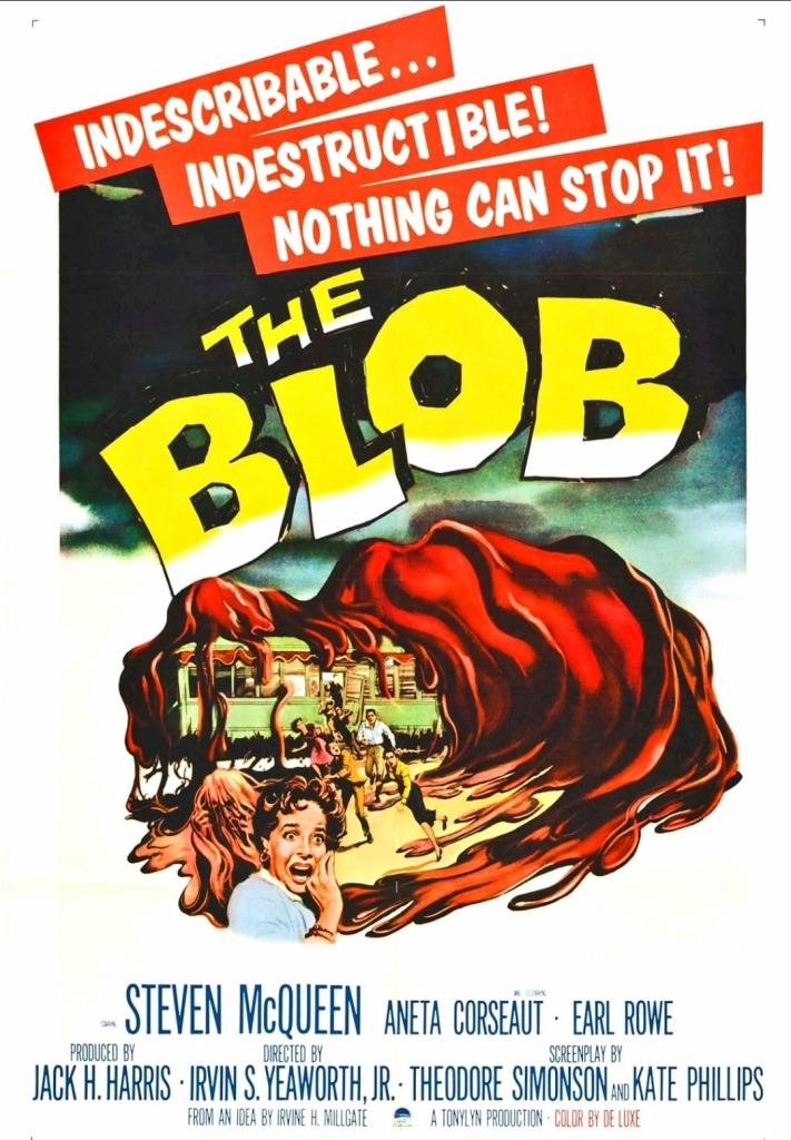
With those details laid down, here is a look back at The Blob, a sci-fi horror movie released in 1958 starring Steve McQueen and Aneta Corsaut, written by Kay Linaker and Theodore Simonson, and directed by Irvin S. Yeaworth, Jr. (Irvin Yeaworth for short). This was a low-budget local-level production by Valley Forge Films, Fairview Productions and Tonylyn Productions.
The Blob movie poster.
Early story
The story begins somewhere within a small town in Pennsylvania. During one evening, teenagers Steve Andrews and Jane Martin spend a romantic time together in a car only to be disturbed when a meteorite from outer space crashes nearby. This easily sparks Steve’s curiosity as he decides to drive to find the spot of the crash taking Jane with him.
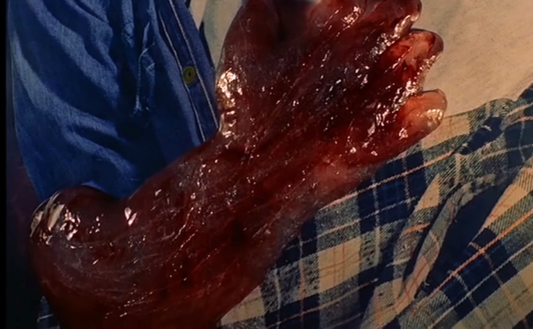
Meanwhile, an old man who happened to be living near the spot of the crash went out of his home and finds the meteorite first. Out of curiosity, he pokes the meteorite with a stick which slowly causes it to break open revealing a gelatinous substance (the blob) inside. He uses the stick on the substance, lifts it up and examines it closely. Against gravity, the substance suddenly moves up the stick and wraps itself on the old man’s hand causing him to become desperate to remove it. He failed.
As Steve drives down the road, the old man with the blob suddenly crosses down their path. The old man tells Steve to take him to a doctor…
Quality
Steve McQueen (3rd from left) as teenager Steve Andrews with Earl Rowe (2nd from right) as Lt. Dave and other over-aged actors playing teenagers.
I can say that I really like this old movie which has always been an independent, low budget production that made a solid contribution to the sci-fi genre and pop culture in general.
To begin, this film has a simple plot about an alien creature in the form of a gelatinous blob from outer space which attached itself into an old man’s hand, grew a lot when the man made it to the doctor, and then started consuming people which made it grow so big, life in the town got disrupted and people found themselves in danger. Unsurprisingly, the blob itself does not dominate the narrative considering the limitations the filmmakers had on making special effects work plus they focused more on the characters to move the plot forward. Rest assured, however, that the production team went all out with their limited resources on making the monster look menacing in the final fifteen minutes. I should state that the special effects team did a convincing job with the way they made the blob move to specific directions.
Given the simple plot, it is not surprising to see the narrative focusing more on the characters particularly with teenagers Steve and Jane (both played by obviously over-aged actors Steve McQueen and Aneta Corseaut). The story clearly follows the two mentioned teenagers who have the best knowledge about the blob and what happened, and it just so happens that they are always at a disadvantage when asked by adults to prove things.
With a monster that large within the local community, you know that something must be done before it causes further damage and kills more people. The blob was portrayed to be unrelenting in consuming and killing people which causes it to grow even bigger and with no limits determined. The blob does not care at all about the pain and anguish of its victims which parallels the evil of Communism/Marxism/socialism/anti-Semitism in real life.
Jane (Aneta Corseaut) and Steve (Steve McQueen) with the local doctor (Stephen Chase) early in the film.
The interactions between teenagers (note: Steve McQueen and Aneta Corseaut are not the only over-aged looking actors playing youth) and the mature authorities (local police, parents, educator and house keeper to name some) dramatized a gap in which the youth lacked credibility while the adults remain difficult to convince. Very notably the backward car race early in the film symbolically reflects the Hollywood film trend of the 1950s in which American teenagers are portrayed to be troublesome and living without real purposes.
Going back to the protagonists Steve and Jane, the screenplay was designed to highlight what good teenagers can do when a crisis strikes the local community and why the adults should get over their doubts about the youth.
Given the structure of the script, there are a lot of talk scenes throughout and the progress of the blob growing as a menace within the plot helped break the monotony. While he is clearly too old to play a teenager, Steve McQueen here remains convincing as a youth who strives to achieve something worthy even as he lacks maturity. The same can be said about Aneta Corseaut whose character was designed to help Steve move forward apart from having romance with him. When her character feels troubled, Steve comes in to support her in return. If you ignore their mature looks and focus on the dialogue, you will find convincing lines of youth within Steve and Jane. The same can be said about the other teenagers.
Considering the low budget and the limitations of technology at the time, the man-made practical effects in this movie are still good.
I can say out loud that watching movies inside the cinema is always better than streaming. The best way to enjoy a movie at home, on the other hand, is with physical media like Blu-ray and 4K Blu-ray.
While McQueen and Corseaut performed well, there were some moments of stiff acting and lifeless delivery of lines of dialogue scattered throughout.
Those of you who are so used to fast-paced films with thrills and jump scares, you should temper your expectations as this movie moved at a slow-to-medium pace with very little horror elements and very little violence. As this was a low-budget local-level production, certain shots had to be made with very obvious creative shortcuts. Even though this movie was filmed on several locations in Pennsylvania, the filmmakers failed to establish a true sense of geography and this means no scenic shots.
Going back to the blob itself, its jello appearance may not look menacing at first and there were times when the lack of scale (note: they did not have equipment to achieved the depth-of-field visual effect) was noticeable. What I liked here is the way the blob was portrayed – unrelenting and totally immune to the emotions and concerns of people it encounters. The blob here somewhat reminds me of the T-800 in The Terminator (1984) in the sense that it simply would not stop to attack people, consume them and then keep on growing into one very large mass which causes a crisis on the small town community.
In case you are wondering, there were accidents that happened during the memorable scene of moviegoers running out of the cinema in the film. The tripping of some people were purely accidental.
When it grabs someone and starts to consume the victim physically, the blob does not care about the pain it causes on its prey. While it is clear that the movie’s script was written during the early stages of the Cold War, it is possible that the blob served as a symbol of Communism infiltrating America, endangering people and taking their lives (and liberties) away. That being said, the rampant Leftist influence and social violence in the minds of millions of Americans today makes this film socially relevant and the blob’s threat has gotten even more symbolic. Lastly, I should state that composer Ralph Carmichael managed to come up with music to emphasize the threat of the blob.
Conclusion
In my honest opinion The Blob (1958) is still a good movie to watch and it deserves its place in film history as well as in the sci-fi genre of movies in general. While it had its shortcomings, this low-budget local-level production managed to be a worthy viewing experience and set the foundation for its movie franchise (note: a sequel was made in 1972 and the memorable remake of 1988 followed). To say the least, this movie paved the way for Frank Darabont and Chuck Russell to produce the 1988 remake that was very intense and a lot of fun to watch.
The Blob (1958) in Blu-ray disc format from The Criterion Collection. This is the best way to enjoy the movie at home.
The blob itself went on to inspire creative imitations (referred to as blobs or ooze) and new monsters in other forms of entertainment (note: the blob appears as one of the monsters in the 1982 Intellivision game Advanced Dungeons & Dragons: Cloudy Mountain). Steve McQueen himself went on to become one of Hollywood’s elite stars in the decades that followed and this film should interest both die-hard fans and any film buff who wants to learn more about him.
Disclaimer: This is my original work with details sourced from reading the comic book and doing personal research. Anyone who wants to use this article, in part or in whole, needs to secure first my permission and agree to cite me as the source and author. Let it be known that any unauthorized use of this article will constrain the author to pursue the remedies under R.A. No. 8293, the Revised Penal Code, and/or all applicable legal actions under the laws of the Philippines.
Welcome back superhero enthusiasts, 1970s arts and culture enthusiasts, Marvel Comics fans and comic book collectors! Today we go back to the year 1977 when Marvel Comics had the license to publish comic books about Japan’s iconic monster Godzilla (Gojira in Japanese) and even integrated him into their shared comic books universe.
The mid-1970s saw a decline of Godzilla’s popularity in Japan as reflected in the commercial disappointment of the movie Terror of Mechagodzilla (1975). The company Toho decided to put on-hold the production of its monster movies without permanently ending the Godzilla film franchise. The next Godzilla movie released was The Return of Godzilla (1984) which proved to be a solid rebound of the Japanese film franchise.
Sometime between the mentioned movies, there was interaction between Toho officials and Marvel Comics – including the late Stan Lee – when the Japanese company screened the movie Godzilla vs. Gigan (titled in America as Monster Island) to the comic guys in relation to the film’s American theatrical release. It turns out Stan Lee enjoyed the movie a lot and seated next to him was writer Doug Moench (the eventual writer for the Godzilla comic book series).
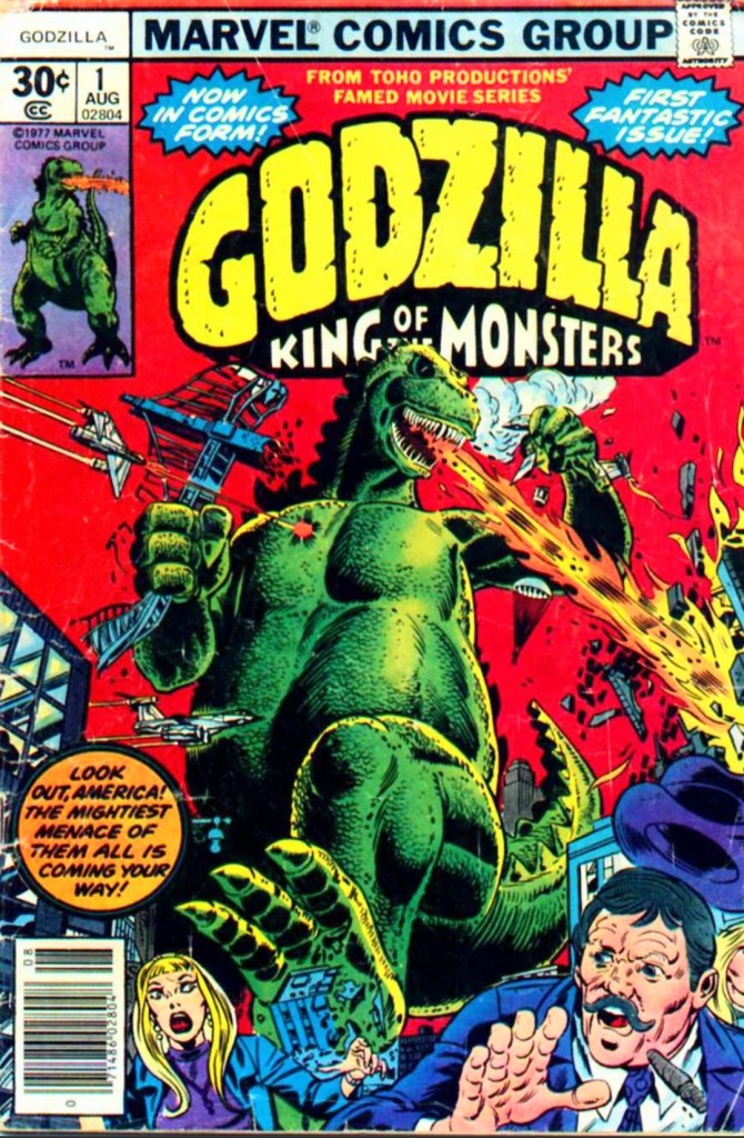
With those details laid down, here is a look back at Godzilla: King of the Monsters #1, published in 1977 by Marvel Comics with a story written by Doug Moench and drawn by Herb Trimpe.
The cover.
Early story
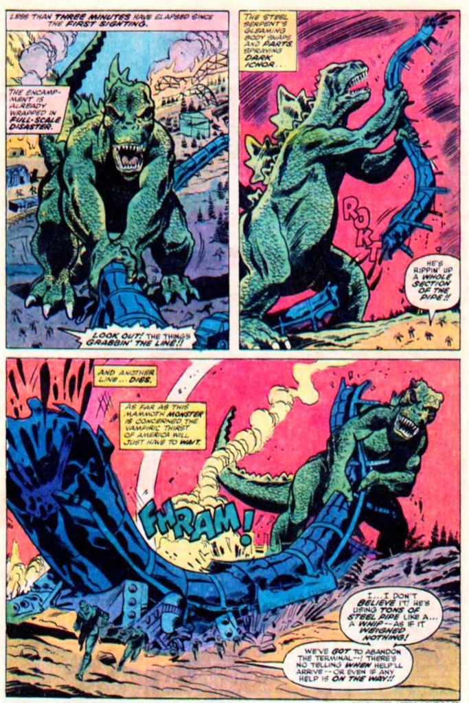
The story begins in Alaska when a huge iceberg suddenly deteriorates unleashing a gigantic monster with sharp teeth, dorsal fins and immense strength – Godzilla. After instantly crushing a supply ship, the monster moves onto the land destroying structures and disrupting the lives of every person nearby.
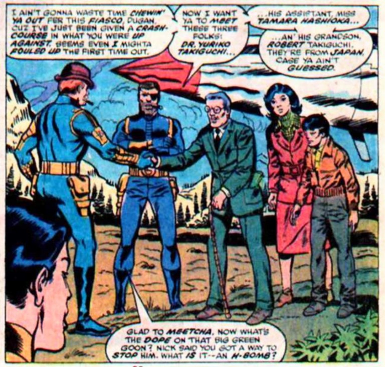
In response to Godzilla’s rampage in Alaska, S.H.I.E.L.D. dispatches its agents to the site of destruction to take on the monster. Meanwhile, S.H.I.E.L.D. director Col. Nick Fury is transporting with him three Japanese individuals deemed important (with clearances from the Pentagon and the White House)…
Quality
Dum Dum Dugan, Col. Nick Fury and the Japanese characters.
To get straight to the point, this comic book not only marked the literary debut of Japan’s iconic monster under Marvel Comics’ banner but also his integration into the shared universe of the time. That being said, the story written by Doug Mench was pretty much a functional build-up of Godzilla’s presence within the realm of Marvel which includes a strategic choice of having S.H.I.E.L.D. and its characters encountering the monster. In short, the creative team decided not to literally pull out Marvel’s biggest guns (the more popular superheroes and teams) as such a move would have lessened the impact of Godzilla’s debut.
For the most part, S.H.I.E.L.D.’s Nick Fury and Dum Dum Dugan had lively portrayals and the way they reacted to the rampage of Godzilla was believable. The introductions of the Japanese characters (who could provide breakthroughs on dealing with the giant monster) were clearly inspired by the Japanese scientists who were crucial in the plot of the original 1954 movie Gojira.
Going further, Doug Mench went on to efficiently establish Godzilla’s origin which creatively is a sensible reinterpretation of what was established in the 1954 movie. The giant monster’s rise as a result of humanity’s testing of powerful weapons on Earth is definitely here.
As expected, Godzilla is the unrestrained force of destruction but as this comic book was released in the 1970s, the destruction scenes lacked impact as they were creatively sanitized with deliberate moves of showing no casualties no matter what happened. This limitation on the part of Marvel Comics showed they were not willing to emulate the approach on destruction and death that was clearly emphasized in the first Godzilla movie of 1954.
As for Godzilla himself, Herb Trimpe’s visual approach is not really good. While Trimpe implemented the guy-in-a-suit shape on the giant monster’s form, he made Godzilla his own (took no inspiration from Godzilla’s cinematic designs) which resulted in making the icon look unrecognizable. There were inconsistencies on Godzilla’s head as well. In certain shots, Godzilla looked terrifying but in other shots, he looked weird or cartoony. The use of the color green did not make Godzilla look reptilian but rather comical.
Conclusion
I can only imagine the SJWs and the climate change extremists enjoying these images of an unrecognizable Godzilla wreaking havoc to the oil supply. Are there lots of people in your local community who were brainwashed to hate oil and gas?
Godzilla: King of the Monsters #1 (1977) is a serviceable approach on debuting the iconic monster within the fantasy realm of Marvel Comics and sparking a new wave of crossovers. There were uneven levels of quality here and there, and Herb Trimpe’s visual approach on Godzilla was alienating to say the least. Honestly, I did not really see Godzilla in this comic book but rather a green-colored dinosaur-like creature that was mislabeled as Godzilla. What works here is the writing by Doug Mench which proved to be entertaining enough.
Overall, Godzilla: King of the Monsters #1 (1977) is satisfactory.
Disclaimer: This is my original work with details sourced from reading the comic book and doing personal research. Anyone who wants to use this article, in part or in whole, needs to secure first my permission and agree to cite me as the source and author. Let it be known that any unauthorized use of this article will constrain the author to pursue the remedies under R.A. No. 8293, the Revised Penal Code, and/or all applicable legal actions under the laws of the Philippines.
Welcome back fellow geeks, pop culture enthusiasts and comic book collectors! Way back in 1982, the horror comedy anthology film Creepshow was released in cinemas and it gave moviegoers a fun time getting scared as it featured well-made short stories written by Stephen King and directed by George Romero. The two creators were strongly influenced by the 1950s horror comic books of EC Comics when they made the movie. Very recently, Creepshow was released on 4K Blu-ray loaded with lots of extras for fans and moviegoers to enjoy. The said 4K Blu-ray release can be ordered online now.
I myself first saw Creepshow on home video sometime in 1983 and got to replay it occasionally on cable TV and DVD. Strangely enough, it was only a few years ago when I first learned that there was indeed a comic book adaptation of the movie that was also released the same year it hit cinemas.
With those details laid down, here is a look back at Stepehen King’s Creepshow published in 1982 by Plum with stories written by Stephen King and drawn by Bernie Wrightson (with Michele Wrightson). The cover was illustrated by the late EC Comics legend Jack Kamen.
The cover.
Early stories
Father’s Day – Sylvia Grantham, her nephew Richard, niece Cass and Hank (husband of Cass) enjoy time together at the Grantham estate anticipating the arrival of Bedelia for the annual family dinner. It is an open secret within the family that Bedelia killed her late father Nathan Grantham who was so overbearing to her as she became responsible on nursing him full-time.
Bedelia apart from her relatives in Father’s Day.
The Lonesome Death of Jordy Verril – A lonely farmer named Jordy witnesses the unexpected arrival of a meteorite from out space which landed violently on his farm. After realizing what it is, he touches it without any protection and gets his fingers burned. Considering the rarity of the object, Jordy begins to imagine making a lot money by bringing it to the local college.
A page of the story of Jordy and the meteor.
The Crate – In the basement level of Amberson Hall (science building of Horlicks University), a janitor accidentally finds a very old wooden crate located right under the staircase. The writings “Ship to Horlicks University via Julia Carpenter – Arctic Expedition – June 19, 1834” were marked on the crate. Meanwhile a faculty party is taking place across town. During the party, the mild-mannered college professor Henry Northrup experiences embarrassment as his unhinged wife Wilma (note: referred to as Billie) talks way too much in front of professor Dexter Stanley and many others. Henry reveals to Dexter that he has grown to hate his wife. Suddenly, someone tells Dexter that a telephone call for him is waiting. It was the janitor who made the call.
Henry, wife Wilma (AKA Bilie), the janitor and Dexter Stanley in The Crate.
Something to Tide You Over – At a beach, Harry Wentworth could do nothing but remain helplessly immobile as his entire body and neck have been buried under the sand by Richard. It turns out that Harry has been having an affair with Becky, Richard’s wife. The helpless Harry expressed that he and Becky were really in love with each other. For his part, Richard has something else to show to him and he certainly has some things prepared.
Richard and Harry in Something to Tide You Over.
They’re Creeping Up on You – A wealthy and cruel businessman named Upson Pratt is alone in his well-lighted apartment. He has been suffering from mysophobia and has been living in isolation and only communicates with others using the telephone and other electronic methods. Slowly but surely, cockroaches begin to multiply in his apartment.
Upson Pratt and the cockroaches in They’re Creeping Up on You.
Quality
Starting with the storytelling with emphasis on how the comic creators selected content from the movie and translated it all into illustrated literature format with a little over sixty pages to work with, I can say that this comic book is pretty much a faithful adaptation of the film’s five short stories (note: the cinematic prologue and epilogue were never adapted). For each short story, it is clear that sufficient details from each cinematic tale were adapted and the overall concepts, acts and characterizations were pretty much maintained. This is a credible piece of illustrated literature work as each tale is not only readable but also engaging and entertaining complete with shock moments. Take note that Stephen King not only wrote all these tales for the movie, there were two tales that were previously published in literary format before Creepshow was even made. Whoever participated in the editing process behind the production of this comic book deserves commendations.
While the writing used in adapting the film’s concepts and characters turned out good, it is clearly obvious that certain cinematic elements could not be translated here. Remember how frantic and scared Dexter Stanley (played by the late Fritz Weaver) was in the movie after he witnessed the janitor got killed by the monster? Those cinematic emotions never made it in illustrated literary format here.
The artworks by Bernie Wrightson are pretty good to look at. Similar to the writing, the visuals here were made to recapture the look of the movie not in a shot-for-shot manner but with the artist’s own approach on how such scenes should be presented. That being said, I should state that the comic book panels that appeared in the movie’s transition scenes (example: still live action image slowly turning into illustrated comic book form) are NOT here at all.
You will instead see Wrightson’s own visual interpretation of the scenes from the movie and the artworks were inspired a bit by the 1950s horror comics of EC Comics and ultimately were more in line with the contemporary approach of drawing comic book art of the 1980s. The gory scenes from the movie made it in this comic book. When it comes to drawing monsters or the undead, the art result was uneven. While Wrightson’s art of the monster in The Crate was really scary to look at (in accordance to how it appeared cinematically), the work on the walking dead in Something to Tide You Over looked much less scary compared to those in the film.
While Wrightson clearly did not prioritize recapturing the likenesses of the actors to illustrate their respective characters, there were a few shots in which professor Henry Northrup somewhat looked like the late Hal Holbrook, and the illustrated Bedelia resembled the late Viveca Lindfors.
Conclusion
The best way to describe Stephen King’s Creepshow (1982) is this…it is indeed a very solid adaptation of the movie and its five short stories. While it was clear that not all the dialogue and other types of content of the movie could ever fit in this comic book, the creators did a very credible job of adapting Creepshow’s core elements and succeeded in making what they had solidly presented for readers to enjoy. Each short story from the movie turned out to be cohesive and enjoyable for reading.
When it comes to really enjoying this graphic novel, I personally would recommend you readers to watch the Creepshow movie first before reading. The film is the complete package of entertainment showcasing the combined works of Stephen King and director George Romero, while this comic book is ultimately the companion piece for those who enjoyed the movie as well as EC Comics’s horror comic books of the 1950s.
Overall, Stephen King’s Creepshow (1982) is highly recommended!
Disclaimer: This is my original work with details sourced from reading the comic book and doing personal research. Anyone who wants to use this article, in part or in whole, needs to secure first my permission and agree to cite me as the source and author. Let it be known that any unauthorized use of this article will constrain the author to pursue the remedies under R.A. No. 8293, the Revised Penal Code, and/or all applicable legal actions under the laws of the Philippines.
Welcome back fellow geeks, pop culture enthusiasts and comic book collectors! I want to make things clear to all of you that when it comes to movies, Indiana Jones is truly an American icon who will be remembered for a long time thanks to the combined works of the legendary creative team of Steven Spielberg, George Lucas and Harrison Ford.
In case you are wondering, I have no intention to watch Indiana Jones and the Dial of Destiny (2023) since that movie was specifically handled by Kathleen Kennedy whose leadership of Lucasfilm (under the Disney banner) ruined Star Wars since 2015. It does not help that the new movie was not directed by Spielberg and clearly it does not involve George Lucas on the creative side. I should state that I reject wokeness, political correctness and identity politics which defined Kathleen Kennedy’s handling of Star Wars and Indiana Jones.
That being said, now is a good time to back into the 1980s when the Indiana Jones entertainment franchise was still new and creatively expanding into other forms of media. In fact, Marvel Comics started publishing an Indiana Jones comic book series between Raiders of the Lost Ark and Indiana Jones and the Temple of Doom.
With those details laid down, here is a look back at The Further Adventures of Indiana Jones #1, published in 1983 by Marvel Comics with a story written and drawn by John Byrne with ink work by Terry Austin.
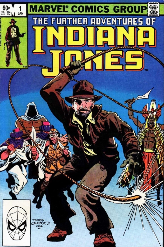
The cover.
Early story
The story begins with Indiana Jones (wearing formal attire for his academic profession) attempting to whip a small stick off the mouth of Miss Greebly who was standing very still. Jones’ superior Dr. Marcus came in to witness the stunt.
Shortly after, Jones and Marcus meet with former student Charlie Dunne who reveals to them he and his sister Edith learned the location of the Ikons of Ikammanen. Just seconds after stating he could prove that the ikons exist, Dunne suddenly gets hit on the back with a knife.
With Dunne suddenly killed and the discreet killer already gone, Jones and Marcus examine the content of the victim’s bag and find a map of coastal Africa, a photograph of a temple and an address…
Quality
Indiana Jones and Edith on a dangerous search.
I will start by stating the obvious thing about this comic book…it looks and feels like a genuine Indiana Jones adventure with clear inspiration taken from the 1981 movie. The basic elements are here: Indy does research and some detective work, he travels overseas searching for answers, faces danger along the way, and gets involved in a series of unexpected events. The good news is that John Byrne crafted a fun and high-quality literary adventure featuring the cinematic icon.
This comic book has an original story concept and deliberately the narrative flowed at a medium pace which allows build-up to immerse readers into the details, followed by some bouts of pay-off to entertain readers. I also like the way the narrations laid down the details with the intention of helping readers understand not only the situations, locations and people, but also giving them unique perspectives about Indy himself. The dialogue was well written and clearly believable. When Indiana Jones explains details, he really uses the knowledge he gained through academic research as well as recollections from his past expeditions or adventures.
I should also state that Byrne gave Indiana Jones, the other characters and locations stylized looks. I don’t mind Jones not resembling Harrison Ford at all but Byrne still made him recognizable in his own unique way. There were some location images that looked pretty detailed.
Conclusion
And just like that, Indiana Jones takes a leave from academic work for his next adventure.
The best way to describe The Further Adventures of Indiana Jones #1 (1983) is this…John Byrne and his team succeeded in making this a fun read inspired by elements of Raiders of the Lost Ark. The story has a strong adventure feel with Indy having a strong presence and the introduction of new characters were executed smoothly. For a launch issue, this one is indeed engaging to read and it succeeded in convincing me to anticipate the next issue. Ultimately it is clear that John Byrne really is an effective Indiana Jones storyteller.
Overall, The Further Adventures of Indiana Jones #1 (1983) is highly recommended!
Disclaimer: This is my original work with details sourced from reading the comic book and doing personal research. Anyone who wants to use this article, in part or in whole, needs to secure first my permission and agree to cite me as the source and author. Let it be known that any unauthorized use of this article will constrain the author to pursue the remedies under R.A. No. 8293, the Revised Penal Code, and/or all applicable legal actions under the laws of the Philippines.
Welcome back superhero enthusiasts, 1990s culture enthusiasts and comic book collectors! Today we go back to the year 1995 to examine what was back then one of the most unthinkable comic book crossovers to ever happen – Superman vs. Aliens (also referred to as Superman/Aliens).
I remember sometime back in 1994, I bought a new superhero comic book from the local comic book retailer and what caught my attention was the print ad on the back – an Alien chestburster crashing through the iconic Superman S logo. A few of my friends who saw the same print ad chuckled at the concept of having the Man of Steel together with the monsters from the movie franchise that first started in 1979 with Ridley Scott’s Alien. Then came 1995 and eventually the first issue of the Superman vs. Aliens mini-series made it on the shelves of local comic book stores. Its cover easily attracted the attention of many and I saw the image of Superman being smaller to the Xenomorph alien in the background, the concept of the crossover started to intrigue me.
With those details laid down, here is a look back at Superman vs. Aliens #1, published in 1995 by Dark Horse Comics and DC Comics with a story written and drawn by Dan Jurgens with ink work done by Kevin Nowlan.
The cover.
Early story
The story begins in space when a fast moving object from nowhere heads towards Earth which was detected by a satellite of Lex Luthor’s corporation. Behind the scenes, personnel initiated an alert for a certain Dr. Kimble.
Clark Kent (Superman) and Lois Lane arrive at the headquarters of Lexcorp. It turns out they were suddenly called for by the corporation due to what happened in space. As they ride the elevator heading towards the rooftop, Clark and Lois talk about Lexcorp’s space program and Dr. Kimble who happens to lead the said program.
At the roof, they meet Dr. Cheryl Kimble and immediately ride with her in the helicopter going to a certain destination in anticipation of the probe’s estimated arrival. During the trip, Kimble reveals that they received radio signals from the incoming probe which were garbled almost unintelligible. She then plays an excerpt of the radio signals for Clark and Lois to listen to.
For Clark, he cannot help but feel shocked as he finds the audio sounding like Kryptonian…
Quality
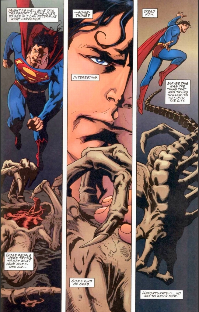
Superman finds a dead Facehugger alien.
Firstly, I can say without any hesitation that the creative team succeeded in making the crossover between Superman and the Aliens believable within this very comic book. For one thing, Dan Jurgens came up with a script and visual design that radically different from what was shown in Superman comic books of the time. The script had this somewhat adulterated tone that made the comic book move away from superhero fantasy and move into the realm of cinematic science fiction. For setting the tone and the look, the creative team scored a home run.
Secondly, the script was properly structured to immerse readers with the tale initially following Superman, Lois Lane and Dr. Kimble which ultimately served as a build-up. The good news here is that readers don’t have to wait too long for the pay-off to be executed. In fact, the pay-off itself (which happens when the Man of Steel finally encounters the Xenomorph for the first time) is huge and immediately the tension and depth of the plot really shifted into high-gear which I enjoyed. Along the way, the expository dialogue or the presentation of details (to help readers understand) was nicely balanced.
Thirdly, I love the way how Dan Jurgens presented Superman as being more troubled and more vulnerable than usual. To see the American icon go into personal obsession over the Kryptonian details was a really unique way to presenting his human side. Also having Superman deep in space far away from any sun or star (the essential source for his powers) really made him truly vulnerable as he actually got weaker even before facing off with a Xenomorph. Being in a vulnerable state, you will see the Man of Steel in real danger which truly goes against type (note: being super strong and invulnerable all the time). As such, the danger of the Aliens against him is believable and intense. What I do find weird, however, is how awkward it is for me to see Superman actually trying to reason with the first Xenomorph he encounters. Of course, he has no previous knowledge about the violent nature of the Aliens but we readers – and millions of people who saw any of the movies – know better than him.
As part of the build-up, Dan Jurgens inserted details and flashbacks that recalled previous tales that were published during the early stage of the post-Crisis era of DC Comics. This not only includes Superman’s arrival on Earth but also his strategic killing of General Zod, Zaora and Quex-Ul using green Kryptonite (as published in Superman #22 of 1988). As such, Superman’s deep regret of taking life away from others serves as a build-up for his avoidance of killing in this crossover. This actually races the stakes for his upcoming encounters with the Aliens.
Even though the story is told through Superman, Dan Jurgens still had enough room to develop Lois Lane and Dr. Kimble. Kimble symbolizes the driven corporate executive who is in-charge of operations that could help her make claims on scientific discoveries and new technologies. Lois Lane here served as the intellectual opposite of Kimble without ever going into the extremes of gaining something for her journalistic career.
Conclusion
Superman with Lois Lane and Dr. Kimble.
Very clearly, Superman vs. Aliens #1 (1995) is indeed a great comic book as well as great opener for its mini-series. Dan Jurgens established a tale that had sufficient build-up and when the pay-off started, the crossover aspect really made the story more compelling to read. Ultimately, this one made the crossover between Superman and the Xenomorphs believable, engaging and intriguing. This comic book is a great start and I am eager to find out what happens next.
Overall, Superman vs. Aliens #1 (1995) is highly recommended!
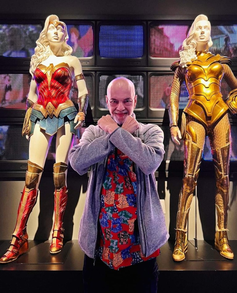
George Perez, the incredible comic book artist who made major contributions to illustrated literature (especially the superhero comic book genre), sadly passed away due to complications related to pancreatic cancer. He was 67-years-old and I can say that superhero comic book art and dynamic expressions will not be the same without him.
George Perez with the two Wonder Woman plastic models. (photo source – DC Comics Facebook page)
Already there were comic book industry figures who reacted to the death of the legendary Perez. DC Comics co-publisher and legendary creator Jim Lee paid tribute stating, “We creators may all have access to the same tools of the trade: pen, paper and imagination, but what George could do with his prodigious talents was off the charts.”
For his part, Rob Liefeld stated, “I’ll remember George for his innovative and prolific storytelling. Thank you for all the great memories. Rest In Peace, George Perez.”
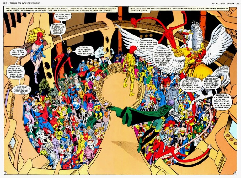
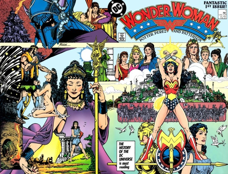
For the newcomers reading this as well as those who are simply unaware of Perez’s legacy, he was responsible for visualizing DC Comics’ 1985 epic maxi-series Crisis on Infinite Earths (note: he drew countless characters complete with varied settings or environments in high detail) and redefining Wonder Woman (note: he also wrote the stories) which made her a more essential pop culture icon. George Perez also worked for Marvel Comics over many projects and was chosen to illustrate the memorable 2003 JLA/Avengers crossover series of Marvel and DC. Perez also worked with other publishers such as Malibu Comics for several Ultraverse comic books and Image Comics for Crimson Plague and Witchblade. In recent years, he was responsible for Sirens published by BOOM! Studios.
For me, Wonder Woman was best defined during the post-Crisis era of DC Comics which involved George Perez and Len Wein who wrote the early issues of the Wonder Woman monthly series in the late 1980s.
In his decades-long career in comics, Perez unsurprisingly earned varied awards and honors (references here, here, here and here to name a few).
I should say that George Perez is a long-time favorite comic book illustrator of mine. I enjoyed reading the superhero comic books he illustrated and I love his art style on the characters, the environments and crowds. If there is anything I love about Perez’s art, it is his distinct style along with his implementation of high levels of details on the characters, objects, creatures and surroundings. Perez is also known to capture the distinct visual elements of superhero characters such as Spider-Man’s costume and his spaghetti-like web, Superman’s physique and distinct letter S, Prime’s overly muscular body and more. Every time Perez is involved as artist, the result is almost always a visual feast that often adds punch to the script prepared.
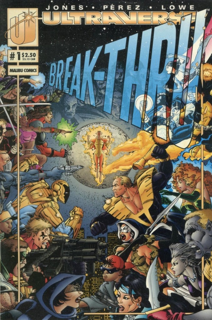
When I was still actively collecting comic books back in the 1990s, I often get excited whenever I learned that George Perez illustrated upcoming comic books. In 1992, he drew Incredible Hulk: Future Imperfect (2 books) which was mind-blowing and intriguing for me! In 1993, I became a fan of the newly launched Ultraverse of Malibu Comics and I got very excited to learn that Perez was hired for their major UV crossover Break-Thru (2 issues). Perez also drew one issue of Prime and most of the early issues of the UV team UltraForce (issues #0, #1, #3, #4, #5 and #6). If you want to see Perez draw ALL the characters of the Ultraverse, you should read the 2-issue Break-Thru storyline.
A page from Break-Thru #2 showing just some of the many Ultraverse characters Perez illustrated. This was published before the release of UltraForce.
Speaking of UltraForce, check out this video by Crypto Comics (with observations on Perez’s art works)…
Going back to George Perez’s amazing run on Wonder Woman, I urge you to watch the video below…
For me, the most defining stories of Wonder Woman ever told in any art form are still the comics that Perez wrote (note: he co-wrote stories with Greg Potter and Len Wein respectively on the early issues) and illustrated during the post-Crisis era of DC Comics. Check out my retro reviews of Wonder Woman 1980s comics on this website.
Truly, George Perez will be missed by a lot of people and his countless pieces of works will be revisited in the foreseeable future. In closing this piece, posted below are varied works (comic book covers and interior art) done by the late creator through the decades for your viewing pleasure and learning. This is a tribute to Perez and may he rest in peace!
+++++
Note: All images shown are properties of their respective companies.
Disclaimer: This is my original work with details sourced from watching V: The Final Battle and doing personal research. Anyone who wants to use this article, in part or in whole, needs to secure first my permission and agree to cite me as the source and author. Let it be known that any unauthorized use of this article will constrain the author to pursue the remedies under R.A. No. 8293, the Revised Penal Code, and/or all applicable legal actions under the laws of the Philippines.
With a very engaging story, memorable characters, intriguing concepts and innovative marketing, the $13 million production V: The Original Miniseries (simply called V back then) became a major TV hit in America over two nights in May, 1983. I personally loved watching the said mini-series back in the 1980s and I still love replaying it in this age of high-definition and Blu-ray discs. For me, at least, it is a timeless classic and it carries several lessons about the fragility of society, the rise of fascism, the spread of evil in many forms and the human desire for freedom from oppression.
The cover and the title that did not live up to its purpose.
Early story
The story begins with Mike Donovan (Marc Singer) having a nightmare of him and his son Sean (who was abducted during the events of V: The Original Miniseries) in a desperate escape attempt while inside one of the motherships of the Visitors. He wakes up in the presence of Julie Parrish (Faye Grant) and realizes they have a dangerous mission to execute at a local facility used by the red-uniformed Visitors. It turns out, the Resistance movement led by Julie has been losing ground to the alien humanoids and Mike has been helping them out while prioritizing the state of his son who has been in captivity in one of the mother ships.
During the night, a truck carrying many local civilians inside its trailer arrives at a local factory controlled by the Visitors with officer Steven (Andrew Pine) watching over. After the civilians got directed to enter the factory, it turns out they got processed and came out in the form of food cocoons. The sight shocks Julie watching from a distance with her armed teammates waiting on stand-by.
Easily the most engaging shot in this sequel. A clear reminder about the fascist takeover by the aliens from outer space.
After causing damage on the nearest fence, the Resistance begins their attempt to raid the facility and free their fellow cocooned people but the tide turned against them. It turns out, the Visitors’ troops are wearing stronger armor and bright lights were installed on the top of the facility to forcing Julie, Marc and the rest of their team to retreat. They lost some members along the way. During a closed-door meeting with the Resistance stakeholders, Mike Donovan says a key event is needed to make a significant gain against the Visitors.
Over at the mothership hovering over Los Angeles and in the presence of Diana (Jane Badler), the leader John (Richard Herd) tells Kristine Walsh (Jenny Sullivan) that a major medical announcement will be held in the form of an organized special event very soon and that she will be part of the presentation for the global TV audience…
Quality
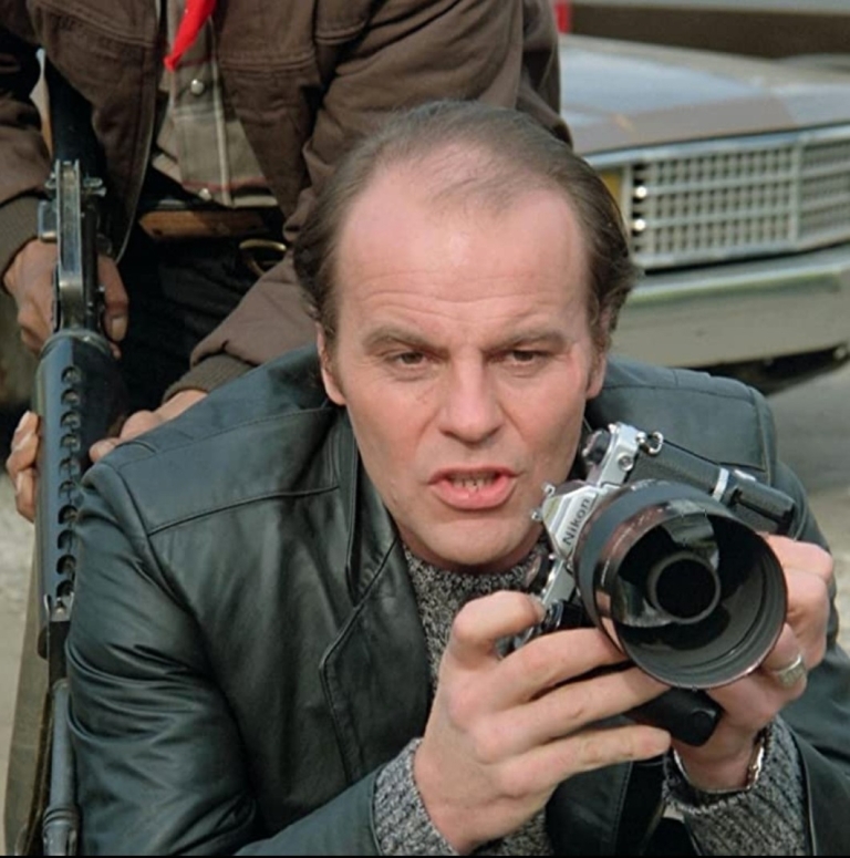
Marc Singer as Mike Donovan with Michael Durrel and Michael Wright as Robert Maxwell and Elias Taylor near him.
I’ll star first with the presentation here. This sequel mini-series was composed of three episodes totaling over 270 minutes. In what looks like to be attempts to ensure more spectacles for the viewers’ enjoyment, each episode of V: The Final Battle has a battle near the end and the creative team succeeded in not only providing on-screen action but also scored well in making the spectacle more varied while still making sense within the main narrative. For the most part, this sequel is indeed a natural progression of what was established in V: The Original Miniseries and that is something to admire given the fact that V creator Kenneth Johnson left this production early.
On the storytelling, V: The Final Battle expands a bit on the Visitors’ dictatorship of Los Angeles and its surrounding areas while the Resistance led by Julie Parrish and supported by close companions Robert Maxwell (Michael Durrell), Elias Taylor (Michael Wright) and Caleb Taylor (Jason Bernard) are shown to be struggling on taking down the alien humanoids even though they secured noticeably more weapons and equipment. The storytelling and the dramatization about the Resistance changes dramatically with the addition of Ham Tyler (Michael Ironside) and partner Chris Farber (Mickey Jones) in the 2nd episode and from that point on, you get to see a human opposition that becomes more flexible with their operations.
Michael Ironside as Ham Tyler is the most significant new addition to the cast.
As mentioned earlier, Kenneth Johnson’s involvement in this sequel was minimal and it is seen on the presentation. The symbolism Johnson implemented in the original mini-series that established parallels between 1980s America to the Nazi occupation of Europe did not continue here which results a more straightforward presentation of details, character moments and story progression. There was also a noticeable lack of suspense when it comes to executing big scenes with big reveals. The pacing, like in the 1983 mini-series, moves smoothly at a moderate pace throughout and there were no boring moments at all.
The quality of script is still good. For the most part, the writers managed to capture the essence of the established characters from the original mini-series as they told the further developments of this sequel. For example, Caleb and Elias’ father-and-son moments quickly remind me of what I saw in V: The Original Miniseries. Robert Maxwell’s struggle to help his troubled daughter Robin (Blair Tefkin) while assisting Julie and the Resistance is a very natural progression of what was shown in 1983. The friendship between good natured alien Willie (Robert Englund) and Harmony (Diane Cary) got developed a lot more than expected eventually adding to one particular side of the conflict. The local collaborators Daniel Bernstein (David Packer) and Eleanor Dupres (Neva Patterson) developed further with their treason towards their fellow humans as they enjoyed further the power they gained from the Visitors. These two characters will surely get on the nerves of viewers rooting for the Resistance.
Denise Galik as Maggie is a fine new addition to the cast.
David Packer returns as Daniel Bernstein.
Sarah Douglas as Pamela, a superior of Diana’s.
When it comes to new additions to the cast, Ham Tyler and Chris Farber are not the only new players to add depth to this sequel. There is also Maggie (Denise Galik) who is an attractive, brave and strategic Resistance member whose contribution makes an impact. On the downside, there is also Andrew Doyle (Thomas Hill) who is bad choice the creative team came up with as the on-screen representative of faith when he in fact represents religion, idolatry, rituals and distortion. On the side of the Visitors is Pamela (Sarah Douglas) who is a higher-ranking officer than Diana and even John. Pamela is the more militaristic type of leader who is more focused on achieving goals while keeping things in order.
If there is anything flawed about the characterization, it is the romantic relationship of Julie Parrish and Mike Donovan which starts in the first episode. Considering how dramatic the performances of Faye Grant and Marc Singer were in this sequel, Julie and Mike still don’t make a believable pair of lovers in my view. While this romantic relationship opens up new dimensions within Julie and Mike and offer viewers something new to focus, it brings down the former’s value as Resistance leader somewhat while also setting aside the hinted personal connection between her and Elias in the 2nd episode of the 1983 mini-series.
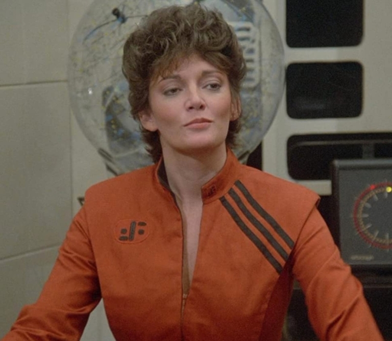
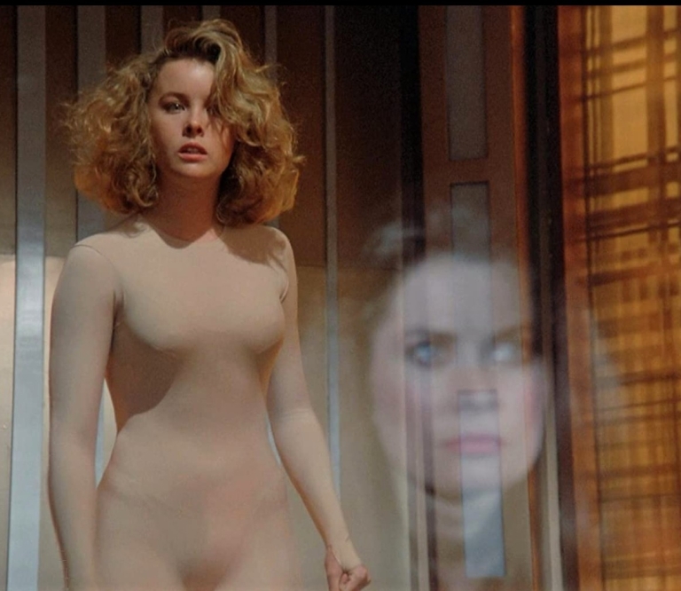
Faye Grant as Julie Parrish in the conversion process scene watched closely by Jane Badler’s Diana.
More on Faye Grant, her performance here is more varied. Not only does she play the brave and struggling leader who is talented in fighting, science and medical practice, she also portrayed Julie as an even more vulnerable character this time around. Her act as the traumatized Julie during the conversion process (read: mental and psychological torture using a more detailed form of virtual reality or nightmare generation) scenes under the watch of Diana is very dramatic and compelling to watch. Just seeing Julie in the conversion process will make grip you with despair and you will eventually feel sorry for her. I should state that the nightmare scenes of Julie were presented with a clear touch of horror.
Marc Singer as Mike Donovan is no longer the reluctant action hero but rather a driven man with a mission to get his missing son back while maintaining a secret connection with Martin (Frank Ashmore) of the Fifth Column (secret dissenters among the Visitors) hoping to achieve breakthroughs for the Resistance and their friends among the dissenting aliens. Singer did the best he could with the script provided to him and he remain likable all throughout. Other than the unbelievable romance with Julie as well as his past encounters with Ham Tyler, there is not much new to expect from the way Mike Donovan was written here. What I should point out, however, is that Mike Donovan’s support for the unholy act of abortion (along with the so-called right to abort) is very wrongful, highly immoral and makes the hero having a sinister presence within him even though he is a father searching for his son.
Jane Badler’s performance as Diana deserves admiration here. Not only did she successfully recapture the charismatic and sinister nature of her character in the 1983 mini-series, Badler was very convincing in showing the more desperate side of Diana, especially when it comes to power struggle within the ranks of the Visitors. You can clearly see the desperation and struggle as soon as Pamela appeared. This sequel also showed a lot more of Diana when it comes to personally supervising her conversion process which is much more elaborate here (note: the conversion process in the 1983 mini-series was limited to the showing of a chair with torture devices). Being the very symbol of charisma and evil in the V franchise, Diana’s place in pop culture is solid and her real-world comparative counterparts would be none other than Hillary Clinton and Kamala Harris.
Jane Badler as the ever charismatic yet very wicked Diana.
As mentioned earlier, Michael Ironside’s Ham Tyler is the most significant addition to the cast and the script. Ironside had that excellent mix of toughness, cruelty and sarcasm portrayed in here and at the same time Ham Tyler brought out very interesting and intriguing interactions with the more established Julie and Mike. As seen in entertainment history, Ironside went on to climb up the ranks in Hollywood with Total Recall (1990), Starship Troopers (1997) and in the Splinter Cell video game franchise. Ironside’s Ham is easily the fourth major character of the V franchise of the 1980s.
Going into the spectacle part of this sequel, the action is more varied as mentioned earlier and the 3-episode structure was a factor. You will see lots of shooting with the use of guns and laser blasters here and there, and with the in-story locations and props as key factors, there are action sequences that are uniquely done. There is a lot to enjoy for any V fan and casual viewers watching this sequel.
As for the special effects part of the spectacle, this one is a mixed bag similar to what was presented in the 1983 mini-series. To put things in perspective, the use of in-camera effects, practical effects and optical effects for TV back in the 1980s was ambitious. That being said, certain effect shots here did not age well such as the miniature shots looking fake (because the camera used did not have a special lens to capture visuals that would have made the miniatures look believable). I should also state that there were certain effects shots that were recycled and reused in key sequences in this sequel which remains embarrassing to see. What is even more embarrassing to see here is the very poor-quality monster effects used during the nightmare scenes (conversion process) of Julie and, more notably, the presentation of Robin’s other child. The monster effects are so fake, they are laughable to watch.
On the bright side of the special effects, the quality of the laser blasts remains good to watch right down to the precise timing with the explosions that were simulated on-set and in-camera.
Conclusion
The Visitors and Resistance key characters in the sequel.
While it has its strengths and weaknesses, V: The Final Battle is still engaging and enjoyable to watch, and at the same time it is a worthy addition for your Blu-ray collection when it comes to HD viewing (note: this is the sequel with the best visuals yet albeit with black borders on the sides). Even though creator Kenneth Johnson was not too involved on the production side, the creative team managed to deliver a long story that proved to be a natural progression of the original mini-series while providing more spectacle (especially action), developing the established characters and resolving key plot threads that started in 1983.
The lack of Kenneth Johnson’s personal touch on the presentation was noticeable and somewhat brought this sequel down a bit in terms of style. What brought V: The Final Battle’s quality down were the overall cheaper looking visual effects, the Julie-Mike love relationship and the climax of the final episode which seemed executed with desperation on the part of the creative team (note: giving a little new character instant purpose). In fairness, this sequel still succeeded in showing what fascism in America (or California specifically which is now dominated by Commies) would look like and it built up on its predecessor’s themes such as the deception of power and the collaboration with foreign enemies. This mini-series even added themes of teenage pregnancy and abortion (note: someone from the creative team wanted to promote the wrongful Roe v. Wade Supreme Court decision of 1973) to its narrative.
Does V: The Final Battle live up to its title? Absolutely not because a regular TV series that deteriorated in quality followed. In retrospect, it’s clear that this sequel marked the beginning of the decline of the V franchise in pop culture. What more, V: The Final Battle was never counted as canon in Kenneth Johnson’s 2008 novel (and sequel to the 1983 mini-series) V: The Second Generation. On its own, V: The Final Battle still has more positive stuff than negative ones and in my experience, it remains enjoyable and compelling to watch from start to finish. Compared to V: The Original Miniseries, I can say this sequel falls short. It is good, not great.
Overall, V: The Final Battle (1984) is recommended. That being said, let this 1984 mini-series remind you that there is so much evil in the real world in the forms of Iran, the terrorists of Palestine, the social justice warriors (SJWs), the Black Lives Matter (BLM) movement and liberal media to name some. Always keep in mind to avoid becoming evil no matter how tempting power in this divided world becomes to you. You also do not want to let the evil ones take over your government and have authority over you, your family members and your community. Push back against evil and stand up strong by faithfully taking sides with the one true Savior whose name is Jesus!
+++++
Thank you for reading. If you find this article engaging, please click the like button below and also please consider sharing this article to others. If you are looking for a copywriter to create content for your special project or business, check out my services and my portfolio. Feel free to contact me with a private message. Also please feel free to visit my Facebook page Author Carlo Carrasco and follow me on Twitter at @HavenorFantasy as well as on Tumblr at https://carlocarrasco.tumblr.com/