Welcome back my readers, YouTube viewers and all others who followed this series of articles focused on YouTube videos worth watching.
Have you been searching for something fun or interesting to watch on YouTube? Do you feel bored right now and you crave for something to see on the world’s most popular online video destination?
I recommend you check out the following videos I found.
#1 The Naked Gun 2½: The Smell of Fear Reaction Videos – What can be said about the 1991 comedy film The Naked Gun 2½: The Smell of Fear? As a sequel to 1988’s The Naked Gun: From the Files of Police Squad!, the movie has this weird and sudden change of setting from Los Angeles to Washington, DC, without any explanation at all. At the time of its release, the United States President was George Bush and the movie had a funny portrayal of him complete with an actress who looks so much like then First Lady Barbara Bush. More notably, the movie has its funny portrayal of energy politics and there is bias against fossil fuel. How it entertained YouTubers is a must see with their reaction videos posted below for your enjoyment.
#2 How Pre-Rendered Backgrounds Defined Early 3D Gaming – Remember back in the 1990s when pre-rendered backgrounds were used a lot in video games? The first three Resident Evil main video games were popular examples of pre-rendered backgrounds which came with high levels of detail and immersed gamers who played. Behind the scenes, pre-rendered visuals for backgrounds became the norm both artistically and with regards to game production. By today, such visuals became a forgotten artform and you revisit its legacy by watching the video below.
#3 Vending Machines In Japan Disappearing? – During my two tours of Japan in the 1990s, I noticed there were lots of vending machines present. When compared to my visits to the United States during that same decade, the number of vending machines in Japan were not only higher but were also present in more strategic locations targeting both tourists and locals. As technology evolved, there were consequences realized as the number of vending machines in the land of the rising sun has gone down. Could it really be a growing disappearance? Watch and learn from the video below.
#4 Ashleigh Burton Reacts To The Mask – Were you old enough to have seen The Mask (starring Jim Carrey) in the movie theater when it was released in 1994? I saw it in the cinema with my friends and it turned out to be very surprisingly entertaining. Carrey’s very comedic performance really brought the character to life complete with a nice variety of computer-generated effects that added a lot of punch to entertain viewers. As the movie (loosely based on a comic book series of the early 1990s) is more than thirty years old now, one has to wonder if it still has what it takes to entertain viewers who were born during or after its theatrical run. Watch and learn from Ashleigh Burton’s reaction video below.
#5 You, Me And the Movies Reacts To King Kong (1976) – You might have heard the news that the 1976 King Kong movie (starring Jeff Bridges and Jessica Lange) is coming out on 4K Blu-ray format this June. I first saw that movie on local TV in the early 1980s and saw it again on cable TV a long time later. As it was a remake of the 1933 classic film, King Kong’s story was relevant to those who experienced the oil crisis of the 1970s. It’s relevance and overall fun factor got tested in the reaction video of You, Me and the Movies, which you can watch below.
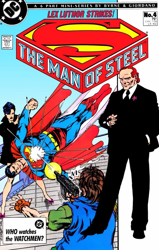
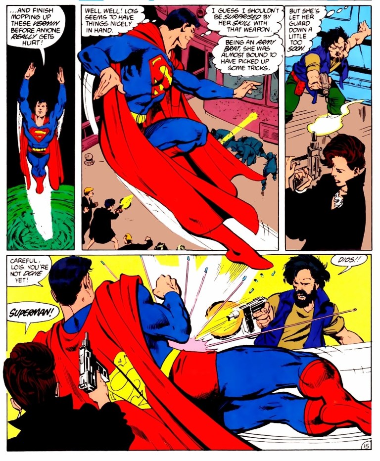
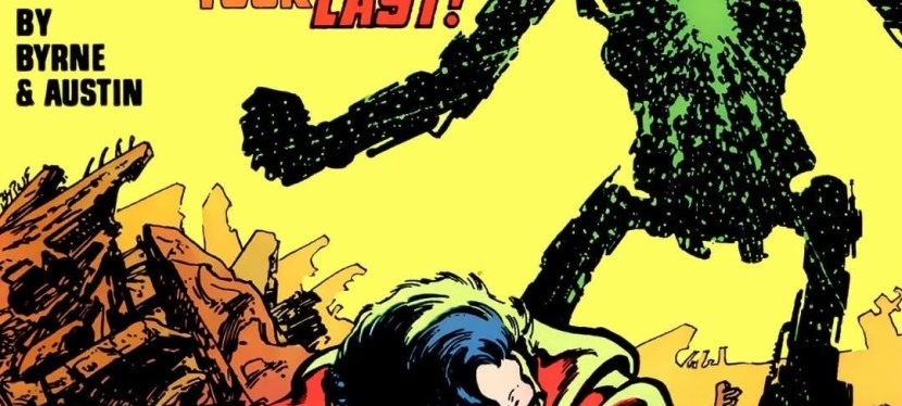
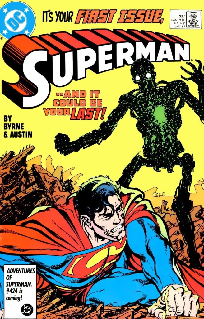
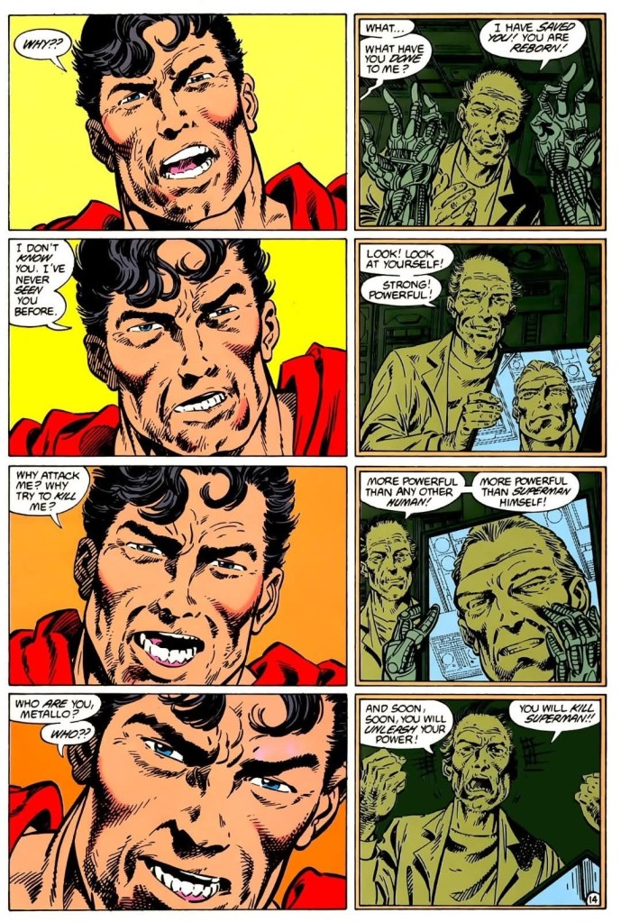
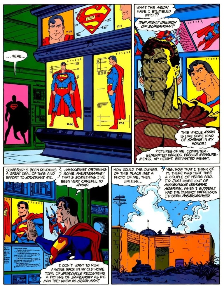
#6 John Byrne’s The Man Of Steel Revisited – What is there to say about John Byrne’s reboot of Superman in the 1986 limited series The Man of Steel? A lot! Byrne, who made a lot of great works with Marvel Comics’ X-Men and Fantastic Four some years prior, was hired by DC Comics to reboot Superman for the post-Crisis age and he was granted creative freedom to not only modernize the American icon but also make him relevant and essential. Can you just imagine experiencing the tremendous pressure of the task if you were Byrne himself? To see why The Man of Steel comic book limited series and Byrne’s rebooting of Superman are very important, I encourage you all to watch the video below.
+++++
Thank you for reading. If you find this article engaging, please click the like button below, share this article to others and also please consider making a donation to support my publishing. If you are looking for a copywriter to create content for your special project or business, check out my services and my portfolio. Feel free to contact me with a private message. Also please feel free to visit my Facebook page Author Carlo Carrasco and follow me on Twitter at @CarloCarrascoPH as well as on Tumblr at https://carlocarrasco.tumblr.com/ and on Instagram athttps://www.instagram.com/authorcarlocarrasco