
Disclaimer: This is my original work with details sourced from reading the comic book and doing personal research. Anyone who wants to use this article, in part or in whole, needs to secure first my permission and agree to cite me as the source and author. Let it be known that any unauthorized use of this article will constrain the author to pursue the remedies under R.A. No. 8293, the Revised Penal Code, and/or all applicable legal actions under the laws of the Philippines.
Welcome back superhero enthusiasts, 1990s arts and culture enthusiasts, Image Comics fans and comic book collectors! Today we go back to the year 1994 to take a close look at one of the many tales of the original WildStorm universe through one of the comic books of the first mini-series of Team 7.
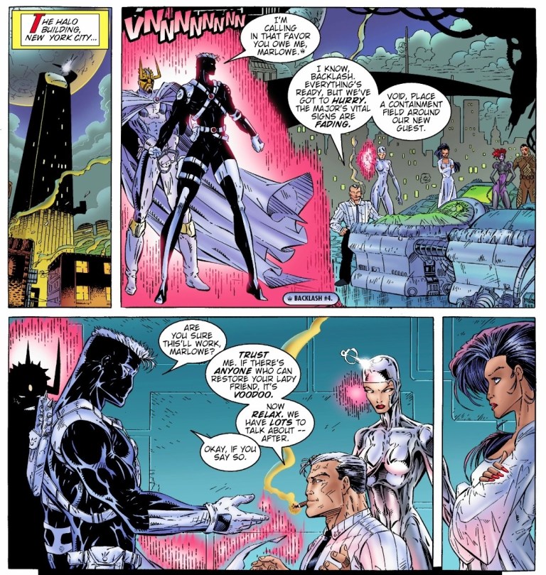
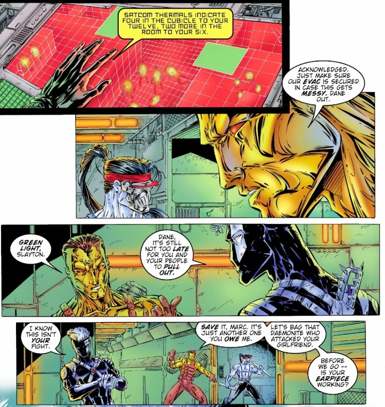
For the newcomers reading this, Team 7 is set in the past within the original WildStorm universe. This is the one special forces team that had major WildStorm heroes – Grifter (WildCATS: Covert Action Teams), Backlash, Jackson Dane (Wetworks), John Lynch (Gen13) and Deathblow – who were younger, were proficient with combat and were destined to gain special abilities that later defined them. Issue #1 reviewed last time worked well by efficiently introducing the characters while also building up the plot and there were some nice pay-offs here and there.
With those details laid down, here is a look back at Team 7 #2, published in 1994 by Image Comics with a story written by Chuck Dixon and drawn by Aron Wiesenfeld. This is the 2nd chapter of the 4-issue mini-series.
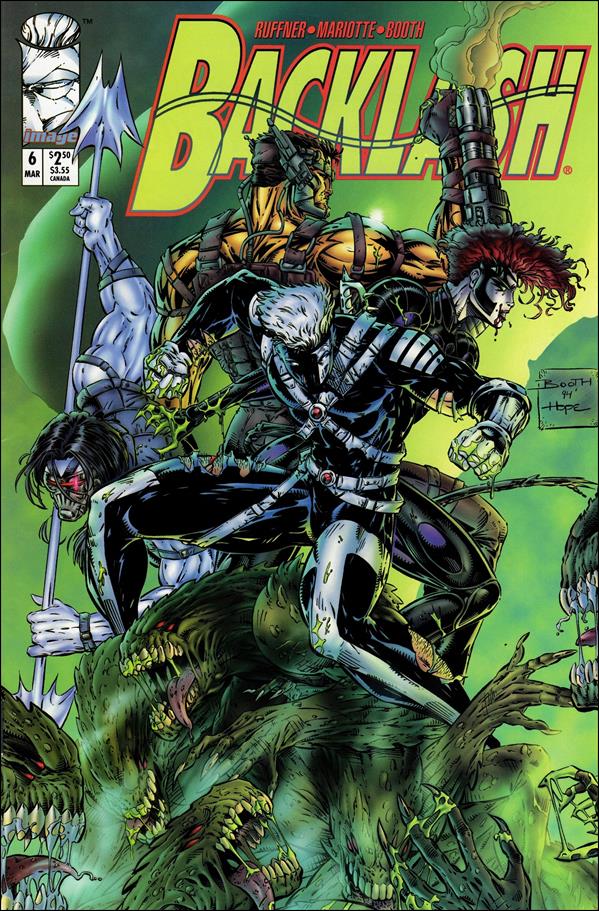
The cover.
Early story
Set in the 1970s, a team of armed escorts and some personnel wearing protective gear isolate and examine a battlefield full of dead bodies. Miles Craven and Gabriel Newman analyze the evidence around them. Craven states that what they have is too important an operation to be left to underlings and he wants Gabriel to stay with the project which could use his special talents. Shortly after, the bodies of the Team 7 members were retrieved barely alive.
Seven days later, John Lynch wakes up in a hospital bed feeling traumatized over what happened to his team during the last mission. He was told that they were exposed to a chemical agent and he had been in a deep coma for a week.
Craven then enters the room to provide Lynch crucial updates…
Quality
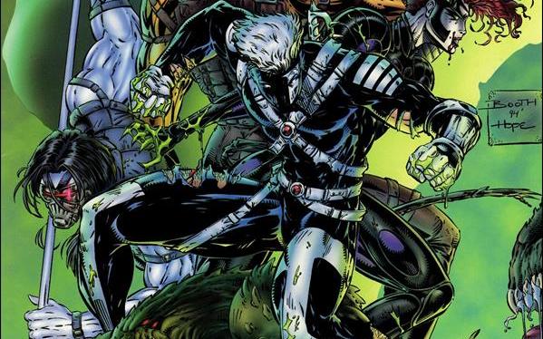
Do you recognize Deathblow and Dane on this page?
As expected, the gritty and dark storytelling from the previous issue continued in this story. Without spoiling the plot, I can say that this issue has some handsome pay-offs to what was built-up in issue #1 and there were new build-ups established along the way. Because the script was crafted to build-up the plot and sub-plot, the military action scenes are lessened which is not surprising. I can assure you that Chuck Dixon’s writing here remains pretty strong.
While the previous issue served as an efficient introduction of the younger versions of WildStorm’s heroes who are in the middle of a world full of violence and espionage, this issue shed some light as to how the heroes dealt with their new abilities (in connection with the climax of issue #1) and how International Operations is handling matters behind closed doors. The suspense kept on building up and this made the narrative more intriguing to follow. Expect to see elements of high-level espionage, unethical science and war throughout.
When it comes to the characters, Lynch (being the captain of Team 7) has a huge share of the spotlight followed by Cole Cash (Grifter). The two have different views about their special forces duty – Lynch follows the superiors while Cole realizes something is wrong about their leadership and the intelligence fed to them.
Conclusion
This scene showing Cole Cash (Grifter) emerging from dark with a defiant tone is a very defining moment of this comic book.
Team 7 #2 (1994) is clearly a very engaging read. It has the fine mix of war (with uncompromising violence drawn by Wiesenfeld), intrigue and the dark side of global espionage. The science fiction element here worked well in explaining the powers Team 7 members got after what happened in issue #1. This comic book also marks the beginning of showing Lynch and Cole Cash as the co-leads among the teammates. Die-hard fans of Deathblow, Dane and Backlash will have to wait a bit before their favorites get their share of the spotlight. Regardless, this is a very powerful read and a fine example of doing a prequel within the original WildStorm universe.
Welcome back fellow geeks, Blu-ray collectors and movie buffs!
Have you been searching for something intense, action-packed and thrilling to add into your collection of 4K Blu-ray movies? Be informed that Godzilla Minus One4K Blu-ray is now available on the market and you can order it online right now.
This is what Godzilla Minus One 4K Blu-ray looks like.
Posted below are the technical details of Godzilla Minus One 4K Blu-ray sourced from its Blu-ray.com page,
Video
Codec: HEVC / H.265 (62.89 Mbps)
Resolution: Native 4K (2160p)
HDR: Dolby Vision, HDR10
Aspect ratio: 2.39:1
Original aspect ratio: 2.39:1
Audio
Japanese: Dolby Atmos
Japanese: Dolby TrueHD 7.1 (48kHz, 24-bit)
English: Dolby TrueHD 5.1 (48kHz, 24-bit)
Subtitles – English, English SDH, French, Spanish
Discs – 4K Ultra HD, Blu-ray Disc, Two-disc set (1 BD-100, 1 BD-50)
Playback – 4K Blu-ray: Region free, 2K Blu-ray: Region A
For the newcomers reading this, Godzilla Minus One is the Japanese-produced Godzilla movie from Toho, directed by Takashi Yamazaki and released in 2023. It was a commercial and critical hit, and it even won the Academy Award for Best Visual Effects. I previously wrote about Godzilla Minus One prior to its release in cinemas.
Due to the fact that Toho’s acclaimed giant monster movie was never released in cinemas here in my native Philippines, pursuing Godzilla Minus One 4K Blu-ray is the next option for me. I really wanted to see the film in local cinemas for the genuine in-theater experience of watching a Japanese-produced Godzilla film. For some reason, Toho did not release Godzilla Minus One in Philippine cinemas even though they released Shin Godzilla in the country in 2016. For the meantime, I have my Criterion Collection Blu-ray of Gojira (1954) to enjoy before my 4K Blu-ray of the latest Godzilla film finally arrives.
If you have decided already to order a copy of Godzilla Minus One 4K Blu-ray, click here.
If you wish to join a group of movie enthusiasts and talk about cinema or movies in Blu-ray and 4K Blu-ray, visit the Movie Fans Worldwide Facebook group at https://www.facebook.com/groups/322857711779576
Welcome back readers, fellow geeks and electronic gaming fans!
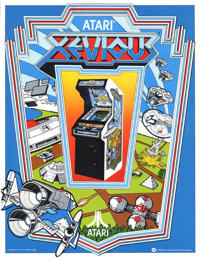
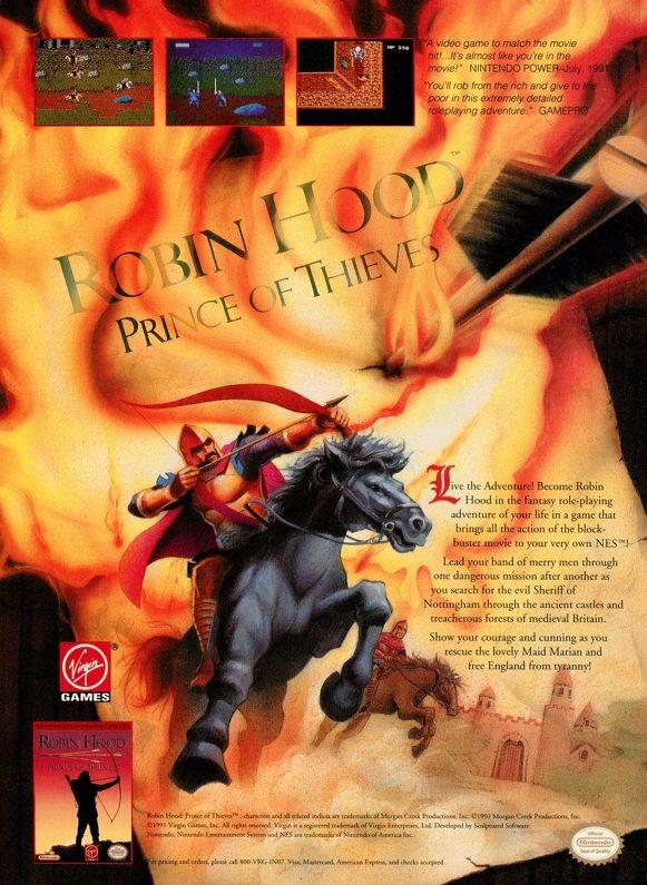
In this edition of the Retro Gaming Ads Blast (RGAB) series, we will take a look at another batch of retro gaming print ads – including arcade flyers – from the 1980s and 1990s.
For the newcomers reading this, Retro Gaming Ads Blast (RGAB) looks back at the many print ads of games (console, arcade, computer and handheld) that were published in comic books, magazines, flyers, posters and newspapers long before smartphones, social media, the worldwide web and streaming became popular. To put things in perspective, people back in the 1980s and 1990s were more trusting of print media for information and images about electronic games and related products.
With those details laid down, here is the newest batch of retro gaming print ads for you to see and enjoy…
1. Raiders of the Lost Ark game print ads
The print ad with strong Indiana Jones imagery.
The print ad with the movie theater exterior image and the small image of the Atari 2600 console.
Directed by Steven Spielberg, Raiders of the Lost Ark was one of the best adventure movies ever made as well as the start of the iconic character Indiana Jones. Given its huge commercial success, an official video game adaptation for the Atari 2600 was released in 1982 and game designer Howard Scott Warshaw even met with Spielberg during the game’s development.
To promote the game, Atari released two print ads – one ad had a movie theater exterior visual concept to emphasize they have the official video game adaptation based on the movie while the other ad showed the game’s official artwork and game box cover while emphasizing a savings offer. Atari really did what they could to sell a game while riding on the success of Raiders of the Lost Ark.
2. Phoenix print ad
Even without any screenshots, this print ad’s art still gives viewers a clear idea of what to expect.
Similar to what they did with Galaxian and Joust, Atari made this print ad promoting Phoenix which was a 2D sci-fi shooting game that was similar with Space Invaders in design. Colorized, hand-drawn artwork resembling the 2D sprites of the game was done to capture the attention of people. The art is so good, it made up for the lack screenshots of the game.
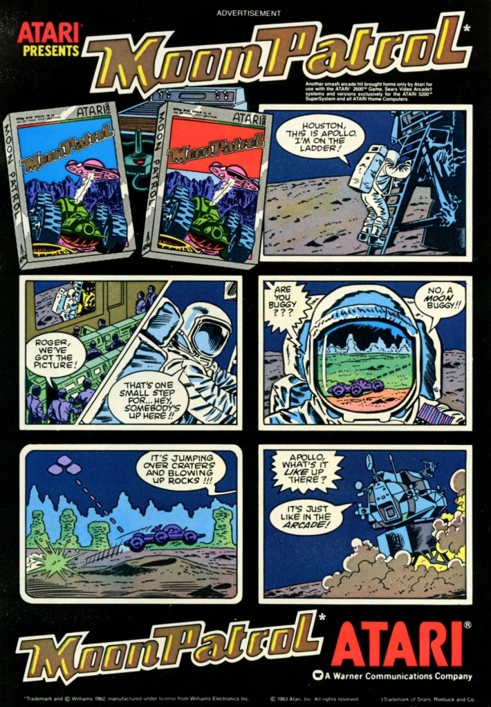
3. Moon Patrol arcade flyer
Front of the Moon Patrol flyer.
The other side of the arcade flyer.
Moon Patrol was a 2D sci-fi side-scrolling adventure game first released in the arcades in 1982. To sell the game to arcade operators, publisher Williams created the North American arcade flyer that heavily used hand-drawn comic book-style artworks on both sides while using available space on the other side for the descriptive text, contact details and the image of an arcade machine. What is very clear is that no screenshots of the game were shown to stand out which explains why a lot of hand-drawn art was used. The picture of the machine showing a screen of Moon Patrol was the closest thing to see a screenshot on this flyer. Personally, I really like the style and quality of the hand-drawn artwork as it made the flyer look lively.
4. Paperboy arcade flyers
The arcade flyer showing the Paperboy machine and screenshots. The hand-drawn art is nice.
This one uses comedy showing a grown man riding a bike as a paper delivery “boy”.
I really like the stronger emphasis on the in-game graphics of Paperboy which dominates the space. What you see is what you get in the arcade.
The first time I ever played the classic Paperboy was in the arcade inside a Las Vegas hotel way back in 1989, and it sure was a challenging yet fun experience. Before its arcade debut in 1985, the developers took a lot of risks making the game which includes coming up with a bicycle handle bar for each machine to have. To promote the game, Atari made at least three arcade flyers that creatively emphasized what the game’s concept was about, how did it play, why does the machine have bicycle handlebars and why players can expect fun. Atari’s promotional efforts paid off as Paperboy became a huge hit in the arcades not only in America but also in Japan.
5. Frogger multi-platform print ad
This print ad is still amusing to look at.
After Frogger became a hit in the arcades, Parker Brothers secured the rights to port the game on Atari consoles, the Intellivision, TI-99/4A, vic-20, the Commodore computers and ColecoVision. To promote their Frogger ports, the single-page print ad was made showing a player in the foreground playing in front of screens that each showed what the game looked like on each platform. Parker Brothers found tremendous success selling 4 million copies of Atari 2600 version of Frogger at a time when there were only 13 million units of Atari 2600 in existence. By the year 2005, video game sales of Frogger reached 20 million worldwide across different platforms.
6. Predator 2 print ad
This is one very edgy print ad as used an official image from the movie.
If there is anything memorable about the 1990 film Predator 2, it is the fact that it had the story and the alien hunter itself within a metropolitan setting. That being said, the Sega Genesis Predator 2 video game had a suitable design of shooting and adventuring within the urban settings. This video game ad really captured the vibe of the movie (even showing the reddish human skull with spine on the Predator’s left hand) and clearly showed what gamers could expect. This old ad is still captivating to look at and its edgy approach is still intact.
7. Atari Jaguar print ad
Did you ever own an Atari Jaguar console?
When I was reading video game magazines back in the 1990s, I always found print ads of the Atari Jaguar intriguing to look at. I was very young when I first played the Atari 2600 and its games at home, and later played some Atari games in the arcade. To me, seeing Atari Jaguar print ads like this one gave me moments of nostalgia and it made me wonder if Atari knew what it was doing with their so-called 64-bit game console. They did what they could to promote their console and the games within this 2-page print ad.
8. Vs. print ad
This print ad easily reminds me of the 1990s.
By 1997, both the arcades and the video game console market were filled with lots of 2D and 3D polygonal fighting games. Japan was the hot spot of the production of 3D polygon fighting games and the developer Polygon Magic (based in Japan) made Fighters’ Impact which Taito released in Japanese arcades and the PlayStation. The said game was picked up by THQ for a late-1997 release on the PlayStation in America under the title Vs. I never played this game but I heard that the game’s development included gang-oriented characters designed by Marvel Comics artist Kurtis Fujita. This Vs. ad is a lively reminder about the hip-hop fashion that made its way into video games.
9. GoldStar/LG Electronics 3DO print ad
This is a very weird way to market a video game machine.
Back in the 1990s, the South Korean electronics company GoldStar (which was part of the umbrella of LG Electronics) had the license to produce 3DO game consoles with its own style. In some ways, the GoldStar 3DO console looked like a premium console on the outside. Unfortunately, the GoldStar 3DO print ad here had a very sloppy presentation as the ad makers used very weird art of a brain-with-eyes holding a 3DO controller leaving little space left to promote the console and games (without any screenshots). The text description was sloppily done. This is a bad example of promoting video game hardware and games.
10. Pandemonium 2 print ad
I saw this ad but never played the game.
Looking back at 1997, I find it strange that I never got to play Pandemonium 2 on the PlayStation even though I saw its print ad in magazines. I had a lot of fun playing Pandemonium! on the console in 1996 but somehow missed out on its sequel. Looking back at the Pandemonium 2 print ad, I was surprised with how the game developers redesigned the two playable protagonists, especially Nikki who was clearly made to look very sexy. The word “libido” (meaning sexual drive) was deliberately placed above Nikki. The ad also had a hypnotizing mix of colors which I believe was also deliberately done by the ad makers. I can only wonder how the game played.
11. Mission: Impossible print ad
A captivating ad.
In 1990, Ultra Games (a label of Konami) released the Mission: Impossible video game on the Nintendo Entertainment System (NES) in America. Developed by Konami, the game was an adaptation of the 1988 TV series and it had an ambitious design with regards to level design and gameplay. To promote the game, the ad makers came up with a visual design showing the game’s box (which had a nice painted art on the cover) on the foreground and several screenshots resembling TV monitors on the background. Even by today’s standards, this print ad still looks good and captivating even if you are not too familiar with Mission: Impossible on TV.
12. The Lawnmower Man Sega CD and Genesis print ad
Are you fan of The Lawnmower Man movie?
Back in 1992, there was a lot of buzz generated by the movie The Lawnmower Man as it had a disturbing concept that involved virtual reality and, more notably, author Stephen King sued the filmmakers to remove his name from the title because the film differed so much from the source material. Of course, those developments did not stop the production of video game adaptations of the movie. This print ad promoting the Sega CD and Sega Genesis versions of the game heavily used the images of CyberJobe which were among the most memorable images from the film. Looking at the ad, the ad makers could have made the screenshots look a little larger to really sell the games.
13. Ground Zero: Texas print ad
The shotguns really made this ad eye-catching.
I never played the Sega CD video game Ground Zero: Texas but I knew that it was one of those games that heavily relied on video footage while giving players moments to interact. Back in 1993, there was an increase in the number of video games that carried lots of live action footage to drive the narrative and players were given options in order to progress. What is very notable about the game is not the game design but the very 2-page ad used to promote it. The image showing four people pointing their shotguns towards the viewer was easily the most captivating part of the ad. Even though there was vacant space in between, the screenshots of the game were displayed to be really small.
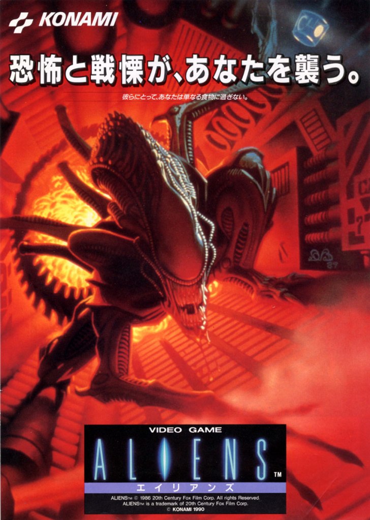
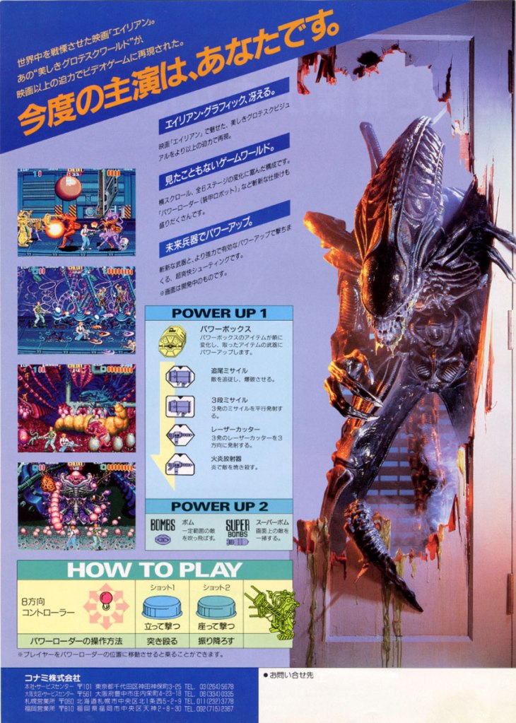
14. Alien vs. Predator for SNES and Game Boy print ad
This ad caught the attention of a lot of people back then.
Back in 1990, Dark Horse Comics launched the 4-issue mini-series of Aliens vs. Predator which turned out to be a very intriguing and engaging crossover comic book tale featuring two iconic sci-fi species of monsters. The success of the comic books led to the production of many video games which delighted both fans of Predator and Aliens. In 1993, Activision released Alien vs. Predator on the Super Nintendo Entertainment System (SNES) and the single-page print ad they came up with was engaging to look at. The SNES game box with the fine looking painted art was the main visual highlight leaving just enough space for the descriptive text, the Game Boy cover and two screenshots. Believe it or not, this video game was not related at all with the Alien vs. Predator arcade game and Atari Jaguar console game.
To conclude their Health Awareness Month, which was primarily aimed to develop self-awareness in their students, Mindbuilders Preschool located in BF Homes organized a special event entitled “All my Feelings are All Me.”
Prior to this culmination, the teachers of Mindbuilders Preschool implemented activities throughout October that would encourage their pupils to identify and even discuss their feelings in class. One tool the students made and used during their daily Circle Time period was a “feelings scale”, which allowed each child to identify a specific emotion he or she was feeling at the time. The children were also taught to use a decorated paper cup nicknamed the “jellyfish”. By breathing in and out of the cup, they could use it to calm themselves down in situations that made them feel scared, nervous or anxious. Other activities promoting self-awareness, specifically in the Gross Motor domain, were also implemented.
Then, on the morning of November 15, the assembly of preschool pupils, teachers and volunteer parents witnessed two very special presentations: one by psychologist Patricia Pacheco-Beton and another by a living legend of Philippine cinema and television, Miss Gina Alajar.
Teacher Pach efficiently taught the young audience about the kind of feelings they have and how to react when they feel something. In separate turns, a few students were called to the front to answer the guest psychologist’s key questions. The answers stated amused the other children as well as the parents and teachers who were present. More importantly, the little children themselves learned a lot from Teacher Pach’s presentation.
Using a children’s picture book, Teacher Pach engaged the students with a story and how it relates with feelings.
Teacher Pach also engaged the students in a read-aloud of an illustrated children’s book about the myriad of feelings a child can have in just one day! And as the narrative went on, students were able to identify the kind of emotions that the main character displayed.
Veteran actress and director Gina Alajar facilitated an acting workshop with three alternating groups of kids in attendance. In relation to the topic of feelings, she first asked the students what kind of emotions were they able to spot in films they had watched before. Collectively, the children gave answers which proved that they had been paying attention to the cinematic emotions even while enjoying the movies.
Ms. Gina Alajar had a group sit-down with the students of Mindbuilders Preschool about their feelings in relation to the senses. (Photo credit: Richard Estuesta)
The veteran filmmaker getting feedback from one of the students. (Photo credit: Richard Estuesta)
To determine how far everyone could go with their emotions, Alajar focused on the five senses: touch, sight, hearing, smell and taste. For each sense explored, the actress used specific items to get reactions from the kids. As children would respond differently to each item, she processed valuing each one’s feelings and respecting the feelings of others as well. Having seen Gina Alajar act so dramatically in movies from long ago, I was very impressed to see how experienced and patient she was when it came to teaching the students of Mindbuilders Preschool. It was as if they were all her grandchildren!
Elsewhere within Mindbuilders were other activities that tapped the students’ other intelligences. These took place inside different classrooms. One classroom had each child decorate a puzzle piece and then assemble the pieces together to form one big puzzle. In another classroom nearby, students were taught to express themselves with music and movement amidst multicolored lights. Finally, a coloring session of positive quotes on affirmation stones was held in another classroom.
In this particular workshop, the students learn to express themselves with music and movement. (Photo credit: Macon Leaño)
Students putting the puzzle pieces together in another classroom. (Photo credit: Tintin L. Cabase)
A student coloring positive quotes on an affirmation stone. (photo credit: Kristine Salustiano)
The session of coloring positive quotes on affirmation stones offers students a unique opportunity to practice their analysis and creativity. (photo credit: Kristine Salustiano)
After all the workshops and sessions were completed, the students were treated to a free film viewing at the play area.
A special activity fulfilled!
According to Mindbuilders Preschool Directress Marah Estuesta, the team worked hard in preparation for their Health Awareness Month Culmination. This included making schedule adjustments due to a major weather disturbance. What transpired on November 15, however, was a huge pay-off complete with a strong reception and the fulfillment of goals on educating the children about self-awareness.
Mindbuilders Preschool’s Health Awareness Month Culmination was supported by Chef Thess Uy Catering.
Philippines film and TV living legend Gina Alajar poses with the teachers and parents of Mindbuilders Preschool. At leftmost is directress Marah Estuesta. (Photo credit: Richard Estuesta)
Words from the Directress
“This activity was one for the books! In today’s world, where mental health is increasingly prioritized, I am happy to have an activity that fosters socio-emotional development in our preschoolers. It is very relevant that children begin developing self-awareness early, as it lays the foundation for understanding and managing their emotions, as well as expressing them effectively.
From understanding their own feelings to recognizing those of others, this activity is a significant step in helping young minds navigate the complexities of emotions. By engaging in activities that promote emotional intelligence, children learn valuable skills such as empathy, emotional regulation, and healthy communication.
Our month-long activities encouraged our preschoolers to explore and express their feelings in a safe and nurturing environment. Through fun, interactive exercises, tapping their Multiple Intelligences, they begin to articulate their emotions, understand their impact, and learn appropriate ways to respond to various emotional states. This kind of early intervention is vital, as it equips children with the tools they need to grow into emotionally resilient and socially adept individuals.“
Mindbuilders Preschool is an early learning environment committed to maximizing a child’s potential by creating exciting experiences that inspire enthusiasm for learning. Founded in 2002, it has grown as the leading Multiple Intelligences Preschool in the South (BF Homes, Las Piñas & Parañaque), following Howard Gardner’s Theory. Mindbuilders Preschool offers one of the best classes in the community for preschoolers.
For more South Metro Manila community news and developments, come back here soon. Also say NO to fake news, NO to irresponsible journalism, NO to misinformation, NO to plagiarists, NO to reckless publishers and NO to sinister propaganda when it comes to news and developments. For South Metro Manila community developments, member engagement, commerce and other relevant updates, join the growing South Metro Manila Facebook group at https://www.facebook.com/groups/342183059992673
Disclaimer: This is my original work with details sourced from reading the comic book and doing personal research. Anyone who wants to use this article, in part or in whole, needs to secure first my permission and agree to cite me as the source and author. Let it be known that any unauthorized use of this article will constrain the author to pursue the remedies under R.A. No. 8293, the Revised Penal Code, and/or all applicable legal actions under the laws of the Philippines.
Welcome back superhero enthusiasts, 1990s arts and culture enthusiasts, movie fans and comic book collectors! Today we go back to the year 1990 to take a look at the official comic book adaptation of the movie Predator 2 (1990).
For the newcomers reading this, Predator 2 is the sequel to the 1987 movie directed by John McTiernan (Die Hard) and starring Arnold Schwarzenegger. As the movie became a huge commercial success, it started a chain of events that led to the rise of the Predator entertainment franchise covering merchandising, comic books and video games to name a few. Of course, the development of a cinematic sequel happened and both the movie studio and filmmakers took their time to make it. Predator 2 was directed by Stephen Hopkins and it starred Danny Glover, Gary Busey and Bill Paxton.
With those details laid down, here is a look back at Predator 2 #1, published in 1990 by Dark Horse Comics with a story written by Frank Henkel (based on the screenplay by Jim Thomas and John Thomas) and drawn by Dan Barry. Mark Verheiden (writer of 1989’s Predator #1) was acknowledged with special thanks. This comic book is the first of a 2-part comic book adaptation of the movie.
The cover.
Early story
The story begins during a very hot day in 1997 Los Angeles. Police office Mike Harrigan rushes to the site of a major shootout between heavily armed gangs (Colombians and Jamaicans). The police managed to corner a gang to a building that was occupied by the foreigners. Knowing that a fellow cop is slowly bleeding to death and the SWAT (Special Weapons and Tactics) team are still stuck in traffic, Harrigan decides to take action against the armed gangsters with the support of his teammates and some police personnel.
After managing to get close to the gangsters by the building using his car, Harrigan manages to shoot them all and pave the way for his teammates to get closer. Harrigan does not realize that a camouflaged Predator is watching him from above.
At one of the higher floors of the building, the rest of the foreign gangsters prepare themselves for the arrival of the cops by gathering guns and ammunition. Suddenly, the camouflaged Predator crashes in on them…
Quality
The Predator here is quite aggressive and even arrogant enough to suddenly fight the Jamaican gang alone.
I am surprised how entertaining this first chapter of the 2-part comic book adaptation of Predator 2 turned out to be. While the accuracy is understandably less than 100% with regards to translation from cinema to literature, this comic book’s narrative is quite faithful to the events of the movie (from the start until the King Willie scene) and the film’s vibe was strongly captured. In fact much of the dialogue spoken in the film were mostly recaptured here, and the same can be said about the way the characters were portrayed.
For brevity and the maximizing of the pages made available, creative liberties or shortcuts were taken by the creators. This means that the presentation of details was carefully done to keep readers properly informed while managing to keep the fun factor and level of intrigue strong. Indeed, writer Frank Henkel did a very good job keeping things together to make the reading experience fun and engaging.
If there is anything that this comic book exceeds the movie on, it is the graphic violence. Artist Dan Barry really ramped up the bloody scenes and gore (examples: Mike Harrigan’s killing of two foreign gangsters with a shotgun, and the scene when Harrigan and his team were stunned by the sight of the many ruined dead bodies of gangsters who were just eliminated by the Predator before they arrived) as he used his own style to make the action scenes as intense as the ones filmed by Stephen Hopkins and crew. It was obvious he saw the movie.
Barry also had his own style on visualizing the characters without the authority to use the likeness of any actor from the film. Mike Harrigan looks nothing like Danny Glover while Peter Keyes does not resemble Gary Busey. Barry’s visual take on the Predator itself has a really distinctive look when compared to how other artists drew Predators.
Barry did not aim to achieve photo realism at all with the characters (who appear with a slightly cartoonish aesthetic), the locations and action scenes but I don’t find anything problematic with his work here. In fact, I enjoyed his way of translating the movie’s visual presentation into literary format.
Conclusion
Mike Harrigan, Danny and Leona make their moves.
Predator 2 #1 (1990) is a very enjoyable read. It strongly captured the vibe of the movie complete with the dialogue and the way the characters were presented. Very clearly, the Henkel-Barry duo did really fine work in this comic book adaptation and I am convinced to move on to issue #2.
Overall, Predator #2 (1990) is highly recommended!
Disclaimer: This is my original work with details sourced from reading the comic book and doing personal research. Anyone who wants to use this article, in part or in whole, needs to secure first my permission and agree to cite me as the source and author. Let it be known that any unauthorized use of this article will constrain the author to pursue the remedies under R.A. No. 8293, the Revised Penal Code, and/or all applicable legal actions under the laws of the Philippines.
Welcome back science fiction enthusiasts, 1980s arts and culture enthusiasts, movie fans and comic book collectors! Today we go back to the year 1989 to take a look at a significant event of the Predator entertainment franchise – the comic book launch of Predator.
For the newcomers reading this, Predator started as a sci-fi action movie in 1987 directed by John McTiernan (Die Hard) and starring Arnold Schwarzenegger, Carl Weathers, and Jesse Ventura to name some. The writers and creators were Jim Thomas and John Thomas. As the movie became a huge commercial success, it led to the start of its own multi-media entertainment franchise covering video games, toys, novels and comic books. It also led to the release of more movies including a crossover film with the Alien franchise.
With those details laid down, here is a look back at Predator #1, published in 1989 by Dark Horse Comics with a story written by Mark Verheiden and drawn by Chris Warner. The is the first chapter of a 4-issue mini-series and it would later be referred to as Predator: Concrete Jungle.
The cover.
Early story
The story begins during a very hot summer day in 1991 New York City. A man killed his own wife using a shotgun which eventually leads to the arrival of cops, medics and his arrest. The two detectives Errol Rasche and John Schaefer (brother of Dutch) have been working together in the local war against crime and they have a tendency to do things that violate their superiors’ orders.
In one of the rundown buildings of New York, a secret meeting between two gangs got terribly disrupted by a Predator who attacked from the outside. Chaos and destruction followed.
Shortly after, Rasche and Schaefer arrive outside the same building which has been surrounded and isolated by the local police. When a man suddenly fell out of the building and crashed on top of a police car, the two detectives decide to enter willfully violating the order to stay out.
Once they enter the room where the secret gang meeting was held, Rasche and Schaefer are shocked to see many skinned and dead bodies inside. Schaefer is convinced that what happened was not the result of a gang war…
Quality
A gang meeting about to be disrupted by the unseen Predator.
This comic book – written as a not-too-obvious sequel to the 1987 movie – is absolutely very intriguing to read from start to finish. Mark Verheiden clearly wrote a crime story that happens to involve the species of deadly hunters from outer space. In fact, this comic book has very notable elements that also made it into the core concept of the 1990 movie Predator 2.
Story is set within a massive city that happens to be suffering from a heat wave – check! There is rampant crime and conflicts between gangs – check! The Predator causes huge disruptions on the criminals – check! The detectives willingly violate protocol to solve cases – check! One of the detectives is gradually getting closer to retiring and his pension – check. It’s almost as if this comic book was a huge influence on the people who made Predator 2.
Going back to the story, this is a strong tale of crime and urban war told through the exploits of detectives Schaefer and Rasche who have worked many years together, they treat each other like brothers (similar to Predator 2’s Mike Harrigan and Danny Archuleta).
With their record of disobeying orders, Schaefer and Rasche simply involve themselves in cases believing they have the right know the details on the spot and to solve problems their way even though their superiors don’t need them. This is the anti-authoritarian portrayal of law enforcers that easily reminded me of certain TV shows and movies of the 1980s.
All throughout, the story by Verheiden is nicely structured, has lots of engaging details to follow and carefully blends sci-fi elements with detective storytelling. Verheiden clearly knows how to build up tension, keep the narrative progressing and use action or spectacle with precise timing.
When it comes to the visuals, Chris Warner’s style is very good. His approach on drawing the characters made them look exquisite and visceral at the same time. In fact, there were some shots of people in this comic book which reminded me of Todd McFarlane’s way of drawing people during his early works in comics. Lastly, I should say that Warner’s approach on hard action and his way of drawing of the Predator must be seen.
Conclusion
Rasche and Schaefer defy orders. Schaefer (holding the gun) is the brother of Arnold Schwarzenegger’s character in the Predator movie of 1987.
I really enjoyed reading Predator #1 (1989). This is indeed really fine work by the Verheiden-Warner team and as far as building up the lore of the Predator goes, they clearly succeeded and their contributions here strongly influenced the creation of Predator 2 which opened in cinemas in late 1990. This comic book has the visceral touch and violence that make it comparable with both the 1987 and 1990 movies.
Overall, Predator #1 (1989) is highly recommended!
Welcome back readers, fellow geeks and electronic gaming fans!
In this edition of the Retro Gaming Ads Blast (RGAB) series, we will take a look at another batch of retro gaming print ads – including arcade flyers – from the 1980s and 1990s.
For the newcomers reading this, Retro Gaming Ads Blast (RGAB) looks back at the many print ads of games (console, arcade, computer and handheld) that were published in comic books, magazines, flyers, posters and newspapers long before smartphones, social media, the worldwide web and streaming became popular. To put things in perspective, people back in the 1980s and 1990s were more trusting of print media for information and images about electronic games and related products.
With those details laid down, here is the newest batch of retro gaming print ads for you to see and enjoy…
1. Star Wars: The Empire Strikes Back Atari print ads
I could not forget the first time I saw this print ad while reading a comic book.
This ad showed the Atari 2600 controller.
Even during its early years under George Lucas, the Star Wars entertainment franchise made its way into video games due to its massive popularity and Parker Brothers really made moves to cash in. This resulted in the Atari 2600 video game adaptation (1982) of The Empire Strikes Back which focused mainly on the memorable Hoth battles between Rebel fighters and the Empire’s AT-AT walkers. Parker Brothers came up with two print ads and each had a different visual concept: one had nicely drawn art along with two screenshots shown while the other had painted art of the AT-AT while showing the Atari joystick. These old print ads still look great and exciting.
2. Double Dragon Japanese and North American arcade flyers
If you read manga (Japanese comics) in Japan, then the art style of this arcade flyer should look familiar to you.
The character designs seem inspired by 1980s Hollywood action cinema.
Released in 1987, Double Dragon became a huge hit in the arcades of Japan, America and Europe resulting in financial gains for developer Technōs Japan and publisher Taito. What I find intriguing was the fact that the Double Dragon arcade flyers for Japan and North America had drastically different art styles used to promote it. The Japanese flyer had art style that is more common with manga while the North American had artwork that seemed inspired by Hollywood action movies (as well as the rise of martial arts films in America during the 1980s). The American flyer even had the two characters identified as Hammer and Spike and they both looked American. This is a classic example of using different approaches to promote a game in each market.
3. Universal Soldier print ad
The people who made this print ad made sure to use the names of the stars to help sell the game.
Even though its worldwide ticket sales did not reach $100 million, the 1992 movie Universal Soldier still caught a lot of attention from moviegoers simply because it had Jean-Claude Van Damme and Dolph Lundgren as the stars. Unsurprisingly, the movie had a video game adaptation and because publisher Accolade wanted to cash-in on the film’s hype, they made some deceptive moves by rebranding one of its games (already development) as a tie-in. Advertised as an official adaptation, Universal Soldier was actually a rushed conversion of Turrican II: The Final Fight. This print ad – which even showed the stars’ names – is a reminder of the deception Accolade pulled off.
4. Sega CD print ad
Do you find this Sega CD print ad hilarious?
When Sega was making waves with its Sega Genesis (Sega Mega Drive in Japan), the company was quick to react to the growing use of the compact disc (CD) format as a useful storage medium for video games. The Sega CD (Mega CD in Japan) was released as an add-on device to work with the Genesis console and Sega’s American team came up with a series of promotions. This print ad is just one of the promotions and ad makers came up with a “crazed” or “electrified” gamer dominating one page while showing the Genesis, the Sega CD and screenshots of games (running on CD) on the other page. By today’s standards, the Sega CD print ad is funny and catchy to look at.
5. Snatcher for Sega CD print ad
I find this Snatch print ad looking odd. The ad makers could have done more to focus on the game itself.
First released in Japan in 1988, Snatcher was a cyberpunk visual adventure game that was one of the early works of the famous Hideo Kojima (Metal Gear series). Due to its design and approach on visuals to tell a story, it was not surprising that a Sega CD version of it got released in 1994. To promote the game to the growing number of North American Sega CD gamers at the time, Konami came up with this rather unusual print ad showing the face of a smiling lady dominating the space leaving little room to show the screenshots and the game’s cover. The visual concept is engaging but it takes effort to notice it was promoting the Sega CD version of the video game. This old ad would have worked better had the ad makers increased the sizes of the screenshots and the game cover.
6. Jurassic Park for Sega CD print ad
Does the T. Rex look scary to you?
As part of its drive to add more games to the Sega CD add-on and help it sell more units, Sega acquired the Jurassic Park license and went on to produce an adaptation utilizing the technological features of the Sega CD. To aggressively promote the game, Sega came up with this print ad that had a Tyrannosaurs Rex (looking through spaces) on one page and then several screenshots plus text descriptions on the other. For a click-and-point Jurassic Park game, this ad was really exciting and intriguing to look at.
7. Atari Jaguar print ad
This was indeed an eye-catching ad.
In the early 1990s, Atari made an aggressive move to compete in the arena of video game consoles which they used to dominate from the late 1970s until 1983. This time around, they came up with the Jaguar console which had some pretty advanced technologies for the time. As part of their North American marketing campaign, Atari unleashed an ad showing game screenshots on the first page and huge artwork of a jaguar coming after Sonic, Mario and Yoshi (mascots of Sega and Nintendo respectively) symbolizing that the Atari Jaguar had more power and better technology than the Genesis and the Super Nintendo Entertainment System (SNS). While it was engaging to look at early on, this print ad is now an embarrassment as the Jaguar console failed terribly. Lastly, the marketing of the Jaguar as a 64-bit machine was never real.
8. George Foreman, The Simpsons and Spider-Man Game Gear print ad
This ad appeared in a lot of comic books in the 1990s.
In the early 1990s, Sega released the Game Gear handheld gaming device which instantly placed them in competition with Nintendo’s Game Boy. Through its Flying Edge label, Acclaim Entertainment promoted George Foreman’s KO Boxing, The Simpsons: Bart vs. the Space Mutants, and Spider-Man for the Game Gear hoping to sell well. This 3-game print ad highlighted the popular figures who had a lot of space for attracting attention. The ad maker managed to insert two screenshots per game, the game covers and a text description to inform consumers what they were being offered. A good ad to look at.
9. Time Gal for Sega CD print ad
The presentation here looks nice but Time Gal herself looked like she was drawn by a different artist.
Originally released in the arcades in Japan in 1985, Time Gal made its way to the Sega CD add-on in the early 1990s. It was a highly unusual video game as it was an interactive movie (with lots of anime footage) made with the use of Laserdisc technology for its arcade version. It played lots of anime scenes and players must choose the on-screen options to execute the character’s next action in order to progress. For the Sega CD version for North America, this print was made to capture the attention of consumers using the protagonist’s sex appeal on the cover art with four screenshots placed on the sides to show what to expect. I noticed that Time Gal on the cover art looked different from how she appeared in the anime sequences. At least the ad makers tried hard to sell the game.
10. Mortal Kombat print ad
Still an effective ad to promote a blockbuster game and make people informed it was coming to multiple platforms.
Considering how successful it was in the arcades, the 1993 release of Mortal Kombat for game consoles and handhelds was unsurprisingly highly anticipated and publisher acclaim came up with this single-page ad. The presentation involved the use of a photographic background of many spectators (to emphasize excitement and popularity), media quotes and screenshots to effectively promote the game.
11. Equinox print ad
Take a close look. Tell me if you find it funny.
I never played Equinox but I heard the loud buzz about its design as a 3D isometric game that had elements of exploration, platform play and puzzle solving. The people responsible for this print ad emphasized the concept that the game is so addicting to play, players will still play it as they get older. This ad has a subtle yet effective approach with humor.
12. James Bond 007: The Duel print ad
Timothy Dalton’s image as James Bond was sourced from Licence to Kill for this game’s ad.
Here is another decades-old James Bond video game print ad I found. Released a few years after Licence to Kill, James Bond 007: The Duel was notable not for its gameplay nor game design but for the fact that it used the image of Timothy Dalton as 007 for its print ad and the opening scenes in the game itself. Dalton’s Bond image here was never new nor originally taken for the game as it came directly from Licence to Kill’s publicity library. Each time I saw this ad, I was only reminded of the 1989 movie which I still enjoy watching.
13. Neo Geo AES console print ad
Do you find this ad both sexy and funny?
Decades ago, SNK made a huge splash in the arcades with lots of really fun games released with their Neo Geo (stylized as NEO GEO) hardware. In 1990, they released the cartridge-based Neo Geo AES console in Japan and America and it carried the same technology as the arcade hardware. To promote the console in North America (note: the Neo Geo console and its games were very expensive), SNK came up with this catchy and funny print ad showing a sexy woman feeling annoyed that her man spends more time with Neo Geo gaming than with her. This was a clever way of emphasizing the arcade-perfect experience in the comfort of home, and it was funny to look at.
14. Gradius II Japanese arcade flyer
Great looking painted art was used for this 1988 arcade game.
Since the original Gradius was a big hit in arcades in Japan in 1985, it was not surprising that Konami released Gradius II three years later. With regards to the use of painted art, the artist showed the game’s spaceship in a dominating position emphasizing high-speed travel and excitement. The image, which also looks more colorful, is a complete reversal of the painted art used in the flyer of the previous which showed the rear of the spaceship as it moves towards a larger spaceship (the opposition). This arcade flyer art still looks great as it has a timeless charm.
In times of prosperity or hardship, Festival Mall (originally named Festival Supermall) in Filinvest City, Alabang, Muntinlupa City continues to attract families and shoppers. Since the mall’s early days in 1998, its amusement center X-Site kept on succeeding on attracting visitors and providing them bouts of varied fun in return to what the customers paid for. X-Site is a lively form of entertainment-focused capitalism that just keeps on moving forward and attracting visitors.
Located at the 3rd floor (note: officially referred to as the 2nd Level or 2L or 2nd Floor by the mall. The 1st floor and 2nd floor of the mall are referred to as Lower Ground Floor and Upper Ground Floor respectively), the X-Site Amusement Center has a wide floor space with a high ceiling.
The way it was designed, X-Site has several arcade games (lots of fun retro games included), merchandiser games, a virtual reality ride, KTV booths, motion-sensing dance spot, the ring toss, entertainment stores, indoor sports games, redemption games, bumper cars, and the indoor roller coaster (which explains the need of having a high ceiling). Watch below the YouTube video and the images I prepared below.
At the arcade games section inside X-Site.
Having a high ceiling made it possible to have an indoor roller coaster (tracks above the machines and people in this image). Other amusement centers in Alabang had lower ceilings which made their places feel small or tight when compared to X-Site.
Some newer machines plus indoor sports games added into the arcade games section.
This is the place for those who love dancing and music.
Back in 1998, I know a few friends whose had not even visited Festival Mall (at the time we talked) yet they already heard of the positive word-of-mouth feedback about the indoor roller coaster of X-Site.
The indoor roller coaster of X-Site remains a favorite ride for those who kept coming back.
On December 25, 2023, I visited Festival Mall to look around. I passed by X-Site and I saw an unusually large number of people there composed of young people, children and their parents/guardians.
For the newcomers reading this, December 25 here in the Philippines is a time of having fun during the Christmas season and also it is the day when the annual Metro Manila Film Festival (MMFF) opens in cinemas. This explains why a lot of people spend time at the shopping malls and it is a cultural thing here in the Philippines.
Considering the fact that the original cinemas of Festival Mall have deteriorated leaving only 2 or 3 screens operating (note: the mall also has modern cinemas at the expanded side), a lot of people still visited the mall to watch the MMFF movies that opened on December 25. As for the large number of people who flocked to X-Site that same day, I can only speculate that some of them might have been moviegoers passing the time as they wait for the next screening of movies to watch.
I took this shot of X-Site on December 25, 2023. Look at the high number of people on the floor.
If you plan to visit Festival Mall in Alabang and if you are craving for fun rides or games, then you might want to visit X-Site Amusement Center.
For more South Metro Manila community news and developments, come back here soon. Also say NO to fake news, NO to irresponsible journalism, NO to misinformation, NO to plagiarists, NO to reckless publishers and NO to sinister propaganda when it comes to news and developments. For South Metro Manila community developments, member engagements, commerce and other relevant updates, join the growing South Metro Manila Facebook group at https://www.facebook.com/groups/342183059992673
Welcome back, my readers, YouTube viewers and all others who followed this series of articles focused on YouTube videos worth watching. Have you been searching for something fun or interesting to watch on YouTube? Do you feel bored right now and you crave for something to see on the world’s most popular online video destination?
I recommend you check out the following topics and the related videos I found.
#1A look at Donald Trump’s amazing comeback as US President – I already blogged about the amazing comeback of Donald Trump who won the 2024 US Presidential Election decisively. While that blog post had lots of videos about the victory, I added some more below for your enlightenment.
#2 The engineering of the F-117 Nighthawk – Do you still remember the F-117 Nighthawk? It was the sophisticated stealth fighter America used against Iraq during the Gulf War in 1991. I personally could not forget the first time I ever saw it on TV (news broadcast of the 1991 war) as a teenager. The F-117 is no longer in use but its engineering and the history of its development should be seen in the video below. Watch and learn!
#3 Dragon Age: The Veilguard’s wokeness – It is a sad fact that very similar with Communist-filled Hollywood (Commiewood), wokeness and identity politics are ruining video games. Recently, EA released Dragon Age: The Veilguard which was the first new Dragon Age game they released in ten long years. The big problem here is that woke activists at BioWare inserted their poison into the game. Watch RK Outpost’s videos below.
#4 The blunders of Kamala Harris, her allies and the Democrats – Kamala Harris, who has been US Vice President for almost four years now, lost the US Presidential Election to Donald Trump convincingly. She led a campaign that was dishonest, pretentious and even turned to hatred by comparing Trump with Adolf Hitler. No matter Kamala did, she and her woke allies failed miserably to connect with voters. Instead of discussing policies and plans to serve the people in the near future, Kamala emphasized identity politics and vibes. Is it any wonder why she lost and why are the Democrats so unpopular? Watch the selected videos to find out why and how she lost.
#5 Kamala Harris supporters freaking out – Losing an election is always painful and embarrassing. So much so, there were supporters of Kamala Harris who could do nothing but record/stream themselves freaking out. Some supporters working in the media or in government just keep on spreading their distorted views and lies to as many people as possible. They also had trouble containing their emotions. I can only wonder if the Democrats themselves care to calm down their devastated supporters. Watch and learn from these videos.
In what is obviously the greatest political comeback in the history of the United States, Donald Trump (Republican) once again won the Office of US President after crushing the woke Kamala Harris (Democrats) in the 2024 US Presidential election!
Trump (US President from 2017 to 2021), whose running mate is US Senator JD Vance, won 286 out of 538 electoral votes as of this writing, according to the official results. 270 electoral votes are required to win the Presidency. As of now, the election results of Michigan and Arizona have yet to be finalized but Trump is leading in both of them.
When it comes to the popular vote, Trump won 70,900,447 votes while Harris got 66,434,997 votes as of this writing. These results proved many polls wrong as they predicted Harris would win more votes nationally than Trump.
For the newcomers reading this, the election of the US President and Vice President are not determined by popular vote nationwide. Rather it is through the Electoral College that determines the winner of the US Presidential Election. By January 20, 2025, Trump and Vance will formally take office as President and Vice President of the United States.
For insight, watch the selected YouTube videos below.
Below are the different YouTube livestreams that covered the elections.
To say that Donald Trump’s delayed re-election is significant is an understatement. He almost lost his life when someone tried to assassinate him. Before that happened, the Democrats and their allies abused government power to attack him and the Trump family. Questionable cases were filed against him in court. And then the Satanic Leftist mainstream news media became the Democrats’ attack dogs against him. Of course, Trump fought back hard and won this year’s Presidential Election decisively! Now that he won again, Trump as the incoming 47th President will tackle a lot of problems that affected America both domestically and overseas.
American families have been suffering from effects of rapid inflation and the reckless economic policies of Joe Biden and Kamala Harris. American society is gradually being dismantled by the LGBTQ and transgender movements, Critical Race Theory extremists, Islamo-Leftists, illegal aliens and the woke mobs which are clearly connected with the Democrats. The cost of living in America has skyrocketed so much, there are individuals who had to work with two jobs just to make ends meet. The Biden-Harris economic plans and post-pandemic measures made life a lot worse for Americans and their families. Meanwhile, illegal immigrants have added a lot to criminal cases around the country.
Once in office, Trump will eventually reposition America to push back hard against terrorist state Iran, Russia and China. I should mention that the Republicans won back control of the US Senate and eventually they will retain the majority in the US House of Representatives which will be helpful for Trump to fulfill his agenda for the people. I anticipate that the first batch of new pieces of legislation in 2025 will be written with the economy, inflation, and illegal immigration in mind.
If there is anything spiritually significant about Trump’s 2024 Presidential victory, I share with you the bible verse below…
“No weapon formed against you shall prosper,
And every tongue which rises against you in judgment
The victories of Trump-Vance and the Republicans this year formed a powerful push back against the Satanic Left, corrupted people, illegal immigration and other wicked forces. The American people have spoken through voting and the 2024 elections will be remembered for a very long time. The people wanted Trump back and they clearly want to join him to make America great again.
Let me end this piece by asking you readers: How did you react when you first learned about the re-election of Donald Trump? Did you let the Leftist mainstream news media fool you into believing Kamala Harris is best for America? Do you think life in America improved a lot under the Biden-Harris administration?