Disclaimer: This is my original work with details sourced from reading the comic book and doing personal research. Anyone who wants to use this article, in part or in whole, needs to secure first my permission and agree to cite me as the source and author. Let it be known that any unauthorized use of this article will constrain the author to pursue the remedies under R.A. No. 8293, the Revised Penal Code, and/or all applicable legal actions under the laws of the Philippines.
Welcome back superhero enthusiasts, 1990s arts and culture enthusiasts, Marvel Comics fans and comic book collectors! Today we go back to the mid-1990s to explore the adaptation of the second season of the X-Men animated series in the form of the X-Men Adventures comic book series.
Before getting to the new retro comic book review, I should state that even though streaming is the norm for millions of people who love entertainment, it would be nice if the classic X-Men: The Animated Series (X-Men TAS) would someday get released on Blu-ray disc format. Even though many X-Men fans are streaming, there are still those who prefer collecting physical releases of what they enjoy. Really, watching entertainment with Blu-ray or 4K Blu-ray format is much better than streaming.
With those details laid down, here is a look back at X-Men Adventures Season II #3, published in 1994 by Marvel with a story written by Ralph Macchio and drawn by John Hebert.
The cover.
Early story
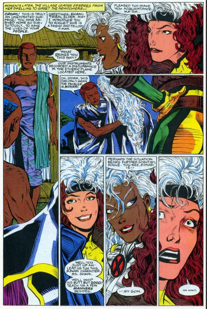
The story begins at the border of Kenya and Tanganyika where Mount Kilimanjaro rests. Something destructive emerges at the top of the mountain causing great disturbance on the people below. At a village, two black persons could not help but notice a demonic figure coming down at them. One of them gets possessed by it.
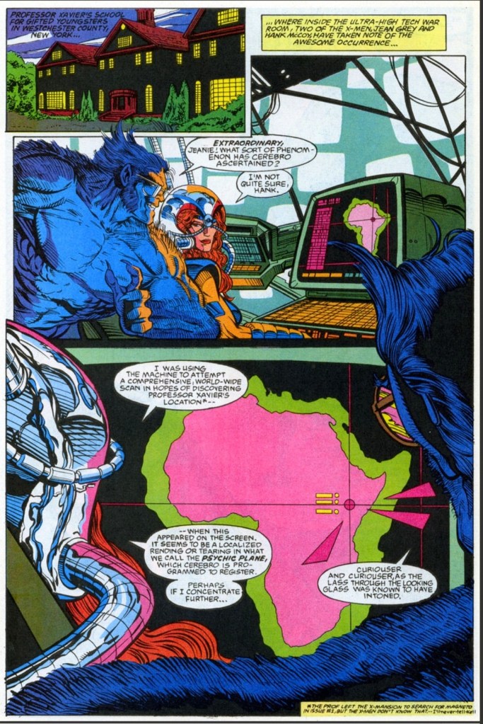
Meanwhile at their headquarters in Westchester County, New York, Jean Grey uses Cerebro to comprehensively scan the world to find Professor X’s location. What Jean detected was a psychic plane which catches Beast’s attention.
Shortly after, Rogue arrives with Storm who just returned from a hospital. As Jean updates them both, Storm realizes that the location of the psychic plane is in Africa…
Quality
Rogue in Africa with Storm.
The first thing I should confirm here is that there is a nice jump in the visual quality – in terms of style and detail specifically – thanks to illustrator John Hebert. Hebert’s work here is a nice relief compared to the rushed works of Andrew Wildman in the previous two issues, and he knows when to use the dynamic moments of spectacle and how to balance it with the calm moments. Hebert’s take on Wolverine is really good.
Regarding the story, I like the way the search for Charles Xavier – which was a sub-plot in the previous issues – unfolded while also opening the opportunity to develop Storm as she returns to Africa. In fact, this tale reveals some really engaging details from Storm’s past as well as her personal connection with a certain tribe of black people. These mentioned elements added nicely to the tension of a particular conflict that followed.
In fact, the Storm-centered story was nicely executed by the creative team and there were revelations that were gripping. Along the way, Rogue got a nice share of the spotlight and was a suitable supporting character even though the comic book had new characters.
Conclusion
Using Cerebro has big advantages.
X-Men Adventures Season II #3 (1994) is a good read and it also has a nice change of geographic setting as it mainly focused on Africa and Storm’s reconnection with her people. Storm is clearly the main character here and this is a solid pay-off as she only had a tiny part in the previous issue. This is a tale – with themes of family, culture and the responsibility that comes with having special talents or power – that should interest dedicated fans of Storm.
Overall, X-Men Adventures Season II #3 (1994) is recommended.
Welcome back readers, fellow geeks and electronic gaming fans!
In this edition of the Retro Gaming Ads Blast (RGAB) series, we will examine print ads from the 1980s and 1990s that caught my attention and I will explain why they are worth look back at.
For the newcomers reading this, Retro Gaming Ads Blast (RGAB) looks back at the many print ads of games (console, arcade, computer and handheld) that were published in comic books, magazines, flyers and newspapers long before smartphones, social media, the worldwide web and streaming became popular. To put things in perspective, people back in the 1980s and 1990s were more trusting of print media for game details and images.
With those details laid down, here is the newest batch of retro gaming print ads for you to see and enjoy…
1. Japanese print ad of Super Star Wars: The Empire Strikes Back
Do you know any Star Wars fan who is aware of the error in this Japanese print ad of Super Star Wars: The Empire Strikes Back?
Back in 1993, the sequel Super Star Wars: The Empire Strikes Back was released on the Super Nintendo Entertainment System (SNES) in the West and on the Super Famicom in Japan. Having played all three Super Star Wars game, I can say that this sequel was a huge improvement over its predecessor technically and also with gameplay (read my retro review by clicking here).
Like its predecessor, the game was released in Japan by JVC Musical Industries and in the above Japanese market print ad, the marketing team wisely used the game’s official artwork to give gamers a clear view of the concept derived from the 1980 movie plus a few screenshots showing gameplay. What I find hilarious to read is the line (highlighted in red and all capitalized no less): MAY THE FORCE WITH YOU. Clearly someone from the Japanese marketing team who prepared that line lacked English proficiency or might not have watched the movies dubbed in English. In the 1977 movie, Han Solo said to Luke, “May the Force be with you.”
2. Spider-Man (Atari 2600) print ad
This is an entertaining way to promote a video game based on a comic book icon.
We are back again with the Parker Brothers company and their promotion of the Spider-Man video game for the Atari 2600 which I myself played long ago. Unlike before, the print ad this time was mainly about the Spider-Man game and somehow Parker Brothers coordinated with Marvel Comics to make a comic book-inspired ad. In the above print ad, Spider-Man was shown playing the game about him with an Atari 2600 controller and console, and the Green Goblin taunts him as he plays. This type of ad is a stroke of genius because it shows the Marvel Comics’ icon as a player and the gameplay was emphasized accurately. Even if viewers are not too fond of video games, they can still find themselves interested in reading the literary adventures of Spider-Man.
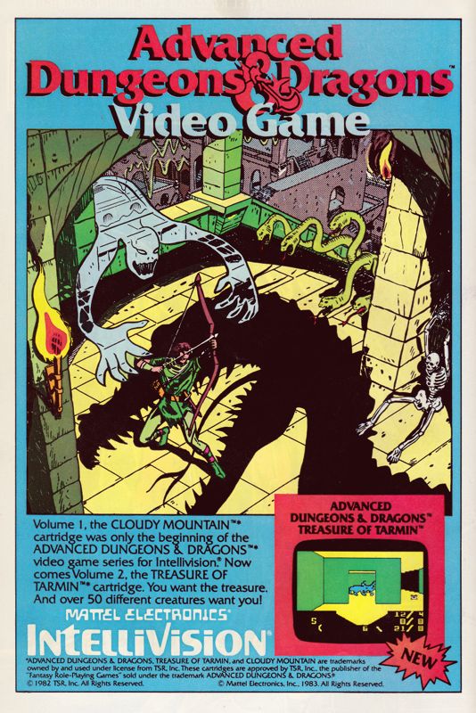
3. Advanced Dungeons & Dragons: Treasure of Tarmin print ad
Apart from emphasizing the fantasy concept of the Dungeons & Dragons franchise, this print ad’s hand-drawn art was strong enough to spark viewers’ curiosity and make them interested in the game or even in the Intellivision console.
Here is a print ad I saw many times while reading comic books in 1983. The game at hand is Advanced Dungeons & Dragons: Treasure of Tarmin released on the Intellivision, and it is the sequel to Cloudy Mountain. Like the ad of its predecessor, the above print ad relied heavily on the spectacle of fantasy (and even a bit of horror) by having hand-drawn art as the eye candy promoting Advanced Dungeons & Dragons: Treasure of Tarmin. If you look closely, only one screenshot from the game was shown and it was enough to tell gamers that the new game has a completely different visual presentation from that of Cloudy Mountain. Considering the primitive nature of computer graphics and game design of the era, having detailed comic book-inspired artwork was effective to grab viewers’ attention with the intention to make them interested in buying the game. In today’s age of computer graphics and social media, this type of ad for video games is rare to see.
4. G.I. Joe: Cobra Strike print ad
The G.I. Joe: A Real American Hero franchise’s early entry into video games.
Going back to Parker Brothers, the company developed and published the first-ever licensed game of the G.I. Joe franchise – G.I. Joe: Cobra Strike for the Atari 2600. In promoting the game, a 2-page ad was released with comic book-style art work (featuring Cobra Commander and Duke representing different sides) dominating the space, with descriptive text and a hand-drawn illustration of the gameplay (read: not a real screenshot) as well as the game box flling the remaining space. In my personal experience, I saw this ad before I even got to watch an episode of the popular G.I. Joe: A Real American Hero animated TV series, and before I got to read an issue the related comic book series (which started before the TV series). Looking back at the above print ad, I can still remember the time when I was puzzled by the two characters simply because I was not yet familiar with them. Take note that the video game and the ad were released at a time when the G.I. Joe: A Real American Hero started rising quickly in popularity on toys, comic books and animation.
5. Alien 3 (SNES) print ad
This print ad appeared in several comic books I read in 1993.
Way back in 1992, I had one of the most depressing cinema viewing experiences with Alien 3 which had a very troublesome production and lacked a solid foundation behind its creativity. Then in the summer of 1993, print ads of the video game Alien 3 for Super Nintendo Entertainment System (SNES) appeared in several comic books I read at the time. The above print ad was actually entertaining to look at. For one thing, the ad makers used three wide layers of screenshots from the game depicting different areas. Then I noticed the details which showed there were more aliens for gamers to encounter (versus only one in the movie) and the playable lead character Ellen Ripley was armed with guns (versus no guns in the movie) being able to fight the monsters. Not only that, the ad makers knew the specific details from the Alien film franchise which is reflected in the ad referencing the Face-hugger aliens, the acid from the creatures and, of course, the alien eggs. To this day, there are old-time gamers who found the Alien 3 SNES game more entertaining than the movie.
Welcome back readers, fellow geeks and electronic gaming fans!
In this edition of the Retro Gaming Ads Blast (RGAB) series, we will examine print ads from the 1980s and 1990s that caught my attention and I will explain why these are worth look back at.
For the newcomers reading this, Retro Gaming Ads Blast (RGAB) looks back at the many print ads of games (console, arcade, computer and handheld) that were published in comic books, magazines, flyers and newspapers long before smartphones, social media, the worldwide web and streaming became popular. Back in the old days, many gamers trusted the print media a lot for information and images about games.
With those details laid down, here is the latest batch of retro gaming print ads for you to see and enjoy…
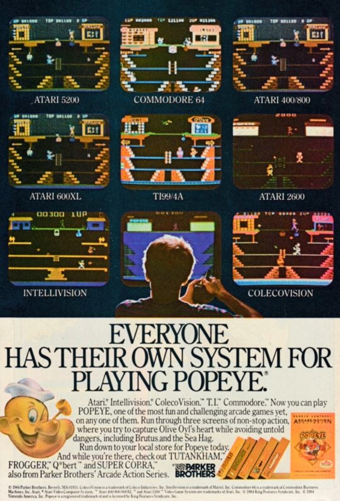
1. Popeye multiplatform print ad
A fine example of promoting the Popeye video game on multiple platforms visually.
During the early 1980s, an arcade game based on Popeye was released and it became a hit with gamers who lined up and inserted coins to play. That game, which had three stages, was eventually ported by Parker Brothers to multiple platforms of Atari, ColecoVision, Intellivision, T.I. and Commodore.
The print ad you see above is a classic display of how one particular game appeared as a multiplatform release. The screenshots showed different versions of the Popeye game on multiple Atari platforms plus the others. See how different the game looks on each platform? The level of visual details and elements varied from one another as each machine had different specs that Parker Brothers had to adjust to. This is a fine example of promoting one game for different machines for those who love video games.
2. Kool-Aid Man Video Game print ad
I never got to play this Kool-Aid Man video game.
Remember Kool-Aid? For the newcomers reading this, Kool-Aid was a very popular product line of flavored juice drinks sold in powdered form. I myself used to mix Kool-Aid with ice-cold water and enjoyed drinking it. In 1954, a promotion of Kool-Aid with a touch of entertainment happened by highlighting the character Kool-Aid Man (famously known as the walking and talking pitcher filled with Kool-Aid juice). In later years, the Kool-Aid Man was often shown breaking through walls saying the line “Oh yeah!”.
The Kool-Aid Man gained tremendous attention as a pop culture figure in the 1980s when a new series of advertisements and promotions happened branching into video games and even comic books. The above print ad was a clever move to promote Kool-Aid as a drink as well as a video game for the Intellivision and the Atari 2600 consoles. Even if you were not too fond of video games in the 1980s, the Kool-Aid game ad would still make you think about the drink. Clever and entertaining!
3. Zombies Ate My Neighbors game print ad
I saw the 2-page ad many times in comic books and video game magazines.
Going into the 1990s, Konami’s print ad of the video game Zombies Ate My Neighbors (for Super Nintendo Entertainment System and Sega Genesis) appeared a lot in the comic books I read when I was much younger. Having seen lots of horror movies – including zombie flicks – the ad easily caught my attention not because of the screenshots but because of the visual style used. For one thing, there was this 1950s America-inspired imagery on the photo of the scared woman with three zombies slowly approaching her. As for the game itself, there were plenty of small-sized screenshots that had lots of interesting details and pixel art (note: 3D polygons in video games were not yet common back then) which gave me a clear idea that it was a humor and horror-laced 2D adventure. Not only that, the text descriptions combined with the fake quotes added zest into the presentation. After having examined all the details carefully, I really felt like Zombies Ate My Neighbors would be a fun-filled game to play on the SNES.
4. Lunar: The Silver Star print ad
With anime artwork used, it was easy to have the impression that the original Lunar game was based on an existing anime series or movie.
In the early 1990s, Game Arts developed and released the Japanese role-playing game (JRPG) Lunar: The Silver Star on the Mega CD platform in Japan which in some ways was also a technological breakthrough – the game came with full motion video (for short videos), animated images, and CD-quality sound (that really made the soundtrack lively to listen to). After achieving critical and commercial success in Japan, the game was picked-up by Working Designs to be localized and released in the North American market for the Sega CD (the American counterpart of the Mega CD) platform. In promoting the game for American Sega CD owners as well as American gamers in general, a print ad highlighting anime images with five screenshots and only a few words was published on both comic books and magazines.
Even though Lunar: The Silver Star’s core concept was never described in the ad, the anime imagery was still eye-catching and the chosen screenshots gave viewers a preview of the gameplay and the animated images. That being said, it was no surprise that gamers who happened to be a bit interested in anime noticed the print ad. At the same time, the ad gave some gamers the impression that Lunar was a game based on an existing anime franchise. This approach on game advertising was daring and it happened at a time when Japanese RPGs had a limited audience among gamers in North America.
5. Lunar: Silver Star Story Complete print ad
In the 2nd half of the 1990s, a remake of Lunar: The Silver Star was released in Japan titled Lunar: Silver Star Story for Sega Saturn (1996), Sony PlayStation (1998) and Windows PC (1998). While it still maintained the 2D visuals for presentation, gameplay and exploration, the remake had smooth anime sequences, new artworks, better sound effects and music. Working Designs pounced on the opportunity to localize the game in America for PlayStation and released it in 1999 with the title Lunar: Silver Star Story Complete. Not only did Working Designs work hard on localizing the game (the English dubbing and singing of the game’s songs were meticulously done), they released it with a very lavish packaging with the dedicated fans and collectors in mind.
By looking at the above print ad that magazines published, Working Designs highlighted the positive feedback quotes from EGM, Gamers’ Republic, PSM and Official U.S. PlayStation Magazine to convince gamers Lunar: Silver Star Story Complete is a great game. While the screenshots showed what kind of eye candy gamers could expect, Working Designs made sure that they would know that the lavish package includes 4 discs (2 game discs, 1 music CD and 1 CD that had video documentary of the making of Lunar), a full-color map in the form of a cloth, and a hardbound art book and instruction manual.
Considering the dynamism of the Lunar: Silver Star Story Complete print ad and the game’s packaging, I can only speculate that Working Designs had to do it aggressively because the gaming landscape changed dramatically as 3D polygonal graphics became the standard while lots of other Japanese RPGs from different publishers were released in 1999 (including the sequels Suikoden II and Final Fantasy VIII) and many of them had more elaborate game designs and visual presentations. Eventually market forces and unfortunate business events led Working Designs to closing down permanently in 2005.
6. Star Wars: Jedi Arena print ad
Remember when Luke Skywalker tested his lightsaber skills with the floating Seeker in the 1977 movie?
Back in the early 1980s, Parker Brothers was very active releasing games on the Atari 2600 console which my family had. At that same time, Star Wars was very popular (and without the wokeness and identity politics garbage of Kathleen Kennedy and woke Disney) and any new game based on the sci-fi franchise was something to be excited for. In the above print ad of Star Wars: Jedi Arena, an artwork showing the iconic her Luke Skywalker testing his lightsaber skills with the floating Seeker ball was displayed and located between Luke’s legs is a monitor showing the screenshot of the game. Looking at the text description, Parker Brothers creatively focused on the aspect of the Jedi way of using the lightsaber interacting with the Seeker ball. Having played the game myself, I can say the ad was creative and pretty much captured the core concept of the game.
Disclaimer: This is my original work with details sourced from reading the comic book and doing personal research. Anyone who wants to use this article, in part or in whole, needs to secure first my permission and agree to cite me as the source and author. Let it be known that any unauthorized use of this article will constrain the author to pursue the remedies under R.A. No. 8293, the Revised Penal Code, and/or all applicable legal actions under the laws of the Philippines.
Welcome back superhero enthusiasts, 1990s culture enthusiasts and comic book collectors! Today we go back to the mid-1990s to explore a part of the Ultraverse through a tale of Mantra, the male eternal warrior Lukasz who died during battle then returned in the body of a woman named Eden.
It has been a few years since the last time I reviewed a Mantra comic book. For the newcomers reading this, the Ultraverse was a franchise of superhero comic books launched by Malibu Comics in 1993 which produced a lot of fun, intriguing and memorable tales made by a variety of really talented creators. Mantra was one of the pioneering characters of the Ultraverse and the related comic book series lasted more than twenty issues. Along the way, a standalone story of Mantra was published in the form of a 2-part mini-series.
With those details laid down, here is a look back at Mantra: Spear of Destiny #1 published in 1995 by Malibu Comics with a story written by Mike W. Barr and drawn by Paul Abrams.
The cover.
Early story
The story begins when Mantra arrives at a museum to start her attempt (in her civilian identity as Eden Blake) to obtain the Spear of Destiny. While wearing a revealing outfit to distract the men, Mantra gets close to the highly prized spear to observe it and see how the security personnel guard it.
At a different spot within the museum, Mantra decides to start obtaining the spear in magical outfit and with a mask. As Mantra arrives at the room where the Spear of Destiny, already there are monsters overwhelming the men guarding the Spear of Destiny…
Quality
Eden Blake/Mantra reporting to work at Aladdin.
Having read most of the stories of the Mantra comic book series, I can say that Mike W. Barr came up with a fresh concept that emphasizes the quest to gain possession of a highly valuable item while also creating a new approach on presenting Mantra…by engaging in espionage (spying and infiltration).
As I am already used to seeing the eternal warrior Lukasz/Mantra using magic in many struggles or missions, the concept of having the protagonist getting disguised and becoming an impostor on a spy mission is a very inspired move by the writer. The preparations taken by Mantra to becoming a certain blonde woman for the mission were nicely structured and detailed enough to make the transformation. As if that was not enough, a certain piece of technology was implemented which made using magic a huge risk for the eternal warrior. That being said, the story smoothly transitioned from magic-filled fantasy into a convincing spy thriller
Along the way, this comic book also emphasizes the darkness of the secret society Aladdin which Mantra (as Eden Blake) works for. Aladdin’s operations were dramatized several times in other Ultraverse comic books but this one has a more explicit portrayal of them.
Conclusion
Mantra got hold of the Spear of Destiny but for how long?
Mantra: Spear of Destiny #1 (1995) is really entertaining and compelling to read. This is easily one of the more creative and more unique tales of the Ultraverse character ever told and I can say that I am eager to find out what would happen next. This is also the one tale in which Mantra became a spy and gets into a dangerous mission in which the use of magic is too risky. The writing by Mike W. Barr is really strong with this one.
Overall, Mantra: Spear of Destiny #1 (1995) is recommended.
Welcome back readers, fellow geeks and electronic gaming fans!
Today I am launching a brand-new series of articles titled Retro Gaming Ads Blast (RGAB) which will explore the many print ads and promotions of video games, computer games, arcade games and handheld games that were published through the decades.
For the newcomers reading this, print ads of games were widely popular and heavily relied on by gamers/players long before smartphones, social media, the worldwide web and online videos even started. Back in the old days, print media was the most common method for companies to market their games while also helping hardware (machines which played the games) reach potential buyers. Such ads appeared in magazines, comic books and newspapers. Not only that, there were several print ads of games that were made to look creative, compelling and even intriguing.
With those details laid down, here is the first batch of retro gaming print ads for you to see and enjoy…
1. Parker Brothers’ Spider-Man-led print ad
Does this ad look amusing?
Remember Parker Brothers? That was a company that started way back in 1883 founded with a strong focus on the enjoyment of games in the form of board games, cards and toys. In the late 1970s, Parker Brothers started making electronic versions of their popular board games and engaged in the video game development and publishing. They also went on to make home ports of popular arcade games in the early 1980 for several gaming platforms.
Parker Brothers was very active with making games for the Atari 2600 console which became the dominant machine for home gaming in North America in 1982. In the above print ad, their marketing heavily emphasize the Spider-Man video game for Atari 2600 and added two others games they also published – Tutankham and Amidar – which was a clever move to market multiple games. The ad’s focus on Spider-Man was amusing and even without showing a single screenshot of the game, it was enough to entice people to watch out for it. Be aware that the Spider-Man game’s development was done by Laura Nikolich who was hired by Parker Brothers at a job fair. Nikolich had full creative control on making the game and had no contact whatsoever with Marvel Comics.
2. Advanced Dungeons & Dragons: Cloudy Mountain print ad
An ad like this was strong enough to motivate gamers’ imagination and interest.
Back in 1982, Advanced Dungeons & Dragons: Cloudy Mountain was released on the Intellivision game console and I was fortunate enough to watch my next-door neighbor play it repeatedly. The above print ad – which simply referred to the game as Advanced Dungeons & Dragons – only had a few words which directly pointed to the main objective of the game…the golden crown. While only one screenshot of the game was displayed, the advertisers heavily relied on hand-drawn, comic book-style fantasy art work to sell the game.
For those who were born long after the 1980s, let me share with you that ads like these were really impressive for their time. It was common for advertisers to use art works (even though they may not accurately reflect the gameplay or game design) and post at least one screenshot to catch the viewer’s attention with the hope that it would even encourage him/her to anticipate the game. It should be noted that ads like these were strong enough to make gamers’ imagination or curiosity grow stronger.
3. Konami’s collective military video games advertising
Print ad of four games for IBM, Amiga and Commodore.
Print ad of Jackal and Contra for the NES.
Konami, the Japanese company that has long been known for Metal Gear, Suikoden and the controversial sacking of famous game designer Hideo Kojima, was aggressive in the gaming business in the 1980s and arguably the aggressiveness was reflected in their publishing of several games that emphasized militarism during the late stages of the Cold War. In short, they made the military look cool and their activities fun to do in digital form.
While Konami has always been identified with console gaming, they actually released Rush’n Attack, Contra, Jackal and Boot Camp on IBM, Amiga and Commodore computers (as seen in the first print ad above) which were popular in the 1980s. The said ad also have a very amusing visual concept emphasizing the excitement and fun of military action games coming to gamers at home for their computers.
The 2nd print ad above – Jackal and Contra for the Nintendo Entertainment System (NES) – was very intriguing to see. It was very clear back in the 1980s that the NES always had a wholesome audience (note: a lot of buyers were parents who wanted to entertain their kids at home) and that includes a lot of very young players. To see the collective ad of Jackal and Contra (for the NES platform) having battle-hardened men in military gear holding guns was openly aggressive to perceive and instantly reminded people about the Cold War (and the menace of Communists, socialists, Marxists and terrorists) and the cultural impact of the mega blockbuster film Rambo: First Blood Part II. This is the kind of ad that would drive today’s woke-minded people crazy and even cause them to panic and pretend to be victims of militarism and patriotism. If you look at the ad closely, you will realize there is simply no room for the garbage of political correctness and wokeness.
Lastly, I myself had played Contra and Jackal with my friends on the Nintendo Family Computer (the Japanese counterpart of the NES) and both military games were a lot of fun to play from start to finish!
4. Batman Returns SNES game ad
This print ad appeared in some comic books I read in the early 1990s.
Way back in 1992, Batman Returns (the sequel to the mega blockbuster Batman movie of 1989) was released in cinemas with intense marketing and merchandising reflecting Warner Bros. intention to replicate the commercial success they had in 1989. Along the way, there were several video game adaptations of Batman Returns that were released on different platforms. Among those many video games was the Super Nintendo Entertainment System (SNES) game of Batman Returns which was developed and published by Konami in 1993 the form of a side-scrolling beat-them-up game.
The above ad was visually appealing with hand-drawn, comic book-style art dominating the spaces while leaving room for some screenshots and a written description of the game. Having seen this ad on multiple comic books I read back then, I can say that the ad was entertaining to see and was effective in making me interested in the game. I played Batman Returns on the SNES but never got to finish it. Oh yes, the game’s audio were really good and there were also digitized images from the movie for the in-game narrative.
5. Flashy Sonic the Hedgehog Japanese print ad
A dazzling approach by Sega on selling Sonic the Hedgehog.
1991 will always be remembered as the year of Sonic who eventually became not only Sega’s most defining mascot but also a video game industry icon. That same year, Sega released Sonic the Hedgehog on the Sega Genesis (referred to as Sega Megadrive in other parts of the world) console and it became a massive success with consumers and the game critics.
In the above Japanese print ad, a very captivating display of light and energy rays dominated the space leaving a minority share left for Sega’s console, screenshots and even a UFO Catcher arcade machine picture. While I could not understand the Japanese text, it seems to me that the flashy visual concept of the ad reflected Sega’s high ambitions with Sonic. How many gamers in Japan bought a copy of Sonic the Hedgehog because of this ad remains undetermined.
6. Japanese Super Star Wars print ad
A long time ago in a galaxy far, far away…
Before Nintendo released its 16-bit game console (referred to as Super Nintendo Entertainment System in America, and Super Famicom in Japan), there were lots of Star Wars video games released on varied platforms and the arcade.
With Nintendo’s 16-bit gaming platform realized, lots of game designers and business partners saw opportunities to make new games with gameplay concepts and designs using the technological advantages of the time. For LucasArts and its partners, taking Star Wars gaming into the next level was inevitable and they made it all come true in 1992’s Super Star Wars video game.
Published in Japan by JVC Musical Industries for the Super Famicom, Super Star Wars was a major leap forward in game design, visuals, sound and enjoyment. Apart from the 2D side-scrolling run-and-gun gameplay, gamers were deeply immersed into Star Wars’ universe with the Mode 7 landspeeder and X-Wing fighter sequences, as well as the first-person trench run sequence.
The Japanese print ad above cleverly presented screenshots from the game while using official imagery from the Star Wars movie poster of 1977 (look at how young Harrison Ford, Mark Hammill and the late Carrie Fisher were back then). The ad is a fine example of combining the greatness of the classic George Lucas-directed film with the highly enjoyable design of Super Star Wars. Lastly, these should remind you that there was a time when Star Wars was not yet tainted by wokeness and the garbage values of the Satanic Leftists (read: woke Disney).
Disclaimer: This is my original work with details sourced from watching the film and doing personal research. Anyone who wants to use this article, in part or in whole, needs to secure first my permission and agree to cite me as the source and author. Let it be known that any unauthorized use of this article will constrain the author to pursue the remedies under R.A. No. 8293, the Revised Penal Code, and/or all applicable legal actions under the laws of the Philippines.
Welcome back, movie buffs, science fiction fans and geeks! When it comes to making remakes or reimagined versions of established movies from previous decades, the 1980s was indeed a special time to watch them. In 1986, The Fly (directed by David Cronenberg) was released and it made a tremendous impact on moviegoers in ways that the original 1958 movie did not.
Remember when The Blob was first released in 1958? That classic film (read my retro review by clicking here) went on to have a forgettable sequel released in the 1970s but got remade big time with a new version in 1988 simply titled The Blob.
The story begins in the town of Arborville where many locals attend an exciting football game. High school player Paul (Donovan Leitch, Jr.) asks cheerleader Meg (Shawnee Smith) to a date. Elsewhere, the troubled guy Briann Flagg (Kevin Dillon) fails with his attempted stunt as a result of his flawed motorcycle which was witnessed by an elderly vagabond. Flagg goes back to town and encounters the local sheriff (Jeffrey DeMunn) who warns him about trouble.
That evening at the outskirts of town, a meteorite crashes within the forest which the elderly vagabond pursues. With strong curiosity in his mind, the old man uses a stick on a sizable body of slime mold substance (the blob itself) that came out of the crashed meteor. Suddenly, the substance moves and sticks to the elderly vagabond’s hand causing him great pain.
A short time later in the forest, Brian Flagg got surprised by the sudden appearance of the vagabond who desperately tries cutting off his own hand. The blob, which Brian saw for the first time ever, attaches itself even more on the old man causing him to run away until he gets hit by a car (with Meg and Paul inside)…
Quality
The blob in this movie looks more menacing as it has a tumor look and the special effect work remains excellent to look at. You should also see the blob move and what it sounds like.
This late-1980s remake of The Blob is not only more engaging and more entertaining than its 1958 predecessor…it is easily on of the best sci-fi horror movies of the 1980s thanks to a very talented creative team led by Chuck Russell.
To begin with, Russell and Darabont (this is the same great director behind The Shawshank Redemption), crafted a very solid screenplay that used key story elements from the 1958 classic while successfully updating everything else with 1980s America (or Ronald Reagan’s America) in mind. For this version, the three leading teenagers played by Shawnee Smith, Kevin Dillon and Donovan Leitch, Jr. were relatable and clearly worth following.
(From left to right) Shawnee Smith, Kevin Dillon and Candy Clark in an early encounter with the blob.
While the 1958 movie emphasized American teenagers being disadvantaged as local adults don’t take them seriously (even though the youth knew the problem and intend to solve it), this remake moved away from the generational gap as it strongly focused more on the crisis of a fast-growing blob that simply won’t stop killing people and destroying things. In other words, this is a crisis-focused monster story that is more violent, more horrific, more action-packed and more graphic than its predecessor.
I should also state that Russell and his team established a solid structure for storytelling and the narrative flowed on a medium-to-fast pace. As this movie has more spectacle in terms of action, monster moments and the like, the creative team carefully balanced the fun stuff with the dramatic and exposition scenes smoothly.
If you see people wearing protective suits arriving in your community and implementing a lockdown, you know a crisis is in effect.
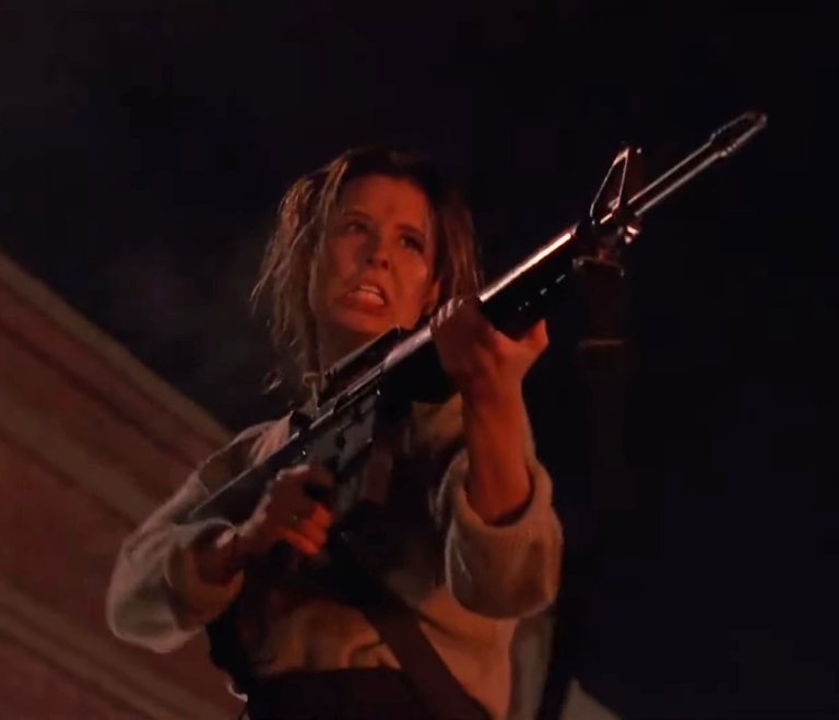
The cast here is solid! Shawnee Smith’s Meg is the sweet, young good-natured high school girl who is willing to not only survive but also take part in solving the crisis situation not for herself but for her family and the entire Arborville community. Meg has some common elements with that of the character Sarah Connor from The Terminator and Terminator 2: Judgment Day. I also love the fact that there is NO WOKENESS and NO RABID FEMINIST VALUES in Meg. Kevin Dillon’s Brian – the troubled youth – is clearly the 2nd lead and he does a good job dramatizing how his character changes from a guy of uncertainty into an actual doer whose efforts proved to be valuable. There definitely is a non-romantic chemistry between Meg and Brian as the crisis situation really brought out solid transformations from them respectively.
The supporting cast is really good too. Candy Clark’s Fran is the relatable community diner owner/manager who contributed nicely to the plot as well as the early showdown of the blob. Jeffrey DeMunn’s sheriff is the local law enforcer who has to deal with the local situations while tackling the challenges of his leadership post. Paul McCrane here plays a local cop who is tough but not necessarily abusive, and this is the same guy who played a very vicious bad guy in 1987’s RoboCop! Joe Seneca is the government scientist who has charisma and deception carefully blended together which added to the plot. You will even see Erika Eleniak in a very small and yet notable appearance that happens to involve the blob. This film has a really interesting cast and I encourage you to research the names mentioned here.
This remake is loaded with action scenes, stunts and incredible visual effects!
On the technical side of things, I really like the cinematography done by Mark Irwin as the visuals captured looked really detailed and clear even during the dark or night-time scenes. The music by Michael Hoenig was pretty good too and his tunes ranged nicely from creepy to sentimental and energetic which reflected the scenes. As for the design of the blob, Lyle Conway deserves the credit for making it very monstrous. As for the physical environment of the movie, the state of Louisiana turned out to be a great location and the real-life Louisiana town Abbeville added strongly to the small town concept of the story.
As mentioned earlier, this version has a lot more spectacle to enjoy. For one thing, there is a good amount of hard action, gunfire and stunts which really added to the excitement (on top of the suspense and horror scenes already implemented). Rest assured, you will not get bored at all when watching this.
Shawnee Smith is the protagonist in this movie and her performance is very memorable.
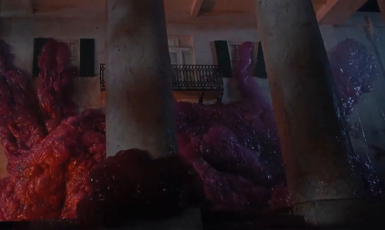
The highlight of the spectacle is the very blob itself which looks so much like a tumor (instead of the jello form in the 1958 version) and the credit goes to the visual effects, sound effects and the animation team behind it all. Compared to its counterpart in the 1958 film, the blob here is very monstrous and horrifying to watch and the way it got animated is excellent. Apart from being unrelenting, this blob is deadlier and even intelligent. Not only does the blob devour the living which adds to its tremendous growth of size and mass, it also has the ability to extend tentacles which added more to the danger. Thanks to the sound effects, the blob is believably animalistic.
Through the blob’s on-screen presence, you can see the hard work implemented by the special effects crew when showing the monster entirely move and devour people, when showing its flexibility on adjusting its size (or its parts) when entering new places through tight spots, and most notably, how the blob alters the flesh of the victims it touches which resulted in very horrifying visuals. The special effects team really excelled with the use of practical effects (read: no computer-generated images) on presenting the titular monster. This is indeed a special effects extravaganza that a lot of people are missing out on.
Conclusion
The Blob (1988) looks and sounds better than ever in 4K Blu-ray format. I highly recommend this version as it is so much better than streaming.
There is no doubt in my mind that The Blob (1988) is a great sci-fi horror film that has a more menacing monster complete with sufficient action, great visual effects and a pretty solid cast! This is indeed a great example of a how a remake of an established film from the past should be done and this also includes raising the stakes within the story, modernizing past cinematic elements and ensuring high entertainment value. What director Russell, his team and the cast collectively achieved is indeed a creative success and this is the kind of film that Commie-filled Hollywood (Commiewood) today does not want to make.
As a companion piece to The Blob (1958), this remake has the good stuff that people who love horror, science fiction, action and monsters will enjoy.
Of all the many movies I have seen, The Blob (1988) stands out as one of the best remakes ever made as well as one of the best mixed-genre movies of its decade as well as of all time. That being said, today is a great time to watch this movie with better-than-ever visuals and sounds through its 4K Blu-ray release (pictured above) which is now available (you can order it online now). There is also a lot of features and extra stuff with the 4K Blu-ray. Make no mistake, The Blob (1988) is great to watch and its replay value is pretty high.
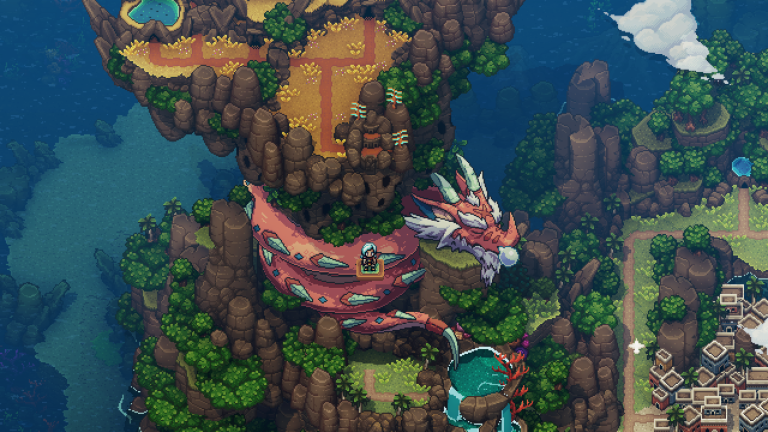
Welcome back, fellow gamers, geeks, role-playing games (RPGs) enthusiasts and fantasy lovers!
In recent times, I completed my first playthrough of Starfield on my Xbox Series X and it lasted me over 220 hours of fun, discoveries and intriguing moments. Having played it so long, I will replay Starfield with a new playthrough only after Bethesda implements the next series of patches/updates (to refine the game) and release the planned downloadable content (DLC).
That being said, I finally started playing the inspired Japanese-style role-playing game (RPG) Sea of Stars on my Xbox Series X. Having played some hours of it, I can say that I am really enjoying Sea of Stars and I intend to finish it. Oh yes, Sea of Stars is available on Xbox Game Pass (XGP) right now!
This is one of many great looking scenes composed of really fine 2D art style and pixel artistry in Sea of Stars.
Developed by Sabotage Studio, Sea of Stars is a turn-based RPG with a strong retro feel that will remind you of past Japanese RPGs (JRPGs) like Chrono Trigger and Secret of Mana. The game follows the exploits of two Children of the Solstice who combine the powers of the sun and moon to perform Eclipse Magic, the only force capable of fending off the monstrous creations of the evil alchemist known as The Fleshmancer. Along the way, the two Children of Solstice start a quest joined by their friend and together they travel to different places encountering different inhabitants and engage in situations that only they can solve.
Having played Chrono Trigger, Secret of Mana, Final Fantasy IV, Final Fantasy VI and a lot of JRPGs from the so-called 16-bit era of console gaming, I can say that Sea of Stars is a very inspired game that has lots of elements common with the mentioned games (plus more) with regards to art style, gameplay, quests, music, character development and visual presentation. To put it short, the guys at Sabotage Studio took a lot of inspiration from the classic JRPGs to make something fun for this current console generation. I am having a lot of fun with the game which itself is available for Xbox Game Pass (XGP) subscribers to avail.
An important meeting about to happen in the game.
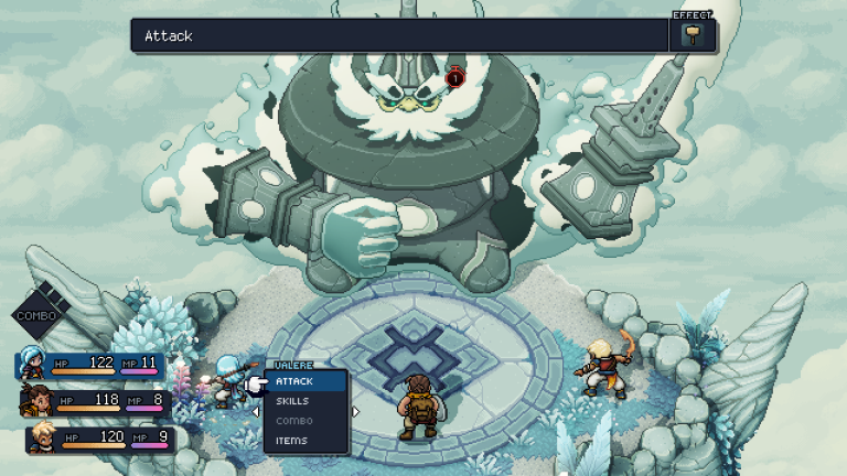
A boss battle early in the game.
This is just a part of the world map of Sea of Stars.
In my experience and recollections from the past, Sea of Stars has visual style that is best compared with Chrono Trigger. Sabotage Studio really created a lot of nice looking 2D artworks and highly detailed sprites that made the new game look lively. With regards to the storytelling , character development and character expressions, the game has a wholesome tone that never felt childish. The tone as well as the humor made Sea of Stars comparable with several Japanese RPGs from the 16-bit age of consoles.
You will encounter really interesting characters who will join your party as the game progresses.
Sea of Stars is really fun to play and it is a great change of pace and style for me as I finished my Starfield playthrough which lasted more than 220 hours. This Sabotage Studio game will help ease my wait for the expected 2024 RPGs such as Eiyuden Chronicle: Hundred Heroes and the Xbox-exclusive Avowed. As much as I hope to see past JRPGs like Xenogears, Breath of Fire and Lunar get remastered and released for Xbox consoles (and XGP), I know such possibilities remain uncertain and Sabotage Studio’s game easily fills the void. If you are looking for a Japanese-style RPG that is fun, nostalgic and visually pleasing, you can’t go wrong with Sea of Stars. Go for the game on Xbox Series X, Xbox Series S, Xbox One, Windows PC and Xbox Game Pass now!
Disclaimer: This is my original work with details sourced from watching the film and doing personal research. Anyone who wants to use this article, in part or in whole, needs to secure first my permission and agree to cite me as the source and author. Let it be known that any unauthorized use of this article will constrain the author to pursue the remedies under R.A. No. 8293, the Revised Penal Code, and/or all applicable legal actions under the laws of the Philippines.
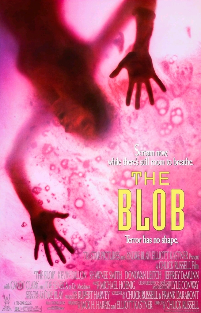
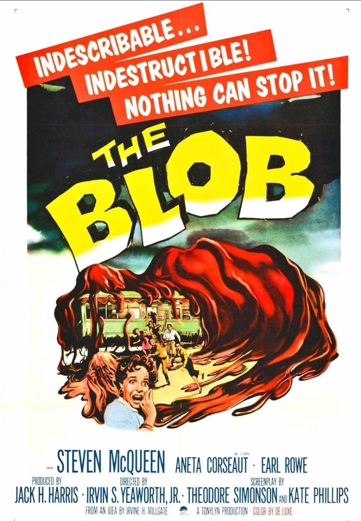
With those details laid down, here is a look back at The Blob, a sci-fi horror movie released in 1958 starring Steve McQueen and Aneta Corsaut, written by Kay Linaker and Theodore Simonson, and directed by Irvin S. Yeaworth, Jr. (Irvin Yeaworth for short). This was a low-budget local-level production by Valley Forge Films, Fairview Productions and Tonylyn Productions.
The Blob movie poster.
Early story
The story begins somewhere within a small town in Pennsylvania. During one evening, teenagers Steve Andrews and Jane Martin spend a romantic time together in a car only to be disturbed when a meteorite from outer space crashes nearby. This easily sparks Steve’s curiosity as he decides to drive to find the spot of the crash taking Jane with him.
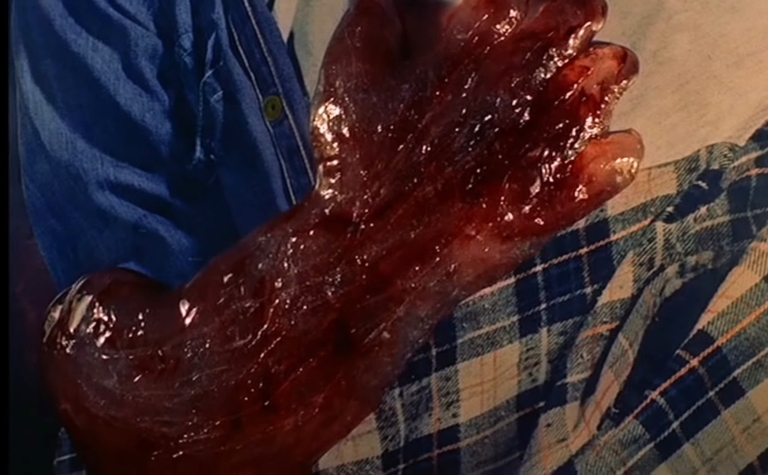
Meanwhile, an old man who happened to be living near the spot of the crash went out of his home and finds the meteorite first. Out of curiosity, he pokes the meteorite with a stick which slowly causes it to break open revealing a gelatinous substance (the blob) inside. He uses the stick on the substance, lifts it up and examines it closely. Against gravity, the substance suddenly moves up the stick and wraps itself on the old man’s hand causing him to become desperate to remove it. He failed.
As Steve drives down the road, the old man with the blob suddenly crosses down their path. The old man tells Steve to take him to a doctor…
Quality
Steve McQueen (3rd from left) as teenager Steve Andrews with Earl Rowe (2nd from right) as Lt. Dave and other over-aged actors playing teenagers.
I can say that I really like this old movie which has always been an independent, low budget production that made a solid contribution to the sci-fi genre and pop culture in general.
To begin, this film has a simple plot about an alien creature in the form of a gelatinous blob from outer space which attached itself into an old man’s hand, grew a lot when the man made it to the doctor, and then started consuming people which made it grow so big, life in the town got disrupted and people found themselves in danger. Unsurprisingly, the blob itself does not dominate the narrative considering the limitations the filmmakers had on making special effects work plus they focused more on the characters to move the plot forward. Rest assured, however, that the production team went all out with their limited resources on making the monster look menacing in the final fifteen minutes. I should state that the special effects team did a convincing job with the way they made the blob move to specific directions.
Given the simple plot, it is not surprising to see the narrative focusing more on the characters particularly with teenagers Steve and Jane (both played by obviously over-aged actors Steve McQueen and Aneta Corseaut). The story clearly follows the two mentioned teenagers who have the best knowledge about the blob and what happened, and it just so happens that they are always at a disadvantage when asked by adults to prove things.
With a monster that large within the local community, you know that something must be done before it causes further damage and kills more people. The blob was portrayed to be unrelenting in consuming and killing people which causes it to grow even bigger and with no limits determined. The blob does not care at all about the pain and anguish of its victims which parallels the evil of Communism/Marxism/socialism/anti-Semitism in real life.
Jane (Aneta Corseaut) and Steve (Steve McQueen) with the local doctor (Stephen Chase) early in the film.
The interactions between teenagers (note: Steve McQueen and Aneta Corseaut are not the only over-aged looking actors playing youth) and the mature authorities (local police, parents, educator and house keeper to name some) dramatized a gap in which the youth lacked credibility while the adults remain difficult to convince. Very notably the backward car race early in the film symbolically reflects the Hollywood film trend of the 1950s in which American teenagers are portrayed to be troublesome and living without real purposes.
Going back to the protagonists Steve and Jane, the screenplay was designed to highlight what good teenagers can do when a crisis strikes the local community and why the adults should get over their doubts about the youth.
Given the structure of the script, there are a lot of talk scenes throughout and the progress of the blob growing as a menace within the plot helped break the monotony. While he is clearly too old to play a teenager, Steve McQueen here remains convincing as a youth who strives to achieve something worthy even as he lacks maturity. The same can be said about Aneta Corseaut whose character was designed to help Steve move forward apart from having romance with him. When her character feels troubled, Steve comes in to support her in return. If you ignore their mature looks and focus on the dialogue, you will find convincing lines of youth within Steve and Jane. The same can be said about the other teenagers.
Considering the low budget and the limitations of technology at the time, the man-made practical effects in this movie are still good.
I can say out loud that watching movies inside the cinema is always better than streaming. The best way to enjoy a movie at home, on the other hand, is with physical media like Blu-ray and 4K Blu-ray.
While McQueen and Corseaut performed well, there were some moments of stiff acting and lifeless delivery of lines of dialogue scattered throughout.
Those of you who are so used to fast-paced films with thrills and jump scares, you should temper your expectations as this movie moved at a slow-to-medium pace with very little horror elements and very little violence. As this was a low-budget local-level production, certain shots had to be made with very obvious creative shortcuts. Even though this movie was filmed on several locations in Pennsylvania, the filmmakers failed to establish a true sense of geography and this means no scenic shots.
Going back to the blob itself, its jello appearance may not look menacing at first and there were times when the lack of scale (note: they did not have equipment to achieved the depth-of-field visual effect) was noticeable. What I liked here is the way the blob was portrayed – unrelenting and totally immune to the emotions and concerns of people it encounters. The blob here somewhat reminds me of the T-800 in The Terminator (1984) in the sense that it simply would not stop to attack people, consume them and then keep on growing into one very large mass which causes a crisis on the small town community.
In case you are wondering, there were accidents that happened during the memorable scene of moviegoers running out of the cinema in the film. The tripping of some people were purely accidental.
When it grabs someone and starts to consume the victim physically, the blob does not care about the pain it causes on its prey. While it is clear that the movie’s script was written during the early stages of the Cold War, it is possible that the blob served as a symbol of Communism infiltrating America, endangering people and taking their lives (and liberties) away. That being said, the rampant Leftist influence and social violence in the minds of millions of Americans today makes this film socially relevant and the blob’s threat has gotten even more symbolic. Lastly, I should state that composer Ralph Carmichael managed to come up with music to emphasize the threat of the blob.
Conclusion
In my honest opinion The Blob (1958) is still a good movie to watch and it deserves its place in film history as well as in the sci-fi genre of movies in general. While it had its shortcomings, this low-budget local-level production managed to be a worthy viewing experience and set the foundation for its movie franchise (note: a sequel was made in 1972 and the memorable remake of 1988 followed). To say the least, this movie paved the way for Frank Darabont and Chuck Russell to produce the 1988 remake that was very intense and a lot of fun to watch.
The Blob (1958) in Blu-ray disc format from The Criterion Collection. This is the best way to enjoy the movie at home.
The blob itself went on to inspire creative imitations (referred to as blobs or ooze) and new monsters in other forms of entertainment (note: the blob appears as one of the monsters in the 1982 Intellivision game Advanced Dungeons & Dragons: Cloudy Mountain). Steve McQueen himself went on to become one of Hollywood’s elite stars in the decades that followed and this film should interest both die-hard fans and any film buff who wants to learn more about him.
For decades now, I have been living in Alabang and I witnessed how much Muntinlupa City modernized along the way. Bordering Barangay Ayala Alabang is Filinvest City (formerly called Filinvest Corporate City) which itself is home to several business or facilities such as the Filinvest Tent, Commercenter, Acacia Hotel Manila, Crimson Hotel, Westgate and, of course, the wildly popular place to be in – Festival Mall.
For the newcomers reading this, Festival Mall opened in May 1998 with its initial name Festival Supermall. Way back then, out of pure curiosity, I entered the mall for the first-time ever during its soft opening on May 1, 1998 (Labor Day here in the Philippines) as I was already looking for a new place and new discoveries at a time when I got tired of Alabang Town Center (ATC).
Being very new back then, Festival Mall’s presence of retailers or tenants was not yet dynamic as there were still businesses inside that could not open in time for the mall’s opening. I do remember walking down seeing lots of vacant retail spots covered with signs such as “opening soon”, “coming soon” and the like. Back in those days, the Philippine economy and society itself were dampened by the 1997 Asian Financial Crisis.
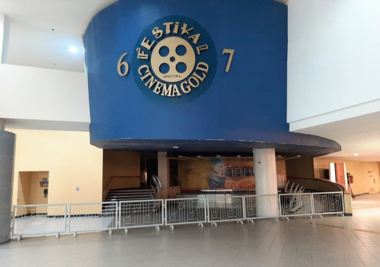
As the months passed by, more businesses opened and Festival Mall’s early attractions include the X-Site Amusement Center (which already had the indoor roller coaster) and, of course, the brand new cinemas which had several screens operating at a very spacious area on the top floor. I still remember seeing lots of people lining up for tickets and seats to watch Armageddon which ended up as the highest grossing movie of the world in 1998.
Indeed, for more than a decade, Festival Mall’s original cinemas became a favorite destination of mine to watch movies in Alabang and I definitely was not alone. I also remember the times when the said cinemas attracted a whole lot of moviegoers when the annual Metro Manila Film Festival’s (MMFF) opening day (every December 25) happened resulting in long lines. Watch the YouTube videos below…
As you can see in the above videos, Festival Mall’s original cinemas was a hot spot for moviegoers. It should be noted that the mall is strategically located in close proximity to the Alabang Viaduct and the South Luzon Expressway (SLEX) which ensures visibility to motorists and accessibility to commuters on a daily basis. The old cinemas were also a hot spot for a variety of small businesses selling different kinds of food and drinks to moviegoers and others who just passed by.
Festival Mall at 25
This past May, Festival Mall turned 25 and its anniversary was highlighted with special events as well and publicity through the media. There were these Festival Mall 25th anniversary feature articles that got published in different newspapers almost simultaneously. In the commemorative article that got published in the Manila Bulletin, President and CEO of Filinvest Development Corporation Josephine Gotianun Yap was quoted which goes as follows in the excerpt below. Some parts in boldface…
“We would not be where we are today without the unwavering support of our customers, merchants, suppliers, and employees who have journeyed with us through the years. It is humbling to think that when we first opened the mall, we only had 30 stores and no anchor supermarket. But thousands of visitors came on our first day, attracted by our amusement centers, cinemas, and food court. And now the mall has 800 tenants and eight leading anchor stores. We value our collaboration with major retailers, which has enabled us to bring together SaveMore, Ace Hardware, Robinson’s Department Store, Handyman, Shopwise, H&M, Decathlon, and Landmark all under one roof. As we build on its strong foundations for the future, we see Festival Mall continuing to serve as a place where time stops for making memories with family and friends,”
As seen above, the Filinvest Development Corporation executive clearly referred to the original cinemas which was one of the early attractions of Festival Mall way back in 1998. As mentioned earlier, Festival Mall today has more modern cinemas located at the expanded area on the same floor but several meters away from the original cinemas. So how does Festival Mall’s original cinemas look like nowadays? Watch the video below…
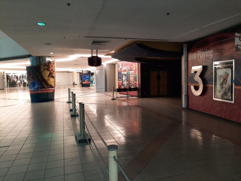
Yes, indeed the mall’s original cinemas have turned depressing. There are much less customers who pass by the area and many of the businesses that operated within have closed down! As I personally found out, Festival Mall is still using a few screens at the old cinemas for moviegoers while leaving the many others closed and left in the dark. If you think about it carefully, what does the mall management have in mind with regards to all of those cinema seats, sound systems, projectors, screens and other pieces of equipment inside each and every closed screen of the original cinemas?
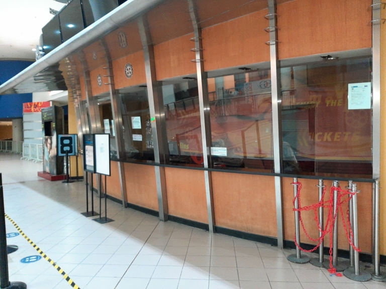
A closed screen at one end of the original cinemas of Festival Mall. Just imagine what is left of all the hardware (examples: projectors and speakers) and seats inside.
This was a premium place to watch movies at. It had more comfortable seats and better equipment that made the cinematic experience more immersive. It was here where I saw 2001’s Final Fantasy: The Spirits Within.
This is where I used to buy movie tickets for many years. For some time now, the selling of movie tickets here has stopped. To buy tickets, you have to go to the modern cinemas of the mall several meters away by foot at the same floor.
Apart from seeing more of the screens of the original cinemas closed down, the number of small-time businesses that sold different kinds of food and drinks are also gone which is depressing. Those businesses offered moviegoers different choices of what to eat or drink apart from the usual popcorn and drinks sold by the cinema’s concessionaires. I do remember a certain business joint that sold really good coffee (both hot and cold) that is also affordable.
There used to be different kinds of small business joints that sold a variety of food and drinks located on the floor spots at the original cinemas area. Those businesses have since closed down and left.
I remember the times I bought popcorn and drinks at this place before watching a movie. Now there are no food, no drinks and no people selling to customers anymore.
With the way things are right now, walking through the original cinemas area of Festival Mall is lonely and depressing to do. The area is almost lifeless and it easily is the saddest place inside the mall which itself has become a major attraction for shoppers and families. I can only wonder if Festival Mall’s management has any plan to revive the original cinemas area. Will they someday renovate at least a few of the screens and install brand new seats and other equipment to accommodate more moviegoers? Do they plan to attract new businesses to occupy the vacant commercial spaces and floor spaces near the old cinemas?
It would be nice to know if Festival Mall’s management or Filinvest itself has any plan to revive commerce at the original cinemas area which is now the saddest and loneliest part of the mall.
To be very clear with you all reading this, I never worked for a shopping mall nor have I ever worked in the movie theater business. I am a long-time resident of Alabang who often visits Festival Mall for purchasing needed items, dining and availing of services. Watching movies at Festival Mall used to be a big reason for me to spend time at the mall. I know for a fact that operating movie theaters is difficult and attracting people to watch movies on the big screen is tougher because of streaming. It does not help that the COVID-19 pandemic convinced people that watching new movies at home via streaming is the new standard which also made them think that movie theaters are unnecessary.
As a movie enthusiast, I can say out loud that watching a movie inside the cinema is still the best and most definitive way to enjoy watching. The movie theater experience can never be matched by streaming nor could the biggest HDTV at home could ever come close to the size and visual impact of a cinema screen. That being said, I can only hope that Festival Mall could someday revive the movie experience and commerce at their original cinemas area. They already have the modern cinemas at the expanded area but those are only 4 screens.
If you are living here in South Metro Manila and you have been to Festival Mall several times before, what do you think the mall management should do about their old cinemas? Is Festival Mall your favorite place to watch movies in? Do you think that hosting multiple film festivals – both foreign and domestic – each year would justify renovating the old cinemas of the mall?
Disclaimer: This is my original work with details sourced from reading the comic book and doing personal research. Anyone who wants to use this article, in part or in whole, needs to secure first my permission and agree to cite me as the source and author. Let it be known that any unauthorized use of this article will constrain the author to pursue the remedies under R.A. No. 8293, the Revised Penal Code, and/or all applicable legal actions under the laws of the Philippines.
Welcome back superhero enthusiasts, 1990s culture enthusiasts and comic book collectors! Today we go back to the early 1990s and explore a key chapter in the post-Crisis era of DC Comics through a Superman comic book.
Previously, I reviewed Adventures of Superman #498 (1993) which marked the first chapter of the Funeral for a Friend storyline and dramatized the impact left behind by the death of Superman. That particular comic book had strong writing and succeeded in dramatizing how Superman’s friends, associates and other characters coped with his death with the future looking uncertain to them.
With those details laid down, here is a look back at Superman: The Man of Steel #20, published in 1993 by DC Comics with a story written by Louise Simonson and drawn by Jon Bogdanove. This comic book marked the third chapter of the Funeral for a Friend storyline.
The cover.
Early story
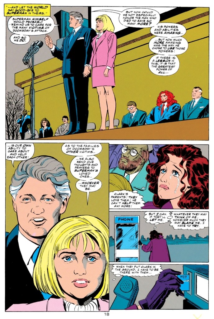
The story begins with people in Metropolis struggling to move forward not only because their hero Superman died but also because of the tremendous damage left behind by Doomsday. In his headquarters, Lex Luthor is talking with the telephone surrounded by several people with Supergirl watching. The matter being discussed was the burial of Superman at Centennial Park particularly in a structure Luthor himself donated. While he has to live on with the fact that he failed to kill Superman, Luthor tells himself he can still bury him.
At the Kent farm far away from Metropolis, Jonathan and Martha Kent are agonizing not only because of the death of their beloved son but also because they realized they cannot even get near him at his funeral as it will be organized as a major event with only the important people allowed to attend…
Quality
It seems like destiny to have the super villain Lex Luthor in the presence of a fictionalized Bill Clinton and Hillary Clinton during the funeral of Superman. By today’s standards, the Clintons made it normal for America to bow to terrorists and make deals with them. That being said, their inclusion in this comic book is just wrong.
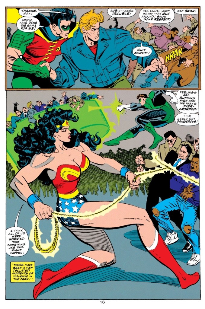
To go straight to the point, like Adventures of Superman #498 (1993), this comic book continues to dramatize the impact of Superman’s death on Metropolis and its people in a very engaging manner. It shows that DC’s creative teams in charge of Superman comic book at the time were really organized and coordinated with each other on crafting the Funeral for a Friend storyline. What makes this comic book stand out is the funeral itself which was organized as a public event (with the burial itself done in the presence of important people – including a very evil couple from the Democrats who love abortion and terrorism) and this includes the presence of many other DC Comics superheroes like Wonder Woman, Green Lantern, The Flash, Maxima, Shazam (AKA Captain Marvel) and others. The burial had its own share of intriguing and dramatic moments emphasizing the people’s struggle to adjust themselves knowing they don’t have Superman anymore to help them.
Wonder Woman, Green Lantern and Robin help out as the huge crowd became rowdy.
More on the post-death dramatization, the creative team managed to keep Superman’s associates Lois Lane, Jimmy Olsen and the other Daily Planet people feeling uneasy over the Man of Steel’s death which makes their work covering the funeral professionally a challenge. Unsurprisingly, Lois Lane gets her own fine share of the spotlight agonizing over the fact that she lost her beloved Clark (Superman to the public) whom she was supposed to get married with. The emotional struggle within her intensified as she experiences difficulty of informing the elderly Kent couple about what happened. This is rich writing prepared by the creators.
Not only that, the creative team also went all-out with dramatizing the impact of Superman’s good deeds on the people. You will see several people from Metropolis’ general population talk about how Superman helped them or inspired them. There are certain lines of dialogue that are quite touching to read.
Conclusion
A pretty powerful portrayal of Lois Lane’s struggle on dealing with the new reality that she lost her beloved Superman.
Superman: The Man of Steel #20 (1993) is another solid, post-death story emphasizing the new normal that Metropolis people and Superman’s friends are having difficulty adjusting to…a world without the Man of Steel. Based on the high quality of the storytelling and character development, it is easy to tell that the Superman titles’ creative teams planned ahead and prepared themselves for telling a post-death saga which was pretty risky given the iconic status of Superman and his decades-long legacy in comics and pop culture. This comic book really made Superman’s absence feel powerful and undeniable.
Overall, Superman: The Man of Steel #20 (1993) is recommended.