Welcome back Xbox fans, Japanese role-playing game (JRPG) enthusiasts, Final Fantasy fans and fellow geeks!
Over a week ago, Square Enix officially releasedFinal Fantasy VII Remake Intergrade for Xbox Series X, Xbox Series S plus Windows PC and Xbox Cloud Gaming. For Xbox gamers who love JRPGs and the Final Fantasy games franchise, this development marked the end of a years-long wait for the big budget remake of Final Fantasy VII to be released on their consoles.
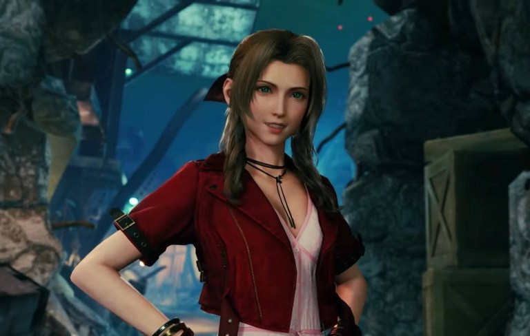
This is Aerith Gainsborough in the big-budget remake?
There are multiple reasons why FF7 Remake will have sold well on Xbox, even beyond the fact that it’s one of the most requested Xbox releases of the past few years. For one, it’s available at the pretty low launch price of just £39.99 / $39.99, and as a “limited early” bonus, it even comes with the original version of Final Fantasy 7 as well. Don’t forget it’s an Xbox Play Anywhere title too, which means you get a free PC version when buying it on console.
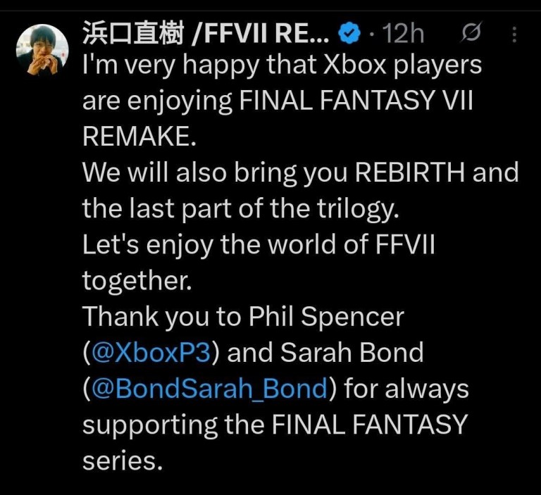
Meanwhile, Final Fantasy VII Remake Intergrade co-director Naoki Hamaguchi expressed his happiness that Xbox gamers are enjoying the game and he already confirmed that the remaining chapters of the Final Fantasy VII Remake trilogy will be released on Xbox. Read his Twitter post below.
Final Fantasy VII Legacy and Cultural Significance
Historically, the original Final Fantasy VII was released on PlayStation in 1997 and it became a massive commercial juggernaut which arguably made the JRPG more popular among Western gamers. Characters like Cloud Strife, Barret Wallace, Tifa Lockhart, Aerith Gainsborough, and Yuffie Kisaragi became wildly popular not only among Final Fantasy fans but with JRPG enthusiasts. Sephiroth meanwhile became one of the most defining villains of video gaming.
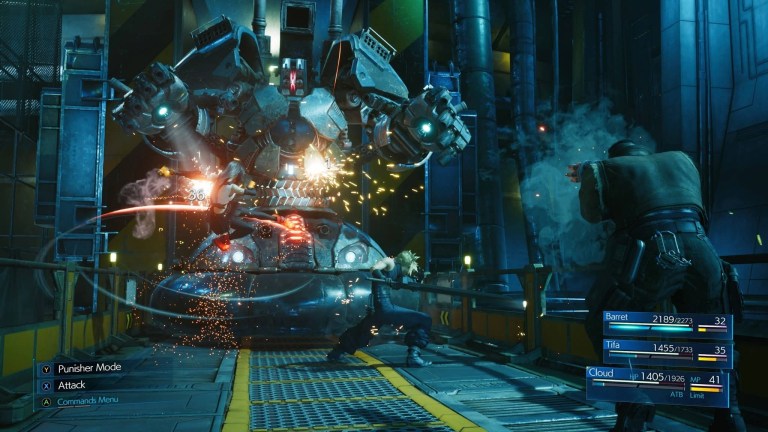
Battles in the game are often fast, intense and filled with visual spectacle.
The road to the big budget remake was a long one and it eventually Final Fantasy VII Remake was released as an exclusive game on PlayStation 4 in 2020. A year later, the upgraded version called Final Fantasy VII Remake Intergrade was released on PlayStation 5.
Xbox gamers who purchase Final Fantasy VII Remake Intergrade can expect the following: Quests, mini-games, and missions set in expanded areas of Midgar. There are also some new characters and content that adds even more depth to the story.
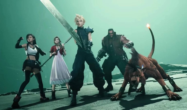
The main cast in Final Fantasy VII Remake Intergrade.
Welcome back fellow geeks, Blu-ray collectors and movie buffs!
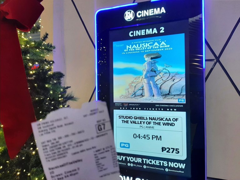
I finally did it! After having seen it many times on home video, cable TV, local TV and DVD, I finally viewed Nausicaä of the Valley of the Wind inside the local cinema here in the Philippines. I saw it on September 17 at SM Cinema inside SM Southmall in Las Piñas City. This was also the first time in two years since I last saw any movie inside the cinema (I last saw Sound of Freedom).
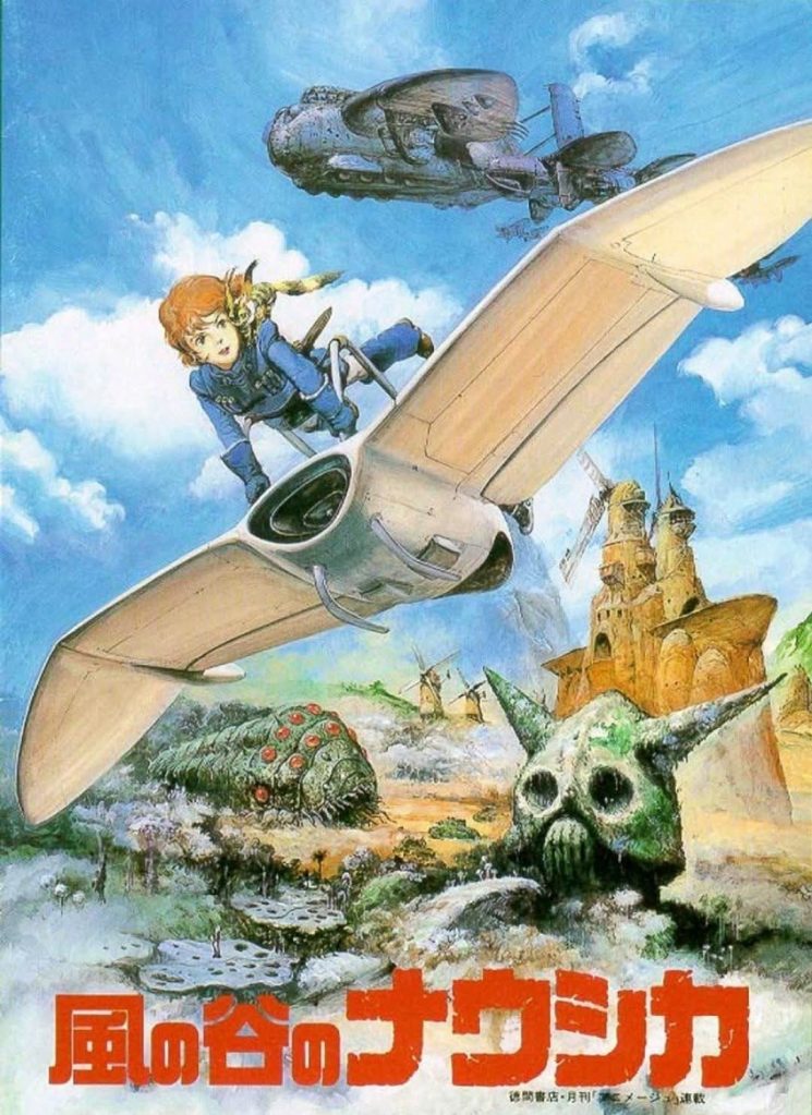
An old movie poster of Nausicaä Of The Valley Of The Wind.
For the newcomers reading this, Nausicaä Of The Valley Of The Wind was part of the Studio Ghibli Fest 2025 which was exclusive to SM Cinema (the largest cinema chain in the country). While the said fest ended on September 16, there were still screenings of Studio Ghibli anime feature films shown in SM Cinema branches from September 17 to 23.
I paid P275 (US$4.72 according to the foreign exchange as of this writing) for my SM Cinema ticket and it includes a free drink. I entered the cinema carrying my ticket, drink and popcorn feeling excited and nostalgic to see Nausicaä Of The Valley Of The Wind on the big screen for the first time ever. What was shown was the English-subtitled version with Japanese voiceovers (Sumi Shimamoto as Nausicaä, Gorô Naya as Yupa, Yoshiko Sakakibara as Kushana, Yôji Matsuda as Asbel, and more)
We were only seven people inside the cinema and there were lots of vacant seats beside, behind and in front of me. I was sitting very comfortably waiting for the screening to begin. At the same time, nobody had a noisy smartphone during the screening. As for me, I deliberately turned my smartphone off to ensure no communication-related distractions would happen.
Eventually Nausicaä Of The Valley Of The Wind finally started playing on the big screen. After the short animated opening scene, the music by Joe Hisaishi started playing as the opening credits went on. At that moment, I was immersed into Hayao Miyazaki’s anime classic immediately and I knew I made the right decision to see it inside the theater.
As the film went on, I adjusted myself to reading the subtitles while maintaining focus on the plot as well as the development of characters. Visually, the film turned out to be really spectacular on the big screen even though it had no computer-generated images at all (note: it is purely hand-drawn animation that was done with so much hard work by Miyazaki and the animators). With the higher resolution on the big screen, I saw a lot more tiny visual details here and there and the facial expressions of the characters became more lively than before. Very clearly, Nausicaä Of The Valley Of The Wind is meant to be seen in the movie theater.
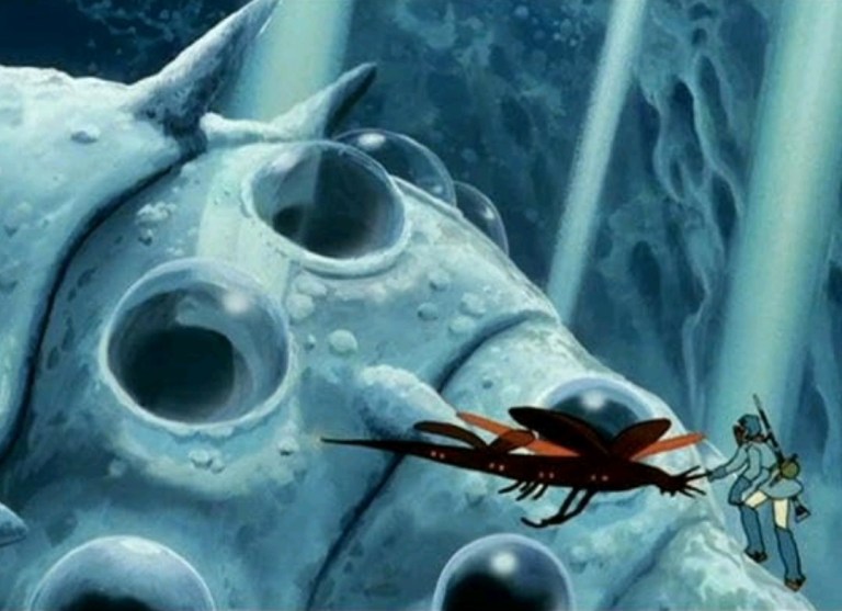
The sense of visual scale in scenes like this one is best viewed on the big screen in the movie theater. (photo source – IMDB.com)
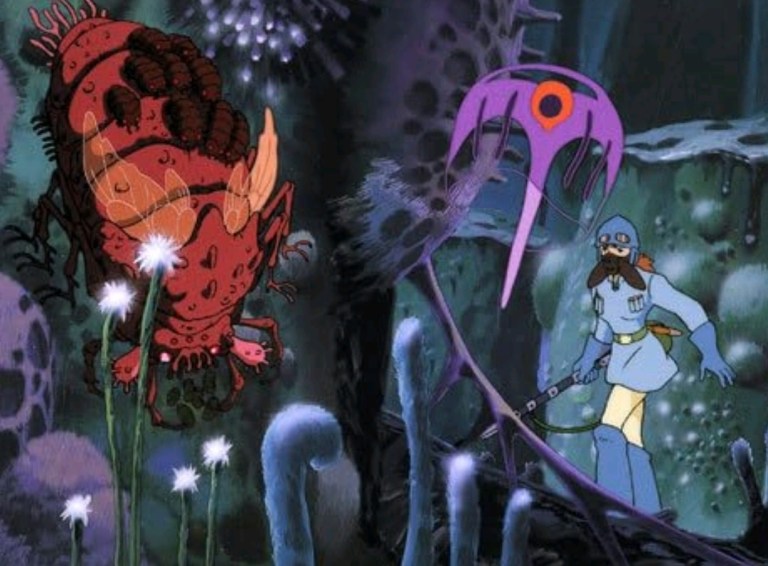
There is nothing like exploring a very polluted forest filled with huge, mutated insects. (photo source – IMDB.com)
After about two hours – the end credits includes animated scenes showing what happened after the climax – of watching, I left the cinema feeling very satisfied and entertained even though I saw Miyazaki’s 1984 masterpiece many times over the decades. The fact that the English-subtitled version was shown gave me an idea of what Japanese moviegoers saw inside their cinemas in 1984, and I can say that the Japanese voiceovers were engaging to listen to. The big screen experience alone made watching Nausicaä Of The Valley Of The Wind worth it.
That being said, I want to express out loud to local movie theater operators reading this to consider showing more of the classic anime feature films as well as classic motion pictures during film festivals or special theatrical events. Personally, I want to see Casablanca, Macross: Do You Remember Love?, Metropolis (2001), Tron, Total Recall (1990) and Akira in the local cinemas.
I am very glad to have seen the 1984 classic anime movie inside the movie theater.
Going back to Nausicaä Of The Valley Of The Wind, I am very glad to have seen inside the cinema and if ever your local cinema will have it screened, I encourage you to go for it. There is absolutely no way that that the screens of your smartphone, your tablet, your PC monitor and your high-definition TV could match the grand visuals of Miyazaki’s film on the cinema’s big screen. Truly the cinema is better than streaming.
If you wish to join a group of movie enthusiasts and talk about cinema, cinematic trends, Blu-ray releases and more relevant stuff, visit the Movie Fans Worldwide Facebook group at https://www.facebook.com/groups/322857711779576
For more South Metro Manila community news and developments, come back here soon. Also say NO to fake news, NO to irresponsible journalism, NO to misinformation, NO to plagiarists, NO to reckless publishers and NO to sinister propaganda when it comes to news and developments. For South Metro Manila community developments, member engagement, commerce and other relevant updates, join the growing South Metro Manila Facebook group at https://www.facebook.com/groups/342183059992673
For the first time ever, I saw Nausicaä of the Valley of the Wind inside the cinema at SM Southmall in Las Piñas City, and I can say it was an immersive experience to replay Hayao Miyazaki’s classic. To make things clear, I saw Nausicaä of the Valley of the Wind a number of times since the mid-1980s starting with the bad English version Warriors of the Wind. I eventually saw the anime feature film in its uncut form on DVD (with the new English dub from Disney).
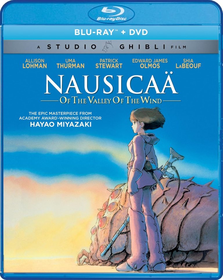
This leads me to my next point… Nausicaä of the Valley of the Wind was released three times on Blu-ray disc format over the past several years. The first was from Disney in 2011. Six years later, a 2nd Blu-ray release came from Shout! Factory which had a newer scan of the film and improved picture quality over the Disney Blu-ray.
The 2017 Blu-ray of Nausicaä of the Valley of the Wind from Shout! Factory.
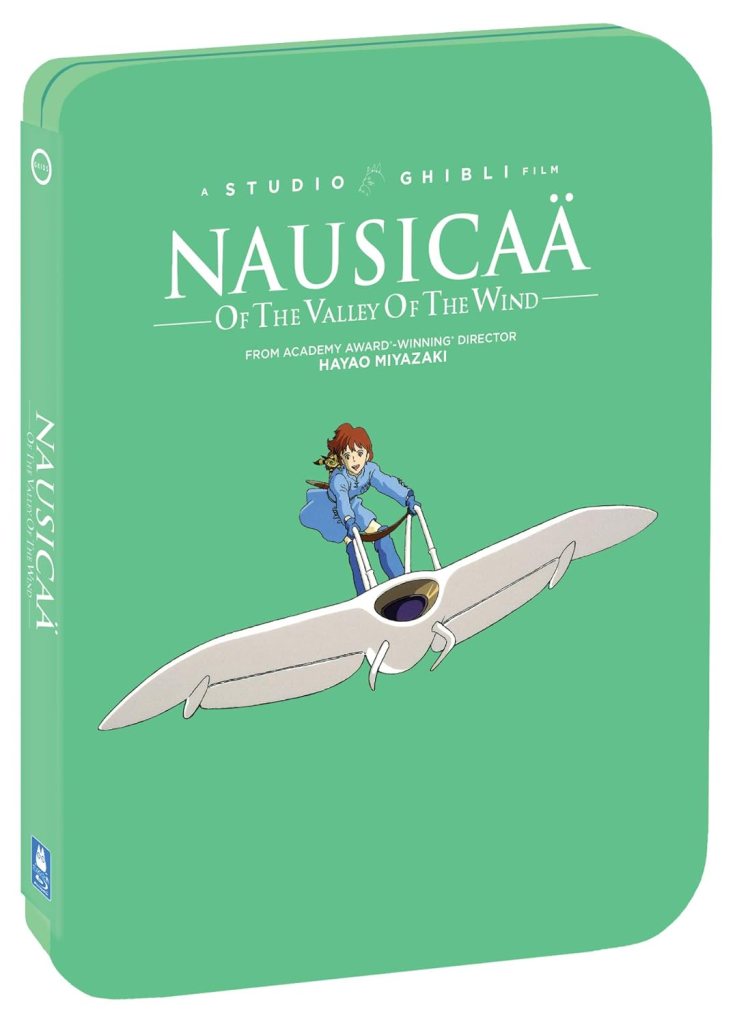
In 2020, Shout! Factory released Nausicaä of the Valley of the Wind in Steelbook (Blu-ray.com describes the picture quality as follows: “Nausicaä of the Valley of the Wind has received a top-notch video-presentation with a high bit-rate encode from Gkids. The encode is of a new remaster of the film. This is a much better video-presentation than that of the original Disney Blu-ray released in North America. Colors are significantly better and more accurate to the original animation cells.”)
As the Steelbook Blu-ray of Nausicaä of the Valley of the Wind is the most recent release, posted below for your reference are the technical details from its Blu-ray.com page.
Video
Codec: MPEG-4 AVC (35.00 Mbps)
Resolution: 1080p
Aspect ratio: 1.85:1
Original aspect ratio: 1.85:1
Audio
English: DTS-HD Master Audio 2.0 (48kHz, 24-bit)
Japanese: DTS-HD Master Audio 2.0 (48kHz, 24-bit)
French: Dolby Digital 2.0
Note: French track is (192kbps)
Subtitles – English, English SDH, French,
Discs –Blu-ray Disc, Two-disc set (1 BD-50, 1 DVD)
Packaging – SteelBook, Inner print, booklet
Playback – 2K Blu-ray: Region A
What caught my attention is the fact that – as of this writing – the 2020 Steelbook Blu-ray of Nausicaä of the Valley of the Wind is only a few Dollars higher than that of the 2017 Blu-ray. As a Blu-ray movie collector, I see a really good deal with the Steelbook Blu-ray at its current price. Both the 2017 and 2020 Blu-ray versions of the classic anime feature film carry a booklet. There is a choice that both Studio Ghibli fans and casual anime fans can take advantage here.
This is what the 2020 Steelbook Blu-ray of Nausicaä of the Valley of the Wind looks like.
At this stage, I can only wonder if Studio Ghibli has plans to produce and release a 4K Blu-ray ofNausicaä of the Valley of the Wind someday. Perhaps if more than enough fans and 4K Blu-ray collectors would get together to express their demand for it, Hayao Miyazaki and his studio would be aware.
If you have decided to buy the 2017 Blu-ray of Nausicaä of the Valley of the Wind, click here. If you want the 2020 Steelbook Blu-ray version, click here.
If you wish to join a group of movie enthusiasts and talk about cinema, cinematic trends, Blu-ray releases and more relevant stuff, visit the Movie Fans Worldwide Facebook group at https://www.facebook.com/groups/322857711779576
Disclaimer: This is my original work with details sourced from reading the comic book and doing personal research. Anyone who wants to use this article, in part or in whole, needs to secure first my permission and agree to cite me as the source and author. Let it be known that any unauthorized use of this article will constrain the author to pursue the remedies under R.A. No. 8293, the Revised Penal Code, and/or all applicable legal actions under the laws of the Philippines.
Welcome back superhero enthusiasts, 1980s arts and culture enthusiasts, Marvel Comics fans and comic book collectors! Today we go back to the year 1982 to examine alternate stories of the Marvel Comics shared universe chronicled through the original What If monthly series.
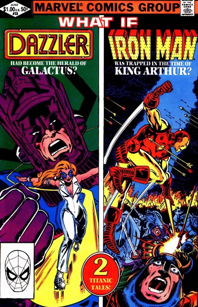
Back in the early 1980s, Dazzler quickly became popular among comic book readers and a standalone monthly series was launched no so long after her debut in Uncanny X-Men #130. Earl on in her monthly series, Dazzler eventually encountered Galactus (the classic nemesis of the Fantastic Four) in a wild tale involving the galaxy. On the other hand, Marvel Comics published a wild tale of the conflict of Iron Man and Dr. Doom (also the nemesis of the Fantastic Four) involving time travel and the presence of King Arthur in Iron Man #150. Eventually, Marvel decided to make alternate tales of the mentioned stories of Dazzler and Iron Man and publish them through an issue of What If.
With those details laid down, here is a look back at What If #33, published in 1982 by Marvel Comics with a Dazzler story written by Dan Fingeroth and drawn by Mike Vosburg, and the Iron Man story written by Steven Grant and drawn by Don Perlin.
The cover.
Early story
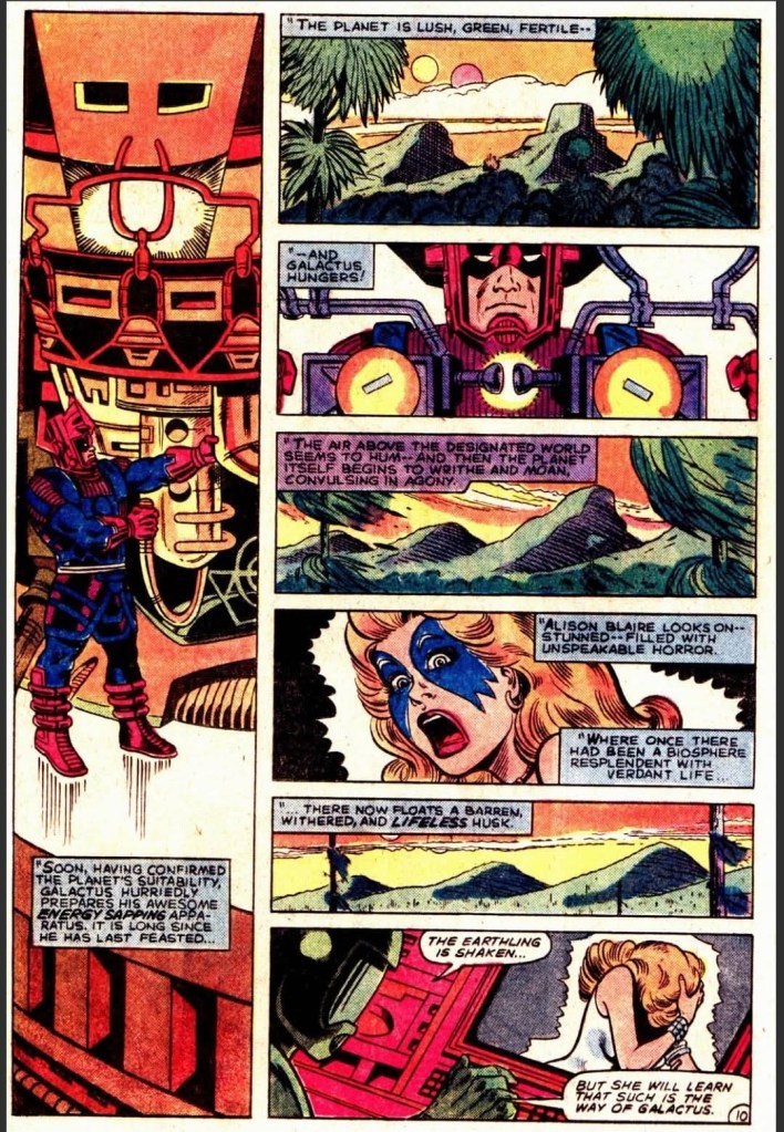
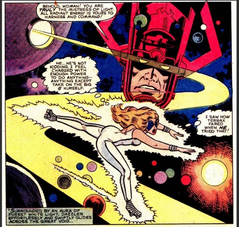
What if Dazzler had become the herald of Galactus? – The story begins with Dazzler standing in the presence of Galactus, Terrax and Drone R-II. After Galactus renders his judgment on Terrax by banishing him to the depths of a black hole, he tells Dazzler she has proven herself worthy to become his new herald. As Drone R-II reminded his superior of the fact that previous heralds were forced to leave service due to their own moral codes and added that Dazzler will do the same, she questions them and stated that she does not belong in deep space and wants to go home. Galactus tells her that Earth is a planet he has sworn to devour and by becoming his herald, he will perhaps spare her home world. Dazzler finds herself cornered and reluctantly joins Galactus as his new herald. Immediately, Galactus sends her out to deep space for her first task…
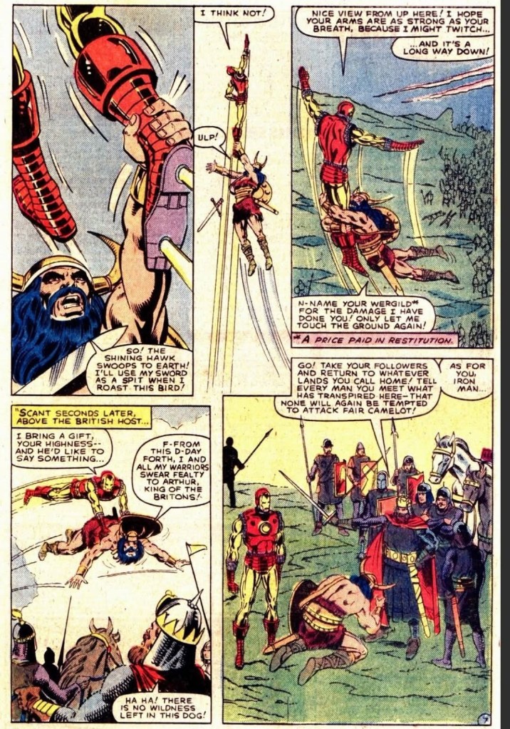
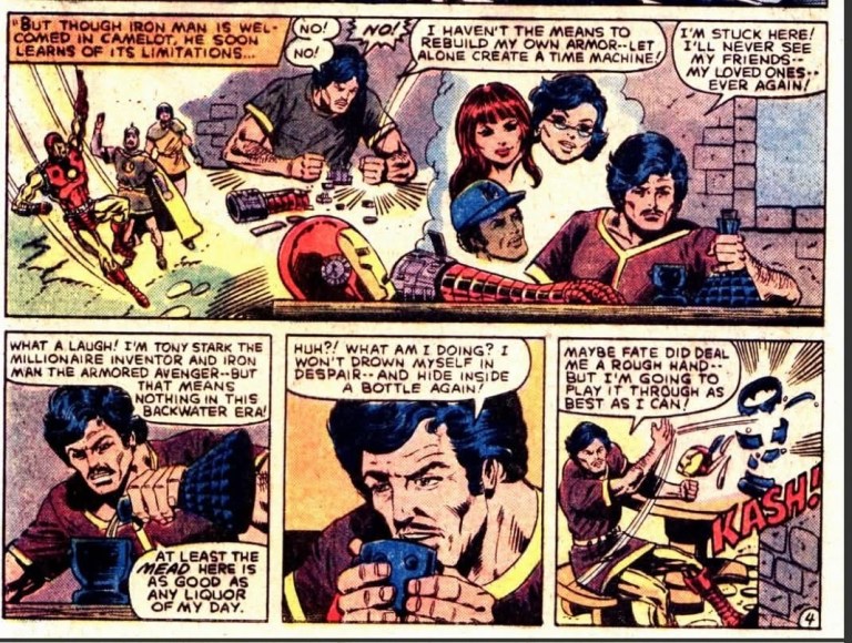
What if Iron Man had been trapped in King Arthur’s time? – The story begins in the past wherein Doctor Doom and Iron Man found themselves during the time of King Arthur. After separating themselves by taking different sides – Iron Man with King Arthur and Doom with Morgana LeFay – they decide to set their differences aside for the common goal of creating a crude time machine to return to the future. Instead, Doom takes advantage of the time machine by shocking Iron Man and leaving him behind in the past. With Doom back in the future, Iron Man struggles moving on the ground only to encounter Morgana LeFay. Believing that there is no pleasure in breaking a helpless man, Morgana spares Iron Man and tells him to return to King Arthur with her pledge…
Quality
After doing advanced work, Dazzler can only watch and witness the loss of life as her master Galactus consumes the planet.
I can start with the good news for you all…the two featured stories in this What If comic book are great to read from start to finish!
With the Dazzler tale, I enjoyed how Danny Fingeroth told the alternate reality story of the dazzling heroine becoming Galactus’ herald and working immediately to serve him. Not only does Dazzler carried tremendous powers she did not have before, she was able to quickly travel through deep space and visit planets that are suitable for her master’s consumption. Even as she wielded tremendous power, Dazzler still retains her conscience and does some analyzing of situations.
Of course, she still retained her human nature throughout and there are moments when she felt defeated or shocked which alone made her a questionable herald. Galactus himself is pretty much in character in this tale and it is very engaging to see how his actions impact not only the beings of the cosmic realm of the Marvel universe but also on Dazzler herself. Without spoiling the plot, I can say the ending is captivating and truly is worth the build-up.
The stranded Iron Man makes an impact on a battle favoring King Arthur.
Regarding the Iron Man tale, the creative team came up with the concept of having the armored superhero actually stranded in time (left behind by Doctor Doom) and getting burdened by many factors. With Doom gone early in the plot, this effectively made Iron Man the main focus and his involvement in the conflict between King Arthur and Morgana really raised the stakes.
Not only does Iron Man have to deal with conflicts, he also became vulnerable as the era of King Arthur had very low forms of technology which made the superhero’s desire to return to the future an effort against the impossible. As the story went on, Iron Man makes impact on the conflicts between the forces of King Arthur and Morgana and the good news here is that the creative duo of Steve Grant and Don Perlin made it all believable and serious to follow.
Conclusion
Dazzler the new herald of Galactus.
Tony Stark struggles initially with being stranded in the past.
I can say that What If #33 (1982) is a great read! The respective tales of Dazzler and Iron Man are captivating, intriguing and enjoyable to read. The creative teams of each story succeeded in building up their respective concepts, moved the established superhero to daring creative directions, and delivered powerful conclusions. This issue of the old What If series has to read as it is a true escape from reality!
Overall, What If #33 (1982) is highly recommended!
Disclaimer: This is my original work with details sourced from reading the comic book, watching the 1996 movie and doing personal research. Anyone who wants to use this article, in part or in whole, needs to secure first my permission and agree to cite me as the source and author. Let it be known that any unauthorized use of this article will constrain the author to pursue the remedies under R.A. No. 8293, the Revised Penal Code, and/or all applicable legal actions under the laws of the Philippines.
Welcome back science fiction enthusiasts, 1990s arts and culture enthusiasts, Marvel Comics fans and comic book collectors! Today we go back to the year 1996 to take a close look at one of the licensed comic books Marvel Comics published which was part of the release of the movie Independence Day (also referred to as ID4).
Back in 1996, there was a considerable amount of hype and anticipation for Independence Day’s release in cinemas not just in America but also in other parts of the world. Following the success they achieved together in Stargate (1994), producer Dean Devlin and director Roland Emmerich teamed up again to make Independence Day which was back then the most modern cinematic portrayal of aliens invading Earth causing the people to fight back. The film creatively was also a disaster movie of its own backed with science fiction concepts and the latest special effects of the era. Independence Day went on to gross almost $820 million worldwide and I myself saw it in a fully packed cinema here in the Philippines.
As I saw the movie, I noticed details about events that took place sometime in the past and they were presented not as flashbacks but only as spoken words. There is that verbal reference about Jeff Goldblum’s character punching Bill Pullman’s character some time before the latter became US President. There are also spoken words about Randy Quaid’s character being previously abducted by aliens. As part of the marketing and publicity of the movie, Marvel Comics was licensed to publish not only a 2-part comic book adaptation but also a prequel comic book.
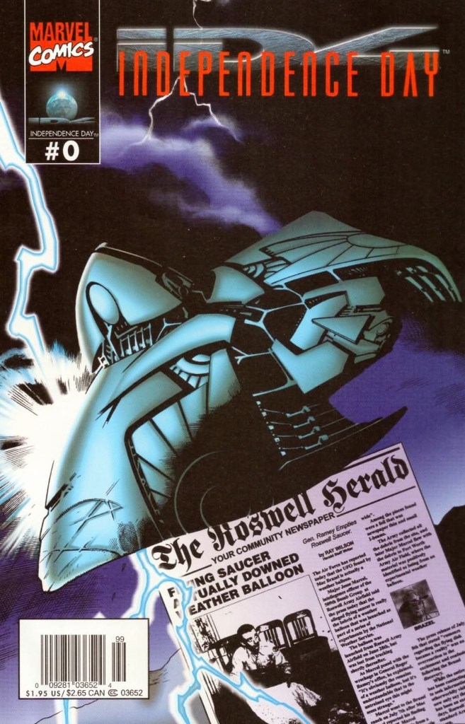
With those details laid down, here is a look back at Independence Day #0, published in 1996 by Marvel Comics with a story written by Phil Crain (based on ideas by Dean Devlin and Roland Emmerih) and drawn by Terry Pallot, Steve Erwin, Rod Whigham and Gabriel Gecko.
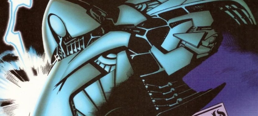
The cover.
Early story
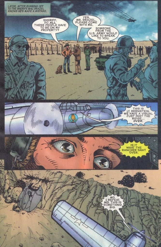
The story begins on July 4, 1947 in Roswell, New Mexico. A thunderstorm took place in the evening compelling residents to stay inside their respective homes. As the storm went on, an unidentified flying object (UFO) of alien origin got struck by thunder causing it to crash on the field of someone’s property with a huge impact that disturbed local residents. The alien ship opens and one of its passengers (alien) ventures out into the stormy night. Injured and still in shock, the passenger slowly moves away from the ship.
The next evening, the property owner arrives and finds several pieces of debris of the crashed ship scattered on the field. He notices the metal are lighter than anything he touched, and he could see the writings were not man-made. The property owner informed the local sheriff of what he found which led to the American army sending troops to the field. The American military plane flies over them and finds the crashed alien ship.
Quality
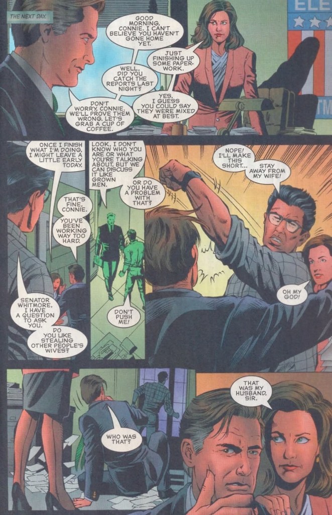
When Whitmore was still a US Senator and candidate for US President, he got punched by David Levinson who thought that he was having an affair with his wife Constance “Connie” Spano. This later led to the “You punched the President,” line in the movie.
As described above, this prequel comic book visually dramatizes the past events that were only mentioned in the movie particularly with regards to the Roswell UFO incident as well as Area 51 and how the government handled findings about aliens from outer space. In fact, the story here was scripted to move from one significant event to the next through the decades, and the good news here is that the exposition is not too heavy (when compared to Jurassic Park comic books of 1993) and the pacing moved at a medium pace. The result is a reading experience that is intriguing and entertaining.
The creators really went all in with their fictional portrayal of the movie’s aliens being involved in Roswell and Area 51, and the notable thing is that they really took the presentation seriously. It’s as if they were trying to tell a factual story which smoothly connects with the movie.
When it comes to the characters from the movie, you will find them in this comic book depending on the stage of the narrative and the time setting. While the characters of Pullman, Goldblum, Robert Loggia, Will Smith, Brent Spiner, James Rebhorn, Viveca A. Fox and Margaret Colin are dramatized in the 1990s scenes, you will see the younger versions of a few of them set in the 1960s scenes. The abduction scene of Randy Quaid’s character is set in the 1980s.
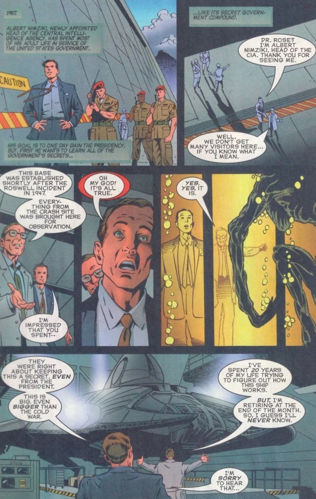
The Area 51 scene set in the 1960s.
As for the script written by Phil Crain, the narrative of this comic book surprisingly has a more serious and dramatic tone when compared to what was expressed in the movie. There were even a few horror elements and no comedic stuff at all. Again, this should not be surprising because this comic book was meant to dramatize past events to not only connect with the movie’s core concept but also show why certain characters acted the way they did in the film.
As this comic book involved multiple artists, it should not be a surprise that the result is of varying quality from one scene to another. In fairness, the illustrator (or illustrators) who drew the Area 51 scenes and the crashed alien ship did a good job with the details. As for the characters, pilot Steven Hiller resembled Will Smith enough, and the same can be said about Thomas Whitmore somewhat looking like Bill Pullman, David Levinson looking somewhat like Jeff Goldblum, and General Grey slightly looking like Robert Loggia. Meanwhile, Constance Pano resembled Margaret Colin more while the 1990s Dr. Okun resembled Brent Spiner in a few shots.
Conclusion
The creators went all-in to make the 1947 Roswell UFO incident a history of Independence Day.
To get straight to the point, Independence Day #0 (1996) succeeded with its main objective of establishing visually the past and emphasizing developments connecting with the blockbuster movie of 1996. It was made with a strong appeal to fans of Independence Day as well as people who simply are fond of UFOs and conspiracy theories regarding Roswell and Area 51. People who are not too interested in the movie and UFOs might not be impressed with this comic book. In my view, this prequel comic book has good enough qualities that make it worth reading and its serious narrative is both surprising and enjoyable. Ultimately, it is a worthy companion piece to the movie.
Overall, Independence Day #0 (1996)is recommended.
Disclaimer: This is my original work with details sourced from reading the comic book and doing personal research. Anyone who wants to use this article, in part or in whole, needs to secure first my permission and agree to cite me as the source and author. Let it be known that any unauthorized use of this article will constrain the author to pursue the remedies under R.A. No. 8293, the Revised Penal Code, and/or all applicable legal actions under the laws of the Philippines.
Welcome back superhero enthusiasts, 1990s arts and culture enthusiasts, Marvel Comics fans and comic book collectors! Today we go back to the year 1996 and explore a part of Marvel Comics’ universe through the reimagined tales emphasized in the What If monthly series.
Back in 1993 – the year that Marvel Comics celebrated the 30th anniversary of the X-Men – the definitive rival of the X-Men, Magneto, made a major comeback and he was so resourceful as a threat to everyone. With the massive space station Avalon as his lair, Magneto sent out Exodus to lure mutants to join him. As time passed, Magneto’s own force grew and arrogantly disrupted the funeral of Illyana Rasputin in the presence of the X-Men, X-Force, Excalibur and X-Factor (as told in Uncanny X-Men #304). As the conflict went on, Colossus betrayed the X-Men to join Magneto.
Can you just imagine what would it be like had Magneto became the ruler of mutants?
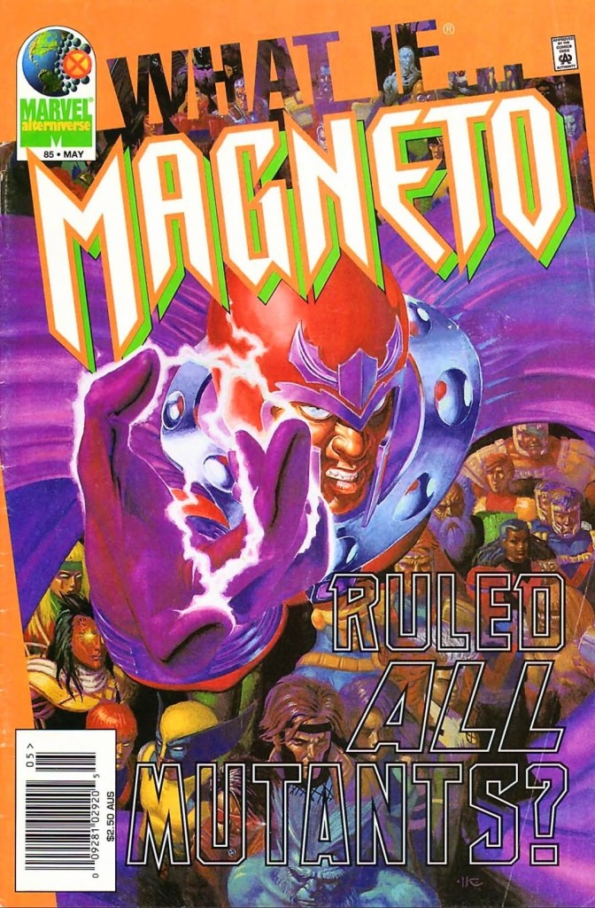
With those details laid down, here is a look back at What If #85, published in 1996 by Marvel Comics with a story written by David Michelinie and drawn by Arnie Jorgensen.
The cover.
Early story
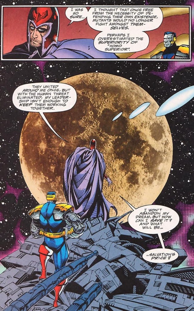
The story begins inside Avalon with Magneto and Colossus watching recorded footage of Charles Xavier announcing his decision to stop opposing the ascension of Avalon. It turns out, Xavier’s decision paved the way for mutants to relocate to Avalon (orbiting Earth) in return for assurance that those who remain in it will do so unmolested. With the intention to let Avalon’s residents achieve their full and glorious potential, Magneto allowed the mutants to rule themselves without any dictatorship by him.
Through the years, division between Avalon’s mutants – Acolytes who believe in isolation and the Acolytes who believe in annihilation – intensified and proved that the spirit of mutant unity has faded away. As violence between the mutants went on, the number of explosions inside Avalon kept increasing…
Quality
A magnificent view for Magneto, Colossus and the readers.
What I like most about this What If tale is its core concept exploring what would have happened had Magneto ruled the mutants specifically those living in his own realm (Avalon). Writer David Michelinie (best known for writing Amazing Spider-Man stories) wrote a really inspired script that emphasized Magneto’s vision of mutant utopia isolated from the twisted and complicated societies of Earth (which still has lots of people who are afraid of and hostile towards mutants) while leaving room for conflict in the form of ideological division between mutants on Avalon. As the growing division and violence are shattering Magneto’s vision of mutant utopia, the birth of an infant whose presence adds to the tension and fear of Avalon’s inhabitants.
The good news here is that Michelinie’s script is pretty solid and Arnie Jorgensen did a good enough job visualizing it all. The characters, mainly Magneto, Colossus and Beast, were portrayed clearly in character and to see the master of magnetism struggling with maintaining order on Avalon is a nice portrayal of his human side which makes him have a lot more in common with his opposite Professor X when it comes mutant matters. Considering Magneto’s long history of intense evil and obsession with leading humanity, his portrayal of insecurity, doubt and weakness is very believable to read.
Colossus, whose betrayal of the X-Men in Uncanny X-Men #304 remains unforgettable, is the loyal and sensible servant of Magneto. Beast, meanwhile, remains the very bright and insightful mutant scientist as he has always been which makes Michelinie’s writing really impressive.
Also at the heart of the story is mutant order. Apart from the division between Avalon mutants who want full separation from humanity and those who want to conquer Earth by eliminating all human beings, the very fabric of mutant society got shaken all because of an infant who was born there on Avalon (Avalon’s first natural birth ever). I like the way this sub-plot added tension to the mutant division because it is, in some ways, socially relevant to this day. It will remind you that certain groups of people out there who would go as far as committing murder only because they are so obsessed with their foolish, worldly beliefs. Look at the Palestinian terrorists, the Iranian terrorists and the woke mobs in many parts of the world.
Conclusion
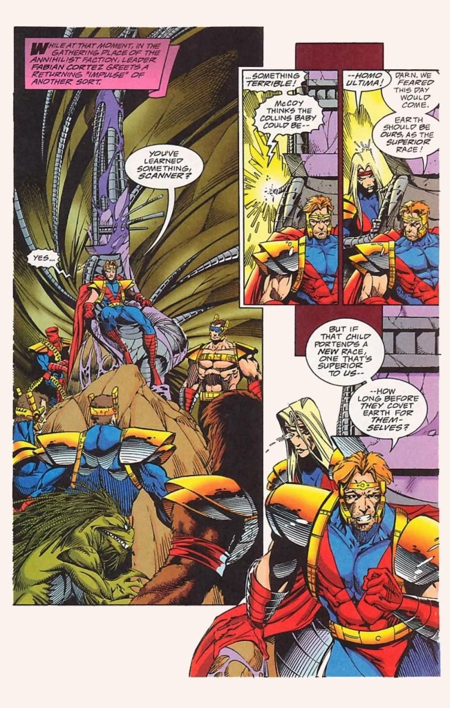
Remember Fabian Cortez and the Acolytes?
With a very solid script filled with intrigue, social relevance and portrayals, What If #85 (1996) is a pretty engaging read. As it is strongly focused on Magneto and his mutants on Avalon, this comic book gives readers a fine dramatization of its core concept as well as developments on what would have happened had mutant utopia been realized far away from human society. I should state that for every build-up in the story, the payoff is fortunately solid. Consider this comic book a dramatic portrayal of mutants of Magneto without the involvement of the X-Men.
Disclaimer: This is my original work with details sourced from reading the comic book and doing personal research. Anyone who wants to use this article, in part or in whole, needs to secure first my permission and agree to cite me as the source and author. Let it be known that any unauthorized use of this article will constrain the author to pursue the remedies under R.A. No. 8293, the Revised Penal Code, and/or all applicable legal actions under the laws of the Philippines.
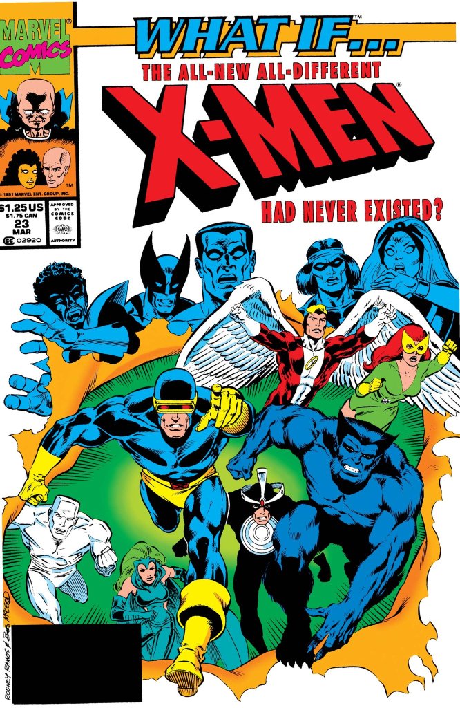
Welcome back superhero enthusiasts, 1990s arts and culture enthusiasts, Marvel Comics fans and comic book collectors! Today we go back to the year 1991 and explore a part of Marvel Comics’ universe through the reimagined tales emphasized in the What If monthly series.
If you are not aware of the extensive literary history of the X-Men, the mutant franchise of Marvel Comics had its turning point in the mid-1970s with the release of the 68-page Giant-Size X-Men #1 which introduced a newer lineup of mutants (Wolverine, Cyclops, Nightcrawler, Thunderbird and Storm). It has been argued that Giant-Size X-Men #1 marked the starting point of the bronze age of comics in America and creatively it sparked a new chain of X-Men stories that captivated the fans and attracted new readers.
But what would have happened had the newer lineup of the X-Men did not even exist?
With those details laid down, here is a look back at What If #23, published in 1991 by Marvel Comics with a story written by Kurt Busiek and drawn by Rodney Ramos.
The cover.
Early story
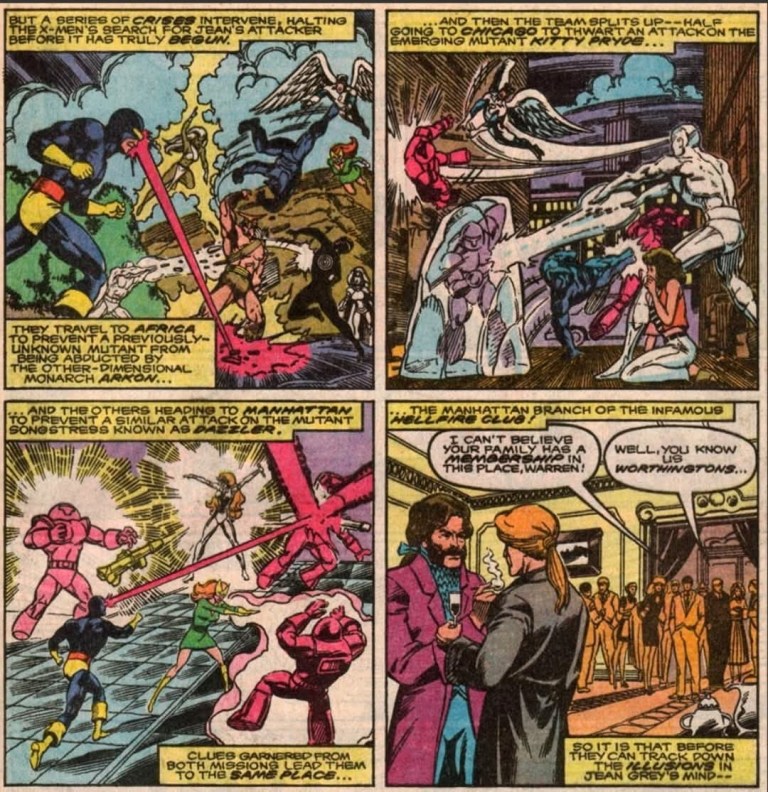
The story begins when the original X-Men (Cyclops, Jean Grey, Angel, Beast and Iceman) members, Havok and Polaris arrive on the island of Krakoa. A huge green monster suddenly appears and attacks them. Guided by Professor X’s mind, Marvel Girl/Jean Grey helps Polaris by overriding the mental blocks that prevented her from using her full magnetic might. With a lot more power in her, Polaris takes action and helps the X-Men not only overwhelm the monster but also hurled the entire island of Krakoa into space.
As the X-Men were never captured by Krakoa, there was no reason to recruit a new team. The X-Men returned home and proceeded with other matters. On the other hand, Charles Xavier experiences a series of intense nightmares of conflict in outer space. As the nightmares took its toll on him, Professor X decides to take a vacation. Before he could leave, the X-Men are suddenly attacked by Eric the Red, Proudstar and Nightcrawler…
Quality
Without the existence of the 2nd X-Men team (from Giant-Size X-Men #1), the original X-Men’s first encounters with Dazzler, Kitty Pryde and the Hellfire Club turned out totally different.
This What If tale exploring an alternate chain of events involving only the original X-Men is not only a daring piece of work by the creators but it is also highly ambitious as seen through the scope of the plot. I’m not just talking about the non-existence of the 2nd X-Men lineup of Giant-Size X-Men #1 but also alternate realities of real X-Men developments such as the encounter with the Phoenix, Lilandra and Professor X’s first encounter, the X-Men’s encounter with the Hellfire Club, and more. Truly, the alterations were executed and the consequences were quite intense.
By focusing on the concept of the original X-Men proceeding as the 2nd X-Men team did not materialize, the Busiek-Ramos team really went all-in exploring the different possibilities and most of them were intriguing and entertaining to follow. The reading experience can be jarring because of the sudden change of scope that happens when the narrative suddenly shifted from one plot development (of local conflict) to another (a conflict on a galactic scale). Indeed, the narrative can be challenging to follow and to really enjoy it, you should pay strong attention to the details as you read on.
When it comes to character development, there is very little to find here which is not surprising given the way the script was written and also because the spotlight had to be shared by so many characters. Still, I enjoyed the character moments between Cyclops and Jean Grey, particularly during important points in the 2nd half of the story.
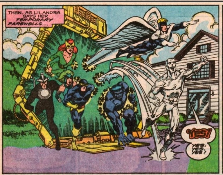
If there were any weak spots in the presentation, it is the fact that a lot of exposition had to be done and there were certain parts of the narrative that felt crammed with an excessive amount of details. Not only that, there is also an excessive amount of characters that go beyond the X-Men such as Lilandra of the Shi’ar Empire, the Starjammers, Alpha Flight, the Avengers and other beings of science fiction mixed in which make following the narrative challenging at certain points.
Conclusion
The original X-Men team plus Polaris and Havok.
What If #23 (1991) has more than enough advantages that outweigh the disadvantages. It’s story is very intriguing and enjoyable to read even though there were some bumpy parts on the narrative. Still, it is great to see what would have happened had the newer X-Men team never materialized and this comic book’s ending is very impactful to see.
Welcome back my readers, YouTube viewers and all others who followed this series of articles focused on YouTube videos worth watching. Have you been searching for something fun or interesting to watch on YouTube? Do you feel bored right now and you crave for something to see on the world’s most popular online video destination?
I recommend you check out the following videos I found.
#1 Retrospective videos of Krull – I was a young boy when I saw Krull inside the cinema way back in 1983. It was an entertaining experience for me as the movie had a clever mix of fantasy, science fiction and even horror in its presentation. As many years passed by, I replayed Krull as an adult on cable TV and DVD, and it still remained entertaining. For those of you who intend to learn more about (or rediscover) Krull, I posted below some videos for your enjoyment. If you have not seen Krull yet, watch the movie entirely first.
#2 The George Foreman Grill remembered – The late George Foreman will be remembered for a long time. He made an impact on the world in professional boxing during his younger days and made a tremendous comeback by becoming the oldest heavyweight champion at age 45. Along the way, he became a preacher of God’s Word, led a local church and managed a youth center. Along the way, the late Foreman found tremendous success by endorsing a product that became the George Foreman Grill. To find out more about the Foreman and the popular grill, watch the video below.
#3 France’s President humiliated – With the way he is leading France as its President and the way he is helping Palestinian terrorists by antagonizing Israel, Emmanuel Macron is on the wrong side of history. He was back in the media spotlight as he got slapped by his wife recently. Watch and learn from the videos below.
#4 Ashleigh Burton reacts to Casper – It has been a little over thirty years since the live-action movie Casper was released in cinemas. As a young boy, I read some Casper comic books and saw some episodes of the cartoon shows on TV but I never was a fan of the character. I did not see the Casper film until it started showing on cable TV. Casper of 1995 does not interest me much but you should see how it draws reactions from Ashleigh Burton in the video below.
#5 PatmanQC examines Cruis’n USA –Cruis’n USA is one of those hit arcade games from the 1990s that I never got to play in Iocal arcades. Most of the time, I received information of Cruis’n USA primarily due to its port for Nintendo 64 (N64) being heavily reported by video game journalists back then. While the original arcade game was successful with both players and game critics, the same cannot be said about the N64 port. To find out more, watch PatmanQC’s in-depth video below.
#6 Ramnexus examines Oblivion Remastered – It’s been over a month since Oblivion Remastered (full title: The Elder Scrolls IV: Oblivion – Remastered) was released, and I still have not played it on my Xbox Series X. While it is popular with gamers, I still was not convinced to return to subscribing to Xbox Game Pass (XGP) for it. The original Oblivion of 2006 is one of my favorite RPGs of the 21st century and I just might consider playing its remastered version someday. For now, I am just watching YouTube videos of the remastered game and I found a recent video by Ramnexus that turns out to be an engaging look at it. Watch Ramnexus’ video below.
Welcome back readers, fellow geeks and electronic gaming fans!
In this edition of the Retro Gaming Ads Blast (RGAB) series, we will take a look at another batch of retro gaming print ads – including arcade flyers – from the 1980s and 1990s.
For the newcomers reading this, Retro Gaming Ads Blast (RGAB) looks back at the many print ads of games (console, arcade, computer and handheld) that were published in comic books, magazines, flyers, posters and newspapers long before smartphones, social media, the worldwide web and streaming became popular. To put things in perspective, people back in the 1980s and 1990s were more trusting of print media for information and images about electronic games and related products.
With those details laid down, here is the newest batch of retro gaming print ads for you to see and enjoy…
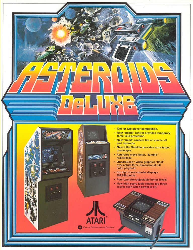
1. Asteroids Deluxe arcade flyer
The arcade flyer for North America.
Given the fact that Asteroids was a massive hit for Atari in the arcades, it was not surprising that a sequel was made called Asteroids Deluxe. In preparation for its 1981 release, Atari made this Asteroids Deluxe arcade flyer showing three machine that arcade operators can choose from complete with technical details displayed. They even emphasized the QuadraScan video graphics as a technological advancement with regards to graphics. By today’s standards, this arcade flyer is still sensible with regards to promoting the game to both arcade operators and players.
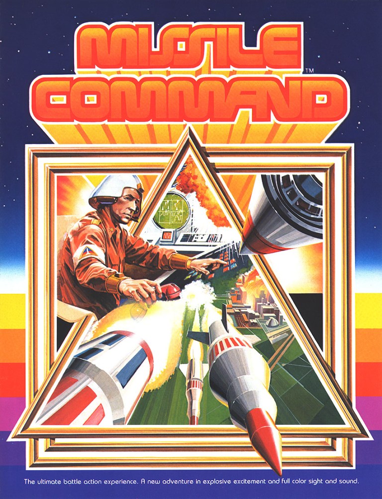
2. Missile Command arcade flyer
Engaging art work on display at the front of the arcade flyer.
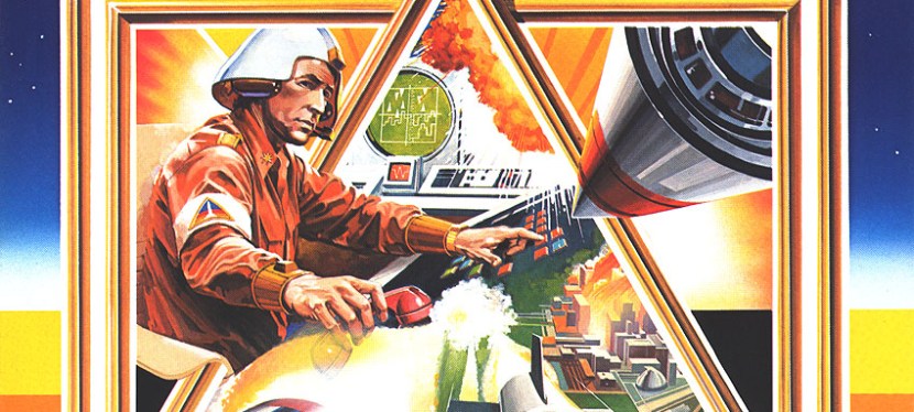
Released in the arcades in 1980, Missile Command is a classic game from Atari and its concept of defending cities from incoming enemy missiles proved to be relevant with people living with the fear of a nuclear missile attack during the days of the Cold War. In my experience, I mainly played the Atari 2600 version and it was only recently I finally started playing the arcade classic on my Xbox Series X using the Atari 50 Collection software. As for the arcade flyer itself, Atari simply used highly detailed painted art for the front which clearly emphasized the science fiction portrayal of a military officer using a console inside a base to come up with defensive response to incoming ballistic missiles. The game was a massive hit in the arcades and in my view, Atari’s simply yet direct way of promoting the concept of Missile Command with the arcade flyer remains compelling to look at.
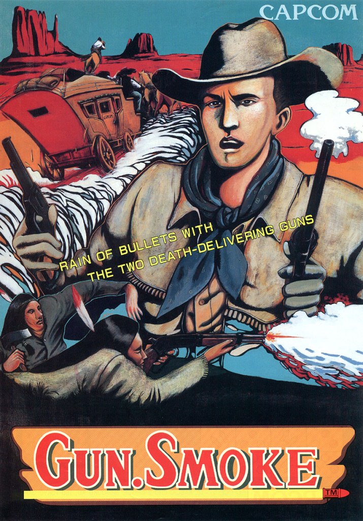
3. Gun.Smoke European arcade flyer
Nice art on the front of this arcade flyer for the European market.
Long before they struck gold with Street Fighter II, Japanese company Capcom scored a hit with gamers in the arcades with 1985’s Gun.Smoke. It was a vertically scrolling run-and-gun game with an Old West setting and it was designed by Yoshiko Okamoto (Final Fight and Street Fighter II). To promote the game for European arcades, Capcom simply used hand-drawn artwork for the arcade flyer’s front which emphasized the Wild West setting, and an American Cowboy and bounty hunter named Billie Bob who is the playable character gamers got to play. In my view, the artwork gave the game a strong Wild West image that is also memorable.
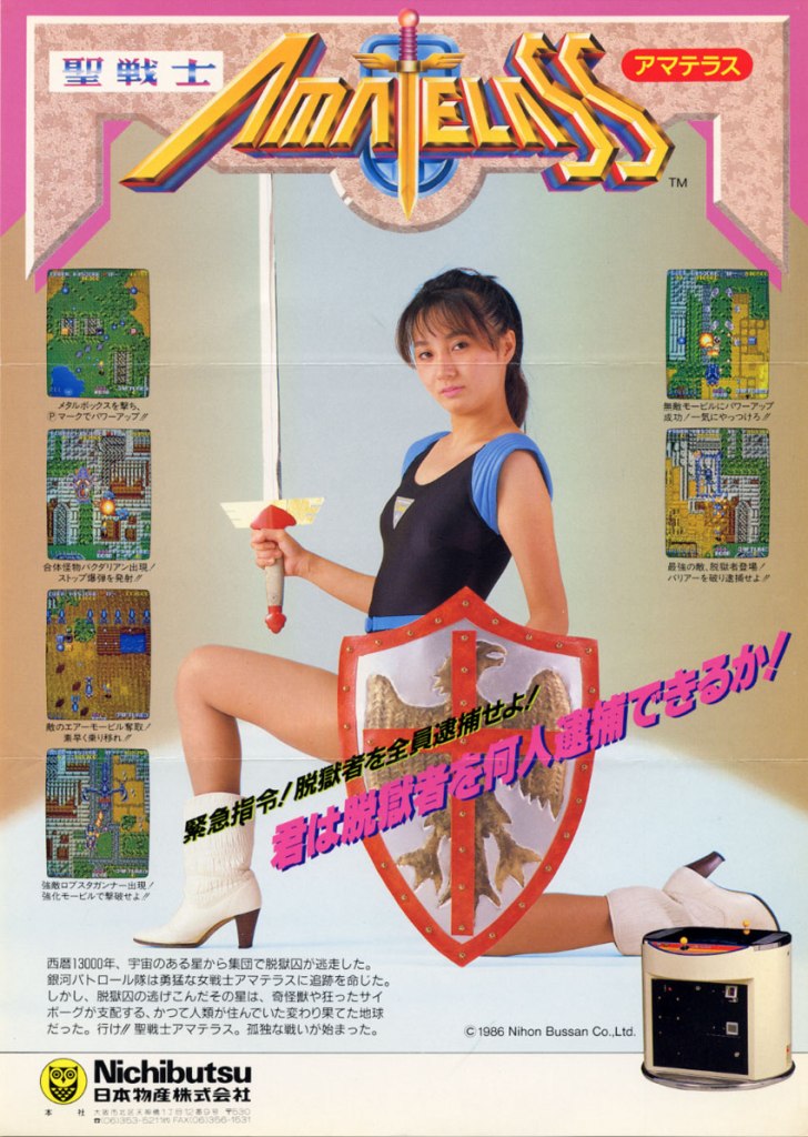
4. Sei Senshi Amatelass arcade flyer
Does the model look sexy or tough?
Released in Japanese arcades in 1986 by Nichibutsu, Sei Senshi Amatelass is a vertical scrolling run-and-gun game with a science fantasy concept. To promote the game and really sell its concept, Nichibutsu hired a model posing with a sword and a shield in fantasy inspired costume. Using the remaining spaces of the flyer, some screenshots and an image of the arcade machine were displayed. This flyer showed the company exerting effort to sell Sei Senshi Amatelass with a touch of beauty and subtle sexiness.
5. Sweet Gal arcade flyer
Seriously, are you interested in playing mahjong in digital form?
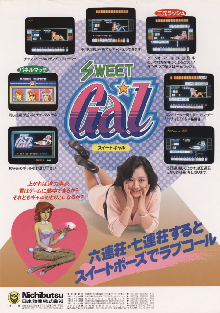
Here is another digital mahjong arcade game from Nichibutsu…Sweet Gal. As typical of the company, a model was hired to add subtle sexiness into the promotion of the game and they even added a digital image of a sexy girl. Sweet Gal clearly was promoted to attract men who enjoy playing mahjong in electronic format and there were some arcade spots in Japan that catered to such mahjong enthusiasts.
6. Moon Patrol print ad
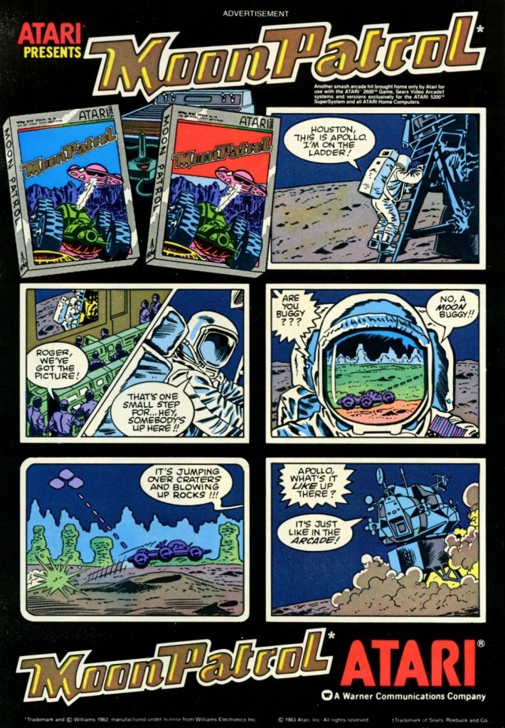
This is a fun-looking, comic book style way of promoting a video game.
Here is one of those video game print ads I saw while reading comic books back in the early 1980s. Moon Patrol is a sci-fi, side-scrolling game by Atari known for introducing full parallax scrolling in side-scrolling games. Instead of showing screenshots of the console versions of the game, this print ad used nice looking hand-drawn artworks presented with a comic book-inspired style to emphasize the concept. I still remember how captivating this ad and its super short story was the first time I saw it. It was enough to make me interested in the game.
7. Tron Atari 2600 games print ad
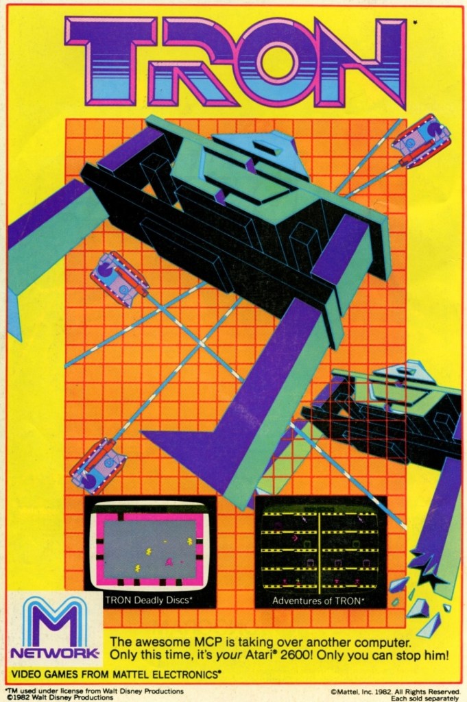
Calling all Tron fans to look at this.
I was very captivated by the 1982 sci-fi movie Tron which I saw on home video. It had very flashy computer-generated visuals, a very memorable story and the fine performance by Jeff Bridges. Tron was also very reflective about the video game culture of its time. When I first saw this print ad while reading a comic book, I was really excited. If you look closely, it had nice artwork dominating the space and screenshots that each promoted the games Tron: Deadly Discs and Adventures of Tron. Even though the graphics were primitive, I still recognized the Tron-related images which added to my excitement.
8. Q*bert print ad
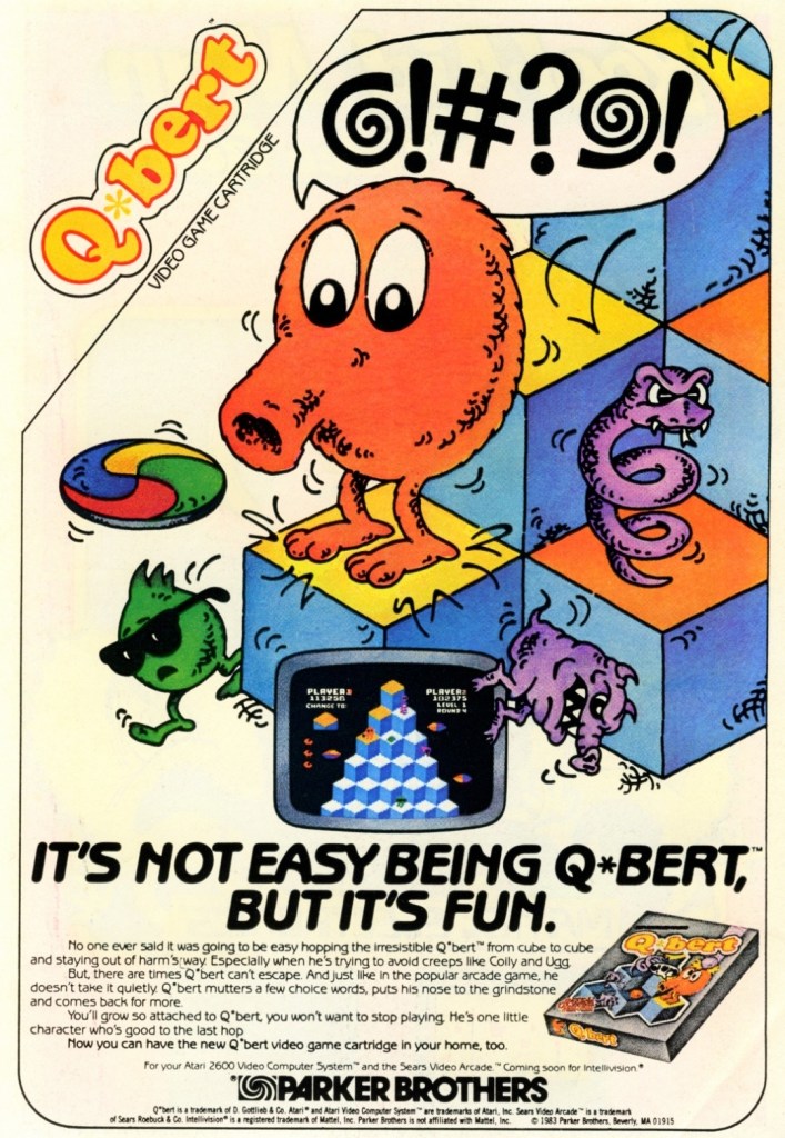
This print ad by Parker Brothers really captured the essence of the game.
The puzzle-oriented 2D action game Q*bert became an arcade hit in America shortly after its 1982 release and even went on to become one of the highest grossing arcade games in 1983. Q*bert is one of those 2D games that cleverly blended puzzle play with 3D-like movement and avoidance of both obstacles and enemies. As expected, the game made its way into gaming console and this particular print ad had artwork that strongly captured the very essence of the game complete with the very catchy line “It’s not easy being Q*bert, but it’s fun.”
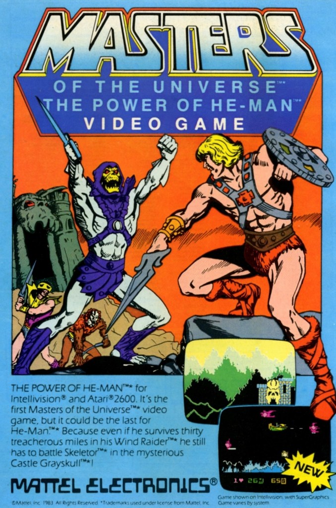
9. Masters of the Universe: The Power of He-Man print ad
Calling all He-Man fans.
I saw this print ad of Masters of the Universe: The Power of He-Man (for Atari 2600 and Intellivision) while reading a comic book long ago. Like the Tron games ad, this made me excited as I was fond of watching the He-Man cartoon series of the 1980s. While the selected screenshots caught my attention, it was the hand-drawn art of He-Man facing off with Skeletor and his minions that captivated me simply because it reminded me of the animated series. This is a fine example of promoting a video game that would instantly resonate with fans of He-Man and the Masters of the Universe franchise.
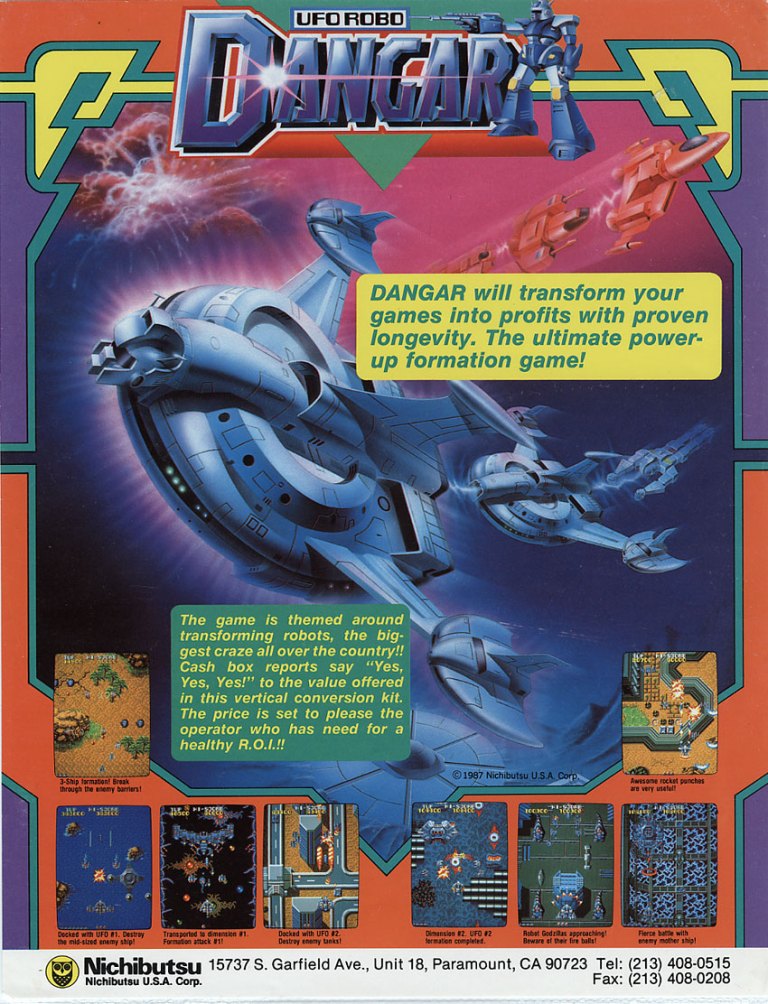
10. UFO Robo Dangar North American arcade flyer
The giant robot concept of this game gave some viewers the impression that it was based on some giant robot anime series from Japan even though the art work used does not suggest it.
Here is another arcade game from Nichibutsu but for the North American market and without the use of a model and without the subtle sexiness. UFO Robo Dangar is a 2D vertically scrolling science fiction shooting game and players get to control a giant robot (composed of flying vehicles that merged into one mechanical body) that has to go through countless waves of enemies in order to advance from one level to another. The arcade flyer used nice looking sci-fi art of ships with the game’s title having a robot and several screenshots of the game. The flyer even made a hard pitch towards arcade operators that UFO Robo Danger will transform their games into profits with proven longevity.
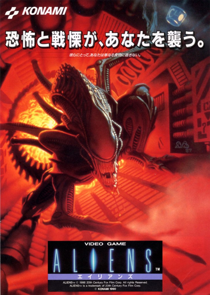
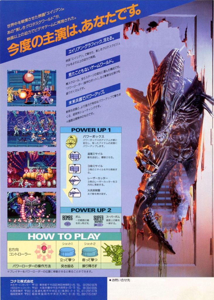
11. Aliens Japanese arcade flyer
The front.
The other side of the flyer of the 1990 arcade hit Aliens.
Quite arguably, Konami’s 1990 arcade hit Aliens is the best video game of any game design to be based on the 1986 film directed by James Cameron. Not only was Aliens a big hit in the arcades, it also won an award from the American Amusement Machine Association (AAMA). Aliens was released in Japanese arcades in February of 1990 and Konami released an arcade flyer that was much more visually striking than its North American arcade flyer. The front had detailed artwork of the Xenomorph while the rear had the instructions and screenshots presented in an orderly manner. The photograph of the Xenomorph alien was added intensity on selling the game. This is still a great looking arcade flyer.
Disclaimer: This is my original work with details sourced from reading the comic book and doing personal research. Anyone who wants to use this article, in part or in whole, needs to secure first my permission and agree to cite me as the source and author. Let it be known that any unauthorized use of this article will constrain the author to pursue the remedies under R.A. No. 8293, the Revised Penal Code, and/or all applicable legal actions under the laws of the Philippines.
Welcome back superhero enthusiasts, 1990s arts and culture enthusiasts, Marvel Comics fans and comic book collectors! Today we go back to the year 1994 to examine an alternate story of the Marvel Comics shared universe chronicled through the What If monthly series.
There is a lot to be said about the origin of Wolverine. There was the tale of his Canadian origin and being born with claws inside him. There was also the tale of him encountering the Hulk in Canada. And there was also the famous storyline Weapon X (written and drawn by Barry Windsor-Smith in Marvel Comics Presents #72 to #84).
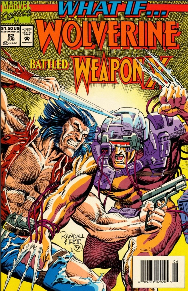
With those details laid down, here is a look back at What If #62, published in 1994 by Marvel Comics with a story written by Kurt Busiek and drawn by Ron Randall.
The cover.
Early story
The story begins in the when Logan (Wolverine) encounters armed men who try to overwhelm him. Logan easily knocks most of them out and leaves them behind by car. It turns out the armed men are agents of a secret organization called Weapon X which has been targeting Logan for their series of unethical experiments on abducted humans (the Weapon X Project).
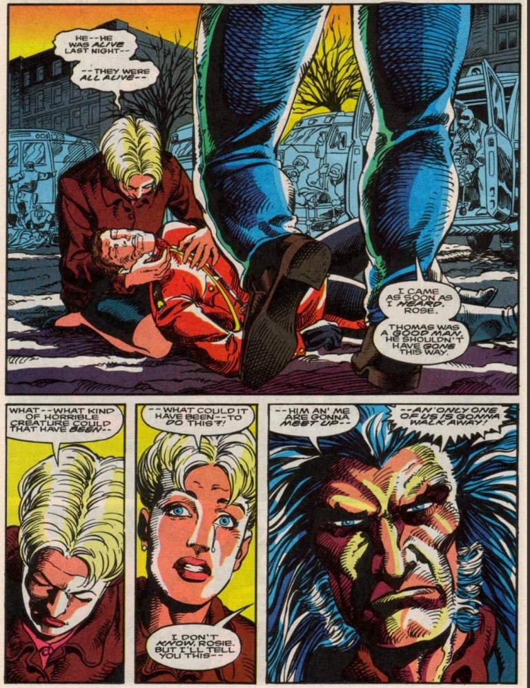
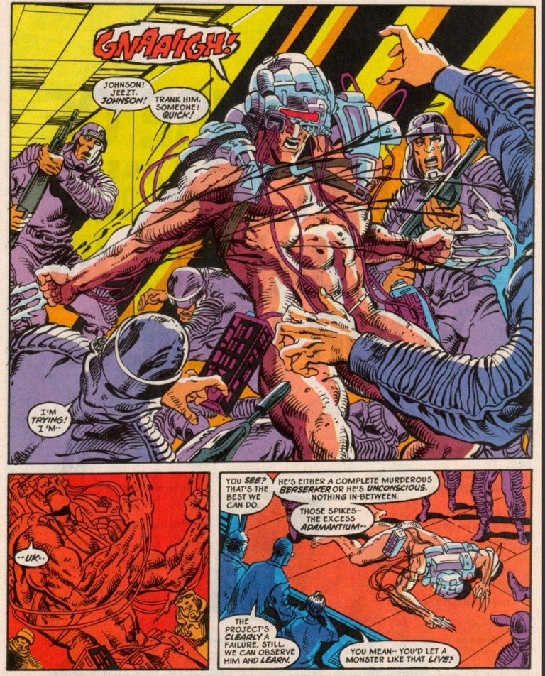
The organization is already dealing with problems regarding their live experiments. One living subject (with adamantium claws on his arms and some machinery on his head and shoulders) became a murderous berserker who cannot be reasoned with anymore. The subject is former Mounted Police Officer and Marine Guy Desjardins and Weapon X dropped him off at Department H.
James Hudson of The Flight took him in and officially refers to him as “Weapon X”. The live subject eventually broke loose, killed Dr. Langkowski and went to Kenora where he starts a killing spree…
Quality
Logan arrives at the scene where the Weapon X biological experiment killed several people.
I want to point out that Kurt Busiek came up with the very believable portrayal Logan who is not Wolverine, not a member of the X-Men and not even the violent fighter in the plot. This is a story about a major scientific experiment of Weapon X that went terrible wrong resulting in their living subject (with adamantium claws and other features identified with Wolverine in the mainstream Marvel universe storyline of Weapon X) going way beyond their controller and impacting Canadian society negatively. The good news here is that the story by Busiek is very well written and nicely structured.
In his civilian form as Logan, Wolverine (as we often identify him) is not the fierce slasher he is often known as. Rather he is a former tool of the Canadian government who previously resigned and decides to get involved in response to the rampage caused by the Weapon X killing machine (Desjardins).
As Logan is no slasher (note: Wolverine #75’s big revelation about Logan’s claws had no influence on this comic book’s concept), he fights with guns and a knife backed with his extensive experience in grounded combat. In relation to this comic book’s concept, you will a captivating portrayal of Logan who is truly unconnected with the X-Men and there are certain character moments that you really have to read.
Along the way, Kurt Busiek’s story not only dramatizes the classic trope about man tampering with nature but also the potential scandal of Canada’s government having top secret unethical science experiments while developing their own superhero project in the form of The Flight. Back to Wolverine, the story pounced on the conflict between being human and being animalistic with sheer believability.
With regards to the artwork, Ron Randall exerted effort to recapture some of the aesthetics of Barry Windosor-Smith’s work on the Weapon X storyline of the Marvel Comics Presents comic books. As required by the script, the visual display of action is brutal to look yet does not go over the top (with regards to graphic violence) as the creators implemented restraint restraint on the display of blood and killing blows.
Conclusion
A new Weapon X biological experiment gone wrong.
What If #62 (1994) is truly a great alternative tale to the established Weapon X storyline and it is also one of the more engaging portrayals of Wolverine unconnected with the X-Men. You will see Logan being more grounded with reality and you will also witness how he sees himself as a Canadian citizen who actually gets involved again with the government which he previously served. This a really compelling work by the Busiek-Randall duo.
Overall, What If #62 (1994) is highly recommended.