Welcome back my readers, YouTube viewers and all others who followed this series of articles focused on YouTube videos worth watching. Have you been searching for something fun or interesting to watch on YouTube? Do you feel bored right now and you crave for something to see on the world’s most popular online video destination?
I recommend you check out the following topics and the related videos I found.
#1 Popcorn in Bed reacts to An Officer and a Gentleman – Released in 1982, An Officer and a Gentleman is a romantic drama film with a militaristic flavor showing a young Richard Gere and Louise Gosset, Jr., in a very memorable role. Some parts of the movie were filmed on location here in my native Philippines. While I am not exactly a fan of the movie, I can say that it still has some shining moments as well as some memorable dramatic scenes. Recently, YouTuber Popcorn in Bed posted its reaction video of the movie, and I can say it is worth watching.
#2When hackers made ATMs release so much money – Recently, YouTuber fern published a new video explaining a certain financial crime that resulted in physical activities that was hard to imagine – automatic teller machines (ATMs) shooting out multiple bills of cash for thieves to collect. What happened, what can financial institutions do to prevent their system from getting hacked, and how the events turned out are explained in detail by fern.
#3 Criterion Collection shows how to restore and remaster very old films – The Criterion Collection (AKA Criterion) is a company that specializes on licensing, restoring and releasing selected films that movie buffs, fans and new film enthusiasts could enjoy. I myself own the Criterion Blu-ray discs of The Blob (1958) and Gojira, and I can say that the company did a great job restoring the said films while adding stuff for collectors and fans to enjoy. When it comes to restoring decades-old films and making them presentable with quality in mind, Criterion really works hard and you can learn a lot from them by watching the videos below.
#4 VKunia reacts to Man of Steel – Do you movie fans enjoy watching Zack Snyder’s Man of Steel? The 2013 Superman movie remains divisive among fans and superhero movie enthusiasts to this day. I’ve seen the movie many times from the local cinemas to my Blu-ray copy, and I can say it truly is a mixed bag when it comes to providing viewers fun and defining Superman in the 21st century. Still, there is a chance that the Man of Steel reaction video by YouTuber VKunia could spark your interest in the film as well as in Zack Snyder’s visceral vision of DC Comics superheroes. I encourage you to watch her reaction video below.
#5 Commie Kamala Harris proves herself pathetic yet again during California wildfire briefing – By the time you are reading this, Donald Trump has officially returned as United States President. That being said, even during times of disaster, the defeated Commie Kamala Harris proved to be pathetic and worthless during the recent briefing about the wildfire in California. She is so pathetic and worthless, Harris proved she is not trustworthy. Imagine all the amounts of American taxpayers’ money that got wasted by Harris during her 4 years as US Vice President.
#6 Battlezone revisited – Released by Atari in 1980, Battlezone was a groundbreaking game both visually and with game design. It gave gamers an immersive experience of driving a tank with 3D graphics, fun gameplay and a first-person view. If you wish to learn about the history of Battlezone, who the creators were and how were they able to produce the game, watch the video of gaming history expert PatmanQC.
#7 Minty Comedic Arts and the 1980s – I really enjoy watching the videos of Minty Comedic Arts. His series of “10 things you didn’t know about…” videos on pop culture (mostly movies) is fun to watch and he often entertains with his delivery of trivia information. In recent times, he posted trivia videos about certain films from the 1980s – each one being memorable in their own ways – namely Fast Times at Ridgemont High, The Breakfast Club, The Blue Brothers, Beverly Hills Cop and Indiana Jones and the Temple of Doom. Watch Minty’s videos now!
#8 The failure of Segway remembered – Remember decades ago when the Segway was first launched and heavily featured through the media? Invented by Dean Kamen, the Segway was a 2-wheeled personal transporter which was released looking fantastic but ended up as a failure. The Segway also ended up looking very bad in media reports about accidents with it. To find out what led to the Segway’s debut and how it failed, watch the video below.
#9 GoodBadFlicks examines five major flops – When it comes to movies that failed miserably, were those really terrible to watch or were they actually decent productions that failed to attract enough moviegoers? There are factors as to why movies fail. There are films that generated so much negative press, the moviegoers were convinced to avoid them. There are movies that were really badly made and there are others that got promoted or distributed very poorly. GoodBadFlicks recently post a video examining five major flops and it might convince you to watch The 13th Warrior, Final Fantasy: The Spirits Within, Titan A.E., The Chronicles of Riddick and Cutthroat Island.
Welcome back my readers, YouTube viewers and all others who followed this series of articles focused on YouTube videos worth watching. Have you been searching for something fun or interesting to watch on YouTube? Do you feel bored right now and you crave for something to see on the world’s most popular online video destination?
I recommend you check out the following topics and the related videos I found.
#1 Akira revisited – The 1988 anime feature film Akira has often been cited as a masterpiece and some pointed it for making anime more popular in the West. For the newcomers reading this, Akira actually started in Japan as a manga/comic book series before getting adapted into anime. Strangely enough, the literary Akira was still publishing when the 1988 feature film was released. As of this writing, there are two English-dubbed versions of it in existence and the Blu-ray copy I own has them both.
It is not surprising that the animated Akira got featured by many YouTubers in the form of retro reviews, reaction videos, documentaries and video analysis. If you have not seen Akira, I encourage you to watch it on Blu-ray first. Otherwise, enjoy the selected videos below.
#2Universal City Studios, Inc. v. Nintendo Co., Ltd. (the Donkey Kong case) – Have you ever played Donkey Kong back in the 1980s? That is a classic game from Nintendo. It was a hit in the arcades and made its way to multiple platforms in the years that followed. Believe it or not, Univeral Studios sued Nintendo alleging that Donkey Kong was a trademark infringement of King Kong. The video below will explain the details as to what happened and I can say it is also amusing to watch.
#3 PatmanQC examines Q*bert – Released in the arcades in 1982, Q*bert became a hit in America and went on to become one of the highest grossing arcade games in 1983. A very fun game, it is remembered for cleverly blending puzzle play with 3D-like movement and avoidance of both obstacles and enemies. You might be wondering who came up with Q*bert, what led to its production and what inspired the game creators to design it. To find out, watch PatmanQC’s detailed examination of Q*bert below…
#4 The Terminator’s connection with The Outer Limits explored – Remember watching 1984’s The Terminator? That was the memorable sci-fi action movie from director James Cameron which went on to become a multimedia franchise of movies, a TV series, comic books, video games and more. If you truly believe that the story is a purely original work written by Cameron (and by those who were involved behind the scenes), you will have to think twice because The Terminator’s sci-fi concept shares some notable similarities with a certain episode of The Outer Limits written by Harlan Ellison. To find out more, watch the video below…
#5 Al Jazeera is the terrorist news network and Qatar’s tool of deception – I will say it out loud right here: Al Jazeera is absolutely not a professional news outlet. Al Jazeera is, in fact, the Islamic terrorist news network and also the tool of Qatar which itself has sinister plans. Qatar may be a small nation but its ambitions for greater influence on the Middle East are very big and they have sinister intentions to grow big. Be aware that Qatar funded anti-Israel movements through American universities. That being said, I urge you all to boycott Al Jazeera. To take a close look at the evil of Al Jazeera and why Qatar should be held accountable, watch the video below.
#6 Ashleigh Burton reacts to The Amazing Spider-Man 2 – Back in 2014, I saw The Amazing Spider-Man 2 in the local cinema which was fully crowded. Even though I had modest expectations, I still left the cinema feeling disappointed. I was convinced that Sony Pictures, Andrew Garfield and director Marc Webb really had nowhere else to go with the way they were handling the Spider-Man film franchise. The Amazing Spider-Man 2 remains a divisive film and yet I had more fun with it by watching Ashleigh Burton’s reaction video. Watch it now.
#7 Popcorn in Bed reacts to Million Dollar Baby – When was the last time you saw YouTuber Popcorn in Bed get emotional and cry during a movie reaction video? If you have already seen Clint Eastwood’s Million Dollar Baby, then you should be aware of its very heartbreaking moments directly related to its very tragic concept. Popcorn in Bed recently reacted to the film and how it impacted her on an emotional level is a must-watch.
#8 SHIFT’s 2024 King of Thong video (Miami Swim Week) – A thong is “an article of swimwear or underwear with the back portion consisting of a narrow strip of cloth that passes between the buttocks and connects with a waistband.” Several months ago, the swimsuit fashion YouTube channel SHIFT posted a video of its coverage of the 2024 Miami Swim Week focusing on a show of King of Thong. For almost nine minutes, you’ll see lots of women appear in thongs showing lots of skin with carefully selected tunes playing. It’s a must-watch for those who enjoy women’s swimwear fashion and thongs. Also, there might be some fashion models you could recognize.
Welcome back my readers, YouTube viewers and all others who followed this series of articles focused on YouTube videos worth watching. Have you been searching for something fun or interesting to watch on YouTube? Do you feel bored right now and you crave for something to see on the world’s most popular online video destination?
I recommend you check out the following topics and the related videos I found.
#1 The dirty business behind Caffeine – Have you been drinking coffee, or sodas or energy drinks a lot over the past twelve months? Chances are, you are dependent on caffeine for your livelihood and your own lifestyle. Sadly, a lot of people out there are not even aware about the subject of caffeine in American history, in business and health studies. YouTuber fern has this in-depth look at caffeine and why there dirty business behind it. Watch and learn.
#2You, Me and the Movies react to Ace Ventura: Pet Detective – Despite being negatively received by movie critics in 1994, Ace Ventura: Pet Detective still went on to become a surprise hit in the cinemas grossing over $107 million worldwide and establishing Jim Carrey as an effective cinematic comedian. The film has an effective formula on making viewers laugh with Carrey’s performance, the jokes, the unfortunate turn of events, the funny one-liners and the like. I saw the film on home video in 1995 and I revisited it by watching the reaction video of You, Me and the Movies. If you have not seen Ace Ventura: Pet Detective, go watch it first. Otherwise, the reaction video below is entertaining to watch.
#3 The hunt for Ted Bundy explained by fern – Way back in 1989, I saw The Deliberate Stranger on local TV here in the Philippines. It was an engaging portrayal of the very notorious serial killer Ted Bundy (executed in 1989) who was responsible for the kidnapping, rape and murders of several young women and girls. While a lot of documentaries about Bundy have been released, fern’s visual presentation and explanatory observation of the killer’s story is a must-see.
#4 A look at the history of the Ikari Warriors trilogy – Back in the mid-1980s, I played Ikari Warriors (Japanese title: Ikari) on the Nintendo Family Computer (Famicom) and it was a fun game and even relatable. Why relatable? Because at the time of its release, the fictional character Rambo (played by Sylvester Stallone) and the Cold War were still present in our minds. As it turned out, Ikari Warriors was originally intended to be an official video game adaptation of Rambo: First Blood Part II but no agreement was made. Regardless, the game still had Rambo-inspired designs for the playable characters, an obvious Vietnam-inspired environment and lots of shooting-oriented action. It became so successful commercially, it eventually spawned two sequels. To know more about the history of the Ikari Warriors trilogy, watch PatmanQC’s video below.
#5 A look at 50 underrated arcade games from the 1990s – The 1990s was a wild time for people who love playing games in the arcades. While the decade was often perceived to be all about fighting games defining the arcade experience, there still was a greater variety of arcade games of different genres or game designs. This retro gaming video from Marvelous Gamers is a fun look back at the 1990s arcade games that got overlooked.
#6 Ashleigh Burton reacts to National Lampoon’s Vacation – If you are looking for a 1980s comedic viewing experience with a theme about going on holiday, then you should focus on National Lampoon’s Vacation directed by the late Harold Ramis and starring Chevy Chase. Released in cinemas in 1983, the movie became a box office hit grossing over $60 million in the American box office and it won a lot of rave reviews from the critics. If you have seen the movie and want to revisit it without the need to spend time watching it all over again, you should watch the reaction video by the jolly YouTuber Ashleigh Burton.
#7 Popcorn in Bed reacts to Quantum of Solace – I will say it clearly – Quantum of Solace was a very disappointing follow-up to Casino Royale (2006) as it was so negatively impacted by the strike of the Writers Guild of America as well as the lack of focus within the production. By the time I left the cinema, Quantum of Solace left me feeling numb and unsatisfied. That being said, I encourage you to see the reaction video of Popcorn in Bed (who also reacted to Casino Royale) and witness how the 2008 James Bond movie affected their viewing experience.
#8 Justin Trudeau officially resigns from office – I really do not like Justin Trudeau. As Prime Minister of Canada, he has been very out of touch with his people and does not seem concerned with them. Under the super woke and feminist Trudeau, the costs of living in Canada has gone way up, housing is too expensive and crime has gone up. There is also division and infighting within his Liberal Party which is not helping Canadians at all. Trudeau’s failed leadership should be a lesson to everyone that woke nuts, Satanic Leftists and outrageous liberals should not be voted to lead the government. Liberals do not care about common sense at all. Watch and learn from the videos below.
Welcome back, my readers, YouTube viewers and all others who followed this series of articles focused on YouTube videos worth watching. Have you been searching for something fun or interesting to watch on YouTube? Do you feel bored right now and you crave for something to see on the world’s most popular online video destination?
I recommend you check out the following topics and the related videos I found.
#1 HolyLandSite’s examination of Kursi and Lord Jesus’ power over the demonic realm – Kursi is a place in the east side of the Sea of Galilee in the region of Gerasenes (or Gadarenes) in Israel where two men possessed by demons stayed at. HolyLandSite produced this video to emphasize the biblical relevance of the place, what happened and, most of all, the immense power Lord Jesus had over the demonic forces that caused huge problems for people back then. This is a biblical examination of the place and a lively reminder of the light and authority of Lord Jesus, the Savior and Hope of ALL nations. Grab a copy of the Holy Bible and then watch the video from start to finish.
#2GTV Japan examines Nintendo’s crisis – Remember back in the late 1980s when a shortage of ROM chips prevented Nintendo from releasing games on time? Back in those days, microchips were essential for manufacturing cartridges of games for consoles. A lot of people believed that Nintendo, which already had several restrictions on game publishing and business with 3rd party game companies, deliberately created the shortage for their advantage. There is a lot more details and developments that happened beyond the perceived shortage and the video by GTV Japan has a very in-depth look at it in the video below.
#3 What the hard drive of terrorist Bin Laden contained – Remember when America found and eliminated the mass murderer and terrorist Osama Bin Laden in 2011? YouTuber fern published a video focused on one particular aspect related to the operation that took Bin Laden down – the sensitive information contained in his hard drive. The video also has a key analyst interviewed who provided a lot of insight. Watch the video now.
#4 Wokeness in Japan exposed – Believe it or not, there definitely is wokeness in Japan and it was exposed a lot during their news media coverage of the 2024 US Presidential Election which Donald Trump won. In fact, a certain Japanese professor who was included in the media outlet’s coverage (being in the studio with others) was so liberal, he got frustrated as Commie Kamala Harris lost and he even reiterated the Democrats’ buzz words like “threat to democracy”. Think about it very carefully. The Democrats and their Satanic Left pawns have been spreading their distorted views in Japan and influenced some people there. The woke-minded in Japan may not realize it but they are looking and sounding awkward (if not pathetic). Perhaps some woke nuts of Japan love Islamic terrorists and I know they have pro-Palestine zealots. Watch and learn from the video below.
#5 Controversial Alice Guo featured in episode of Dark Asia with Megan – Alice Guo (AKA Guo Hua Ping), the controversial former mayor of Bamban who has been detained for various charges, is now the subject of a new episode of Dark Asia with Megan. For the newcomers reading this, Alice Guo is notorious in the Philippines not only for her links with POGOs (Philippine Offshore Gaming Operators) but also for her very questionable background with regards to citizenship, family and origin. She even escaped the Philippines temporarily before getting brought back. In fact, Alice Guo’s case raises a lot of questions about national security, espionage and foreign infiltration into the systems of governance in the Philippines. Watch and learn from the Dark Asia with Megan video.
#6 PatmanQC examines Donkey Kong – Long before Donkey Kong Country became a massive critical and commercial hit with gamers around the world, there was the original Donkey Kong in 1981. I never played the arcade version but I played Donkey Kong on the Atari 2600 back in the early 1980s and it was a fun game. A short time later, I played the ColecoVision version and was impressed to see the graphical improvements. The production history of Donkey Kong is really interesting and PatmanQC produced not just one but two documentary videos about the game.
#7 Popcorn in Bed and You, Me and the Movies react to Vertigo –Vertigo, the classic film directed by Alfred Hichcock, was one of the first twenty-five films selected for preservation in the US National Film Registry for being “culturally, historically, or aesthetically significant”. That being said, it is not surprising that it has been the subject of several movie reaction videos on YouTube. If you have not seen it, I encourage you to watch it entirely first when you have the chance. Otherwise, I encourage you to watch the reaction videos of Popcorn in Bed, and You, Me and the Movies below.
#8 Ashleigh Burton reacts to Signs – Back in 2002, I saw Signs inside a packed local cinema during the evening. The film directed by M. Night Shyamalan and starring Mel Gibson kept moviegoers in suspense and occasionally pulled off some sudden scary moments. That being said, you have to see Ashleigh Burton react to it.
Happy New Year to all my readers, YouTube viewers and all others who followed this series of articles focused on YouTube videos worth watching. Have you been searching for something fun or interesting to watch on YouTube? Do you feel bored right now and you crave for something to see on the world’s most popular online video destination?
I recommend you check out the following topics and the related videos I found.
#1 You, Me and the Movies react to The Tower (2012) –The Tower (2012) is a South Korean disaster film that drew huge audiences in its country and found some success overseas. Its concept will remind long-time movie buffs about 1974’s The Towering Inferno which itself was an inspiration for director Kim Ji-hoon. If you want to discover The Tower but you are not willing to spend time and money to see it, I encourage to watch You, Me and the Movies’ reaction video.
#2Alien versus Predator games history examined by Slope’s Game Room – I really enjoy watching the retro gaming videos of YouTuber Slope’s Game Room. This time around, Slope examines the history of video games featuring one of the most memorable sci-fi crossovers ever: Alien versus Predator. For the newcomers reading this, there was a time when Alien and Predator were separate sci-fi film franchises. How a crossover between them happened and what video games were made are explained in detail in the video below.
#3 The rise of cold coffee in America – Do you like drinking coffee that is actually cold? Over the past several years in America, spending on cold coffee skyrocketed and outpaced hot coffee. To be clear, cold coffee includes iced coffee, cold brew and frozen coffee drinks. Already, cold coffee sales really grew for certain businesses that sell coffee. To find out why Americans are buying more cold coffee and what possibly started the trend, watch the video below.
#4 Changing the Middle East – There is no denying the fact that Israel will be remembered for significant gains against Iran-sponsored terrorists in 2024. They did not have much support from Biden-led America but Israel still succeeded in eliminating Yahya Sinwar (Hamas) and Hassan Nasrallah (Hezbollah). Israel also succeeded in hitting military targets in terrorist state Iran which crippled them significantly. Also the collapse of the wicked Assad regime in Syria proved to be a huge loss for Iran which had a sinister alliance with Bashar al-Assad (who abandoned Syria).
With Donald Trump set to return as United States President on January 20, 2025, Israeli Prime Minister Benjamin Netanyahu expressed confidence of changing the Middle East. Netanyahu talked with Trump recently and you can learn more by watching CBN News’ video.
If you have accepted Jesus as your Lord and Savior, I encourage you to pray to Him in support of Israel and the new Trump administration to change the Middle East in 2025. Pray to Him for the Christians in Syria who will soon be affected negatively by the new regime’s plan to impose Sharia Law. Pray to Him for the rescue or release of the hostages of the October 7, 2023 attacks.
#5 Lefties losing it – In case you did not notice, the Democrats in America don’t just have wicked and dishonest leaders. They also have Hollywood celebrities as Democrat activists who are actually phony intellectuals who love to fool their fellow Americans. A lot of Democrat leaders and activists are actually out of touch with the people and reality in general, which is what this Lefties Losing It video from Sky News Australia emphasized clearly. Watch and learn from start to finish.
#6 PatmanQC examines Gun.Smoke – Developed by Capcom, Gun.Smoke debuted in the arcades in 1985 and eventually got ported to different platforms. I never played the arcade version but I had fun with Gun.Smoke on the Nintendo Family Computer (Famicom) Disk System. It was a run-and-gun shooter with an Old West setting and its designer was Yoshiki Okamoto (1942, Street Fighter II and Resident Evil). The production history of the game is quite interesting and you can find out more in PatmanQC’s video.
#7 Ashleigh Burton reacts to The Naked Gun 2½: The Smell of Fear – I love watching Ashleigh Burton’s movie reaction videos, especially the ones that has her laughing a lot. She’s a jolly YouTuber and often entertaining. That being said, you have to watch her reaction to 1991’s The Naked Gun 2½: The Smell of Fear.
#8 Popcorn in Bed reacts to Star Trek: Nemesis – Were you able to watch the entire Star Trek: The Next Generation (Star Trek: TNG) series from 1987 to 1994? I never had the privilege to watch all seven seasons but I managed to watch several random episodes of it and got to know the characters enough before proceeding to watch all four Star Trek: TNG movies from 1994 to 2002. Star Trek: Nemesis (2002) was released in American theaters right in the middle of intense box office competition with a Harry Potter movie, a James Bond movie and a Lord of the Rings movie. Apart from its box office failure, there was something wrong that happened behind the scenes during Star Trek: Nemesis’ production which explains its disappointing quality. If you want to discover the movie but you don’t want to spend too much time nor money on it, I encourage you to watch Popcorn in Bed’s reaction video.
Disclaimer: This is my original work with details sourced from reading the comic book and doing personal research. Anyone who wants to use this article, in part or in whole, needs to secure first my permission and agree to cite me as the source and author. Let it be known that any unauthorized use of this article will constrain the author to pursue the remedies under R.A. No. 8293, the Revised Penal Code, and/or all applicable legal actions under the laws of the Philippines.
Welcome back superhero enthusiasts, 1990s arts and culture enthusiasts, Image Comics fans and comic book collectors! Today we go back to the year 1995 to take a close look at one of the many tales of the original WildStorm universe through one of the comic books of the Backlash series.
For the newcomers reading this, Backlash is one of the major characters of the WildStorm universe which started in the early 1990s when the famous Jim Lee was one of the founding fathers of Image Comics. Backlash, Deathblow, Wetworks, Gen13 and WildCATS: Covert Action Teams were all connected with each other and many of the major characters were linked together in the Team 7 series of prequel stories.
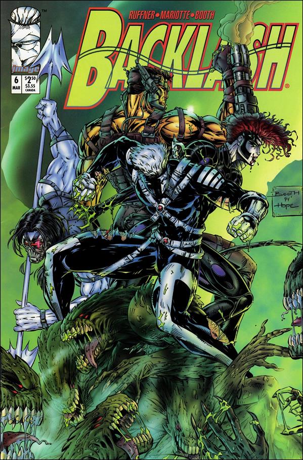
With those details laid down, here is a look back at Backlash #6, published in 1995 by Image Comics with a story written by Brett Booth, Jeff Mariotte and Sean Ruffner. Booth and Dan Norton were the illustrators.
The cover.
Early story
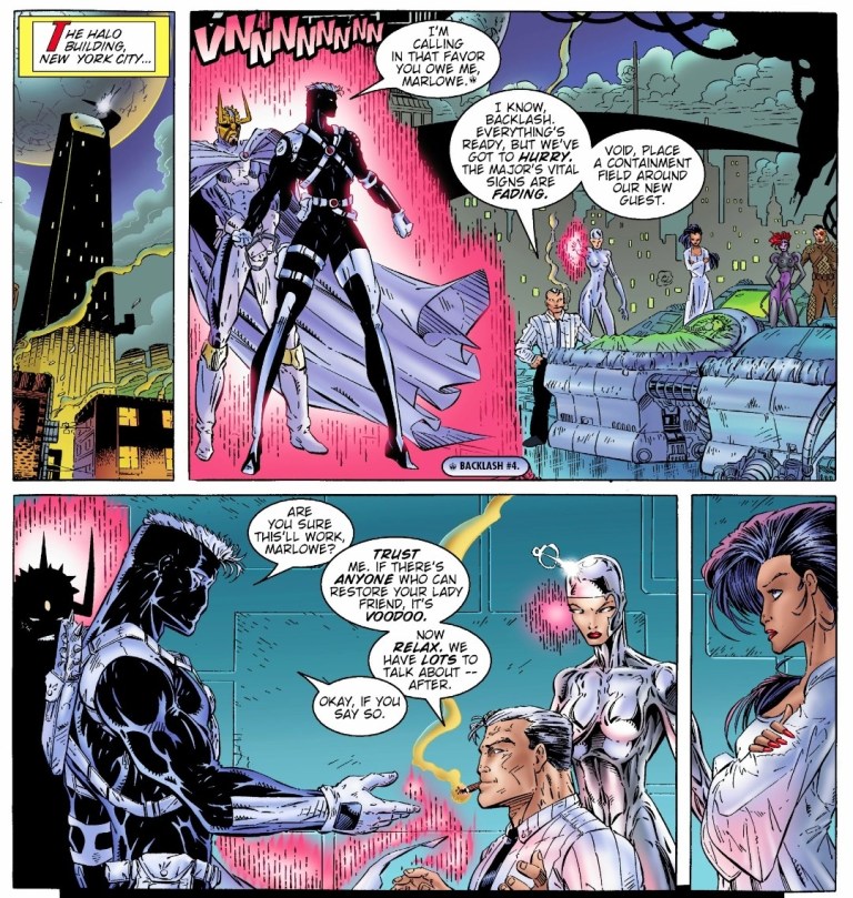
The story begins inside the Wildlife Organization Research institute in northern Montana. After Dane and Grail (the Filipino soldier Salvador Joel Alonday) of Wetworks easily took out two guards, a third one suddenly tried to attack them only to be killed by Backlash. While the three of them are on a stealth mission, Backlash tells Dane that it’s not too late for Wetworks to pull out as it is not their fight. Dane dismisses the remark and insists on pursuing their objective.
Over at a medical institute in Detroit, Taboo and Cyberjack are operating on their own mission which is directly linked with that of Backlash and Wetworks.
Quality
Backlash and the WildC.A.T.S. at the team’s headquarters.
As the sixth issue of its series, this tale has a lot at stake and the writers took their time to balance the build-up with pay-offs and twists. Without spoiling the plot, I can say that a lot is at stake for Backlash as there is something really personal about the missions and the final scene. I can also say that this is a well-crafted comic book that was clearly made with Backlash fans in mind even as the creative team did their parts in expanding the lore of the original WildStorm universe using a clever mix of science fiction and paramilitary action.
I really enjoy reading this comic book and it also has some fine moments that defined Backlash’s personality. The added crossovers with WildC.A.T.S. and Wetworks added not only to the spectacle but also to the depth of the plot. This Backlash comic book is clearly not another adventure but an actual turning point for the former Team 7 member and the series as a whole. That being said, I am looking forward to reading the next issue.
Conclusion
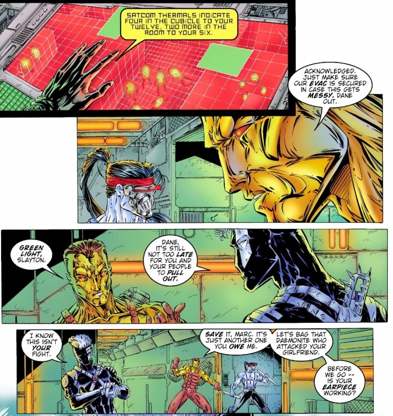
Backlash with Dane and Grail of Wetworks during the mission.
Backlash #6 (1995) is a very solid read. Not only was it an improvement over the previous issue, it raised the stakes high and managed to live up to the expectations. The build-up is really powerful and the way the story ended justified it. I can say that anyone who managed to start reading each of the first five issues of Backlash will experience the power of the ending of this comic book. That being said, you better read all the previous issues before reading this one.
Overall, Backlash #6 (1995) is highly recommended.
Welcome back readers, fellow geeks and electronic gaming fans!
In this edition of the Retro Gaming Ads Blast (RGAB) series, we will take a look at another batch of retro gaming print ads – including arcade flyers – from the 1980s and 1990s.
For the newcomers reading this, Retro Gaming Ads Blast (RGAB) looks back at the many print ads of games (console, arcade, computer and handheld) that were published in comic books, magazines, flyers, posters and newspapers long before smartphones, social media, the worldwide web and streaming became popular. To put things in perspective, people back in the 1980s and 1990s were more trusting of print media for information and images about electronic games and related products.
With those details laid down, here is the newest batch of retro gaming print ads for you to see and enjoy…
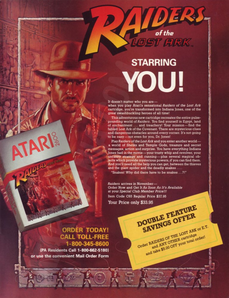
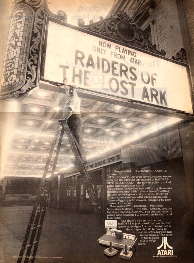
1. Raiders of the Lost Ark game print ads
The print ad with strong Indiana Jones imagery.
The print ad with the movie theater exterior image and the small image of the Atari 2600 console.
Directed by Steven Spielberg, Raiders of the Lost Ark was one of the best adventure movies ever made as well as the start of the iconic character Indiana Jones. Given its huge commercial success, an official video game adaptation for the Atari 2600 was released in 1982 and game designer Howard Scott Warshaw even met with Spielberg during the game’s development.
To promote the game, Atari released two print ads – one ad had a movie theater exterior visual concept to emphasize they have the official video game adaptation based on the movie while the other ad showed the game’s official artwork and game box cover while emphasizing a savings offer. Atari really did what they could to sell a game while riding on the success of Raiders of the Lost Ark.
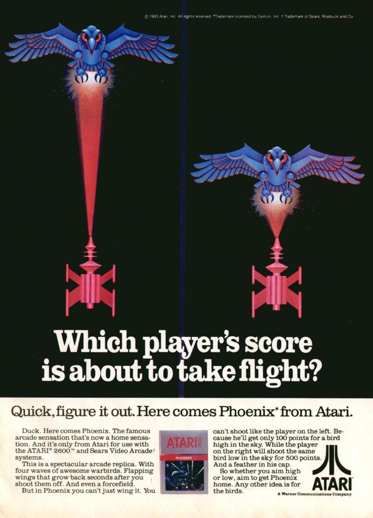
2. Phoenix print ad
Even without any screenshots, this print ad’s art still gives viewers a clear idea of what to expect.
Similar to what they did with Galaxian and Joust, Atari made this print ad promoting Phoenix which was a 2D sci-fi shooting game that was similar with Space Invaders in design. Colorized, hand-drawn artwork resembling the 2D sprites of the game was done to capture the attention of people. The art is so good, it made up for the lack screenshots of the game.
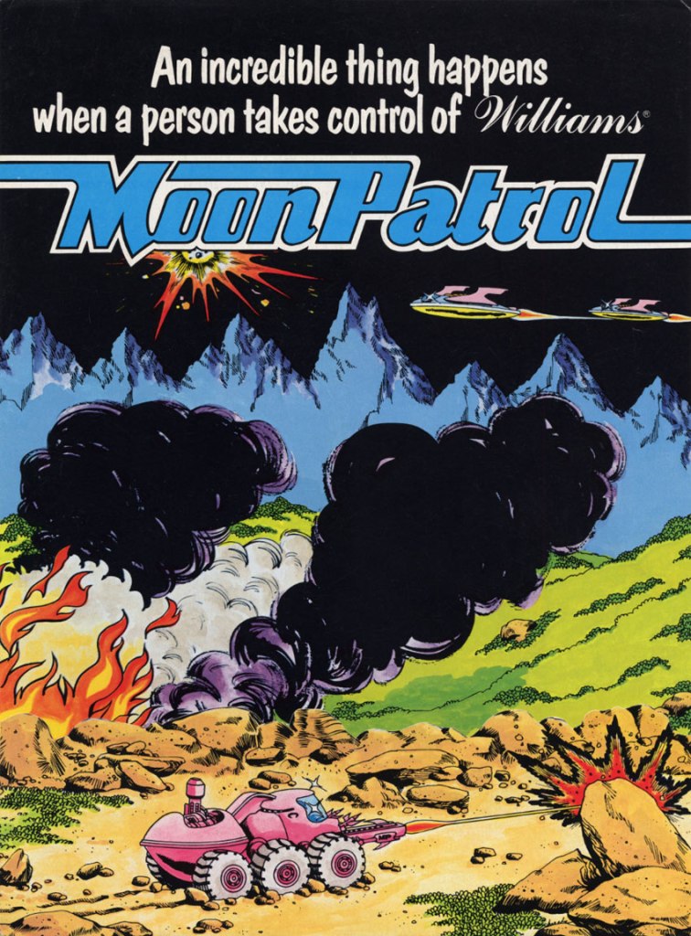
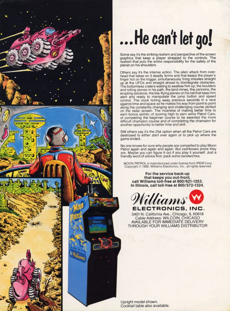
3. Moon Patrol arcade flyer
Front of the Moon Patrol flyer.
The other side of the arcade flyer.
Moon Patrol was a 2D sci-fi side-scrolling adventure game first released in the arcades in 1982. To sell the game to arcade operators, publisher Williams created the North American arcade flyer that heavily used hand-drawn comic book-style artworks on both sides while using available space on the other side for the descriptive text, contact details and the image of an arcade machine. What is very clear is that no screenshots of the game were shown to stand out which explains why a lot of hand-drawn art was used. The picture of the machine showing a screen of Moon Patrol was the closest thing to see a screenshot on this flyer. Personally, I really like the style and quality of the hand-drawn artwork as it made the flyer look lively.
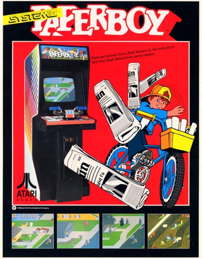
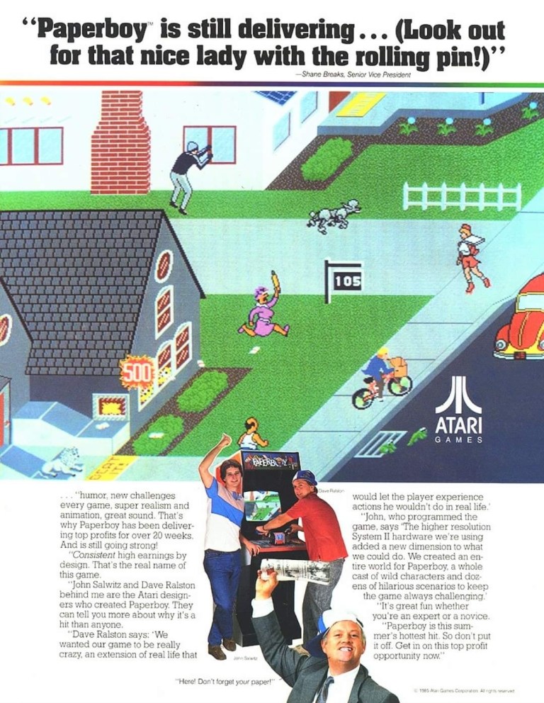
4. Paperboy arcade flyers
The arcade flyer showing the Paperboy machine and screenshots. The hand-drawn art is nice.
This one uses comedy showing a grown man riding a bike as a paper delivery “boy”.
I really like the stronger emphasis on the in-game graphics of Paperboy which dominates the space. What you see is what you get in the arcade.
The first time I ever played the classic Paperboy was in the arcade inside a Las Vegas hotel way back in 1989, and it sure was a challenging yet fun experience. Before its arcade debut in 1985, the developers took a lot of risks making the game which includes coming up with a bicycle handle bar for each machine to have. To promote the game, Atari made at least three arcade flyers that creatively emphasized what the game’s concept was about, how did it play, why does the machine have bicycle handlebars and why players can expect fun. Atari’s promotional efforts paid off as Paperboy became a huge hit in the arcades not only in America but also in Japan.
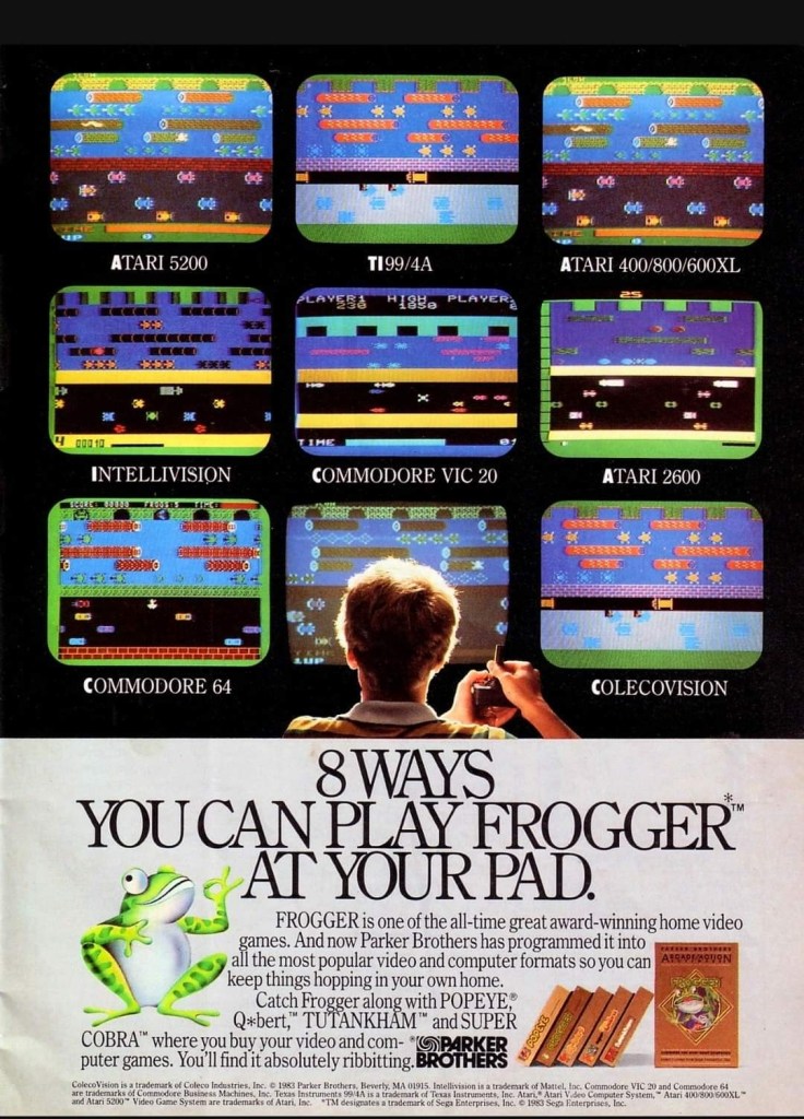
5. Frogger multi-platform print ad
This print ad is still amusing to look at.
After Frogger became a hit in the arcades, Parker Brothers secured the rights to port the game on Atari consoles, the Intellivision, TI-99/4A, vic-20, the Commodore computers and ColecoVision. To promote their Frogger ports, the single-page print ad was made showing a player in the foreground playing in front of screens that each showed what the game looked like on each platform. Parker Brothers found tremendous success selling 4 million copies of Atari 2600 version of Frogger at a time when there were only 13 million units of Atari 2600 in existence. By the year 2005, video game sales of Frogger reached 20 million worldwide across different platforms.
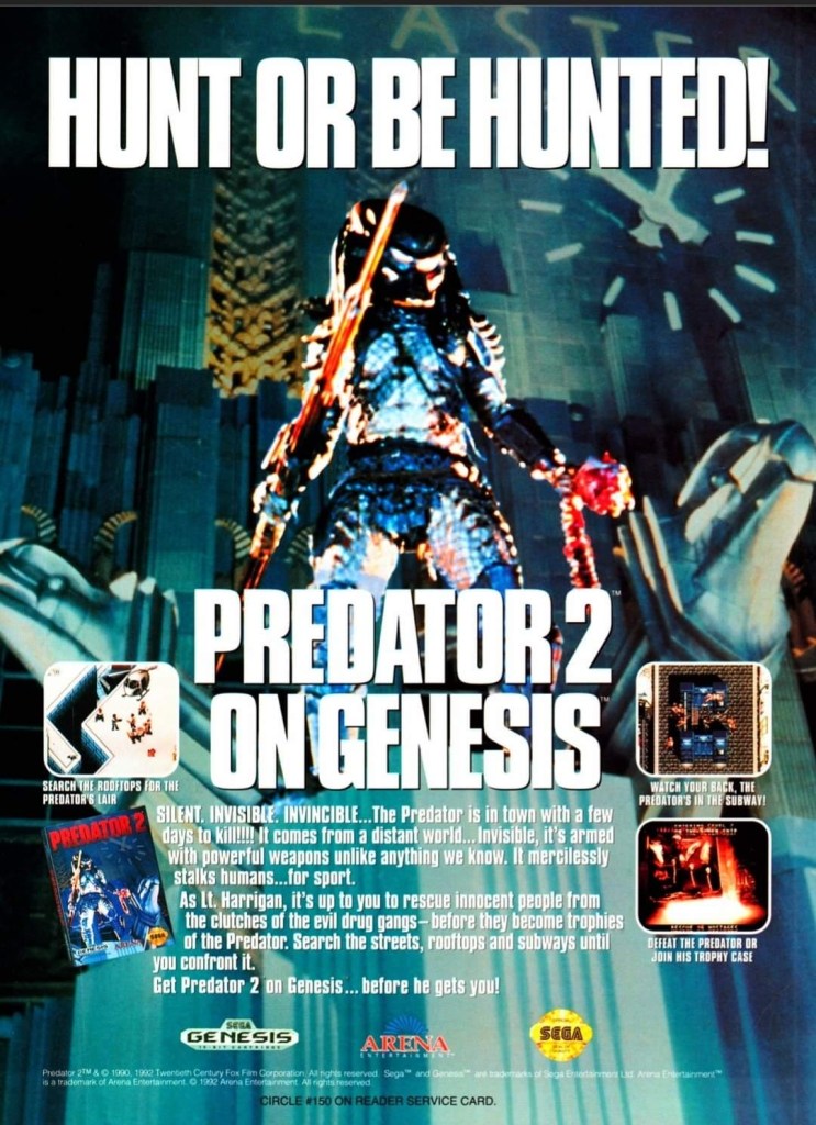
6. Predator 2 print ad
This is one very edgy print ad as used an official image from the movie.
If there is anything memorable about the 1990 film Predator 2, it is the fact that it had the story and the alien hunter itself within a metropolitan setting. That being said, the Sega Genesis Predator 2 video game had a suitable design of shooting and adventuring within the urban settings. This video game ad really captured the vibe of the movie (even showing the reddish human skull with spine on the Predator’s left hand) and clearly showed what gamers could expect. This old ad is still captivating to look at and its edgy approach is still intact.
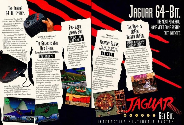
7. Atari Jaguar print ad
Did you ever own an Atari Jaguar console?
When I was reading video game magazines back in the 1990s, I always found print ads of the Atari Jaguar intriguing to look at. I was very young when I first played the Atari 2600 and its games at home, and later played some Atari games in the arcade. To me, seeing Atari Jaguar print ads like this one gave me moments of nostalgia and it made me wonder if Atari knew what it was doing with their so-called 64-bit game console. They did what they could to promote their console and the games within this 2-page print ad.
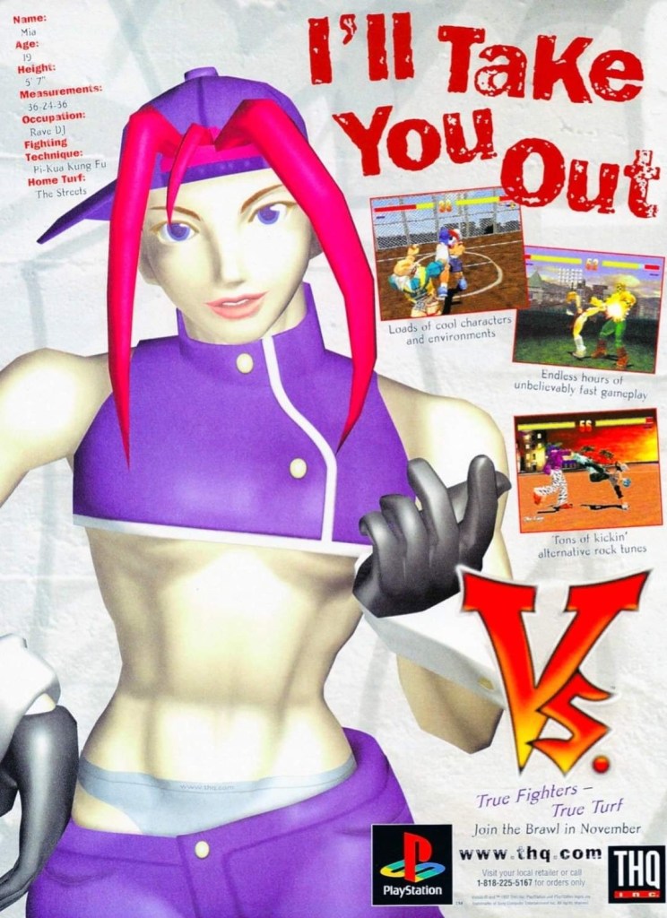
8. Vs. print ad
This print ad easily reminds me of the 1990s.
By 1997, both the arcades and the video game console market were filled with lots of 2D and 3D polygonal fighting games. Japan was the hot spot of the production of 3D polygon fighting games and the developer Polygon Magic (based in Japan) made Fighters’ Impact which Taito released in Japanese arcades and the PlayStation. The said game was picked up by THQ for a late-1997 release on the PlayStation in America under the title Vs. I never played this game but I heard that the game’s development included gang-oriented characters designed by Marvel Comics artist Kurtis Fujita. This Vs. ad is a lively reminder about the hip-hop fashion that made its way into video games.
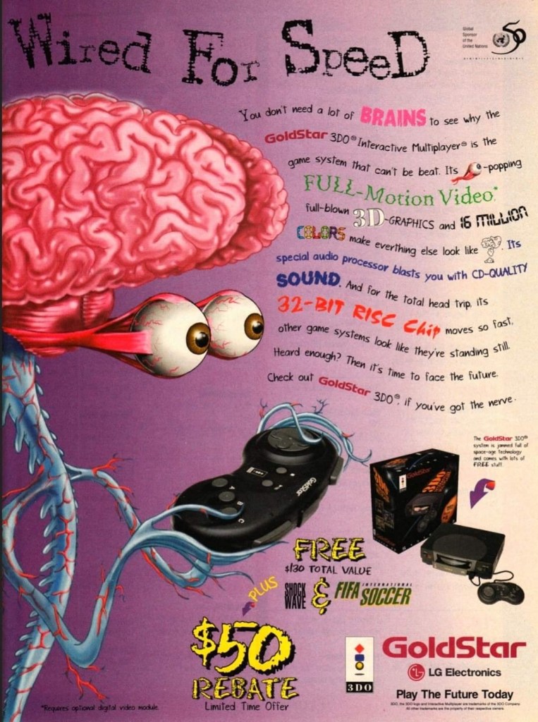
9. GoldStar/LG Electronics 3DO print ad
This is a very weird way to market a video game machine.
Back in the 1990s, the South Korean electronics company GoldStar (which was part of the umbrella of LG Electronics) had the license to produce 3DO game consoles with its own style. In some ways, the GoldStar 3DO console looked like a premium console on the outside. Unfortunately, the GoldStar 3DO print ad here had a very sloppy presentation as the ad makers used very weird art of a brain-with-eyes holding a 3DO controller leaving little space left to promote the console and games (without any screenshots). The text description was sloppily done. This is a bad example of promoting video game hardware and games.
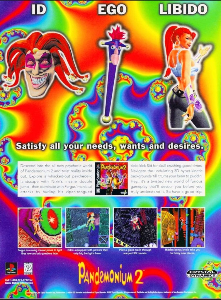
10. Pandemonium 2 print ad
I saw this ad but never played the game.
Looking back at 1997, I find it strange that I never got to play Pandemonium 2 on the PlayStation even though I saw its print ad in magazines. I had a lot of fun playing Pandemonium! on the console in 1996 but somehow missed out on its sequel. Looking back at the Pandemonium 2 print ad, I was surprised with how the game developers redesigned the two playable protagonists, especially Nikki who was clearly made to look very sexy. The word “libido” (meaning sexual drive) was deliberately placed above Nikki. The ad also had a hypnotizing mix of colors which I believe was also deliberately done by the ad makers. I can only wonder how the game played.
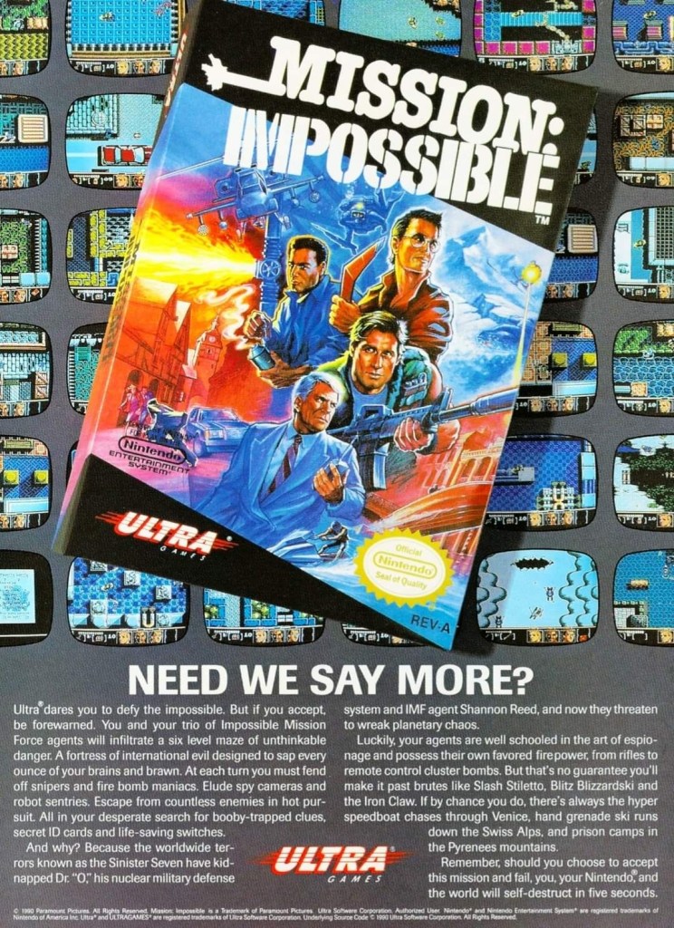
11. Mission: Impossible print ad
A captivating ad.
In 1990, Ultra Games (a label of Konami) released the Mission: Impossible video game on the Nintendo Entertainment System (NES) in America. Developed by Konami, the game was an adaptation of the 1988 TV series and it had an ambitious design with regards to level design and gameplay. To promote the game, the ad makers came up with a visual design showing the game’s box (which had a nice painted art on the cover) on the foreground and several screenshots resembling TV monitors on the background. Even by today’s standards, this print ad still looks good and captivating even if you are not too familiar with Mission: Impossible on TV.
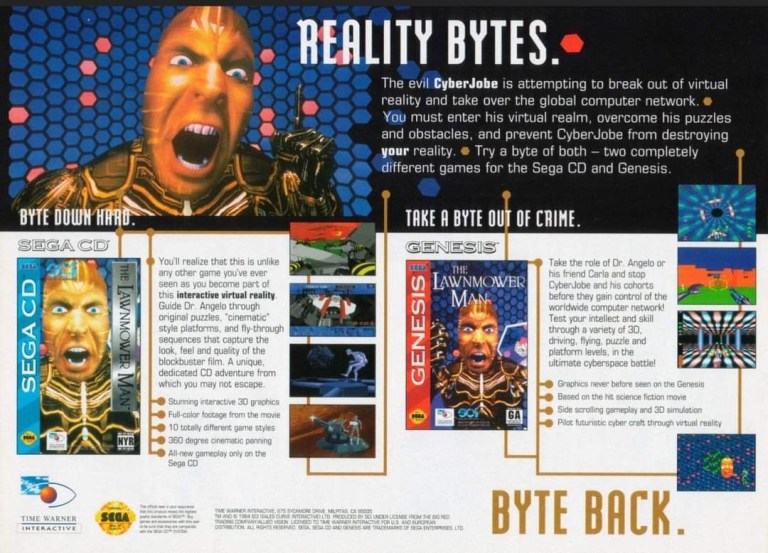
12. The Lawnmower Man Sega CD and Genesis print ad
Are you fan of The Lawnmower Man movie?
Back in 1992, there was a lot of buzz generated by the movie The Lawnmower Man as it had a disturbing concept that involved virtual reality and, more notably, author Stephen King sued the filmmakers to remove his name from the title because the film differed so much from the source material. Of course, those developments did not stop the production of video game adaptations of the movie. This print ad promoting the Sega CD and Sega Genesis versions of the game heavily used the images of CyberJobe which were among the most memorable images from the film. Looking at the ad, the ad makers could have made the screenshots look a little larger to really sell the games.
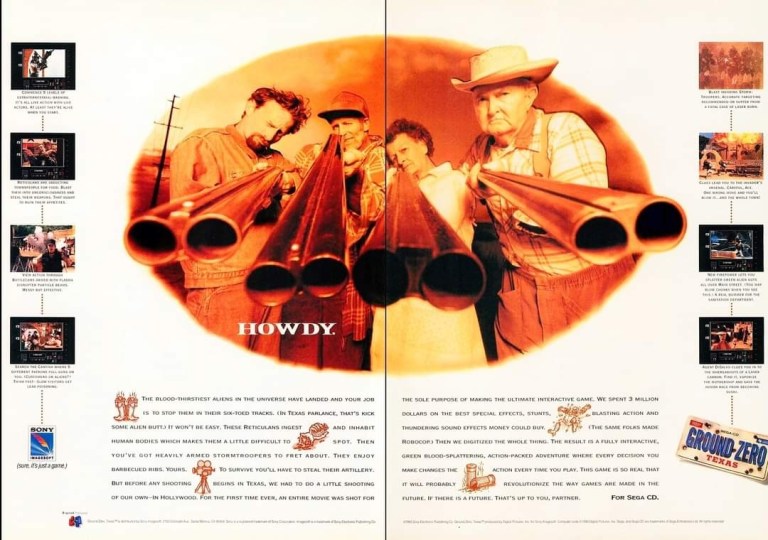
13. Ground Zero: Texas print ad
The shotguns really made this ad eye-catching.
I never played the Sega CD video game Ground Zero: Texas but I knew that it was one of those games that heavily relied on video footage while giving players moments to interact. Back in 1993, there was an increase in the number of video games that carried lots of live action footage to drive the narrative and players were given options in order to progress. What is very notable about the game is not the game design but the very 2-page ad used to promote it. The image showing four people pointing their shotguns towards the viewer was easily the most captivating part of the ad. Even though there was vacant space in between, the screenshots of the game were displayed to be really small.
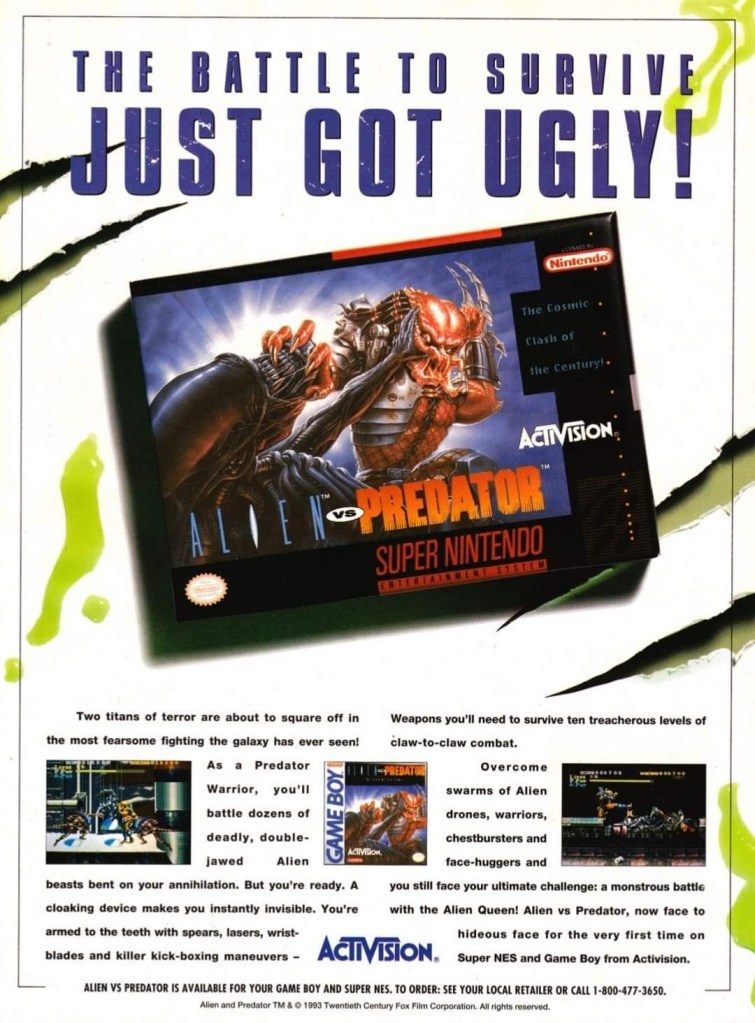
14. Alien vs. Predator for SNES and Game Boy print ad
This ad caught the attention of a lot of people back then.
Back in 1990, Dark Horse Comics launched the 4-issue mini-series of Aliens vs. Predator which turned out to be a very intriguing and engaging crossover comic book tale featuring two iconic sci-fi species of monsters. The success of the comic books led to the production of many video games which delighted both fans of Predator and Aliens. In 1993, Activision released Alien vs. Predator on the Super Nintendo Entertainment System (SNES) and the single-page print ad they came up with was engaging to look at. The SNES game box with the fine looking painted art was the main visual highlight leaving just enough space for the descriptive text, the Game Boy cover and two screenshots. Believe it or not, this video game was not related at all with the Alien vs. Predator arcade game and Atari Jaguar console game.
Welcome back readers, fellow geeks and electronic gaming fans!
In this edition of the Retro Gaming Ads Blast (RGAB) series, we will take a look at another batch of retro gaming print ads – including arcade flyers – specifically about fighting games that were released in the 1990s. The said decade marked the time when Street Fighter II became a massive hit in the video arcades (and on game consoles) which sparked a wave of new fighting games from business competitors. In that same decade, 3D polygonal fighting games were also released which added greater choices of fighting games at the arcades and on game consoles that players could choose from.
For the newcomers reading this, Retro Gaming Ads Blast (RGAB) looks back at the many print ads of games (console, arcade, computer and handheld) that were published in comic books, magazines, flyers, posters and newspapers long before smartphones, social media, the worldwide web and streaming became popular. To put things in perspective, people back in the 1980s and 1990s were more trusting of print media for information and images about electronic games and related products.
With those details laid down, here is the newest batch of retro gaming print ads for you to see and enjoy…
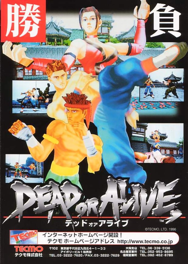
1. Dead or Alive Japanese arcade flyer
Dead or Alive was the start of new success that impacted the direction of Tecmo in the gaming industry.
The above arcade flyer of Dead or Alive gave Japanese arcade operators and gamers a taste of what to expect with the game. While the screenshots showed some resemblance with what gamers saw in Virtua Fighter 2, the character designs Tecmo and its developers came up with were unique.
Before Dead or Alive was released in Japanese arcades in 1996, company Tecmo was in financial trouble and they asked Tomonobu Itagaki to make a fighting game similar to Sega’s polygonal blockbuster Virtua Fighter. A breakthrough for Tecmo happened when Sega announced they were licensing their Model 2 arcade to third-party companies which paved the way for Itagaki’s team to make Dead or Alive with it. The game became a big hit and it paved the way for Tecmo to release it on Sega Saturn and PlayStation, and the sequels that followed years later.
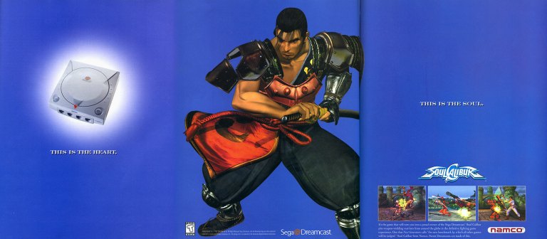
2. North American Soulcalibur Dreamcast version print ad
Namco came up with a creative approach to emphasize heart-and-soul promoting their game and the Dreamcast.
On September 9, 1999, Sega launched their Dreamcast console in America. With a gap of around ten months between the Japanese launch (November 1998) and the American launch, Sega had time to prepare Dreamcast’s release to American gamers with a huge lineup of games (both Sega’s games and from other publishers). Fortunately for Sega, they had Namco (their rival on arcade games) supporting their console.
Behind the scenes, Namco’s developers worked hard to not only port their arcade hit Soulcalibur to the Dreamcast, but to enhance the graphics using the console’s more advanced technology. The visual enhancements include rendering all of the games stages (and backgrounds) into full 3D polygonal environments. Namco also implemented different game modes and added even more content to ensure satisfaction to Dreamcast gamers.
The above 3-page print ad of Soulcalibur on Dreamcast was undeniably strategic and captivating to look at. The ad described the console as the heart, showed Soulcalibur character Mitsurugi (one of the game’s most popular characters) in the middle and then described the game (with 3 screenshots of game rendered with Dreamcast graphics) as the soul. It was a strong way to promote both the game and the console. In the years that followed, Soulcalibur grew into a popular fighting game franchise and the Dreamcast version will always be remembered as the crucial turning point.
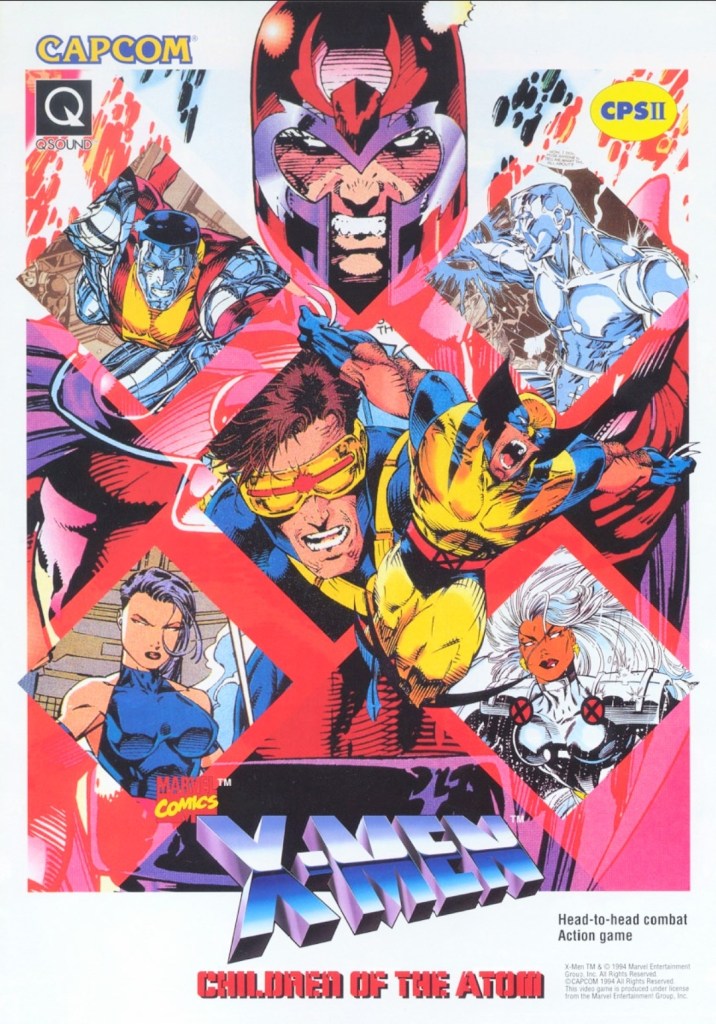
3. X-Men: Children of the Atom arcade flyer
Anyone who read lots of X-Men comic books in the 1990s should be able to tell which character was drawn by which artist.
When Capcom first released X-Men: Children of the Atom in the arcades in the mid-1990s, I was surprised because I did not anticipate the day would come when the company behind Street Fighter II would actually make a 2D fighting game showcasing the Marvel’s mutants. Even more intriguing was the X-Men art Capcom used for the arcade flyer to promote the game. I recognize Jim Lee’s artworks of Magneto, Cyclops and Colossus. The art of Wolverine shown was drawn by Andy Kubert. It was a wise move for Capcom (with Marvel as a business partner) to use established X-Men comic book artworks instead of having their internal illustrator draw the characters. That being said, this arcade flyer still looks great and captivating to look at.
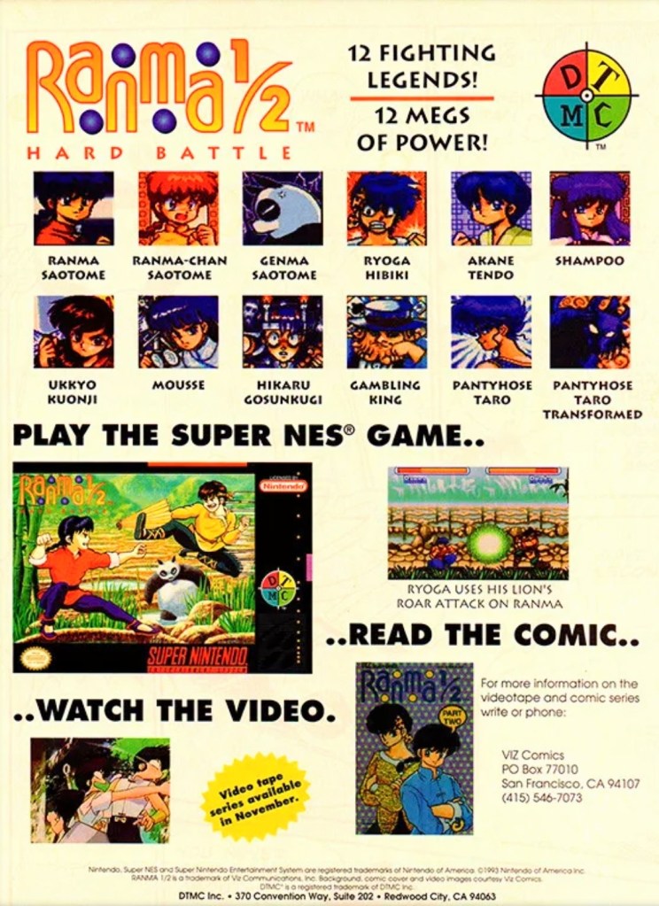
4. North American Ranma ½: Hard Battle print ad
A print ad promoting the game while saving some space to promote the anime and comic books.
By 1993, Street Fighter II and its upgraded follow-ups were wildly popular both in the arcades and on game consoles around the world. At the same time, there were many other 2D fighting games released to compete with and cash-in on Street Fighter II’s success. Believe it or not, the established anime franchise Ranma ½ saw a video game adaptation in the form of a 2D fighting game – Ranma ½: Hard Battle.
The North American print ad above published by DTMC (in cooperation with Viz Communications) promoted the game (one screenshot, the SNES game box and images of the characters as they appeared in the game) as well as Ranma ½ on anime videos and comic books. The way it was presented, the print ad promoted Ranma ½: Hard Battle without much heart nor passion.
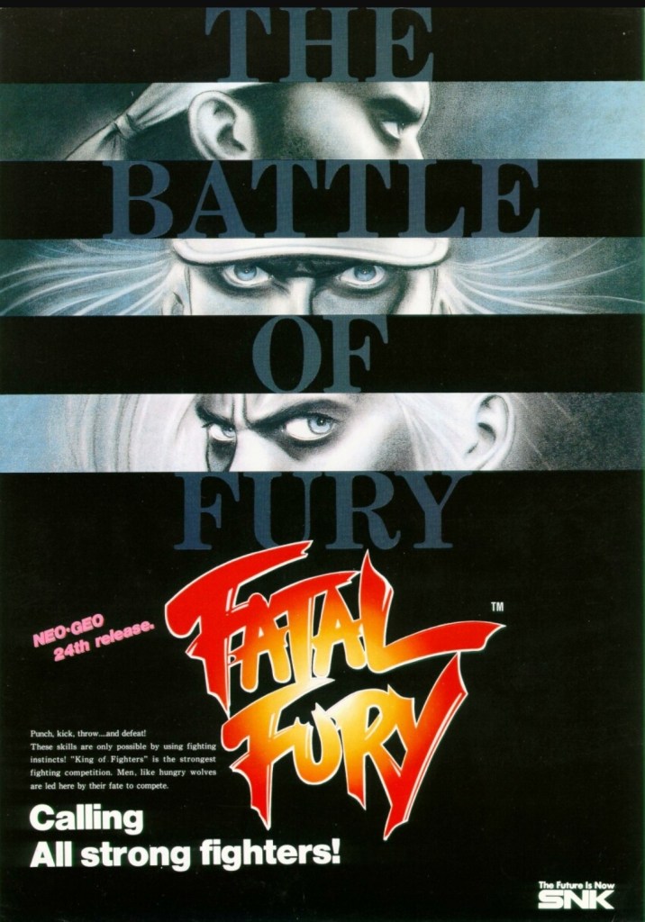
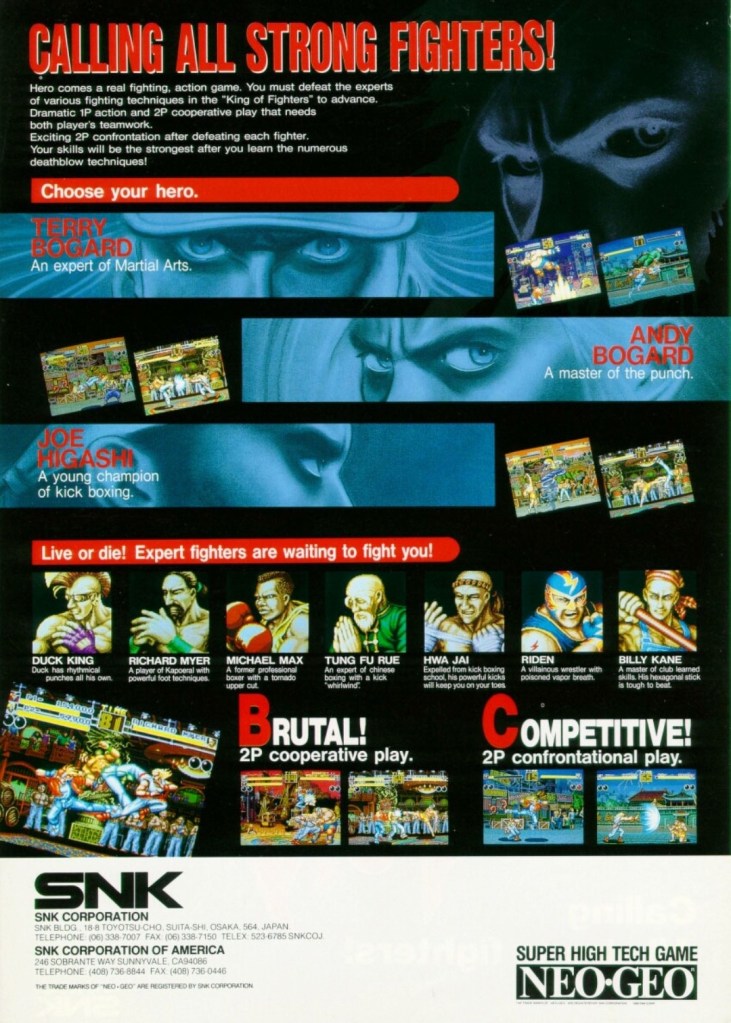
5. Fatal Fury: King of Fighters arcade flyer
An intriguing visual presentation on the front.
You get to know the characters and what the game features are.
There is no doubt that Fatal Fury: King of Fighters is the most significant game that SNK made. Apart from being the company’s first fighting game for the Neo Geo system, it established the fictional “king of fighters” tournament that became the core concept for The King of Fighters series of games in the years that followed. Fatal Fury itself is notable for being designed by Takashi Nishiyama, a former Capcom employee who created the original Street Fighter game. What Nishiyama could not do with Street Fighter, he accomplished while making SNK’s fighting game. Compared with the combo-oriented approach of Street Fighter II, Fatal Fury was designed to emphasize the timing of special moves, confrontational play, cooperative play and the 3D-like spacing between characters (background row and foreground row in each stage) while telling a story in a solid way.
The above arcade flyer of Fatal Fury has this unique looking artwork on the front showing stylized rectangular shots of the major characters Terry Bogard, Andy Bogard and Joe Higashi. On the other side of the flyer are the details that emphasized the creative concept of the game, who the characters are and what they could expect with regards to gameplay features. This flyer is still captivating to look at and it could entice you to try playing the original Fatal Fury game before trying out the sequels and spin-offs.
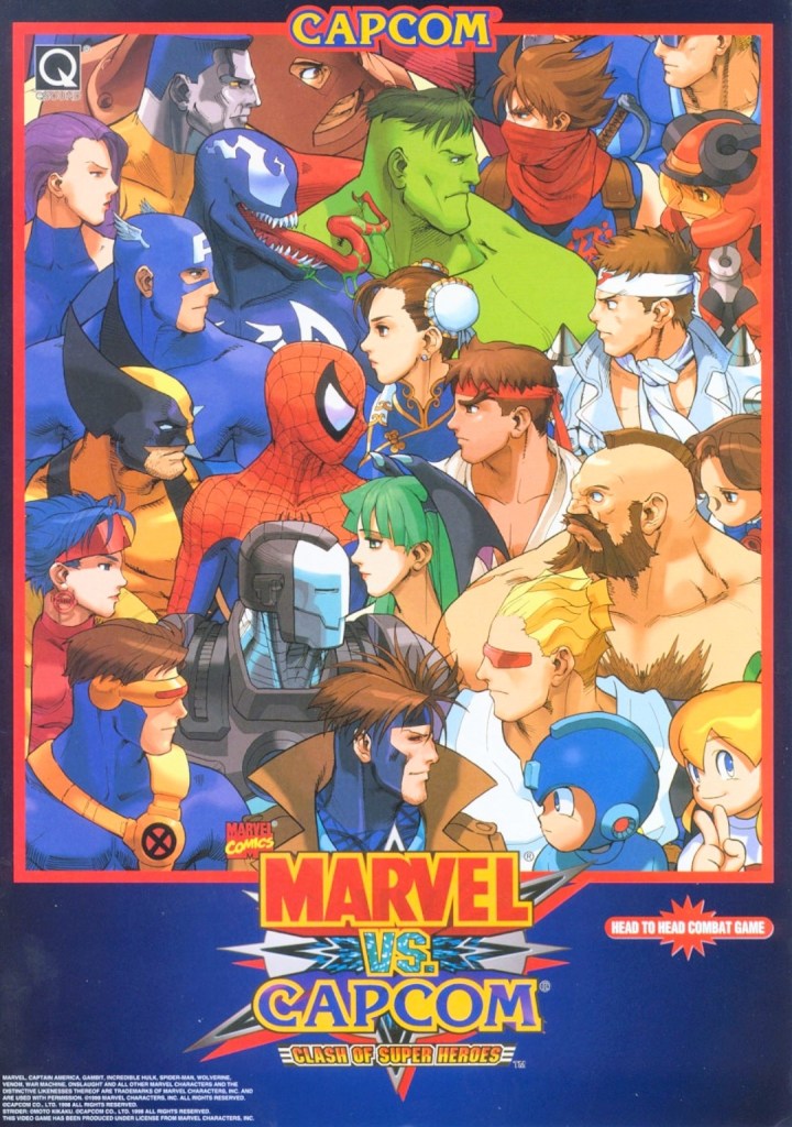
6. Marvel vs. Capcom: Clash of Super Heroes arcade flyer
This is NOT a comic book crossover.
If there is anything that truly emphasizes the essence of a fictional crossover in terms of visuals, it’s the art that Capcom and Marvel agreed to for Marvel vs. Capcom: Clash of Superheroes which is evident on the front of the above arcade flyer. By looking at how the Marvel characters were drawn, it looks like someone at Capcom illustrated the artwork as the Capcom characters still maintained that particular art style seen in the artworks of the Japanese company’s other games like Street Fighter, Darkstalkers, Mega Man and Strider. Regardless, the artwork still is amusing to look at.
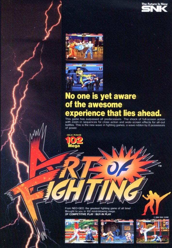
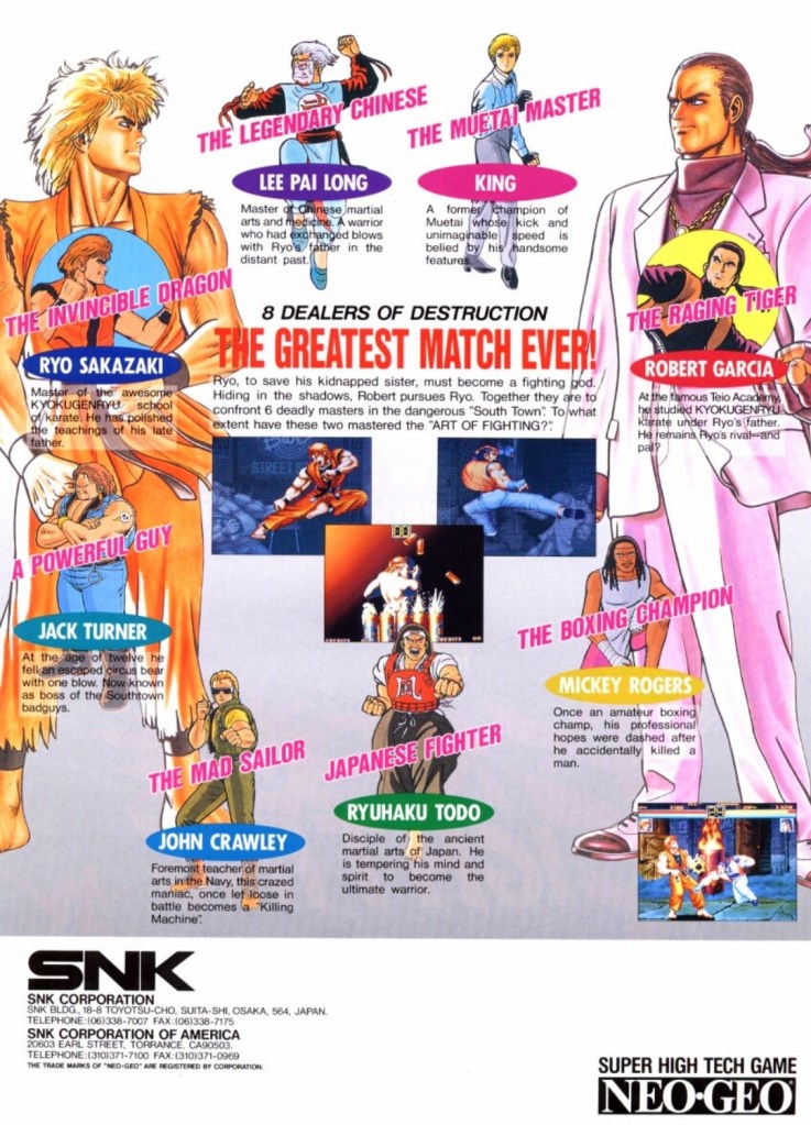
7. Art of Fighting arcade flyer
The front of the flyer.
The cast of characters showcased on the other side of the flyer.
Following the success of Fatal Fury, SNK went on to release Art of Fighting in arcades in 1992 and it became successful enough for the company to make sequels. With regards to the realm of fantasy, Art of Fighting was part of the same fictional universe as Fatal Fury and The King of Fighters, and there were times when its own characters appeared in other SNK games.
Art of Fighting’s arcade flyer had an energetic visual concept on the front with a rectangular lightning portion on the left balanced with five screenshots of the game itself. Once you get to the other side of the flyer, you will see really nice art of the characters with Ryo Sakazaki and Robert Garcia as the most dominating figures. Sakazaki and Garcia are the major characters of the Art of Fighting series. This flyer confidently introduced the characters and succeeded in making them look interesting.
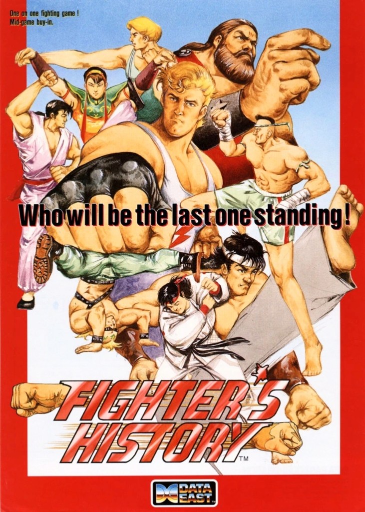
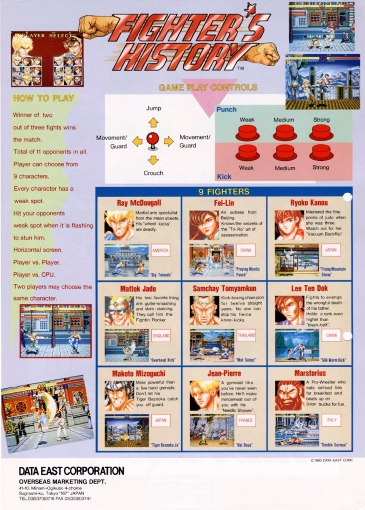
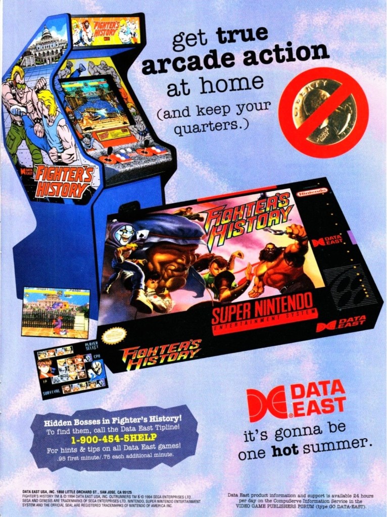
8. Fighter’s History arcade flyer and print ad
Great looking front artwork showing the game’s characters, posing and some action.
If you look closely at the controls, you will see the six-button layout and functions which are the same with those used in Street Fighter II.
Data East offered two ways for gamers to enjoy Fighter’s History – pay a high price for the SNES version or gamers can go play the game in the arcade by dropping a few coins.
In 1993, Data East released their fighting game Fighter’s History in the arcades around the world. Along the way, the company released their arcade flyer which had a very captivating art work on the front featuring their characters and some action. The other side of the flyer showed the technical details on how to play, how the control works and who the characters are. Fighter’s History was nicely received in the arcades and the success led Data East into porting the game for the Super Nintendo Entertainment System (SNES). If you look at the print ad above, you can see how clever Data East was promoting the SNES version of the game while keeping an image of the arcade machine which serves like a subtle reminder that the same game is still available in video arcades.
Shortly after the release of Fighter’s History in the arcades, there were gamers who noticed that it had certain visual and gameplay elements that made it so familiar with what Street Fighter II had. When Capcom became aware of the similarities, they sued Data East claiming that Fighter’s History was too similar to their game and that copyright infringement was committed. Capcom lost the case ultimately and Data East went on to release two more Fighter’s History games.
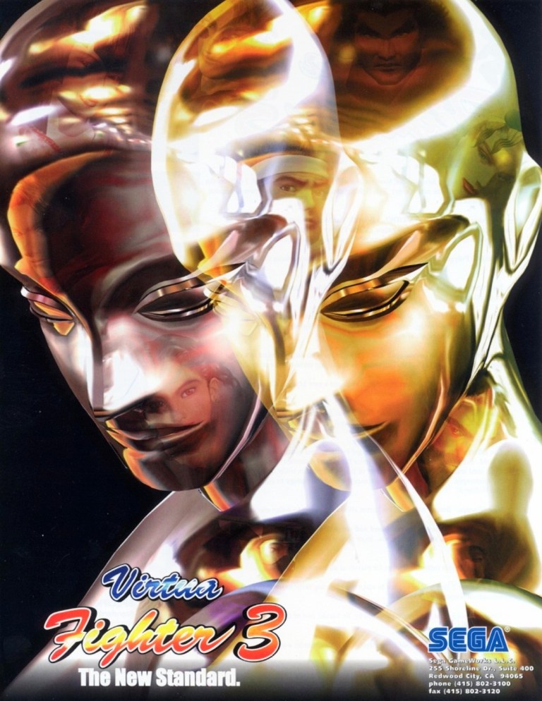
9. Virtua Fighter 3 arcade flyer
Virtua Fighter 3 truly raised the standards for arcade game graphics back in 1996.
When it comes to gaming innovation and standing out among the rest, Sega did exactly those when they released Virtua Fighter 3 in arcades in 1996 and it had the best-looking and really mind-blowing graphics at the time. Developed by AM2 (led by Yu Suzuki) on the very expensive Model 3 arcade hardware, Virtua Fighter 3 broke new ground on graphics as it moved over 1 million polygons per second, had highly detailed visuals on the characters and surroundings, realistic reflection effects, detailed shining, parallel lighting and high-specular Gouraud shading to name some. Even the characters’ eyes followed the opponent’s position.
The Virtua Fighter 3 arcade flyer showcased their reflective, metallic character Dural who in turn was part of the graphical showcase (emphasizing reflections, smooth animation and liquid metal effects) when the game was previewed in the 1996 AOU event in Japan. The words “The New Standard” written on the lower-left corner of the front of the flyer was justified and truthful.
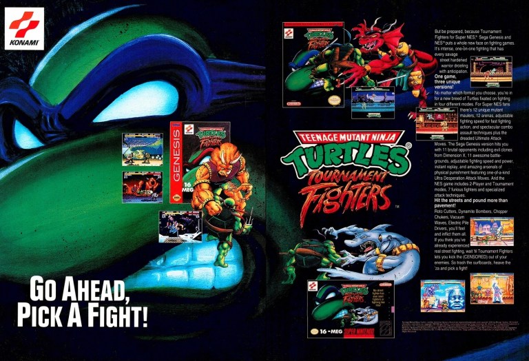
10. Teenage Mutant Ninja Turtles: Tournament Fighters print ad
This print ad had a nice visual presentation and was easily recognizable to the many TMNT fans.
In 1989, the Teenage Mutant Ninja Turtles (TMNT) franchise made quite a splash on video games which is not surprising as the multimedia franchise was already a popular in the West. More video game adaptation of TMNT were released in the early 1990s providing fans and gamers a lot of fun gameplay at the arcades (click here) and on consoles. Konami had the video game rights of TMNT and in a clear response to the sudden popularity of fighting games, they released Teenage Mutant Ninja Turtles: Tournament Fighters on the most popular game consoles of the time achieving varying levels of success critically and commercially (note: the SNES version stood out as the best). This print ad of the fighting game was effective in visually promoting the three console versions and the displayed text contained enough information to lure the attention of both fans and gamers.
Disclaimer: This is my original work with details sourced from reading the comic book and doing personal research. Anyone who wants to use this article, in part or in whole, needs to secure first my permission and agree to cite me as the source and author. Let it be known that any unauthorized use of this article will constrain the author to pursue the remedies under R.A. No. 8293, the Revised Penal Code, and/or all applicable legal actions under the laws of the Philippines.
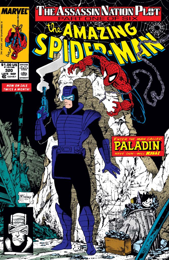
Welcome back superhero enthusiasts, 1980s arts and culture enthusiasts, Marvel Comics fans and comic book collectors! Today we go back to the year 1985 to examine a small part of the Marvel Comics shared universe through a tale of the Amazing Spider-Man monthly series.
For this particular review, we will explore the first chapter of The Assassin Nation Plot storyline that took place within the Amazing Spider-Man series.
With those details laid down, here is a look back at Amazing Spider-Man #320, published in 1989 by Marvel Comics with a story written by David Michelinie and drawn by Todd McFarlane.
The cover.
Early story
The story begins inside Empire State University where Peter Parker – working as an assistant in the science lab – takes advantage of the free time and resources to create web fluid using a new formula. He notices that the acetylene torch does not even leave a smudge on the new web he made.
To his surprise, his boss doctor Evan Sloan catches him doing an interesting experiment. Parker comes up with a convincing excuse for the experiment which spares him from getting into trouble. After promising doctor Sloan he will get on the neutron project first thing in the morning of Thursday, Parker leaves, secretly changes into Spider-Man and equipped his brand new web. He then leaves the university and moves deep into the city…
Quality
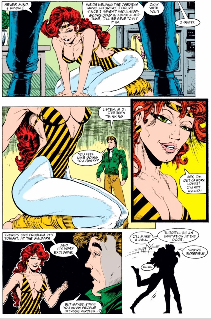
Peter Parker and Mary Jane having a discussion.
I really like the story David Micheline came up with as the start of The Assassin Nation Plot storyline. This is clearly not your typical good-versus-evil superhero tale starring the webslinger. Instead, there are layers of secrecy, suspense and intrigue that involves a powerful private organization, private armies and diplomats.
Instead of facing off with super villains, Spider-Man finds himself in the middle of something very big brewing behind the scenes, and that puts him in deep danger. That being said, Michelinie’s approach on building up the details of the plot moved very smoothly and the payoff for each buildup was executed on a timely manner. The buildup of details was never boring nor too slow to absorb, and Todd McFarlane excelled with visualizing the plot while still delivering dynamic superhero action.
I should mention that the character Paladin has a strong presence in the story and there were moments when he outweighed Spider-Man in terms of importance.
Conclusion
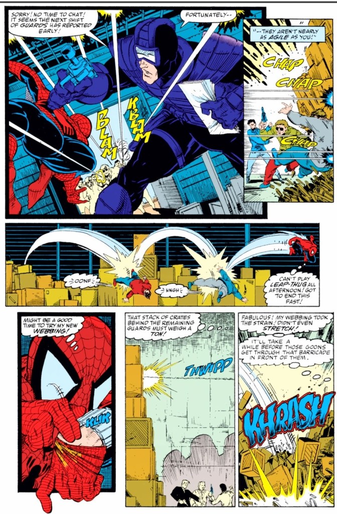
Spider-Man and Paladin targeted by armed guards.
Amazing Spider-Man #320 (1989) is indeed a very solid story to read and a powerful start of The Assassin Nation Plot storyline. With the way the core concept was presented, this comic book symbolically showed that there are high stakes and other matters that are clearly too overwhelming for Spider-Man to deal with. The story is nicely paced and the creative team knew when and how to execute worthy payoffs for each buildup. By the time I reached the end of the comic book, I became convinced to read the next chapter of this storyline.
Disclaimer: This is my original work with details sourced from reading the comic book and doing personal research. Anyone who wants to use this article, in part or in whole, needs to secure first my permission and agree to cite me as the source and author. Let it be known that any unauthorized use of this article will constrain the author to pursue the remedies under R.A. No. 8293, the Revised Penal Code, and/or all applicable legal actions under the laws of the Philippines.
Welcome back superhero enthusiasts, 1990s culture enthusiasts and comic book collectors! Today we go back to the early 1990s and explore a part of the Valiant Comics shared universe through the Armorines monthly series.
During the said decade, Valiant Comics was notable for having crossovers that some readers found to be tightly executed in relation to continuity. The armored U.S. Marines (Armorines) and the powerful individual X-O Manowar have the spider aliens as a common enemy.
With those details laid down, here is a look back at Armorines #6, published in 1994 by Valiant Comics with a story written by Jorge Gonzalez and drawn by Jim Calafiore.
The cover.
Early story
The story begins in space when the spider aliens (located inside a huge space ship) are organizing themselves to get back to their home world.
Meanwhile above the Earth, X-O Manowar significantly helps the Armorines with repairing their space shuttle. It turns out that they have been spending a long time in space and the crew has gotten exhausted after the big battle with the spider aliens. Going back home was their next objective.
Just as the crew prepares to return to Earth, the same huge space ship of the spider aliens suddenly approaches them…
Quality
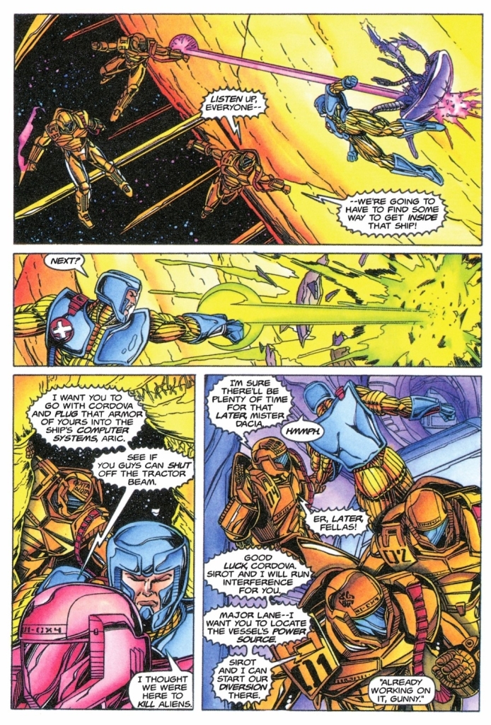
The spider aliens.
Set after the crossover tale about the humans’ battle with the spider aliens in space, this tale served as a creative extension of those events utilizing space travel and sci-fi action concepts. The Armorines once again fight the spider aliens and X-O Manowar (a major Valiant character) gets heavily involved as he has a personal grudge against them. Without spoiling the plot, I can say that themes of freeing yourself from the enemy and getting back home are evident.
There is plenty of action to enjoy here and the sci-fi settings (including the interiors of the spider aliens ship) are nicely presented. I also like the fact that the tension gradually built-up as the story went on. Still, at this particular stage of this series, I could not help but feel that the Armorines have been in conflict with the spider aliens for too long.
Conclusion
There is a lot of sci-fi action to enjoy here.
Armorines #6 (1994) is a pretty good read but I was getting tired of seeing the Armorines remaining in conflict with the spider aliens. What added strong value to the comic book was the heavy involvement (and crossover) of X-O Manowar and his interactions with the Armorines was well executed. To be clear, the story was not conclusive and at this stage, I still am interested to see what would happen next. Here is hoping that the Armorines conflict with the spider aliens will improve somehow.