Welcome back readers, fellow geeks and electronic gaming fans!
In this edition of the Retro Gaming Ads Blast (RGAB) series, we will take a look at another batch of retro gaming print ads related to the 1993 blockbuster film Jurassic Park. As part of the business strategy of the film directed by Steven Spielberg, several video games were licensed to make movies based on the movie. Unsurprisingly, the sequel The Lost World: Jurassic Park was released in 1997 and it also had its own video games. This is the Jurassic Park Special.
For the newcomers reading this, Retro Gaming Ads Blast (RGAB) looks back at the many print ads of games (console, arcade, computer and handheld) that were published in comic books, magazines, flyers, posters and newspapers long before smartphones, social media, the worldwide web and streaming became popular. To put things in perspective, people back in the 1980s to the 1990s were more trusting of print media for information and images about electronic games and related products.
With those details laid down, here is the newest batch of retro gaming print ads for you to see and enjoy…
1. Jurassic Park SNES Game Print Ad
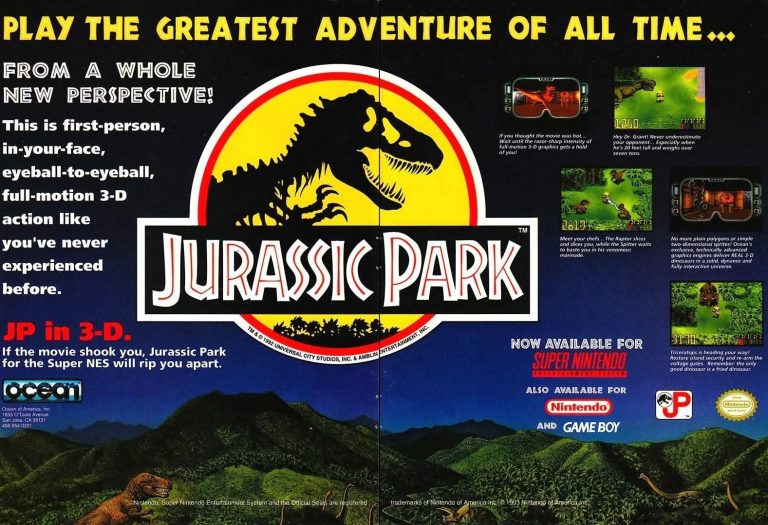
Just a few months after the release of the movie, the official Jurassic Park video game on the Super Nintendo Entertainment System (SNES) was released by Ocean and the company came up with a 2-page print ad to showcase a few screenshots and creative text emphasizing an adventure experience with a touch of “3-D”. The ad makers cleverly showed two first-person view sequence screenshots that showed the SNES was strong enough to deliver the so-called 3D experience. I remember seeing this ad while reading a video game magazine in 1993 and it easily caught my attention.
2. Jurassic Park PC Game Print Ad
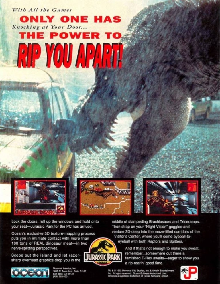
For the Jurassic Park personal computer (PC) game, Ocean came up with a single-page print ad that uses a live-action image from the film’s production. Not only was the image of Tyrannosaurus Rex head (with its sharp teeth visible) touching the vehicle very engaging to see, it is also a reminder that practical effects and other physical stuff were heavily used to do it resulting in a high level of realism that computer-generated imagery (CGI) cannot match.
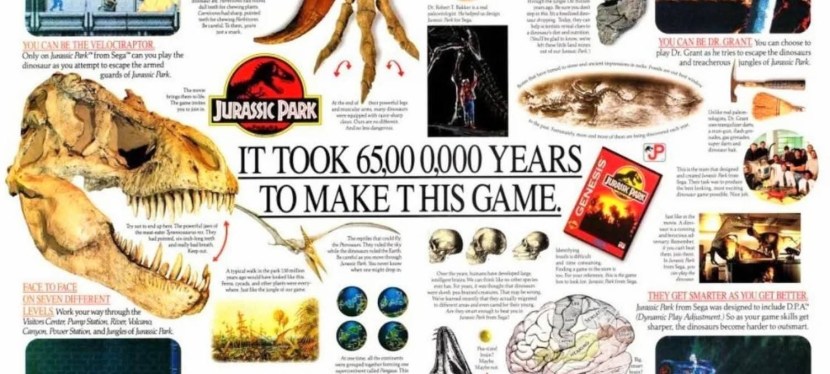
3. Jurassic Park Sega Genesis North American Print Ad
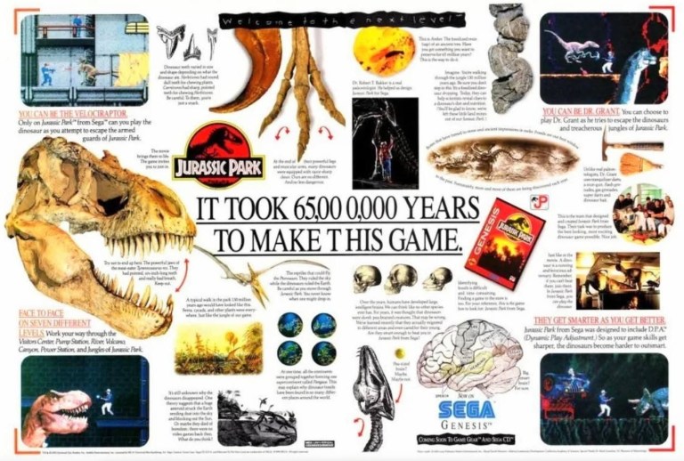
Sega acquired licenses to make Jurassic Park games for its existing consoles plus the arcade game. To promote the Sega Genesis JP game, Sega came up with this 2-page print ad with a great visual design. While there were only few screenshots from the video game, the rest of the ad was filled with lots of eye candy such as dinosaur fossils, illustrations, science-based details and more. Very clearly, this print ad strongly emphasized the dinosaurs, adventure and intrigue. The game eventually sold a lot of copies and added to the overall commercial success Sega had in North America in 1993.
4. Jurassic Park Japanese Arcade Flyer
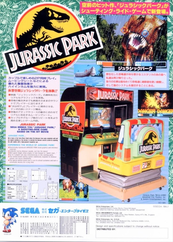
In 1994, Sega released the ambitious Jurassic Park arcade game which was a rail shooter game that had a sophisticated physical design that includes seats for two people. Developed by Sega’s AM3 team, the player(s) equipped with the joystick(s) has to shoot the dinosaurs that appeared on-screen from start to finish. To immerse gamers into the Jurassic Park environment, the game has a fine blend of 2D sprits and 3D polygons which resulted in the feel of 3D surroundings. For its part, Sega had to excite players and arcade operators while also explaining the technical details using the arcade flyer. The arcade game was a commercial success.
5. Jurassic Park Part 2: The Chaos Continues Print Ad
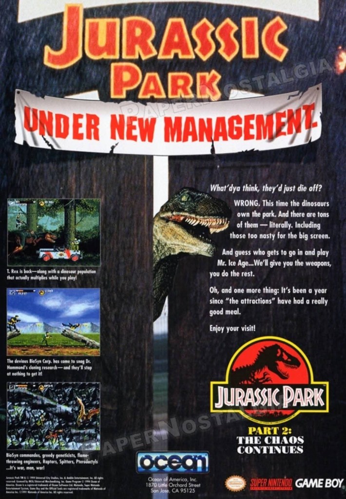
While it is a fact that the sequel to Jurassic Park did not come out in book format (1995) and in the cinemas (1997), Ocean went ahead with its very own sequel titles Jurassic Park Part 2: The Chaos Continues. They even had an original tale about the established character Dr. Alan Grant returning to Jurassic Park to stop a rival corporation from taking over the place. To promote the SNES version of the game, the company came up with a single-page print ad that had an “under new management” sign above while showing a Velociraptor and a few screenshots from the game. As it was released in 1994, the game strongly appealed to the fans as well as gamers who enjoyed 2D side-scrolling adventure games on the SNES.
6. The Lost World: Jurassic Park Print Ad
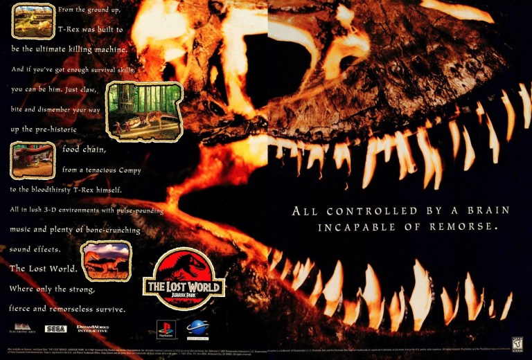
Like its blockbuster predecessor, The Lost World: Jurassic Park had its own video game adaptations. The Lost World: Jurassic Park games for PlayStation and Sega Saturn were developed by a video game company which was under DreamWorks SKG (note: Steven Spielberg was one of the founders), and they had Electronic Arts (EA) and Sega publishing each game per specific console. To market the game, a 2-page print ad was made which featured a dinosaur skull dominating the image leaving some space for screenshots and the descriptive text. Having seen the movie and having played the game, I can say that the dark aesthetic of this print ad reflected the dark and gritty tone of the Spielberg-directed movie.
7. The Lost World: Jurassic Park North American Sega GameWorks Arcade Flyer
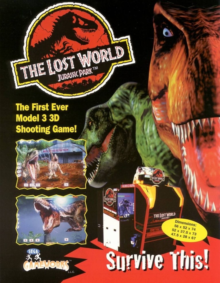
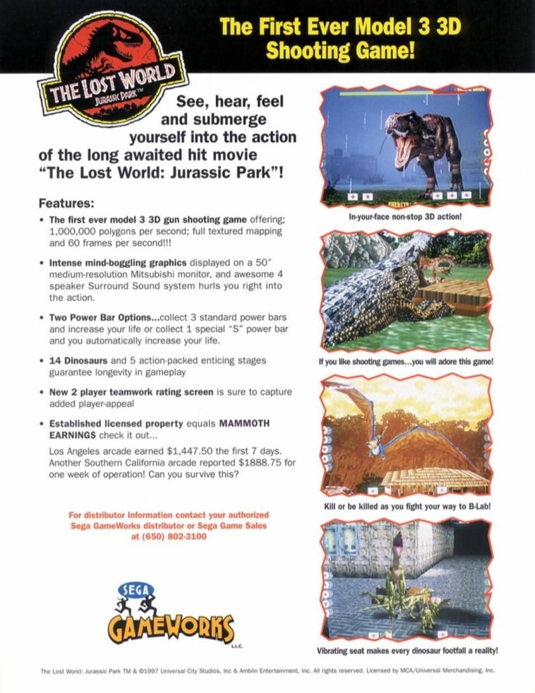
For me, the best game based on The Lost World: Jurassic Park has always been the official arcade game developed and distributed by Sega. It was a sophisticated rail shooter made by the same team behind the 1994 Jurassic Park arcade game. The arcade flyer clearly mentions the Model 3 which was a highly advanced arcade hardware of Sega that made highly detailed 3D polygonal graphics and smooth animation possible. The flyer also boasted the use of a 50-inch medium resolution Mitsubishi monitor and the 4-speaker Surround Sound system that made the arcade experience intense. Even by today’s standards, this 1997 arcade game still looks great and remains enjoyable to play. This arcade flyer really promoted what was real for gamers to experience in the arcade. Are you aware that Steven Spielberg himself received The Lost World: Jurassic Park arcade cabinet as a gift from Sega?
+++++
Thank you for reading. If you find this article engaging, please click the like button below, share this article to others and also please consider making a donation to support my publishing. If you are looking for a copywriter to create content for your special project or business, check out my services and my portfolio. Feel free to contact me with a private message. Also please feel free to visit my Facebook page Author Carlo Carrasco and follow me on Twitter at @HavenorFantasy as well as on Tumblr at https://carlocarrasco.tumblr.com/ and on Instagram at https://www.instagram.com/authorcarlocarrasco