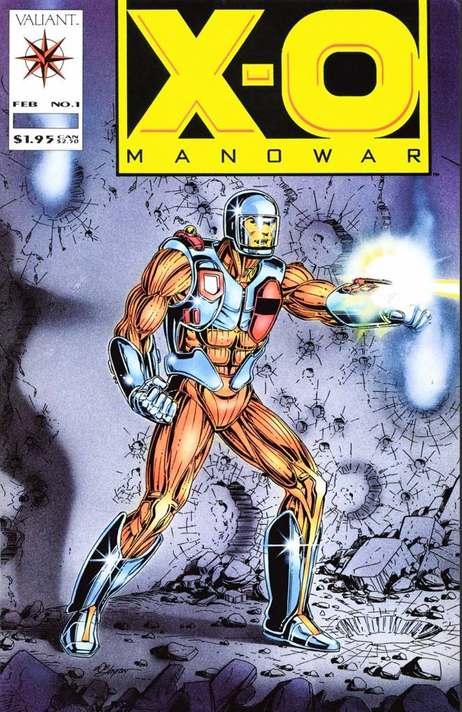
A Look Back at Gen13 #3 (1994)

Welcome back, superhero fans, 1990s arts and culture enthusiasts, Image Comics fans and comic book collectors! Today we go back to the mid-1990s to examine one of the many tales of Jim Lee’s original WildStorm universe through the original Gen13 mini-series.

With the first two issues over, the stakes have been raised now that Caitlin Fairchild has been separated from her eventual teammates. Fairchild is alone in the middle of the desert in Nevada and her pals – who went back to the International Operations (IO) facility that trained them – are in deep trouble already.

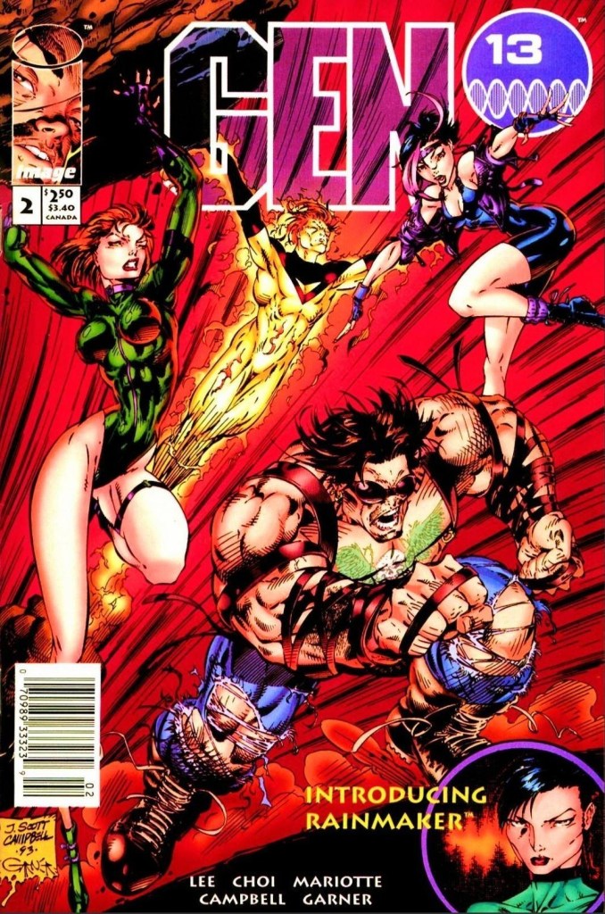
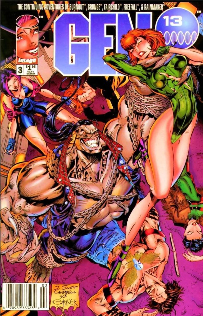
With those details laid down, here is a look back at Gen13 #3, published by Image Comics in 1994 with a story written by Jim Lee and Brandon Choi with artwork done by Jeffrey Scott Campbell. This is the third issue of the mini-series.  

The cover.

Early story

The story begins in the desert. From a distance, Caitlin Fairchild spots a paramilitary convoy delivering something big and important. It turns out the convoy is handled by the Black Razors and they arrived at the IO facility in the middle of the night.

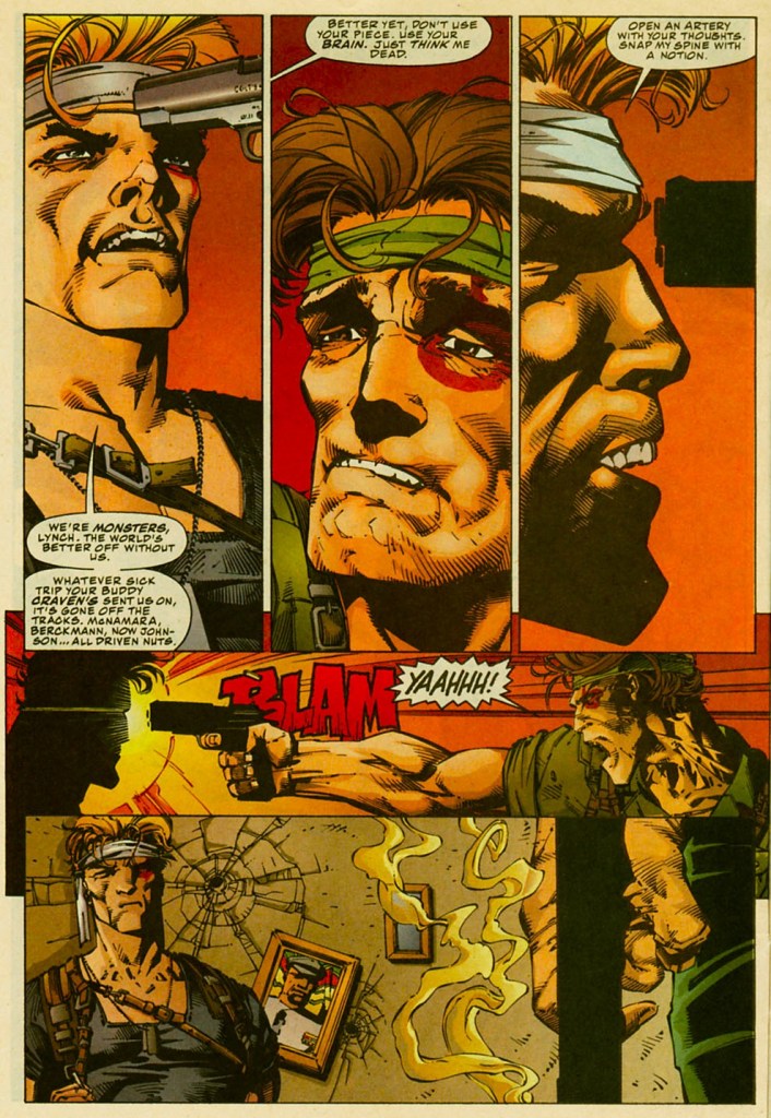
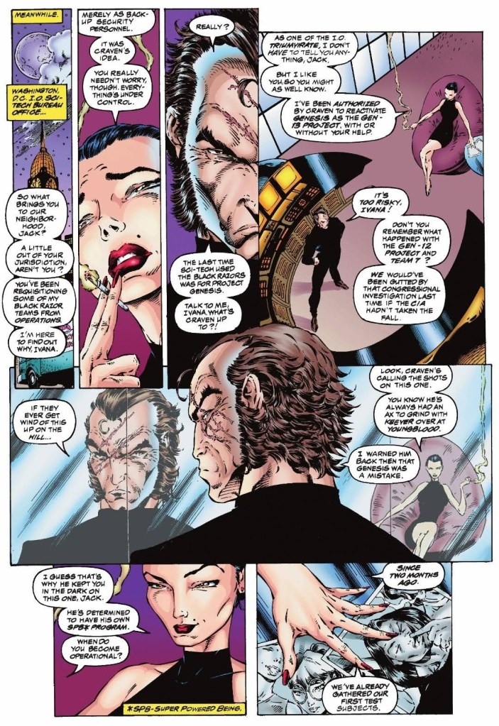
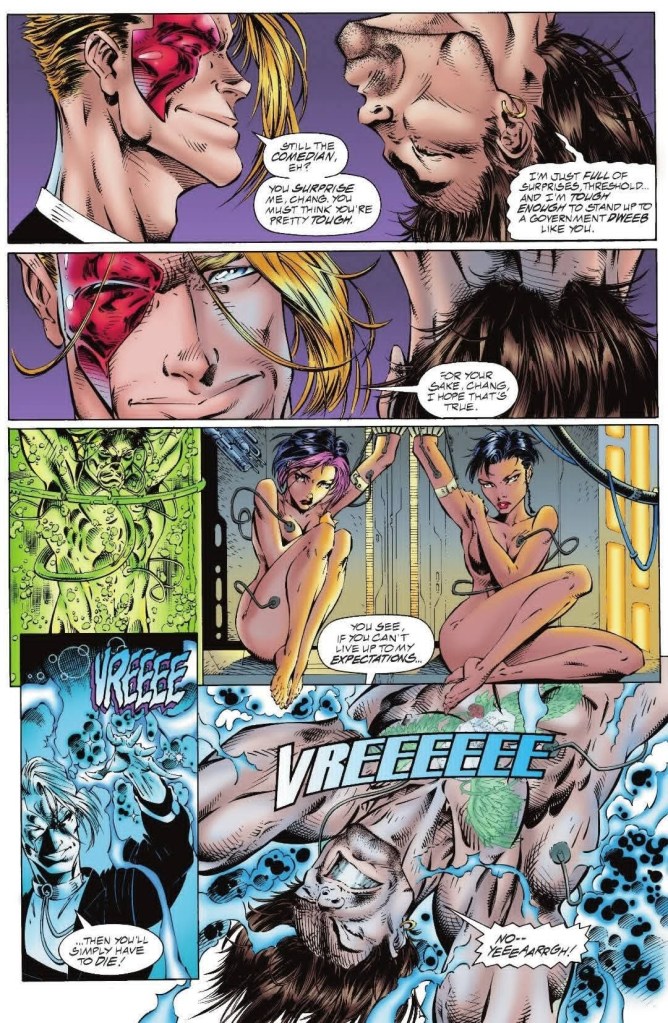
Ivana (one of leaders of the facility) woke up to personally examine what the convoy delivered to them unexpectedly. When she asked who is giving the orders, John Lynch (formerly of Team 7) appears and he tells her that he has an unidentified super-powered being that has to be secured at their facility only for the night.

Inside the heavy containment unit is Pitt…

Quality

Fairchild and Pitt fight!

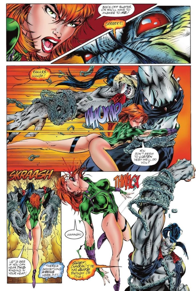
I can say that the story here is both a thrill ride and also a build-up for what is clearly the next stage of the mini-series’ concept. The addition of Pitt here is actually a crossover-related appearance as the said character is a creation of Dale Keown (essentially a non-WildStorm character). Pitt’s presence added weight to the spectacle as a short fight between him and a stronger Caitland Fairchild over a misunderstanding took place.

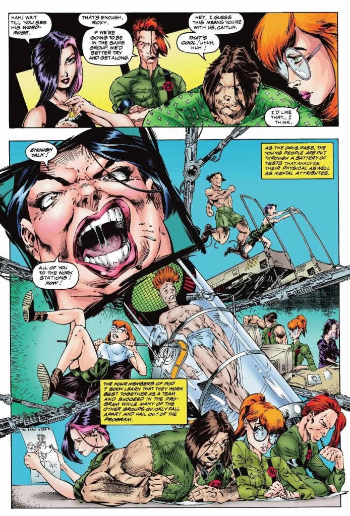
One part of the narrative followed Fairchild who made the suicidal move to return to the facility alone as she decided to rescue her companions Roxy, Grunge, Rainmaker and Burnout. Even though she already has an idea that a trap could be set up for her, Fairchild has fully decided to pursue a rescue rather running away to freedom. As such, Fairchild here is braver, took huge risks to meet her new goals and has shown notable changes following what happened in the first two issues.

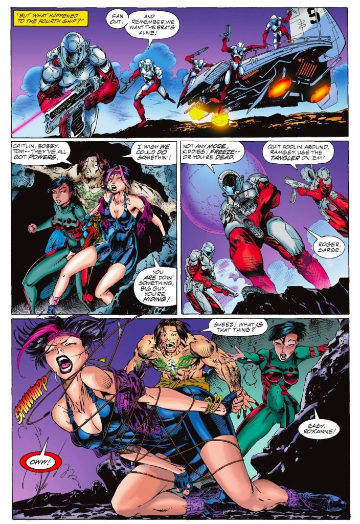
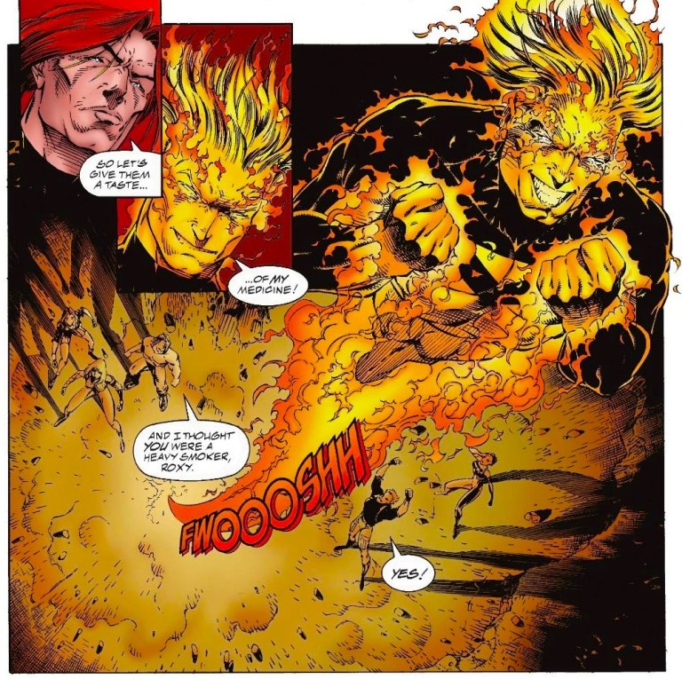
Another part of the plot follows Roxy, Grunge, Burnout and Rainmaker who have been held captive in very humiliating fashion as they have been stripped naked and have been restrained in ways that would outrage the human rights activists. The main antagonists Ivana, Threshold and Nicole wield absolute power in the facility and they are indeed ruthless. Ivana, who had to receive and meet John Lynch, is obsessed with experimenting on gen-active youth to create her own personal army of super-powered beings. Threshold helps her by torturing the captured companions of Fairchild and he is so cold-hearted, he actually enjoys performing both torture and humiliation.

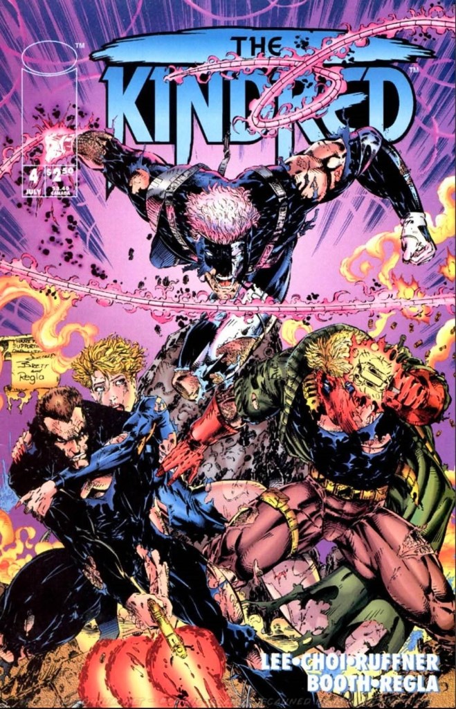
The WildStorm universe veteran John Lynch (read my past reviews of Team 7 and The Kindred) appears here and was portrayed to be uncompromising and dead serious with his task handling Pitt’s transfer. His presence and interactions with Ivana shed more light on the purpose of International Operations (IO) and how the organization is connected with the youth program at the facility.

Conclusion

Grunge gets tortured in front of his naked companions. Threshold takes pleasure in torturing him.

Gen13 #3 (1994) has a lot of thrills plus intrigue and even some shock value that made it stand out among the many superhero comic books about powered teenagers published in the 1990s. There is clear development on Fairchild and what she does here is the result of the huge decision she made at the end of issue #2. Fairchild’s captured companions also got their fair share of development as well and it is here where their bond as a group really grows. Along the way, Pitt added the monster presence but with a touch of heroism instead of instant death towards others. Anyone who follows Pitt should see his crossover appearance here. Indeed, this third issue of the mini-series is still fun to read.

Overall, Gen13 #3 (1994) is recommended.

+++++

Thank you for reading. If you find this article engaging, please click the like button below and also please consider sharing this article to others. If you are looking for a copywriter to create content for your special project or business, check out my services and my portfolio. If you want to support my website, please consider making a donation. Feel free to contact me with a private message. Also please feel free to visit my Facebook page Author Carlo Carrasco and follow me on Twitter at @CarloCarrascoPH as well as on Tumblr at https://carlocarrasco.tumblr.com/ and on Instagram at https://www.instagram.com/authorcarlocarrasco/.

Retro Gaming Ads Blast – Part 43

Welcome back readers, fellow geeks and electronic gaming fans!

In this edition of the Retro Gaming Ads Blast (RGAB) series, we will take a look at another batch of retro gaming print ads from the 1980s to the 1990s.

For the newcomers reading this, Retro Gaming Ads Blast (RGAB) looks back at the many print ads of games (console, arcade, computer and handheld) that were published in comic books, magazines, flyers, posters and newspapers long before smartphones, social media, the worldwide web and streaming became popular. To put things in perspective, people back in the 1980s to the 1990s were more trusting of print media for information and images about electronic games and related products.

With those details laid down, here is the newest batch of retro gaming print ads for you to see and enjoy…

1. Taito’s 4-in-1 Print Ad

I remember seeing this ad in some comic books I read back in the 1980s.

There is nothing like taking the clever approach of promoting multiple video games using only one single print ad in the size of a single page. Taito did exactly that in the 1980s when it promoted Elevator Action, The Legend of Kage, Arkanoid and Renegade for the Nintendo Entertainment System (NES) promising excitement as the mentioned games were making the jump from arcade to console. What is very notable in Taito’s single-page print ad was that it did not show any screenshots of the games. Instead, they used hand-drawn artwork to emphasize each game’s theme or setting, and leave it up to the viewers’ imagination as to how those games would look like on NES. This old ad is intriguing and amusing at the same time.  

2. Chase H.Q. II: Special Criminal Investigation Print Ad

Cars and high-speed action emphasized in this ad.

Following the huge success of the original Chase H.Q. on both arcade and consoles in the late-1980s, the sequel Special Crime Investigation was released in the arcades in 1989 and ported to game consoles and computers in the early 1990s under the title Chase H.Q. II: Special Criminal Investigation. To promote Chase H.Q. II: Special Criminal Investigation for home computers, game publisher Ocean came up with a colorful print ad showcasing a few cars, a city background and elements of gun-related action presented in nice art. The ad has an image of the original arcade machine to remind gamers that they are playing the sequel to Chase H.Q.

3. Dancing Eyes Japanese Arcade Flyer

The front.
The rear.

Released by Namco in Japan in 1996, Dancing Eyes is a puzzle arcade game that became notorious due to its overtly sexual nature. With the way it was designed, players control a small monkey called Urusu-San and crawl along a 3D grid mapped over characters (mostly ladies) or various objects. If the 3D grid is mapped over a young lady, any tile of the grid destroyed by the player exposes the lady’s underwear or skin. Such sexuality is reflected in the arcade flyer of Dancing Eyes which has a suggestive hand-drawn art on the front while the game’s mechanics are explained in the rear. Even the rear of the flyer shows sexual nature of the game with screenshots. While the game was officially released only in Japan, Dancing Eyes actually was made available for gamers to play at the arcade of X-Site amusement center inside Festival Mall in Alabang during the early 2000s and it attracted a lot of guys. I bet Namco did not know about that.

4. Sega Saturn North American Print Ad

This print ad always caught people’s attention.

When the Sega launched the Saturn console in America roughly four months ahead of schedule in 1995, the company suffered as the sales were disappointing, ties with business partners were strained and the available Saturn games were very few. By the fourth quarter of that year, more games became available for the Saturn and this gave Sega the opportunity to aggressively market the console as the one that gamers should get for their enjoyment. To promote the Saturn, Sega came up with a two-page print ad that had a dominant image of a naked woman whose private parts were cleverly covered by screenshots of the available games. Since most gamers were predominantly male from teenagers to adults, it made sense for Sega to come up with an eye-catching sexy ad to promote their console and the video games (including those from other companies). This old ad is considered by the woke and rabid feminists as very offensive today.

5. Blockbuster Video Print Ad

If you won the grand prize and wanted a lot of entertainment, you would not want to leave your home.

Back in the late 20th century, Blockbuster Video was the dominant retailer that offered customers movies in home video format for sale and for rent. Along the way, the company offered video game rentals and attracted millions of gamers around the nation. Given the tremendous growth of video gaming in America in the 1990s, Blockbuster got itself more involved by launching the Games of Summer Sweepstakes in 1996. Utilizing print ads, the sweepstakes offered the Ultimate Game Rooms – composed of a 41-inch big-screen TV, Surround Sound speakers, hi-fi VCR, NBA Jame Extreme arcade game, the Sega Saturn, the PlayStation, a gaming chair, Acclaim games for Saturn and PlayStation, and a 1-year free Blockbuster Video game rentals privilege – as the grand prizes. Do you know anyone who won in Blockbuster’s sweepstakes?

6. Independence Day (ID4) Print Ad

A nice looking ad for a game that was actually mediocre.

Remember how big a blockbuster Independence Day (ID4) was in cinemas in 1996? The film grossed over $800 million worldwide and it revived the disaster movie genre using modern filmmaking techniques and the latest technologies of the decade. Given the massive success of the movie, it was not surprising that an official video game adaptation was released in 1997. To promote the game, Fox Interactive (the video game company of the movie studio behind the film) came up with a 2-page print ad using official artwork from the movie showcasing the alien spaceship being attacked by a military fighter plane. The ad showed only 3 screenshots and the descriptive text was written to make gamers feel like they have the role to lead Earth’s fight against the aliens. While the art looks good, it can only go so far to hide the mediocrity of the game itself.

7. GoldenEye 007 Print Ad

Bond, James Bond.

When GoldenEye achieved both critical and financial success in movies, it revived the James Bond movie franchise big-time and Pierce Brosnan was easily accepted by the public as the newest Agent 007. Several months before the movie was even released, an official video game adaptation started development. After much revisions and hard adjustments, the project evolved into a first-person shooting game for the Nintendo 64 console titled GoldenEye 007. To promote the game, Nintendo came up with a 2-page print ad that cleverly showed Brosnan as James Bond on the left and displayed the screenshots and other details on the right. This ad was easily eye-catching and it made lots of gamers excited. As history showed, GoldenEye 007 got released in 1997 and became a huge critical and commercial success while also proving that first-person shooters on game consoles can be a lot of fun.

8. North American Sega Saturn Games Promo Print Ad

There definitely was something fun offered to gamers. Who could go wrong with titles like Tomb Raider, Nights into Dreams, Virtual On and Virtua Cop 2?

As mentioned earlier, the Sega Saturn had a bad launch in America in 1995 which caused a lot of problems for the company. In 1996, Sega of America went on the offensive to really capture gamers’ attention by launching their Saturn games promo. The message of this 2-page print ad was very clear…Sega offered one free first-party game (limited to four specific games including Nights into Dreams) to those who bought two games (from a lineup of twelve specific titles). It should be noted that the Christmas season of 1996 was the most successful sales period of the Sega Saturn in America as gamers really responded to the promo. Even though some called this promo an act of desperation, nothing changes the fact that Sega succeeded during the most critical sales season of 1996.

+++++

Thank you for reading. If you find this article engaging, please click the like button below, share this article to others and also please consider making a donation to support my publishing. If you are looking for a copywriter to create content for your special project or business, check out my services and my portfolio. Feel free to contact me with a private message. Also please feel free to visit my Facebook page Author Carlo Carrasco and follow me on Twitter at @CarloCarrascoPH as well as on Tumblr at https://carlocarrasco.tumblr.com/ and on Instagram athttps://www.instagram.com/authorcarlocarrasco

A Look Back at Team 7 #3 (1994)

Welcome back superhero enthusiasts, 1990s arts and culture enthusiasts, Image Comics fans and comic book collectors! Today we go back to the year 1995 to take a close look at one of the many tales of the original WildStorm universe through one of the comic books of the first mini-series of Team 7.

For the newcomers reading this, Team 7 is set in the past within the original WildStorm universe. This is the special forces team that had major WildStorm heroes – Grifter (WildCATS: Covert Action Teams), Backlash, Jackson Dane (Wetworks), John Lynch (Gen13) and Michael Cray (Deathblow) – who were younger, were proficient with combat and gained special abilities as a result of a sinister move by their superiors. Issue #2 took place after the team got exposed to something they never anticipated and their superiors knew it.

With those details laid down, here is a look back at Team 7 #3, published in 1994 by Image Comics with a story written by Chuck Dixon and drawn by Aron Wiesenfeld. This is the 3rd chapter of a 4-issue mini-series.

The cover.

Early story

Set in the 1970s, the surviving Team 7 members (already exposed to the chemical agent) are in the middle of a new mission somewhere in East Africa. Because their teammate Johnson abused his new power to manipulate a black general to kill himself against his own will, Cole Cash eliminates Johnson causing John Lynch to be outraged. Cash tells Lynch that Johnson lost himself completely. He also tells him to list Johnson as MIA (missing-in-action) and turn a blind eye as before.

Lynch points his gun at Cash’s head believing he is standing for the mission and rules. After Cash tells him that they are monsters and that the world is better off without them, Lynch relents and shoots the wall instead. The mission concludes and Team 7 goes home by helicopter.

As the ride goes on, John Lynch thinks very deeply about everything that happened since they got exposed to the chemical agent. He realizes that they were exposed to genetic altering elements and wonders if he and his teammates were nothing more than lab rats for International Operations (IO)…

Quality

John Lynch in the presence of his traitorous superiors following the East African operation.

If there is anything notable here apart from the continued dark and gritty tone, the plot really thickened clearly. At this stage, it is more obvious that the superiors have indeed something more sinister planned for Team 7 to endure. They know that the infected team members are closing ranks to protect itself which means they are ready for the so-called final test.

Along the way, John Lynch gradually realizes the evil of his superiors and being the field leader, he begins to analyze what is best for him and his teammates and which options to take knowing the betrayal from above. Quitting is simply not an option for Lynch and the pressure builds up as the story went on. Cole Cash here sees things very clearly and he easily became the pathfinder among Team 7 members. When he scolds his teammate Fairchild (father of Gen13’s Caitlin Fairchild) for abusing his power in a public place while off-duty, it is clear that Cash wants to keep the team together by means of keeping together while maintaining sanity.

As for Team 7 itself, there is something intriguing that awaits readers once they start their new mission here. I won’t spoil it and it has to be seen. Simply grab a copy of this comic book, read it and pay attention to the details. It’s strong stuff from the creative team.

Conclusion

Cole Cash (Grifter) talks sense into John Lynch about what has really been going on and why they have become monsters.

Team 7 #3 (1994) has a lot of intrigue as the plot thickened. At this stage, it is clear that IO is really up to no good and Team 7 is symbolically their scientific and military experiment. Fortunately for the team, they have John Lynch and Cole Cash as the reasonable members who are able to cut through the noise and became aware of what IO has been executing. The stage is set for the concluding issue and this comic book is indeed a solid build-up and also an engaging WildStorm read.

Overall, Team 7 #3 (1994) is recommended.

+++++

Thank you for reading. If you find this article engaging, please click the like button below, share this article to others and also please consider making a donation to support my publishing. If you are looking for a copywriter to create content for your special project or business, check out my services and my portfolio. Feel free to contact me with a private message. Also please feel free to visit my Facebook page Author Carlo Carrasco and follow me on Twitter at  @CarloCarrascoPH as well as on Tumblr at https://carlocarrasco.tumblr.com/ and on Instagram at https://www.instagram.com/authorcarlocarrasco

A Look Back at Amazing Spider-Man #361 (1992)

Welcome back superhero enthusiasts, 1990s arts and culture enthusiasts, Marvel Comics fans and comic book collectors! Today we go back to the early 1990s to examine a small part of the Marvel Comics shared universe through a tale of the Amazing Spider-Man monthly series.

When it comes to the argument as to who is the most evil or the deadliest foe Spider-Man ever has, many point towards Venom (Eddie Brock and the alien costume from Secret Wars) who is murderous, filled with revenge against Spider-Man, is physically formidable and knows Peter Parker and his family members. In the early 1990s, the creative guys behind the Amazing Spider-Man series made the key decision to create another symbiote-wearing super villain like Venom but much more violent, more murderous and truly insane.

With those details laid down, here is a look back at Amazing Spider-Man #361, published in 1992 by Marvel Comics with a story written by David Michelinie and drawn by Mark Bagley.

The cover.

Early story

The story begins inside the agro-lab of the Empire State University where an awful figure in black-and-blood intimidates a male worker. The awful figure is Carnage and he decides to play with the worker a bit before fulfilling his intention to kill him. The worker tries to escape but ends up failing as Carnage throws a huge piece of hardware at the door. Carnage grabs the man, slams him on the wall and uses sharp makeshift blades that suddenly stretched to murder the him.

At the a certain home in Forest Hills, Peter Parker spends quality time his aunt May Parker as he repairs an important machine in the basement. Moments later, the phone rings and May goes up to answer it. Peter follows and learns that the call was meant for him.

Upon using the phone, Peter learns the tragic news that his friend Chip at the university was murdered. He excuses himself from May to go outside to secretly change into Spider-Man and make his way to Empire State University. Struck by the tragic news, Spider-Man is aware that there have been a dozen brutal murders in New York City over the last week. He is also aware that a message was written in blood by someone called Carnage…

Quality

The first-ever battle between Spider-Man and Carnage is very intense to look at.

To make things very clear, this comic book has the first full appearance of Carnage which is Cletus Kasady with a living costume spawned from Venom’s symbiote. Kasady himself first appeared in Amazing Spider-Man #344 in 1991, and it is very clear that the creators deliberately modeled him after DC Comics’ super villain the Joker to have the psychopath appearance (distinctive messy hair, crazed facial expressions, slim body frames and the unusual jawline). Kasady and the Joker also have a nihilistic view of the world focused on spreading chaos while enjoying unrestrained violence.

David Michelinie was really methodical when it came to build-up the tension, presenting key details and pacing the narrative when showing Carnage (who actually appears on the first page) and emphasizing the details about him (including Kasady’s background history and personality as observed by the witnesses who knew him). The appearance of Carnage in the first half was deliberately limited to ten panels and as the story moved on, details of him were revealed especially when Peter Parker did his own detective work. By the time Spider-Man and Carnage finally faced off with each other, the spectacle (action scenes) really ramped up high and the Michelinie-Bagley duo succeeded in showing Carnage being deadlier and unrelenting towards the webslinger.

Spider-Man doing detective work in costume and in civilian form as Peter Parker. This is also one of the finest pieces of Spider-Man art done by Mark Bagley.

More on the iconic hero, Peter Parker here was portrayed as being highly disturbed by the recent murders of the city and the loss of his friend which compelled him to do very serious detective work leading up to his discovering of Kasady (and the eventual face-off in a ruined property where Carnage took refuge in). Parker also felt uneasy about remembering his recent encounter with Venom and the details of the murder reminded him of the old nemesis. The pacing here is excellent and as the narrative went on, the tension really intensified.

Spider-Man’s encounter with Carnage – which the cover art obviously emphasized without restraint – is really intense to look at. As he is completely unprepared as to what Carnage was capable of doing, the webslinger really struggled and was in danger in key moments. Carnage also has unique capabilities using the symbiote such as forming sharp blades and shooting small but sharp projectiles. If you want super villain-led moments of action that really challenged the superhero, you will find a good amount of that here. Also, I can say that Mark Bagley is very good in presenting the action scenes with dynamism, danger and intensity mixed together well.

Conclusion

The news image of Cletus Kasady on the lower-right corner is obviously patterned after Batman’s nemesis the Joker. That image really looks like it was ripped out of a Batman comic book.

Amazing Spider-Man #361 (1992) marks the very intense debut of Carnage and the way he was presented as the newest super villain for Spider-Man to deal with, he is nastier and deadlier than Venom (who would eventually have the delusion of protecting the innocent while remaining murderous). In fact, the way the battle between the two was executed here made me forget about Venom temporarily which shows the Michelinie-Bagley duo pulled the right moves in making this comic book. To be clear, Carnage is pure evil laced with insanity and with absolute disregard towards people. Both Carnage and Venom are murderers and they should be condemned always. It happens that Carnage is more disastrous and has no regard for human life, which ironically makes Venom looking a bit less evil by comparison.

As for Spider-Man, his portrayal here is really dramatic and his superhero pursuits only added to the trouble of his marriage with Mary Jane. As such, you could end up feeling sorry for MJ even though Peter Parker himself wants to solve problems while protecting not only their lives but also the lives of the innocent.

Overall, Amazing Spider-Man #361 (1992) is highly recommended.

+++++

Thank you for reading. If you find this article engaging, please click the like button below, share this article to others and also please consider making a donation to support my publishing. If you are looking for a copywriter to create content for your special project or business, check out my services and my portfolio. Feel free to contact me with a private message. Also please feel free to visit my Facebook page Author Carlo Carrasco and follow me on Twitter at  @HavenorFantasy as well as on Tumblr at https://carlocarrasco.tumblr.com/ and on Instagram at https://www.instagram.com/authorcarlocarrasco

A Look Back at Street Fighter #1 (1993)

Welcome back, superhero fans, 1990s arts and culture enthusiasts, Street Fighter fans, retro gamers, Malibu Comics enthusiasts and comic book collectors! Today we go back to the year 1993 to examine the official comic book adaptation of the wildly popular video game Street Fighter II.

While the original Street Fighter game of 1987 did not achieve huge success in the arcades and on consoles, it literally started the ball rolling for Capcom as the game itself influence other arcade game developers to focus more on making beat-them-up games and the use of special moves appealed to others. Capcom went on to release Street Fighter II in the arcades and it came with a dedicated fighting game design that strongly lured in gamers to play it in huge numbers. After selling 200,000 arcade cabinets, SFII went on to become a huge seller on game consoles. Capcom even went on to produce new versions of the game – popularly referred to as upgrades – culminating with Super Street Fighter II Turbo in 1994.

As Street Fighter II kept on attracting countless players into the arcades worldwide, Capcom approached Malibu Comics (publisher of the Ultraverse).

“Capcom came to Malibu because we know how to do it—we’ve handled licensed properties before and done very well,” said Tom Mason in the opening message of the first issue of the Street Fighter comic book adaptation.

With those details laid down, here is a look back at Street Fighter 1, published by Malibu Comics in 1993 with a story written by the late Len Strazewski and drawn by Don Hillsman. This was the first issue of a planned mini-series.

The cover.

Early story

The story begins some time in the past when Ryu permanently scars Sagat on the chest with his Dragon Punch during street fight in front of many. Enraged, Sagat tries hard to retaliate against Ryu who happens to be the champion among street fighters. The Japanese fighter hits the tall Thai kickboxer with a barrage of kicks.

The past fight was played on home video and viewed by Sagat and Balrog. Embarrassed by the video, Sagat destroys the TV and asked his companion why must he be humiliated. After Balrog tells him not to talk that tone with their superior Bison, Sagat hits the American boxer. As the fight between the two intensifies, Bison arrives and stops the violence. He tells Sagat that he is an embarrassment to his organization.

Bison reminds them that he took them into his criminal network and still have not redeemed themselves in front of him. He tells the two that they must beat Ryu and regain the street fighter championship.

As Balrog and Sagat express difficulty in finding and fighting Ryu, Bison tells them the Japanese fighter’s friends are Chun Li and Ken…

Quality

Once a dedicated, well-trained martial arts competitor, Ken Masters has been doing his moves in productions of commercials. He does not enjoy the product he endorsed.

Back in 1993, I even contemplated buying a copy of this comic book locally when it was brand new. I’m glad I chose not to buy it back then as this one has bad quality in its presentation from start to finish. Dedicated Street Fighter II fans should be warned.

For starters, the storytelling is not faithful to the lore of Street Fighter II even though the creators derived key elements of characters from the game itself. That said, it looks like liberties were taken in order to form a narrative that can be told in comic book format.

Chun Li here is correctly described as an agent of Interpol and is motivated by revenge over the loss of her father who was killed by M. Bison. And yet, she is portrayed here as having a romantic relationship with Ryu and has been training with him along with Ken in the past. The romantic relationship between the two never existed in the popular video game and it is established in Street Fighter II lore that Chun Li came from a different martial arts background while Ken and Ryu trained together under the same master.

Contrary to what was established in Street Fighter II lore, Ken and Chun Li were portrayed as having trained together and have romance with each other.

Ryu in this comic book is the defending street fighter champion (reflecting the canonical story of Street Fighter and Street Fighter II) who is responsible for the huge scar on Sagat’s chest. While Ryu is the wandering warrior who travels around the world with only a duffel bag as he seeks the true way of the fighter, in this adaptation he is a reigning champion who starts having doubts when Chun Li lectures him over his devotion to fighting as life changes for others around him.

While the liberties are notable and could be insulting to dedicated Street Fighter II fans, the story of this comic book is surprisingly readable. As Ryu is the target of Bison and his criminal network, it made sense for dangerous pawns Sagat and Balrog to go after Ken to get to the Japanese fighter. There definitely is a plot here and if readers can ignore the actual lore of Street Fighter II, it can be followed and the classic concept of good versus evil will be realized.

As for the art, the work done by Don Hillsman is lackluster. While he excelled in making Balrog look scary early in the story, his visual takes on the other Street Fighter II characters range from bad to passable. Ken, Ryu, Sagat, Bison, Vega and Chun Li all have that rough look on their faces and bodies. Hillsman even tried to emulate special moves from the game but ended up looking sub-par. Lackluster artworks like these only add to the perception of the fans and other people obsessed with Japanese culture and the arts that Western illustrators should not draw Street Fighter characters.

Conclusion

Balrog on the offensive against Ken.

I am glad that I never bought Street Fighter #1 (1993) brand new decades ago. Its quality is really bad and clearly it has not aged well. Street Fighter fans – especially those obsessed with Street Fighter II games – should look elsewhere to enjoy the tale and concepts of Street Fighter II. This comic book from Malibu Comics is a creative failure and was the start of the eventual collapse of the publishing deal made with Capcom. Can you just imagine the shock the Capcom executives had when they first read this comic book? Ultimately, this comic book adaption was creative catastrophe which is a shame because Malibu Comics had a good record of licensed projects and the late Strazewski (died on April 27, 2026) was one of the finest writers and creators on the Ultraverse line of comic books.

The first half of the message about the Street Fighter II adaptation and the deal between Capcom and Malibu Comics.
The 2nd half of the message. The Capcom-Malibu deal and the production of this adaptation started in mid-1992. Street Fighter II was already dominating the arcades at the time.

Overall, Street Fighter #1 (1993) should be avoided.

+++++

Thank you for reading. If you find this article engaging, please click the like button below and also please consider sharing this article to others. If you are looking for a copywriter to create content for your special project or business, check out my services and my portfolio. If you want to support my website, please consider making a donation. Feel free to contact me with a private message. Also please feel free to visit my Facebook page Author Carlo Carrasco and follow me on Twitter at @CarloCarrascoPH as well as on Tumblr at https://carlocarrasco.tumblr.com/ and on Instagram at https://www.instagram.com/authorcarlocarrasco/.

A Look Back at The Kindred #4 (1994)

Welcome back, superhero fans, 1990s arts and culture enthusiasts, Image Comics and comic book collectors! Today we go back to the mid-1990s to examine one of the many tales of the WildStorm universe through The Kindred mini-series.

After reading the first three issues of this WildStorm mini-series, Grifter and Backlash were well defined as two former teammates of Team 7 who are at great odds with each other. Adding more emphasis to the Team 7 legacy and the dirty history of International Operations (IO) was IO officer John Lynch (who became a captive in this mini-series) and the revealed leader of the Kindred. The stage is set for the conclusion of this mini-series.

With those details laid down, here is a look back at The Kindred #4, published by Image Comics in 1994 with a story written by Jim Lee, Brandon Choi, Sean Ruffner and the illustrator himself, Brett Booth.

The cover.

Early story

The story begins some time after the leader of the Kindred revealed himself to Lynch, Grifter, Backlash and Alicia Turner. It has been former IO operative and Team 7 member Roberto Diaz all along and he blamed Backlash for leaving him for dead more than twenty years prior during a desperate situation in South America.

On the orders of Diaz, a few of the beastly Kindred servants carried the severely damaged body of Backlash to a waterfall and threw him down. Elsewhere, Grifter is naked and contained in a water container with oxygen and a communication device attached to him. Roberto Diaz watches and communicates with him. Diaz tells Grifter that the his old identity is no more and the only thing he requires from him are gen samples which are crucial to better understand the genesis drug.

Diaz reveals to him that duplicating the genesis drug is crucial for the Kindred to create more life and be able to overwhelm the world and force it to recognize the might of the Kindred society. Grifter tries to reason with his former teammate by telling him that the genesis serum is something that is not meant to be tampered as it will lead to destruction…

Quality

Backlash in action!

This early, I can say that Jim Lee, Brandon Choi, Sean Ruffner and Brett Booth gave their best effort to make this final chapter very intriguing, dramatic and explosive to read at the same time. Along the way, they expanded the lore of the original WildStorm universe while building up anticipation for the Team 7 original mini-series (released in the 4th quarter of 1994).

The writing got even stronger in this final issue in terms of storytelling and character development. Roberto Diaz is not a one-dimensional super villain. In fact, he strongly believes that he was betrayed not only by Team 7 and IO, but by humanity in general. As such, he found purpose with the Kindred during his survival days and injected himself with the genesis drug which enhanced him but also turned him into an addict (this alone added drug addiction as a key theme). As far as Roberto Diaz is concerned, he is on a path of no return and his obsession with vengeance against humanity justifies his leadership of the Kindred and the master plan to overwhelm humanity someday. In terms of geopolitics, this reminds me a lot about Islamic terrorists going up against Western civilization using violence while having their fellow Islamists migrate into different nations worldwide to overwhelm those societies from within. Of course, the concept of Diaz and the Kindred plotting against many billions of humans here is high fantasy mixed with unethical science, terrorism, infiltration and terrorism.

The creators managed to develop Grifter, Backlash and John Lynch even more. Lynch here is portrayed as very stressed and struggling with being responsible over the deaths of many men IO sent to rescue him. He even believed for a while that Backlash is dead and he knows fully well that the Kindred are not crazy but rather intelligent and are obsessed with seeking justice. In some ways, Lynch is also responsible for the Kindred and he reflects on what he did for decades for IO while serving as a Team 7 member with a leadership role.

John Lynch in the prison cell with Colby.

Grifter and Backlash, who are often visually featured in the promos of this mini-series, also have their fair share of the spotlight. Both heroes are severely beaten and not even their special talents or powers were enough to overcome the violent opposition of the Kindred. I like the way the creators emphasized Grifter’s (civilian identity: Cole Cash) personality as he got into the same prison cell with Alicia Turner who turned out to be involved with him several years prior. Grifter here is uneasy about the past not only as member of Team 7 but also as a person. As for Backlash, I’ll say that he has the classic heroic comeback in this issue and things got really tense between him and Roberto Diaz.

When it comes to superhero spectacle, this one is really packed with action and Brett Booth delivered some dynamic artworks to make the story look entertaining. When he draws the Kindred – those animalistic loyalists of Roberto Diaz – he makes them look horrific and intimidating from time to time. When it comes to drawing Backlash and Grifter, Booth’s take has some rough edges as this mini-series was produced before the start of the Backlash series.

Conclusion

A dynamic action shot of a battered Grifter with Alicia Turner.

I can say that The Kindred #4 (1994) is a worthy end to the mini-series. By the time the plot concluded, the lore and the paramilitary concepts of the original WildStorm universe got expanded a lot with emphasis on the legacy left behind by Team 7 and IO. Grifter, Backlash and John Lynch – all former teammates of Team 7 – got nicely developed here and their significance within the WildStorm universe got stronger. This comic book delivered intrigue, surprises and a good amount of spectacle from start to finish. It also succeeded in setting the stage for the late-1994 launch of Team 7.

Overall, The Kindred #4 (1994) is recommended.

+++++

Thank you for reading. If you find this article engaging, please click the like button below and also please consider sharing this article to others. If you are looking for a copywriter to create content for your special project or business, check out my services and my portfolio. If you want to support my website, please consider making a donation. Feel free to contact me with a private message. Also please feel free to visit my Facebook page Author Carlo Carrasco and follow me on Twitter at @CarloCarrascoPH as well as on Tumblr at https://carlocarrasco.tumblr.com/ and on Instagram at https://www.instagram.com/authorcarlocarrasco/.

A Look Back at Gen13 #2 (1994)

Welcome back, superhero fans, 1990s arts and culture enthusiasts, Image Comics fans and comic book collectors! Today we go back to the mid-1990s to examine one of the many tales of Jim Lee’s original WildStorm universe through the original Gen13 mini-series.

Historically, Gen13 (stylized as Gen13) was launched at a time when Jim Lee’s company was establishing and expanding the original WildStorm shared universe with such comic book titles like WildCATS: Covert Action Teams, StormWatch, Backlash, Wetworks and the prequel title Team 7. When compared to those mentioned titles that had strong paramilitary elements combined with conspiracy and intrigue, Gen13 stood out with its concept of super-powered teenagers who don’t realize they are subjects of International Operations (IO) which has a long history of abuse, corruption and human rights violations. Gen13 #1 started strongly thanks to the solid writing of Jim Lee and Brandon Choi who challenged themselves to expand the WildStorm lore differently.

With those details laid down, here is a look back at Gen13 #2, published by Image Comics in 1994 with a story written by Jim Lee and Brandon Choi with artwork done by Jeffrey Scott Campbell. This is the second issue of the mini-series.  

The cover.

Early story

The story begins with Caitlin Fairchild, Grunge, Roxy, Bobby, Rainmaker and Tom Hallinan in the middle of a desert running away from the floating troopers of Project Genesis. They just escaped from the top-secret facility.

Tom Hallinan suddenly uses his power to shock three troopers on a floating craft (gunship) and brings them down to an explosive end. As Caitlin has trouble accepting the fact that the troopers were killed, Tom emphasizes that they can fight back using their super powers and Bobby (Burnout) agrees by utilizing his own powers of flight and flame to confront even more troopers on their gunships.

As the conflict escalates, Fairchild begins to use her super strength to tear off a huge rock and successfully destroys one of the gunships with it. Nearby, Roxy, Rainmaker and Grunge find themselves cornered by armed troopers. Roxy gets hit by the tangler from the troopers…

Quality

Roxy, Grunge and Rainmaker cornered by the armed troopers.

Similar to the first issue, this comic book has a solid plot structure and the writers took their time to emphasize the tale, develop the characters within their limits, and doing both build-ups and pay-offs.

Following the events of issue #1, Fairchild and her eventual Gen13 teammates here are only discovering their respective super capabilities at a time of confusion and desperation. They still have yet to form the rock-solid bond as a team and they are still struggling with the new situation they found themselves in. The tale opened with a desperate escape from the Project Genesis facility (with a clever flashback used to explain what happened) putting themselves into a series of unfortunate events with no guarantee of survival ahead.

While this comic book featured the eventual core Gen13 characters, the tale is still pretty much focused on Caitlin Fairchild and the writers did a really good job developing her with not just the present-day events but also with her own perception of how her life turned out. Apart from being a very smart college student, Fairchild is also very observant and does her best when dealing with the challenges in new situations. At this stage, she has yet to realize her true goals as she deals with the sudden changes and dangers that came with being a super-powered teenager under the grasp of IO.

Grunge, Roxy, Burnout and Rainmaker also got their own shares of the spotlight but nowhere as great as Fairchild which is understandable. At this stage, it clear that the writers had something planned for them for further parts of the story.

More on the story itself, the plot really moved forward without being rushed. The pace moved from medium to fast, and as generous pay-offs to previous build-up’s took place, more plot elements were being built-up. In line with the greater lore of WildStorm, the concept of the government testing drugs on people for decades is raised and it makes the sinister moves of IO on human subjects really believable. Symbolically, the government and IO have affected generations of people with mad science and experimentation, and these are reflected well on the characters.

The plot indeed has intrigue and strong dramatic moments to back it up. However, the storytelling got weakened with the way one of the new characters here expressed himself which made the late-story twist predictable and unsurprising. Along the way, the visual eroticism ramped up here as Jeffrery Scott Campbell went on to visualize the script. The said visual eroticism (perhaps eye candy to those who enjoyed it) is unnecessary in my opinion and they took away from the written dialogue. The sexy imagery is a reminder of the 1990s comic book trends.

Conclusion

For the first time ever, Bobby becomes Burnout.

With the exception of the mentioned storytelling weakness and the unnecessary erotic visuals, Gen13 #2 (1994) managed to be a solid follow-up to its predecessor and is also an entertaining read. The continued strong writing by Lee and Choi ensured strong engagement, suspense and spectacle throughout. Revisiting this old comic book resulted in a fun read in my experience and I am convinced to keep going on with this WildStorm mini-series.

Overall, Gen13 #2 (1994) is recommended.

+++++

Thank you for reading. If you find this article engaging, please click the like button below and also please consider sharing this article to others. If you are looking for a copywriter to create content for your special project or business, check out my services and my portfolio. If you want to support my website, please consider making a donation. Feel free to contact me with a private message. Also please feel free to visit my Facebook page Author Carlo Carrasco and follow me on Twitter at @CarloCarrascoPH as well as on Tumblr at https://carlocarrasco.tumblr.com/ and on Instagram at https://www.instagram.com/authorcarlocarrasco/

Retro Gaming Ads Blast – Part 42

Welcome back readers, fellow geeks and electronic gaming fans!

In this edition of the Retro Gaming Ads Blast (RGAB) series, we will take a look at another batch of retro gaming print ads from the 1980s to the 1990s.

For the newcomers reading this, Retro Gaming Ads Blast (RGAB) looks back at the many print ads of games (console, arcade, computer and handheld) that were published in comic books, magazines, flyers, posters and newspapers long before smartphones, social media, the worldwide web and streaming became popular. To put things in perspective, people back in the 1980s to the 1990s were more trusting of print media for information and images about electronic games and related products.

With those details laid down, here is the newest batch of retro gaming print ads for you to see and enjoy…

1. Space Duel Arcade Flyer

The front.
The rear.

When the 1979 arcade classic Asteroids achieved massive success for Atari, the company went on to make ports of it on different platforms as well as follow-ups in the arcades. The first follow-up Asteroids Deluxe had a positive reception but never reached the huge impact of its predecessor. Since Asteroids Deluxe was well regarded for improved visuals and higher level of challenge, Atari went on to make the 1982 follow-up Space Duel. To promote the game, Atari’s artists made fascinating original artworks for both the arcade cabinet and the arcade flyer itself. Apart from looking great, I noticed the spaceships of Space Duel’s art looks similar with those of Xevious (a Namco arcade game distributed by Atari in America) and I can only speculate that the same artist made those.

2. Midway Auxiliary Show Monitor Print Ad

Did you experience watching arcade gameplay footage displayed on an overhead monitor?

As video arcades in America became massively popular with people and became a major economic sector, it was not surprising that crowding became a trend especially whenever a very popular game attracted both players (waiting in line) as well as onlookers. Midway, which was an arcade giant in the 1980s, came up with their own concept of a specialized secondary display called the Midway Auxiliary Show Monitor designed to let onlookers watch a video of ongoing gameplay without physically standing by the player. As the print ad above shows precisely the use of the monitors, those were used at trade shows or in arcades with a setup to make turn the single-player experience into a makeshift show for the people nearby. Back in the 1980s, there was indeed a spectator approach to the arcade experience but players had to deal with the disturbance of many onlookers standing near to see the on-screen action. At the very least, Midway’s concept and hardware was a bold attempt to solve overcrowding.

3. Sega Genesis North American Print Ad

Did this 1989 ad convince you to buy a Sega Genesis console?

While the Sega Genesis has always been identified with 1990s console gaming in America, the console was officially launched there in August 1989. At the time, Sega of America was not too creative nor aggressive when it comes to marketing the Genesis. The above 1989 print ad showed a lot of screenshots to promote the games, showed the console with a TV and a few peripherals and a text description that emphasized the Genesis as the so-called ultimate dimension in game play. Considering how dynamic and aggressive Sega’s marketing of the Genesis and games became a few years later when Tom Kalinske became the CEO, it is not surprising that this old ad has been forgotten.

4. The Punisher NES Print Ad

Fact: The Punisher started as an assassin in the comic books in 1974 before being turned into an anti-criminal killer.

By the year 1990, The Punisher became one of Marvel Comics’ most popular figures and the character had two monthly series published. As such, an actual video game featuring the character was made for the Nintendo Entertainment System (NES) and to promote it, three screenshots were shown, a brick wall with stylized short messages was shown and a hand-drawn art of the Punisher was displayed. As seen in the screenshots, elements from The Punisher comic books were displayed such as shooting and fighting the criminals. Considering how wholesome the NES audience was at the time, this print promotion of The Punisher game looks odd although it is a fact that entertainment products featuring violent entertainment properties or characters were made and marketed towards children less than 12-years-old. Remember the Rambo animated series and video games of the 1980s?

5. Lethal Enforcers II: Gun Fighters Arcade Flyer

Did you enjoy this Lethal Enforcers sequel?

After achieving both critical and big-time commercial arcade success with Lethal Enforcers in 1992, Konami proceeded with the sequel Lethal Enforcers II: Gun Fighters which was released in arcades two years later. While the 1994 game used 2D sprites and digitized photographs like its predecessor, Konami used the 19th century Old West as the setting making it totally different from the 1992 original. To promote the game and emphasize the Old West setting, Konami came up with this arcade flyer that showed actors in cowboy costumes with a background that looks like a cowboy movie set. Lethal Enforcers II: Gun Fighters went on to become successful in the arcades and it later got ported to game consoles.

6. Wipeout XL Print Ad

This is an ad and not an article.

1996 was a tremendous year for console gaming. As Nintendo launched their highly anticipated Nintendo 64 console (N64) that year, game publishers came up with new games that further utilized the features of both Sony PlayStation and Sega Saturn. Wipeout XL was a sequel sci-fi racing game exclusive to the PlayStation and developer/publisher Psygnosis went all-in promoting the game with a lot of creativity and energy. They came up with this 2-page print ad to make gamers excited while creatively informing them what features, rave music and fun gameplay it has. On face value, this print ad looked more like a dazzling article.

7. Nights into Dreams Print Ad

The team behind the popular Sonic platform games on the Sega Genesis made Nights into Dreams.

If there is anything notable about the history of the Sega Saturn, it is the fact that there were no new dedicated platform games of Sonic The Hedgehog released for it which is very odd as the Sonic platform games on Sega Genesis were big sellers, critically acclaimed and even made their mark on pop culture. During the mid-1990s, Sonic Team (which had Sonic game creators like Yuji Naka and Naoto Ohshima) were laser-focused on making Nights into Dreams (stylized as NiGHTS into Dreams) which was an all-new intellectual property that allowed them to utilize the 3D capabilities of the Saturn while making room for their creativity. Sega knew Nights into Dreams was special so they came up with this 2-page print ad which had an eye-catching display of screenshots of the game on the left (with the Saturn in the middle) while using the other half for descriptive text and explanations (with the special Saturn controller in the middle) to grab people’s attention. This old ad from 1996 is a mixed bag for me as the left side was captivating to see while the description on the right side requires some effort to read properly due to the small size of the text.

8. Super Mario 64 Print Ad

This one was simple, clean and yet memorable.

What is arguably the most memorable video game released in 1996 was Super Mario 64 which was not only a fully featured launch game of the Nintendo 64 console, but also the first-ever Super Mario platform game made with 3D polygons complete with a large 3D environment that can be explored a lot. There was a huge anticipation for this game by both gamers and the media, and whenever it was previewed before release, it drew lots of crowds and many ended up being very impressed and wanting more. Nintendo knew they had some very special under the production and direction of Mario creator Shigeru Miyamoto. As such, Nintendo had an ambitious marketing campaign that includes print media, video advertising on MTV, Fox and Nickelodeon and even sending video tapes to thousands of Nintendo Power magazine subscribers. This 2-page print ad was part of the campaign and it had a fine visual design that strongly emphasized the iconic Mario in polygonal form in most spaces, leaving the screenshots in the bottom. This old ad from 1996 never looks outdated and its clean approach is really effective in helping people understand that something great would be launched along with the N64. Both the console and this game sold a lot of copies ultimately and it remains one of Nintendo’s biggest achievements ever.

+++++

Thank you for reading. If you find this article engaging, please click the like button below, share this article to others and also please consider making a donation to support my publishing. If you are looking for a copywriter to create content for your special project or business, check out my services and my portfolio. Feel free to contact me with a private message. Also please feel free to visit my Facebook page Author Carlo Carrasco and follow me on Twitter at @CarloCarrascoPH as well as on Tumblr at https://carlocarrasco.tumblr.com/ and on Instagram athttps://www.instagram.com/authorcarlocarrasco

A Look Back at Gen13 #1 (1994)

Welcome back, superhero fans, 1990s arts and culture enthusiasts, Image Comics fans and comic book collectors! Today we go back to the mid-1990s to examine one of the many tales of Jim Lee’s original WildStorm universe through the original Gen13 mini-series.

There is a lot to enjoy in the WildStorm comic book universe of the 1990s with such titles like WildCATS: Covert Action Teams, Team 7, StormWatch, Grifter, Backlash and Wetworks to name some. The WildStorm depicts the world as chaotic filled with strong paramilitary concepts, conspiracies and even aliens from deep space.

Along the way, WildStorm has its own take on the sub-genre of super-powered teenagers which was realized as Gen13 (stylized as Gen13). Strangely enough, the team – which actually first appeared in the Deathmate Black crossover comic book in 1993 – was originally titled as Gen X but WildStorm had to rebrand it into Gen13 as Marvel Comics already trademarked the name Generation X for an X-Men-related comic book project. To learn more about production history and background of Gen13, click here.

With those details laid down, here is a look back at Gen13 #1, published by Image Comics in 1994 with a story written by Jim Lee and Brandon Choi with artwork done by Jeffrey Scott Campbell (ink work by Alex Garner). This is the first issue of the mini-series.  

The cover.

Early story

The story begins sometime in 1979 when a married couple (Stephen and Rachel Callahan) desperate runs away with their two little children. A team of armored troops (the Black Razors) riding two hovering vehicles catches up with them and hit Rachel with bullets passing through her body. Stephen, who is carrying his son Matthew, uses his power to destroy one of the hovering vehicles. One of the Black Razors realized that the husband is gen-active and nobody informed their team that he was with Gen12.

Agonizing with severe head pain, Stephen tells Matthew to take his little sister Nicole with him and run to the trees. As far as Stephen is concerned, he is finished and all he can do is buy time for the two little children to escape. He tells Matthew to protect his sister. Suddenly, the Black Razors killed Stephen right in front of Matthew and Nicole.

Fifteen years later, a young, nerdy college student named Caitlin Fairchild makes her way through the college campus in Princeton. She is a gifted student who has been focused on maintaining a high grade and graduate with her advanced degree in computer science in the near future.

Upon arriving at the dormitory, she meets her promiscuous roommate Alexa who informs her that some guys arrived earlier looking for her. The guys were described as middle-aged suits and they wanted to talk to Caitlin about some internship program. Alexa then leaves.

A few hours later, Caitlin wakes up as the door gets knocked. Special agent baker of the National Security Committee tells her that she has been accepted into the Gen13 program and her presence is immediately required in order to process her into the program before it begins the next day…

Quality

Roxy, Burnout, Grunge and Caitlin Fairchild together for the first time at the secret facility of the Gen13 program. One other member – Rainmaker – has yet to appear.

I enjoyed this comic book the first time I had it in 1994. I can clearly say that it is still fun and engaging to read again today.

This comic book was written with the intention to introduce super-powered teenagers as a new and really distinctive team in one corner of the original WildStorm universe while also expanding the lore by focusing more on International Operations’ unethical covert operations which will easily remind people about government conspiracies, top secret missions and the like. The story has really strong elements about conspiracies, unethical scientific experiments and even human rights violations. The story by Jim Lee and Brandon Choi has a strong structure but what stood out to me was the really creative writing done to bring the characters to life complete with a touch of the 1990s vibe (in reference to comic book trends and real-life society).

John Lynch, a former member of Team 7 and also one of the high-ranking officials of IO who occasionally appeared in prior WildStorm comic books, gets a nice share of the spotlight in the story and indeed he is not full control of his organization. In fact, IO’s execution of a new program about developing people with special abilities or powers (without their knowledge) raises Lynch’s concerns as he himself was a victim of betrayal and exposure to an experimental gas during his time with Team 7. Lynch also appeared in The Kindred mini-series (read my reviews by clicking here, here and here).

When it comes to the characters, Gen13’s members here are introduced with notable differences in terms of personality. The nerdy Caitlin Fairchild is the very promising smart young lady who has the potential to succeed. Bobby (Burnout) is the quiet guy who quickly realizes that true unity is needed in order for a group to succeed under the program they are in. Roxy is the undisciplined and rebellious young lady while Grunge is the loose cannon and has trouble with authorities. While it is clear you won’t see much of their powers yet in this comic book, they turned out to be interesting enough to follow thanks to the strong creative writing by Lee and Choi.

When it comes to the visuals, Jeffrey Scott Campbell’s artworks really stood out mainly due to his distinctive style. If you look closely at how he draws the faces of women – particularly the ones who are young and fit – you will realize the exaggerated look complete with the big eyes and curves seen on females in anime or even manga (Japanese comics). If you are looking visual realism on the characters, you won’t find it here at all. Campbell’s style truly defined the look of the characters and yet he was able to draw armored troops (Black Razors and the armed security guard) with a really high level of details (including their weapons) which really stood out visually. Campbell is also good with superhero spectacle and hard action. Last but not least, there is a deliberate amount of erotic imagery in this comic book which serves as a reminder that this is a story aimed at young adult and adult readers.  

Conclusion

John Lynch and Ivana having a confidential talk about International Operations and its current project about super-powered beings. Even though he is a very high officer at IO, Lynch was kept in the dark about something crucial.

Indeed, Gen13 #1 (1994) remains entertaining to read mainly because of the strong writing. The story moved at a smooth pace, the exposition was done cleverly, and the characters ended up being worthy enough to pay attention to. By the time I reached the end, I am convinced to go on to the next issue and rediscover not only more of the mini-series but also the way it expanded the lore of the WildStorm universe of the 1990s. This comic book alone strongly emphasized the connections with other elements of the WildStorm universe, particularly with Team 7 (its mini-series launched months after this one) and the dark legacy of IO. It is an adulterated superhero comic book that really offered readers something new and intriguing.

Overall, Gen13 #1 (1994) is recommended.

+++++

Thank you for reading. If you find this article engaging, please click the like button below and also please consider sharing this article to others. If you are looking for a copywriter to create content for your special project or business, check out my services and my portfolio. If you want to support my website, please consider making a donation. Feel free to contact me with a private message. Also please feel free to visit my Facebook page Author Carlo Carrasco and follow me on Twitter at @CarloCarrascoPH as well as on Tumblr at https://carlocarrasco.tumblr.com/ and on Instagram at https://www.instagram.com/authorcarlocarrasco/.

A Look Back at X-O Manowar #1 (1992)

Welcome back superhero enthusiasts, 1990s arts and culture enthusiasts, Valiant Comics fans and comic book collectors! Today we go back to the early 1990s to examine a key part of the Valiant Comics universe through a tale of X-O Manowar.

Valiant – under the banner of Voyager Communications – was established in 1989 by former Marvel Comics editor-in-chief Jim Shooter and Steven Massarsky. This happened following their failed attempt to acquire Marvel Comics. Early on, Valiant hired several creators from Marvel and together they brainstormed to create an all-new shared superhero comics universe which will have varied characters of originally creations as well as some licensed creations. In 1991, the company officially launched with titles of Magnus: Robot Fighter and Solar: Man of the Atom.

In 1992, the first wave of Valiant’s original intellectual properties were launched starting with Harbinger in January followed by X-O Manowar in February.

With those details laid down, here is a look back at X-O Manowar #1, published in 1992 by Valiant Comics with a story written by the late Jim Shooter and Steve Englehart with art by Barry Windsor-Smith.

The cover.

Early story

The story begins inside an alien space ship traveling through deep space. A brave Visigoth warrior named Aric fights hard against Spider Aliens which he referred to as hard-skins. Even though he is naked and surrounded, he is determined to kill the aliens which have kept him as their slave and prisoner for many years.

Using the makeshift map marked by blood on his right palm, Aric makes his way through the ship until he finds a futuristic, metallic armor which puzzles him as he anticipated something useful in his desperate fight against the aliens. As a Spider Alien approaches him, Aric remembered the map giver advised him to take the ring which he does.

Suddenly, the armor moves to fit into him. Aric calls the armor a good skin and he realizes that it is stronger than fire-light. By instinct, Aric fires a powerful energy blast which not only kills two Spider Aliens but also damaged the hull of the space ship leading him into outer space.

When the space ship blows up near him, the armored Aric is pushed down into Earth’s atmosphere landing him on a snowy hill. He takes the armor off, leaves it behind and walks away fully naked. He still has the ring with him…  

Quality

Even though he clearly has yet to fully master the use of the X-O armor, Aric is able to learn and adjust fast in a dangerous situation like this one.

Reading this Valiant comic book is indeed a great experience and it has indeed aged well. Right from the start, Aric is the protagonist designed to lead readers to get immersed into the story, follow his experiences, learn from his views and discoveries, and experience his development.

The story Jim Shooter and Steve Englehart came up with had a really strong structure and the narrative moved at a consistent medium-pace which allowed readers to follow the developments and learn the details.

As the titular hero, Aric here is a man from the distant past of Earth who got abducted by aliens and spent time as a prisoner and a slave in space for a number of years (note: time on Earth moved faster due to time dilation) before finally being able to free himself using his bravery and the armor.

Aric was written to be a man out of time and in this comic book, you will see how he struggles to not only survive but also adjust to life in 20th century Earth. He no longer has his tribe and the ancient world he lived in has long passed away. With the ring still with him, Aric holds the key and the ability to control the armor, and this makes the people of Orb Industries (a company serving as a front of the Spider Aliens who turned out to be operating in Earth for centuries) bothered. As such, Orb sees Aric as prey (who tasted power with the armor) and they have so much resources to commit mass murder and destruction just to get to him.  

The build-up of the tale gradually intensified as the narrative moved on. The good news here is that the pay-offs are very rewarding to see. The spectacle is a mix of explosive scenes, shooting and superhero action with a strong science fiction flavor.

Conclusion

Orb Industries has the armor and they know Aric has the ring.

X-O Manowar #1 (1992) is absolutely a great comic to read and also one of the very best superhero introduction ever told. It has an adulterated tale that is believable and compelling to follow. By the time I reached the end of the story, Aric became a more relatable protagonist and I am convinced to follow the next issue. The story Shooter and Englehart came up with is indeed immersive and there Valiant shared universe itself became even more attractive to discover. There is no surprise that this comic book is one of the most significant comic book launches of Valiant.

Overall, X-O Manowar #1 (1992) is highly recommended!

+++++

Thank you for reading. If you find this article engaging, please click the like button below, share this article to others and also please consider making a donation to support my publishing. If you are looking for a copywriter to create content for your special project or business, check out my services and my portfolio. Feel free to contact me with a private message. Also please feel free to visit my Facebook page Author Carlo Carrasco and follow me on Twitter at @CarloCarrascoPH as well as on Tumblr at https://carlocarrasco.tumblr.com/ and on Instagram at https://www.instagram.com/authorcarlocarrasco