Disclaimer: This is my original work with details sourced from reading the comic book and doing personal research. Anyone who wants to use this article, in part or in whole, needs to secure first my permission and agree to cite me as the source and author. Let it be known that any unauthorized use of this article will constrain the author to pursue the remedies under R.A. No. 8293, the Revised Penal Code, and/or all applicable legal actions under the laws of the Philippines.
Welcome back superhero enthusiasts, 1990s arts and culture enthusiasts, Image Comics fans and comic book collectors! Today we go back to the year 1995 to take a close look at one of the many tales of the original WildStorm universe through one of the comic books of the first mini-series of Team 7.
For the newcomers reading this, Team 7 is set in the past within the original WildStorm universe. This is the one special forces team that had major WildStorm heroes – Grifter (WildCATS: Covert Action Teams), Backlash, Jackson Dane (Wetworks), John Lynch (Gen13) and Deathblow – who were younger, were proficient with combat and were destined to gain special abilities that later defined them. Issue #1 reviewed last time worked well by efficiently introducing the characters while also building up the plot and there were some nice pay-offs here and there.
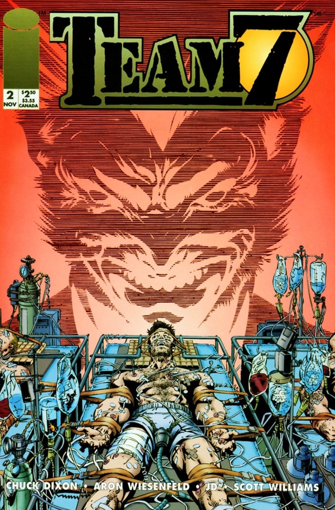
With those details laid down, here is a look back at Team 7 #2, published in 1994 by Image Comics with a story written by Chuck Dixon and drawn by Aron Wiesenfeld. This is the 2nd chapter of the 4-issue mini-series.
The cover.
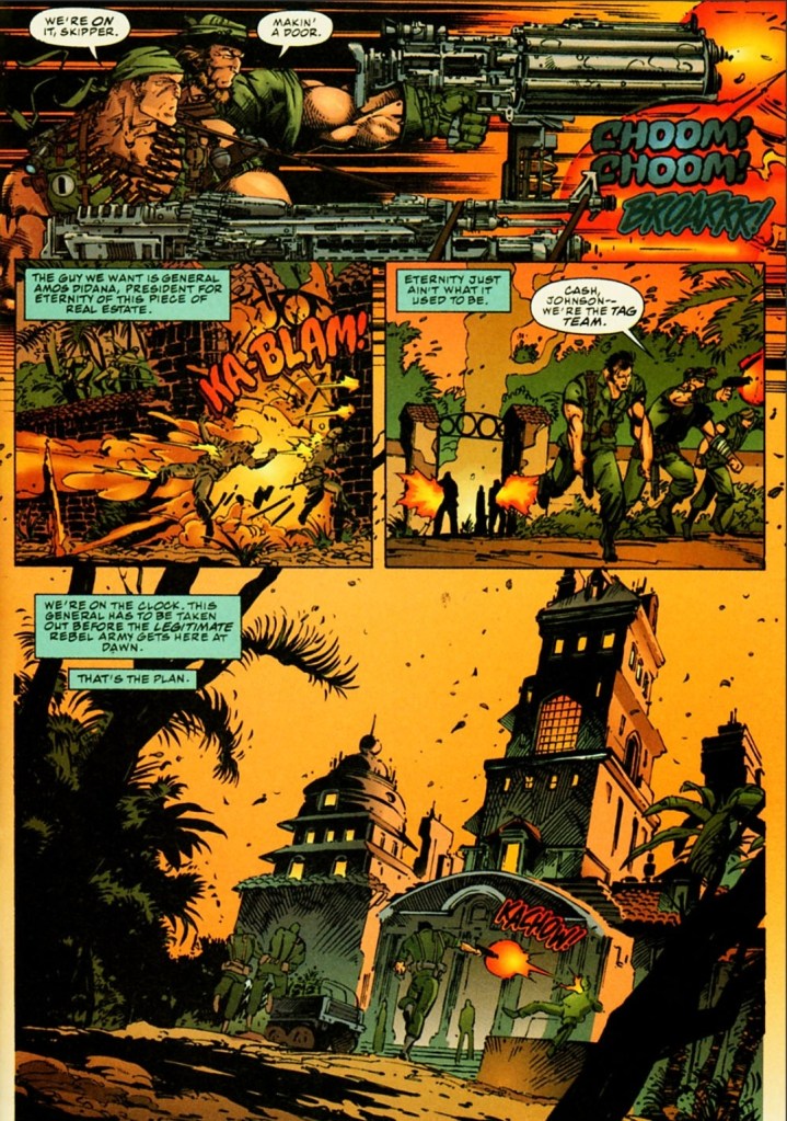
Early story
Set in the 1970s, a team of armed escorts and some personnel wearing protective gear isolate and examine a battlefield full of dead bodies. Miles Craven and Gabriel Newman analyze the evidence around them. Craven states that what they have is too important an operation to be left to underlings and he wants Gabriel to stay with the project which could use his special talents. Shortly after, the bodies of the Team 7 members were retrieved barely alive.
Seven days later, John Lynch wakes up in a hospital bed feeling traumatized over what happened to his team during the last mission. He was told that they were exposed to a chemical agent and he had been in a deep coma for a week.
Craven then enters the room to provide Lynch crucial updates…
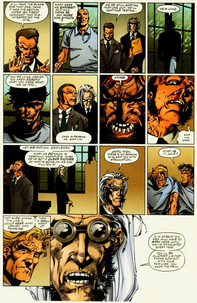
Quality
Do you recognize Deathblow and Dane on this page?
As expected, the gritty and dark storytelling from the previous issue continued in this story. Without spoiling the plot, I can say that this issue has some handsome pay-offs to what was built-up in issue #1 and there were new build-ups established along the way. Because the script was crafted to build-up the plot and sub-plot, the military action scenes are lessened which is not surprising. I can assure you that Chuck Dixon’s writing here remains pretty strong.
While the previous issue served as an efficient introduction of the younger versions of WildStorm’s heroes who are in the middle of a world full of violence and espionage, this issue shed some light as to how the heroes dealt with their new abilities (in connection with the climax of issue #1) and how International Operations is handling matters behind closed doors. The suspense kept on building up and this made the narrative more intriguing to follow. Expect to see elements of high-level espionage, unethical science and war throughout.
When it comes to the characters, Lynch (being the captain of Team 7) has a huge share of the spotlight followed by Cole Cash (Grifter). The two have different views about their special forces duty – Lynch follows the superiors while Cole realizes something is wrong about their leadership and the intelligence fed to them.
Conclusion
This scene showing Cole Cash (Grifter) emerging from dark with a defiant tone is a very defining moment of this comic book.
Team 7 #2 (1994) is clearly a very engaging read. It has the fine mix of war (with uncompromising violence drawn by Wiesenfeld), intrigue and the dark side of global espionage. The science fiction element here worked well in explaining the powers Team 7 members got after what happened in issue #1. This comic book also marks the beginning of showing Lynch and Cole Cash as the co-leads among the teammates. Die-hard fans of Deathblow, Dane and Backlash will have to wait a bit before their favorites get their share of the spotlight. Regardless, this is a very powerful read and a fine example of doing a prequel within the original WildStorm universe.
Welcome back readers, fellow geeks and electronic gaming fans!
In this edition of the Retro Gaming Ads Blast (RGAB) series, we will take a look at another batch of retro gaming print ads – including arcade flyers – from the 1980s and 1990s.
For the newcomers reading this, Retro Gaming Ads Blast (RGAB) looks back at the many print ads of games (console, arcade, computer and handheld) that were published in comic books, magazines, flyers, posters and newspapers long before smartphones, social media, the worldwide web and streaming became popular. To put things in perspective, people back in the 1980s and 1990s were more trusting of print media for information and images about electronic games and related products.
With those details laid down, here is the newest batch of retro gaming print ads for you to see and enjoy…
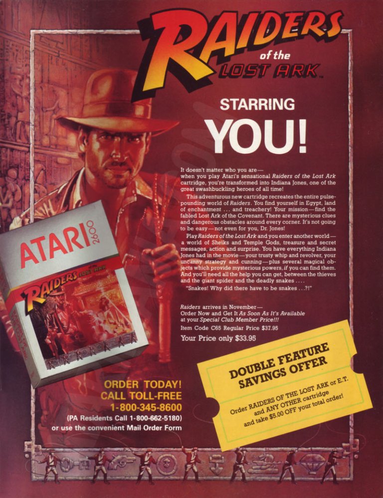
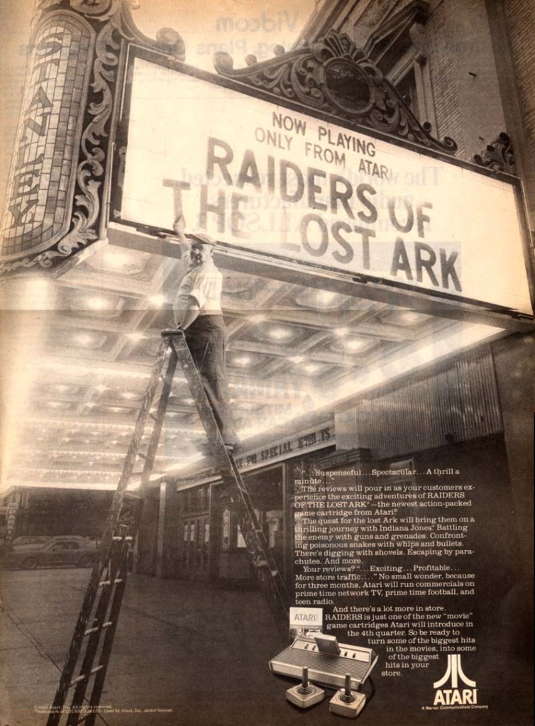
1. Raiders of the Lost Ark game print ads
The print ad with strong Indiana Jones imagery.
The print ad with the movie theater exterior image and the small image of the Atari 2600 console.
Directed by Steven Spielberg, Raiders of the Lost Ark was one of the best adventure movies ever made as well as the start of the iconic character Indiana Jones. Given its huge commercial success, an official video game adaptation for the Atari 2600 was released in 1982 and game designer Howard Scott Warshaw even met with Spielberg during the game’s development.
To promote the game, Atari released two print ads – one ad had a movie theater exterior visual concept to emphasize they have the official video game adaptation based on the movie while the other ad showed the game’s official artwork and game box cover while emphasizing a savings offer. Atari really did what they could to sell a game while riding on the success of Raiders of the Lost Ark.
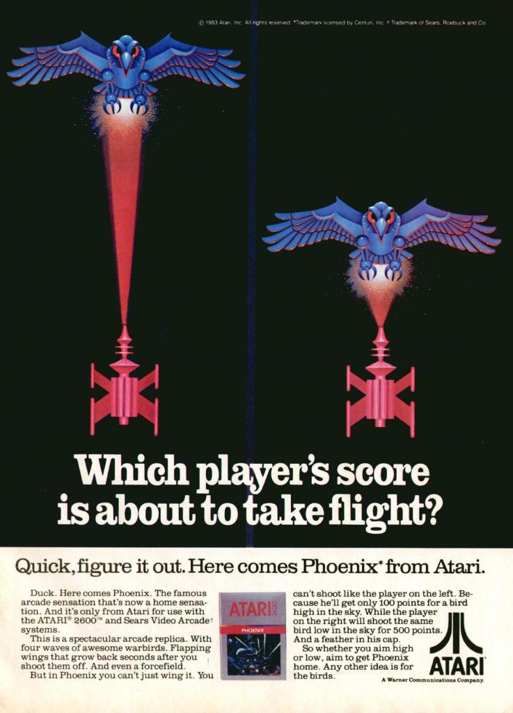
2. Phoenix print ad
Even without any screenshots, this print ad’s art still gives viewers a clear idea of what to expect.
Similar to what they did with Galaxian and Joust, Atari made this print ad promoting Phoenix which was a 2D sci-fi shooting game that was similar with Space Invaders in design. Colorized, hand-drawn artwork resembling the 2D sprites of the game was done to capture the attention of people. The art is so good, it made up for the lack screenshots of the game.
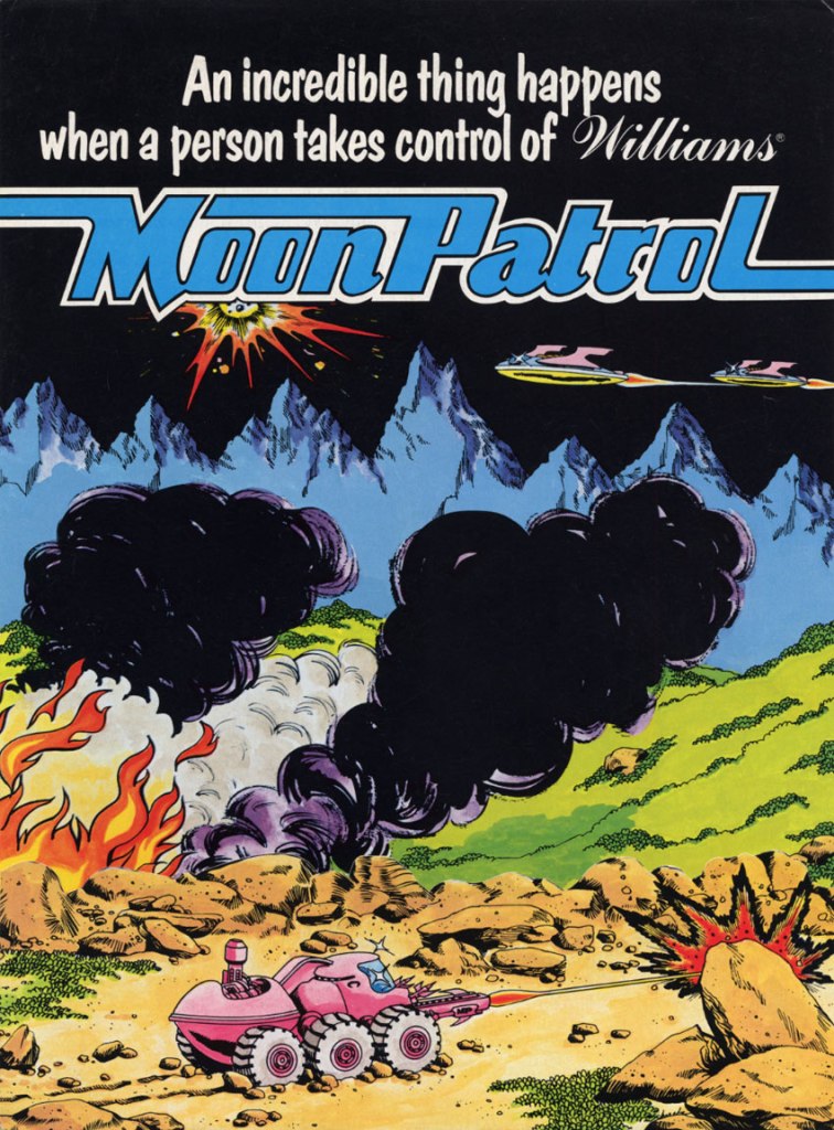
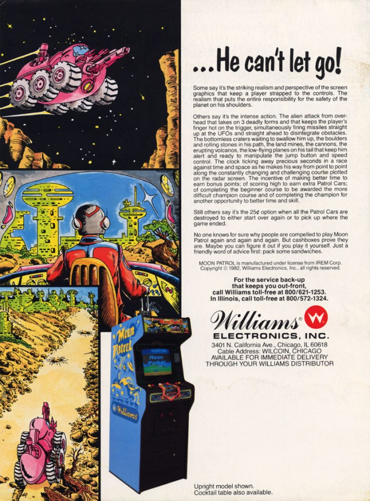
3. Moon Patrol arcade flyer
Front of the Moon Patrol flyer.
The other side of the arcade flyer.
Moon Patrol was a 2D sci-fi side-scrolling adventure game first released in the arcades in 1982. To sell the game to arcade operators, publisher Williams created the North American arcade flyer that heavily used hand-drawn comic book-style artworks on both sides while using available space on the other side for the descriptive text, contact details and the image of an arcade machine. What is very clear is that no screenshots of the game were shown to stand out which explains why a lot of hand-drawn art was used. The picture of the machine showing a screen of Moon Patrol was the closest thing to see a screenshot on this flyer. Personally, I really like the style and quality of the hand-drawn artwork as it made the flyer look lively.
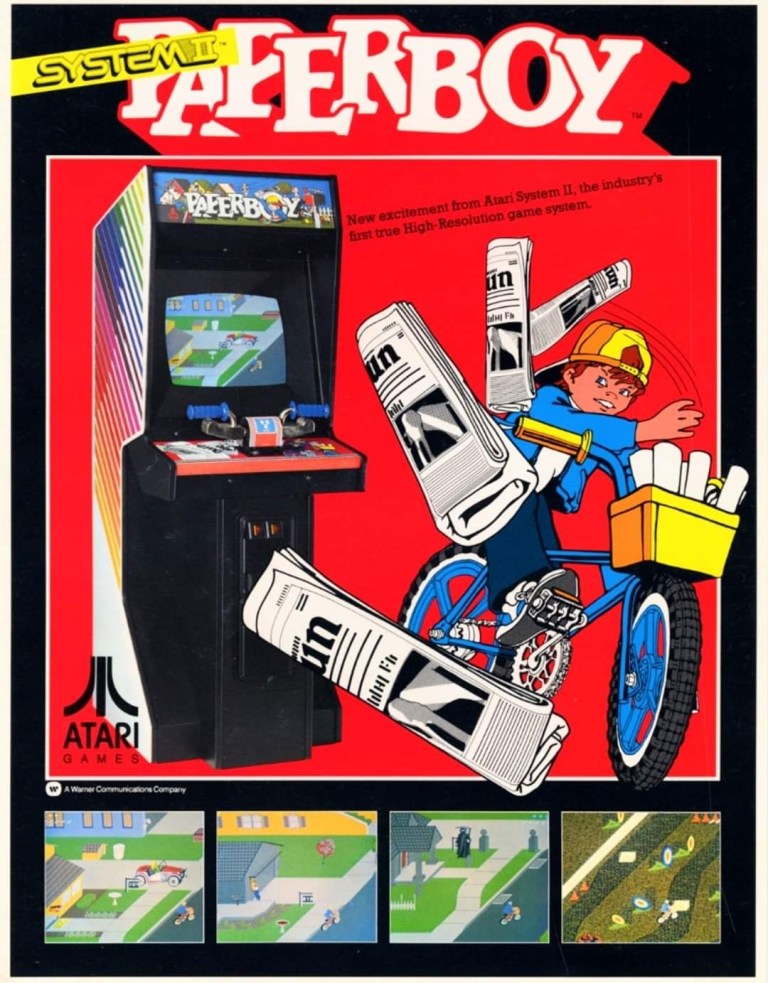
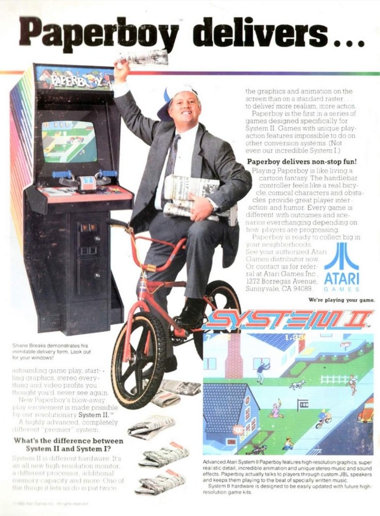
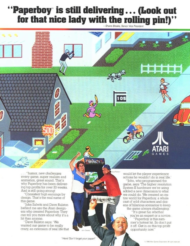
4. Paperboy arcade flyers
The arcade flyer showing the Paperboy machine and screenshots. The hand-drawn art is nice.
This one uses comedy showing a grown man riding a bike as a paper delivery “boy”.
I really like the stronger emphasis on the in-game graphics of Paperboy which dominates the space. What you see is what you get in the arcade.
The first time I ever played the classic Paperboy was in the arcade inside a Las Vegas hotel way back in 1989, and it sure was a challenging yet fun experience. Before its arcade debut in 1985, the developers took a lot of risks making the game which includes coming up with a bicycle handle bar for each machine to have. To promote the game, Atari made at least three arcade flyers that creatively emphasized what the game’s concept was about, how did it play, why does the machine have bicycle handlebars and why players can expect fun. Atari’s promotional efforts paid off as Paperboy became a huge hit in the arcades not only in America but also in Japan.
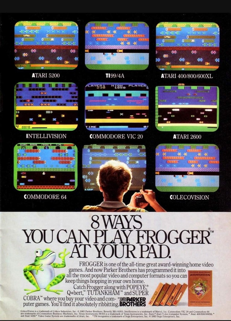
5. Frogger multi-platform print ad
This print ad is still amusing to look at.
After Frogger became a hit in the arcades, Parker Brothers secured the rights to port the game on Atari consoles, the Intellivision, TI-99/4A, vic-20, the Commodore computers and ColecoVision. To promote their Frogger ports, the single-page print ad was made showing a player in the foreground playing in front of screens that each showed what the game looked like on each platform. Parker Brothers found tremendous success selling 4 million copies of Atari 2600 version of Frogger at a time when there were only 13 million units of Atari 2600 in existence. By the year 2005, video game sales of Frogger reached 20 million worldwide across different platforms.
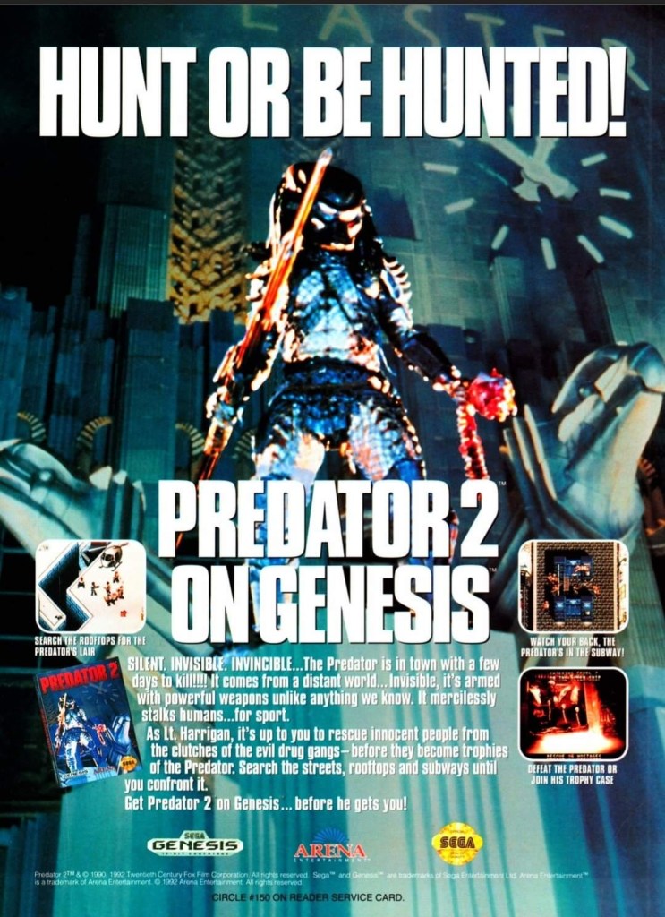
6. Predator 2 print ad
This is one very edgy print ad as used an official image from the movie.
If there is anything memorable about the 1990 film Predator 2, it is the fact that it had the story and the alien hunter itself within a metropolitan setting. That being said, the Sega Genesis Predator 2 video game had a suitable design of shooting and adventuring within the urban settings. This video game ad really captured the vibe of the movie (even showing the reddish human skull with spine on the Predator’s left hand) and clearly showed what gamers could expect. This old ad is still captivating to look at and its edgy approach is still intact.
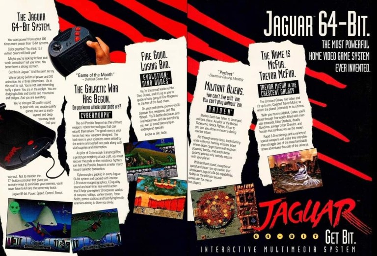
7. Atari Jaguar print ad
Did you ever own an Atari Jaguar console?
When I was reading video game magazines back in the 1990s, I always found print ads of the Atari Jaguar intriguing to look at. I was very young when I first played the Atari 2600 and its games at home, and later played some Atari games in the arcade. To me, seeing Atari Jaguar print ads like this one gave me moments of nostalgia and it made me wonder if Atari knew what it was doing with their so-called 64-bit game console. They did what they could to promote their console and the games within this 2-page print ad.
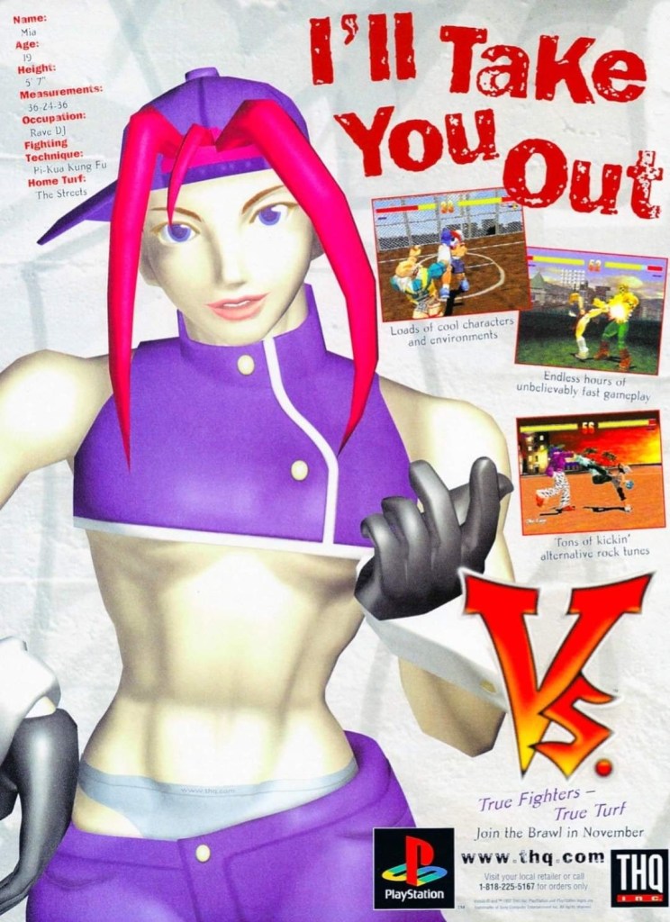
8. Vs. print ad
This print ad easily reminds me of the 1990s.
By 1997, both the arcades and the video game console market were filled with lots of 2D and 3D polygonal fighting games. Japan was the hot spot of the production of 3D polygon fighting games and the developer Polygon Magic (based in Japan) made Fighters’ Impact which Taito released in Japanese arcades and the PlayStation. The said game was picked up by THQ for a late-1997 release on the PlayStation in America under the title Vs. I never played this game but I heard that the game’s development included gang-oriented characters designed by Marvel Comics artist Kurtis Fujita. This Vs. ad is a lively reminder about the hip-hop fashion that made its way into video games.
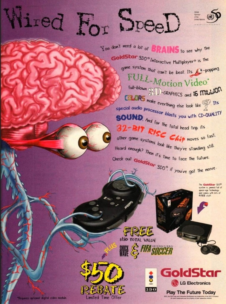
9. GoldStar/LG Electronics 3DO print ad
This is a very weird way to market a video game machine.
Back in the 1990s, the South Korean electronics company GoldStar (which was part of the umbrella of LG Electronics) had the license to produce 3DO game consoles with its own style. In some ways, the GoldStar 3DO console looked like a premium console on the outside. Unfortunately, the GoldStar 3DO print ad here had a very sloppy presentation as the ad makers used very weird art of a brain-with-eyes holding a 3DO controller leaving little space left to promote the console and games (without any screenshots). The text description was sloppily done. This is a bad example of promoting video game hardware and games.
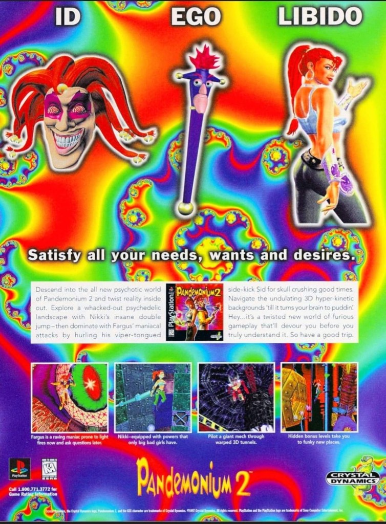
10. Pandemonium 2 print ad
I saw this ad but never played the game.
Looking back at 1997, I find it strange that I never got to play Pandemonium 2 on the PlayStation even though I saw its print ad in magazines. I had a lot of fun playing Pandemonium! on the console in 1996 but somehow missed out on its sequel. Looking back at the Pandemonium 2 print ad, I was surprised with how the game developers redesigned the two playable protagonists, especially Nikki who was clearly made to look very sexy. The word “libido” (meaning sexual drive) was deliberately placed above Nikki. The ad also had a hypnotizing mix of colors which I believe was also deliberately done by the ad makers. I can only wonder how the game played.
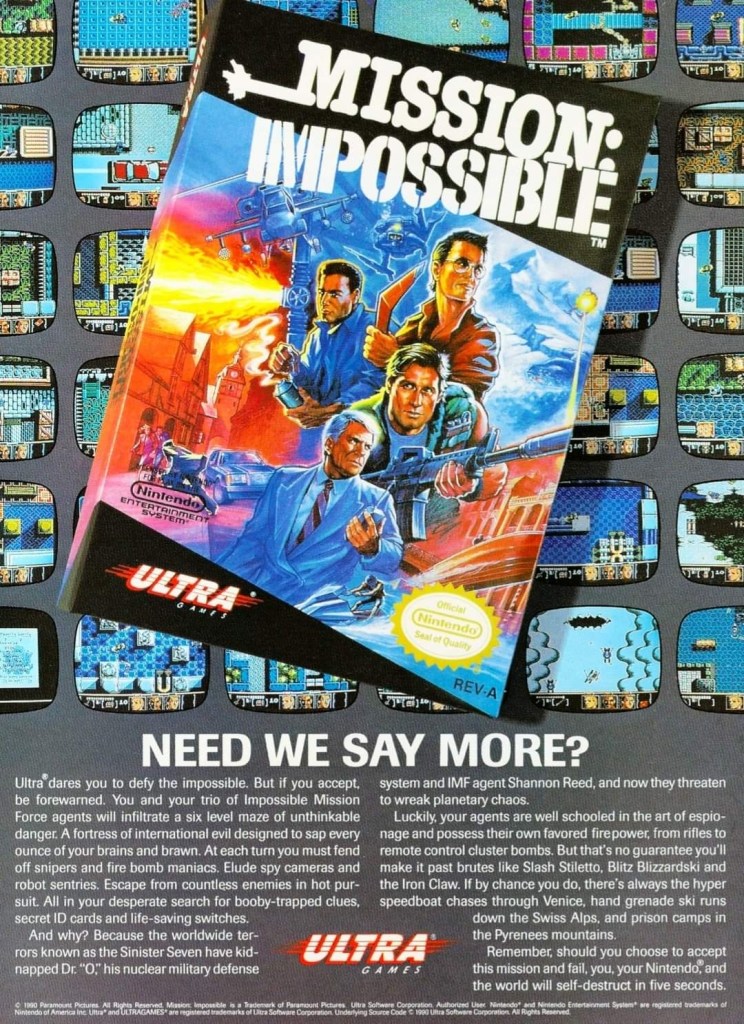
11. Mission: Impossible print ad
A captivating ad.
In 1990, Ultra Games (a label of Konami) released the Mission: Impossible video game on the Nintendo Entertainment System (NES) in America. Developed by Konami, the game was an adaptation of the 1988 TV series and it had an ambitious design with regards to level design and gameplay. To promote the game, the ad makers came up with a visual design showing the game’s box (which had a nice painted art on the cover) on the foreground and several screenshots resembling TV monitors on the background. Even by today’s standards, this print ad still looks good and captivating even if you are not too familiar with Mission: Impossible on TV.
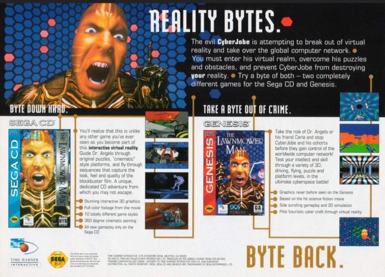
12. The Lawnmower Man Sega CD and Genesis print ad
Are you fan of The Lawnmower Man movie?
Back in 1992, there was a lot of buzz generated by the movie The Lawnmower Man as it had a disturbing concept that involved virtual reality and, more notably, author Stephen King sued the filmmakers to remove his name from the title because the film differed so much from the source material. Of course, those developments did not stop the production of video game adaptations of the movie. This print ad promoting the Sega CD and Sega Genesis versions of the game heavily used the images of CyberJobe which were among the most memorable images from the film. Looking at the ad, the ad makers could have made the screenshots look a little larger to really sell the games.
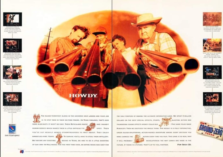
13. Ground Zero: Texas print ad
The shotguns really made this ad eye-catching.
I never played the Sega CD video game Ground Zero: Texas but I knew that it was one of those games that heavily relied on video footage while giving players moments to interact. Back in 1993, there was an increase in the number of video games that carried lots of live action footage to drive the narrative and players were given options in order to progress. What is very notable about the game is not the game design but the very 2-page ad used to promote it. The image showing four people pointing their shotguns towards the viewer was easily the most captivating part of the ad. Even though there was vacant space in between, the screenshots of the game were displayed to be really small.
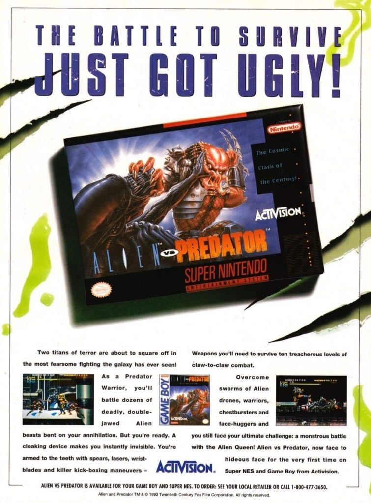
14. Alien vs. Predator for SNES and Game Boy print ad
This ad caught the attention of a lot of people back then.
Back in 1990, Dark Horse Comics launched the 4-issue mini-series of Aliens vs. Predator which turned out to be a very intriguing and engaging crossover comic book tale featuring two iconic sci-fi species of monsters. The success of the comic books led to the production of many video games which delighted both fans of Predator and Aliens. In 1993, Activision released Alien vs. Predator on the Super Nintendo Entertainment System (SNES) and the single-page print ad they came up with was engaging to look at. The SNES game box with the fine looking painted art was the main visual highlight leaving just enough space for the descriptive text, the Game Boy cover and two screenshots. Believe it or not, this video game was not related at all with the Alien vs. Predator arcade game and Atari Jaguar console game.
Disclaimer: This is my original work with details sourced from reading the comic book and doing personal research. Anyone who wants to use this article, in part or in whole, needs to secure first my permission and agree to cite me as the source and author. Let it be known that any unauthorized use of this article will constrain the author to pursue the remedies under R.A. No. 8293, the Revised Penal Code, and/or all applicable legal actions under the laws of the Philippines.
Welcome back superhero enthusiasts, 1990s arts and culture enthusiasts, movie fans and comic book collectors! Today we go back to the year 1990 to take a look at the official comic book adaptation of the movie Predator 2 (1990).
For the newcomers reading this, Predator 2 is the sequel to the 1987 movie directed by John McTiernan (Die Hard) and starring Arnold Schwarzenegger. As the movie became a huge commercial success, it started a chain of events that led to the rise of the Predator entertainment franchise covering merchandising, comic books and video games to name a few. Of course, the development of a cinematic sequel happened and both the movie studio and filmmakers took their time to make it. Predator 2 was directed by Stephen Hopkins and it starred Danny Glover, Gary Busey and Bill Paxton.
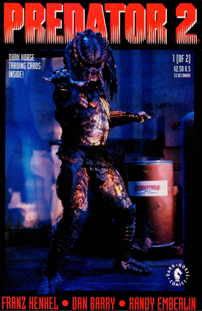
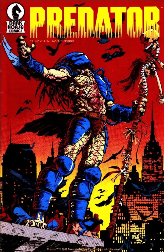
With those details laid down, here is a look back at Predator 2 #1, published in 1990 by Dark Horse Comics with a story written by Frank Henkel (based on the screenplay by Jim Thomas and John Thomas) and drawn by Dan Barry. Mark Verheiden (writer of 1989’s Predator #1) was acknowledged with special thanks. This comic book is the first of a 2-part comic book adaptation of the movie.
The cover.
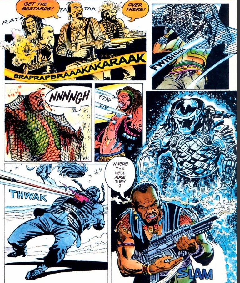
Early story
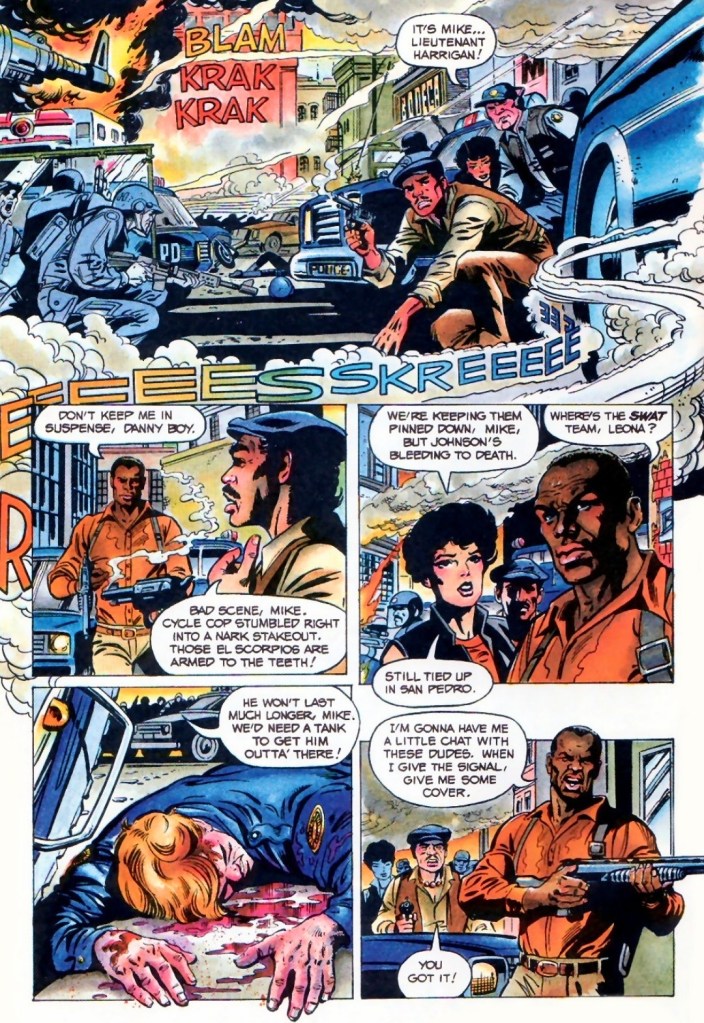
The story begins during a very hot day in 1997 Los Angeles. Police office Mike Harrigan rushes to the site of a major shootout between heavily armed gangs (Colombians and Jamaicans). The police managed to corner a gang to a building that was occupied by the foreigners. Knowing that a fellow cop is slowly bleeding to death and the SWAT (Special Weapons and Tactics) team are still stuck in traffic, Harrigan decides to take action against the armed gangsters with the support of his teammates and some police personnel.
After managing to get close to the gangsters by the building using his car, Harrigan manages to shoot them all and pave the way for his teammates to get closer. Harrigan does not realize that a camouflaged Predator is watching him from above.
At one of the higher floors of the building, the rest of the foreign gangsters prepare themselves for the arrival of the cops by gathering guns and ammunition. Suddenly, the camouflaged Predator crashes in on them…
Quality
The Predator here is quite aggressive and even arrogant enough to suddenly fight the Jamaican gang alone.
I am surprised how entertaining this first chapter of the 2-part comic book adaptation of Predator 2 turned out to be. While the accuracy is understandably less than 100% with regards to translation from cinema to literature, this comic book’s narrative is quite faithful to the events of the movie (from the start until the King Willie scene) and the film’s vibe was strongly captured. In fact much of the dialogue spoken in the film were mostly recaptured here, and the same can be said about the way the characters were portrayed.
For brevity and the maximizing of the pages made available, creative liberties or shortcuts were taken by the creators. This means that the presentation of details was carefully done to keep readers properly informed while managing to keep the fun factor and level of intrigue strong. Indeed, writer Frank Henkel did a very good job keeping things together to make the reading experience fun and engaging.
If there is anything that this comic book exceeds the movie on, it is the graphic violence. Artist Dan Barry really ramped up the bloody scenes and gore (examples: Mike Harrigan’s killing of two foreign gangsters with a shotgun, and the scene when Harrigan and his team were stunned by the sight of the many ruined dead bodies of gangsters who were just eliminated by the Predator before they arrived) as he used his own style to make the action scenes as intense as the ones filmed by Stephen Hopkins and crew. It was obvious he saw the movie.
Barry also had his own style on visualizing the characters without the authority to use the likeness of any actor from the film. Mike Harrigan looks nothing like Danny Glover while Peter Keyes does not resemble Gary Busey. Barry’s visual take on the Predator itself has a really distinctive look when compared to how other artists drew Predators.
Barry did not aim to achieve photo realism at all with the characters (who appear with a slightly cartoonish aesthetic), the locations and action scenes but I don’t find anything problematic with his work here. In fact, I enjoyed his way of translating the movie’s visual presentation into literary format.
Conclusion
Mike Harrigan, Danny and Leona make their moves.
Predator 2 #1 (1990) is a very enjoyable read. It strongly captured the vibe of the movie complete with the dialogue and the way the characters were presented. Very clearly, the Henkel-Barry duo did really fine work in this comic book adaptation and I am convinced to move on to issue #2.
Overall, Predator #2 (1990) is highly recommended!
Welcome back, my readers, YouTube viewers and all others who followed this series of articles focused on YouTube videos worth watching. Have you been searching for something fun or interesting to watch on YouTube? Do you feel bored right now and you crave for something to see on the world’s most popular online video destination?
I recommend you check out the following topics and the related videos I found.
#1When Atari invaded Japan – Here in the Philippines, me and my friends played video games on the Atari 2600 consoles in our respective homes during the first half of the 1980s. What I did not know back then was the fact that Atari did its best to sell its console and video games in nearby Japan. It turns out, their console in Japan was the Atari 2800. Watch and learn about this particular part of video game history with the video of GTV Japan below.
#2 A look back at Superman: The Animated Series – When it comes to animated series of the 1990s related to superheroes, X-Men: The Animated Series, Batman: The Animated Series and Spider-Man: The Animated Series are often remembered by long-time fans and geeks. The animated series of Superman, however, does not get remembered as much even though it had good quality animation and presentation. Of course, it should be remembered that the 1990s was the same decade when DC Comics had Superman killed, introduced the Supermen, brought Superman back to life and even had the Clark Kent identity destroyed which probably overshadowed the animated series. To discover more of Superman: The Animated Series, watch the video below.
#3 Examining the original 2099 comics franchise of Marvel Comics – You might have heard about 2099 among the many comic books Marvel published through the decades. The futuristic of Marvel’s shared universe originally started in late 1992 when the comic book speculator boom was still intense. It started strongly with Spider-Man 2099 followed by Ravage 2099, Doom 2099 and Punisher 2099. In the 2nd half of 1993, X-Men 2099 followed and even more related comic books got released. Of course, the 2099 franchise of the 1990s eventually ended. How and why it all happened like that, you can learn by watching Owen likes Comics’ video below.
#4 You, Me and the Movies’ Excalibur reaction – Excalibur is an epic medieval fantasy movie about the legend of King Arthur and his knights released in 1981. I first saw the film on TV in 1988 and it was an intriguing viewing experience. I replayed it on physical disc format in 2003 and eventually recognized Patrick Stewart, Helen Mirren, Liam Neeson and Gabriel Byrne looking much younger. If you want to discover more of Excalibur through the reaction of You, Me and the Movies, watch the video posted below. It’s a fun watch.
#5 Assorted videos about Planet of the Apes (1968) – Planet of the Apes of 1968 is considered by many as a great science fiction film as well as a philosophical and intelligent viewing experience. While it is an engaging viewing experience, I find the concept of human evolution and the so-called genetic links between humans and apes to be nothing more than fantasies. Considering its fame, it is no surprise that a lot of YouTubers made their own videos about it and you can watch the selected videos below.
#6 A look back at Robotron: 2084 – Robotron: 2084 is a 2D, multi-directional shooting game first released in arcades way back in 1982. I never played the arcade version but managed to play it on an IBM PC around the mid-1980s. The history behind the game is quite rich in details and you can enjoy learning about it by watching the video of PatmanQC below.
Disclaimer: This is my original work with details sourced from reading the comic book and doing personal research. Anyone who wants to use this article, in part or in whole, needs to secure first my permission and agree to cite me as the source and author. Let it be known that any unauthorized use of this article will constrain the author to pursue the remedies under R.A. No. 8293, the Revised Penal Code, and/or all applicable legal actions under the laws of the Philippines.
Welcome back science fiction enthusiasts, 1980s arts and culture enthusiasts, movie fans and comic book collectors! Today we go back to the year 1989 to take a look at a significant event of the Predator entertainment franchise – the comic book launch of Predator.
For the newcomers reading this, Predator started as a sci-fi action movie in 1987 directed by John McTiernan (Die Hard) and starring Arnold Schwarzenegger, Carl Weathers, and Jesse Ventura to name some. The writers and creators were Jim Thomas and John Thomas. As the movie became a huge commercial success, it led to the start of its own multi-media entertainment franchise covering video games, toys, novels and comic books. It also led to the release of more movies including a crossover film with the Alien franchise.
With those details laid down, here is a look back at Predator #1, published in 1989 by Dark Horse Comics with a story written by Mark Verheiden and drawn by Chris Warner. The is the first chapter of a 4-issue mini-series and it would later be referred to as Predator: Concrete Jungle.
The cover.
Early story
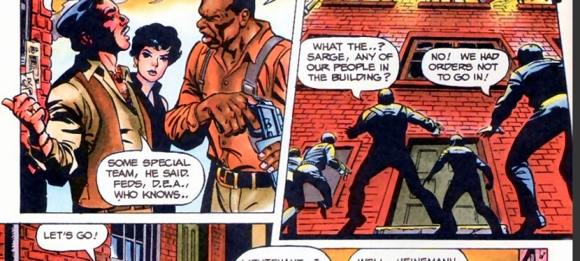
The story begins during a very hot summer day in 1991 New York City. A man killed his own wife using a shotgun which eventually leads to the arrival of cops, medics and his arrest. The two detectives Errol Rasche and John Schaefer (brother of Dutch) have been working together in the local war against crime and they have a tendency to do things that violate their superiors’ orders.
In one of the rundown buildings of New York, a secret meeting between two gangs got terribly disrupted by a Predator who attacked from the outside. Chaos and destruction followed.
Shortly after, Rasche and Schaefer arrive outside the same building which has been surrounded and isolated by the local police. When a man suddenly fell out of the building and crashed on top of a police car, the two detectives decide to enter willfully violating the order to stay out.
Once they enter the room where the secret gang meeting was held, Rasche and Schaefer are shocked to see many skinned and dead bodies inside. Schaefer is convinced that what happened was not the result of a gang war…
Quality
A gang meeting about to be disrupted by the unseen Predator.
This comic book – written as a not-too-obvious sequel to the 1987 movie – is absolutely very intriguing to read from start to finish. Mark Verheiden clearly wrote a crime story that happens to involve the species of deadly hunters from outer space. In fact, this comic book has very notable elements that also made it into the core concept of the 1990 movie Predator 2.
Story is set within a massive city that happens to be suffering from a heat wave – check! There is rampant crime and conflicts between gangs – check! The Predator causes huge disruptions on the criminals – check! The detectives willingly violate protocol to solve cases – check! One of the detectives is gradually getting closer to retiring and his pension – check. It’s almost as if this comic book was a huge influence on the people who made Predator 2.
Going back to the story, this is a strong tale of crime and urban war told through the exploits of detectives Schaefer and Rasche who have worked many years together, they treat each other like brothers (similar to Predator 2’s Mike Harrigan and Danny Archuleta).
With their record of disobeying orders, Schaefer and Rasche simply involve themselves in cases believing they have the right know the details on the spot and to solve problems their way even though their superiors don’t need them. This is the anti-authoritarian portrayal of law enforcers that easily reminded me of certain TV shows and movies of the 1980s.
All throughout, the story by Verheiden is nicely structured, has lots of engaging details to follow and carefully blends sci-fi elements with detective storytelling. Verheiden clearly knows how to build up tension, keep the narrative progressing and use action or spectacle with precise timing.
When it comes to the visuals, Chris Warner’s style is very good. His approach on drawing the characters made them look exquisite and visceral at the same time. In fact, there were some shots of people in this comic book which reminded me of Todd McFarlane’s way of drawing people during his early works in comics. Lastly, I should say that Warner’s approach on hard action and his way of drawing of the Predator must be seen.
Conclusion
Rasche and Schaefer defy orders. Schaefer (holding the gun) is the brother of Arnold Schwarzenegger’s character in the Predator movie of 1987.
I really enjoyed reading Predator #1 (1989). This is indeed really fine work by the Verheiden-Warner team and as far as building up the lore of the Predator goes, they clearly succeeded and their contributions here strongly influenced the creation of Predator 2 which opened in cinemas in late 1990. This comic book has the visceral touch and violence that make it comparable with both the 1987 and 1990 movies.
Overall, Predator #1 (1989) is highly recommended!
Disclaimer: This is my original work with details sourced from reading the comic book and doing personal research. Anyone who wants to use this article, in part or in whole, needs to secure first my permission and agree to cite me as the source and author. Let it be known that any unauthorized use of this article will constrain the author to pursue the remedies under R.A. No. 8293, the Revised Penal Code, and/or all applicable legal actions under the laws of the Philippines.
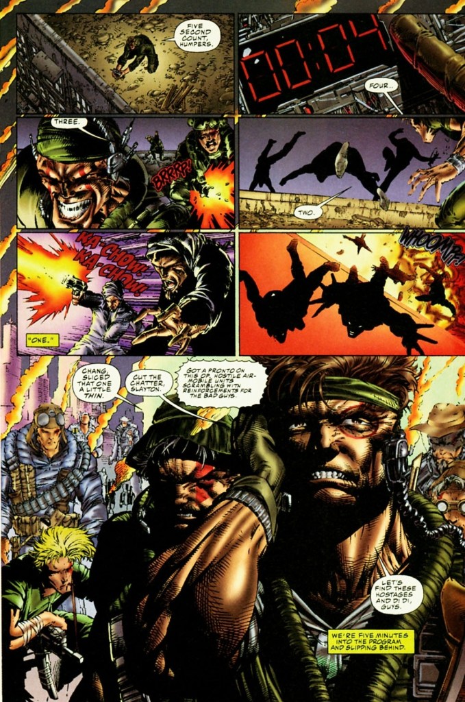
Welcome back superhero enthusiasts, 1990s arts and culture enthusiasts, Image Comics fans and comic book collectors! Today we go back to the year 1994 to take a close look at one of the many tales of the original WildStorm universe through one of the comic books of the first mini-series of Team 7.
For the newcomers reading this, Team 7 is set in the past within the original WildStorm universe. This is the one special forces team that had major WildStorm heroes – Grifter (WildCATS: Covert Action Teams), Backlash, Jackson Dane (Wetworks), John Lynch (Gen13) and Deathblow – who were younger, were proficient with combat and were destined to gain special abilities that later defined them.
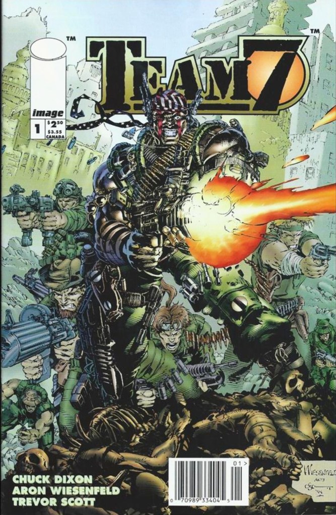
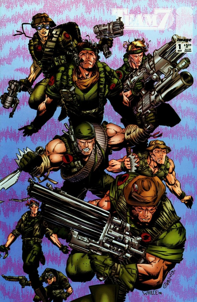
With those details laid down, here is a look back at Team 7 #1, published in 1994 by Image Comics with a story written by Chuck Dixon and drawn by Aron Wiesenfeld. This is the first chapter of a 4-issue mini-series. Also this year marks the 30th anniversary of this very comic book.
The cover.
Early story
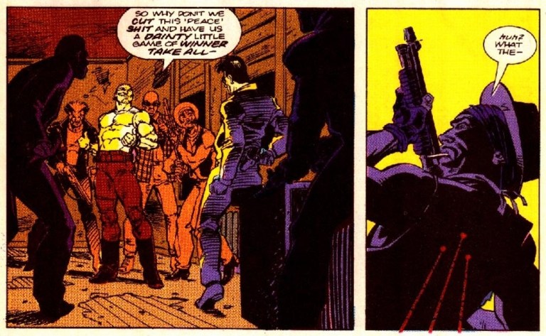
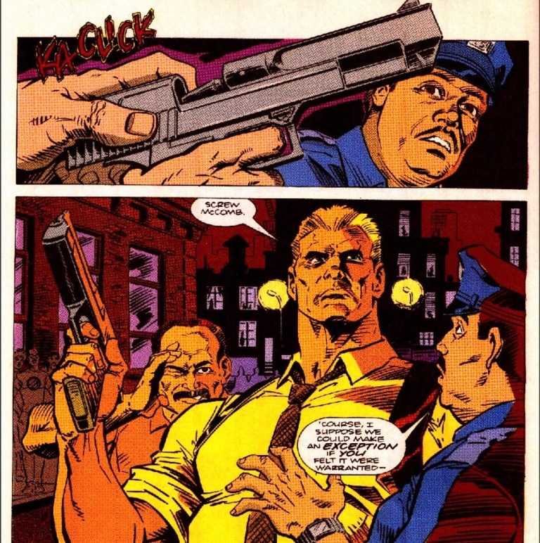
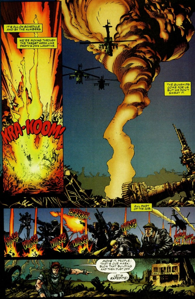
Set in the 1970s, the story begins when the United States Special Forces Team 7 arrives in Iran with the objective of rescuing hostages. Led by John Lynch, the team encounters several Iranian terrorists along the way and eliminates them as they proceed with their mission. A lot of killings and a few explosions happened as they made their way into the facility.
Eventually, Team 7 discovers that the hostages are gone as they only found stuffed dummies made to look like hostages. As they are so deep within the facility, going outside to survive an incoming powerful bombing was out of the question. They decide to go deeper knowing that the facility has a hardened sub-basement that was designed to absorb a shockwave…
Quality
See if you could recognize the WildStorm heroes among them.
I can say out loud that this WildStorm prequel tale by the Dixon-Wiesenfield is a very inspired work of fiction that captures (intentionally or not) the vibe of R-rated Hollywood action and war movies of the 1980s. In my view, the tone and style of this comic book reminds me a lot about Predator (1987), Rambo: First Blood Part II (1985) and Full Metal Jacket (1987). Of course, this is a tale about a band of brothers who risk their lives working overseas for their country taking orders from their superiors at International Operations (IO).
As a WildStorm tale, this one efficiently puts up the building blocks needed to define the key characters who would later become major WildStorm figures in what was back then the present day stories (set in the 1990s) told through WildCATS: Covert Action Teams, Kindred, Gen13, Backlash, StormWatch and more. At the same time, readers will get a close look at the developments behind closed doors at IO which itself appeared in WildStorm comic books with a much older Lynch as director. Of course, as this is the first issue the build-up would obviously continue in the succeeding issues of the mini-series.
The team led by John Lynch fought the Iranian terrorists as they make their way through.
War imagery here is intense.
The story itself has themes of espionage, political intrigue, Islamic terrorism and military conflict. It was made clear here that IO has a wicked director called Craven and the young John Lynch (the protagonist and future IO director) could do nothing but receive intelligence (no matter how limited) and execute orders that put him and his teammates in grave danger.
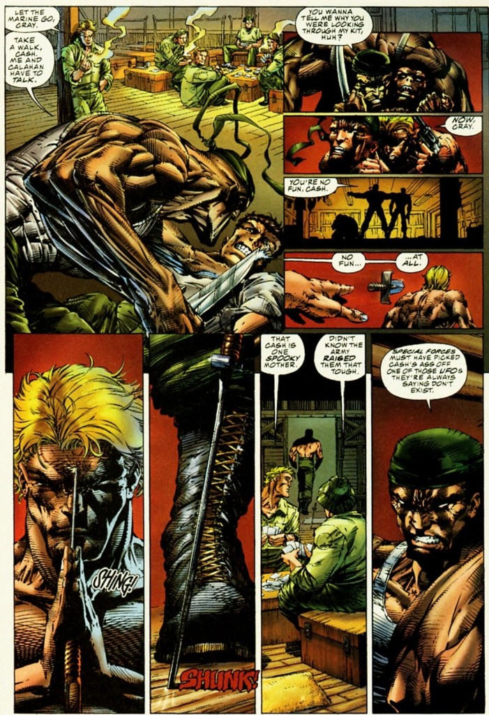
Along the way, you will see younger versions of WildStorm heroes Grifter (Cole Cash), Jackson Dane, Backlash (Marc Slayton), Deathblow (Michael Cray) as well as a few minor characters whose legacies will be felt in the present day stories (example: Gen13’s Grunge is the son of member Philip Chang). Oh yes, the banter and interactions between Team 7 members were very much inspired by what was portrayed in Predator (1987) and Full Metal Jacket (1987). While Lynch is the protagonist struggling with following orders and leading the team, the young Deathblow here clearly their most natural and aggressive eliminator.
When it comes to the visuals, Aron Wiesenfeld came up with a consistently dark and gritty look backed with uncompromising violence that strongly emphasizes the horror of war. He also has this exquisite approach on displaying the characters and the action portrayed was more of shooting, explosions and hard action. This comic book was released years before Steven Spielberg’s Saving Private Ryan (1998) hit the cinemas and caused some controversy with its display of graphical violence. In short, this is a comic book visualized with adults in mind.
Conclusion
The cover of the variant edition of Team 7 #1 drawn by Whilce Portacio.
Team 7 #1 (1994) is a very compelling read and it still remains one of the most unique comic books of the original WildStorm universe ever published. It is also one of the most defining war comic books published in the 1990s.
Considering the great work done by the Dixon-Wiesenfield duo, your enjoyment and understanding of this comic book depends a lot on how much you have oriented yourself with the mentioned WildStorm heroes who appeared in the comic books of WildCATS: Covert Action Teams, StormWatch, Wetworks and the like. I enjoyed this comic book a lot because I familiarized myself with Grifter, Backlash, Deathblow, Lynch and Dane before reading it. That being said, I urge you newcomers to get to know the said characters first before reading this comic book.
Disclaimer: This is my original work with details sourced from reading the comic book and doing personal research. Anyone who wants to use this article, in part or in whole, needs to secure first my permission and agree to cite me as the source and author. Let it be known that any unauthorized use of this article will constrain the author to pursue the remedies under R.A. No. 8293, the Revised Penal Code, and/or all applicable legal actions under the laws of the Philippines.
Welcome back superhero enthusiasts, 1990s arts and culture enthusiasts, Marvel Comics fans and comic book collectors! Today we go back to the year 1990 to take a close look at the concluding chapter of the comic book adaptation of the movie RoboCop 2 (1990).
In my previous retro review, I found the 2nd issue of the 3-part comic book adaptation mini-series that it lacked the impact of issue #1. It was understood that the comic book team was limited by the source material they had and the movie’s comedic scenes showing RoboCop not being his normal self were adapted. Those scenes did not translate into humorous comic book moments. At the very least, the build-up achieved by the comic book creators in issue #2 (which includes several internal developments at Omni Consumer Products) sets the stage for the final issue.
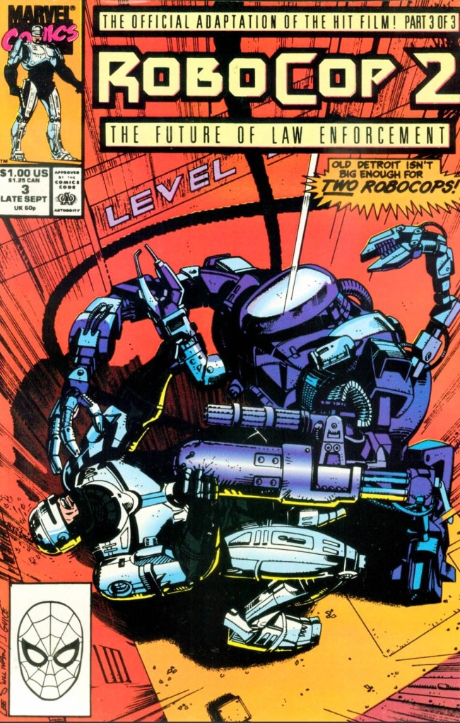
With those details laid down, here is a look back at RoboCop 2 #3, published in 1990 by Marvel with a story written by Alan Grant and drawn by Mark Bagley based on the movie screenplay by Frank Miller and Walon Green.
The cover.
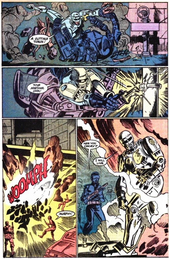
Early story
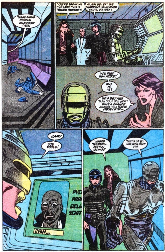
The story begins in Detroit where OCP executives press RoboCop (Officer Murphy) for answers about the spying he recently did on his ex-wife. It turns out that his wife was so traumatized over his death, there were therapists, hypnotists and other treatments involved to help her recover. As a result of the spying, his ex-wife now believes her husband is still alive. In response to questions, RoboCop gave answers that the OCP guys wanted – he is no longer a husband, no longer human, no longer Alex Murphy and he is simply a machine. The private meeting between him and his ex-wife did not go well.
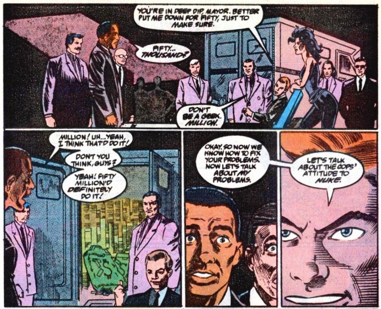
Meanwhile, the City Government of Detroit organizes a telethon in an attempt to raise funds needed to pay off the $37,985,300 they owe OCP. The mayor receives a very important call from former associates of Cain (RoboCop 2).
Shortly after, OCP realizes that the City Government could pay soon and if they fail to foreclose Detroit, their stock will plummet. With the approval from the corporation’s chief, Dr. Juliette Faxx proceeds to launch RoboCop 2 with the mind of Cain inside it…
Quality
The battle between RoboCop and his bigger rival (Cain) is action-packed and fun to read.
As it is clear that the imagery and plot developments of the movie screenplay were adapted by the comic book creators with their very own distinctive ways throughout the mini-series, this comic book succeeded in concluding its 3-part story. In fact, this is a huge pay-off to most of the build-up that took place in issues #1 and #2. The much-awaited big battle between RoboCop and the Cain-controlled RoboCop 2 lasted eight pages and it was indeed action-packed and satisfying. Before the said battle took place, RoboCop 2’s debut is short, stylishly obscured visually and yet vicious to see.
Considering the huge amount of details the movie screenplay had, the Grant-Bagley duo managed to adapt the most relevant content efficiently while also telling a literary tale that is cohesive enough.
This scene did not appear in the movie.
What I found very notable is the fact that this comic book opened with RoboCop getting berated by OCP executives for his spying on his ex-wife. The said scene actually happened very early in the movie itself and to have it as an opener of this comic book added depth to RoboCop’s character development in this adaptation.
When it comes to weaknesses, there were times when Mark Bagley’s drawing of RoboCop 2 were off. RoboCop 2 was visually huge and intimidating in the movie but in this comic book, the size and scale were clearly lacking particularly in the shot where he is standing near OCP’s chief. The lack of visual details on RoboCop 2’s body showed signs of rush by the artist.
Conclusion
Is your local government leader making secret deals with criminals in real life?
RoboCop 2 #3 (1990) is a nice pay-off to the build-up that preceded it and, more importantly, it was a satisfying mini-series conclusion. As a standalone comic book, it has a good amount of plot details, dialogue and action scenes that can delight RoboCop fans. As the conclusion of the 3-part adaptation of the 1990 movie, it has a stronger focus on RoboCop and the plot moved at a better pace than in issue #2. The storytelling is good and the spectacle was much improved.
Welcome back readers, fellow geeks and electronic gaming fans!
In this edition of the Retro Gaming Ads Blast (RGAB) series, we will take a look at another batch of retro gaming print ads – including arcade flyers – from the 1980s and 1990s.
For the newcomers reading this, Retro Gaming Ads Blast (RGAB) looks back at the many print ads of games (console, arcade, computer and handheld) that were published in comic books, magazines, flyers, posters and newspapers long before smartphones, social media, the worldwide web and streaming became popular. To put things in perspective, people back in the 1980s and 1990s were more trusting of print media for information and images about electronic games and related products.
With those details laid down, here is the newest batch of retro gaming print ads for you to see and enjoy…
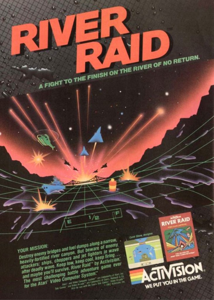
1. River Raid print ad
This River Raid print ad appeared on comic books and magazines long ago.
Decades before it became an industry giant with the best-selling Call of Duty games, Activision became a standout publisher in the early 1980s with River Raid on the Atari 2600. Designed by Carol Shaw, River Raid was a huge success ending up as the 2nd best-seller on the Atari 2600 as well as Activision’s best-selling game for the year 1983. Apart from showing one screenshot and the box cover of the game, the print ad of River Raid had this mesmerizing 3D image that caught many gamers’ attention and helped them feel like they will pilot on dangerous missions. The 3D image was futuristic in its own style became forward-moving 3D sequences in video games became reality many years later.
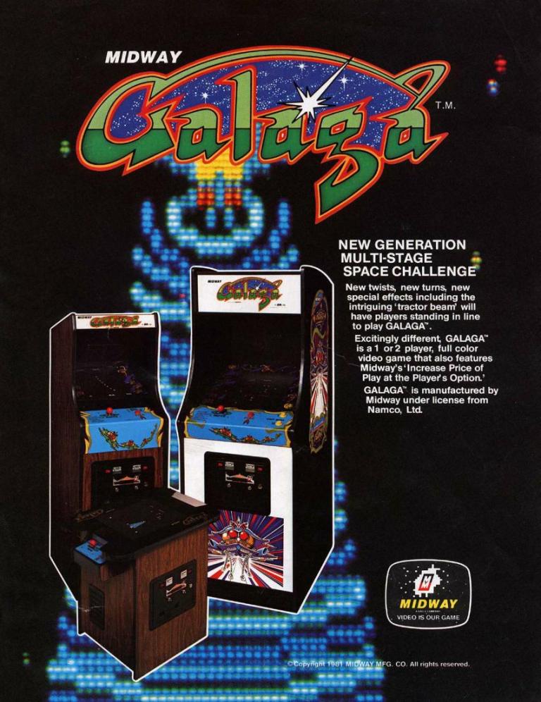
2. Galaga North American arcade flyer
The front of the flyer showing three Galaga machines that arcade operators can choose from.
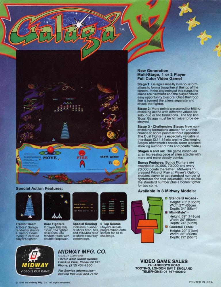
Key details about Galaga were nicely presented on the rear of the flyer.
In the history of gaming, Namco’s Galaga was played by countless millions of gamers and it is still highly regarded as an arcade classic as well as one of the most enjoyable arcade games ever made. In preparation for the North American launch (October 1981), Midway prepared the arcade flyer showing the three types of machine on the front that arcade operators can choose from. On the rear is the really neat approach of explaining the details of the game, what kind of gameplay is to be expected, and how to play. Whether you are an individual player or the manager of an arcade joint, this flyer suits your needs.
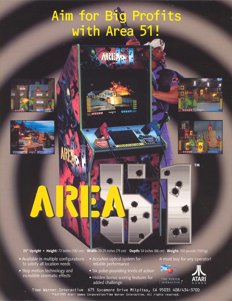
3. Area 51 arcade flyer and conversion kit flyer
The front of this Area 51 flyer had an enticing message for arcade operators as well as other business owners/managers who are interested in having a machine to add value to their business joints. Atari was already in deep money problems by the time they started making this game.
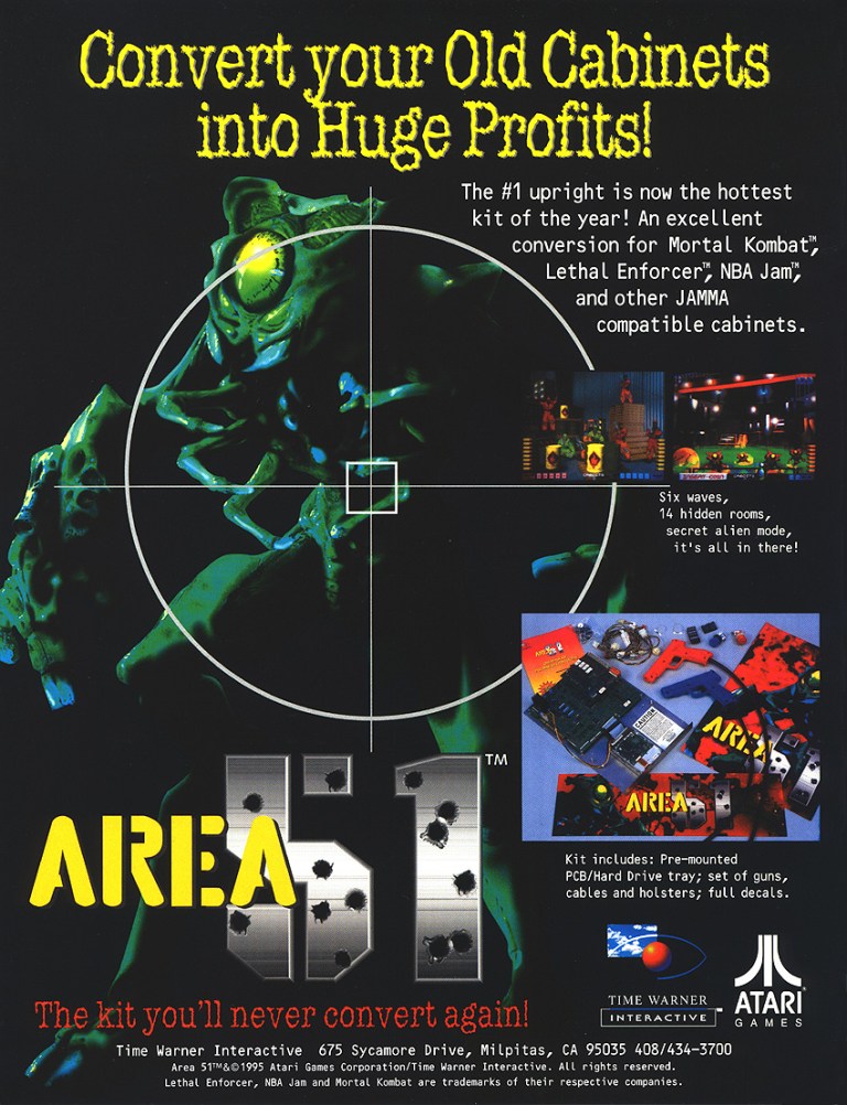
The Area 51 arcade conversion kit is a cheaper alternative for businesses who want the game.
Moving on to the 1990s, Atari was already struggling financially and desperately needed a hit to lift them up fast. A light gun shooter project was approved as arcade shooters were in good demand and after overcoming serious hurdles during production internally, Atari hired independent team Mesa Logic to take charge of development. After being granted extra time and more creative freedom, the project under Mesa Logic’s handling became a sci-fi shooter titled Area 51. The game became a huge hit in the arcades for Atari resulting in sales of more than 20,000 arcade cabinets as well as a major financial boost for the company (note: Atari still exists today). Atari went on to release Atari 51 versions for PlayStation, Sega Saturn and PC in America in 1996. The Atari 51 flyers you see here are still captivating to look at and were crucial in generating buzz among arcade operators, business joints that had space for arcade cabinets and gamers.
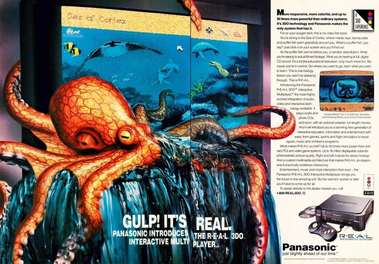
4. Panasonic 3DO print ad
The makers of this print ad forgot to mention the 3DO is also a game machine.
Back in 1993, the 3DO Interactive Multiplayer console manufactured by Panasonic (a licensee of the 3DO Company) was launched with a CD-ROM drive, multimedia features and gaming capabilities (with a 3-button control pad). This print ad strongly emphasized the 3DO’s ability to play high-quality sound and full-motion videos using the Sea of Cortez software which functioned as an interactive movie. Obviously, this did not resonate well with people who loved to play games and by the time the 3DO Company and its partners started marketing games, they could not save the 3DO console from fading to obscurity. The console shown in the ad is specifically model Panasonic FZ-1 R·E·A·L 3DO Interactive Multiplayer. Panasonic was one of five companies that were licensed by the 3DO Company.
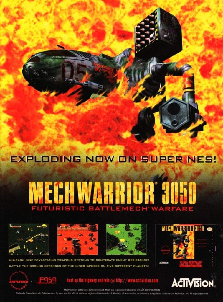
5. MechWarrior 3050 SNES print ad
If you were unaware of the 1994 game BattleTech, then this ad would have fooled you into thinking it is promoting a brand new game.
In 1995, the popular BattleTech entertainment franchise arrived on the Super Nintendo Entertainment (SNES) system with MechWarrior 3050 and its print ad had a really blazing artwork of an armed mech in fire which gave readers the illusion of a new and original game. In reality, MechWarrior 3050 was actually a port of BattleTech which was released on the Sega Genesis in 1994. The Genesis game was published by Extreme Entertainment Group while the SNES game was published by the more famous Activision. If you look closely at the MechWarrior print ad, you can tell how hard they tried to sell the game like it was brand new and all-original.
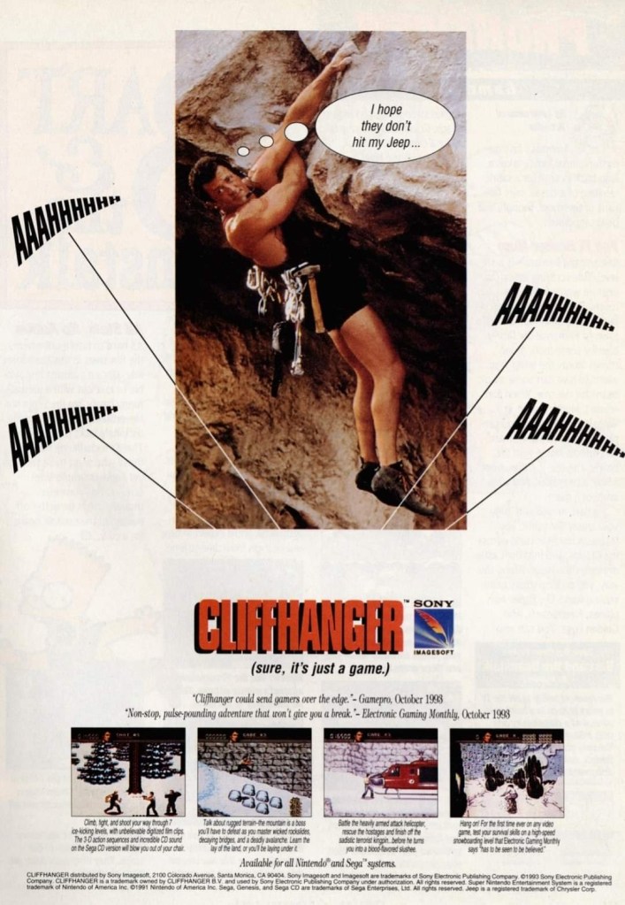
6. Cliffhanger video game print ad
This print ad had Sylvester Stallone hanging on a cliff to be relevant with the title of both the film and the game. They could not show images of Stallone in hard action scenes.
For fans of Sylvester Stallone, 1993 was a big and exciting year as the Hollywood icon appeared in two major action films – Cliffhanger and Demolition Man. Cliffhanger was released first and there were video game adaptations of it released on game consoles, handhelds and computers. This print ad of the Cliffhanger video game had an image of Stallone hanging on a cliff to emphasize the title. The ad makers cleverly posted selected gameplay screenshots and quoted GamePro and Electronic Gaming Monthly (EGM) to make the game look credible and worthy of purchasing. The marketing led to nowhere as the game received mostly negative reviews from critics and it faded to obscurity. Lastly, the Cliffhanger game ad had a noticeable amount of space wasted. They could have made the screenshots and text look somewhat bigger to sell the game.
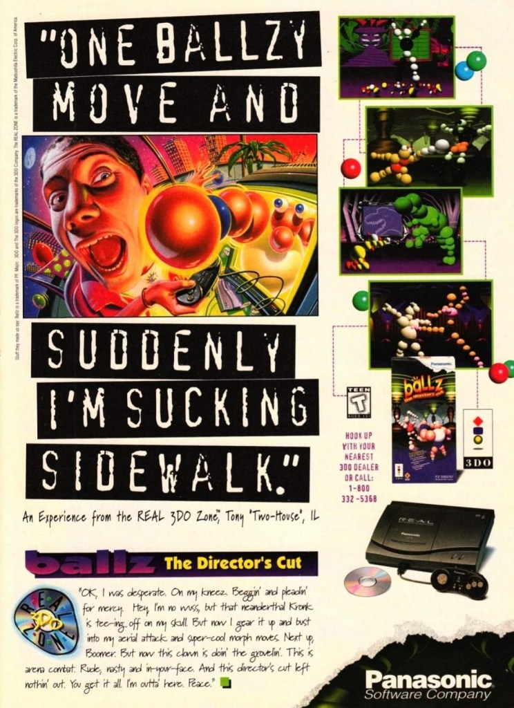
7. Ballz: The Director’s Cut print ad
I never got to play this game on the 3DO.
Here is another ad of the video game released on the failed 3DO console. As its title made obvious, Ballz: The Director’s Cut is an enhanced version of the original Ballz game of 1994 that was released on other consoles. The print ad had an eye-catching piece of artwork and posted beside it were selected shots of the gameplay. Strangely enough, the creative writing on the lower part of the ad does not make any sense and did nothing to convince gamers to play the game. As Ballz: The Director’s Cut was released in 1995, this ad shows the revised 3DO console from Panasonic (model: Panasonic FZ-10 R·E·A·L 3DO Interactive Multiplayer).
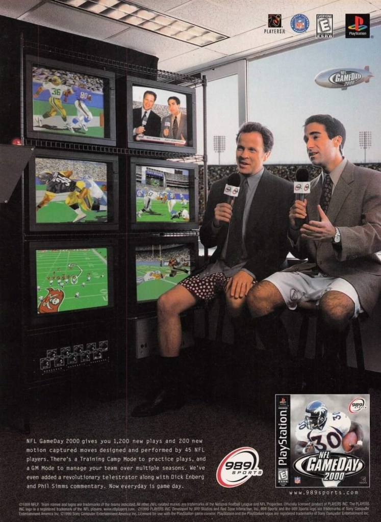
8. NFL GameDay 2000 print ad
Did you find this ad funny to look at in 1999?
To promote the PlayStation-exclusive NFL GameDay 2000, Sony publisher 989 Sports and the ad makers decided to implement a humorous look at football TV coverage by having two sportscasters wearing shorts in front of a TV camera that was only showing their heads and upper bodies. The TV sets on the side show screenshots from the game to emphasize the sports gaming experience. Ultimately the game scored mostly positive review from the critics.
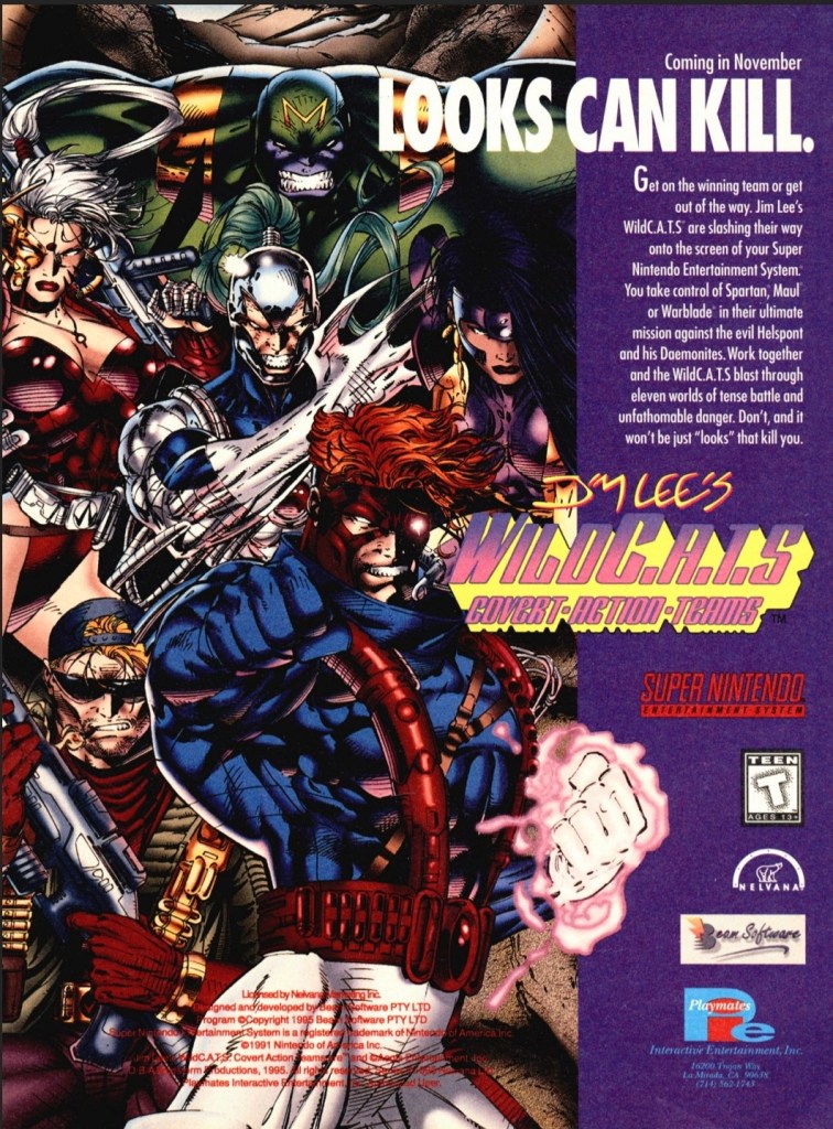
9. WildC.A.T.S: Covert Action Teams print ad
WildC.A.T.S. art by Jim Lee was used to promote the SNES video game.
When Image Comics launched in 1992, WildC.A.T.S: Covert Action Teams was Jim Lee’s creator-owned comic book franchise and its launch issue was a big seller. Years later, WildC.A.T.S. grew in popularity with comic book fans and the franchise achieved multi-media status by venturing into TV (with an animated series) and video games. This print ad promoting the video game adaptation had no screenshots to show which kept fans and gamers guessing how the game will turn out in terms of gameplay and game design. It was obvious that the people who made this print ad had to rely on the best WildC.A.T.S. artwork they could find drawn by Jim Lee. This ad made me laugh back in the old days because if you did not look closely, it might fool you into thinking it was more about comic books than the game on the SNES.
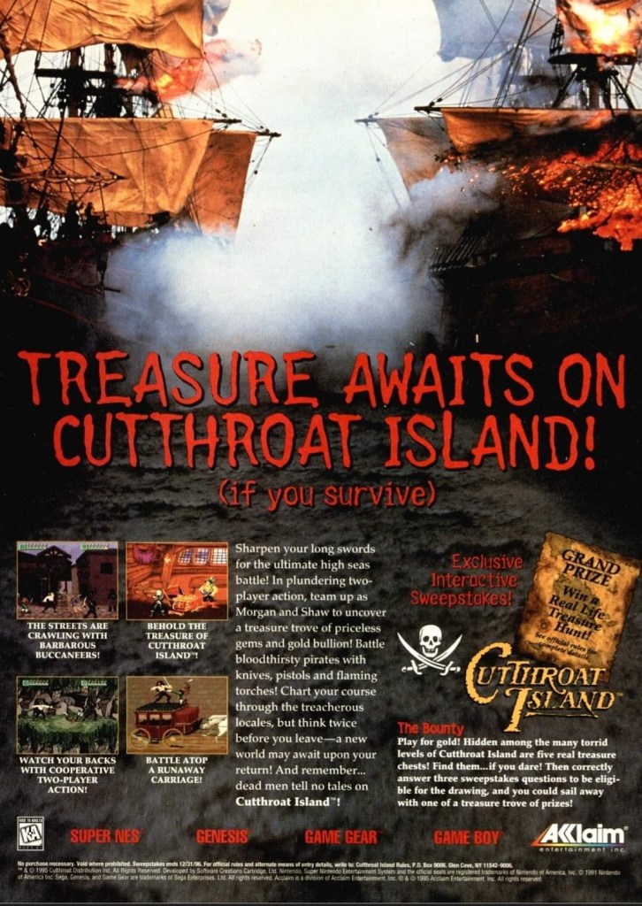
10. Cutthroat Island print ad
Exciting imagery without Geena Davis and Matthew Modine was used to promote the video game adaptation.
I never saw the Hollywood mega-flop Cutthroat Island nor have I ever played any of its multiple video game adaptations (released on SNES, Sega Genesis, Sega Game Gear and Game Boy). The video game print ad, however, caught my attention back in 1995 because the ad makers cleverly used a photograph from one the many expensive movie sequences filmed and the hard, physical work by the filmmakers was clearly visible. Then the ad makers had four screenshots placed on the lower-left part and inserted descriptive text that sounded exciting. Lastly, the ad mentioned a sweepstakes promo.
Without using any images of stars Geena Davis and Matthew Modine, this ad was a strong attempt to get gamers excited for the video game adaptation. Like the movie itself, this game flopped and has faded away to the land of the forgotten.
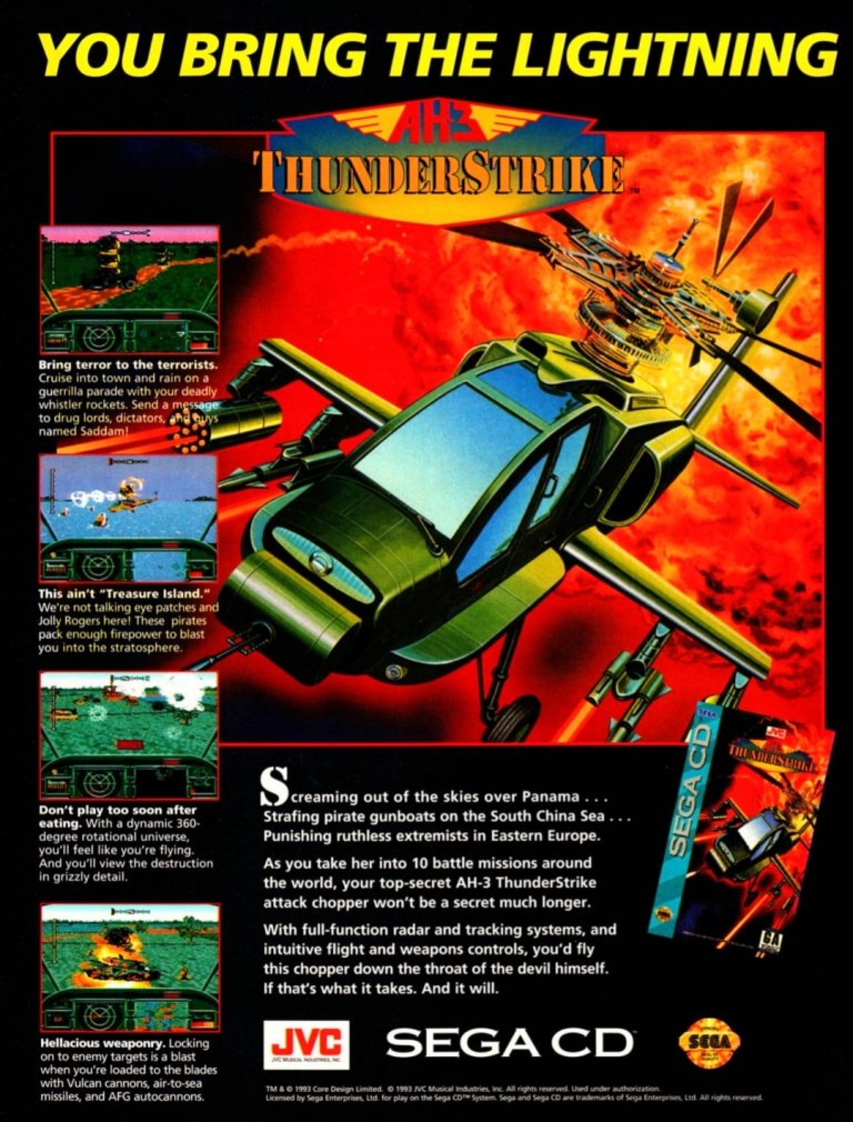
11. AH-3 Thunderstrike print ad
Captivating artwork, vibrant colors and orderly text descriptions made this an effective ad.
AH-3 Thunderstrike is one of the better games that was released on the Sega CD add-on (requires the Sega Genesis console) in 1993. Similar with MechWarrior 3050, the game was actually a port of Thunderhawk which itself was released on the Amiga and MS-DOS PC in 1992. The print ad showcased a captivating artwork (which was also used on the game’s box cover), a few screenshots and strategically placed text descriptions to sell the game. This ad still looks good.
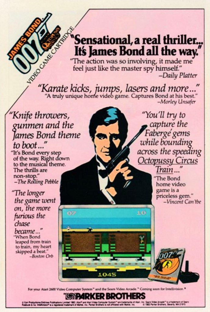
12. James Bond 007 print ad
This print ad appeared in many comic books in 1984.
This is a print ad I saw many times while reading comic books in 1984. James Bond 007 for Atari 2600 was an ambitious licensed video game as it featured levels that were inspired by missions in the James Bond movies Diamonds are Forever, The Spy Who Loved Me, Moonraker and For Your Eyes Only. Keep in mind that programmers back then had to deal with memory limitations and primitive tools to make games.
To promote the game, original art of Agent 007 was used which did not resemble the James Bond star of the time – Roger Moore. Strangely enough, the illustrated James Bond slightly resembled Timothy Dalton whose debut as 007 happened in 1987. Adding further zest to the add was the use of fictionalized quotes pointing to fantasized critics as sources (example: Vincent Can’tbe is a reference to real life critic Vincent Canby). The use of a pink background made this catchy ad look really odd.
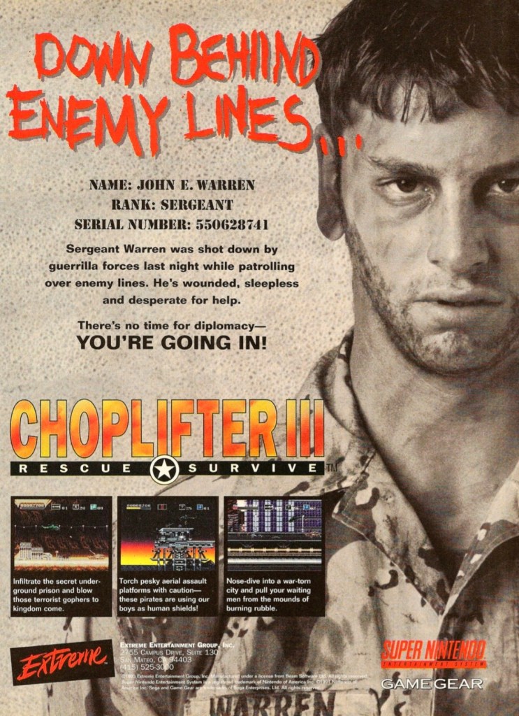
13. Choplifter III: Rescue Survive print ad
A captivating print ad that brought gamers’ attention to the Choplifter series again.
This print ad of Choplifter III: Rescue Survive has a striking look showing a military officer who needs your help as he has been stranded behind enemy lines. The presentation reflects the long-time tradition of the Choplifter game franchise which has been about piloting an armed helicopter to the opposition’s territory, shooting at bad guys and then rescuing the hostages or prisoners-of-war (POWs). The game eventually gathered mostly positive feedback from video game critics.
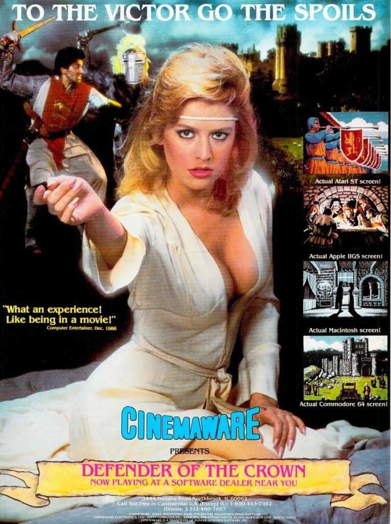
14. Defender of the Crown print ad
Cinemaware took a gamble with the visual concept of this print ad.
Released in 1986 for home computers, Defender of the Crown was made with a high level of quality backed with solid artistry. To capture gamers’ attention, Cinemaware came up with this print ad showcasing a pretty model looking somewhat seductive which reflects what happens in the game when players rescue a damsel in distress. The selected screenshots showed what the game looked like on different platforms, and the lower part of the ad made the game feel like it was a historical epic waiting to be discovered. Defender of the Crown eventually became a big hit with computer gamers.
Disclaimer: This is my original work with details sourced from reading the comic book and doing personal research. Anyone who wants to use this article, in part or in whole, needs to secure first my permission and agree to cite me as the source and author. Let it be known that any unauthorized use of this article will constrain the author to pursue the remedies under R.A. No. 8293, the Revised Penal Code, and/or all applicable legal actions under the laws of the Philippines.
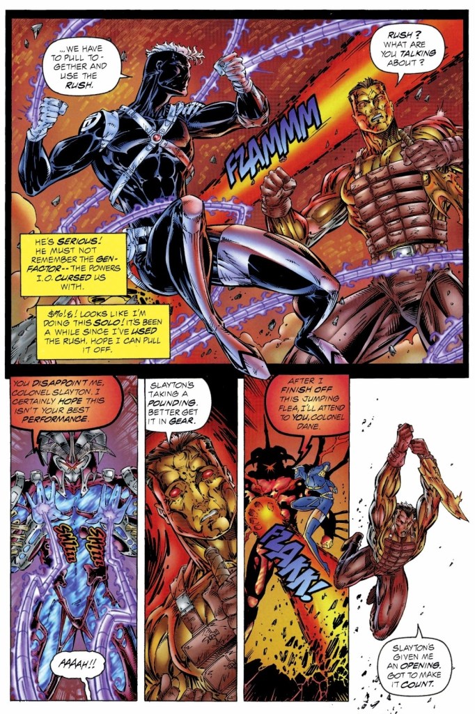
Welcome back superhero enthusiasts, 1990s arts and culture enthusiasts, Image Comics fans and comic book collectors! Today we go back to the year 1995 to take a close look at one of the many tales of the original WildStorm universe through one of the comic books of the Backlash series.
For the newcomers reading this, Backlash is one of the major characters of the WildStorm universe which started in the early 1990s when the famous Jim Lee was one of the founding fathers of Image Comics. Backlash, Deathblow, Wetworks, Gen13 and WildCATS: Covert Action Teams were all connected with each other and many of the characters were linked together in the Team 7 series of prequel stories.
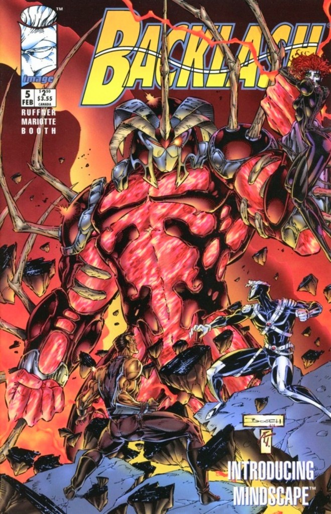
With those details laid down, here is a look back at Backlash #5, published in 1995 by Image Comics with a story written by Brett Booth, Jeff Mariotte and Sean Ruffner. Booth did the artworks.
The cover.
Early story
The story begins with Backlash having visions of his beloved Diane who eventually turns into a gruesome Daemonite monster. Suddenly his female companion Taboo appears to him only to betray him moments after.
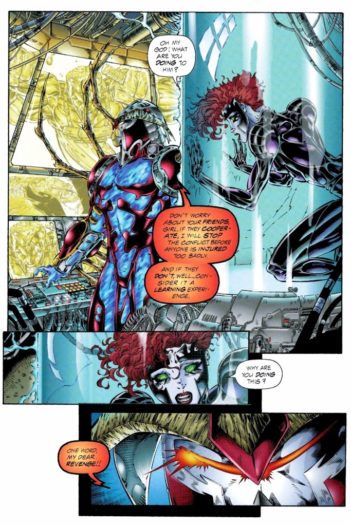
In the real world, it turns out that Backlash is helplessly restrained and connected to machines in the presence of Mindscape and his assistant Virtual Bob. Wetworks leader Jackson Dane and Taboo have been contained separately and could only watch Backlash agonizing. Backlash’s mind has been infiltrated by Mindscape through the use of virtual reality.
Mindscape has been looking for a living subjects who could become suitable for his project of combat droids which require genetic information from the subject. Even though he knows that having two live subjects would confuse the combat droids, Mindscape gives the order to have both Backlash and Dane together in cyberspace…
Quality
Backlash and Wetworks leader Dane face-off with Mindscape in cyberspace.
With its heavy emphasis on virtual reality and cyberspace, the creators temporarily changed their approach on storytelling and showing spectacle while managing to introduce a new villain and show more of the friendship of Backlash and Dane.
In my view, Mindscape is indeed a very interesting antagonist who is not the typical super villain who is simply being evil for the sake of it. In fact, Mindscape’s origin was efficiently told here and by the time I finished reading this comic book, I found him to be intriguing. Before he became the powerful villain here, Mindscape used to be a very talented virtual reality developer. Mindscape looks at Dane and Backlash – both of which have extensive military experience as they used to be teammates with Team 7 – not for the sake of murder but as suitable subjects for his combat drones which signifies his intention to build an army that will serve him in the real world.
As this story took place a short time after the reunion that happened late in issue #4, this comic book shows a bit more of the friendship between Backlash and Dane, revealing small details about their past together as specially trained soldiers. With the way the story here was told, there was too little room left for any character development to happen but the small details revealed about the two WildStorm heroes was enough to inspire me to revisit Team 7.
In relation to the story’s concept about virtual reality, the spectacle here is much different and absolutely wilder. You have to see it for yourselves.
Conclusion
Being trapped and helpless, Taboo could only watch Mindscape and ask him questions.
Backlash #5 (1995) is an entertaining and intriguing read. This comic book also served as a suitable break from the norm of showing Backlash fighting bad guys in the real world and infiltrating places to accomplish his objectives. Backlash and Dane here were portrayed to be vulnerable as their conflict with Mindscape happened in cyberspace. The final conflict was a spectacle to look at and the story’s ending was satisfying enough leaving the sense that Backlash and Dane would meet each other again.
Welcome back readers, fellow geeks and electronic gaming fans!
In this edition of the Retro Gaming Ads Blast (RGAB) series, we will take a look at another batch of retro gaming print ads – including arcade flyers – from the 1980s and 1990s.
For the newcomers reading this, Retro Gaming Ads Blast (RGAB) looks back at the many print ads of games (console, arcade, computer and handheld) that were published in comic books, magazines, flyers, posters and newspapers long before smartphones, social media, the worldwide web and streaming became popular. To put things in perspective, people back in the 1980s and 1990s were more trusting of print media for information and images about electronic games and related products.
With those details laid down, here is the newest batch of retro gaming print ads for you to see and enjoy…
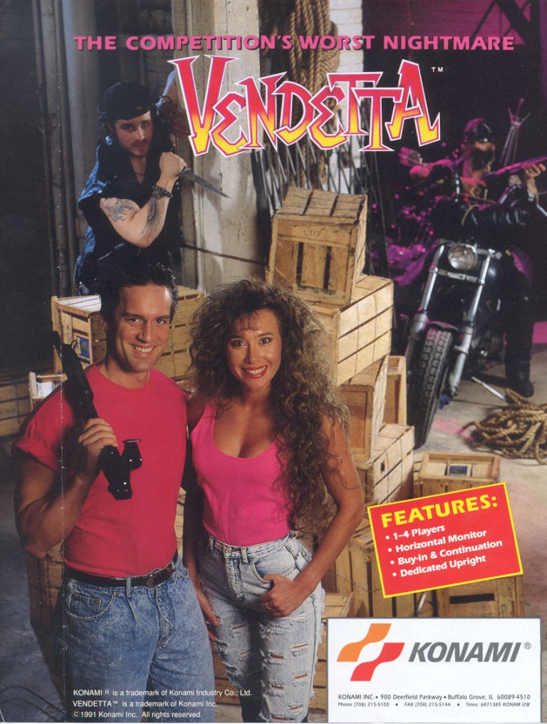
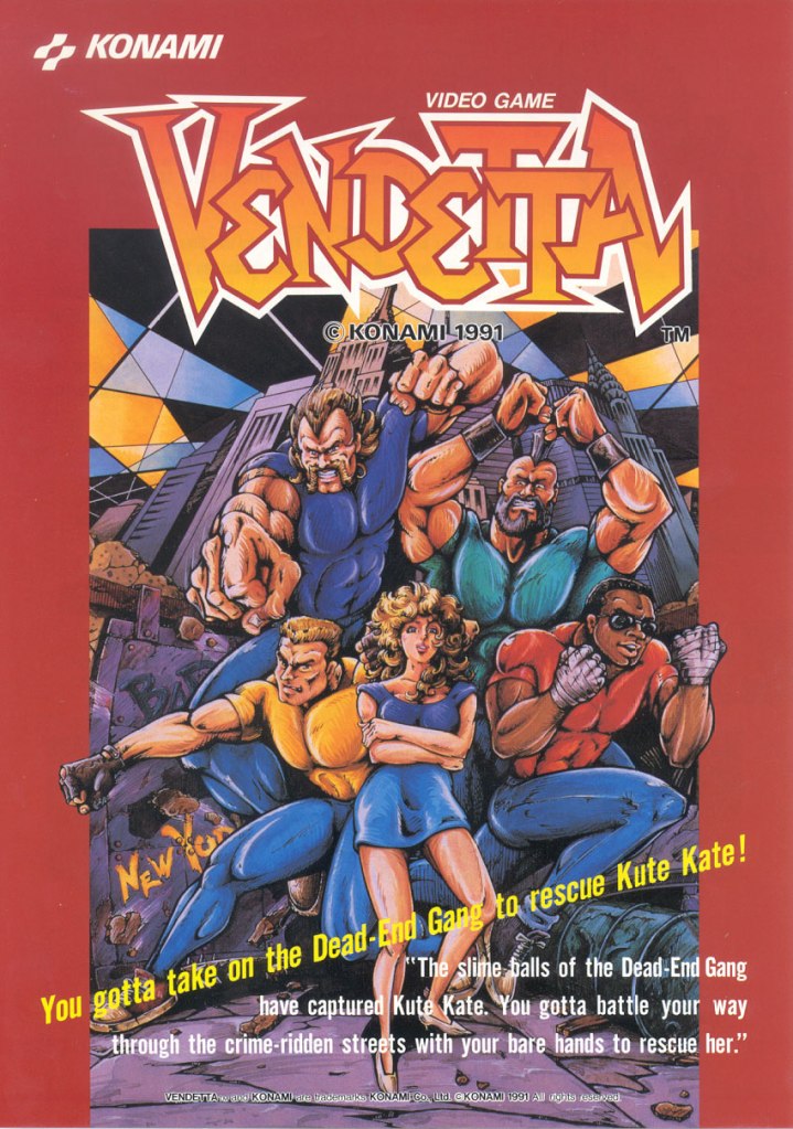
1. Vendetta UK and North American arcade flyers
Vendetta arcade flyer for North America
Vendetta arcade flyer for the UK.
In 1991, Konami released the 2D side-scrolling beat-them-up game Vendetta in arcades around the world achieving commercial success. While it is hard to tell if the promotions helped the game commercially, there is no doubt that the arcade flyers for the North American and United Kingdom (UK) markets were indeed very eye-catching.
The North American Vendetta arcade flyer had a photographic approach showing models playing characters supposedly representing the Cobras gang and the Dead End gang. The display of wooden boxes and the rope was done to symbolize the rough city environments of the game. On the other hand, the UK arcade flyer has illustrated artwork that captured the look of the Cobras gang from the game.
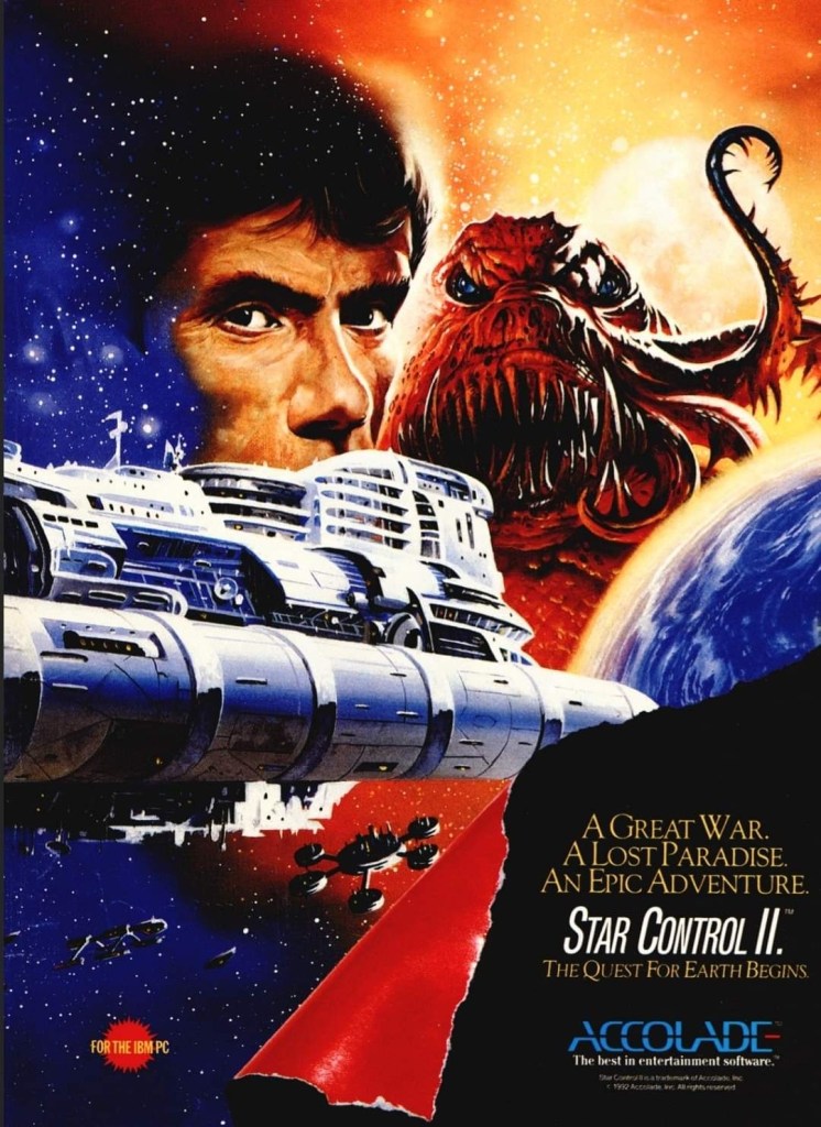
2. Star Control II: The Ur-Quan Masters print ad
This ad has great art that strongly emphasizes its science fiction concept.
This print ad of Star Control II: The Ur-Quan Masters (PC version) really caught my attention when I read gaming magazines in the early 1990s. The painted artwork showing a human and a hideous alien in the background with a planet, space ships and space stations filling the rest of the space was very captivating to look at. So captivating, it enticed me to search for the game but our PC at home had really low specs. Strangely enough, I played another version of Star Control II on a rented 3DO Interactive Multiplayer console in 1995. For the newcomers reading this, the game was critically acclaimed and was declared as one of the very best PC games ever made. Enjoy looking at the print ad above.
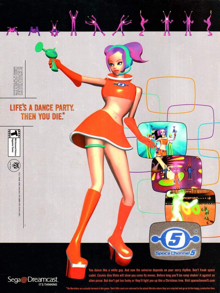
3. Space Channel 5 print ad
The visual style and character designs are the result of the game designer’s research that includes interviews with lots of young girls over their interests and tastes in video games.
When Sega launched their Dreamcast console in Japan in late-1998, their financial health was already in a very bad state and the future looked grim. Even as they faced tremendous odds, Sega still went on to aggressively sell Dreamcast consoles with exclusive games and Space Channel 5 was one of them.
First released in Japan in 1999, Space Channel 5 was a musical, puzzle-oriented game that was the result of Tetsuya Mizuguchi’s work backed with research he did that included interviewing young girls to find out what their tastes in gaming are. The print ad showing the highly stylized protagonist Ulala and a few screenshots really caught the attention of gamers and kept the Dreamcast in their minds. While the game did not achieve commercial success as a Dreamcast-exclusive, Sega went on to release a version of Space Channel 5 on the PlayStation 2 console, plus sequels.
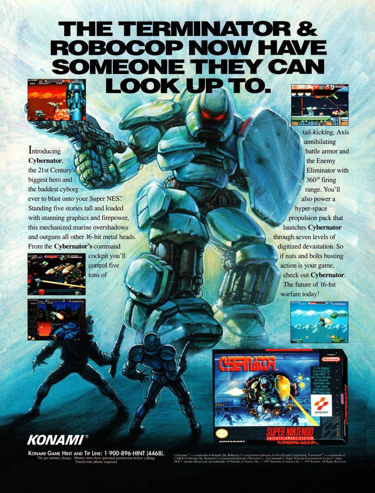
4. Cybernator print ad
The mention of Terminator and RoboCop rivaled the artwork when it comes to grabbing people’s attention.
I remember seeing the print ad of Konami’s Cybernator (Japanese title: Assault Suits Valken) in several comic books I read back in 1992. I never got to play it but the print ad’s artwork was memorable as I was fond of robots in anime, movies and video games back then. What was arguably the most memorable aspect of the print ad was the line that mentioned RoboCop and the Terminator in a comedic way. This is a creative way to market the game.
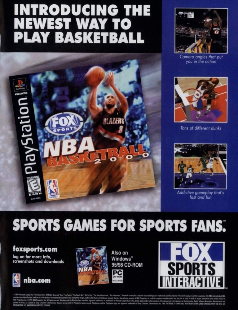
5. NBA Basketball 2000 print ad
There were a lot more NBA video games back in the 1990s.
NBA Basketball 2000 was one of those basketball videos games of the 1990s that was not published by EA Sports nor published by the other established game publishers like Sega, PlayStation and Konami. In fact, the one thing on the ad that caught my attention was Fox Sports Interactive which published some sports videos games during the decade. The print ad also served as a reminder that there were a lot more NBA video games for gamers to choose from during the 1990s.
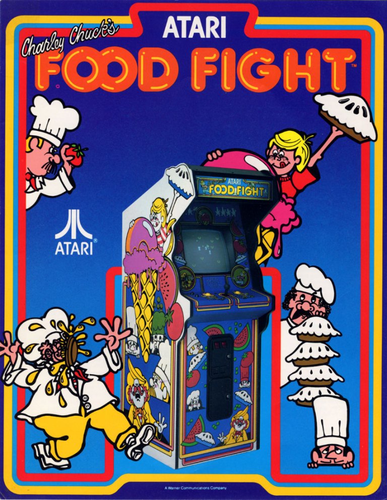
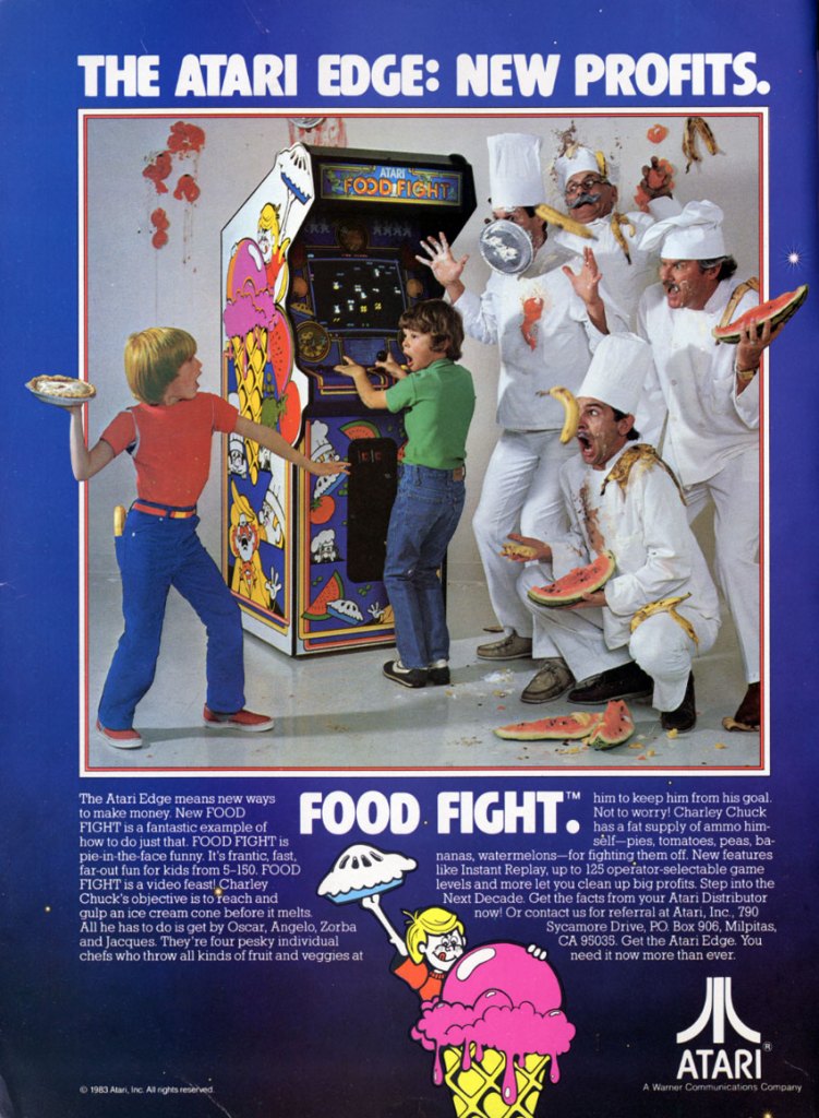
6. Food Fight arcade flyers
Food Fighter arcade flyer with illustrated artworks.
Food Fight arcade flyer with a photographic touch and actors.
I never got to play the 1980s game Food Fight in the arcades nor did I ever had the opportunity to play it on Atari consoles and Xbox 360. Released in 1983 in the arcades by Atari, Food Fight was designed to allow players to control a character moving through a 2D field to consume an ice cream on a cone (placed on the opposite end of the field) before it melts while avoiding the chefs who are out to chase and block the player.
The arcade flyer with illustrated artwork on the characters interacting with the arcade machine is really amusing to look at. Equally amusing is the other arcade flyer that had a photographic approach showing two kids (one playing the arcade machine and the other about to throw a pie) and four chefs. Considering the nice visual concepts Atari came up with for the arcade flyers, Food Fight actually never became a commercial hit selling only a few thousand arcade units.
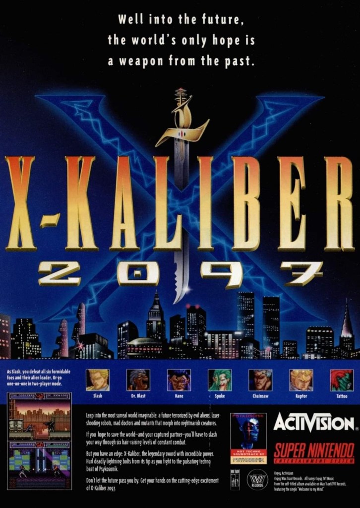
7. X-Kaliber 2097 print ad
This print ad from the 1990s had a nice visual style.
The Super Nintendo Entertainment System (SNES) had plenty of 2D side-scrolling adventure games and among them was X-Kaliber 2097 released by Activision (now a Microsoft-owned company and integral part of Xbox) in America in 1994. The game had a really interesting story concept about a chaotic far future society plagued by overwhelming crime and violence. The print ad showed a mild taste about the game’s concept and gameplay, but it was more effective when it comes to showing the formidable foes that await the playable protagonist Slash. This print appeared in several comic books I read and was eye-catching.
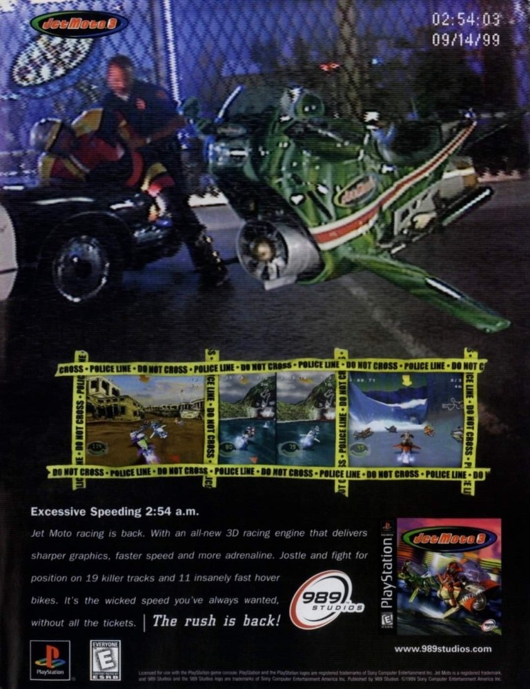
8. Jet Moto 3 print ad
When was the last time the police caught you for over-speeding?
This print ad for Jet Moto 3 had a clever concept of showing a police officer apprehending a jet biker for over-speeding. The visual presentation was done in photo-realistic fashion to make the sci-fi aspect of the video game look real. The ad made me interested enough to do some research of Jet Moto 3 a few months before finally buying it for my PlayStation console.
9. Wipeout 3 print ad
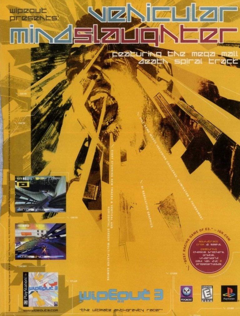
Were you fond of futuristic racing and techno music back in 1999?
Released in 1999, Wipeout 3 was one of those video games that showcased what the PlayStation (originally launched in Japan in 1994) could do in terms of visual fidelity, special effects and frame rates. The print ad, which had a radical visual concept emphasizing intensity and energy, had style listing down vertically the technical details of the game which required a close look in order to be read. With only two screenshots displayed, the ad makers smartly included the E3 acclaim of “Best Racing Game of E3” as well as the names of artists behind the game soundtrack on the lower-right corner. This print ad was cool and intriguing to look at.
10. Breath of Fire II print ad
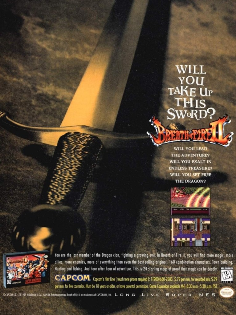
This was a good effort to lure American gamers to buy and play Breath of Fire II.
When Breath of Fire II was released on the SNES in America in late 1995, Japanese role-playing games (JRPGs) were not yet wildly popular among American gamers. To grab the attention of gamers, Capcom and the ad makers came up with the eye-catching image of a sword and posted key questions to emphasize the fantasy aspect of Breath of Fire II. While the game received mixed reviews upon its North American release, Nintendo Power listed it as 171st best game in its Top 200 Games chart published in 2006.