Welcome back Xbox fans, geeks, retro gaming enthusiasts, fighting game enthusiasts and other gamers!
With the current Xbox-exclusive fantasy role-playing game Avowedcoming out on February 18, I’m supposed to be excited about what Team Xbox has prepared this year. Of course, there were disappointments not only with certain Xbox first-party releases but also with the way things have been changing on the part of Team Xbox.
Wow! That’s a collection of very fun and popular games Capcom released from 1993 to 2000. With the exception of The Punisher arcade game (a 2D adventure game), I played them all in the arcades decades ago and I can say that having them in a single collection for the modern Xbox consoles is indeed a blessing for long-time Xbox gamers who love 2D fighting games and retro gaming. The way I feel right now, Marvel vs. Capcom Fighting Collection: Arcade Classics looks really enticing to purchase.
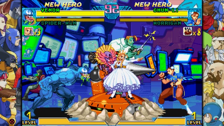
Marvel vs. Capcom: Clash of Super Heroes is not just a lot of fun to play but also will please those who love the characters. With Wolverine, Spider-Man, Venom, Captain America from Marvel’s side included, there is something that will bring both geeks and gamers together.
I have fond memories of Capcom 2D fighting games that carried Marvel’s intellectual properties. X-Me: Children of the Atom was enjoyable to play with and it resonated with me as I was already an X-Men comic book reader back in the 1990s. Marvel Super Heroes was also fun to play and it somewhat reminded me of The Infinity Gauntlet storyline. X-Men vs. Street Fighter was the most intriguing crossover fighting game at the time of its release and it really raised the bar for fast-and-furious style gameplay complete with a quick character swap during the heat of battles. Marvel Super Heroes vs. Street Fighter was the follow-up which came with changes that were not well received by the fans.
Then came the two Marvel vs. Capcom crossover fighting games which really built upon the foundation of X-Men vs. Street Fighter for more team battles with speed and impact in mind. I could not forget the inclusion of Resident Evil characters, Mega Man and others.
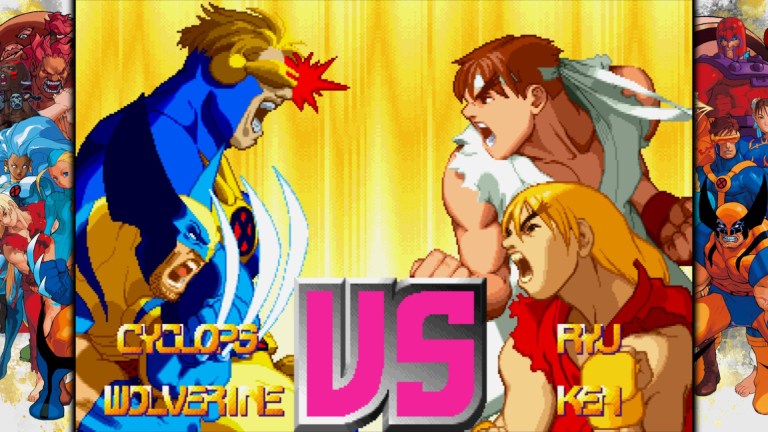
X-Men vs. Street Fighter is a classic tag-team, crossover-oriented video game! Fast and furious action ensured!
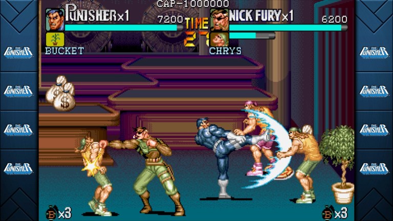
The Punisher arcade game is the only non-fighting game of the collection. Punisher fans should look at this.
Adding further zest to the collection is online play that allows casual matches, ranked matches, custom matches. Think about how your skills or your scoring will compare with those of other players from around the world.
That being said, Marvel vs. Capcom Fighting Collection: Arcade Classics is a retro gaming package that deserves attention as it carries some of the finest video games Capcom ever made.
Disclaimer: This is my original work with details sourced from reading the comic book and doing personal research. Anyone who wants to use this article, in part or in whole, needs to secure first my permission and agree to cite me as the source and author. Let it be known that any unauthorized use of this article will constrain the author to pursue the remedies under R.A. No. 8293, the Revised Penal Code, and/or all applicable legal actions under the laws of the Philippines.
Welcome back superhero enthusiasts, 1980s pop culture enthusiasts and comic book collectors! Today we go back to the year 1987 and explore a notable chapter of the post-Crisis DC Comics universe through the iconic Superman.
To put things in perspective, DC Comics rebooted its entire shared universe in 1986 after the conclusion of Crisis on Infinite Earths. They published the 6-part The Man of Steel mini-series to reboot the iconic Superman and modernize him with the creative leadership of John Byrne. By the time the mini-series ended, the new background stories, the supporting characters and creative foundation of the post-Crisis Superman were established. That being said, a brand new Superman monthly series led by Byrne was inevitable.
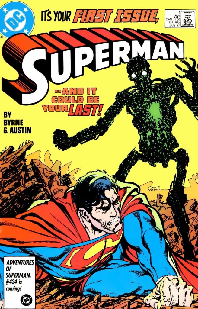
With those details laid down, here is a look back at Superman #1, published in 1987 by DC Comics with a story written and drawn by John Byrne.
The cover.
Early story
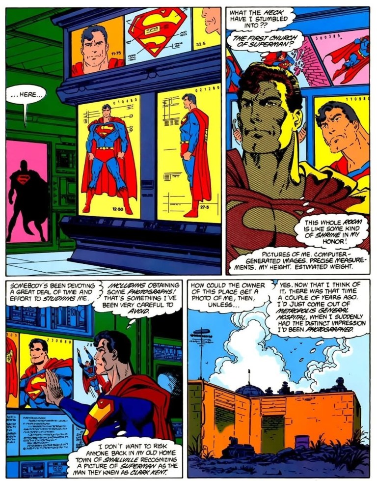
The story begins with Superman smashing his way through into a secretive, high-tech facility. Noticing so much technology, he begins to wonder why would anyone abandon such a facility. As he slowly makes his way inside, he finds several images of him displayed confirming that someone has been devoting a great deal of time and effort to research him. This makes him concerned that someone in his old home town of Smallville could recognize a picture of Superman as their fellow resident Clark Kent.
As he keeps searching, he finds the body of a dead scientist whose neck was broken. He also notices the corpse’s fingerprints are the same as those found on the truck outside of the facility. The truck itself was involved in the theft of his Kryptonian rocket. After finding more nasty evidence, Superman digs deep down underneath the facility then lifts a huge part of the ground with the said structure on top. He lifts up everything and brought them all into space free from the reach of people below.
Superman then flies off to Metropolis to change into Clark Kent to meet with Lois Lane at the city park…
Quality
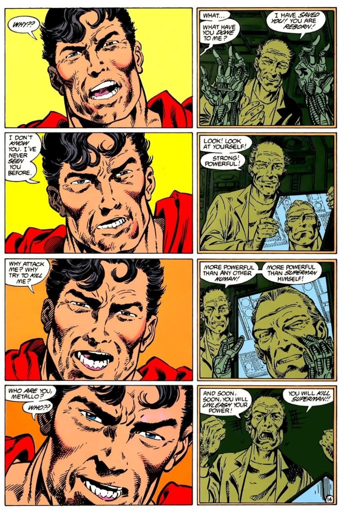
I like the way John Byrne told parallel narratives with Superman in the present on the left, and flashbacks of Metallo on the right.
To begin with, this tale written by John Byrne is another inspire piece of work published at a time when the post-Crisis shared universe of DC Comics was still new and expanding. Byrne really defined Superman’s place in the shared universe by modernizing it with the 1980s in mind and he came up with a story introducing the post-Crisis version of Metallo while coming up with a sub-plot of a mad scientist who was not only obsessed with Superman but also was involved with the said super villain.
The plot is clearly well-structured which starts with Superman doing believable detective work of his own which led to the discovery of the mad scientist whose intense research pose a danger to the Man of Steel. Having dual identities and social responsibilities to live up to, Superman also takes the time to adjust to his normal life as Clark Kent at a time when he has to socialize with his Daily Planet colleague Lois Lane. Without spoiling the plot, I can say that you will see the iconic superhero ranging from being mighty to becoming vulnerable, weakened and suffering tremendous pain. How Byrne handled the transition of Superman is excellent.
The sub-plot of the mad scientist obsessing over discoveries about Superman is short and yet highly significant. For one thing, Superman himself has been very careful on keeping his dual identities secret and yet someone managed to secretly photograph him and come up with a lot of information – including the destroyed world of Krypton and the Kryptonian legacy of the hero – that could expose his deepest secrets and ruin his life entirely. The mad scientist’s obsession has strong sci-fi elements related to UFOs and aliens from deep space.
For the Man of Steel, this is too dangerous and also too personal to be left behind untouched. This aspect of the story makes this old tale more relevant in today’s world of drones with cameras, CCTV systems, hacking and the potential of users (or artificial intelligence) who could collect information on people without their consent.
The post-Crisis Metallo looks inspired by the Terminator and appears in human form. He goes by the name John Corben who previously got fatally injured in a car crash and subsequently was taken by the mad scientist (who transplanted the man’s brain into a robotic body). It should be noted that the said scientist also has an obsession about Kryptonians which led to his plan to send a chosen warrior to go against Superman supposedly to prevent Earth from getting conquered. How Metallo and his physical fight with the Man of Steel is a must-read.
Conclusion
Imagine yourself discovering a secret room filled with information and pieces of evidence and visual references about you. This should resonate with people whose privacy got violated. Also try imagining people inside the offices of tech giants with collected information and images about you.
Superman #1 (1987) is still a great read. It has a complex approach on portraying the battle between good and evil without losing focus on the storytelling and the expansion of Superman’s post-Crisis lore. Its sub-plot of the mad scientist and his obsession on Superman will resonate with people who feel vulnerable over the loss of their private information in today’s world of social media, abusive technology giants and artificial intelligence-driven surveillance systems. There is also a lot of superhero action for readers to enjoy, and the spectacle is never silly nor outlandish to look at. Oh yes, seeing Superman in a vulnerable state and getting actually hurt is believable to see.
Overall, Superman #1 (1987) is highly recommended!
Disclaimer: This is my original work with details sourced from reading the comic book and doing personal research. Anyone who wants to use this article, in part or in whole, needs to secure first my permission and agree to cite me as the source and author. Let it be known that any unauthorized use of this article will constrain the author to pursue the remedies under R.A. No. 8293, the Revised Penal Code, and/or all applicable legal actions under the laws of the Philippines.
Welcome back superhero enthusiasts, 20th century pop culture enthusiasts and comic book collectors! Today we go back to the year 1980 to take a close look at one of the many tales published through the original Superman monthly series (first launched in 1939).
Before Crisis on Infinite Earths happened, the DC Comics multiverse had a lot of superhero stories that had outlandish fantasy elements. For example, Action Comics #454 showed Superman eating tons of food in order to survive. In Action Comics #456, the battles between Superman and The Shark had lots of outlandish looking forms of action. In short, the old multiverse and its tropes are looking fun to revisit.
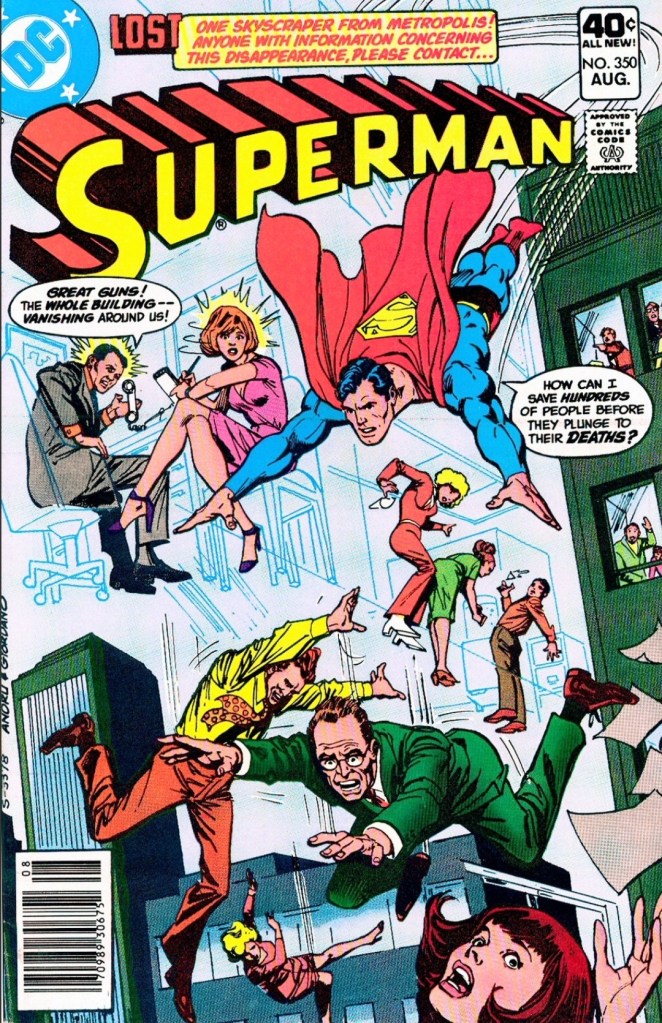
With those details laid down, here is a look back at Superman #350, published in 1980 by DC Comics with a story written by Gerry Conway and drawn by Curt Swan.
The cover.
Early story
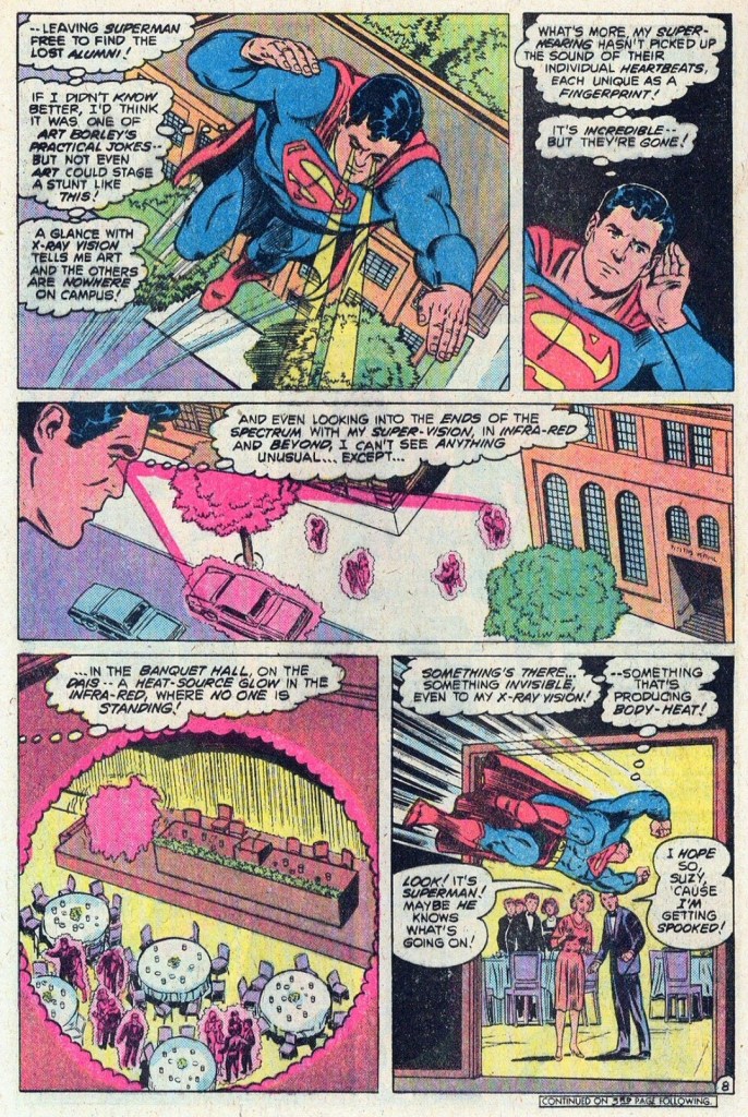
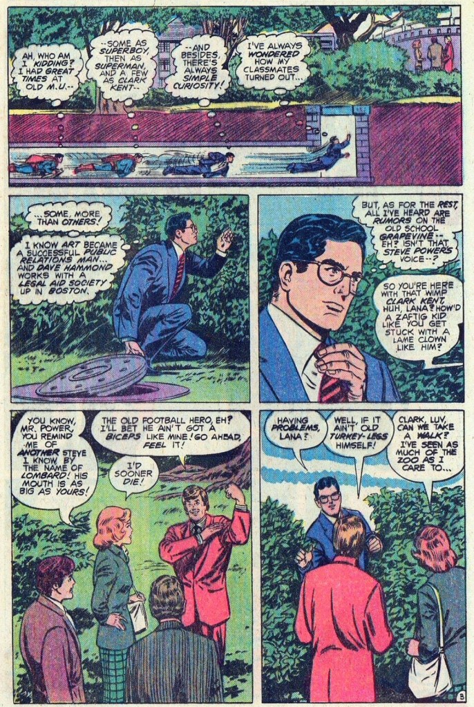
The story begins when Superman makes his move to prevent a punctured hot air balloon transport from crashing. It turns out the balloon was part of the promotion of a reunion event at Metropolis University and Superman really went there to attend it in his civilian identity as Clark Kent. Also attending the event is his long-time friend and colleague Lana Lang.
As the old professor Lemuel B. Tolkein – former superior of Clark and his classmates – speaks during the reunion, several attendees – including people Clark personally knew – begin to disappear into thin air. The remaining attendees and guests begin to panic…
Quality
Superman uses his special abilities to solve problems here.
I really like this story. Without spoiling the plot, I can say that this tale written by Conway is actually a mystery that happens to take place during Clark Kent’s reunion with many people from his past. As there is no good-versus-evil concept, the story is solidly focused on mysterious happenings that challenge Superman’s ability to solve problems. Even though he already has many super powers, the Man of Steel still got challenged a lot by the disappearances of people and things.
Apart from the story, I also enjoyed Conway’s approach on developing Clark Kent/Superman, Lana Lang and Lois Lane. Seeing Clark reconnecting with people from his past at Metropolis University was a refreshing portrayal and it also sheds light on how he handled himself during his collegiate years. As for Lois Lane, she was portrayed to be hostile towards Clark with regards to journalistic competition between them, and yet she still has tenderness towards Superman deep inside.
Conclusion
Superman quickly changes into his Clark Kent identity to attend the reunion.
Superman #350 (1980) is enjoyable and the elements of the pre-Crisis multiverse of DC Comics added depth to it. The story is relaxing to follow and it managed to surprise me and keep me engaged until the very end. I am convinced to follow the next issue.
Disclaimer: This is my original work with details sourced from reading the comic book and doing personal research. Anyone who wants to use this article, in part or in whole, needs to secure first my permission and agree to cite me as the source and author. Let it be known that any unauthorized use of this article will constrain the author to pursue the remedies under R.A. No. 8293, the Revised Penal Code, and/or all applicable legal actions under the laws of the Philippines.
Welcome back superhero enthusiasts, 20th century pop culture enthusiasts and comic book collectors! Today we go back to the mid-1990s to take a close look at the launch issue of the comic book series that was an adaptation of the WildC.A.T.S: Covert Action Teams animated series.
To put things into perspective, Jim Lee and several creators left Marvel Comics to establish Image Comics. In 1992, Lee launched his creator-owned project WildC.A.T.s: Covert Action Teams #1 which also was a part of the creative foundation of the WildStorm universe. Just a little over two years later, an animated series of WildC.A.T.S. was launched on TV. Similar to what Marvel Comics did in relation to adapting stories of the X-Men animated series, Image Comics launched a comic book series based on the WildC.A.T.S. animated series.
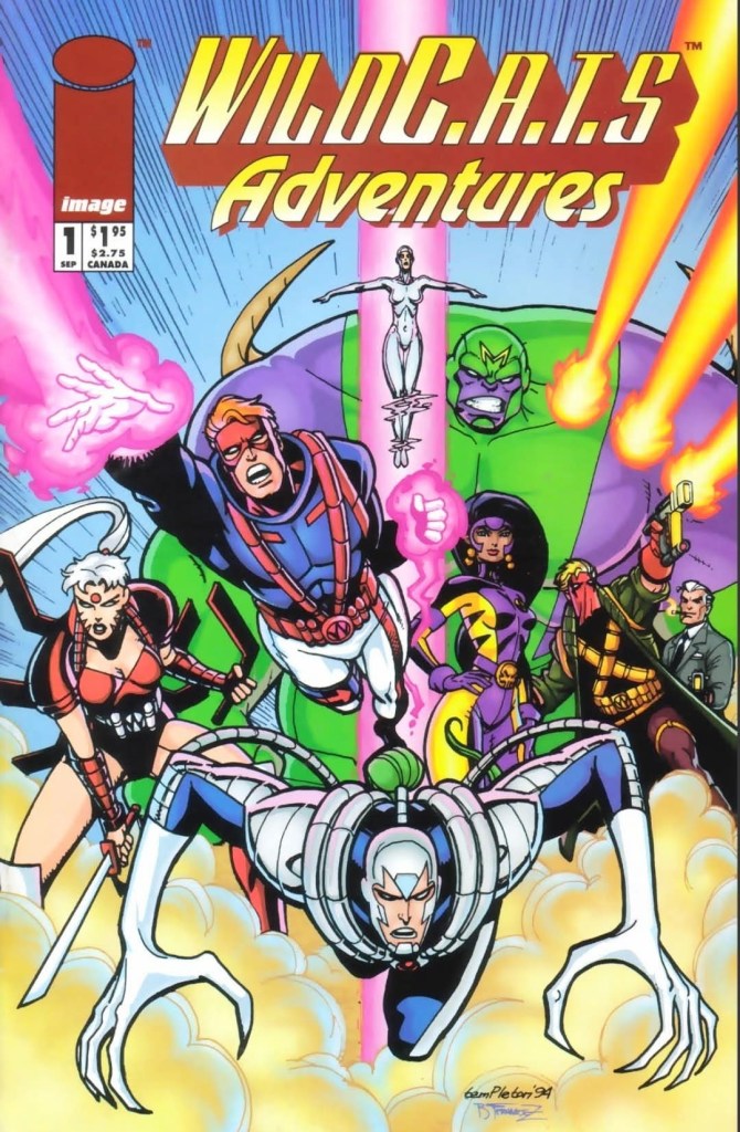
With those details laid down, here is a look back at WildC.A.T.s Adventures #1, published in 1994 by Image Comics with a story written by Jeff Mariotte (adapting the animated story by David Wise) and drawn by Ty Templeton.
The cover.
Early story
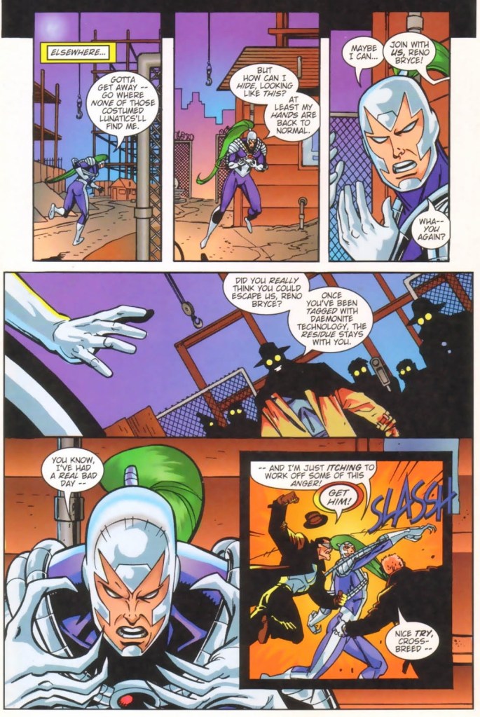
The story begins one night inside an office where Reno Bryce (Warblade) works obsessively on a circuit board. He is surrounded by the technology he knows and loves. As he works, three armed men wearing coats and hats enter his office and ask him for his identity. One of the men grabs a circuit board and destroys it, which triggers Reno to react with violence.
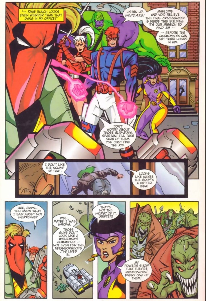
Knowing he is outnumbered, he quickly runs out of the office for safety. He heard one of the men referred to him as a crossbreed whelp. As soon as he finally leaves the building, Reno sees the WildCATS team composed of Grifter, Spartan, Zealot, Voodoo and Maul. Thinking that the WildCATS are out to kill him like the armed men, Reno keeps on running away.
Suddenly, a group of people are rushing towards the WildCATs. Powered with the Sight, Voodoo realizes that the mob is composed of Daemonites disguised as humans. The WildCATs and the mob engage in battle.
From high above, Reno see the battle happening. Suddenly, the three armed men appeared behind him telling him that he has no escape from them…
Quality
Reno Bryce still adjusting to his new form as Warblade.
Having seen the first episode myself, I can say that this comic book is actually a faithful adaptation and the creative team did their jobs well.
As an alternate introductory story of the WildCATs, this one obviously has the violence and visceral essence of the comic book series toned down due to the fact that the animated series was made with a younger audience in mind. There is still plenty of action here and the creative team’s focus on telling the story was consistently strong.
Within one story, the creative teams of both the animated episode and this comic book succeeded in gradually emphasizing the lore of WildCATS which had strong sci-fi elements (example: the long conflict between the Kherubim and the Daemonites), introducing the characters and the super villain, showcase the capabilities of the characters, emphasizing the purposes of each side, and having Reno Bryce as the newcomer who is about to discover his real role in the conflict (which reminds me of Jubilee in the opening episode of the X-Men animated series).
Conclusion
Ty Templeton’s art is nice to look at and he captured the essence of the animated episode. The WildCATS themselves are easily recognizable.
Like its animated source, WildC.A.T.s Adventures #1 (1994) is enjoyable and the creators did a very good job translating the story and essence from animation into literary format. Having read the Jim Lee-drawn issue #1 of 1992, this one worked well as an alternate introduction of the WildCATS and their conflict with the Daemonites. Like the animated TV episode, the presentation was done in a wholesome manner without ever becoming childish. I can say that there is still enough good stuff of WildCATS to enjoy here, and the characters are recognizable (both in looks and portrayals). Right now, I’m looking forward to reading the next issue.
Disclaimer: This is my original work with details sourced from reading the comic book and doing personal research. Anyone who wants to use this article, in part or in whole, needs to secure first my permission and agree to cite me as the source and author. Let it be known that any unauthorized use of this article will constrain the author to pursue the remedies under R.A. No. 8293, the Revised Penal Code, and/or all applicable legal actions under the laws of the Philippines.
Welcome back superhero enthusiasts, 20th century pop culture enthusiasts and comic book collectors! Today we go back to the year 1978 to take a close look at one of the many tales published through the original Action Comics monthly series (launched in 1938).
Long before Crisis on Infinite Earths happened, DC Comics had its convoluted multiverse. For the newcomers reading this, this meant that there were actually different versions of Superman and other DC superheroes, plus different universes or parallel worlds existing with each other. This particular Action Comics issue features a certain version of Superman and what happened to him and the related characters.
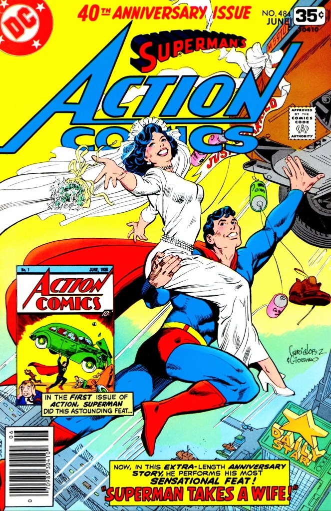
With those details laid down, here is a look back at Action Comics #484, published in 1978 by DC Comics with a story written by Cary Bates and drawn by Curt Swan.
The cover.
Early story
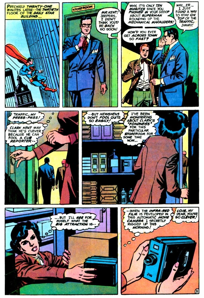
The story begins in Metropolis of Earth-Two when four mechanical marauders fly through the city carrying bags of money taken from a bank. Superman (of Earth-Two) quickly flew after the mechanical marauders and uses his powers to beat them all. From a distance, Colonel Future (leader of the C-F Gang) observes Superman and analyzes his moves. It turns out, the gang is responsible for the mechanical marauders and Colonel Future believes that he can wipe out the Man of Steel.
Superman returns quietly into the Daily Star Building and changes into civilian clothing as Clark Kent. His office mate Jimmy Olsen approaches him and together they walk and talk about what has been going on.
Behind them, Lois Lane silently enters the store room where Clark came out of. It turns out, she prepared a hidden camera inside hoping to capture evidence about Clark using the room. She has been suspecting that Superman and Clark Kent are one and the same person…
Quality
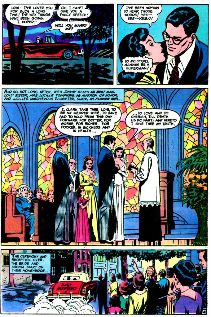
While it is clear that Superman – in his civilian form as Clark Kent – married Lois Lane, there is still a lot more to discover from the in-depth story written by Cary Bates.
I really like this pre-Crisis Superman story which is specifically set in Earth-Two of the DC multiverse. To make things clear, this is a tale showing Superman getting married to Lois Lane without impacting the mainstream version of DC’s icon at the time. Confused? That’s the consequence of having different versions of Superman complete with detailed parallel universes for each.
More on the core concept of this comic book, there is a lot more at stake – storywise and creatively – than meets the eye. Without spoiling the plot details, I can clearly say that the concept of Superman and Lois Lane getting married involves a daring plot which was executed nicely by the Bates-Swan duo resulting in a really intriguing reading experience for me. In other words, there is nothing simple with the presentation as the fantasy elements are really strong and the creative team took creative risks to emphasize the story while developing the key characters in new ways.
Still on the storytelling, the conflict between good and evil is emphasized not by struggle but rather the consequences which ultimately affect Superman and Lois Lane. The main opposition used by the Bate-Swan duo involves magic as a creative way to impact the Man of Steel and the narrative in general. There are some really intriguing moments about Superman (including his civilian identity as Clark Kent) and Lois Lane that await readers.
Conclusion
Lois Lane has an in-depth portrayal in this comic book, going beyond what the page shows you.
Action Comics #484 (1978) is undoubtedly a very intriguing and surprising read. The creative team came up with ideas that subverted expectations and the execution was well done which made this a powerful and twisting read. Having read lots of Superman comic books through the decades, this comic book is one of the more surprising ones I have read. Finally, this one has a believable presentation about what married life between Superman and Lois Lane would be like reflecting the social norms at the time of publication.
Overall, Action Comics #484 (1978) is highly recommended.
Welcome back readers, fellow geeks and electronic gaming fans!
In this edition of the Retro Gaming Ads Blast (RGAB) series, we will take a look at another batch of retro gaming print ads – including arcade flyers – from the 1980s and 1990s.
For the newcomers reading this, Retro Gaming Ads Blast (RGAB) looks back at the many print ads of games (console, arcade, computer and handheld) that were published in comic books, magazines, flyers, posters and newspapers long before smartphones, social media, the worldwide web and streaming became popular. To put things in perspective, people back in the 1980s and 1990s were more trusting of print media for information and images about electronic games and related products.
With those details laid down, here is the newest batch of retro gaming print ads for you to see and enjoy…
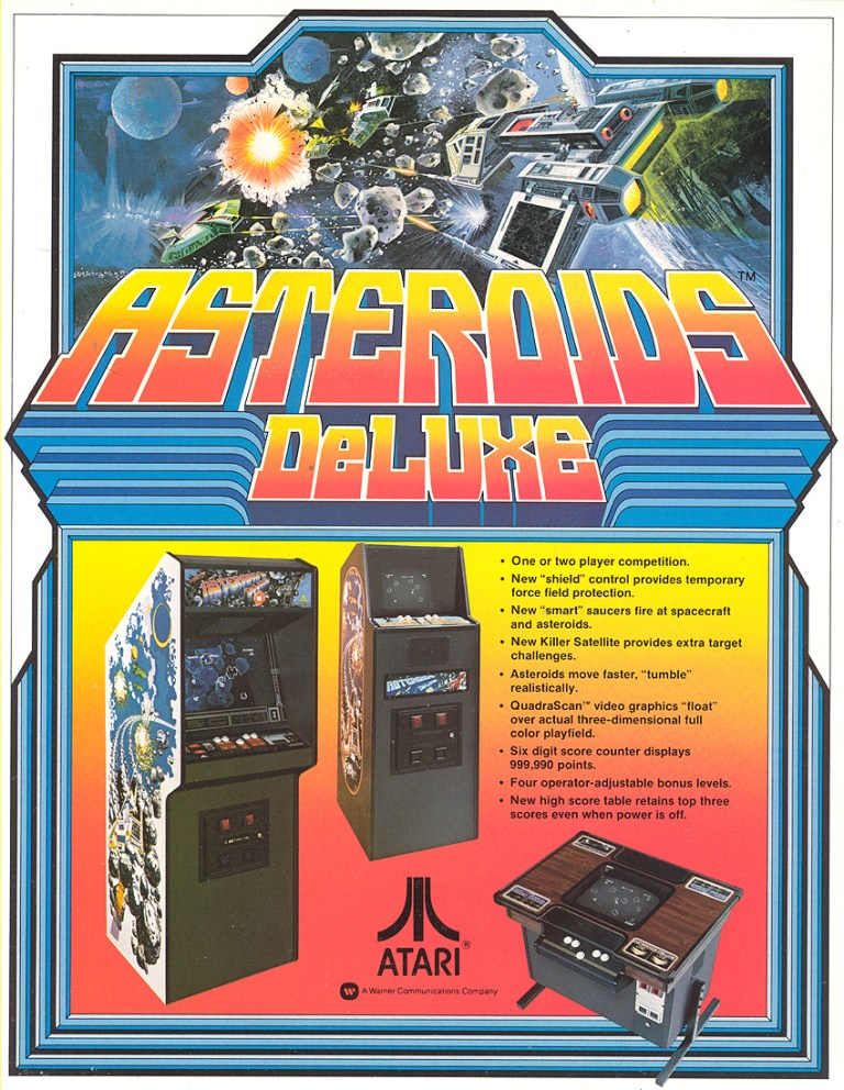
1. Asteroids Deluxe arcade flyer
The arcade flyer for North America.
Given the fact that Asteroids was a massive hit for Atari in the arcades, it was not surprising that a sequel was made called Asteroids Deluxe. In preparation for its 1981 release, Atari made this Asteroids Deluxe arcade flyer showing three machine that arcade operators can choose from complete with technical details displayed. They even emphasized the QuadraScan video graphics as a technological advancement with regards to graphics. By today’s standards, this arcade flyer is still sensible with regards to promoting the game to both arcade operators and players.
2. Missile Command arcade flyer
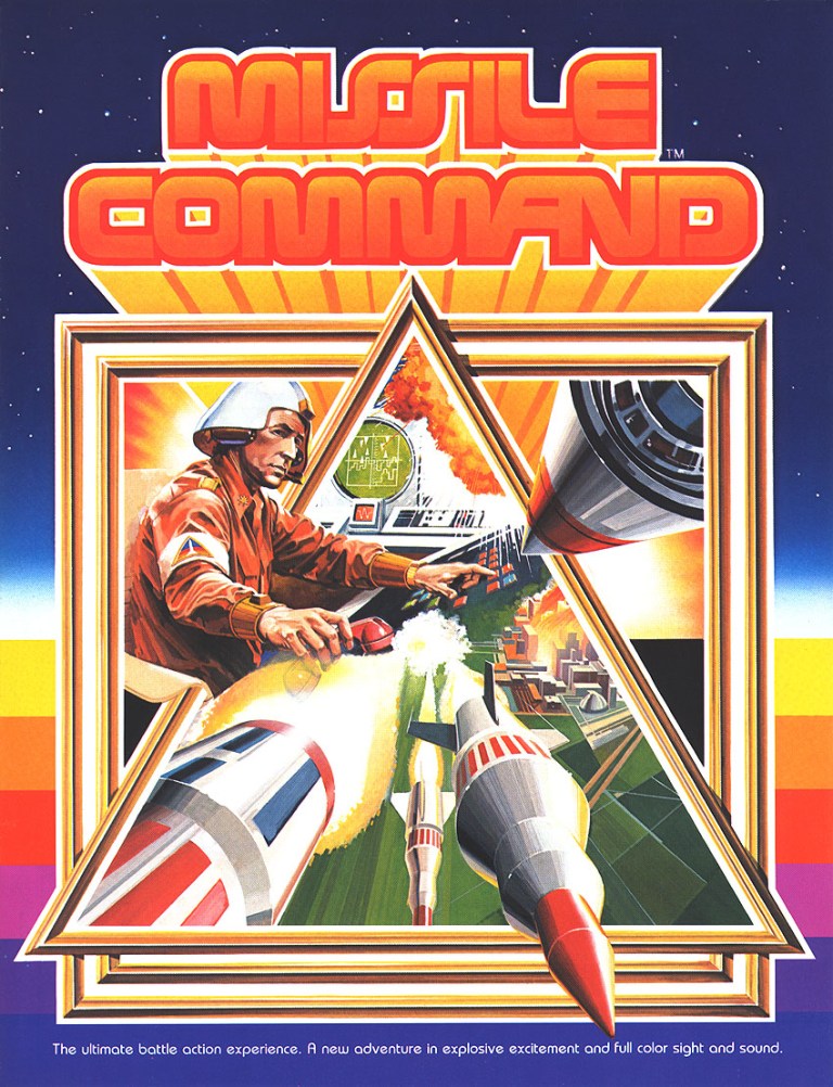
Engaging art work on display at the front of the arcade flyer.
Released in the arcades in 1980, Missile Command is a classic game from Atari and its concept of defending cities from incoming enemy missiles proved to be relevant with people living with the fear of a nuclear missile attack during the days of the Cold War. In my experience, I mainly played the Atari 2600 version and it was only recently I finally started playing the arcade classic on my Xbox Series X using the Atari 50 Collection software. As for the arcade flyer itself, Atari simply used highly detailed painted art for the front which clearly emphasized the science fiction portrayal of a military officer using a console inside a base to come up with defensive response to incoming ballistic missiles. The game was a massive hit in the arcades and in my view, Atari’s simply yet direct way of promoting the concept of Missile Command with the arcade flyer remains compelling to look at.
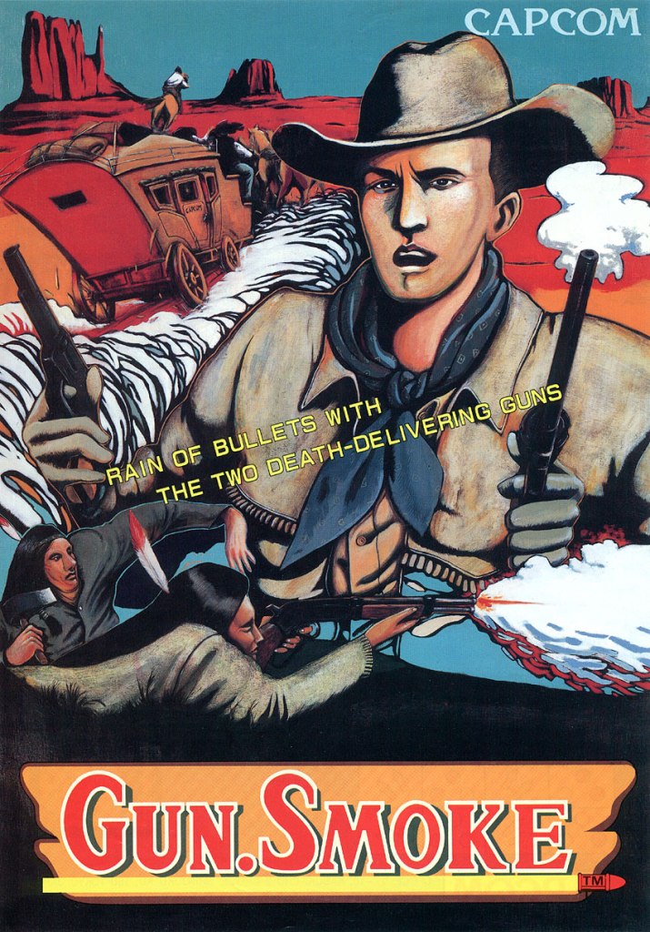
3. Gun.Smoke European arcade flyer
Nice art on the front of this arcade flyer for the European market.
Long before they struck gold with Street Fighter II, Japanese company Capcom scored a hit with gamers in the arcades with 1985’s Gun.Smoke. It was a vertically scrolling run-and-gun game with an Old West setting and it was designed by Yoshiko Okamoto (Final Fight and Street Fighter II). To promote the game for European arcades, Capcom simply used hand-drawn artwork for the arcade flyer’s front which emphasized the Wild West setting, and an American Cowboy and bounty hunter named Billie Bob who is the playable character gamers got to play. In my view, the artwork gave the game a strong Wild West image that is also memorable.
4. Sei Senshi Amatelass arcade flyer
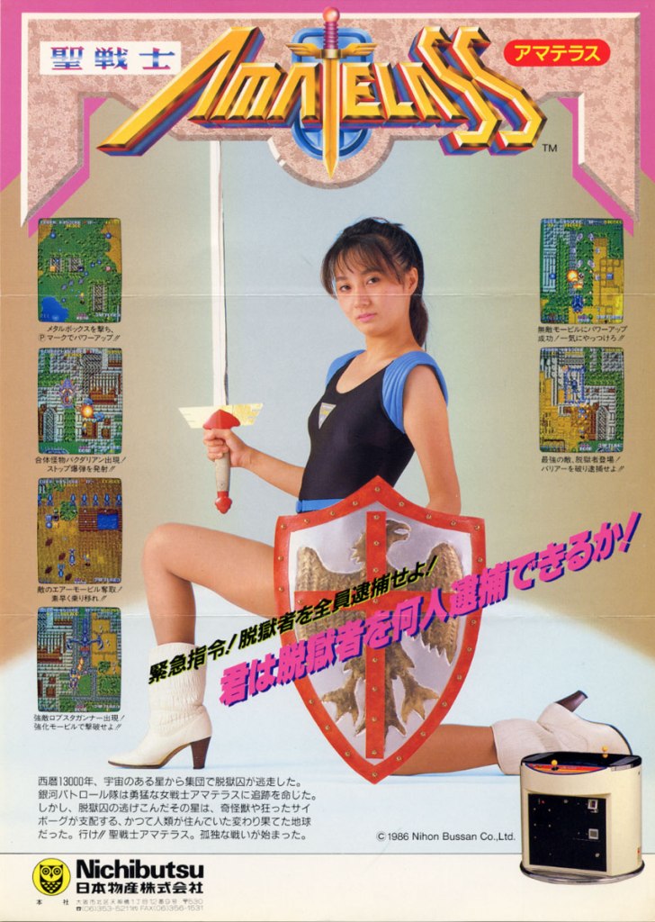
Does the model look sexy or tough?
Released in Japanese arcades in 1986 by Nichibutsu, Sei Senshi Amatelass is a vertical scrolling run-and-gun game with a science fantasy concept. To promote the game and really sell its concept, Nichibutsu hired a model posing with a sword and a shield in fantasy inspired costume. Using the remaining spaces of the flyer, some screenshots and an image of the arcade machine were displayed. This flyer showed the company exerting effort to sell Sei Senshi Amatelass with a touch of beauty and subtle sexiness.
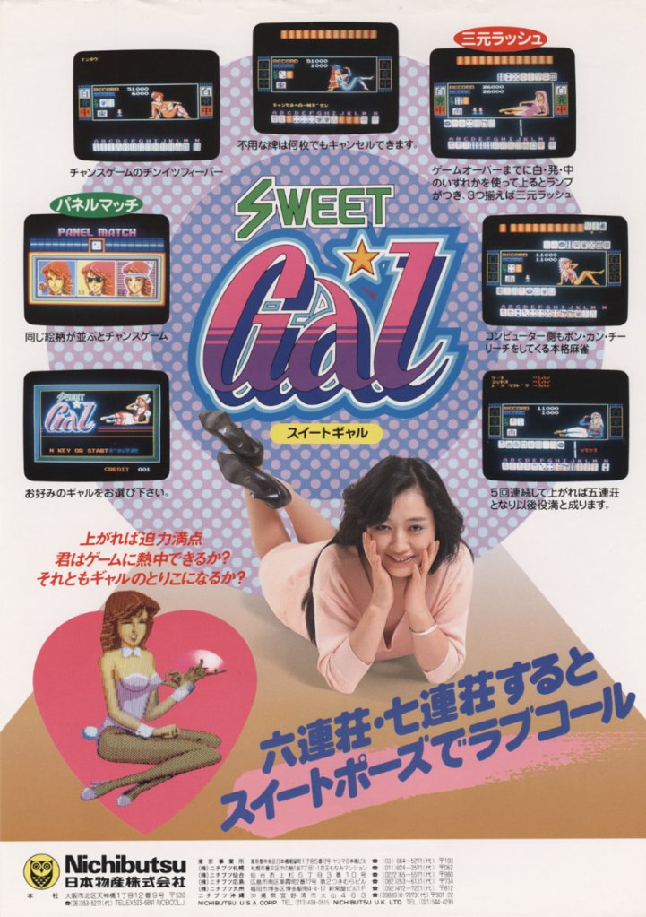
5. Sweet Gal arcade flyer
Seriously, are you interested in playing mahjong in digital form?
Here is another digital mahjong arcade game from Nichibutsu…Sweet Gal. As typical of the company, a model was hired to add subtle sexiness into the promotion of the game and they even added a digital image of a sexy girl. Sweet Gal clearly was promoted to attract men who enjoy playing mahjong in electronic format and there were some arcade spots in Japan that catered to such mahjong enthusiasts.
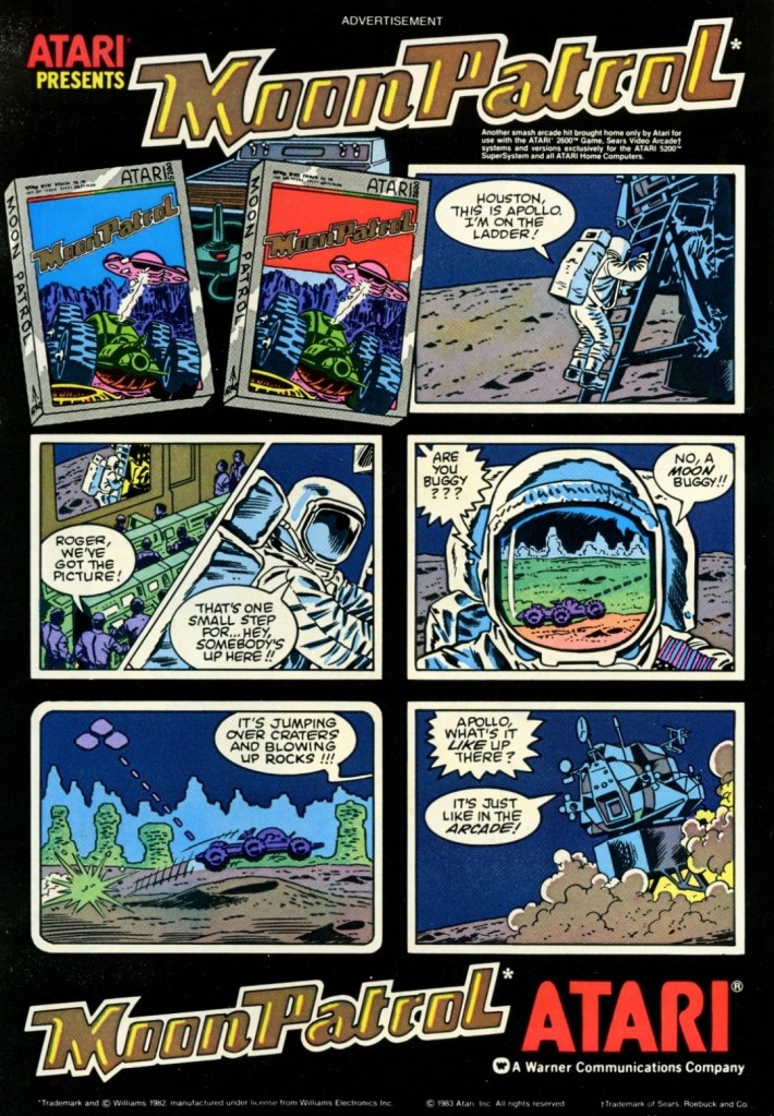
6. Moon Patrol print ad
This is a fun-looking, comic book style way of promoting a video game.
Here is one of those video game print ads I saw while reading comic books back in the early 1980s. Moon Patrol is a sci-fi, side-scrolling game by Atari known for introducing full parallax scrolling in side-scrolling games. Instead of showing screenshots of the console versions of the game, this print ad used nice looking hand-drawn artworks presented with a comic book-inspired style to emphasize the concept. I still remember how captivating this ad and its super short story was the first time I saw it. It was enough to make me interested in the game.
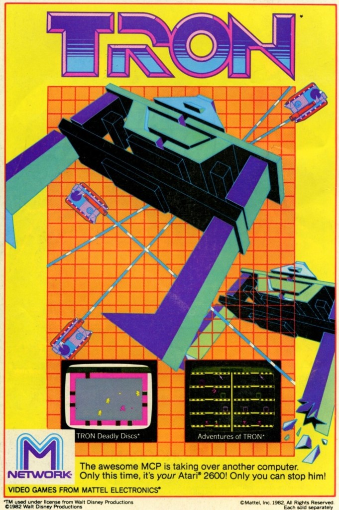
7. Tron Atari 2600 games print ad
Calling all Tron fans to look at this.
I was very captivated by the 1982 sci-fi movie Tron which I saw on home video. It had very flashy computer-generated visuals, a very memorable story and the fine performance by Jeff Bridges. Tron was also very reflective about the video game culture of its time. When I first saw this print ad while reading a comic book, I was really excited. If you look closely, it had nice artwork dominating the space and screenshots that each promoted the games Tron: Deadly Discs and Adventures of Tron. Even though the graphics were primitive, I still recognized the Tron-related images which added to my excitement.
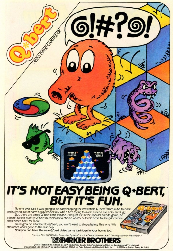
8. Q*bert print ad
This print ad by Parker Brothers really captured the essence of the game.
The puzzle-oriented 2D action game Q*bert became an arcade hit in America shortly after its 1982 release and even went on to become one of the highest grossing arcade games in 1983. Q*bert is one of those 2D games that cleverly blended puzzle play with 3D-like movement and avoidance of both obstacles and enemies. As expected, the game made its way into gaming console and this particular print ad had artwork that strongly captured the very essence of the game complete with the very catchy line “It’s not easy being Q*bert, but it’s fun.”
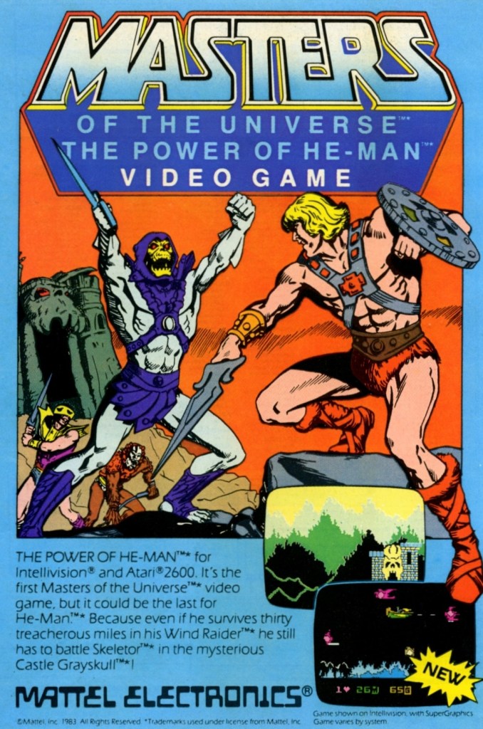
9. Masters of the Universe: The Power of He-Man print ad
Calling all He-Man fans.
I saw this print ad of Masters of the Universe: The Power of He-Man (for Atari 2600 and Intellivision) while reading a comic book long ago. Like the Tron games ad, this made me excited as I was fond of watching the He-Man cartoon series of the 1980s. While the selected screenshots caught my attention, it was the hand-drawn art of He-Man facing off with Skeletor and his minions that captivated me simply because it reminded me of the animated series. This is a fine example of promoting a video game that would instantly resonate with fans of He-Man and the Masters of the Universe franchise.
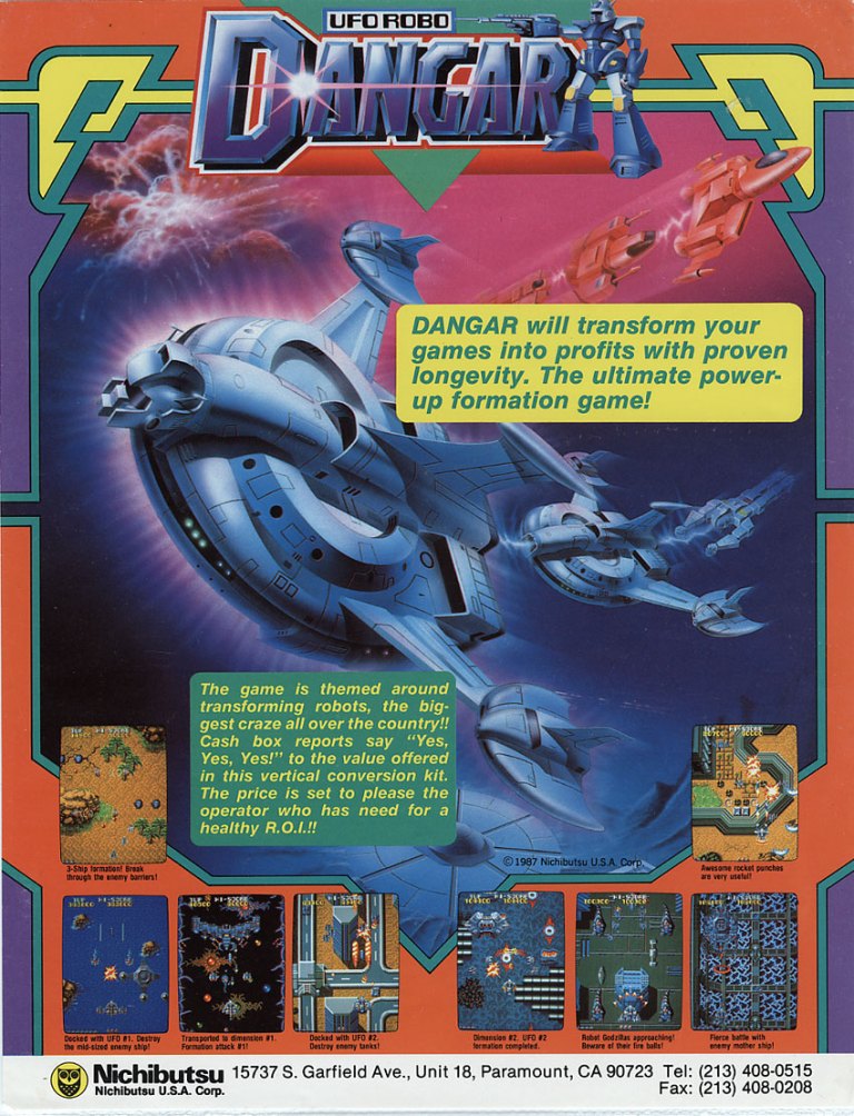
10. UFO Robo Dangar North American arcade flyer
The giant robot concept of this game gave some viewers the impression that it was based on some giant robot anime series from Japan even though the art work used does not suggest it.
Here is another arcade game from Nichibutsu but for the North American market and without the use of a model and without the subtle sexiness. UFO Robo Dangar is a 2D vertically scrolling science fiction shooting game and players get to control a giant robot (composed of flying vehicles that merged into one mechanical body) that has to go through countless waves of enemies in order to advance from one level to another. The arcade flyer used nice looking sci-fi art of ships with the game’s title having a robot and several screenshots of the game. The flyer even made a hard pitch towards arcade operators that UFO Robo Danger will transform their games into profits with proven longevity.
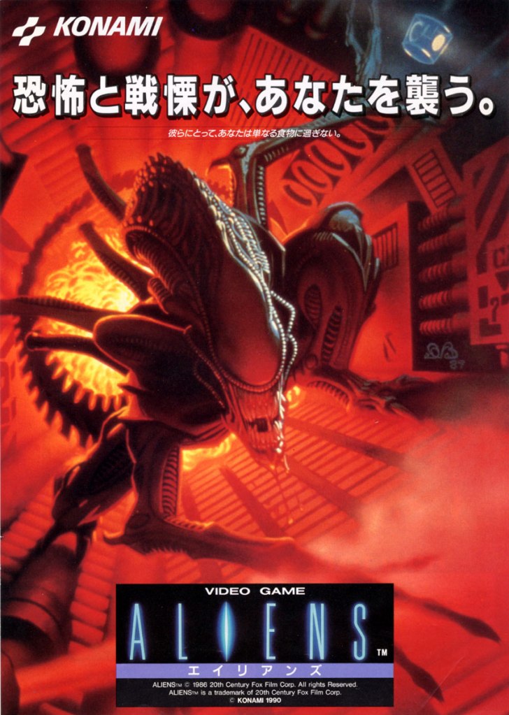
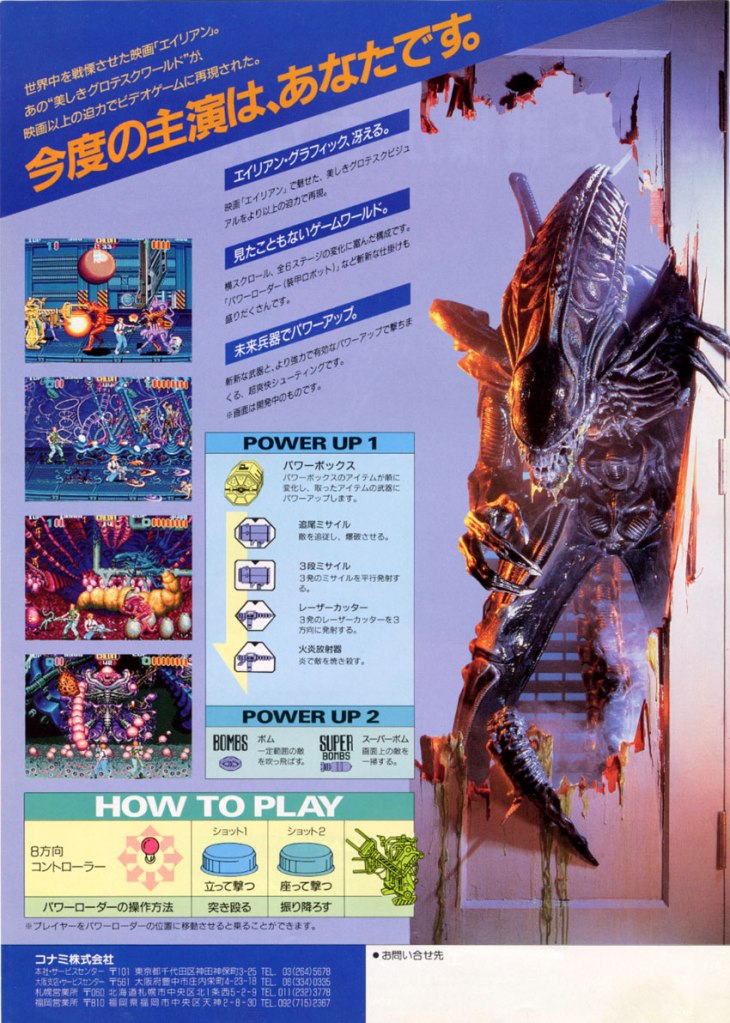
11. Aliens Japanese arcade flyer
The front.
The other side of the flyer of the 1990 arcade hit Aliens.
Quite arguably, Konami’s 1990 arcade hit Aliens is the best video game of any game design to be based on the 1986 film directed by James Cameron. Not only was Aliens a big hit in the arcades, it also won an award from the American Amusement Machine Association (AAMA). Aliens was released in Japanese arcades in February of 1990 and Konami released an arcade flyer that was much more visually striking than its North American arcade flyer. The front had detailed artwork of the Xenomorph while the rear had the instructions and screenshots presented in an orderly manner. The photograph of the Xenomorph alien was added intensity on selling the game. This is still a great looking arcade flyer.
Disclaimer: This is my original work with details sourced from reading the comic book and doing personal research. Anyone who wants to use this article, in part or in whole, needs to secure first my permission and agree to cite me as the source and author. Let it be known that any unauthorized use of this article will constrain the author to pursue the remedies under R.A. No. 8293, the Revised Penal Code, and/or all applicable legal actions under the laws of the Philippines.
Welcome back superhero enthusiasts, 20th century pop culture enthusiasts and comic book collectors! Today we go back to the year 1983 to take a close look at one of the many tales published through the original Superman monthly series (first launched in 1939).
Back in 1983, DC Comics published Action Comics #544 which marked the 45th anniversary of Superman and celebrated it by executing things very differently – introducing the new look of Lex Luthor in battle armor and showing Brainiac in a more robotic body. I really loved reading Action Comics #544 for its very rich storytelling and modernizing the two classic super villains. With regards to what happened in Lex Luthor’s story in the comic book, his tale actually continued with the Superman monthly series afterwards.
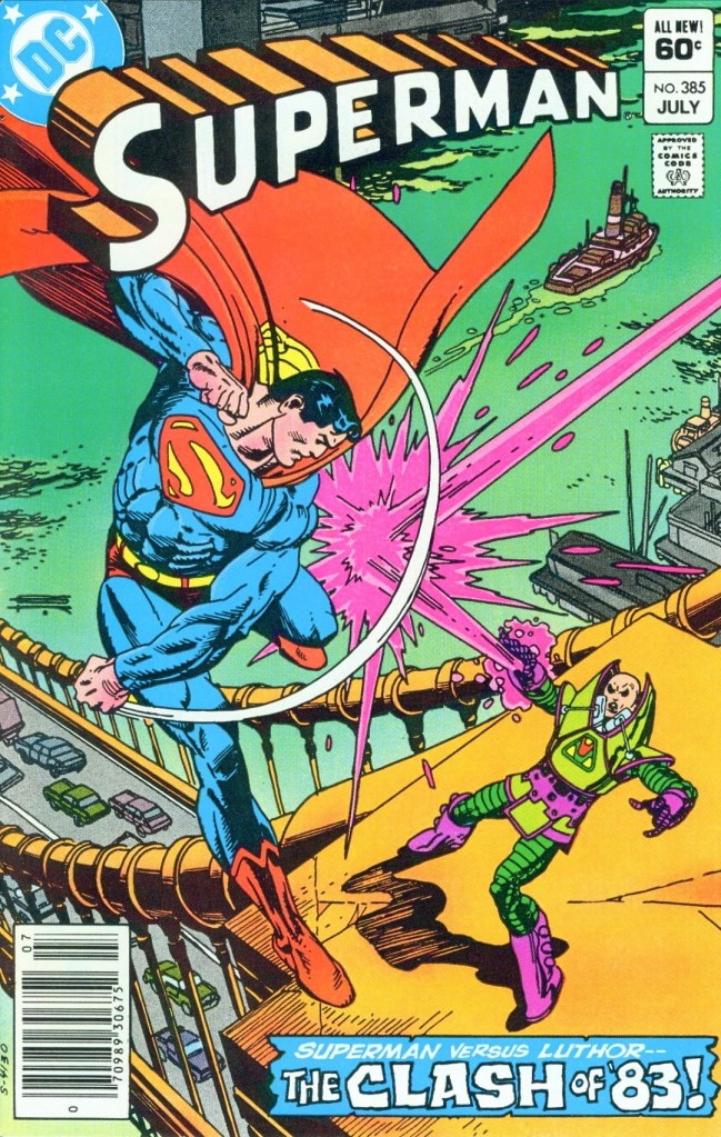
With those details laid down, here is a look back at Superman #385, published in 1983 by DC Comics with a story written by Cary Bates and drawn by Curt Swan.
The cover.
Early story
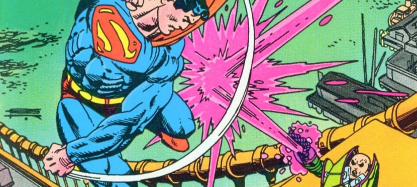
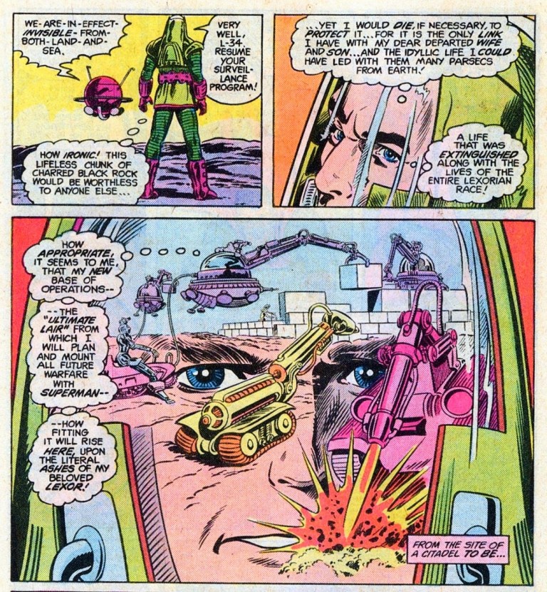
The story begins with the armored Lex Luthor alone and grieving in deep space surrounded by floating rocks. His world Lexor just got destroyed and his wife and child are gone. He blames Superman for being responsible of the massive destruction. He remembers the moment when he fired an energy blast at Superman which got deflected towards the neutrarod (a device Luthor made to shoot a steady stream of stabilizing neutrons into the planet’s unstable core) which started a chain reaction transmitted directly into the core. Lexor detonated but Superman and Luthor survived.
Using the intense power and technologies of his armor, Luthor moves an island-sized rock (a remaining piece of Lexor) towards planet Earth. He is determined to have his revenge against Superman and will stop at nothing to make it happen…
Quality
This is a great visualization of Lex Luthor (in his warsuit) by Curt Swan.
Through the decades, I have read lots of Superman comic books that involved Lex Luthor as the main antagonist. This particular story of good-versus-evil is actually very unique thanks to the approach taken by the Bates-Swan duo. To be clear, this is actually a build-up type of story done with the next conflict between Superman and Luthor in mind.
Without spoiling the plot, I can say that Luthor – following the events of Action Comics #544 which really hurt him deeply – got a nice share of the spotlight and deservedly so. He is determined to get back at Superman whom he holds responsible for the destruction of Lexor and its many inhabitants (including Luthor’s wife and child). Luthor does not rush things as he is very focused on preparing himself first which reminds me of Batman’s approach to preparations. In some ways, Luthor has his own principles and he is not just being evil for the sake of it. There is this very human portrayal of him and Bates’ writing could make you even forget that he is a madman.
As for the Man of Steel himself, Bates wrote him to be really burdened by having his share of the responsibility of the billions of deaths of the people of Lexor. Instead of the focused Superman dedicated to doing good, you will see him feeling really uneasy and even distracted. He even commits huge blunders! This is a Superman who is showing signs of internal weakness and not even his civilian life as journalist Clark Kent could relieve the tension he is experiencing. I really like this portrayal of DC Comics’ icon.
But there is more! There is the sub-plot of Lois Lane taking a much-needed break from work to relieve herself and it sure is a really interesting portrayal of her. Even Perry White has his own share of the spotlight. There is also the spotlight on some obscure DC villains which actually added to the plot.
Conclusion
A very uneasy Clark Kent at work.
Superman #385 (1983) is clearly a very engaging read and it is a worthy follow-up to what happened in Action Comics #544. I really like the way the armored Lex Luthor is portrayed here and the build-up for his upcoming conflict with Superman is really powerful. I’m really glad to have read this particular Superman-Luthor story and I can say that I am looking forward to the next issue to see what will happen.
Overall, Superman #385 (1983) is highly recommended.
Welcome back readers, fellow geeks and electronic gaming fans!
In this edition of the Retro Gaming Ads Blast (RGAB) series, we will take a look at another batch of retro gaming print ads – including arcade flyers – from the 1980s and 1990s.
For the newcomers reading this, Retro Gaming Ads Blast (RGAB) looks back at the many print ads of games (console, arcade, computer and handheld) that were published in comic books, magazines, flyers, posters and newspapers long before smartphones, social media, the worldwide web and streaming became popular. To put things in perspective, people back in the 1980s and 1990s were more trusting of print media for information and images about electronic games and related products.
With those details laid down, here is the newest batch of retro gaming print ads for you to see and enjoy…
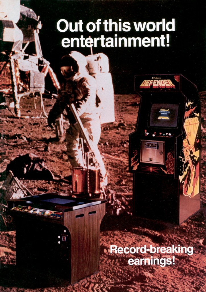
1. Defender arcade flyer
Perhaps Atari did not have enough original artwork of Defender to be used in this arcade flyer. So they ended up using footage of an astronaut on the moon.
Very long ago, I played the classic game Defender a lot on the Atari 2600. Strangely enough, I never played its arcade version as my visits to arcades were quite limited as I was so young back then. When it comes to the arcade flyer of Defender, I find the use of stock footage of an astronaut on the moon as the artistic backdrop baffling because the game’s concept was all about fighting back alien invaders and protecting the citizens. Ironically, the image blended well with the photos of two arcade machines showcased.
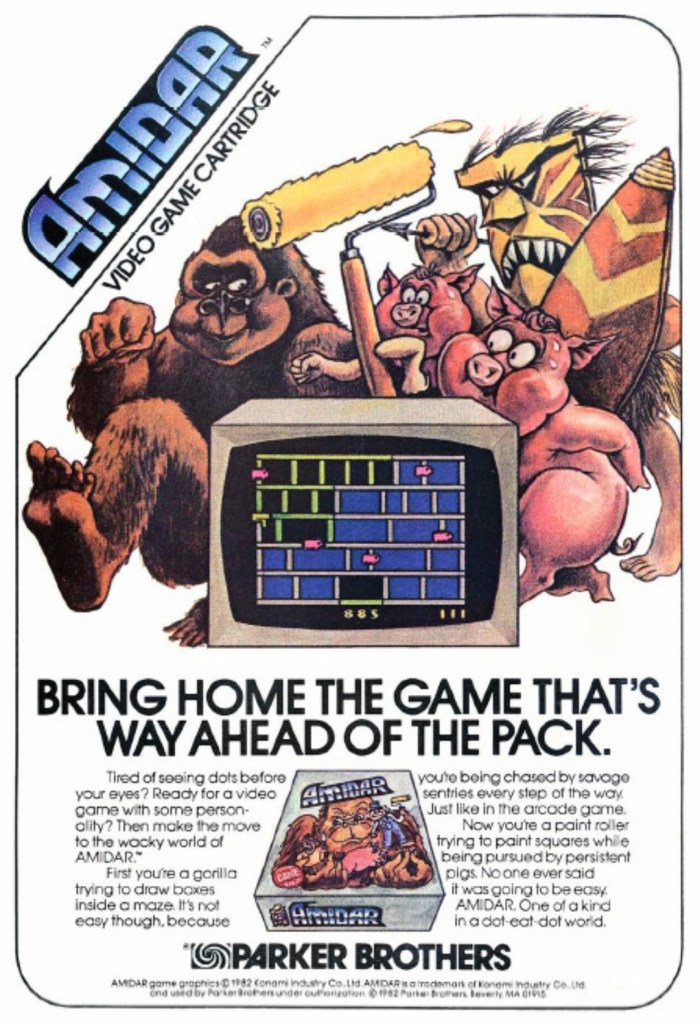
2. Amidar Atari 2600 print ad
Does this ad make you think about King Kong or animals?
When I was a young boy, I saw this Parker Brothers print ad of Amidar appear in many superhero comic books I read. I never played the game on the Atari 2600 nor in the arcades. Each time I saw this ad, I always wondered how the game played and what its creative concept was all about. The constant showing of a giant gorilla on the game box cover reminded me of King Kong.
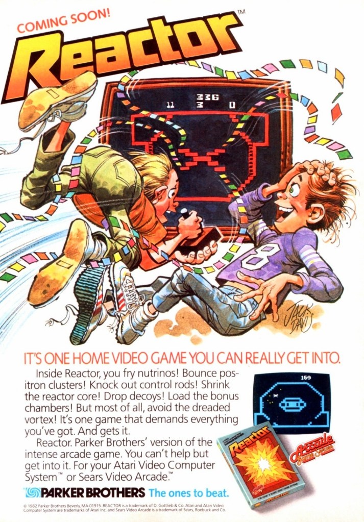
3. Reactor Atari 2600 print ad
Parker Brothers made this ad imagining gamers getting very engaged with reactor once they start playing it.
Reactor was one of those video games that was somewhat influenced by the subject of nuclear technology, particularly about the nuclear reactors. This is another game I never played on console nor in the arcades. This Reactor print ad by Parker Brothers for the Atari 2600 has a visual style and creative concept that I still find fascinating to look at.
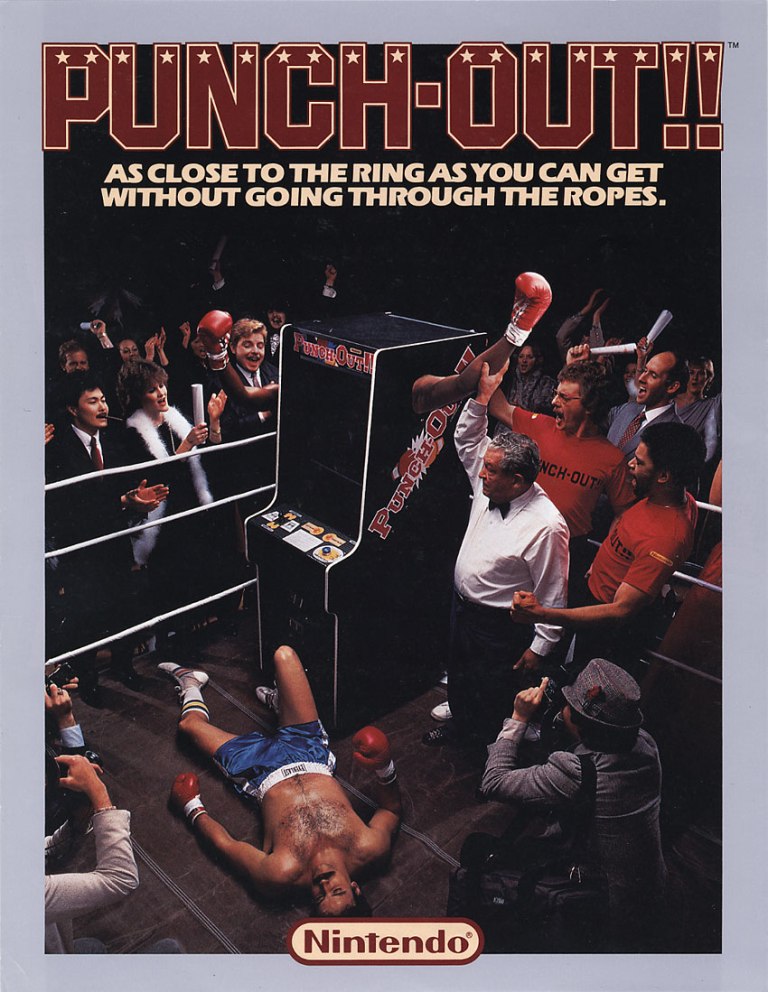
4. Punch-Out!! arcade flyer
This was years before Nintendo hired Mike Tyson to endorse the console version of Punch-Out!!
In 1984, Nintendo released the original Punch-Out!! game in the arcades and literally punched its way through to the top of American arcades that year while also scoring big in other arcades around the world. While the game proved to be very playable and a lot of fun, it could be argued that the intriguing image Nintendo used for the North American arcade flyer – a boxer down after literally getting beaten by the Punch-Out!! machine – made an impact on both gamers and arcade operators.
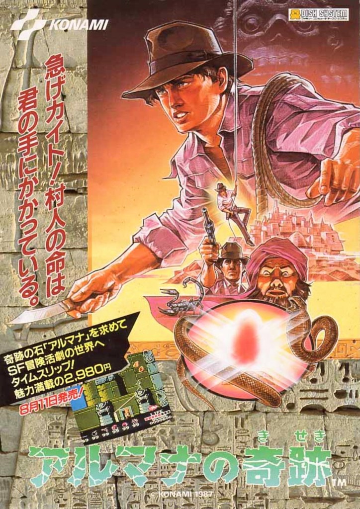
5. Arumana no Kiseki flyer
Is the famous Indiana Jones theme music playing inside your mind right now as you look at this art?
Released in 1987 on the Disk System of the Nintendo Family Computer (Famicom) in Japan, Arumana no Kiseki was one of the many 2D adventure games Konami released that entertained gamers. When compared to Castlevania – strongly influenced by American horror movies – this game was very influenced by the Indiana Jones movies of Steven Spielberg which is very evident in this promotional flyer.
In fact, some gamers who could not read the Japanese title actually thought this was an official Indiana Jones video game because the artwork was so suggestive. Having played and finished the game myself, I can say that Arumana no Kiseki was simply an Indiana Jones-inspired adventure game that had its own creative concept and unique settings and characters.
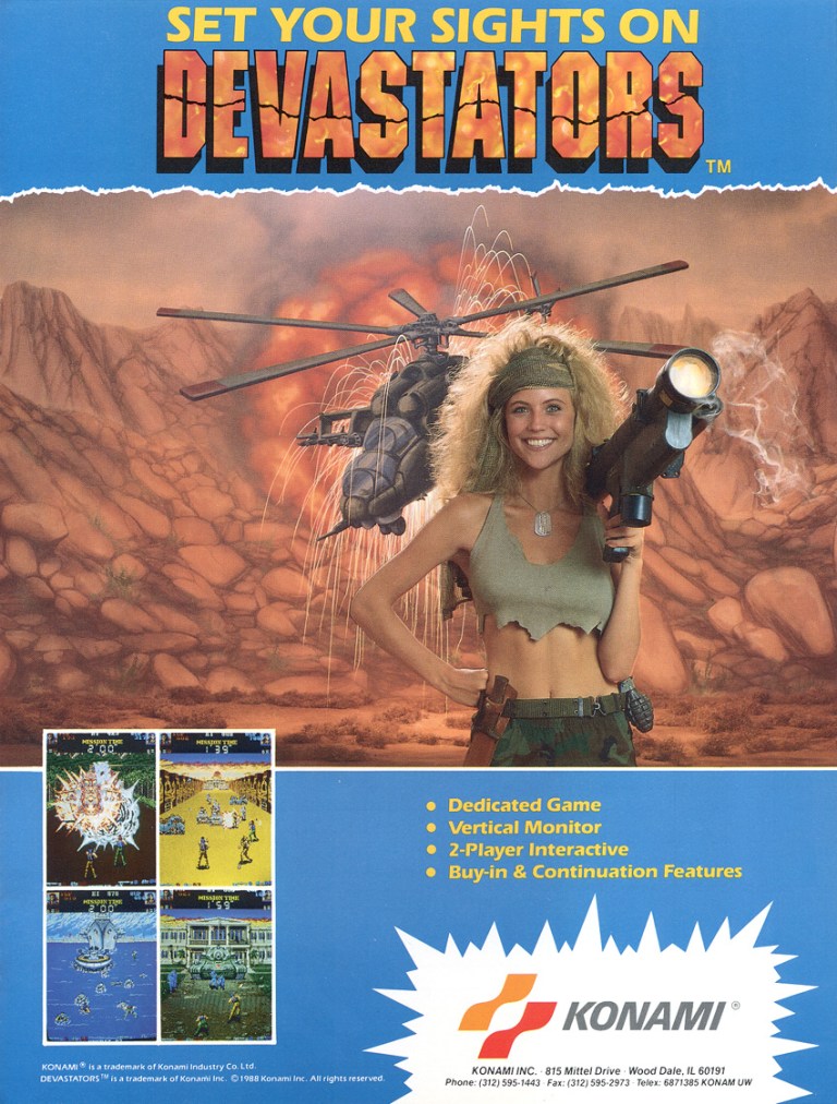
6. Devastators arcade flyer
The 1980s female Rambo smiling towards you.
By looking at the track record of Konami closely, you will notice that many of their games in the 1980s were influenced by Hollywood movies and they hired pretty or sexy models for their arcade flyers. This arcade flyer of Devastators is no exception and you can clearly see the Rambo-inspired lady smiling while carrying a weapon. Devastators itself had strong Rambo vibes for its concept.
7. S.P.Y. Special Project Y arcade flyer
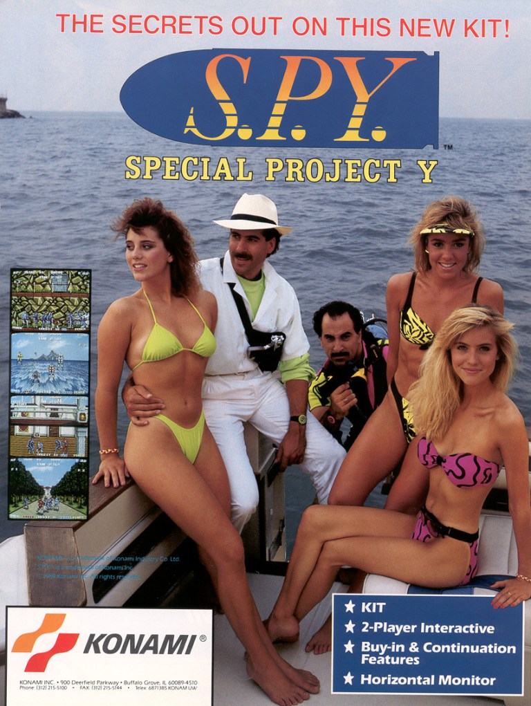
Somehow the picture of this flyer reminds me of Miami Vice.
Still with Konami, S.P.Y. Special Project Y is 1989 arcade game that featured action sequences in which players fight against countless enemies in order to progress with the minimal story. This game had certain spy movie elements and to promote it, Konami came up with this arcade flyer showcasing three sexy women wearing swimwear accompanied by two men who looked more like operators or schemers. Can you imagine yourself as an arcade operator looking at this flyer trying to decide to buy the game?
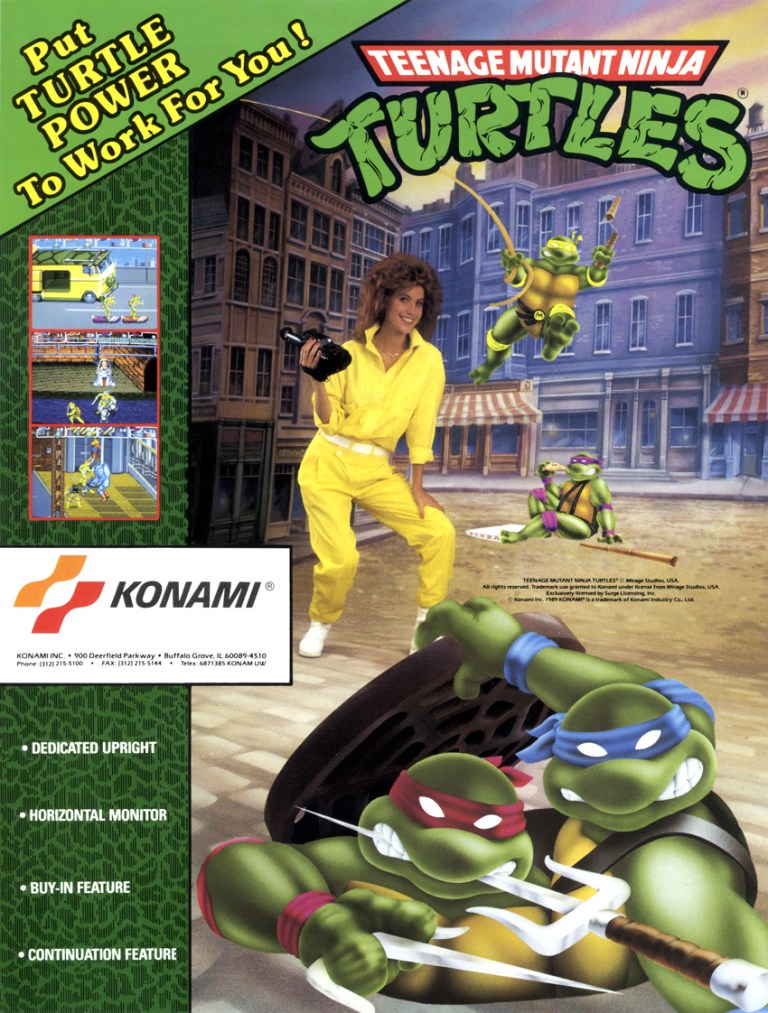
This arcade flyer is still great and exciting to look at, even if your not a TMNT fan.
Now this is one of the most definitive arcade games Konami ever made. Released in late 1989, Teenage Mutant Ninja Turtles became a massive arcade hit in North America constantly attracting lots of fans and casual gamers to play at each machine. The demand was so great, Konami had no choice but to hire a company to manufacture more machines. When it comes to promoting the game, Konami cleverly used a mix of artworks for the TMNT characters and fantasy environment while having a hired model playing April O’Neil blending in smoothly.
Having seen the 1980s animated series myself, I can say that the ad makers struck gold when it came to making a promotional image that Teenage Mutant Ninja Turtle fans can easily recognize and go to the arcade to play the game.
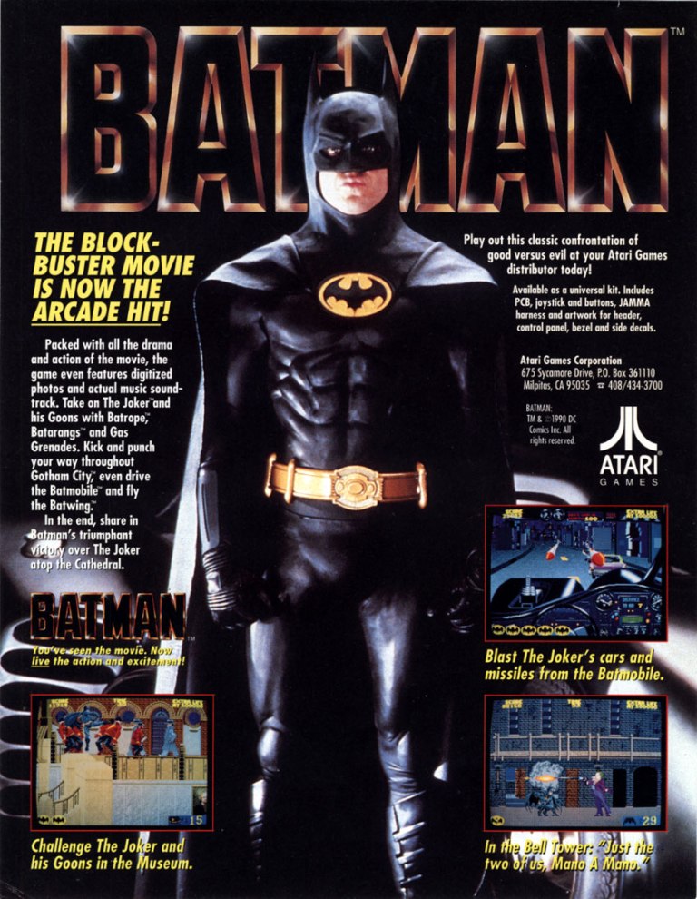
9. Batman arcade flyer
If you saw the 1989 movie, did you play this in the arcade?
The live-action Batman movie of 1989 was simply inescapable as there was so much hype, merchandising and promos connected with it. When it came to video games, it was not surprising that a lot of companies talked with Warner Bros. and eventually Atari made the official arcade game based on the movie (for insight on the production, watch PatmanQC’s video by clicking here). This early-1990s arcade flyer had a simplistic approach showing a few screenshots and descriptive text while having the live-action Batman (note: Michael Keaton in costume) dominating in the middle. Simplistic yet effective in telling gamers and arcade operators what to expect.
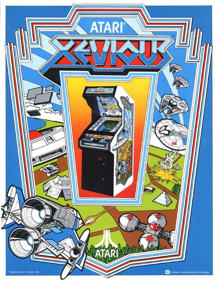
10. Xevious arcade flyer
This arcade flyer is exciting and creative to focus on.
Xevious is a long-running series of video games owned by Namco. Since the early 1980s, several Xevious video games were released on arcades, consoles and mobile devices. Believe it or not, the original Xevious game was published by Atari for North American arcades and the company came up with this dynamic looking flyer to promote it. The arcade flyer really looks dynamic due to the hand-drawn art surrounding the photo of the machine. Even by today standards, this flyer still looks modern and energetic.
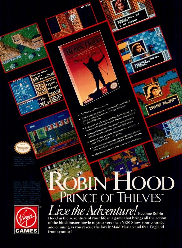
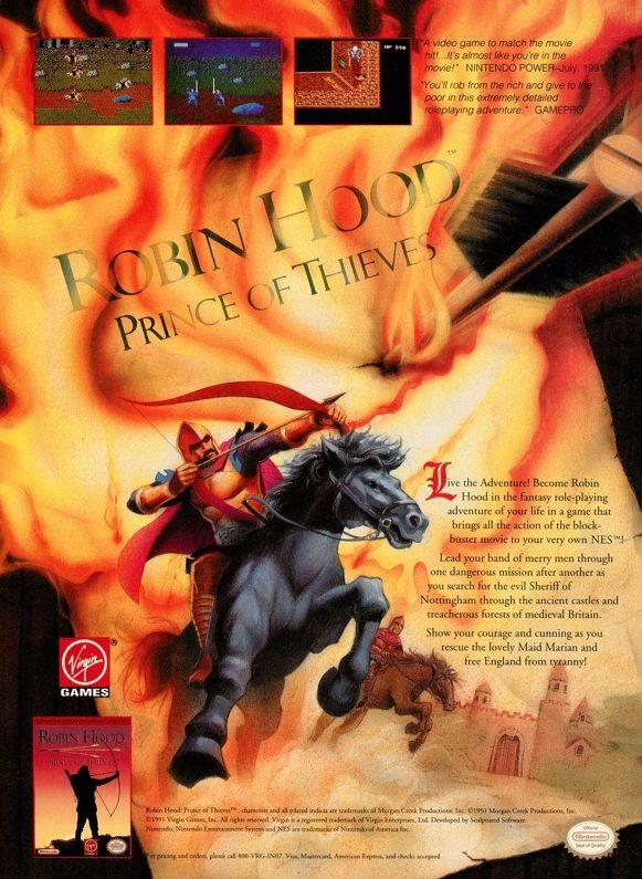
11. Robin Hood: Prince of Thieves print ads
Tell me if this ad makes you want to play the game.
Original artwork here was meant to immerse viewers into the fantasy setting of the game based on the movie.
If you saw the 1991 movie Robin Hood: Prince of Thieves, were you able to play the video game adaptation? Robin Hood: Prince of Thieves on the Nintendo Entertainment System (NES) was notable for being specially featured in the Nintendo Power magazine and its game design was truly ambitious at the time. To promote the game and take advantage of the movie’s popularity, Virgin Games came out with two print ads targeting movie fans and NES gamers.
The first print ad above had lots of selected screenshots surrounding the game’s box and crammed the descriptive text. The 2nd print ad had original artwork to emphasize the fictional setting and used only three screenshots. Looking at both print ads, it was clear that the ad makers had no permission to use the likeness of Kevin Costner as Robin Hood. The same with other actors and their characters. Regardless, the ads still reminded me enough of the movie while keeping me informed about the video game.
Disclaimer: This is my original work with details sourced from reading the comic book and doing personal research. Anyone who wants to use this article, in part or in whole, needs to secure first my permission and agree to cite me as the source and author. Let it be known that any unauthorized use of this article will constrain the author to pursue the remedies under R.A. No. 8293, the Revised Penal Code, and/or all applicable legal actions under the laws of the Philippines.
Welcome back literature enthusiasts, 20th century arts and culture enthusiasts, Marvel Comics fans and comic book collectors! Today we go back to the year 1975 to take a close look at Marvel Comics’ very own comic book adaptation of the science fiction film Planet of the Apes (1968).
The first time I ever saw the Charlton Heston-led movie was on local TV but I could only watch a few portions of it as my access to TV was very limited on the day of its broadcast. It took me a purchase of the DVD copy of Planet of the Apes in 2001 and the use of a relative’s TV and DVD player to finally see it entirely.
As the movie was highly philosophical and symbolic with its presentation, I could see why a lot of people regard it as a sci-fi classic. I should state that I do not believe in human evolution nor do I believe that humans and apes share a common genetic ancestor. Science and technology could never solve God’s designs and power of creation of life. As such, the concept of Planet of the Apes – which started as a novel before being adapted into film with the involvement of Rod Serling of The Twilight Zone – is nothing more than fantasy.
As the 1968 movie turned out successful, it not only spawned cinematic sequels but also an official comic book adaptation by Marvel Comics.
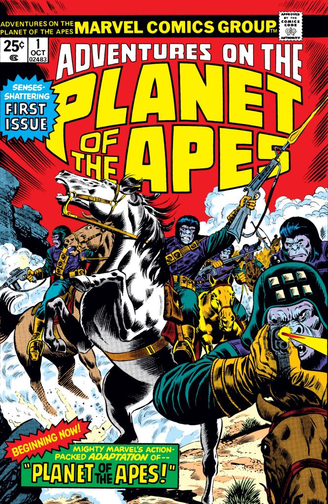
With those details laid down, here is a look back at Adventures on The Planet of the Apes #1, published in 1975 by Marvel Comics with a story written by Doug Moench and drawn by George Tuska. This is the first chapter of a 6-part adaptation of the 1968 movie.
The cover.
Early story
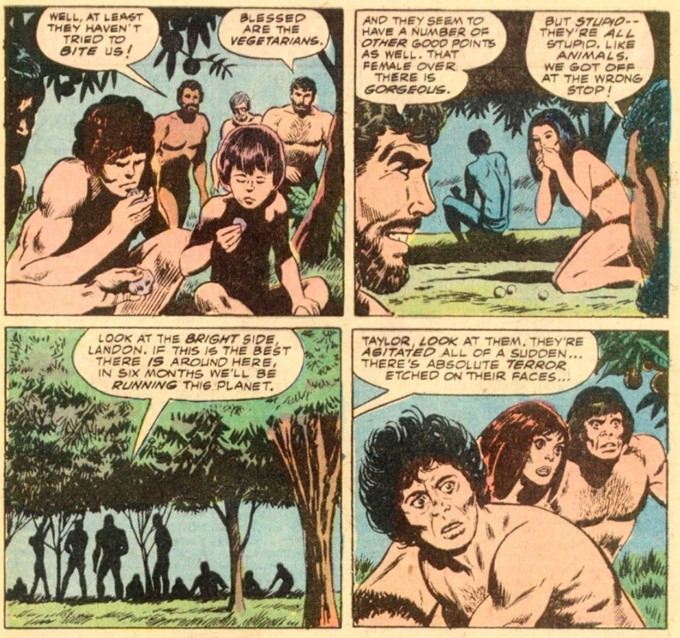
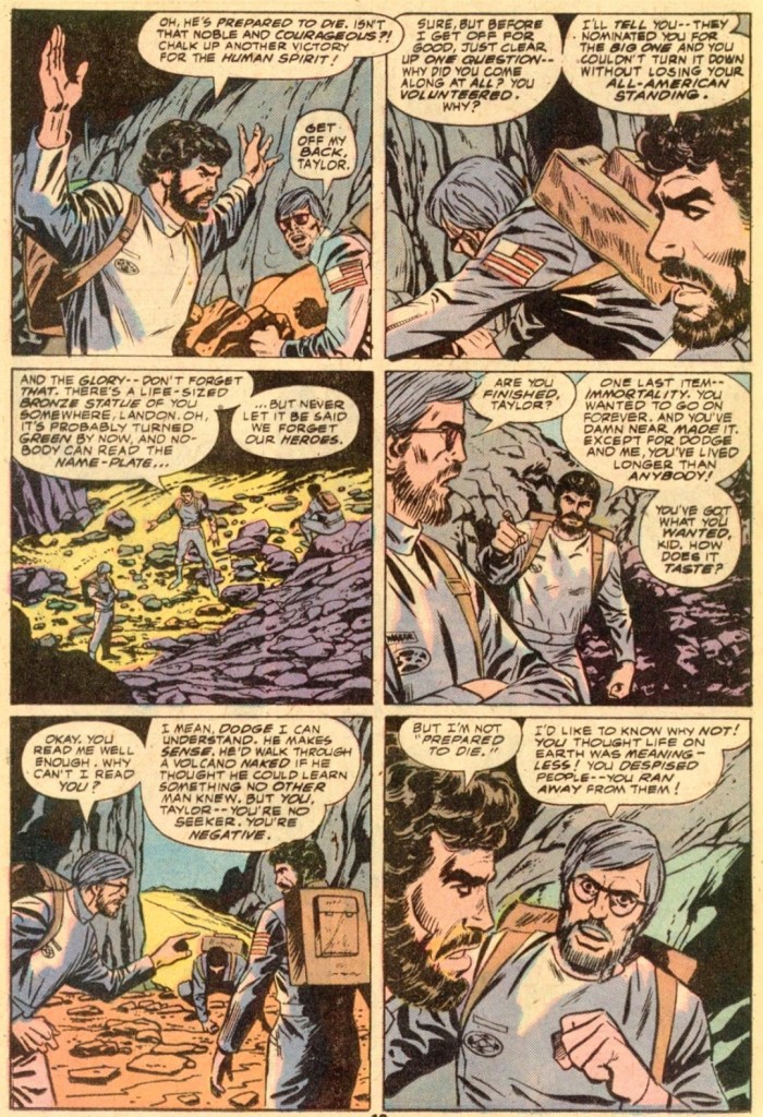
The story begins in deep space. Inside the speeding space ship is the American pilot Taylor doing an audio recording of mission details and his thoughts. He mentions the theory of Dr. Hasslein stating that centuries have already passed back on Earth even though he and his companions Dodge, Landon and Stewart (all three already in a state of suspended animation) hardly aged at all. He then joins his teammates for the long-term sleep expecting that by the time they wake up, they will their destination.
A very long time later, the ship enters the atmosphere of a breathable planet and crash lands on water. Now with facial hair, Taylor, Dodge and Landon wake up and they are shocked to see that Stewart is already dead. Suddenly, water begins to enter the interior of the ship forcing the three men go outside and ride on a boat with the equipment they managed to bring out. They move on as their ship sinks below the water.
Taylor, Dodge and Landon arrive on shore and they realize they are in the middle of a wasteland…
Quality
Taylor, Dodge and Landon with the primitive humans.
I am surprised to see that this literary work turned out to be faithful to the movie (specifically from the start until Taylor got shot during the ape-led hunt). It is not a 100% accurate which is not surprising as Marvel’s creators balanced the amount of details for adaptation while still having some space left for them to implement their own creative way of dramatizing the characters.
Writer Doug Moench clearly paid close attention to the details from the movie while ensuring that the adaptation will work within the limitations of the comic book format. For his part, artist George Tuska did a fine job drawing the characters, the environments and the apes. The way he drew Taylor, Landon and Dodge, there is clearly some 1970s influence on their space suits and the character designs (example: Dodge has an afro hairstyle). Tuska’s art on the apes unfortunately lacked details and they look rushed. The way they appeared in the comic book, the apes don’t look intimidating at all.
When it comes to adapting scenes from the movie script into comic book form, there were clear differences with regards to the arrangement of the details. For example in the movie, Charlton Heston’s Taylor talks a lot more in the opening scene (inside the space ship) expressing his lack of faith in humanity and desire for something better than his own species. In this comic book, Taylor talked much less in the beginning but his cynicism as well as his sarcastic views on humanity and nation were revealed in a scene when he and his companions were in the middle of the wasteland. Literary Taylor’s putdowns on Landon are much more detailed than what was shown in the movie. In some ways, the dialogue in this comic book is more philosophical than what was executed in the movie when it comes to the common scenes (between comic book and film).
Another example was the scene showing the three men and the waterfall. In the film, they took their clothes off and started swimming in the lake without even checking the quality of the water. In the comic book, Dodge actually tested the water and declared it safe for them to swim in. The comic book also showed more of Dodge’s dedication to scientific testing.
Conclusion
Observe how divisive and cynical Taylor here is. The grey-haired Landon is in conflict with Taylor while Dodge keeps doing scientific work.
I can say that Adventures on The Planet of the Apes #1 (1975) is an entertaining read and a good enough start of the 6-part adaptation of the movie. The Moench-Tuska duo’s efforts resulted in an engaging tale of Taylor and his two teammates who find themselves in a strange world that turned out to have apes being armed and riding horses. This comic book is mostly composed of build-up of details and expository dialogue, and yet the action scenes on the last three pages resulted in a short yet sufficient pay-off.
Overall, Adventures on The Planet of the Apes #1 (1975) is recommended.
Disclaimer: This is my original work with details sourced from reading the comic book and doing personal research. Anyone who wants to use this article, in part or in whole, needs to secure first my permission and agree to cite me as the source and author. Let it be known that any unauthorized use of this article will constrain the author to pursue the remedies under R.A. No. 8293, the Revised Penal Code, and/or all applicable legal actions under the laws of the Philippines.
Welcome back superhero enthusiasts, 1990s arts and culture enthusiasts, Image Comics fans and comic book collectors! Today we go back to the year 1995 to take a close look at one of the many tales of the original WildStorm universe through one of the comic books of the Backlash series.
For the newcomers reading this, Backlash is one of the major characters of the WildStorm universe which started in the early 1990s when the famous Jim Lee was one of the founding fathers of Image Comics. Backlash, Deathblow, Wetworks, Gen13 and WildCATS: Covert Action Teams were all connected with each other and many of the major characters were linked together in the Team 7 series of prequel stories.
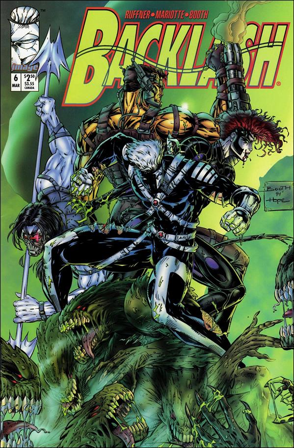
With those details laid down, here is a look back at Backlash #6, published in 1995 by Image Comics with a story written by Brett Booth, Jeff Mariotte and Sean Ruffner. Booth and Dan Norton were the illustrators.
The cover.
Early story
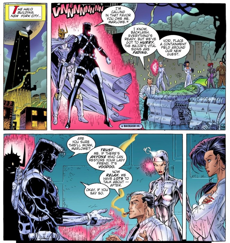
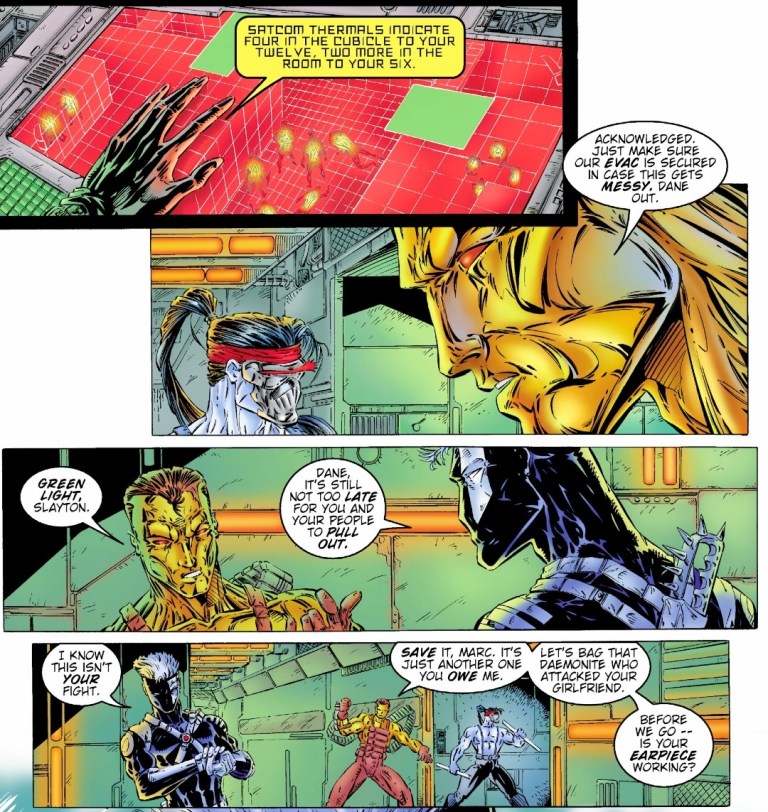
The story begins inside the Wildlife Organization Research institute in northern Montana. After Dane and Grail (the Filipino soldier Salvador Joel Alonday) of Wetworks easily took out two guards, a third one suddenly tried to attack them only to be killed by Backlash. While the three of them are on a stealth mission, Backlash tells Dane that it’s not too late for Wetworks to pull out as it is not their fight. Dane dismisses the remark and insists on pursuing their objective.
Over at a medical institute in Detroit, Taboo and Cyberjack are operating on their own mission which is directly linked with that of Backlash and Wetworks.
Quality
Backlash and the WildC.A.T.S. at the team’s headquarters.
As the sixth issue of its series, this tale has a lot at stake and the writers took their time to balance the build-up with pay-offs and twists. Without spoiling the plot, I can say that a lot is at stake for Backlash as there is something really personal about the missions and the final scene. I can also say that this is a well-crafted comic book that was clearly made with Backlash fans in mind even as the creative team did their parts in expanding the lore of the original WildStorm universe using a clever mix of science fiction and paramilitary action.
I really enjoy reading this comic book and it also has some fine moments that defined Backlash’s personality. The added crossovers with WildC.A.T.S. and Wetworks added not only to the spectacle but also to the depth of the plot. This Backlash comic book is clearly not another adventure but an actual turning point for the former Team 7 member and the series as a whole. That being said, I am looking forward to reading the next issue.
Conclusion
Backlash with Dane and Grail of Wetworks during the mission.
Backlash #6 (1995) is a very solid read. Not only was it an improvement over the previous issue, it raised the stakes high and managed to live up to the expectations. The build-up is really powerful and the way the story ended justified it. I can say that anyone who managed to start reading each of the first five issues of Backlash will experience the power of the ending of this comic book. That being said, you better read all the previous issues before reading this one.
Overall, Backlash #6 (1995) is highly recommended.