Disclaimer: This is my original work with details sourced from reading the comic book and doing personal research. Anyone who wants to use this article, in part or in whole, needs to secure first my permission and agree to cite me as the source and author. Let it be known that any unauthorized use of this article will constrain the author to pursue the remedies under R.A. No. 8293, the Revised Penal Code, and/or all applicable legal actions under the laws of the Philippines.
Welcome back superhero enthusiasts, 1970s arts and culture enthusiasts, DC Comics fans and comic book collectors! Today we go back to the year 1974 to take a close look at a part of the DC Comics universe through a tale of the Action Comics monthly series.
Throughout the superhero comics publishing history of DC Comics, Lois Lane is the definitive leading lady of Superman. Traits of her personality and journalistic work ethic got emphasized through her interactions with fellow reporter Clark Kent (Superman). At times, Lois Lane becomes a rival of Kent’s when it comes to getting the hottest scoop and getting the approval of their boss Perry White for publishing it on the next issue of the Daily Planet. But have ever seen Lane become a monster strong enough to take on Superman?
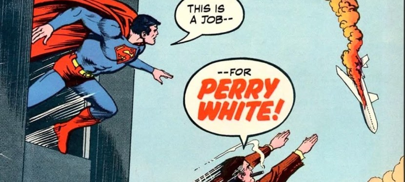
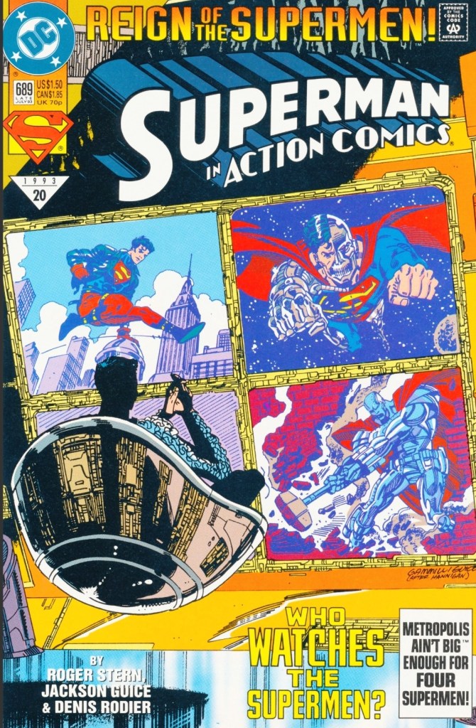
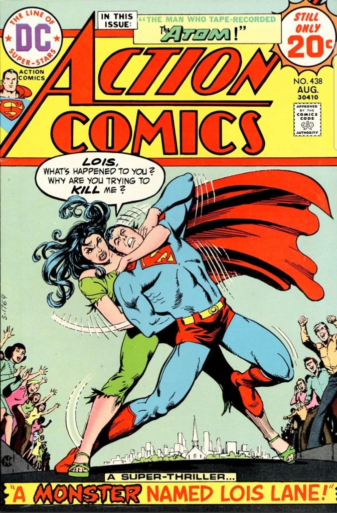
With those details laid down, here is a look back at Action Comics #438, published in 1974 by DC Comics with a story written by Cary Bates and drawn by Curt Swan.
Early story
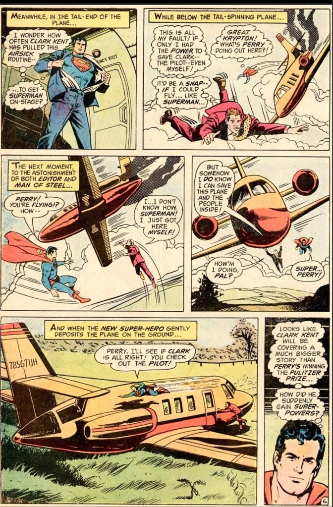
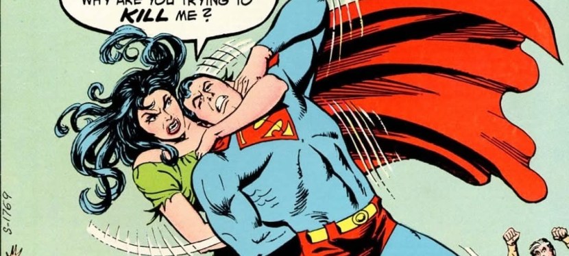
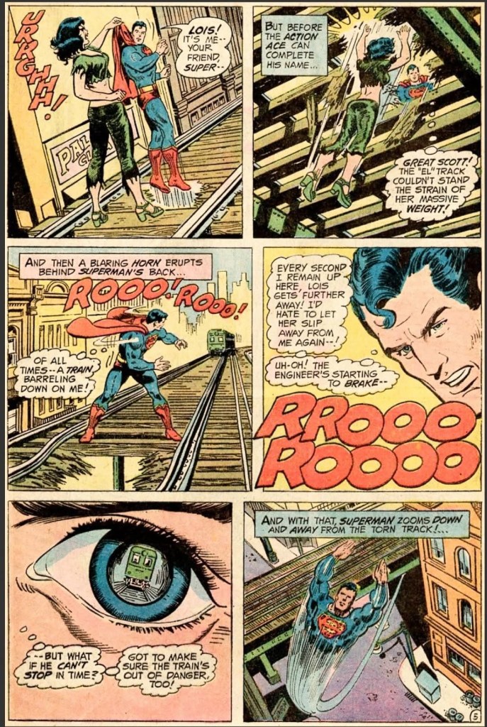
The story begins on the busy streets of Metropolis with Clark Kent and Lois Lane riding in a taxi. He gives her a very unique looking necklace as an advanced birthday gift which she gladly wears. Lois then kisses Clark on the lips which surprises him. Moments later, the taxi stops on a sidewalk as something inside happened. Seconds later, a monstrous woman emerges from the taxi which turned out to be none other than Lois Lane in a transformed state. The monster Lois gets out of the taxi, throws the necklace away and leaves Clark behind. The incident causes a commotion in the city.
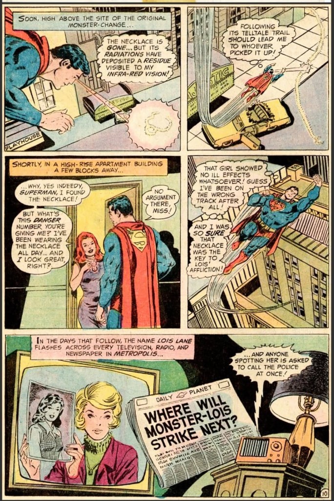
Still inside the taxi, Clark discreetly changes into Superman and flies away to search for Lois Lane…
Quality
To begin with, the concept of this comic book is clearly outlandish and the creators decided to make a monster out of Lois Lane and explore what would happen to both the city and Superman. The good news here is that the storytelling has a firm structure and the dialogue – most notably that of Superman – still made sense and was believable to follow. Without spoiling the plot, I can say that Superman is still the main focus of the story and how he made moves to solve problems while still caring for Lois Lane is engaging to read.
In this comic book, you will see some interesting developments that emphasize how Clark Kent works within the limitations of his journalistic career and connections, how Superman takes responsibility things he did before, and how he works to protect his secret identity. The Bates-Swan duo really delivered the goods here.
Conclusion
Action Comics #438 (1974) is a fun read but it is not a brainless nor a low-intelligence tale. This is a tale about Superman relying less on his powers and using more of skills as civilian Clark Kent to handle the problem of monster Lois Lane. The story lacked the superhero spectacle of action but it still is entertaining to read, and the emphasis on Superman and Lois alone is worth reading. As for The Atom short story included, it is essentially a somewhat fun additive.
Overall, Action Comics #438 (1974) is recommended.
+++++
Thank you for reading. If you find this article engaging, please click the like button below, share this article to others and also please consider making a donation to support my publishing. If you are looking for a copywriter to create content for your special project or business, check out my services and my portfolio. Feel free to contact me with a private message. Also please feel free to visit my Facebook page Author Carlo Carrasco and follow me on Twitter at @HavenorFantasy as well as on Tumblr at https://carlocarrasco.tumblr.com/ and on Instagram at https://www.instagram.com/authorcarlocarrasco