Disclaimer: This is my original work with details sourced from reading the comic book and doing personal research. Anyone who wants to use this article, in part or in whole, needs to secure first my permission and agree to cite me as the source and author. Let it be known that any unauthorized use of this article will constrain the author to pursue the remedies under R.A. No. 8293, the Revised Penal Code, and/or all applicable legal actions under the laws of the Philippines.
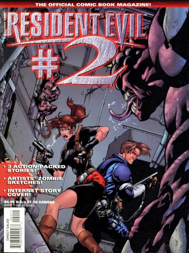
Welcome back, 1990s arts and culture enthusiasts, video game enthusiasts and comic book collectors! Today we go back to the late-1990s to examine another issue of the magazine-sized comic book series titled Resident Evil: The Official Comic Book Magazine.
By the time WildStorm Productions released the 3rd issue in 1998, many millions of gamers around the world played Resident Evil 2 on PlayStation. The Resident Evil fanbase expanded dramatically and many of them completed the game’s multiple scenarios. At the same time, Leon Kennedy and Claire Redfield became popular characters in gaming.
The 2nd issue I reviewed had a very bad adaptation of Resident Evil 2’s story. What prevented the comic book from ending up as a complete disaster were the two other short stories which were surprisingly entertaining to read. Still, I wonder if Shinji Mikami and the game developers ever saw the abysmal Resident Evil 2 adaptation in the 2nd issue.
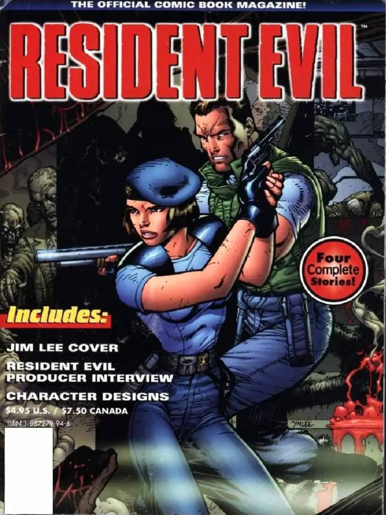
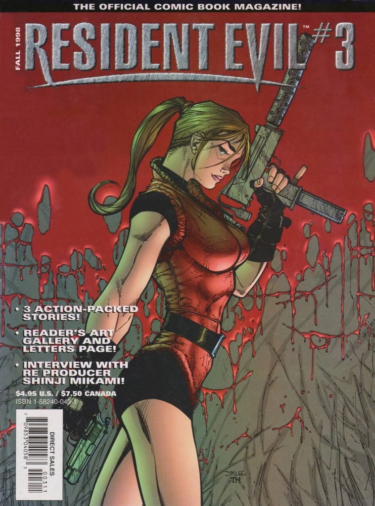
With those details laid down, here is a look back at Resident Evil: The Official Comic Book Magazine #3, published by WildStorm/Image Comics in 1998 with short stories written by Ted Adams and Kris Oprisko, and drawn by Ryan Odagawa, Carlos D’Anda and Lee Bermejo.
Early stories
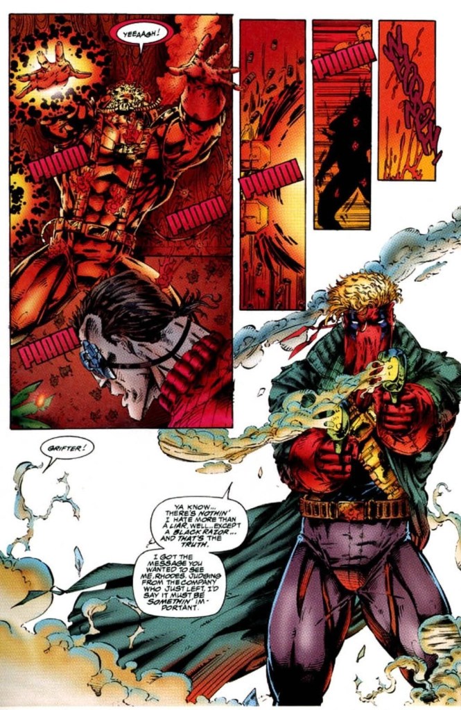
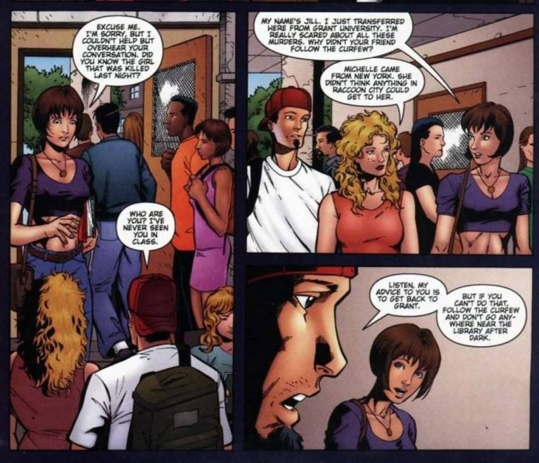
Wolf Hunt – At Raccoon City College, a few students talk about someone who got killed at school and her body was all torn up. They aware that the authorities are keeping the story out of the papers to avoid causing a panic. In the evening, of the students got harmed by a ferocious monster. The next day at S.T.A.R.S. headquarters, Albert Wesker, Jill Valentine and Barry Burton discuss the killings that happened at the city college. They were asked by the local police to investigate what happened. Jill takes the assignment of going undercover as a student.
Danger Island – A man and a woman arrive at Isla Bonale in Caribbean for a vacation. The island is so exclusive, they only let ten couples on it at a time. After having a romantic night of dinner and dancing, they decide to go snorkeling and rent a boat. Just as they start snorkeling, a plane crashes on the island.
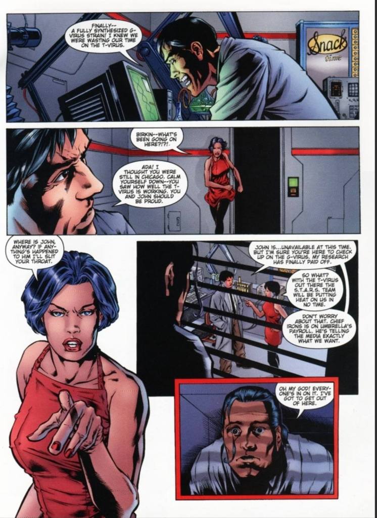
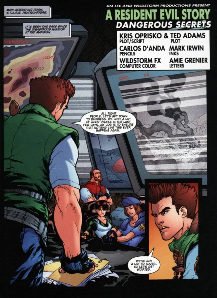
Dead Air – Following the events of Resident Evil (1996) and Resident Evil 2, Chris Redfield, Jill Valentine and Barry Burton start traveling to Europe with the goal of ending Umbrella’s current progress on a new variation of the T-virus even though they have to go undercover. They have the support of a top-secret international agency which already has someone in place to help them. Meanwhile, Umbrella has a spy watching on the three.
Quality
Similar to issue #2, this comic book has three short stories and some extras.
The short story Wolf Hunt, which took place before the events of the original Resident Evil game of 1996, has the odd concept of having werewolves existing within the RE universe. Werewolves are often super natural and such monsters don’t align with the sci-fi and biological aspects of the Resident Evil games. In fairness, the creative team had this interesting concept of having Jill Valentine going undercover as a student in the city college to find answers and solve the problem. I should state that the artwork by Ryan Odagawa is good overall although his take on Jill Valentine is cartoonish. This story is pretty short and lacked a solid conclusion. It’s really a glorified piece of fan fiction that should interest fans of the 1996 game.
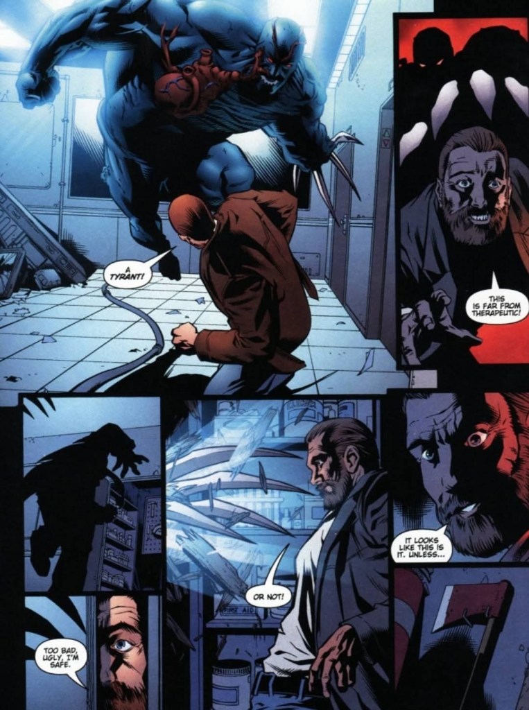
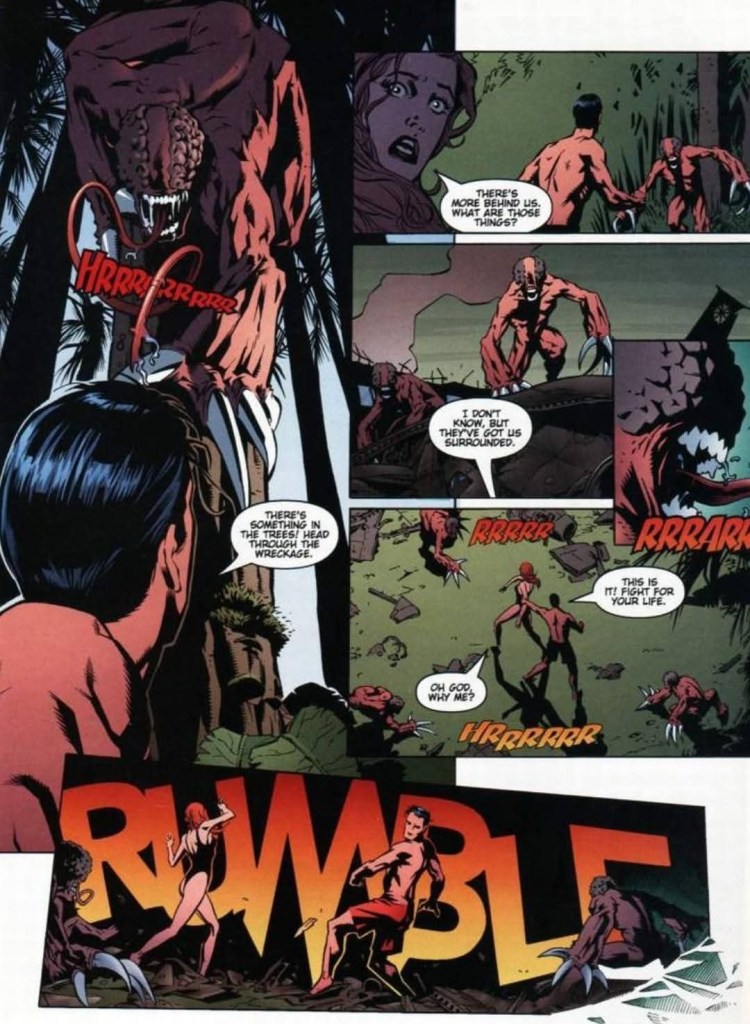
Danger Island, the 2nd short story, is easily the gem of this comic book. This is a completely original tale that has brand-new lead characters – the couple Stan and Leslie – and an island as the setting. Without spoiling the plot, this is a suspense story with a moderate pace, some dynamic visuals and a good implementation of elements from the lore of Resident Evil. The creative team behind this tale emphasized that as long as Umbrella and is biological experiments exist, danger and death will creep up on people regardless of location. A notable monster species from Resident Evil 2 is included here and the effects the G-virus has on creatures on the island are cleverly presented complete with nice artwork by Lee Bermejo.
Through the couple, readers will feel the danger, desperation and anxiety as the story went on. How the story ended is a must-see and I am confident it will encourage you to revisit Resident Evil 2.
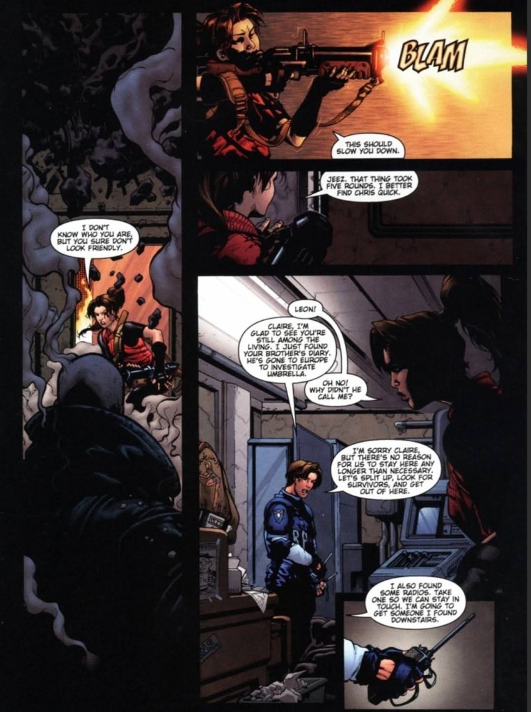
The final tale Dead Air is a daring attempt by WildStorm’s creators to make a sequel to the first two games. As mentioned above, Chris Redfield, Jill Valentine and Barry Burton are together on a high-risk mission to find and stop Umbrella in Europe. The main setting is inside a commercial flight where a zombie outbreak happens. Without their weapons, Chris, Jill and Barry are compelled to use alternative items and ways to overcome the zombies.
While this tale is packed with action and the violence is uncompromised, something is off with the way Jill Valentine is portrayed. She is more violent with action and even expressed sarcasm. This tale is pretty short as the comic book made it clear that the continuation will happen in the next issue. Considering what was told in Resident Evil: Code Veronica (released in 2000 with Chris and Claire Redfield included), Dead Air is clearly a non-canon Resident Evil tale and it is at best a polished piece of fan fiction by WildStorm.
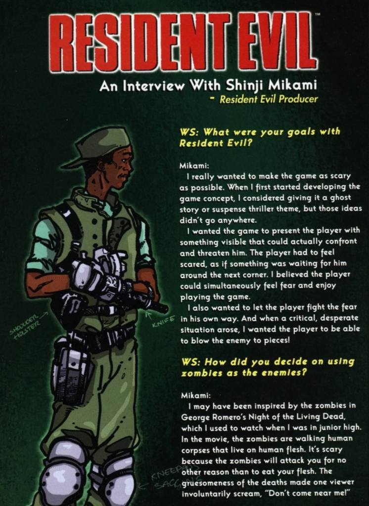
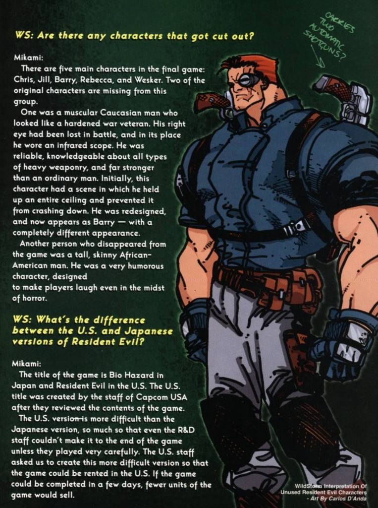
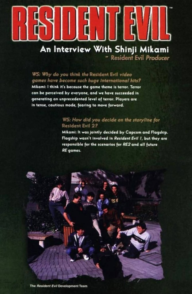
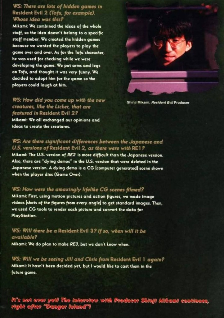
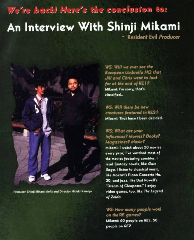
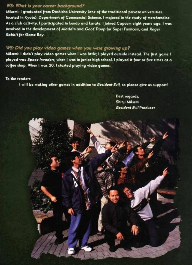
When it comes to the extras, you will find the Readers Art gallery and The Resident Evil Files (featuring Chris Redfield and his sister Claire). The most notable extra stuff here, however, is another interview with Resident Evil creator/producer Shinji Mikami and you will even see a few pictures of not just him but also Hideki Kamiya (the game director of Resident Evil 2 who went on to produce lots of highly entertaining games through the decades) and members of the team behind the RE games of the time. Enjoy the pages of the interview below.
Conclusion
Considering the qualities of the three short stories and the extra stuff, Resident Evil: The Official Comic Book Magazine #3 (1998) is easily a huge improvement over issue #2. The quality and creativity of the short stories are better, the interview with Shinji Mikami was worth reading and the comic book itself is more entertaining. That said, I am convinced to move on to the next Resident Evil comic book.
Overall, Resident Evil: The Official Comic Book Magazine #3 (1998) is recommended.
+++++
Thank you for reading. If you find this article engaging, please click the like button below and also please consider sharing this article to others. If you are looking for a copywriter to create content for your special project or business, check out my services and my portfolio. If you want to support my website, please consider making a donation. Feel free to contact me with a private message. Also please feel free to visit my Facebook page Author Carlo Carrasco and follow me on Twitter at @HavenorFantasy as well as on Tumblr at https://carlocarrasco.tumblr.com/ and on Instagram at https://www.instagram.com/authorcarlocarrasco/.