Disclaimer: This is my original work with details sourced from reading the comic book and doing personal research. Anyone who wants to use this article, in part or in whole, needs to secure first my permission and agree to cite me as the source and author. Let it be known that any unauthorized use of this article will constrain the author to pursue the remedies under R.A. No. 8293, the Revised Penal Code, and/or all applicable legal actions under the laws of the Philippines.
Welcome back superhero enthusiasts, 1980s arts and culture enthusiasts, Marvel Comics fans and comic book collectors! Today we go back to the year 1984 to examine a small part of the Marvel Comics universe through a tale of the Amazing Spider-Man monthly series.
By now, you readers should be aware that I reviewed a lot of comic books about Spider-Man and his deadliest enemy Venom. It is already established through comic book history that the iconic webslinger is responsible for the establishment of Venom as he brought into the world the alien costume (the symbiote) coming from deep space (as told in the Secret Wars limited series), and he also became responsible for the destruction of Eddie Brock’s career in journalism. Of course, Venom did not debut immediately after Spider-Man’s return from Secret Wars and there was a lot more about the symbiote when it was with Peter Parker.
With those details laid down, here is a look back at Amazing Spider-Man #252, published in 1984 by Marvel Comics with a story written by Roger Stern and Tom DeFalco, and drawn by Ron Frenz. This comic book marked the first appearance of the alien costume.

Early story
The story begins inside the New York headquarters of the Daily Bugle. It has been observed that several superheroes such as Captain America, Thor, Spider-Man, Iron Man, the X-Men and the Avengers have been missing this resulted in a rise of crime. Publisher J. Jonah Jameson and editor-in-chief Joe Robertson discuss the newest edition of their newspaper.
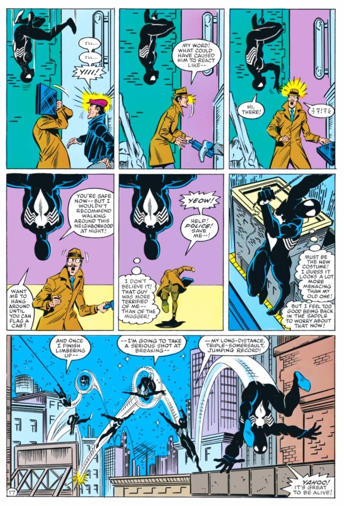
Meanwhile over at Central Park where police officers and others stand by an area that was closed off, a physical structure suddenly appears spreading bright light to onlookers. Suddenly Spider-Man (wearing a new dominant black costume) leaps out of the structure carrying Dr. Connor (the Lizard) surprising the people.
After realizing they have returned home at last after spending lots of time and struggle in deep space (Secret Wars), Spider-Man could not help but feel jubilant to be home. As the police officers don’t realize that they are talking with the same webslinger due to the new costume, one of them was about to draw his gun which prompted the superhero to use his web on him.
Suddenly, the Avengers, Captain America, Thor and Iron Man emerge from the physical structure which provided Spider-Man relief as he thought that only he and Dr. Connors made it home. With the people focusing on the other superheroes, Spider-Man and Dr. Connors slowly exited. Connors asked him what are they going to tell the world about all they have seen and experienced in deep space…
Quality
I really like this story. I first read this a long time ago and I re-read it all over again for this retro review, and still this story engaged me a lot. There is a lot of richness in the script and you will get to see Peter Parker transitioning into a series of major changes that await him. Without spoiling the plot, there is no hero-versus-villain element here at all. It is all about Spider-Man who just arrived home from a major conflict (and also one of the most significant comic events ever published by Marvel Comics) and the alien costume saga truly began right here. The Venom debut did not happen until a few years later in reality.
In accordance to what was established in Secret Wars (not to be confused with the 2015 series of the same name) and the standards of then editor-in-chief Jim Shooter, the creative came up with a tale that not only showed a different Spider-Man but also portrayed him in ways that defied the tropes and creative ideas the preceded this comic book.
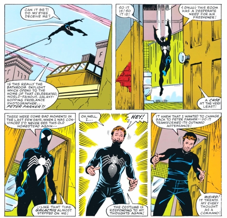
For one thing, Peter Parker is literally like a fish out of water here. As far as the whole world is concerned, only days passed when the superheroes went to deep space. But for the webslinger, a lot more time passed as so many battles, discoveries and intriguing events took place for him along with the others. That being said, Peter Parker’s perception of reality and track of time really got messed up and the weight of Secret War’s events really turned out overwhelming on him. This was well dramatized in the scene wherein Peter – who realized that so much time had passed – he had to call his aunt May fearing that she must be worried sick over him. There was also the moment when by walking down the street, he realized how much he missed not only his home but also the local surroundings.
It was also in this comic book when Peter started getting more oriented with the alien costume he first got in Secret Wars #8 (which was actually published after this comic book) and started to enjoy the benefits with the way it responds to his thinking. Of course, at this stage, he has yet to realize the unfortunate truth about the living costume he brought home and this story really kicked off a new and profound stage in the comic book history of Spider-Man
Conclusion
Amazing Spider-Man #252 (1984) is still a great comic book to read all over again. This was released during the time when Secret Wars (1984) was still being published and years before Venom’s big debut in the series’ 300th issue. In my view, the alien costume saga was a big turning point in the literary history of Spider-Man and the creators who got involved in this comic book really sowed the seeds of compelling and intriguing events that followed. What is intriguing is that all of these significant developments started when a Marvel Comics reader from Illinois came up with the idea of a new costume for Spider-Man, wrote to them and the publisher responded to acquire his idea for over $200 (click here).
This comic book is also a reminder of how significant Jim Shooter’s rule at Marvel Comics really was and I can say that the Marvel’s literary universe of the 1980s should not be ignored.
Overall, Amazing Spider-Man #252 (1984) is highly recommended!
+++++
Thank you for reading. If you find this article engaging, please click the like button below, share this article to others and also please consider making a donation to support my publishing. If you are looking for a copywriter to create content for your special project or business, check out my services and my portfolio. Feel free to contact me with a private message. Also please feel free to visit my Facebook page Author Carlo Carrasco and follow me on Twitter at @HavenorFantasy as well as on Tumblr at https://carlocarrasco.tumblr.com/ and on Instagram at https://www.instagram.com/authorcarlocarrasco