For burgers and arcade fun in BF Homes, visit Hackensack

Along the stretch of Aguirre Avenue inside BF Homes subdivision, Barangay BF Homes, Parañaque City is the 1950s-inspired diner Hackensack. To be clear, it is the BF Homes branch of the business whose other branch is located in Quezon City.

I had my first-ever visit there this past February for a lunch reunion and meeting with a dear friend of mine. We both had rice meals and drinks, and we had a nice chat while seating comfortably.

Daytime shot of a portion of the interior at Hackensack’s BF Homes branch. Comfortable seats and sufficient space for customers.
Through the window, customers can watch their food getting cooked.

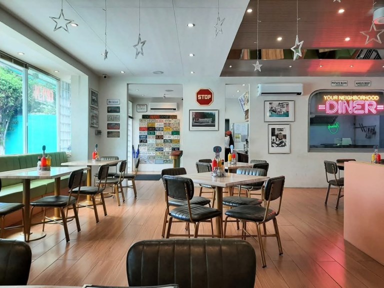
I carefully examined Hackensack as it was my first time back then. I noticed they have sufficient parking spaces – spacious enough to allow double-parking – for motorists outside. Upon entering, the 1950s vibe was clearly present through the interior design and the carefully placed decorations. With the nice interiors, cool aircon system and sufficient walking space between the chairs and tables, Hackensack’s BF Homes branch is nice and comfortable to be in.

Recently, I had a 2nd visit at Hackensack in BF Homes and this time it was dinner with my family.

Food

This is the Deluxe “Smashed” Cheeseburger and Fries Combo. The cheeseburger had two Angus beef patties.

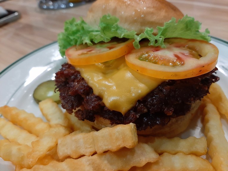
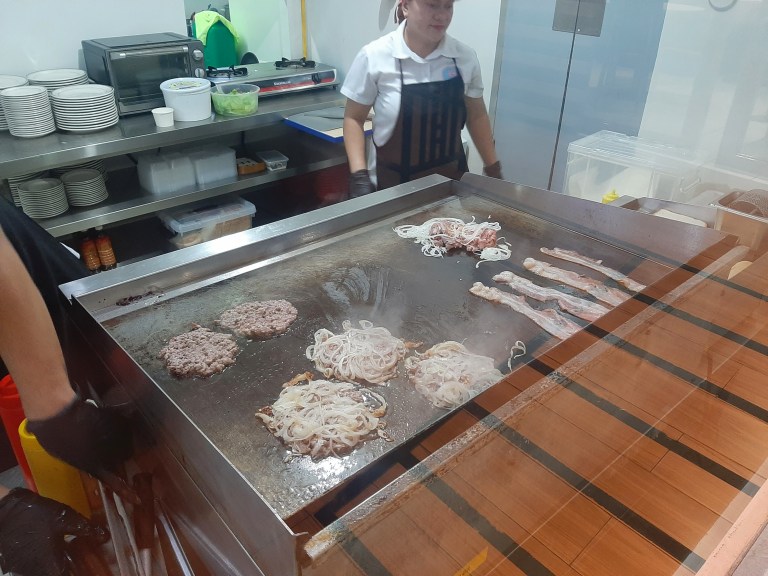
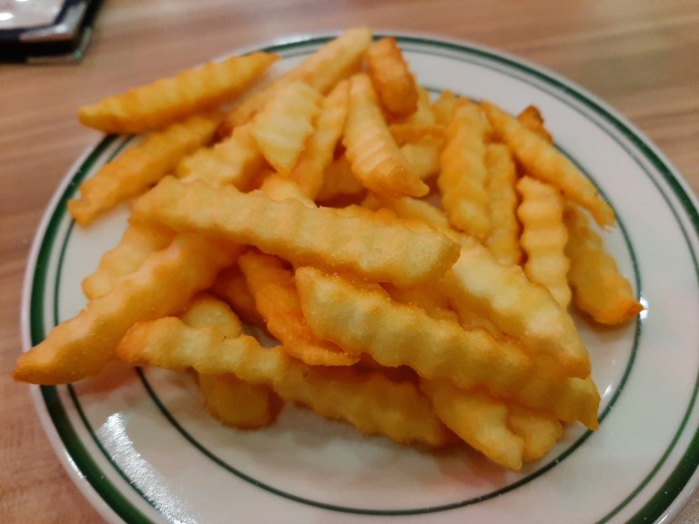
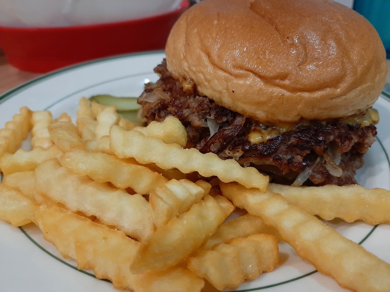
During my 2nd visit, I had the Deluxe “Smashed” Cheeseburger (double-patty) and Fries Combo and a Chocolate Milkshake. The cheeseburger itself came with two Angus beef patties, two wide tomato slices, lettuce and cheese, and it tasted really good. I’m glad I had the cheeseburger as I was getting tired of the cheeseburgers from the more popular burger-and-fries fast food restaurants. Meanwhile, the fries were well cooked and satisfying to eat.

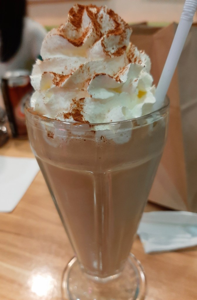
As mentioned above, I had the Chocolate Milkshake although I ordered at least 30 minutes after I finished my cheeseburger and fries combo meal. Hackensack’s milkshake tasted mildly sweet (given the chocolate flavor) but more importantly, it also tasted freshly made.

The chocolate milkshake was tasty and satisfying.

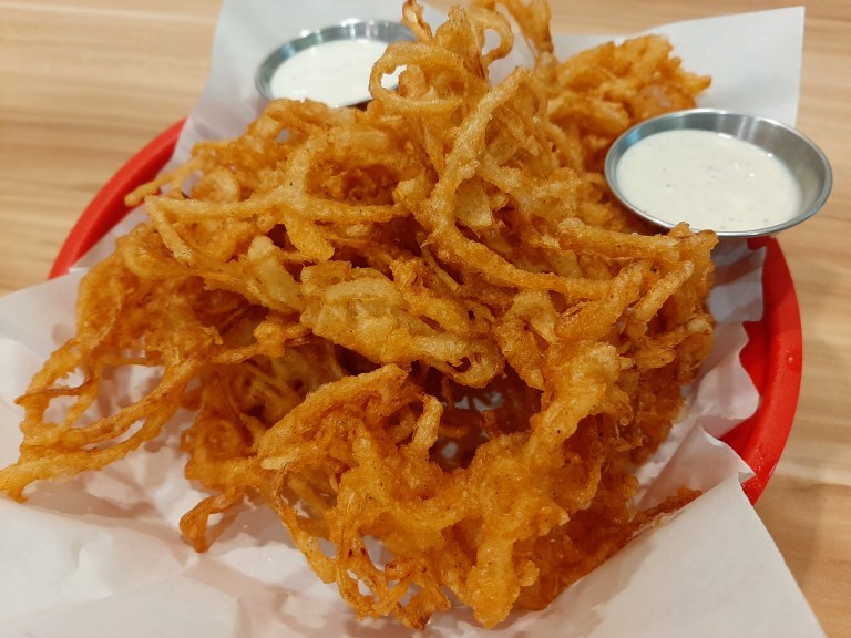
Other food that my family enjoyed include the 1950s Onion-steamed Cheeseburger and Fries Combo, the Fried Onion Strings, Fries, the Philly Cheesesteak, Chicken Wings, and the Classic BLT (Bacon, Lettuce and Tomato). I can clearly say that my family enjoyed the food and what was served exceeded expectations.

The Fried Onion Strings was a delicious appetizer and also ideal when eating with a group of companions.
A standalone service of Fries.
The 1950s Onion-steamed Cheeseburger and Fries Combo.

Hackensack’s menu offers lots of food and drink options that customers can choose from such as the Chicken Salad Sandwich with Chips combo meal, Clubhouse Sandwich with Chips combo meal, Waffle Fries, New York Frank and Fries combo meal, Mom’s Baked Spaghetti, Monty Brewster and Fries combo meal, Homemade Apple Pie, Steak and Eggs rice meal, Rootbeer Float and more.

Arcade games plus notable comic book artworks

While Hackensack has a strong 1950s vibe with its food, interiors and atmosphere, the place with the two arcade cabinets (where players can stand in front of and play games) is something else. If you know your entertainment history, you should be aware already that arcade games in America (electronic games played on machines) did not exist during the 1950s.

That being said, the two arcade cabinets allow users to pick games from a wide selection of titles from the 1970s to the 1990s. The beauty about have these arcade cabinets is that you can play games absolutely free! No need to insert coins or tokens at all!

The two arcade cabinets inside Hackensack. Each machine contains lots of classic arcade games and the great thing is that customers can play those games for free. Simply select the game, press the button and start enjoying retro gaming fun.
A few of the many retro games to choose from.

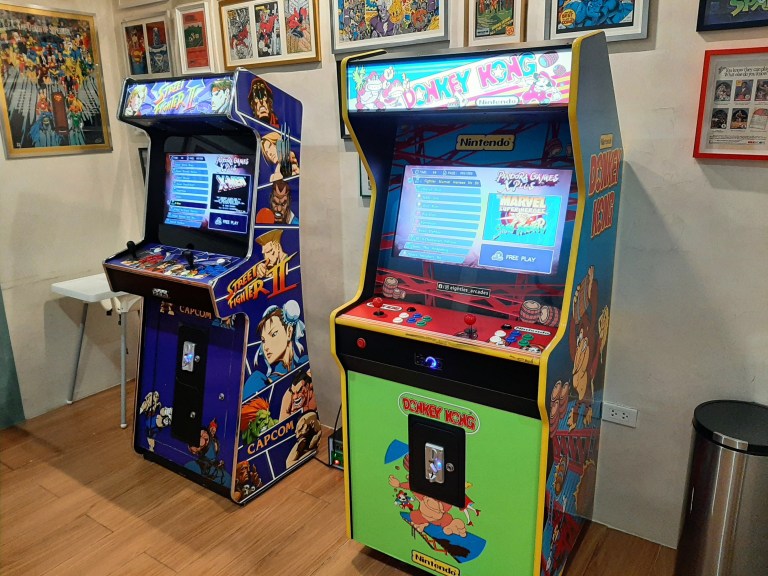
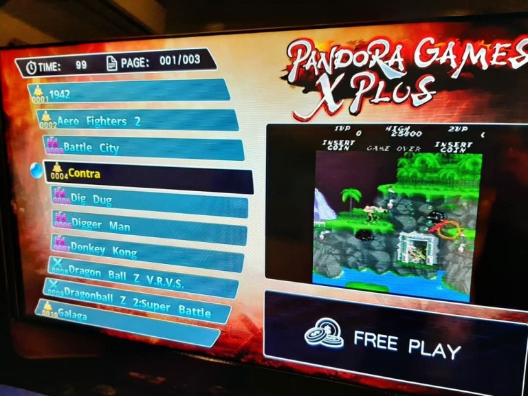
During my two visits at Hackensack in BF Homes, I had retro gaming fun with Galaga, Elevator Action, X-Men vs. Street Fighter, Pac-Man, the X-Men arcade game from Konami, and Donkey Kong to name some. Other arcade classic available for gamers to choose from include Street Fighter II, Battle City, 1942, Contra, Rambo III and RoboCop to name a few.

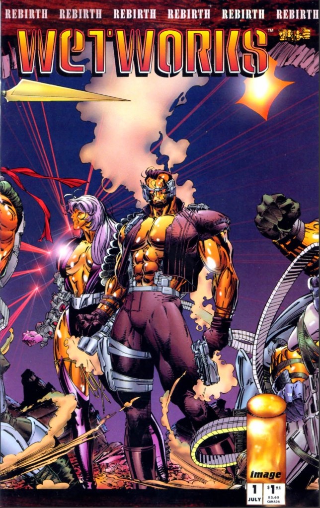
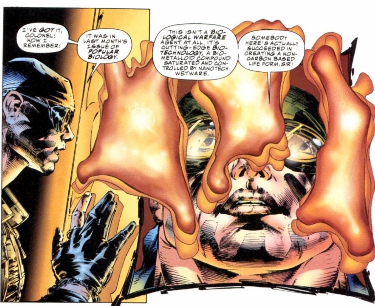
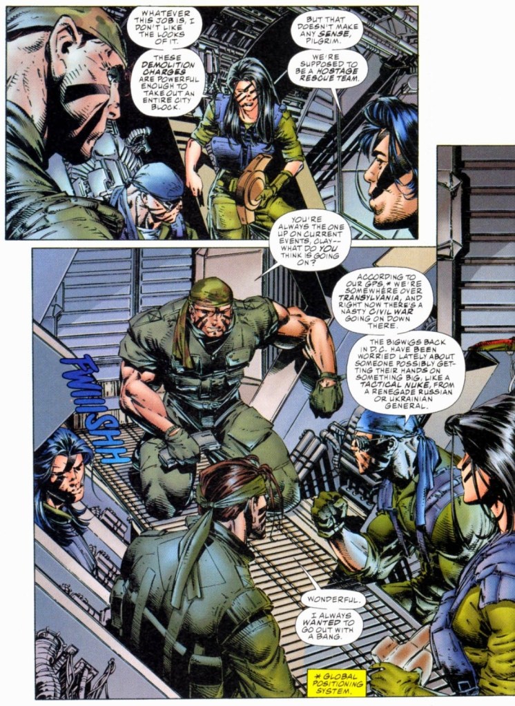
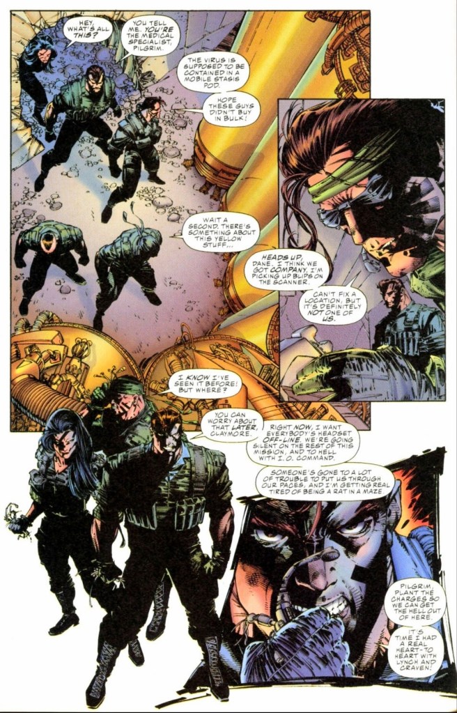
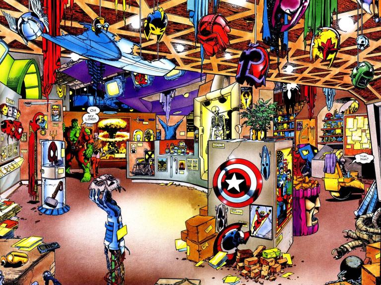
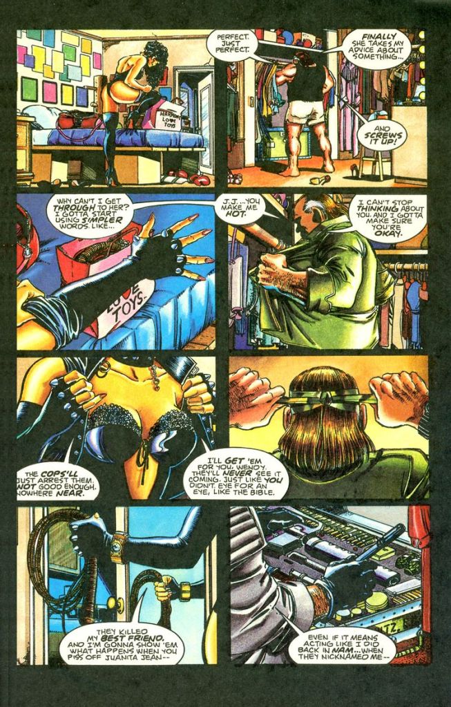
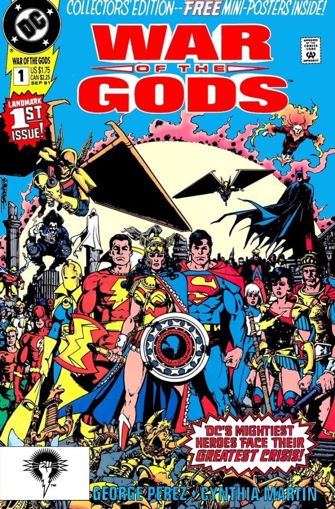
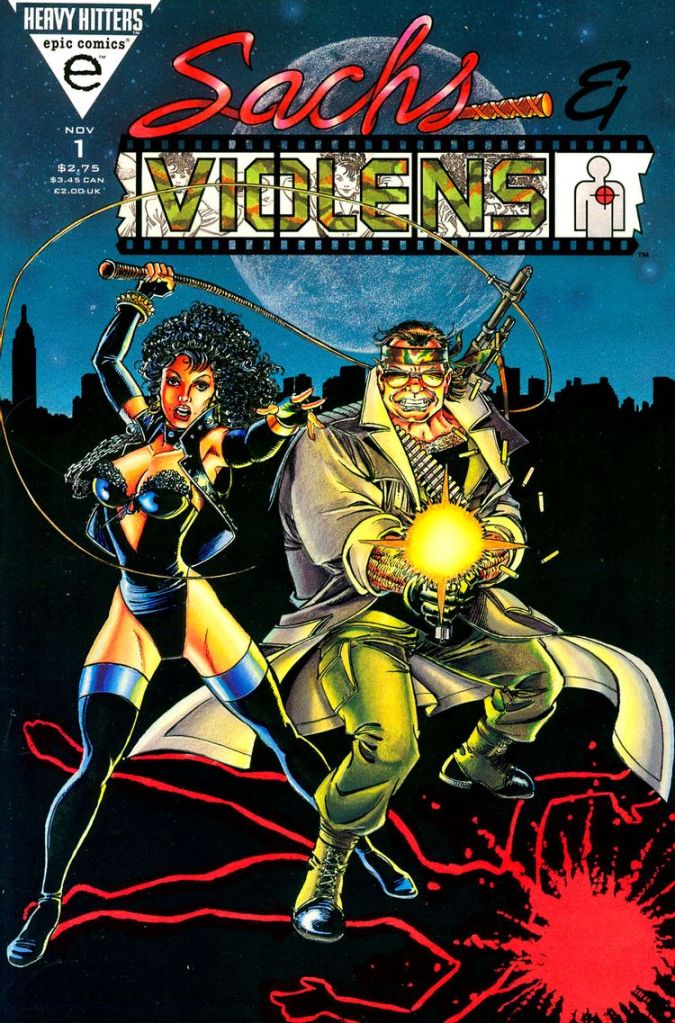
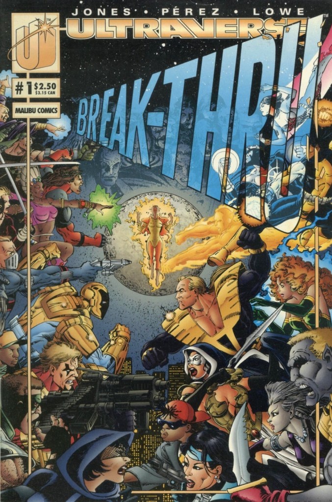
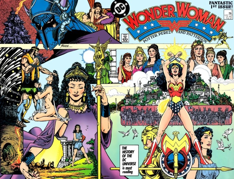
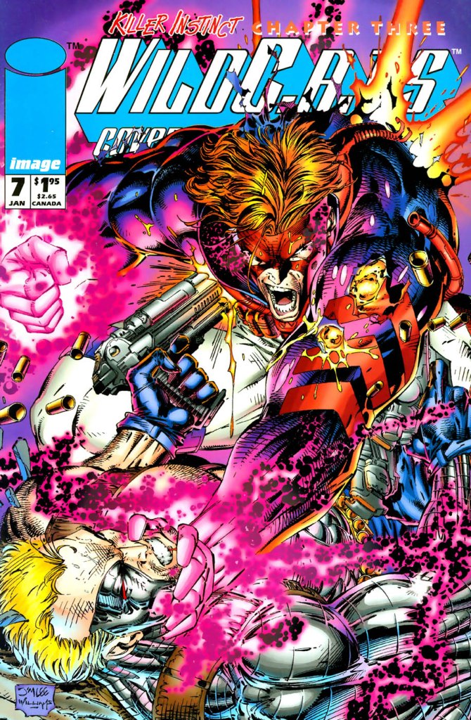
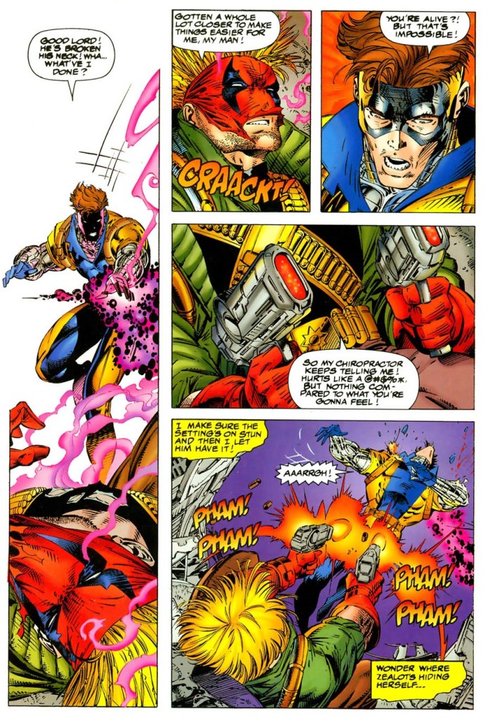
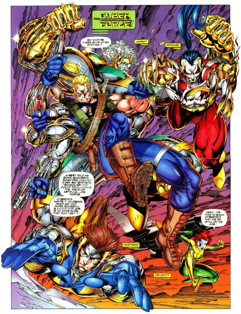
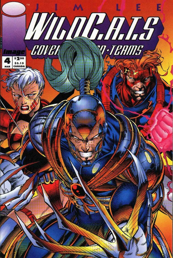
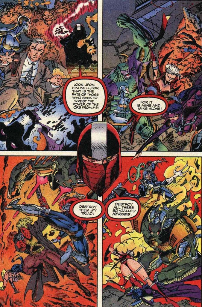
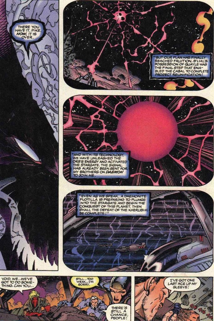
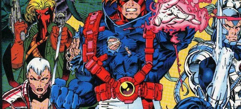
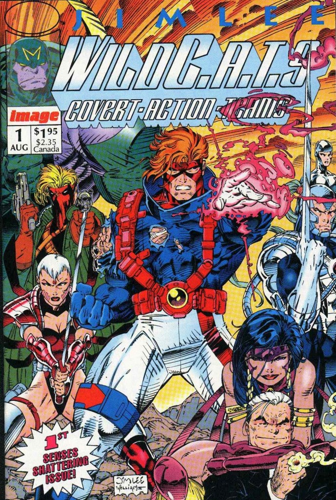
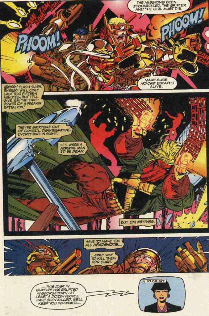
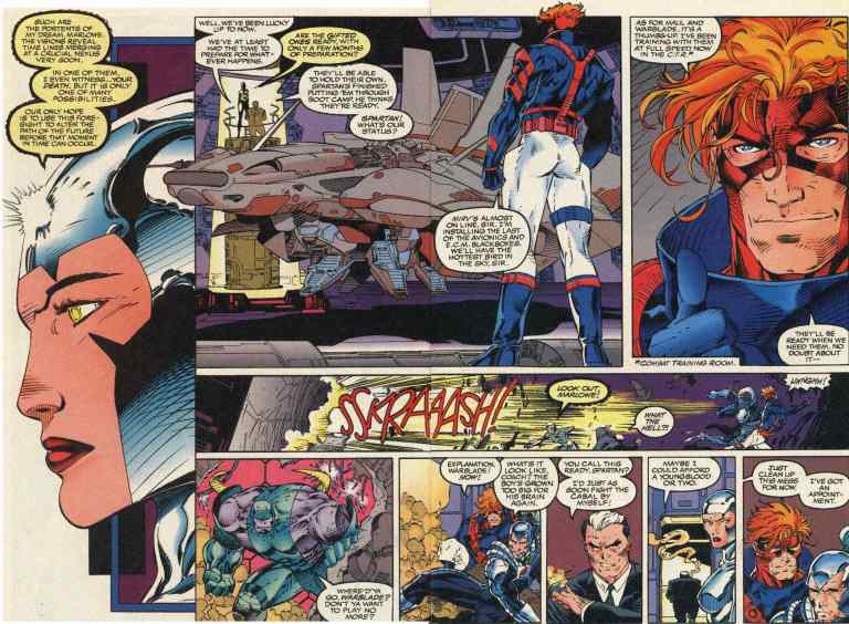
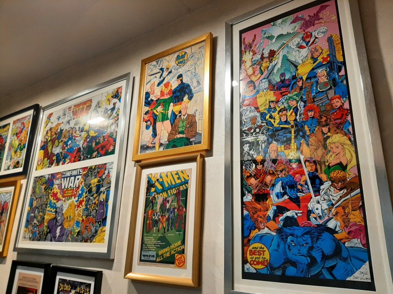
In addition to the existing retro gaming vibe the arcade cabinets provided, there were these very notable comic book covers and artworks displayed on the walls near them. Having read and collected superhero comic books in the 1990s, I recognized a lot of notable artworks there such as WetWorks by Whilce Portacio, X-Men by Jim Lee, Youngblood by Rob Liefeld, Spider-Man by Todd McFarlane, and Superman by Dan Jurgens.

Are you a 1990s comic book enthusiast? Check out the selected comic book materials displayed as decorations.

With good food, a comfortable retro place and retro gaming fun, Hackensack really stands out nicely among the many food joints inside BF Homes. As of now, it is the one place in the entire South Metro Manila where you can enjoy meals and arcade games together.

To learn more about Hackensack, visit their Facebook page by clicking https://www.facebook.com/hackensack.ph. To visit their BF Homes branch right now, click the Google Maps location link at https://maps.app.goo.gl/EHAAteZTZXwgeggw9

+++++

Thank you for reading. If you find this article engaging, please click the like button below, share this article to others and also please consider making a donation to support my publishing. If you are looking for a copywriter to create content for your special project or business, check out my services and my portfolio. Feel free to contact me with a private message. Also please feel free to visit my Facebook page Author Carlo Carrasco and follow me on Twitter at  @HavenorFantasy as well as on Tumblr at https://carlocarrasco.tumblr.com/ and on Instagram at https://www.instagram.com/authorcarlocarrasco

For more South Metro Manila community news and developments, come back here soon. Also say NO to fake news, NO to irresponsible journalism, NO to misinformation, NO to plagiarists, NO to reckless publishers and NO to sinister propaganda when it comes to news and developments. For South Metro Manila community developments, member engagement, commerce and other relevant updates, join the growing South Metro Manila Facebook group at https://www.facebook.com/groups/342183059992673

What to watch on YouTube right now – Part 58

Welcome back my readers, YouTube viewers and all others who followed this series of articles focused on YouTube videos worth watching. Have you been searching for something fun or interesting to watch on YouTube? Do you feel bored right now and you crave for something to see on the world’s most popular online video destination?

I recommend you check out the following topics and the related videos I found.

Ashleigh Burton and VKunia’s reaction videos featuring Captain America: The First Avenger – Way back in 2011, I saw Captain America: The First Avenger in the local cinema and it was an enjoyable viewing experience. Among all the Marvel Cinema Universe (MCU) movies released to date, it remained the most unique superhero movie as it had a strong World War II aesthetic and really brought much of Captain America’s literary concepts to life. I recently saw the respective reaction videos of YouTubers Ashleigh Burton and VKunia and they were enjoyable to watch. If you have not seen the movie, watch it first. Otherwise, enjoy the videos below.

#2 The wickedness of Qatar and its agenda against Israel and the West explained – When it comes to waging war against Israel and Western civilization as we know it, Qatar is much more subtle when executing its sinister agenda. While terrorist state Iran openly expresses its hatred towards Israel and the West, and arms many Middle East terrorists groups, Qatar uses the terrorist news network Al Jazeera, lies through the diplomatic arena and clearly sided with the Palestinian terrorists. Watch this explanatory and analytical video.

Trump Gaza plan makes sense – Since it was first announced, the ambitious plan of US President Donald Trump for America to take over the Gaza Strip has been making a lot of waves internationally. Of course, the political activists who hate Israel and support Palestinian terrorists just won’t relent with their distorted views and they preferred more people to become misled to support their so-called pro-Palestine movement. That being said, if you want to truly understand the truth and the details carefully, watch the videos below.

The significance of Capernaum – It has been two years since I visited Israel on a Holy Land pilgrimage tour with my local church. Capernaum is the ancient site that Lord Jesus Himself chose to base His ministry after leaving Nazareth. In addition to being Jesus’ chosen city, Capernaum is also where many significant events happened as recorded in the Holy Bible. Having visited Capernaum myself, it is indeed a very holy site and you can learn more about it by watching the videos below from Hananya Naftali and HolyLandSite. I pray that these videos will inspire you to visit Israel to deepen your faith in Lord Jesus. Grab the Bible as well.

There was a superhero-themed restaurant by Marvel – Long before the Marvel Cinematic Universe (MCU) rocked the world with many blockbuster movies, Marvel Entertainment Group (in partnership with Planet Hollywood and Universal Studios Hollywood) actually launched a superhero-themed restaurant that eventually failed. Launched in the late 1990s, the restaurant Marvel Mania was located near Universal Hollywood Studios. The failed business has long been forgotten. Fortunately, someone managed to record videos inside Marvel Mania long ago and uploaded footage on YouTube. The video below by Panels to Pixel is a must-see!

PatmanQC examines classic game Xevious – During the golden age of arcades, the 2D sci-fi shooter Xevious was released and became very successful both commercially and critically. The only version of Xevious I played was on the Nintendo Family Computer (Famicom) and it turned out many other local gamers played it in their respective homes. There is a lot more to the history and conception of Xevious and you can find out more from PatmanQC’s videos below.

Rob Liefeld’s Captain America artwork explained – Going back to Captain America, it’s time to take a closer look at a certain artwork of the icon done by Rob Liefeld (Youngblood, X-Force, The New Mutants) a long time ago. A lot of people hated it and called it exaggerated and totally unbelievable. There is an explanation for Liefeld’s Captain America artwork and you can watch and learn from the video of YouTuber Panels to Pixels below. Trust me, it is worth your time.

+++++

Thank you for reading. If you find this article engaging, please click the like button below, share this article to others and also please consider making a donation to support my publishing. If you are looking for a copywriter to create content for your special project or business, check out my services and my portfolio. Feel free to contact me with a private message. Also please feel free to visit my Facebook page Author Carlo Carrasco and follow me on Twitter at  @HavenorFantasy as well as on Tumblr at https://carlocarrasco.tumblr.com/ and on Instagram athttps://www.instagram.com/authorcarlocarrasco

A Look Back at Wetworks #1 (1994)

Welcome back superhero enthusiasts, 1990s arts and culture enthusiasts, and comic book collectors! Today we go back to the mid-1990s to explore the comic book launch of a notable fictional team co-created by the Whilce Portacio and Brandon Choi…Wetworks.

For the newcomers reading this, Whilce Portacio was one of the highly talented illustrators who left Marvel Comics and co-founded Image Comics in the early 1990s. While his fellow co-founders Todd McFarlane, Jim Lee, Rob Liefeld, Marc Silvestri, Jim Valentino and Erik Larsen were able to launch their respective dream projects (creator-owned properties) during Image’s first year of publishing, the launch of Wetworks was delayed by two years due to a death in Portacio’s family.

As a very young comic book reader in those days, I remember hearing rumors about Wetworks inside comic book stores I visited. There were rumors of business negotiations, solicitations and scheduled launches (ranging from October 1993 to January 1994). I also noticed some comic book enthusiasts who bought old copies of X-Factor and Uncanny X-Men that Portacio illustrated while waiting for Wetworks to debut.

In the middle of 1994, Wetworks was finally launched under the Image Comics label and I still remember the day when I saw lots of copies of issue displayed on the shelves and windows of comic book stores.

With those details laid down, here is a look back at Wetworks , published in 1994 by Image Comics with a story written by Whilce Portacio and Brandon Choi. The art was done by Portacio with ink work by Scott Williams.

The cover.

Early story

The story begins when a covert operations team working under International Operations (IO) travels to eastern Europe to infiltrate and destroy the base of operations of a certain warring faction and retrieve a biological agent (highly contagious) no matter what the cost. As it turns out, this new mission for the team (led by Colonel Jackson Dane, one of the pioneers of Team 7) started less than twenty four houses after their previous mission and their female member Pilgrim (reconnaissance specialist) pointed out that the demolition charges they are carrying are strong enough to wipe out an entire city block. Another teammate called Grail (the Filipino named Salvador Joel Alonday) stated that they are supposed to be a hostage rescue team.

Meanwhile deep inside the command center of IO in Washington, D.C., Admiral Halsey tells Miles Craven that Team 7 (the team led by Dane) are under his command and states that his sources tell him that there is more to the mission than just a group of ethnic nationalists obsessed on a biological terror campaign. It turns out, Craven sent the team to eastern Europe without fully informing them of what they are going up against. Craven insists that Team 7 are paid to put their lives on the line and to die if necessary just to get the job done. Craven then reveals to Halsey the true nature of the mission. The admiral then realizes Craven is right and certain sacrifices must be made for the greater good.

Craven and his team arrived at the location in Transylvania. They started seeing signs that someone else arrived ahead of them…

Quality

One of the team members looks at a symbiote.

I’ll start first with the fantasy concept and the storytelling. Whilce Portacio and Brandon Choi’s joint creation of Wetworks is indeed an inspired move with connections to real-life military influences the creators had. The Wetworks team – initially referred to as Team 7 – started looking and acting like typical military squad in the world of fiction but the major twist that happened drastically redefined and refined them into the most unique military team in the world of superhero comics. It’s the closest thing to seeing G.I. Joe fused with living symbiotes (another inspired move most likely influenced by a certain Marvel murderer with a symbiote whose origin is linked with one of the most iconic superheroes ever) there is and I can say Wetworks remains relevant and stands out nicely among superhero comic book teams to this day.

With regards to the plot, it looks cliched on face value. I’m talking about the trope in which a team is sent by their powerful superiors on a mission without knowing all the crucial details needed (because the superiors hid it from them) and they eventually encounter immense danger. As mentioned earlier, the major twist in the plot not only completed a major transformation of Dane and his teammates but also ramped up the fantasy aspect of the tale to much higher levels.

Still on the plot, Portacio and Choi came up with a solid structure for the narrative. The build-up of details and tension was very good and the pay-offs (lots of spectacle plus twists) were great. As the story moved on, the suspense grew stronger and the narrative succeeded in making me care about the team led by Dane.

Meet the team members who would later become Wetworks.

When it comes to the art, Portacio’s work here (with ink by Scott Williams) still looks great and, more notably, it is a fine departure from the superhero visuals he worked in years prior. As with his past works, you will see the artist’s stylized approach on visualizing the narrative related to how he implements the panels per page.

Portacio did a very good job with the military look of Wetworks and he drew their guns with a high amount of detail that should be seen (you should try using a magnifying glass on this comic book). Not only that, his art on military hardware such as the gunships, the interiors plus equipment all have that detailed appearance. When it comes to action, I believe that Portacio took a lot inspiration from Hollywood action flicks (most notably Predator) on portraying Wetworks members using their guns and positioning during battle.

Of course, the spectacle is not totally limited to military stuff. There is a touch of fantasy and horror visuals involved which is directly related to what was set-up for Wetworks to encounter in the near future. To realize what I am saying here, you must read this comic book until the intense end.

Conclusion

Wetworks from 1994 is still great to read!

I can say without a doubt that Wetworks (1994) remains as gripping and as entertaining as when I first read it decades ago. In short, it has aged well and reading it all over again today is compelling and a lot of fun to do. If you ask me, this is one of the finest works ever by Whilce Portacio in terms of art and storytelling. As one of the many comic books Image published during its first few years in the industry, Wetworks (1994) clearly stands out with its military theme and fantasy concept. Lastly, Wetworks is set within the WildStorm universe as dramatically symbolized with the presence of International Operations (the team’s superiors).

Overall, Wetworks (1994) is highly recommended!

+++++

Thank you for reading. If you find this article engaging, please click the like button below, share this article to others and also please consider making a donation to support my publishing. If you are looking for a copywriter to create content for your special project or business, check out my services and my portfolio. Feel free to contact me with a private message. Also please feel free to visit my Facebook page Author Carlo Carrasco and follow me on Twitter at  @HavenorFantasy as well as on Tumblr at https://carlocarrasco.tumblr.com/ and on Instagram at https://www.instagram.com/authorcarlocarrasco

A Look Back at What If #7 (1989)

Welcome back superhero enthusiasts, 1980s arts and culture enthusiasts, Marvel Comics fans and comic book collectors! Today we go back to the late 1980s to examine an alternate universe portrayal of Wolverine and S.H.I.E.L.D. told through an issue of the 2nd What If comic book series.

While Wolverine has always been identified with the X-Men, the famous mutant spent time with the Canadian team Alpha Flight and his early encounter with the Hulk remains a highly significant chapter of Marvel Comics’ superhero universe.

With those details laid down, here is a look back at What If published in 1989 by Marvel Comics with a story written by Joe Valentino and drawn by Rob Liefeld.

The cover.

Early story

The story begins with the Watcher looking back at Wolverine’s encounter with not only the Hulk but also the Wendigo (as recorded in Incredible Hulk #180 and #181). A short time later, Wolverine is alone in the forest and gets visited by Nick Fury (S.H.I.E.L.D.) and Hudson (Alpha Flight) who arrived by helicopter.

Hudson tells Logan that an agreement has been made to loan him to the United States which prompts a response – Wolverine claims he is nobody’s property and tells Fury to reveal the details.

As it turns out, Wolverine joined Fury at the helicarrier of S.H.I.E.L.D. for a briefing. Fury reveals to him that the internal security of S.H.I.E.L.D. has been breached by an advanced model of Hydra LMDs (life model decoys) and their sensors cannot even detect them. An agent with top security clearance was recently caught trying to transmit classified data. The said agent blew up…

Quality

Wolverine, Nick Fury, Black Widow and some S.H.I.E.L.D. personnel take on Hydra!

I can say that I am very impressed and entertained with what Valentino and Liefeld came up with in this comic book. The story has a pretty strong structure designed to engage readers, pull off some surprises here and there, while also emphasizing the legacy of conflict between S.H.I.E.L.D. and Hydra with efficiency.

With regards to this comic book’s subject matter, Valentino succeeded in exploring the concept of Wolverine becoming an agent of S.H.I.E.L.D. complete with great interactions between the characters. While Wolverine has his ideological differences with Nick Fury, the story went on to show great chemistry between them when S.H.I.E.L.D. operates (with the clawed mutant involved). Wolverine and Black Widow make a solid duo in action and the writer managed to dramatize the conflict between Fury and Baron Strucker (Hydra). For the newcomers reading this, Baron Strucker is Marvel’s super villain with a Nazi heritage and he first appeared in the 1964 comic book Sgt. Fury and his Howling Commandos . Strucker here is very intimidating and powerful and Hydra’s use of LMDs symbolically reflect his ruthlessness.

When it comes to the visuals, Rob Liefeld’s art here is really great to look at and it truly is one of the best looking Marvel comics I have read with his artwork as well as the most distinctive looking What If story. Great not only because of his stylized take on the established characters (note: the Hulk and Wendigo looked very visceral) but also because Liefeld truly brought Valentino’s solid script into life from start to finish. The action scenes drawn were excellent, the facial expressions were lively and detailed to look at (note: Wolverine’s got some very visceral faces here) and most of all, Liefeld managed to make the established characters look recognizable.

Conclusion

Really nice action of Wolverine and Black Widow against many drawn by Rob Liefeld.

Thanks to Jim Valentino and Rob Liefeld’s combined works, What If (1989) is a great comic book and easily one of the best tales of the 2nd volume of What If that I have ever read. The way it emphasized Wolverine as an agent of S.H.I.E.L.D. was highly imaginative, compelling and fun to read from start to finish. There is so much enjoyable stuff here that should appeal strongly to fans Wolverine, Nick Fury and S.H.I.E.L.D. In retrospect, this comic book was published just a few years before Valentino and Liefeld left Marvel Comics to establish Image Comics and right here you will see the great creativity from their younger days. Lastly, I can say that this What If tale has a strong conclusion which should compel you to read specific Marvel comic books to realize the connections

Overall, What If (1989) is highly recommended!

+++++

Thank you for reading. If you find this article engaging, please click the like button below, share this article to others and also please consider making a donation to support my publishing. If you are looking for a copywriter to create content for your special project or business, check out my services and my portfolio. Feel free to contact me with a private message. Also please feel free to visit my Facebook page Author Carlo Carrasco and follow me on Twitter at  @HavenorFantasy as well as on Tumblr at https://carlocarrasco.tumblr.com/ and on Instagram at https://www.instagram.com/authorcarlocarrasco

GMA Network’s fake Filipinos (AI sportscasters) should remind you that AI has no soul

George Perez (1954-2022)

George Perez, the incredible comic book artist who made major contributions to illustrated literature (especially the superhero comic book genre), sadly passed away due to complications related to pancreatic cancer. He was 67-years-old and I can say that superhero comic book art and dynamic expressions will not be the same without him.

George Perez with the two Wonder Woman plastic models. (photo source – DC Comics Facebook page)

Already there were comic book industry figures who reacted to the death of the legendary Perez. DC Comics co-publisher and legendary creator Jim Lee paid tribute stating, “We creators may all have access to the same tools of the trade: pen, paper and imagination, but what George could do with his prodigious talents was off the charts.”

For his part, Rob Liefeld stated, “I’ll remember George for his innovative and prolific storytelling. Thank you for all the great memories. Rest In Peace, George Perez.”

For the newcomers reading this as well as those who are simply unaware of Perez’s legacy, he was responsible for visualizing DC Comics’ 1985 epic maxi-series Crisis on Infinite Earths (note: he drew countless characters complete with varied settings or environments in high detail) and redefining Wonder Woman (note: he also wrote the stories) which made her a more essential pop culture icon. George Perez also worked for Marvel Comics over many projects and was chosen to illustrate the memorable 2003 JLA/Avengers crossover series of Marvel and DC. Perez also worked with other publishers such as Malibu Comics for several Ultraverse comic books and Image Comics for Crimson Plague and Witchblade. In recent years, he was responsible for Sirens published by BOOM! Studios.

For me, Wonder Woman was best defined during the post-Crisis era of DC Comics which involved George Perez and Len Wein who wrote the early issues of the Wonder Woman monthly series in the late 1980s.

In his decades-long career in comics, Perez unsurprisingly earned varied awards and honors (references here, here, here and here to name a few).

I should say that George Perez is a long-time favorite comic book illustrator of mine. I enjoyed reading the superhero comic books he illustrated and I love his art style on the characters, the environments and crowds. If there is anything I love about Perez’s art, it is his distinct style along with his implementation of high levels of details on the characters, objects, creatures and surroundings. Perez is also known to capture the distinct visual elements of superhero characters such as Spider-Man’s costume and his spaghetti-like web, Superman’s physique and distinct letter S, Prime’s overly muscular body and more. Every time Perez is involved as artist, the result is almost always a visual feast that often adds punch to the script prepared.

When I was still actively collecting comic books back in the 1990s, I often get excited whenever I learned that George Perez illustrated upcoming comic books. In 1992, he drew Incredible Hulk: Future Imperfect (2 books) which was mind-blowing and intriguing for me! In 1993, I became a fan of the newly launched Ultraverse of Malibu Comics and I got very excited to learn that Perez was hired for their major UV crossover Break-Thru (2 issues). Perez also drew one issue of Prime and most of the early issues of the UV team UltraForce (issues #0, #1, #3, #4, #5 and #6). If you want to see Perez draw ALL the characters of the Ultraverse, you should read the 2-issue Break-Thru storyline.

A page from Break-Thru showing just some of the many Ultraverse characters Perez illustrated. This was published before the release of UltraForce.

Speaking of UltraForce, check out this video by Crypto Comics (with observations on Perez’s art works)…

Going back to George Perez’s amazing run on Wonder Woman, I urge you to watch the video below…

For me, the most defining stories of Wonder Woman ever told in any art form are still the comics that Perez wrote (note: he co-wrote stories with Greg Potter and Len Wein respectively on the early issues) and illustrated during the post-Crisis era of DC Comics. Check out my retro reviews of Wonder Woman 1980s comics on this website.

Truly, George Perez will be missed by a lot of people and his countless pieces of works will be revisited in the foreseeable future. In closing this piece, posted below are varied works (comic book covers and interior art) done by the late creator through the decades for your viewing pleasure and learning. This is a tribute to Perez and may he rest in peace!

+++++

Note: All images shown are properties of their respective companies.

Thank you for reading. If you find this article engaging, please click the like button below and also please consider sharing this article to others. If you are looking for a copywriter to create content for your special project or business, check out my services and my portfolio. Feel free to contact me with a private message. Also please feel free to visit my Facebook page Author Carlo Carrasco and follow me on Twitter at  @HavenorFantasy as well as on Tumblr at https://carlocarrasco.tumblr.com/ and on Instagram at https://www.instagram.com/authorcarlocarrasco/

A Look Back at WildC.A.T.S: Covert Action Teams #7 (1994)

Disclaimer: This is my original work with details sourced from reading the comic book and doing personal research. Anyone who wants to use this article, in part or in whole, needs to secure first my permission and agree to cite me as the source and author. Let it be known that any unauthorized use of this article will constrain the author to pursue the remedies under R.A. No. 8293, the Revised Penal Code, and/or all applicable legal actions under the laws of the Philippines.

Welcome back superhero enthusiasts, 1990s culture enthusiasts and comic book collectors! Today we continue revisiting Jim Lee’s flagship title under the Image Comics label – WildC.A.T.S: Covert Action Teams!

While the 3rd and 4th issues of the WildC.A.T.S: Covert Action Teams mini-series had Lee’s superhero team crossing over with Rob Liefeld’s Youngblood, a bigger crossover was agreed upon with Image Comics co-founder Marc Silvestri – Killer Instict! This marked a creative collaboration between Lee and Silvestri resulting a multiple issue crossover between WildC.A.T.S and Cyber Force. For clarification, I already mentioned in my retro review of WildC.A.T.S: Covert Action Teams (1993) that its story was the first chapter of the 4-part Killer Instinct crossover. For your reference, Killer Instinct’s 2nd and 4 chapters were published as Cyber Force issues and of its regular series under Marc Silverstri. This WildC.A.T.S retro review is about the 3rd chapter of Killer Instinct.

With those details laid down, here is a look back WildC.A.T.S: Covert Action Teams , published by Image Comics in 1994 with a story written by Brandon Choi and Jim Lee. Lee did the art.

The cover.

Early story

The story begins somewhere in the skies above Gamorra, off the coast of the Philippines! Stryker, the Cyber Force member with three cybernetic right arms, communicates with his teammates and tells them that if half of what Misery said is true about the new Cyberdata S.H.O.C.S., they’re in for a nasty fight and they have to hit the ground.

Stryker, Impact, Heatwave, Velocity and Ripclaw jump off their high-tech jet (which has Cyblade and Misery inside) and land safely. Using his enhanced ability of smell, Ripclaw begins detecting tracks of what they are look for.

Meanwhile at the back of the Isle of the Dead, a high-tech craft arrives with three passengers who are prepared to do a drug deal. Slowly, someone bleeding and with blades on his hands climbs into the craft surprising the passengers. He takes control of the craft, throws the passengers off and leaves.

As Cyber Force starts its ground search with Misery advising them while carefully using her telepathy on them. As Stryker enters a ravaged high-tech place, his sensors detect nothing and yet his instincts tell him something is present nearby. Standing near him is Spartan of WildC.A.T.S…

Quality

In this encounter between Grifter and Heatwave, do you notice something lacking visually?

I’ll start with the very obvious purpose of this comic book. After the build-up done in the first two chapters of the Killer Instinct storyline, this story serves as the start of what turned out to be the big pay-off as WildC.A.T.S and Cyber Force members finally got together with an action-packed battle to kick things off. From a storytelling view point, this one is mainly a WildC.A.T.S versus Cyber Force tale with really nice match-ups between their members such as Spartan-Stryker, Cyblade-Zealot and Maul-Impact to name a few. These match-ups and fights are excellently drawn by Jim Lee and I really enjoyed his own artistic visuals of Marc Silvestri’s Cyber Force.

More on the plot, it is pretty simple in concept and structure. The members of the two teams get to fight each other which gets the attention of Skywatch which itself has vested interest with the operations of Stormwatch (note: this is within the WildStorm lore) and the secret facility on that blew up (as seen in WildC.A.T.S ). Misery remains the key factor in the story and in this tale, she gets to guide and manipulate Cyber Force to find something valuable while Warblade remains mostly absent. Apart from the battles, the absent Voodoo, Void and Jacob Marlowe have their respective spotlights mainly for the character developments as well as reminding readers about the continuing Kherubim-Daemonite conflict.

The quality of the writing is serviceable and the way I look at this comic book, it is mainly driven by spectacle and match-ups. The amount of crossover action is of top-notch quality (note: Jim Lee apparently missed out on key details while drawing Heatwave in a scene with Grifter) and clearly Jim Lee planned the visuals carefully. While there is little character development here, the ironic thing is that Misery (note: visually she is a wicked version of Jean Grey of the X-Men) is the one who gets a good chunk of the said development. Not only does she become a force in the minds of Cyber Force members, she also has her intimate moments with Ripclaw which is a reminder to readers that they have a shared past together (note: this will resonate more with those who read Cyber Force of the regular series).

Conclusion

This is how Cyber Force looks like as drawn by Jim Lee.

To make things clear, WildC.A.T.S: Covert Action Teams (1994) will strongly appeal to the respective fans of WildC.A.T.S and Cyber Force, to the readers who love high-quality superhero action, and to those who simply enjoy superhero crossover stories. While it is not a surprise that this comic book has great visuals, the writing this time clearly lacks depth and I really felt that the dialogue and text descriptions were done mainly to fit the obvious spectacle-led concept. If you are the kind of reader who wants storytelling and characterization prioritized in an action-packed crossover comic book, this one might not satisfy you. Ultimately, this one is a fun read even though the quality of the writing does not even come close to the quality of the visuals.  

If you are seriously planning to buy an existing hard copy of WildC.A.T.S: Covert Action Teams (1994), be aware that as of this writing, MileHighComics.com shows that the near-mint copy of the regular edition costs $30 while the near-mint copy of the newsstand edition costs $90. The near-mint copy of the silver cover edition costs $300.

Overall, WildC.A.T.S: Covert Action Teams (1994) is recommended.

+++++

Thank you for reading. If you find this article engaging, please click the like button below and also please consider sharing this article to others. If you are looking for a copywriter to create content for your special project or business, check out my services and my portfolio. Feel free to contact me with a private message. Also please feel free to visit my Facebook page Author Carlo Carrasco and follow me on Twitter at  @HavenorFantasy as well as on Tumblr at https://carlocarrasco.tumblr.com/

A Look Back at WildC.A.T.S: Covert Action Teams #4 (1993)

Disclaimer: This is my original work with details sourced from reading the comic book and doing personal research. Anyone who wants to use this article, in part or in whole, needs to secure first my permission and agree to cite me as the source and author. Let it be known that any unauthorized use of this article will constrain the author to pursue the remedies under R.A. No. 8293, the Revised Penal Code, and/or all applicable legal actions under the laws of the Philippines.

Welcome back superhero enthusiasts, 1990s culture enthusiasts and comic book collectors! Today we revisit the early days of Image Comics through Jim Lee’s WildC.A.T.S: Covert Action Teams comic book franchise which was one of the launch titles of the said company.

Last time around, I reviewed the third issue of the WildC.A.T.S mini-series and its quality was good enough for me. Other than the visual candies delivered by Jim Lee, WildC.A.T.S: Covert Action Teams featured a crossover with Rob Liefeld’s very own Youngblood which was really surprising and intriguing back in those times.

With those details laid down, here is a look back at the final issue of the mini-series…WildC.A.T.S: Covert Action Teams , published by Image Comics through Malibu Comics in 1993 with a story written by Brandon Choi and Jim Lee. Lee did the art.

Jim Lee drew this cover very similarly to his cover art work on X-Men (1992).

Early story

The story begins with Helspont already declaring victory as well as the beginning of his operation called Reunification which involves the use of the orb to activate a stargate which would allow his brethren of Daemonites to come to Earth to not only overwhelm the Kherubim but also to conquer the whole world. In his presence are two of his deadly companies standing with him and certain members of WildC.A.T.S – including their leader Jacob Marlowe – who are down on the rough surface having been hit hard moments earlier.

Suddenly a group composed of the six Youngblood members, Vice President Dan Quayle and WildC.A.T.S’ members Voodoo and Maul approach Helspont and his companions in an attempt to make them surrender.

As Voodoo realizes her power does not affect Helspont, the vicious Daemonite strikes the group with an energy blast aided by the orb and the high technology of the place. As this happens, Grift, Void and Jacob slowly make their moves. Jacob uses his communicator to send a signal to the heavily damaged Spartan…

Quality

WildC.A.T.S face strong opposition from the Gnome and his dangerous companions.

As the final tale of the mini-series, I can say that the script made for this comic book is a pretty satisfying read from start to finish. Like in issue , the pace here moves fast and there is a lot of spectacle that got executed while never overwhelming its narrative. More on the narrative, the conflict between the Kherubim and Daemonites is strongly symbolized by the WildC.A.T.S and Helspont’s forces going head to head. There are some pretty notable character moments that added to the fun factor such as Jacob sarcastically telling Helspont he could not access the back-up systems for his dreaded operation to bring the Daemonites to Earth.

Of course, this is not simply a WildC.A.T.S versus Helspont story in the good-versus-evil type of way. Apart from the inclusion of Rob Liefeld’s Youngblood, there is also the other dangerous party led by the Gnome who also have a strong interest in the orb. While their participation in the story happens pretty late, they do provide serious opposition against Jacob Marlowe and his team.

As mentioned earlier, there is a lot of action that expresses the intensity of the conflicts. While there is almost no room left for any real character development, the creators managed to craft a story that never felt brainless or unintelligent. As such, there is a lot of entertaining stuff to enjoy here and I personally find the establishment of WildC.A.T.S’ core concept to be solid and worth following.

Conclusion

As Helspont emphasizes his evil plan, Jacob Marlowe makes his move.

WildC.A.T.S: Covert Action Teams (1993) is a not just a fun comic book to read. It is also a worthy conclusion to its mini-series and also it succeeded in establishing the WildC.A.T.S as both Jim Lee’s passion project and as one of the most worthy early titles of Image Comics. By the time I reached the end of this comic book, it became clear to me back in 1993 that Jim Lee was moving forward to a new territory on superhero comic book creations leaving behind his legacy with Marvel and their X-Men franchise. While this comic book ended the 4-issue mini-series, the funny thing was that Jim Lee and his team went on to start a regular comic book series of WildC.A.T.S: Covert Action Teams by actually publishing issue #5 (in late 1993) instead of starting with a brand new issue .

If you are seriously planning to buy an existing hard copy of WildC.A.T.S: Covert Action Teams (1993), be aware that as of this writing, MileHighComics.com shows that the near-mint copy of the regular edition costs $20 while the near-mint copies of newsstand edition (without card) and the numbered-and-signed edition cost $48 and $160 respectively.

Overall, WildC.A.T.S: Covert Action Teams (1993) is recommended.

+++++

Thank you for reading. If you find this article engaging, please click the like button below and also please consider sharing this article to others. If you are looking for a copywriter to create content for your special project or business, check out my services and my portfolio. Feel free to contact me with a private message. Also please feel free to visit my Facebook page Author Carlo Carrasco and follow me on Twitter at  @HavenorFantasy as well as on Tumblr at https://carlocarrasco.tumblr.com/

A Look Back at WildC.A.T.s: Covert Action Teams #1 (1992)

Disclaimer: This is my original work with details sourced from reading the comic book and doing personal research. Anyone who wants to use this article, in part or in whole, needs to secure first my permission and agree to cite me as the source and author. Let it be known that any unauthorized use of this article will constrain the author to pursue the remedies under R.A. No. 8293, the Revised Penal Code, and/or all applicable legal actions under the laws of the Philippines.

Before he became the co-publisher of DC Comics, the great Jim Lee made his debut in the comic book industry as an illustrator for Marvel Comics. Just a few short years after that, he became a fan-favorite of X-Men fans and was a major factor in the massive sales success of 1991’s X-Men #1 (Volume 2). Not only did that particular comic book established a long-lasting sales record for all comic books, Lee’s designs and visual concepts for the X-Men were adapted by the producers and creators of the fan-favorite X-Men: The Animated Series (1992-1997).

For the newcomers reading this, Jim Lee’s tenure with Marvel Comics ended in December 1991 when he, Rob Liefeld and Todd McFarlane met with the publisher and expressed that Marvel’s policies toward them were unfair and they were not rewarded well for their work. To put things in perspective, Jim Lee’s X-Men , Rob Liefeld’s X-Force and Todd McFarlane’s Spider-Man were respectively million-sellers. As such, Lee, Liefeld, McFarlane plus some more creators left Marvel and went on to establish Image Comics (which involved a production and distribution deal with Malibu Comics).

In 1992, Jim Lee’s dream project – with concepts first created in 1986 – came through free from the constraints he endured from Marvel’s editorial team and strict policies. That’s dream project was WildC.A.T.s: Covert Action Teams , which is the feature of this retro comic book review.

But before we start the review, here’s a quick look back at the conceptual history of WildC.A.T.s as written by Jim Lee himself.

“I created my first ‘professional’ comic book submission in the summer of 1986 entitled The Wild Boys involving an espionage agency called International Operations. The co-writer of that sublime piece of work was coincidentally enough – Brandon Choi – who at the time was still in college getting a double major in history and politics,” Lee wrote in the comic book’s intro.

Now that we’re done with the history, here is a look back at WildC.A.T.s: Covert Action Teams , published in 1992 through Image Comics with a story co-written by Jim Lee and Brandon Choi. Lee illustrated the comic book with ink work done by Scott Williams.

The cover.

Early story

The story begins in Antarctica in 1986. There, two men braved the cold weather searching for something with information they learned from IO (International Operations). Suddenly an orb rises from the snow and then an image of a lady wearing silver tights and wielding energy appears in front of them. After demanding them to let her have the orb, she and the energy field fade away.

In 1992, at the crisis control facility of IO in Virginia, IO’s executives carefully view video footage of Georgetown which was hit by an explosion. They suspect rogue C.A.T.s (covert action teams) could have been involved. Suddenly, the same energy field from six years earlier forms in their presence with the same lady appearing for a few moments. The energy field fades away.

In the present day, a dwarf named Jacob Marlowe wakes up in the middle of garbage in an alley. After getting hurt by two troublemakers, the same silver lady from the past appears and uses her energetic power to save Jacob. She introduces her to him as Void, claiming he came for him and she knows he was once a lord named Emp. She tells him the Cabal is a threat to humans on Earth…

Quality

Clearly Jim Lee took inspiration from John Woo’s action movies.

When it comes to the presentation of the story, the comic book starts in a deliberately cryptic way. It’s like having very short prologues back to back and, fortunately, it works well to capture attention while building up slowly its concept. The story really begins when Jacob Marlowe arrives at his headquarters with Void as his enduring advisor and executor. The introductions of each of the team’s members – Spartan, Warblade, Maul, Grifter, Zealot and Voodoo – were decently done and never felt rushed as Jim Lee and Brandon Choi carefully paced the storytelling and really tried to balance exposition and spectacle. That being said, similar results happened with regards to the comic book’s spotlight on the Cabal and its evil leader.

With regards to the presentation of the classic conflict between good and evil, Lee and Choi came up with the concept of planet Earth being slowly infiltrated by Daemonites (who originated in outer space) with the Cabal serving like an anchor with an organized set-up for domination. Over at the WildC.A.T.s, Marlowe formed a team to fight and stop the Cabal since the lives of the people of Earth are at stake. This is a really nice concept serving as the foundation, and the irony is that, in this comic book specifically, IO was on the sideline.

When it comes to the visuals, Jim Lee must have enjoyed the liberty he had in illustrating this comic book…free from the editorial interference from Marvel and free too from the restrictions of the Comics Code Authority (CCA). The result here is a visual presentation showing more Lee’s creativity and a style different somewhat from his final works on X-Men. He clearly took more inspiration from action movies and the violence is somewhat more mature to look at. It should be noted that Scott Williams helped Lee’s art shine.

Conclusion

These two pages remind me somewhat of the X-Men, their jet and the Danger Room.

By today’s standards, WildC.A.T.s: Covert Action Teams is surprisingly still a good superhero team comic book to read. It’s not a literary classic but it proved to be compelling and fun enough to read from start to finish. It has a decent amount of action here and there which is understandable since Choi and Lee had to build up the concepts and the plot. If there were any weak spots, this comic book is almost devoid of character development and the clear lack of a lead character (which is still needed even for a superhero team comic book).

If you are seriously planning to buy an existing hard copy of WildC.A.T.s: Covert Action Teams (1992), be aware that as of this writing, MileHighComics.com shows that the near-mint copy of the regular edition costs $5 while the near-mint copy of the newsstand edition is priced at $16. The near-mint copy of the 3D edition costs $9 while the near-mint copy of the gold cover edition is priced at $42.

Overall, WildC.A.T.s: Covert Action Teams (1992) is recommended.

+++++

Thank you for reading. If you find this article engaging, please click the like button below and also please consider sharing this article to others. If you are looking for a copywriter to create content for your special project or business, check out my services and my portfolio. Feel free to contact me as well. Also please feel free to visit my Facebook page Author Carlo Carrasco and follow me at HavenorFantasy@twitter.com

A Look Back At Youngblood #2 (1992)

During my high school days, I heard some buzz about the launch of Image Comics. The year was 1992 and public Internet access in the Philippines was still years away. The buzz of Image in the Philippines was produced through comic book industry magazines read by local geeks who mostly expressed their excitement.

Image Comics was the result of seven high-profile comic book illustrators who left Marvel Comics over issues such as low compensation, low royalties and the company’s immediate ownership of characters they created. Image officially launched with Rob Liefeld’s Youngblood .

I should say that I never had the opportunity to buy a copy of Youngblood nor was I able to read a copy of it from a fellow comic reader. However I was fortunate enough to buy an existing old copy of Youngblood which is the subject of this retro comic book review.

The story begins with a prologue introducing readers to a group called the Berzerkers fighting a group of metallic beings. The Berzerkers meet Kirby, a short muscular guy who seems to be inspired somewhat by the late comic book legend Jack Kirby (died in 1994). In fact, written on the lower part of page 1 was a message: Respectfully dedicated to Jack “The King” Kirby.

Then the spotlight finally moves to Youngblood who are discussing the newly discovered body of Prophet, a muscular man sleeping in suspended animation. Prophet was described as “the product of a groundbreaking bio-genetic experiment conducted under the supervision of Dr. Garnet Wells sometime around the Second World War.”

Soon enough, Prophet wakes up and then things really get moving. You just have to read the comic book to find out what happened.

When it comes to quality, I should say this comic book does not have much of a story. What I described above was pretty much it. The comic book had a descent build-up however mainly for Prophet and all the expository dialogue and visuals made clear that the character was designed to be important.

When it comes to art, Youngblood clearly shows Rob Liefeld with a lot of heart and passion. The elements that defined not only his style but also 1990s superhero comic book culture are here – big futuristic guns, muscular bodies, pupil-less eyes, weird looking feet, disproportionate body parts, armor, shoulder pads and the like.

Superhero action? This comic book is heavily loaded and the action scenes drawn by Liefeld packed a lot of punch. Seeing Prophet getting punched by the giant guy looked exaggerated but it still had a lot of visual impact.

2019-08-23_093447~2.jpg
Hard hitting action, visceral looks, muscles, shoulder pads, pupil-less eyes and Prophet.

2019-08-23_093609~2.jpg
Really passionate work by Liefeld.

Adding more value to the comic book was a 5-page preview of Shadowhawk done by Image Comics co-founder Jim Valentino. Without spoiling the details, I should say that the preview does a good job selling ShadowHawk. Lastly, Youngblood has two covers and one end has to be flipped to read the opening content properly.

Overall, Youngblood is worth reading even though its story is very light. To say this comic book is terrible is just wrong. To say the least, it is a nice showcase of the talent and creativity of Rob Liefeld who not only illustrated and inked it, he also wrote the story! Youngblood 2 sure has a light story and heavy action content but ultimately it succeeded on introducing Prophet as well as setting up the excitement for the next issue.

I want to point out that it was recently revealed that Liefeld stayed clear off Youngblood in relation to a custody battle with a co-owner related to past deals made. This explains why he has not done Youngblood stuff for a long time. It’s too bad that we won’t see any more new Youngblood involving Liefeld’s passionate work.

Read Liefeld’s words from a long post he made in Facebook on August 2.

Youngblood represented some of my finest work, I’m proud of all the work that was produced. Sadly, film companies will be reluctant to invest the time and money in a venture without the support and blessing of its creator.

Youngblood is recommended.


Thank you for reading. If you find this article engaging, please click the like button below and also please consider sharing this article to others. Also my fantasy book The World of Havenor is still available in paperback and e-book format. If you are looking for a copywriter to create content for your special project or business, check out my services and my portfolio. Feel free to contact me as well. Also please feel free to visit my Facebook page Author Carlo Carrasco and follow me at HavenorFantasy@twitter.com