A Look Back at Harbinger #1 (1992)

Disclaimer: This is my original work with details sourced from reading the comic book and doing personal research. Anyone who wants to use this article, in part or in whole, needs to secure first my permission and agree to cite me as the source and author. Let it be known that any unauthorized use of this article will constrain the author to pursue the remedies under R.A. No. 8293, the Revised Penal Code, and/or all applicable legal actions under the laws of the Philippines.

Welcome back superhero enthusiasts, 1990s culture enthusiasts and comic book collectors! Today we go back to the early 1990s and explore a part of the Valiant Comics shared universe through the Harbinger monthly series.

For the newcomers reading this, Harbinger was created by former Marvel editor-in-chief and Valiant founder Jim Shooter (note: read my retro reviews of his works here, here, here, here and here) and artist David Lapham. Harbinger follows a few teenagers with unique abilities or powers who got involved with the Harbinger Foundation, an organization established by Toyo Harada who dreams to change the world as people know it.

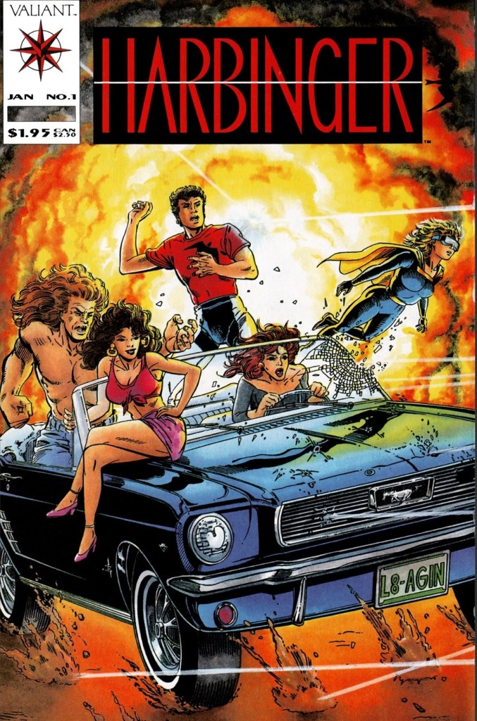
With those details laid down, here is a look back at Harbinger #1, published in 1992 by Valiant Comics with a story written by Jim Shooter and drawn by David Lapham.

The cover.

Early story

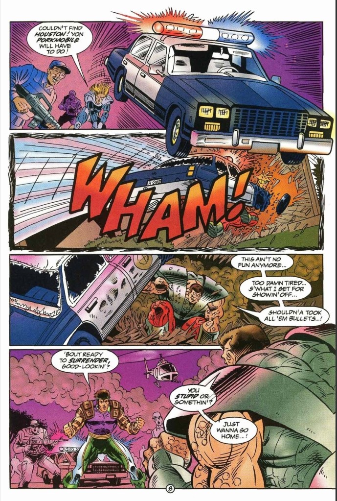
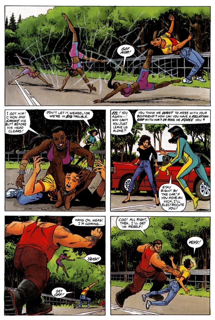
The story begins at 2:35 PM of June 2, 1991. Pete and his companion Kris are riding a car floating high above the road being followed by a helicopter. After Pete manages to communicate with the helicopter’s operators, they even settle down by landing on a road with no traffic. As Pete and the helicopter people begin talking, three people – Weasel, Eel and Lump – quickly rushed in to subdue Pete and Kris. After Pete manages to free himself from Weasel and Lump, he uses his power to lift up the car Kris drove (note: Kris is no longer in the car) and uses it as a weapon to hit Lump.

Just as Kris hits Eel on the stomach, Pete notices that the gasoline was leaking out of the car which Eel ignites with her electricity causing a huge explosion. Pete and Kris managed to survive the blast and together they fly off to a motel to rest and reorganize themselves.

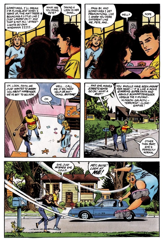
The next morning, they have a meal together and Kris examines a newspaper. She notices another one of the Harbinger Foundation’s print ads reaching out to people who find themselves different or notice strange things around them. The two fugitives realize that the said foundation somehow made involved youth become dangerous. Remembering that people write and send letters to the Harbinger Foundation, Pete comes up with the idea of intercepting letters…

Quality

Pete, Kris and Faith.

This is one very engaging story to read. While story concepts about super-powered teenagers being desperate and struggling to realize their purpose while facing evil is not new, this comic book has a concept that remains unique even by today’s standards. Instead of seeing a group of powered teenage outcasts escaping society’s authorities or taking refuge in the home of a caring person, this comic book follows teenagers who are being targeted by a powerful organization as one of them – Pete – personally got involved with them before.

The story written by Jim Shooter is deliberately paced at a moderate level which allows readers to be able to absorb the details before moving from one chapter to the next. Along the way, Kris and Pete get to meet other powered characters like Faith, Flamingo and John. In between the introductions of the three mentioned characters, Shooter’s script managed to set up enough space for character development and interactions between the characters which have been executed to be believable. Even key elements of youth such as insecurity, fear, angst and the false sense of maturity are portrayed along the way. I should state that Shooter dramatized these characters like they were real people.

As for the Harbinger Foundation itself, it complete lacks visibility and its exposure was limited to the print ad and mentions. Still, the foundation is a clear and present danger to Pete and his companions as it has powered youth members who are dedicated to it and they also have heavily armed personnel working for them.

If you are fond of superhero spectacle, I can say that the action scenes were executed in accordance to the narrative. The spectacle of this comic book was clearly made to emphasize the plot elements and not serve as eye candy. That being said, this is a unique way of enjoying superhero spectacle.

Conclusion

The Harbinger Foundation’s pawns Weasel, Eel and Lump take on Pete and Kris.

Harbinges #1 (1992) is a pretty engaging comic book of Valiant and at the same time it is also one of the more unique portrayals of powered teenagers who are living with tremendous odds tilted at them. The tone of the story really felt grounded in reality (the early 1990s specifically) and the character moments, action and incidents were all executed in a believable fashion.

Overall, Harbinger #1 (1992) is highly recommended!

+++++

Thank you for reading. If you find this article engaging, please click the like button below and also please consider sharing this article to others. If you are looking for a copywriter to create content for your special project or business, check out my services and my portfolio. Feel free to contact me with a private message. Also please feel free to visit my Facebook page Author Carlo Carrasco and follow me on Twitter at  @HavenorFantasy as well as on Tumblr at https://carlocarrasco.tumblr.com/ and on Instagram at https://www.instagram.com/authorcarlocarrasco/

A Look Back at Ultraverse Year One (1994)

Disclaimer: This is my original work with details sourced from reading the comic book and doing personal research. Anyone who wants to use this article, in part or in whole, needs to secure first my permission and agree to cite me as the source and author. Let it be known that any unauthorized use of this article will constrain the author to pursue the remedies under R.A. No. 8293, the Revised Penal Code, and/or all applicable legal actions under the laws of the Philippines.

Welcome back superhero enthusiasts, 1990s culture enthusiasts and comic book collectors! Today we go back to the mid-1990s which was a pretty wild time for comic collectors. To be more specific, this newest retro review revisits the Ultraverse through a comic-like publication in the form of a guide meant for UV fans and comic collectors.

The subject at hand is Ultraverse Year One which, as written on the edge of the front cover, was designed to be the “complete guide to the Ultraverse’s first year.” It is a reference guide for those who seriously want to discover each and every Ultraverse comic book that was published during its first year. In my experience as a comic collector, the Ultraverse launch in 1993 was very memorable even though my financial limitations prevented me from acquiring each and every launch comic book and subsequent releases of the time. How useful is this complete UV guide? We can go on and find out.

With those details laid down, here is a look back at Ultraverse Year One, published in 1994 by Malibu Comics.

The cover.

Quality

I can say without a doubt that this publication is indeed a complete guide to each and every Ultraverse comic book released during its first year from 1993 to 1994 specifically. You want to know exactly how many issues of Mantra, Prime, Hardcase, The Solution, Prototype, The Strangers and others were published in the first year? This one has it all listed! You want to know which UV comic book involved the talents of Steve Gerber, Norm Breyfogle, Rick Hoberg, Len Strazewski, Aaron Lopresti, George Perez, James Hudnall, Gerard Jones, Steve Englehart, Tom Mason, Terry Dodson, James Robinson, Howard Chaykin, Mike W. Barr and many others under the Malibu Comics banner? This guide has it all listed! What months were Exiles #1, Sludge #1, Firearm #0, Break-Thru #1 and Mantra #1 were published? The answers to each are included. The same can also be said when it comes to which characters appeared in each comic book.

This is what each page typically looks like with details of the Ultraverse timeline on the lower part.
The timeline reveals that the male warrior Lukasz, who would later end up in woman’s body as Mantra/Eden Blake, was born in 1220 BC.

Very clearly, the Malibu Comics people worked hard to collect the essential types of information, organized them and put them all into print media form for readers and collectors to use when it comes to searching just about everything about the Ultraverse’s first year. Things did not just stop there, however.

What I found amusing to look at in each page of this Ultraverse guide are details of the shared universe’s timeline posted on the lowest part. The said timeline – which is limited to text and numbers – reveal interesting details such as what year was Lukasz (AKA Mantra) born, when did Rune begin, when was the Choice corporation established, what year did the island of Yrial’s people move up to the clouds, what years were infants injected by Wetware Mary and more. These details are actually quite encouraging to make readers discover or re-read Ultraverse comic books to see how they are dramatized on paper.

Conclusion

As you can see in the details above, Len Strazewski was involved in both the Prime and Prototype comic book series.

Ultraverse Year One (1994) is a pretty detailed guide that will not only help readers track down each and every UV comic book of the mentioned time period, but also help them spot the precise comic books that has characters included as well as the published works of varied comic book creators. If you are really determined to track down and buy all the Year One UV comic books, this guide is a must-have. If there are any weaknesses to mention, it would be the fact that each comic book’s entire plot got summarized in full which are actually spoilers.

Overall, Ultraverse Year One (1994) is recommended.

+++++

Thank you for reading. If you find this article engaging, please click the like button below and also please consider sharing this article to others. If you are looking for a copywriter to create content for your special project or business, check out my services and my portfolio. Feel free to contact me with a private message. Also please feel free to visit my Facebook page Author Carlo Carrasco and follow me on Twitter at  @HavenorFantasy as well as on Tumblr at https://carlocarrasco.tumblr.com/ and on Instagram at https://www.instagram.com/authorcarlocarrasco/

A Look Back at Exiles #2 (1993)

Disclaimer: This is my original work with details sourced from reading the comic book and doing personal research. Anyone who wants to use this article, in part or in whole, needs to secure first my permission and agree to cite me as the source and author. Let it be known that any unauthorized use of this article will constrain the author to pursue the remedies under R.A. No. 8293, the Revised Penal Code, and/or all applicable legal actions under the laws of the Philippines.

Welcome back superhero enthusiasts, 1990s culture enthusiasts and comic book collectors! Today we go back to the mid-1990s which was a really wild time for comic collectors. To be more specific, this newest retro comic book review revisits Ultraverse through the very short series titled Exiles.

It has been years since I reviewed Exiles #1 (1993). Since after, I reviewed a lot of Ultraverse comic books and went through notable storylines such as the Atalon Saga in UltraForce, the Hostile Takeover in Prototype, The Solution, The Night Man and Solitaire, and more. That being said, it was just right that I returned to Exiles for retro reviewing.

With those details laid down, here is a look back Exiles #2, published in 1993 by Malibu Comics with a story written by Steve Gerber and drawn by Robb Phipps.

The cover.

Early story

The story begins with Exiles members Catapult and Mustang staring at two bodies (a large man and a lady) on the floor. It turns out their mission was a failure as Timmy Halloran (the young guy they tried to save) went missing while his mother just died.

As soon as the two step out of the house feeling bad about their failure, they suddenly find themselves confronted by several police officers. Police cars and a helicopter have surrounded the place. Just as Catapult and Mustang turned themselves in, the large man named Bruut suddenly regains consciousness and attacks the police.

The police officers respond by firing several bullets at Bruut which slowed him down. After noticing that Bruut was only regaining his strength, the two Exile members made their moves before the large man strikes the police…

Quality

Inside the headquarters of Exiles. Ghoul’s mentioning of Prime and Hardcase seems to foreshadow his eventual part in UltraForce.

As expected, the storytelling in this comic book really progressed and paid off some of the build-up that happened in issue #1. Here, the conflict between the Exiles and the enhanced forces of business tycoon Victor Kort got clearly defined and what they have in common other than having enhanced beings is their pursuit of individuals who carry within their bodies the Theta virus which unlocks unexpected powers or capabilities. Such developments could impact the people and the world around them when left unguarded or deliberately developed with assistance of guidance.

Amber, who was a key figure in issue #1, appears much less in this comic book but her purpose with the Exiles gets more elaborated. The lack of spotlight on Amber is not surprising as the creators had to emphasize the conflict between the titular team and Kort’s forces while also introducing Timmy Halloran as a new Theta-carrying individual.

There is a good amount of superhero spectacle here and along the way, the dialogue is good and got witty as well. By the time I reached the end, I found myself anticipating what would come next in issue #3.

Conclusion

The two Exiles members take on Bruut right in the presence of police officers.

Exiles #2 (1993) is a worthy follow-up to its predecessor and the creators succeeded in making the conflict more engaging while cleverly releasing new details that defined what is at stake and what could follow. In retrospect, Amber Hunt later became a key figure in the 2-part Break-Thru crossover storyline (which was memorably drawn by the late George Perez) and the story here defined how much impact super beings can have on societies filled with mostly people who don’t have super powers or special talents. The conflict between the Exiles and Kort’s forces not only got emphasized a lot, their respective agendas and resources are also well defined.

Overall, Exiles #2 (1993) is recommended.

+++++

Thank you for reading. If you find this article engaging, please click the like button below and also please consider sharing this article to others. If you are looking for a copywriter to create content for your special project or business, check out my services and my portfolio. Feel free to contact me with a private message. Also please feel free to visit my Facebook page Author Carlo Carrasco and follow me on Twitter at  @HavenorFantasy as well as on Tumblr at https://carlocarrasco.tumblr.com/ and on Instagram at https://www.instagram.com/authorcarlocarrasco/

A Look Back at Sludge #10 (1994)

Disclaimer: This is my original work with details sourced from reading the comic book and doing personal research. Anyone who wants to use this article, in part or in whole, needs to secure first my permission and agree to cite me as the source and author. Let it be known that any unauthorized use of this article will constrain the author to pursue the remedies under R.A. No. 8293, the Revised Penal Code, and/or all applicable legal actions under the laws of the Philippines.

Welcome back, superhero fans, 1990s arts and culture enthusiasts and comic book collectors! Today we revisit the Ultraverse of Malibu Comics and examine one of its many stories told through an issue of the Sludge comic book series.

In my previous retro review, the “Street Wars” storyline came to a solid and even shocking end which ultimately left Sludge free and yet desperate and unfulfilled. At this stage, Sludge is clearly a very lost soul and this opens another opportunity for readers to follow him and see where he will go next.

With those details laid down, here is a look back at Sludge #10, published by Malibu Comics in 1994 with a story written by Steve Gerber and drawn by Robb Phipps.

The cover.

Early story

The story begins with Sludge once again alone in the sewers. This time, he holds large quantities of the illegal substance Zuke which he believes will help him achieve something he desires in relation to his existence. Life has been very hard for him since he became a slimy creature.

Then he remembers when the mercenary Bloodstorm was forced fed with Zuke. Afterwards, he consumes the large Zuke containers expecting them to fix him. Nothing happened. No instant results whatsoever which frustrates him. Sludge then walks into the darkness.

On the city street, police officers in cars chase an unusual target…a lady riding a large bird of unknown species. After causing her pursuers to crash and explode, the lady rider reveals herself to be Vinaigrette.

Just as Vinaigrette and her speedy bird move into an alley, Sludge sees them…

Quality

Investigative journalism being done.

When it comes to the story, I can say that the Sludge series really made a serious turn towards a different direction here. Without spoiling the rest of the plot, I can say that very significant changes await readers, so much so their usual expectations towards Sludge become unnecessary. Are you so used to seeing Sludge think or talk inconsistently? Be ready for something really new about him, something that makes him more human moving a bit closer to his past life as a civilian.

Moreover, with the gang war aspect of New York already out of the narrative, this comic book not only follows Sludge more significantly, its story is also more character-driven than before. What Steve Gerber wrote here is very nicely structured and it is also clear he also adjusted his portrayal of the titular character to give readers something fresh and yet familiar to follow.

So what kind of story does this comic book present other than being a more character-driven piece? Definitely it’s not a monster story nor a superhero tale but something more of a misadventure mixed with elements of detective story plus a bit of investigative journalism (mainly due to the series’ notable lady journalist).

Conclusion

A lady and her speedy ride.

In my view, Sludge #10 (1994) is a successful attempt by the creative team to emphasize Sludge’s exploits and personality even more while taking a new direction without ever feeling alienating. I should state that after reading back-to-back issues about the New York gang war which had the titular character caught in the middle, this comic book’s character-driven approach with Sludge is literally like a breath of fresh air. Not only will you see even more of Sludge, you will also enjoy the creators’ attempt on exploring his past life while showing lots of significant new things in connection to the changes he goes through. The story is nicely paced, the storytelling is creatively stylized and there are nice pay-offs for each build-up.

Overall, Sludge #10 (1994) is highly recommended.

+++++

Thank you for reading. If you find this article engaging, please click the like button below and also please consider sharing this article to others. If you are looking for a copywriter to create content for your special project or business, check out my services and my portfolio. Feel free to contact me with a private message. Also please feel free to visit my Facebook page Author Carlo Carrasco and follow me on Twitter at  @HavenorFantasy as well as on Tumblr at https://carlocarrasco.tumblr.com/ and on Instagram at https://www.instagram.com/authorcarlocarrasco/

A Look Back at Wolverine #75 (1993)

Disclaimer: This is my original work with details sourced from reading the comic book and doing personal research. Anyone who wants to use this article, in part or in whole, needs to secure first my permission and agree to cite me as the source and author. Let it be known that any unauthorized use of this article will constrain the author to pursue the remedies under R.A. No. 8293, the Revised Penal Code, and/or all applicable legal actions under the laws of the Philippines.

Welcome back, superhero enthusiasts, comic collectors, 1990s culture enthusiasts and fans of the X-Men! We go back to the year 1993 when the 30th anniversary of the X-Men was celebrated with the 6-part Fatal Attractions storyline. Already I reviewed Uncanny X-Men #304 (Part 3) which was not worthy of the X-Men’s 30th anniversary celebration. X-Men #25 (Part 4) meanwhile was not only great but also shocking and had a years-long impact on X-Men comics.

So now the focus is on the 5th chapter of the Fatal Attractions storyline handled by the Larry Hama-Adam Kubert team on the Wolverine monthly series of the time. With those details laid down, here is a look back at Wolverine #75, published by Marvel Comics in 1993 with a story written by Larry Hama and drawn by Adam Kubert.

The cover.

Early story

The story begins in outer space. Carrying Charles Xavier, Wolverine, Gambit, Jean Grey, Rogue and Quicksilver (who participated in the dangerous mission in X-Men #25), the X-Men’s jet (piloted by Bishop) struggles mechanically as it was not designed for space travel. Worse, Wolverine is under very serious condition and the medical unit has been operating in full capacity dealing with his intense trauma.

In an attempt to alleviate Wolverine’s psychic trauma, Charles Xavier and Jean Grey enter his mind and discover that there is a world full of pain and horror. They see visions of a restrained Wolverine (from his Weapon X days) being attacked by Sabretooth and Lady Deathstrike. Xavier explains that they are at the epicenter of Logan’s most suppressed cataclysmic memories which were clearly triggered by the physical damage Magneto inflicted on him (see X-Men #25).

As the X-Men’s jet attempts to enter Earth’s atmosphere, its exteriors heat up dramatically shaking everyone inside. This complicates the situation on stabilizing Wolverine…

Quality

The other X-Men team members at their headquarters expressing worry and concern about the situation of their teammates struggling to come back home from space.

To be clear, this story continues the events of Fatal Attractions but with a bit more focus on Wolverine (compared to the earlier chapters of the storyline that is). There is no real battle between good and evil at all. It’s really all about Wolverine struggling to survive just as his teammates struggle to arrive home.

Before the stories of this comic book and X-Men #25 happened, Wolverine has often been portrayed to be very tough, brave and a walking machine of violence which has been reflected in other X-Men stories told in video games and movies. In this very comic book, Wolverine has been presented to coming close to death. This means Logan, at this particular stage of the history of the literary X-Men, was at his most vulnerable state. In my experience, this was both alienating and shocking to see.

With regards to the writing, Larry Hama did an excellent job with pacing the story from start to finish. Right from the beginning, the story pulls you into the X-Men’s tough situation and as each page gets turned, the tension as well as the suspense builds up until the execution of the climax. Along the way, the comic book not only portrays Wolverine struggling on the edge, it also works to make you care more or be more concerned towards him. Oh yes, the shocking moment near the end of this comic book remains very powerful and you who read this retro review should read Wolverine #75 and see it for yourselves.

Conclusion

Wolverine at his most vulnerable state.

By today’s standards, Wolverine #75 (1993) is still a very great comic book to read. In fact, I can say it is not only one of most defining chapters of the Fatal Attractions storyline as well as one of the most significant X-Men comic books of the 1990s, it is indeed a true illustrated literature classic ever published by Marvel Comics. In retrospect, this comic book marks a major turning point in the life of Wolverine who is still one of the most iconic characters in all of superhero literature. All of these were achieved thanks to the creative team of Larry Hama and Adam Kubert (whose are here was great and stylized at the same time). Hama succeeded in writing the continuation of the Fatal Attractions storyline while balancing all of the exposition and still putting Wolverine in the center. That itself is a very great work of writing.

If you are seriously planning to buy an existing hard copy of Wolverine #75 (1993), be aware that as of this writing, MileHighComics.com shows that the near-mint copy of the regular edition costs $60 while the near-mint copies of the signed-and-numbered edition and the newsstand edition cost $300 and $180 respectively.

Overall, Wolverine #75 (1993) is highly recommended!

+++++

Thank you for reading. If you find this article engaging, please click the like button below and also please consider sharing this article to others. If you are looking for a copywriter to create content for your special project or business, check out my services and my portfolio. Feel free to contact me as well. Also please feel free to visit my Facebook page Author Carlo Carrasco and follow me at HavenorFantasy@twitter.com

A Look Back at X-Men Adventures #7 (1993)

Disclaimer: This is my original work with details sourced from reading the comic book and doing personal research. Anyone who wants to use this article, in part or in whole, needs to secure first my permission and agree to cite me as the source and author. Let it be known that any unauthorized use of this article will constrain the author to pursue the remedies under R.A. No. 8293, the Revised Penal Code, and/or all applicable legal actions under the laws of the Philippines.

Welcome back, X-Men fans, superhero enthusiasts, 1990s culture enthusiasts and comic book collectors! Today, we take a look at the topic of slavery and its connection with the mutants within the universe of Marvel. To be more specific, slavery was emphasized in one of the episodes of the popular X-Men animated series which itself had a monthly series of comic book adaptations – X-Men Adventures!

With those details laid down, here is a look back at X-Men Adventures #7, published by Marvel Comics in 1993 with a story written by Ralph Macchio and drawn by Chris Batista.

The cover.

Early story

The story begins in Genosha, an island nation where mutants are designated as slaves constantly monitored by armed personnel of the state. X-Men team members Gambit, Storm and Jubilee are forced to do hard labor as they have been rendered powerless (with high-tech collars on their necks). Along with many other mutants, they are working on a key infrastructure project of the state.

As soon as the local authorities deactivated the collars of the slaves, Storm immediately attempts to escape by flying. Immediately, the collar on her neck got reactivated which neutralized her powers and caused her to fall down to the water below. As soon as she climbs up on a rock to rest, a cable wraps itself on her right leg. Suddenly, a huge Sentinel rises above the water and pulls her…

Quality

The money shot!

Like the TV episode it was based on, this comic book does a decent job of portraying slavery and oppression with mutants in mind while avoiding the very sensitive topic of racism. To see Gambit, Storm and Jubilee portrayed as much more vulnerable characters is a nice change from their usual portrayals. While the story has a strong slavery theme, it also sheds light on the ongoing, secretive development of the Sentinels program which clearly emphasizes the growing danger that await not only the X-Men (the prime target of Trask and his team) but mutants in general.

When it comes to the art, Chris Batista did a nice job drawing not only the characters (all recognizable) but also their surroundings, the Sentinels and the framing of action scenes.

Conclusion

Gambit, Storm and Jubilee as slaves on Genosha.

I personally find X-Men Adventures #7 (1993) somewhat fun and slightly engaging to read. As this is an adaptation of the X-Men animated series episode about Genosha and mutant slavery, it clearly has a strong wholesome approach to its presentation. That being said, its depth is actually limited as it presented its themes with younger readers and new X-Men readers in mind. Unsurprisingly, the action is limited and was portrayed to avoid violence. If you want a more serious and grittier portrayal of Genosha and mutant slavery, you should read Uncanny X-Men #235 to #238, and the X-tinction Agenda storyline.

If you are seriously planning to buy an existing hard copy of X-Men Adventures #7 (1993) be aware that as of this writing, MileHighComics.com shows that the near-mint copy of the regular edition costs $30, while the near-mint copies of the newsstand edition and the Greek edition cost $90 and $200 respectively.

Overall, X-Men Adventures #7 (1993) is satisfactory.

+++++

Thank you for reading. If you find this article engaging, please click the like button below and also please consider sharing this article to others. If you are looking for a copywriter to create content for your special project or business, check out my services and my portfolio. Feel free to contact me as well. Also please feel free to visit my Facebook page Author Carlo Carrasco and follow me at HavenorFantasy@twitter.com

A Look Back at Star Wars: Shadows of the Empire #1 (1996)

Disclaimer: This is my original work with details sourced from reading the comic book and doing personal research. Anyone who wants to use this article, in part or in whole, needs to secure first my permission and agree to cite me as the source and author. Let it be known that any unauthorized use of this article will constrain the author to pursue the remedies under R.A. No. 8293, the Revised Penal Code, and/or all applicable legal actions under the laws of the Philippines.

Way back in the mid-1990s, something special happened for Star Wars fans. A brand-new story involving Star Wars icons Luke Skywalker, Darth Vader and others would be told set between The Empire Strikes Back and Return of the Jedi. That story was called Shadows of the Empire and it was released as a special event in the form of a novel (written by Steve Perry), a video game on Nintendo 64 and PC, comic books, a soundtrack, posters, model kits, toys and action figures. What was missing here was a live-action movie.   

To put things in perspective, the Shadows of the Empire multi-media event was done by Lucasfilm (note: when creator George Lucas was still in control) with its many business partners to reinvigorate the Star Wars franchise ahead of the planned special editions of the original Star Wars movie trilogy. From a business point-of-view, it made sense to release something new for fans to enjoy and more notably it was the chance for Lucasfilm and its creators to explore what happened between The Empire Strikes Back and Return of the Jedi.

A limited comic book series was released in 1996 and it involved the novel’s author as a story consultant. Back in those days, my comic book interest faded temporarily and even though I was still into Star Wars, I did not bother to buy and read the Shadows of the Empire comic books. The video game caught my attention a lot more back then. Fortunately, I found copies of the comic books and had the time to read them recently.

With those details laid down, here is a look back at Star Wars: Shadows of the Empire #1, published by Dark Horse Comics in 1996 with a story written by John Wagner and drawn by Kilian Plunkett.

The cover.

Early story

The story begins with a group of Rebel spaceships traveling together in the depth of space. Luke, who now has a mechanical hand and has been recovering from the terrible ordeal he went through at Cloud City, is with Princess Leia, C3PO and R2D2 in the medical frigate. The Rebels detect the presence of an approaching ship which they suspect to be hostile.

Luke suddenly decides to take action but is halted when he realizes that his X-wing fighter is still being refitted. In space, Wedge and the Rogue Squadron fly towards the Imperial Strike Cruiser which then releases some Tie Fighters. The personnel inside the Strike Cruiser tried to inform Darth Vader the location of the Rebel fleet…

Quality

Darth Vader!

The first thing I want to mention is that the writing done by John Wagner is solid. That being said, the story itself felt like a natural continuation of The Empire Strikes Back especially when the comic book’s narrative is focused on Luke and the Rebels. The way the recovering Luke, Leia and the two droids were presented following the end of the 1980 movie was believable, and there was that nice touch of characterization when Luke has not yet adjusted with his mechanical hand.

The story then moves into new territory when the narrative shifts on the Imperial side, especially when Emperor Palpatine gives Darth Vader a new order that has nothing to do with pursuing Luke and the weakened Rebels, but more to do with the construction of the Empire’s new weapon. This is also where the new character Xizor comes in and his presence alone confirms something that the movies did not…the Empire is in business with crime syndicates with regards to major projects.

Space ship battles look great in this comic book.

When it comes to characterization, I like the way Darth Vader handled himself when communicating with Emperor Palpatine who viewed Luke’s escape from Bespin a failure on his part. Compared with his private communication with the Emperor in the 1980 movie, Vader bravely questions him about doing business with Xizor backed with his knowledge of the prince and the ties with Black Sun. Vader, who has been part of the Empire for a long time, knew well how risky it is for them to get involved with criminals especially when military cargo is involved.

As for the visuals, Kilian Plunkett does a decent job drawing the characters. While his take makes Luke recognizable and faltered a bit on capturing Leia’s look, his illustrations on Darth Vader, the Emperor and Xizor were really good. Where Plunkett exceled visually are the locations and surroundings, the machines and the space battles (some pages were drawn really dynamically).

Conclusion

This shows how Luke has not fully adjusted with his mechanical hand.

To put it clearly, Star Wars: Shadows of the Empire #1 (1996) has three narratives (the other is about Boba Fett carrying the frozen Han Solo) to build-up on and for a debut issue of a limited series, this one has strength in its execution complete with a good amount of creative stuff that will resonate with long-time Star Wars fans (and also those who love the original Star Wars movie trilogy). It succeeds in telling what happened shortly after the end of The Empire Strikes Back as well as establishing a new sub-plot with Xizor involved. By the time I finished this comic book, I was convinced to look forward to the next issue.

If you are seriously planning to buy an existing hard copy of Star Wars: Shadows of the Empire #1 (1996), be aware that as of this writing, MileHighComics.com shows that the near-mint copy of the regular edition costs $48 while the near-mint copy of the newsstand edition costs $144.

Overall, Star Wars: Shadows of the Empire #1 (1996) is recommended.

+++++

Thank you for reading. If you find this article engaging, please click the like button below and also please consider sharing this article to others. If you are looking for a copywriter to create content for your special project or business, check out my services and my portfolio. Feel free to contact me as well. Also please feel free to visit my Facebook page Author Carlo Carrasco and follow me at HavenorFantasy@twitter.com

A Look Back at Superman Annual #10 (1984)

Disclaimer: This is my original work with details sourced from reading the comic book and doing personal research. Anyone who wants to use this article, in part or in whole, needs to secure first my permission and agree to cite me as the source and author. Let it be known that any unauthorized use of this article will constrain the author to pursue the remedies under R.A. No. 8293, the Revised Penal Code, and/or all applicable legal actions under the laws of the Philippines.

Before DC Comics ended their original superhero multiverse with Crisis on Infinite Earths (1985-1986) to restart all over again, there were a whole lot of stories about Superman ranging from the dramatic stuff, the epic tales and right down to the most outlandish tales.

As a kid, I was fortunate enough to buy myself a copy of a 1984 Superman comic book, the cover of which really intrigued and caught my interest. It was a Superman annual comic book with a $1.25 cover price which was somewhat high at the time. Its cover showed the Man of Steel himself carrying a sword pointed up.

That image made me wonder: Why would Superman have to use a sword when he is so powerful and capable without weapons? Where did that sword come from? Who made it in the first place? Is the sword so special to Superman?

With those details laid down, here is a look back at Superman Annual #10, published by DC Comics in 1984 with a story written by Elliot Maggin and drawn by classic Superman artist Curt Swan.

The cover.

Early story

The story begins in a space where a group of diverse people composed of aliens and humans are gathered together watching a live video feed Superman on a large monitor above their heads. As it turns out, the Man of Steel is in space working to prevent meteoroids from entering the planet below him. He then speeds off into space heading back to Earth.

Along time ago deep in the galaxy, a big bang effect took place creating several new fragments in the vacuum of space and among them is a long, rough object that resembles a sword. As an unknown amount of time passed, the long object gradually turns into a smooth looking sword complete with a sharp blade and a letter “S” on one end that is the same as the one Superman carries. It is referred to as the sword of Superman!

In Metropolis, Clark Kent is passed by his officemate Jimmy Olsen who mentioned that he is rushing to interview the billionaire industrialist Oswald Mandias. Two days have passed and Jimmy Olsen remained missing. As his boss Perry White heads on to the office, Clark remains and changes into Superman when the coast got clear.

As the Man of Steel flies off into the city, a Galaxy Broadcasting live report on TV shows Lana Lang reporting from the Kennedy Space Center where the new space shuttle Magellan is about to make its first-ever commercial flight to launch a mysterious new communications satellite owned by Mandias Industries…

Quality

Clark Kent/Superman being a complete stranger to others added a lot to the story.
The sword led Superman to a book about the legend of King Arthur inside the city library.

Being an annual, I can say that the Sword of Superman story was well-written and nicely visualized by the creators which made it fun and engaging to read. It is a Superman story that further adds to his being an essential hero of the original DC Comics multiverse and a key factor here is the somewhat outlandish concept that the sword that he gained was an original material of the universe from the big bang and even had connections to the unseen omnipotent force.

This story is not a simple, straightforward tale about Superman gaining a weapon required to defeat the supervillain King Kosmos. In fact, the sword opens up events that made the Man of Steel reevaluate himself, his situation and the people around him. King Kosmos, who is a time-travelling villain from the future (first appearance in DC Comics Presents Annual #2), served not just merely as the opposition but also adds a good amount of complexity within the reality of the story. For one thing, it is very intriguing and also refreshing to see people of Metropolis (even Clark’s friend Jimmy Olsen) failing to recognize Superman and perceive him with fear. This is a one-of-a-kind story of Superman that must be read, even though it is not really an epic tale.

All throughout, there is a fine balance between spectacle and intrigue. If you pay close attention to the dialogue and details, you will understand the story better and enjoy the comic book more eventually.

Conclusion

The return of King Kosmos!

I personally enjoyed reading Superman Annual #10 (1984) the first time back in 1984. The fact here is that after re-reading it recently, I do confirm that it is still an enjoyable comic book to read, and I am not even a Superman fan anymore. That is quite something! This is indeed a really good piece of Superman history from the pre-Crisis era. It also touches on themes about omnipotence, how ordinary people react to people who wield great power, and being whole with the entire universe.

If you are seriously planning to buy an existing hard copy of Superman Annual #10 (1984), be aware that as of this writing, MileHighComics.com shows that the near-mint copy of the regular edition costs $35 while the near-mint copy of the newsstand edition costs $70.

Overall, Superman Annual #10 (1984) is recommended.

+++++

Thank you for reading. If you find this article engaging, please click the like button below and also please consider sharing this article to others. If you are looking for a copywriter to create content for your special project or business, check out my services and my portfolio. Feel free to contact me as well. Also please feel free to visit my Facebook page Author Carlo Carrasco and follow me at HavenorFantasy@twitter.com

A Look Back at X-Men 2099: Oasis

Disclaimer: This is my original work with details sourced from reading the comic book and doing personal research. Anyone who wants to use this article, in part or in whole, needs to secure first my permission and agree to cite me as the source and author. Let it be known that any unauthorized use of this article will constrain the author to pursue the remedies under R.A. No. 8293, the Revised Penal Code, and/or all applicable legal actions under the laws of the Philippines.

According to the online edition of Merriam-Webster Dictionary, an oasis is something that provides refuge, relief, or pleasant contrast. In the case of X-Men 2099, the open areas of the southwestern region of the United States is a dangerous place to be in even though they are free from oppressive systems of control that dominate cities. As such, it is the southwestern region in 2099 can be compared to the Old West in history where there are lots of desolate places as well as lots outcasts and outlaws. Unlike their mainstream counterparts, the X-Men of the far future are nomads and they don’t have a long-term place of residence they could call home. Considering how dangerous the region is for the mutants, a haven of peace, security and prosperity is always ideal to them but only if it is indeed real.

That is what we will explore in the one-shot comic book X-Men 2099: Oasis here.

But before proceeding with the review, it has to be emphasized first that the one-shot comic book which was made special with the painted art of the Hilderbrandt brothers Greg and Tim. For long-time X-Men 2099 scribe John Francis Moore, Oasis was like a big dream come true. When asked during an online interview about his recollections on making X-Men 2099: Oasis and working with the Hildebrandt Brothers, Moore stated:

I was a fan of the Hildebrandt’s fantasy illustration, and I was blown away when Joey told me that they wanted to do an X-men 2099 project. I met with them in Joey’s office and they were both really great guys. I think they said they really liked Bloodhawk, so I knew he’d be a major player in whatever story we developed. They didn’t enter the project with a lot of conditions. They seemed genuinely happy to get to play in this corner of the Marvel universe.

I can’t remember ever writing a full script for any of my Marvel work. I gave them a plot and sometime later received Xeroxes of pencil art (Hildebrant art!) to dialogue. Then it went back for them to paint, and they did a phenomenal job. I only wish that it could’ve been published before the 2099 line was axed. It was a beautiful book that I think was sadly under promoted.

To find out if it is any good, here is a look back at X-Men 2099: Oasis published in 1996 by Marvel Comics with a story written by John Francis Moore and painted art done by Greg and Tim Hildebrandt.

Cover
The cover.

Early story

The comic book begins with a flashback set in Hong Kong in the year 2090. A much younger Shakti/Cerebra is on the loose trying to reach a ferry to Kowloon with a plan to hide in the back alleys of Tsimshatsui. Suddenly Lokjaw intercepts her and grabs her. They had a short history together and Lokjaw insists that Shakti should be grateful to her father who raised her to run his bio-shops. After a brief chase, something hits Lokjaw who fell into the water. It turns out Ryu Kobolt helped Shakti, and he has been instructed by his boss to offer her asylum.

11
Luna and Skullfire explore a place.

In the present day of 2099 in New Mexico, Bloodhawk flies to his desert home not knowing he is being monitored. Two people, an old man with white hair and a lady, work together to stun the X-Men member and take him with them. A short time later, inside a high-tech facility, Bloodhawk wakes up finding himself restrained and being watched over by the lady and the old man. They tell him he is in the Promised Land, a place where the sins of the old world will be washed away. Using her powers, she touches Bloodhawk’s head and slowly turns him into his normal human form.

Meanwhile outside a deserted town near the border between Colorado and Kansas, Shakti, Tim/Skullfire and Luna arrive riding motorcycles. They are checking the potential presence of a mutant nearby…

Quality

15
Really great visuals by the Hildebrandt brothers!

It is very safe to say that this is one very ambitious X-Men 2099 story ever told by John Francis Moore. It sure has an epic concept showing that Oasis in the open region not only exists, but also serves as the closest thing humanity in America has to imitating Heaven built on top of the land. Oasis is the indoor paradise where mutants and humans gather together, live in peace and work together in tremendous ways that the X-Men could only hope to achieve in Halo City (note: this story is set some time after X-Men 2099 #25).

The titular place is clearly the centerpiece of the story backed with characters and threads from the past that explain how it got established. Part of the creation of Oasis is connected with Ryu Kobolt whom Shakti got close with many years back. Of course, someone else got involved with Ryu which directly connects with the creation of Oasis.

While it is also clear that the story took some inspiration from Christianity, I should say that the approach was done by rehashing old storytelling concepts like emphasizing a charismatic person who looks godly or messianic, people getting converted with ways that are not holy, false prophets misleading those seeking salvation, etc. With the ages-old concept of the mad scientists added, then there is conflict here for the X-Men to engage with. The story touches on themes like destiny, conversion, having the power to judge people and committing genocide.

As for the characters, John Francis Moore made the right move to utilize Shakti, Bloodhawk, Skullfire and Luna of the X-Men, however the other new characters such as Memphis, Pandora and Ryu pale in comparison with regards to importance (even though Memphis and Ryu each had a good amount of the spotlight and even some character development).

When it comes to the artwork, this is one great looking superhero, sci-fi story in painted form thanks to the Hildebrandt brothers! Not only is their painted art beautiful to look at, there are also eye-catching shots of scenery, very detailed facial expressions and a very lively presentation of the action scenes and explosions! Each and every character painted – specifically Shakti, Skullfire, Bloodhawk, Luna, Memphis, Pandora and Ryu – has that touch of visual realism (note: not photo realism) that make them look more human to the eyes (especially the X-Men members when compared to how they were drawn by Ron Lim and Jan Duursema in the monthly series). This is one great looking comic book and easily one of the very best of the X-Men of 2099!

Conclusion

16
The Oasis!

X-Men 2099: Oasis is a one-shot comic book that did not match its high ambition. While it has some of the best painted superhero art of the 1990s ever, the storytelling just did not engage me that much. For one thing, its approach on taking inspiration from Christianity is very flawed not only due to rehashing storytelling concepts but also due to the fact that everything – including the titular Oasis – had to be concluded already. Even though there was a build-up leading to a final conflict, the payoff was not that great and ultimately there was a sense of rush in the 2nd half of the story.

What is also disappointing is the fact that the events told here did not really impact Shakti, Skullfire, Luna and Bloodhawk at all, nor was there anything added to the narrative of the X-Men 2099 monthly series. This is too bad because the existence of a haven where people can live in and be protected from the prejudice and violence in the region fits nicely with the concept of X-Men 2099 in the first place. Even though there was a reference to issue #25 during the first half, this comic book ended up looking like a dream story or a parallel universe tale with a $5.95 cover price! It seems to me like this was more like a cash-grab attempt to exploit comic collectors and the fans of X-Men 2099.

If you are seriously planning to buy an existing hard copy of X-Men 2099: Oasis, be aware that as of this writing, MileHighComics.com shows that the near-mint copy costs $14.

Overall, X-Men 2099: Oasis is a serviceable one-shot comic book. That being said, if you really intend to buy it, you should not pay more than $5 for it.


Thank you for reading. If you find this article engaging, please click the like button below and also please consider sharing this article to others. If you are looking for a copywriter to create content for your special project or business, check out my services and my portfolio. Feel free to contact me as well. Also please feel free to visit my Facebook page Author Carlo Carrasco and follow me at HavenorFantasy@twitter.com

A Look Back at Spider-Man 2099 #35 (1995)

Disclaimer: This is my original work with details sourced from reading the comic book and doing personal research. Anyone who wants to use this article, in part or in whole, needs to secure first my permission and agree to cite me as the source and author. Let it be known that any unauthorized use of this article will constrain the author to pursue the remedies under R.A. No. 8293, the Revised Penal Code, and/or all applicable legal actions under the laws of the Philippines.

When Marvel Comics first launched the 2099 imprint of comic books showcasing many futuristic versions of their present-day characters – like Spider-Man, Ravage and Dr. Doom – it was inevitable that the same treatment will be applied to their popular supervillains.

In 1993, the 2099 version of Vulture was introduced and he sure proved to be one tough opponent for Spider-Man 2099. Even back then, there already was clamor for a futuristic version of Venom which at the time was riding high with readers being the featured anti-hero in several limited series (starting with Lethal Protector) of comic books.

Then in 1995, after doing a creative teaser in issue #34, Marvel formally introduced Venom 2099 by releasing Spider-Man 2099 #35. This is my review of the comic book written by Peter David and drawn by Andrew Wildman (X-Men Adventures).

Cover
The cover drawn by Rick Leonardi.

Early story

Picking up from the events of issue #34, the story begins in Washington, DC with Dana freeing herself only to find out that Alchemax’s CEO Tyler Stone was down suffering from a gun shot and losing blood. Minutes later, emergency personnel take Stone’s body for immediate treatment.

Meanwhile, Spider-Man 2099 (Miguel O’Hara) encounters the SHIELD flyboys in New York. After almost getting into trouble together, Spidey gets informed that US President Doom 2099 ordered them to leave him alone for a period of seventy-two hours while he considers a cabinet offer. Back in Washington, Dana gets interrogated by one of the authorities. President Doom enters the scene telling Dana that she will join Tyler Stone immediately in the medical center.

3
Andrew Wildman’s take on Spider-Man 2099 and the future was really nice to look at.

In New York, two guys sitting on the sidewalk witness a moving black liquid coming out of the sewer. The thing turns out to be a living symbiote (or alien costume) forming into a human-like shape – Venom 2099!

Quality

As with other comic books of this particular series, the writing by Peter David is pretty deep and engaging. The usual balance between dramatization, character development, plotting and spectacle is here once again but with a slight touch of horror in relation to the introduction of Venom of 2099. Speaking of dramatization, the portrayal of Venom 2099 as a vicious villain is similar to the 20th century Venom (Eddie Brock) but with a very powerful obsession to kill Miguel O’Hara and Tyler Stone.

Here’s an excerpt from the dialogue of Venom of 2099: Miguel O’Hara…and Tyler Stone…together again. We…I get to kill you…at the same time…how awfully…awfully…considerate. To show my appreciation…I’ll kill you slowly.

What makes this comic book unique is the artwork by Andrew Wildman who temporarily replaced regular illustrator Rick Leonardi. For comparison, I find Wildman’s art style a welcome thing in this comic book mainly because he draws with a lot more detail per panel and per page than Leonardi ever could. Instead of seeing the usual sketch-like art style of Leonardi, Wildman’s style is livelier and more expressive to look at. I also enjoyed Wildman’s visual take on Spider-Man 2099/Miguel O’Hara, Lyla, Tyle Stone, and the other established characters. Their facial expressions are also livelier to see.

9
Venom 2099 appears! Take note of the “liquid” at the edges of the page.

More on visuals, Wildman’s take on Venom 2099 is unforgettable. Like 20th century Venom, he has a dark suit, elongated jaw with rows of sharp teeth and an elongated tongue but with green acid dripping all the time. There are also those tentacles-like things that stretch from his body until the arms. Also his white-colored mask with large eyes make him look horrific.

Conclusion

Despite being shorter than the usual 22-pages, Spider-Man 2099 #35 is still a very engaging and fun old comic book to read. Its purpose was to build-up anticipation leading to the introduction of Venom 2099 was achieved nicely and the respective qualities of the writing and visuals are very good even by today’s standards. More on the presentation of Venom of 2099, it seems like Peter David took inspiration from movie director James Cameron on building-up tension and suspense before showing the villain. That’s a move I enjoyed in this comic book.

Overall, Spider-Man 2099 #35 is highly recommended. If you plan to acquire an existing and legitimate hard copy, be aware that the near-mint copy of it is over $100 for the newsstand version while the Rich Leonardi-drawn “Venom 2099 AD” cover version is priced at over $80 at MileHighComics.com as of this writing.


Thank you for reading. If you find this article engaging, please click the like button below and also please consider sharing this article to others. Also my fantasy book The World of Havenor is still available in paperback and e-book format. If you are looking for a copywriter to create content for your special project or business, check out my services and my portfolio. Feel free to contact me as well. Also please feel free to visit my Facebook page Author Carlo Carrasco and follow me at HavenorFantasy@twitter.com