Disclaimer: This is my original work with details sourced from reading the comic book and doing personal research. Anyone who wants to use this article, in part or in whole, needs to secure first my permission and agree to cite me as the source and author. Let it be known that any unauthorized use of this article will constrain the author to pursue the remedies under R.A. No. 8293, the Revised Penal Code, and/or all applicable legal actions under the laws of the Philippines.
Welcome back superhero enthusiasts, 1990s arts and culture enthusiasts, Marvel Comics fans and comic book collectors! Today we go back to the mid-1990s to explore the adaptation of the second season of the famous X-Men: The Animated Series (X-Men TAS) in the form of the X-Men Adventures comic book series.
Before getting to the new retro comic book review, I should state that it is indeed very challenging to implement the concepts of time travel and timeline conflicts into the narrative of an established X-Men universe. As far as the X-Men TAS narrative goes, Bishop and Cable are mutants who each came from different points in the future and in different ways they each made impact with the present day X-Men as portrayed in the comics (the literary X-Men specifically).
With those details laid down, here is a look back at X-Men Adventures Season II #8, published in 1994 by Marvel with a story written by Ralph Macchio and drawn by John Hebert. The is the 2nd chapter of the Time Fugitives storyline.
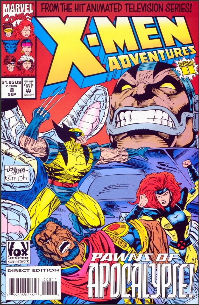
The cover.
Early story
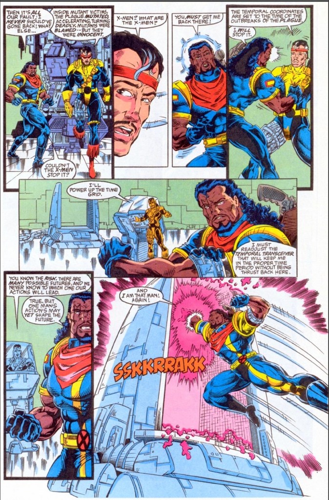
The story begins on Earth in the far future of 3999 AD. Cable, who has been leading the fight against Apocalypse, is receiving information from his cube-shaped computer which informs him that a temporal storm has wreaked havoc with the time stream and their present is reconfiguring in response to the existence of a new past. Once realignment gets completed, everyone in the current timeline will cease to exist. Cable then learns that Bishop (who returned to the X-Men in the previous issue) is the primary chronal component of the time readjustment.
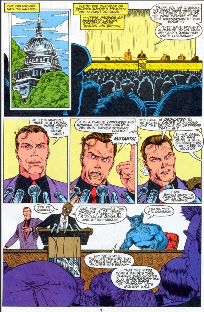
Meanwhile in the present day inside Xavier’s mansion, the X-Men listen to Bishop who explains that mutants will be blamed for the plague that a certain virus will precipitate and that the fear of the virus will make things much worse for many people. He states that the virus was not brought into being by mutants.
Beast then shares that his investigation of a viral-ridden cell sample was convincing and discovered that the virus was genetically engineered. He reveals that once the little germs spread to the mutant population and combine with mutant DNA, it could turn out incredibly deadly…
Quality
Conflict brewing in front of a huge audience.
To be straight to the point, what the creative team started in issue #7 got strongly concluded here. With the animated episode’s teleplay being the primary reference, writer Ralph Macchio successfully crafted a script that raised the stakes of the 2-part Time Fugitives story while tying closely the gaps with regards to the time travel and timeline conflicts concepts. Without spoiling the plot, I can say that one development that took place in the present day clearly set off the stage for another futuristic mutant to not only get involved but also make a huge impact on the narrative.
As with the previous issue, this story has elements of xenophobia as well as fear of viruses and potential massive infections which added a good layer of depth to the plot. Macchio’s writing is very strong and no matter how intense the tale got as more details got presented, it still remained very readable and efficient to follow. Also, I should say that Apocalypse’s presence turned out very powerful and it should inspire readers to search for comic books of the supervillain’s conflict with the X-Men and X-Factor for insight.
John Hebert returned on the visual department and his art style really works well with both the sci-fi concept of the story and the presentation of the X-Men plus Bishop and Cable. I really admire Hebert’s stylized take on Wolverine, Cable and Bishop as he made each them look even grittier than before. There is also this creepy vibe with the way Hebert drew some of the X-Men members’ faces. Herbert is also very good with visualizing sci-fi elements such as energy forms, futuristic machines, techno-virus forms on the skin, and more. His presentation of dynamic superhero action is great to look at. This is clearly one of the best looking issues of Season II of the X-Men Adventures series.
Conclusion
Bishop explains things to the X-Men and Beast confirms key details.
X-Men Adventures Season II #8 (1994) is a rock-solid comic book in terms of quality and impact. It concluded the 2-part story with a powerful resolution, it tied the loose ends in a very timely fashion and I really enjoyed the way how the X-Men were dramatized as Bishop and Cable got involved with them in their present day setting. So far, this is the most satisfying and more impactful issue of Season II I have read in this series.
Overall, X-Men Adventures Season II #8 (1994) is highly recommended.
Disclaimer: This is my original work with details sourced from reading the comic book and doing personal research. Anyone who wants to use this article, in part or in whole, needs to secure first my permission and agree to cite me as the source and author. Let it be known that any unauthorized use of this article will constrain the author to pursue the remedies under R.A. No. 8293, the Revised Penal Code, and/or all applicable legal actions under the laws of the Philippines.
Welcome back superhero enthusiasts, 1990s arts and culture enthusiasts, Marvel Comics fans and comic book collectors! Today we go back to the year 1993 and examine a small part of the Marvel Comics universe through a tale of the Amazing Spider-Man monthly series.
In early 1993, the supervillain and murderer Venom was in very high demand among Marvel readers and comic collectors. The Venom: Lethal Protector mini-series launched with issue #1 selling a lot of copies and it portrayed Spider-Man’s greatest enemy as a very twisted and violent makeshift hero who dedicated himself to protecting what he (Eddie Brock specifically) to innocent people. As Venom was one of the few supervillains who knew Spider-Man’s true identity, the creative team behind the Amazing Spider-Man series decided to raise the stakes temporarily by having him encounter Peter Parker’s parents (the ones that appeared in Amazing Spider-Man #365).
With those details laid down, here is a look back at Amazing Spider-Man #374, published in 1993 by Marvel Comics with a story written by David Michelinie and drawn by Mark Bagley.
The cover.
Early story
The story begins inside the bunker beneath the grounds of the deserted Brooklyn amusement park. As Eddie Brock struggles to lift a very heavy piece of equipment, the symbiote forms over his body helping him lift it up above the head. Venom is obsessed with killing Spider-Man and Eddie Brock remains totally bitter over the webslinger’s responsibility on destroying his career. Eddie sees a page of the Daily Bugle on the wall and it contains a news photo of Peter Parker with his mother and father.
At New York’s famous Central Park, Peter, wife Mary Jane and his parents enjoy quality time skating on ice. Aunt May is standing on a wooden platform watching them…
Quality
Lots of intense action scenes in this comic book for fans and readers to be entertained with. The action scenes are not mindless as they serve as reflections of Venom’s powerful quest for revenge.
To begin with, I can say that this tale by David Michelinie is a very intense and dramatic read and it added a new layer of depth into the enduring rivalry between Spider-Man and Venom. At this point in Marvel Comics’ shared universe history, the two icons have encountered each other so many times, the time was right for Michelinie to raise the stakes and have the elderly Parkers (note: Aunt May excluded) as the new targets of Venom (already made obvious on the cover which in turn added tremendous stress on the part of Spider-Man and his wife.
For the newcomers reading this, Eddie Brock’s journalistic career was destroyed over the Sin-Eater story as a result of Spider-Man’s public revelation of Stanley Carter as the said figure (note: Brock’s Sin-Eater article series was based on interviews with Emil Gregg who actually turned out to be a delusional neighbor of Carter’s).
As Brock’s life went way downhill with his reputation destroyed, his hatred of Spider-Man grew and so did his quest for revenge. That being said, what happened in this particular comic book was a very reflective extension of what happened years prior. Anyone who has basic knowledge of the origin of Venom and early appearances of Brock in comics will be able to understand the intensified rivalry in this tale.
Apart from the great story, this comic book has lots of superhero spectacle for readers to enjoy. That being said, the smashing action of the fight between Spider-Man and Venom was clearly made to be more violent which suitably reflected the supervillain’s lust for revenge. Spidey, meanwhile, had no choice but to avoid causing any more damage or harm as Venom goes after him in public surrounded with lots of bystanders. Along the way, you will see a key moment of the insanity of Venom which served as a useful pause of the fight. Finally, when it comes to the art, this comic book has some of the finest artworks I have seen from Mark Bagley.
Conclusion
At the time of this comic book’s publication, Venom was one of the few supervillains who knew Spider-Man and Peter Parker are one and the same person. The inclusion of Peter’s parents only added to the raising of the stakes.
Amazing Spider-Man #374 (1993) is undeniably a great read complete with intense action scenes, lots of intrigue and, most notably, a rock solid development of the Spider-Man-Venom rivalry. This is the kind of story that will compel long-time Spider-Man fans to revisit Venom’s origin as well as Spider-Man’s involvement with the Sin-Eater. At the same time, this tale will help readers understand the insanity and murderous mind of Venom that took place not only in the Venom: Lethal Protector mini-series in also other mini-series about the symbiotic killer that Marvel published throughout the 1990s.
Welcome back readers, fellow geeks and electronic gaming fans!
In this edition of the Retro Gaming Ads Blast (RGAB) series, we will examine print ads of Sega from the 1990s which was a notable period of time when they went from being a prominent video game company into a desperate, struggling entity by the end of the decade. All the Sega ads in this edition are promotions of their own video games that were exclusive to their consoles during the 1990s.
For the newcomers reading this, Retro Gaming Ads Blast (RGAB) looks back at the many print ads of games (console, arcade, computer and handheld) that were published in comic books, magazines, flyers and newspapers long before smartphones, social media, the worldwide web and streaming became popular. To put things in perspective, people back in the 1980s and 1990s were more trusting of print media for information and images about electronic games and related hardware.
With those details laid down, here is the newest batch of retro gaming print ads for you to see and enjoy…
1. Phantasy Star IV print ad
This was the last single-player Phantasy Star game released. There is no sign of Sega revisiting the franchise for another single-player experience.
Long before the emergence of online console gaming that involved a high number of players, Sega released Phantasy Star IV for the Genesis console in America in 1994 which was praised by gamers and critics. This one also turned out to be the last single-player role-playing game (RPG) of the Phantasy Star series as Sega eventually turned it into a series of online RPGs since the year 2000.
This print ad is significant because a lot of gamers today are not aware that Phantasy Star started as a series of single-player RPGs the same year Final Fantasy debuted in Japan. Anyone interested to play Phantasy Star IV on a modern console should buy the Sega Genesis Classics collection.
2. Eternal Champions print ad
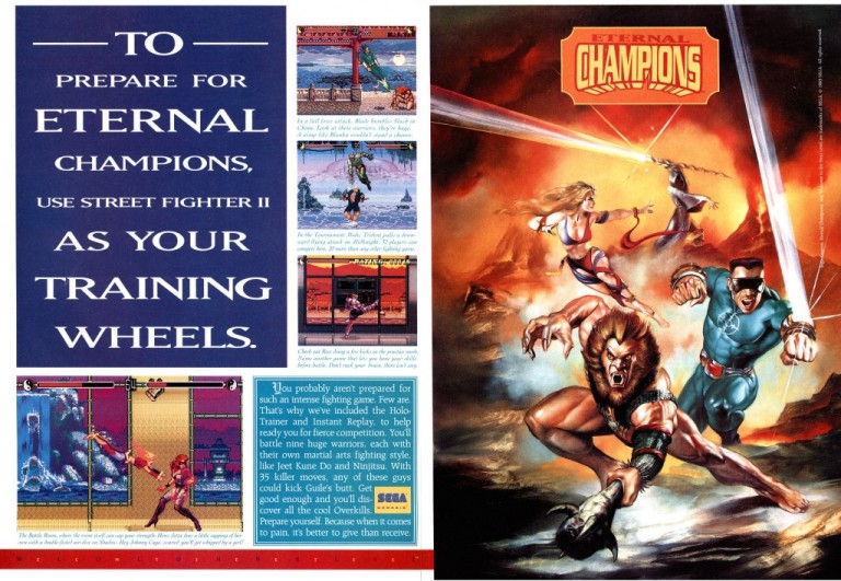
This 2-page print ad appeared in many comic books and some magazines that I read long ago.
Back in the 1990s, the fighting game genre became wildly popular with gamers at the arcades and on consoles at home. Capcom literally sparked a wild fire with the Street Fighter II game and its upgraded editions, and other companies went on to make their own 2D fighting games to cash in. Sega was one of them and they released their own 2D fighting game Eternal Champions for the Sega Genesis console.
Unsurprisingly, the game was marketed aggressively and this 2-page print ad really stood out as it had the great looking painted art on the right, screenshots and details of the game, and most notably made a sarcastic reference to Street Fighter II. Eternal Champions sold enough copies, it led to the release of the sequel Eternal Champions: Challenge from the Dark Side and two spin-off games. I can only guess that referencing Street Fighter II was helpful in achieving commercial success.
3. Streets of Rage 3 print ad
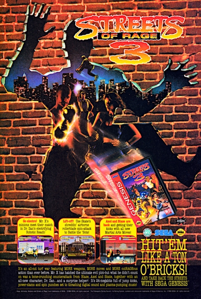
This ad caught my attention easily when I saw it in comic books I read.
Streets of Rage (Japanese title: Bare Knuckle) was one of the most defining game franchises Sega came up with and it started on the Sega Genesis console. It was a series of side-scrolling, 2D beat-them-up games that ensured action and excitement for gamers. As the first two games were critically and commercially successful, Sega was confident in aggressively marketing Streets of Rage 3 and the print ad seen had a very attention-grabbing artwork.
The artistic style emphasized power and intensity as it shows a damaged wall with the shape of a human body (symbolizing that someone was thrown through it) and then there were images of people on the other side. The game went on to attract mostly positive reviews although it paled in comparison to its predecessors in terms of sales.
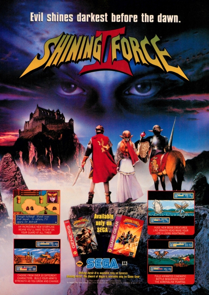
4. Shining Force II print ad
The first time I saw this ad, it made me interested to buy a Sega Genesis console to play it.
As Sega was so prolific with making and releasing games across different genres, they had their own tactical role-playing game series with Shining Force and the first game released on the Sega Genesis was a critical and commercial success. That being said, the company was confident with releasing Shining Force II on the same console more than a year later achieving critical and commercial success.
The North American print ad of the game had a visual presentation that closely captured the foreground-background style (characters facing the distance) used in-game, and the advertising team use photographic imagery to achieve a fantasy look. Very cleverly, Sega inserted the Sega Game Gear title Shining Force Shining Force: The Sword of Hajya into the ad. This print ad made me interested in acquiring a Sega Genesis for Shining Force II.
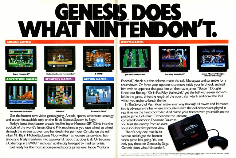
5. Genesis does what Nintendon’t print ad
With the famous line heavily emphasized, this print ad showed how bullish Sega really was in competing with Nintendo.
Now this print ad of Sega’s has the most definitive and best-known advertising line in the so-called 16-bit console generation: Genesis does what Nintendon’t. This was Sega’s aggressive marketing push to convince gamers to buy the Genesis console to play games and experience thrills of fun that they would not find on a Nintendo console at the time. Genesis was launched in America in 1989 with “16-bit” emphasized a lot, and the technological rival Super Nintendo Entertainment System (SNES) was released in the same market more than two years later.
The 2-year advantage helped Sega establish the Genesis as the next-gen machine for gaming at home and there were years in the 1990s when Sega’s console outsold Nintendo’s in America during the so-called 16-bit war. The Genesis also had lots of exclusive games plus strong software support from third-parties. While the SNES would eventually outsell the Genesis in other parts of the world, it was in America where Sega proved to be very competitive and successful.
6. Knuckles’ Chaotix print ad
Sega was aggressive with marketing this game for the 32X.
In late 1994, Sega released in America and in Japan the 32X which was an add-on device for the Sega Genesis designed enhance its power while serving as a transition (a warm-up) into the so-called 32-bit era of console gaming. The 32X was the result of corporate decisions involving the American and Japanese executives of the company.
To keep 32X customers happy and boost hardware sales, Sega adjusted the development of Knuckles’ Chaotix (a Sonic spin-off) from being a Sonic project 32-bit console Sega Saturn into a standalone game for the add-on device. Even though Sega knew the game’s development was rushed, they went on to strongly promote the game and the print ad shown here was quite eye-catching.
The image of a fist with a ring showing the character Knuckles (a character from the Sonic games) emphasizes power and the colors used seem to express intensity. Then there were the selected screenshots shown without descriptive text. Although Sega tried hard, Knuckles’ Chaotix (launched in 1995) received mixed-to-positive reviews and sadly sold poorly. Unsurprisingly, the sales of the 32X dropped further and by then a lot of consumers knew that the Sega Saturn (the true successor to the Genesis) was all set to launch in America and Europe within 1995.
7. Sonic 3D Blast for Sega Saturn print ad
Too bad Sega and its teams failed to make the true Saturn Sonic game.
Back in the 1980s and 1990s, having a high-quality, console-exclusive game featuring a company mascot was crucial to sell game consoles while keeping dedicated fans happy. Like what Nintendo did with their icon Mario, Sega achieved great commercial success with the three Sonic the Hedgehog games they released exclusively on the Sega Genesis console and this naturally created expectations they would make new Sonic games on the Saturn console. Unfortunately, Sega and its teams failed to complete development of the Saturn-exclusive game Sonic X-treme and the company cancelled it which sent shockwaves through the games industry news.
With the 1996 holiday shopping season too crucial to ignore, Sega commissioned a Saturn version of the game Sonic 3D Blast which was originally made for the Genesis console. Sonic 3D Blast on the Saturn took seven weeks to make and there were some graphical enhancements implemented. While Sonic 3D Blast’s Genesis version attracted a positive reception from critics (and sold 700,000 copies), the reception for the Saturn version was mixed. This print ad of Sonic 3D Blast on Sega Saturn is a reminder of the company’s failed attempt to take their icon to the next-generation. They never replicated the big success they had with Sonic on the Genesis.
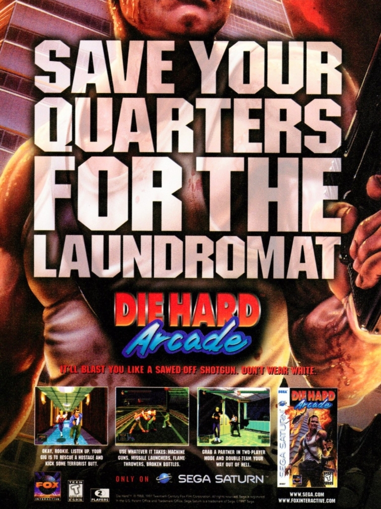
8. Die Hard Arcade print ad
Each time I saw this print ad, it easily reminded me of the classic action film of 1988.
Like many other movie franchises, Die Hard has many video game adaptations released through the decades. In 1997, Sega released Die Hard Arcade (Japanese title: Dynamite Deka) on the Sega Saturn and the game critics praised it for its fun gameplay as well as its flawless conversion of the arcade version (released in 1996). To say the least, the development history of Die Hard Arcade is not as straightforward as many would think. To get the details and explanations of the development of the game, click here.
As for the print ad itself, this one cleverly used official game art as the background with imagery which instantly reminded me of what I saw in the classic 1988 movie that starred Bruce Willis. This ad made me interested to buy a Sega Saturn or find a place to rent it to play the game.
9. Shenmue Japanese print ad
Simplistic with presentation and yet engaging to look at. The Dreamcast-exclusive Shenmue sold over a million copies in Japan alone.
When Shenmue was released exclusively on the Sega Dreamcast in Japan on December 29, 1999, it turned out to be a very mind-blowing experience for many gamers due to its ambitious game design, the intense attention to detail implemented, very high production values, in-depth exploration and very immersive gameplay.
It was the open-world game released at a time when “open-world” was not even a standard gaming term. Often called the masterpiece of the legendary game designer Yu Suzuki, Shenmue sold over 1.2 million copies in Japan and went on to be released worldwide in the months that followed. Sadly, the game failed to make a profit due to its very high budget of $70 million (which Suzuki himself said in English during an interview) and the fact that the number of Dreamcast units already sold to gamers was not massively high.
The Japanese print ad of Shenmue had a simplistic looking visual concept and yet it was engaging to look at because the way the characters appeared was how they appeared in the game during gameplay which was astounding. Take note that back in the 1990s, it was common for video game marketing materials to show human characters in high detail but in reality the polygonal models of those characters appeared looking blocky and much less detailed during gameplay.
Disclaimer: This is my original work with details sourced from reading the comic book and doing personal research. Anyone who wants to use this article, in part or in whole, needs to secure first my permission and agree to cite me as the source and author. Let it be known that any unauthorized use of this article will constrain the author to pursue the remedies under R.A. No. 8293, the Revised Penal Code, and/or all applicable legal actions under the laws of the Philippines.
Welcome back superhero enthusiasts, 1990s arts and culture enthusiasts, Marvel Comics fans and comic book collectors! Today we go back to the year 1991 to explore a chapter of the Uncanny X-Men series that took place between X-Tinction Agenda and Mutant Genesis (the modernization point of Marvel’s mutants for the 1990s).
For the newcomers reading this, X-Tinction Agenda was a very notable part of the history of the X-Men comic book franchise as it marked the first time that the X-Men, X-Factor and the New Mutants were combined and also reunited several X-Men members who were scattered around the world. That being said, the state of mutants within Marvel Comics’ shared universe created a sense of uncertainty towards Charles Xavier’s grand dream of establishing a peaceful co-existence between humans and mutants.
With those details laid down, here is a look back at Uncanny X-Men #273, published in 1991 by Marvel Comics with a story written by Chris Claremont and drawn by Whilce Portacio, Klaus Janson, Jim Lee, John Byrne, Rick Leonardi, Marc Silvestri, Michael Golden and Larry Stroman.
The cover.
Early story
The story begins in the control center within the complex located deep under the ruins of Charles Xavier’s mansion. Storm (X-Men), Jean Grey (X-Factor), Cyclops (X-Factor) and Cable (New Mutants) carefully examine the worldly forces that oppose them. After Storm asked about what they could do about the opposing forces located in different parts of the world, Cable says that they should hit them hard and fast as they have the power to do so.
Storm asked Cable if violence is his only solution. Even though violence got things done for Cable, Cyclops rejects it and states that his fellow mutants (pertaining to the X-Men and X-Factor) are not like him.
As the conversation intensifies, Jean Grey tells Cable that they are not warriors and the school was not founded by Professor X to have mutants to fight wars. Cable replied that war is what they got and reminded them of the two mutants they lost and another one who ended up as a genetically engineered slave. Cable asked them if they want to see more of their fellow mutants end up badly…
Quality
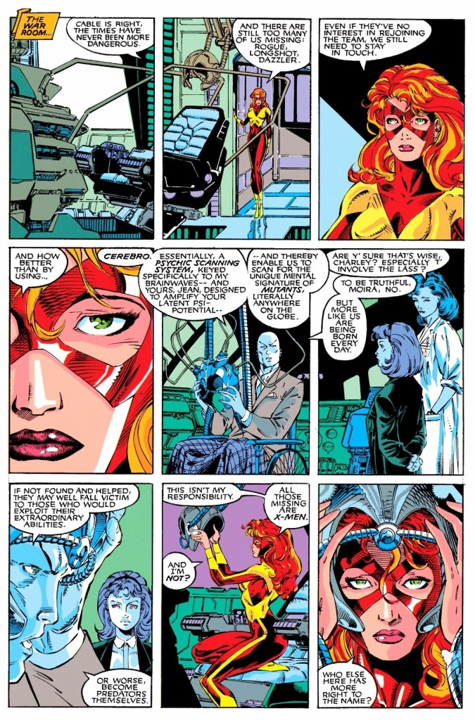
In the absence of Professor X, Jean Grey (then a member of X-Factor) revisits Cerebro and recalls what she learned long ago.
In relation to the mentioned fact that this particular story took place between X-Tinction Agenda and Mutant Genesis, this is a tale that reflects a period of transition leading to the latter. That being said, Chris Claremont took the opportunity to emphasize the current state of the X-Men and the other mutants, as well as the uncertainty ahead of them all. To be clear, this story does not have Marvel’s mutants going up against another super villain nor a group that opposes them.
The story opened very strongly with the leading figures of the X-Men (Storm), X-Factor (Cyclops and Jean Grey) and the New Mutants (Cable) being together analyzing the global situation and the forces that oppose them.
For Cable, violence is necessary for their survival and progress because he sees war against mutants already happening and there is simply no room left for error nor compromise. Very symbolically, Storm, Cyclops and Jean Grey – who all were nurtured by Professor X with his pacifist dream of bridging the gap between mutants and humans – reject Cable’s beliefs as they don’t see themselves as warriors and they do not dream of conquering their enemies at all. All the dialogue that took place in the argument are very richly written and there are layers of meanings which long-time X-Men fans will able to relate with.
Along the way, Claremont and the other creators made good use of available comic book space to develop the other characters which resulted in the gradual developments within each team of mutants. Gambit here is a brand new member of the X-Men and his talk with Storm is very sensible to read. There was also this notable Danger Room training session between Archangel and Cannonball in which the former (who is already very experienced as one of the original X-Men and a current member of X-Factor) shares wisdom to the very young mutant (who later went on to lead X-Force some time later). The creative team also inserted a few moments of humor on the other character development scenes.
Conclusion
Truly this is one of the most symbolic and most engaging arguments between the leading figures of the X-Men, X-Factor and New Mutants (which later became X-Force).
Even though it was mainly focused on character development and has no battle with any enemy, Uncanny X-Men #273 (1991) remained a very engaging read as it tackles not only the current state of the three mutant teams of the time but also realigned their direction creatively and the results were fully realized through the eventual Muir Island saga as well as Mutant Genesis and even in further tales (including Fatal Attractions). In many ways, this comic book served as a solid foundation of things to come and this partially explains the eventual reform of the X-Men into a much larger group that had to be composed of two teams shortly after the return of Professor X (as seen in X-Men #1 and Uncanny X-Men #281 in 1991).
Overall, Uncanny X-Men #273 (1991) is highly recommended.
Welcome back Xbox fans, geeks and gamers who love Japanese role-playing games (JRPGs)! In case you missed the news, Grandia HD Collection is now available for Xbox Series X, Xbox Series S and the aging Xbox One console and you can order the digital copy by clicking here.
For the newcomers reading this, Grandia HD Collection on Xbox consoles was officially released on March 26, 2024. It is a collection of two very solid role-playing games (RPGs) from the previous console generations, namely Grandia (originally released on Sega Saturn in Japan in 1997) and Grandia II (originally released on Sega Dreamcast in Japan in 2000). Although the said HD collection has been available for weeks, it was only very recently that an official Xbox trailer of it was published on the ID@Xbox YouTube channel and you can watch it right below…
Personally, I find it very strange why the trailer was released on the ID@Xbox YouTube channel instead of the official Xbox YouTube channel (as of this writing). Perhaps someone at Team Xbox confused the Grandia RPGs to be productions by small and independent studios which is wrong because both games were developed by Game Arts (the same team responsible for the Lunar RPGs and also a publisher of games). Right now, it seems that internal woke problems over at Team Xbox (for reference, click here, here and here) are preventing them from realizing the significance of Grandia and Grandia II.
Apart from the rather late Xbox trailer, a late Grandia HD Collectionannouncement was published on Xbox.com. To put things in perspective, posted below are selected excerpt from the Xbox announcement written by Gung Ho Online Community Coordinator Allyson Nicholas. Some parts in boldface…
I am excited to announce that the remaster of the classic role-playing series, Grandia HD Collection, has launched on Xbox One and Xbox Series X|S! Whether you are returning to these iconic games or entering these worlds for the first time, the series’ dynamic attack system, rewarding magic and skill progression, and immersive storylines offer dozens of hours of heroic adventures.
Getting You up to Speed on All Things Grandia – The Grandia HD Collection brings two role-playing games that have defined the genre for decades to come to contemporary audiences.
Screenshot from Grandia. The game has fully polygonal environments and the characters and creatures are presented as detailed 2D sprites.
Grandia follows Justin, a young adventurer who fatefully inherits a magic stone and thus sets out to uncover the mysteries of a lost civilization. In his search, he attracts all types of attention. Some good, in that he meets other adventurers who aid him along on his quest. However, some are bad, like the Garlyle Forces who work to keep him from unraveling the truth of the past.
Meet the Crew
Justin – Driven by his curious and fearless nature, Justin often dives headfirst into situations without thinking. He possesses the mysterious Spirit Stone—an artifact passed down through his family—which plays a pivotal role in his adventures.
Sue – Justin’s childhood friend from the town of Parm. She often joins him on his misadventures, bringing to them her courageous optimism and unexpected maturity that balances out Justin’s impulsiveness. She is almost always accompanied by her flying ball of fluff Puffy, who is as mysterious as he is adorable!
Feena – The most well-traveled of the bunch, Feena has an independent spirit and impressive skillset that garners the respect of those around her, especially Justin. As the journey unfolds, players delve deeper into her multifaceted character and mysterious past.
Screenshot of Grandia II showing Ryudo and his companions fighting a large monster. The characters and monsters are polygonal.
Grandia II acquaints us with Ryudo, a Geohound who does odd jobs to get money alongside his loyal eagle companion, Skye. One fateful day, he receives a request from the Church of Granas to serve as a bodyguard to one Elena, Songstress of Granas. Together, they bring out pieces of each other that neither of them knew existed amidst their journey to rid the world of Evil in the form of Valmar, God of Darkness.
Meet The Crew
Ryudo – A mercenary with a tough exterior and noble heart. He takes on various jobs for money—despite the moral implications—and is accompanied by his trusted bird companion, Skye.
Elena – The epitome of innocence and purity, Elena’s world is opened wide when she begins to journey alongside Ryudo.
Millenia – Uninhibited, playful, and mischievous, Millenia is a force to be reckoned with. Her origins and the nature of her existence cause her relationship with the party to take many interesting and unexpected turns.
Two fun Japanese RPGs now available for Xbox gamers to enjoy in a single collection.
For the Xbox fans who want to have a good amount of fun, there is a lot to be excited for this month and next month as Eiyuden Chronicle: Hundred Heroes (April 23) and Senua’s Saga: Hellblade II will be released on Xbox Series X, Xbox Series S, Windows PC and Xbox Game Pass (XGP) weeks apart. The good news is that Grandia HD Collection on Xbox is already available for anyone willing to purchase it. The Grandia RPGs are undeniably retro gaming highlights that RPG fans should play, especially now that both games have been remastered and enhanced with high-definition in mind.
Disclaimer: This is my original work with details sourced from reading the comic book and doing personal research. Anyone who wants to use this article, in part or in whole, needs to secure first my permission and agree to cite me as the source and author. Let it be known that any unauthorized use of this article will constrain the author to pursue the remedies under R.A. No. 8293, the Revised Penal Code, and/or all applicable legal actions under the laws of the Philippines.
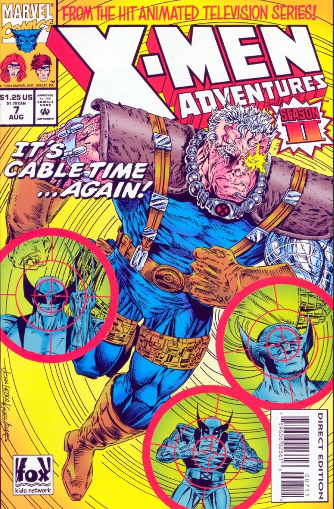
Welcome back superhero enthusiasts, 1990s arts and culture enthusiasts, Marvel Comics fans and comic book collectors! Today we go back to the mid-1990s to explore the adaptation of the second season of the X-Men animated series in the form of the X-Men Adventures comic book series.
Before getting to the new retro comic book review, I should state that decades ago, the use of future timelines was implemented on the X-Men comics. I’m talking about the possible future where Cable and Stryfe came from, another possible future where Phoenix/Rachel Summers came from, and the more established future of the classic Days of Future Past storyline. Time travel and possible future timelines are the themes in the next X-Men Adventures comic book I reviewed recently.
With those details laid down, here is a look back at X-Men Adventures Season II #7, published in 1994 by Marvel with a story written by Ralph Macchio and drawn by Scott Rosema.
The cover.
Early story
The story begins on Earth in the far future of 3999 AD. Cable, who is fighting for the rebels, battles the deadly forces of the powers that be. It turns out, he and his teammates have been struggling a lot and their team suffered several deaths already. Even though they are very tired and heavily outnumbered, Cable refuses to give up and bravely calls for a frontal assault against their enemies.
Suddenly, Apocalypse appears on the battlefield and commands his robotic troops to destroy Cable and his fellow rebels. To Apocalypse’s surprise, a temporal storm appears and Cable notices it appearing so close to them. One of his teammates got caught by the storm which pushes Cable away. After receiving computer updates, Cable decides to get away from the robotic troops.
Meanwhile in another time period and place, Bishop returns from his mission (his interactions with the X-Men of the 20th century – click here and here) only to discover from Forge that nothing has changed and the plague still rages on…
Quality
The X-Men have a new problem to deal with.
Having read X-Men Adventures #13 and #14 of season 1, I found this particular tale (clearly a sequel to Bishop’s interaction with the X-Men after traveling through time) relatable and enjoyable. There is a strong science fiction vibe here and the time travel aspect added a lot to the build-up of tension.
Bishop here is almost the protagonist as the story showed an altered future in which Forge has no memory of the X-Men and only made a reference to a plague that has lasted for a long time. This compels Bishop to go back to the 20th century again hoping to meet the X-Men and somehow prevent the plague from bringing down society.
The impact of the mysterious virus is tremendous as so many people got infected and authorities suspect mutants to be the carriers. At this stage, the social aspects inserted by the creators really started to grow stronger within the narrative and you will see the X-Men struggling with not only the increased scrutiny on mutants but also with the manipulative tactics of anti-mutant activists who can’t help but see golden opportunities to wipe out mutants in a more clever fashion.
The dialogue here is noticeably gripping to read and the dramatization worked accordingly. There is also a good amount of superhero spectacle to enjoy here even though the X-Men have no super villains to fight with.
Conclusion
Forge has no memory of the X-Men.
X-Men Adventures Season II #7 (1994) looks like a repeat or even a remake of what happened in X-Men Adventures #13 (Season I) but its concept turned out to be not only unique with strong social commentary and sci-fi elements, but also became really engaging thanks to the fine execution by the creative team. On the aspect of social relevance, this comic book will remind you about the internment of Japanese Americans in America (1942-1946) and the COVID-19 restrictions and the quarantine on communities imposed by governments that disrupted people’s lives. As this comic book marks the first part of the Time Fugitives, I can say that I enjoyed it and I’m looking forward to the next chapter.
Overall, X-Men Adventures Season II #7 (1994) is recommended.
Disclaimer: This is my original work with details sourced from reading the comic book and doing personal research. Anyone who wants to use this article, in part or in whole, needs to secure first my permission and agree to cite me as the source and author. Let it be known that any unauthorized use of this article will constrain the author to pursue the remedies under R.A. No. 8293, the Revised Penal Code, and/or all applicable legal actions under the laws of the Philippines.
Welcome back superhero enthusiasts, 1990s arts and culture enthusiasts, Marvel Comics fans and comic book collectors! Today we go back to the mid-1990s to explore the adaptation of the second season of the X-Men animated series in the form of the X-Men Adventures comic book series.
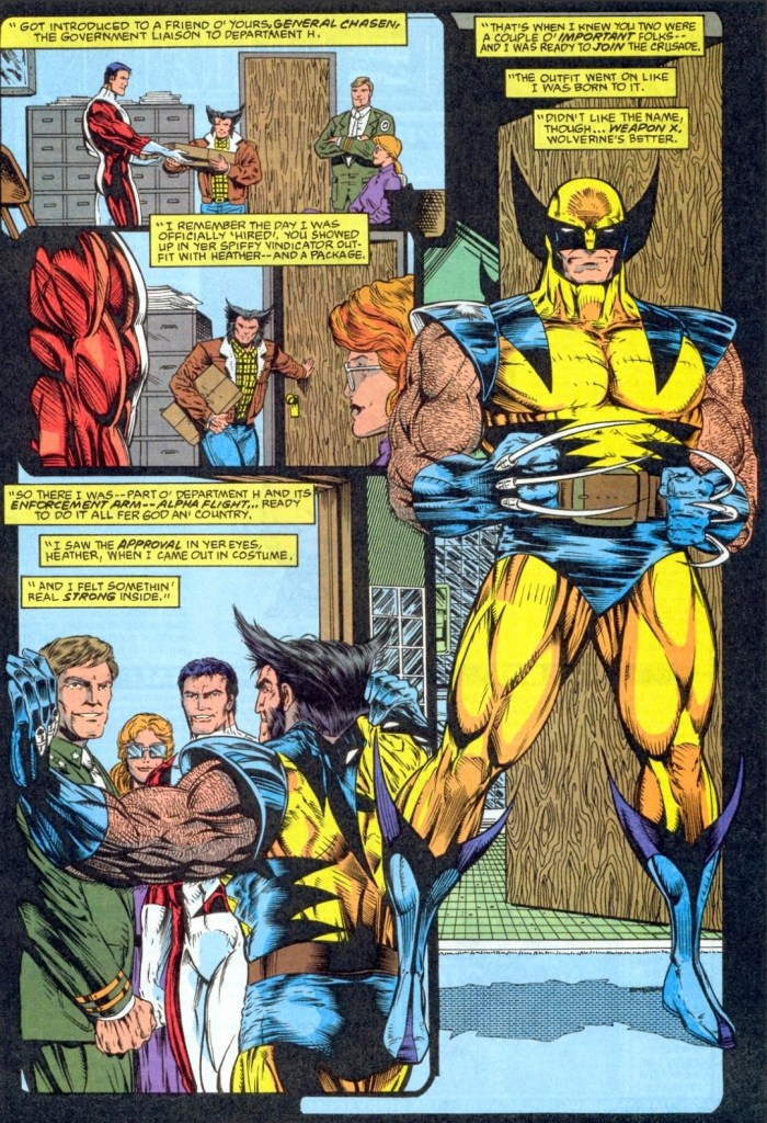
Before getting to the new retro comic book review, I should state that I visited Canada only once. Even before my one and only visit there, I knew through the comic books that famous character Wolverine is a native of Canada and a former member of Alpha Flight (Canadian government-sponsored team of mutant operatives). Somewhere in his past, he was live test subject of Weapon X. I have to mention this because the X-Men Adventures about to be reviewed here is focused on Wolverine.
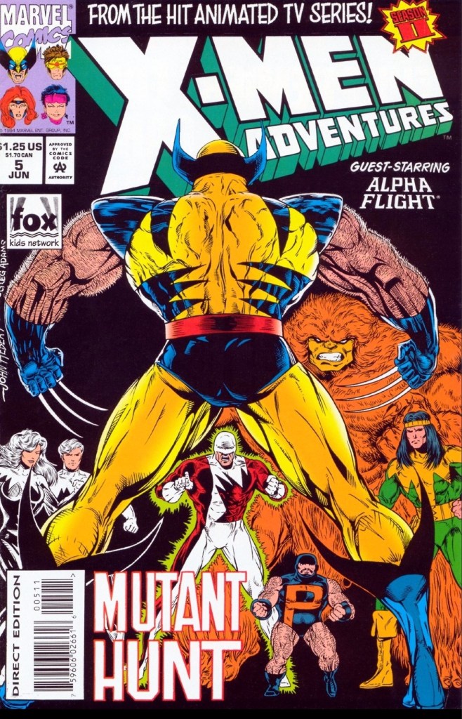
With those details laid down, here is a look back at X-Men Adventures Season II #5, published in 1994 by Marvel with a story written by Ralph Macchio and drawn by John Hebert.
The cover.
Early story
The story somewhere in the wilderness in Canada where Wolverine helps free an animal that was stuck. Suddenly, Alpha Flight’s Vindicator appears and reminds Wolverine of the fact that he deserted them to work of Charles Xavier. It turns out, Wolverine is back in Canada to visit Heather.
Moments later, he finds himself surrounded by Vindicator’s teammates Puck, Shaman and Sasquatch, and tells them that he is never coming back to Alpha Flight. Even though two more members of the Canadian team joined in, Wolverine manages to avoid defeat in battle and hides away.
As he listens to Alpha Flight from a distance, he hears Vindicator mentioning that a certain lab is expecting their team. This causes Wolverine to remember the traumatic time he had as a live test subject of Weapon X…
Quality
A look back at the time Wolverine joined the Canadian government-sponsored superhero team Alpha Flight. Would you want to join a unit serving the woke Canadian government of Justin Trudeau in real life?
I should mention first that the teleplay by the late Len Wein contains a very solid and sensible interpretation of Wolverine’s Weapon X origin (with a modern touch for the 1990s) which turned out to be a detailed reference for Ralph Macchio to adapt into this comic book.
That being said, this comic book’s plot of Wolverine going to Canada for a solid purpose and encountering challenges – both from his past with Alpha Flight and others – while bringing back his painful Weapon X past turned out to be a really engaging read. The Weapon X flashback scenes added a depth to the story as well as Wolverine’s portrayal in this adaptation. You will see the clawed X-Men member being tough and gritty as usual, and yet you will witness his fragile side as he becomes personally troubled about the past.
The appearance of Alpha Flight here was put to good use. Apart from the revelation of Wolverine’s past membership with them, you will see the team truly operate with a clear goal as mandated by their government (note: this is clearly not the ultra-woke, Islamo-Leftist government of Justin Trudeau). In fact, this tale gives readers a glimpse of how the Canadian government analyzes and decides what to do with Canadians who are very exceptional and are more valuable than many other citizens. Alpha Flight is the government’s tool which is strongly emphasized here.
Apart from the plot focused on Wolverine, this comic book managed to move the sub-plot of Magneto and Charles Xavier forward a bit.
Conclusion
A Weapon X flashback.
X-Men Adventures Season II #5 (1994) has a very engaging and fun tale focused on Wolverine who encounters his fellow Canadians. Anyone who loves the clawed X-Men member will have a lot to enjoy here. The appearance of Alpha Flight here (as well as in the X-Men TAS episode) added a good layer of depth to the plot while also emphasizing the shared Marvel universe in a controlled manner. Lastly, artist John Hebert’s artwork on Wolverine is really good and his high level of visual detail on other characters and locations should be seen.
Overall, X-Men Adventures Season II #5 (1994) is recommended.
Welcome back readers, fellow geeks and electronic gaming fans!
In this edition of the Retro Gaming Ads Blast (RGAB) series, we will examine print ads from the 1980s and the 1990s that caught my attention and I will explain why they are worth look back at.
For the newcomers reading this, Retro Gaming Ads Blast (RGAB) looks back at the many print ads of games (console, arcade, computer and handheld) that were published in comic books, magazines, flyers and newspapers long before smartphones, social media, the worldwide web and streaming became popular. To put things in perspective, people back in the 1980s and 1990s were more trusting of print media for information and images about electronic games.
With those details laid down, here is the newest batch of retro gaming print ads for you to see and enjoy…
1. Operation Wolf print ad
Even though there were screenshots from the game, this was still an eye-catching print promoting Operation Wolf for the Nintendo Entertainment System.
Looking back at the history of pop culture, the 1980s saw the surge of Hollywood action movies that emphasized or even glorified militarism. Arnold Schwarzenegger, Sylvester Stallone and Tom Cruise were just a few Hollywood stars who found success playing military figures. It was not surprising that there were game developers in Japan who noticed the Hollywood military trend and were inspired to make games that had similar themes. The Japan-based company Taito developed and released the light gun shooter arcade game Operation Wolf which became a huge commercial success worldwide. Unsurprisingly, versions of Operation Wolf were eventually made for the existing home computers and game consoles of the time.
The above print ad of the Nintendo Entertainment System (NES) version of Operation Wolf only showed the official artwork, descriptive text and noticeably no gameplay screenshots. While the ad made the NES version of the game look exciting to look forward to, the actual game looked and felt nothing like the arcade version as the console’s limitations resulted in really small 2D sprites (which made shooting tough) and the 2D art used were rather ugly to see. I can only speculate that the people at Taito knew their product for the NES had sub-par quality and only hoped for the best trying to fool gamers to buy it.
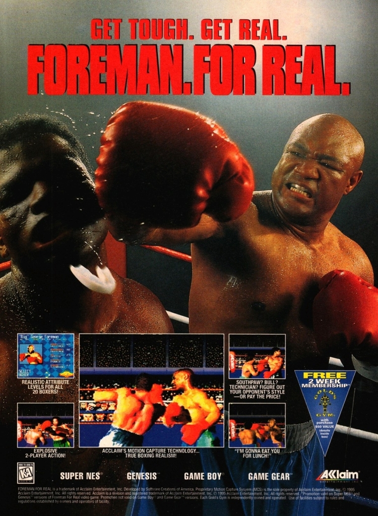
2. Foreman For Real print ad
Apart from boxing and endorsing grills, are you aware that George Foreman is also a worship leader and preacher of God’s Word?
In late-1994, George Foreman knocked out Michael Moorer to reclaim the heavyweight boxing title and the last time he had it was way back in 1974. For the newcomers reading this, Foreman halted his professional boxing in 1977, established his connection with God, preached His Word, opened a youth center and became a major product endorser. Foreman came back into fighting in 1987 and stunned everyone when he became heavyweight champion seven years later.
That being said, it was no surprise that game publisher Acclaim (which already released a video game with the boxer in 1992) quickly returned to Foreman to get him as the titular endorser in the 1995 video game Foreman For Real which was released on multiple gaming platforms less than a year after his championship victory. Apart from showing Foreman’s dominating image and screenshots from the game, the ad even had a promo of a free 2-week membership with Gold’s Gym. This ad was a lively reminder of the significance of Foreman’s presence in professional sports and it was instantly eye-catching.
3. BurgerTime print ad
Arcade hits like BurgerTime also made it into personal computers.
Previously, I showed an eye-catching print ad of the arcade classic BurgerTime. This time, the BurgerTime print ad shown here focused more on the IBM and Apple computer versions. This print ad had a photograph of an actor playing chef Peter Pepper carrying a huge burger bun running away two eggs and a hotdog, and near them were the respective boxes of BurgerTime for IBM and Apple. This is a sharp change of visual style away from the comic book-style art used in the other BurgerTime print ad. I can only imagine how excited IBM and Apple computer users became after seeing this ad back in the 1980s.
4. Shining Wisdom print ad
Even though this was a very eye-catching ad that appeared in several publications, Shining Wisdom went on to become a forgotten game after receiving mixed reviews from game review writers.
Here is another print ad of Working Designs from the 1990s. Released only on the Sega Saturn in 1996, Shining Wisdom was a fantasy action-adventure game from Japan that publisher Working Designs localized with North Americans in mind. This meant taking lots of creative liberties with the story, name changes, insertions of pop culture jokes and even altered the personalities of the characters. Developed by Sonic Software Planning and Camelot Software Planning, Shining Wisdom started as a project for the 16-bit console Mega Drive (Sega Genesis in America) that was revised for the more powerful Saturn console. While this print ad caught the attention of gamers and readers, Shining Wisdom received mixed reviews from critics upon release. Sadly, not too many gamers talk about this game anymore.
5. Cabal print ad
Military action and shooting strongly emphasized in this print ad for the Nintendo Entertainment System version of the arcade smash Cabal.
Like many games released in the 1980s, Cabal had a strong military theme and allowed players to engage in bouts of shooting playing soldiers who have to fight entire armies of bad guys. This print ad about the Nintendo Entertainment System (NES) version of the game had really nice art dominating the page, the packaging of the game plus three screenshots showing what gamers could expect. This was a very eye-catching print ad that made Cabal look both exciting and enticing.
6. Metal Gear print ad
Wow! So many weapons and pieces of equipment displayed in this Metal Gear (NES version) ad.
Back in the late 1980s, the NES port of Metal Gear had a notable promotion in America thanks to this cleverly designed print ad. When it comes to emphasizing “gear” from the title, the marketing team emphasized the words “Gear up” and literally filled the ad spaces with lots of pieces of equipment that was not only eye-catching but also gave readers the idea that a huge adventure awaits them in Metal Gear. As for the game box on the lower left corner of the print, the cover art highlighting the character Snake was an artistic copy of a still image of actor Michael Biehn as Kyle Reese in The Terminator (1984). This print ad was both entertaining and intriguing to look at.
7. Dino Crisis print ad
For many gamers, Dino Crisis was like a combination of Resident Evil and Jurassic Park and this visceral looking print ad really got lots of people interested in the game.
In 1999, Capcom released Dino Crisis for PlayStation in America and the timing was almost perfect as millions of gamers who owned the console enjoyed the releases of Resident Evil and Resident Evil 2 (both games from Capcom) firmly establishing the survival horror genre as a popular one. That being said, a lot of RE fans anticipated the release of Dino Crisis due to the fact that the game shared several elements with Resident Evil games in terms of exploration, survival, control and shooting. Not only that, Resident Evil creator and original game director Shinji Mikami was in charge of the making of Dino Crisis. Mikami pointed to the films The Lost World: Jurassic Park (1997) and Aliens (1986) as influences on making the game which for most gamers was perceived as “Resident Evil filled with dinosaurs.”
The print ad above had a very engaging visual design that symbolized action, horror and tension well. Mikami clearly wanted gamers to experience the intense violence of encountering dinosaurs and this ad gave viewers a small sample of that. It’s safe to say that this print ad was effective as Dino Crisis went on to sell millions of copies and established Regina (the red-haired lady in the ad) as another memorable character from Capcom.
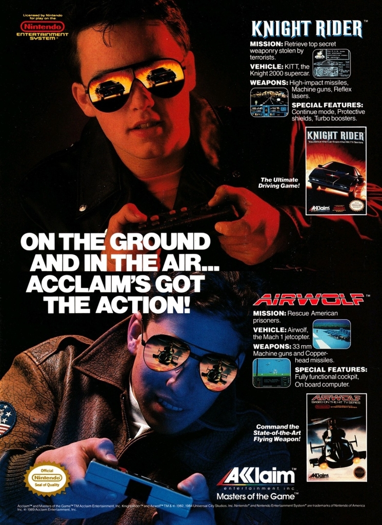
8. Airwolf/Knight Rider games print ad
Very clearly, the advertiser focused on the cool look to sell the games of Airwolf and Knight Rider.
Back in the 1980s, Airwolf and Knight Rider were wildly popular TV series that each had winning formulas to entertain millions of viewers with action, suspense and storytelling. It was not surprising that video game adaptations of them were produced on the Nintendo Entertainment System (NES). This particular print ad was an efficient way of promoting the Airwolf and Knight Rider games which featured two players looking cool with jackets and sunglasses. Acclaim clearly aimed for the TV series’ fans and slightly older players among the NES owners/users.
Disclaimer: This is my original work with details sourced from my personal experiences and observations during the Israel pilgrimage tour I joined and what happened during my free time. Anyone who wants to use this article, in part or in whole, needs to secure first my permission and agree to cite me as the source and author. Let it be known that any unauthorized use of this article will constrain the author to pursue the remedies under R.A. No. 8293, the Revised Penal Code, and/or all applicable legal actions under the laws of the Philippines.
Welcome back, readers and fellow followers of the Lord! This is the 8th chapter of my ongoing series of articles about the holy nation of Israel with recollections about the experiences and discoveries I had during the pilgrimage tour I joined with my local church (hosted by strategic partner Behold Israel). To see my previous Israel tour articles, click here, here, here, here, here, here and here.
Before moving on, may I request to you readers to pray to the Lord in support for the nation of Israel as it has been at war with the Palestinian terrorist group Hamas (which committed the October 7, 2023 terrorist attacks) in the Gaza Strip, as well as with Hezbollah in the north. Prayers are also needed for the hostages (taken by Hamas) and for the Israel Defense Forces (IDF) which has been working so hard and long. Israel’s economy and people also need prayers of support. I will always stand with Israel and my faith in the Lord remains uncompromising!
In this latest edition of my Israel 2023 series, I share with you my observations about what happened during our group’s one and only rest day. Instead of just resting at our nice hotel in Jerusalem, I decided to take advantage of the day to visit the Temple Mount for the first time ever, return to the Western Wall/Jewish Quarter/Upper Room, and visiting King David’s Tomb to name some.
Having revisited the Upper Room as well as King David’s Tomb (located just below), I took the rare opportunity of visiting the grave of the late Oskar Schindler which is located inside a Catholic cemetery just a few hundred meters away by foot. Look at the Google Map screenshot below…
This should give you an idea as to how close the Upper Room and King David’s Tomb sites in Israel are to the cemetery that has Schindler’s grave.
Who is Oskar Schindler?
For the newcomers reading this, Oskar Schindler was a German industrialist and a member of the Nazi Party who is best known for saving more than one thousand Jews during the Holocaust by having them employed in his business of enamelware and ammunition (across different locations in Europe). His costly efforts of saving the Jews from certain death during World War II became his most defining legacy to world initially chronicled in the novel Schindler’s Ark (later retitled as Schindler’s List) written by Thomas Keneally, and most famously dramatized in cinematic form in Steven Spielberg’s Schindler’s List (1993) with Liam Neeson portraying him. I myself saw Schindler’s List in the cinema here in the Philippines on April 2, 1994, and it was the most engaging movie theater experience I ever had.
The real-life Oskar Schindler (1908-1974).(photo source – Yad Vashem)
The cinematic Oskar Schindler portrayed by Liam Neeson in the Steven Spielberg-directed film Schindler’s List. (photo source – IMDB.com)
Schindler was born in 1908 in Zwittau, Austria-Hungary (now referred to as the Czech Republic). After the end of the Austro-Hungarian Empire, he became a citizen of the Czechoslovak Republic. He married Emilie Pelzl in 1928 and went on to work in different occupations ranging from farm machinery to selling government property. He also served in his republic’s army and eventually made his way into the German Armed Forces specifically through its military foreign intelligence office. In 1939, Schindler joined the Nazi Party and eventually arrived in Poland (after the German invasion) and established himself as a businessman. It was in Poland where he established the enamelware business and hired Jewish people as his workers.
A lot happened to Schindler and his wife after the end of World War II. He faced danger of being arrested as a war criminal. Schindler and his wife endured lots of difficulties moving back to Germany. In the years that followed, Schindler had a series of failed business ventures and declared bankruptcy in the early 1960s. Thanks to his Jewish friends from the war, he survived on donations sent by the Schindlerjuden (the people he saved during the Holocaust).
Schindler visited Israel for the first time ever in 1961 and was welcomed warmly. A tree was planted in his honor at the Avenue of the Righteous at Yad Vashem in 1962 (note: his wife Emilie got recognized as among the Righteous Among the Nations in 1993).
Before dying in 1974, he lived partly in Israel and partly in Germany. Schindler was buried in Jerusalem in Mount Zion and his grave has been visited many times by Jews and other people from around the world.
How I made it to Schindler’s grave
Having prayed to the Lord for a meaningful and blessed day-off, I got ready for the places to visit in ancient Jerusalem and that includes a precise study of maps and where the significant sites are located.
As mentioned above, coming from the Temple Mount, the Western Wall and the Jewish Quarter, I exited through Zion Gate of the old city of Jerusalem heading towards the Upper Room (the traditional site of the Last Supper that involved our Lord Savior Jesus) for a return visit (note: my first time there was with our tour group with a guide) and for my first-ever visit at the King David’s Tomb site (on the ground floor level so nearby).
That being said, it was easy to find the nearby cemetery (note: there was one other cemetery nearby) for Schindler’s grave coming from King David’s Tomb by foot. After walking down a short road leading to a major road outside and crossing it, I found the entrance of the cemetery which even had a small sign that says “To Oskar Schindler’s grave.”
The cemetery gate with a sign confirming that Schindler’s grave is inside.
My time at Schindler’s grave
So I entered the cemetery all alone, walked further and climbed down some steps until I reached the very area of Schindler’s grave which was actually located by a cemented walkway. Posted below is the shot I took before approaching the grave.
A wide shot of the lower area of the cemetery where Schindler’s grave is located (in the distance).
Finally, I made my first-ever approach to the grave of the one German businessman who saved the lives of many Jews and I captured it all by video as you can see below along with the pictures I took right there. Schindler’s grave was full of stones placed in thanks to him, remembrance of him and in honor for him. I noticed one particular stone even has a “Thank you!”
The grave of Oskar Schindler with lots of stones placed on it by visitors and by those who remember him for saving over a thousand Jewish people during the Holocaust.
A diagonal shot of the grave with a good amount of sunlight captured during the moment.
This is me taking a picture of myself near Oskar Schindler’s grave.
Visible on the grave was the German inscription which in English means “The unforgettable lifesaver of 1200 persecuted Jews.”
Being right there at the grave brought me strong memories about the final sequence of the movie Schindler’s List which was presented in color. That scene turned out very powerful to watch as a line of people – including the Jewish survivors who encountered Schindler during the war plus the actors who played many of them – took turns placing stones at this very grave. The late Leopold “Poldek” Pfefferberg himself was present in the scene at the grave which is very significant because he personally encountered Schindler and was crucial with both the publishing of Schindler’s Ark and the filming of Schindler’s List. Pfefferberg was an advisor to Spielberg.
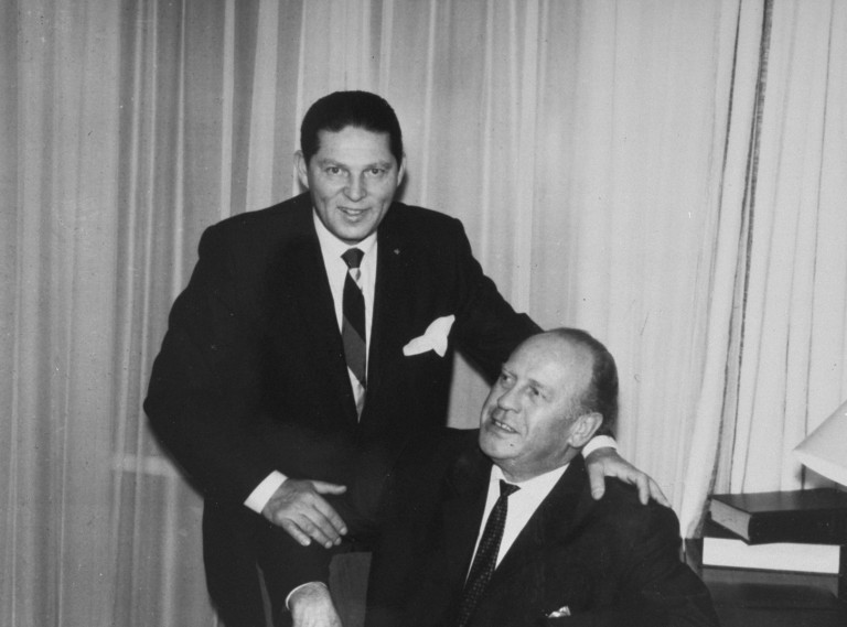
Holocaust survivor Poldek Pfefferberg with Oskar Schindler in the 1960s. (photo source – United States Holocaust Memorial Museum)
This is my 4K Blu-ray copy of Schindler’s List. This is the best and most definitive way to watch it at the comfort of home. So much better than streaming.
The placing of stones or pebbles on a grave has an important part in the Jewish ways. The Jewish Virtual Library describes it as follows (some parts in boldface):
As opposed to the common practice of burying loved ones with flowers and placing flowers by the tombstone, Jewish tradition instead puts an emphasis on placing stones on graves.
Jewish authorities likely objected to the flower ritual because of its proximity to pagan customs.
The origin of the stone custom is uncertain, though it may relate to ancient times when a pile of stones was used as a marker. The most common explanation is that placing stones is a symbolic act that indicates someone has come to visit and the deceased has not been forgotten.
A superstitious rationale for stones is that they keep the soul down, based on a belief that souls continue to dwell for a while in the graves in which they are placed.
A more common theme, however, is that stones last for eternity – as opposed to the short life span of flowers. Like the memory our loved ones, stones will never die.
As Oskar Schindler was German, the placing of stones at his grave is notably exceptional and if you wish to feel the impact of the colored scene near the end of Schindler’s List, you will have to endure the film first from the beginning. After all, the Spielberg-directed movie gradually shows how the German businessman got connected with the Jewish people as his laborers, and the turning point of him deciding to save them from death by sacrificing so much (read: lots of money spent and use of influence with German officials) and taking huge risks along the way was powerful to watch.
Even though I’m not Jewish and not a survivor of World War II, I still placed a stone on Oskar Schindler’s grave to thank him for saving many Jews long ago. As a person faith, my love for Israel and the Jewish people remains uncompromising in relation to my unwavering faith in the Lord and His Word.
Significant lessons about loving, blessing and helping the Jewish people
Having been to the Holocaust museum at Yad Vashem prior to the rest day, I learned there that Oskar Schindler was one of many others who took risks to save Jews during the Holocaust. The Schindler Jews of more than one thousand survivors have since multiplied into thousands more people through the decades.
The Holocaust and the October 7, 2023 terrorist attacks should remind each of us faithful ones that we cannot simply ignore the tragedies and do nothing. People of the Jewish State need our help and praying for them is a solid way to start. Ask the Lord for signs on how to help Israelites in additional ways. Do not rush and wait for Him to send you a command or a clear message on what to do next. Right now, Israel is fighting the enemy inside Gaza while defending itself from the other enemy on the north.
Around the world, there are millions of young protesters and activists who were brainwashed into supporting the terrorists while attacking Israel so blindly. Indeed, the world is chaotic and all the people who attack Israel while empowering the terrorists are doing the dirty works for Satan. It is also not surprising to encounter a pro-Palestine believer or an anti-Semitic person who openly rejects the Word of God or even mock Lord Jesus. The people – the brainwashed activists and terrorists specifically – who wish to destroy Israel in this modern age are becoming more like the Nazi Germans who were led by Adolf Hitler (who dreamed of wiping out all Jewish people). These unfortunate events should compel you to stand up for Israel and the Jewish people as you live on with unwavering faith in the Lord and His Word.
You might be wondering what are the biblical lessons to learn with regards to loving, blessing and helping the Jewish people. We can start by acknowledging the sovereignty, authority and the holiness of the Lord God and remember always that Lord Jesus is the Anointed Mediator. Read the following holy scriptures below…
“Therefore, give the people of Israel this message from the Sovereign Lord: I am bringing you back, but not because you deserve it. I am doing it to protect my holy name, on which you brought shame while you were scattered among the nations. I will show how holy my great name is—the name on which you brought shame among the nations. And when I reveal my holiness through you before their very eyes, says the Sovereign Lord, then the nations will know that I am the Lord. For I will gather you up from all the nations and bring you home again to your land.
“Then I will sprinkle clean water on you, and you will be clean. Your filth will be washed away, and you will no longer worship idols. And I will give you a new heart, and I will put a new spirit in you. I will take out your stony, stubborn heart and give you a tender, responsive heart. And I will put my Spirit in you so that you will follow my decrees and be careful to obey my regulations.
“And you will live in Israel, the land I gave your ancestors long ago. You will be my people, and I will be your God. I will cleanse you of your filthy behavior. I will give you good crops of grain, and I will send no more famines on the land. I will give you great harvests from your fruit trees and fields, and never again will the surrounding nations be able to scoff at your land for its famines. Then you will remember your past sins and despise yourselves for all the detestable things you did. But remember, says the Sovereign Lord, I am not doing this because you deserve it. O my people of Israel, you should be utterly ashamed of all you have done!
“This is what the Sovereign Lord says: When I cleanse you from your sins, I will repopulate your cities, and the ruins will be rebuilt.
Ezekiel 36:22-33 (NLT)
Behold, the days are coming, says the Lord, that the plowman shall overtake the reaper, and the treader of grapes him who sows the seed; and the mountains shall drop sweet wine and all the hills shall melt [that is, everything heretofore barren and unfruitful shall overflow with spiritual blessing].
And I will bring back the exiles of My people Israel, and they shall build the waste cities and inhabit them; and they shall plant vineyards and drink the wine from them; they shall also make gardens and eat the fruit of them.
And I will plant them upon their land, and they shall no more be torn up out of their land which I gave them, says the Lord your God.
Amos 9:13-15 (AMPC)
For God is not unrighteous to forget or overlook your labor and the love which you have shown for His name’s sake in ministering to the needs of the saints (His own consecrated people), as you still do.
Hebrews 6:10 (AMPC)
For there [is only] one God, and [only] one Mediator between God and men, the Man Christ Jesus,
1 Timothy 2:5 (AMPC)
They answered, “Believe in the Lord Jesus and you will be saved—you and all your family.”
Acts 16:31 (TPT)
My beloved friends, if you see a believer who is overtaken with a fault, the one who is in the Spirit should seek to restore him in the Spirit of gentleness. But keep watch over your own heart so that you won’t be tempted to exalt yourself over him. Love empowers us to fulfill the law of the Anointed One as we carry each other’s troubles.
Galatians 6:1-2 (TPT)
For God did not appoint us to wrath, but to obtain salvation through our Lord Jesus Christ, who died for us, that whether we wake or sleep, we should live together with Him.
Therefore comfort each other and edify one another, just as you also are doing.
1 Thessalonians 5:9-11 (NKJV)
The Son of Man will send out His angels, and they will gather out of His kingdom all things that offend, and those who practice lawlessness, and will cast them into the furnace of fire. There will be wailing and gnashing of teeth. Then the righteous will shine forth as the sun in the kingdom of their Father. He who has ears to hear, let him hear!
Matthew 13:41-43 (NKJV)
“I am a true sprouting vine, and the farmer who tends the vine is my Father. He cares for the branches connected to me by lifting and propping up the fruitless branches and pruning every fruitful branch to yield a greater harvest. The words I have spoken over you have already cleansed you. So you must remain in life-union with me, for I remain in life-union with you. For as a branch severed from the vine will not bear fruit, so your life will be fruitless unless you live your life intimately joined to mine.
“I am the sprouting vine and you’re my branches. As you live in union with me as your source, fruitfulness will stream from within you—but when you live separated from me you are powerless. 6If a person is separated from me, he is discarded; such branches are gathered up and thrown into the fire to be burned. But if you live in life-union with me and if my words live powerfully within you—then you can ask whatever you desire and it will be done. When your lives bear abundant fruit, you demonstrate that you are my mature disciples who glorify my Father!
John 15:1-8 (TPT)
Also, never forget that Israel is the land that God the Heavenly Father designated for the Jewish people and He always has great plans for them. Read the scriptures below…
Now the Lord had said to Abram:
“Get out of your country,
From your family
And from your father’s house,
To a land that I will show you.
I will make you a great nation;
I will bless you
And make your name great;
And you shall be a blessing.
I will bless those who bless you,
And I will curse him who curses you;
And in you all the families of the earth shall be blessed.”
Genesis 12:1-3 (NKJV)
Then God said to Abraham, “As for Sarai your wife, you shall not call her name Sarai, but Sarah shall be her name. And I will bless her and also give you a son by her; then I will bless her, and she shall be a mother of nations; kings of peoples shall be from her.”
Then Abraham fell on his face and laughed, and said in his heart, “Shall a child be born to a man who is one hundred years old? And shall Sarah, who is ninety years old, bear a child?” And Abraham said to God, “Oh, that Ishmael might live before You!”
Then God said: “No, Sarah your wife shall bear you a son, and you shall call his name Isaac; I will establish My covenant with him for an everlasting covenant, and with his descendants after him.
And as for Ishmael, I have heard you. Behold, I have blessed him, and will make him fruitful, and will multiply him exceedingly. He shall beget twelve princes, and I will make him a great nation. But My covenant I will establish with Isaac, whom Sarah shall bear to you at this set time next year.” Then He finished talking with him, and God went up from Abraham.
Genesis 17:15-22 (NKJV)
Again God said to him, Your name is Jacob [supplanter]; you shall not be called Jacob any longer, but Israel shall be your name. So He called him Israel [contender with God].
And God said to him, I am God Almighty. Be fruitful and multiply; a nation and a company of nations shall come from you and kings shall be born of your stock;
The land which I gave Abraham and Isaac I will give to you, and to your descendants after you I will give the land.
Genesis 35:10-12 (AMPC)
Now therefore, if you will obey My voice in truth and keep My covenant, then you shall be My own peculiar possession and treasure from among and above all peoples; for all the earth is Mine.
And you shall be to Me a kingdom of priests, a holy nation [consecrated, set apart to the worship of God]. These are the words you shall speak to the Israelites.
Exodus 19:5-6 (AMPC)
Say therefore to the people of Israel, ‘I am the Lord, and I will bring you out from under the burdens of the Egyptians, and I will deliver you from slavery to them, and I will redeem you with an outstretched arm and with great acts of judgment. I will take you to be my people, and I will be your God, and you shall know that I am the Lord your God, who has brought you out from under the burdens of the Egyptians. I will bring you into the land that I swore to give to Abraham, to Isaac, and to Jacob. I will give it to you for a possession. I am the Lord.’”
Exodus 6:6-8 (ESV)
“Yet hear now, O Jacob My servant, And Israel whom I have chosen.
Thus says the Lord who made you And formed you from the womb, who will help you: ‘Fear not, O Jacob My servant; And you, Jeshurun, whom I have chosen.
For I will pour water on him who is thirsty, And floods on the dry ground; I will pour My Spirit on your descendants, And My blessing on your offspring;
They will spring up among the grass Like willows by the watercourses.’
One will say, ‘I am the Lord’s’; Another will call himself by the name of Jacob; Another will write with his hand, ‘The Lord’s,’ And name himself by the name of Israel.
Isaiah 44:1-5 (NKJV)
Conclusion
During my final moments at the cemetery, I carefully touched Schindler’s grave and went on marching all the way to Mahane Yehuda Market in the city.
I am very thankful to the Lord for the significant visits and favors He blessed me with during the rest day in Jerusalem. The visit to Schindler’s grave was a worthy conclusion to the time I spent visiting the sites inside and outside of the walls of the old city of Jerusalem during the cold morning. After Schindler’s grave, I marched all the way to Mahane Yehuda market (with a coffee break at Tmol Shilshom on the way).
I cannot say that Schindler’s grave is a holy site to visit, but it still carries great historical significance in relation to the saving of Jews during the Holocaust. To those of you who get to visit the grave, do not be surprised to see the many stones placed on it. Finally, be mindful that when you visit the Upper Room or King David’s Tomb site just outside of Zion Gate, the cemetery that has Schindler’s grave is only a few hundred meters away by walking. Ask your tour guide about the location and what time the cemetery opens in the morning.
While Oskar Schindler remains a controversial person of history as his legacy continues to be debated between varied people with specific beliefs and reasons (note: there are people who admired him as well as others who condemned him), his efforts (aided by his wife Emilie and his Jewish assistant Itzhak Stern) on protecting the Jewish workers from certain death during World War II should always be remembered.
It should be noted that Schindler’s List has been criticized for having fictionalized scenes, deliberate omissions of historical facts and its portrayal of Oskar as a hero whose personality developed over time. In reality, wife Emilie Schindler was much more involved with her husband on rescuing the Jews which is a significant fact that Spielberg’s movie ignored.
Emilie and Oskar Schindler in Argentina after the end of World War II. Emilie was much more involved with her husband on sparing over a thousand Jewish people from certain death during the Holocaust. (photo credit: Yad Vashem)
The German businessman’s legacy is clearly connected with the 1993 film which itself made tremendous impact by making people aware of the Holocaust and the six million Jews who got killed. The said impact, in my view, is much bigger than the many Academy Awards the movie won! Spielberg’s movie marked the beginning of my learning about the Holocaust and back in 1994, I was not even aware of the biblical significance of Israel and the Jewish people. In my old life of rituals, traditions and idolatrous religion, no person of religion ever taught me to love and bless Israel, nor did anyone religious tell me about God’s covenant with the Jewish people. Reading the Bible back then was only occasional.
In the year I got born again, I gradually learned about the significance of Israel, the Jewish people and the biblical ties between Jews and Christians as I immersed myself with God’s Word. Studying the Holy Bible and living by His Word helped me understand God’s covenant with Abraham whose rightful heirs have always been Isaac (his son) and Jacob (his grandson who later got renamed Israel). Just months after getting born again, I prayed to the Lord a lot for His plan for me related with Israel as I wanted to deepen my faith in Him by visiting the Holy Land and witness the Bible come to life. The 2023 Israel pilgrimage tour I joined with my local church was the Lord’s anointed answer and blessing to me. It is also the greatest and most significant foreign trip I ever had.
Israel is a great and holy place to visit! Visit Israel with the Holy Bible! Pray to the Lord wholeheartedly and reveal to Him your heart’s desire to visit Israel to deepen your faith in Him. Always be the fearless and aggressive church of Lord Jesus! Follow the light of Lord Jesus, keep on praying for the peace of Jerusalem and live on with unwavering faith in Him!
Watch out for more Israel 2023 travel articles here. There is more to come!
Disclaimer: This is my original work with details sourced from reading the comic book and doing personal research. Anyone who wants to use this article, in part or in whole, needs to secure first my permission and agree to cite me as the source and author. Let it be known that any unauthorized use of this article will constrain the author to pursue the remedies under R.A. No. 8293, the Revised Penal Code, and/or all applicable legal actions under the laws of the Philippines.
Welcome back superhero enthusiasts, 1990s arts and culture enthusiasts, Marvel Comics fans and comic book collectors! Today we go back to the mid-1990s to explore the adaptation of the second season of the X-Men animated series in the form of the X-Men Adventures comic book series.
Before getting to the new retro comic book review, I should state that even though streaming is the norm for millions of people who love entertainment, it would be nice if the classic X-Men: The Animated Series (X-Men TAS) would someday get released on Blu-ray disc format. Even though many X-Men fans are streaming, there are still those who prefer collecting physical releases of what they enjoy. Really, watching entertainment with Blu-ray or 4K Blu-ray format is much better than streaming.
With those details laid down, here is a look back at X-Men Adventures Season II #3, published in 1994 by Marvel with a story written by Ralph Macchio and drawn by John Hebert.
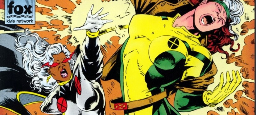
The cover.
Early story
The story begins at the border of Kenya and Tanganyika where Mount Kilimanjaro rests. Something destructive emerges at the top of the mountain causing great disturbance on the people below. At a village, two black persons could not help but notice a demonic figure coming down at them. One of them gets possessed by it.
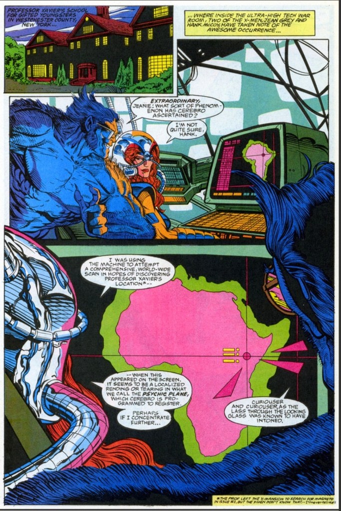
Meanwhile at their headquarters in Westchester County, New York, Jean Grey uses Cerebro to comprehensively scan the world to find Professor X’s location. What Jean detected was a psychic plane which catches Beast’s attention.
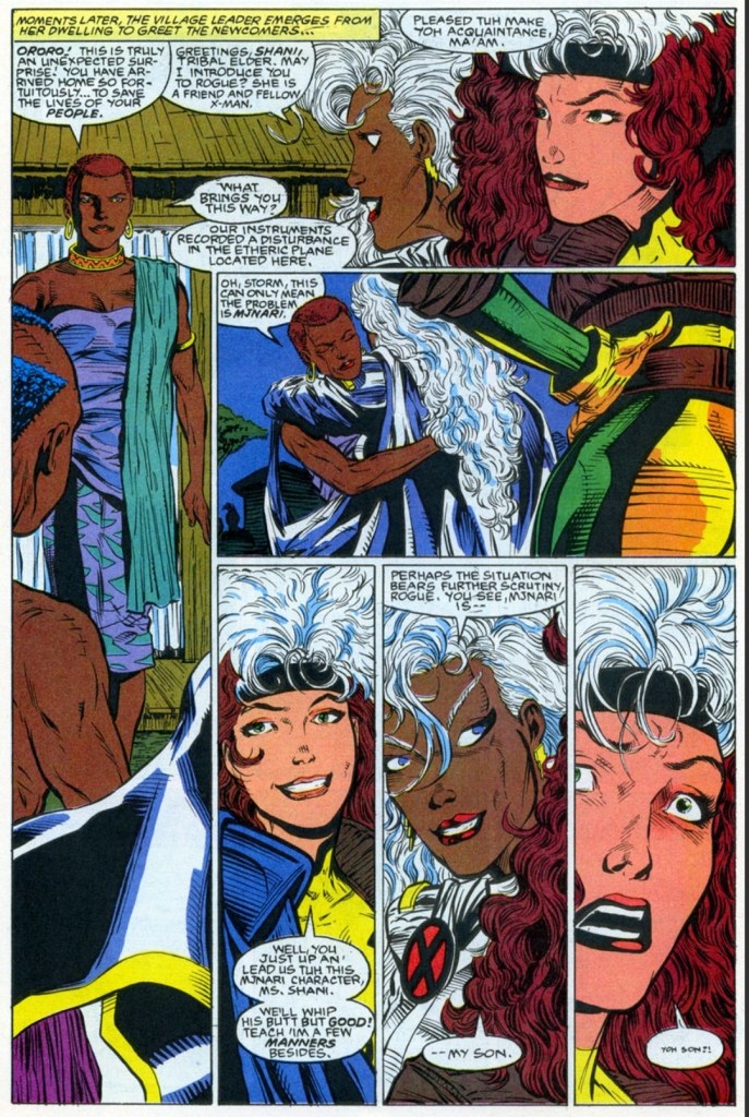
Shortly after, Rogue arrives with Storm who just returned from a hospital. As Jean updates them both, Storm realizes that the location of the psychic plane is in Africa…
Quality
Rogue in Africa with Storm.
The first thing I should confirm here is that there is a nice jump in the visual quality – in terms of style and detail specifically – thanks to illustrator John Hebert. Hebert’s work here is a nice relief compared to the rushed works of Andrew Wildman in the previous two issues, and he knows when to use the dynamic moments of spectacle and how to balance it with the calm moments. Hebert’s take on Wolverine is really good.
Regarding the story, I like the way the search for Charles Xavier – which was a sub-plot in the previous issues – unfolded while also opening the opportunity to develop Storm as she returns to Africa. In fact, this tale reveals some really engaging details from Storm’s past as well as her personal connection with a certain tribe of black people. These mentioned elements added nicely to the tension of a particular conflict that followed.
In fact, the Storm-centered story was nicely executed by the creative team and there were revelations that were gripping. Along the way, Rogue got a nice share of the spotlight and was a suitable supporting character even though the comic book had new characters.
Conclusion
Using Cerebro has big advantages.
X-Men Adventures Season II #3 (1994) is a good read and it also has a nice change of geographic setting as it mainly focused on Africa and Storm’s reconnection with her people. Storm is clearly the main character here and this is a solid pay-off as she only had a tiny part in the previous issue. This is a tale – with themes of family, culture and the responsibility that comes with having special talents or power – that should interest dedicated fans of Storm.
Overall, X-Men Adventures Season II #3 (1994) is recommended.