Disclaimer: This is my original work with details sourced from reading the comic book and doing personal research. Anyone who wants to use this article, in part or in whole, needs to secure first my permission and agree to cite me as the source and author. Let it be known that any unauthorized use of this article will constrain the author to pursue the remedies under R.A. No. 8293, the Revised Penal Code, and/or all applicable legal actions under the laws of the Philippines.
Welcome back superhero enthusiasts, 1980s arts and culture enthusiasts, Marvel Comics fans and comic book collectors! Today we go back to the year 1984 to examine a small part of the Marvel Comics universe through a tale of the Wolverine monthly series.
This particular tale shows were Wolverine went and what he has been doing since he decided to leave the X-Men in Wolverine #75 (1993). Since Magneto removed the Adamantium out of him in X-Men #25 (1993) and Wolverine discovered that his claws were made of pure bones (part of him all along), he has been very determine to search for answers and the truth about himself.
With those details laid down, here is a look back at Wolverine #87, published in 1994 by Marvel Comics with a story written by Larry Hama and drawn by Adam Kubert.
The cover.
Early story
The story begins in the Southeast Asian city of Madripoor (fictional) where Wolverine and his former teammate Gambit are reunited. As they walk, Gambit tells him that Sabretooth (Wolverine’s long-time rival) is staying in Charles Xavier’s mansion (refer to X-Men #28 and #29). As they talk, Wolverine notices something odd at the Princess Bar which he previously visited and there seems to be something wrong. The two decided to break in, causing damage and expecting the worst. It turns out, a lot of people are inside (including those who became friends of Logan) who prepared a surprise celebration for Wolverine.
As the celebration goes on, ninjas at the top of the building watch Wolverine carefully as they prepare to go down and kill him…
Quality
Amazingly, Wolverine managed to slash the two falling guys with his bone claws and impressed Gambit.
If you are familiar with Team X (revealed in flashbacks in X-Men #5 and X-Men #6) composed of Wolverine, Sabretooth and Maverick as black ops operatives, then the story of this comic book will really become relevant with you. In fact, reading the mentioned comic books is a must.
Without spoiling the plot, I can say that creative duo of Hama and Kubert came up with their own contribution to the Team X mythos (with flashbacks visualized in similar style to those in the above-mentioned X-Men comic books of 1992) while emphasizing how the past affects Wolverine, Sabretooth and Maverick in the present day.
What Hama-Kubert came up with was not the typical good-versus-evil superhero tale but rather a believable expansion of the Team X legacy, what the three former members have in common, and what uncertainties are they dealing with as surviving mutants. In the case of Wolverine, this tale adds depth to his solo exploits since leaving his team behind in search for answers.
Conclusion
Wolverine dancing with a pretty lady while two guys above watch them.
Wolverine #87 (1994) is a fine character exploration and also a nice revelation about Team X. Considering how good the contributions from Hama and Kubert are, they would not be so relevant if you have never read Team X’s flashbacks in the two specific X-Men comic books published in 1992 and that alone makes this one a tricky read.
Disclaimer: This is my original work with details sourced from reading the comic book and doing personal research. Anyone who wants to use this article, in part or in whole, needs to secure first my permission and agree to cite me as the source and author. Let it be known that any unauthorized use of this article will constrain the author to pursue the remedies under R.A. No. 8293, the Revised Penal Code, and/or all applicable legal actions under the laws of the Philippines.
Welcome back superhero enthusiasts, 1980s arts and culture enthusiasts, Marvel Comics fans and comic book collectors! Today we go back to the year 1984 to examine a small part of the Marvel Comics universe through a tale of the Amazing Spider-Man monthly series.
In my previous retro review, Puma was introduced and quickly made an impact on the plot that connects the Rose with Spider-Man (who foiled the Rose’s criminal operation with the help of Black Cat). Puma is not a one-dimensional villain as he is quite principled. Ultimately, issue #256 served as an entertaining build-up of the conflict between Spider-Man and Puma.
With those details laid down, here is a look back at Amazing Spider-Man #257, published in 1984 by Marvel Comics with a story written by Tom DeFalco and drawn by Ron Frenz.
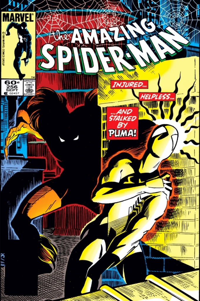
The cover.
Early story
The story begins on top of a building in New York City. Puma grabs the head of the helpless Spider-Man (who just suffered the dislocation of his arm and endured the pain of shoving it back into place before eventually succumbing to the intense pain). He does not strike immediately as he finds the act of eliminating the webslinger almost too easy and he remembers the Rose promised him of a worthy foe.
Just as Puma starts his move to kill Spidey, Black Cat suddenly strikes him out of nowhere. Puma quickly recovers his balance and tells Black Cat to go away. Suddenly, Puma notices something in her. Using his heightened senses, he sees Black Cat’s aura then jumps at her. He quickly realizes he miscalculated with his movement and finds himself overshooting her. In a desperate attempt, Puma grabs a pipe but it quickly broke and causes him to slide on the rooftop and hit the edge.
As Puma picks himself up, the roof beneath him gives in and he falls down…
Quality
Spider-Man’s 2nd encounter with Puma is action-packed and fun to read. Pay close attention to the details.
There is no doubt that the story of this comic book is pretty much a big pay-off to the build-up of the previous issue. Not only that, the creative team continued to gradually develop Puma not only as a formidable foe of Spider-Man but also as a sensible and believable new addition to the Marvel Comics universe of the time.
Here, you will see Spider-Man in a truly vulnerable state which symbolically shows that wearing the alien costume has its limits when it comes to protecting and enhancing him. As seen in the final pages of issue #256, Spider-Man struggles a lot physically and, for the first time ever, struggles to command the symbiote (not realizing it is organic and has its own intelligence). With Spidey in a serious physical disadvantage, you will see Black Cat getting a nice share of the spotlight. Not only does she bravely face off with Puma, her concern for Spidey (note: she knows he is Peter Parker) intensifies in a very believable way. She still loves him but could not figure out why Peter prefers to live like a normal person when he could dedicate himself on being a hero every day as Spider-Man.
As for Puma, the creative team developed him even further both in his animalistic form and in his civilian identity as the head of Fireheart Enterprises. As the man Thomas Fireheart, he is a really intelligent man who analyzes a lot of details before making his next move. You will see more of his intellectual side as he deals with both his corporate affairs as well as his contracted service for the Rose (who in turn is serving the Kingpin).
The plot in this comic book is deeper and more elaborate. Without spoiling much, you will get to see the Puma-Rose-Kingpin connection and, more notably, you will see how complex and intense the situation becomes for Peter Parker when he encounters Puma for the 2nd time. The story is very good, you just have to read it.
Conclusion
Spider-Man, Black Cat and the alien costume.
Like the previous issue, Amazing Spider-Man #257 (1984) is a great read but in the form of a great pay-off to the build-up that preceded it. The DeFalco-Frenz duo succeeded in developing the newcomer Puma into a significant Marvel Comics universe addition and their portrayal of an injured Spider-Man is very captivating. That being said, I encourage you all to pay close attention to the literary details revealed during the banter between Spidey and Puma which will resonate with you when you read the next issue.
Welcome back readers, fellow geeks and electronic gaming fans!
In this edition of the Retro Gaming Ads Blast (RGAB) series, we will take a look at another batch of retro gaming print ads from the 1980s and 1990s. In addition, there will be a few flyers of arcade games as well as promotional posters of a notable console game that was released only in Japan.
For the newcomers reading this, Retro Gaming Ads Blast (RGAB) looks back at the many print ads of games (console, arcade, computer and handheld) that were published in comic books, magazines, flyers and newspapers long before smartphones, social media, the worldwide web and streaming became popular. To put things in perspective, people back in the 1980s and 1990s were more trusting of print media for information and images about electronic games and related products.
With those details laid down, here is the newest batch of retro gaming print ads for you to see and enjoy…
1. M.I.A.: Missing in Action arcade flyer
This is an effective way of catching the attention of both players and arcade operators. I can imagine the woke, the SJWs and rabid feminists getting easily offended by this.
Konami was a very prominent producer of games back in the 1980s. Not only did the company produce high-quality and enjoyable military-themed games on consoles and computers, Konami also made its presence felt in the highly competitive sector of arcade games. In 1989, they released the arcade conversion kit of M.I.A.: Missing in Action and this flyer is the best know promotion of it. M.I.A.: Missing in Action is the follow-up to Konami’s hit game Rush’n Attack.
Visually, the flyer’s display of four screenshots combined with a dominating photographic image of prisoners of war (POWs) getting delightfully released by an attractive female Rambo-type rescuer were designed to catch the attention of young adult and adult gamers. The text descriptions (note: there were more details on the back of the flyer), however, were geared towards arcade operators who were looking for new games to acquire without the hassle of having to buy an entire arcade cabinet. That being said, this flyer was a clever way to appeal to arcade operators and the people who love playing arcade games.
2. Fonz arcade flyer
Simplistic yet effective to look at. If you are an arcade operator, this flyer conveniently has key information displayed.
Believe it or not, Sega was already active in arcade games way back in the 1970s. In this particular flyer, Sega’s arcade game Fonz (also called Moto-Cross, Man T.T.) offered players the unique experience of driving a digital vehicle using actual handlebars on the machine that were meant to create an immersive and realistic feel. If you look closely, the flyer has lots of details written with arcade operators and players in mind.
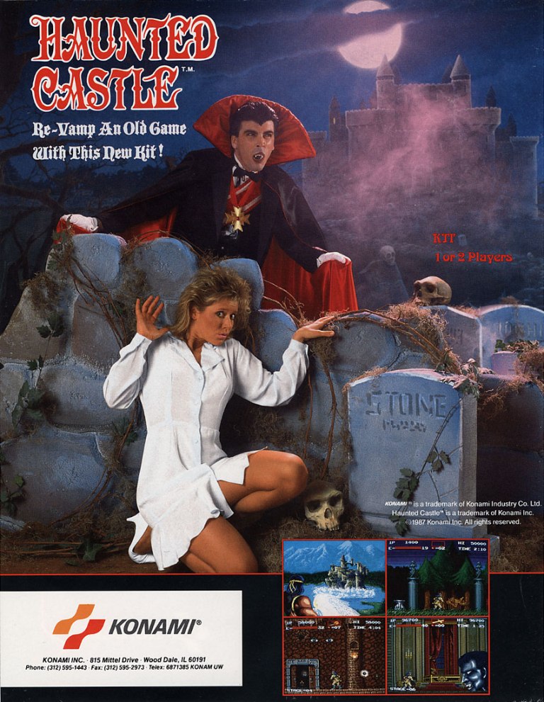
3. Haunted Castle arcade flyer
Indeed, this game is part of the Castlevania game franchise. It was one of the first Castlevania games released for arcades.
Arguably, Konami is best known for the Castlevania game series which covered handheld gaming devices, personal computers, video game consoles and even arcades. Haunted Castle (Japanese title: Akumajō Dracula) is the 2nd arcade game of the Castlevania franchise and it is not a port of any console game. Like the arcade flyer of M.I.A.: Missing in Action, this one was crafted to lure the attention (and money) of arcade operators looking for conversion kits to replace their old games. The visual presentation is eye-catching and even though the Castlevania brand was nowhere to be seen, Castlevania fans could tell this this arcade offering was part of their favorite game franchise.
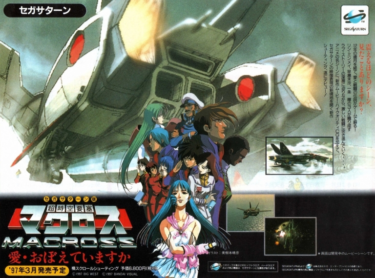
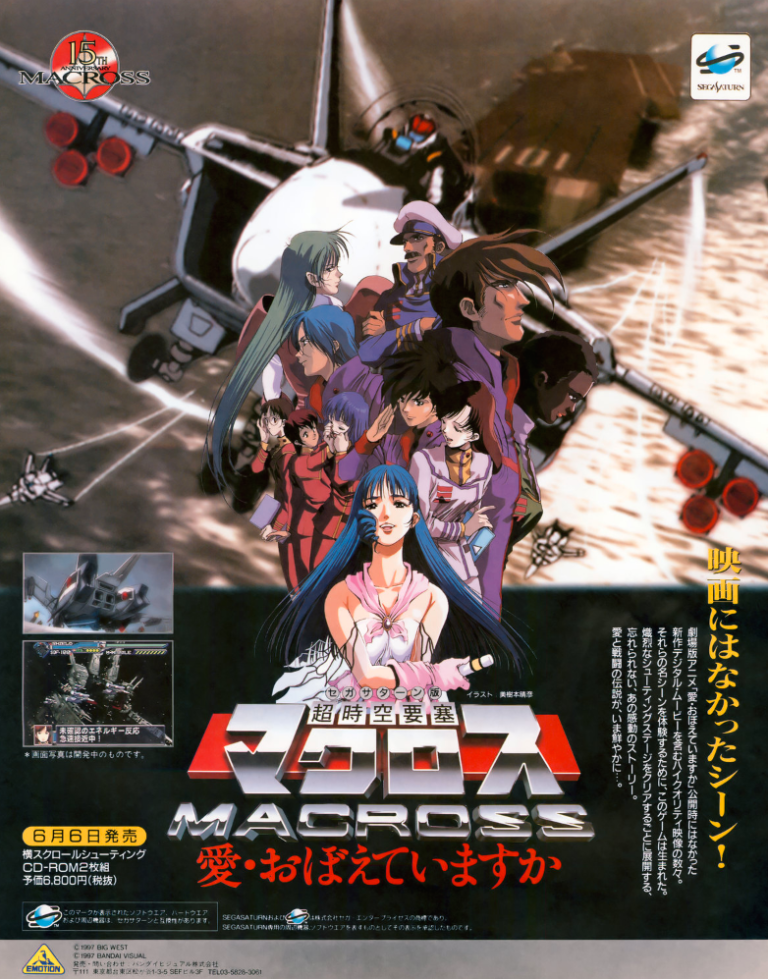
4. The Super Dimension Fortress Macross: Do You Remember Love? flyer and poster
The poster promoting the release of the game for Sega Saturn in Japan.
The flyer promoting the Sega Saturn game’s 1997 release as well as the 15th anniversary of Macross.
In 1997, the 15th anniversary of the Macross multimedia franchise was celebrated in Japan and among the highlights was the release of The Super Dimension Fortress Macross: Do You Remember Love? on the Sega Saturn. To promote the game and the franchise itself, lots of flyers and posters were released in Japan. If you look at the illustrated images on the promotional materials closely, you will realize that they are not from the original 1982-83 Macross anime TV series but rather from the The Super Dimension Fortress Macross: Do You Remember Love? animated movie of 1984 (read my retro movie review by clicking here).
While it might be baffling to some as to why the original anime TV series was not used as the source material for the 15th anniversary celebration through gaming, the 1984 anime feature film was actually more adaptable for a video game project (read my retro review by clicking here). It is so obvious, you just have to ask yourselves this question – how can the game developers compress the entire concepts of the 36-episode Macross anime series into one game while ensuring fun gameplay? Regardless, the game was a lot of fun to play and I enjoyed playing the PlayStation version in 1999.
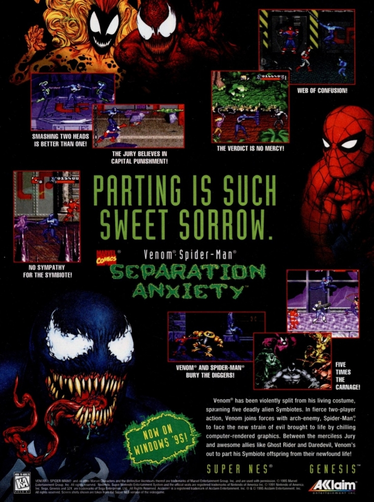
5. Venom/Spider-Man: Separation Anxiety print ad
A clear effort to sell the game to gamers as well as fans of Spider-Man and Venom.
In 1994, Acclaim released Spider-Man and Venom: Maximum Carnage (based on the 1993 comic book storyline Maximum Carnage) on Super Nintendo Entertainment System (SNES) and Sega Genesis ultimately becoming popular with comic book fans and gamers who enjoyed sidescrolling beat-them-up games.
Subsequently, Acclaim and develop Software Creations reunited to release the sequel Venom/Spider-Man: Separation Anxiety a year later on the two leading 16-bit consoles as well as on personal computer (PC). If there is anything notable about this eye-catching print ad, it is the fact that its visual presentation (with graphics on-par with the previous year’s game) cleverly hides the fact that it did not have much new to offer gamers with regards to gameplay and story cutscenes (which the previous game prominently had). Eventually, this game attracted weaker reviews from game critics and has since been forgotten.
6. Tecmo Super Bowl SNES print ad
From the time when Tecmo was still a strong producer of sports video games.
In 1991, Tecmo Super Bowl was released on the aging Nintendo Entertainment System (NES) and because its game design greatly entertained gamers, it became a tremendous commercial success. Not even the very high launch price of $54.99 stopped it from selling a lot.
To keep the commercial success and public interest going, Tecmo announced a new version of the game for the more powerful SNES console with the simple title of Tecmo Super Bowl. If you look closely at the print ad, you will notice that gameplay screenshots were not used at all. Instead, they showed images of the nicely illustrated art works they prepared as eye candy for the game with the intention of making it look cinematic. This is very curious because gameplay itself was the main selling factor of the NES version of Tecmo Super Bowl. I can only guess that Tecmo was not ready to show gameplay images by the time this print ad was made.
7. X-Men 2: Clone Wars print ad
The art used is too alienating for promoting this game.
During the age of the 16-bit consoles, there was a variety of X-Men video games released and produced by different companies. In 1993, an X-Men game published by Sega was released exclusively on the Genesis console which turned out to be fun for gamers and received mostly positive reviews from the critics. Sega went on to publish the sequel X-Men 2: Clone Wars and this print ad caught my attention because of how exaggerated the characters looked. It’s so strange, it’s as if the artist took visual reference from a somewhat blocky 3D polygonal portrait then tried to make them look hand-drawn. I wonder if anyone from Sega regretted this.
Disclaimer: This is my original work with details sourced from reading the comic book and doing personal research. Anyone who wants to use this article, in part or in whole, needs to secure first my permission and agree to cite me as the source and author. Let it be known that any unauthorized use of this article will constrain the author to pursue the remedies under R.A. No. 8293, the Revised Penal Code, and/or all applicable legal actions under the laws of the Philippines.
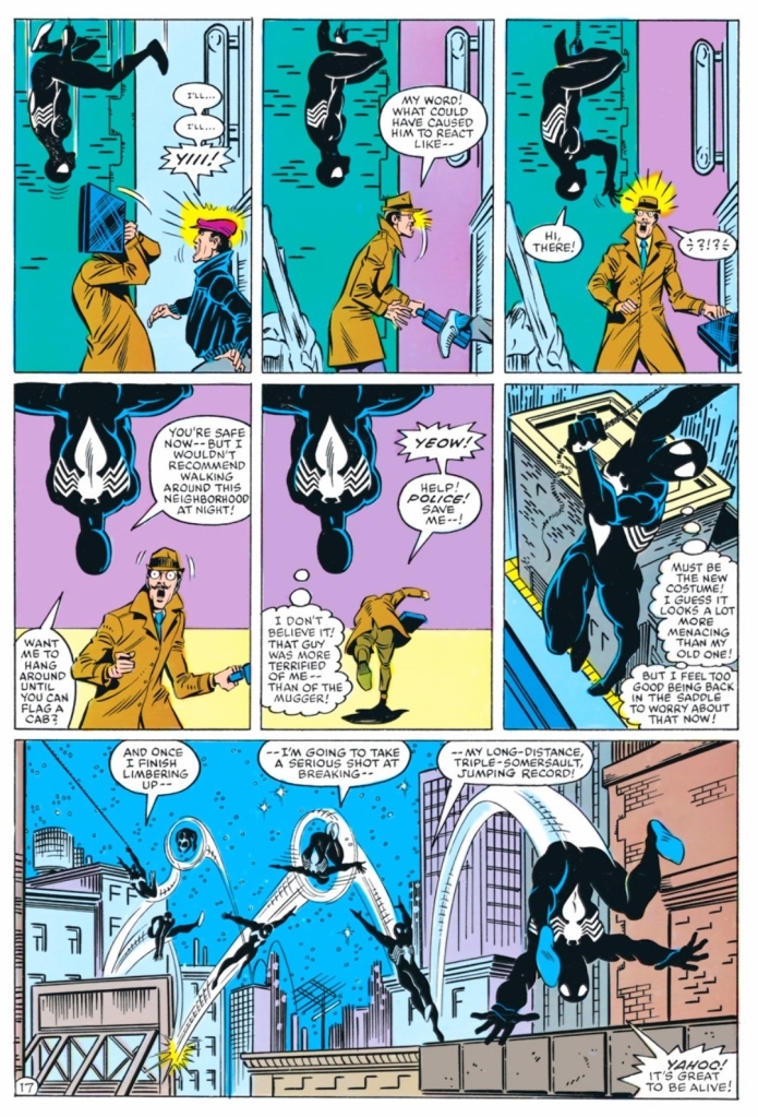
Welcome back superhero enthusiasts, 1980s arts and culture enthusiasts, Marvel Comics fans and comic book collectors! Today we go back to the year 1984 to examine a small part of the Marvel Comics universe through a tale of the Amazing Spider-Man monthly series.
The era when Spider-Man came back from deep space (refer to Secret Wars) with a new black costume (the symbiote that would later help form Venom) that itself had special abilities was indeed a very notable time in superhero comics history. As if Spidey’s troubled personal life was not enough, he had to deal with new villains that were formidable and tough to deal with.
With those details laid down, here is a look back at Amazing Spider-Man #256, published in 1984 by Marvel Comics with a story written by Tom DeFalco and drawn by Ron Frenz.
The cover.
Early story
The story begins inside a warehouse when Spider-Man suddenly catches a lot of men by surprise. The men turned out to be doing something illegal with lots of stolen good contained in boxes. Quite fearlessly, the webslinger knocks out many of them while Black Cat takes pictures (assistance for Peter Parker) from a distance above. Black Cat eventually gets involved in the physical struggle and the bad guys all got defeated afterwards.
After the struggle, Spider-Man and Black Cat (who know each other personally) have a short sentimental talk before parting ways. As soon as he arrives home, Peter Parker starts developing the pictures in preparation for much-needed income from the Daily Bugle.
Elsewhere in New York (the next morning), the warehouse raid caused by Spider-Man and Black Cat makes immediate impact on the secret operations of the Rose who in turn wants the hero dead. The Rose (who reports to the Kingpin) then sends a message to New Mexico to contact the one person capable of killing Spider-Man…the Puma.
Quality
Puma in his animalistic form deep within the harsh wilderness of New Mexico.
I can state that within the age of Spider-Man wearing the alien costume, this particular tale has a strong debut of a new foe and the plot itself is quite intriguing. Tom DeFalco cleverly paced the introduction of Puma whose civilian personality is that of a very focused business executive. The creative team took the inspired approach of defining Puma with the harshness of the New Mexico wilderness contrasted with that of his civilian identity spending time in the bustling urban environment of New York City.
Not only is Puma very powerful and focused, he also has a high standard when it comes to accomplishing tasks showing no fear nor hesitation with regards to potential obstacles ahead of him. Clearly, Puma is not your typical super villain but a very principled and very capable figure. When compared to Wolverine, Puma shares some common animalistic elements with him but he consistently maintains control of himself. This makes him a dangerous force of opposition towards Spider-Man.
Spider-Man here is usual self. His personal problems and lack of a stable life are taking their toll on him just as he continues to keep doing good (example: fighting crime). It should be said that when Puma first strikes at him, the creative monotony with the webslinger suddenly got snapped causing a new series of unfortunate developments that test him. It is also revealed here that using the alien costume does not spare him from serious physical injury.
Conclusion
These panels show how vulnerable Peter Parker really is as the alien costume comes to him willingly.
Amazing Spider-Man #256 (1984) is a great read. The build-up with Puma is very powerful and his presence really made a huge impact on the reading experience. By the time the story ended, I was very convinced to read the next issue.
Disclaimer: This is my original work with details sourced from reading the comic book and doing personal research. Anyone who wants to use this article, in part or in whole, needs to secure first my permission and agree to cite me as the source and author. Let it be known that any unauthorized use of this article will constrain the author to pursue the remedies under R.A. No. 8293, the Revised Penal Code, and/or all applicable legal actions under the laws of the Philippines.
Welcome back superhero enthusiasts, 1980s arts and culture enthusiasts, Marvel Comics fans and comic book collectors! Today we go back to the year 1984 to examine a small part of the Marvel Comics universe through a tale of the Amazing Spider-Man monthly series.
Between the developments of 1980s Secret Wars limited series and the debut of Venom was the time when Peter Parker wore a black new costume as Spider-Man which happens to be the alien costume he gained while spending time with other superheroes in deep space (refer to Secret Wars #8). There was this gradual approach done by the creators to tell new tales of Spider-Man who has the symbiote attached to him most of the time.
With those details laid down, here is a look back at Amazing Spider-Man #255, published in 1984 by Marvel Comics with a story written by Tom DeFalco and drawn by Ron Frenz.
The cover.
Early story
The story begins when a black costumed figure arrives at the balcony of a tall building during night time in New York City. He carefully makes an unlawful entry into the place to steal something. The figure was the Black Fox who intends to take valuables not to feed his greed but to properly subsidize his retirement. When he touches an exquisite-looking vase, it disappears and suddenly a monstrous ape appears from nowhere surprising him. Soon enough, he finds himself surrounded by more apes and faces their human leader (one who referred to the apes as pets).
Meanwhile at his apartment, a very tired Peter Parker washes his black costume (the symbiote), reflects on recent events he went through and then goes to bed. During the night, the black costume comes to life and slowly slithers its way into the bedroom wrapping itself on the sleeping Peter…
Quality
The sneaky Black Fox has no chance of escaping Spider-Man (wearing the alien costume that would later lead to the start of Venom).
I want to start with the force of opposition the creative team came up with. This is about the powerful villain the Red Ghost who has super-apes under his control and vast wealth and resources to organize criminal activities. Red Ghost here is not your typical villain as he is actually strategic, smart and even philosophical clearly knowing what he is doing and what he needs to keep on doing crime. The retiring old thief Black Fox happens to be the very criminal that Red Ghost needs for a special task involving the machine called the Cosmicizer which is essential to his need of vastly increasing his cosmic-ray induced powers.
The Red Ghost is struggling with certain limits which are related to his need of the Black Fox to accomplish something for him with the assistance of the super apes. That being said, the presentation of evil awaiting Spider-Man in this tale is a clever move by DeFalco and Frenz.
As for the iconic webslinger, you will see more of Peter Parker’s personal struggles balancing his life between real-world living and performing as Spider-Man to help people and solve problems. In this tale, his personal life is at a low point and it does not help that his has a strained link with his Aunt May. Even though he has the alien costume that is capable of aiding him a lot, there are still problems that the superhero simply cannot solve. The dramatization here is pretty good and the way the final conflict with the main villain turned out was a pretty nice pay-off.
Conclusion
Peter Parker’s sleep has been disorderly since he brought home with him the symbiote.
Amazing Spider-Man #255 (1984) is an entertaining and intriguing read. The creative team’s decision to have the established Fantastic Four foe Red Ghost as the definitive villain for Spider-Man turned out to be a smart move and what they did was fun to read. The presence of Black Fox (note: this comic book is his debut) added a layer of depth to the plot and his declared desire to retire from the life of crime made him an intriguing addition to the Spider-Man list of villains.
Welcome back readers, fellow geeks and electronic gaming fans!
In this edition of the Retro Gaming Ads Blast (RGAB) series, we will take a look at another batch of retro gaming print ads from the 1980s and 1990s.
For the newcomers reading this, Retro Gaming Ads Blast (RGAB) looks back at the many print ads of games (console, arcade, computer and handheld) that were published in comic books, magazines, flyers and newspapers long before smartphones, social media, the worldwide web and streaming became popular. To put things in perspective, people back in the 1980s and 1990s were more trusting of print media for information and images about electronic games and related products.
With those details laid down, here is the newest batch of retro gaming print ads for you to see and enjoy…
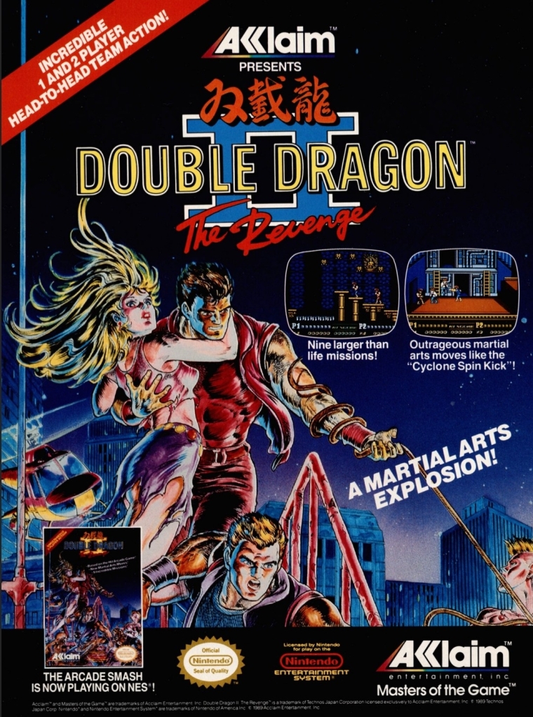
1. Double Dragon II: The Revenge print ad
Nice looking art used to promote the game.
The beat-them-up sub-genre of gaming was already popular in the 1980s and one of the most defining game franchises of this type of game was the Double Dragon series which proved to be popular with Nintendo Entertainment System (NES in America) and Family Computer (Famicom in Japan) gamers. As the first game was a very big hit on Nintendo’s consoles, the sequel Double Dragon II: The Revenge was promoted in America with strong confidence on the part of publisher Acclaim that it would become another massive hit. This print ad had a very nice looking comic books-style art that not only captured the concept of the game but also visualized the heroes Billy and Jimmy with enough details to focus on. I can say this was an eye-catching ad.
2. X-Men: Children of the Atom print ad
Great looking ad but the line “100% direct conversion” is not true at all.
Developed by Capcom in cooperation with Marvel, X-Men: Children of the Atom was a huge hit in the video arcades and it was not surprising that it got released on the Sega Saturn by Acclaim. Acclaim organized an aggressive promotional campaign by pouncing on the fans’ love and knowledge of the X-Men and the high fun factor of Capcom’s game. What this print ad got wrong, however, was the line “100% direct conversion of the #1 arcade smash!” which was wrong and misleading. In reality, the Sega Saturn version of the game had about one-third of the animation frames cut due to the console’s smaller RAM capacity.
As the years passed by, the Sega Saturn became the more suitable console for home ports of Capcom’s further 2D fighting games as Sony’s PlayStation had even more severe limitations and a graphics processor that was not suitable for 2D graphics. By the end of 2000, Capcom’s 2D fighting games on PlayStation all were inferior to the Sega Saturn versions.
3. Sky Shark NES print ad
This is an effective looking ad.
Released in Japan as Flying Shark, Sky Shark was released on multiple platforms in 1988 and there was an NES version of it which this particular print ad promoted. The American branch of Taito wisely used positive quotes from media outlets to promote the game while coming up with an engaging text description and displayed NES screenshots. And then there was that very engaging painted cover art that gave this print ad a lot of punch. An effective ad overall.
4. Conflict print ad
This is a very captivating artwork for advertising.
There is no denying the fact that the Cold War was a strong influence on arcade games and video games. Titles like Contra, Jackal, Metal Gear, Operation Wolf, Cabal and Rush’n Attack were militaristic games that entertained millions of gamers from the young adults to the little children. In 1990, Vic Tokai released the game Conflict on the NES which had a military theme but an unusual game design composed of digital maps with hexagons in which gamers will play with strategy to win battles. That being said, this print ad’s visual concept was very captivating yet also misleading. If you see how the game is played, you will know what I mean.
5. College Slam print ad
Were you ever interested in college basketball video games?
This is one of the more eye-catching print ads I’ve seen due to the artist’s illustration of a basketball with a mouth biting the basketball rim which dominates the space. For the newcomers reading this, College Slam was a basketball video game that was actually a repacked version of the popular NBA Jam with focus on NCAA basketball players. With the biting basketball at the center, it was easily an attraction and the screenshots implemented were larger than usual which easily gave gamers a clear look at what the game looked like. While this print ad is eye-catching, it did not help sell College Slam and there never was a follow-up.
6. Tecmo Super Baseball print ad
From the time when Tecmo was prolific with video games about sports.
Long before it started the Dead or Alive game franchise, Tecmo was once heavily invested in making sports video games. Tecmo Super Baseball was their first American pro baseball video game released for Super Nintendo Entertainment System (SNES) and Sega Genesis, and it was notable that the publisher secured only the Major League Baseball Players Association (MLBPA) which resulted in the game featuring real-life players but the teams had no names and no logos. Regardless, this print ad showed how aggressive Tecmo was in trying to attract consumers’ attention by showing ten screenshots with short text descriptions each. The ad’s write-up boasted realism as well as the promise of gaming quality.
7. The Punisher print ad
Marvel’s vigilante firing at someone.
In the early 1990s, Capcom and Marvel Comics started their partnership resulting in the releasing of the arcade game The Punisher. Developed by Capcom, the said arcade game became a big hit with gamers as it featured fun gameplay, multiple enemies appearing on screen simultaneously and other fun elements. Unsurprisingly, the game was ported (note: Sculptured Software was the lead developer) to the Sega Genesis with significant downgrades in terms of graphics, sound, enemy variety and other related elements due to technical limitations. That being said, this print ad used detailed art of the Punisher (with Col. Fury in the background) in a clever way to promote the Sega Genesis version while keeping their attention away from the obvious visual downgrades of the two screenshots displayed. The Punisher on Genesis was poorly received.
8. Stargate print ad
If you did not enjoy the movie, were you able to play the video game adaptation on Sega Genesis or Super NES?
Remember the sci-fi movie Stargate (1994)? The film was a surprise box office hit and eventually video game adaptations of it were made for the SNES, Sega Genesis, Game Gear and the GameBoy. This particular print ad, however, showed screenshots of the SNES and Genesis versions which is made obvious with the side-scrolling adventure plus 3D flying sequence (one screenshot showed it). Combined with images sourced from the movie poster plus an insert of the movie in home video format (lower-right corner), this print ad was obviously an aggressive way to promote the film with the post-theatrical business in mind. In case you are wondering, the cinematic Stargate is not related at all with the early 1980s video game (a follow-up to the classic game Defender) of the same name.
9. Aerobiz Supersonic print ad
For a simulation game released on consoles, Aerobiz Supersonic is pretty deep and a lot of fun to play.
The airline simulation game Aerobiz Supersonic is a highly addictive and surprisingly fun game that I enjoyed playing on the SNES (read my retro review by clicking here) and strangely enough I first learned about not through its print ad but by reading a preview published by Electronic Gaming Monthly (EGM) magazine. As for this print ad made by Koei’s American team, this is really odd to look at due to the ad makers’ choice of showing a not-so-attractive flight meal. In contrast to that, the ad makers did a good job describing the game creatively and showed three screenshots that were strategically selected in my view. Having played the game many times, I can say that this print ad is very truthful.
Disclaimer: This is my original work with details sourced from reading the comic book and doing personal research. Anyone who wants to use this article, in part or in whole, needs to secure first my permission and agree to cite me as the source and author. Let it be known that any unauthorized use of this article will constrain the author to pursue the remedies under R.A. No. 8293, the Revised Penal Code, and/or all applicable legal actions under the laws of the Philippines.
Welcome back superhero enthusiasts, 1980s arts and culture enthusiasts, Marvel Comics fans and comic book collectors! Today we go back to the year 1984 to examine a small part of the Marvel Comics universe through a tale of the Amazing Spider-Man monthly series.
By now, you readers should be aware that I reviewed a lot of comic books about Spider-Man and his deadliest enemy Venom. It is already established through comic book history that the iconic webslinger is responsible for the establishment of Venom as he brought into the world the alien costume (the symbiote) coming from deep space (as told in the Secret Wars limited series), and he also became responsible for the destruction of Eddie Brock’s career in journalism. Of course, Venom did not debut immediately after Spider-Man’s return from Secret Wars and there was a lot more about the symbiote when it was with Peter Parker.
With those details laid down, here is a look back at Amazing Spider-Man #252, published in 1984 by Marvel Comics with a story written by Roger Stern and Tom DeFalco, and drawn by Ron Frenz. This comic book marked the first appearance of the alien costume.
The cover.
Early story
The story begins inside the New York headquarters of the Daily Bugle. It has been observed that several superheroes such as Captain America, Thor, Spider-Man, Iron Man, the X-Men and the Avengers have been missing this resulted in a rise of crime. Publisher J. Jonah Jameson and editor-in-chief Joe Robertson discuss the newest edition of their newspaper.
Meanwhile over at Central Park where police officers and others stand by an area that was closed off, a physical structure suddenly appears spreading bright light to onlookers. Suddenly Spider-Man (wearing a new dominant black costume) leaps out of the structure carrying Dr. Connor (the Lizard) surprising the people.
After realizing they have returned home at last after spending lots of time and struggle in deep space (Secret Wars), Spider-Man could not help but feel jubilant to be home. As the police officers don’t realize that they are talking with the same webslinger due to the new costume, one of them was about to draw his gun which prompted the superhero to use his web on him.
Suddenly, the Avengers, Captain America, Thor and Iron Man emerge from the physical structure which provided Spider-Man relief as he thought that only he and Dr. Connors made it home. With the people focusing on the other superheroes, Spider-Man and Dr. Connors slowly exited. Connors asked him what are they going to tell the world about all they have seen and experienced in deep space…
Quality
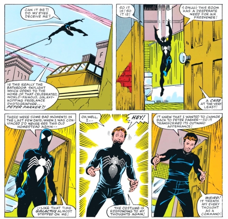
Spider-Man’s first night in New York wearing the alien costume .
I really like this story. I first read this a long time ago and I re-read it all over again for this retro review, and still this story engaged me a lot. There is a lot of richness in the script and you will get to see Peter Parker transitioning into a series of major changes that await him. Without spoiling the plot, there is no hero-versus-villain element here at all. It is all about Spider-Man who just arrived home from a major conflict (and also one of the most significant comic events ever published by Marvel Comics) and the alien costume saga truly began right here. The Venom debut did not happen until a few years later in reality.
In accordance to what was established in Secret Wars (not to be confused with the 2015 series of the same name) and the standards of then editor-in-chief Jim Shooter, the creative came up with a tale that not only showed a different Spider-Man but also portrayed him in ways that defied the tropes and creative ideas the preceded this comic book.
For one thing, Peter Parker is literally like a fish out of water here. As far as the whole world is concerned, only days passed when the superheroes went to deep space. But for the webslinger, a lot more time passed as so many battles, discoveries and intriguing events took place for him along with the others. That being said, Peter Parker’s perception of reality and track of time really got messed up and the weight of Secret War’s events really turned out overwhelming on him. This was well dramatized in the scene wherein Peter – who realized that so much time had passed – he had to call his aunt May fearing that she must be worried sick over him. There was also the moment when by walking down the street, he realized how much he missed not only his home but also the local surroundings.
It was also in this comic book when Peter started getting more oriented with the alien costume he first got in Secret Wars #8 (which was actually published after this comic book) and started to enjoy the benefits with the way it responds to his thinking. Of course, at this stage, he has yet to realize the unfortunate truth about the living costume he brought home and this story really kicked off a new and profound stage in the comic book history of Spider-Man
Conclusion
When Spider-Man finally arrived home after spending so much time during Secret Wars.
Amazing Spider-Man #252 (1984) is still a great comic book to read all over again. This was released during the time when Secret Wars (1984) was still being published and years before Venom’s big debut in the series’ 300th issue. In my view, the alien costume saga was a big turning point in the literary history of Spider-Man and the creators who got involved in this comic book really sowed the seeds of compelling and intriguing events that followed. What is intriguing is that all of these significant developments started when a Marvel Comics reader from Illinois came up with the idea of a new costume for Spider-Man, wrote to them and the publisher responded to acquire his idea for over $200 (click here).
This comic book is also a reminder of how significant Jim Shooter’s rule at Marvel Comics really was and I can say that the Marvel’s literary universe of the 1980s should not be ignored.
Welcome back readers, fellow geeks and electronic gaming fans!
In this edition of the Retro Gaming Ads Blast (RGAB) series, we will take a look at another batch of retro gaming print ads from the 1980s and 1990s.
For the newcomers reading this, Retro Gaming Ads Blast (RGAB) looks back at the many print ads of games (console, arcade, computer and handheld) that were published in comic books, magazines, flyers and newspapers long before smartphones, social media, the worldwide web and streaming became popular. To put things in perspective, people back in the 1980s and 1990s were more trusting of print media for information and images about electronic games and related products.
With those details laid down, here is the newest batch of retro gaming print ads for you to see and enjoy…
1. Konami’s 3-in-1 sports games print ad
Long before the advent of major league sports video games, Konami was prolific with sports video games.
Back in the 1980s, Konami was a prominent gaming company as they released a lot of games that became hits in the arcades, on home computers and gaming consoles. Considering the limited amount of games publishers were allowed to release on the Nintendo Entertainment System in America, what Konami released were really fun games to play and their contributions of sports-based video games on the NES were significant. Possibly due to a lack of marketing budget at the time, they promoted Blades of Steel, Double Dribble and Track & Field II with this single-page ad showing the game box covers and screenshots. Ultimately, this print ad was sufficient in giving gamers a clear idea of what to expect with the three games.
2. The Adventures of Bayou Billy print ad
Bayou Billy looks inspired by the cinematic hero Crocodile Dundee. This video game even had a comic book adaptation published by Archie Comics.
Still with Konami, the Japanese publisher released in America the non-military adventure game The Adventures of Bayou Billy for the NES which was a revised version of their 1988 Family Computer game titled Mad City (see the differences by clicking here). This game really looked like it was influenced by Hollywood action/adventure movies of the era and it provided gamers gameplay styles of light gun shooting, beat-them-up action and racing. The titular hero looks very inspired by the cinematic hero Crocodile Dundee. This print ad is very stylish and also eye-catching. I think it has done a good job to make viewers interested in the video game.
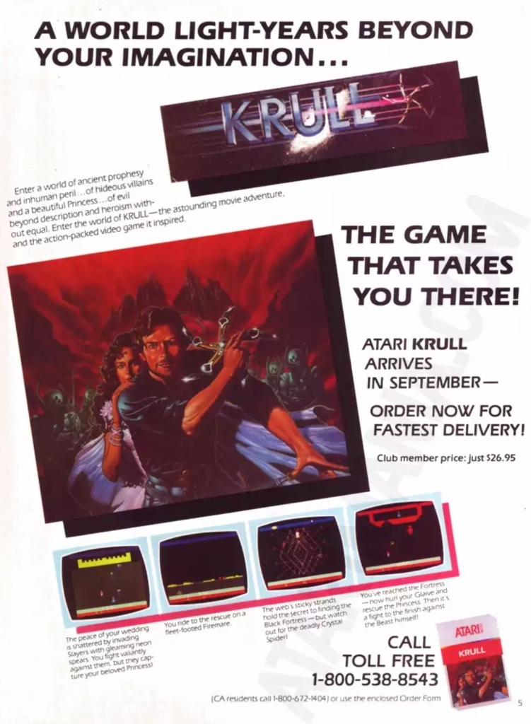
3. Krull Atari video game print ad
I never got to play this Krull video game on Atari 2600, nor its arcade game.
Way back in 1983, I was fortunate to see the science fantasy movie Krull inside the movie theater here in the Philippines. When I saw this print ad, I easily got excited for the Atari 2600 video game adaptation but never got to play it. This print ad does its job showing what Krull’s game looked like and the ad makers cleverly used painted art reflecting the movie’s characters and the armored enemies from space. I should add that between the time I saw the movie and the time I first saw this print ad, I became aware of the existence of the Krull arcade game by watching an episode of Starcade on TV.
4. Rocket Ranger NES print ad
Really great and detailed painted artwork in this print ad.
When Rocket Ranger on the Amiga in 1988, it had fancy visuals and a strong cinematic vibe that worked smoothly with the game design. This game was developed by Cinemaware which developed a reputation of releasing games based on classic film genres. In 1990, a version of Rocket Ranger for the NES was published by Kemco/Seika and print ads using painted art were made to promote the game. This particular print ad made heavy use of painted art which was captivating to look at while conveniently keeping people’s minds off the downgraded visuals of the NES version.
5. Michael Jordan: Chaos in the Windy City print ad with contest entry
Some gamers thought this was a basketball video game.
Yes, it was all true. There definitely was a video game that NBA legend Michael Jordan endorsed. First released on Super Nintendo Entertainment System (SNES) in America in 1994, Michael Jordan: Chaos in the Windy City was a side-scrolling action game in which gamers play a digital version of Jordan who has to save his friends, fight enemies and move from one location to the next in order to progress. The fact that an image of Michael Jordan holding two balls was used in this print ad (as well as on the game cover) in a dominating fashion made some gamers think this was a basketball game. The display of screenshots was so small, it did not help the situation. Lastly, the available of a contest entry form in this print ad was meant to promote not only the game but also GamePro magazine.
6. Gun.Smoke print ad
Gun.Smoke was indeed a fun game to play on NES. Therefore, the promotion is justified.
This print ad of the NES port of Gun.Smoke has strong imagery and literary descriptions the strongly emphasize the Old West concept and setting. The screenshots displayed are too small but the descriptions more than made up for it. Ultimately, what this print ad emphasized was realized as the NES version of Gun.Smoke itself captured the continuous action and excitement of the arcade version and the graphical limitations of the console did not matter much. I myself played this game and it was a lot of fun.
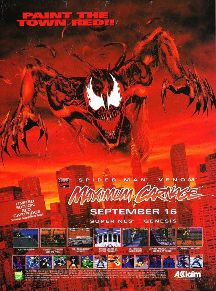
7. Spider-Man and Venom: Maximum Carnage print ad
This add appeared in my comic books and magazines I read in 1994.
Back in 1993, Marvel Comics published the huge Maximum Carnage crossover storyline which covered many issues of the four monthly Spider-Man comic books and two issues of the quarterly Spider-Man Unlimited series. Considering the high popularities of Venom and Carnage at the time, it was not surprising that Marvel took advantage by having Maximum Carnage licensed to Acclaim to create a video game adaptation in the form of a beat-them-up.
Spider-Man and Venom: Maximum Carnage was released for SNES and Sega Genesis in 1994, and game developer Software Creations really adapted story to fit with their side-scrolling game design. Between playable stages are cutscenes that actually were digitized versions of actual comic book panels. This red-colored print ad had a dominating image of Carnage and screenshots with text descriptions. The ad makers even went the extra mile by inserting screenshot cut-outs showing individual characters such as Firestar, Venom, Spider-Man, Carnage, Cloak and Dagger, Iron Fist, Captain America and more. Whatever your opinion is about the Maximum Carnage storyline or the video game adaptation, there is no denying that this was a very eye-catching print ad.
Disclaimer: This is my original work with details sourced from reading the comic book and doing personal research. Anyone who wants to use this article, in part or in whole, needs to secure first my permission and agree to cite me as the source and author. Let it be known that any unauthorized use of this article will constrain the author to pursue the remedies under R.A. No. 8293, the Revised Penal Code, and/or all applicable legal actions under the laws of the Philippines.
Welcome back superhero enthusiasts, 1990s arts and culture enthusiasts, Marvel Comics fans and comic book collectors! Today we go back to the year 1993 and examine a small part of the Marvel Comics universe through a tale of the Amazing Spider-Man monthly series.
In my previous retro comic book review, the insane murderer Venom returned to antagonize Spider-Man by targeting his parents. While it was a fact that Venom – who knew Spider-Man’s true identity – got into close contact with Aunt May (symbolizing the danger he poses on the Peter Parker’s family) a few years prior, going after the mother and father of Peter really raised the stakes.
With those details laid down, here is a look back at Amazing Spider-Man #375, published in 1993 by Marvel Comics with a story written by David Michelinie and drawn by Mark Bagley. This comic book marked the 30th anniversary of Amazing Spider-Man #1 (1963).
The cover.
Early story
The story begins inside one of the facilities of the closed amusement park in Brooklyn. In his vicious form, Venom tells Richard and Mary Parker (both restrained) that they belong to him and declares that he would protect them from Spider-Man.
When Richard Parker asked why would he think that they would have anything to do with Spider-Man, Venom realizes that the couple does not even know their son is the webslinger. Venom tells the couple that their innocence is what he is sworn to preserve.
Over at Manhattan, Spider-Man swings back to the Daily Bugle building and discreetly changes his clothes before moving in as photographer Peter Parker. Inside one of the offices, J. Jonah Jameson reaches out to Silver Sable by telephone…
Quality
Peter Parker had to commit a crime by trespassing into Anne Weying’s residence. His disguise as Spider-Man does not protect him from the law.
I have mixed feelings about this follow-up to the great story of the previous issue. For one thing, David Michelinie’s script had a completely different tone and direction even though he intended this comic book to conclude what issue #374 started. Another thing is that this story has even more characters added in which clearly diluted the intensity of the Venom-Spider-Man rivalry that was so intense in the previous issue.
There are two sub-plots – one of which deals with someone from Eddie Brock’s past – that were emphasized with sufficient details and the creative team integrated them into the main story. It seems that the creators intended to make the main story look grander in scope while sacrificing the very elements that made issue #374 a great and intense reading experience.
Remember the suspense and danger that came with Venom targeting the older Parker couple? Those elements are almost totally absent in this comic book even though this story concluded the previous issue’s conflict build-up. Richard and Mary Parker are both present as captives of Venom but there really is no tension nor any sense of danger here due to the drastic change of tone and direction in the script.
I should also stress that the introduction of Anne Weying (previously Anne Brock) as Eddie Brock’s ex-wife looked and felt like an afterthought inserted into the story. While Anne’s presence brought out some traces of humanity and sanity from Venom during the 2nd half of the story, it did not add much impact on the conflict between the webslinger and the symbiote-wearer murderer. Ultimately, the creative team had to do something to explain the story build-up on Venom’s part leading into the Lethal Protector limited series which is set in the city of San Francisco.
And then there was the presence of Silver Sable’s team called the Wild Pack. The Wild Pack is the result of J. Jonah Jameson’s agreement with Silver Sable with the objective of achieving a journalistic exclusive for the Daily Bugle. This particular sub-plot is really lousy and not even the dynamic looking action sequences involving the Wild Pack could hide lousiness.
If there is anything symbolic about the script, it is the emphasis on family as well as the impact that comes with elements of the past emerging unexpectedly. In this very comic book, you will get to see Eddie Brock/Venom react like a sane person in response to the sudden re-appearance of his former wife. No matter what the creative team did here, I can say that the Spidey/Venom conflict did not really intensify (note: the dynamic action scenes did not solve the shortcomings) and there was no reason to worry about the captive Parker couple.
Conclusion
The insane murderer Venom with the parents of Peter Parker.
Considering the great stuff and raised stakes that made issue #374 a very compelling read, Amazing Spider-Man #375 (1993) is clearly a disappointing conclusion. This is not a terrible comic book as it has some good stuff for fans to enjoy but the overall presentation of the creators here is not too great due to their approach with the storytelling (with two sub-plots that did not add much). Overall, I am glad I never bought this comic book (with flashy cover and more pages) at full price in 1993.
Disclaimer: This is my original work with details sourced from reading the comic book and doing personal research. Anyone who wants to use this article, in part or in whole, needs to secure first my permission and agree to cite me as the source and author. Let it be known that any unauthorized use of this article will constrain the author to pursue the remedies under R.A. No. 8293, the Revised Penal Code, and/or all applicable legal actions under the laws of the Philippines.
Welcome back superhero enthusiasts, 1990s arts and culture enthusiasts, Marvel Comics fans and comic book collectors! Today we go back to the year 1990 to take a close look at the comic book adaptation of the movie RoboCop 2 (1990).
Before getting to the new retro comic book review, I should state that my friends and I had a fun time watching RoboCop 2 in the cinema shortly after it opened here in the Philippines. Back then, I was not yet a comic book collector and I rarely visited comic book specialty stores. That being said, I was unaware that Marvel Comics actually published an adaptation in the form of a 3-issue mini-series.
With those details laid down, here is a look back at RoboCop 2 #1, published in 1990 by Marvel with a story written by Alan Grant and drawn by Mark Bagley based on the movie screenplay by Frank Miller and Walon Green.
The cover.
Early story
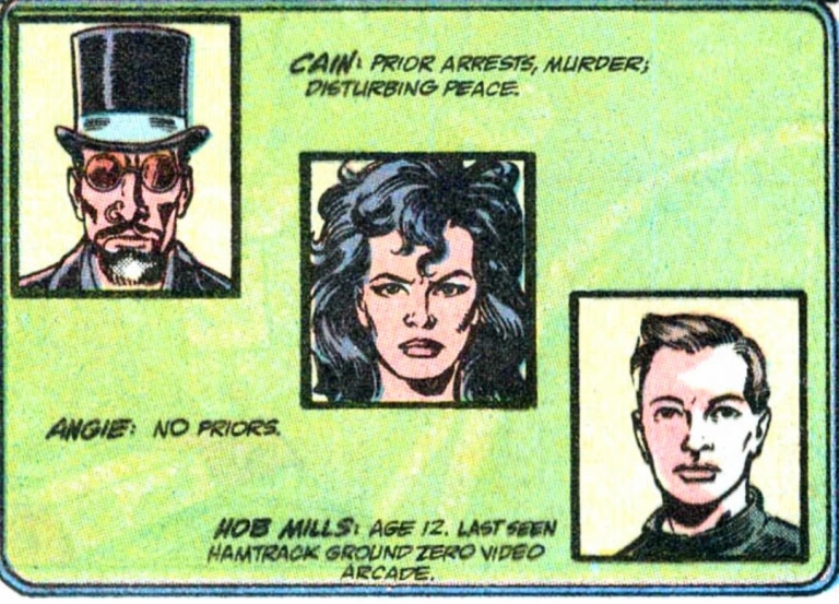
The story begins in Detroit where the cops are run by corporations and the streets have turned into red-alert war zones. Crime is overwhelming the city and the highly addictive narcotic poses the greatest threat facing societies. The surgeon general who made the public warning about nuke was killed and the crime boss Cain (leader of a cult of nuke addicts and pushers) claims responsibility. Through the news media, Cain tells the public that nuke will make people’s problems go away and people want its paradise.
Under the management of Omni Consumer Products (OCP), several of Detroit’s police officers go on strike demanding better terms from their employer. The City Government of Detroit under Mayor Kuzak missed a payment (in relation to them owing $37 million) and OCP begins to move to foreclose the city and its assets in accordance to the terms of the contract. Mayor Kuzak accuses OCP of engineering the police strike which made crime rampant.
Elsewhere in the evening, the cruel activities of the thugs got disrupted by the arrival of a police car. Even though the police car got destroyed by the thugs, RoboCop emerges and begins to fight back…
Quality
There is simply no holding back for RoboCop when it comes to doing police work at a time when many police officers are on strike while crime has turned more rampant in Detroit.
This opening issue of the mini-series sticks close the basic plot of the movie (right until after Cain’s gang dismantled RoboCop) although there were a few notable differences with the sequence of events and there were scenes that showed the creative team took liberties to make the story suitable with the literary format in mind. That being said, don’t expect to see the key moments of the movie look exactly the same in this comic book and don’t expect to see the characters here looking like the actors who played them on the big screen. In terms of visual and literary presentation, this adaptation has a lot in common with the Total Recall comic book adaptation which coincidentally was released the same year.
For me, this is indeed a really readable comic book that has its stylized approach on telling the movie’s concept. OCP is the most powerful entity in the story while Cain and his gang are clearly the force of evil that strongly pose danger not only to Detroit’s people but even to the very divided police force. Nuke as the dangerous object of the plot clearly was inspired from elements of the real life war against drugs in 1980s America which made this story socially relevant.
Very clearly these villains look nothing like actors Tom Noonan, Galyn Görg and Gabriel Damon.
Like in the movie, RoboCop here performs his law enforcement duty in an uncompromising manner even though memories of his past life as officer Murphy re-emerged deep inside. That being said, there are a few moments in which you might sympathize with the titular hero as this comic book pays close attention to the conflict between humanity and technology.
The action scenes here are sufficient but clearly don’t come anywhere close to the intensity of the film in terms of violence. Still, there is enough action for readers to enjoy.
When it comes to the visuals, the artwork done by Mark Bagley eerily looks comparable with Tom Lyle’s art in the Total Recall comic book of 1990. For the newcomers read this, Bagley became a popular artist through the Amazing Spider-Man monthly series and the Venom: Lethal Protector comic books that were released after years after this one. Having seen many of Bagley’s works published in 1992 to 1995, I can hardly recognize his art style in this comic book adaptation. The way he drew people’s faces in this comic book looks very different from those seen in Amazing Spider-Man issues. At the same time, Bagley’s own take on RoboCop has that balanced approach on depicting humanity with machinery while also making the hero look less bulky compared to the movie’s version.
Conclusion
Julie Faxx of OCP sure talks like a woke nut and rabid feminist in this scene.
RoboCop 2 #1 (1990) is clearly not a faithful adaptation of selected parts of the movie but that’s not necessarily a bad thing. This is more about the Grant-Bagley team doing their own visual presentation of the movie script copy they had and ultimately they succeeded in making this comic book a stylized and worthy reading experience. This is indeed a surprisingly entertaining read and I can say that I am looking forward to reading the next issue.