Disclaimer: This is my original work with details sourced from reading the comic book and doing personal research. Anyone who wants to use this article, in part or in whole, needs to secure first my permission and agree to cite me as the source and author. Let it be known that any unauthorized use of this article will constrain the author to pursue the remedies under R.A. No. 8293, the Revised Penal Code, and/or all applicable legal actions under the laws of the Philippines.
Welcome back superhero enthusiasts, 1990s arts and culture enthusiasts, Marvel Comics fans and comic book collectors! Today we go back to the 1990s to examine a small part of the Marvel Comics shared universe through a tale of the Amazing Spider-Man monthly series.
Following a serious of unfortunate events that kept Spider-Man away from his wife Mary Jane (read my retro reviews by clicking here, here and here), the Amazing Spider-Man creators decided it was time to have the iconic webslinger in a new rematch with the classic villain The Vulture (specifically Adrian Toomes whose first appearance was in Amazing Spider-Man #2 in 1963). What makes Toomes Vulture notable (note: there were other versions of Vulture in Marvel’s history) is that he is an old man who happens to be a brilliant electrical engineer who proved to be a very capable criminal. He is also a co-founder of the Sinister Six.
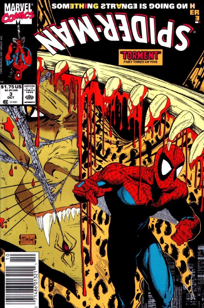
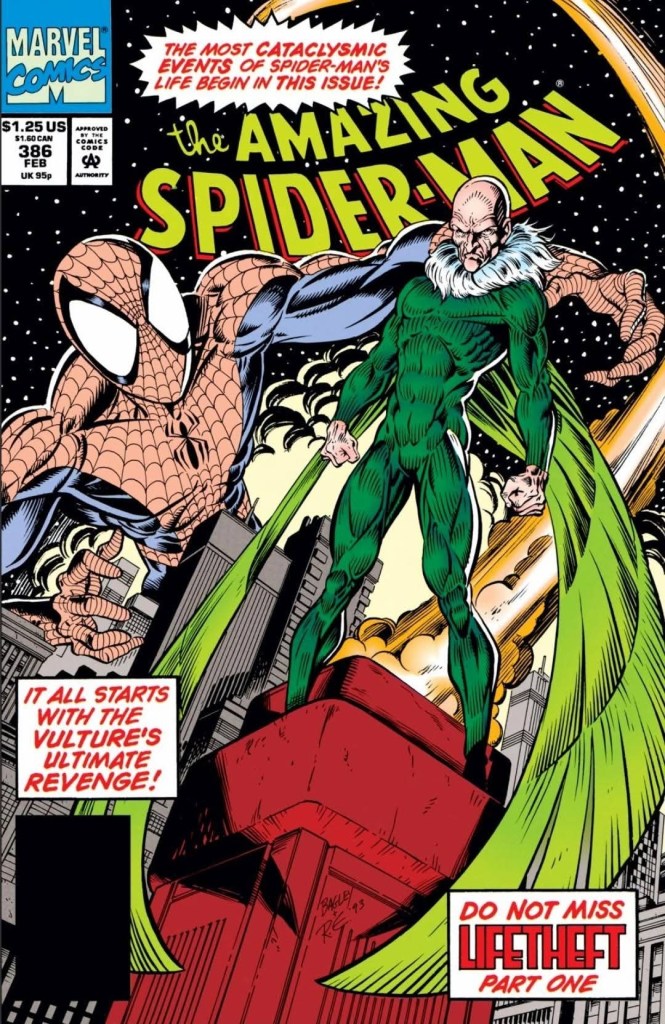
With those details laid down, here is a look back at Amazing Spider-Man #386, published in 1994 by Marvel Comics with a story written by David Michelinie and drawn by Mark Bagley.
Early story
The story begins in the prison complex at Ryker’s Island. Adrian Toomes (Vulture) is inside his prison cell working on a small device with a guard watching from his back. It turns out the device has a tractor beam and Toomes uses it on the guard to physically slam his body on the sliding door of the prison cell. Toomes then uses the tractor beam to pull the metal bars of the other side of the cell to create an opening. He equips himself with mechanical wings and flew out of his cell and reach the speed boat prepared by two companions.
At the residence of May Parker, Peter and his Aunt May talk with an investigator. It turns out Aunt May hired the investigator to follow and observe Richard and Mary Parker. When asked by Peter, she tells him she does not think Richard and Mary are his parents. As far as the investigator is concerned, there is nothing suspicious with Richard and Mary Parker. He tells peters that his aunt needs professional help (related to Alzheimer’s Disease)…
Quality
Perceived as modern during the time of publication, the conflict between Spider-Man and the Vulture in this comic book utilized the concept of everlasting youth with science fiction (combined with the villain’s own obsession). This in turn resulted in a unique approach executed by the Michelinie-Bagley duo to make something new with the rematch between Spidey and his winged nemesis.
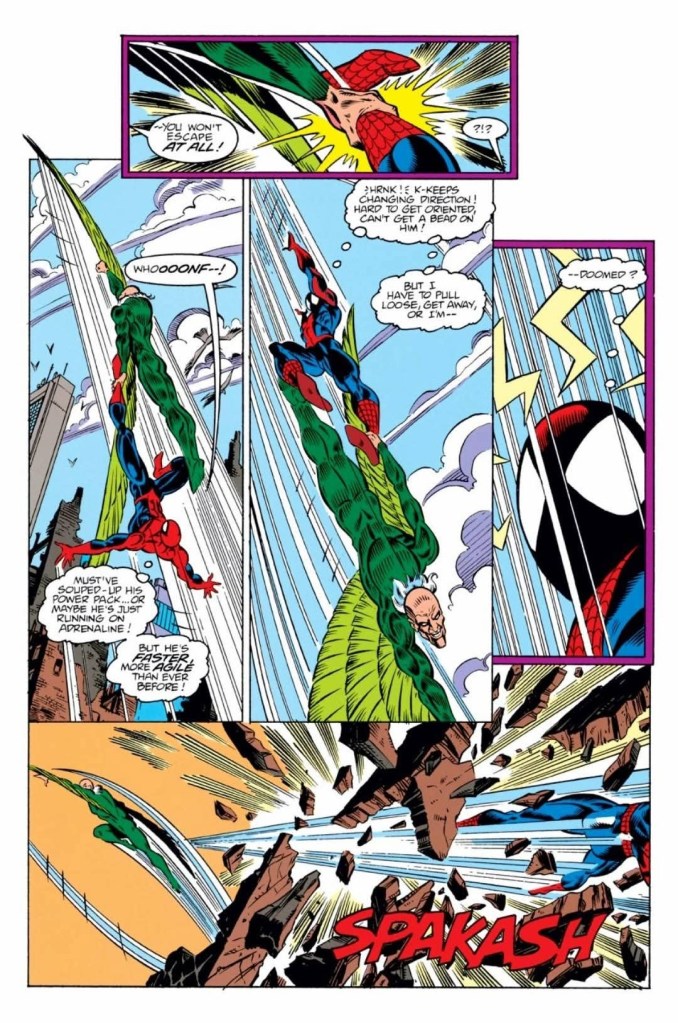
The Vulture here is not only very obsessed with obtaining everlasting life as there is something deep inside him that has been raging. This explains why the winged super villain is more visceral in his battle with Spider-Man which Mark Bagley visualized with dynamism and intensity. For the newcomers reading this, the two have fought each other a lot since the 1960s and this 1994 rematch was very unique. The Vulture here is not unhinged but rather strategic while being obsessed, and this made him even more dangerous for Spider-Man.
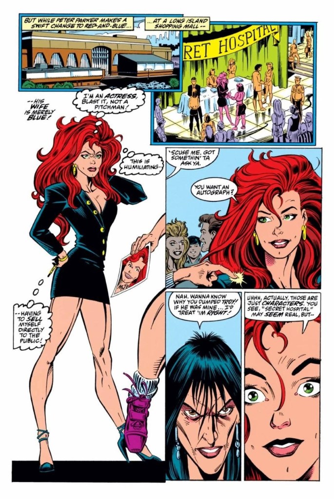
Apart from the promised rematch, this comic book continued building up the tension for the eventual tragedy in Peter Parker’s life (which happened in Amazing Spider-Man #388) while also dramatizing the lasting hardships Mary Jane experiences as Peter’s wife. Peter Parker meanwhile is focused on his family and his intention to find professional help for Aunt May smoothly connected with his rematch with the Vulture.
Conclusion
There is a lot to enjoy in Amazing Spider-Man #386 (1994). The rematch between the Vulture and Spider-Man is engaging and intriguing to read. There is also a good amount of suspense applied on the main plot as well as on the sub-plot about Aunt May being suspicious about Richard and Mary Parker. The result here is a reading experience that is entertaining and also balanced with regards to tone and storytelling.
Overall, Amazing Spider-Man #386 (1994) is recommended.
+++++
Thank you for reading. If you find this article engaging, please click the like button below, share this article to others and also please consider making a donation to support my publishing. If you are looking for a copywriter to create content for your special project or business, check out my services and my portfolio. Feel free to contact me with a private message. Also please feel free to visit my Facebook page Author Carlo Carrasco and follow me on Twitter at @HavenorFantasy as well as on Tumblr at https://carlocarrasco.tumblr.com/ and on Instagram at https://www.instagram.com/authorcarlocarrasco