Retro Gaming Ads Blast – Part 36

Welcome back readers, fellow geeks and electronic gaming fans!

In this edition of the Retro Gaming Ads Blast (RGAB) series, we will take a look at another batch of retro gaming print ads – including arcade flyers – from the 1970s to the 1990s.

For the newcomers reading this, Retro Gaming Ads Blast (RGAB) looks back at the many print ads of games (console, arcade, computer and handheld) that were published in comic books, magazines, flyers, posters and newspapers long before smartphones, social media, the worldwide web and streaming became popular. To put things in perspective, people back in the 1980s and 1990s were more trusting of print media for information and images about electronic games and related products.

With those details laid down, here is the newest batch of retro gaming print ads for you to see and enjoy…

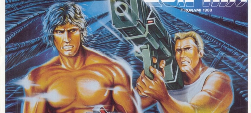
1. Super Contra North American arcade flyer

Have you seen many Hollywood action movies of the 1980s? Does this arcade flyer remind you of something?

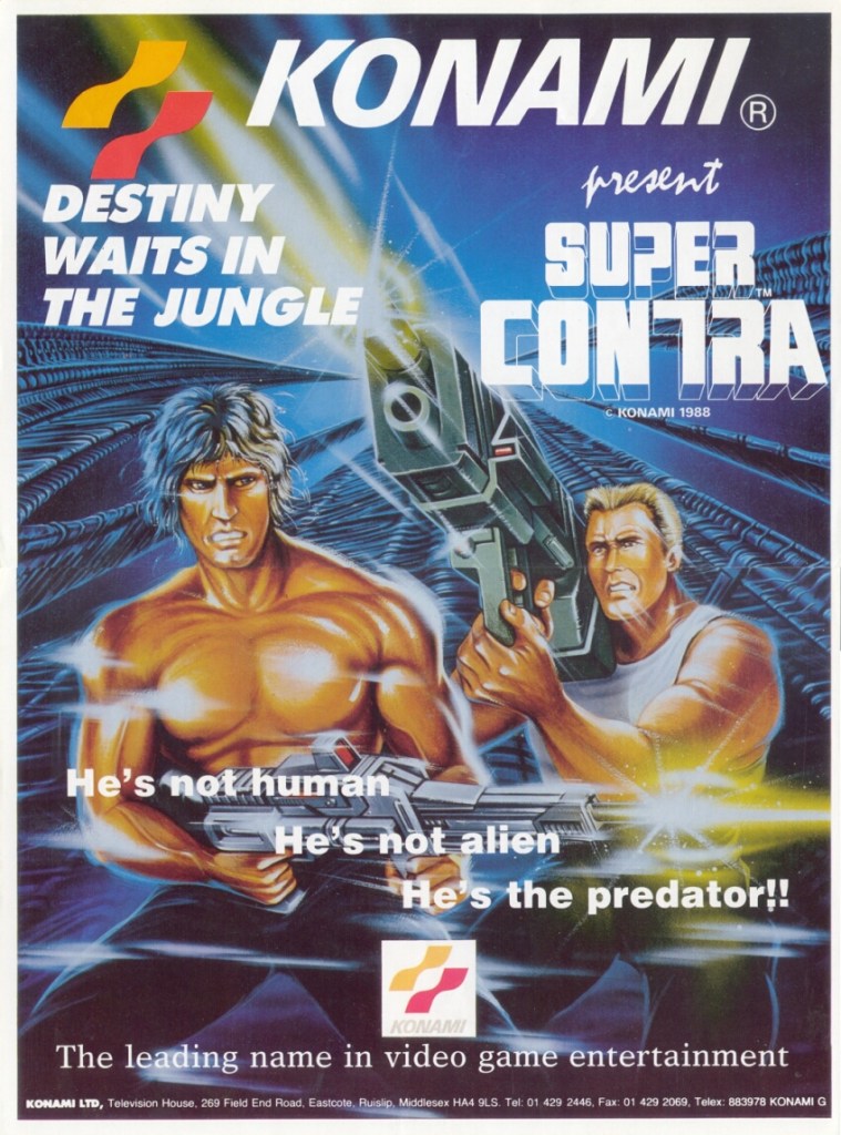
After Konami struck gold with Contra in 1987, it was inevitable that sequels and spin-offs will be made. In 1988, they released the follow-up Super Contra in the arcades and to promote it in America, the company came up with artwork that easily gave gamers the impression they are seeing Sylvester Stallone as a fantasized Rambo and another armed guy who might remind them of Arnold Schwarzenegger’s character in Commando or Dutch in Predator. To capitalize on the movie references even more, the American arcade flyer had the line “He’s not human. He’s not alien. He’s the predator!!” As it was the 1980s, this creative approach to promotion was not surprising as Konami and its game makers were influenced by Hollywood movies.

2. Double Dragon II: The Revenge North American arcade flyer

The artwork used in this arcade flyer remains intriguing to look at.

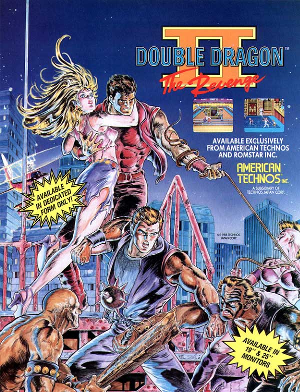
I never played Double Dragon II: The Revenge in the arcade, but I played it on the Nintendo Entertainment System (NES). That being said, I was surprised to see how this old North American arcade flyer has the same hand-drawn artwork used on the cover of the NES version. Take note that the arcade game was released in 1988 while the NES port was released in early 1990. I can only guess that Technos decided to use the same artwork not only for convenience but to have a definitive image emphasizing Double Dragon II to gamers wherever they are.

3. Devastators North American arcade flyer

The front.
The rear.

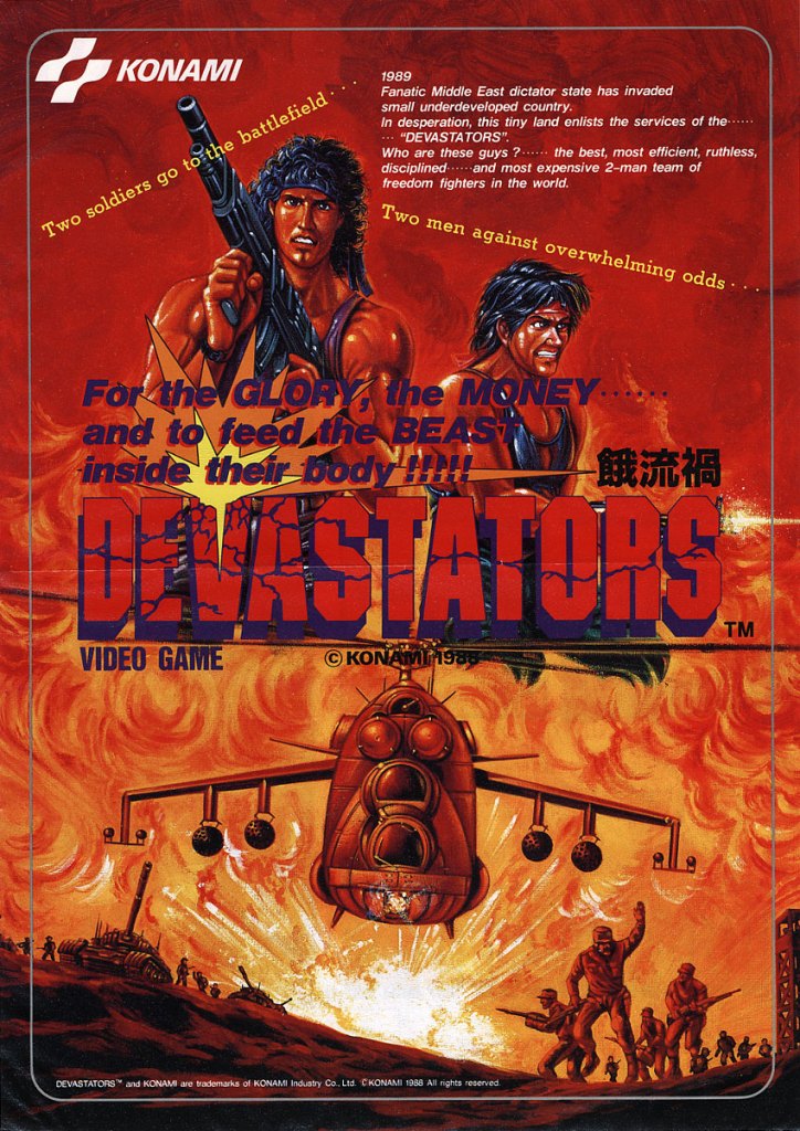
Devastators is another Konami arcade game that had a strong war theme and it was influenced by Hollywood action films of the 1980s. This particular arcade flyer for the North American market is almost identical with the Japanese arcade flyer as both have the same artwork on the front and almost the same visual layout on the rear. The most obvious difference is the use of English text for the North American flyer.

4. Assault North American arcade flyer

The front.
The rear.

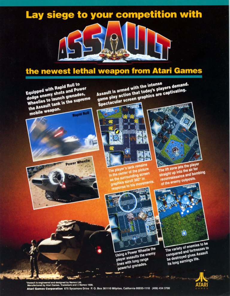
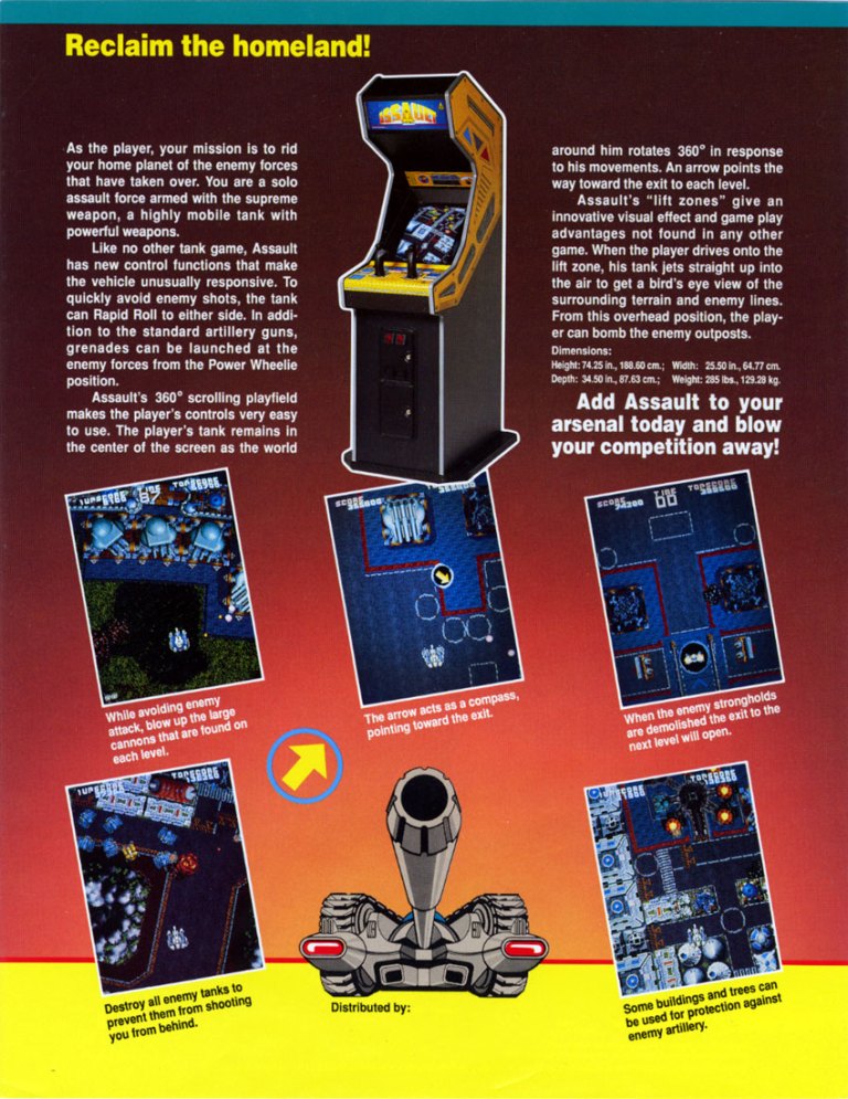
Released in American arcades by Atari, Assault is a multi-directional shooter that had a twin-stick control layout (similar with the classic Battlezone) and players experienced intense battles as well as immersive visual effects such as sprite scaling and environment rotation of up to 360 degrees. To promote the game (this originated in Japan by Namco), Atari came up with this arcade flyer that had selected screenshots and descriptive text on both the front and the rear (which showed the arcade cabinet). Assault was a hit with gamers at the arcades and it was not released on consoles until 2009.

5. Sega CD print ad

Having a socially relevant message can be catchy but it leaves little room for excitement.

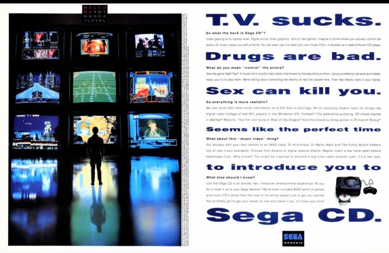
As the Sega Genesis console became a huge commercial success in North America, Sega itself became ambitious about what CD-ROM technology would do for video games. Sega in Japan tasked its Consumer Products Research and Development Labs to create a CD-ROM add-on which resulted in the Sega CD (Mega-CD in other parts of the world) which launched in America in 1992. To promote the add-on towards existing Genesis console owners as well as potential new customers, Sega of America came up with the above 2-page print ad that had a social message on the right and an image of a man standing in front of large monitors (showing Sega CD game footage) on the left. While it looked like an odd way of promoting video game hardware, it still remains catchy to see.

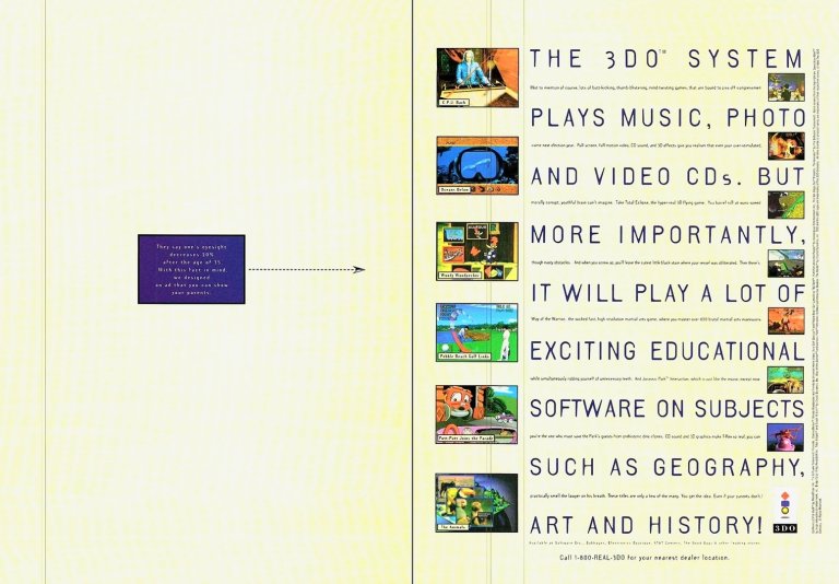
6. Panasonic 3DO print ad

Panasonic knows how to promote entertainment hardware for people’s homes.

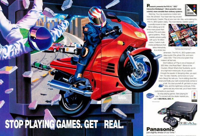
Still in the field of CD-ROM gaming, Panasonic had competitive presence in video gaming when its Panasonic FZ-1 R.E.A.L. 3DO Interactive Multiplayer (with technology licensed by The 3DO Company) was launched in America in 1993. If you look at the print ad closely, you will notice that the descriptive text emphasized the multimedia entertainment aspect more than video gaming. The dominating artwork used does not come from a particular video game as it was made to emphasize home entertainment in general. It’s not surprising that the Panasonic 3DO and other 3DO machines from other manufacturers failed commercially.

7. Shaq Fu print ad

The close-up of Shaquille O’Neal’s face on the left made him looked less recognizable.

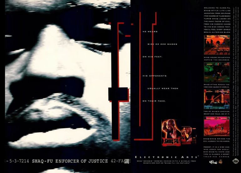
Yes, it is true! There was indeed a video game endorsed by Shaquille O’Neal and it was not a basketball game. Shaq Fu is a 1994 2D fighting game with adventure elements and a story in which gamers play O’Neal as martial artist (note: O’Neal himself participated in the game’s production). To promote the game, Electronic Arts came up with a 2-page print ad that had a very odd black-and-white close-up image of O’Neal’s face on the left leaving small screenshots and hard-to-read text on the right (even though there was some vacant space remaining. I remember seeing this ad while reading a video game magazine and the ad ended up looking more like a promotion of O’Neal (already an NBA superstar) than the game itself. By today’s standards, this print ad is an example of a marketing misfire.

8. Kasumi Ninja print ad

Do you even remember seeing this print ad in magazines?

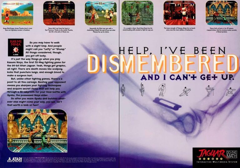
Remember the 1990s video game trends of digitized human images and disturbingly violent 2D fighting games sparked by Mortal Kombat? The Atari Jaguar-exclusive game Kasumi Ninja was made to capitalize on those trends and it failed badly. Apart from the low sales of the Jaguar console, Atari as publisher came up with the above 2-page print ad that was not appealing to gamers’ eyes and it had almost no excitement overall. This is another marketing misfire.

9. Parasite Eve North American and Japanese print ads

Following the successful release of Final Fantasy VII, this ad excited PlayStation gamers and JRPG enthusiasts for Parasite Eve’s 1998 release in America.
A stronger horror presentation in this print ad for the Japanese market. There were already a lot of people in Japan who enjoyed horror.

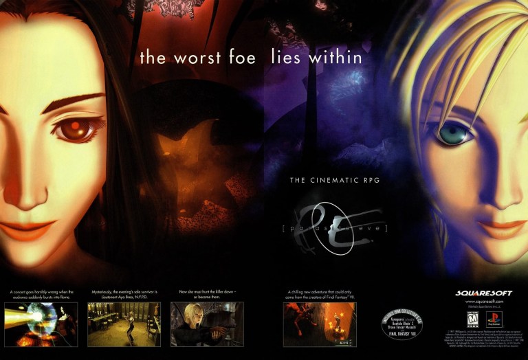
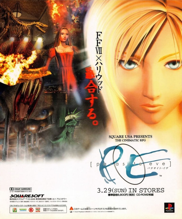
Starting in the mid-1990s, Squaresoft (now Square Enix) really became aggressive with video game creativity and experimentation as they launched several new projects that eventually got released on PlayStation in the late 1990s until 2000. One of those daring new projects was Parasite Eve which was a role-playing game (RPG) that had visual elements – particularly pre-rendered backgrounds – and a style of exploration that reminded gamers of Resident Evil. The game was a sequel to the Japanese science fiction horror novel of the same name and it involved the creativity of Final Fantasy creator Hironobu Sakaguchi (credited as producer). To promote the game, the 2-page North American print ad had protagonist Aya Brea on the right and the enemy on the left with a cryptic line placed strategically between them. The North American ad clearly stated that the game is a cinematic RPG. By comparison, the Japanese print ad of Parasite Eve has a strong horror vibe which is not surprising because of the novel’s horror elements and the fact that Squaresoft was capitalizing on the popularity of horror-related entertainment in Japan. By today’s standards, Parasite Eve is truly a product of the late-1990s and it has a dedicated fanbase.

+++++

Thank you for reading. If you find this article engaging, please click the like button below, share this article to others and also please consider making a donation to support my publishing. If you are looking for a copywriter to create content for your special project or business, check out my services and my portfolio. Feel free to contact me with a private message. Also please feel free to visit my Facebook page Author Carlo Carrasco and follow me on Twitter at  @HavenorFantasy as well as on Tumblr at https://carlocarrasco.tumblr.com/ and on Instagram at https://www.instagram.com/authorcarlocarrasco

Retro Gaming Ads Blast – Part 35

Welcome back readers, fellow geeks and electronic gaming fans!

In this edition of the Retro Gaming Ads Blast (RGAB) series, we will take a look at another batch of retro gaming print ads – including arcade flyers – from the 1970s to the 1990s.

For the newcomers reading this, Retro Gaming Ads Blast (RGAB) looks back at the many print ads of games (console, arcade, computer and handheld) that were published in comic books, magazines, flyers, posters and newspapers long before smartphones, social media, the worldwide web and streaming became popular. To put things in perspective, people back in the 1980s and 1990s were more trusting of print media for information and images about electronic games and related products.

With those details laid down, here is the newest batch of retro gaming print ads for you to see and enjoy…

1. Intellivision print ad

Were you able to play a game on the Intellivision long ago?

In 1979, Mattel launched their Intellivision game console in America which instantly placed them in competition with Atari’s 2600 console. In a bid to convince gain market share, Mattel daringly came up with a competitive print ad like the one above showing two TV sets (with an Atari 2600 baseball game and a similar game on Intellivision), descriptive text that explained why the intellivision and its games are better, and even mentioned Atari by name several times. Obviously the tactic did not lead Mattel to ultimate market victory but the above print ad showed it was okay for a newcomer to mention their competitor and aggressively attack it to gain customers (both newcomers and active gamers).

2. Popeye Japanese arcade flyer

The front of the flyer.
The rear.

In 1982, Nintendo released the Popeye arcade game which was incidentally the result of the success of their original Donkey Kong arcade game. To promote the game, Nintendo came up with an arcade flyer that had a very lively front (note: the characters were instantly recognizable thanks to the great art used) and the rear having easy-to-read instructions on how to play the game, what levels to expect and what must be done when playing. Popeye was an arcade hit in Japan, but an even bigger hit in America. This old arcade flyer still looks nice.

3. Time Gal arcade flyer

On face value, this one looks more like an anime promo since gameplay elements were missing.

Released in Japanese arcades in 1985, Time Gal is one of those games that used the expensive LaserDisc technology to stream pre-recorded animation (made by Toei) and challenged gamers to react quickly (using the joystick and button for commands) in order to progress in real-time. The arcade flyer has a very lively visual design making it clear to players and arcade operators that a lot of anime awaits those who play Time Gal. Technically, players watch anime cutscenes happen and react using the controls. Time Gal was an arcade hit and it made its way outside of Japan by getting ported for the Sega CD.

4. 3DO print ad

If you bought a 3DO long ago, was it for gaming or for home entertainment purposes?

Remember the 3DO? Developed by the 3DO Company and launched in 1993, the 3DO was designed to not only play video games but also function with multimedia features. In fact, the 3DO was initially marketed as a machine that allows users to watch videos, play music, browse digital photographs, and even immerse themselves with software focused on different topics. This is exactly what the above 3DO print ad emphasized. In retrospect, it was so odd for me to see the print ad inside video gaming magazines I read.

5. Atari Jaguar print ad

The strong focus on gaming was clear with Atari for the Jaguar.

Over a month after the launch of the 3DO, Atari launched its Jaguar console with a strong focus on video gaming. As console sales slowly grew in 1994, Atari came up with the above print ad – showing lots of games for the Jaguar – to lure in customers aggressively. If you look closely at the descriptive text of the ad, it mentions the Atari Jaguar as 64-bit system emphasizing that it is more powerful than other video game machines of the time. The bit count controversy harmed Atari and eventually the Jaguar failed.

6. NBA Action ’94 print ad

Remember when Sega made NBA basketball video games that were exclusive to the Genesis console?

Remember when there were a lot of basketball video games licensed by the NBA in the 1990s? Through its own sports games brand – Sega Sports – Sega was dedicated to making exclusive sports video games for its customers and their NBA games were under the NBA Action brand. In 1994, they released NBA Action ’94 for the Genesis console and this two-page print ad they came up with had a catchy visual design (a supposed basketball player showing his palm and message to the camera on one side of the ad). Looking closely at the descriptive text, the ad mentions “most realistic 16-bit pro basketball”, “digitized players” and having all 27 NBA teams and star players. Sega Sports is no more but it’s legacy still lives on among Sega fans.

7. X-Men Sega Game Gear print ad

For X-Men fans!

Similar to its approach with the Sega Sports brand, Sega developed exclusive games for the Game Gear. The company secured from Marvel the license to make an original X-Men game and to promote it, this 2-page print ad showcased original art of the established X-Men characters of the time while using the remaining spaces for the screenshots and descriptive text. This old print ad still looks attractive and will easily resonate with X-Men fans as well as 1990s superhero comics enthusiasts.

8. Liberty or Death print ad

American history is the core concept of this strategy game by Koei.

If there is anything notable about the Japanese company Koei, it is the fact that it released strategy and simulation games that tackled varied topics while making each game distinct and playable regardless of platform. In my experience, I had a lot of fun playing their business simulation Aerobiz Supersonic on the Super Nintendo Entertainment System (SNES). In 1993, Koei released their turn-based strategy game Liberty or Death which tackled American history for its setting (note: Koei already established itself with historical simulations). To sell the game, Koei came up with a print ad that had a very eye-catching historical art (George Washington, Thomas Jefferson, and Benjamin Franklin among the figures), a few selected screenshots and descriptive text that emphasized the essence of the game. This print ad is a reminder that no video game company today would make a historical simulation due to geopolitics (note: there are a lot of woke activists among video game employees today) and for business reasons.

+++++

Thank you for reading. If you find this article engaging, please click the like button below, share this article to others and also please consider making a donation to support my publishing. If you are looking for a copywriter to create content for your special project or business, check out my services and my portfolio. Feel free to contact me with a private message. Also please feel free to visit my Facebook page Author Carlo Carrasco and follow me on Twitter at  @HavenorFantasy as well as on Tumblr at https://carlocarrasco.tumblr.com/ and on Instagram at https://www.instagram.com/authorcarlocarrasco

Retro Gaming Ads Blast – Part 31

Welcome back readers, fellow geeks and electronic gaming fans!

In this edition of the Retro Gaming Ads Blast (RGAB) series, we will take a look at another batch of retro gaming print ads – including arcade flyers – from the 1980s and 1990s.

For the newcomers reading this, Retro Gaming Ads Blast (RGAB) looks back at the many print ads of games (console, arcade, computer and handheld) that were published in comic books, magazines, flyers, posters and newspapers long before smartphones, social media, the worldwide web and streaming became popular. To put things in perspective, people back in the 1980s and 1990s were more trusting of print media for information and images about electronic games and related products.

With those details laid down, here is the newest batch of retro gaming print ads for you to see and enjoy…

1. Operation Wolf American and Japanese arcade flyers

Operation Wolf for American arcades.
Operation Wolf for Japan.

In the late 1980s, Taito achieved massive success in arcades around the world with Operation Wolf. Released during the late stage of the Cold War and with many militaristic action movies already released by Hollywood, Operation Wolf attracted a lot of money from countless players as well as praise from game critics. For the American market, Taito came up with a colorful yet gritty looking arcade flyer that had nice hand-drawn artwork and enough details and screenshots to give readers a useful look at what to expect. The Japanese arcade flyer meanwhile has an even grittier looking original artwork that strongly emphasized war, guns and action. In retrospect, I look both arcade flyers a lot.  

2. Centipede Atari 2600 and Atari 5200 print ad

I played Centipede a lot on Atari 2600.

While I completely missed out on the arcade version of Centipede, I managed to play its Atari 2600 version a lot. Ultimately, the simple game design and unique challenges resulted in lots of fun-filled bouts in my experience. To promote the game’s versions on Atari 2600 and Atari 5200, the game giant came up with this particular print ad that had two near-identical artworks that reflect the concept of Centipede. The ad also has some catchy expressions in the text description. This old ad is still fun to look at.

3. Atari RealSports print ad

Long before EA sports video games, there was this.

Way back in 1982, Atari launched its RealSports line of sports video games mainly to revitalize sports gaming for their consoles. In fact, RealSports was the result of a critical and aggressive ad campaign by competitor Intellivision which had its Sports Network series of games. In this RealSports print ad, a large image of Atari’s baseball game was used probably to emphasize the scope of the field. The ad had screenshots of the volleyball and football games, while the text description reflected Atari’s aggressive response to Intellivision. This ad is an early example of competition between rival game console makers focused on sports gaming.

4. Lethal Enforcers Sega CD print ad

When was the last time you bought a video game with a hard copy and a peripheral bundled together?

Porting light gun games from the arcade to the console is very difficult and tricky to do. This is what Konami did in the early 1990s when they released a version of the arcade hit Lethal Enforcers on the Sega CD console and the package had a light gun with the game on disc. To promote the Sega CD version, Konami came up with a 2-page print ad with the catchy line “You won’t find a toy like this in any Cracker Jack box.” In addition, their ad had a few paragraphs of descriptive text to not only excite gamers but also gently inform them that Lethal Enforcers was also available on the Sega Genesis (note: this console is required for the Sega CD add-on to work) and the Super Nintendo Entertainment System (SNES). Overall, this old ad has a strong visual approach and a clever marketing strategy.

5. Pitfall II: Lost Caverns Atari 2600 print ad

A very stylish layout to promote the game.

In 1982, Activision struck gold with the huge success of Pitfall! which became an influential model of designing platform games. Of course, the publisher (now owned by Microsoft) did not stop there as they went on to make the sequel Pitfall II: Lost Caverns to not only keep the success going but also to exceed the standard they set with the first game. Activision came up with a print ad that not only told gamers of Pitfall Harry’s next adventure but also express humor visually. In line with Activision’s policy of crediting its creators (note: Atari was notorious for refusing to credit its game makers during this era), game designer David Crane was acknowledged in the ad.

6. Team USA Basketball print ad

See your favorite NBA player from the 1990s?

In 1992, a lot of people were obsessed with the Dream Team Olympic basketball squad of the United States as its roster had NBA legends like Larry Bird, Magic Johnson, Michael Jordan, Karl Malone, Charles Barkley and David Robinson to name a few. In fact, the Dream Team became the most popular attraction among all teams in any sport of any country that participated in the summer Olympics in Barcelona. Knowing how popular the squad really was, Electronic Arts (EA) made the video game Team USA Basketball and released it on the Sega Genesis which was already a popular console for sports video games. EA came up with this eye-catching 2-page print ad that strongly emphasized the Dream Team, international basketball gaming, and the company’s tested design on 2D basketball video games. In retrospect, this print ad is still amusing and exciting to look at.

7. Jungle Hunt Atari 2600 and Atari 5200 print ad

Do you fine the parallel artworks amusing or disturbing?

Following the huge success of Jungle Hunt (previously titled as Jungle King), Atari saw potential Dollar signs and made a deal with Taito to publish ports under their own brand for the Atari 2600, Atari 5200 and 8-bit computers. As with the Atari console ads of Pitfall II: Lost Caverns and Phoenix, Atari came up with a print ad that featured two parallel artworks that look similar with each other as they promoted Jungle Hunt for Atari 2600 and Atari 5200. To their credit, the artworks used were detailed and eye-catching, and the descriptive line of words displayed carried a possible reference to 1975’s Jaws.

8. GameShark print ad

A James Bond-inspired way of promoting GameShark.

Remember GameShark? For the newcomers reading this, GameShark is the brand of a line of products released on different video game consoles and personal computers (Windows specifically) that gamers use to cheat in video games.  GameShark was popular at a time when not too many people had access to the Internet nor did gamers had the means to search for cheats online, and codes were needed to enable cheating. GameShark became so popular, more ambitious and stylish print ads were realized such as this James Bond-inspired 2-page ad. On face value, this ad looked like it was a promoting a particular game but ultimately it was about promoting GameShark with style, cool and some sexiness.

+++++

Thank you for reading. If you find this article engaging, please click the like button below, share this article to others and also please consider making a donation to support my publishing. If you are looking for a copywriter to create content for your special project or business, check out my services and my portfolio. Feel free to contact me with a private message. Also please feel free to visit my Facebook page Author Carlo Carrasco and follow me on Twitter at  @HavenorFantasy as well as on Tumblr at https://carlocarrasco.tumblr.com/ and on Instagram at https://www.instagram.com/authorcarlocarrasco

Retro Gaming Ads Blast – Part 26

Welcome back readers, fellow geeks and electronic gaming fans!

In this edition of the Retro Gaming Ads Blast (RGAB) series, we will take a look at another batch of retro gaming print ads – including arcade flyers – from the 1980s and 1990s.

For the newcomers reading this, Retro Gaming Ads Blast (RGAB) looks back at the many print ads of games (console, arcade, computer and handheld) that were published in comic books, magazines, flyers, posters and newspapers long before smartphones, social media, the worldwide web and streaming became popular. To put things in perspective, people back in the 1980s and 1990s were more trusting of print media for information and images about electronic games and related products.

With those details laid down, here is the newest batch of retro gaming print ads for you to see and enjoy…

1. Asteroids Deluxe arcade flyer

The arcade flyer for North America.

Given the fact that Asteroids was a massive hit for Atari in the arcades, it was not surprising that a sequel was made called Asteroids Deluxe. In preparation for its 1981 release, Atari made this Asteroids Deluxe arcade flyer showing three machine that arcade operators can choose from complete with technical details displayed. They even emphasized the QuadraScan video graphics as a technological advancement with regards to graphics. By today’s standards, this arcade flyer is still sensible with regards to promoting the game to both arcade operators and players.

2. Missile Command arcade flyer

Engaging art work on display at the front of the arcade flyer.

Released in the arcades in 1980, Missile Command is a classic game from Atari and its concept of defending cities from incoming enemy missiles proved to be relevant with people living with the fear of a nuclear missile attack during the days of the Cold War. In my experience, I mainly played the Atari 2600 version and it was only recently I finally started playing the arcade classic on my Xbox Series X using the Atari 50 Collection software. As for the arcade flyer itself, Atari simply used highly detailed painted art for the front which clearly emphasized the science fiction portrayal of a military officer using a console inside a base to come up with defensive response to incoming ballistic missiles. The game was a massive hit in the arcades and in my view, Atari’s simply yet direct way of promoting the concept of Missile Command with the arcade flyer remains compelling to look at.

3. Gun.Smoke European arcade flyer

Nice art on the front of this arcade flyer for the European market.

Long before they struck gold with Street Fighter II, Japanese company Capcom scored a hit with gamers in the arcades with 1985’s Gun.Smoke. It was a vertically scrolling run-and-gun game with an Old West setting and it was designed by Yoshiko Okamoto (Final Fight and Street Fighter II). To promote the game for European arcades, Capcom simply used hand-drawn artwork for the arcade flyer’s front which emphasized the Wild West setting, and an American Cowboy and bounty hunter named Billie Bob who is the playable character gamers got to play. In my view, the artwork gave the game a strong Wild West image that is also memorable.

4. Sei Senshi Amatelass arcade flyer

Does the model look sexy or tough?

Released in Japanese arcades in 1986 by Nichibutsu, Sei Senshi Amatelass is a vertical scrolling run-and-gun game with a science fantasy concept. To promote the game and really sell its concept, Nichibutsu hired a model posing with a sword and a shield in fantasy inspired costume. Using the remaining spaces of the flyer, some screenshots and an image of the arcade machine were displayed. This flyer showed the company exerting effort to sell Sei Senshi Amatelass with a touch of beauty and subtle sexiness.

5. Sweet Gal arcade flyer

Seriously, are you interested in playing mahjong in digital form?

Here is another digital mahjong arcade game from Nichibutsu…Sweet Gal. As typical of the company, a model was hired to add subtle sexiness into the promotion of the game and they even added a digital image of a sexy girl. Sweet Gal clearly was promoted to attract men who enjoy playing mahjong in electronic format and there were some arcade spots in Japan that catered to such mahjong enthusiasts.

6. Moon Patrol print ad

This is a fun-looking, comic book style way of promoting a video game.

Here is one of those video game print ads I saw while reading comic books back in the early 1980s. Moon Patrol is a sci-fi, side-scrolling game by Atari known for introducing full parallax scrolling in side-scrolling games. Instead of showing screenshots of the console versions of the game, this print ad used nice looking hand-drawn artworks presented with a comic book-inspired style to emphasize the concept. I still remember how captivating this ad and its super short story was the first time I saw it. It was enough to make me interested in the game.

7. Tron Atari 2600 games print ad

Calling all Tron fans to look at this.

I was very captivated by the 1982 sci-fi movie Tron which I saw on home video. It had very flashy computer-generated visuals, a very memorable story and the fine performance by Jeff Bridges. Tron was also very reflective about the video game culture of its time. When I first saw this print ad while reading a comic book, I was really excited. If you look closely, it had nice artwork dominating the space and screenshots that each promoted the games Tron: Deadly Discs and Adventures of Tron. Even though the graphics were primitive, I still recognized the Tron-related images which added to my excitement.

8. Q*bert print ad

This print ad by Parker Brothers really captured the essence of the game.

The puzzle-oriented 2D action game Q*bert became an arcade hit in America shortly after its 1982 release and even went on to become one of the highest grossing arcade games in 1983. Q*bert is one of those 2D games that cleverly blended puzzle play with 3D-like movement and avoidance of both obstacles and enemies. As expected, the game made its way into gaming console and this particular print ad had artwork that strongly captured the very essence of the game complete with the very catchy line “It’s not easy being Q*bert, but it’s fun.”

9. Masters of the Universe: The Power of He-Man print ad

Calling all He-Man fans.

I saw this print ad of Masters of the Universe: The Power of He-Man (for Atari 2600 and Intellivision) while reading a comic book long ago. Like the Tron games ad, this made me excited as I was fond of watching the He-Man cartoon series of the 1980s. While the selected screenshots caught my attention, it was the hand-drawn art of He-Man facing off with Skeletor and his minions that captivated me simply because it reminded me of the animated series. This is a fine example of promoting a video game that would instantly resonate with fans of He-Man and the Masters of the Universe franchise.

10. UFO Robo Dangar North American arcade flyer

The giant robot concept of this game gave some viewers the impression that it was based on some giant robot anime series from Japan even though the art work used does not suggest it.

Here is another arcade game from Nichibutsu but for the North American market and without the use of a model and without the subtle sexiness. UFO Robo Dangar is a 2D vertically scrolling science fiction shooting game and players get to control a giant robot (composed of flying vehicles that merged into one mechanical body) that has to go through countless waves of enemies in order to advance from one level to another. The arcade flyer used nice looking sci-fi art of ships with the game’s title having a robot and several screenshots of the game. The flyer even made a hard pitch towards arcade operators that UFO Robo Danger will transform their games into profits with proven longevity.

11. Aliens Japanese arcade flyer

The front.
The other side of the flyer of the 1990 arcade hit Aliens.

Quite arguably, Konami’s 1990 arcade hit Aliens is the best video game of any game design to be based on the 1986 film directed by James Cameron. Not only was Aliens a big hit in the arcades, it also won an award from the American Amusement Machine Association (AAMA). Aliens was released in Japanese arcades in February of 1990 and Konami released an arcade flyer that was much more visually striking than its North American arcade flyer. The front had detailed artwork of the Xenomorph while the rear had the instructions and screenshots presented in an orderly manner. The photograph of the Xenomorph alien was added intensity on selling the game. This is still a great looking arcade flyer.

+++++

Thank you for reading. If you find this article engaging, please click the like button below, share this article to others and also please consider making a donation to support my publishing. If you are looking for a copywriter to create content for your special project or business, check out my services and my portfolio. Feel free to contact me with a private message. Also please feel free to visit my Facebook page Author Carlo Carrasco and follow me on Twitter at  @HavenorFantasy as well as on Tumblr at https://carlocarrasco.tumblr.com/ and on Instagram at https://www.instagram.com/authorcarlocarrasco

Retro Gaming Ads Blast – Part 23

Welcome back readers, fellow geeks and electronic gaming fans!

In this edition of the Retro Gaming Ads Blast (RGAB) series, we will take a look at another batch of retro gaming print ads – including arcade flyers – from the 1980s and 1990s.

For the newcomers reading this, Retro Gaming Ads Blast (RGAB) looks back at the many print ads of games (console, arcade, computer and handheld) that were published in comic books, magazines, flyers, posters and newspapers long before smartphones, social media, the worldwide web and streaming became popular. To put things in perspective, people back in the 1980s and 1990s were more trusting of print media for information and images about electronic games and related products.

With those details laid down, here is the newest batch of retro gaming print ads for you to see and enjoy…

1. Raiders of the Lost Ark game print ads

The print ad with strong Indiana Jones imagery.
The print ad with the movie theater exterior image and the small image of the Atari 2600 console.

Directed by Steven Spielberg, Raiders of the Lost Ark was one of the best adventure movies ever made as well as the start of the iconic character Indiana Jones. Given its huge commercial success, an official video game adaptation for the Atari 2600 was released in 1982 and game designer Howard Scott Warshaw even met with Spielberg during the game’s development.

To promote the game, Atari released two print ads – one ad had a movie theater exterior visual concept to emphasize they have the official video game adaptation based on the movie while the other ad showed the game’s official artwork and game box cover while emphasizing a savings offer. Atari really did what they could to sell a game while riding on the success of Raiders of the Lost Ark.

2. Phoenix print ad

Even without any screenshots, this print ad’s art still gives viewers a clear idea of what to expect.

Similar to what they did with Galaxian and Joust, Atari made this print ad promoting Phoenix which was a 2D sci-fi shooting game that was similar with Space Invaders in design. Colorized, hand-drawn artwork resembling the 2D sprites of the game was done to capture the attention of people. The art is so good, it made up for the lack screenshots of the game. 

3. Moon Patrol arcade flyer

Front of the Moon Patrol flyer.
The other side of the arcade flyer.

Moon Patrol was a 2D sci-fi side-scrolling adventure game first released in the arcades in 1982. To sell the game to arcade operators, publisher Williams created the North American arcade flyer that heavily used hand-drawn comic book-style artworks on both sides while using available space on the other side for the descriptive text, contact details and the image of an arcade machine. What is very clear is that no screenshots of the game were shown to stand out which explains why a lot of hand-drawn art was used. The picture of the machine showing a screen of Moon Patrol was the closest thing to see a screenshot on this flyer. Personally, I really like the style and quality of the hand-drawn artwork as it made the flyer look lively.

4. Paperboy arcade flyers

The arcade flyer showing the Paperboy machine and screenshots. The hand-drawn art is nice.
This one uses comedy showing a grown man riding a bike as a paper delivery “boy”.
I really like the stronger emphasis on the in-game graphics of Paperboy which dominates the space. What you see is what you get in the arcade.

The first time I ever played the classic Paperboy was in the arcade inside a Las Vegas hotel way back in 1989, and it sure was a challenging yet fun experience. Before its arcade debut in 1985, the developers took a lot of risks making the game which includes coming up with a bicycle handle bar for each machine to have. To promote the game, Atari made at least three arcade flyers that creatively emphasized what the game’s concept was about, how did it play, why does the machine have bicycle handlebars and why players can expect fun. Atari’s promotional efforts paid off as Paperboy became a huge hit in the arcades not only in America but also in Japan.

5. Frogger multi-platform print ad

This print ad is still amusing to look at.

After Frogger became a hit in the arcades, Parker Brothers secured the rights to port the game on Atari consoles, the Intellivision, TI-99/4A, vic-20, the Commodore computers and ColecoVision. To promote their Frogger ports, the single-page print ad was made showing a player in the foreground playing in front of screens that each showed what the game looked like on each platform. Parker Brothers found tremendous success selling 4 million copies of Atari 2600 version of Frogger at a time when there were only 13 million units of Atari 2600 in existence. By the year 2005, video game sales of Frogger reached 20 million worldwide across different platforms.

6. Predator 2 print ad

This is one very edgy print ad as used an official image from the movie.

If there is anything memorable about the 1990 film Predator 2, it is the fact that it had the story and the alien hunter itself within a metropolitan setting. That being said, the Sega Genesis Predator 2 video game had a suitable design of shooting and adventuring within the urban settings. This video game ad really captured the vibe of the movie (even showing the reddish human skull with spine on the Predator’s left hand) and clearly showed what gamers could expect. This old ad is still captivating to look at and its edgy approach is still intact.

7. Atari Jaguar print ad

Did you ever own an Atari Jaguar console?

When I was reading video game magazines back in the 1990s, I always found print ads of the Atari Jaguar intriguing to look at. I was very young when I first played the Atari 2600 and its games at home, and later played some Atari games in the arcade. To me, seeing Atari Jaguar print ads like this one gave me moments of nostalgia and it made me wonder if Atari knew what it was doing with their so-called 64-bit game console. They did what they could to promote their console and the games within this 2-page print ad.

8. Vs. print ad

This print ad easily reminds me of the 1990s.

By 1997, both the arcades and the video game console market were filled with lots of 2D and 3D polygonal fighting games. Japan was the hot spot of the production of 3D polygon fighting games and the developer Polygon Magic (based in Japan) made Fighters’ Impact which Taito released in Japanese arcades and the PlayStation. The said game was picked up by THQ for a late-1997 release on the PlayStation in America under the title Vs. I never played this game but I heard that the game’s development included gang-oriented characters designed by Marvel Comics artist Kurtis Fujita. This Vs. ad is a lively reminder about the hip-hop fashion that made its way into video games.

9. GoldStar/LG Electronics 3DO print ad

This is a very weird way to market a video game machine.

Back in the 1990s, the South Korean electronics company GoldStar (which was part of the umbrella of LG Electronics) had the license to produce 3DO game consoles with its own style. In some ways, the GoldStar 3DO console looked like a premium console on the outside. Unfortunately, the GoldStar 3DO print ad here had a very sloppy presentation as the ad makers used very weird art of a brain-with-eyes holding a 3DO controller leaving little space left to promote the console and games (without any screenshots). The text description was sloppily done. This is a bad example of promoting video game hardware and games.

10. Pandemonium 2 print ad

I saw this ad but never played the game.

Looking back at 1997, I find it strange that I never got to play Pandemonium 2 on the PlayStation even though I saw its print ad in magazines. I had a lot of fun playing Pandemonium! on the console in 1996 but somehow missed out on its sequel. Looking back at the Pandemonium 2 print ad, I was surprised with how the game developers redesigned the two playable protagonists, especially Nikki who was clearly made to look very sexy. The word “libido” (meaning sexual drive) was deliberately placed above Nikki. The ad also had a hypnotizing mix of colors which I believe was also deliberately done by the ad makers. I can only wonder how the game played.

11. Mission: Impossible print ad

A captivating ad.

In 1990, Ultra Games (a label of Konami) released the Mission: Impossible video game on the Nintendo Entertainment System (NES) in America. Developed by Konami, the game was an adaptation of the 1988 TV series and it had an ambitious design with regards to level design and gameplay. To promote the game, the ad makers came up with a visual design showing the game’s box (which had a nice painted art on the cover) on the foreground and several screenshots resembling TV monitors on the background. Even by today’s standards, this print ad still looks good and captivating even if you are not too familiar with Mission: Impossible on TV.  

12. The Lawnmower Man Sega CD and Genesis print ad

Are you fan of The Lawnmower Man movie?

Back in 1992, there was a lot of buzz generated by the movie The Lawnmower Man as it had a disturbing concept that involved virtual reality and, more notably, author Stephen King sued the filmmakers to remove his name from the title because the film differed so much from the source material. Of course, those developments did not stop the production of video game adaptations of the movie. This print ad promoting the Sega CD and Sega Genesis versions of the game heavily used the images of CyberJobe which were among the most memorable images from the film. Looking at the ad, the ad makers could have made the screenshots look a little larger to really sell the games.

13. Ground Zero: Texas print ad

The shotguns really made this ad eye-catching.

I never played the Sega CD video game Ground Zero: Texas but I knew that it was one of those games that heavily relied on video footage while giving players moments to interact. Back in 1993, there was an increase in the number of video games that carried lots of live action footage to drive the narrative and players were given options in order to progress. What is very notable about the game is not the game design but the very 2-page ad used to promote it. The image showing four people pointing their shotguns towards the viewer was easily the most captivating part of the ad. Even though there was vacant space in between, the screenshots of the game were displayed to be really small.

14. Alien vs. Predator for SNES and Game Boy print ad

This ad caught the attention of a lot of people back then.

Back in 1990, Dark Horse Comics launched the 4-issue mini-series of Aliens vs. Predator which turned out to be a very intriguing and engaging crossover comic book tale featuring two iconic sci-fi species of monsters. The success of the comic books led to the production of many video games which delighted both fans of Predator and Aliens. In 1993, Activision released Alien vs. Predator on the Super Nintendo Entertainment System (SNES) and the single-page print ad they came up with was engaging to look at. The SNES game box with the fine looking painted art was the main visual highlight leaving just enough space for the descriptive text, the Game Boy cover and two screenshots. Believe it or not, this video game was not related at all with the Alien vs. Predator arcade game and Atari Jaguar console game.

+++++

Thank you for reading. If you find this article engaging, please click the like button below, share this article to others and also please consider making a donation to support my publishing. If you are looking for a copywriter to create content for your special project or business, check out my services and my portfolio. Feel free to contact me with a private message. Also please feel free to visit my Facebook page Author Carlo Carrasco and follow me on Twitter at  @HavenorFantasy as well as on Tumblr at https://carlocarrasco.tumblr.com/ and on Instagram at https://www.instagram.com/authorcarlocarrasco

Retro Gaming Ads Blast – Part 3

Welcome back readers, fellow geeks and electronic gaming fans!

In this edition of the Retro Gaming Ads Blast (RGAB) series, we will examine print ads from the 1980s and 1990s that caught my attention and I will explain why they are worth look back at.

For the newcomers reading this, Retro Gaming Ads Blast (RGAB) looks back at the many print ads of games (console, arcade, computer and handheld) that were published in comic books, magazines, flyers and newspapers long before smartphones, social media, the worldwide web and streaming became popular. To put things in perspective, people back in the 1980s and 1990s were more trusting of print media for game details and images.

With those details laid down, here is the newest batch of retro gaming print ads for you to see and enjoy…

1. Japanese print ad of Super Star Wars: The Empire Strikes Back

Do you know any Star Wars fan who is aware of the error in this Japanese print ad of Super Star Wars: The Empire Strikes Back?

Back in 1993, the sequel Super Star Wars: The Empire Strikes Back was released on the Super Nintendo Entertainment System (SNES) in the West and on the Super Famicom in Japan. Having played all three Super Star Wars game, I can say that this sequel was a huge improvement over its predecessor technically and also with gameplay (read my retro review by clicking here).

Like its predecessor, the game was released in Japan by JVC Musical Industries and in the above Japanese market print ad, the marketing team wisely used the game’s official artwork to give gamers a clear view of the concept derived from the 1980 movie plus a few screenshots showing gameplay. What I find hilarious to read is the line (highlighted in red and all capitalized no less): MAY THE FORCE WITH YOU. Clearly someone from the Japanese marketing team who prepared that line lacked English proficiency or might not have watched the movies dubbed in English. In the 1977 movie, Han Solo said to Luke, “May the Force be with you.”  

2.  Spider-Man (Atari 2600) print ad

This is an entertaining way to promote a video game based on a comic book icon.

We are back again with the Parker Brothers company and their promotion of the Spider-Man video game for the Atari 2600 which I myself played long ago. Unlike before, the print ad this time was mainly about the Spider-Man game and somehow Parker Brothers coordinated with Marvel Comics to make a comic book-inspired ad. In the above print ad, Spider-Man was shown playing the game about him with an Atari 2600 controller and console, and the Green Goblin taunts him as he plays. This type of ad is a stroke of genius because it shows the Marvel Comics’ icon as a player and the gameplay was emphasized accurately. Even if viewers are not too fond of video games, they can still find themselves interested in reading the literary adventures of Spider-Man.

3. Advanced Dungeons & Dragons: Treasure of Tarmin print ad

Apart from emphasizing the fantasy concept of the Dungeons & Dragons franchise, this print ad’s hand-drawn art was strong enough to spark viewers’ curiosity and make them interested in the game or even in the Intellivision console.

Here is a print ad I saw many times while reading comic books in 1983. The game at hand is Advanced Dungeons & Dragons: Treasure of Tarmin released on the Intellivision, and it is the sequel to Cloudy Mountain. Like the ad of its predecessor, the above print ad relied heavily on the spectacle of fantasy (and even a bit of horror) by having hand-drawn art as the eye candy promoting Advanced Dungeons & Dragons: Treasure of Tarmin. If you look closely, only one screenshot from the game was shown and it was enough to tell gamers that the new game has a completely different visual presentation from that of Cloudy Mountain. Considering the primitive nature of computer graphics and game design of the era, having detailed comic book-inspired artwork was effective to grab viewers’ attention with the intention to make them interested in buying the game. In today’s age of computer graphics and social media, this type of ad for video games is rare to see.

4. G.I. Joe: Cobra Strike print ad

The G.I. Joe: A Real American Hero franchise’s early entry into video games.

Going back to Parker Brothers, the company developed and published the first-ever licensed game of the G.I. Joe franchise – G.I. Joe: Cobra Strike for the Atari 2600. In promoting the game, a 2-page ad was released with comic book-style art work (featuring Cobra Commander and Duke representing different sides) dominating the space, with descriptive text and a hand-drawn illustration of the gameplay (read: not a real screenshot) as well as the game box flling the remaining space. In my personal experience, I saw this ad before I even got to watch an episode of the popular G.I. Joe: A Real American Hero animated TV series, and before I got to read an issue the related comic book series (which started before the TV series). Looking back at the above print ad, I can still remember the time when I was puzzled by the two characters simply because I was not yet familiar with them. Take note that the video game and the ad were released at a time when the G.I. Joe: A Real American Hero started rising quickly in popularity on toys, comic books and animation.  

5. Alien 3 (SNES) print ad

This print ad appeared in several comic books I read in 1993.

Way back in 1992, I had one of the most depressing cinema viewing experiences with Alien 3 which had a very troublesome production and lacked a solid foundation behind its creativity. Then in the summer of 1993, print ads of the video game Alien 3 for Super Nintendo Entertainment System (SNES) appeared in several comic books I read at the time. The above print ad was actually entertaining to look at. For one thing, the ad makers used three wide layers of screenshots from the game depicting different areas. Then I noticed the details which showed there were more aliens for gamers to encounter (versus only one in the movie) and the playable lead character Ellen Ripley was armed with guns (versus no guns in the movie) being able to fight the monsters. Not only that, the ad makers knew the specific details from the Alien film franchise which is reflected in the ad referencing the Face-hugger aliens, the acid from the creatures and, of course, the alien eggs. To this day, there are old-time gamers who found the Alien 3 SNES game more entertaining than the movie.

+++++

Thank you for reading. If you find this article engaging, please click the like button below, share this article to others and also please consider making a donation to support my publishing. If you are looking for a copywriter to create content for your special project or business, check out my services and my portfolio. Feel free to contact me with a private message. Also please feel free to visit my Facebook page Author Carlo Carrasco and follow me on Twitter at  @HavenorFantasy as well as on Tumblr at https://carlocarrasco.tumblr.com/ and on Instagram at https://www.instagram.com/authorcarlocarrasco

Retro Gaming Ads Blast – Part 2

Welcome back readers, fellow geeks and electronic gaming fans!

In this edition of the Retro Gaming Ads Blast (RGAB) series, we will examine print ads from the 1980s and 1990s that caught my attention and I will explain why these are worth look back at.

For the newcomers reading this, Retro Gaming Ads Blast (RGAB) looks back at the many print ads of games (console, arcade, computer and handheld) that were published in comic books, magazines, flyers and newspapers long before smartphones, social media, the worldwide web and streaming became popular. Back in the old days, many gamers trusted the print media a lot for information and images about games.

With those details laid down, here is the latest batch of retro gaming print ads for you to see and enjoy…

1. Popeye multiplatform print ad

A fine example of promoting the Popeye video game on multiple platforms visually.

During the early 1980s, an arcade game based on Popeye was released and it became a hit with gamers who lined up and inserted coins to play. That game, which had three stages, was eventually ported by Parker Brothers to multiple platforms of Atari, ColecoVision, Intellivision, T.I. and Commodore.

The print ad you see above is a classic display of how one particular game appeared as a multiplatform release. The screenshots showed different versions of the Popeye game on multiple Atari platforms plus the others. See how different the game looks on each platform? The level of visual details and elements varied from one another as each machine had different specs that Parker Brothers had to adjust to. This is a fine example of promoting one game for different machines for those who love video games.  

2.  Kool-Aid Man Video Game print ad

I never got to play this Kool-Aid Man video game.

Remember Kool-Aid? For the newcomers reading this, Kool-Aid was a very popular product line of flavored juice drinks sold in powdered form. I myself used to mix Kool-Aid with ice-cold water and enjoyed drinking it. In 1954, a promotion of Kool-Aid with a touch of entertainment happened by highlighting the character Kool-Aid Man (famously known as the walking and talking pitcher filled with Kool-Aid juice). In later years, the Kool-Aid Man was often shown breaking through walls saying the line “Oh yeah!”.

The Kool-Aid Man gained tremendous attention as a pop culture figure in the 1980s when a new series of advertisements and promotions happened branching into video games and even comic books. The above print ad was a clever move to promote Kool-Aid as a drink as well as a video game for the Intellivision and the Atari 2600 consoles. Even if you were not too fond of video games in the 1980s, the Kool-Aid game ad would still make you think about the drink. Clever and entertaining!  

3. Zombies Ate My Neighbors game print ad

I saw the 2-page ad many times in comic books and video game magazines.

Going into the 1990s, Konami’s print ad of the video game Zombies Ate My Neighbors (for Super Nintendo Entertainment System and Sega Genesis) appeared a lot in the comic books I read when I was much younger. Having seen lots of horror movies – including zombie flicks – the ad easily caught my attention not because of the screenshots but because of the visual style used. For one thing, there was this 1950s America-inspired imagery on the photo of the scared woman with three zombies slowly approaching her. As for the game itself, there were plenty of small-sized screenshots that had lots of interesting details and pixel art (note: 3D polygons in video games were not yet common back then) which gave me a clear idea that it was a humor and horror-laced 2D adventure. Not only that, the text descriptions combined with the fake quotes added zest into the presentation. After having examined all the details carefully, I really felt like Zombies Ate My Neighbors would be a fun-filled game to play on the SNES.

4. Lunar: The Silver Star print ad

With anime artwork used, it was easy to have the impression that the original Lunar game was based on an existing anime series or movie.

In the early 1990s, Game Arts developed and released the Japanese role-playing game (JRPG) Lunar: The Silver Star on the Mega CD platform in Japan which in some ways was also a technological breakthrough – the game came with full motion video (for short videos), animated images, and CD-quality sound (that really made the soundtrack lively to listen to). After achieving critical and commercial success in Japan, the game was picked-up by Working Designs to be localized and released in the North American market for the Sega CD (the American counterpart of the Mega CD) platform. In promoting the game for American Sega CD owners as well as American gamers in general, a print ad highlighting anime images with five screenshots and only a few words was published on both comic books and magazines.

Even though Lunar: The Silver Star’s core concept was never described in the ad, the anime imagery was still eye-catching and the chosen screenshots gave viewers a preview of the gameplay and the animated images. That being said, it was no surprise that gamers who happened to be a bit interested in anime noticed the print ad. At the same time, the ad gave some gamers the impression that Lunar was a game based on an existing anime franchise. This approach on game advertising was daring and it happened at a time when Japanese RPGs had a limited audience among gamers in North America.

5. Lunar: Silver Star Story Complete print ad

In the 2nd half of the 1990s, a remake of Lunar: The Silver Star was released in Japan titled Lunar: Silver Star Story for Sega Saturn (1996), Sony PlayStation (1998) and Windows PC (1998). While it still maintained the 2D visuals for presentation, gameplay and exploration, the remake had smooth anime sequences, new artworks, better sound effects and music. Working Designs pounced on the opportunity to localize the game in America for PlayStation and released it in 1999 with the title Lunar: Silver Star Story Complete. Not only did Working Designs work hard on localizing the game (the English dubbing and singing of the game’s songs were meticulously done), they released it with a very lavish packaging with the dedicated fans and collectors in mind.

By looking at the above print ad that magazines published, Working Designs highlighted the positive feedback quotes from EGM, Gamers’ Republic, PSM and Official U.S. PlayStation Magazine to convince gamers Lunar: Silver Star Story Complete is a great game. While the screenshots showed what kind of eye candy gamers could expect, Working Designs made sure that they would know that the lavish package includes 4 discs (2 game discs, 1 music CD and 1 CD that had video documentary of the making of Lunar), a full-color map in the form of a cloth, and a hardbound art book and instruction manual.

Considering the dynamism of the Lunar: Silver Star Story Complete print ad and the game’s packaging, I can only speculate that Working Designs had to do it aggressively because the gaming landscape changed dramatically as 3D polygonal graphics became the standard while lots of other Japanese RPGs from different publishers were released in 1999 (including the sequels Suikoden II and Final Fantasy VIII) and many of them had more elaborate game designs and visual presentations. Eventually market forces and unfortunate business events led Working Designs to closing down permanently in 2005.

6. Star Wars: Jedi Arena print ad

Remember when Luke Skywalker tested his lightsaber skills with the floating Seeker in the 1977 movie?

Back in the early 1980s, Parker Brothers was very active releasing games on the Atari 2600 console which my family had. At that same time, Star Wars was very popular (and without the wokeness and identity politics garbage of Kathleen Kennedy and woke Disney) and any new game based on the sci-fi franchise was something to be excited for. In the above print ad of Star Wars: Jedi Arena, an artwork showing the iconic her Luke Skywalker testing his lightsaber skills with the floating Seeker ball was displayed and located between Luke’s legs is a monitor showing the screenshot of the game. Looking at the text description, Parker Brothers creatively focused on the aspect of the Jedi way of using the lightsaber interacting with the Seeker ball. Having played the game myself, I can say the ad was creative and pretty much captured the core concept of the game.  

+++++

Thank you for reading. If you find this article engaging, please click the like button below, share this article to others and also please consider making a donation to support my publishing. If you are looking for a copywriter to create content for your special project or business, check out my services and my portfolio. Feel free to contact me with a private message. Also please feel free to visit my Facebook page Author Carlo Carrasco and follow me on Twitter at  @HavenorFantasy as well as on Tumblr at https://carlocarrasco.tumblr.com/ and on Instagram at https://www.instagram.com/authorcarlocarrasco

Retro Gaming Ads Blast

Welcome back readers, fellow geeks and electronic gaming fans!

Today I am launching a brand-new series of articles titled Retro Gaming Ads Blast (RGAB) which will explore the many print ads and promotions of video games, computer games, arcade games and handheld games that were published through the decades.

For the newcomers reading this, print ads of games were widely popular and heavily relied on by gamers/players long before smartphones, social media, the worldwide web and online videos even started. Back in the old days, print media was the most common method for companies to market their games while also helping hardware (machines which played the games) reach potential buyers. Such ads appeared in magazines, comic books and newspapers. Not only that, there were several print ads of games that were made to look creative, compelling and even intriguing.

With those details laid down, here is the first batch of retro gaming print ads for you to see and enjoy…

1. Parker Brothers’ Spider-Man-led print ad

Does this ad look amusing?

Remember Parker Brothers? That was a company that started way back in 1883 founded with a strong focus on the enjoyment of games in the form of board games, cards and toys. In the late 1970s, Parker Brothers started making electronic versions of their popular board games and engaged in the video game development and publishing. They also went on to make home ports of popular arcade games in the early 1980 for several gaming platforms.

Parker Brothers was very active with making games for the Atari 2600 console which became the dominant machine for home gaming in North America in 1982. In the above print ad, their marketing heavily emphasize the Spider-Man video game for Atari 2600 and added two others games they also published – Tutankham and Amidar – which was a clever move to market multiple games. The ad’s focus on Spider-Man was amusing and even without showing a single screenshot of the game, it was enough to entice people to watch out for it. Be aware that the Spider-Man game’s development was done by Laura Nikolich who was hired by Parker Brothers at a job fair. Nikolich had full creative control on making the game and had no contact whatsoever with Marvel Comics.

2. Advanced Dungeons & Dragons: Cloudy Mountain print ad

An ad like this was strong enough to motivate gamers’ imagination and interest.

Back in 1982, Advanced Dungeons & Dragons: Cloudy Mountain was released on the Intellivision game console and I was fortunate enough to watch my next-door neighbor play it repeatedly. The above print ad – which simply referred to the game as Advanced Dungeons & Dragons – only had a few words which directly pointed to the main objective of the game…the golden crown. While only one screenshot of the game was displayed, the advertisers heavily relied on hand-drawn, comic book-style fantasy art work to sell the game.

For those who were born long after the 1980s, let me share with you that ads like these were really impressive for their time. It was common for advertisers to use art works (even though they may not accurately reflect the gameplay or game design) and post at least one screenshot to catch the viewer’s attention with the hope that it would even encourage him/her to anticipate the game. It should be noted that ads like these were strong enough to make gamers’ imagination or curiosity grow stronger.  

3. Konami’s collective military video games advertising

Print ad of four games for IBM, Amiga and Commodore.
Print ad of Jackal and Contra for the NES.

Konami, the Japanese company that has long been known for Metal Gear, Suikoden and the controversial sacking of famous game designer Hideo Kojima, was aggressive in the gaming business in the 1980s and arguably the aggressiveness was reflected in their publishing of several games that emphasized militarism during the late stages of the Cold War. In short, they made the military look cool and their activities fun to do in digital form.

While Konami has always been identified with console gaming, they actually released Rush’n Attack, Contra, Jackal and Boot Camp on IBM, Amiga and Commodore computers (as seen in the first print ad above) which were popular in the 1980s. The said ad also have a very amusing visual concept emphasizing the excitement and fun of military action games coming to gamers at home for their computers.

The 2nd print ad above – Jackal and Contra for the Nintendo Entertainment System (NES) – was very intriguing to see. It was very clear back in the 1980s that the NES always had a wholesome audience (note: a lot of buyers were parents who wanted to entertain their kids at home) and that includes a lot of very young players. To see the collective ad of Jackal and Contra (for the NES platform) having battle-hardened men in military gear holding guns was openly aggressive to perceive and instantly reminded people about the Cold War (and the menace of Communists, socialists, Marxists and terrorists) and the cultural impact of the mega blockbuster film Rambo: First Blood Part II. This is the kind of ad that would drive today’s woke-minded people crazy and even cause them to panic and pretend to be victims of militarism and patriotism. If you look at the ad closely, you will realize there is simply no room for the garbage of political correctness and wokeness.

Lastly, I myself had played Contra and Jackal with my friends on the Nintendo Family Computer (the Japanese counterpart of the NES) and both military games were a lot of fun to play from start to finish!

4. Batman Returns SNES game ad

This print ad appeared in some comic books I read in the early 1990s.

Way back in 1992, Batman Returns (the sequel to the mega blockbuster Batman movie of 1989) was released in cinemas with intense marketing and merchandising reflecting Warner Bros. intention to replicate the commercial success they had in 1989. Along the way, there were several video game adaptations of Batman Returns that were released on different platforms. Among those many video games was the Super Nintendo Entertainment System (SNES) game of Batman Returns which was developed and published by Konami in 1993 the form of a side-scrolling beat-them-up game.

The above ad was visually appealing with hand-drawn, comic book-style art dominating the spaces while leaving room for some screenshots and a written description of the game. Having seen this ad on multiple comic books I read back then, I can say that the ad was entertaining to see and was effective in making me interested in the game. I played Batman Returns on the SNES but never got to finish it. Oh yes, the game’s audio were really good and there were also digitized images from the movie for the in-game narrative.

5. Flashy Sonic the Hedgehog Japanese print ad

A dazzling approach by Sega on selling Sonic the Hedgehog.

1991 will always be remembered as the year of Sonic who eventually became not only Sega’s most defining mascot but also a video game industry icon. That same year, Sega released Sonic the Hedgehog on the Sega Genesis (referred to as Sega Megadrive in other parts of the world) console and it became a massive success with consumers and the game critics.

In the above Japanese print ad, a very captivating display of light and energy rays dominated the space leaving a minority share left for Sega’s console, screenshots and even a UFO Catcher arcade machine picture. While I could not understand the Japanese text, it seems to me that the flashy visual concept of the ad reflected Sega’s high ambitions with Sonic. How many gamers in Japan bought a copy of Sonic the Hedgehog because of this ad remains undetermined.

6. Japanese Super Star Wars print ad

A long time ago in a galaxy far, far away…

Before Nintendo released its 16-bit game console (referred to as Super Nintendo Entertainment System in America, and Super Famicom in Japan), there were lots of Star Wars video games released on varied platforms and the arcade.

With Nintendo’s 16-bit gaming platform realized, lots of game designers and business partners saw opportunities to make new games with gameplay concepts and designs using the technological advantages of the time. For LucasArts and its partners, taking Star Wars gaming into the next level was inevitable and they made it all come true in 1992’s Super Star Wars video game.

Published in Japan by JVC Musical Industries for the Super Famicom, Super Star Wars was a major leap forward in game design, visuals, sound and enjoyment. Apart from the 2D side-scrolling run-and-gun gameplay, gamers were deeply immersed into Star Wars’ universe with the Mode 7 landspeeder and X-Wing fighter sequences, as well as the first-person trench run sequence.

The Japanese print ad above cleverly presented screenshots from the game while using official imagery from the Star Wars movie poster of 1977 (look at how young Harrison Ford, Mark Hammill and the late Carrie Fisher were back then). The ad is a fine example of combining the greatness of the classic George Lucas-directed film with the highly enjoyable design of Super Star Wars. Lastly, these should remind you that there was a time when Star Wars was not yet tainted by wokeness and the garbage values of the Satanic Leftists (read: woke Disney).   

+++++

Thank you for reading. If you find this article engaging, please click the like button below, share this article to others and also please consider making a donation to support my publishing. If you are looking for a copywriter to create content for your special project or business, check out my services and my portfolio. Feel free to contact me with a private message. Also please feel free to visit my Facebook page Author Carlo Carrasco and follow me on Twitter at  @HavenorFantasy as well as on Tumblr at https://carlocarrasco.tumblr.com/ and on Instagram at https://www.instagram.com/authorcarlocarrasco

A Look Back at The Blob (1958)

Welcome back, movie buffs, science fiction fans and geeks! Some of you might have heard about the news about the recent release of the collector’s edition 4K Blu-ray of the movie The Blob (1988). For the newcomers reading this, The Blob (1988) was a remake of the original movie from 1958.

With those details laid down, here is a look back at The Blob, a sci-fi horror movie released in 1958 starring Steve McQueen and Aneta Corsaut, written by Kay Linaker and Theodore Simonson, and directed by Irvin S. Yeaworth, Jr. (Irvin Yeaworth for short). This was a low-budget local-level production by Valley Forge Films, Fairview Productions and Tonylyn Productions.

The Blob movie poster.

Early story

The story begins somewhere within a small town in Pennsylvania. During one evening, teenagers Steve Andrews and Jane Martin spend a romantic time together in a car only to be disturbed when a meteorite from outer space crashes nearby. This easily sparks Steve’s curiosity as he decides to drive to find the spot of the crash taking Jane with him.

Meanwhile, an old man who happened to be living near the spot of the crash went out of his home and finds the meteorite first. Out of curiosity, he pokes the meteorite with a stick which slowly causes it to break open revealing a gelatinous substance (the blob) inside. He uses the stick on the substance, lifts it up and examines it closely. Against gravity, the substance suddenly moves up the stick and wraps itself on the old man’s hand causing him to become desperate to remove it. He failed.

As Steve drives down the road, the old man with the blob suddenly crosses down their path. The old man tells Steve to take him to a doctor… 

Quality

Steve McQueen (3rd from left) as teenager Steve Andrews with Earl Rowe (2nd from right) as Lt. Dave and other over-aged actors playing teenagers.

I can say that I really like this old movie which has always been an independent, low budget production that made a solid contribution to the sci-fi genre and pop culture in general.

To begin, this film has a simple plot about an alien creature in the form of a gelatinous blob from outer space which attached itself into an old man’s hand, grew a lot when the man made it to the doctor, and then started consuming people which made it grow so big, life in the town got disrupted and people found themselves in danger. Unsurprisingly, the blob itself does not dominate the narrative considering the limitations the filmmakers had on making special effects work plus they focused more on the characters to move the plot forward. Rest assured, however, that the production team went all out with their limited resources on making the monster look menacing in the final fifteen minutes. I should state that the special effects team did a convincing job with the way they made the blob move to specific directions.

Given the simple plot, it is not surprising to see the narrative focusing more on the characters particularly with teenagers Steve and Jane (both played by obviously over-aged actors Steve McQueen and Aneta Corseaut). The story clearly follows the two mentioned teenagers who have the best knowledge about the blob and what happened, and it just so happens that they are always at a disadvantage when asked by adults to prove things.

With a monster that large within the local community, you know that something must be done before it causes further damage and kills more people. The blob was portrayed to be unrelenting in consuming and killing people which causes it to grow even bigger and with no limits determined. The blob does not care at all about the pain and anguish of its victims which parallels the evil of Communism/Marxism/socialism/anti-Semitism in real life.
Jane (Aneta Corseaut) and Steve (Steve McQueen) with the local doctor (Stephen Chase) early in the film.

The interactions between teenagers (note: Steve McQueen and Aneta Corseaut are not the only over-aged looking actors playing youth) and the mature authorities (local police, parents, educator and house keeper to name some) dramatized a gap in which the youth lacked credibility while the adults remain difficult to convince. Very notably the backward car race early in the film symbolically reflects the Hollywood film trend of the 1950s in which American teenagers are portrayed to be troublesome and living without real purposes.

Going back to the protagonists Steve and Jane, the screenplay was designed to highlight what good teenagers can do when a crisis strikes the local community and why the adults should get over their doubts about the youth.

Given the structure of the script, there are a lot of talk scenes throughout and the progress of the blob growing as a menace within the plot helped break the monotony. While he is clearly too old to play a teenager, Steve McQueen here remains convincing as a youth who strives to achieve something worthy even as he lacks maturity. The same can be said about Aneta Corseaut whose character was designed to help Steve move forward apart from having romance with him. When her character feels troubled, Steve comes in to support her in return. If you ignore their mature looks and focus on the dialogue, you will find convincing lines of youth within Steve and Jane. The same can be said about the other teenagers.

Considering the low budget and the limitations of technology at the time, the man-made practical effects in this movie are still good.
I can say out loud that watching movies inside the cinema is always better than streaming. The best way to enjoy a movie at home, on the other hand, is with physical media like Blu-ray and 4K Blu-ray.

While McQueen and Corseaut performed well, there were some moments of stiff acting and lifeless delivery of lines of dialogue scattered throughout.

Those of you who are so used to fast-paced films with thrills and jump scares, you should temper your expectations as this movie moved at a slow-to-medium pace with very little horror elements and very little violence. As this was a low-budget local-level production, certain shots had to be made with very obvious creative shortcuts. Even though this movie was filmed on several locations in Pennsylvania, the filmmakers failed to establish a true sense of geography and this means no scenic shots.

Going back to the blob itself, its jello appearance may not look menacing at first and there were times when the lack of scale (note: they did not have equipment to achieved the depth-of-field visual effect) was noticeable. What I liked here is the way the blob was portrayed – unrelenting and totally immune to the emotions and concerns of people it encounters. The blob here somewhat reminds me of the T-800 in The Terminator (1984) in the sense that it simply would not stop to attack people, consume them and then keep on growing into one very large mass which causes a crisis on the small town community.

In case you are wondering, there were accidents that happened during the memorable scene of moviegoers running out of the cinema in the film. The tripping of some people were purely accidental.

When it grabs someone and starts to consume the victim physically, the blob does not care about the pain it causes on its prey. While it is clear that the movie’s script was written during the early stages of the Cold War, it is possible that the blob served as a symbol of Communism infiltrating America, endangering people and taking their lives (and liberties) away. That being said, the rampant Leftist influence and social violence in the minds of millions of Americans today makes this film socially relevant and the blob’s threat has gotten even more symbolic. Lastly, I should state that composer Ralph Carmichael managed to come up with music to emphasize the threat of the blob.

Conclusion

In my honest opinion The Blob (1958) is still a good movie to watch and it deserves its place in film history as well as in the sci-fi genre of movies in general. While it had its shortcomings, this low-budget local-level production managed to be a worthy viewing experience and set the foundation for its movie franchise (note: a sequel was made in 1972 and the memorable remake of 1988 followed). To say the least, this movie paved the way for Frank Darabont and Chuck Russell to produce the 1988 remake that was very intense and a lot of fun to watch.

The Blob (1958) in Blu-ray disc format from The Criterion Collection. This is the best way to enjoy the movie at home.

The blob itself went on to inspire creative imitations (referred to as blobs or ooze) and new monsters in other forms of entertainment (note: the blob appears as one of the monsters in the 1982 Intellivision game Advanced Dungeons & Dragons: Cloudy Mountain). Steve McQueen himself went on to become one of Hollywood’s elite stars in the decades that followed and this film should interest both die-hard fans and any film buff who wants to learn more about him.

Overall, The Blob (1958) is recommended.

+++++

Thank you for reading. If you find this article engaging, please click the like button below, share this article to others and also please consider making a donation to support my publishing. If you are looking for a copywriter to create content for your special project or business, check out my services and my portfolio. Feel free to contact me with a private message. Also please feel free to visit my Facebook page Author Carlo Carrasco and follow me on Twitter at  @HavenorFantasy as well as on Tumblr at https://carlocarrasco.tumblr.com/ and on Instagram at https://www.instagram.com/authorcarlocarrasco

If you wish to join a group of movie enthusiasts and talk about cinema, visit the Movie Fans Worldwide Facebook group at https://www.facebook.com/groups/322857711779576