Disclaimer: This is my original work with details sourced from reading the comic book and doing personal research. Anyone who wants to use this article, in part or in whole, needs to secure first my permission and agree to cite me as the source and author. Let it be known that any unauthorized use of this article will constrain the author to pursue the remedies under R.A. No. 8293, the Revised Penal Code, and/or all applicable legal actions under the laws of the Philippines.
Welcome back superhero enthusiasts, 1990s arts and culture enthusiasts, Image Comics fans and comic book collectors! Today we go back to the year 1995 to take a close look at one of the many tales of the original WildStorm universe through one of the comic books of the Backlash series.
For the newcomers reading this, Backlash is one of the major characters of the WildStorm universe which started in the early 1990s when the famous Jim Lee was one of the founding fathers of Image Comics. Backlash, Deathblow, Wetworks, Gen13 and WildCATS: Covert Action Teams were all connected with each other and many of the major characters were linked together in the Team 7 series of prequel stories.
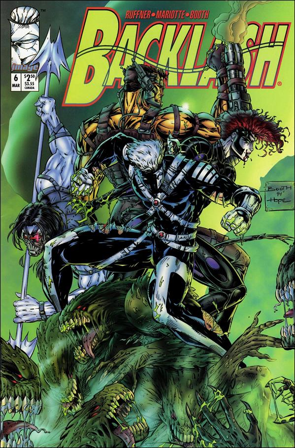
With those details laid down, here is a look back at Backlash #6, published in 1995 by Image Comics with a story written by Brett Booth, Jeff Mariotte and Sean Ruffner. Booth and Dan Norton were the illustrators.
The cover.
Early story
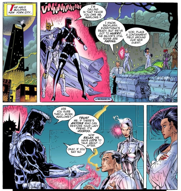
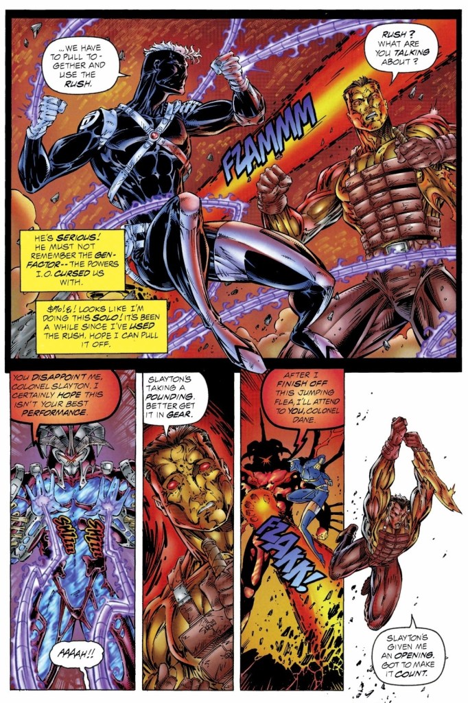
The story begins inside the Wildlife Organization Research institute in northern Montana. After Dane and Grail (the Filipino soldier Salvador Joel Alonday) of Wetworks easily took out two guards, a third one suddenly tried to attack them only to be killed by Backlash. While the three of them are on a stealth mission, Backlash tells Dane that it’s not too late for Wetworks to pull out as it is not their fight. Dane dismisses the remark and insists on pursuing their objective.
Over at a medical institute in Detroit, Taboo and Cyberjack are operating on their own mission which is directly linked with that of Backlash and Wetworks.
Quality
Backlash and the WildC.A.T.S. at the team’s headquarters.
As the sixth issue of its series, this tale has a lot at stake and the writers took their time to balance the build-up with pay-offs and twists. Without spoiling the plot, I can say that a lot is at stake for Backlash as there is something really personal about the missions and the final scene. I can also say that this is a well-crafted comic book that was clearly made with Backlash fans in mind even as the creative team did their parts in expanding the lore of the original WildStorm universe using a clever mix of science fiction and paramilitary action.
I really enjoy reading this comic book and it also has some fine moments that defined Backlash’s personality. The added crossovers with WildC.A.T.S. and Wetworks added not only to the spectacle but also to the depth of the plot. This Backlash comic book is clearly not another adventure but an actual turning point for the former Team 7 member and the series as a whole. That being said, I am looking forward to reading the next issue.
Conclusion
Backlash with Dane and Grail of Wetworks during the mission.
Backlash #6 (1995) is a very solid read. Not only was it an improvement over the previous issue, it raised the stakes high and managed to live up to the expectations. The build-up is really powerful and the way the story ended justified it. I can say that anyone who managed to start reading each of the first five issues of Backlash will experience the power of the ending of this comic book. That being said, you better read all the previous issues before reading this one.
Overall, Backlash #6 (1995) is highly recommended.
Disclaimer: This is my original work with details sourced from reading the comic book and doing personal research. Anyone who wants to use this article, in part or in whole, needs to secure first my permission and agree to cite me as the source and author. Let it be known that any unauthorized use of this article will constrain the author to pursue the remedies under R.A. No. 8293, the Revised Penal Code, and/or all applicable legal actions under the laws of the Philippines.
Welcome back superhero enthusiasts, 1990s arts and culture enthusiasts, Image Comics fans and comic book collectors! Today we go back to the year 1995 to take a close look at one of the many tales of the original WildStorm universe through one of the comic books of the first mini-series of Team 7.
For the newcomers reading this, Team 7 is set in the past within the original WildStorm universe. This is the one special forces team that had major WildStorm heroes – Grifter (WildCATS: Covert Action Teams), Backlash, Jackson Dane (Wetworks), John Lynch (Gen13) and Deathblow – who were younger, were proficient with combat and were destined to gain special abilities that later defined them. Issue #1 reviewed last time worked well by efficiently introducing the characters while also building up the plot and there were some nice pay-offs here and there.
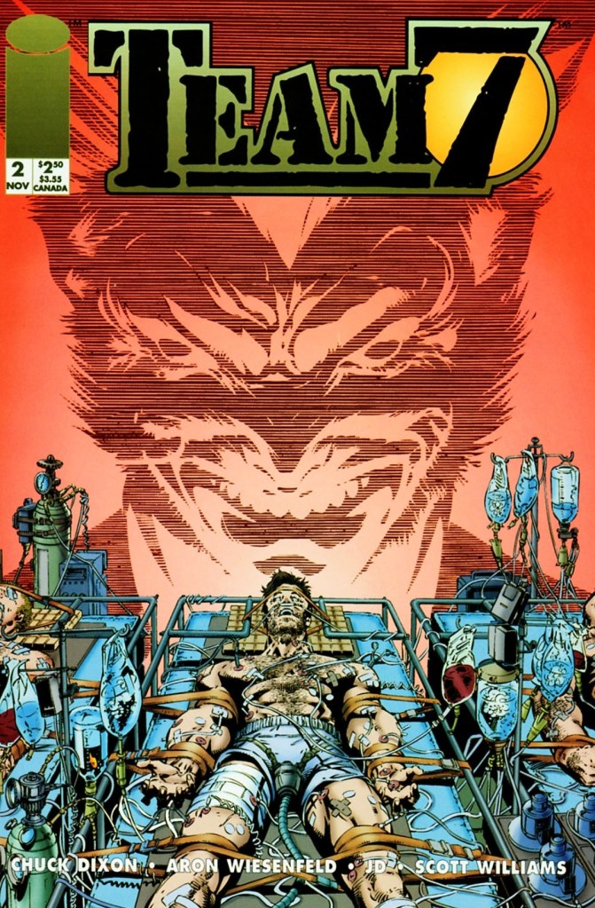
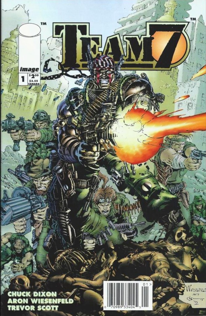
With those details laid down, here is a look back at Team 7 #2, published in 1994 by Image Comics with a story written by Chuck Dixon and drawn by Aron Wiesenfeld. This is the 2nd chapter of the 4-issue mini-series.
The cover.
Early story
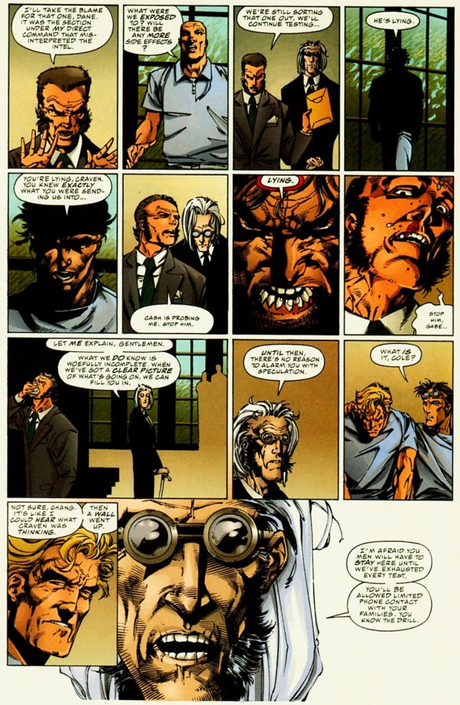
Set in the 1970s, a team of armed escorts and some personnel wearing protective gear isolate and examine a battlefield full of dead bodies. Miles Craven and Gabriel Newman analyze the evidence around them. Craven states that what they have is too important an operation to be left to underlings and he wants Gabriel to stay with the project which could use his special talents. Shortly after, the bodies of the Team 7 members were retrieved barely alive.
Seven days later, John Lynch wakes up in a hospital bed feeling traumatized over what happened to his team during the last mission. He was told that they were exposed to a chemical agent and he had been in a deep coma for a week.
Craven then enters the room to provide Lynch crucial updates…
Quality
Do you recognize Deathblow and Dane on this page?
As expected, the gritty and dark storytelling from the previous issue continued in this story. Without spoiling the plot, I can say that this issue has some handsome pay-offs to what was built-up in issue #1 and there were new build-ups established along the way. Because the script was crafted to build-up the plot and sub-plot, the military action scenes are lessened which is not surprising. I can assure you that Chuck Dixon’s writing here remains pretty strong.
While the previous issue served as an efficient introduction of the younger versions of WildStorm’s heroes who are in the middle of a world full of violence and espionage, this issue shed some light as to how the heroes dealt with their new abilities (in connection with the climax of issue #1) and how International Operations is handling matters behind closed doors. The suspense kept on building up and this made the narrative more intriguing to follow. Expect to see elements of high-level espionage, unethical science and war throughout.
When it comes to the characters, Lynch (being the captain of Team 7) has a huge share of the spotlight followed by Cole Cash (Grifter). The two have different views about their special forces duty – Lynch follows the superiors while Cole realizes something is wrong about their leadership and the intelligence fed to them.
Conclusion
This scene showing Cole Cash (Grifter) emerging from dark with a defiant tone is a very defining moment of this comic book.
Team 7 #2 (1994) is clearly a very engaging read. It has the fine mix of war (with uncompromising violence drawn by Wiesenfeld), intrigue and the dark side of global espionage. The science fiction element here worked well in explaining the powers Team 7 members got after what happened in issue #1. This comic book also marks the beginning of showing Lynch and Cole Cash as the co-leads among the teammates. Die-hard fans of Deathblow, Dane and Backlash will have to wait a bit before their favorites get their share of the spotlight. Regardless, this is a very powerful read and a fine example of doing a prequel within the original WildStorm universe.
Disclaimer: This is my original work with details sourced from reading the comic book and doing personal research. Anyone who wants to use this article, in part or in whole, needs to secure first my permission and agree to cite me as the source and author. Let it be known that any unauthorized use of this article will constrain the author to pursue the remedies under R.A. No. 8293, the Revised Penal Code, and/or all applicable legal actions under the laws of the Philippines.
Welcome back superhero enthusiasts, 1990s arts and culture enthusiasts, Image Comics fans and comic book collectors! Today we go back to the year 1994 to take a close look at one of the many tales of the original WildStorm universe through one of the comic books of the first mini-series of Team 7.
For the newcomers reading this, Team 7 is set in the past within the original WildStorm universe. This is the one special forces team that had major WildStorm heroes – Grifter (WildCATS: Covert Action Teams), Backlash, Jackson Dane (Wetworks), John Lynch (Gen13) and Deathblow – who were younger, were proficient with combat and were destined to gain special abilities that later defined them.
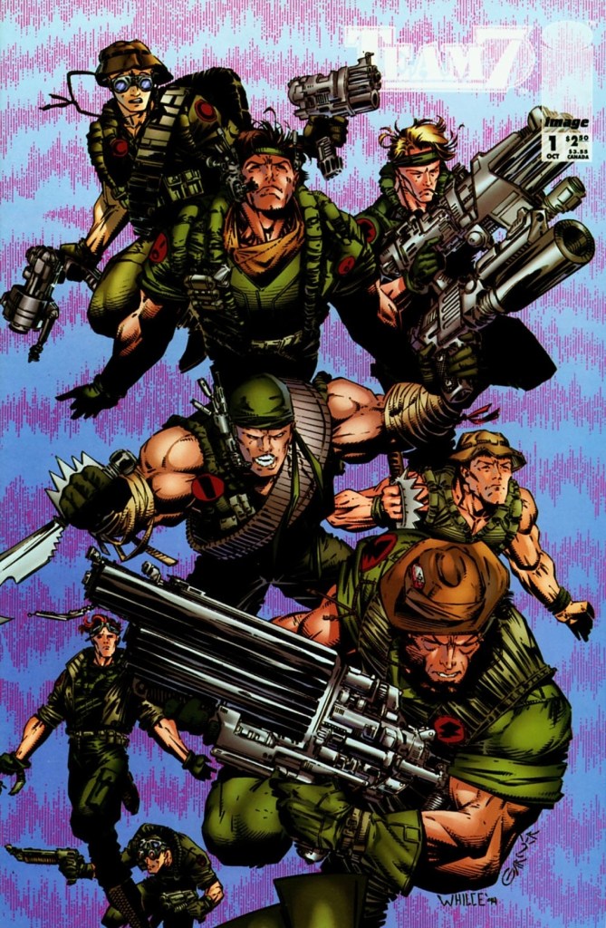
With those details laid down, here is a look back at Team 7 #1, published in 1994 by Image Comics with a story written by Chuck Dixon and drawn by Aron Wiesenfeld. This is the first chapter of a 4-issue mini-series. Also this year marks the 30th anniversary of this very comic book.
The cover.
Early story
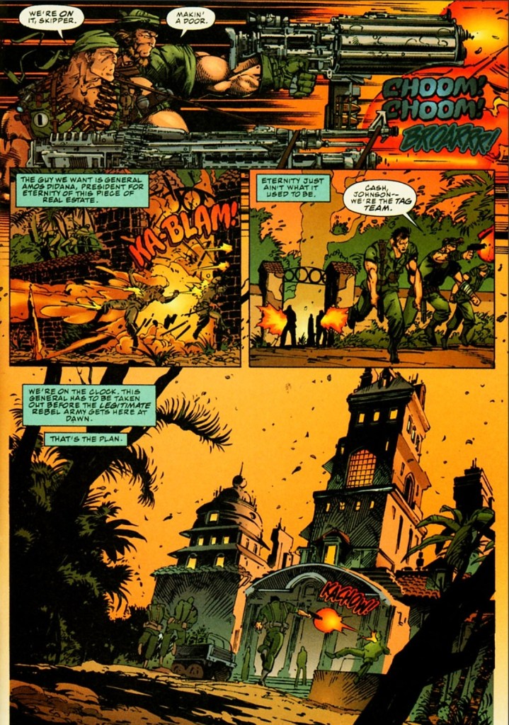
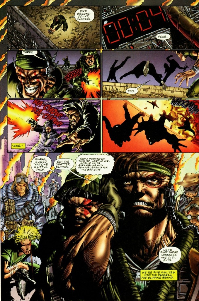
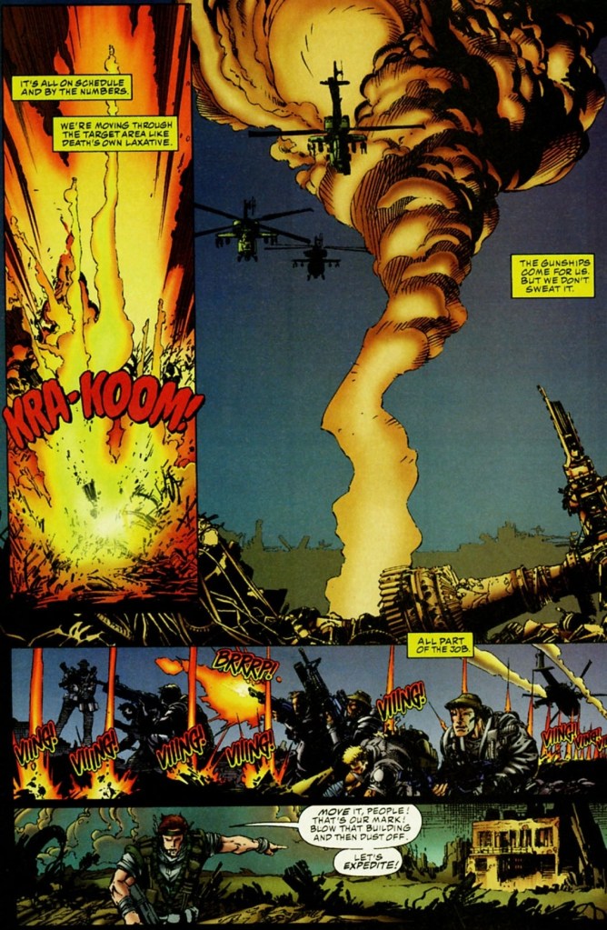
Set in the 1970s, the story begins when the United States Special Forces Team 7 arrives in Iran with the objective of rescuing hostages. Led by John Lynch, the team encounters several Iranian terrorists along the way and eliminates them as they proceed with their mission. A lot of killings and a few explosions happened as they made their way into the facility.
Eventually, Team 7 discovers that the hostages are gone as they only found stuffed dummies made to look like hostages. As they are so deep within the facility, going outside to survive an incoming powerful bombing was out of the question. They decide to go deeper knowing that the facility has a hardened sub-basement that was designed to absorb a shockwave…
Quality
See if you could recognize the WildStorm heroes among them.
I can say out loud that this WildStorm prequel tale by the Dixon-Wiesenfield is a very inspired work of fiction that captures (intentionally or not) the vibe of R-rated Hollywood action and war movies of the 1980s. In my view, the tone and style of this comic book reminds me a lot about Predator (1987), Rambo: First Blood Part II (1985) and Full Metal Jacket (1987). Of course, this is a tale about a band of brothers who risk their lives working overseas for their country taking orders from their superiors at International Operations (IO).
As a WildStorm tale, this one efficiently puts up the building blocks needed to define the key characters who would later become major WildStorm figures in what was back then the present day stories (set in the 1990s) told through WildCATS: Covert Action Teams, Kindred, Gen13, Backlash, StormWatch and more. At the same time, readers will get a close look at the developments behind closed doors at IO which itself appeared in WildStorm comic books with a much older Lynch as director. Of course, as this is the first issue the build-up would obviously continue in the succeeding issues of the mini-series.
The team led by John Lynch fought the Iranian terrorists as they make their way through.
War imagery here is intense.
The story itself has themes of espionage, political intrigue, Islamic terrorism and military conflict. It was made clear here that IO has a wicked director called Craven and the young John Lynch (the protagonist and future IO director) could do nothing but receive intelligence (no matter how limited) and execute orders that put him and his teammates in grave danger.
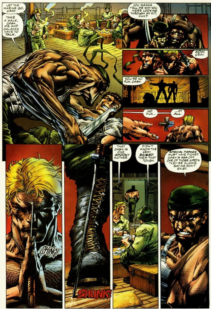
Along the way, you will see younger versions of WildStorm heroes Grifter (Cole Cash), Jackson Dane, Backlash (Marc Slayton), Deathblow (Michael Cray) as well as a few minor characters whose legacies will be felt in the present day stories (example: Gen13’s Grunge is the son of member Philip Chang). Oh yes, the banter and interactions between Team 7 members were very much inspired by what was portrayed in Predator (1987) and Full Metal Jacket (1987). While Lynch is the protagonist struggling with following orders and leading the team, the young Deathblow here clearly their most natural and aggressive eliminator.
When it comes to the visuals, Aron Wiesenfeld came up with a consistently dark and gritty look backed with uncompromising violence that strongly emphasizes the horror of war. He also has this exquisite approach on displaying the characters and the action portrayed was more of shooting, explosions and hard action. This comic book was released years before Steven Spielberg’s Saving Private Ryan (1998) hit the cinemas and caused some controversy with its display of graphical violence. In short, this is a comic book visualized with adults in mind.
Conclusion
The cover of the variant edition of Team 7 #1 drawn by Whilce Portacio.
Team 7 #1 (1994) is a very compelling read and it still remains one of the most unique comic books of the original WildStorm universe ever published. It is also one of the most defining war comic books published in the 1990s.
Considering the great work done by the Dixon-Wiesenfield duo, your enjoyment and understanding of this comic book depends a lot on how much you have oriented yourself with the mentioned WildStorm heroes who appeared in the comic books of WildCATS: Covert Action Teams, StormWatch, Wetworks and the like. I enjoyed this comic book a lot because I familiarized myself with Grifter, Backlash, Deathblow, Lynch and Dane before reading it. That being said, I urge you newcomers to get to know the said characters first before reading this comic book.
Welcome back readers, fellow geeks and electronic gaming fans!
In this edition of the Retro Gaming Ads Blast (RGAB) series, we will take a look at another batch of retro gaming print ads – including arcade flyers – from the 1980s and 1990s.
For the newcomers reading this, Retro Gaming Ads Blast (RGAB) looks back at the many print ads of games (console, arcade, computer and handheld) that were published in comic books, magazines, flyers, posters and newspapers long before smartphones, social media, the worldwide web and streaming became popular. To put things in perspective, people back in the 1980s and 1990s were more trusting of print media for information and images about electronic games and related products.
With those details laid down, here is the newest batch of retro gaming print ads for you to see and enjoy…
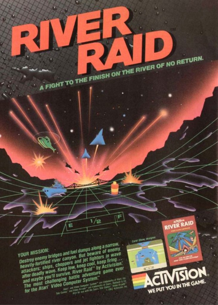
1. River Raid print ad
This River Raid print ad appeared on comic books and magazines long ago.
Decades before it became an industry giant with the best-selling Call of Duty games, Activision became a standout publisher in the early 1980s with River Raid on the Atari 2600. Designed by Carol Shaw, River Raid was a huge success ending up as the 2nd best-seller on the Atari 2600 as well as Activision’s best-selling game for the year 1983. Apart from showing one screenshot and the box cover of the game, the print ad of River Raid had this mesmerizing 3D image that caught many gamers’ attention and helped them feel like they will pilot on dangerous missions. The 3D image was futuristic in its own style became forward-moving 3D sequences in video games became reality many years later.
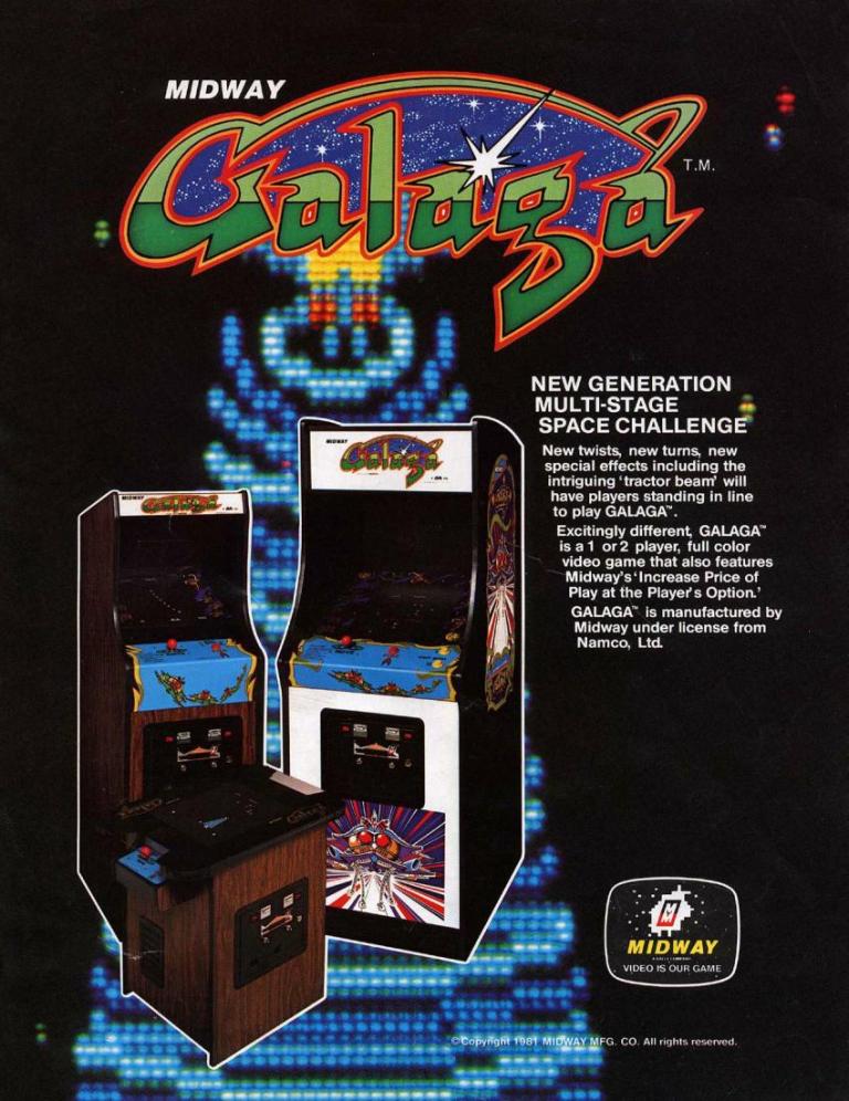
2. Galaga North American arcade flyer
The front of the flyer showing three Galaga machines that arcade operators can choose from.
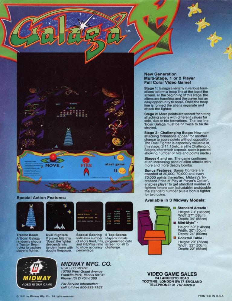
Key details about Galaga were nicely presented on the rear of the flyer.
In the history of gaming, Namco’s Galaga was played by countless millions of gamers and it is still highly regarded as an arcade classic as well as one of the most enjoyable arcade games ever made. In preparation for the North American launch (October 1981), Midway prepared the arcade flyer showing the three types of machine on the front that arcade operators can choose from. On the rear is the really neat approach of explaining the details of the game, what kind of gameplay is to be expected, and how to play. Whether you are an individual player or the manager of an arcade joint, this flyer suits your needs.
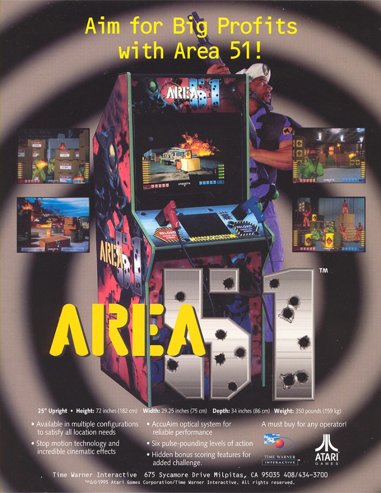
3. Area 51 arcade flyer and conversion kit flyer
The front of this Area 51 flyer had an enticing message for arcade operators as well as other business owners/managers who are interested in having a machine to add value to their business joints. Atari was already in deep money problems by the time they started making this game.
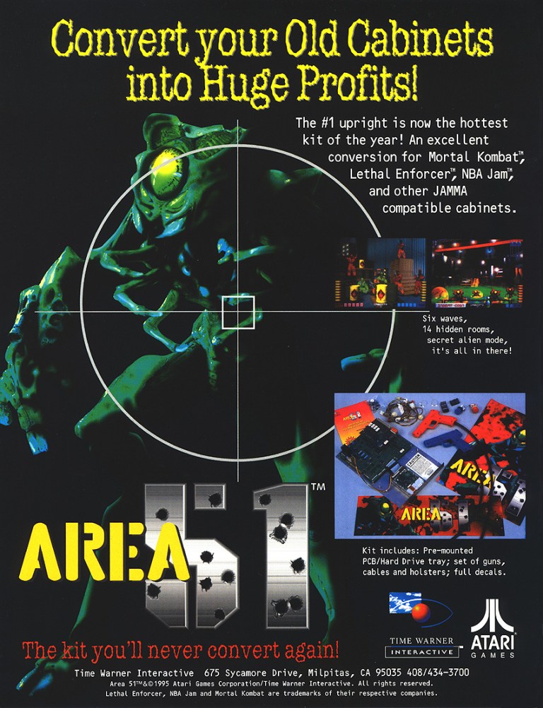
The Area 51 arcade conversion kit is a cheaper alternative for businesses who want the game.
Moving on to the 1990s, Atari was already struggling financially and desperately needed a hit to lift them up fast. A light gun shooter project was approved as arcade shooters were in good demand and after overcoming serious hurdles during production internally, Atari hired independent team Mesa Logic to take charge of development. After being granted extra time and more creative freedom, the project under Mesa Logic’s handling became a sci-fi shooter titled Area 51. The game became a huge hit in the arcades for Atari resulting in sales of more than 20,000 arcade cabinets as well as a major financial boost for the company (note: Atari still exists today). Atari went on to release Atari 51 versions for PlayStation, Sega Saturn and PC in America in 1996. The Atari 51 flyers you see here are still captivating to look at and were crucial in generating buzz among arcade operators, business joints that had space for arcade cabinets and gamers.
4. Panasonic 3DO print ad
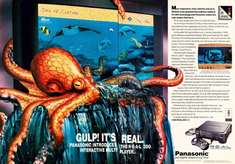
The makers of this print ad forgot to mention the 3DO is also a game machine.
Back in 1993, the 3DO Interactive Multiplayer console manufactured by Panasonic (a licensee of the 3DO Company) was launched with a CD-ROM drive, multimedia features and gaming capabilities (with a 3-button control pad). This print ad strongly emphasized the 3DO’s ability to play high-quality sound and full-motion videos using the Sea of Cortez software which functioned as an interactive movie. Obviously, this did not resonate well with people who loved to play games and by the time the 3DO Company and its partners started marketing games, they could not save the 3DO console from fading to obscurity. The console shown in the ad is specifically model Panasonic FZ-1 R·E·A·L 3DO Interactive Multiplayer. Panasonic was one of five companies that were licensed by the 3DO Company.
5. MechWarrior 3050 SNES print ad
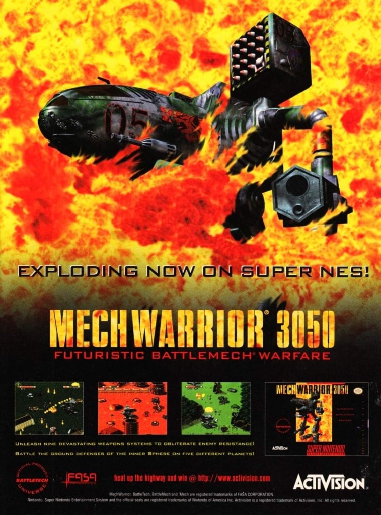
If you were unaware of the 1994 game BattleTech, then this ad would have fooled you into thinking it is promoting a brand new game.
In 1995, the popular BattleTech entertainment franchise arrived on the Super Nintendo Entertainment (SNES) system with MechWarrior 3050 and its print ad had a really blazing artwork of an armed mech in fire which gave readers the illusion of a new and original game. In reality, MechWarrior 3050 was actually a port of BattleTech which was released on the Sega Genesis in 1994. The Genesis game was published by Extreme Entertainment Group while the SNES game was published by the more famous Activision. If you look closely at the MechWarrior print ad, you can tell how hard they tried to sell the game like it was brand new and all-original.
6. Cliffhanger video game print ad
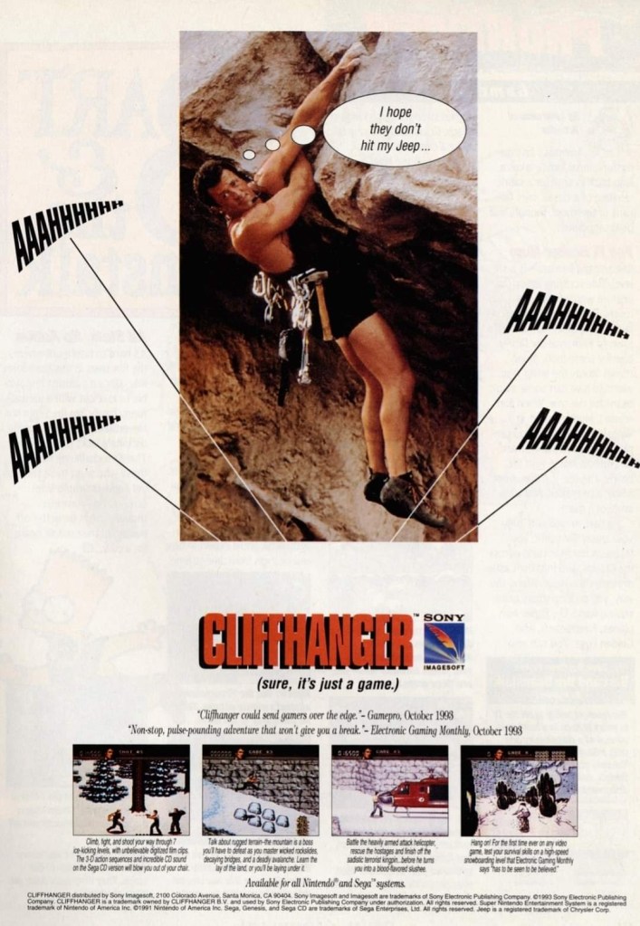
This print ad had Sylvester Stallone hanging on a cliff to be relevant with the title of both the film and the game. They could not show images of Stallone in hard action scenes.
For fans of Sylvester Stallone, 1993 was a big and exciting year as the Hollywood icon appeared in two major action films – Cliffhanger and Demolition Man. Cliffhanger was released first and there were video game adaptations of it released on game consoles, handhelds and computers. This print ad of the Cliffhanger video game had an image of Stallone hanging on a cliff to emphasize the title. The ad makers cleverly posted selected gameplay screenshots and quoted GamePro and Electronic Gaming Monthly (EGM) to make the game look credible and worthy of purchasing. The marketing led to nowhere as the game received mostly negative reviews from critics and it faded to obscurity. Lastly, the Cliffhanger game ad had a noticeable amount of space wasted. They could have made the screenshots and text look somewhat bigger to sell the game.
7. Ballz: The Director’s Cut print ad
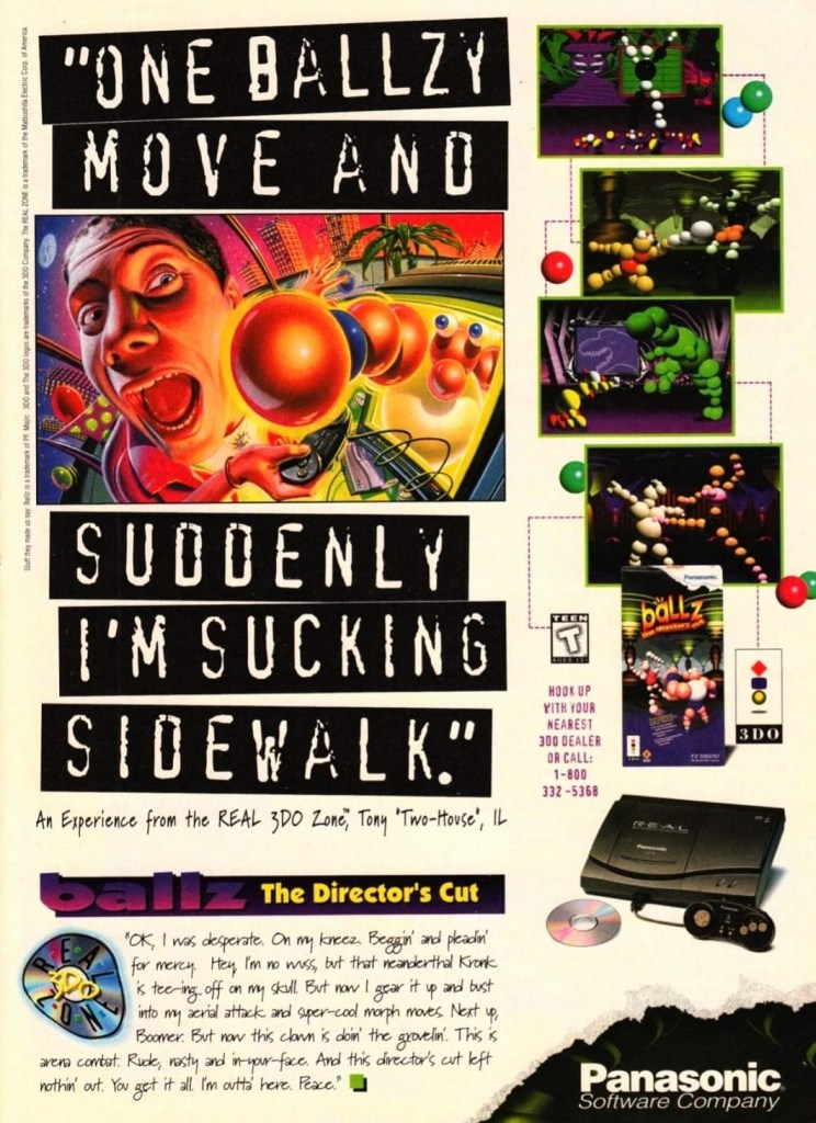
I never got to play this game on the 3DO.
Here is another ad of the video game released on the failed 3DO console. As its title made obvious, Ballz: The Director’s Cut is an enhanced version of the original Ballz game of 1994 that was released on other consoles. The print ad had an eye-catching piece of artwork and posted beside it were selected shots of the gameplay. Strangely enough, the creative writing on the lower part of the ad does not make any sense and did nothing to convince gamers to play the game. As Ballz: The Director’s Cut was released in 1995, this ad shows the revised 3DO console from Panasonic (model: Panasonic FZ-10 R·E·A·L 3DO Interactive Multiplayer).
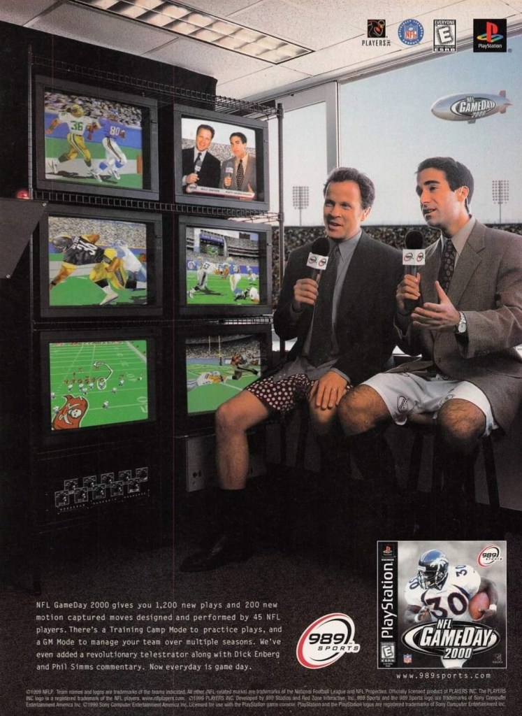
8. NFL GameDay 2000 print ad
Did you find this ad funny to look at in 1999?
To promote the PlayStation-exclusive NFL GameDay 2000, Sony publisher 989 Sports and the ad makers decided to implement a humorous look at football TV coverage by having two sportscasters wearing shorts in front of a TV camera that was only showing their heads and upper bodies. The TV sets on the side show screenshots from the game to emphasize the sports gaming experience. Ultimately the game scored mostly positive review from the critics.
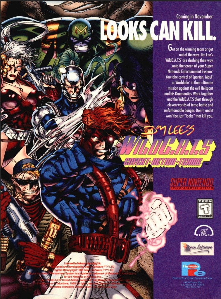
9. WildC.A.T.S: Covert Action Teams print ad
WildC.A.T.S. art by Jim Lee was used to promote the SNES video game.
When Image Comics launched in 1992, WildC.A.T.S: Covert Action Teams was Jim Lee’s creator-owned comic book franchise and its launch issue was a big seller. Years later, WildC.A.T.S. grew in popularity with comic book fans and the franchise achieved multi-media status by venturing into TV (with an animated series) and video games. This print ad promoting the video game adaptation had no screenshots to show which kept fans and gamers guessing how the game will turn out in terms of gameplay and game design. It was obvious that the people who made this print ad had to rely on the best WildC.A.T.S. artwork they could find drawn by Jim Lee. This ad made me laugh back in the old days because if you did not look closely, it might fool you into thinking it was more about comic books than the game on the SNES.
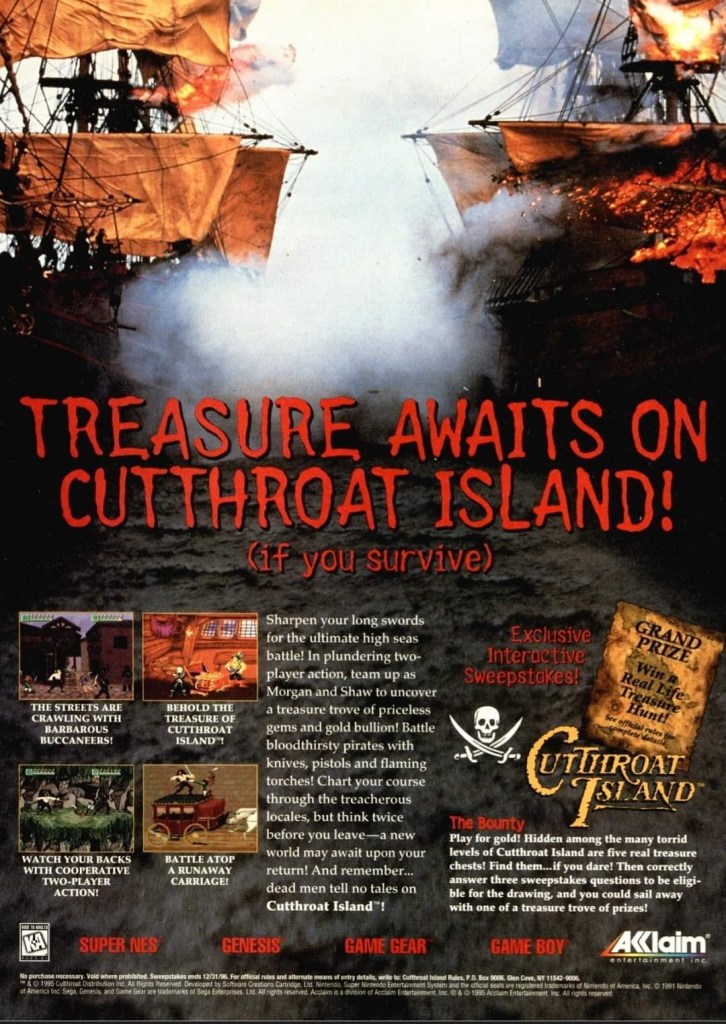
10. Cutthroat Island print ad
Exciting imagery without Geena Davis and Matthew Modine was used to promote the video game adaptation.
I never saw the Hollywood mega-flop Cutthroat Island nor have I ever played any of its multiple video game adaptations (released on SNES, Sega Genesis, Sega Game Gear and Game Boy). The video game print ad, however, caught my attention back in 1995 because the ad makers cleverly used a photograph from one the many expensive movie sequences filmed and the hard, physical work by the filmmakers was clearly visible. Then the ad makers had four screenshots placed on the lower-left part and inserted descriptive text that sounded exciting. Lastly, the ad mentioned a sweepstakes promo.
Without using any images of stars Geena Davis and Matthew Modine, this ad was a strong attempt to get gamers excited for the video game adaptation. Like the movie itself, this game flopped and has faded away to the land of the forgotten.
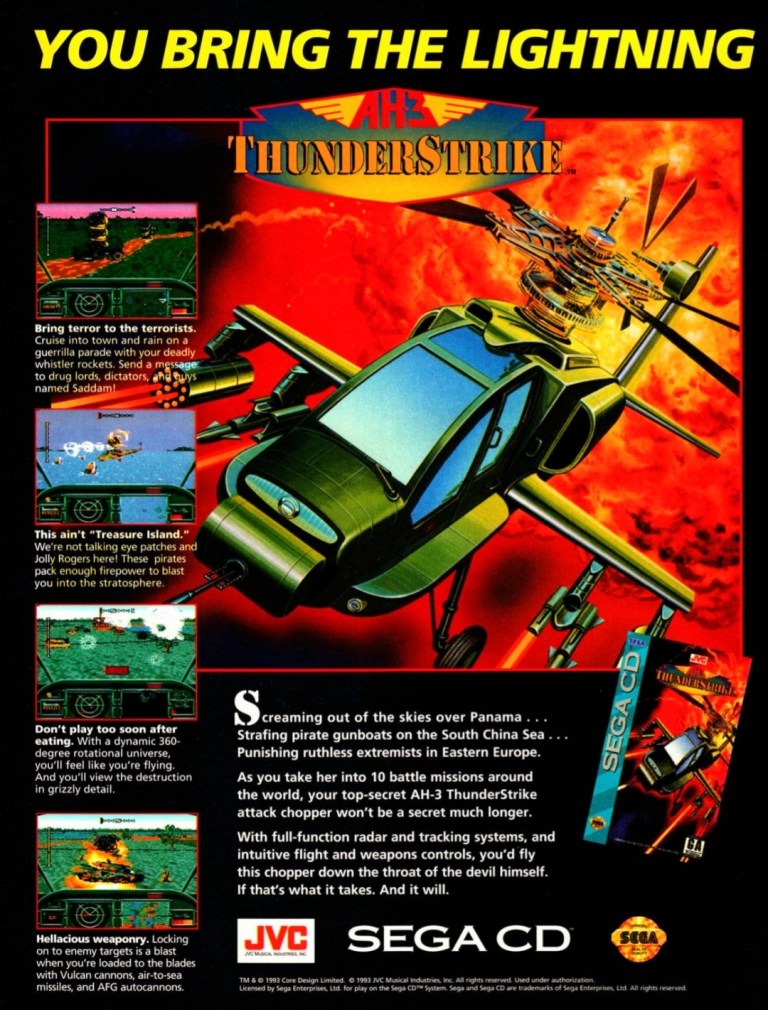
11. AH-3 Thunderstrike print ad
Captivating artwork, vibrant colors and orderly text descriptions made this an effective ad.
AH-3 Thunderstrike is one of the better games that was released on the Sega CD add-on (requires the Sega Genesis console) in 1993. Similar with MechWarrior 3050, the game was actually a port of Thunderhawk which itself was released on the Amiga and MS-DOS PC in 1992. The print ad showcased a captivating artwork (which was also used on the game’s box cover), a few screenshots and strategically placed text descriptions to sell the game. This ad still looks good.
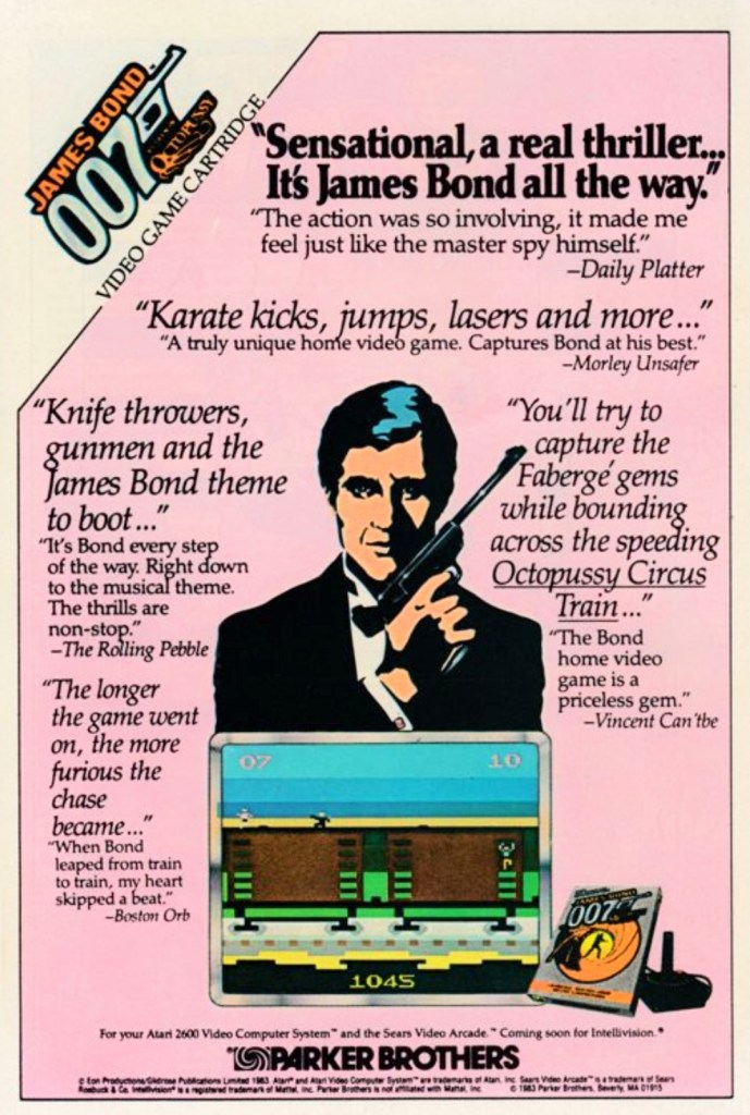
12. James Bond 007 print ad
This print ad appeared in many comic books in 1984.
This is a print ad I saw many times while reading comic books in 1984. James Bond 007 for Atari 2600 was an ambitious licensed video game as it featured levels that were inspired by missions in the James Bond movies Diamonds are Forever, The Spy Who Loved Me, Moonraker and For Your Eyes Only. Keep in mind that programmers back then had to deal with memory limitations and primitive tools to make games.
To promote the game, original art of Agent 007 was used which did not resemble the James Bond star of the time – Roger Moore. Strangely enough, the illustrated James Bond slightly resembled Timothy Dalton whose debut as 007 happened in 1987. Adding further zest to the add was the use of fictionalized quotes pointing to fantasized critics as sources (example: Vincent Can’tbe is a reference to real life critic Vincent Canby). The use of a pink background made this catchy ad look really odd.
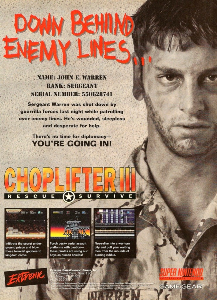
13. Choplifter III: Rescue Survive print ad
A captivating print ad that brought gamers’ attention to the Choplifter series again.
This print ad of Choplifter III: Rescue Survive has a striking look showing a military officer who needs your help as he has been stranded behind enemy lines. The presentation reflects the long-time tradition of the Choplifter game franchise which has been about piloting an armed helicopter to the opposition’s territory, shooting at bad guys and then rescuing the hostages or prisoners-of-war (POWs). The game eventually gathered mostly positive feedback from video game critics.
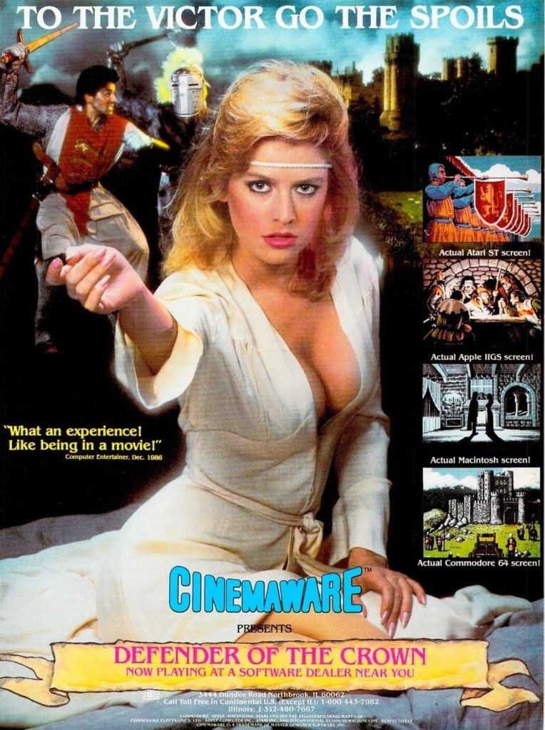
14. Defender of the Crown print ad
Cinemaware took a gamble with the visual concept of this print ad.
Released in 1986 for home computers, Defender of the Crown was made with a high level of quality backed with solid artistry. To capture gamers’ attention, Cinemaware came up with this print ad showcasing a pretty model looking somewhat seductive which reflects what happens in the game when players rescue a damsel in distress. The selected screenshots showed what the game looked like on different platforms, and the lower part of the ad made the game feel like it was a historical epic waiting to be discovered. Defender of the Crown eventually became a big hit with computer gamers.
Disclaimer: This is my original work with details sourced from reading the comic book and doing personal research. Anyone who wants to use this article, in part or in whole, needs to secure first my permission and agree to cite me as the source and author. Let it be known that any unauthorized use of this article will constrain the author to pursue the remedies under R.A. No. 8293, the Revised Penal Code, and/or all applicable legal actions under the laws of the Philippines.
Welcome back superhero enthusiasts, 1990s arts and culture enthusiasts, Image Comics fans and comic book collectors! Today we go back to the year 1995 to take a close look at one of the many tales of the original WildStorm universe through one of the comic books of the Backlash series.
For the newcomers reading this, Backlash is one of the major characters of the WildStorm universe which started in the early 1990s when the famous Jim Lee was one of the founding fathers of Image Comics. Backlash, Deathblow, Wetworks, Gen13 and WildCATS: Covert Action Teams were all connected with each other and many of the characters were linked together in the Team 7 series of prequel stories.
With those details laid down, here is a look back at Backlash #5, published in 1995 by Image Comics with a story written by Brett Booth, Jeff Mariotte and Sean Ruffner. Booth did the artworks.
The cover.
Early story
The story begins with Backlash having visions of his beloved Diane who eventually turns into a gruesome Daemonite monster. Suddenly his female companion Taboo appears to him only to betray him moments after.
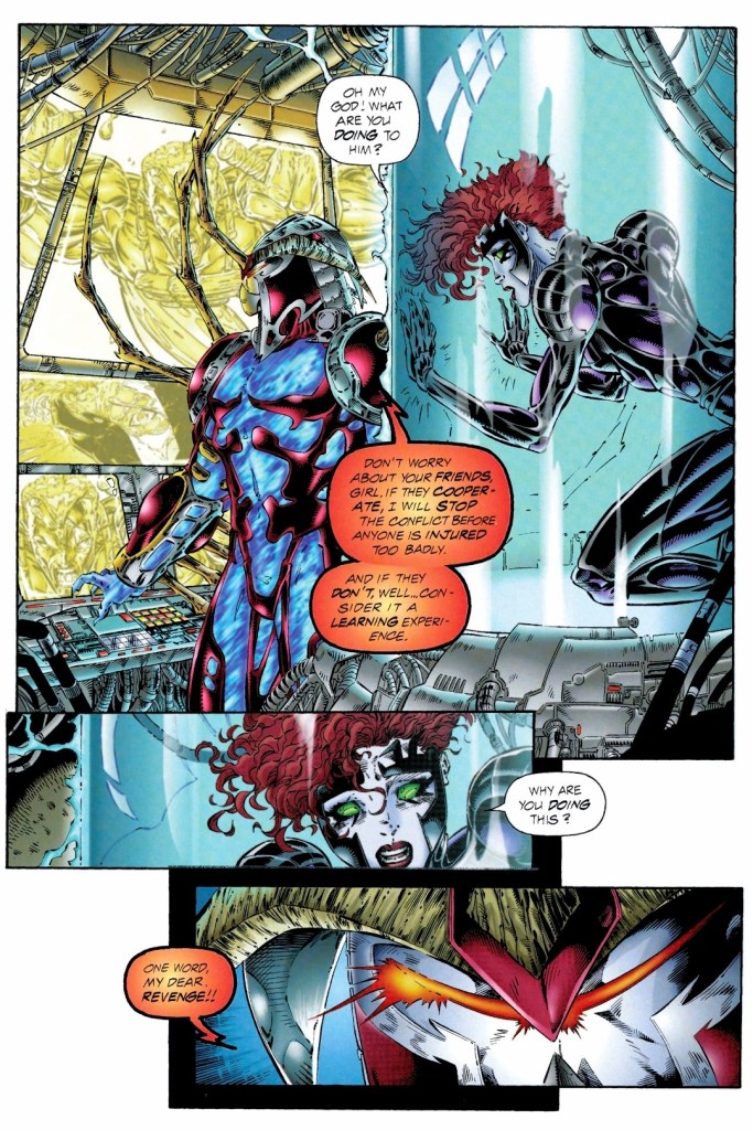
In the real world, it turns out that Backlash is helplessly restrained and connected to machines in the presence of Mindscape and his assistant Virtual Bob. Wetworks leader Jackson Dane and Taboo have been contained separately and could only watch Backlash agonizing. Backlash’s mind has been infiltrated by Mindscape through the use of virtual reality.
Mindscape has been looking for a living subjects who could become suitable for his project of combat droids which require genetic information from the subject. Even though he knows that having two live subjects would confuse the combat droids, Mindscape gives the order to have both Backlash and Dane together in cyberspace…
Quality
Backlash and Wetworks leader Dane face-off with Mindscape in cyberspace.
With its heavy emphasis on virtual reality and cyberspace, the creators temporarily changed their approach on storytelling and showing spectacle while managing to introduce a new villain and show more of the friendship of Backlash and Dane.
In my view, Mindscape is indeed a very interesting antagonist who is not the typical super villain who is simply being evil for the sake of it. In fact, Mindscape’s origin was efficiently told here and by the time I finished reading this comic book, I found him to be intriguing. Before he became the powerful villain here, Mindscape used to be a very talented virtual reality developer. Mindscape looks at Dane and Backlash – both of which have extensive military experience as they used to be teammates with Team 7 – not for the sake of murder but as suitable subjects for his combat drones which signifies his intention to build an army that will serve him in the real world.
As this story took place a short time after the reunion that happened late in issue #4, this comic book shows a bit more of the friendship between Backlash and Dane, revealing small details about their past together as specially trained soldiers. With the way the story here was told, there was too little room left for any character development to happen but the small details revealed about the two WildStorm heroes was enough to inspire me to revisit Team 7.
In relation to the story’s concept about virtual reality, the spectacle here is much different and absolutely wilder. You have to see it for yourselves.
Conclusion
Being trapped and helpless, Taboo could only watch Mindscape and ask him questions.
Backlash #5 (1995) is an entertaining and intriguing read. This comic book also served as a suitable break from the norm of showing Backlash fighting bad guys in the real world and infiltrating places to accomplish his objectives. Backlash and Dane here were portrayed to be vulnerable as their conflict with Mindscape happened in cyberspace. The final conflict was a spectacle to look at and the story’s ending was satisfying enough leaving the sense that Backlash and Dane would meet each other again.
Disclaimer: This is my original work with details sourced from reading the comic book and doing personal research. Anyone who wants to use this article, in part or in whole, needs to secure first my permission and agree to cite me as the source and author. Let it be known that any unauthorized use of this article will constrain the author to pursue the remedies under R.A. No. 8293, the Revised Penal Code, and/or all applicable legal actions under the laws of the Philippines.
Welcome back superhero enthusiasts, Tomb Raider fans and comic book collectors! Today we go back to year 2000 to revisit the 2nd issue of the Tomb Raider comic book series which was published through Image Comics.
In my previous retro review, the creative team smoothly and firmly established the iconic Lara Croft as an experienced treasure hunter and explorer who also knows how to negotiate with clients when it comes to high-risk tasks. In short, her debut in comics turned out very inspired by the video games and that made the Tomb Raider herself a fitting protagonist in the realm of comic books.
With those details laid down, here is a look back at Tomb Raider #2, published in 2000 by Image Comics (production work by Top Cow) with a story written by Dan Jurgens and drawn by Andy Park.
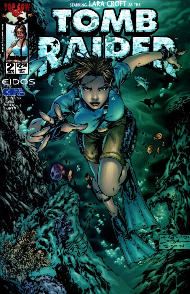
The cover.
Early story
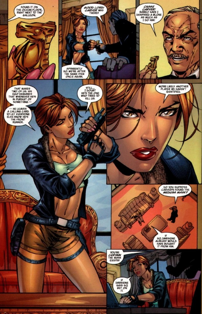
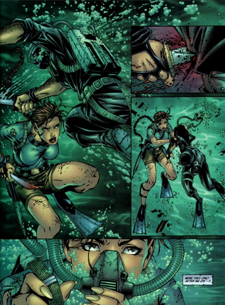
The story begins with Lara Croft in trouble deep underwater as her oxygen line had been cut off while her yacht got badly damaged by a time bomb placed on it by unidentified operators. The wounded Lara is approached by two scuba divers responsible for the attack. As they search her for valuable items, Lara fights back against them strategically. After the two got attacked by the sharks separately, she avoids the sharks near her only to witness her yacht sink from above and on to the surface below.
Lara then begins to worry about her butler Compton…
Quality
The interactions between Lara Croft and Compton remind me a lot about Bruce Wayne (Batman) and Alfred working together.
This tale shows Lara aided by Compton (who turned out to be more than just dedicated butler) on a search not only for artifacts but also for answers and people. This is the result of the disruption caused by a gang led by Chase Carver as Lara conducted the dangerous underwater search in relation to her agreement with a dangerous client. If there is any symbolism here, it would be the unfortunate events confirming that the so-called industry on the search for artifacts is truly dangerous not only because of difficult locations to visit but also because there are powerful stakeholders who resort to violence to get ahead of other searchers. In short, the very rich Lara is destined to encounter danger as she personally engages in the searching.
Using flashbacks, Dan Jurgens inserted scenes showing readers what Lara was like when she was a young girl, who her parents are, and how involved Compton became as the family’s defender and butler. As a result, Compton here ended up looking and acting very much like Batman’s Alfred Pennyworth (butler and operator). This is not exactly problematic as having Compton allows the creators to have Lara someone to talk with and place her trust on. That being said, I can say that Lara-Compton is pretty much like Batman-Alfred.
More on the story, there is a focus on the violent competition within the world of the search for artifacts. The attack by Carver’s gang drastically altered the direction of Lara’s search which leads her and Compton to Nepal.
When it comes to spectacle, I noticed that the Jurgens-Park duo ramped up the action a lot and the violence was intensified making this tale look like an R-rated action movie. This opened a lot of opportunities for Park to draw more dynamic action shots complete with explosions. In my view, the ramped-up spectacle did not overwhelm the narrative and turned out a very generous pay-off to the build-up.
Conclusion
There is plenty of action to enjoy in this comic book.
Tomb Raider #1 (2000) is a fun read that moved the story forward while saving enough space for character exposition (the flashbacks) and spectacle. As Lara’s search for answers goes on, the suspense got built-up nicely and there were details that caught my curiosity. As of now, I am looking forward to finding out more and what would happen next.
Disclaimer: This is my original work with details sourced from reading the comic book and doing personal research. Anyone who wants to use this article, in part or in whole, needs to secure first my permission and agree to cite me as the source and author. Let it be known that any unauthorized use of this article will constrain the author to pursue the remedies under R.A. No. 8293, the Revised Penal Code, and/or all applicable legal actions under the laws of the Philippines.
Welcome back superhero enthusiasts, 1990s culture enthusiasts and comic book collectors! Today we go back to the early 1990s and explore a part of the Marvel Comics shared universe through a tale of the Spider-Man monthly series.
Back in the late 1980s, Todd McFarlane proved to be a highly talented artist who helped Marvel sell a lot of issues of the Amazing Spider-Man series. McFarlane was also highly involved with the creation of Venom which not only became Spider-Man’s deadliest foe but also an icon of Marvel’s. In the year 1990, a brand new monthly series of Spider-Man was launched and it had Todd McFarlane writing and illustrating the tales.
With those details laid down, here is a look back at Spider-Man #1, published in 1990 by Marvel Comics with a story written and drawn by Todd McFarlane. This marks the beginning of the Torment storyline.
The cover.
Early story
The story begins in New York City where countless people walk to their respective destinations not realizing that the local hero Spider-Man was swinging above them. In a dirty alley, Spider-Man prevents an armed thug from harming a woman and leaves him hanging covered with a lot of web.
Elsewhere in the city, a sinister figure conducts a ritual, prays to evil forces and begins using magic.
In yet another location, a hideous creature emerges from the water. It’s the Lizard…
Quality
This page is an example of Todd McFarlane creating a travel sequence that allowed him to draw something great. It’s a classic example of moving back into the comfort zone.
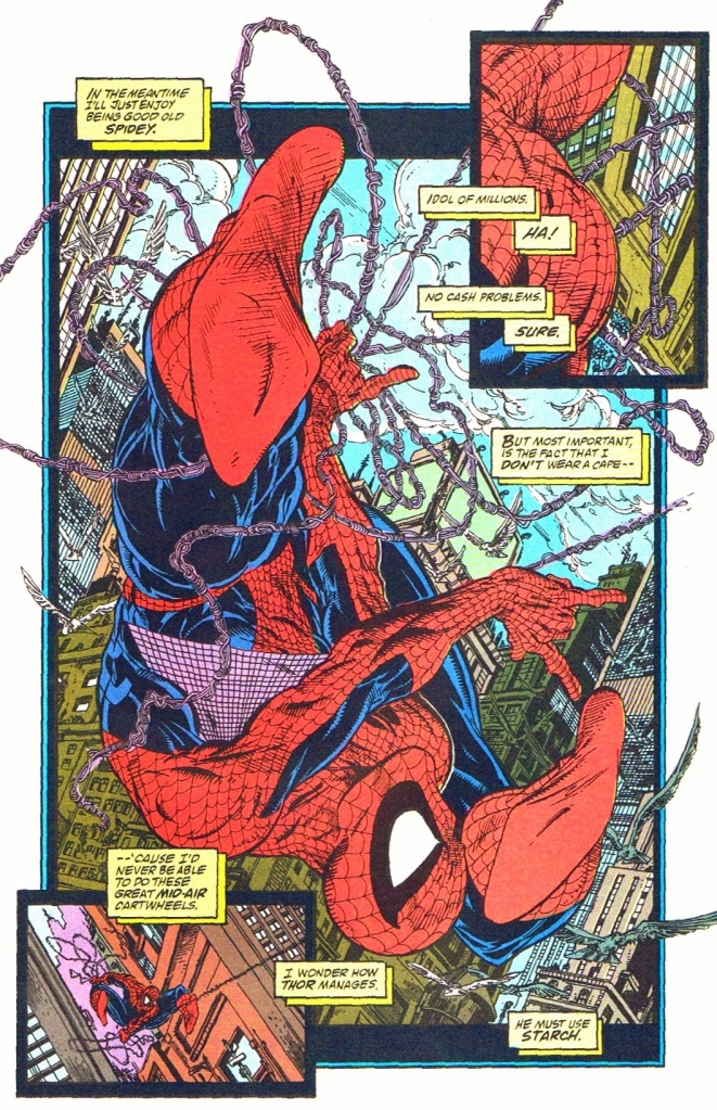
To make things very clear here, this comic book is pretty shallow and hollow mainly due to its storytelling as this was the writing of a very young Todd McFarlane. There is no denying that his art here is great to look at from start to finish. In fact, this was one of McFarlane’s finest visual works ever with Marvel.
But if you look beyond the great visuals, the writing is very weak all throughout the issue. At best, this comic book is a grand-looking yet shallow set-up for the conflict of the Torment storyline complete with shared emphasis on the iconic web-slinger, the Lizard (looking more menacing than before) and Calypso (the one behind the magic and rituals).
In fairness to McFarlane, he added his own touch on emphasizing the personalities of Peter Parker and wife Mary Jane simultaneously as a couple. If you were used to seeing in-depth character development and witty dialogue about the two major characters as portrayed in the Amazing Spider-Man, Web of Spider-Man and Spectacular Spider-Man series of 1990, you won’t find them in this comic book. Under McFarlane’s writing, Spider-Man in this issue showed signs of sarcasm and cockiness in the first scene, and with Mary Jane he (as Peter Parker) expressed himself philosophically. To say the least, the portrayal of Spider-Man here is noticeably different under McFarlane.
The Lizard, a long-time rival of Spider-Man’s, was presented to be very violent and murderous in this issue. This was clearly McFarlane’s approach on emphasizing the force of opposition that awaits the iconic web-slinger and he obviously went for a more adulterated approach with the visuals. That being said, the violent content in this comic book is very unique and clearly stood out from the rest of the Spider-Man-related comics published by Marvel in 1990. Lastly, I should say that McFarlane’s visual take on the Lizard is the best I have seen.
Going back to the visuals, McFarlane implemented strong elements of horror, darkness and grittiness which went along well with the adulterated approach to violence. These mixed elements, as they turned out in reality, became part of McFarlane’s future works past Spider-Man.
Conclusion
McFarlane’s vicious and horrifying approach on visualizing the Lizard can’t be ignored. This Lizard makes the cinematic Lizard of the 2012 movie The Amazing Spider-Man look cartoony.
Spider-Man #1 (1990) is a very mixed bag when it comes to literary enjoyment. It clearly has great artwork by McFarlane whose adulterated approach on expression and spectacle made it very unique. The writing by McFarlane (who was very young at the time of production) is clearly the big letdown although his own approach on portraying Spider-Man, MJ and the Lizard are very notable. Take note that this was Todd McFarlane starting with writing while doing the art (his true strength), and at this point in comic book history his talent on telling compelling stories would not be realized until a few years later (particularly with Spawn and Image Comics). Notably, his use of visual horror and darkness predates his work in Spawn which makes his Spider-Man take very distinct. Ultimately, this comic book served as a build-up for things to come in the Torment storyline. Don’t expect too much when acquiring this comic book.
Disclaimer: This is my original work with details sourced from reading the comic book and doing personal research. Anyone who wants to use this article, in part or in whole, needs to secure first my permission and agree to cite me as the source and author. Let it be known that any unauthorized use of this article will constrain the author to pursue the remedies under R.A. No. 8293, the Revised Penal Code, and/or all applicable legal actions under the laws of the Philippines.
Welcome back superhero enthusiasts, 1990s arts and culture enthusiasts, and comic book collectors! Today we go back to the mid-1990s to explore the comic book launch of a notable fictional team co-created by the Whilce Portacio and Brandon Choi…Wetworks.
For the newcomers reading this, Whilce Portacio was one of the highly talented illustrators who left Marvel Comics and co-founded Image Comics in the early 1990s. While his fellow co-founders Todd McFarlane, Jim Lee, Rob Liefeld, Marc Silvestri, Jim Valentino and Erik Larsen were able to launch their respective dream projects (creator-owned properties) during Image’s first year of publishing, the launch of Wetworks was delayed by two years due to a death in Portacio’s family.
As a very young comic book reader in those days, I remember hearing rumors about Wetworks inside comic book stores I visited. There were rumors of business negotiations, solicitations and scheduled launches (ranging from October 1993 to January 1994). I also noticed some comic book enthusiasts who bought old copies of X-Factor and Uncanny X-Men that Portacio illustrated while waiting for Wetworks to debut.
In the middle of 1994, Wetworks was finally launched under the Image Comics label and I still remember the day when I saw lots of copies of issue #1 displayed on the shelves and windows of comic book stores.
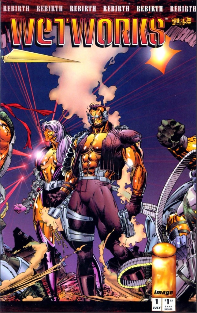
With those details laid down, here is a look back at Wetworks #1, published in 1994 by Image Comics with a story written by Whilce Portacio and Brandon Choi. The art was done by Portacio with ink work by Scott Williams.
The cover.
Early story
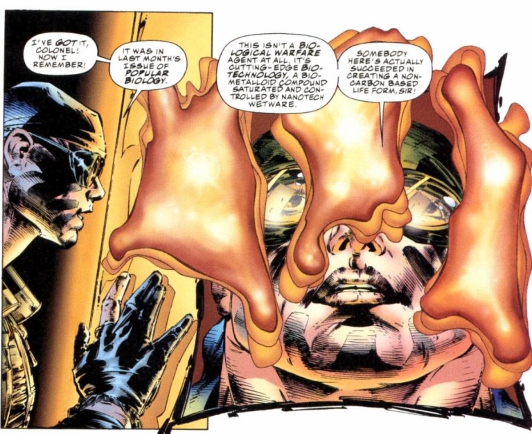
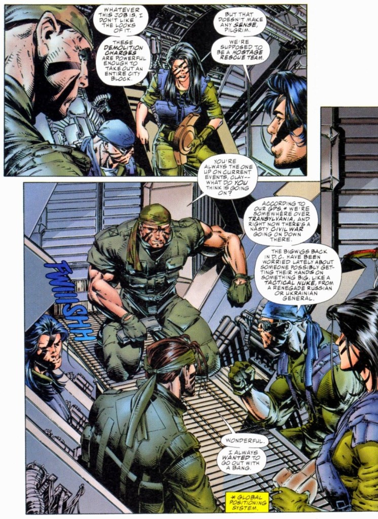
The story begins when a covert operations team working under International Operations (IO) travels to eastern Europe to infiltrate and destroy the base of operations of a certain warring faction and retrieve a biological agent (highly contagious) no matter what the cost. As it turns out, this new mission for the team (led by Colonel Jackson Dane, one of the pioneers of Team 7) started less than twenty four houses after their previous mission and their female member Pilgrim (reconnaissance specialist) pointed out that the demolition charges they are carrying are strong enough to wipe out an entire city block. Another teammate called Grail (the Filipino named Salvador Joel Alonday) stated that they are supposed to be a hostage rescue team.
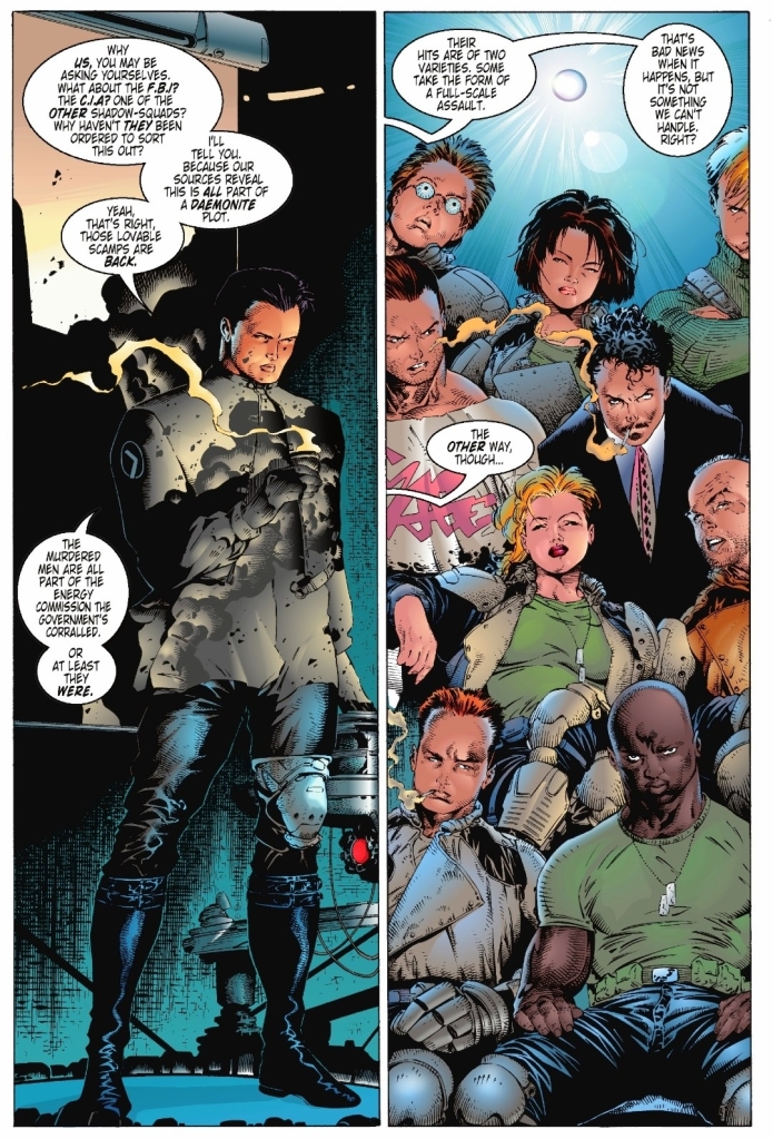
Meanwhile deep inside the command center of IO in Washington, D.C., Admiral Halsey tells Miles Craven that Team 7 (the team led by Dane) are under his command and states that his sources tell him that there is more to the mission than just a group of ethnic nationalists obsessed on a biological terror campaign. It turns out, Craven sent the team to eastern Europe without fully informing them of what they are going up against. Craven insists that Team 7 are paid to put their lives on the line and to die if necessary just to get the job done. Craven then reveals to Halsey the true nature of the mission. The admiral then realizes Craven is right and certain sacrifices must be made for the greater good.
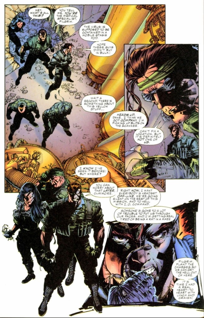
Craven and his team arrived at the location in Transylvania. They started seeing signs that someone else arrived ahead of them…
Quality
One of the team members looks at a symbiote.
I’ll start first with the fantasy concept and the storytelling. Whilce Portacio and Brandon Choi’s joint creation of Wetworks is indeed an inspired move with connections to real-life military influences the creators had. The Wetworks team – initially referred to as Team 7 – started looking and acting like typical military squad in the world of fiction but the major twist that happened drastically redefined and refined them into the most unique military team in the world of superhero comics. It’s the closest thing to seeing G.I. Joe fused with living symbiotes (another inspired move most likely influenced by a certain Marvel murderer with a symbiote whose origin is linked with one of the most iconic superheroes ever) there is and I can say Wetworks remains relevant and stands out nicely among superhero comic book teams to this day.
With regards to the plot, it looks cliched on face value. I’m talking about the trope in which a team is sent by their powerful superiors on a mission without knowing all the crucial details needed (because the superiors hid it from them) and they eventually encounter immense danger. As mentioned earlier, the major twist in the plot not only completed a major transformation of Dane and his teammates but also ramped up the fantasy aspect of the tale to much higher levels.
Still on the plot, Portacio and Choi came up with a solid structure for the narrative. The build-up of details and tension was very good and the pay-offs (lots of spectacle plus twists) were great. As the story moved on, the suspense grew stronger and the narrative succeeded in making me care about the team led by Dane.
Meet the team members who would later become Wetworks.
When it comes to the art, Portacio’s work here (with ink by Scott Williams) still looks great and, more notably, it is a fine departure from the superhero visuals he worked in years prior. As with his past works, you will see the artist’s stylized approach on visualizing the narrative related to how he implements the panels per page.
Portacio did a very good job with the military look of Wetworks and he drew their guns with a high amount of detail that should be seen (you should try using a magnifying glass on this comic book). Not only that, his art on military hardware such as the gunships, the interiors plus equipment all have that detailed appearance. When it comes to action, I believe that Portacio took a lot inspiration from Hollywood action flicks (most notably Predator) on portraying Wetworks members using their guns and positioning during battle.
Of course, the spectacle is not totally limited to military stuff. There is a touch of fantasy and horror visuals involved which is directly related to what was set-up for Wetworks to encounter in the near future. To realize what I am saying here, you must read this comic book until the intense end.
Conclusion
Wetworks #1 from 1994 is still great to read!
I can say without a doubt that Wetworks #1 (1994) remains as gripping and as entertaining as when I first read it decades ago. In short, it has aged well and reading it all over again today is compelling and a lot of fun to do. If you ask me, this is one of the finest works ever by Whilce Portacio in terms of art and storytelling. As one of the many comic books Image published during its first few years in the industry, Wetworks #1 (1994) clearly stands out with its military theme and fantasy concept. Lastly, Wetworks is set within the WildStorm universe as dramatically symbolized with the presence of International Operations (the team’s superiors).
Disclaimer: This is my original work with details sourced from reading the comic book and doing personal research. Anyone who wants to use this article, in part or in whole, needs to secure first my permission and agree to cite me as the source and author. Let it be known that any unauthorized use of this article will constrain the author to pursue the remedies under R.A. No. 8293, the Revised Penal Code, and/or all applicable legal actions under the laws of the Philippines.
Welcome back superhero enthusiasts, 1990s arts and culture enthusiasts, Marvel Comics fans and comic book collectors! Today we go back to the mid-1990s to explore another notable chapter of Jim Lee’s WildC.A.T.S.: Covert Action Teams during the creator’s time with Image Comics.
For any fan, witnessing a change of creative direction can either be alienating or engaging to follow. As clearly done in the WildC.A.T.S.-Huntsman storyline done by Chris Claremont and Lee, there was a serious change of direction of the team as it involved in-depth redevelopment of Zealot, the introduction of Claremont’s creation (Huntsman), the introduction of new characters and moving certain WildC.A.T.S. members into the background. Read my retro reviews by clicking here, here, here and here.
After the publication of Erik Larsen’s creative handling of WildC.A.T.S.: Covert Action Teams with issue #14, a new creative team came into the picture with several new stories and the further redevelopment of the titular team in mind.
With those details laid down, here is a look back at WildC.A.T.S.: Covert Action Teams #15, published in 1994 by Image Comics with a story written by James Robinson and drawn by Travis Charest.
The cover.
Early story
The story begins at Jacob Marlowe’s high-end place in Aspen, Colorado. In presence of Spartan, Grifter, Void, Zealot, Voodoo, Maul and Warblade, Marlowe tells them he has important matters to attend to as he, along with other heads of corporations, has been asked by the new government to run an energy commission. The said commission is part of the government’s plan to repair the damage that was done by the possessed US Vice President Dan Quayle.
Suddenly a heavily armed helicopter arrives out of nowhere and fires at them causing a lot of damage. During the attack, Voodoo gets hit and suffers a serious injury. Grifter fires a barrage of bullets at the helicopter which causes it to explode and crash. With Voodoo out of commission, the team just lost its advantage to spot Daemonites.
The next day at the headquarters of IO (International Operations), the team Black Razors hold a meeting as their member Ben Santini has been elevated as their new leader. He leads the briefing and informs the members of the assassination attempts on the members of the commission…
Quality
Meet Ben Santini (left), the new leader of the Black Razors. At right are the members.
When I first read this story way back in 1994, I was alienated a bit by the creative team’s approach to emphasize the Black Razors at the expense of the titular team. And yet, I was pleasantly surprised by the Robinson-Charest creative direction as the Black Razors turned out to be a sensible and strong parallel team to the WildC.A.T.S. without becoming another force of evil. While it is clear that the Daemonite threat is strong with several of the aliens hidden among members of human populations, there clearly had to be another force of opposition for the titular team to face-off with and the Black Razors (which serve IO) clearly fit in well with the concept.
Any dedicated fan of this franchise will realize that the Black Razors first appeared in the original 1992 mini-series but it was only in this issue when Ben Santini (who was shot on the knee by Jacob Marlowe) was realized as a character.
Ben Santini’s introduction here was engaging and his motivations to lead the team were made clear while other Black Razor members had their own small slices of the spotlight. Santini is not exactly evil but he has a clearly defined goal in serving his superiors at IO. This means he intends to make an impact as he struggles with the responsibilities of leading the team even as the other members are not so trusting towards him.
While the paramilitary influence within the WildC.A.T.S. series has often been present, it was noticeably revived strongly by the Robinson-Charest duo in this comic book. The story also served as a creative update of IO for readers to absorb complete with elements of espionage and geo-political developments. In some ways, this comic book made the series more grounded with reality while still maintaining some fantasy concepts to keep readers entertained.
Conclusion
Grifter successfully defeated the armed helicopter but Voodoo remained seriously injured from the attack.
I can say out loud that WildC.A.T.S.: Covert Action Teams #15 (1994) is still great to read and the debut of James Robinson and Travis Charest as handlers of the comic book series remains rock solid in terms of quality and creativity. While the titular team and fan-favorite characters had a very limited presence in this comic book, the introduction of Ben Santini and the stronger emphasis on the Black Razors as a group of trained members (as opposed to being faceless during their appearance in the mini-series) more than made up for it. In fact, the build-up of the Black Razors has a lot of variety and nice quality work by Robinson and Charest. Ultimately, I was entertained with this comic book and it proved effective to make me look forward to the next issue.
Overall, WildC.A.T.S.: Covert Action Teams #15 (1994)is highly recommended!
Disclaimer: This is my original work with details sourced from reading the comic book and doing personal research. Anyone who wants to use this article, in part or in whole, needs to secure first my permission and agree to cite me as the source and author. Let it be known that any unauthorized use of this article will constrain the author to pursue the remedies under R.A. No. 8293, the Revised Penal Code, and/or all applicable legal actions under the laws of the Philippines.
Welcome back superhero enthusiasts, 1980s arts and culture enthusiasts, Marvel Comics fans and comic book collectors! Today we go back to the late 1980s to examine an alternate universe portrayal of Wolverine and S.H.I.E.L.D. told through an issue of the 2ndWhat If comic book series.
While Wolverine has always been identified with the X-Men, the famous mutant spent time with the Canadian team Alpha Flight and his early encounter with the Hulk remains a highly significant chapter of Marvel Comics’ superhero universe.
With those details laid down, here is a look back at What If #7 published in 1989 by Marvel Comics with a story written by Joe Valentino and drawn by Rob Liefeld.
The cover.
Early story
The story begins with the Watcher looking back at Wolverine’s encounter with not only the Hulk but also the Wendigo (as recorded in Incredible Hulk #180 and #181). A short time later, Wolverine is alone in the forest and gets visited by Nick Fury (S.H.I.E.L.D.) and Hudson (Alpha Flight) who arrived by helicopter.
Hudson tells Logan that an agreement has been made to loan him to the United States which prompts a response – Wolverine claims he is nobody’s property and tells Fury to reveal the details.
As it turns out, Wolverine joined Fury at the helicarrier of S.H.I.E.L.D. for a briefing. Fury reveals to him that the internal security of S.H.I.E.L.D. has been breached by an advanced model of Hydra LMDs (life model decoys) and their sensors cannot even detect them. An agent with top security clearance was recently caught trying to transmit classified data. The said agent blew up…
Quality
Wolverine, Nick Fury, Black Widow and some S.H.I.E.L.D. personnel take on Hydra!
I can say that I am very impressed and entertained with what Valentino and Liefeld came up with in this comic book. The story has a pretty strong structure designed to engage readers, pull off some surprises here and there, while also emphasizing the legacy of conflict between S.H.I.E.L.D. and Hydra with efficiency.
With regards to this comic book’s subject matter, Valentino succeeded in exploring the concept of Wolverine becoming an agent of S.H.I.E.L.D. complete with great interactions between the characters. While Wolverine has his ideological differences with Nick Fury, the story went on to show great chemistry between them when S.H.I.E.L.D. operates (with the clawed mutant involved). Wolverine and Black Widow make a solid duo in action and the writer managed to dramatize the conflict between Fury and Baron Strucker (Hydra). For the newcomers reading this, Baron Strucker is Marvel’s super villain with a Nazi heritage and he first appeared in the 1964 comic book Sgt. Fury and his Howling Commandos #5. Strucker here is very intimidating and powerful and Hydra’s use of LMDs symbolically reflect his ruthlessness.
When it comes to the visuals, Rob Liefeld’s art here is really great to look at and it truly is one of the best looking Marvel comics I have read with his artwork as well as the most distinctive looking What If story. Great not only because of his stylized take on the established characters (note: the Hulk and Wendigo looked very visceral) but also because Liefeld truly brought Valentino’s solid script into life from start to finish. The action scenes drawn were excellent, the facial expressions were lively and detailed to look at (note: Wolverine’s got some very visceral faces here) and most of all, Liefeld managed to make the established characters look recognizable.
Conclusion
Really nice action of Wolverine and Black Widow against many drawn by Rob Liefeld.
Thanks to Jim Valentino and Rob Liefeld’s combined works, What If #7 (1989) is a great comic book and easily one of the best tales of the 2nd volume of What If that I have ever read. The way it emphasized Wolverine as an agent of S.H.I.E.L.D. was highly imaginative, compelling and fun to read from start to finish. There is so much enjoyable stuff here that should appeal strongly to fans Wolverine, Nick Fury and S.H.I.E.L.D. In retrospect, this comic book was published just a few years before Valentino and Liefeld left Marvel Comics to establish Image Comics and right here you will see the great creativity from their younger days. Lastly, I can say that this What If tale has a strong conclusion which should compel you to read specific Marvel comic books to realize the connections