Disclaimer: This is my original work with details sourced from reading the comic book and doing personal research. Anyone who wants to use this article, in part or in whole, needs to secure first my permission and agree to cite me as the source and author. Let it be known that any unauthorized use of this article will constrain the author to pursue the remedies under R.A. No. 8293, the Revised Penal Code, and/or all applicable legal actions under the laws of the Philippines.
Welcome back superhero enthusiasts, 1990s arts and culture enthusiasts, Marvel Comics fans and comic book collectors! Today we go back to the early 1990s to explore one of the many tales of the Marvel shared universe through the Uncanny X-Men series.
While issue #284 marked the turning point following the successful return of Jean Grey and the encounter with Bishop, issue #285 generated strong vibes of the sci-fi TV series Otherworld as it revealed most of the X-Men’s Gold Team members in a completely different world filled with unknown inhabitants and culture. Clearly a lot has happened following the Gold Team’s debut in issue #281 which reflects the respective contributions of the creators.
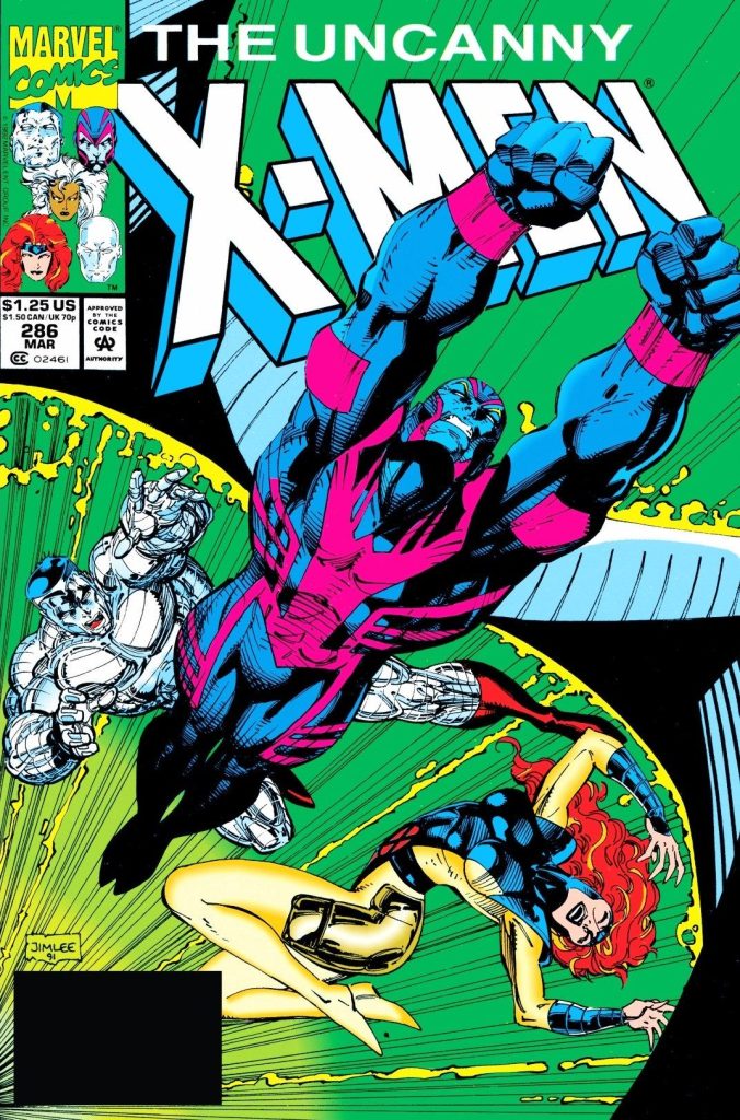
With those details laid down, here is a look back at Uncanny X-Men #286, published in 1992 by Marvel Comics with a story co-written by Jim Lee and Scott Lobdell (who worked on the script). The art was done by Whilce Portacio with ink work by Art Thibert.
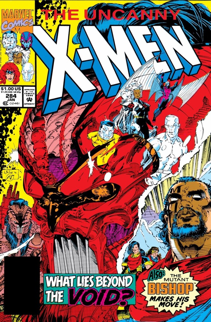
The cover.
Early story
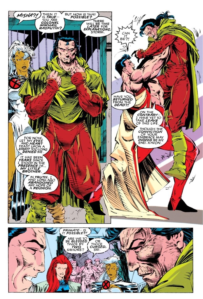
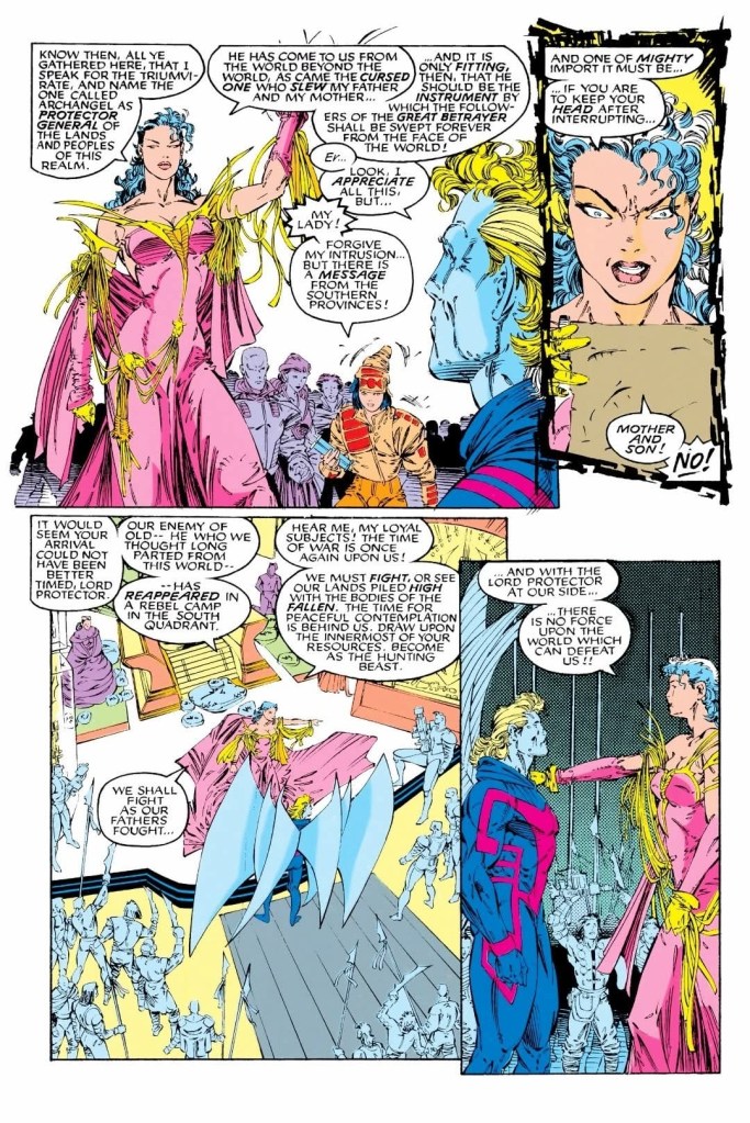
The story begins with Jean Grey, Colossus, Storm and her male companion (Mikhail Rasputin) together. While Jean is surprised and relieved to see Storm again (she was separated from the team temporarily in the last issue), Colossus is shocked to see his long-lost brother Mikhail alive and well. Mikhail reveals that so many years have passed since he last stood with his little brother and had long abandoned any hope of a reunion.
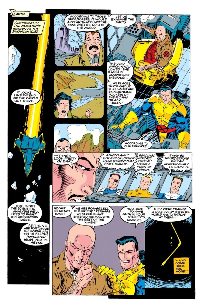
The reunion is interrupted when a portal has grown larger by the moment and it means that it is only a matter time before Earth is pulled into the realm they are in. Both worlds are at risk of getting destroyed…
Quality
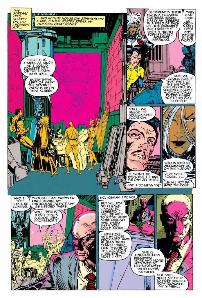
Charles Xavier and Forge are still on Earth separated from the rest of the X-Men’s Gold Team members.
Following the build-up and character developments that happened in the previous issue, this X-Men tale is pretty much a strong pay-off while leaving some space for suspense and surprises. The writers intended to conclude what started in issue #284 and along the way, they had to go through the challenges of introducing a new world, new people and the conflicts within. Mikhail Rasputin – the same guy who helped Storm in issue #284 – is easily the most impactful addition to this tale and because of him and what he revealed, Colossus became emotional and felt like his life was crumbling as he simply could not handle the truth. Colossus’ despair and emotional state here served as the creative seeds that later led to the betrayal he would eventually commit (in Uncanny X-Men #304).
The Mikhail-Colossus interaction was easily this comic book’s source of emotions which added some weight to the plot. By the time I reached the end of this issue, I felt really satisfied and at the same time curious about the state of Colossus (note: there’s a still a long road of X-Men tales before Uncanny X-Men #304).
With regards to the writing, John Byrne’s intricate touch on the dialog was clearly missing but Scott Lobdell did a fine job taking over. While Whilce Portacio was credited as illustrator, there were a few pages that looked like they were drawn by someone else. The same also happened with regards to the inking in different parts of the comic book…Art Thibert’s inking has a fine touch and there were some images that had aggressive and thicker inking (it has to be the work of someone uncredited).
Conclusion
A very significant moment for the Rasputin brothers witnessed by Jean Grey, Storm and a few of the locals.
While there were some inconsistencies on the quality of the artworks, Uncanny X-Men #286 (1992) had a really strong script and the good news here is that the creative team managed to pull off a solid conclusion. This is the kind of tale in which the X-Men utilized their skills and made tough decisions while being far away from Charles Xavier. At this particular stage of the Uncanny X-Men series, the Gold Team’s development really progressed and they became a more appealing team to follow.
Overall, Uncanny X-Men #286 (1992) is highly recommended!
Disclaimer: This is my original work with details sourced from reading the comic book and doing personal research. Anyone who wants to use this article, in part or in whole, needs to secure first my permission and agree to cite me as the source and author. Let it be known that any unauthorized use of this article will constrain the author to pursue the remedies under R.A. No. 8293, the Revised Penal Code, and/or all applicable legal actions under the laws of the Philippines.
Welcome back superhero enthusiasts, 1990s arts and culture enthusiasts, Marvel Comics fans and comic book collectors! Today we go back to the early 1990s to explore one of the many tales of the Marvel shared universe through the Uncanny X-Men series.
What happened in issue #284 was a turning point in storytelling and it is only a part of the early period of the X-Men – Gold Team’s operation. The X-Men were on the way home (with Jean Grey successfully retrieved and restored) following their encounters with Fitzroy’s gang and the mutant from the future Bishop only to proceed to a specific island in response to a distress call. By the end of it, something significant happened which separated the X-Men from Professor X and Forge.
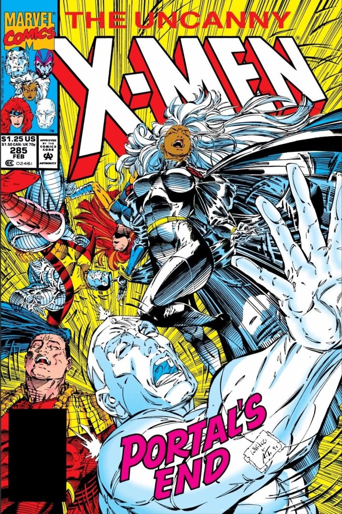
With those details laid down, here is a look back at Uncanny X-Men #285, published in 1992 by Marvel Comics with a story co-written by Whilce Portacio, Jim Lee and John Byrne (who worked on the script). The art was done by Portacio with ink work by Art Thibert.
The cover.
Early story
The story begins with Jean Grey and Colossus (carrying a female primate) who find themselves not only disoriented but also separated from their teammates Iceman, Archangel and Storm. A unknown amount of time has passed since they were sucked forcefully into a void which turned out to be a portal into a new world of unknown origin.
As soon as they land, several primates (humans wearing armor and futuristic gadgets) immediately ganged up on them, knocking Jean Grey out successfully while ramping up their attacks on Colossus. With Colossus down after intense hits, the Russian X-Men member does not fight back and eventually saw his metallic skin turn into flesh fully exposing his human identity. The primates suddenly changed their attitude as they referred to Colossus as a returned savior who has fulfilled the prophecy they grew up with.
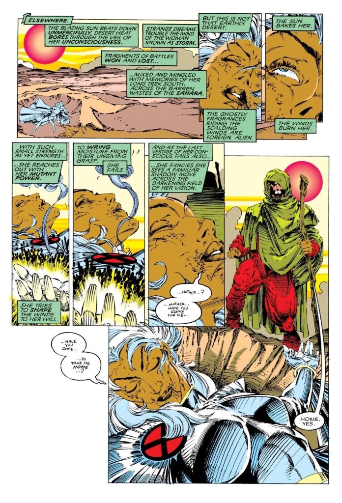
Elsewhere, in the middle of a hot desert, Storm is down on the sand feeling weak and groggy. She tries to alter the wind but fails. Suddenly, a man arrives with the intention of carrying Storm to his home…
Quality
The natives in this page, Archangel is not only accepted by the leader but also perceived to be a great figure of destiny in connection with their beliefs.
This particular X-Men tale is the result of the turning point that happened in the previous issue. In this comic book, the X-Men’s Gold Team members are separated from each other and the world they are in is alien in nature and yet filled with unusual looking humans who clearly have a long-lasting culture, history and cultural norms formed through generations. This concept the creative team came up with has strong vibes of the 1980s American science fiction TV series Otherworld which I saw a very long time ago. In fact, I find the overall concept of this comic book an inspired piece of work.
Like in Otherworld, the X-Men are in a totally new and unknown world that somewhat looks like Earth but then it is not as the natives they encountered are totally unlike anything they encountered before. Like in The Empire Strikes Back, the X-Men here are separated from each other which opened up opportunities for the creators to develop the characters, show particular threads of their respective personalities (or their talents) and emphasize how they perceive new people and the new world they are in.
Without spoiling the plot, I can say that the natives of the unknown world are living with the foolishness of idolatry which can be seen at least in how they believe Colossus (in the flesh) is their savior and the fulfillment of the prophecy they were oriented with. The idolatry aspect of the tale serves as the twist on the primates’ (specifically the few who went to Earth willing to fight to the death) who first appeared to the X-Men as very daring opponents and it adds depth to the X-Men’s struggle on understanding the new world they are in.
When it comes to character development, Colossus and Jean Grey are strongly emphasized by the creative team who also managed to do the same with Iceman, Storm and Archangel. This tale also serves as a relief from the back-to-back good-versus-evil battles that took place since issue #281 and I can say the writing is solid.
Conclusion
A very helpless Storm is approached by a man in the middle of the desert.
While it lacks the usual conflict between Marvel’s mutants and evildoers, Uncanny X-Men #285 (1992) is an inspired piece of work filled with sci-fi concepts, the overwhelming power of discovering a new world and established natives, and a lot of character development on Colossus, Storm, Jean Grey, Ice Man and Archangel. As I read the story, the mystery builds up and there were these subtle pay-offs that happened along the way. Overall, this comic book is a huge pay-off to what was established in issue #284 and the notable thing is that the X-Men Gold Team (who have Sunfire with them) are just getting started in the unknown world.
Overall, Uncanny X-Men #285 (1992) is highly recommended!
Disclaimer: This is my original work with details sourced from reading the comic book and doing personal research. Anyone who wants to use this article, in part or in whole, needs to secure first my permission and agree to cite me as the source and author. Let it be known that any unauthorized use of this article will constrain the author to pursue the remedies under R.A. No. 8293, the Revised Penal Code, and/or all applicable legal actions under the laws of the Philippines.
Welcome back superhero enthusiasts, 1990s arts and culture enthusiasts, Marvel Comics fans and comic book collectors! Today we go back to the early 1990s to explore one of the many tales of the Marvel shared universe through the Uncanny X-Men series.
As of this writing, I really enjoyed reading the tales about the Gold Team of the X-Men under the co-writing of Whilce Portacio and John Byrne (click here, here and here). Following Bishop’s debut in issue #282, issue #283 featured his intense first-ever encounter with the X-Men while concluding the mutants mission (retrieving Jean Grey).
With those details laid down, here is a look back at Uncanny X-Men #284, published in 1992 by Marvel Comics with a story co-written by Whilce Portacio and by John Byrne (script). The art was done by Portacio with ink work by Art Thibert, Scott Williams and Karl Altstaetter.
The cover.
Early story
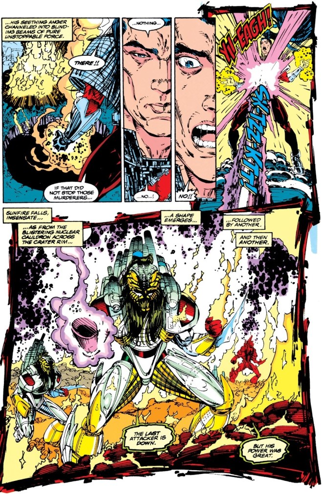
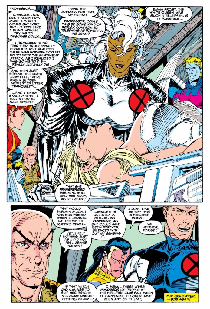
The story begins at the Sakhali islands located off the coast of Siberian Russia and separated from Hokkaido of Japan. Previously a territory of China and explored by the Japanese, the island is now bustling with unusual activity as government officials and personnel of both Russia and Japan focus on a massive, sealed crater there. After meeting with the Russians and his fellow Japanese on location, the mutant Sunfire (Shiro Yoshida) proceeds to do a task with his immense power on the crater. The scientists quickly detect intense readings that went off the scale and it seems the void of the crater is responding to Sunfire’s assault. The void adapted its own frequencies with Sunfire’s and returns fire at him. The void then begins to change.
Elsewhere, the X-Men’s Gold Team are spending quality time together on board their supersonic blackbird heading home. Jean Grey, who previously occupied Emma Frost’s body temporarily, is back as herself and interacting with her teammates. With them is the unconscious body of Emma Frost (White Queen). Professor X and his mutants are uncertain as to what happened to Emma Frost’s mind and Bobby Drake (Iceman) speculates that she could have transferred her psyche into some unsuspecting victim (note: the party at the Hellfire Club’s headquarters in issue #281 was filled with hundreds of people).
Having heard Iceman’s opinion, Professor X decides to scan Emma Frost for the last dim echo of her personality. He tells Jean Grey to join him to scan Frost. Suddenly, the X-Men receive a distress call from the Sakhalin islands…
Quality
After Sunfire got hit, a new batch of enemies emerged from the void.
Following the intense and enduring events of issues #281 until #283, this comic book’s concept had Charles Xavier and the Gold Team get busy yet again due to an emergency at the Sakhalin islands. This opened the opportunity for Portacio and Byrne to introduce a new conflict at the said islands (which turns into a war zone), a new force of opposition for the X-Men and giving the Japanese mutant Sunfire a share of the spotlight in X-Men comics.
At the heart of the conflict is the crater and void at the mentioned islands which brought out a strong element of mystery slowly backed up with intriguing revelations. The new force of opposition are armored, human-like beings (whose heads, hair and masks easily remind me of the Predator design of Stan Winston in the movies) who are armed, dangerous and determined to achieve their goals no matter how difficult. What is intriguing is how the new beings (referred to as aliens) remain concerned and caring with each other even during the intense moments of their encounter with the X-Men.
The climax of the conflict here is a must-see. You just have to get a copy of this comic book to find out.
When it comes to the visuals, Portacio continues to deliver solid artworks which showcased intense scenes, scenic shots, dynamic superhero action and subtle moments of drama (especially when the X-Men are together and in comfort). As there were three guys who inked Portacio’s work, there is a noticeable inconsistency with the visuals as the story went on.
Conclusion
Following their recent encounters with Bishop and Trevor Fitzroy, the X-Men still have the unconscious body of Emma Frost with them.
While some readers might find the X-Men Gold Team’s involvement in the conflict rushed, Uncanny X-Men #284 (1992) remains an enjoyable read. As the situation is very new, the stakes are different here and for the most part, this comic book is a build-up of a new concept that just happened to be filled with a lot of action scenes. Portacio and Byrne delivered a fun-filled read with a good amount of intrigue and some surprises as they introduced a new force opposite the X-Men. And for the people are who are fond of Bishop, he and his companions are here but not with the X-Men.
Overall, Uncanny X-Men #284 (1992) is recommended.
Disclaimer: This is my original work with details sourced from reading the comic book and doing personal research. Anyone who wants to use this article, in part or in whole, needs to secure first my permission and agree to cite me as the source and author. Let it be known that any unauthorized use of this article will constrain the author to pursue the remedies under R.A. No. 8293, the Revised Penal Code, and/or all applicable legal actions under the laws of the Philippines.
Welcome back superhero enthusiasts, 1990s arts and culture enthusiasts, Marvel Comics fans and comic book collectors! Today we go back to the year 1991 to explore one of the many tales of the Marvel shared universe through the Uncanny X-Men series.
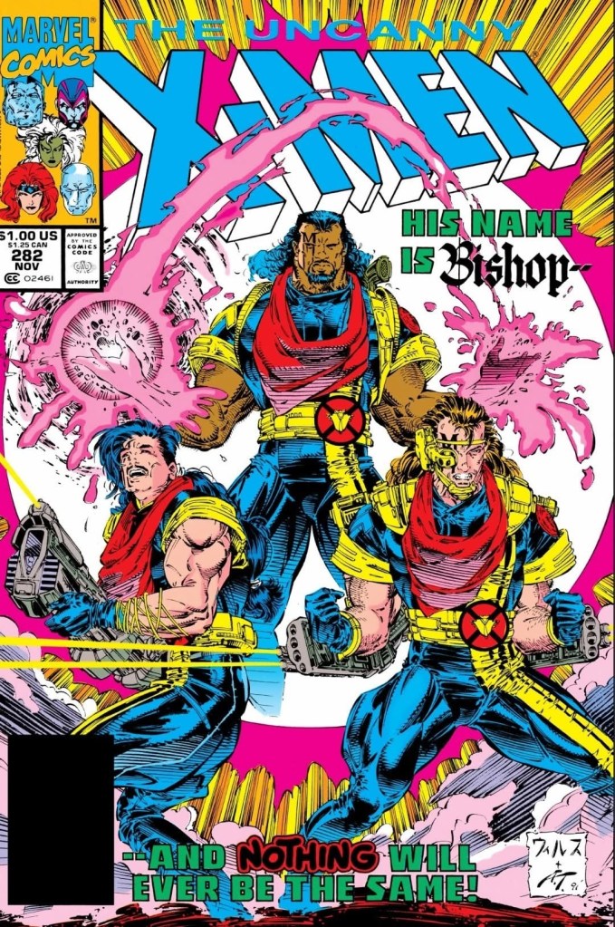
Uncanny X-Men #282 marked the continuing conflict between the X-Men and Trevor Fitzroy’s group, and the arrival of one of the most notable additions to Marvel’s Mutants…Bishop. To be clear, Bishop was not alone when arrived from the future through one of Fitzroy’s portals. In relation to everything that happened in the comic book, the arrival was a very powerful conclusion to read.
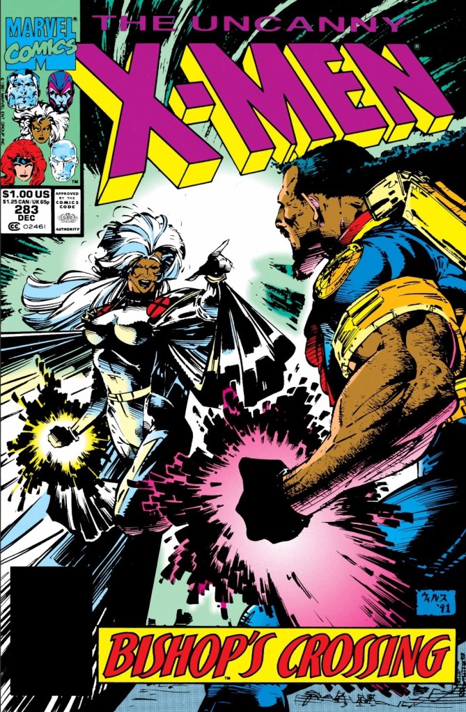
With those details laid down, here is a look back at Uncanny X-Men #283, published in 1991 by Marvel Comics with a story co-written by Whilce Portacio and by John Byrne (script). The art was done by Portacio with ink work by Art Thibert.
The cover.
Early story
The story begins in the arctic lair of Trevor Fitzroy. The arrival of Bishop and his two mutant companions – Malcolm and Randall – from the future caught everyone by surprise (including the X-Men). Bishop, who has Trevor Fitzroy subdued, tells his companions to throw their takes (members of Fitzroy’s force) into the portal.
Bishop intends to have Fitzroy go first which draws a loud reaction from the mutant madman. Fitzroy, who had been using the life force of captive mutants to open portals, knows exactly what would happen if he goes first. His exchange of words with Bishop shows they have a history together.
When Bishop’s companion moved a subdued person into the portal, it tore him apart. Fitzroy reveals to Bishop that the portals he created only function one-way and he tells him that he and his companions are stuck in the 20th century.
In response, Bishop assumes complete judicial authority and tells Malcolm and Randall to standby for termination sweep. The X-Men begin to react…
Quality
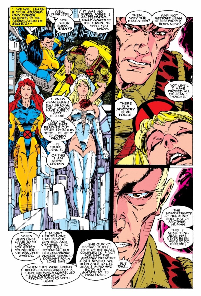
Professors takes a huge risk to help Jean Grey who recently occupied the body of Emma Frost.
When it comes to the creativity, this comic book is both a strong pay-off to the build-up of issues #281 and #282 while also serving as a new build-up focusing on Bishop’s arrival. At the heart of this tale is Bishop’s first-ever personal encounter with the X-Men which instantly expanded the lore of Marvel’s mutants a lot.
Bishop is a mutant from one possible future (of the Marvel Comics shared universe) in which Storm, Iceman, Archangel, Charles Xavier and others are remembered as legacy figures of the X-Men. In this comic book, you will see there is a good amount of depth with the way Bishop is dramatized and with many notable details on the dialogue prepared for him. Co-created by Whilce Portacio and John Byrne, Bishop is really an inspired work and clearly is not a mere addition. There is Filipino inspiration behind the creation of Bishop (click here and here) with some elements of John Ford and Prince mixed in (click here).
As far as the storytelling is concerned, there is notable shift of tone here as Bishop, Malcolm and Randall received much of the spotlight and yet there was still some room left for focus on the X-Men and Fitzroy’s group respectively. What makes this comic book an intriguing read is the first-ever personal encounters between Bishop and the X-Men which involved the temporary blurring of the boundary between good and evil. The interactions between Storm and Bishop are easily the most dramatic to see, and you will witness how their respective toughness (plus leadership) collide intensively.
Along the way, there is a lot superhero action to enjoy here. In fact, there are many forms action that served as extensions or pay-offs to the exchange of words between Bishop and a few specific X-Men members. Even a non-action scene like Professor X helping Jean Grey (who was in Emma Frost’s body temporarily) resulted in some visual spectacle.
Conclusion
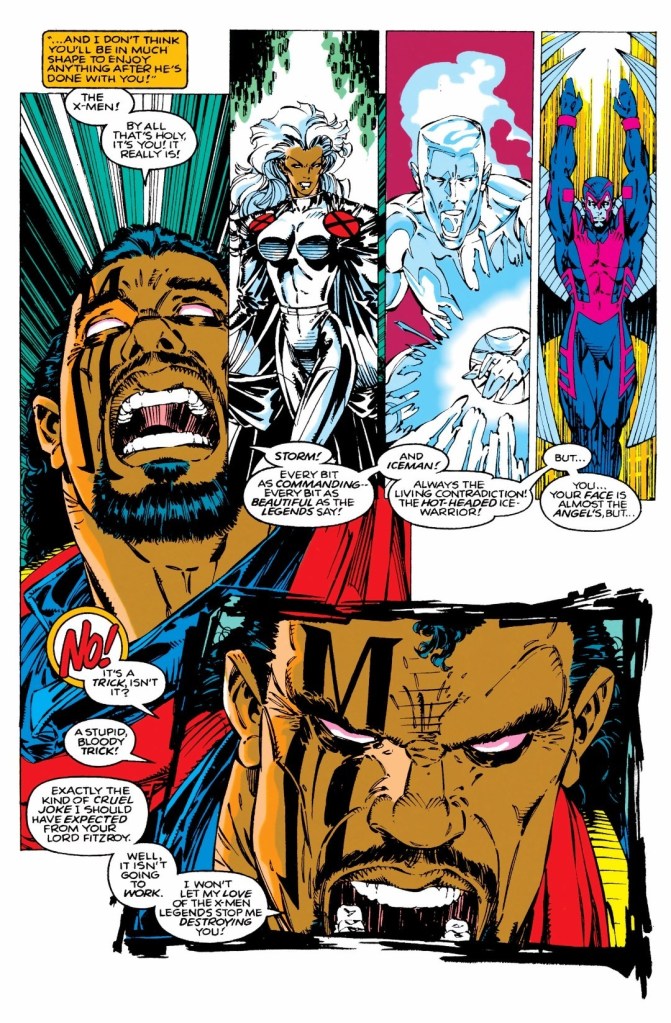
Bishop’s first-ever encounter with the X-Men not only challenged his perception but also brought out traits of his attitude.
Uncanny X-Men #283 (1991) is another very compelling, intriguing and entertaining read from the Portacio-Byrne duo. The X-Men lore has been expanded more and Bishop’s first encounter with the X-Men is easily the most engaging aspect of the story. At the same time, the conflict between the X-Men’s Gold Team and Trevor Fitzroy took a twist that really turned the plot to an unexpected new direction which is not surprising as Bishop’s presence made a huge impact (even on Storm herself). This is one of the best superhero stories of 1991 I have read so far.
Overall, Uncanny X-Men #283 (1991) is highly recommended!
Disclaimer: This is my original work with details sourced from reading the comic book and doing personal research. Anyone who wants to use this article, in part or in whole, needs to secure first my permission and agree to cite me as the source and author. Let it be known that any unauthorized use of this article will constrain the author to pursue the remedies under R.A. No. 8293, the Revised Penal Code, and/or all applicable legal actions under the laws of the Philippines.
Welcome back superhero enthusiasts, 1990s arts and culture enthusiasts, Marvel Comics fans and comic book collectors! Today we go back to the year 1991 to explore one of the many tales of the Marvel shared universe through the Uncanny X-Men series.
Uncanny X-Men #281 was a great read. For most of the early 1990s, I read more X-Men stories about the Blue Team than the Gold Team. In Uncanny X-Men #281 – which took place after X-Men #5 – the spotlight was on the Gold Team which showed the strategic leadership of Storm, the X-Men revisiting the headquarters of the Hellfire Club, Jean Grey’s own recollections of past events and the new threat of Trevor Fitzroy and the Sentinels.
With those details laid down, here is a look back at Uncanny X-Men #282, published in 1991 by Marvel Comics with a story co-written by Whilce Portacio and by John Byrne (script). The art was done by Portacio with ink work by Art Thibert.
The cover.
Early story
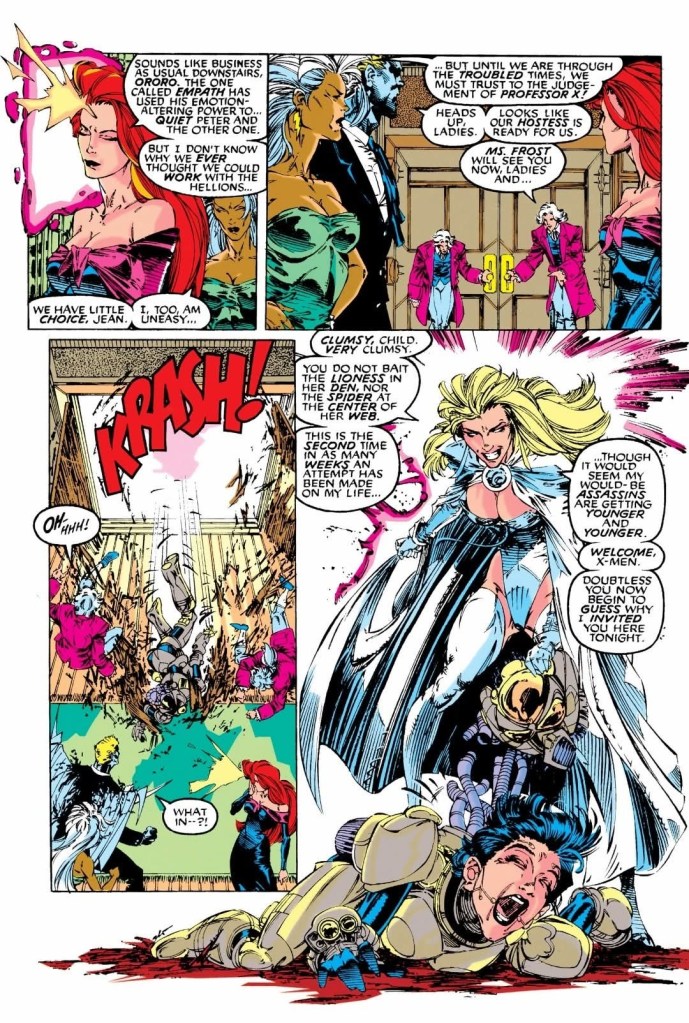
The story begins inside the School For Gifted Youngsters when the Gold Team arrives (with Colossus carrying the inactive body of Jean Grey) and disrupts the chess game between Professor X and Forge. Charles Xavier mentally examines Jean and notices that her psyche survives and has been displaced. He realizes Jean is alive but not in her body.
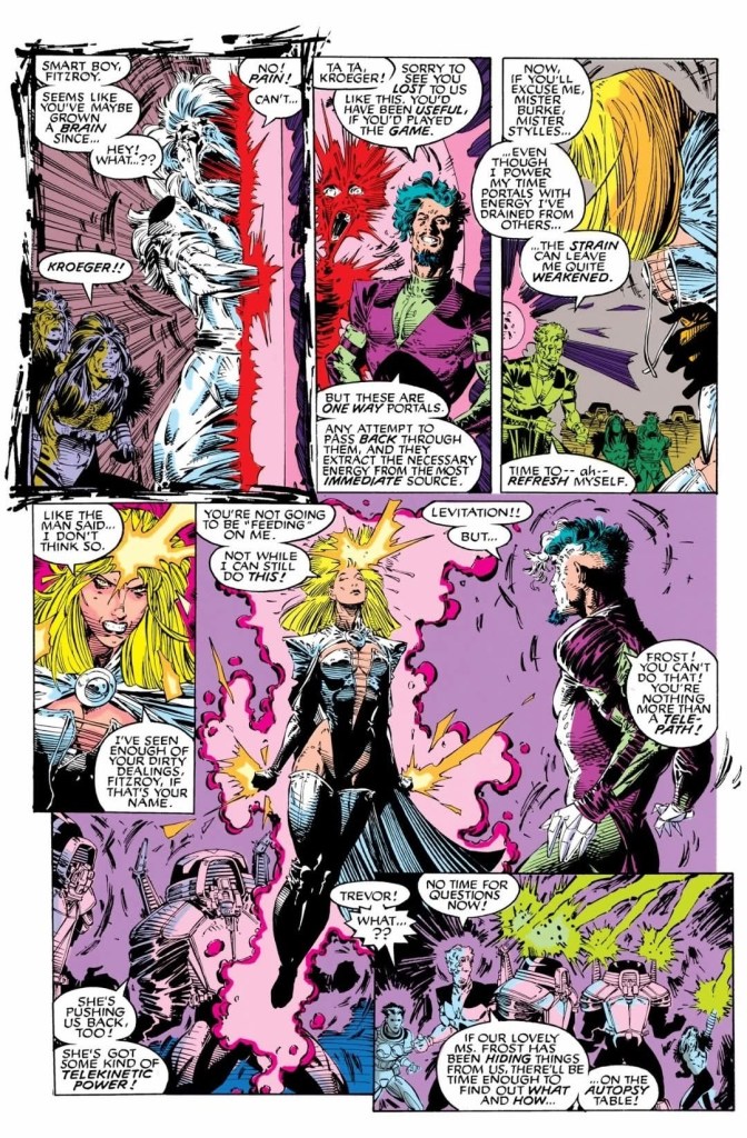
In New York City, Trevor Fitzroy (who is carrying the body of an inactive Emma Frost) and his Sentinels surprise Shinobi Shaw showing what is left of the cyborg of Pierce. Trevor boasted to Shinobi that he won claiming that he has terminated one of the founders of the inner circle, captured a small band of Hellions and has Emma Frost as a trophy. Very slowly, Jean Grey – now occupying Frost’s body – wakes up…
Quality
Trevor Fitzroy does not know who is inside Emma Frost’s body.
I can say out loud that this is a great follow-up to the previous issue (which itself is a great read) as it has a lot of hefty payoffs to the build-up from before. With the story concept already established in issue #281, the progression continued strongly, the narrative is clearer and the stakes were raised even higher.
In this issue, Trevor Fitzroy still has extreme tendencies and he might look insane or unhinged to you. Still, Fitzroy really has diabolical plans to execute and those plans involves his ability to open portals to bring in his reinforcements from far away, including the “denizens of the future.” Adding to Fitzroy’s merciless and arrogant personality is his use of the captives’ life force to energize himself to open portals. Really, he does not care much about the lives of captives as he treats them as nothing more than bodies of energy for his use. Whilce Portacio really excels in not only bringing the script to life but also showcasing the personality and expressions of Fitzroy who at this point in comic book history was a brand new villain for the X-Men.
As for the X-Men’s Gold Team, not having Jean Grey was really disadvantageous to them which compels Professor X to actually join them on their mission. This is a notable development as Xavier is very close with Jean (his original student and fellow telepath) and he knows that great odds await their team. Xavier’s involvement added a lot to the plot itself and I love the way John Byrne and Portacio portrayed him here.
When it comes to the storytelling, the pace noticeably moved faster as a lot of payoffs to the build-up were executed here. The X-Men themselves each got their respective share of the spotlight and all of them were portrayed consistently in character. The stakes were raised here this time and the handling of all the details and developments was very solid.
Conclusion
Knowing great odds await them, Charles Xavier joins the X-Men on their mission to save Jean Grey.
Even with the stakes raised higher, the creative team delivered the great stuff Uncanny X-Men #282 (1991) is a very worthy follow-up to the previous issue. In fact, I find this comic book more entertaining and more intriguing to read from start to finish. Fitzroy is indeed a very worthy new enemy for the X-Men’s Gold Team, and there is much that long-time X-Men fans can enjoy here.
Overall, Uncanny X-Men #282 (1991) is highly recommended!
Disclaimer: This is my original work with details sourced from reading the comic book and doing personal research. Anyone who wants to use this article, in part or in whole, needs to secure first my permission and agree to cite me as the source and author. Let it be known that any unauthorized use of this article will constrain the author to pursue the remedies under R.A. No. 8293, the Revised Penal Code, and/or all applicable legal actions under the laws of the Philippines.
Welcome back superhero enthusiasts, 1990s arts and culture enthusiasts, Marvel Comics fans and comic book collectors! Today we go back to the year 1991 to explore one of the many tales of the Marvel shared universe through the Uncanny X-Men series…Uncanny X-Men #281.
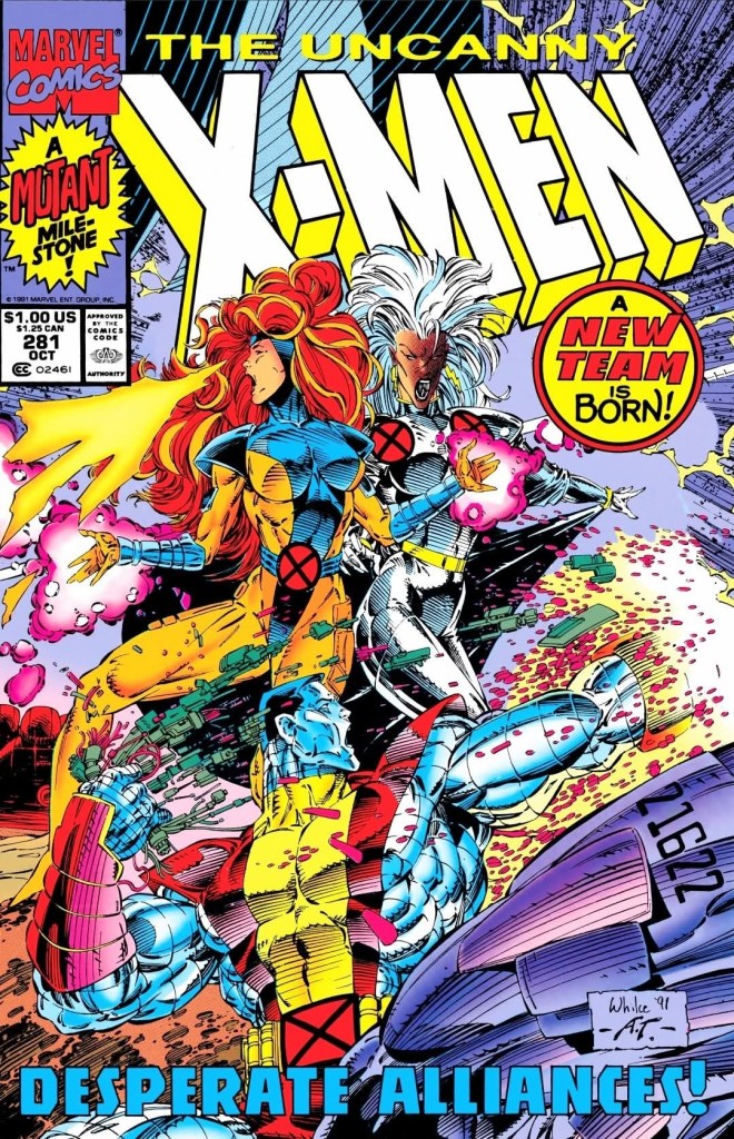
For the newcomers reading this, Marvel had a major reorganizing of their X-Men-related comic book series in the 2nd half of 1991. After the events of the Muir Island Saga, the X-Men grew into such a large group they had to be divided into two teams – Blue and Yellow – under Charles Xavier who returned as their leader. When X-Men #1 (by Chris Claremont and Jim Lee) launched in 1991, it showed the Blue Team dealing with Magneto. Uncanny X-Men #281 was released the same month as that comic book and it shows the first mission of the Gold Team composed of Storm, Jean Grey, Colossus, Iceman and Archangel. Very notably, its story took place immediately after X-Men #5 was released in 1992.
With those details laid down, here is a look back at Uncanny X-Men #281, published in 1991 by Marvel Comics with a story co-written by Jim Lee and Whilce Portacio and script by John Byrne. The art was done by Portacio with ink work by Art Thibert.
The cover.
Early story
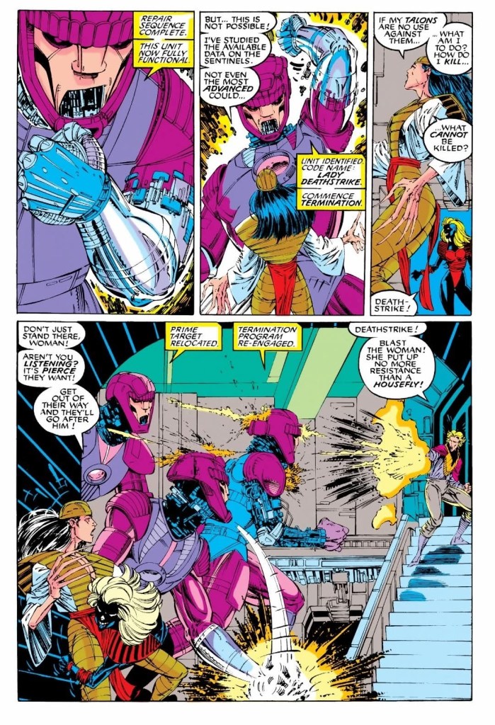
The story begins in the Australian outback where the Reavers are relaxing while the sandstorm is happening and with them is Donald Pierce. Suddenly, a group of Sentinels attacked them resulting in deaths of some of their members.
Elsewhere in New York City, Storm, Jean Grey, Archangel, Colossus and Iceman – all in formal attire as civilians – attend a lavish party at the headquarters of the Hellfire Club. It turns out, they were invited by Emma Frost who leads the club. Even with several guests and a lot of enjoyable things around them, the X-Men remain prepared to react if something unfortunate happens.
After a brief moment of tension between the X-Men and the Hellions, someone in a powered suit of armor crashed through a door near Jean, Storm and Archangel. Emma Frost emerges, takes the helmet off the armored person (a young woman) and even welcomed the X-Men. Frost claims that the armored lady was another assassin who tried to take her life and it is the 2nd assassination attempt she encountered over the past weeks….
Quality
The Sentinels, Lady Deathstrike and Donald Pierce in an intense scene.
As this comic book was part of the new era of the X-Men, the creative team came up with tale that is loaded with sub-plots that had a mix of old (the X-Men fought with the Hellfire Club during the Dark Phoenix Saga, and had encounters with the Sentinels a number of times) and new (Trevor Fitzroy – the illegitimate son of Sebastian Shaw – and the Upstarts are the new antagonists of the X-Men) creative elements for the X-Men’s Gold Team to encounter. The fact that the Hellfire Club is present in the story requires readers to have some knowledge about them from previous X-Men comic books as well as other characters and past tales that formed the background of the newer characters.
The story was made to modernize the X-Men and their struggle with people they encounter, while creatively reconnecting with the past. This should not be a surprise because writer John Byrne (yes, the same creator behind The Man of Steel mini-series) himself was involved in the Dark Phoenix Saga. The result is a tale of intrigue, twists, action and a lot of tension here.
When it comes to encounters, I enjoyed the discussion the X-Men had with Emma Frost (first appeared in Uncanny X-Men #129) who was their fierce enemy (Frost previously tried to manipulate Kitty Pryde) before having a change of heart and partnered with Professor X. Their exchange of words was civil, smart and there were some nice pay-offs in the form of intriguing revelations. The script by John Byrne was really solid here.
The artwork by Whilce Portacio here is still great to look at and his contribution on modernizing the X-Men’s look for the 1990s is a must-see. The same can be said with his take on Emma Frost, and the other established characters here. Portacio’s visualization of Trevor Fitzroy has that strong science fiction vibe combined with that fluffy early 1990s look.
Conclusion
The X-Men witness an intense moment followed by the emergence of Emma Frost.
Even though there were a few bumps on the flow of the narrative, I can say that Uncanny X-Men #281 (1991) is a very enjoyable read filled with intrigue, twists, reconnections to the past, notable character moments and sufficient spectacle. Its story has a lot of details and attachments to the past which will resonate with long-time X-Men fans. At the same time, Whilce Portacio’s art works made this one of the finest looking Uncanny X-Men issues of the 1990s and that is saying a lot. Considering the details and the richness of the writing, this Uncanny X-Men comic book should be read at a moderate pace as paying close attention to what was presented is essential.
That being said, this first tale of the Gold Team of the X-Men is a great read.
Overall, Uncanny X-Men #281 (1991) is highly recommended!
Disclaimer: This is my original work with details sourced from reading the comic book and doing personal research. Anyone who wants to use this article, in part or in whole, needs to secure first my permission and agree to cite me as the source and author. Let it be known that any unauthorized use of this article will constrain the author to pursue the remedies under R.A. No. 8293, the Revised Penal Code, and/or all applicable legal actions under the laws of the Philippines.
Welcome back superhero enthusiasts, 1990s arts and culture enthusiasts, Marvel Comics fans and comic book collectors! Today we go back to the year 1996 and explore a part of Marvel Comics’ universe through the reimagined tales emphasized in the What If monthly series.
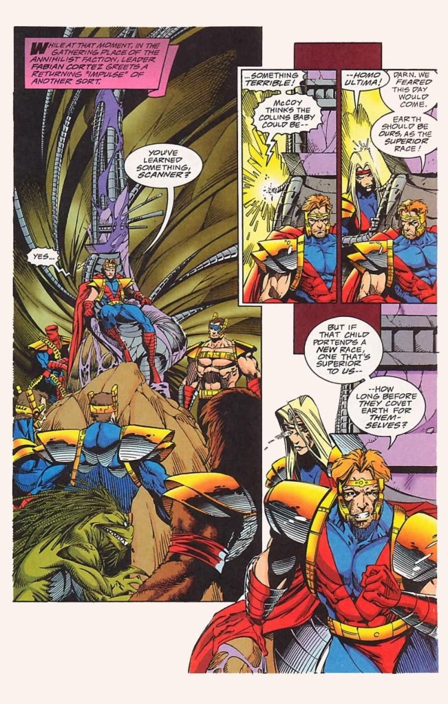
Back in 1993 – the year that Marvel Comics celebrated the 30th anniversary of the X-Men – the definitive rival of the X-Men, Magneto, made a major comeback and he was so resourceful as a threat to everyone. With the massive space station Avalon as his lair, Magneto sent out Exodus to lure mutants to join him. As time passed, Magneto’s own force grew and arrogantly disrupted the funeral of Illyana Rasputin in the presence of the X-Men, X-Force, Excalibur and X-Factor (as told in Uncanny X-Men #304). As the conflict went on, Colossus betrayed the X-Men to join Magneto.
Can you just imagine what would it be like had Magneto became the ruler of mutants?
With those details laid down, here is a look back at What If #85, published in 1996 by Marvel Comics with a story written by David Michelinie and drawn by Arnie Jorgensen.
The cover.
Early story
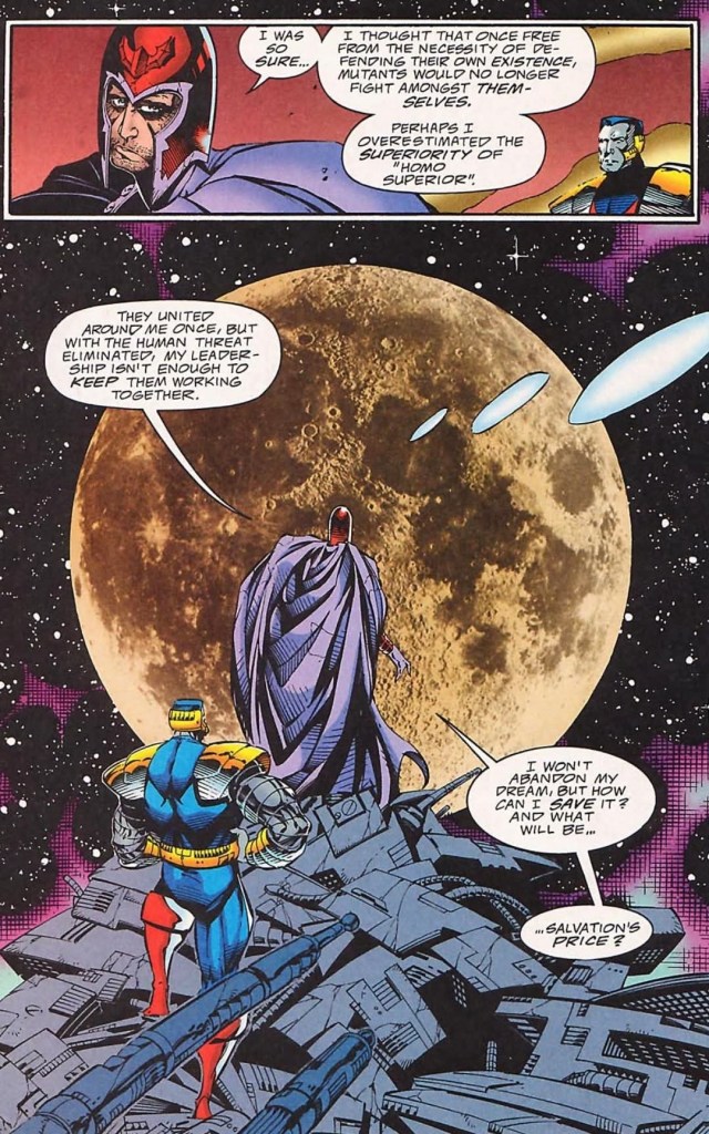
The story begins inside Avalon with Magneto and Colossus watching recorded footage of Charles Xavier announcing his decision to stop opposing the ascension of Avalon. It turns out, Xavier’s decision paved the way for mutants to relocate to Avalon (orbiting Earth) in return for assurance that those who remain in it will do so unmolested. With the intention to let Avalon’s residents achieve their full and glorious potential, Magneto allowed the mutants to rule themselves without any dictatorship by him.
Through the years, division between Avalon’s mutants – Acolytes who believe in isolation and the Acolytes who believe in annihilation – intensified and proved that the spirit of mutant unity has faded away. As violence between the mutants went on, the number of explosions inside Avalon kept increasing…
Quality
A magnificent view for Magneto, Colossus and the readers.
What I like most about this What If tale is its core concept exploring what would have happened had Magneto ruled the mutants specifically those living in his own realm (Avalon). Writer David Michelinie (best known for writing Amazing Spider-Man stories) wrote a really inspired script that emphasized Magneto’s vision of mutant utopia isolated from the twisted and complicated societies of Earth (which still has lots of people who are afraid of and hostile towards mutants) while leaving room for conflict in the form of ideological division between mutants on Avalon. As the growing division and violence are shattering Magneto’s vision of mutant utopia, the birth of an infant whose presence adds to the tension and fear of Avalon’s inhabitants.
The good news here is that Michelinie’s script is pretty solid and Arnie Jorgensen did a good enough job visualizing it all. The characters, mainly Magneto, Colossus and Beast, were portrayed clearly in character and to see the master of magnetism struggling with maintaining order on Avalon is a nice portrayal of his human side which makes him have a lot more in common with his opposite Professor X when it comes mutant matters. Considering Magneto’s long history of intense evil and obsession with leading humanity, his portrayal of insecurity, doubt and weakness is very believable to read.
Colossus, whose betrayal of the X-Men in Uncanny X-Men #304 remains unforgettable, is the loyal and sensible servant of Magneto. Beast, meanwhile, remains the very bright and insightful mutant scientist as he has always been which makes Michelinie’s writing really impressive.
Also at the heart of the story is mutant order. Apart from the division between Avalon mutants who want full separation from humanity and those who want to conquer Earth by eliminating all human beings, the very fabric of mutant society got shaken all because of an infant who was born there on Avalon (Avalon’s first natural birth ever). I like the way this sub-plot added tension to the mutant division because it is, in some ways, socially relevant to this day. It will remind you that certain groups of people out there who would go as far as committing murder only because they are so obsessed with their foolish, worldly beliefs. Look at the Palestinian terrorists, the Iranian terrorists and the woke mobs in many parts of the world.
Conclusion
Remember Fabian Cortez and the Acolytes?
With a very solid script filled with intrigue, social relevance and portrayals, What If #85 (1996) is a pretty engaging read. As it is strongly focused on Magneto and his mutants on Avalon, this comic book gives readers a fine dramatization of its core concept as well as developments on what would have happened had mutant utopia been realized far away from human society. I should state that for every build-up in the story, the payoff is fortunately solid. Consider this comic book a dramatic portrayal of mutants of Magneto without the involvement of the X-Men.
Disclaimer: This is my original work with details sourced from reading the comic book and doing personal research. Anyone who wants to use this article, in part or in whole, needs to secure first my permission and agree to cite me as the source and author. Let it be known that any unauthorized use of this article will constrain the author to pursue the remedies under R.A. No. 8293, the Revised Penal Code, and/or all applicable legal actions under the laws of the Philippines.
Welcome back superhero enthusiasts, 1990s arts and culture enthusiasts, Marvel Comics fans and comic book collectors! Today we go back to the year 1991 and explore a part of Marvel Comics’ universe through the reimagined tales emphasized in the What If monthly series.
If you are not aware of the extensive literary history of the X-Men, the mutant franchise of Marvel Comics had its turning point in the mid-1970s with the release of the 68-page Giant-Size X-Men #1 which introduced a newer lineup of mutants (Wolverine, Cyclops, Nightcrawler, Thunderbird and Storm). It has been argued that Giant-Size X-Men #1 marked the starting point of the bronze age of comics in America and creatively it sparked a new chain of X-Men stories that captivated the fans and attracted new readers.
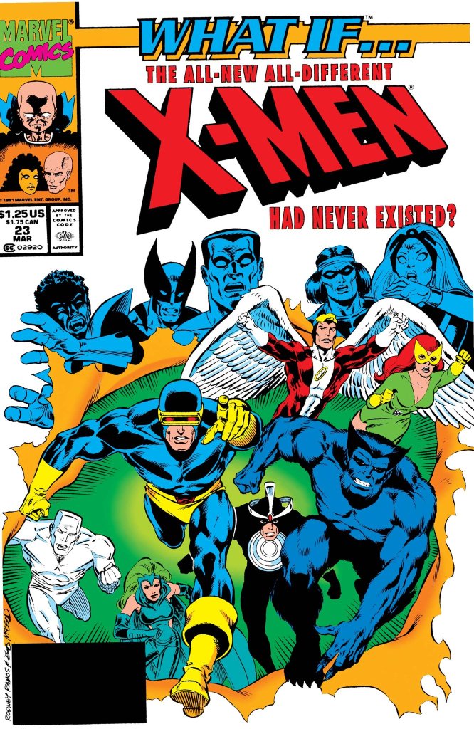
But what would have happened had the newer lineup of the X-Men did not even exist?
With those details laid down, here is a look back at What If #23, published in 1991 by Marvel Comics with a story written by Kurt Busiek and drawn by Rodney Ramos.
The cover.
Early story
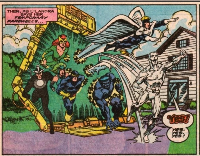
The story begins when the original X-Men (Cyclops, Jean Grey, Angel, Beast and Iceman) members, Havok and Polaris arrive on the island of Krakoa. A huge green monster suddenly appears and attacks them. Guided by Professor X’s mind, Marvel Girl/Jean Grey helps Polaris by overriding the mental blocks that prevented her from using her full magnetic might. With a lot more power in her, Polaris takes action and helps the X-Men not only overwhelm the monster but also hurled the entire island of Krakoa into space.
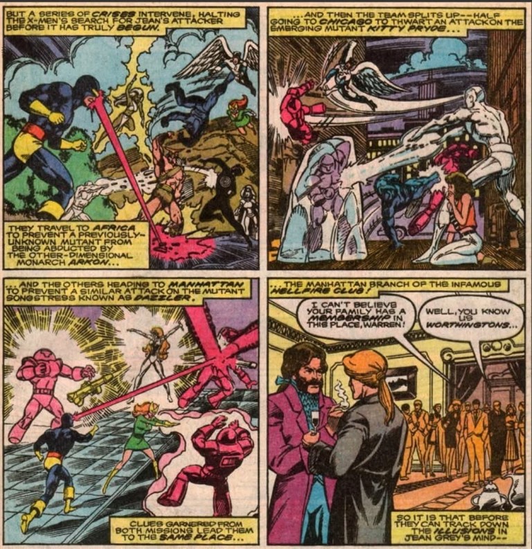
As the X-Men were never captured by Krakoa, there was no reason to recruit a new team. The X-Men returned home and proceeded with other matters. On the other hand, Charles Xavier experiences a series of intense nightmares of conflict in outer space. As the nightmares took its toll on him, Professor X decides to take a vacation. Before he could leave, the X-Men are suddenly attacked by Eric the Red, Proudstar and Nightcrawler…
Quality
Without the existence of the 2nd X-Men team (from Giant-Size X-Men #1), the original X-Men’s first encounters with Dazzler, Kitty Pryde and the Hellfire Club turned out totally different.
This What If tale exploring an alternate chain of events involving only the original X-Men is not only a daring piece of work by the creators but it is also highly ambitious as seen through the scope of the plot. I’m not just talking about the non-existence of the 2nd X-Men lineup of Giant-Size X-Men #1 but also alternate realities of real X-Men developments such as the encounter with the Phoenix, Lilandra and Professor X’s first encounter, the X-Men’s encounter with the Hellfire Club, and more. Truly, the alterations were executed and the consequences were quite intense.
By focusing on the concept of the original X-Men proceeding as the 2nd X-Men team did not materialize, the Busiek-Ramos team really went all-in exploring the different possibilities and most of them were intriguing and entertaining to follow. The reading experience can be jarring because of the sudden change of scope that happens when the narrative suddenly shifted from one plot development (of local conflict) to another (a conflict on a galactic scale). Indeed, the narrative can be challenging to follow and to really enjoy it, you should pay strong attention to the details as you read on.
When it comes to character development, there is very little to find here which is not surprising given the way the script was written and also because the spotlight had to be shared by so many characters. Still, I enjoyed the character moments between Cyclops and Jean Grey, particularly during important points in the 2nd half of the story.
If there were any weak spots in the presentation, it is the fact that a lot of exposition had to be done and there were certain parts of the narrative that felt crammed with an excessive amount of details. Not only that, there is also an excessive amount of characters that go beyond the X-Men such as Lilandra of the Shi’ar Empire, the Starjammers, Alpha Flight, the Avengers and other beings of science fiction mixed in which make following the narrative challenging at certain points.
Conclusion
The original X-Men team plus Polaris and Havok.
What If #23 (1991) has more than enough advantages that outweigh the disadvantages. It’s story is very intriguing and enjoyable to read even though there were some bumpy parts on the narrative. Still, it is great to see what would have happened had the newer X-Men team never materialized and this comic book’s ending is very impactful to see.
Welcome back readers, fellow geeks and electronic gaming fans!
In this edition of the Retro Gaming Ads Blast (RGAB) series, we will take a look at another batch of retro gaming print ads – including arcade flyers – specifically about fighting games that were released in the 1990s. The said decade marked the time when Street Fighter II became a massive hit in the video arcades (and on game consoles) which sparked a wave of new fighting games from business competitors. In that same decade, 3D polygonal fighting games were also released which added greater choices of fighting games at the arcades and on game consoles that players could choose from.
For the newcomers reading this, Retro Gaming Ads Blast (RGAB) looks back at the many print ads of games (console, arcade, computer and handheld) that were published in comic books, magazines, flyers, posters and newspapers long before smartphones, social media, the worldwide web and streaming became popular. To put things in perspective, people back in the 1980s and 1990s were more trusting of print media for information and images about electronic games and related products.
With those details laid down, here is the newest batch of retro gaming print ads for you to see and enjoy…
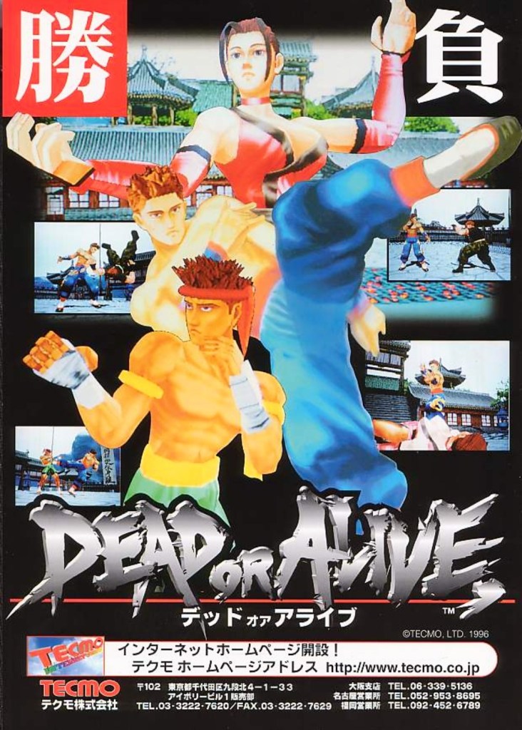
1. Dead or Alive Japanese arcade flyer
Dead or Alive was the start of new success that impacted the direction of Tecmo in the gaming industry.
The above arcade flyer of Dead or Alive gave Japanese arcade operators and gamers a taste of what to expect with the game. While the screenshots showed some resemblance with what gamers saw in Virtua Fighter 2, the character designs Tecmo and its developers came up with were unique.
Before Dead or Alive was released in Japanese arcades in 1996, company Tecmo was in financial trouble and they asked Tomonobu Itagaki to make a fighting game similar to Sega’s polygonal blockbuster Virtua Fighter. A breakthrough for Tecmo happened when Sega announced they were licensing their Model 2 arcade to third-party companies which paved the way for Itagaki’s team to make Dead or Alive with it. The game became a big hit and it paved the way for Tecmo to release it on Sega Saturn and PlayStation, and the sequels that followed years later.
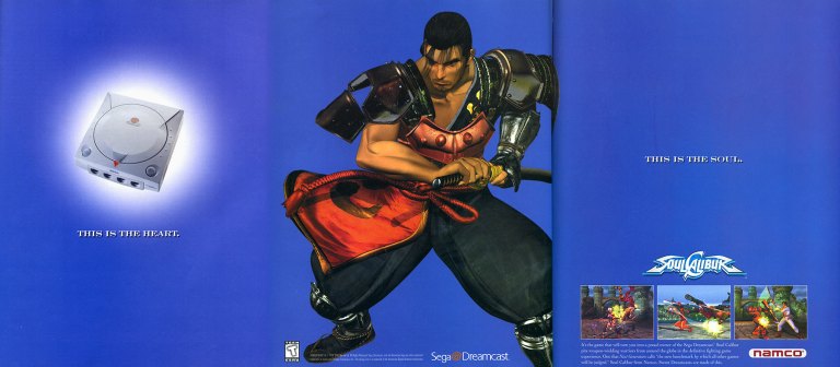
2. North American Soulcalibur Dreamcast version print ad
Namco came up with a creative approach to emphasize heart-and-soul promoting their game and the Dreamcast.
On September 9, 1999, Sega launched their Dreamcast console in America. With a gap of around ten months between the Japanese launch (November 1998) and the American launch, Sega had time to prepare Dreamcast’s release to American gamers with a huge lineup of games (both Sega’s games and from other publishers). Fortunately for Sega, they had Namco (their rival on arcade games) supporting their console.
Behind the scenes, Namco’s developers worked hard to not only port their arcade hit Soulcalibur to the Dreamcast, but to enhance the graphics using the console’s more advanced technology. The visual enhancements include rendering all of the games stages (and backgrounds) into full 3D polygonal environments. Namco also implemented different game modes and added even more content to ensure satisfaction to Dreamcast gamers.
The above 3-page print ad of Soulcalibur on Dreamcast was undeniably strategic and captivating to look at. The ad described the console as the heart, showed Soulcalibur character Mitsurugi (one of the game’s most popular characters) in the middle and then described the game (with 3 screenshots of game rendered with Dreamcast graphics) as the soul. It was a strong way to promote both the game and the console. In the years that followed, Soulcalibur grew into a popular fighting game franchise and the Dreamcast version will always be remembered as the crucial turning point.
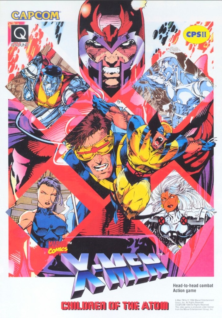
3. X-Men: Children of the Atom arcade flyer
Anyone who read lots of X-Men comic books in the 1990s should be able to tell which character was drawn by which artist.
When Capcom first released X-Men: Children of the Atom in the arcades in the mid-1990s, I was surprised because I did not anticipate the day would come when the company behind Street Fighter II would actually make a 2D fighting game showcasing the Marvel’s mutants. Even more intriguing was the X-Men art Capcom used for the arcade flyer to promote the game. I recognize Jim Lee’s artworks of Magneto, Cyclops and Colossus. The art of Wolverine shown was drawn by Andy Kubert. It was a wise move for Capcom (with Marvel as a business partner) to use established X-Men comic book artworks instead of having their internal illustrator draw the characters. That being said, this arcade flyer still looks great and captivating to look at.
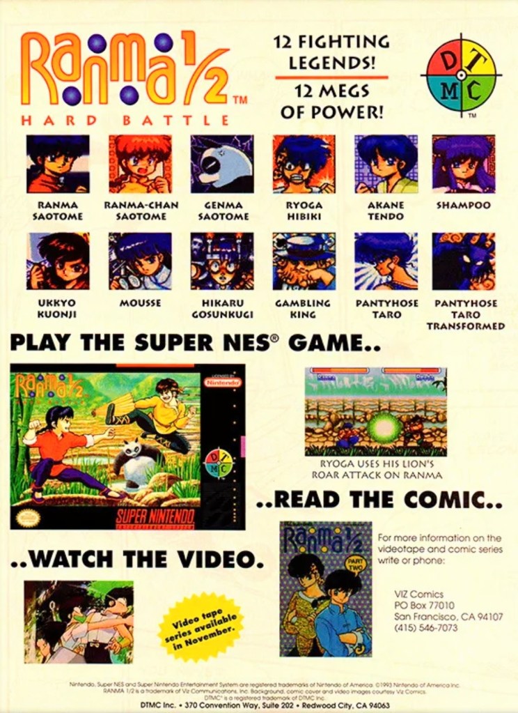
4. North American Ranma ½: Hard Battle print ad
A print ad promoting the game while saving some space to promote the anime and comic books.
By 1993, Street Fighter II and its upgraded follow-ups were wildly popular both in the arcades and on game consoles around the world. At the same time, there were many other 2D fighting games released to compete with and cash-in on Street Fighter II’s success. Believe it or not, the established anime franchise Ranma ½ saw a video game adaptation in the form of a 2D fighting game – Ranma ½: Hard Battle.
The North American print ad above published by DTMC (in cooperation with Viz Communications) promoted the game (one screenshot, the SNES game box and images of the characters as they appeared in the game) as well as Ranma ½ on anime videos and comic books. The way it was presented, the print ad promoted Ranma ½: Hard Battle without much heart nor passion.
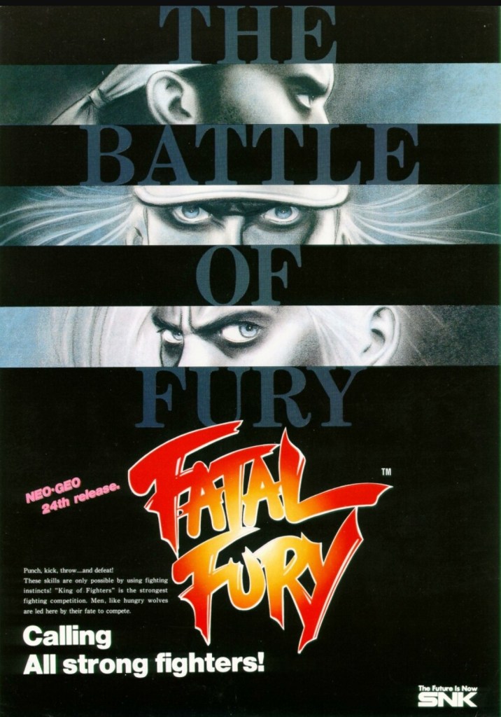
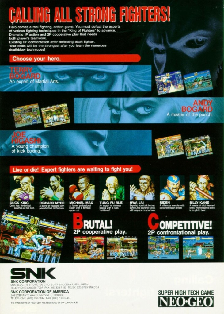
5. Fatal Fury: King of Fighters arcade flyer
An intriguing visual presentation on the front.
You get to know the characters and what the game features are.
There is no doubt that Fatal Fury: King of Fighters is the most significant game that SNK made. Apart from being the company’s first fighting game for the Neo Geo system, it established the fictional “king of fighters” tournament that became the core concept for The King of Fighters series of games in the years that followed. Fatal Fury itself is notable for being designed by Takashi Nishiyama, a former Capcom employee who created the original Street Fighter game. What Nishiyama could not do with Street Fighter, he accomplished while making SNK’s fighting game. Compared with the combo-oriented approach of Street Fighter II, Fatal Fury was designed to emphasize the timing of special moves, confrontational play, cooperative play and the 3D-like spacing between characters (background row and foreground row in each stage) while telling a story in a solid way.
The above arcade flyer of Fatal Fury has this unique looking artwork on the front showing stylized rectangular shots of the major characters Terry Bogard, Andy Bogard and Joe Higashi. On the other side of the flyer are the details that emphasized the creative concept of the game, who the characters are and what they could expect with regards to gameplay features. This flyer is still captivating to look at and it could entice you to try playing the original Fatal Fury game before trying out the sequels and spin-offs.
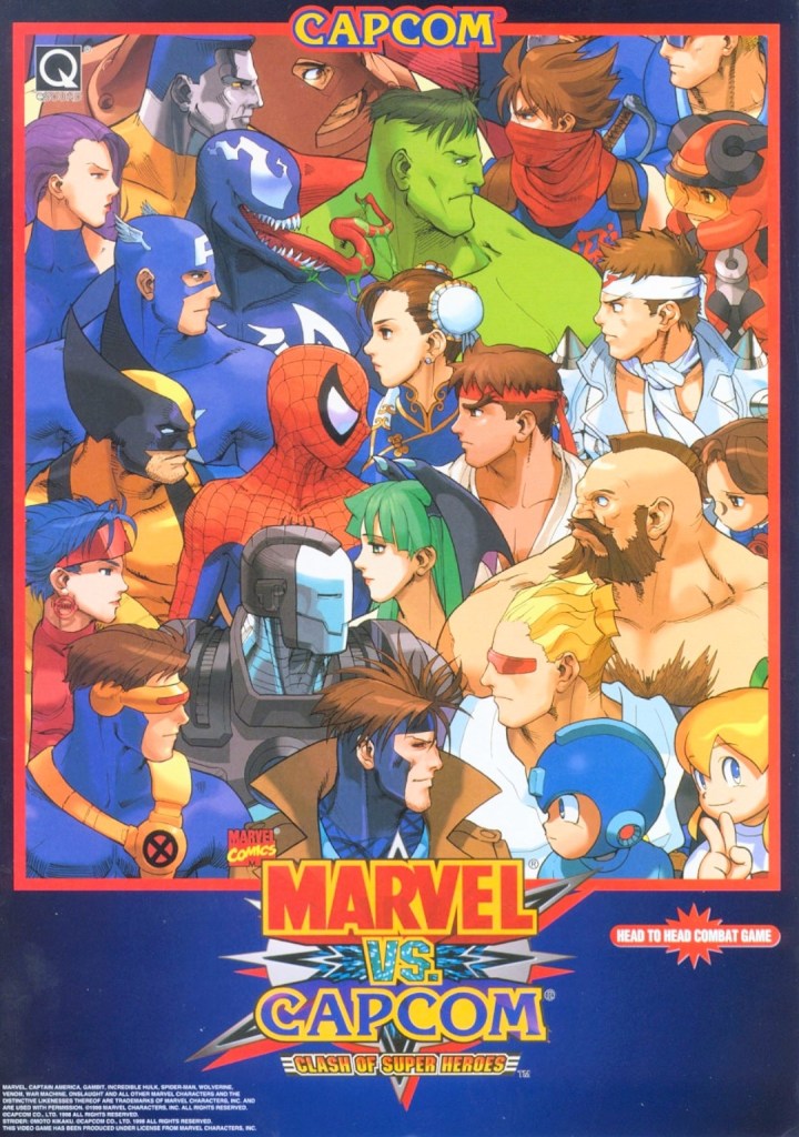
6. Marvel vs. Capcom: Clash of Super Heroes arcade flyer
This is NOT a comic book crossover.
If there is anything that truly emphasizes the essence of a fictional crossover in terms of visuals, it’s the art that Capcom and Marvel agreed to for Marvel vs. Capcom: Clash of Superheroes which is evident on the front of the above arcade flyer. By looking at how the Marvel characters were drawn, it looks like someone at Capcom illustrated the artwork as the Capcom characters still maintained that particular art style seen in the artworks of the Japanese company’s other games like Street Fighter, Darkstalkers, Mega Man and Strider. Regardless, the artwork still is amusing to look at.
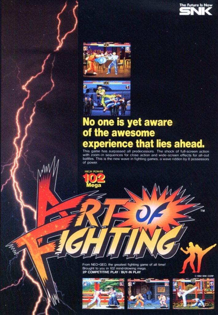
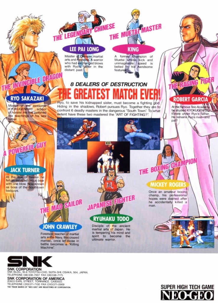
7. Art of Fighting arcade flyer
The front of the flyer.
The cast of characters showcased on the other side of the flyer.
Following the success of Fatal Fury, SNK went on to release Art of Fighting in arcades in 1992 and it became successful enough for the company to make sequels. With regards to the realm of fantasy, Art of Fighting was part of the same fictional universe as Fatal Fury and The King of Fighters, and there were times when its own characters appeared in other SNK games.
Art of Fighting’s arcade flyer had an energetic visual concept on the front with a rectangular lightning portion on the left balanced with five screenshots of the game itself. Once you get to the other side of the flyer, you will see really nice art of the characters with Ryo Sakazaki and Robert Garcia as the most dominating figures. Sakazaki and Garcia are the major characters of the Art of Fighting series. This flyer confidently introduced the characters and succeeded in making them look interesting.
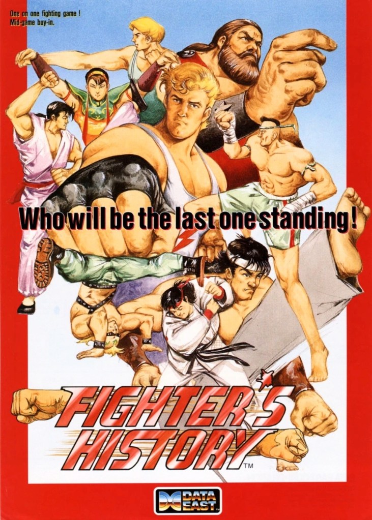
8. Fighter’s History arcade flyer and print ad
Great looking front artwork showing the game’s characters, posing and some action.
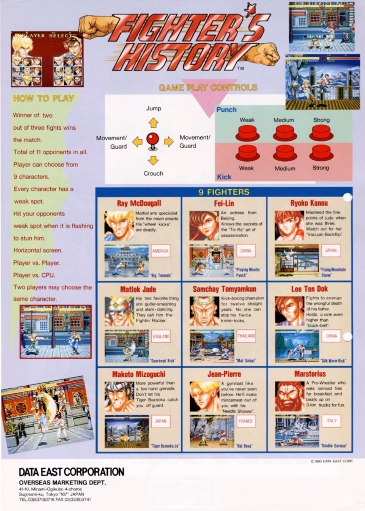
If you look closely at the controls, you will see the six-button layout and functions which are the same with those used in Street Fighter II.
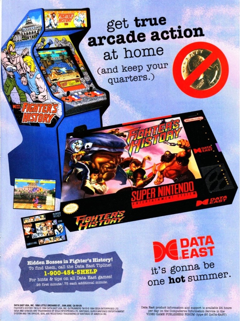
Data East offered two ways for gamers to enjoy Fighter’s History – pay a high price for the SNES version or gamers can go play the game in the arcade by dropping a few coins.
In 1993, Data East released their fighting game Fighter’s History in the arcades around the world. Along the way, the company released their arcade flyer which had a very captivating art work on the front featuring their characters and some action. The other side of the flyer showed the technical details on how to play, how the control works and who the characters are. Fighter’s History was nicely received in the arcades and the success led Data East into porting the game for the Super Nintendo Entertainment System (SNES). If you look at the print ad above, you can see how clever Data East was promoting the SNES version of the game while keeping an image of the arcade machine which serves like a subtle reminder that the same game is still available in video arcades.
Shortly after the release of Fighter’s History in the arcades, there were gamers who noticed that it had certain visual and gameplay elements that made it so familiar with what Street Fighter II had. When Capcom became aware of the similarities, they sued Data East claiming that Fighter’s History was too similar to their game and that copyright infringement was committed. Capcom lost the case ultimately and Data East went on to release two more Fighter’s History games.
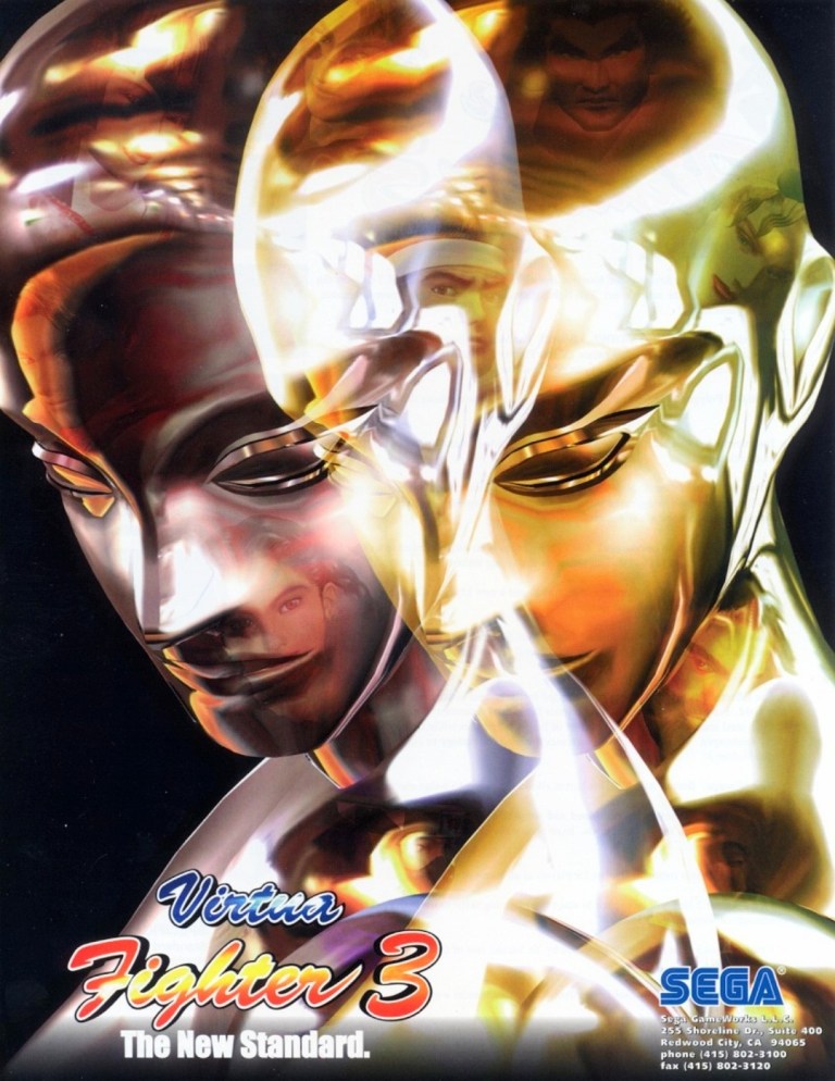
9. Virtua Fighter 3 arcade flyer
Virtua Fighter 3 truly raised the standards for arcade game graphics back in 1996.
When it comes to gaming innovation and standing out among the rest, Sega did exactly those when they released Virtua Fighter 3 in arcades in 1996 and it had the best-looking and really mind-blowing graphics at the time. Developed by AM2 (led by Yu Suzuki) on the very expensive Model 3 arcade hardware, Virtua Fighter 3 broke new ground on graphics as it moved over 1 million polygons per second, had highly detailed visuals on the characters and surroundings, realistic reflection effects, detailed shining, parallel lighting and high-specular Gouraud shading to name some. Even the characters’ eyes followed the opponent’s position.
The Virtua Fighter 3 arcade flyer showcased their reflective, metallic character Dural who in turn was part of the graphical showcase (emphasizing reflections, smooth animation and liquid metal effects) when the game was previewed in the 1996 AOU event in Japan. The words “The New Standard” written on the lower-left corner of the front of the flyer was justified and truthful.
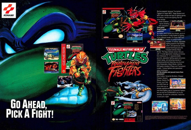
10. Teenage Mutant Ninja Turtles: Tournament Fighters print ad
This print ad had a nice visual presentation and was easily recognizable to the many TMNT fans.
In 1989, the Teenage Mutant Ninja Turtles (TMNT) franchise made quite a splash on video games which is not surprising as the multimedia franchise was already a popular in the West. More video game adaptation of TMNT were released in the early 1990s providing fans and gamers a lot of fun gameplay at the arcades (click here) and on consoles. Konami had the video game rights of TMNT and in a clear response to the sudden popularity of fighting games, they released Teenage Mutant Ninja Turtles: Tournament Fighters on the most popular game consoles of the time achieving varying levels of success critically and commercially (note: the SNES version stood out as the best). This print ad of the fighting game was effective in visually promoting the three console versions and the displayed text contained enough information to lure the attention of both fans and gamers.
Welcome back readers, fellow geeks and electronic gaming fans!
In this edition of the Retro Gaming Ads Blast (RGAB) series, we will take a look at another batch of retro gaming print ads from the 1980s and 1990s.
For the newcomers reading this, Retro Gaming Ads Blast (RGAB) looks back at the many print ads of games (console, arcade, computer and handheld) that were published in comic books, magazines, flyers and newspapers long before smartphones, social media, the worldwide web and streaming became popular. To put things in perspective, people back in the 1980s and 1990s were more trusting of print media for information and images about electronic games and related products.
With those details laid down, here is the newest batch of retro gaming print ads for you to see and enjoy…
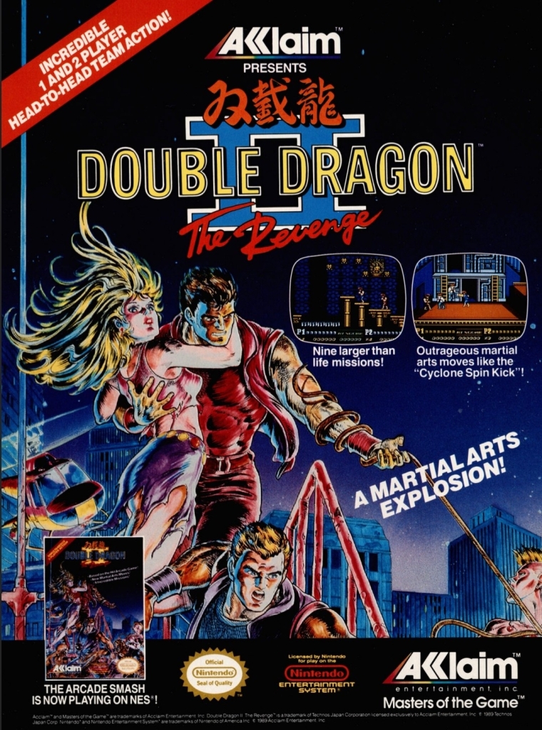
1. Double Dragon II: The Revenge print ad
Nice looking art used to promote the game.
The beat-them-up sub-genre of gaming was already popular in the 1980s and one of the most defining game franchises of this type of game was the Double Dragon series which proved to be popular with Nintendo Entertainment System (NES in America) and Family Computer (Famicom in Japan) gamers. As the first game was a very big hit on Nintendo’s consoles, the sequel Double Dragon II: The Revenge was promoted in America with strong confidence on the part of publisher Acclaim that it would become another massive hit. This print ad had a very nice looking comic books-style art that not only captured the concept of the game but also visualized the heroes Billy and Jimmy with enough details to focus on. I can say this was an eye-catching ad.
2. X-Men: Children of the Atom print ad
Great looking ad but the line “100% direct conversion” is not true at all.
Developed by Capcom in cooperation with Marvel, X-Men: Children of the Atom was a huge hit in the video arcades and it was not surprising that it got released on the Sega Saturn by Acclaim. Acclaim organized an aggressive promotional campaign by pouncing on the fans’ love and knowledge of the X-Men and the high fun factor of Capcom’s game. What this print ad got wrong, however, was the line “100% direct conversion of the #1 arcade smash!” which was wrong and misleading. In reality, the Sega Saturn version of the game had about one-third of the animation frames cut due to the console’s smaller RAM capacity.
As the years passed by, the Sega Saturn became the more suitable console for home ports of Capcom’s further 2D fighting games as Sony’s PlayStation had even more severe limitations and a graphics processor that was not suitable for 2D graphics. By the end of 2000, Capcom’s 2D fighting games on PlayStation all were inferior to the Sega Saturn versions.
3. Sky Shark NES print ad
This is an effective looking ad.
Released in Japan as Flying Shark, Sky Shark was released on multiple platforms in 1988 and there was an NES version of it which this particular print ad promoted. The American branch of Taito wisely used positive quotes from media outlets to promote the game while coming up with an engaging text description and displayed NES screenshots. And then there was that very engaging painted cover art that gave this print ad a lot of punch. An effective ad overall.
4. Conflict print ad
This is a very captivating artwork for advertising.
There is no denying the fact that the Cold War was a strong influence on arcade games and video games. Titles like Contra, Jackal, Metal Gear, Operation Wolf, Cabal and Rush’n Attack were militaristic games that entertained millions of gamers from the young adults to the little children. In 1990, Vic Tokai released the game Conflict on the NES which had a military theme but an unusual game design composed of digital maps with hexagons in which gamers will play with strategy to win battles. That being said, this print ad’s visual concept was very captivating yet also misleading. If you see how the game is played, you will know what I mean.
5. College Slam print ad
Were you ever interested in college basketball video games?
This is one of the more eye-catching print ads I’ve seen due to the artist’s illustration of a basketball with a mouth biting the basketball rim which dominates the space. For the newcomers reading this, College Slam was a basketball video game that was actually a repacked version of the popular NBA Jam with focus on NCAA basketball players. With the biting basketball at the center, it was easily an attraction and the screenshots implemented were larger than usual which easily gave gamers a clear look at what the game looked like. While this print ad is eye-catching, it did not help sell College Slam and there never was a follow-up.
6. Tecmo Super Baseball print ad
From the time when Tecmo was prolific with video games about sports.
Long before it started the Dead or Alive game franchise, Tecmo was once heavily invested in making sports video games. Tecmo Super Baseball was their first American pro baseball video game released for Super Nintendo Entertainment System (SNES) and Sega Genesis, and it was notable that the publisher secured only the Major League Baseball Players Association (MLBPA) which resulted in the game featuring real-life players but the teams had no names and no logos. Regardless, this print ad showed how aggressive Tecmo was in trying to attract consumers’ attention by showing ten screenshots with short text descriptions each. The ad’s write-up boasted realism as well as the promise of gaming quality.
7. The Punisher print ad
Marvel’s vigilante firing at someone.
In the early 1990s, Capcom and Marvel Comics started their partnership resulting in the releasing of the arcade game The Punisher. Developed by Capcom, the said arcade game became a big hit with gamers as it featured fun gameplay, multiple enemies appearing on screen simultaneously and other fun elements. Unsurprisingly, the game was ported (note: Sculptured Software was the lead developer) to the Sega Genesis with significant downgrades in terms of graphics, sound, enemy variety and other related elements due to technical limitations. That being said, this print ad used detailed art of the Punisher (with Col. Fury in the background) in a clever way to promote the Sega Genesis version while keeping their attention away from the obvious visual downgrades of the two screenshots displayed. The Punisher on Genesis was poorly received.
8. Stargate print ad
If you did not enjoy the movie, were you able to play the video game adaptation on Sega Genesis or Super NES?
Remember the sci-fi movie Stargate (1994)? The film was a surprise box office hit and eventually video game adaptations of it were made for the SNES, Sega Genesis, Game Gear and the GameBoy. This particular print ad, however, showed screenshots of the SNES and Genesis versions which is made obvious with the side-scrolling adventure plus 3D flying sequence (one screenshot showed it). Combined with images sourced from the movie poster plus an insert of the movie in home video format (lower-right corner), this print ad was obviously an aggressive way to promote the film with the post-theatrical business in mind. In case you are wondering, the cinematic Stargate is not related at all with the early 1980s video game (a follow-up to the classic game Defender) of the same name.
9. Aerobiz Supersonic print ad
For a simulation game released on consoles, Aerobiz Supersonic is pretty deep and a lot of fun to play.
The airline simulation game Aerobiz Supersonic is a highly addictive and surprisingly fun game that I enjoyed playing on the SNES (read my retro review by clicking here) and strangely enough I first learned about not through its print ad but by reading a preview published by Electronic Gaming Monthly (EGM) magazine. As for this print ad made by Koei’s American team, this is really odd to look at due to the ad makers’ choice of showing a not-so-attractive flight meal. In contrast to that, the ad makers did a good job describing the game creatively and showed three screenshots that were strategically selected in my view. Having played the game many times, I can say that this print ad is very truthful.