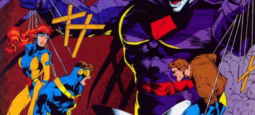
A Look Back at X-Men Adventures Season II #1 (1994)

Welcome back superhero enthusiasts, 1990s arts and culture enthusiasts, Marvel Comics fans and comic book collectors! Today we go back to the mid-1990s to explore the adaptation of the start of the second season of the X-Men animated series in the form of the X-Men Adventures comic book series.

Before getting to the retro comic book review, I want to address the recent controversy and criticism of the new animated series X-Men ’97, a continuation of the popular 1990s series that turned out to be woke by featuring the so-called non-binary presentation of people. In my view, this is not surprising given the fact that the very woke Disney company has owned Marvel Entertainment for many years now and its wokeness has infected the animated X-Men franchise along with the most recent movies and shows of the Marvel Cinematic Universe (MCU). Wokeness and Leftist beliefs continue to ruin entertainment and established properties as we know it. It’s the culture of Communist-filled Hollywood (Commiewood).

So how do you reject X-Men wokeness apart from avoiding X-Men ’97? You simply go back to the X-Men animated series of the 1990s as well as the comic books that adapted the stories.

With those details laid down, here is a look back at X-Men Adventures Season II #1, published in 1994 by Marvel Comics with a story written by Ralph Macchio and drawn by Andrew Wildman.
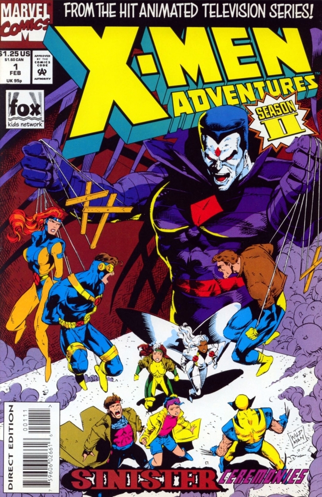
The cover.

Early story

The story begins with the cosmic being the Watcher carefully examining the flow of events on Earth and what has changed for the X-Men since then. Robert Kelly, who previously had an anti-mutant agenda when he was a U.S. Senator, has since been elected as the President of the United States and openly pushes for a policy of conciliation with mutants. His action sparks social unrest.

Meanwhile inside a small church far away from the nation’s capital, the wedding of Jean Grey and Scott Summers pushes through with several members of the X-Men in attendance. Very notable was the absence of Wolverine who turned out to be inside the Danger Room (deep within Charles Xavier’s estate) fighting a giant-sized version of Cyclops…

Quality
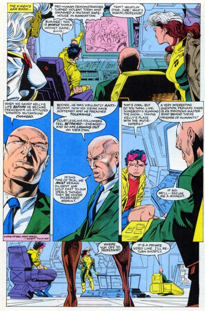
The X-Men are troubled by the anti-mutant wave happening in public.

As the opening issue of the second volume of the X-Men Adventures comic book series, this comic book carefully sets up the tone and the plot of a series of future challenges for the X-Men which is clearly reflected on the front cover with Mister Sinister displayed prominently. The story mainly highlights X-Men’s new struggle with the wave of anti-mutant rage in the public while dealing with the absence of their leader Cyclops (on honeymoon with his new wife Jean) while leaving space for potential sub-plots such as the attraction between Jean and Wolverine, the moves of the anti-mutant radicals and, most notable of all, the secretive return of Morph (thought to have died in issue #2 of the first season).

As expected, build-up is the main approach taken by the creators on telling the story and there were some bouts of superhero spectacle (action) that spiced up the reading experience for me. Considering what has been happening in different parts of the world in recent years, the sub-plot of the rabid anti-mutant activists using tactics to destroy the X-Men’s credibility with violence and misinformation magnified through the news networks is very socially relevant.

What the rabid anti-mutant people committed in this comic book reminds me of the October 7, 2023 attacks on Israel organized by the Palestinian terrorist group Hamas in which violence, destruction and selective images of terror spread through news networks and social media were done. Similarities aside, the wave of evil is clear here and the intent of the anti-mutant believers and Palestinian terrorists obviously expresses intentions of genocide against another particular group of people.

When it comes to weaknesses of this comic book, I cannot help but find Andrew Wildman’s art looking very rushed. There is a lack of precision and detail of his art here when compared directly to his works in the first volume of X-Men Adventures.

Conclusion
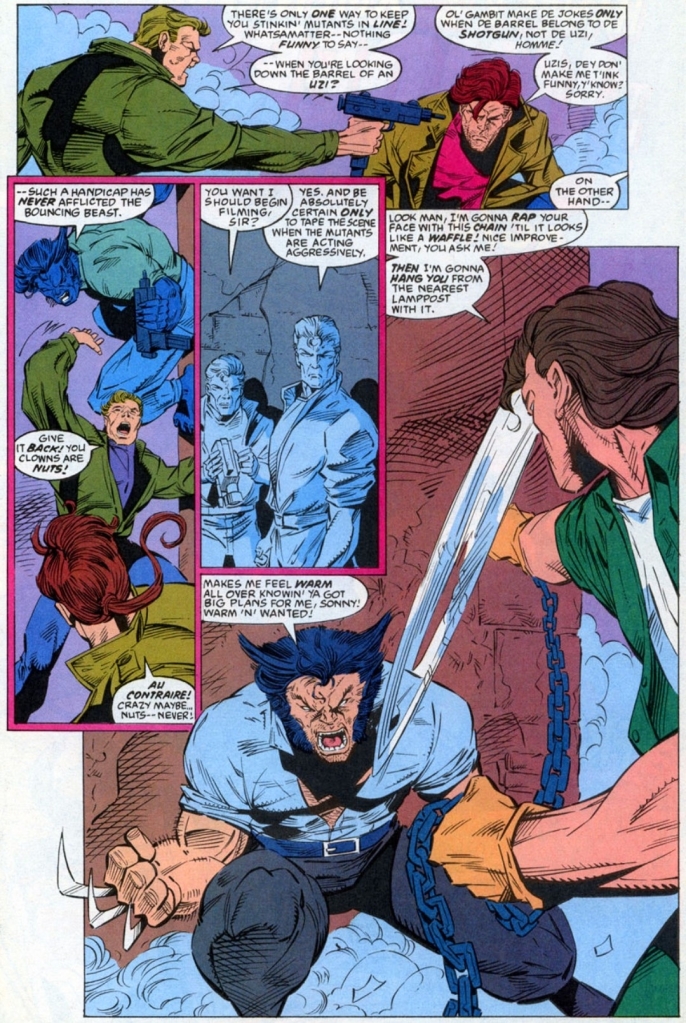
The anti-mutant radicals in this comic book have a lot in common with Palestinian terrorists, the pro-Palestine activists, the Black Lives Matter activists and other members of woke mobs. Violence, arrogance, rage and misinformation are their values.

X-Men Adventures Season II #1 (1994) incidentally works well as an adaptation of the animated series, as a standalone comic book as well as being a socially relevant tale in today’s age of social media. While the concept of evil remains in X-Men lore, what was told here shows different layers of it. The X-Men themselves also looked fragile and the return of Morph is a key part of the story clearly designed with future events in mind. Finally, this comic book is a lively reminder of the era when X-Men stories were made for the fans, not the woke mob.

Overall, X-Men Adventures Season II #1 (1994) is recommended.

+++++

Thank you for reading. If you find this article engaging, please click the like button below, share this article to others and also please consider making a donation to support my publishing. If you are looking for a copywriter to create content for your special project or business, check out my services and my portfolio. Feel free to contact me with a private message. Also please feel free to visit my Facebook page Author Carlo Carrasco and follow me on Twitter at  @HavenorFantasy as well as on Tumblr at https://carlocarrasco.tumblr.com/ and on Instagram at https://www.instagram.com/authorcarlocarrasco
Retro Gaming Ads Blast – Part 3

Welcome back readers, fellow geeks and electronic gaming fans!

In this edition of the Retro Gaming Ads Blast (RGAB) series, we will examine print ads from the 1980s and 1990s that caught my attention and I will explain why they are worth look back at.

For the newcomers reading this, Retro Gaming Ads Blast (RGAB) looks back at the many print ads of games (console, arcade, computer and handheld) that were published in comic books, magazines, flyers and newspapers long before smartphones, social media, the worldwide web and streaming became popular. To put things in perspective, people back in the 1980s and 1990s were more trusting of print media for game details and images.

With those details laid down, here is the newest batch of retro gaming print ads for you to see and enjoy…

1. Japanese print ad of Super Star Wars: The Empire Strikes Back

Do you know any Star Wars fan who is aware of the error in this Japanese print ad of Super Star Wars: The Empire Strikes Back?

Back in 1993, the sequel Super Star Wars: The Empire Strikes Back was released on the Super Nintendo Entertainment System (SNES) in the West and on the Super Famicom in Japan. Having played all three Super Star Wars game, I can say that this sequel was a huge improvement over its predecessor technically and also with gameplay (read my retro review by clicking here).

Like its predecessor, the game was released in Japan by JVC Musical Industries and in the above Japanese market print ad, the marketing team wisely used the game’s official artwork to give gamers a clear view of the concept derived from the 1980 movie plus a few screenshots showing gameplay. What I find hilarious to read is the line (highlighted in red and all capitalized no less): MAY THE FORCE WITH YOU. Clearly someone from the Japanese marketing team who prepared that line lacked English proficiency or might not have watched the movies dubbed in English. In the 1977 movie, Han Solo said to Luke, “May the Force be with you.”  

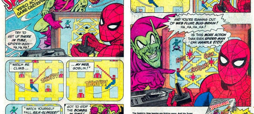
2.  Spider-Man (Atari 2600) print ad

This is an entertaining way to promote a video game based on a comic book icon.

We are back again with the Parker Brothers company and their promotion of the Spider-Man video game for the Atari 2600 which I myself played long ago. Unlike before, the print ad this time was mainly about the Spider-Man game and somehow Parker Brothers coordinated with Marvel Comics to make a comic book-inspired ad. In the above print ad, Spider-Man was shown playing the game about him with an Atari 2600 controller and console, and the Green Goblin taunts him as he plays. This type of ad is a stroke of genius because it shows the Marvel Comics’ icon as a player and the gameplay was emphasized accurately. Even if viewers are not too fond of video games, they can still find themselves interested in reading the literary adventures of Spider-Man.

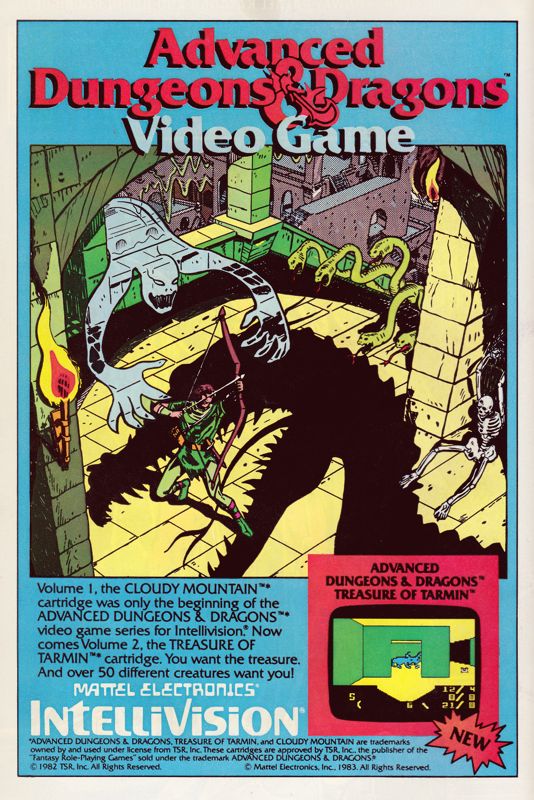
3. Advanced Dungeons & Dragons: Treasure of Tarmin print ad

Apart from emphasizing the fantasy concept of the Dungeons & Dragons franchise, this print ad’s hand-drawn art was strong enough to spark viewers’ curiosity and make them interested in the game or even in the Intellivision console.

Here is a print ad I saw many times while reading comic books in 1983. The game at hand is Advanced Dungeons & Dragons: Treasure of Tarmin released on the Intellivision, and it is the sequel to Cloudy Mountain. Like the ad of its predecessor, the above print ad relied heavily on the spectacle of fantasy (and even a bit of horror) by having hand-drawn art as the eye candy promoting Advanced Dungeons & Dragons: Treasure of Tarmin. If you look closely, only one screenshot from the game was shown and it was enough to tell gamers that the new game has a completely different visual presentation from that of Cloudy Mountain. Considering the primitive nature of computer graphics and game design of the era, having detailed comic book-inspired artwork was effective to grab viewers’ attention with the intention to make them interested in buying the game. In today’s age of computer graphics and social media, this type of ad for video games is rare to see.

4. G.I. Joe: Cobra Strike print ad

The G.I. Joe: A Real American Hero franchise’s early entry into video games.

Going back to Parker Brothers, the company developed and published the first-ever licensed game of the G.I. Joe franchise – G.I. Joe: Cobra Strike for the Atari 2600. In promoting the game, a 2-page ad was released with comic book-style art work (featuring Cobra Commander and Duke representing different sides) dominating the space, with descriptive text and a hand-drawn illustration of the gameplay (read: not a real screenshot) as well as the game box flling the remaining space. In my personal experience, I saw this ad before I even got to watch an episode of the popular G.I. Joe: A Real American Hero animated TV series, and before I got to read an issue the related comic book series (which started before the TV series). Looking back at the above print ad, I can still remember the time when I was puzzled by the two characters simply because I was not yet familiar with them. Take note that the video game and the ad were released at a time when the G.I. Joe: A Real American Hero started rising quickly in popularity on toys, comic books and animation.  

5. Alien 3 (SNES) print ad

This print ad appeared in several comic books I read in 1993.

Way back in 1992, I had one of the most depressing cinema viewing experiences with Alien 3 which had a very troublesome production and lacked a solid foundation behind its creativity. Then in the summer of 1993, print ads of the video game Alien 3 for Super Nintendo Entertainment System (SNES) appeared in several comic books I read at the time. The above print ad was actually entertaining to look at. For one thing, the ad makers used three wide layers of screenshots from the game depicting different areas. Then I noticed the details which showed there were more aliens for gamers to encounter (versus only one in the movie) and the playable lead character Ellen Ripley was armed with guns (versus no guns in the movie) being able to fight the monsters. Not only that, the ad makers knew the specific details from the Alien film franchise which is reflected in the ad referencing the Face-hugger aliens, the acid from the creatures and, of course, the alien eggs. To this day, there are old-time gamers who found the Alien 3 SNES game more entertaining than the movie.

+++++

Thank you for reading. If you find this article engaging, please click the like button below, share this article to others and also please consider making a donation to support my publishing. If you are looking for a copywriter to create content for your special project or business, check out my services and my portfolio. Feel free to contact me with a private message. Also please feel free to visit my Facebook page Author Carlo Carrasco and follow me on Twitter at  @HavenorFantasy as well as on Tumblr at https://carlocarrasco.tumblr.com/ and on Instagram at https://www.instagram.com/authorcarlocarrasco

A Look Back at Batman Returns: The Official Comic Adaptation of the Warner Bros. Motion Picture (1992)

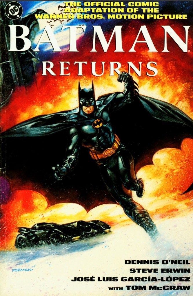
Welcome back superhero enthusiasts, 1990s culture enthusiasts and comic book collectors! Today we go back to the early 1990s and look at the official comic book adaptation of the 1992 superhero movie Batman Returns.  

Way back in 1992, I managed to watch Batman Returns in a movie theater here in the Philippines. It was entertaining but I noticed it had an even darker tone, more violence (although the quality of physical action went down) and was more adulterated compared, at least, with its 1989 predecessor. What really stood out for me in the Tim Burton-directed movie were the great performances of Danny DeVito as the Penguin and Michelle Pfeiffer as Catwoman.

Even though I was already visiting comic book stores back then, I was not even aware that an official comic book adaptation of the movie was released by DC Comics. It was only recently I finally got to read a copy.

With those details laid down, here is a look back at Batman Returns: The Official Comic Book Adaptation of the Warner Bros. Motion Pictured published in 1992 by DC Comics with the adapted story written by Dennis O’Neil and drawn by Steve Erwin.

The cover.

Early story

The story begins decades into the past in Gotham City. A wealthy couple (Cobblepot family) decide to reject and abandon their infant son (Oswald/Penguin) as he was born with freakish features. They placed their son into a metal container (which itself is contained in a large makeshift basket) and dropped it on a local waterway that leads deep into the city’s sewers. At the end of the journey, large penguins find the container.

Decades later in Gotham City, tycoon Max Schreck talks to the mayor about his planned power plant project that needs permits and tax incentives from the local government to be realized. The mayor is doubtful about the project as he believes that the city has more than enough energy sources to sustain growth into the next century. Schreck insists that the local government’s analysts don’t realize the big picture about energy and economic growth. Then Chip Schreck (Max’s only heir) arrives with Selina Kyle (Catwoman) carrying coffee near him.

Minutes later, Max, Chip and the mayor arrive at Gotham Plaza for the local Christmas tree lighting. Even though he forgot to bring his speech, Max Schreck delivers remarks pretending to be caring and charitable to others. As his speech ends, two over-sized objects looking like giant gift boxes arrived nearby giving the mayor the false impression that those are clever gimmicks by Schreck.

As soon as Schreck says that those objects were not his, the oversized gift box opens violently as thugs wearing circus costumes and masks suddenly come out causing violence and hysteria to the unprepared people.

The local police activate the Bat Signal to call Batman for his assistance. Nearby, the Penguin sees it and says, “Ooh, Batman. I’m trembling…”

Quality

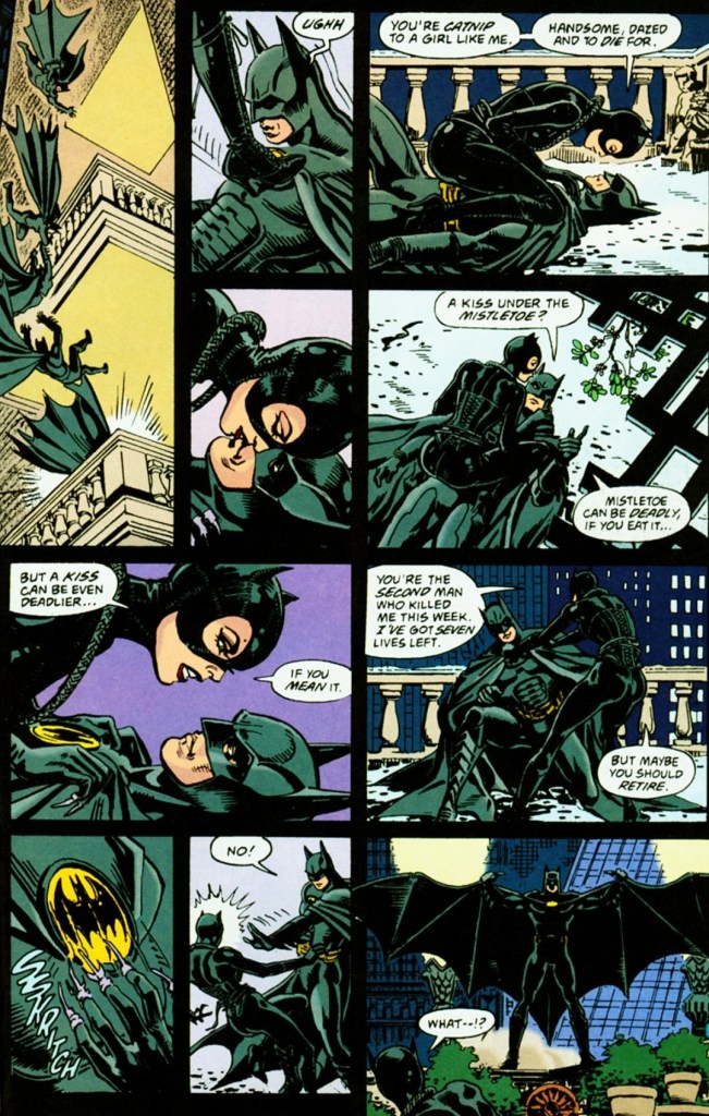
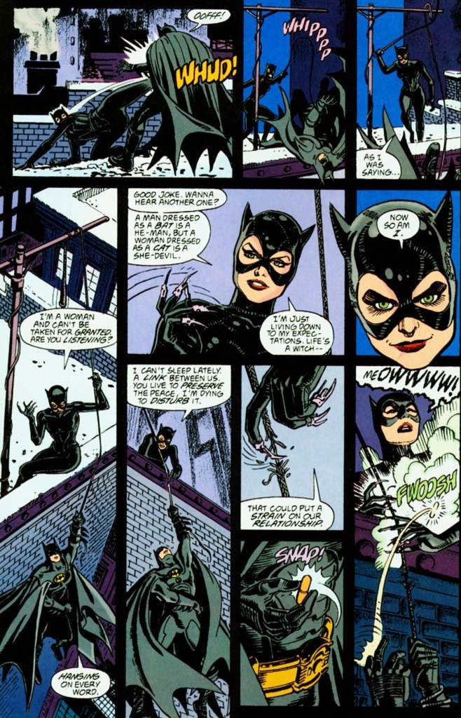
Moments from Batman’s first fight with Catwoman.

To get straight to the point regarding the narrative, this comic book adaptation does have the same basic plot and concept of the movie but with noticeable differences (whether technical or creative) that happened here and there. For the most part, Dennis O’Neil captured the concept of the movie but with less of the flavor of Tim Burton’s creative touches (which should not be surprising).

Having seen the movie, it is clear that the comic book creators reduced the dialogue and took shortcuts on adapting scenes from the film not just for the sake of brevity but to ensure they could fill the limited amount of pages to work with. That being said, I can say that the reduced dialogue from the first conversation between Penguin and Max Schreck severely weakened the impact when compared to what was executed in the film. Speaking of dialogue, the comic creators had to down key words (think of it as creative censorship) to avoid offending readers.

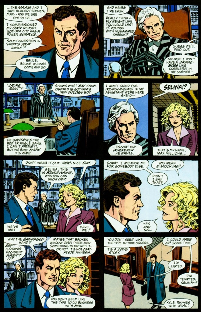
This is a unique, alternate portrayal at the aftermath of Selina Kyle’s fall from the high window. When compared to the movie itself, this adaptation emphasizes how far the Schrecks would go to avoid being held accountable for crimes committed.
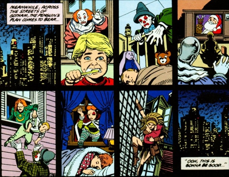
This particular scene did not appear in the movie at all. Perhaps it was based on an older version of the film script.

When it comes to scenes between the film and this comic book adaptation, I can say that the date between Bruce Wayne and Selina Kyle inside Wayne Manor does not appear in literary form at all. Ironically, there is one scene that appeared in this adaptation (the Penguin plotting chaos in Gotham while Catwoman mentions “An orgy of sex and violence,”) that never made the final cut in the movie itself. With regards to the aftermath of Max Schreck’s violent push of Selina Kyle through the high window, this adaptation showed Max’s son Chip present (implying he witnessed his father’s act just steps away) and he goes along with his father to ensure that none of them would be held accountable for Kyle’s fall (caused by “stress” and being “depressed”).  

With the way the narrative was completed, this adaptation works well but much less of the theatrical touches of Tim Burton and without the power of the respective performances of Danny DeVito, Michelle Pfeiffer and Christopher Walken (Max Schreck). Ironically, I can easily imagine Bruce Wayne/Batman sounding like Michael Keaton through dialogue.

While artist Steve Erwin did not come close to capturing the likenesses of Christopher Walken as Max Schreck, and Michael Keaton as Bruce Wayne, his take on Selina Kyle is better as she somewhat resembles Michelle Pfeiffer.

With regards to the visuals by Steve Erwin, he does a good job drawing the locations and help establish geography (albeit in limited scopes) for readers to grasp. In fact, there were drawings in which Erwin literally copied location spots, objects and even camera angles from the film which suggests he had confidential access to the footage. When it comes to visualizing action, Erwin’s approach is pretty simplistic and limited. There simply was no dynamism with the action which theoretically means he had no artistic freedom (sticking closely to script while working within the limits of images per page) or he simply had no intention to make the action look spectacular.

With regards to violence connected with the action, the comic creators had to resort to creative censorship apparently to make this adaptation more acceptable with younger readers. The fall of Selina Kyle from the high window had severely reduced intensity in comic form and the horrific moments of her being surrounded by cats in the film were completely gone. Oh yes, Batman’s use of the Batarang against multiple thugs on the street was executed with a simplistic and not-so-violent (read: little impact) manner by Erwin.

Consider this as a late-20th century portrayal of diversity and inclusion in America. By today’s standards, there are hordes of SJWs (social justice warriors), woke nuts, socialists, Communists, Marxists, and liberals who believe in diversity (racism in reverse) and inclusion (exclusion actually) so much, they intend to destroy families starting with the children.

When it comes to drawing the major characters, Erwin really falls short here. His Bruce Wayne never came close to resembling Michael Keaton and the same can be said about Max Schreck (does not look much like Walken) and the Penguin (does not resemble Danny DeVito at all and with reduced facial details, he looks nowhere as scary as the cinematic villain). Ironically, Erwin’s take on Selina Kyle comes a bit close to looking like Michelle Pfeiffer. Erwin does, however, did a good job drawing Batman and Catwoman in their fully costumed, masked appearances.

Conclusion

Very clearly, Steve Erwin had access to footage of the movie when making this adaptation.

Considering its flaws and compromises, Batman Returns: The Official Comic Adaptation of the Warner Bros. Motion Picture (1992) still works as an entertaining read and I myself have seen the movie many times. It captures the plot and several shots of the 1992 movie, but it certainly lacks Burton’s theatrical flavor and the powerful performances of DeVito and Pfeiffer. To its credit, this adaptation has several visual and literary differences compared with the movie which adds to its entertainment value. If you really want the full impact, full fun factor and artistry of Batman Returns at all, watching the movie itself is the best way. That being said, consider this adaptation as a cheaper accessible counterpart.

Overall, Batman Returns: The Official Comic Adaptation of the Warner Bros. Motion Picture (1992) is satisfactory.

+++++

Thank you for reading. If you find this article engaging, please click the like button below, share this article to others and also please consider making a donation to support my publishing. If you are looking for a copywriter to create content for your special project or business, check out my services and my portfolio. Feel free to contact me with a private message. Also please feel free to visit my Facebook page Author Carlo Carrasco and follow me on Twitter at  @HavenorFantasy as well as on Tumblr at https://carlocarrasco.tumblr.com/ and on Instagram at https://www.instagram.com/authorcarlocarrasco
A Look Back at Spider-Man #2 (1990)

Welcome back superhero enthusiasts, 1990s culture enthusiasts and comic book collectors! Today we go back to the early 1990s and explore a part of the Marvel Comics shared universe through a tale of the Spider-Man monthly series.

In my previous retro review, Todd McFarlane told a tale of the iconic web-slinger with intense build-up leading to another rematch with his old nemesis the Lizard (Dr. Connors). While the writing was pretty weak, McFarlane still managed to tell a tale with a strong element of horror and supernatural stuff. McFarlane’s approach with visual violence and graphic stuff was clearly adulterated. What was presented daringly tested the limits allowed under the Comics Code Authority (CCA).

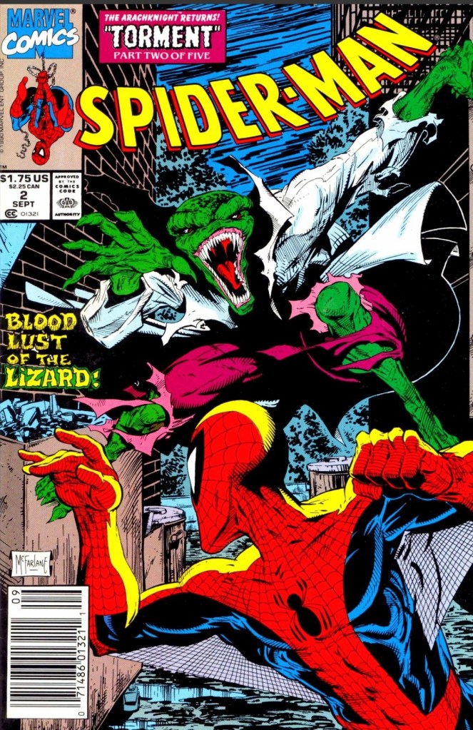
With those details laid down, here is a look back at Spider-Man #2, published in 1990 by Marvel Comics with a story written and drawn by Todd McFarlane. This is also the 2nd chapter of the Torment storyline.

The cover.

Early story

The story begins in New York City where two men got suddenly murdered by the Lizard in an alley during the night. The next morning Peter Parker reads the newspaper (showing the photograph and the news story of the Lizard’s murder of the two men) while having a breakfast moment with his wife Mary Jane. As soon as his wife mentions the word “monster”, Peter takes a 2nd look at the newspaper’s photograph and finally notices the bloody writing “CNNR” on the alley wall which makes him realize that the Lizard is back again.

Feeling very troubled, Peter leaves Mary Jane quietly and dresses up as Spider-Man to go out once again.

Elsewhere in the city, a sorceress uses her evil method of crafting a potion which creates an unrelenting sound of disturbance which Spider-Man hears. As the sound goes on, his focus and Spider Sense get overwhelmed…

Quality

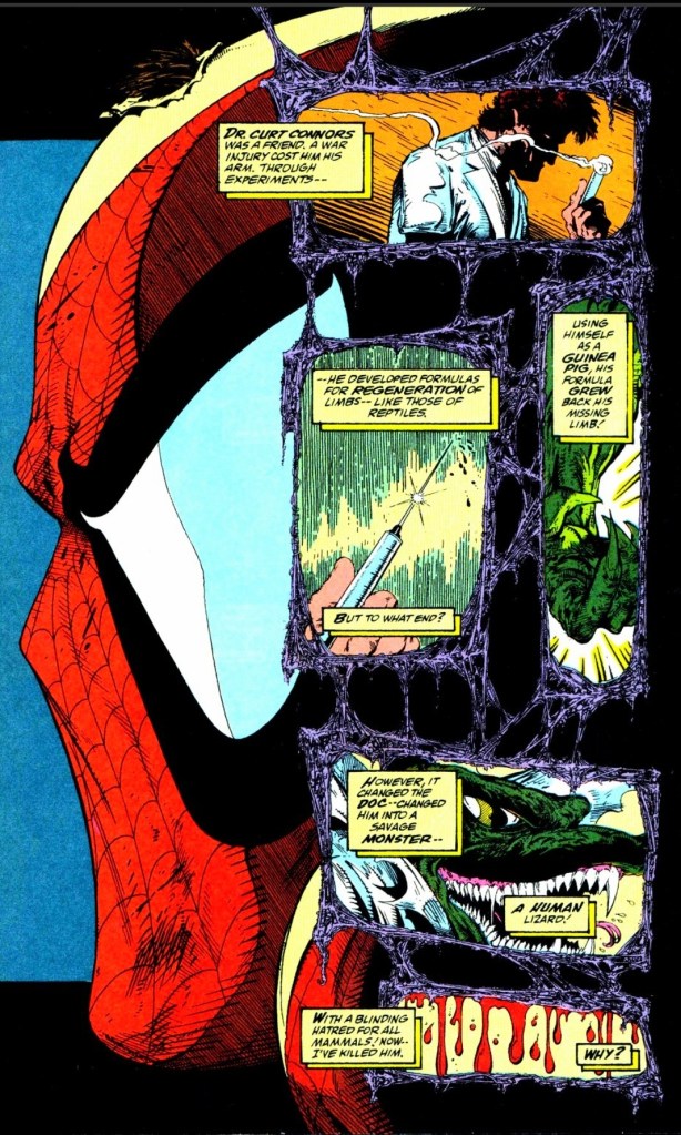
A quick look at the origin of the Lizard by McFarlane.

While the writing by McFarlane remains weak, he still succeeded in making this story a marginal improvement over the previous issue in terms of moving the plot forward, paying off a good chunk of the build-up in issue #1, and establishing his own visual corner (inspired by horror and adulterated stuff) within the Spider-Man franchise of comics of the time.

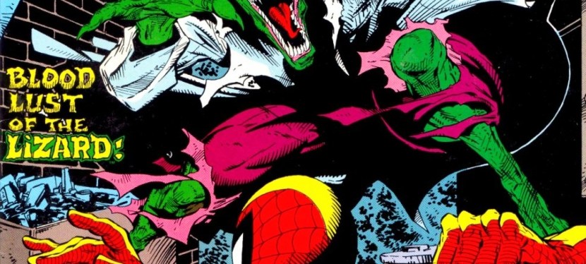
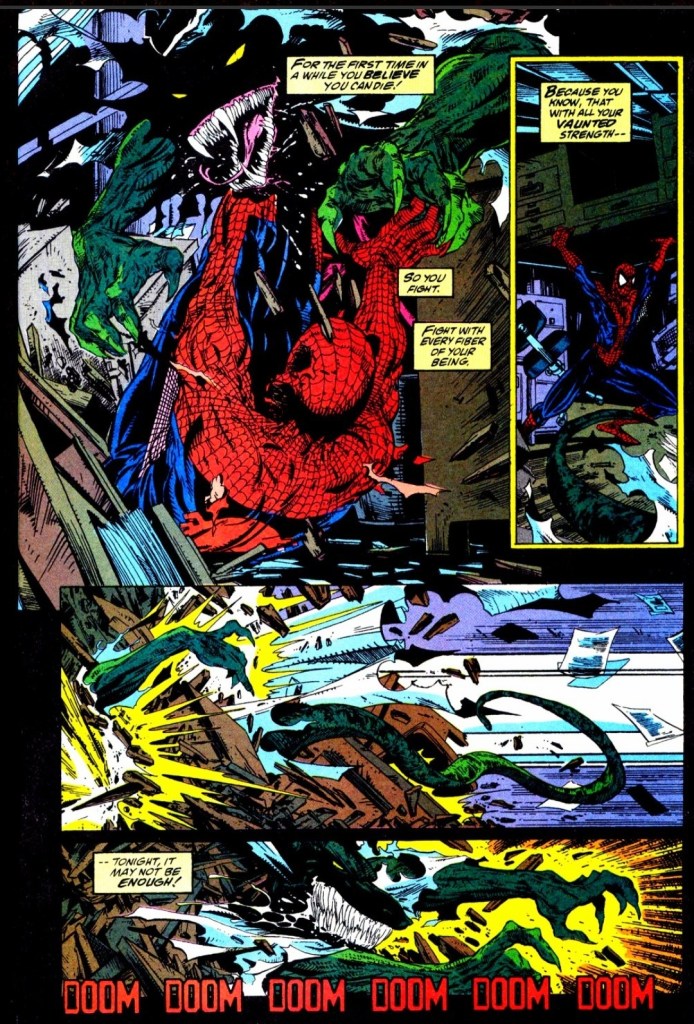
The biggest feature here is the physical conflict between Spider-Man and the Lizard. As expected, McFarlane drew the big fight with a lot of intense action, powerful violence (note: it was clear the editorial team recommended moves to tone down the graphic violence), suspense and a good amount of horror. Not only does the big fight move the story forward, it allowed McFarlane to dramatize Spider-Man as a vulnerable hero who not only has to cope with the disturbance from the sorceress far away, but also deal with the poison he got from the Lizard. That being said, Spidey also struggles with his sanity and the new fact that the Lizard has turned into a murder machine which disturbs him a lot as he personally knew Dr. Connors.

Considering what happened here and in the previous issue, there is still a greater force of evil that awaits Spider-Man and the Lizard happens to be an ultra-violent tool.

Conclusion

Many times Spider-Man finds himself in a disadvantage while fighting the Lizard.

Being the 2nd chapter of the Torment storyline, Spider-Man #2 (1990) is a slight improvement over the previous issue in terms of moving the story forward, spectacle and dramatization. While the big fight between Spider-Man and the murderous Lizard is clearly the big feature of the story, McFarlane does a good job portraying Spider-Man as vulnerable and on the edge towards defeat. McFarlane’s writing here is still weak but the other positive elements achieved outweighed the weakness.

Overall, Spider-Man #2 (1990) is satisfactory.

+++++

Thank you for reading. If you find this article engaging, please click the like button below, share this article to others and also please consider making a donation to support my publishing. If you are looking for a copywriter to create content for your special project or business, check out my services and my portfolio. Feel free to contact me with a private message. Also please feel free to visit my Facebook page Author Carlo Carrasco and follow me on Twitter at  @HavenorFantasy as well as on Tumblr at https://carlocarrasco.tumblr.com/ and on Instagram at https://www.instagram.com/authorcarlocarrasco

A Look Back at The Man of Steel #2 (1986)

Welcome back superhero enthusiasts, 1980s culture enthusiasts and comic book collectors! Today we go back to the mid-1980s to explore a part of the DC Comics shared universe through a tale of the iconic Superman.

Previously, I reviewed the first issue of The Man of Steel mini-series written and drawn by John Byrne. Using a unique structure for storytelling, Byrne gradually told how the post-Crisis version of Superman came to be while also retaining specific classic elements that made DC’s icon inspirational. That very comic book had its influences on other portrayals of Superman beyond comic books such as he Lois & Clark: The New Adventures of Superman TV series and even the very divisive Man of Steel movie.

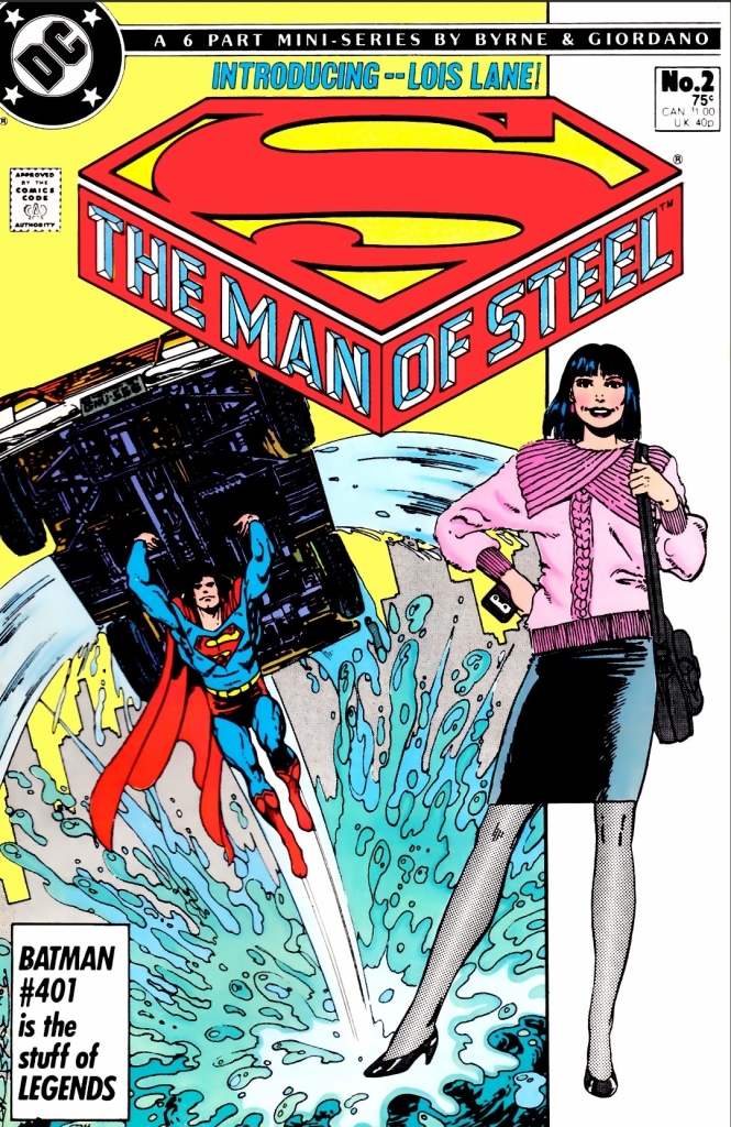
With those details laid down, here is a look back at The Man of Steel #2, published in 1986 by DC Comics with a story written and illustrated by John Byrne.

The cover.

Early story

The story begins in the middle of Metropolis when the newly established hero Superman (now in full costume) flies just above the busy road which distracted Daily Planet editor-in-chief Perry White (who was having a coffee break with reported Lois Lane inside a coffee shop). Remembering how the space plane and its crew got saved by Superman (Clark Kent in civilian clothes) sometime prior, White tells Lane (who first encountered Superman immediately after the space plane was saved) to go after him to get the hot scoop.

While Lane crosses the road, a limousine’s opens with the driver telling her that Mister L (Lex Luthor the tycoon) wants to her. Lane declines and proceeds with her chase for Superman…

Quality

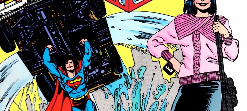
An act of help by Superman for someone who was in trouble.

This story is set during the early days of Superman as the new, randomly appearing hero of Metropolis whose impact on local society is just growing stronger. At the same time, this shows Clark Kent being a very new resident of the city still looking for a job. This is inspired work by Byrne on building up the Man of Steel for what was back then the modern age.

That being said, the most intriguing fact here is that this Superman story has Lois Lane as the actual protagonist. While Lane’s literary presence here is slightly stronger than DC’s icon, this tale is clearly all about her unrelenting approach with newspaper journalism, her use of the Daily Planet’s valuable connections and resources, and how much risk she would take to get the facts, the statements and other details all for the sake of getting the hot story. This is Byrne’s modernization of Lois Lane highlighting the concept that Clark Kent will have serious competition with her within the Daily Planet.  

That being said, there is no romance between Clark and Lois here. This is after all their 2nd encounter (the saving of the space plane in issue #1 was shown in flashback with Lois Lane already present) and Byrne took a careful approach on establishing the first lengthy encounter and interactions between the two. Their encounter here is really engaging.

More on Superman himself, the writer kept the pace of developing him flow smoothly and steadily. You will see how Superman keeps himself in control whenever he talks with normal people or when he encounters criminals who cause danger on others. While he has a priority to help others in need using his powers, he does not neglect his actual identity (and personal life) as Clark Kent and this includes moderating or limiting the use of his special abilities as he levels himself with the rest of the civilian population.

Conclusion

Lois Lane portrayed as the unrelenting and very determined newspaper reporter. Even though Superman always flew away, she just won’t give up.

The Man of Steel #2 (1986) is clearly a very solid follow-up to issue #1. The continued development of Superman remains solid and the dramatization of Lois Lane as the strongly determined newspaper journalist is compelling to see. With regards to the build-up of the post-Crisis DC Comics shared universe, this particular Superman tale is one of essential parts of it.

Overall, The Man of Steel #2 (1986) is highly recommended!

+++++

Thank you for reading. If you find this article engaging, please click the like button below, share this article to others and also please consider making a donation to support my publishing. If you are looking for a copywriter to create content for your special project or business, check out my services and my portfolio. Feel free to contact me with a private message. Also please feel free to visit my Facebook page Author Carlo Carrasco and follow me on Twitter at  @HavenorFantasy as well as on Tumblr at https://carlocarrasco.tumblr.com/ and on Instagram at https://www.instagram.com/authorcarlocarrasco

Retro Gaming Ads Blast – Part 2

Welcome back readers, fellow geeks and electronic gaming fans!

In this edition of the Retro Gaming Ads Blast (RGAB) series, we will examine print ads from the 1980s and 1990s that caught my attention and I will explain why these are worth look back at.

For the newcomers reading this, Retro Gaming Ads Blast (RGAB) looks back at the many print ads of games (console, arcade, computer and handheld) that were published in comic books, magazines, flyers and newspapers long before smartphones, social media, the worldwide web and streaming became popular. Back in the old days, many gamers trusted the print media a lot for information and images about games.

With those details laid down, here is the latest batch of retro gaming print ads for you to see and enjoy…

1. Popeye multiplatform print ad

A fine example of promoting the Popeye video game on multiple platforms visually.

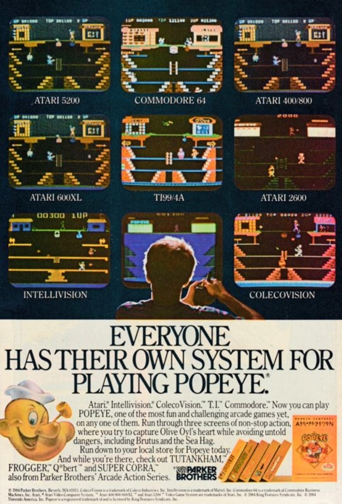
During the early 1980s, an arcade game based on Popeye was released and it became a hit with gamers who lined up and inserted coins to play. That game, which had three stages, was eventually ported by Parker Brothers to multiple platforms of Atari, ColecoVision, Intellivision, T.I. and Commodore.

The print ad you see above is a classic display of how one particular game appeared as a multiplatform release. The screenshots showed different versions of the Popeye game on multiple Atari platforms plus the others. See how different the game looks on each platform? The level of visual details and elements varied from one another as each machine had different specs that Parker Brothers had to adjust to. This is a fine example of promoting one game for different machines for those who love video games.  

2.  Kool-Aid Man Video Game print ad

I never got to play this Kool-Aid Man video game.

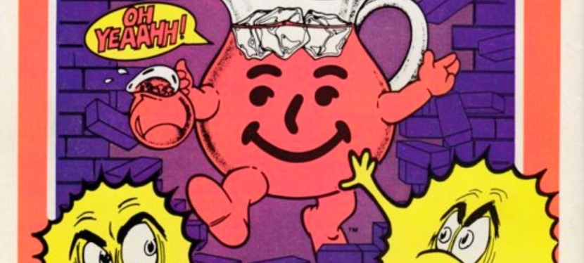
Remember Kool-Aid? For the newcomers reading this, Kool-Aid was a very popular product line of flavored juice drinks sold in powdered form. I myself used to mix Kool-Aid with ice-cold water and enjoyed drinking it. In 1954, a promotion of Kool-Aid with a touch of entertainment happened by highlighting the character Kool-Aid Man (famously known as the walking and talking pitcher filled with Kool-Aid juice). In later years, the Kool-Aid Man was often shown breaking through walls saying the line “Oh yeah!”.

The Kool-Aid Man gained tremendous attention as a pop culture figure in the 1980s when a new series of advertisements and promotions happened branching into video games and even comic books. The above print ad was a clever move to promote Kool-Aid as a drink as well as a video game for the Intellivision and the Atari 2600 consoles. Even if you were not too fond of video games in the 1980s, the Kool-Aid game ad would still make you think about the drink. Clever and entertaining!  

3. Zombies Ate My Neighbors game print ad

I saw the 2-page ad many times in comic books and video game magazines.

Going into the 1990s, Konami’s print ad of the video game Zombies Ate My Neighbors (for Super Nintendo Entertainment System and Sega Genesis) appeared a lot in the comic books I read when I was much younger. Having seen lots of horror movies – including zombie flicks – the ad easily caught my attention not because of the screenshots but because of the visual style used. For one thing, there was this 1950s America-inspired imagery on the photo of the scared woman with three zombies slowly approaching her. As for the game itself, there were plenty of small-sized screenshots that had lots of interesting details and pixel art (note: 3D polygons in video games were not yet common back then) which gave me a clear idea that it was a humor and horror-laced 2D adventure. Not only that, the text descriptions combined with the fake quotes added zest into the presentation. After having examined all the details carefully, I really felt like Zombies Ate My Neighbors would be a fun-filled game to play on the SNES.

4. Lunar: The Silver Star print ad

With anime artwork used, it was easy to have the impression that the original Lunar game was based on an existing anime series or movie.

In the early 1990s, Game Arts developed and released the Japanese role-playing game (JRPG) Lunar: The Silver Star on the Mega CD platform in Japan which in some ways was also a technological breakthrough – the game came with full motion video (for short videos), animated images, and CD-quality sound (that really made the soundtrack lively to listen to). After achieving critical and commercial success in Japan, the game was picked-up by Working Designs to be localized and released in the North American market for the Sega CD (the American counterpart of the Mega CD) platform. In promoting the game for American Sega CD owners as well as American gamers in general, a print ad highlighting anime images with five screenshots and only a few words was published on both comic books and magazines.

Even though Lunar: The Silver Star’s core concept was never described in the ad, the anime imagery was still eye-catching and the chosen screenshots gave viewers a preview of the gameplay and the animated images. That being said, it was no surprise that gamers who happened to be a bit interested in anime noticed the print ad. At the same time, the ad gave some gamers the impression that Lunar was a game based on an existing anime franchise. This approach on game advertising was daring and it happened at a time when Japanese RPGs had a limited audience among gamers in North America.

5. Lunar: Silver Star Story Complete print ad

In the 2nd half of the 1990s, a remake of Lunar: The Silver Star was released in Japan titled Lunar: Silver Star Story for Sega Saturn (1996), Sony PlayStation (1998) and Windows PC (1998). While it still maintained the 2D visuals for presentation, gameplay and exploration, the remake had smooth anime sequences, new artworks, better sound effects and music. Working Designs pounced on the opportunity to localize the game in America for PlayStation and released it in 1999 with the title Lunar: Silver Star Story Complete. Not only did Working Designs work hard on localizing the game (the English dubbing and singing of the game’s songs were meticulously done), they released it with a very lavish packaging with the dedicated fans and collectors in mind.

By looking at the above print ad that magazines published, Working Designs highlighted the positive feedback quotes from EGM, Gamers’ Republic, PSM and Official U.S. PlayStation Magazine to convince gamers Lunar: Silver Star Story Complete is a great game. While the screenshots showed what kind of eye candy gamers could expect, Working Designs made sure that they would know that the lavish package includes 4 discs (2 game discs, 1 music CD and 1 CD that had video documentary of the making of Lunar), a full-color map in the form of a cloth, and a hardbound art book and instruction manual.

Considering the dynamism of the Lunar: Silver Star Story Complete print ad and the game’s packaging, I can only speculate that Working Designs had to do it aggressively because the gaming landscape changed dramatically as 3D polygonal graphics became the standard while lots of other Japanese RPGs from different publishers were released in 1999 (including the sequels Suikoden II and Final Fantasy VIII) and many of them had more elaborate game designs and visual presentations. Eventually market forces and unfortunate business events led Working Designs to closing down permanently in 2005.

6. Star Wars: Jedi Arena print ad

Remember when Luke Skywalker tested his lightsaber skills with the floating Seeker in the 1977 movie?

Back in the early 1980s, Parker Brothers was very active releasing games on the Atari 2600 console which my family had. At that same time, Star Wars was very popular (and without the wokeness and identity politics garbage of Kathleen Kennedy and woke Disney) and any new game based on the sci-fi franchise was something to be excited for. In the above print ad of Star Wars: Jedi Arena, an artwork showing the iconic her Luke Skywalker testing his lightsaber skills with the floating Seeker ball was displayed and located between Luke’s legs is a monitor showing the screenshot of the game. Looking at the text description, Parker Brothers creatively focused on the aspect of the Jedi way of using the lightsaber interacting with the Seeker ball. Having played the game myself, I can say the ad was creative and pretty much captured the core concept of the game.  

+++++

Thank you for reading. If you find this article engaging, please click the like button below, share this article to others and also please consider making a donation to support my publishing. If you are looking for a copywriter to create content for your special project or business, check out my services and my portfolio. Feel free to contact me with a private message. Also please feel free to visit my Facebook page Author Carlo Carrasco and follow me on Twitter at  @HavenorFantasy as well as on Tumblr at https://carlocarrasco.tumblr.com/ and on Instagram at https://www.instagram.com/authorcarlocarrasco

A Look Back at Mantra: Spear of Destiny #1 (1995)

Welcome back superhero enthusiasts, 1990s culture enthusiasts and comic book collectors! Today we go back to the mid-1990s to explore a part of the Ultraverse through a tale of Mantra, the male eternal warrior Lukasz who died during battle then returned in the body of a woman named Eden.

It has been a few years since the last time I reviewed a Mantra comic book. For the newcomers reading this, the Ultraverse was a franchise of superhero comic books launched by Malibu Comics in 1993 which produced a lot of fun, intriguing and memorable tales made by a variety of really talented creators. Mantra was one of the pioneering characters of the Ultraverse and the related comic book series lasted more than twenty issues. Along the way, a standalone story of Mantra was published in the form of a 2-part mini-series.

With those details laid down, here is a look back at Mantra: Spear of Destiny #1 published in 1995 by Malibu Comics with a story written by Mike W. Barr and drawn by Paul Abrams.

The cover.

Early story

The story begins when Mantra arrives at a museum to start her attempt (in her civilian identity as Eden Blake) to obtain the Spear of Destiny. While wearing a revealing outfit to distract the men, Mantra gets close to the highly prized spear to observe it and see how the security personnel guard it.

At a different spot within the museum, Mantra decides to start obtaining the spear in magical outfit and with a mask. As Mantra arrives at the room where the Spear of Destiny, already there are monsters overwhelming the men guarding the Spear of Destiny…

Quality

Eden Blake/Mantra reporting to work at Aladdin.

Having read most of the stories of the Mantra comic book series, I can say that Mike W. Barr came up with a fresh concept that emphasizes the quest to gain possession of a highly valuable item while also creating a new approach on presenting Mantra…by engaging in espionage (spying and infiltration).

As I am already used to seeing the eternal warrior Lukasz/Mantra using magic in many struggles or missions, the concept of having the protagonist getting disguised and becoming an impostor on a spy mission is a very inspired move by the writer. The preparations taken by Mantra to becoming a certain blonde woman for the mission were nicely structured and detailed enough to make the transformation. As if that was not enough, a certain piece of technology was implemented which made using magic a huge risk for the eternal warrior. That being said, the story smoothly transitioned from magic-filled fantasy into a convincing spy thriller

Along the way, this comic book also emphasizes the darkness of the secret society Aladdin which Mantra (as Eden Blake) works for. Aladdin’s operations were dramatized several times in other Ultraverse comic books but this one has a more explicit portrayal of them.  

Conclusion

Mantra got hold of the Spear of Destiny but for how long?

Mantra: Spear of Destiny #1 (1995) is really entertaining and compelling to read. This is easily one of the more creative and more unique tales of the Ultraverse character ever told and I can say that I am eager to find out what would happen next. This is also the one tale in which Mantra became a spy and gets into a dangerous mission in which the use of magic is too risky. The writing by Mike W. Barr is really strong with this one.

Overall, Mantra: Spear of Destiny #1 (1995) is recommended.

+++++

Thank you for reading. If you find this article engaging, please click the like button below, share this article to others and also please consider making a donation to support my publishing. If you are looking for a copywriter to create content for your special project or business, check out my services and my portfolio. Feel free to contact me with a private message. Also please feel free to visit my Facebook page Author Carlo Carrasco and follow me on Twitter at  @HavenorFantasy as well as on Tumblr at https://carlocarrasco.tumblr.com/ and on Instagram at https://www.instagram.com/authorcarlocarrasco
Retro Gaming Ads Blast

Welcome back readers, fellow geeks and electronic gaming fans!

Today I am launching a brand-new series of articles titled Retro Gaming Ads Blast (RGAB) which will explore the many print ads and promotions of video games, computer games, arcade games and handheld games that were published through the decades.

For the newcomers reading this, print ads of games were widely popular and heavily relied on by gamers/players long before smartphones, social media, the worldwide web and online videos even started. Back in the old days, print media was the most common method for companies to market their games while also helping hardware (machines which played the games) reach potential buyers. Such ads appeared in magazines, comic books and newspapers. Not only that, there were several print ads of games that were made to look creative, compelling and even intriguing.

With those details laid down, here is the first batch of retro gaming print ads for you to see and enjoy…

1. Parker Brothers’ Spider-Man-led print ad

Does this ad look amusing?

Remember Parker Brothers? That was a company that started way back in 1883 founded with a strong focus on the enjoyment of games in the form of board games, cards and toys. In the late 1970s, Parker Brothers started making electronic versions of their popular board games and engaged in the video game development and publishing. They also went on to make home ports of popular arcade games in the early 1980 for several gaming platforms.

Parker Brothers was very active with making games for the Atari 2600 console which became the dominant machine for home gaming in North America in 1982. In the above print ad, their marketing heavily emphasize the Spider-Man video game for Atari 2600 and added two others games they also published – Tutankham and Amidar – which was a clever move to market multiple games. The ad’s focus on Spider-Man was amusing and even without showing a single screenshot of the game, it was enough to entice people to watch out for it. Be aware that the Spider-Man game’s development was done by Laura Nikolich who was hired by Parker Brothers at a job fair. Nikolich had full creative control on making the game and had no contact whatsoever with Marvel Comics.

2. Advanced Dungeons & Dragons: Cloudy Mountain print ad

An ad like this was strong enough to motivate gamers’ imagination and interest.

Back in 1982, Advanced Dungeons & Dragons: Cloudy Mountain was released on the Intellivision game console and I was fortunate enough to watch my next-door neighbor play it repeatedly. The above print ad – which simply referred to the game as Advanced Dungeons & Dragons – only had a few words which directly pointed to the main objective of the game…the golden crown. While only one screenshot of the game was displayed, the advertisers heavily relied on hand-drawn, comic book-style fantasy art work to sell the game.

For those who were born long after the 1980s, let me share with you that ads like these were really impressive for their time. It was common for advertisers to use art works (even though they may not accurately reflect the gameplay or game design) and post at least one screenshot to catch the viewer’s attention with the hope that it would even encourage him/her to anticipate the game. It should be noted that ads like these were strong enough to make gamers’ imagination or curiosity grow stronger.  

3. Konami’s collective military video games advertising

Print ad of four games for IBM, Amiga and Commodore.
Print ad of Jackal and Contra for the NES.

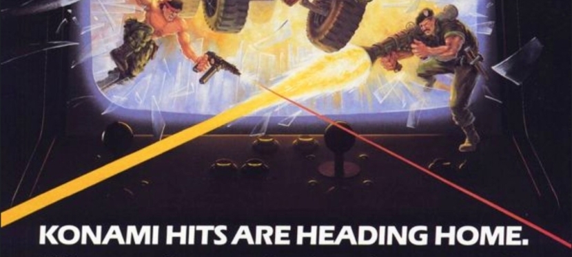
Konami, the Japanese company that has long been known for Metal Gear, Suikoden and the controversial sacking of famous game designer Hideo Kojima, was aggressive in the gaming business in the 1980s and arguably the aggressiveness was reflected in their publishing of several games that emphasized militarism during the late stages of the Cold War. In short, they made the military look cool and their activities fun to do in digital form.

While Konami has always been identified with console gaming, they actually released Rush’n Attack, Contra, Jackal and Boot Camp on IBM, Amiga and Commodore computers (as seen in the first print ad above) which were popular in the 1980s. The said ad also have a very amusing visual concept emphasizing the excitement and fun of military action games coming to gamers at home for their computers.

The 2nd print ad above – Jackal and Contra for the Nintendo Entertainment System (NES) – was very intriguing to see. It was very clear back in the 1980s that the NES always had a wholesome audience (note: a lot of buyers were parents who wanted to entertain their kids at home) and that includes a lot of very young players. To see the collective ad of Jackal and Contra (for the NES platform) having battle-hardened men in military gear holding guns was openly aggressive to perceive and instantly reminded people about the Cold War (and the menace of Communists, socialists, Marxists and terrorists) and the cultural impact of the mega blockbuster film Rambo: First Blood Part II. This is the kind of ad that would drive today’s woke-minded people crazy and even cause them to panic and pretend to be victims of militarism and patriotism. If you look at the ad closely, you will realize there is simply no room for the garbage of political correctness and wokeness.

Lastly, I myself had played Contra and Jackal with my friends on the Nintendo Family Computer (the Japanese counterpart of the NES) and both military games were a lot of fun to play from start to finish!

4. Batman Returns SNES game ad

This print ad appeared in some comic books I read in the early 1990s.

Way back in 1992, Batman Returns (the sequel to the mega blockbuster Batman movie of 1989) was released in cinemas with intense marketing and merchandising reflecting Warner Bros. intention to replicate the commercial success they had in 1989. Along the way, there were several video game adaptations of Batman Returns that were released on different platforms. Among those many video games was the Super Nintendo Entertainment System (SNES) game of Batman Returns which was developed and published by Konami in 1993 the form of a side-scrolling beat-them-up game.

The above ad was visually appealing with hand-drawn, comic book-style art dominating the spaces while leaving room for some screenshots and a written description of the game. Having seen this ad on multiple comic books I read back then, I can say that the ad was entertaining to see and was effective in making me interested in the game. I played Batman Returns on the SNES but never got to finish it. Oh yes, the game’s audio were really good and there were also digitized images from the movie for the in-game narrative.

5. Flashy Sonic the Hedgehog Japanese print ad

A dazzling approach by Sega on selling Sonic the Hedgehog.

1991 will always be remembered as the year of Sonic who eventually became not only Sega’s most defining mascot but also a video game industry icon. That same year, Sega released Sonic the Hedgehog on the Sega Genesis (referred to as Sega Megadrive in other parts of the world) console and it became a massive success with consumers and the game critics.

In the above Japanese print ad, a very captivating display of light and energy rays dominated the space leaving a minority share left for Sega’s console, screenshots and even a UFO Catcher arcade machine picture. While I could not understand the Japanese text, it seems to me that the flashy visual concept of the ad reflected Sega’s high ambitions with Sonic. How many gamers in Japan bought a copy of Sonic the Hedgehog because of this ad remains undetermined.

6. Japanese Super Star Wars print ad

A long time ago in a galaxy far, far away…

Before Nintendo released its 16-bit game console (referred to as Super Nintendo Entertainment System in America, and Super Famicom in Japan), there were lots of Star Wars video games released on varied platforms and the arcade.

With Nintendo’s 16-bit gaming platform realized, lots of game designers and business partners saw opportunities to make new games with gameplay concepts and designs using the technological advantages of the time. For LucasArts and its partners, taking Star Wars gaming into the next level was inevitable and they made it all come true in 1992’s Super Star Wars video game.

Published in Japan by JVC Musical Industries for the Super Famicom, Super Star Wars was a major leap forward in game design, visuals, sound and enjoyment. Apart from the 2D side-scrolling run-and-gun gameplay, gamers were deeply immersed into Star Wars’ universe with the Mode 7 landspeeder and X-Wing fighter sequences, as well as the first-person trench run sequence.

The Japanese print ad above cleverly presented screenshots from the game while using official imagery from the Star Wars movie poster of 1977 (look at how young Harrison Ford, Mark Hammill and the late Carrie Fisher were back then). The ad is a fine example of combining the greatness of the classic George Lucas-directed film with the highly enjoyable design of Super Star Wars. Lastly, these should remind you that there was a time when Star Wars was not yet tainted by wokeness and the garbage values of the Satanic Leftists (read: woke Disney).   

+++++

Thank you for reading. If you find this article engaging, please click the like button below, share this article to others and also please consider making a donation to support my publishing. If you are looking for a copywriter to create content for your special project or business, check out my services and my portfolio. Feel free to contact me with a private message. Also please feel free to visit my Facebook page Author Carlo Carrasco and follow me on Twitter at  @HavenorFantasy as well as on Tumblr at https://carlocarrasco.tumblr.com/ and on Instagram at https://www.instagram.com/authorcarlocarrasco
A Look Back at Turok: Dinosaur Hunter #3 (1993)

Welcome back superhero enthusiasts, 1990s culture enthusiasts and comic book collectors! Today we go back to the early 1990s and explore a part of the Valiant Comics shared universe through a tale of the Turok: Dinosaur Hunter series.

Previously, Turok went on exploring Colombia after leaving the village of his romantic interest Serita. The village was decimated by the intelligent dinosaurs (also referred to as bionisaurs) that served Mon-ark, a fierce enemy of Turok’s. Eventually Turok got involved with the Colombian drug lord Comacho who has gang of armed men and lots of resources. Ever the dedicated hunter, Turok makes a deal with the drug lord to pursue dinosaurs.

With those details laid down, here is a look back at Turok: Dinosaur Hunter #3, published in 1993 by Valiant Comics with a story written by David Michelinie and drawn by Bernard Chang.

The cover.

Early story

The story begins in Colombia in 1987. Turok tries to sell the severed head of a bionisaur to a local buyer (collector of hunt-related trophies) who offers him only three hundred Pesos.

After concluding a disappointing deal, Turok leaves the local joint only to encounter a lady driving a jeep…the scientist Maria Cortez. She tells him that the drug lord Comacho is planning a raid against the dinosaurs very soon and the gang wants Turok to come along. Cortez, who is obsessed with researching dinosaurs, tells him her single condition that one dinosaur should be spared for scientific study. After some thinking, Turok agrees to join…

Quality

The evil of Mon-ark emphasized.

Starting first with the plot, I can say that David Michelinie’s script is well-written and never lost focus on the inevitable encounter between Turok and his vicious dinosaur rival Mon-Ark. Right from the start, it is clear that the stakes have been raised higher which is the result of Turok’s successful killing of Mon-ark’s mate. Like in the previous issue, Mon-ark here was portrayed again to be very evil and even abusive to his fellow dinosaurs.

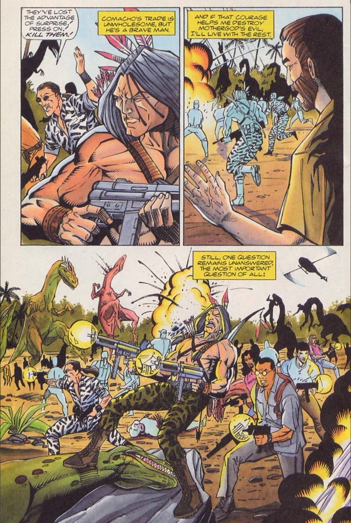
The raid mentioned early in the story is easily the action-packed highlight and it has some notable forms of symbolism. For one thing, the raid was organized by Comacho not because of concern towards Mon-ark nor Turok, but because he wants to stop the disruptions on his illegal drug business caused by the dinosaurs. Cortez meanwhile sees the dinosaurs as animals meant to be studied for the sake of science. And then there is a certain photographer who wants to record everything visually no matter what happens. I can say the raid scenes are entertaining to follow.

As this comic book was not drawn by Bart Sears, I can say that the visual quality and style went way down. I’m not saying that Bernard Chang is a terrible artist at all. It’s just that Chang’s art style does not live up to the gritty, exquisite and intense visuals of the first two issues which clearly defined how Turok stories should look. Along the way, there are several instances wherein Chang’s art style made some characters and facial expressions look somewhat cartoony. The dinosaurs themselves also looked cartoony at times and the heavy loss of visual details on them is very clear.

Conclusion

The armed raid against the dinosaurs with Turok as a willing participant looking like Rambo.

Similar to its predecessor, Turok: Dinosaur Hunter #3 (1993) has enough stuff worth following to be entertained even though the visual quality went down several notches. For one thing, the promised battle between Turok and Mon-ark happened and the way it was written was strong on its own. At the same time, the Indian hunter of dinosaurs got more involved Comacho’s gang which raises questions about his ability to differentiate right from wrong, and good from evil. At this stage of the series, Turok’s direction remains clouded.

Overall, Turok: Dinosaur Hunter #3 (1993) is recommended.

+++++

Thank you for reading. If you find this article engaging, please click the like button below, share this article to others and also please consider making a donation to support my publishing. If you are looking for a copywriter to create content for your special project or business, check out my services and my portfolio. Feel free to contact me with a private message. Also please feel free to visit my Facebook page Author Carlo Carrasco and follow me on Twitter at  @HavenorFantasy as well as on Tumblr at https://carlocarrasco.tumblr.com/ and on Instagram at https://www.instagram.com/authorcarlocarrasco

A Look Back at The Blob (1988)

Welcome back, movie buffs, science fiction fans and geeks! When it comes to making remakes or reimagined versions of established movies from previous decades, the 1980s was indeed a special time to watch them. In 1986, The Fly (directed by David Cronenberg) was released and it made a tremendous impact on moviegoers in ways that the original 1958 movie did not.

Remember when The Blob was first released in 1958? That classic film (read my retro review by clicking here) went on to have a forgettable sequel released in the 1970s but got remade big time with a new version in 1988 simply titled The Blob.

With those details laid down, here is a look back at The Blob, a sci-fi horror movie released in 1988 starring Shawnee Smith and Kevin Dillon, written by Chuck Russell, Frank Darabont, Kaye Linaker and Irving H. Millgate, and directed by Chuck Russell.

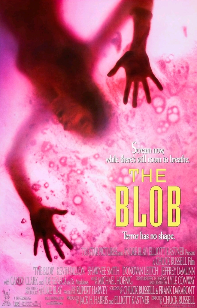
The movie poster.

Early story

The story begins in the town of Arborville where many locals attend an exciting football game. High school player Paul (Donovan Leitch, Jr.) asks cheerleader Meg (Shawnee Smith) to a date. Elsewhere, the troubled guy Briann Flagg (Kevin Dillon) fails with his attempted stunt as a result of his flawed motorcycle which was witnessed by an elderly vagabond. Flagg goes back to town and encounters the local sheriff (Jeffrey DeMunn) who warns him about trouble.

That evening at the outskirts of town, a meteorite crashes within the forest which the elderly vagabond pursues. With strong curiosity in his mind, the old man uses a stick on a sizable body of slime mold substance (the blob itself) that came out of the crashed meteor. Suddenly, the substance moves and sticks to the elderly vagabond’s hand causing him great pain.

A short time later in the forest, Brian Flagg got surprised by the sudden appearance of the vagabond who desperately tries cutting off his own hand. The blob, which Brian saw for the first time ever, attaches itself even more on the old man causing him to run away until he gets hit by a car (with Meg and Paul inside)…

Quality

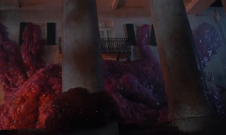
The blob in this movie looks more menacing as it has a tumor look and the special effect work remains excellent to look at. You should also see the blob move and what it sounds like.

This late-1980s remake of The Blob is not only more engaging and more entertaining than its 1958 predecessor…it is easily on of the best sci-fi horror movies of the 1980s thanks to a very talented creative team led by Chuck Russell.

To begin with, Russell and Darabont (this is the same great director behind The Shawshank Redemption), crafted a very solid screenplay that used key story elements from the 1958 classic while successfully updating everything else with 1980s America (or Ronald Reagan’s America) in mind. For this version, the three leading teenagers played by Shawnee Smith, Kevin Dillon and Donovan Leitch, Jr. were relatable and clearly worth following.

(From left to right) Shawnee Smith, Kevin Dillon and Candy Clark in an early encounter with the blob.

While the 1958 movie emphasized American teenagers being disadvantaged as local adults don’t take them seriously (even though the youth knew the problem and intend to solve it), this remake moved away from the generational gap as it strongly focused more on the crisis of a fast-growing blob that simply won’t stop killing people and destroying things. In other words, this is a crisis-focused monster story that is more violent, more horrific, more action-packed and more graphic than its predecessor.

I should also state that Russell and his team established a solid structure for storytelling and the narrative flowed on a medium-to-fast pace. As this movie has more spectacle in terms of action, monster moments and the like, the creative team carefully balanced the fun stuff with the dramatic and exposition scenes smoothly.

If you see people wearing protective suits arriving in your community and implementing a lockdown, you know a crisis is in effect.

The cast here is solid! Shawnee Smith’s Meg is the sweet, young good-natured high school girl who is willing to not only survive but also take part in solving the crisis situation not for herself but for her family and the entire Arborville community. Meg has some common elements with that of the character Sarah Connor from The Terminator and Terminator 2: Judgment Day. I also love the fact that there is NO WOKENESS and NO RABID FEMINIST VALUES in Meg. Kevin Dillon’s Brian – the troubled youth – is clearly the 2nd lead and he does a good job dramatizing how his character changes from a guy of uncertainty into an actual doer whose efforts proved to be valuable. There definitely is a non-romantic chemistry between Meg and Brian as the crisis situation really brought out solid transformations from them respectively.

The supporting cast is really good too. Candy Clark’s Fran is the relatable community diner owner/manager who contributed nicely to the plot as well as the early showdown of the blob. Jeffrey DeMunn’s sheriff is the local law enforcer who has to deal with the local situations while tackling the challenges of his leadership post. Paul McCrane here plays a local cop who is tough but not necessarily abusive, and this is the same guy who played a very vicious bad guy in 1987’s RoboCop! Joe Seneca is the government scientist who has charisma and deception carefully blended together which added to the plot. You will even see Erika Eleniak in a very small and yet notable appearance that happens to involve the blob. This film has a really interesting cast and I encourage you to research the names mentioned here.

This remake is loaded with action scenes, stunts and incredible visual effects!

On the technical side of things, I really like the cinematography done by Mark Irwin as the visuals captured looked really detailed and clear even during the dark or night-time scenes. The music by Michael Hoenig was pretty good too and his tunes ranged nicely from creepy to sentimental and energetic which reflected the scenes. As for the design of the blob, Lyle Conway deserves the credit for making it very monstrous. As for the physical environment of the movie, the state of Louisiana turned out to be a great location and the real-life Louisiana town Abbeville added strongly to the small town concept of the story.

As mentioned earlier, this version has a lot more spectacle to enjoy. For one thing, there is a good amount of hard action, gunfire and stunts which really added to the excitement (on top of the suspense and horror scenes already implemented). Rest assured, you will not get bored at all when watching this.

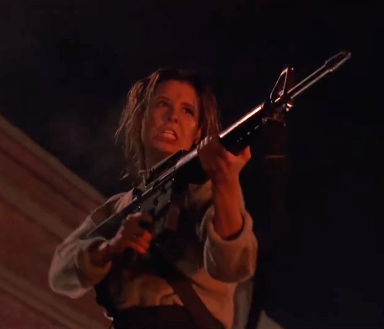
Shawnee Smith is the protagonist in this movie and her performance is very memorable.

The highlight of the spectacle is the very blob itself which looks so much like a tumor (instead of the jello form in the 1958 version) and the credit goes to the visual effects, sound effects and the animation team behind it all. Compared to its counterpart in the 1958 film, the blob here is very monstrous and horrifying to watch and the way it got animated is excellent. Apart from being unrelenting, this blob is deadlier and even intelligent. Not only does the blob devour the living which adds to its tremendous growth of size and mass, it also has the ability to extend tentacles which added more to the danger. Thanks to the sound effects, the blob is believably animalistic.

Through the blob’s on-screen presence, you can see the hard work implemented by the special effects crew when showing the monster entirely move and devour people, when showing its flexibility on adjusting its size (or its parts) when entering new places through tight spots, and most notably, how the blob alters the flesh of the victims it touches which resulted in very horrifying visuals. The special effects team really excelled with the use of practical effects (read: no computer-generated images) on presenting the titular monster. This is indeed a special effects extravaganza that a lot of people are missing out on.

Conclusion

The Blob (1988) looks and sounds better than ever in 4K Blu-ray format. I highly recommend this version as it is so much better than streaming.

There is no doubt in my mind that The Blob (1988) is a great sci-fi horror film that has a more menacing monster complete with sufficient action, great visual effects and a pretty solid cast! This is indeed a great example of a how a remake of an established film from the past should be done and this also includes raising the stakes within the story, modernizing past cinematic elements and ensuring high entertainment value. What director Russell, his team and the cast collectively achieved is indeed a creative success and this is the kind of film that Commie-filled Hollywood (Commiewood) today does not want to make.

As a companion piece to The Blob (1958), this remake has the good stuff that people who love horror, science fiction, action and monsters will enjoy.

Of all the many movies I have seen, The Blob (1988) stands out as one of the best remakes ever made as well as one of the best mixed-genre movies of its decade as well as of all time. That being said, today is a great time to watch this movie with better-than-ever visuals and sounds through its 4K Blu-ray release (pictured above) which is now available (you can order it online now). There is also a lot of features and extra stuff with the 4K Blu-ray. Make no mistake, The Blob (1988) is great to watch and its replay value is pretty high.

Overall, The Blob (1988) is highly recommended.

+++++

Thank you for reading. If you find this article engaging, please click the like button below, share this article to others and also please consider making a donation to support my publishing. If you are looking for a copywriter to create content for your special project or business, check out my services and my portfolio. Feel free to contact me with a private message. Also please feel free to visit my Facebook page Author Carlo Carrasco and follow me on Twitter at  @HavenorFantasy as well as on Tumblr at https://carlocarrasco.tumblr.com/ and on Instagram at https://www.instagram.com/authorcarlocarrasco

If you wish to join a group of movie enthusiasts and talk about cinema, visit the Movie Fans Worldwide Facebook group at https://www.facebook.com/groups/322857711779576