Disclaimer: This is my original work with details sourced from reading the comic book and doing personal research. Anyone who wants to use this article, in part or in whole, needs to secure first my permission and agree to cite me as the source and author. Let it be known that any unauthorized use of this article will constrain the author to pursue the remedies under R.A. No. 8293, the Revised Penal Code, and/or all applicable legal actions under the laws of the Philippines.
Welcome back superhero enthusiasts, 1990s arts and culture enthusiasts, movie fans and comic book collectors! Today we go back to the year 1990 to take a look at the official comic book adaptation of the movie Predator 2 (1990).
For the newcomers reading this, Predator 2 is the sequel to the 1987 movie directed by John McTiernan (Die Hard) and starring Arnold Schwarzenegger. As the movie became a huge commercial success, it started a chain of events that led to the rise of the Predator entertainment franchise covering merchandising, comic books and video games to name a few. Of course, the development of a cinematic sequel happened and both the movie studio and filmmakers took their time to make it. Predator 2 was directed by Stephen Hopkins and it starred Danny Glover, Gary Busey and Bill Paxton.
With those details laid down, here is a look back at Predator 2 #1, published in 1990 by Dark Horse Comics with a story written by Frank Henkel (based on the screenplay by Jim Thomas and John Thomas) and drawn by Dan Barry. Mark Verheiden (writer of 1989’s Predator #1) was acknowledged with special thanks. This comic book is the first of a 2-part comic book adaptation of the movie.
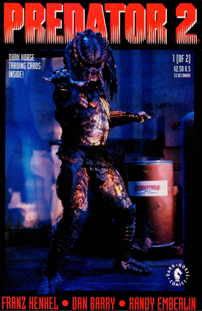
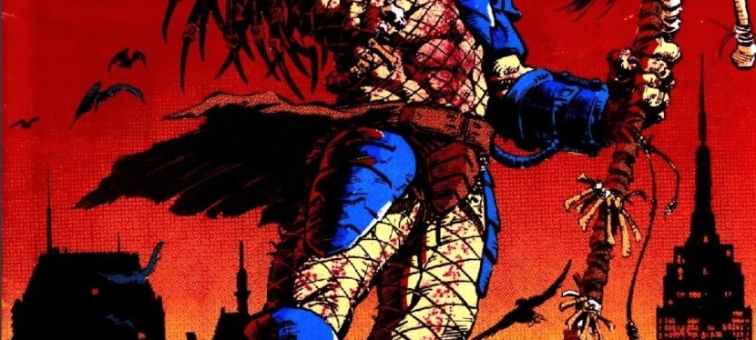
The cover.
Early story
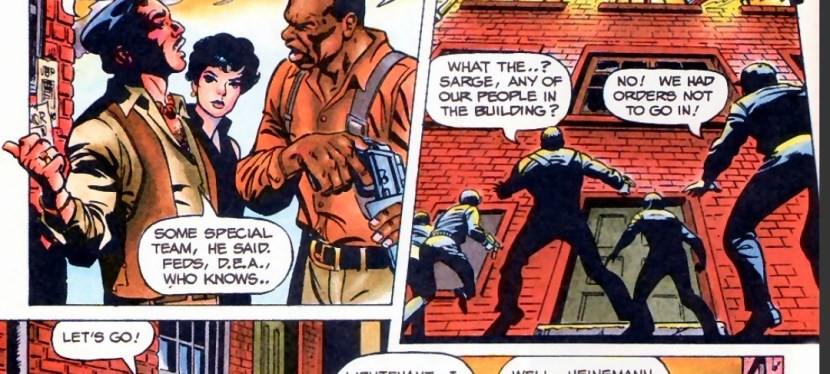
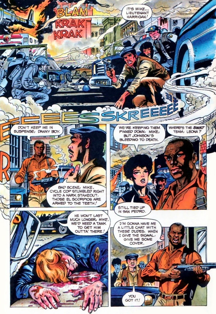
The story begins during a very hot day in 1997 Los Angeles. Police office Mike Harrigan rushes to the site of a major shootout between heavily armed gangs (Colombians and Jamaicans). The police managed to corner a gang to a building that was occupied by the foreigners. Knowing that a fellow cop is slowly bleeding to death and the SWAT (Special Weapons and Tactics) team are still stuck in traffic, Harrigan decides to take action against the armed gangsters with the support of his teammates and some police personnel.
After managing to get close to the gangsters by the building using his car, Harrigan manages to shoot them all and pave the way for his teammates to get closer. Harrigan does not realize that a camouflaged Predator is watching him from above.
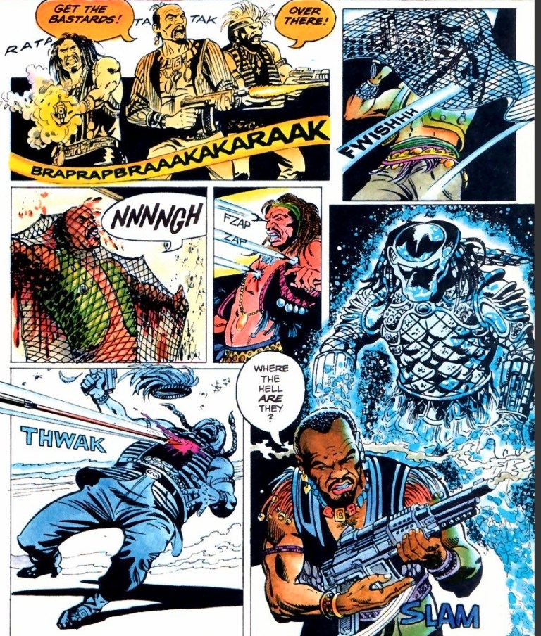
At one of the higher floors of the building, the rest of the foreign gangsters prepare themselves for the arrival of the cops by gathering guns and ammunition. Suddenly, the camouflaged Predator crashes in on them…
Quality
The Predator here is quite aggressive and even arrogant enough to suddenly fight the Jamaican gang alone.
I am surprised how entertaining this first chapter of the 2-part comic book adaptation of Predator 2 turned out to be. While the accuracy is understandably less than 100% with regards to translation from cinema to literature, this comic book’s narrative is quite faithful to the events of the movie (from the start until the King Willie scene) and the film’s vibe was strongly captured. In fact much of the dialogue spoken in the film were mostly recaptured here, and the same can be said about the way the characters were portrayed.
For brevity and the maximizing of the pages made available, creative liberties or shortcuts were taken by the creators. This means that the presentation of details was carefully done to keep readers properly informed while managing to keep the fun factor and level of intrigue strong. Indeed, writer Frank Henkel did a very good job keeping things together to make the reading experience fun and engaging.
If there is anything that this comic book exceeds the movie on, it is the graphic violence. Artist Dan Barry really ramped up the bloody scenes and gore (examples: Mike Harrigan’s killing of two foreign gangsters with a shotgun, and the scene when Harrigan and his team were stunned by the sight of the many ruined dead bodies of gangsters who were just eliminated by the Predator before they arrived) as he used his own style to make the action scenes as intense as the ones filmed by Stephen Hopkins and crew. It was obvious he saw the movie.
Barry also had his own style on visualizing the characters without the authority to use the likeness of any actor from the film. Mike Harrigan looks nothing like Danny Glover while Peter Keyes does not resemble Gary Busey. Barry’s visual take on the Predator itself has a really distinctive look when compared to how other artists drew Predators.
Barry did not aim to achieve photo realism at all with the characters (who appear with a slightly cartoonish aesthetic), the locations and action scenes but I don’t find anything problematic with his work here. In fact, I enjoyed his way of translating the movie’s visual presentation into literary format.
Conclusion
Mike Harrigan, Danny and Leona make their moves.
Predator 2 #1 (1990) is a very enjoyable read. It strongly captured the vibe of the movie complete with the dialogue and the way the characters were presented. Very clearly, the Henkel-Barry duo did really fine work in this comic book adaptation and I am convinced to move on to issue #2.
Overall, Predator #2 (1990) is highly recommended!
Disclaimer: This is my original work with details sourced from reading the comic book and doing personal research. Anyone who wants to use this article, in part or in whole, needs to secure first my permission and agree to cite me as the source and author. Let it be known that any unauthorized use of this article will constrain the author to pursue the remedies under R.A. No. 8293, the Revised Penal Code, and/or all applicable legal actions under the laws of the Philippines.
Welcome back science fiction enthusiasts, 1980s arts and culture enthusiasts, movie fans and comic book collectors! Today we go back to the year 1989 to take a look at a significant event of the Predator entertainment franchise – the comic book launch of Predator.
For the newcomers reading this, Predator started as a sci-fi action movie in 1987 directed by John McTiernan (Die Hard) and starring Arnold Schwarzenegger, Carl Weathers, and Jesse Ventura to name some. The writers and creators were Jim Thomas and John Thomas. As the movie became a huge commercial success, it led to the start of its own multi-media entertainment franchise covering video games, toys, novels and comic books. It also led to the release of more movies including a crossover film with the Alien franchise.
With those details laid down, here is a look back at Predator #1, published in 1989 by Dark Horse Comics with a story written by Mark Verheiden and drawn by Chris Warner. The is the first chapter of a 4-issue mini-series and it would later be referred to as Predator: Concrete Jungle.
The cover.
Early story
The story begins during a very hot summer day in 1991 New York City. A man killed his own wife using a shotgun which eventually leads to the arrival of cops, medics and his arrest. The two detectives Errol Rasche and John Schaefer (brother of Dutch) have been working together in the local war against crime and they have a tendency to do things that violate their superiors’ orders.
In one of the rundown buildings of New York, a secret meeting between two gangs got terribly disrupted by a Predator who attacked from the outside. Chaos and destruction followed.
Shortly after, Rasche and Schaefer arrive outside the same building which has been surrounded and isolated by the local police. When a man suddenly fell out of the building and crashed on top of a police car, the two detectives decide to enter willfully violating the order to stay out.
Once they enter the room where the secret gang meeting was held, Rasche and Schaefer are shocked to see many skinned and dead bodies inside. Schaefer is convinced that what happened was not the result of a gang war…
Quality
A gang meeting about to be disrupted by the unseen Predator.
This comic book – written as a not-too-obvious sequel to the 1987 movie – is absolutely very intriguing to read from start to finish. Mark Verheiden clearly wrote a crime story that happens to involve the species of deadly hunters from outer space. In fact, this comic book has very notable elements that also made it into the core concept of the 1990 movie Predator 2.
Story is set within a massive city that happens to be suffering from a heat wave – check! There is rampant crime and conflicts between gangs – check! The Predator causes huge disruptions on the criminals – check! The detectives willingly violate protocol to solve cases – check! One of the detectives is gradually getting closer to retiring and his pension – check. It’s almost as if this comic book was a huge influence on the people who made Predator 2.
Going back to the story, this is a strong tale of crime and urban war told through the exploits of detectives Schaefer and Rasche who have worked many years together, they treat each other like brothers (similar to Predator 2’s Mike Harrigan and Danny Archuleta).
With their record of disobeying orders, Schaefer and Rasche simply involve themselves in cases believing they have the right know the details on the spot and to solve problems their way even though their superiors don’t need them. This is the anti-authoritarian portrayal of law enforcers that easily reminded me of certain TV shows and movies of the 1980s.
All throughout, the story by Verheiden is nicely structured, has lots of engaging details to follow and carefully blends sci-fi elements with detective storytelling. Verheiden clearly knows how to build up tension, keep the narrative progressing and use action or spectacle with precise timing.
When it comes to the visuals, Chris Warner’s style is very good. His approach on drawing the characters made them look exquisite and visceral at the same time. In fact, there were some shots of people in this comic book which reminded me of Todd McFarlane’s way of drawing people during his early works in comics. Lastly, I should say that Warner’s approach on hard action and his way of drawing of the Predator must be seen.
Conclusion
Rasche and Schaefer defy orders. Schaefer (holding the gun) is the brother of Arnold Schwarzenegger’s character in the Predator movie of 1987.
I really enjoyed reading Predator #1 (1989). This is indeed really fine work by the Verheiden-Warner team and as far as building up the lore of the Predator goes, they clearly succeeded and their contributions here strongly influenced the creation of Predator 2 which opened in cinemas in late 1990. This comic book has the visceral touch and violence that make it comparable with both the 1987 and 1990 movies.
Overall, Predator #1 (1989) is highly recommended!
Welcome back readers, fellow geeks and electronic gaming fans!
In this edition of the Retro Gaming Ads Blast (RGAB) series, we will take a look at another batch of retro gaming print ads – including arcade flyers – from the 1980s and 1990s.
For the newcomers reading this, Retro Gaming Ads Blast (RGAB) looks back at the many print ads of games (console, arcade, computer and handheld) that were published in comic books, magazines, flyers, posters and newspapers long before smartphones, social media, the worldwide web and streaming became popular. To put things in perspective, people back in the 1980s and 1990s were more trusting of print media for information and images about electronic games and related products.
With those details laid down, here is the newest batch of retro gaming print ads for you to see and enjoy…
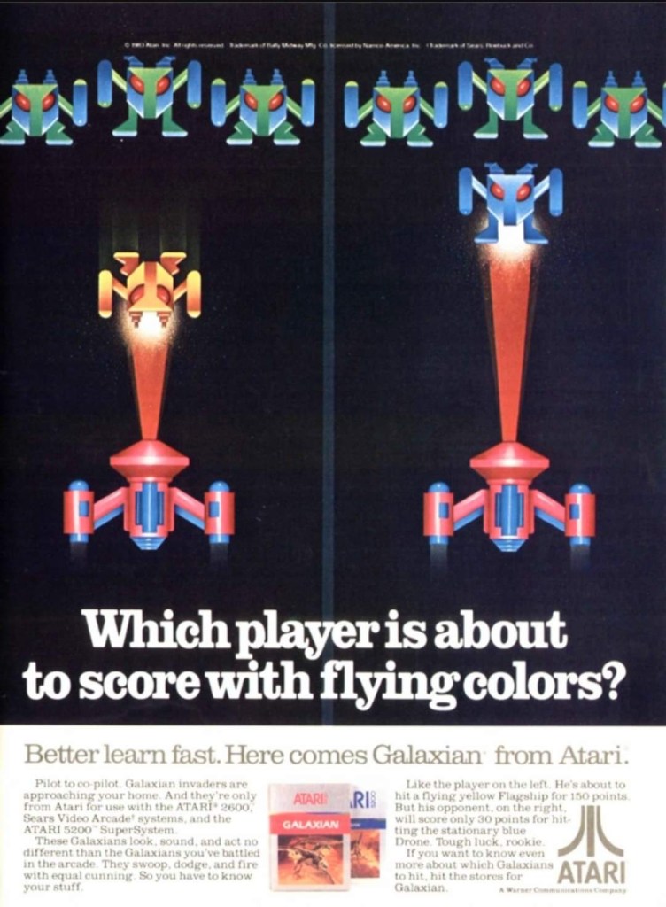
1. Galaxian for Atari print ad
A unique approach to the art done by the advertisers.
Developed by Namco, Galaxian was a 2D sci-fi shooter that debuted in arcades in 1979. It was so successful and widely acclaimed, it got ported to varied game consoles and home computers as the years passed by. For its release on the Atari 2600 and Atari 5200, this print ad was created to catch the attention of fans and gamers by utilizing artwork that resembled the look of 2D sprites from the game. That being said, no screenshots of Galaxian on the Atari consoles were shown because the artwork used looked detailed and were attention-grabbing already.
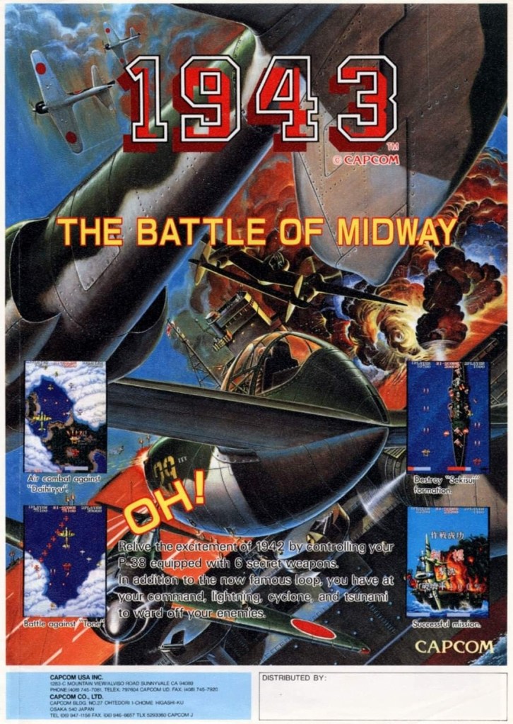
2. 1943: The Battle of Midway arcade flyer
This is a fine looking flyer.
In 1987, Capcom released in the arcades 1943: The Battle of Midway which was their follow-up to 1942. The arcade flyer itself was designed to strongly promote the game using a combination of screenshots, short-but-clear text descriptions and the great looking piece of artwork which really emphasized the World War II concept. Behind it all, this game was made by Japanese developers with the Western markets in mind and the irony is that the game has players control Americans fighting the Japanese fleet.
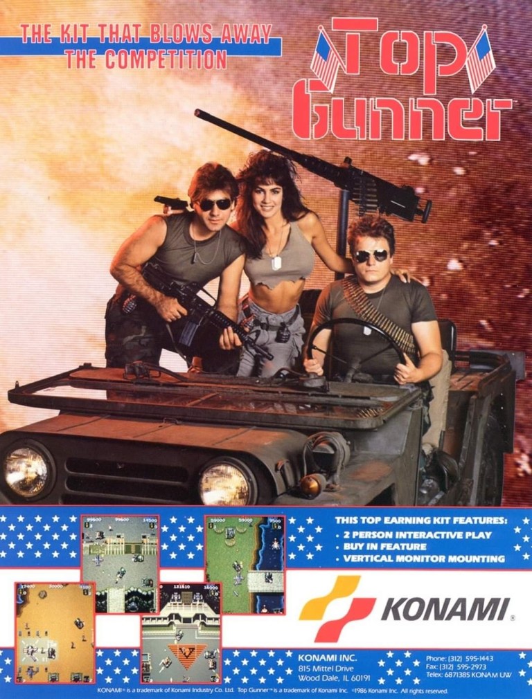
3. Top Gunner arcade conversion kit flyer
Show this nice looking image to the woke nut or modern day Communist near you. Watch and observe his or her reaction.
To make things clear, Top Gunner is actually the run-and-gun game Jackal and the alternative titles was mainly used in North American arcade distribution and also reflected Konami’s move of coming up with titles inspired by blockbuster movies of the time. To promote its 1986 arcade release in America as a conversion kit, the advertisers had three models playing soldiers on a military jeep to immerse gamers into the core concept of the game – moving armed military jeeps from one location to another while fighting bad guys. The approach used for the visual concept is indeed inspiring, especially during the Cold War. Top Gunner/Jackal became a hit in both arcades and consoles.
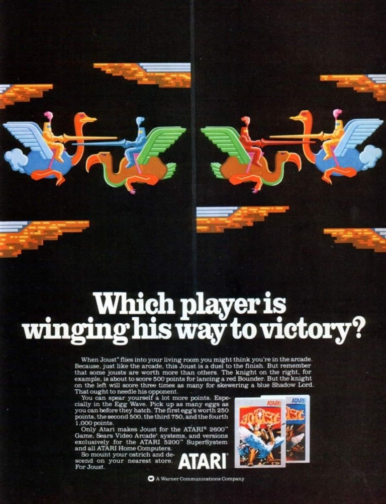
4. Joust for Atari print ad
While I played Joust on console, I don’t remember seeing this print ad before.
Made by Williams Electronics, Joust was one of those early 1980s arcade games that eventually made its way to the Atari 2600 console which was massively popular in North America. Strangely enough, the artistic approach Atari’s advertising came up with for the console version of Joust was similar with that of the ad of the Atari version of Galaxian (see item #1 above) in which artwork was used to resemble the 2D sprites of the game. Regardless, the images of this ad showed what a joust looked like – a martial game between two armed combatants going against each other while riding an animal.
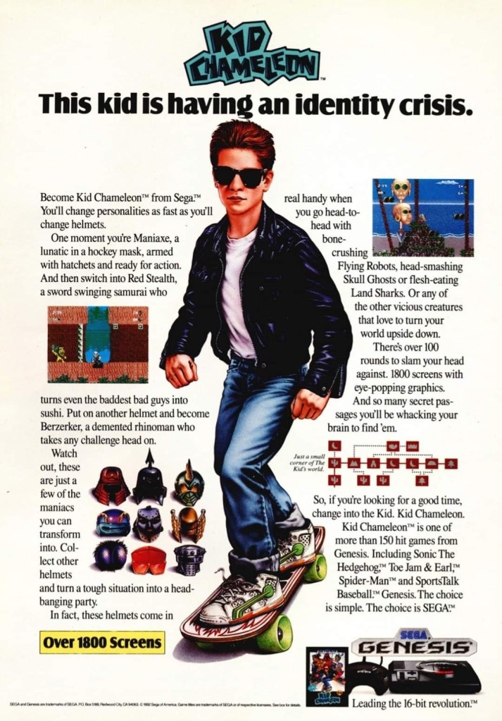
5. Kid Chameleon print ad
Can you relate with Kid Chameleon’s identity crisis?
During the early years of the Sega Genesis, Sega of America exerted efforts to make new games that were not only exclusive to their console but also stand out among the many 2D side-scrolling adventure games by coming up with a protagonist with a unique personality that could somehow resonate with young kids and teenagers.
Developed by their internal experts (Sega Technical Institute), the company released Kid Chameleon in 1992 and they came up with the above print ad that had detailed hand-drawn art of the lead character as well as a wordy text description which was a clear attempt to help young gamers (including teenagers) get connected with both the game and the protagonist. The advertisers even had space to spare to accommodate two screenshots of the game.
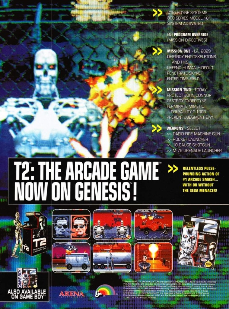
6. Terminator 2: Judgment Day (AKA T2: The Arcade Game) for Sega Genesis print ad
This print ad appeared on the many comic books I read long ago.
Back in the early 1990s, Terminator 2: Judgment Day was a massive success in the global box office and this resulted in Arnold Schwarzenegger’s popularity to soar very high while also establishing the Terminator as an essential pop culture figure. Apart from comic books and merchandise, video games based on the movie were made and the one that stood out the most was the arcade shooter game initially titled Terminator 2: Judgment Day (later retitled as T2: The Arcade Game).
The arcade mega hit eventually got ported to the Sega Genesis and this print ad really looked flashy with its visual presentation showing screenshots and a zoomed-in look at how the Terminator T-800 looked like in the Genesis version complete with a few explosions in the background. It should be noted that this flashy print ad cleverly concealed the visual downgrades and the redrawn images as the Genesis itself could never come close to matching the high quality visuals of the arcade version.
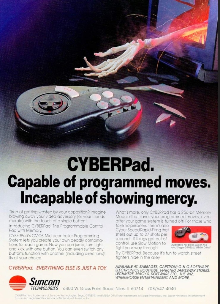
7. CYBERPad print ad
I never owned the CYBERPad, nor have I ever used one.
During the so-called 16-bit console generation (actually the 4th console generation), there were lots of licensed console peripherals made by independent companies in support of the Sega Genesis and Super Nintendo Entertainment System (SNES). The company Suncom Technologies came up with the CYBERPad controller for the two consoles and they boasted in their print ad that the product had a programmable control pad that allowed users to create combinations for each game with convenience in mind. The CYBERPad also allowed the saving of the programmable moves and it had a rapid-fire feature and even a slow-motion function. The CYBERPad was made to make the gameplay experience more user-friendly.
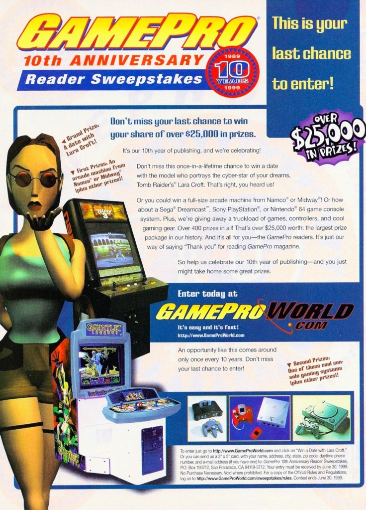
If you look closely, this print announcement by GamePro technically advertised the game consoles, the arcade game and Lara Croft to its readers.
In 1999, GamePro magazine celebrated its 10th anniversary and to keep on resonating with gamers and maintaining the loyalty of their fans, they organized a reader sweepstakes with prizes worth over $25,000 to be won by the few winners. GamePro boasted a date with an unnamed model who played the iconic Lara Croft (Tomb Raider). Certain arcade machines plus the modern consoles of the time – including the brand-new Sega Dreamcast – were also at stake. The way it was presented, this GamePro print announcement was enticing to read.
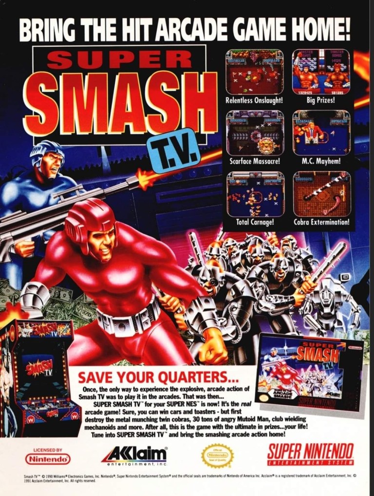
9. Smash T.V. for SNES print ad
Smash T.V. was a lot of fun on both arcade and console.
The arcade hit Smash T.V. made its way to the Super Nintendo Entertainment System (SNES) in 1992 and the publisher came up with a print ad that had captivating artwork, six screenshots and a text description that emphasized that a lot of fun awaits gamers on the console version. In my view, this old ad is still amusing to look at.
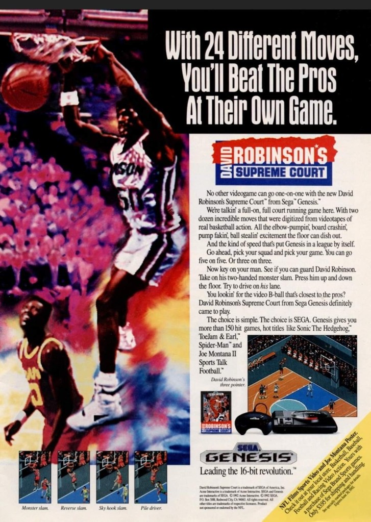
10. David Robinson’s Supreme Court print ad
It was a smart move by Sega to get NBA superstar David Robinson as the endorser of this basketball video game exclusive on the Sega Genesis. This ad was published many years before Robinson finally won an NBA championship.
As part of its strategy in competing with Nintendo during the 4th console generation, Sega of America was focused on producing exclusive sports video games for the Genesis console backed by endorsements of sports professionals. In 1992, they released David Robinson’s Supreme Court on the Genesis and unsurprisingly their print ad used a large, stylized image of the NBA superstar dunking backed with an exciting text description plus screenshots showing the game’s use of the isometric view for gameplay. This is still worth looking at.
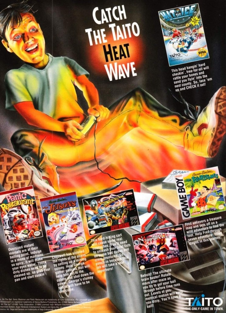
11. Taito’s “heat wave” print ad
An amusing and creative way to sell video games.
If your company lacks money to effectively market your video games individually, you can try making a single ad promoting them together. This is what Taito did in this print ad which showcases multiple games for different platforms and they used artwork of a player experiencing the so-called heat wave. This is a nice stroke of creativity on the part of Taito.
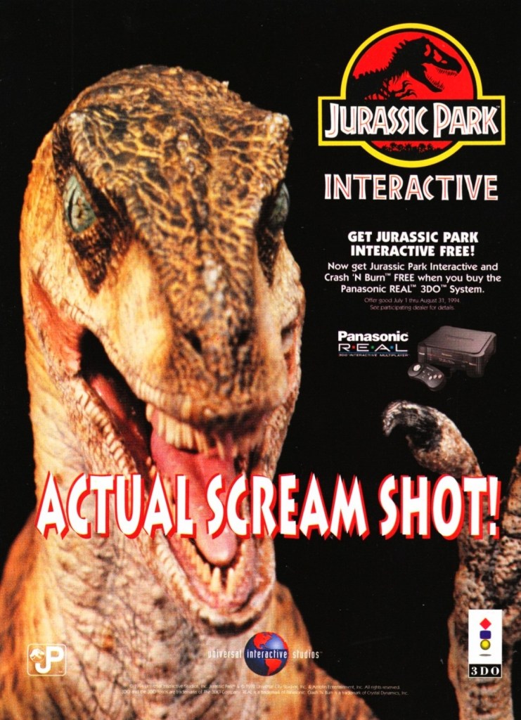
12. Jurassic Park Interactive print ad
This was a creepy print ad promoting the 3DO-exclusive Jurassic Park Interactive.
When it comes to video game consoles, having exclusive games is essential as long as they are of high quality, highly playable and enjoyable. The 3DO company acquired a license of the Jurassic Park movie and made the exclusive game Jurassic Park Interactive hoping it would sell a lot and lift up 3DO hardware sales.
This print ad, which features a zoomed-in image of the Raptor from the game, was more focused on selling the 3DO console than the video game as seen on the descriptive text. 3DO ran a promo selling the console which would entitle the buyer to get Jurassic Park Interactive and another game free. Nothing was done to describe the console’s multimedia capabilities of showing videos, images and graphics of the game (which was essentially a collection of mini-games). This print ad shows ignorance on the part of the 3DO company and the ad maker as it showed desperation happening really early in the console’s life. Notably, Jurassic Park Interactive was the only video game adaptation to use actual footage (note: the faces of the actors were edited out) and music from the film.
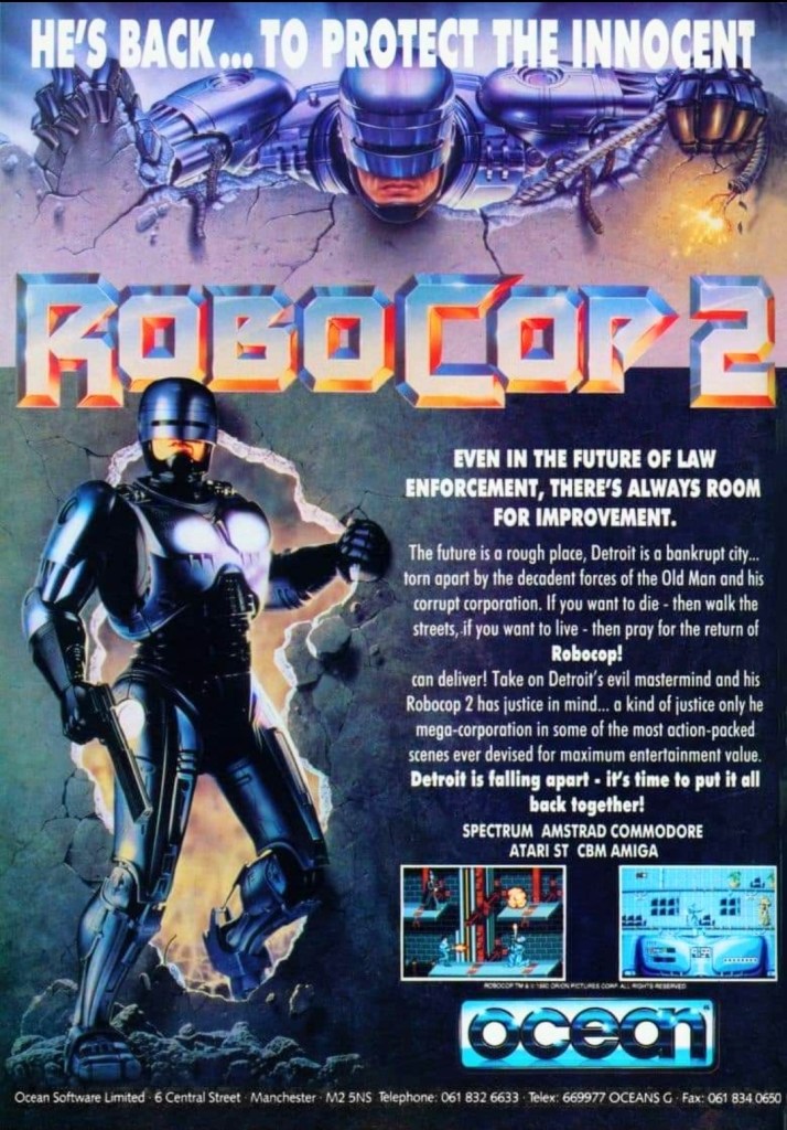
13. RoboCop 2 print ad
You want to become RoboCop to save the city of Detroit from criminals?
Way back in 1990, RoboCop 2 was a big hit in cinemas here in the Philippines and in some places around the world. As typical of the time, licenses to make video games based on the movie were released resulting in RoboCop 2 games for multiple platforms. The print ad featured two different images of RoboCop – one from the movie poster and the other from an official artwork. The descriptive text does a fine job to immerse readers into the story concept of the game but showing only two screenshots was a lackluster effort to sell the game.
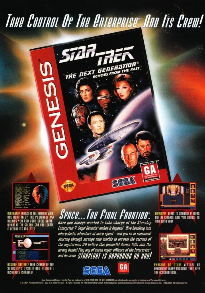
14. Star Trek: The Next Generation – Echoes from the Past print ad
Space…the final frontier waiting for Sega Genesis gamers.
Released in 1994, Star Trek: The Next Generation – Echoes from the Past delivered the Star Trek TNG adventure experience to Sega Genesis gamers. In fact, it is the exact same experience that SNES gamers got the same year. In reality, Star Trek: The Next Generation – Echoes from the Past is actually a port of Star Trek: The Next Generation – Future’s Past on the SNES and the screenshots on the print ad are giveaways about it. In fairness to the ad makers, this print ad never attempted to deceive gamers that it promoted a totally different Star Trek TNG game.
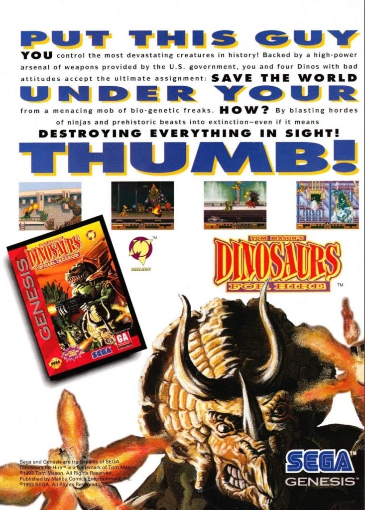
15. Dinosaurs for Hire print ad
This print ad caught my attention and made me interested in the game and the comic book series. Even though it was small, Malibu Comics’ logo was still recognizable.
Dinosaurs for Hire (sometimes referred to as Tom Mason’s Dinosaurs for Hire) was a 2D side-scrolling platform adventure game based on the comic book series of Tom Mason. Published by Sega, it was a Genesis-exclusive game and this print ad had a catchy text description, a few screenshots and the eye-catching artwork of a triceratops facing the viewer. This print ad is still good to look at. If you’re thinking about searching for existing copies of the game, I encourage you to also read some Dinosaurs for Hire comic books before playing. By the way, Tom Mason also wrote several comic books of the Ultraverse.
Disclaimer: This is my original work with details sourced from reading the comic book and doing personal research. Anyone who wants to use this article, in part or in whole, needs to secure first my permission and agree to cite me as the source and author. Let it be known that any unauthorized use of this article will constrain the author to pursue the remedies under R.A. No. 8293, the Revised Penal Code, and/or all applicable legal actions under the laws of the Philippines.
Welcome back superhero enthusiasts, 1990s arts and culture enthusiasts, Image Comics fans and comic book collectors! Today we go back to the year 1994 to take a close look at one of the many tales of the original WildStorm universe through one of the comic books of the first mini-series of Team 7.
For the newcomers reading this, Team 7 is set in the past within the original WildStorm universe. This is the one special forces team that had major WildStorm heroes – Grifter (WildCATS: Covert Action Teams), Backlash, Jackson Dane (Wetworks), John Lynch (Gen13) and Deathblow – who were younger, were proficient with combat and were destined to gain special abilities that later defined them.
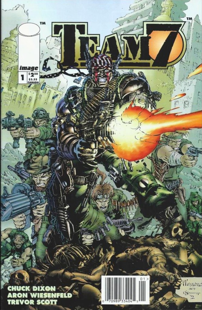
With those details laid down, here is a look back at Team 7 #1, published in 1994 by Image Comics with a story written by Chuck Dixon and drawn by Aron Wiesenfeld. This is the first chapter of a 4-issue mini-series. Also this year marks the 30th anniversary of this very comic book.
The cover.
Early story
Set in the 1970s, the story begins when the United States Special Forces Team 7 arrives in Iran with the objective of rescuing hostages. Led by John Lynch, the team encounters several Iranian terrorists along the way and eliminates them as they proceed with their mission. A lot of killings and a few explosions happened as they made their way into the facility.
Eventually, Team 7 discovers that the hostages are gone as they only found stuffed dummies made to look like hostages. As they are so deep within the facility, going outside to survive an incoming powerful bombing was out of the question. They decide to go deeper knowing that the facility has a hardened sub-basement that was designed to absorb a shockwave…
Quality
See if you could recognize the WildStorm heroes among them.
I can say out loud that this WildStorm prequel tale by the Dixon-Wiesenfield is a very inspired work of fiction that captures (intentionally or not) the vibe of R-rated Hollywood action and war movies of the 1980s. In my view, the tone and style of this comic book reminds me a lot about Predator (1987), Rambo: First Blood Part II (1985) and Full Metal Jacket (1987). Of course, this is a tale about a band of brothers who risk their lives working overseas for their country taking orders from their superiors at International Operations (IO).
As a WildStorm tale, this one efficiently puts up the building blocks needed to define the key characters who would later become major WildStorm figures in what was back then the present day stories (set in the 1990s) told through WildCATS: Covert Action Teams, Kindred, Gen13, Backlash, StormWatch and more. At the same time, readers will get a close look at the developments behind closed doors at IO which itself appeared in WildStorm comic books with a much older Lynch as director. Of course, as this is the first issue the build-up would obviously continue in the succeeding issues of the mini-series.
The team led by John Lynch fought the Iranian terrorists as they make their way through.
War imagery here is intense.
The story itself has themes of espionage, political intrigue, Islamic terrorism and military conflict. It was made clear here that IO has a wicked director called Craven and the young John Lynch (the protagonist and future IO director) could do nothing but receive intelligence (no matter how limited) and execute orders that put him and his teammates in grave danger.
Along the way, you will see younger versions of WildStorm heroes Grifter (Cole Cash), Jackson Dane, Backlash (Marc Slayton), Deathblow (Michael Cray) as well as a few minor characters whose legacies will be felt in the present day stories (example: Gen13’s Grunge is the son of member Philip Chang). Oh yes, the banter and interactions between Team 7 members were very much inspired by what was portrayed in Predator (1987) and Full Metal Jacket (1987). While Lynch is the protagonist struggling with following orders and leading the team, the young Deathblow here clearly their most natural and aggressive eliminator.
When it comes to the visuals, Aron Wiesenfeld came up with a consistently dark and gritty look backed with uncompromising violence that strongly emphasizes the horror of war. He also has this exquisite approach on displaying the characters and the action portrayed was more of shooting, explosions and hard action. This comic book was released years before Steven Spielberg’s Saving Private Ryan (1998) hit the cinemas and caused some controversy with its display of graphical violence. In short, this is a comic book visualized with adults in mind.
Conclusion
The cover of the variant edition of Team 7 #1 drawn by Whilce Portacio.
Team 7 #1 (1994) is a very compelling read and it still remains one of the most unique comic books of the original WildStorm universe ever published. It is also one of the most defining war comic books published in the 1990s.
Considering the great work done by the Dixon-Wiesenfield duo, your enjoyment and understanding of this comic book depends a lot on how much you have oriented yourself with the mentioned WildStorm heroes who appeared in the comic books of WildCATS: Covert Action Teams, StormWatch, Wetworks and the like. I enjoyed this comic book a lot because I familiarized myself with Grifter, Backlash, Deathblow, Lynch and Dane before reading it. That being said, I urge you newcomers to get to know the said characters first before reading this comic book.
Disclaimer: This is my original work with details sourced from reading the comic book and doing personal research. Anyone who wants to use this article, in part or in whole, needs to secure first my permission and agree to cite me as the source and author. Let it be known that any unauthorized use of this article will constrain the author to pursue the remedies under R.A. No. 8293, the Revised Penal Code, and/or all applicable legal actions under the laws of the Philippines.
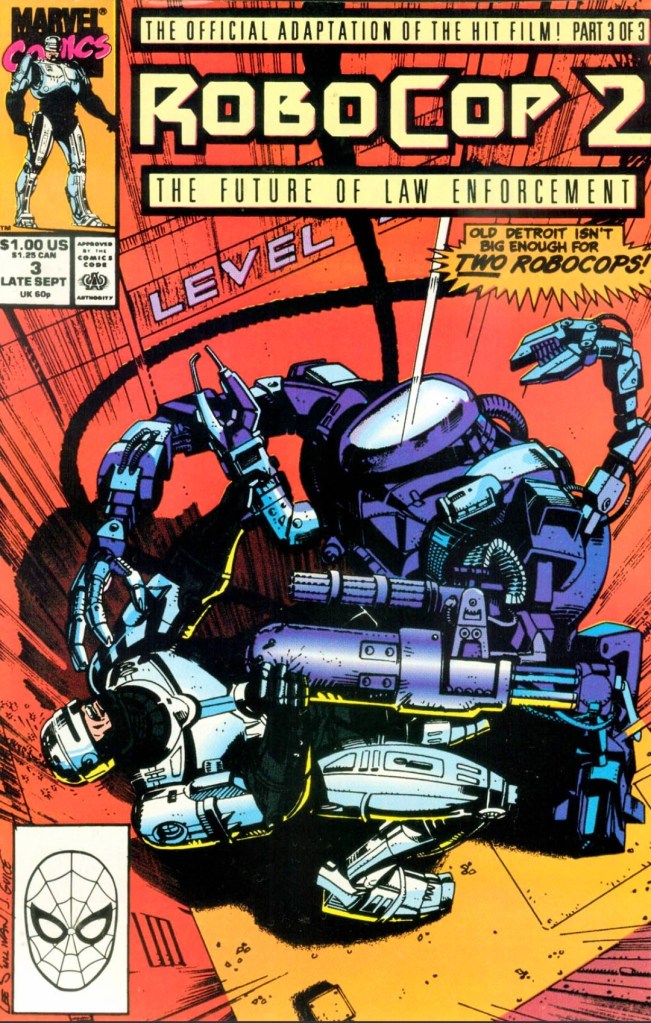
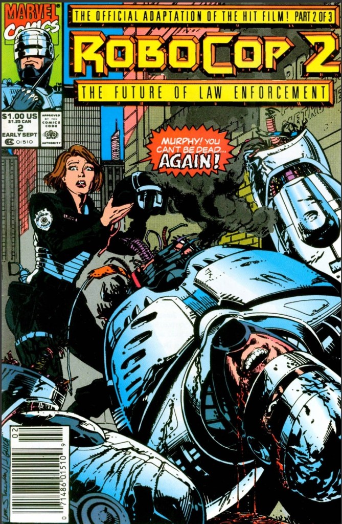
Welcome back superhero enthusiasts, 1990s arts and culture enthusiasts, Marvel Comics fans and comic book collectors! Today we go back to the year 1990 to take a close look at the concluding chapter of the comic book adaptation of the movie RoboCop 2 (1990).
In my previous retro review, I found the 2nd issue of the 3-part comic book adaptation mini-series that it lacked the impact of issue #1. It was understood that the comic book team was limited by the source material they had and the movie’s comedic scenes showing RoboCop not being his normal self were adapted. Those scenes did not translate into humorous comic book moments. At the very least, the build-up achieved by the comic book creators in issue #2 (which includes several internal developments at Omni Consumer Products) sets the stage for the final issue.
With those details laid down, here is a look back at RoboCop 2 #3, published in 1990 by Marvel with a story written by Alan Grant and drawn by Mark Bagley based on the movie screenplay by Frank Miller and Walon Green.
The cover.
Early story
The story begins in Detroit where OCP executives press RoboCop (Officer Murphy) for answers about the spying he recently did on his ex-wife. It turns out that his wife was so traumatized over his death, there were therapists, hypnotists and other treatments involved to help her recover. As a result of the spying, his ex-wife now believes her husband is still alive. In response to questions, RoboCop gave answers that the OCP guys wanted – he is no longer a husband, no longer human, no longer Alex Murphy and he is simply a machine. The private meeting between him and his ex-wife did not go well.
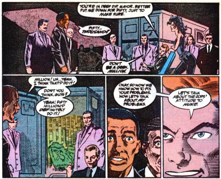
Meanwhile, the City Government of Detroit organizes a telethon in an attempt to raise funds needed to pay off the $37,985,300 they owe OCP. The mayor receives a very important call from former associates of Cain (RoboCop 2).
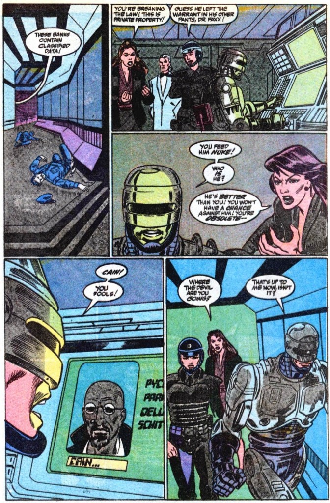
Shortly after, OCP realizes that the City Government could pay soon and if they fail to foreclose Detroit, their stock will plummet. With the approval from the corporation’s chief, Dr. Juliette Faxx proceeds to launch RoboCop 2 with the mind of Cain inside it…
Quality
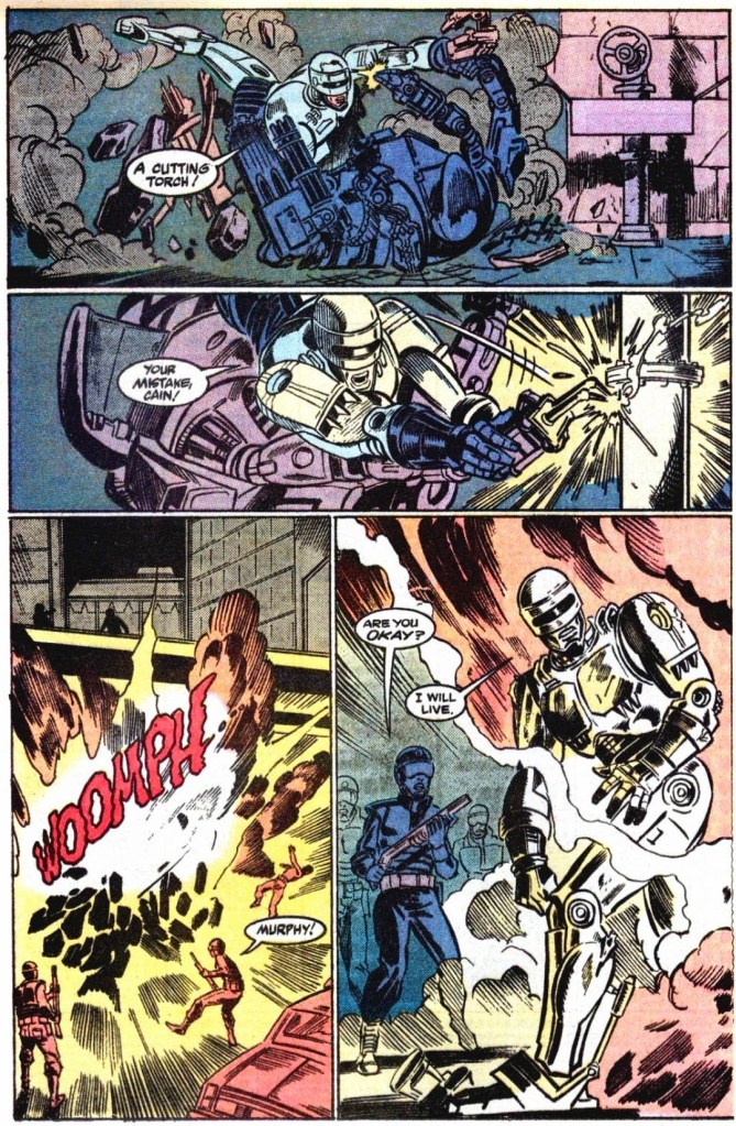
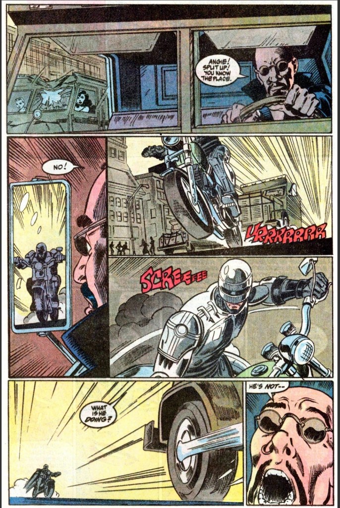
The battle between RoboCop and his bigger rival (Cain) is action-packed and fun to read.
As it is clear that the imagery and plot developments of the movie screenplay were adapted by the comic book creators with their very own distinctive ways throughout the mini-series, this comic book succeeded in concluding its 3-part story. In fact, this is a huge pay-off to most of the build-up that took place in issues #1 and #2. The much-awaited big battle between RoboCop and the Cain-controlled RoboCop 2 lasted eight pages and it was indeed action-packed and satisfying. Before the said battle took place, RoboCop 2’s debut is short, stylishly obscured visually and yet vicious to see.
Considering the huge amount of details the movie screenplay had, the Grant-Bagley duo managed to adapt the most relevant content efficiently while also telling a literary tale that is cohesive enough.
This scene did not appear in the movie.
What I found very notable is the fact that this comic book opened with RoboCop getting berated by OCP executives for his spying on his ex-wife. The said scene actually happened very early in the movie itself and to have it as an opener of this comic book added depth to RoboCop’s character development in this adaptation.
When it comes to weaknesses, there were times when Mark Bagley’s drawing of RoboCop 2 were off. RoboCop 2 was visually huge and intimidating in the movie but in this comic book, the size and scale were clearly lacking particularly in the shot where he is standing near OCP’s chief. The lack of visual details on RoboCop 2’s body showed signs of rush by the artist.
Conclusion
Is your local government leader making secret deals with criminals in real life?
RoboCop 2 #3 (1990) is a nice pay-off to the build-up that preceded it and, more importantly, it was a satisfying mini-series conclusion. As a standalone comic book, it has a good amount of plot details, dialogue and action scenes that can delight RoboCop fans. As the conclusion of the 3-part adaptation of the 1990 movie, it has a stronger focus on RoboCop and the plot moved at a better pace than in issue #2. The storytelling is good and the spectacle was much improved.
Disclaimer: This is my original work with details sourced from reading the comic book and doing personal research. Anyone who wants to use this article, in part or in whole, needs to secure first my permission and agree to cite me as the source and author. Let it be known that any unauthorized use of this article will constrain the author to pursue the remedies under R.A. No. 8293, the Revised Penal Code, and/or all applicable legal actions under the laws of the Philippines.
Welcome back comic book readers, 1990s arts and culture enthusiasts, movie fans and comic book collectors! Today we go back to the year 1992 to take a close look at the official comic book adaptation of the action movie Universal Soldier.
Universal Soldier stood out among Hollywood action films in 1992 as it had Jean-Claude Van Damme and Dolph Lundgren as the main stars and both of them were established action movie stars each with huge followings of fans. As it grossed almost $100 million worldwide on a budget of less than $25 million, the movie was successful and eventually sparked its of franchise of movies, TV shows, video games and comic books. NOW Comics was in-charge of making and publishing the comic book adaptation of the 1992 film.
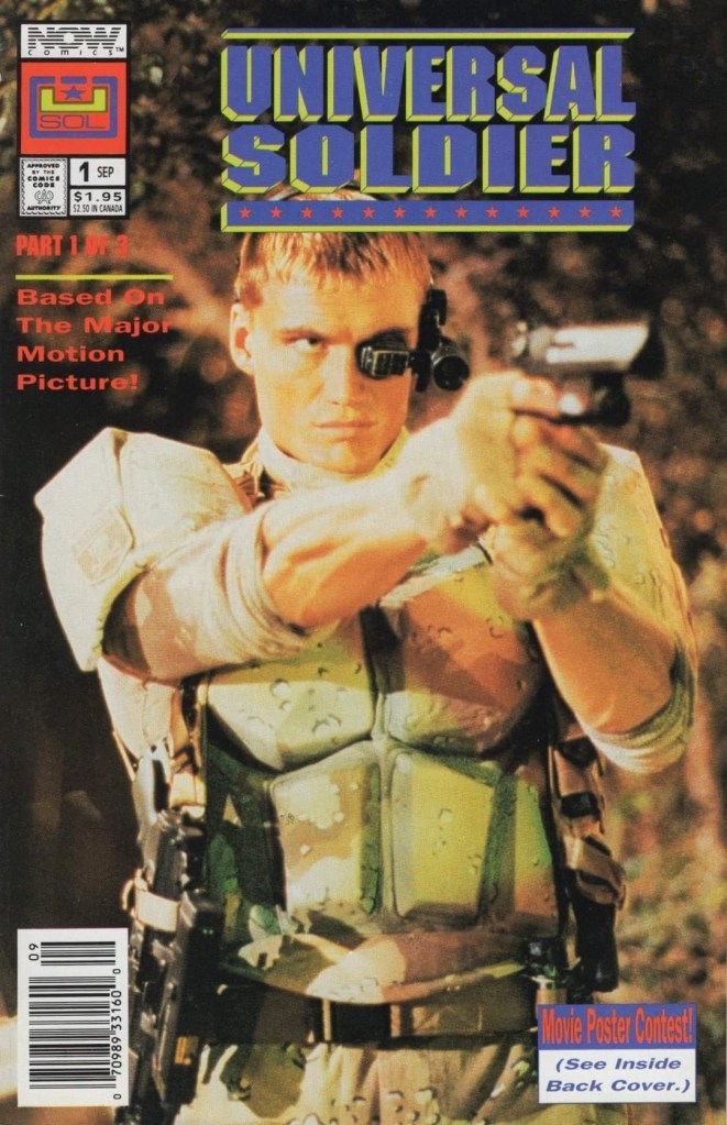
With those details laid down, here is a look back at Universal Soldier #1 published in 1992 by NOW Comics with a story written by Clint McElroy and drawn by Lenin Delsol. This was the first chapter of a 3-issue mini-series.
The cover showing a photographic image of star Dolph Lundgren.
Early story
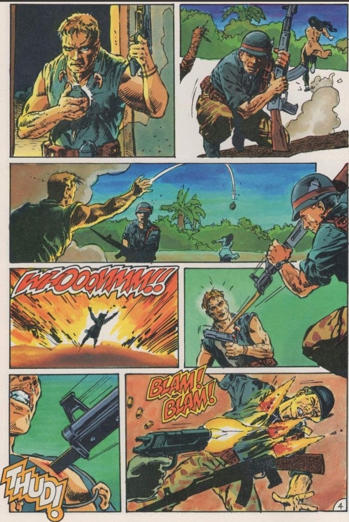
The story begins in Vietnam in 1969. The American soldier Luc Deveraux arrives at a village that was secured by the U.S. Army. To his shock, he finds several dead bodies of his squad members and villagers, then encounters Sergeant Andrew Scott with two Vietnamese individuals (male and female) tied together near him. It turns out that Scott, who made a necklace composed of severed ears, has gone insane and executes the Vietnamese man. As Deveraux refuses to follow Scott’s order to shoot the Vietnamese female, the sergeant kills he. Deveraux and Scott shot each other to death and eventually their corpses were recovered by another squad to be cryogenically frozen.
A few decades later in Nevada, the elite counter-terrorism unit of the UniSol (Universal Soldier) arrives and among the members are Deveraux (identified as GR44) and Scott (GR13) who have been reanimated by the government with their past memories fully suppressed. Their team gets deployed to the Hoover Dam (Mackinley Dam in the comic book) to resolve a hostage situation…
Quality
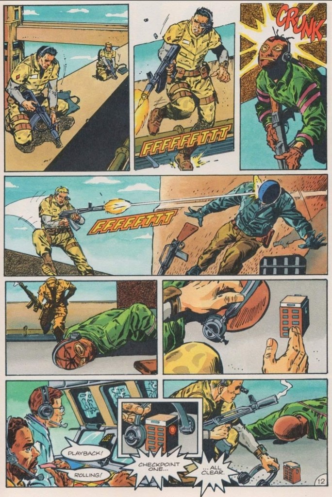
Operating very much like robots, two Universal Soldiers take down terrorists and manipulated their communication as they make their way through to save the hostages from the remaining terrorists.
As an adaptation, I find this comic book a surprisingly accurate translation of the movie’s early part of the story (note: the literary narrative ends when Deveraux leaves with the female reporter). While not 100% of the film’s plot and visual details were captured, this comic book still succeeded in replicating the look, feel and tone of the movie. It is clear that the comic book team had access to the footage of the film and a copy of the screenplay (written by Richard Rothstein, Christopher Leitch and Dean Devlin).
Clint McElroy really stuck close to the film’s plot, the dialogue and the way the characters were portrayed. Again, not 100% of the relevant details were adapted and some liberties were taken but McElroy managed to craft a comic book narrative that was solidly structured, had sufficient details to keep readers oriented and engaged, and ensured the story moved at a satisfying pace. By the time I reached the end of this comic book, I got oriented with the story, the characters and the details shown in between.
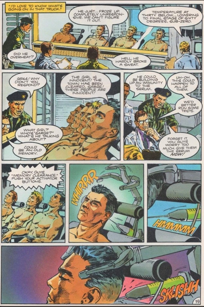
Like in the movie, this comic book emphasizes the government’s very cold and heartless approach on handling their Universal Soldiers who are treated more like tools instead of people.
Lenin Delsol’s artwork here is really good. It is clear that he had access to the film’s production footage as several images of locations and characters here very closely resembled what was shown in the movie most of the time. When it comes to the action scenes, Delsol did not go for visual dynamism (note: the dynamic action style was common with superhero comics of the 1990s) but rather he portrayed the action with realism and varying degrees of brutality.
When it comes to visualizing the characters, it is clear that the creative team was not authorized to use the likenesses of the actors. Luc Deveraux looks absolutely nothing like Jean-Claude Van Damme while journalist Veronica Roberts does not look like Ally Walker. Ironically, there are a few images of Scott’s face that somewhat resembles Dolph Lundgren. The way I see it, it is not problematic to see the characters not resembling the actors from the film. In fact, I like the new character designs Delsol came up with for the characters.
Conclusion
This early scene sets the tone of the entire comic book. As for the characters, Deveraux look nothing like Jean-Claude Van Damme and Sergeant Scott does not look like Dolph Lundgren (note: in other images of Scott shown later in the comic book, he looked a bit like the actor).
Even though I was not a fan of the 1992 movie, Universal Soldier #1 (1992) succeeded in keeping me engaged and entertained until the end. This is a really good adaptation of the early part of the film and I like the approach the Elroy-Densol team took on establishing the literary experience. Of course, if you want more dynamic visuals of the Hoover Dam scene or if you want that strong rated-R vibe when it comes to hard action, you should watch the movie. As of now, I am convinced to look forward to the next issue of this 3-part mini-series adaptation.
Overall, Universal Soldier #1 (1992) is recommended.
Disclaimer: This is my original work with details sourced from reading the comic book and doing personal research. Anyone who wants to use this article, in part or in whole, needs to secure first my permission and agree to cite me as the source and author. Let it be known that any unauthorized use of this article will constrain the author to pursue the remedies under R.A. No. 8293, the Revised Penal Code, and/or all applicable legal actions under the laws of the Philippines.
Welcome back superhero enthusiasts, 1980s arts and culture enthusiasts, Marvel Comics fans and comic book collectors! Today we go back to the year 1984 to take a close look at the official comic book adaptation of the classic sci-fi movie The Last Starfighter.
The Last Starfighter is highly memorable for its extensive use of computer-generated imagery (CGI) which brought its science fiction concepts of war and space travel to life. Directed by Nick Castle, the film is also remembered for its unique storytelling (note: with scenes set on Earth and in space) as well as the solid performances by Lance Guest, Robert Preston, Dan O’Herlihy, Catherine Mary Stewart and Norman Snow.
I should also state that the movie was released during the golden age of arcade games in America and its narrative has video game elements within. The Last Starfighter, which had unreleased ports for Atari consoles and an actual game released on the Nintendo Entertainment System (NES), clearly has a place in retro gaming culture. To know more about the movie, watch the retrospective video by Oliver Harper by clicking here, the retrospective video by GoodBadFlicks by clicking here and the movie trivia video by Minty Comedic Arts by clicking here.
Marvel Comics was in-charge of producing and publishing the comic book adaptation of the movie. In fact, it was released as issue #31 of the Marvel Comics Super Special (AKA Marvel Super Special) series and also in the form of a 3-issue mini-series.
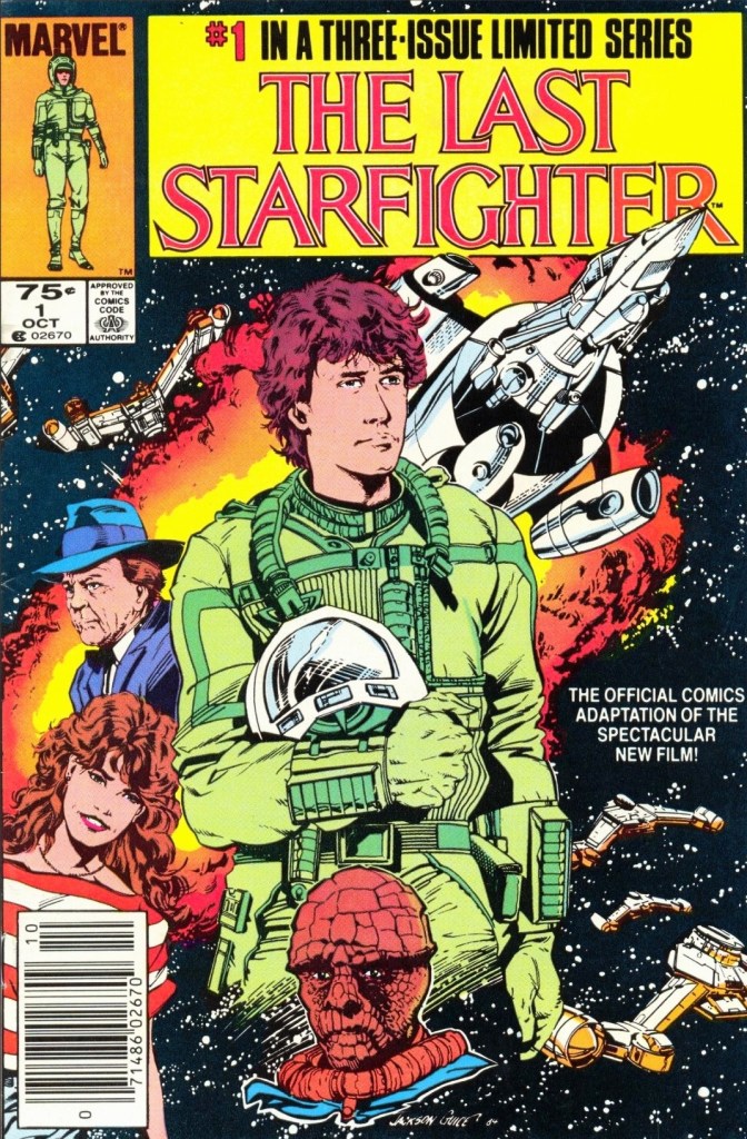
With those details laid down, here is a look back at The Last Starfighter #1, published in 1984 by Marvel Comics with a story written by Bill Mantlo and drawn by Bret Levins. This is the first chapter of the 3-issue mini-series.
The cover.
Early story
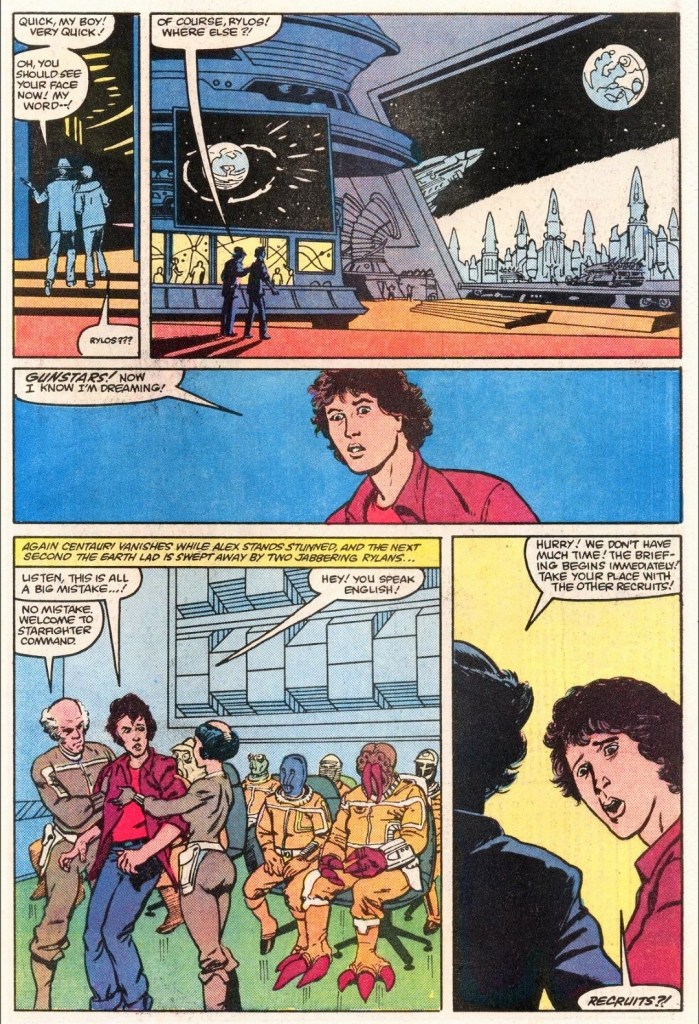
The story begins on a sunny day at a trailer park filled with residents who know each other. Maggie Gordon searches for Alex who is busy playing The Last Starfighter arcade game inside the local store. Alex’s little brother Louis was told to inform him that a neighbor’s electricity problem needs fixing.
Alex is laser focused on playing the arcade game which has an immersive space shooter game design. As Maggie tells him that their friends had arrived, Alex decides to let Louis play the rest of the game as he moves out.
Just as Alex and Maggie are about the leave, his mother tells him that he the neighbor’s electricity problem needs his repair service making him miss the trip.
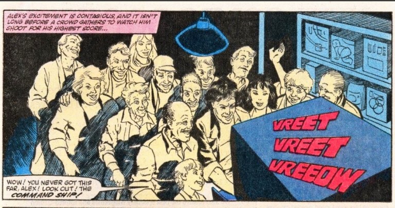
In the evening, Alex resumes playing The Last Starfighter and shortly after scoring over 900,000 points, many members of the local community flocked inside the grocery to watch him play…
Quality
There is nothing like being inside a very futuristic place and getting involved in a galactic conflict.
Considering the limited scope of the narrative – which ends with Alex already far away from home – and the creative liberties committed by the production team, this comic book is faithful for the most part and it does a good job replicating the vibe and tone of the movie.
Bill Mantlo’s script focused on the more important dialogue from the film and it did a good job following Alex Rogan (the protagonist) who is a video game achiever who happens to be striving to move forward with his life. He is a likable guy facing great odds as well as the harshness of reality, and he has hope with Maggie who just might become an integral part of his life in the years to come. Centauri is clearly the 2nd most notable character after Alex and through him, the narrative moves forward a lot leading to the greater science fiction stuff sourced from the movie.
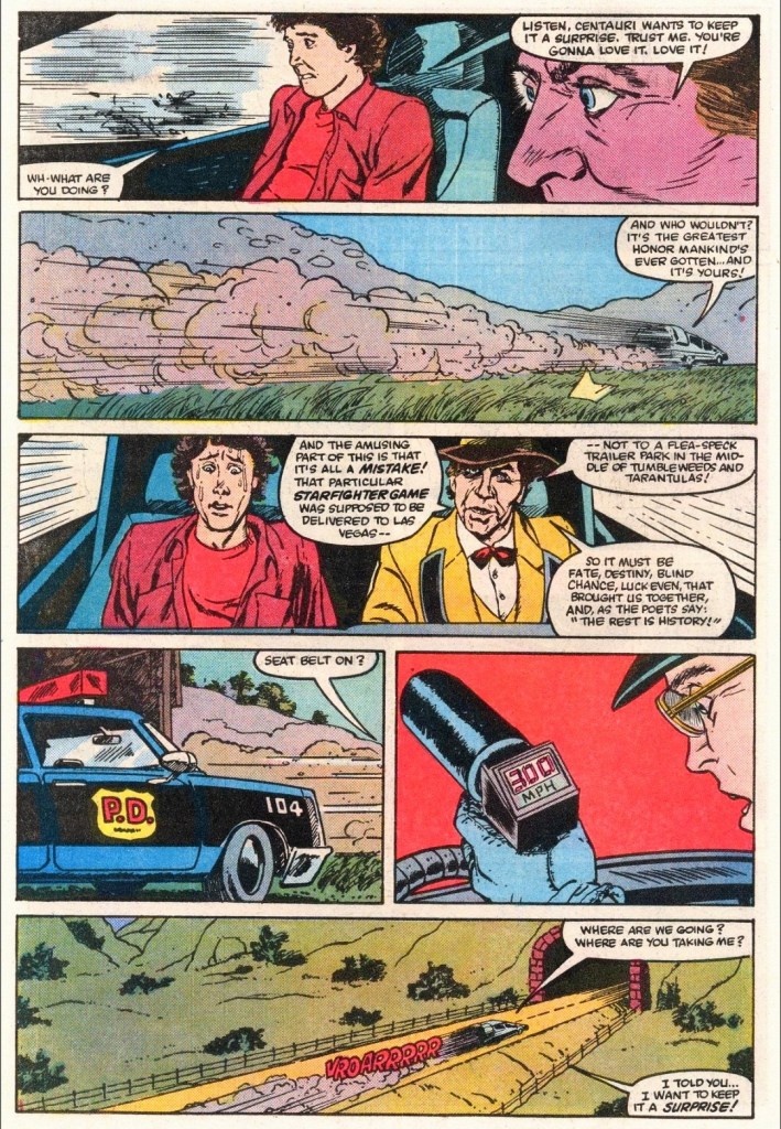
The wild ride!
As it is clearly not a 100% replica of the movie’s screenplay, the script Mantlo made ensured that this comic book has a whole lot of relevant details, notable moments and characterization that readers can immerse themselves into.
For his part, Bret Blevins (note: his name was spelled as Brett Blevins here) did a fine job replicating the movie imagery that includes the locations, the characters, and the sci-fi elements. While it is not clear if the comic book team was authorized to use the actors’ likenesses when drawing the characters, there were a few instances in which Alex somewhat resembles actor Lance Guest, and Centauri looking a bit like the late Robert Preston.
Conclusion
Have you ever experienced attracting a lot of people while playing an arcade game?
Even though there were no battles within its narrative, The Last Starfighter #1 (1984) is a good comic book adaptation. Having seen the movie a number of times in my life, I can say that this comic book recaptures the feel and tone of the film in varying degrees. Of course, the illustrated literature format can only go so far with adapting the movie’s greatness. That being said, if you truly want mesmerizing imagery, strong thrills, great music and the dramatics of the characters, watching the movie is the clear option (note: The Last Starfighter 4K Blu-ray is available). This comic book is a worthy partial companion and I can confirm that it has convinced me to read the next issue.
Overall, The Last Starfighter #1 (1984) is recommended.
Disclaimer: This is my original work with details sourced from reading the comic book and doing personal research. Anyone who wants to use this article, in part or in whole, needs to secure first my permission and agree to cite me as the source and author. Let it be known that any unauthorized use of this article will constrain the author to pursue the remedies under R.A. No. 8293, the Revised Penal Code, and/or all applicable legal actions under the laws of the Philippines.
Welcome back superhero enthusiasts, 1990s arts and culture enthusiasts, Marvel Comics fans and comic book collectors! Today we go back to the year 1990 to take a close look at the 2nd part of the comic book adaptation of the movie RoboCop 2 (1990).
In my previous retro review of Robocop 2 #1, I pointed out that the comic book was not a faithful adaptation of the movie but more of the creators’ creative interpretation of the movie script they had which resulted in a stylized presentation. It was a surprisingly enjoyable reading experience for me.
With those details laid down, here is a look back at RoboCop 2 #2, published in 1990 by Marvel with a story written by Alan Grant and drawn by Mark Bagley based on the movie screenplay by Frank Miller and Walon Green.
The cover.
Early story
The story begins in Detroit with RoboCop reduced into a very bad condition with most of his parts missing. The cops are still on strike and the ultra-addicting drug Nuke continues to spread through the city causing social problems. Cain and his gang are still on the loose, and his video statement (which emphasizes his gang’s defeat of RoboCop) spreads through the news cycles.
Inside a hideout, Cain and his loyal companions terrify and killed traitorous police officer Duffy for betraying them. Meanwhile at police headquarters, the support crew bumps heads with the Omni Consumer Products (OCP) executive who does not see RoboCop’s poor state as a problem. As far as OCP is concerned, getting replacement parts for RoboCop is very expensive.
Over at OCP, the psychologist executive Dr. Juliette Faxx begins researching criminals for the new RoboCop project…
Quality
The motorized encounter between RoboCop and Cain here is shorter and much inferior compared to what the movie showed.
As with issue #1, this comic book followed the events and scenes of the film but left enough room for the creative team to make their stylized version suitable with the literary format. Mark Bagley, who is best known for drawing Spider-Man and Venom in the 1990s, came up with nice artwork that brought Grant’s script to life. There were a few shots here that were pretty graphic or brutal to see at the time of publication which makes me wonder why did the Comics Code Authority (CCA) give its approval to this comic book.
Without spoiling the plot, I can say that the creative team and editor Gregory Wright did a good job adapting scenes of the movie script to (fill up the pages) while also succeeding in setting up readers for the final conflict in the 3rd and final issue.
As a standalone reading material, this comic book will lead readers deep into the crisis of the police force as well as into the developments behind the closed doors of OCP. Due to the selected scenes of the film’s script, RoboCop has sufficient presence but lacked his normal personality. That being said, the movie’s comedic look of RoboCop acting very out-of-touched (hint: OCP tampered with his mind digitally) did not translate well into literary format. If you’re hoping to see solid storytelling with a consistent tone, you won’t find it here.
When it comes to action, there is just enough of it to keep the reading experience entertaining. Again, this comic book does not have the final conflict and the selected action scenes are rather limiting in terms of impact. If you want to see the police raid of the Nuke facility as well as RoboCop’s motorized chase with Cane, you are better off replaying the movie.
Conclusion
There definitely is something wrong with RoboCop here.
Considering the selected movie script scenes for adaptation, RoboCop 2 #2 (1990) lacks impact compared to the first issue. In fairness, this comic book was clearly meant to set-up readers for the next issue. If there is anything worth looking at within the 2nd issue’s pages, it would be the details that were highlighted during the internal developments at OCP and the police. As mentioned earlier, RoboCop is not his usual self for a significant portion of this comic book. While the engagement and fun factor are lower this time around, I’m still interested to read the next issue.
Welcome back readers, fellow geeks and electronic gaming fans!
In this edition of the Retro Gaming Ads Blast (RGAB) series, we will take a look at another batch of retro gaming print ads from the 1980s and 1990s.
For the newcomers reading this, Retro Gaming Ads Blast (RGAB) looks back at the many print ads of games (console, arcade, computer and handheld) that were published in comic books, magazines, flyers and newspapers long before smartphones, social media, the worldwide web and streaming became popular. To put things in perspective, people back in the 1980s and 1990s were more trusting of print media for information and images about electronic games and related products.
With those details laid down, here is the newest batch of retro gaming print ads for you to see and enjoy…
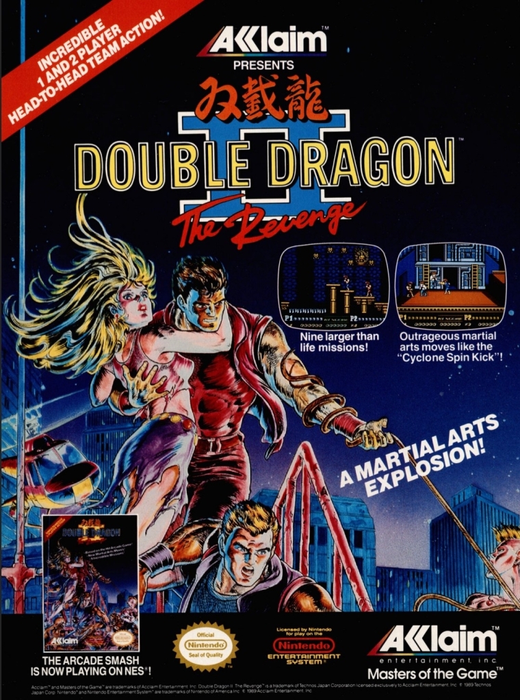
1. Double Dragon II: The Revenge print ad
Nice looking art used to promote the game.
The beat-them-up sub-genre of gaming was already popular in the 1980s and one of the most defining game franchises of this type of game was the Double Dragon series which proved to be popular with Nintendo Entertainment System (NES in America) and Family Computer (Famicom in Japan) gamers. As the first game was a very big hit on Nintendo’s consoles, the sequel Double Dragon II: The Revenge was promoted in America with strong confidence on the part of publisher Acclaim that it would become another massive hit. This print ad had a very nice looking comic books-style art that not only captured the concept of the game but also visualized the heroes Billy and Jimmy with enough details to focus on. I can say this was an eye-catching ad.
2. X-Men: Children of the Atom print ad
Great looking ad but the line “100% direct conversion” is not true at all.
Developed by Capcom in cooperation with Marvel, X-Men: Children of the Atom was a huge hit in the video arcades and it was not surprising that it got released on the Sega Saturn by Acclaim. Acclaim organized an aggressive promotional campaign by pouncing on the fans’ love and knowledge of the X-Men and the high fun factor of Capcom’s game. What this print ad got wrong, however, was the line “100% direct conversion of the #1 arcade smash!” which was wrong and misleading. In reality, the Sega Saturn version of the game had about one-third of the animation frames cut due to the console’s smaller RAM capacity.
As the years passed by, the Sega Saturn became the more suitable console for home ports of Capcom’s further 2D fighting games as Sony’s PlayStation had even more severe limitations and a graphics processor that was not suitable for 2D graphics. By the end of 2000, Capcom’s 2D fighting games on PlayStation all were inferior to the Sega Saturn versions.
3. Sky Shark NES print ad
This is an effective looking ad.
Released in Japan as Flying Shark, Sky Shark was released on multiple platforms in 1988 and there was an NES version of it which this particular print ad promoted. The American branch of Taito wisely used positive quotes from media outlets to promote the game while coming up with an engaging text description and displayed NES screenshots. And then there was that very engaging painted cover art that gave this print ad a lot of punch. An effective ad overall.
4. Conflict print ad
This is a very captivating artwork for advertising.
There is no denying the fact that the Cold War was a strong influence on arcade games and video games. Titles like Contra, Jackal, Metal Gear, Operation Wolf, Cabal and Rush’n Attack were militaristic games that entertained millions of gamers from the young adults to the little children. In 1990, Vic Tokai released the game Conflict on the NES which had a military theme but an unusual game design composed of digital maps with hexagons in which gamers will play with strategy to win battles. That being said, this print ad’s visual concept was very captivating yet also misleading. If you see how the game is played, you will know what I mean.
5. College Slam print ad
Were you ever interested in college basketball video games?
This is one of the more eye-catching print ads I’ve seen due to the artist’s illustration of a basketball with a mouth biting the basketball rim which dominates the space. For the newcomers reading this, College Slam was a basketball video game that was actually a repacked version of the popular NBA Jam with focus on NCAA basketball players. With the biting basketball at the center, it was easily an attraction and the screenshots implemented were larger than usual which easily gave gamers a clear look at what the game looked like. While this print ad is eye-catching, it did not help sell College Slam and there never was a follow-up.
6. Tecmo Super Baseball print ad
From the time when Tecmo was prolific with video games about sports.
Long before it started the Dead or Alive game franchise, Tecmo was once heavily invested in making sports video games. Tecmo Super Baseball was their first American pro baseball video game released for Super Nintendo Entertainment System (SNES) and Sega Genesis, and it was notable that the publisher secured only the Major League Baseball Players Association (MLBPA) which resulted in the game featuring real-life players but the teams had no names and no logos. Regardless, this print ad showed how aggressive Tecmo was in trying to attract consumers’ attention by showing ten screenshots with short text descriptions each. The ad’s write-up boasted realism as well as the promise of gaming quality.
7. The Punisher print ad
Marvel’s vigilante firing at someone.
In the early 1990s, Capcom and Marvel Comics started their partnership resulting in the releasing of the arcade game The Punisher. Developed by Capcom, the said arcade game became a big hit with gamers as it featured fun gameplay, multiple enemies appearing on screen simultaneously and other fun elements. Unsurprisingly, the game was ported (note: Sculptured Software was the lead developer) to the Sega Genesis with significant downgrades in terms of graphics, sound, enemy variety and other related elements due to technical limitations. That being said, this print ad used detailed art of the Punisher (with Col. Fury in the background) in a clever way to promote the Sega Genesis version while keeping their attention away from the obvious visual downgrades of the two screenshots displayed. The Punisher on Genesis was poorly received.
8. Stargate print ad
If you did not enjoy the movie, were you able to play the video game adaptation on Sega Genesis or Super NES?
Remember the sci-fi movie Stargate (1994)? The film was a surprise box office hit and eventually video game adaptations of it were made for the SNES, Sega Genesis, Game Gear and the GameBoy. This particular print ad, however, showed screenshots of the SNES and Genesis versions which is made obvious with the side-scrolling adventure plus 3D flying sequence (one screenshot showed it). Combined with images sourced from the movie poster plus an insert of the movie in home video format (lower-right corner), this print ad was obviously an aggressive way to promote the film with the post-theatrical business in mind. In case you are wondering, the cinematic Stargate is not related at all with the early 1980s video game (a follow-up to the classic game Defender) of the same name.
9. Aerobiz Supersonic print ad
For a simulation game released on consoles, Aerobiz Supersonic is pretty deep and a lot of fun to play.
The airline simulation game Aerobiz Supersonic is a highly addictive and surprisingly fun game that I enjoyed playing on the SNES (read my retro review by clicking here) and strangely enough I first learned about not through its print ad but by reading a preview published by Electronic Gaming Monthly (EGM) magazine. As for this print ad made by Koei’s American team, this is really odd to look at due to the ad makers’ choice of showing a not-so-attractive flight meal. In contrast to that, the ad makers did a good job describing the game creatively and showed three screenshots that were strategically selected in my view. Having played the game many times, I can say that this print ad is very truthful.
Disclaimer: This is my original work with details sourced from reading the comic book and doing personal research. Anyone who wants to use this article, in part or in whole, needs to secure first my permission and agree to cite me as the source and author. Let it be known that any unauthorized use of this article will constrain the author to pursue the remedies under R.A. No. 8293, the Revised Penal Code, and/or all applicable legal actions under the laws of the Philippines.
Welcome back superhero enthusiasts, 1990s arts and culture enthusiasts, Marvel Comics fans and comic book collectors! Today we go back to the year 1993 and examine a small part of the Marvel Comics universe through a tale of the Amazing Spider-Man monthly series.
In my previous retro comic book review, the insane murderer Venom returned to antagonize Spider-Man by targeting his parents. While it was a fact that Venom – who knew Spider-Man’s true identity – got into close contact with Aunt May (symbolizing the danger he poses on the Peter Parker’s family) a few years prior, going after the mother and father of Peter really raised the stakes.
With those details laid down, here is a look back at Amazing Spider-Man #375, published in 1993 by Marvel Comics with a story written by David Michelinie and drawn by Mark Bagley. This comic book marked the 30th anniversary of Amazing Spider-Man #1 (1963).
The cover.
Early story
The story begins inside one of the facilities of the closed amusement park in Brooklyn. In his vicious form, Venom tells Richard and Mary Parker (both restrained) that they belong to him and declares that he would protect them from Spider-Man.
When Richard Parker asked why would he think that they would have anything to do with Spider-Man, Venom realizes that the couple does not even know their son is the webslinger. Venom tells the couple that their innocence is what he is sworn to preserve.
Over at Manhattan, Spider-Man swings back to the Daily Bugle building and discreetly changes his clothes before moving in as photographer Peter Parker. Inside one of the offices, J. Jonah Jameson reaches out to Silver Sable by telephone…
Quality
Peter Parker had to commit a crime by trespassing into Anne Weying’s residence. His disguise as Spider-Man does not protect him from the law.
I have mixed feelings about this follow-up to the great story of the previous issue. For one thing, David Michelinie’s script had a completely different tone and direction even though he intended this comic book to conclude what issue #374 started. Another thing is that this story has even more characters added in which clearly diluted the intensity of the Venom-Spider-Man rivalry that was so intense in the previous issue.
There are two sub-plots – one of which deals with someone from Eddie Brock’s past – that were emphasized with sufficient details and the creative team integrated them into the main story. It seems that the creators intended to make the main story look grander in scope while sacrificing the very elements that made issue #374 a great and intense reading experience.
Remember the suspense and danger that came with Venom targeting the older Parker couple? Those elements are almost totally absent in this comic book even though this story concluded the previous issue’s conflict build-up. Richard and Mary Parker are both present as captives of Venom but there really is no tension nor any sense of danger here due to the drastic change of tone and direction in the script.
I should also stress that the introduction of Anne Weying (previously Anne Brock) as Eddie Brock’s ex-wife looked and felt like an afterthought inserted into the story. While Anne’s presence brought out some traces of humanity and sanity from Venom during the 2nd half of the story, it did not add much impact on the conflict between the webslinger and the symbiote-wearer murderer. Ultimately, the creative team had to do something to explain the story build-up on Venom’s part leading into the Lethal Protector limited series which is set in the city of San Francisco.
And then there was the presence of Silver Sable’s team called the Wild Pack. The Wild Pack is the result of J. Jonah Jameson’s agreement with Silver Sable with the objective of achieving a journalistic exclusive for the Daily Bugle. This particular sub-plot is really lousy and not even the dynamic looking action sequences involving the Wild Pack could hide lousiness.
If there is anything symbolic about the script, it is the emphasis on family as well as the impact that comes with elements of the past emerging unexpectedly. In this very comic book, you will get to see Eddie Brock/Venom react like a sane person in response to the sudden re-appearance of his former wife. No matter what the creative team did here, I can say that the Spidey/Venom conflict did not really intensify (note: the dynamic action scenes did not solve the shortcomings) and there was no reason to worry about the captive Parker couple.
Conclusion
The insane murderer Venom with the parents of Peter Parker.
Considering the great stuff and raised stakes that made issue #374 a very compelling read, Amazing Spider-Man #375 (1993) is clearly a disappointing conclusion. This is not a terrible comic book as it has some good stuff for fans to enjoy but the overall presentation of the creators here is not too great due to their approach with the storytelling (with two sub-plots that did not add much). Overall, I am glad I never bought this comic book (with flashy cover and more pages) at full price in 1993.