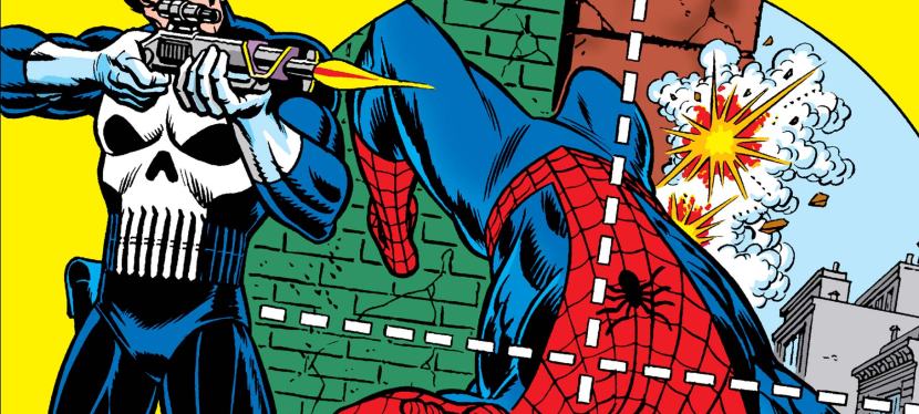
A Look Back at Amazing Spider-Man #375 (1993)

Welcome back superhero enthusiasts, 1990s arts and culture enthusiasts, Marvel Comics fans and comic book collectors! Today we go back to the year 1993 and examine a small part of the Marvel Comics universe through a tale of the Amazing Spider-Man monthly series.

In my previous retro comic book review, the insane murderer Venom returned to antagonize Spider-Man by targeting his parents. While it was a fact that Venom – who knew Spider-Man’s true identity – got into close contact with Aunt May (symbolizing the danger he poses on the Peter Parker’s family) a few years prior, going after the mother and father of Peter really raised the stakes.

With those details laid down, here is a look back at Amazing Spider-Man #375, published in 1993 by Marvel Comics with a story written by David Michelinie and drawn by Mark Bagley. This comic book marked the 30th anniversary of Amazing Spider-Man #1 (1963).

The cover.

Early story

The story begins inside one of the facilities of the closed amusement park in Brooklyn. In his vicious form, Venom tells Richard and Mary Parker (both restrained) that they belong to him and declares that he would protect them from Spider-Man.

When Richard Parker asked why would he think that they would have anything to do with Spider-Man, Venom realizes that the couple does not even know their son is the webslinger. Venom tells the couple that their innocence is what he is sworn to preserve.

Over at Manhattan, Spider-Man swings back to the Daily Bugle building and discreetly changes his clothes before moving in as photographer Peter Parker. Inside one of the offices, J. Jonah Jameson reaches out to Silver Sable by telephone…

Quality

Peter Parker had to commit a crime by trespassing into Anne Weying’s residence. His disguise as Spider-Man does not protect him from the law.

I have mixed feelings about this follow-up to the great story of the previous issue. For one thing, David Michelinie’s script had a completely different tone and direction even though he intended this comic book to conclude what issue #374 started. Another thing is that this story has even more characters added in which clearly diluted the intensity of the Venom-Spider-Man rivalry that was so intense in the previous issue.

There are two sub-plots – one of which deals with someone from Eddie Brock’s past – that were emphasized with sufficient details and the creative team integrated them into the main story. It seems that the creators intended to make the main story look grander in scope while sacrificing the very elements that made issue #374 a great and intense reading experience.

Remember the suspense and danger that came with Venom targeting the older Parker couple? Those elements are almost totally absent in this comic book even though this story concluded the previous issue’s conflict build-up. Richard and Mary Parker are both present as captives of Venom but there really is no tension nor any sense of danger here due to the drastic change of tone and direction in the script.

I should also stress that the introduction of Anne Weying (previously Anne Brock) as Eddie Brock’s ex-wife looked and felt like an afterthought inserted into the story. While Anne’s presence brought out some traces of humanity and sanity from Venom during the 2nd half of the story, it did not add much impact on the conflict between the webslinger and the symbiote-wearer murderer. Ultimately, the creative team had to do something to explain the story build-up on Venom’s part leading into the Lethal Protector limited series which is set in the city of San Francisco.

And then there was the presence of Silver Sable’s team called the Wild Pack. The Wild Pack is the result of J. Jonah Jameson’s agreement with Silver Sable with the objective of achieving a journalistic exclusive for the Daily Bugle. This particular sub-plot is really lousy and not even the dynamic looking action sequences involving the Wild Pack could hide lousiness.

If there is anything symbolic about the script, it is the emphasis on family as well as the impact that comes with elements of the past emerging unexpectedly. In this very comic book, you will get to see Eddie Brock/Venom react like a sane person in response to the sudden re-appearance of his former wife. No matter what the creative team did here, I can say that the Spidey/Venom conflict did not really intensify (note: the dynamic action scenes did not solve the shortcomings) and there was no reason to worry about the captive Parker couple.

Conclusion

The insane murderer Venom with the parents of Peter Parker.

Considering the great stuff and raised stakes that made issue #374 a very compelling read, Amazing Spider-Man #375 (1993) is clearly a disappointing conclusion. This is not a terrible comic book as it has some good stuff for fans to enjoy but the overall presentation of the creators here is not too great due to their approach with the storytelling (with two sub-plots that did not add much). Overall, I am glad I never bought this comic book (with flashy cover and more pages) at full price in 1993.

Overall, Amazing Spider-Man #375 (1993) is satisfactory.

+++++

Thank you for reading. If you find this article engaging, please click the like button below, share this article to others and also please consider making a donation to support my publishing. If you are looking for a copywriter to create content for your special project or business, check out my services and my portfolio. Feel free to contact me with a private message. Also please feel free to visit my Facebook page Author Carlo Carrasco and follow me on Twitter at  @HavenorFantasy as well as on Tumblr at https://carlocarrasco.tumblr.com/ and on Instagram at https://www.instagram.com/authorcarlocarrasco
A Look Back at RoboCop 2 #1 (1990)

Welcome back superhero enthusiasts, 1990s arts and culture enthusiasts, Marvel Comics fans and comic book collectors! Today we go back to the year 1990 to take a close look at the comic book adaptation of the movie RoboCop 2 (1990).

Before getting to the new retro comic book review, I should state that my friends and I had a fun time watching RoboCop 2 in the cinema shortly after it opened here in the Philippines. Back then, I was not yet a comic book collector and I rarely visited comic book specialty stores. That being said, I was unaware that Marvel Comics actually published an adaptation in the form of a 3-issue mini-series.

With those details laid down, here is a look back at RoboCop 2 #1, published in 1990 by Marvel with a story written by Alan Grant and drawn by Mark Bagley based on the movie screenplay by Frank Miller and Walon Green.

The cover.

Early story

The story begins in Detroit where the cops are run by corporations and the streets have turned into red-alert war zones. Crime is overwhelming the city and the highly addictive narcotic poses the greatest threat facing societies. The surgeon general who made the public warning about nuke was killed and the crime boss Cain (leader of a cult of nuke addicts and pushers) claims responsibility. Through the news media, Cain tells the public that nuke will make people’s problems go away and people want its paradise.

Under the management of Omni Consumer Products (OCP), several of Detroit’s police officers go on strike demanding better terms from their employer. The City Government of Detroit under Mayor Kuzak missed a payment (in relation to them owing $37 million) and OCP begins to move to foreclose the city and its assets in accordance to the terms of the contract. Mayor Kuzak accuses OCP of engineering the police strike which made crime rampant.

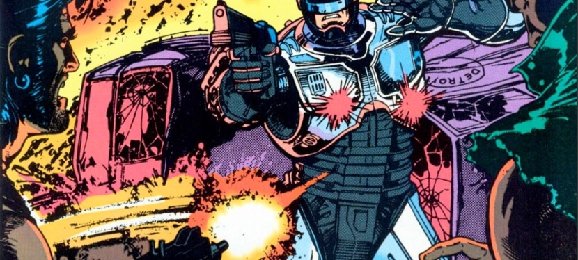
Elsewhere in the evening, the cruel activities of the thugs got disrupted by the arrival of a police car. Even though the police car got destroyed by the thugs, RoboCop emerges and begins to fight back…

Quality

There is simply no holding back for RoboCop when it comes to doing police work at a time when many police officers are on strike while crime has turned more rampant in Detroit.

This opening issue of the mini-series sticks close the basic plot of the movie (right until after Cain’s gang dismantled RoboCop) although there were a few notable differences with the sequence of events and there were scenes that showed the creative team took liberties to make the story suitable with the literary format in mind. That being said, don’t expect to see the key moments of the movie look exactly the same in this comic book and don’t expect to see the characters here looking like the actors who played them on the big screen. In terms of visual and literary presentation, this adaptation has a lot in common with the Total Recall comic book adaptation which coincidentally was released the same year.  

For me, this is indeed a really readable comic book that has its stylized approach on telling the movie’s concept. OCP is the most powerful entity in the story while Cain and his gang are clearly the force of evil that strongly pose danger not only to Detroit’s people but even to the very divided police force. Nuke as the dangerous object of the plot clearly was inspired from elements of the real life war against drugs in 1980s America which made this story socially relevant.

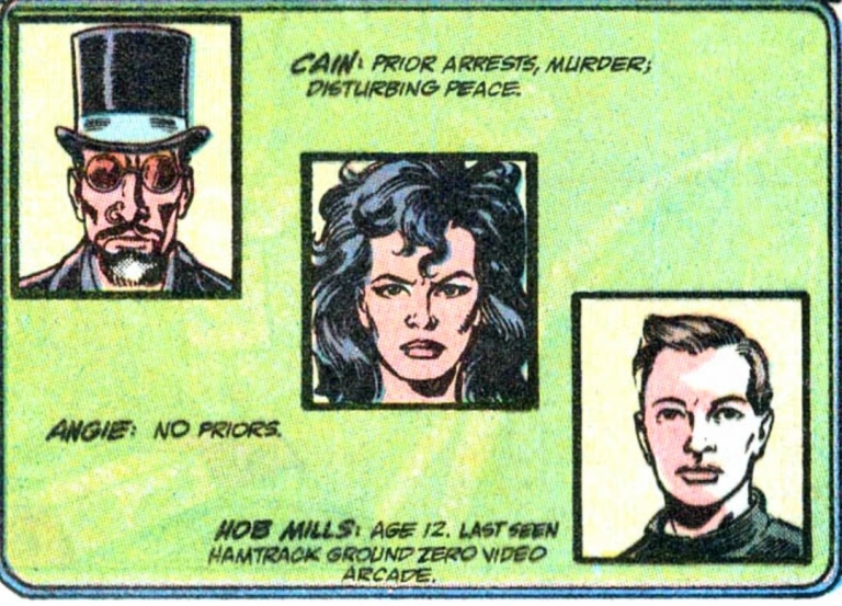
Very clearly these villains look nothing like actors Tom Noonan, Galyn Görg and Gabriel Damon.

Like in the movie, RoboCop here performs his law enforcement duty in an uncompromising manner even though memories of his past life as officer Murphy re-emerged deep inside. That being said, there are a few moments in which you might sympathize with the titular hero as this comic book pays close attention to the conflict between humanity and technology.

The action scenes here are sufficient but clearly don’t come anywhere close to the intensity of the film in terms of violence. Still, there is enough action for readers to enjoy.

When it comes to the visuals, the artwork done by Mark Bagley eerily looks comparable with Tom Lyle’s art in the Total Recall comic book of 1990. For the newcomers read this, Bagley became a popular artist through the Amazing Spider-Man monthly series and the Venom: Lethal Protector comic books that were released after years after this one. Having seen many of Bagley’s works published in 1992 to 1995, I can hardly recognize his art style in this comic book adaptation. The way he drew people’s faces in this comic book looks very different from those seen in Amazing Spider-Man issues. At the same time, Bagley’s own take on RoboCop has that balanced approach on depicting humanity with machinery while also making the hero look less bulky compared to the movie’s version.

Conclusion

Julie Faxx of OCP sure talks like a woke nut and rabid feminist in this scene.

RoboCop 2 #1 (1990) is clearly not a faithful adaptation of selected parts of the movie but that’s not necessarily a bad thing. This is more about the Grant-Bagley team doing their own visual presentation of the movie script copy they had and ultimately they succeeded in making this comic book a stylized and worthy reading experience. This is indeed a surprisingly entertaining read and I can say that I am looking forward to reading the next issue.

Overall, RoboCop 2 #1 (1990) is recommended.

+++++

Thank you for reading. If you find this article engaging, please click the like button below, share this article to others and also please consider making a donation to support my publishing. If you are looking for a copywriter to create content for your special project or business, check out my services and my portfolio. Feel free to contact me with a private message. Also please feel free to visit my Facebook page Author Carlo Carrasco and follow me on Twitter at  @HavenorFantasy as well as on Tumblr at https://carlocarrasco.tumblr.com/ and on Instagram at https://www.instagram.com/authorcarlocarrasco

A Look Back at Amazing Spider-Man #374 (1993)

Welcome back superhero enthusiasts, 1990s arts and culture enthusiasts, Marvel Comics fans and comic book collectors! Today we go back to the year 1993 and examine a small part of the Marvel Comics universe through a tale of the Amazing Spider-Man monthly series.

In early 1993, the supervillain and murderer Venom was in very high demand among Marvel readers and comic collectors. The Venom: Lethal Protector mini-series launched with issue #1 selling a lot of copies and it portrayed Spider-Man’s greatest enemy as a very twisted and violent makeshift hero who dedicated himself to protecting what he (Eddie Brock specifically) to innocent people. As Venom was one of the few supervillains who knew Spider-Man’s true identity, the creative team behind the Amazing Spider-Man series decided to raise the stakes temporarily by having him encounter Peter Parker’s parents (the ones that appeared in Amazing Spider-Man #365).

With those details laid down, here is a look back at Amazing Spider-Man #374, published in 1993 by Marvel Comics with a story written by David Michelinie and drawn by Mark Bagley.

The cover.

Early story

The story begins inside the bunker beneath the grounds of the deserted Brooklyn amusement park. As Eddie Brock struggles to lift a very heavy piece of equipment, the symbiote forms over his body helping him lift it up above the head. Venom is obsessed with killing Spider-Man and Eddie Brock remains totally bitter over the webslinger’s responsibility on destroying his career. Eddie sees a page of the Daily Bugle on the wall and it contains a news photo of Peter Parker with his mother and father.

At New York’s famous Central Park, Peter, wife Mary Jane and his parents enjoy quality time skating on ice. Aunt May is standing on a wooden platform watching them…

Quality

Lots of intense action scenes in this comic book for fans and readers to be entertained with. The action scenes are not mindless as they serve as reflections of Venom’s powerful quest for revenge.

To begin with, I can say that this tale by David Michelinie is a very intense and dramatic read and it added a new layer of depth into the enduring rivalry between Spider-Man and Venom. At this point in Marvel Comics’ shared universe history, the two icons have encountered each other so many times, the time was right for Michelinie to raise the stakes and have the elderly Parkers (note: Aunt May excluded) as the new targets of Venom (already made obvious on the cover which in turn added tremendous stress on the part of Spider-Man and his wife.

For the newcomers reading this, Eddie Brock’s journalistic career was destroyed over the Sin-Eater story as a result of Spider-Man’s public revelation of Stanley Carter as the said figure (note: Brock’s Sin-Eater article series was based on interviews with Emil Gregg who actually turned out to be a delusional neighbor of Carter’s).

As Brock’s life went way downhill with his reputation destroyed, his hatred of Spider-Man grew and so did his quest for revenge. That being said, what happened in this particular comic book was a very reflective extension of what happened years prior. Anyone who has basic knowledge of the origin of Venom and early appearances of Brock in comics will be able to understand the intensified rivalry in this tale.  

Apart from the great story, this comic book has lots of superhero spectacle for readers to enjoy. That being said, the smashing action of the fight between Spider-Man and Venom was clearly made to be more violent which suitably reflected the supervillain’s lust for revenge. Spidey, meanwhile, had no choice but to avoid causing any more damage or harm as Venom goes after him in public surrounded with lots of bystanders. Along the way, you will see a key moment of the insanity of Venom which served as a useful pause of the fight. Finally, when it comes to the art, this comic book has some of the finest artworks I have seen from Mark Bagley.

Conclusion

At the time of this comic book’s publication, Venom was one of the few supervillains who knew Spider-Man and Peter Parker are one and the same person. The inclusion of Peter’s parents only added to the raising of the stakes.

Amazing Spider-Man #374 (1993) is undeniably a great read complete with intense action scenes, lots of intrigue and, most notably, a rock solid development of the Spider-Man-Venom rivalry. This is the kind of story that will compel long-time Spider-Man fans to revisit Venom’s origin as well as Spider-Man’s involvement with the Sin-Eater. At the same time, this tale will help readers understand the insanity and murderous mind of Venom that took place not only in the Venom: Lethal Protector mini-series in also other mini-series about the symbiotic killer that Marvel published throughout the 1990s.

Overall, Amazing Spider-Man #374 (1993) is highly recommended!

+++++

Thank you for reading. If you find this article engaging, please click the like button below, share this article to others and also please consider making a donation to support my publishing. If you are looking for a copywriter to create content for your special project or business, check out my services and my portfolio. Feel free to contact me with a private message. Also please feel free to visit my Facebook page Author Carlo Carrasco and follow me on Twitter at  @HavenorFantasy as well as on Tumblr at https://carlocarrasco.tumblr.com/ and on Instagram at https://www.instagram.com/authorcarlocarrasco
What to watch on YouTube right now – Part 15

Have you been searching for something fun or interesting to watch on YouTube? Do you feel bored right now and you crave for something to see on the world’s most popular online video destination?

I recommend you check out the following topics and the related videos I found.

#1 Movie reaction videos by You, Me and the Movies – When it comes to watching movie reaction videos, I enjoy what the YouTube channel You, Me and the Movies posted. Go watch the five videos of theirs that I selected for your enjoyment. I also encourage you to visit You, Me and the Movies’ YouTube channel.

#2 Minty Comedic Arts’ superhero trivia videos – In recent times, superhero movies from Hollywood became irrelevant and unexciting not because of the so-called superhero movie fatigue but because they are no longer made to be fun. That being said, now is a good time to look back at the enjoyable superhero movies from the past through Minty Comedic Arts’ trivia videos below. You will learn something new and do not forget to visit Minty Comedic Arts’ YouTube channel.

#3 Looking back at the Sega Dreamcast’s American launch and legacy – It has been almost 25 years since the Sega Dreamcast console launched in the United States. The American launch turned out highly successful with almost $100 million in sales revenue achieved during the first 24 hours. For the newcomers reading this, there was a time when Sega had consoles and the Dreamcast was the last one they had before going all-in with multiplatform publishing of games. That being said, watch these videos of the Dreamcast.

#4 Assorted videos of violations and reckless driving incidents of electric bikes (e-bikes) and electric tricycles (e-trikes) in the Philippines – For the international readers and newcomers reading this, the amount of electric bikes (e-bikes) and electric tricycles (e-trikes) here in the Philippines grew dramatically over the past ten years. Because of the many incidents as well as cases of careless or reckless driving of e-bikes and e-trikes that took place, authorities in the National Capital Region (NCR) or Metro Manila took action to have such electric vehicles regulated as well as banned from traveling along major roads and highways. Hopefully in the future, e-bike and e-trike riders will be required to have their electric vehicles registered and get themselves licensed to drive. To see the incidents, watch the videos below…

#5 Rita Panahi and the Leftists who embarrassed themselves – We now move on to the more serious and real-world stuff. I can say that Rita Panahi and her segment titled “Lefties losing it” is easily the most engaging one to watch on Sky News Australia. Here you will see varied videos showing the recklessness, the shamelessness and craziness of the Leftists as captured on social media and news media. Watch and listen to the videos below…

+++++

Thank you for reading. If you find this article engaging, please click the like button below, share this article to others and also please consider making a donation to support my publishing. If you are looking for a copywriter to create content for your special project or business, check out my services and my portfolio. Feel free to contact me with a private message. Also please feel free to visit my Facebook page Author Carlo Carrasco and follow me on Twitter at  @HavenorFantasy as well as on Tumblr at https://carlocarrasco.tumblr.com/ and on Instagram athttps://www.instagram.com/authorcarlocarrasco

Retro Gaming Ads Blast – Part 3

Welcome back readers, fellow geeks and electronic gaming fans!

In this edition of the Retro Gaming Ads Blast (RGAB) series, we will examine print ads from the 1980s and 1990s that caught my attention and I will explain why they are worth look back at.

For the newcomers reading this, Retro Gaming Ads Blast (RGAB) looks back at the many print ads of games (console, arcade, computer and handheld) that were published in comic books, magazines, flyers and newspapers long before smartphones, social media, the worldwide web and streaming became popular. To put things in perspective, people back in the 1980s and 1990s were more trusting of print media for game details and images.

With those details laid down, here is the newest batch of retro gaming print ads for you to see and enjoy…

1. Japanese print ad of Super Star Wars: The Empire Strikes Back

Do you know any Star Wars fan who is aware of the error in this Japanese print ad of Super Star Wars: The Empire Strikes Back?

Back in 1993, the sequel Super Star Wars: The Empire Strikes Back was released on the Super Nintendo Entertainment System (SNES) in the West and on the Super Famicom in Japan. Having played all three Super Star Wars game, I can say that this sequel was a huge improvement over its predecessor technically and also with gameplay (read my retro review by clicking here).

Like its predecessor, the game was released in Japan by JVC Musical Industries and in the above Japanese market print ad, the marketing team wisely used the game’s official artwork to give gamers a clear view of the concept derived from the 1980 movie plus a few screenshots showing gameplay. What I find hilarious to read is the line (highlighted in red and all capitalized no less): MAY THE FORCE WITH YOU. Clearly someone from the Japanese marketing team who prepared that line lacked English proficiency or might not have watched the movies dubbed in English. In the 1977 movie, Han Solo said to Luke, “May the Force be with you.”  

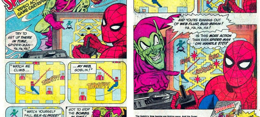
2.  Spider-Man (Atari 2600) print ad

This is an entertaining way to promote a video game based on a comic book icon.

We are back again with the Parker Brothers company and their promotion of the Spider-Man video game for the Atari 2600 which I myself played long ago. Unlike before, the print ad this time was mainly about the Spider-Man game and somehow Parker Brothers coordinated with Marvel Comics to make a comic book-inspired ad. In the above print ad, Spider-Man was shown playing the game about him with an Atari 2600 controller and console, and the Green Goblin taunts him as he plays. This type of ad is a stroke of genius because it shows the Marvel Comics’ icon as a player and the gameplay was emphasized accurately. Even if viewers are not too fond of video games, they can still find themselves interested in reading the literary adventures of Spider-Man.

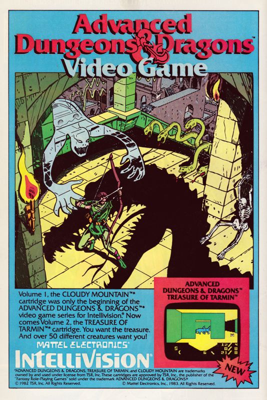
3. Advanced Dungeons & Dragons: Treasure of Tarmin print ad

Apart from emphasizing the fantasy concept of the Dungeons & Dragons franchise, this print ad’s hand-drawn art was strong enough to spark viewers’ curiosity and make them interested in the game or even in the Intellivision console.

Here is a print ad I saw many times while reading comic books in 1983. The game at hand is Advanced Dungeons & Dragons: Treasure of Tarmin released on the Intellivision, and it is the sequel to Cloudy Mountain. Like the ad of its predecessor, the above print ad relied heavily on the spectacle of fantasy (and even a bit of horror) by having hand-drawn art as the eye candy promoting Advanced Dungeons & Dragons: Treasure of Tarmin. If you look closely, only one screenshot from the game was shown and it was enough to tell gamers that the new game has a completely different visual presentation from that of Cloudy Mountain. Considering the primitive nature of computer graphics and game design of the era, having detailed comic book-inspired artwork was effective to grab viewers’ attention with the intention to make them interested in buying the game. In today’s age of computer graphics and social media, this type of ad for video games is rare to see.

4. G.I. Joe: Cobra Strike print ad

The G.I. Joe: A Real American Hero franchise’s early entry into video games.

Going back to Parker Brothers, the company developed and published the first-ever licensed game of the G.I. Joe franchise – G.I. Joe: Cobra Strike for the Atari 2600. In promoting the game, a 2-page ad was released with comic book-style art work (featuring Cobra Commander and Duke representing different sides) dominating the space, with descriptive text and a hand-drawn illustration of the gameplay (read: not a real screenshot) as well as the game box flling the remaining space. In my personal experience, I saw this ad before I even got to watch an episode of the popular G.I. Joe: A Real American Hero animated TV series, and before I got to read an issue the related comic book series (which started before the TV series). Looking back at the above print ad, I can still remember the time when I was puzzled by the two characters simply because I was not yet familiar with them. Take note that the video game and the ad were released at a time when the G.I. Joe: A Real American Hero started rising quickly in popularity on toys, comic books and animation.  

5. Alien 3 (SNES) print ad

This print ad appeared in several comic books I read in 1993.

Way back in 1992, I had one of the most depressing cinema viewing experiences with Alien 3 which had a very troublesome production and lacked a solid foundation behind its creativity. Then in the summer of 1993, print ads of the video game Alien 3 for Super Nintendo Entertainment System (SNES) appeared in several comic books I read at the time. The above print ad was actually entertaining to look at. For one thing, the ad makers used three wide layers of screenshots from the game depicting different areas. Then I noticed the details which showed there were more aliens for gamers to encounter (versus only one in the movie) and the playable lead character Ellen Ripley was armed with guns (versus no guns in the movie) being able to fight the monsters. Not only that, the ad makers knew the specific details from the Alien film franchise which is reflected in the ad referencing the Face-hugger aliens, the acid from the creatures and, of course, the alien eggs. To this day, there are old-time gamers who found the Alien 3 SNES game more entertaining than the movie.

+++++

Thank you for reading. If you find this article engaging, please click the like button below, share this article to others and also please consider making a donation to support my publishing. If you are looking for a copywriter to create content for your special project or business, check out my services and my portfolio. Feel free to contact me with a private message. Also please feel free to visit my Facebook page Author Carlo Carrasco and follow me on Twitter at  @HavenorFantasy as well as on Tumblr at https://carlocarrasco.tumblr.com/ and on Instagram at https://www.instagram.com/authorcarlocarrasco

A Look Back at Spider-Man #2 (1990)

Welcome back superhero enthusiasts, 1990s culture enthusiasts and comic book collectors! Today we go back to the early 1990s and explore a part of the Marvel Comics shared universe through a tale of the Spider-Man monthly series.

In my previous retro review, Todd McFarlane told a tale of the iconic web-slinger with intense build-up leading to another rematch with his old nemesis the Lizard (Dr. Connors). While the writing was pretty weak, McFarlane still managed to tell a tale with a strong element of horror and supernatural stuff. McFarlane’s approach with visual violence and graphic stuff was clearly adulterated. What was presented daringly tested the limits allowed under the Comics Code Authority (CCA).

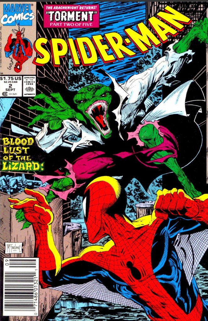
With those details laid down, here is a look back at Spider-Man #2, published in 1990 by Marvel Comics with a story written and drawn by Todd McFarlane. This is also the 2nd chapter of the Torment storyline.

The cover.

Early story

The story begins in New York City where two men got suddenly murdered by the Lizard in an alley during the night. The next morning Peter Parker reads the newspaper (showing the photograph and the news story of the Lizard’s murder of the two men) while having a breakfast moment with his wife Mary Jane. As soon as his wife mentions the word “monster”, Peter takes a 2nd look at the newspaper’s photograph and finally notices the bloody writing “CNNR” on the alley wall which makes him realize that the Lizard is back again.

Feeling very troubled, Peter leaves Mary Jane quietly and dresses up as Spider-Man to go out once again.

Elsewhere in the city, a sorceress uses her evil method of crafting a potion which creates an unrelenting sound of disturbance which Spider-Man hears. As the sound goes on, his focus and Spider Sense get overwhelmed…

Quality

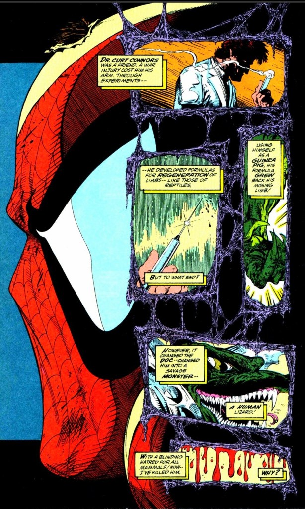
A quick look at the origin of the Lizard by McFarlane.

While the writing by McFarlane remains weak, he still succeeded in making this story a marginal improvement over the previous issue in terms of moving the plot forward, paying off a good chunk of the build-up in issue #1, and establishing his own visual corner (inspired by horror and adulterated stuff) within the Spider-Man franchise of comics of the time.

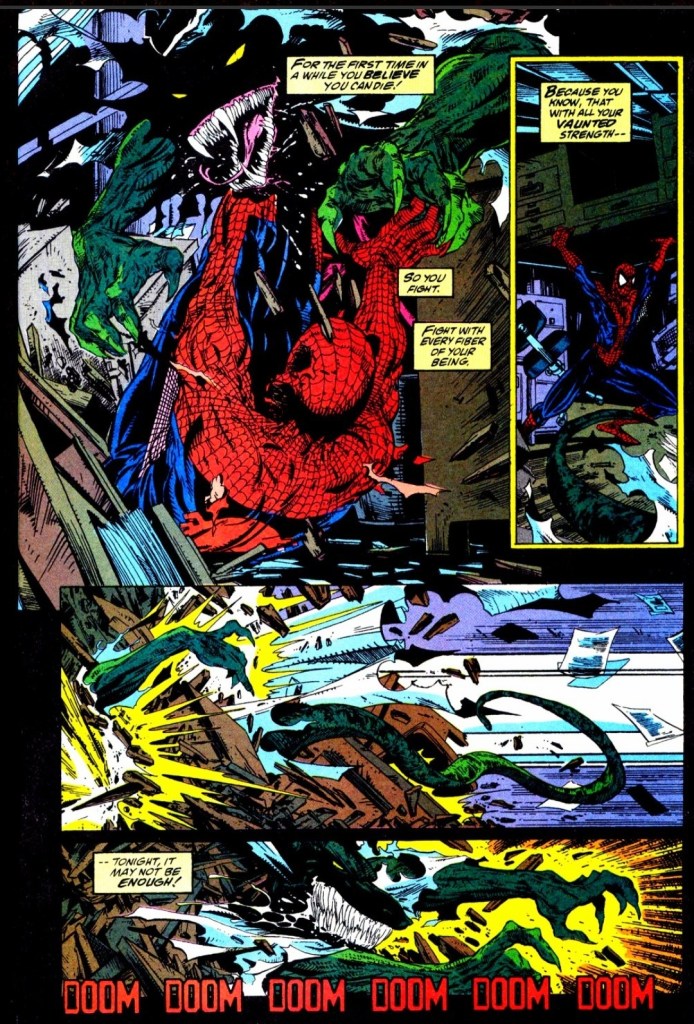
The biggest feature here is the physical conflict between Spider-Man and the Lizard. As expected, McFarlane drew the big fight with a lot of intense action, powerful violence (note: it was clear the editorial team recommended moves to tone down the graphic violence), suspense and a good amount of horror. Not only does the big fight move the story forward, it allowed McFarlane to dramatize Spider-Man as a vulnerable hero who not only has to cope with the disturbance from the sorceress far away, but also deal with the poison he got from the Lizard. That being said, Spidey also struggles with his sanity and the new fact that the Lizard has turned into a murder machine which disturbs him a lot as he personally knew Dr. Connors.

Considering what happened here and in the previous issue, there is still a greater force of evil that awaits Spider-Man and the Lizard happens to be an ultra-violent tool.

Conclusion

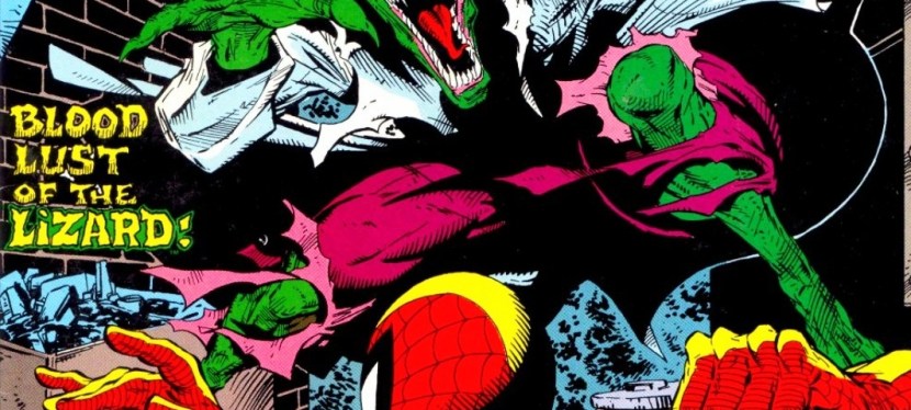
Many times Spider-Man finds himself in a disadvantage while fighting the Lizard.

Being the 2nd chapter of the Torment storyline, Spider-Man #2 (1990) is a slight improvement over the previous issue in terms of moving the story forward, spectacle and dramatization. While the big fight between Spider-Man and the murderous Lizard is clearly the big feature of the story, McFarlane does a good job portraying Spider-Man as vulnerable and on the edge towards defeat. McFarlane’s writing here is still weak but the other positive elements achieved outweighed the weakness.

Overall, Spider-Man #2 (1990) is satisfactory.

+++++

Thank you for reading. If you find this article engaging, please click the like button below, share this article to others and also please consider making a donation to support my publishing. If you are looking for a copywriter to create content for your special project or business, check out my services and my portfolio. Feel free to contact me with a private message. Also please feel free to visit my Facebook page Author Carlo Carrasco and follow me on Twitter at  @HavenorFantasy as well as on Tumblr at https://carlocarrasco.tumblr.com/ and on Instagram at https://www.instagram.com/authorcarlocarrasco

Retro Gaming Ads Blast

Welcome back readers, fellow geeks and electronic gaming fans!

Today I am launching a brand-new series of articles titled Retro Gaming Ads Blast (RGAB) which will explore the many print ads and promotions of video games, computer games, arcade games and handheld games that were published through the decades.

For the newcomers reading this, print ads of games were widely popular and heavily relied on by gamers/players long before smartphones, social media, the worldwide web and online videos even started. Back in the old days, print media was the most common method for companies to market their games while also helping hardware (machines which played the games) reach potential buyers. Such ads appeared in magazines, comic books and newspapers. Not only that, there were several print ads of games that were made to look creative, compelling and even intriguing.

With those details laid down, here is the first batch of retro gaming print ads for you to see and enjoy…

1. Parker Brothers’ Spider-Man-led print ad

Does this ad look amusing?

Remember Parker Brothers? That was a company that started way back in 1883 founded with a strong focus on the enjoyment of games in the form of board games, cards and toys. In the late 1970s, Parker Brothers started making electronic versions of their popular board games and engaged in the video game development and publishing. They also went on to make home ports of popular arcade games in the early 1980 for several gaming platforms.

Parker Brothers was very active with making games for the Atari 2600 console which became the dominant machine for home gaming in North America in 1982. In the above print ad, their marketing heavily emphasize the Spider-Man video game for Atari 2600 and added two others games they also published – Tutankham and Amidar – which was a clever move to market multiple games. The ad’s focus on Spider-Man was amusing and even without showing a single screenshot of the game, it was enough to entice people to watch out for it. Be aware that the Spider-Man game’s development was done by Laura Nikolich who was hired by Parker Brothers at a job fair. Nikolich had full creative control on making the game and had no contact whatsoever with Marvel Comics.

2. Advanced Dungeons & Dragons: Cloudy Mountain print ad

An ad like this was strong enough to motivate gamers’ imagination and interest.

Back in 1982, Advanced Dungeons & Dragons: Cloudy Mountain was released on the Intellivision game console and I was fortunate enough to watch my next-door neighbor play it repeatedly. The above print ad – which simply referred to the game as Advanced Dungeons & Dragons – only had a few words which directly pointed to the main objective of the game…the golden crown. While only one screenshot of the game was displayed, the advertisers heavily relied on hand-drawn, comic book-style fantasy art work to sell the game.

For those who were born long after the 1980s, let me share with you that ads like these were really impressive for their time. It was common for advertisers to use art works (even though they may not accurately reflect the gameplay or game design) and post at least one screenshot to catch the viewer’s attention with the hope that it would even encourage him/her to anticipate the game. It should be noted that ads like these were strong enough to make gamers’ imagination or curiosity grow stronger.  

3. Konami’s collective military video games advertising

Print ad of four games for IBM, Amiga and Commodore.
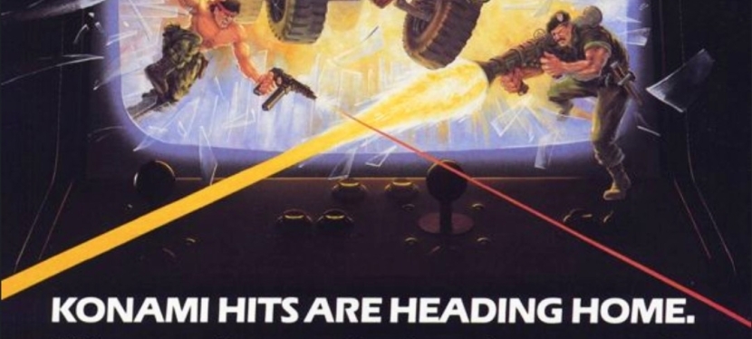
Print ad of Jackal and Contra for the NES.

Konami, the Japanese company that has long been known for Metal Gear, Suikoden and the controversial sacking of famous game designer Hideo Kojima, was aggressive in the gaming business in the 1980s and arguably the aggressiveness was reflected in their publishing of several games that emphasized militarism during the late stages of the Cold War. In short, they made the military look cool and their activities fun to do in digital form.

While Konami has always been identified with console gaming, they actually released Rush’n Attack, Contra, Jackal and Boot Camp on IBM, Amiga and Commodore computers (as seen in the first print ad above) which were popular in the 1980s. The said ad also have a very amusing visual concept emphasizing the excitement and fun of military action games coming to gamers at home for their computers.

The 2nd print ad above – Jackal and Contra for the Nintendo Entertainment System (NES) – was very intriguing to see. It was very clear back in the 1980s that the NES always had a wholesome audience (note: a lot of buyers were parents who wanted to entertain their kids at home) and that includes a lot of very young players. To see the collective ad of Jackal and Contra (for the NES platform) having battle-hardened men in military gear holding guns was openly aggressive to perceive and instantly reminded people about the Cold War (and the menace of Communists, socialists, Marxists and terrorists) and the cultural impact of the mega blockbuster film Rambo: First Blood Part II. This is the kind of ad that would drive today’s woke-minded people crazy and even cause them to panic and pretend to be victims of militarism and patriotism. If you look at the ad closely, you will realize there is simply no room for the garbage of political correctness and wokeness.

Lastly, I myself had played Contra and Jackal with my friends on the Nintendo Family Computer (the Japanese counterpart of the NES) and both military games were a lot of fun to play from start to finish!

4. Batman Returns SNES game ad

This print ad appeared in some comic books I read in the early 1990s.

Way back in 1992, Batman Returns (the sequel to the mega blockbuster Batman movie of 1989) was released in cinemas with intense marketing and merchandising reflecting Warner Bros. intention to replicate the commercial success they had in 1989. Along the way, there were several video game adaptations of Batman Returns that were released on different platforms. Among those many video games was the Super Nintendo Entertainment System (SNES) game of Batman Returns which was developed and published by Konami in 1993 the form of a side-scrolling beat-them-up game.

The above ad was visually appealing with hand-drawn, comic book-style art dominating the spaces while leaving room for some screenshots and a written description of the game. Having seen this ad on multiple comic books I read back then, I can say that the ad was entertaining to see and was effective in making me interested in the game. I played Batman Returns on the SNES but never got to finish it. Oh yes, the game’s audio were really good and there were also digitized images from the movie for the in-game narrative.

5. Flashy Sonic the Hedgehog Japanese print ad

A dazzling approach by Sega on selling Sonic the Hedgehog.

1991 will always be remembered as the year of Sonic who eventually became not only Sega’s most defining mascot but also a video game industry icon. That same year, Sega released Sonic the Hedgehog on the Sega Genesis (referred to as Sega Megadrive in other parts of the world) console and it became a massive success with consumers and the game critics.

In the above Japanese print ad, a very captivating display of light and energy rays dominated the space leaving a minority share left for Sega’s console, screenshots and even a UFO Catcher arcade machine picture. While I could not understand the Japanese text, it seems to me that the flashy visual concept of the ad reflected Sega’s high ambitions with Sonic. How many gamers in Japan bought a copy of Sonic the Hedgehog because of this ad remains undetermined.

6. Japanese Super Star Wars print ad

A long time ago in a galaxy far, far away…

Before Nintendo released its 16-bit game console (referred to as Super Nintendo Entertainment System in America, and Super Famicom in Japan), there were lots of Star Wars video games released on varied platforms and the arcade.

With Nintendo’s 16-bit gaming platform realized, lots of game designers and business partners saw opportunities to make new games with gameplay concepts and designs using the technological advantages of the time. For LucasArts and its partners, taking Star Wars gaming into the next level was inevitable and they made it all come true in 1992’s Super Star Wars video game.

Published in Japan by JVC Musical Industries for the Super Famicom, Super Star Wars was a major leap forward in game design, visuals, sound and enjoyment. Apart from the 2D side-scrolling run-and-gun gameplay, gamers were deeply immersed into Star Wars’ universe with the Mode 7 landspeeder and X-Wing fighter sequences, as well as the first-person trench run sequence.

The Japanese print ad above cleverly presented screenshots from the game while using official imagery from the Star Wars movie poster of 1977 (look at how young Harrison Ford, Mark Hammill and the late Carrie Fisher were back then). The ad is a fine example of combining the greatness of the classic George Lucas-directed film with the highly enjoyable design of Super Star Wars. Lastly, these should remind you that there was a time when Star Wars was not yet tainted by wokeness and the garbage values of the Satanic Leftists (read: woke Disney).   

+++++

Thank you for reading. If you find this article engaging, please click the like button below, share this article to others and also please consider making a donation to support my publishing. If you are looking for a copywriter to create content for your special project or business, check out my services and my portfolio. Feel free to contact me with a private message. Also please feel free to visit my Facebook page Author Carlo Carrasco and follow me on Twitter at  @HavenorFantasy as well as on Tumblr at https://carlocarrasco.tumblr.com/ and on Instagram at https://www.instagram.com/authorcarlocarrasco

A Look Back at Spider-Man #1 (1990)

Welcome back superhero enthusiasts, 1990s culture enthusiasts and comic book collectors! Today we go back to the early 1990s and explore a part of the Marvel Comics shared universe through a tale of the Spider-Man monthly series.

Back in the late 1980s, Todd McFarlane proved to be a highly talented artist who helped Marvel sell a lot of issues of the Amazing Spider-Man series. McFarlane was also highly involved with the creation of Venom which not only became Spider-Man’s deadliest foe but also an icon of Marvel’s. In the year 1990, a brand new monthly series of Spider-Man was launched and it had Todd McFarlane writing and illustrating the tales.

With those details laid down, here is a look back at Spider-Man #1, published in 1990 by Marvel Comics with a story written and drawn by Todd McFarlane. This marks the beginning of the Torment storyline.

The cover.

Early story

The story begins in New York City where countless people walk to their respective destinations not realizing that the local hero Spider-Man was swinging above them. In a dirty alley, Spider-Man prevents an armed thug from harming a woman and leaves him hanging covered with a lot of web.

Elsewhere in the city, a sinister figure conducts a ritual, prays to evil forces and begins using magic.

In yet another location, a hideous creature emerges from the water. It’s the Lizard…

Quality

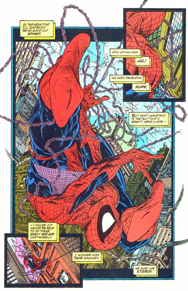
This page is an example of Todd McFarlane creating a travel sequence that allowed him to draw something great. It’s a classic example of moving back into the comfort zone.

To make things very clear here, this comic book is pretty shallow and hollow mainly due to its storytelling as this was the writing of a very young Todd McFarlane. There is no denying that his art here is great to look at from start to finish. In fact, this was one of McFarlane’s finest visual works ever with Marvel.

But if you look beyond the great visuals, the writing is very weak all throughout the issue. At best, this comic book is a grand-looking yet shallow set-up for the conflict of the Torment storyline complete with shared emphasis on the iconic web-slinger, the Lizard (looking more menacing than before) and Calypso (the one behind the magic and rituals).

In fairness to McFarlane, he added his own touch on emphasizing the personalities of Peter Parker and wife Mary Jane simultaneously as a couple. If you were used to seeing in-depth character development and witty dialogue about the two major characters as portrayed in the Amazing Spider-Man, Web of Spider-Man and Spectacular Spider-Man series of 1990, you won’t find them in this comic book. Under McFarlane’s writing, Spider-Man in this issue showed signs of sarcasm and cockiness in the first scene, and with Mary Jane he (as Peter Parker) expressed himself philosophically. To say the least, the portrayal of Spider-Man here is noticeably different under McFarlane.

The Lizard, a long-time rival of Spider-Man’s, was presented to be very violent and murderous in this issue. This was clearly McFarlane’s approach on emphasizing the force of opposition that awaits the iconic web-slinger and he obviously went for a more adulterated approach with the visuals. That being said, the violent content in this comic book is very unique and clearly stood out from the rest of the Spider-Man-related comics published by Marvel in 1990. Lastly, I should say that McFarlane’s visual take on the Lizard is the best I have seen.  

Going back to the visuals, McFarlane implemented strong elements of horror, darkness and grittiness which went along well with the adulterated approach to violence.  These mixed elements, as they turned out in reality, became part of McFarlane’s future works past Spider-Man.

Conclusion

McFarlane’s vicious and horrifying approach on visualizing the Lizard can’t be ignored. This Lizard makes the cinematic Lizard of the 2012 movie The Amazing Spider-Man look cartoony.

Spider-Man #1 (1990) is a very mixed bag when it comes to literary enjoyment. It clearly has great artwork by McFarlane whose adulterated approach on expression and spectacle made it very unique. The writing by McFarlane (who was very young at the time of production) is clearly the big letdown although his own approach on portraying Spider-Man, MJ and the Lizard are very notable. Take note that this was Todd McFarlane starting with writing while doing the art (his true strength), and at this point in comic book history his talent on telling compelling stories would not be realized until a few years later (particularly with Spawn and Image Comics). Notably, his use of visual horror and darkness predates his work in Spawn which makes his Spider-Man take very distinct. Ultimately, this comic book served as a build-up for things to come in the Torment storyline. Don’t expect too much when acquiring this comic book.

Overall, Spider-Man #1 (1990) is satisfactory.

+++++

Thank you for reading. If you find this article engaging, please click the like button below, share this article to others and also please consider making a donation to support my publishing. If you are looking for a copywriter to create content for your special project or business, check out my services and my portfolio. Feel free to contact me with a private message. Also please feel free to visit my Facebook page Author Carlo Carrasco and follow me on Twitter at  @HavenorFantasy as well as on Tumblr at https://carlocarrasco.tumblr.com/ and on Instagram at https://www.instagram.com/authorcarlocarrasco

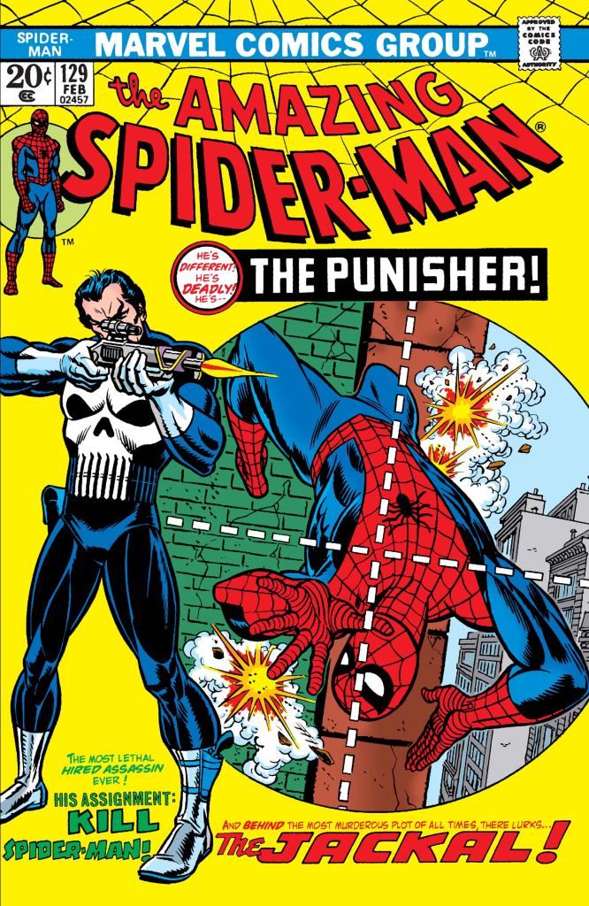
A Look Back at Amazing Spider-Man #129 (1974)

Welcome back superhero enthusiasts, 1970s arts and culture enthusiasts, Marvel Comics fans and comic book collectors! Today we go back to the year 1974 to examine a highly significant tale from Marvel Comics’ shared universe – the first appearance of the Punisher and his first-ever encounter with Spider-Man.

To put things in perspective, Punisher’s literary debut was told within the Amazing Spider-Man comic book series and it happened not too long after the legendary tragedy of Gwen Stacey. During the 1970s, Hollywood made and released several action movies and crime thrillers that were violent, gritty and highlighted vigilantes and assassins. Some of that influence somehow made it into Marvel’s shared universe which was symbolized creatively through the Punisher who debuted as an assassin.

With those details laid down, here is a look back at Amazing Spider-Man #129, published in 1974 by Marvel Comics with a story written by Gerry Conway and drawn by Ross Andru (the same creative duo behind Superman vs. The Amazing Spider-Man crossover).

The cover.

Early story

The story begins inside a private facility an assassin wearing black with a huge skull on his upper body heavily damages a solid statue of Spider-Man using a powerful rifle. This impresses the hideous villain called the Jackal who tells him that if he does well with the real Spider-Man, he would have performed a great service for the world. Knowing he impressed the Jackal, the Punisher states that he will only kill those who deserve killing and he expresses his belief that the webslinger deserves to die.

Elsewhere, Spider-Man swings into action and successfully stops an armed robbery from happening. Along the way he managed to capture photographs, changes into his civilian clothes and enters the Daily Bugle’s office ready to submit the roll of film as Peter Parker. Unfortunately, his superior J. Jonah Jameson disregards Parker’s submission and points out that the Punisher made waves with New York’s readers via the Bugle’s competitor The New York Star. For Jameson, the Punisher is only the most newsworthy thing to happen to New York and tells Parker he wants photos of the assassin…

Quality

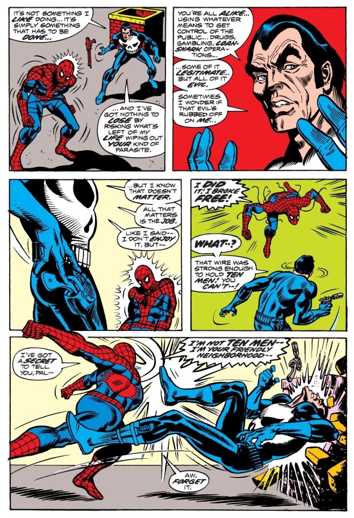
This is a scene from the first of two encounters between Spider-Man and the Punisher who was introduced as an assassin.

To make things very clear about storytelling without spoiling plot details, this is a tale about intrigue and the darker side of society that involves vigilantes and murdering. The Punisher here did not debut as a crime-busting vigilante but rather an assassin who accepts assignments from clients as long as the jobs fall in line with his personal philosophy that focuses on taking the lives of those who deserved to be killed. That being said, it is clear that Hollywood’s vigilante flicks of the 1970s influenced the presentation and I can say that whenever the story focuses on the Punisher, there definitely is a grim tone which contradicts the tone of Spider-Man’s scenes.

Spider-Man here continues to struggle somewhat with his personal life having recently lost Gwen Stacey while remaining disturbed about the identity of the Green Goblin. The webslinger also has to live with the heavy situation in which a lot of people in New York were convinced that he killed Norman Osborne which was the result of his own boss’ handling of the Daily Bugle. These elements along with his civilian involvement with his newspaper creatively added to the build-up of Spider-Man’s eventual encounters with the Punisher. The build-up was structured nicely and the pay-off was worth it.

There was also the introduction of Jackal. While he has a hideous appearance, his participation was more about scheming than action which contrasted him with the Punisher. For the newcomers reading this, Jackal is actually Miles Warren in a more monstrous form. From this comic book, it was clear that Jackal was created to be a recurring super villain for Spider-Man and this was strongly executed in the first Clone Saga of 1975 and the controversial Clone Saga of the 1990s.

Going back to the Punisher, he symbolically uses guns with designs that were more grounded in reality (inspired by real-life guns in looks) instead of taking influence from science fiction. As an assassin living with a strong code, the Punisher is truly determined to eliminate Spider-Man whom he even referred to as a murderer. The perception of Spider-Man as a criminal on the part of the Punisher clearly reflected the defamation caused by the Daily Bugle on the webslinger. Gerry Conway established the assassin to be a strong believer in fighting evil by using violence and killing.

The build-up of the Punisher is very solid and the pay-off in the form of battles with Spider-Man is tremendous and very satisfying to read. There is a lot of action to enjoy here and most notably Gerry Conway maintained a strong narrative throughout.

Conclusion

Have you ever worked in a newspaper before?

I can say out loud that Amazing Spider-Man #129 (1974) is truly a great read and a true illustrated literary classic of Marvel Comics. This tale alone added a touch of darkness and grit (in the form of vigilante and assassins cultures) into the Spider-Man legacy. Apart from its status as a comic book classic, this one paved the way for the rise of the Punisher in terms of more comic book appearances and the publishing of new comic book series featuring him. While the Punisher’s legacy as a killer is obviously not something worth believing in, Marvel Comics took the risk of having him as one of their primary characters in the decades that followed. This particular story is so significant, Marvel Comics revisited it with What If #58 (1994). Check out my other Punisher-related retro reviews by clicking here, here, here, here and here.

Overall, Amazing Spider-Man #129 (1974) is highly recommended!

+++++

Thank you for reading. If you find this article engaging, please click the like button below, share this article to others and also please consider making a donation to support my publishing. If you are looking for a copywriter to create content for your special project or business, check out my services and my portfolio. Feel free to contact me with a private message. Also please feel free to visit my Facebook page Author Carlo Carrasco and follow me on Twitter at  @HavenorFantasy as well as on Tumblr at https://carlocarrasco.tumblr.com/ and on Instagram at https://www.instagram.com/authorcarlocarrasco

A Look Back at Spider-Man 2099 #43 (1996)

Welcome back superhero enthusiasts, 1990s culture enthusiasts and comic book collectors! Today we go back to the year 1996 and explore a part of the Marvel 2099 comics universe through a tale of the Spider-Man 2099 monthly series.

In my previous retro review, Miguel O’Hara learns how challenging it could be for him to direct the path of Alchemax which is symbolize with himself being surrounded by the managers. He recently stopped his father Tyler Stone from taking control of his office. As his office needs a secretary, someone very exceptional came in.

With those details laid down, here is a look back at Spider-Man 2099 #43, published in 1996 by Marvel Comics with a story written by Peter David and drawn by Andrew Wildman and Ron Lim.

The cover.

Early story

The story begins when one of the undersea bases of Alchemax explodes to the surface in heavily damaged form. Something terrible happened to it deep below and there is only one man (wearing a protective suit) still living floating on the sea. Just as he notices sharks coming his way, Spider-Man comes down to save him with the use of one of Alchemax’s floating vehicles. As Spider-Man pulls the helpless man up with his web, one of the sharks leaped high at them. The web breaks and both the man and Spidey fall into the sea.

Meanwhile at Alchemax, Gabriel O’Hara confronts his mother Conchata who very recently started working as the office secretary of Miguel. Gabriel asks how could she be working for Miguel as part of Alchemax which is the very corporation she hated. The mother answered back stating that she resolved her accumulated anger related to Miguel and has realized that he needs her…

Quality

The rise of the mutate rebel Roman and Miguel O’Hara’s corporate interactions dramatized efficiently in this single page.

Moving further away from what was dramatized in issues #40 and #41, Peter David crafted this tale focusing on a new threat that endangers not only Spider-Man but the people and their local society as a whole. To put things in perspective, it is recommend you revisit issue #8 and focus on Alchemax’s aquatic division called Atlantis which had been working on a major reclamation project under the sea with the objective of becoming a tourist attraction in the years to come. Right there, Tyler Stone mentioned Miguel’s involvement with the project which includes bio-engineered workers.

The key elements of Atlantis mentioned in issue #8 literally resurfaced in this comic book and Peter David heavily emphasized the related details and integrated it all in the plot which essentially justified the existence of the new opposition led by Roman who is the charismatic leader of the mutates (genetically designed sentient beings) who had long been working hard and long outside of the undersea bases which had humans living comfortably inside. Roman here is not related in any way to Marvel’s aquatic hero Namor the Sub-Mariner but he is an imitation of him (note: his name is Namor in reverse).

The conflict of Atlantis revives the business-laborers conflict but was twisted to show the conflict between humans and mutates, as well as Atlantis being symbolized as a physical project of Alchemax to exploit the aquatic life and resources deep under the sea. The build-up of the human-mutates conflict in this particular comic book is surprisingly beefy and was efficiently done.

As for Spider-Man himself, you will get to see him more involved with Alchemax just as he successfully keeps his civilian identity secret. Along the way, you will see more of Miguel O’Hara doing more corporate work and negotiations. As expected, his drive to lead Alchemax with his own perception of being compassionate encounters hurdles from the established order – both within and outside his company. His mother was portrayed to be more sympathetic than before and she shows lots of signs of having mellowed. The development on Miguel and Conchata here were deep and they made a lot of sense with the plot itself.

Conclusion

The futuristic Spidey interacts with a huge shark!

Spider-Man 2099 #43 (1996) is another tale that has aged well as its foundations and elements proved to be very solid until now. With regards to the big event that took place near the end of this comic book, it seems that Peter David took inspiration from what was portrayed in Fantastic Four #4 (1962) as well as from Namor the Sub-Mariner himself. I really enjoyed how this story became a huge pay-off to the minor build-up in issue #8.

Overall, Spider-Man 2099 #43 (1996) is highly recommended!

+++++

Thank you for reading. If you find this article engaging, please click the like button below, share this article to others and also please consider making a donation to support my publishing. If you are looking for a copywriter to create content for your special project or business, check out my services and my portfolio. Feel free to contact me with a private message. Also please feel free to visit my Facebook page Author Carlo Carrasco and follow me on Twitter at  @HavenorFantasy as well as on Tumblr at https://carlocarrasco.tumblr.com/ and on Instagram at https://www.instagram.com/authorcarlocarrasco