Welcome back readers, fellow geeks and electronic gaming fans!
In this edition of the Retro Gaming Ads Blast (RGAB) series, we will take a look at another batch of retro gaming print ads – including arcade flyers – from the 1980s and 1990s.
For the newcomers reading this, Retro Gaming Ads Blast (RGAB) looks back at the many print ads of games (console, arcade, computer and handheld) that were published in comic books, magazines, flyers, posters and newspapers long before smartphones, social media, the worldwide web and streaming became popular. To put things in perspective, people back in the 1980s and 1990s were more trusting of print media for information and images about electronic games and related products.
With those details laid down, here is the newest batch of retro gaming print ads for you to see and enjoy…
1. Operation Wolf American and Japanese arcade flyers
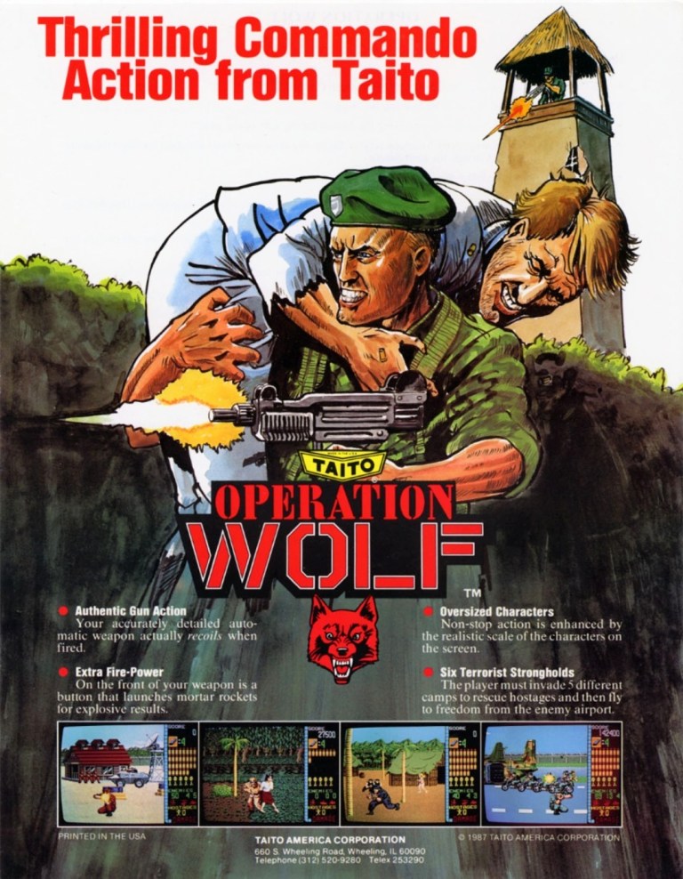
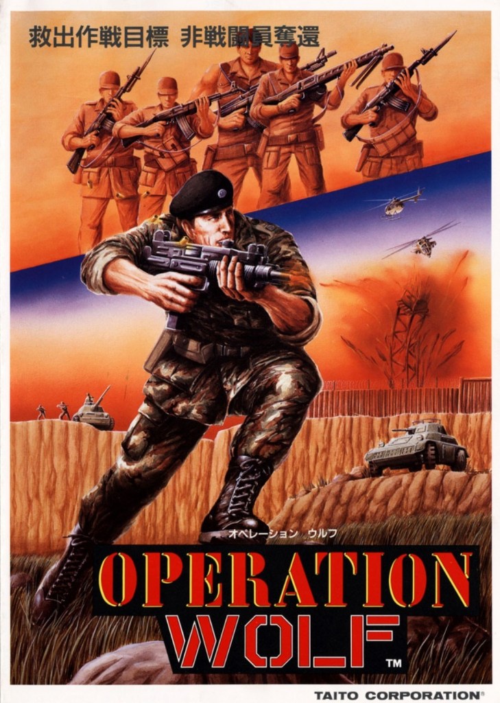
In the late 1980s, Taito achieved massive success in arcades around the world with Operation Wolf. Released during the late stage of the Cold War and with many militaristic action movies already released by Hollywood, Operation Wolf attracted a lot of money from countless players as well as praise from game critics. For the American market, Taito came up with a colorful yet gritty looking arcade flyer that had nice hand-drawn artwork and enough details and screenshots to give readers a useful look at what to expect. The Japanese arcade flyer meanwhile has an even grittier looking original artwork that strongly emphasized war, guns and action. In retrospect, I look both arcade flyers a lot.
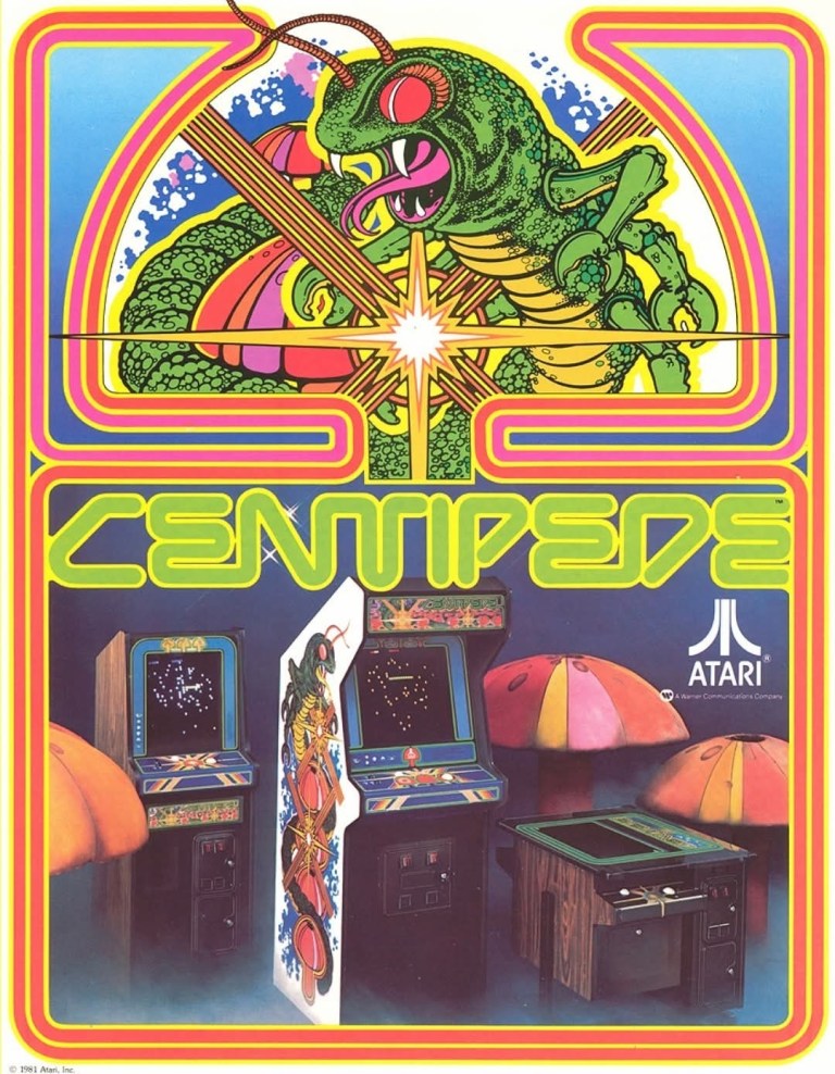
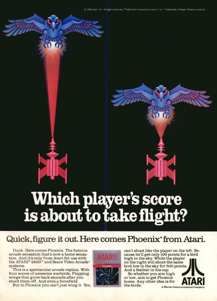
2. Centipede Atari 2600 and Atari 5200 print ad
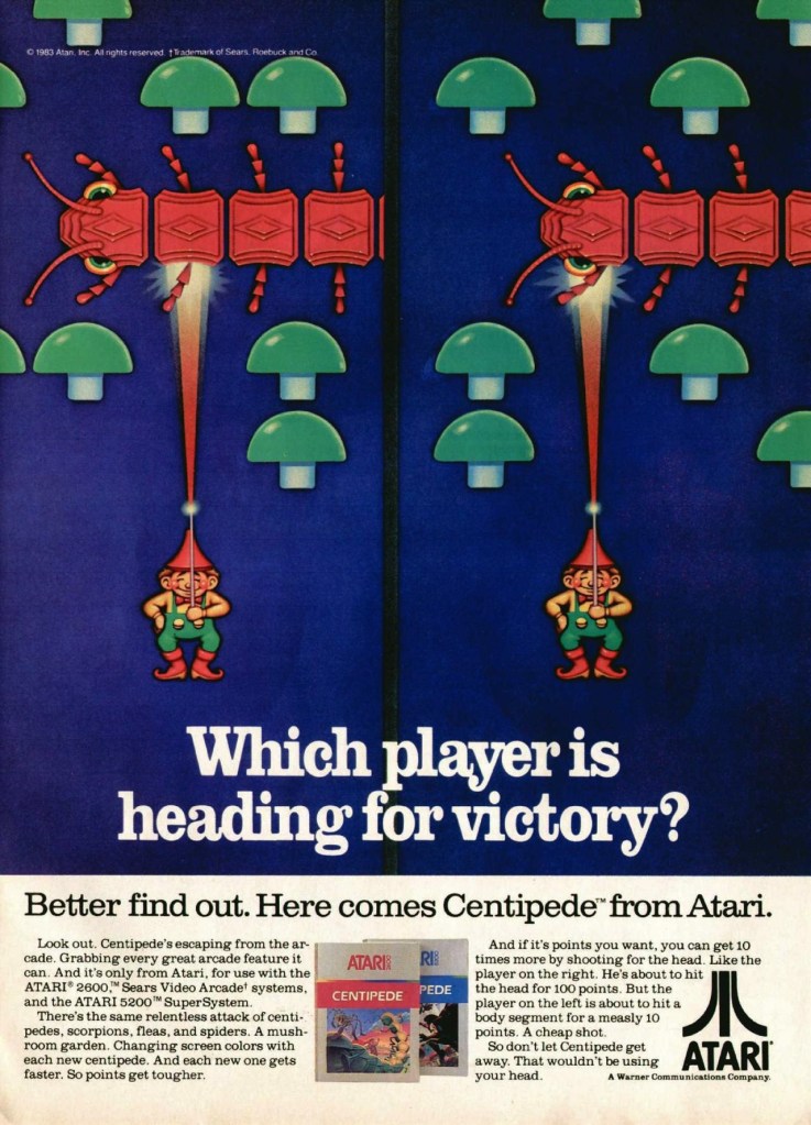
While I completely missed out on the arcade version of Centipede, I managed to play its Atari 2600 version a lot. Ultimately, the simple game design and unique challenges resulted in lots of fun-filled bouts in my experience. To promote the game’s versions on Atari 2600 and Atari 5200, the game giant came up with this particular print ad that had two near-identical artworks that reflect the concept of Centipede. The ad also has some catchy expressions in the text description. This old ad is still fun to look at.
3. Atari RealSports print ad
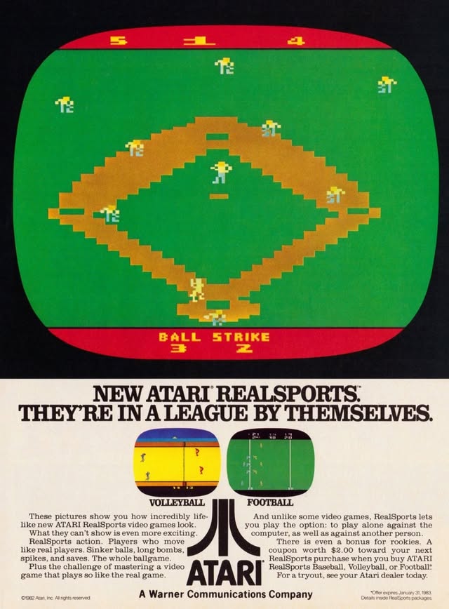
Way back in 1982, Atari launched its RealSports line of sports video games mainly to revitalize sports gaming for their consoles. In fact, RealSports was the result of a critical and aggressive ad campaign by competitor Intellivision which had its Sports Network series of games. In this RealSports print ad, a large image of Atari’s baseball game was used probably to emphasize the scope of the field. The ad had screenshots of the volleyball and football games, while the text description reflected Atari’s aggressive response to Intellivision. This ad is an early example of competition between rival game console makers focused on sports gaming.
4. Lethal Enforcers Sega CD print ad
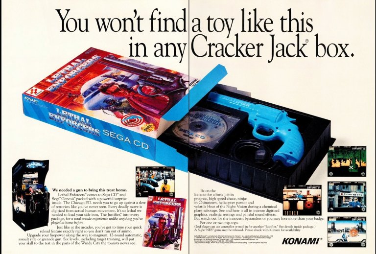
Porting light gun games from the arcade to the console is very difficult and tricky to do. This is what Konami did in the early 1990s when they released a version of the arcade hit Lethal Enforcers on the Sega CD console and the package had a light gun with the game on disc. To promote the Sega CD version, Konami came up with a 2-page print ad with the catchy line “You won’t find a toy like this in any Cracker Jack box.” In addition, their ad had a few paragraphs of descriptive text to not only excite gamers but also gently inform them that Lethal Enforcers was also available on the Sega Genesis (note: this console is required for the Sega CD add-on to work) and the Super Nintendo Entertainment System (SNES). Overall, this old ad has a strong visual approach and a clever marketing strategy.
5. Pitfall II: Lost Caverns Atari 2600 print ad
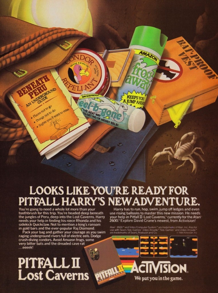
In 1982, Activision struck gold with the huge success of Pitfall! which became an influential model of designing platform games. Of course, the publisher (now owned by Microsoft) did not stop there as they went on to make the sequel Pitfall II: Lost Caverns to not only keep the success going but also to exceed the standard they set with the first game. Activision came up with a print ad that not only told gamers of Pitfall Harry’s next adventure but also express humor visually. In line with Activision’s policy of crediting its creators (note: Atari was notorious for refusing to credit its game makers during this era), game designer David Crane was acknowledged in the ad.
6. Team USA Basketball print ad
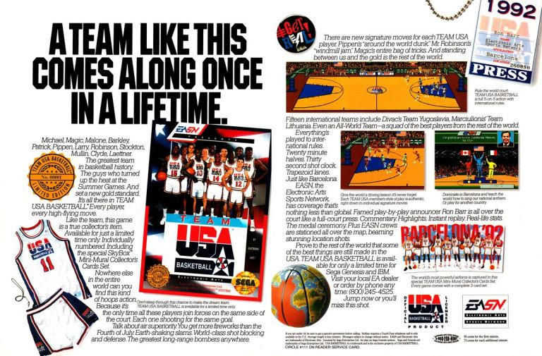
In 1992, a lot of people were obsessed with the Dream Team Olympic basketball squad of the United States as its roster had NBA legends like Larry Bird, Magic Johnson, Michael Jordan, Karl Malone, Charles Barkley and David Robinson to name a few. In fact, the Dream Team became the most popular attraction among all teams in any sport of any country that participated in the summer Olympics in Barcelona. Knowing how popular the squad really was, Electronic Arts (EA) made the video game Team USA Basketball and released it on the Sega Genesis which was already a popular console for sports video games. EA came up with this eye-catching 2-page print ad that strongly emphasized the Dream Team, international basketball gaming, and the company’s tested design on 2D basketball video games. In retrospect, this print ad is still amusing and exciting to look at.
7. Jungle Hunt Atari 2600 and Atari 5200 print ad
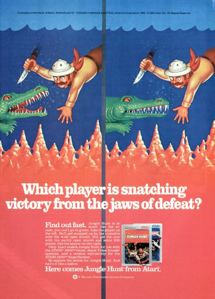
Following the huge success of Jungle Hunt (previously titled as Jungle King), Atari saw potential Dollar signs and made a deal with Taito to publish ports under their own brand for the Atari 2600, Atari 5200 and 8-bit computers. As with the Atari console ads of Pitfall II: Lost Caverns and Phoenix, Atari came up with a print ad that featured two parallel artworks that look similar with each other as they promoted Jungle Hunt for Atari 2600 and Atari 5200. To their credit, the artworks used were detailed and eye-catching, and the descriptive line of words displayed carried a possible reference to 1975’s Jaws.
8. GameShark print ad
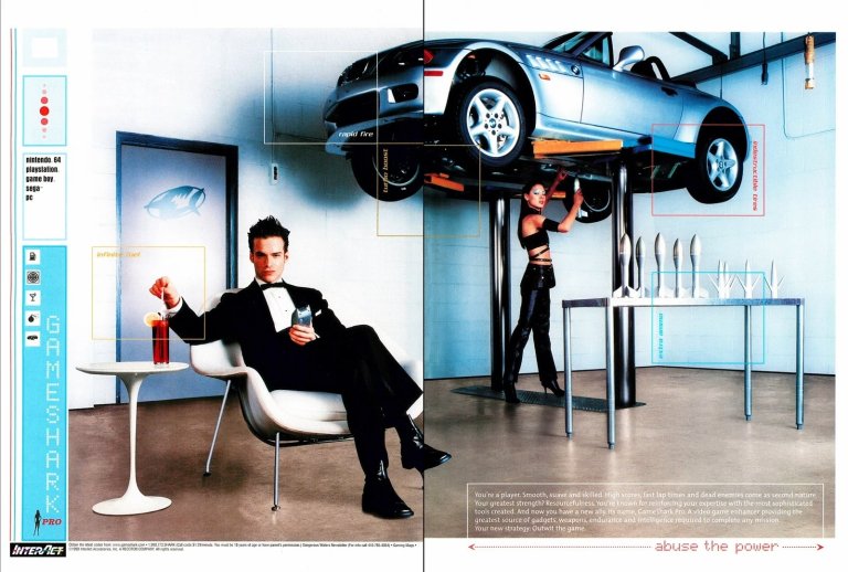
Remember GameShark? For the newcomers reading this, GameShark is the brand of a line of products released on different video game consoles and personal computers (Windows specifically) that gamers use to cheat in video games. GameShark was popular at a time when not too many people had access to the Internet nor did gamers had the means to search for cheats online, and codes were needed to enable cheating. GameShark became so popular, more ambitious and stylish print ads were realized such as this James Bond-inspired 2-page ad. On face value, this ad looked like it was a promoting a particular game but ultimately it was about promoting GameShark with style, cool and some sexiness.
+++++
Thank you for reading. If you find this article engaging, please click the like button below, share this article to others and also please consider making a donation to support my publishing. If you are looking for a copywriter to create content for your special project or business, check out my services and my portfolio. Feel free to contact me with a private message. Also please feel free to visit my Facebook page Author Carlo Carrasco and follow me on Twitter at @HavenorFantasy as well as on Tumblr at https://carlocarrasco.tumblr.com/ and on Instagram at https://www.instagram.com/authorcarlocarrasco