Welcome back, my readers, YouTube viewers and all others who followed this series of articles focused on YouTube videos worth watching. Have you been searching for something fun or interesting to watch on YouTube? Do you feel bored right now and you crave for something to see on the world’s most popular online video destination?
I recommend you check out the following topics and the related videos I found.
#1Minty Comedic Arts’ trivia video about V: The Original Miniseries, V: The Final Battle and V TV series – If you are a fan of the V sci-fi entertainment franchise that made big waves on television in the 1980s, then you must watch Minty Comedic Arts’ video which covers V: The Original Miniseries (1983), V: The Final Battle (1984) and the creative mess that was the V TV series. The video also includes the 2009 V TV series which makes it a complete package for all V fans. If you are a long-time V fan, now is a good time to test your knowledge by watching the video below.
#2 Moneymaking locations in Red Dead Redemption 2 – If you have been struggling to make big money in the realm of the 2018 blockbuster video game Red Dead Redemption 2, then this video by YouTuber MrBossFTW must be seen. In RDR2 there are indeed places where you can find gold bars, sets of Dollar bills and other valuables that can sell in-game. There are indeed challenges to find the riches but they are worth doing.
#3 Hezbollah terrorists and allies hit hard by as their communication devices blew up – Recently several Hezbollah terrorists and some allies got hit hard because the pagers used turned out to be bombs which blew up and crippled their communication network. The initial attack even injured the Iranian ambassador to Lebanon himself got injured because he was also using the same pager that Hezbollah uses. The high-tech attacks not only happened in Lebanon but also in Syria where some Hezbollah terrorists were present. Unsurprisingly, the Islamic terrorists blamed Israel. Watch and learn from the videos below.
#4 Wokeness of Dragon Age: The Veilgard exposed – I really don’t like when the woke activists working in entertainment deform video games, movies and comic books as they turned them into vehicles promoting their pathetic agenda. Simply put, whatever the Satanic Left touches, they ruin it. The same can be said about the upcoming video game Dragon Age: The Veilgard. Already it can be seen that there is indeed a lot of woke stuff in the new game and YouTuber Ryan Kinel – RK Outpost posted a video explaining what was found and why the gamers heavily rejected the new Dragon Age game. Watch and learn from the video below.
#5 Kamala Harris’ dishonesty and lying – There is no doubt that the Democrats in American nominated a very dishonest candidate for US President with Kamala Harris. Harris is truly a Communist and she will do anything bad to gain power. That being said, her lying is clear and the corrupted mainstream news media just let her get away with poisoning people’s minds. Watch and learn from the videos below.
#6 PS5 Pro reactions – In recent times, Sony unveiled the PlayStation 5 Pro (PS5 Pro) which is the upgraded version of the PS5. Apart from the flawed console presentation by Sony, PS5 Pro is overpriced at $699 for America and it does not even have an optical drive and no vertical stand is included. For your reference, posted below are selected videos about the reactions and analysis of the PS5 Pro. Things are not really looking good for the upgraded PS5.
Disclaimer: This is my original work with details sourced from reading the comic book and doing personal research. Anyone who wants to use this article, in part or in whole, needs to secure first my permission and agree to cite me as the source and author. Let it be known that any unauthorized use of this article will constrain the author to pursue the remedies under R.A. No. 8293, the Revised Penal Code, and/or all applicable legal actions under the laws of the Philippines.
Welcome back superhero enthusiasts, 1980s culture enthusiasts and comic book collectors! Today we go back to the year 1987 to explore a part of the Marvel Comics shared universe through the Web of Spider-Man monthly series.
In this review, we will examine the opening chapter of one of the more significant storylines of the entire publishing history of Spider-Man… Kraven’s Last Hunt. Behind the scenes, writer J. M. DeMatteis came up with a concept about a limited series featuring the Marvel hero Wonder Man getting buried and returning from the grave. After getting rejected, the writer redeveloped his concept, proposed it to DC Comics (with Batman in mind), got rejected again and pitched the concept again to Marvel (with Spider-Man in mind) with a new villain who would really define the storyline. Marvel accepted the proposal and DeMatteis proceeded to write it while adding more Spider-Man elements to it.
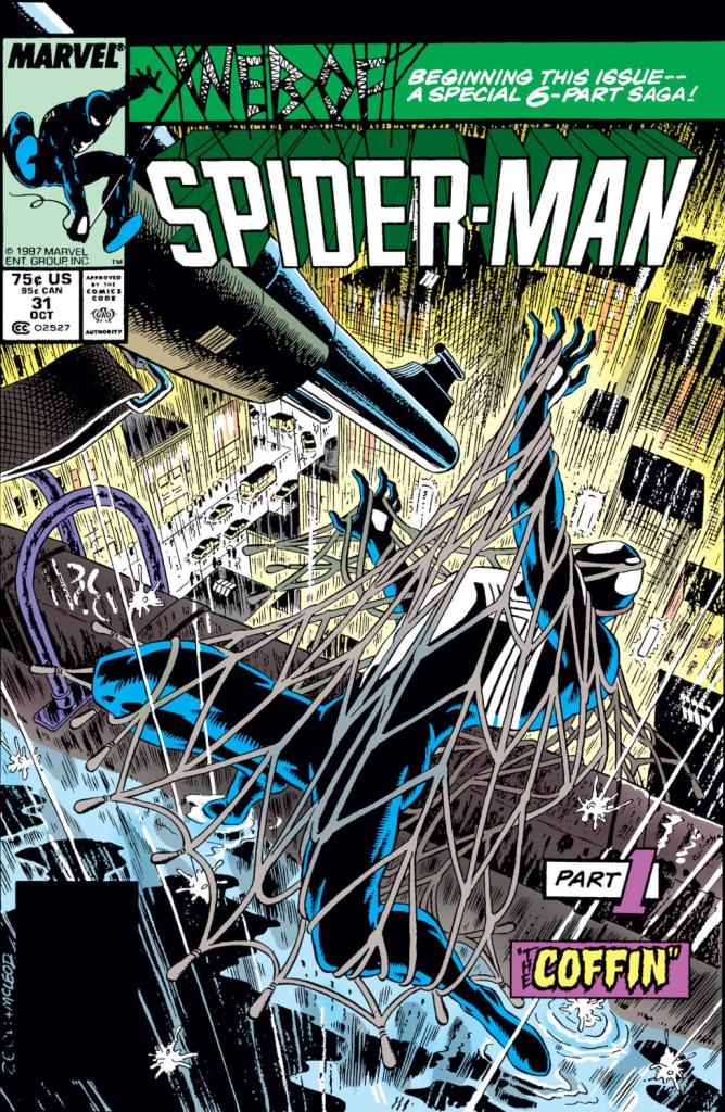
With those details laid down, here is a look back at Web of Spider-Man #31, published in 1987 by Marvel Comics with a story by J.M. DeMatteis and drawn by Mike Zeck.
The cover.
Early story
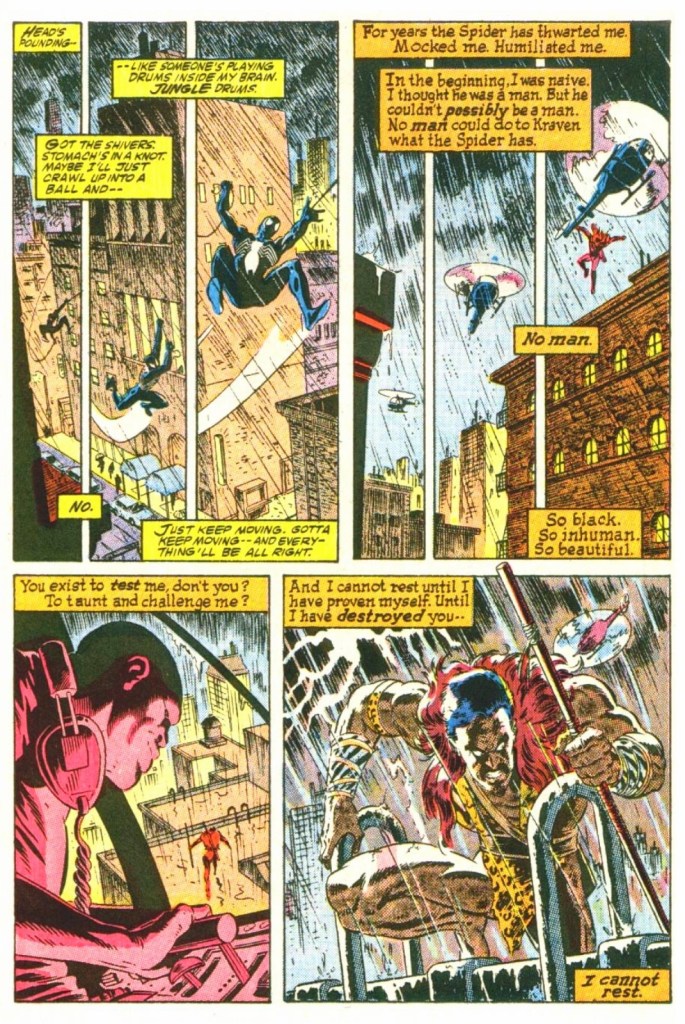
The story begins with Kraven The Hunter moving and attacking like an animal interacting with life-sized figures of animals inside his castle. Afterwards, he slows down, gets a drink and walks into another large room that has an open coffin. He pulls out a black costume that carries the design of Spider-Man’s own costume. Kraven, who was a child when his parents arrived in America shortly after the overthrow of the Czar in Russia, is convinced that the world seem to have followed Russia’s sad example and he found dignity in the jungles instead of the cities. He found honor in the primal, not the civilized. He knows he will die soon and Spider-Man is the central part of his final pursuit in life.
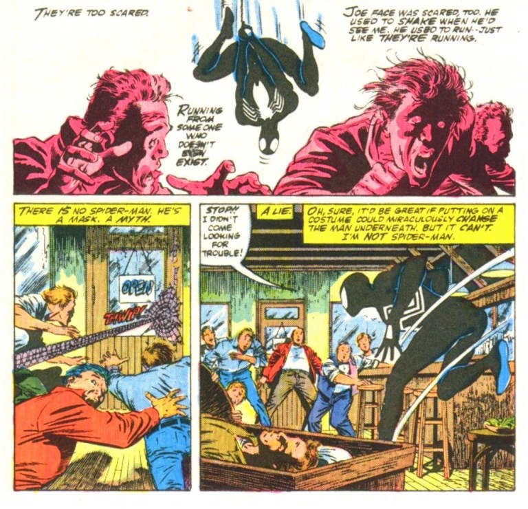
Meanwhile in another part of New York City, Spider-Man discreetly attends the private gathering of several men in a bar who pay their last respects to the late Joe Face (a helpful friend of Spidey). As soon as he revealed himself, the men got scared of him and tension intensified. The webslinger pays his respect to Joe Face and puts several Dollar bills into the collection of funds.
Spider-Man then swings his way home…
Quality
As Spider-Man travels, Kraven the Hunter pursues him obsessively.
I want to state first that this Spider-Man tale has a dark and gritty presentation. The story feels really grounded with reality and it has an almost perfect atmosphere for the concept about Kraven getting ready to eliminate Spider-Man and do something very ambitious afterwards. The pacing of the storytelling moved at a medium pace and most notably, the build-up is really great to follow.
Without spoiling the plot, Kraven is truly the most featured character of this comic book as Spider-Man was written to be his moving target. DeMatteis invested a lot of creativity to build up Kraven not only as the definitive menace but also as a human being. Through the rich writing, Kraven is a man who developed and heavily prepared himself to achieve his goal. You will realize what he thinks about modern society, how he views life and why he is acting as if each day would be his last. As a villain, the evil of Kraven is very subtle yet he emerges as the deadliest foe of Spider-Man. This is truly a major development of the hunter when compared to his first-ever appearance in Amazing Spider-Man #15 (1964).
Through the views of Kraven, you will realize his own perception of Spider-Man which is intriguing to read as we readers know the webslinger’s true identity while the obsessed hunter does not. In relation to his obsession with Spider-Man, Kraven truly immerses himself with what he knows and does things that all other people would never do. I should also state that the hunter’s intense preparation has strong parallels with Batman’s approach on preparing himself for a major encounter.
As mentioned earlier, the webslinger is the target. Spider-Man appears as a disturbed and vulnerable figure and there is nothing that his powers can do to help him overcome his problems. As the build-up grows, the troubles of Spider-Man intensified which made the reading experience captivating.
Conclusion
People getting spooked by Spider-Man’s sudden appearance.
Web of Spider-Man #31 (1987) is truly a great read and it is also a very powerful opening of its storyline. By having Kraven as the definitive character and Spider-Man as the target, this comic book really subverted expectations backed with powerful writing by DeMatteis. Along the way, Mike Zeck’s artworks truly captured the dark and gritty tone of the script and this resulted in a very captivating visual presentation.
Overall, Web of Spider-Man #31 (1987) is highly recommended.
Welcome back readers, fellow geeks and electronic gaming fans!
In this edition of the Retro Gaming Ads Blast (RGAB) series, we will take a look at another batch of retro gaming print ads – including arcade flyers – specifically about fighting games that were released in the 1990s. The said decade marked the time when Street Fighter II became a massive hit in the video arcades (and on game consoles) which sparked a wave of new fighting games from business competitors. In that same decade, 3D polygonal fighting games were also released which added greater choices of fighting games at the arcades and on game consoles that players could choose from.
For the newcomers reading this, Retro Gaming Ads Blast (RGAB) looks back at the many print ads of games (console, arcade, computer and handheld) that were published in comic books, magazines, flyers, posters and newspapers long before smartphones, social media, the worldwide web and streaming became popular. To put things in perspective, people back in the 1980s and 1990s were more trusting of print media for information and images about electronic games and related products.
With those details laid down, here is the newest batch of retro gaming print ads for you to see and enjoy…
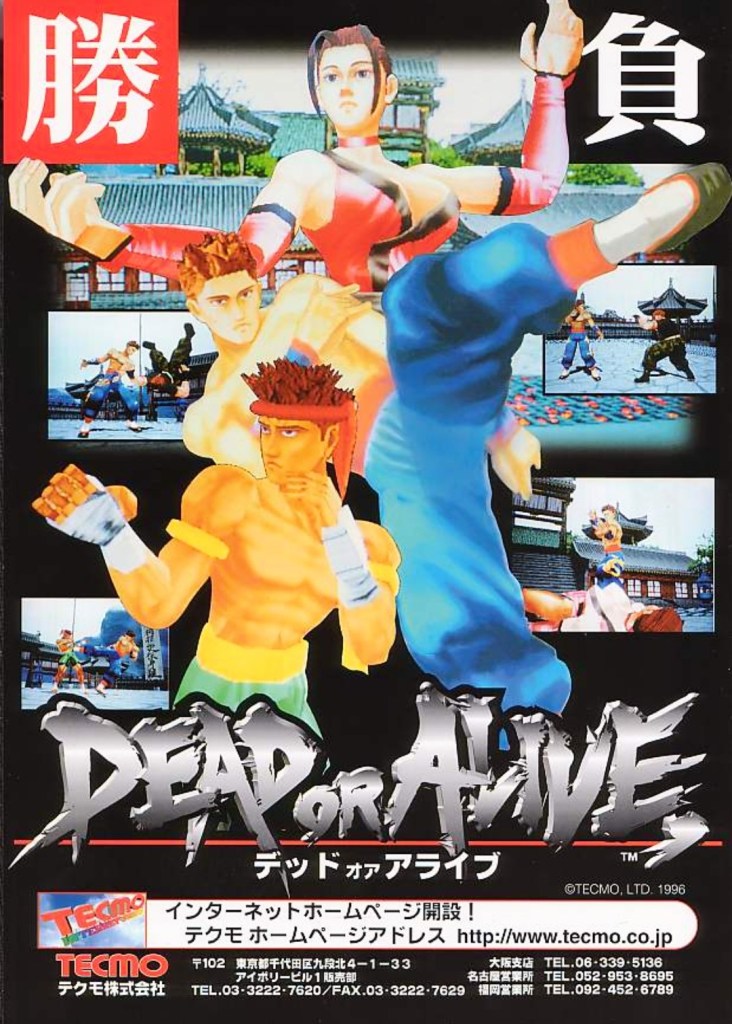
1. Dead or Alive Japanese arcade flyer
Dead or Alive was the start of new success that impacted the direction of Tecmo in the gaming industry.
The above arcade flyer of Dead or Alive gave Japanese arcade operators and gamers a taste of what to expect with the game. While the screenshots showed some resemblance with what gamers saw in Virtua Fighter 2, the character designs Tecmo and its developers came up with were unique.
Before Dead or Alive was released in Japanese arcades in 1996, company Tecmo was in financial trouble and they asked Tomonobu Itagaki to make a fighting game similar to Sega’s polygonal blockbuster Virtua Fighter. A breakthrough for Tecmo happened when Sega announced they were licensing their Model 2 arcade to third-party companies which paved the way for Itagaki’s team to make Dead or Alive with it. The game became a big hit and it paved the way for Tecmo to release it on Sega Saturn and PlayStation, and the sequels that followed years later.
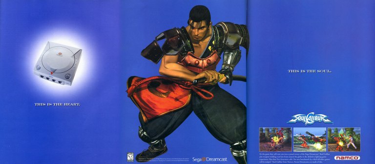
2. North American Soulcalibur Dreamcast version print ad
Namco came up with a creative approach to emphasize heart-and-soul promoting their game and the Dreamcast.
On September 9, 1999, Sega launched their Dreamcast console in America. With a gap of around ten months between the Japanese launch (November 1998) and the American launch, Sega had time to prepare Dreamcast’s release to American gamers with a huge lineup of games (both Sega’s games and from other publishers). Fortunately for Sega, they had Namco (their rival on arcade games) supporting their console.
Behind the scenes, Namco’s developers worked hard to not only port their arcade hit Soulcalibur to the Dreamcast, but to enhance the graphics using the console’s more advanced technology. The visual enhancements include rendering all of the games stages (and backgrounds) into full 3D polygonal environments. Namco also implemented different game modes and added even more content to ensure satisfaction to Dreamcast gamers.
The above 3-page print ad of Soulcalibur on Dreamcast was undeniably strategic and captivating to look at. The ad described the console as the heart, showed Soulcalibur character Mitsurugi (one of the game’s most popular characters) in the middle and then described the game (with 3 screenshots of game rendered with Dreamcast graphics) as the soul. It was a strong way to promote both the game and the console. In the years that followed, Soulcalibur grew into a popular fighting game franchise and the Dreamcast version will always be remembered as the crucial turning point.
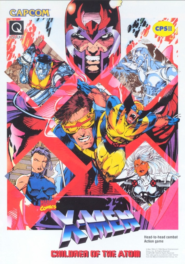
3. X-Men: Children of the Atom arcade flyer
Anyone who read lots of X-Men comic books in the 1990s should be able to tell which character was drawn by which artist.
When Capcom first released X-Men: Children of the Atom in the arcades in the mid-1990s, I was surprised because I did not anticipate the day would come when the company behind Street Fighter II would actually make a 2D fighting game showcasing the Marvel’s mutants. Even more intriguing was the X-Men art Capcom used for the arcade flyer to promote the game. I recognize Jim Lee’s artworks of Magneto, Cyclops and Colossus. The art of Wolverine shown was drawn by Andy Kubert. It was a wise move for Capcom (with Marvel as a business partner) to use established X-Men comic book artworks instead of having their internal illustrator draw the characters. That being said, this arcade flyer still looks great and captivating to look at.
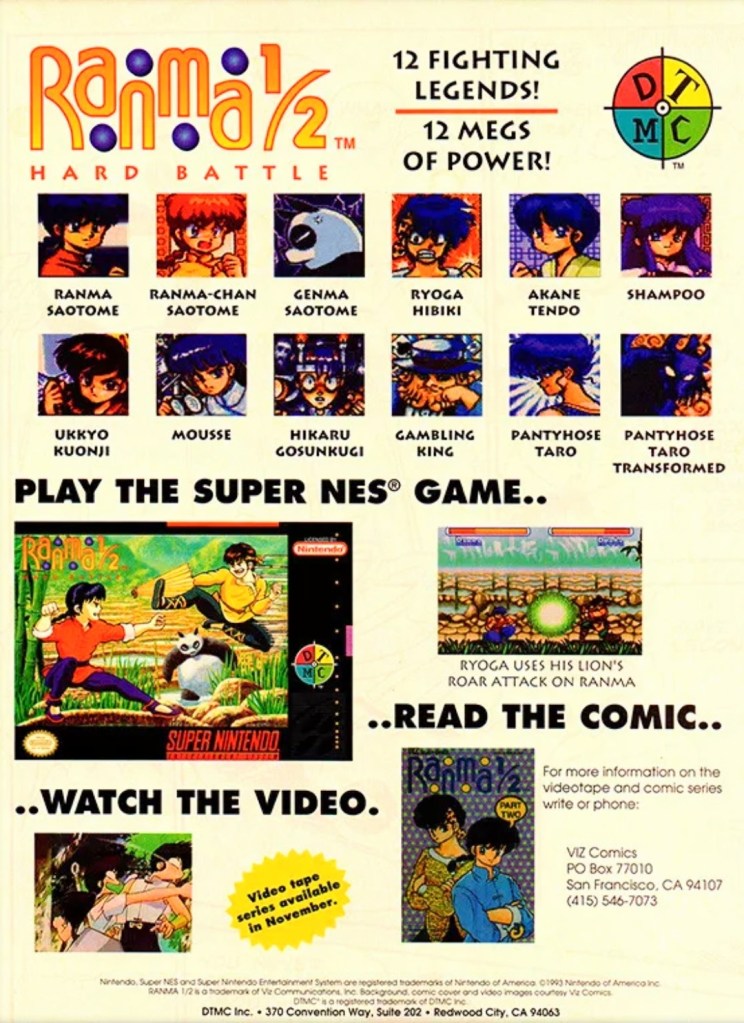
4. North American Ranma ½: Hard Battle print ad
A print ad promoting the game while saving some space to promote the anime and comic books.
By 1993, Street Fighter II and its upgraded follow-ups were wildly popular both in the arcades and on game consoles around the world. At the same time, there were many other 2D fighting games released to compete with and cash-in on Street Fighter II’s success. Believe it or not, the established anime franchise Ranma ½ saw a video game adaptation in the form of a 2D fighting game – Ranma ½: Hard Battle.
The North American print ad above published by DTMC (in cooperation with Viz Communications) promoted the game (one screenshot, the SNES game box and images of the characters as they appeared in the game) as well as Ranma ½ on anime videos and comic books. The way it was presented, the print ad promoted Ranma ½: Hard Battle without much heart nor passion.
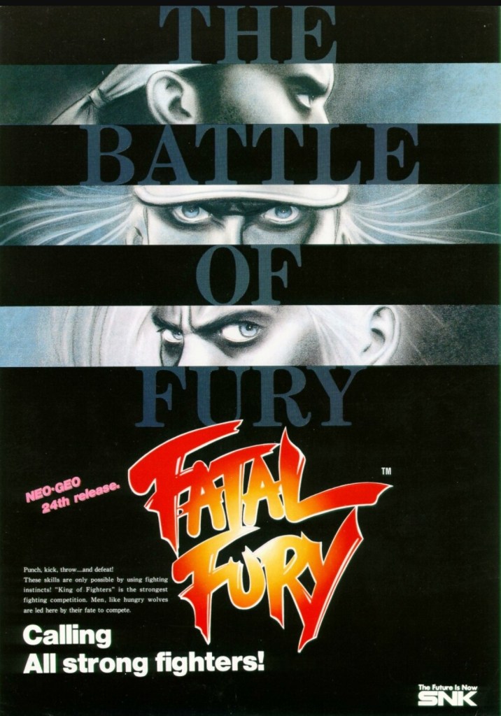
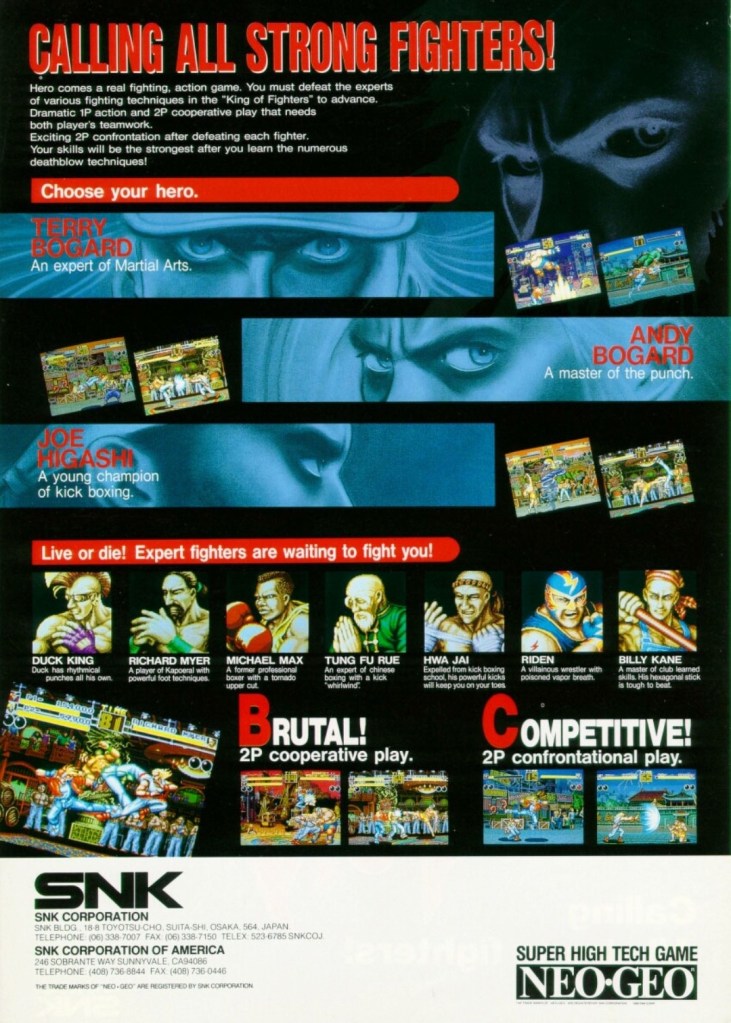
5. Fatal Fury: King of Fighters arcade flyer
An intriguing visual presentation on the front.
You get to know the characters and what the game features are.
There is no doubt that Fatal Fury: King of Fighters is the most significant game that SNK made. Apart from being the company’s first fighting game for the Neo Geo system, it established the fictional “king of fighters” tournament that became the core concept for The King of Fighters series of games in the years that followed. Fatal Fury itself is notable for being designed by Takashi Nishiyama, a former Capcom employee who created the original Street Fighter game. What Nishiyama could not do with Street Fighter, he accomplished while making SNK’s fighting game. Compared with the combo-oriented approach of Street Fighter II, Fatal Fury was designed to emphasize the timing of special moves, confrontational play, cooperative play and the 3D-like spacing between characters (background row and foreground row in each stage) while telling a story in a solid way.
The above arcade flyer of Fatal Fury has this unique looking artwork on the front showing stylized rectangular shots of the major characters Terry Bogard, Andy Bogard and Joe Higashi. On the other side of the flyer are the details that emphasized the creative concept of the game, who the characters are and what they could expect with regards to gameplay features. This flyer is still captivating to look at and it could entice you to try playing the original Fatal Fury game before trying out the sequels and spin-offs.
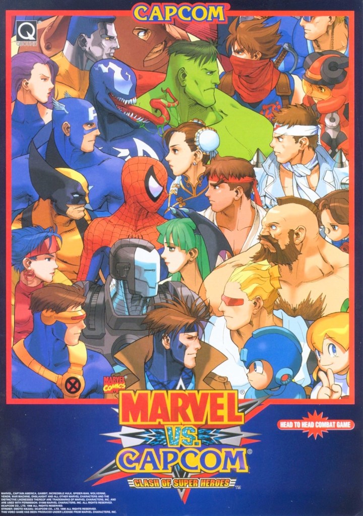
6. Marvel vs. Capcom: Clash of Super Heroes arcade flyer
This is NOT a comic book crossover.
If there is anything that truly emphasizes the essence of a fictional crossover in terms of visuals, it’s the art that Capcom and Marvel agreed to for Marvel vs. Capcom: Clash of Superheroes which is evident on the front of the above arcade flyer. By looking at how the Marvel characters were drawn, it looks like someone at Capcom illustrated the artwork as the Capcom characters still maintained that particular art style seen in the artworks of the Japanese company’s other games like Street Fighter, Darkstalkers, Mega Man and Strider. Regardless, the artwork still is amusing to look at.
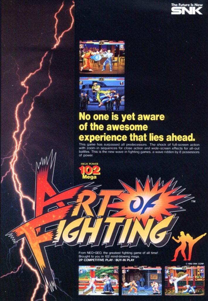
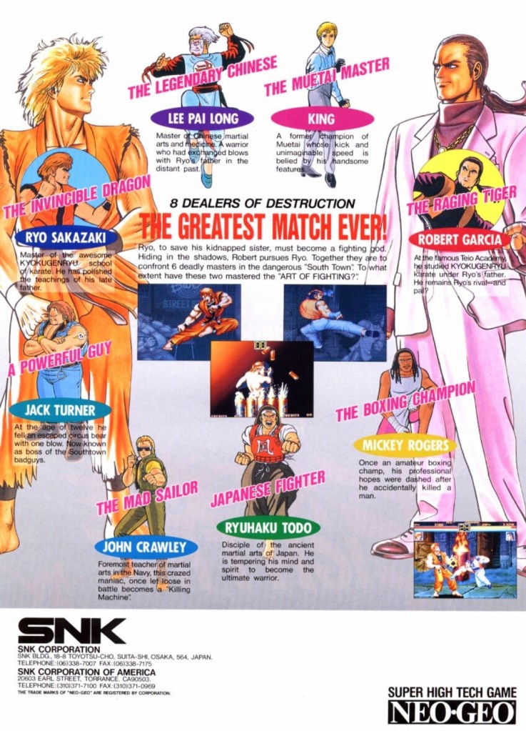
7. Art of Fighting arcade flyer
The front of the flyer.
The cast of characters showcased on the other side of the flyer.
Following the success of Fatal Fury, SNK went on to release Art of Fighting in arcades in 1992 and it became successful enough for the company to make sequels. With regards to the realm of fantasy, Art of Fighting was part of the same fictional universe as Fatal Fury and The King of Fighters, and there were times when its own characters appeared in other SNK games.
Art of Fighting’s arcade flyer had an energetic visual concept on the front with a rectangular lightning portion on the left balanced with five screenshots of the game itself. Once you get to the other side of the flyer, you will see really nice art of the characters with Ryo Sakazaki and Robert Garcia as the most dominating figures. Sakazaki and Garcia are the major characters of the Art of Fighting series. This flyer confidently introduced the characters and succeeded in making them look interesting.
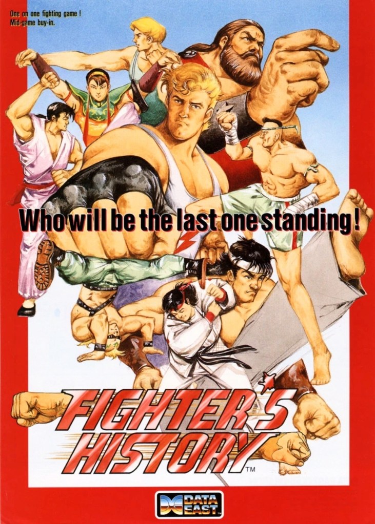
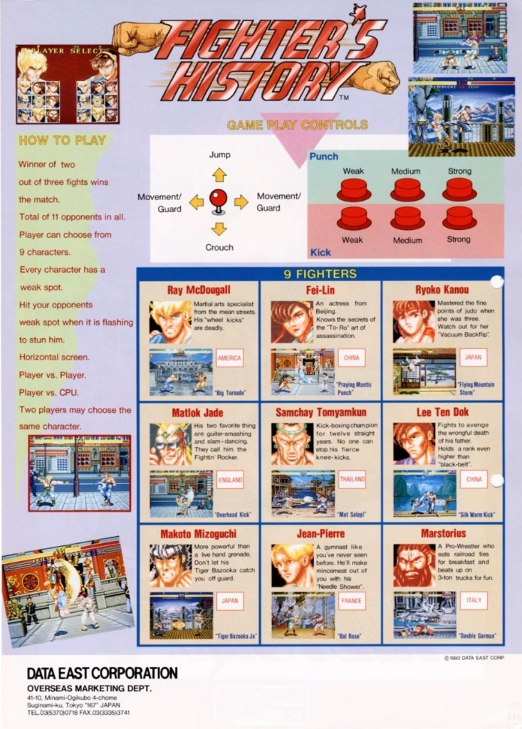
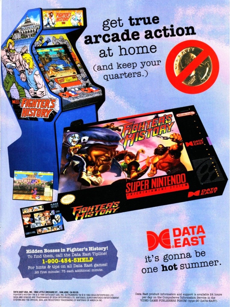
8. Fighter’s History arcade flyer and print ad
Great looking front artwork showing the game’s characters, posing and some action.
If you look closely at the controls, you will see the six-button layout and functions which are the same with those used in Street Fighter II.
Data East offered two ways for gamers to enjoy Fighter’s History – pay a high price for the SNES version or gamers can go play the game in the arcade by dropping a few coins.
In 1993, Data East released their fighting game Fighter’s History in the arcades around the world. Along the way, the company released their arcade flyer which had a very captivating art work on the front featuring their characters and some action. The other side of the flyer showed the technical details on how to play, how the control works and who the characters are. Fighter’s History was nicely received in the arcades and the success led Data East into porting the game for the Super Nintendo Entertainment System (SNES). If you look at the print ad above, you can see how clever Data East was promoting the SNES version of the game while keeping an image of the arcade machine which serves like a subtle reminder that the same game is still available in video arcades.
Shortly after the release of Fighter’s History in the arcades, there were gamers who noticed that it had certain visual and gameplay elements that made it so familiar with what Street Fighter II had. When Capcom became aware of the similarities, they sued Data East claiming that Fighter’s History was too similar to their game and that copyright infringement was committed. Capcom lost the case ultimately and Data East went on to release two more Fighter’s History games.
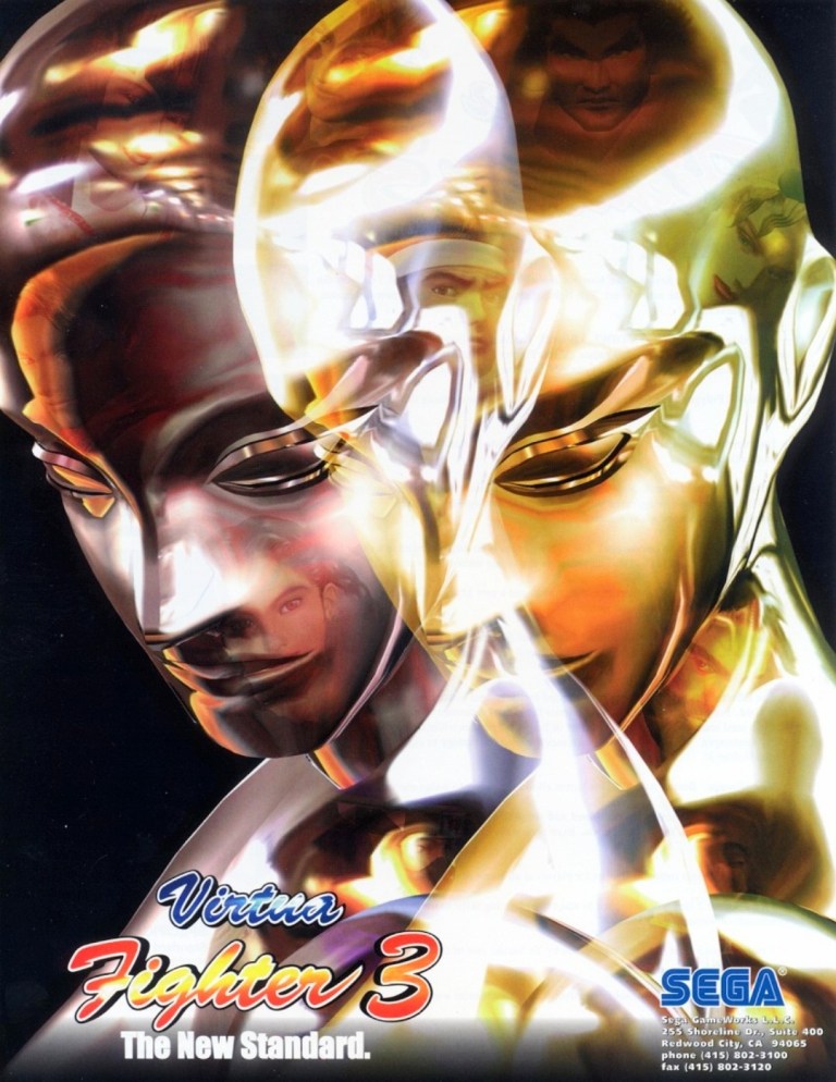
9. Virtua Fighter 3 arcade flyer
Virtua Fighter 3 truly raised the standards for arcade game graphics back in 1996.
When it comes to gaming innovation and standing out among the rest, Sega did exactly those when they released Virtua Fighter 3 in arcades in 1996 and it had the best-looking and really mind-blowing graphics at the time. Developed by AM2 (led by Yu Suzuki) on the very expensive Model 3 arcade hardware, Virtua Fighter 3 broke new ground on graphics as it moved over 1 million polygons per second, had highly detailed visuals on the characters and surroundings, realistic reflection effects, detailed shining, parallel lighting and high-specular Gouraud shading to name some. Even the characters’ eyes followed the opponent’s position.
The Virtua Fighter 3 arcade flyer showcased their reflective, metallic character Dural who in turn was part of the graphical showcase (emphasizing reflections, smooth animation and liquid metal effects) when the game was previewed in the 1996 AOU event in Japan. The words “The New Standard” written on the lower-left corner of the front of the flyer was justified and truthful.
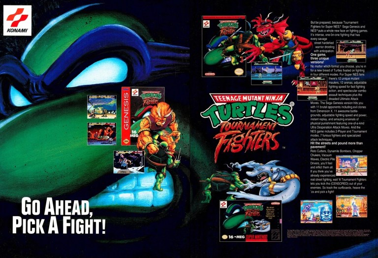
10. Teenage Mutant Ninja Turtles: Tournament Fighters print ad
This print ad had a nice visual presentation and was easily recognizable to the many TMNT fans.
In 1989, the Teenage Mutant Ninja Turtles (TMNT) franchise made quite a splash on video games which is not surprising as the multimedia franchise was already a popular in the West. More video game adaptation of TMNT were released in the early 1990s providing fans and gamers a lot of fun gameplay at the arcades (click here) and on consoles. Konami had the video game rights of TMNT and in a clear response to the sudden popularity of fighting games, they released Teenage Mutant Ninja Turtles: Tournament Fighters on the most popular game consoles of the time achieving varying levels of success critically and commercially (note: the SNES version stood out as the best). This print ad of the fighting game was effective in visually promoting the three console versions and the displayed text contained enough information to lure the attention of both fans and gamers.
Disclaimer: This is my original work with details sourced from reading the comic book and doing personal research. Anyone who wants to use this article, in part or in whole, needs to secure first my permission and agree to cite me as the source and author. Let it be known that any unauthorized use of this article will constrain the author to pursue the remedies under R.A. No. 8293, the Revised Penal Code, and/or all applicable legal actions under the laws of the Philippines.
Welcome back superhero enthusiasts, 1970s arts and culture enthusiasts, DC Comics fans and comic book collectors! Today we go back to the year 1976 to take a close look at a part of the DC Comics universe through a tale of the Action Comics monthly series.
If you know your entertainment history, you should be aware that Steven Spielberg’s Jaws made a tremendous impact on millions of people who saw the film in cinemas in the mid-1970s. The massive success of the movie caused some people to become afraid of sharks which in turn convinced them to avoid swimming alone at sea. Over at DC Comics, it just so happens that they have a super villain who is actually a highly evolved shark called The Shark (Karshon).
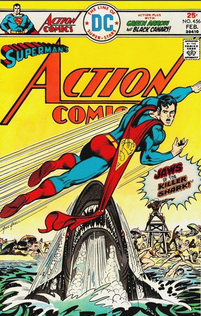
With those details laid down, here is a look back at Action Comics #456, published in 1976 by DC Comics with a story written by Cary Bates and illustrated by Curt Swan.
The cover inspired by Steven Spielberg’s Jaws.
Early story
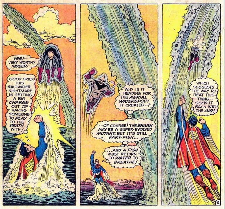
The story begins inside the Metropolis Aquarium where Captain Strong, young boy Jayson, young girl Jill and others closely watch a tiger shark swimming. What the viewers do not realize is that the tiger shark they are watching is a super shark (The Shark) whose evolution jumped by eons as a result of a freak nuclear accident from the previous years.
The Shark is a highly evolved mutant (half-fish and half-human) endowed with fantastic mental powers. The Shark previously encountered Green Lantern (Hal Jordan) who caused him to devolve back to his primitive form as a tiger shark.
At the aquarium, The Shark moves closely towards Captain Strong and Jayson with strong glass separating them. Suddenly, Jayson is turned into a pool of jelly on the floor and The Shark uses its power to form a large stream of water to break the way out of the Metropolis Aquarium and into the air.
Meanwhile, Lois Lane and Clark Kent are riding the metro-island ferry. A giant water sprout emerges near them…
Quality
The struggle between Superman and The Shark starts.
While it was clear that DC Comics took a creative stab on people’s awareness of the movie Jaws, the Bates-Swan duo came up with a rather fantastic way of having Superman deal with The Shark. For one thing, the creators efficiently came up with exposition to keep readers informed about who The Shark is, why he exists and what his background was within the DC Comics shared universe. Next, the creators managed to make The Shark an actual threat to the people of Metropolis which serves as an efficient build-up for the inevitable conflict with Superman. The good news here is that Bates-Swan combined efforts turned out to be gripping and believable.
When compared to the many battles Superman had against the other powerful villains, the traditional collateral damage is pretty light in this story. This is because the creators used science fiction concepts and a little bit of real-world science to explain The Shark’s powers, how the water streams used by him got formed and why he has key advantages over Superman. These creative methods more than made up for the lack of hard action and there are explanations that made sense just before the story ends.
This comic book also contains a short, standalone Black Canary tale that ultimate served as added amusement that is not related with the Superman story at all. It should interest fans of Green Arrow.
Conclusion
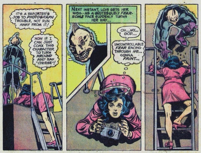
The Shark’s menacing face and power overwhelms Lois Lane.
Do not let the Jaws-inspired cover art fool you. Action Comics #456 (1976) is actually an entertaining read thanks to the combined efforts of the Bates-Swan team. The Shark was a believable threat and the story was well written. To say that this comic book was just a cheap way of exploiting the popularity of Jaws by coming up with shark-related tale of Superman is not true. This old tale is a fun ride free from the politicized science and woke garbage that dominate modern-day entertainment.
Overall, Action Comics #456 (1976) is recommended.
Disclaimer: This is my original work with details sourced from reading the comic book and doing personal research. Anyone who wants to use this article, in part or in whole, needs to secure first my permission and agree to cite me as the source and author. Let it be known that any unauthorized use of this article will constrain the author to pursue the remedies under R.A. No. 8293, the Revised Penal Code, and/or all applicable legal actions under the laws of the Philippines.
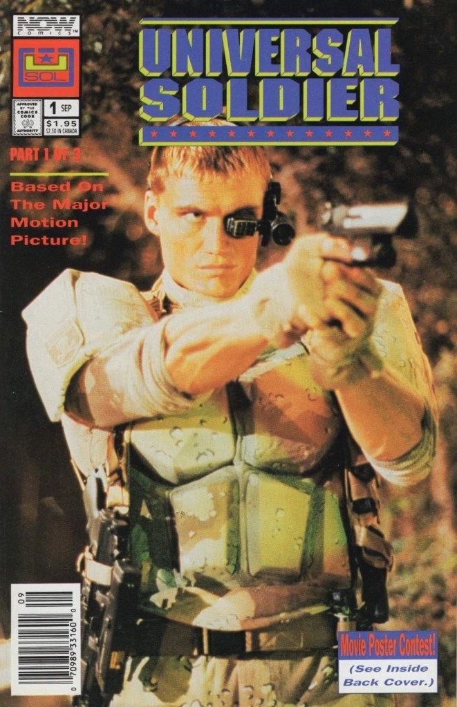
Welcome back comic book readers, 1990s arts and culture enthusiasts, movie fans and comic book collectors! Today we go back to the year 1992 to take a close look at the official comic book adaptation of the action movie Universal Soldier.
Universal Soldier stood out among Hollywood action films in 1992 as it had Jean-Claude Van Damme and Dolph Lundgren as the main stars and both of them were established action movie stars each with huge followings of fans. As it grossed almost $100 million worldwide on a budget of less than $25 million, the movie was successful and eventually sparked its of franchise of movies, TV shows, video games and comic books. NOW Comics was in-charge of making and publishing the comic book adaptation of the 1992 film.
With those details laid down, here is a look back at Universal Soldier #1 published in 1992 by NOW Comics with a story written by Clint McElroy and drawn by Lenin Delsol. This was the first chapter of a 3-issue mini-series.
The cover showing a photographic image of star Dolph Lundgren.
Early story
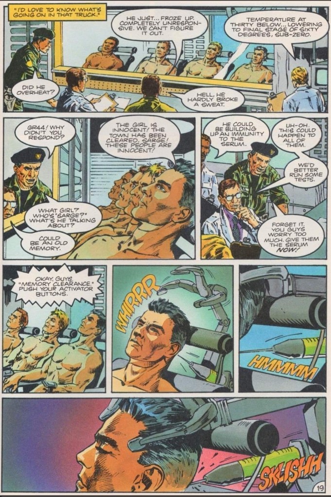
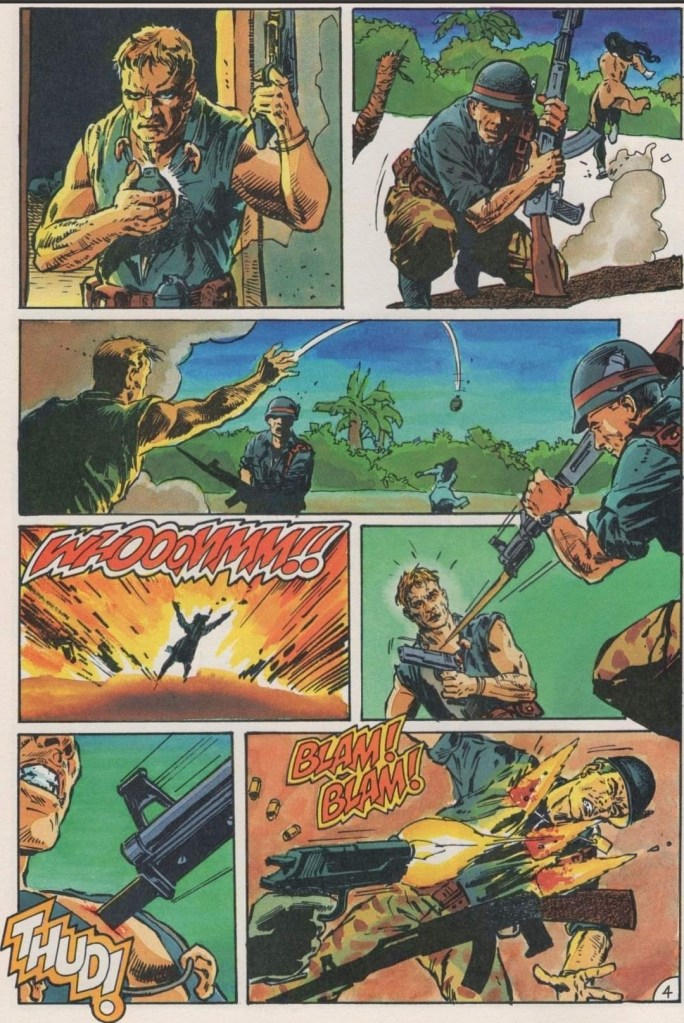
The story begins in Vietnam in 1969. The American soldier Luc Deveraux arrives at a village that was secured by the U.S. Army. To his shock, he finds several dead bodies of his squad members and villagers, then encounters Sergeant Andrew Scott with two Vietnamese individuals (male and female) tied together near him. It turns out that Scott, who made a necklace composed of severed ears, has gone insane and executes the Vietnamese man. As Deveraux refuses to follow Scott’s order to shoot the Vietnamese female, the sergeant kills he. Deveraux and Scott shot each other to death and eventually their corpses were recovered by another squad to be cryogenically frozen.
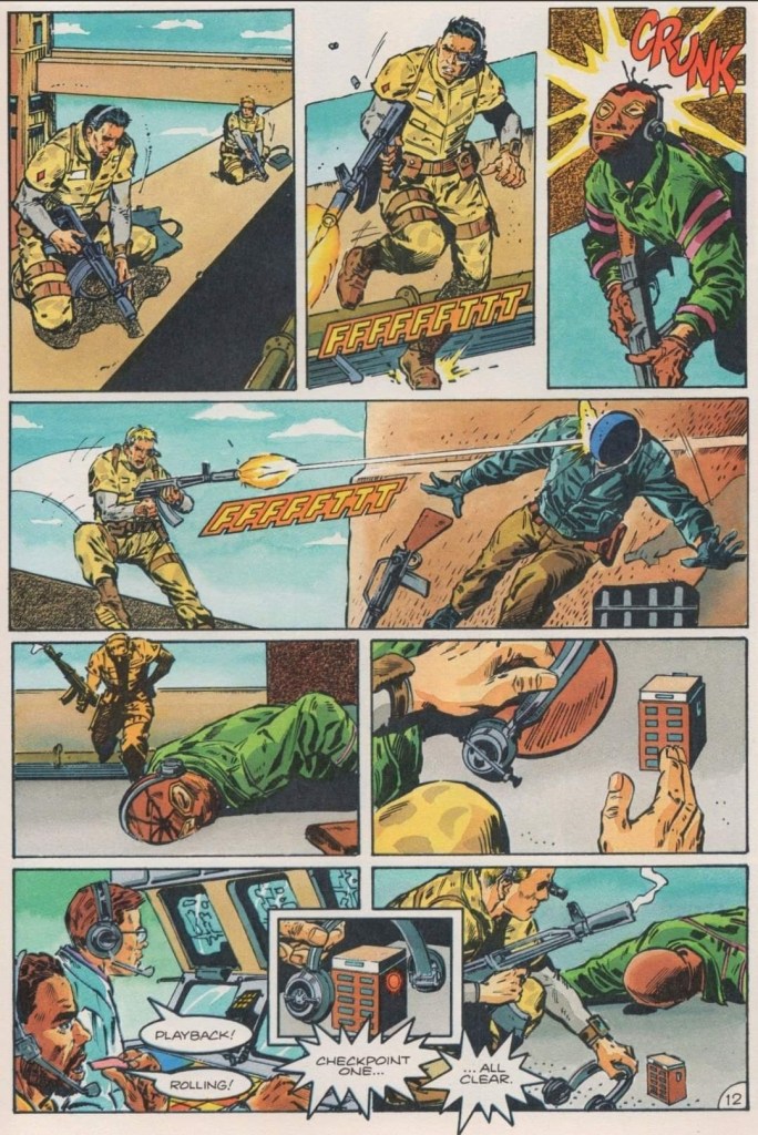
A few decades later in Nevada, the elite counter-terrorism unit of the UniSol (Universal Soldier) arrives and among the members are Deveraux (identified as GR44) and Scott (GR13) who have been reanimated by the government with their past memories fully suppressed. Their team gets deployed to the Hoover Dam (Mackinley Dam in the comic book) to resolve a hostage situation…
Quality
Operating very much like robots, two Universal Soldiers take down terrorists and manipulated their communication as they make their way through to save the hostages from the remaining terrorists.
As an adaptation, I find this comic book a surprisingly accurate translation of the movie’s early part of the story (note: the literary narrative ends when Deveraux leaves with the female reporter). While not 100% of the film’s plot and visual details were captured, this comic book still succeeded in replicating the look, feel and tone of the movie. It is clear that the comic book team had access to the footage of the film and a copy of the screenplay (written by Richard Rothstein, Christopher Leitch and Dean Devlin).
Clint McElroy really stuck close to the film’s plot, the dialogue and the way the characters were portrayed. Again, not 100% of the relevant details were adapted and some liberties were taken but McElroy managed to craft a comic book narrative that was solidly structured, had sufficient details to keep readers oriented and engaged, and ensured the story moved at a satisfying pace. By the time I reached the end of this comic book, I got oriented with the story, the characters and the details shown in between.
Like in the movie, this comic book emphasizes the government’s very cold and heartless approach on handling their Universal Soldiers who are treated more like tools instead of people.
Lenin Delsol’s artwork here is really good. It is clear that he had access to the film’s production footage as several images of locations and characters here very closely resembled what was shown in the movie most of the time. When it comes to the action scenes, Delsol did not go for visual dynamism (note: the dynamic action style was common with superhero comics of the 1990s) but rather he portrayed the action with realism and varying degrees of brutality.
When it comes to visualizing the characters, it is clear that the creative team was not authorized to use the likenesses of the actors. Luc Deveraux looks absolutely nothing like Jean-Claude Van Damme while journalist Veronica Roberts does not look like Ally Walker. Ironically, there are a few images of Scott’s face that somewhat resembles Dolph Lundgren. The way I see it, it is not problematic to see the characters not resembling the actors from the film. In fact, I like the new character designs Delsol came up with for the characters.
Conclusion
This early scene sets the tone of the entire comic book. As for the characters, Deveraux look nothing like Jean-Claude Van Damme and Sergeant Scott does not look like Dolph Lundgren (note: in other images of Scott shown later in the comic book, he looked a bit like the actor).
Even though I was not a fan of the 1992 movie, Universal Soldier #1 (1992) succeeded in keeping me engaged and entertained until the end. This is a really good adaptation of the early part of the film and I like the approach the Elroy-Densol team took on establishing the literary experience. Of course, if you want more dynamic visuals of the Hoover Dam scene or if you want that strong rated-R vibe when it comes to hard action, you should watch the movie. As of now, I am convinced to look forward to the next issue of this 3-part mini-series adaptation.
Overall, Universal Soldier #1 (1992) is recommended.
Disclaimer: This is my original work with details sourced from reading the comic book and doing personal research. Anyone who wants to use this article, in part or in whole, needs to secure first my permission and agree to cite me as the source and author. Let it be known that any unauthorized use of this article will constrain the author to pursue the remedies under R.A. No. 8293, the Revised Penal Code, and/or all applicable legal actions under the laws of the Philippines.
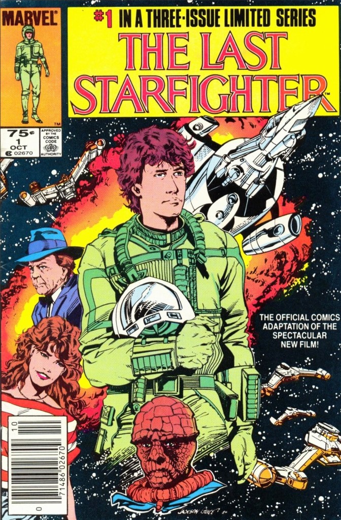
Welcome back superhero enthusiasts, 1980s arts and culture enthusiasts, Marvel Comics fans and comic book collectors! Today we go back to the year 1984 to take a close look at the official comic book adaptation of the classic sci-fi movie The Last Starfighter.
The Last Starfighter is highly memorable for its extensive use of computer-generated imagery (CGI) which brought its science fiction concepts of war and space travel to life. Directed by Nick Castle, the film is also remembered for its unique storytelling (note: with scenes set on Earth and in space) as well as the solid performances by Lance Guest, Robert Preston, Dan O’Herlihy, Catherine Mary Stewart and Norman Snow.
I should also state that the movie was released during the golden age of arcade games in America and its narrative has video game elements within. The Last Starfighter, which had unreleased ports for Atari consoles and an actual game released on the Nintendo Entertainment System (NES), clearly has a place in retro gaming culture. To know more about the movie, watch the retrospective video by Oliver Harper by clicking here, the retrospective video by GoodBadFlicks by clicking here and the movie trivia video by Minty Comedic Arts by clicking here.
Marvel Comics was in-charge of producing and publishing the comic book adaptation of the movie. In fact, it was released as issue #31 of the Marvel Comics Super Special (AKA Marvel Super Special) series and also in the form of a 3-issue mini-series.
With those details laid down, here is a look back at The Last Starfighter #1, published in 1984 by Marvel Comics with a story written by Bill Mantlo and drawn by Bret Levins. This is the first chapter of the 3-issue mini-series.
The cover.
Early story
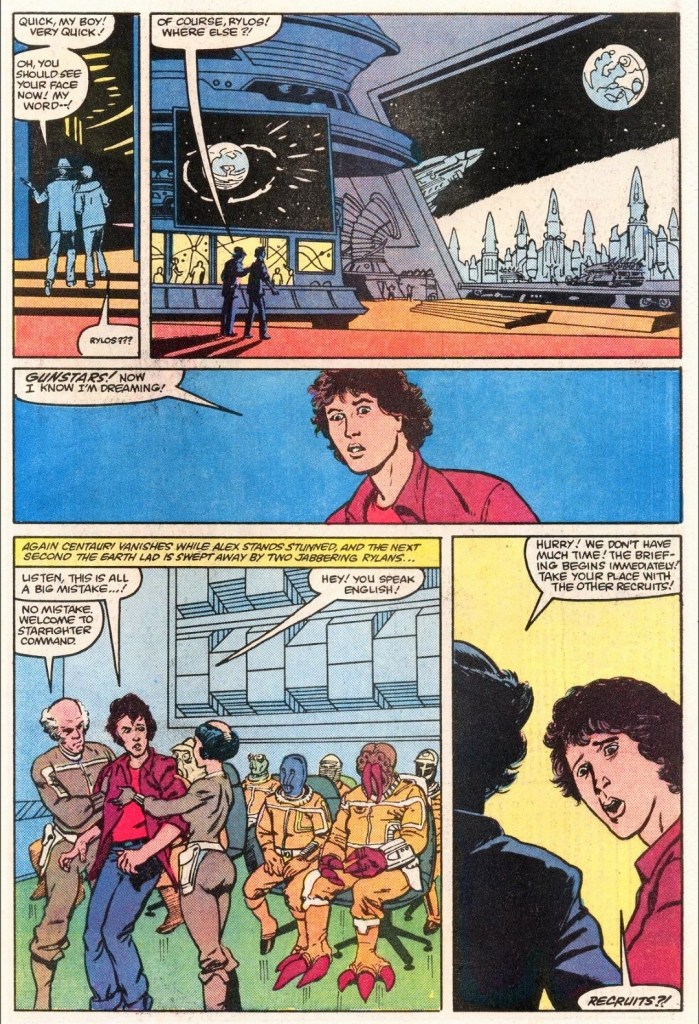
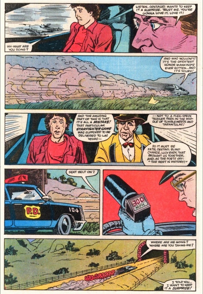
The story begins on a sunny day at a trailer park filled with residents who know each other. Maggie Gordon searches for Alex who is busy playing The Last Starfighter arcade game inside the local store. Alex’s little brother Louis was told to inform him that a neighbor’s electricity problem needs fixing.
Alex is laser focused on playing the arcade game which has an immersive space shooter game design. As Maggie tells him that their friends had arrived, Alex decides to let Louis play the rest of the game as he moves out.
Just as Alex and Maggie are about the leave, his mother tells him that he the neighbor’s electricity problem needs his repair service making him miss the trip.
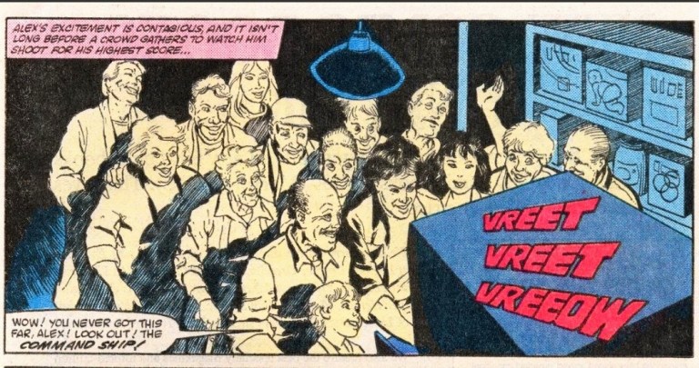
In the evening, Alex resumes playing The Last Starfighter and shortly after scoring over 900,000 points, many members of the local community flocked inside the grocery to watch him play…
Quality
There is nothing like being inside a very futuristic place and getting involved in a galactic conflict.
Considering the limited scope of the narrative – which ends with Alex already far away from home – and the creative liberties committed by the production team, this comic book is faithful for the most part and it does a good job replicating the vibe and tone of the movie.
Bill Mantlo’s script focused on the more important dialogue from the film and it did a good job following Alex Rogan (the protagonist) who is a video game achiever who happens to be striving to move forward with his life. He is a likable guy facing great odds as well as the harshness of reality, and he has hope with Maggie who just might become an integral part of his life in the years to come. Centauri is clearly the 2nd most notable character after Alex and through him, the narrative moves forward a lot leading to the greater science fiction stuff sourced from the movie.
The wild ride!
As it is clearly not a 100% replica of the movie’s screenplay, the script Mantlo made ensured that this comic book has a whole lot of relevant details, notable moments and characterization that readers can immerse themselves into.
For his part, Bret Blevins (note: his name was spelled as Brett Blevins here) did a fine job replicating the movie imagery that includes the locations, the characters, and the sci-fi elements. While it is not clear if the comic book team was authorized to use the actors’ likenesses when drawing the characters, there were a few instances in which Alex somewhat resembles actor Lance Guest, and Centauri looking a bit like the late Robert Preston.
Conclusion
Have you ever experienced attracting a lot of people while playing an arcade game?
Even though there were no battles within its narrative, The Last Starfighter #1 (1984) is a good comic book adaptation. Having seen the movie a number of times in my life, I can say that this comic book recaptures the feel and tone of the film in varying degrees. Of course, the illustrated literature format can only go so far with adapting the movie’s greatness. That being said, if you truly want mesmerizing imagery, strong thrills, great music and the dramatics of the characters, watching the movie is the clear option (note: The Last Starfighter 4K Blu-ray is available). This comic book is a worthy partial companion and I can confirm that it has convinced me to read the next issue.
Overall, The Last Starfighter #1 (1984) is recommended.
Welcome back, my readers, YouTube viewers and all others who followed this series of articles focused on YouTube videos worth watching. Have you been searching for something fun or interesting to watch on YouTube? Do you feel bored right now and you crave for something to see on the world’s most popular online video destination?
I recommend you check out the following topics and the related videos I found.
#1HolyLandSite’s comprehensive videos about the Temple Mount in Jerusalem, Israel – I love Israel and I will always stand with it in accordance to my uncompromising faith in the Lord and His Word (the Holy Bible). During the one and only day-off of the Israel 2023 pilgrimage tour I joined, I visited the Temple Mount in the Old City of Jerusalem and it is truly one of the most significant places to visit in the entire world. The Dome of the Rock (the Muslim shrine) occupies the space where the two Jewish temples used to be and inside it is the Foundation Stone (preserved layer of mountain top rock) which is the spot where Abraham almost sacrificed Isaac before God sent the angel to intervene. Be aware that during the time of Lord Jesus, the 2nd Jewish temple was established.
HolyLandSite produced the most in-depth and most informative videos about the Temple Mount and I encourage you to watch them now.
#2 The #10 billion Apple Car disaster – You ever heard of the Apple Car? Such a project from the very same company behind iPhone actually existed and it ended up as a disaster worth an estimated $10 billion. What happened behind the scenes at Apple? Did the technology giant really believe it could make a positive impact on the automobile industry? You can find out more by watching ColdFusion’s video below.
#3 Venom: Lethal Protector revisited and explained – I should mention first that I am not a fan of the Marvel Comics super villain Venom. For the newcomers reading this, Venom emerged in the late 1980s as Spider-Man’s deadliest enemy and went on to become a murderer who somehow helped Marvel Comics sell a lot of comic books. Because comic book fans wanted more of him so much, Marvel went on to publish the Venom: Lethal Protector limited series in the early 1990s and it led to even more comic books showcasing him as an anti-hero (specifically a killer helping the powerless people). If you are interested to learn about the Venom: Lethal Protector limited series without having to go through all the trouble of finding the comic books, watch the video below. Better save your money.
#4 You, Me and the Movies’ reaction videos of the first three Jaws movies – YouTube channel You, Me and the Movies recently posted their movie reaction videos of Steven Spielberg’s Jaws (1975), Jaws 2 (1978) and Jaws 3-D (1983). Having seen all three movies before, I enjoyed these reaction videos. The first movie from 1975 is a true cinematic classic directed by a very young Spielberg and if you have not seen it, I encourage you to watch it entirely first before seeing the related reaction video. I cannot say the same about Jaws 2 and Jaws 3-D (AKA Jaws 3). Once you are ready, enjoy the videos below.
#5 Retrospective videos of Suikoden and Suikoden II – Recently, Konami announced that it will finally be releasing the anticipated collection Suikoden I&II HD Remaster Gate Rune and Dunan Unification Wars on March 6, 2025 for varied game consoles plus Steam. The said collection was supposed to have been released in 2023 but a delay happened and Konami was very silent until recently. Now that fans of the first two Suikoden games have something to look forward to in 2025, here are some retrospective videos that will help you understand what the games are and why they are still popular among Japanese RPG (JRPG) enthusiasts.
#6 The wickedness and wokeness of Rachel Zegler exposed – Actress Rachel Zegler is not worth trusting as she went ballistic while promoting the new Snow White movie from woke Disney. Not only did she go against the legacy of the classic Snow White animated movie, she sided with the pro-Palestine movement and their terrorists. While her tweet could encourage pro-Palestine believers to watch the new Snow White, it is a fact that there already a movement of people who hate Israel telling people to boycott the said movie simply because it has Israeli actress (and Wonder Woman star) Gal Gadot. By being woke and reckless, Zegler is only turning off people from watching the new Snow White and if the movie fails, it will cost Disney a lot of money. Watch and learn from the selected videos below.
#7 Popcorn in Bed reacts to King Kong (1933) and Godzilla (1954) – I really enjoy watching the movie reaction videos of Popcorn in Bed (PIB) and recently she posted new videos about two very significant movies…the original King Kong of 1933 and the original Godzilla (Gojira) film of 1954. As the two mentioned movies are cinematic classics, I encourage you to watch them first before watching Popcorn in Bed’s reaction videos. To those who saw classics already, watch the reaction videos below.
Disclaimer: This is my original work with details sourced from reading the comic book and doing personal research. Anyone who wants to use this article, in part or in whole, needs to secure first my permission and agree to cite me as the source and author. Let it be known that any unauthorized use of this article will constrain the author to pursue the remedies under R.A. No. 8293, the Revised Penal Code, and/or all applicable legal actions under the laws of the Philippines.
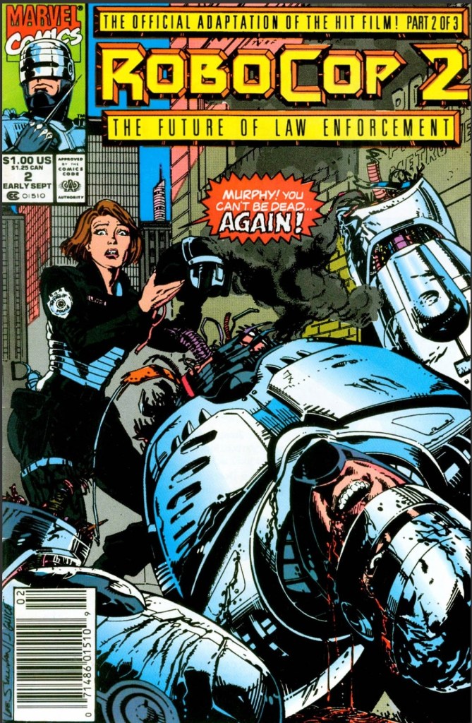
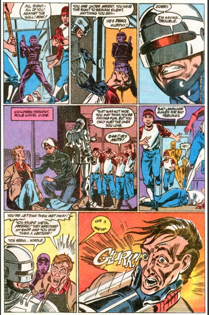
Welcome back superhero enthusiasts, 1990s arts and culture enthusiasts, Marvel Comics fans and comic book collectors! Today we go back to the year 1990 to take a close look at the 2nd part of the comic book adaptation of the movie RoboCop 2 (1990).
In my previous retro review of Robocop 2 #1, I pointed out that the comic book was not a faithful adaptation of the movie but more of the creators’ creative interpretation of the movie script they had which resulted in a stylized presentation. It was a surprisingly enjoyable reading experience for me.
With those details laid down, here is a look back at RoboCop 2 #2, published in 1990 by Marvel with a story written by Alan Grant and drawn by Mark Bagley based on the movie screenplay by Frank Miller and Walon Green.
The cover.
Early story
The story begins in Detroit with RoboCop reduced into a very bad condition with most of his parts missing. The cops are still on strike and the ultra-addicting drug Nuke continues to spread through the city causing social problems. Cain and his gang are still on the loose, and his video statement (which emphasizes his gang’s defeat of RoboCop) spreads through the news cycles.
Inside a hideout, Cain and his loyal companions terrify and killed traitorous police officer Duffy for betraying them. Meanwhile at police headquarters, the support crew bumps heads with the Omni Consumer Products (OCP) executive who does not see RoboCop’s poor state as a problem. As far as OCP is concerned, getting replacement parts for RoboCop is very expensive.
Over at OCP, the psychologist executive Dr. Juliette Faxx begins researching criminals for the new RoboCop project…
Quality
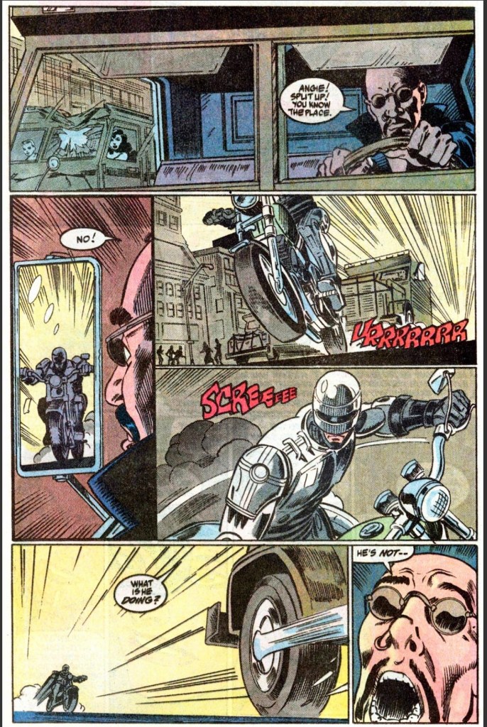
The motorized encounter between RoboCop and Cain here is shorter and much inferior compared to what the movie showed.
As with issue #1, this comic book followed the events and scenes of the film but left enough room for the creative team to make their stylized version suitable with the literary format. Mark Bagley, who is best known for drawing Spider-Man and Venom in the 1990s, came up with nice artwork that brought Grant’s script to life. There were a few shots here that were pretty graphic or brutal to see at the time of publication which makes me wonder why did the Comics Code Authority (CCA) give its approval to this comic book.
Without spoiling the plot, I can say that the creative team and editor Gregory Wright did a good job adapting scenes of the movie script to (fill up the pages) while also succeeding in setting up readers for the final conflict in the 3rd and final issue.
As a standalone reading material, this comic book will lead readers deep into the crisis of the police force as well as into the developments behind the closed doors of OCP. Due to the selected scenes of the film’s script, RoboCop has sufficient presence but lacked his normal personality. That being said, the movie’s comedic look of RoboCop acting very out-of-touched (hint: OCP tampered with his mind digitally) did not translate well into literary format. If you’re hoping to see solid storytelling with a consistent tone, you won’t find it here.
When it comes to action, there is just enough of it to keep the reading experience entertaining. Again, this comic book does not have the final conflict and the selected action scenes are rather limiting in terms of impact. If you want to see the police raid of the Nuke facility as well as RoboCop’s motorized chase with Cane, you are better off replaying the movie.
Conclusion
There definitely is something wrong with RoboCop here.
Considering the selected movie script scenes for adaptation, RoboCop 2 #2 (1990) lacks impact compared to the first issue. In fairness, this comic book was clearly meant to set-up readers for the next issue. If there is anything worth looking at within the 2nd issue’s pages, it would be the details that were highlighted during the internal developments at OCP and the police. As mentioned earlier, RoboCop is not his usual self for a significant portion of this comic book. While the engagement and fun factor are lower this time around, I’m still interested to read the next issue.
Disclaimer: This is my original work with details sourced from reading the comic book and doing personal research. Anyone who wants to use this article, in part or in whole, needs to secure first my permission and agree to cite me as the source and author. Let it be known that any unauthorized use of this article will constrain the author to pursue the remedies under R.A. No. 8293, the Revised Penal Code, and/or all applicable legal actions under the laws of the Philippines.
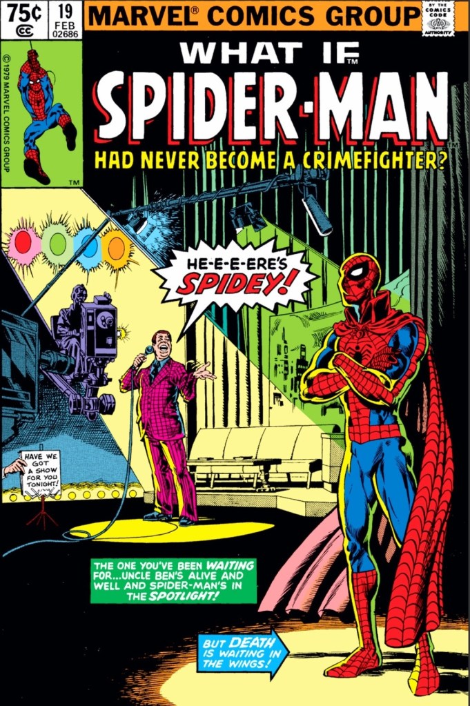
Welcome back superhero enthusiasts, 1980s arts and culture enthusiasts, Marvel Comics fans and comic book collectors! Today we go back to the year 1980 to examine an alternate story of the Marvel Comics shared universe chronicled through the What If monthly series.
Spider-Man is clearly Marvel Comics’ greatest icon. He is the one Marvel superhero who is easily recognized around the world through the many comic books published, the animated TV shows and the big-budget Hollywood movies released. Given Spider-Man’s real-life fame as a pop culture and American icon, one has to wonder what would it be like had the webslinger decided to have a career in showbiz instead of fighting bad guys. How can Spidey realize that with great power comes great responsibility if he is so focused on being an entertainer?
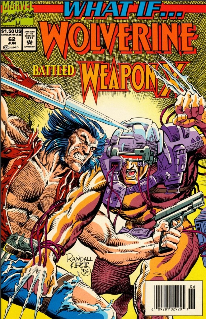
With those details laid down, here is a look back at What If #19, published in 1980 by Marvel Comics with a story written by Peter Gillis and drawn by Pat Broderick.
The cover.
Early story
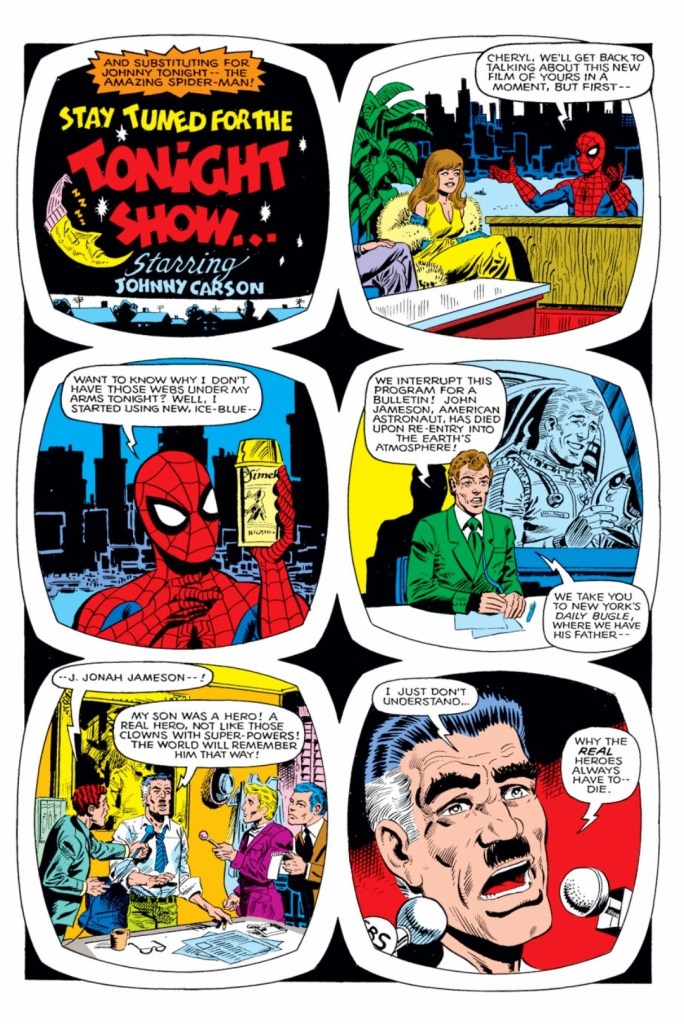
The story begins far into Spider-Man’s past when he started as an entertainer. Spider-Man sees a police man chasing a thief down the hallway (note: this was a key moment in the life of Peter Parker who went to become a crime fighter as Spider-Man). Instead of letting the thief get away, Spidey uses his web to stop him which enabled the police officer to apprehend him.
The next day, the Daily Globe published a front page story showing Spider-Man (described as a TV star) stopped the crook which established him as a heroic entertainer. The story bothered J. Jonah Jameson (The Daily Bugle) so much not only because the rival newspaper reported it but also because he perceived it as a glorification of so-called superheroes.
Elsewhere, Spider-Man and a famous film producer talk about making a movie about him that can really entertain a lot of people…
Quality
As Spider-Man makes waves on television as an entertainer and endorser, J. Jonah Jameson tells the media the difference between real heroes and the costumed ones with super powers.
Considering the history of Spider-Man, it is both difficult and risky to come up with a new reality that diverged from the key moment of the icon’s past (letting a crook get away from the chasing cop) resulting in a completely new version of him – Spider-Man as an entertainer. The good news here is that Peter Gillis’ script is solid and its scenes were nicely arranged to make this new version of the icon believable.
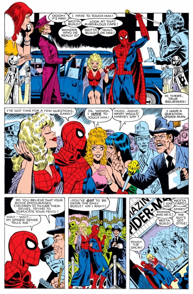
As shown on the cover of this comic book, the tale shows Spider-Man as a celebrity who found success and wealth in showbiz. Along the way, the classic Peter Parker gradually transforms into a new version who is not only focused on entertaining people but also engaging in publicity wars without ever becoming journalist. Since Marvel’s most famous icon does not fight crime, you will see him as an entertainment entrepreneur, a fighter through publicity, and as someone who enjoys the high life that most Americans don’t have.
In relation to the concept of the story, J. Jonah Jameson and Daredevil became the next important players to Spider-Man. Jameson is the rival of the webslinger but not necessarily the villain. Through Jameson, you will not only witness how he misuses his power at The Daily Bugle but also his interactions with criminal elements as he searches for ways to deal with Spidey. When it comes to Daredevil’s role, I encourage you to read the comic book to find out.
The story by Gillis moved at a medium-to-fast pace and for each build-up done, pay-offs were satisfying to read. When it comes to the scope of the story, this alternate reality is actually captivating to follow from start to finish.
Conclusion
Can you just imagine how different superhero comics would have been in real life had Marvel actually depicted Spider-Man as a showbiz figure?
What If #19 (1980) is a very solid and captivating comic book to read. The creative duo of Peter Gillis and Pat Broderick succeeded in selling the concept of what would happen had Spider-Man became an entertainer instead of fighting evil figures that hound society. Apart from showing a drastically different version of Spidey, the story will compel you to think about the relevance of superheroes in society, why becoming a major player in showbiz is chaotic, and how could Peter Parker be responsible with the power (related to showbiz) he has without combating evil.
Disclaimer: This is my original work with details sourced from reading the comic book and doing personal research. Anyone who wants to use this article, in part or in whole, needs to secure first my permission and agree to cite me as the source and author. Let it be known that any unauthorized use of this article will constrain the author to pursue the remedies under R.A. No. 8293, the Revised Penal Code, and/or all applicable legal actions under the laws of the Philippines.
Welcome back superhero enthusiasts, 1990s arts and culture enthusiasts, Marvel Comics fans and comic book collectors! Today we go back to the year 1994 to examine an alternate story of the Marvel Comics shared universe chronicled through the What If monthly series.
There is a lot to be said about the origin of Wolverine. There was the tale of his Canadian origin and being born with claws inside him. There was also the tale of him encountering the Hulk in Canada. And there was also the famous storyline Weapon X (written and drawn by Barry Windsor-Smith in Marvel Comics Presents #72 to #84).
With those details laid down, here is a look back at What If #62, published in 1994 by Marvel Comics with a story written by Kurt Busiek and drawn by Ron Randall.
The cover.
Early story
The story begins in the when Logan (Wolverine) encounters armed men who try to overwhelm him. Logan easily knocks most of them out and leaves them behind by car. It turns out the armed men are agents of a secret organization called Weapon X which has been targeting Logan for their series of unethical experiments on abducted humans (the Weapon X Project).
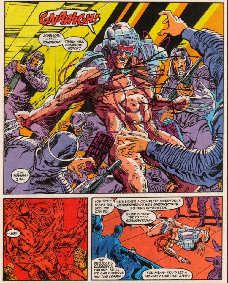
The organization is already dealing with problems regarding their live experiments. One living subject (with adamantium claws on his arms and some machinery on his head and shoulders) became a murderous berserker who cannot be reasoned with anymore. The subject is former Mounted Police Officer and Marine Guy Desjardins and Weapon X dropped him off at Department H.
James Hudson of The Flight took him in and officially refers to him as “Weapon X”. The live subject eventually broke loose, killed Dr. Langkowski and went to Kenora where he starts a killing spree…
Quality
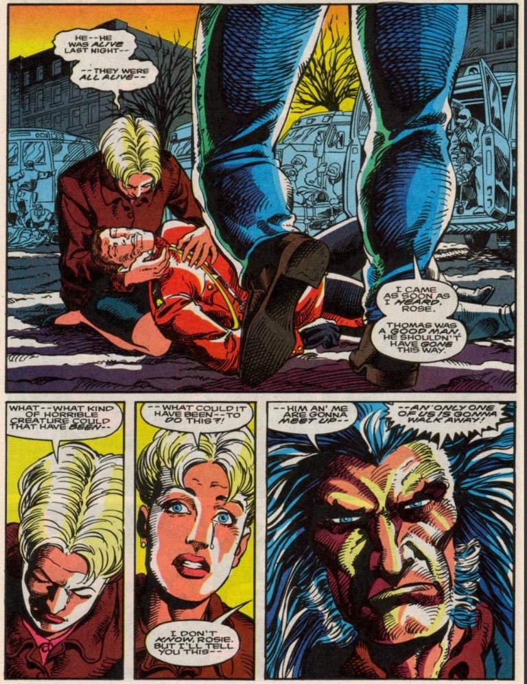
Logan arrives at the scene where the Weapon X biological experiment killed several people.
I want to point out that Kurt Busiek came up with the very believable portrayal Logan who is not Wolverine, not a member of the X-Men and not even the violent fighter in the plot. This is a story about a major scientific experiment of Weapon X that went terrible wrong resulting in their living subject (with adamantium claws and other features identified with Wolverine in the mainstream Marvel universe storyline of Weapon X) going way beyond their controller and impacting Canadian society negatively. The good news here is that the story by Busiek is very well written and nicely structured.
In his civilian form as Logan, Wolverine (as we often identify him) is not the fierce slasher he is often known as. Rather he is a former tool of the Canadian government who previously resigned and decides to get involved in response to the rampage caused by the Weapon X killing machine (Desjardins).
As Logan is no slasher (note: Wolverine #75’s big revelation about Logan’s claws had no influence on this comic book’s concept), he fights with guns and a knife backed with his extensive experience in grounded combat. In relation to this comic book’s concept, you will a captivating portrayal of Logan who is truly unconnected with the X-Men and there are certain character moments that you really have to read.
Along the way, Kurt Busiek’s story not only dramatizes the classic trope about man tampering with nature but also the potential scandal of Canada’s government having top secret unethical science experiments while developing their own superhero project in the form of The Flight. Back to Wolverine, the story pounced on the conflict between being human and being animalistic with sheer believability.
With regards to the artwork, Ron Randall exerted effort to recapture some of the aesthetics of Barry Windosor-Smith’s work on the Weapon X storyline of the Marvel Comics Presents comic books. As required by the script, the visual display of action is brutal to look yet does not go over the top (with regards to graphic violence) as the creators implemented restraint restraint on the display of blood and killing blows.
Conclusion
A new Weapon X biological experiment gone wrong.
What If #62 (1994) is truly a great alternative tale to the established Weapon X storyline and it is also one of the more engaging portrayals of Wolverine unconnected with the X-Men. You will see Logan being more grounded with reality and you will also witness how he sees himself as a Canadian citizen who actually gets involved again with the government which he previously served. This a really compelling work by the Busiek-Randall duo.
Overall, What If #62 (1994) is highly recommended.