Disclaimer: This is my original work with details sourced from reading the comic book and doing personal research. Anyone who wants to use this article, in part or in whole, needs to secure first my permission and agree to cite me as the source and author. Let it be known that any unauthorized use of this article will constrain the author to pursue the remedies under R.A. No. 8293, the Revised Penal Code, and/or all applicable legal actions under the laws of the Philippines.
Welcome back superhero enthusiasts, 1990s arts and culture enthusiasts, Marvel Comics fans and comic book collectors! Today we go back to the year 1991 to explore one of the many tales of the Marvel shared universe through the Uncanny X-Men series.
Uncanny X-Men #281 was a great read. For most of the early 1990s, I read more X-Men stories about the Blue Team than the Gold Team. In Uncanny X-Men #281 – which took place after X-Men #5 – the spotlight was on the Gold Team which showed the strategic leadership of Storm, the X-Men revisiting the headquarters of the Hellfire Club, Jean Grey’s own recollections of past events and the new threat of Trevor Fitzroy and the Sentinels.
With those details laid down, here is a look back at Uncanny X-Men #282, published in 1991 by Marvel Comics with a story co-written by Whilce Portacio and by John Byrne (script). The art was done by Portacio with ink work by Art Thibert.
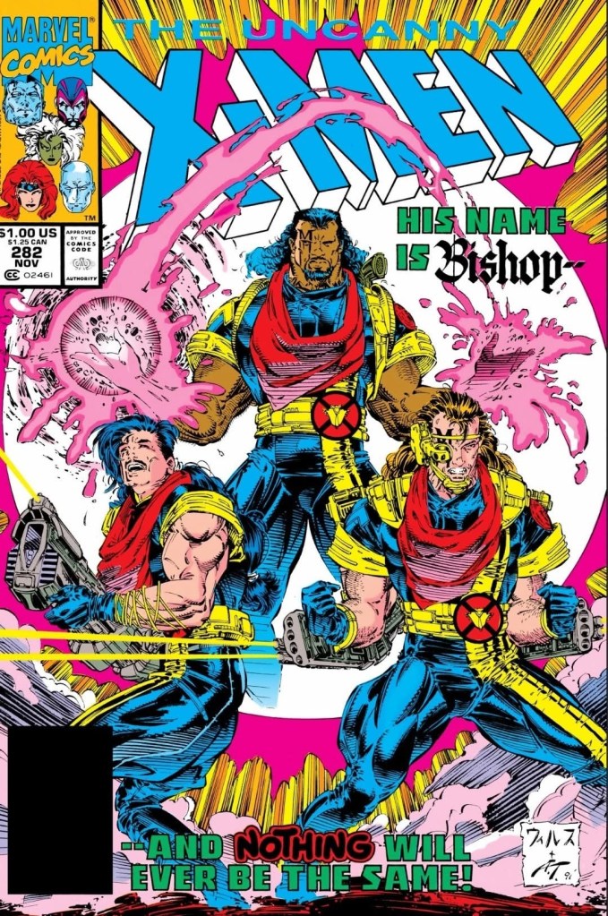
The cover.
Early story
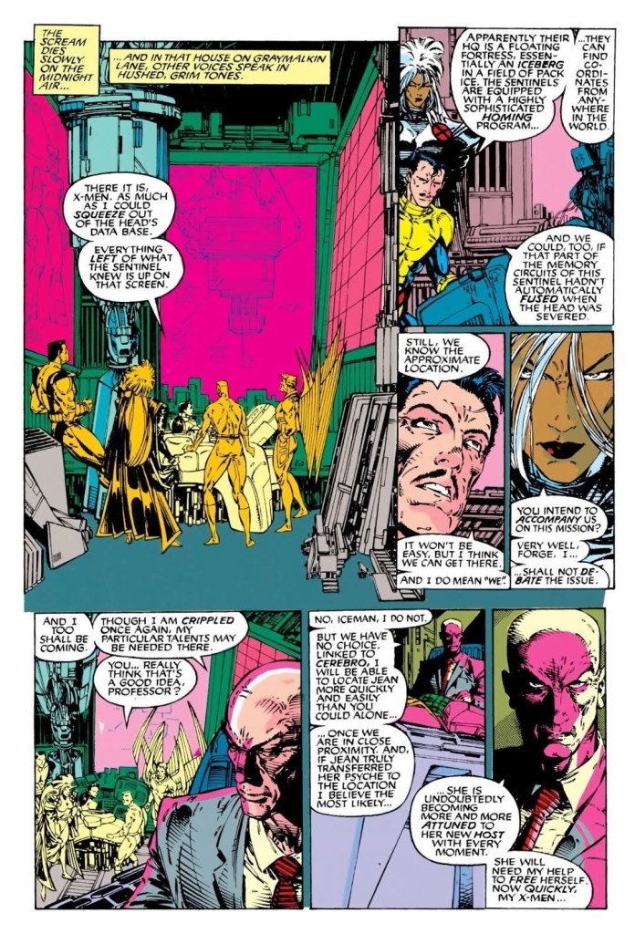
The story begins inside the School For Gifted Youngsters when the Gold Team arrives (with Colossus carrying the inactive body of Jean Grey) and disrupts the chess game between Professor X and Forge. Charles Xavier mentally examines Jean and notices that her psyche survives and has been displaced. He realizes Jean is alive but not in her body.
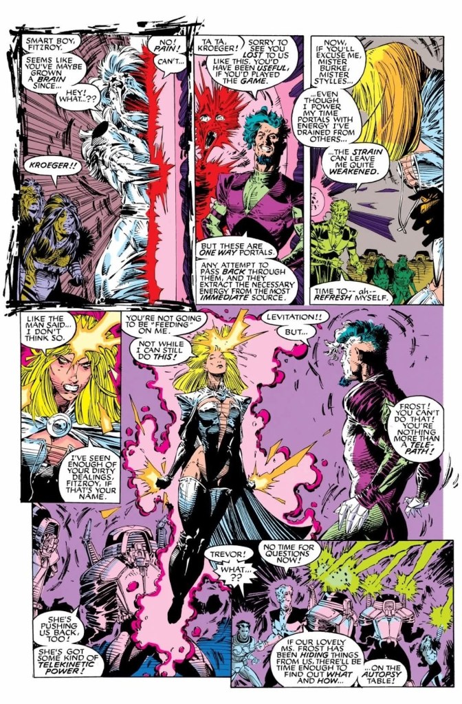
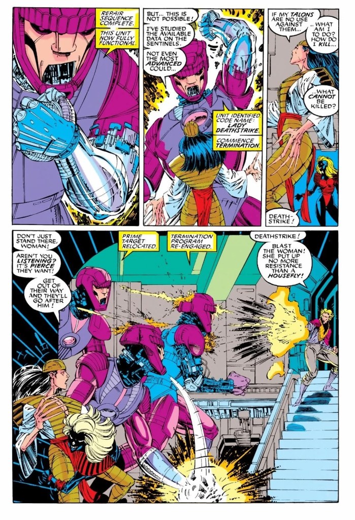
In New York City, Trevor Fitzroy (who is carrying the body of an inactive Emma Frost) and his Sentinels surprise Shinobi Shaw showing what is left of the cyborg of Pierce. Trevor boasted to Shinobi that he won claiming that he has terminated one of the founders of the inner circle, captured a small band of Hellions and has Emma Frost as a trophy. Very slowly, Jean Grey – now occupying Frost’s body – wakes up…
Quality
Trevor Fitzroy does not know who is inside Emma Frost’s body.
I can say out loud that this is a great follow-up to the previous issue (which itself is a great read) as it has a lot of hefty payoffs to the build-up from before. With the story concept already established in issue #281, the progression continued strongly, the narrative is clearer and the stakes were raised even higher.
In this issue, Trevor Fitzroy still has extreme tendencies and he might look insane or unhinged to you. Still, Fitzroy really has diabolical plans to execute and those plans involves his ability to open portals to bring in his reinforcements from far away, including the “denizens of the future.” Adding to Fitzroy’s merciless and arrogant personality is his use of the captives’ life force to energize himself to open portals. Really, he does not care much about the lives of captives as he treats them as nothing more than bodies of energy for his use. Whilce Portacio really excels in not only bringing the script to life but also showcasing the personality and expressions of Fitzroy who at this point in comic book history was a brand new villain for the X-Men.
As for the X-Men’s Gold Team, not having Jean Grey was really disadvantageous to them which compels Professor X to actually join them on their mission. This is a notable development as Xavier is very close with Jean (his original student and fellow telepath) and he knows that great odds await their team. Xavier’s involvement added a lot to the plot itself and I love the way John Byrne and Portacio portrayed him here.
When it comes to the storytelling, the pace noticeably moved faster as a lot of payoffs to the build-up were executed here. The X-Men themselves each got their respective share of the spotlight and all of them were portrayed consistently in character. The stakes were raised here this time and the handling of all the details and developments was very solid.
Conclusion
Knowing great odds await them, Charles Xavier joins the X-Men on their mission to save Jean Grey.
Even with the stakes raised higher, the creative team delivered the great stuff Uncanny X-Men #282 (1991) is a very worthy follow-up to the previous issue. In fact, I find this comic book more entertaining and more intriguing to read from start to finish. Fitzroy is indeed a very worthy new enemy for the X-Men’s Gold Team, and there is much that long-time X-Men fans can enjoy here.
Overall, Uncanny X-Men #282 (1991) is highly recommended!
Disclaimer: This is my original work with details sourced from reading the comic book and doing personal research. Anyone who wants to use this article, in part or in whole, needs to secure first my permission and agree to cite me as the source and author. Let it be known that any unauthorized use of this article will constrain the author to pursue the remedies under R.A. No. 8293, the Revised Penal Code, and/or all applicable legal actions under the laws of the Philippines.
Welcome back superhero enthusiasts, 1990s arts and culture enthusiasts, Marvel Comics fans and comic book collectors! Today we go back to the year 1991 to explore one of the many tales of the Marvel shared universe through the Uncanny X-Men series…Uncanny X-Men #281.
For the newcomers reading this, Marvel had a major reorganizing of their X-Men-related comic book series in the 2nd half of 1991. After the events of the Muir Island Saga, the X-Men grew into such a large group they had to be divided into two teams – Blue and Yellow – under Charles Xavier who returned as their leader. When X-Men #1 (by Chris Claremont and Jim Lee) launched in 1991, it showed the Blue Team dealing with Magneto. Uncanny X-Men #281 was released the same month as that comic book and it shows the first mission of the Gold Team composed of Storm, Jean Grey, Colossus, Iceman and Archangel. Very notably, its story took place immediately after X-Men #5 was released in 1992.
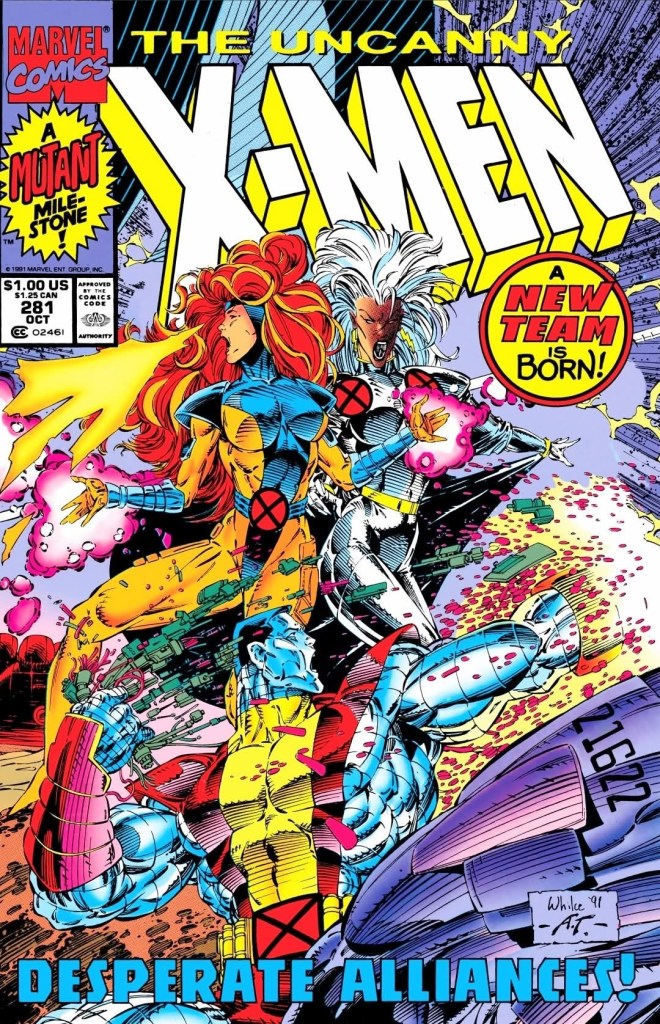
With those details laid down, here is a look back at Uncanny X-Men #281, published in 1991 by Marvel Comics with a story co-written by Jim Lee and Whilce Portacio and script by John Byrne. The art was done by Portacio with ink work by Art Thibert.
The cover.
Early story
The story begins in the Australian outback where the Reavers are relaxing while the sandstorm is happening and with them is Donald Pierce. Suddenly, a group of Sentinels attacked them resulting in deaths of some of their members.
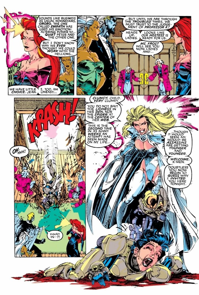
Elsewhere in New York City, Storm, Jean Grey, Archangel, Colossus and Iceman – all in formal attire as civilians – attend a lavish party at the headquarters of the Hellfire Club. It turns out, they were invited by Emma Frost who leads the club. Even with several guests and a lot of enjoyable things around them, the X-Men remain prepared to react if something unfortunate happens.
After a brief moment of tension between the X-Men and the Hellions, someone in a powered suit of armor crashed through a door near Jean, Storm and Archangel. Emma Frost emerges, takes the helmet off the armored person (a young woman) and even welcomed the X-Men. Frost claims that the armored lady was another assassin who tried to take her life and it is the 2nd assassination attempt she encountered over the past weeks….
Quality
The Sentinels, Lady Deathstrike and Donald Pierce in an intense scene.
As this comic book was part of the new era of the X-Men, the creative team came up with tale that is loaded with sub-plots that had a mix of old (the X-Men fought with the Hellfire Club during the Dark Phoenix Saga, and had encounters with the Sentinels a number of times) and new (Trevor Fitzroy – the illegitimate son of Sebastian Shaw – and the Upstarts are the new antagonists of the X-Men) creative elements for the X-Men’s Gold Team to encounter. The fact that the Hellfire Club is present in the story requires readers to have some knowledge about them from previous X-Men comic books as well as other characters and past tales that formed the background of the newer characters.
The story was made to modernize the X-Men and their struggle with people they encounter, while creatively reconnecting with the past. This should not be a surprise because writer John Byrne (yes, the same creator behind The Man of Steel mini-series) himself was involved in the Dark Phoenix Saga. The result is a tale of intrigue, twists, action and a lot of tension here.
When it comes to encounters, I enjoyed the discussion the X-Men had with Emma Frost (first appeared in Uncanny X-Men #129) who was their fierce enemy (Frost previously tried to manipulate Kitty Pryde) before having a change of heart and partnered with Professor X. Their exchange of words was civil, smart and there were some nice pay-offs in the form of intriguing revelations. The script by John Byrne was really solid here.
The artwork by Whilce Portacio here is still great to look at and his contribution on modernizing the X-Men’s look for the 1990s is a must-see. The same can be said with his take on Emma Frost, and the other established characters here. Portacio’s visualization of Trevor Fitzroy has that strong science fiction vibe combined with that fluffy early 1990s look.
Conclusion
The X-Men witness an intense moment followed by the emergence of Emma Frost.
Even though there were a few bumps on the flow of the narrative, I can say that Uncanny X-Men #281 (1991) is a very enjoyable read filled with intrigue, twists, reconnections to the past, notable character moments and sufficient spectacle. Its story has a lot of details and attachments to the past which will resonate with long-time X-Men fans. At the same time, Whilce Portacio’s art works made this one of the finest looking Uncanny X-Men issues of the 1990s and that is saying a lot. Considering the details and the richness of the writing, this Uncanny X-Men comic book should be read at a moderate pace as paying close attention to what was presented is essential.
That being said, this first tale of the Gold Team of the X-Men is a great read.
Overall, Uncanny X-Men #281 (1991) is highly recommended!
Welcome back readers, fellow geeks and electronic gaming fans!
In this edition of the Retro Gaming Ads Blast (RGAB) series, we will take a look at another batch of retro gaming print ads – including arcade flyers – from the 1970s to the 1990s.
For the newcomers reading this, Retro Gaming Ads Blast (RGAB) looks back at the many print ads of games (console, arcade, computer and handheld) that were published in comic books, magazines, flyers, posters and newspapers long before smartphones, social media, the worldwide web and streaming became popular. To put things in perspective, people back in the 1980s and 1990s were more trusting of print media for information and images about electronic games and related products.
With those details laid down, here is the newest batch of retro gaming print ads for you to see and enjoy…
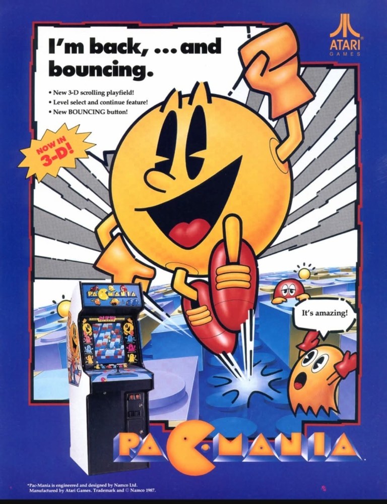
1. North American Pac-Mania arcade flyer
The front.
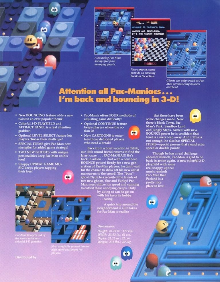
The rear.
Released in 1987, Pac-Mania became a big hit among critics, fans and casual arcade gamers which added a lot to the enduring popularity of the Pac-Man game franchise. As it featured a new game design with an oblique perspective and a more 3D feel, Pac-Mania was a very serious attempt on reinventing the Pac-Man formula. For the American market, Namco licensed the game to Atari which in turn came up with the above arcade flyer that had a pretty eye-catching front cover artwork showcasing the iconic Pac-Man jumping out from a maze with the line “I’m back,…and bouncing.” The arcade cabinet was also shown and a clear message about the 3D feature of the game was shown. The other side of the flyer showed screenshots and details that are worth reading. This arcade flyer still looks attractive and informative by today’s standards.
2. Japanese Missile Command arcade flyer
Cocktail arcade tables were popular in Japan and Taito brought Missile Command with the format.
Missile Command is a true arcade classic which I always enjoy replaying (read my retro review by clicking here). It was an instant hit in arcades in America and after Atari licensed the game to Sega and Taito for the arcades of Japan, it also achieved huge success there. Along the way, Taito released Missile Command with an cocktail arcade table format which is common in Japan. The arcade flyer Taito came up with had a very simplistic presentation of details, an image of the cocktail arcade table and one screenshot of the game. The Japanese arcade flyer clearly lacks excitement but at least it gave gamers and arcade operators a clear idea of what to expect with Missile Command.
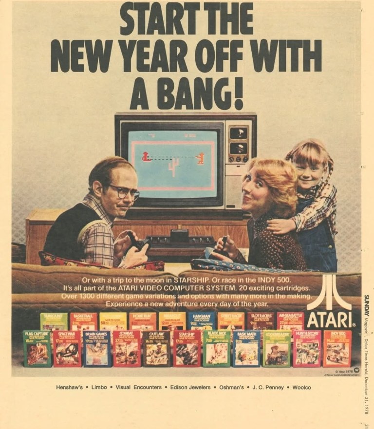
3. Atari 2600 print ad
The 1978 print ad.
When the Atari 2600 was first launched in 1977, it was officially called the Atari Video Computer System (Atari VCS). The Atari company really aimed high to sell a lot of consoles to as many households as possible and they came up with a print ad like this one from 1978. While the Atari 2600 and its games were displayed, the image of a father, mother and daughter showed that the company not only targeted American families but also want to change home entertainment to be more interactive. This old ad is truly an inspired piece of work.
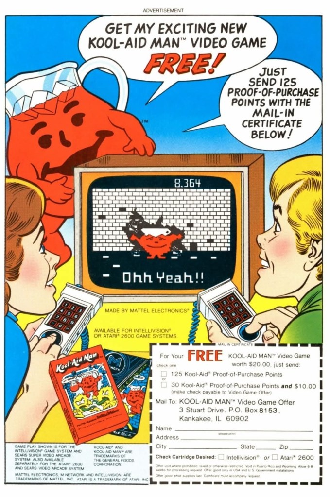
4. Kool-Aid Man video game print ad
I never played the Kool-Aid Man video game.
There was a time when Kool-Aid was such a popular drink, the character Kool-Aid Man debuted in 1974 after initially starting as the Pitcher Man. A short time later, merchandising featuring the character followed and in 1983 the official Kool-Aid Man video game was released on the Atari 2600 and the Intellivision. This particular print ad appeared in some comic books I read a very long time ago and it offered customers the opportunity to get the game free by sending 125 proof-of-purchase points to the company by mail. This old ad was visually striking and was a creative way to boost sales of the drink.
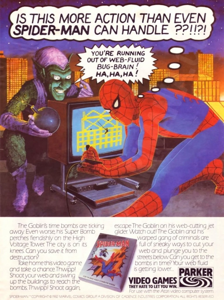
5. Spider-Man Atari 2600 game print ad
Spider-Man and Green Goblin with the Atari 2600 and the TV.
Even though the controls were rough and the game’s difficulty really went high with each new session, my friends and I still enjoyed playing the Spider-Man video game on Atari 2600 from Parker Brothers. Apart from the comic book-style print ads they came up with to promote the game, Parker Brothers went on to make this particular ad featuring Spider-Man and the Green Goblin with a TV set, the game and the Atari 2600 together all presented with a totally different art style. This is still a fun ad to look at.
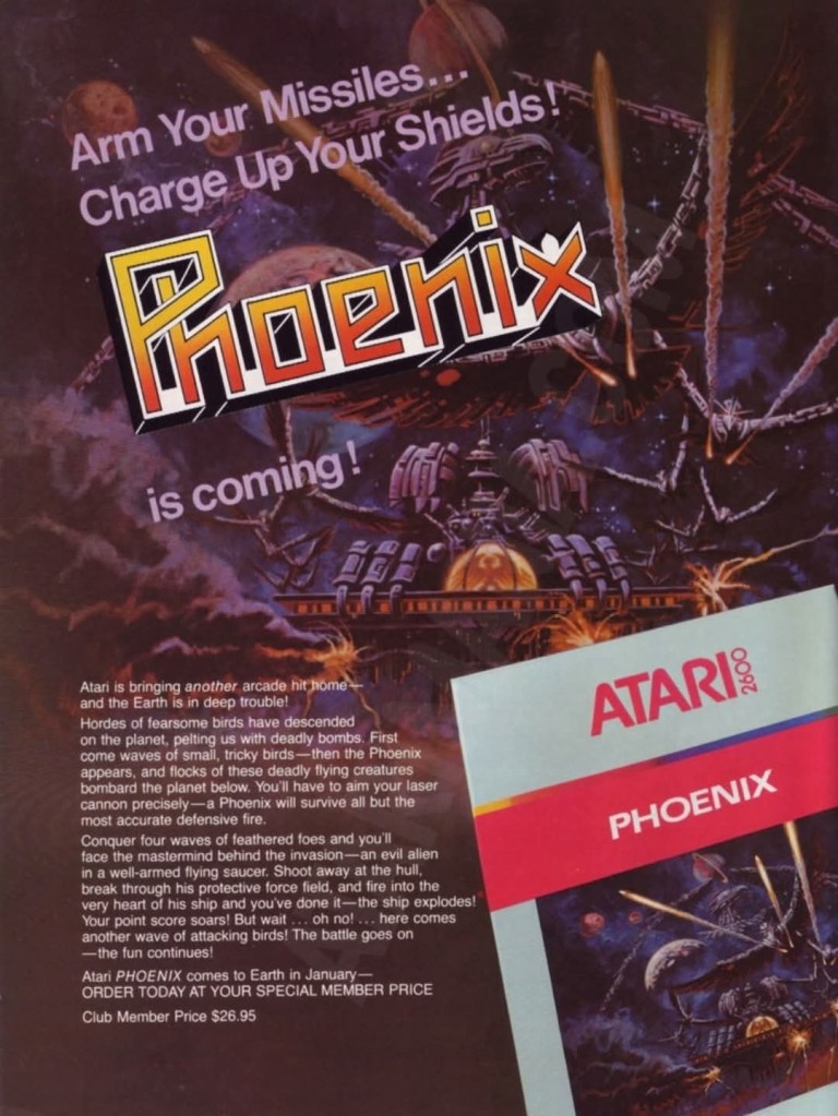
6. Phoenix game print ad
This is still an impressive print ad.
After playing shooter-type games like Space Invaders and Centipede on the Atari 2600, my friends and I experienced something familiar yet fresh with Phoenix. Atari secured from Taito the rights to make the Atari 2600 port of the game, and they came up with a dark print ad that showcased the official painted art work, a portion of the video game’s box and the line “Arm Your Missiles…Charge Up Your Shields! Phoenix is coming!” Having played the game many times, those highlighted words really captured the essence of Phoenix gameplay.
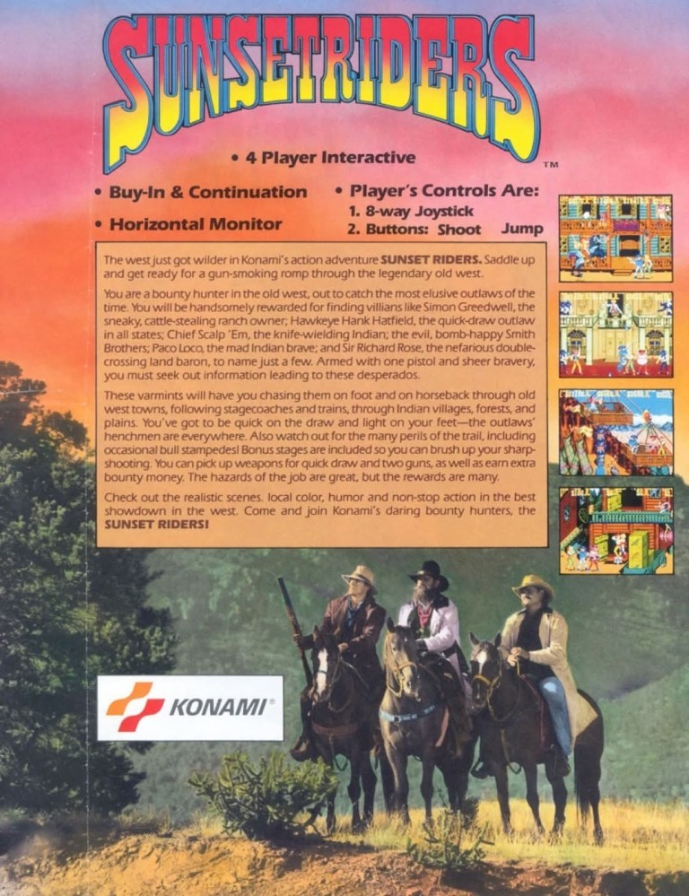
7. Sunset Riders North American arcade flyer
The front.
The rear.
Released in arcades in 1991, Sunset Riders was a critical and commercial hit raking in more success to Konami. For the American arcades, Konami came up with this print ad showing a creepy looking cowboy carrying a bag of money (related to the “strike it rich” line) with his donkey with him. The rear of the ad shows another photograph of 3 cowboys on their horses, the four screenshots and the creative text description. Too bad we don’t see flyers like this anymore.
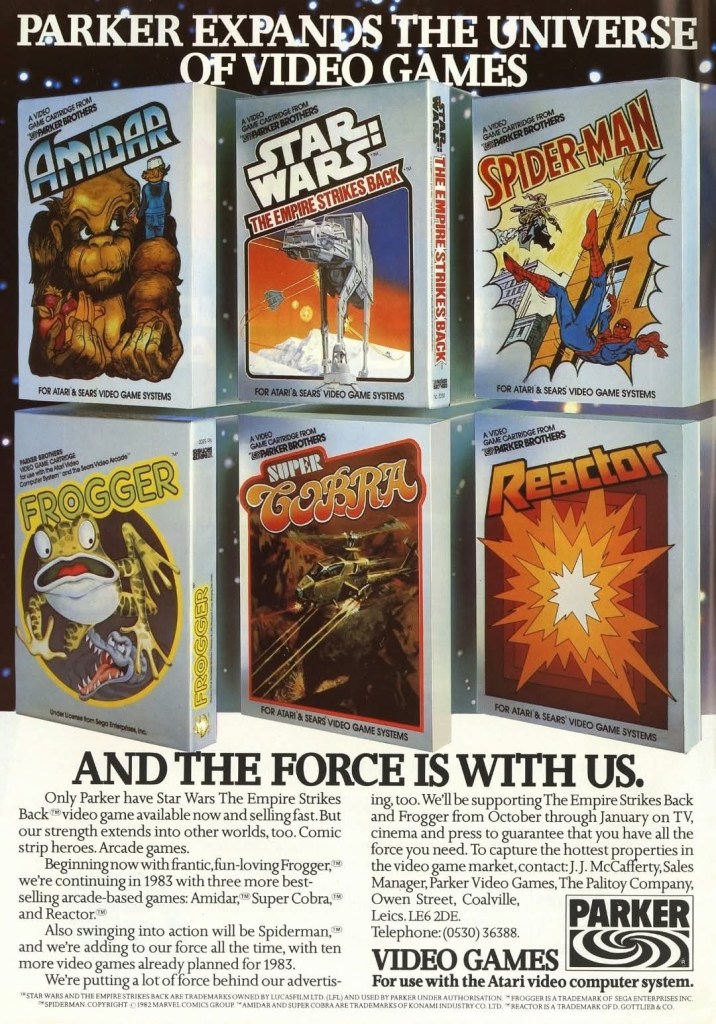
8. Parker Brothers’ 6-game print ad
Parker Brothers 6-game print ad.
Quite arguably, Parker Brothers was the 2nd most prominent publisher of video games on the Atari 2600 console next to Atari itself. Out of the six games presented in this old print ad, I only played Spider-Man and Super Cobra. Each game’s box had a unique art style and collectively they made this ad look exciting. Times were really different back in the 1980s.
Disclaimer: This is my original work with details sourced from reading the comic book and doing personal research. Anyone who wants to use this article, in part or in whole, needs to secure first my permission and agree to cite me as the source and author. Let it be known that any unauthorized use of this article will constrain the author to pursue the remedies under R.A. No. 8293, the Revised Penal Code, and/or all applicable legal actions under the laws of the Philippines.
Welcome back superhero enthusiasts, 1990s arts and culture enthusiasts, Marvel Comics fans and comic book collectors! Today we go back to the year 1991 and explore a part of Marvel Comics’ universe through the reimagined tales emphasized in the What If monthly series.
If you are not aware of the extensive literary history of the X-Men, the mutant franchise of Marvel Comics had its turning point in the mid-1970s with the release of the 68-page Giant-Size X-Men #1 which introduced a newer lineup of mutants (Wolverine, Cyclops, Nightcrawler, Thunderbird and Storm). It has been argued that Giant-Size X-Men #1 marked the starting point of the bronze age of comics in America and creatively it sparked a new chain of X-Men stories that captivated the fans and attracted new readers.
But what would have happened had the newer lineup of the X-Men did not even exist?
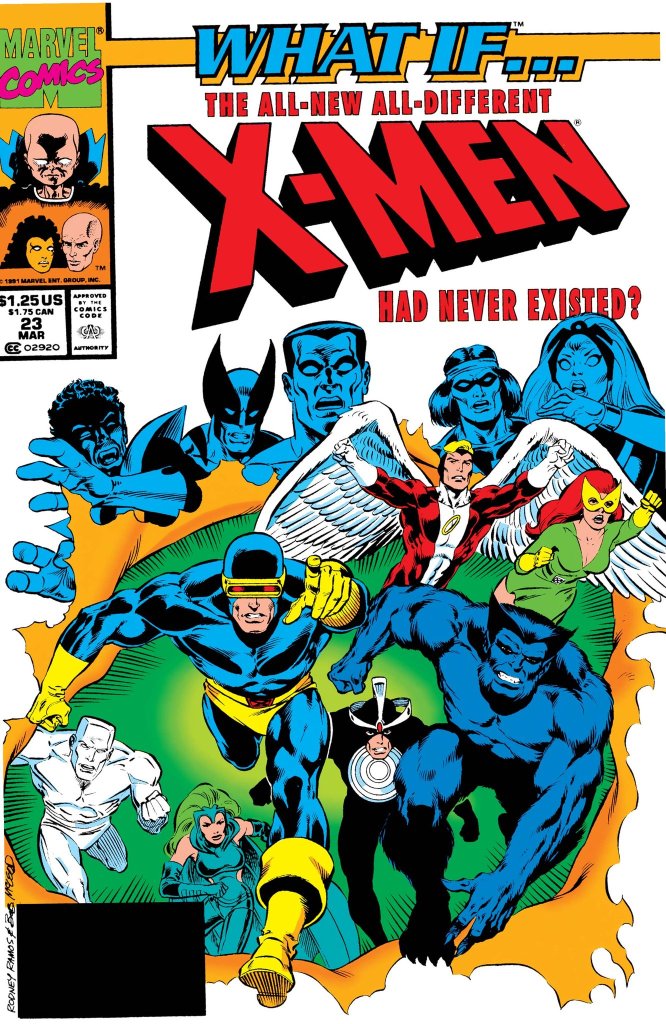
With those details laid down, here is a look back at What If #23, published in 1991 by Marvel Comics with a story written by Kurt Busiek and drawn by Rodney Ramos.
The cover.
Early story
The story begins when the original X-Men (Cyclops, Jean Grey, Angel, Beast and Iceman) members, Havok and Polaris arrive on the island of Krakoa. A huge green monster suddenly appears and attacks them. Guided by Professor X’s mind, Marvel Girl/Jean Grey helps Polaris by overriding the mental blocks that prevented her from using her full magnetic might. With a lot more power in her, Polaris takes action and helps the X-Men not only overwhelm the monster but also hurled the entire island of Krakoa into space.
As the X-Men were never captured by Krakoa, there was no reason to recruit a new team. The X-Men returned home and proceeded with other matters. On the other hand, Charles Xavier experiences a series of intense nightmares of conflict in outer space. As the nightmares took its toll on him, Professor X decides to take a vacation. Before he could leave, the X-Men are suddenly attacked by Eric the Red, Proudstar and Nightcrawler…
Quality
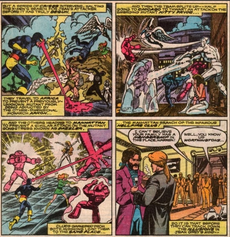
Without the existence of the 2nd X-Men team (from Giant-Size X-Men #1), the original X-Men’s first encounters with Dazzler, Kitty Pryde and the Hellfire Club turned out totally different.
This What If tale exploring an alternate chain of events involving only the original X-Men is not only a daring piece of work by the creators but it is also highly ambitious as seen through the scope of the plot. I’m not just talking about the non-existence of the 2nd X-Men lineup of Giant-Size X-Men #1 but also alternate realities of real X-Men developments such as the encounter with the Phoenix, Lilandra and Professor X’s first encounter, the X-Men’s encounter with the Hellfire Club, and more. Truly, the alterations were executed and the consequences were quite intense.
By focusing on the concept of the original X-Men proceeding as the 2nd X-Men team did not materialize, the Busiek-Ramos team really went all-in exploring the different possibilities and most of them were intriguing and entertaining to follow. The reading experience can be jarring because of the sudden change of scope that happens when the narrative suddenly shifted from one plot development (of local conflict) to another (a conflict on a galactic scale). Indeed, the narrative can be challenging to follow and to really enjoy it, you should pay strong attention to the details as you read on.
When it comes to character development, there is very little to find here which is not surprising given the way the script was written and also because the spotlight had to be shared by so many characters. Still, I enjoyed the character moments between Cyclops and Jean Grey, particularly during important points in the 2nd half of the story.
If there were any weak spots in the presentation, it is the fact that a lot of exposition had to be done and there were certain parts of the narrative that felt crammed with an excessive amount of details. Not only that, there is also an excessive amount of characters that go beyond the X-Men such as Lilandra of the Shi’ar Empire, the Starjammers, Alpha Flight, the Avengers and other beings of science fiction mixed in which make following the narrative challenging at certain points.
Conclusion
The original X-Men team plus Polaris and Havok.
What If #23 (1991) has more than enough advantages that outweigh the disadvantages. It’s story is very intriguing and enjoyable to read even though there were some bumpy parts on the narrative. Still, it is great to see what would have happened had the newer X-Men team never materialized and this comic book’s ending is very impactful to see.
Welcome back readers, fellow geeks and electronic gaming fans!
In this edition of the Retro Gaming Ads Blast (RGAB) series, we will take a look at another batch of retro gaming print ads – including arcade flyers – from the 1980s and 1990s.
For the newcomers reading this, Retro Gaming Ads Blast (RGAB) looks back at the many print ads of games (console, arcade, computer and handheld) that were published in comic books, magazines, flyers, posters and newspapers long before smartphones, social media, the worldwide web and streaming became popular. To put things in perspective, people back in the 1980s and 1990s were more trusting of print media for information and images about electronic games and related products.
With those details laid down, here is the newest batch of retro gaming print ads for you to see and enjoy…
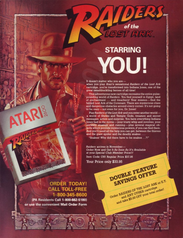
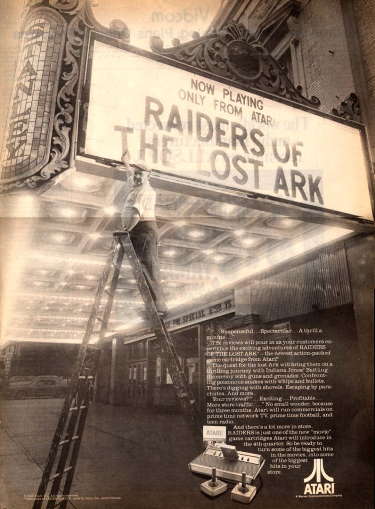
1. Raiders of the Lost Ark game print ads
The print ad with strong Indiana Jones imagery.
The print ad with the movie theater exterior image and the small image of the Atari 2600 console.
Directed by Steven Spielberg, Raiders of the Lost Ark was one of the best adventure movies ever made as well as the start of the iconic character Indiana Jones. Given its huge commercial success, an official video game adaptation for the Atari 2600 was released in 1982 and game designer Howard Scott Warshaw even met with Spielberg during the game’s development.
To promote the game, Atari released two print ads – one ad had a movie theater exterior visual concept to emphasize they have the official video game adaptation based on the movie while the other ad showed the game’s official artwork and game box cover while emphasizing a savings offer. Atari really did what they could to sell a game while riding on the success of Raiders of the Lost Ark.
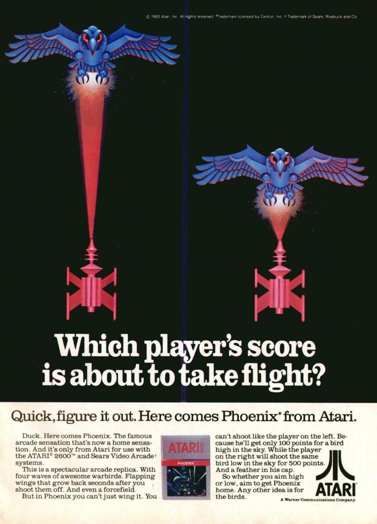
2. Phoenix print ad
Even without any screenshots, this print ad’s art still gives viewers a clear idea of what to expect.
Similar to what they did with Galaxian and Joust, Atari made this print ad promoting Phoenix which was a 2D sci-fi shooting game that was similar with Space Invaders in design. Colorized, hand-drawn artwork resembling the 2D sprites of the game was done to capture the attention of people. The art is so good, it made up for the lack screenshots of the game.
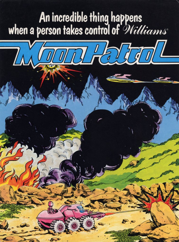
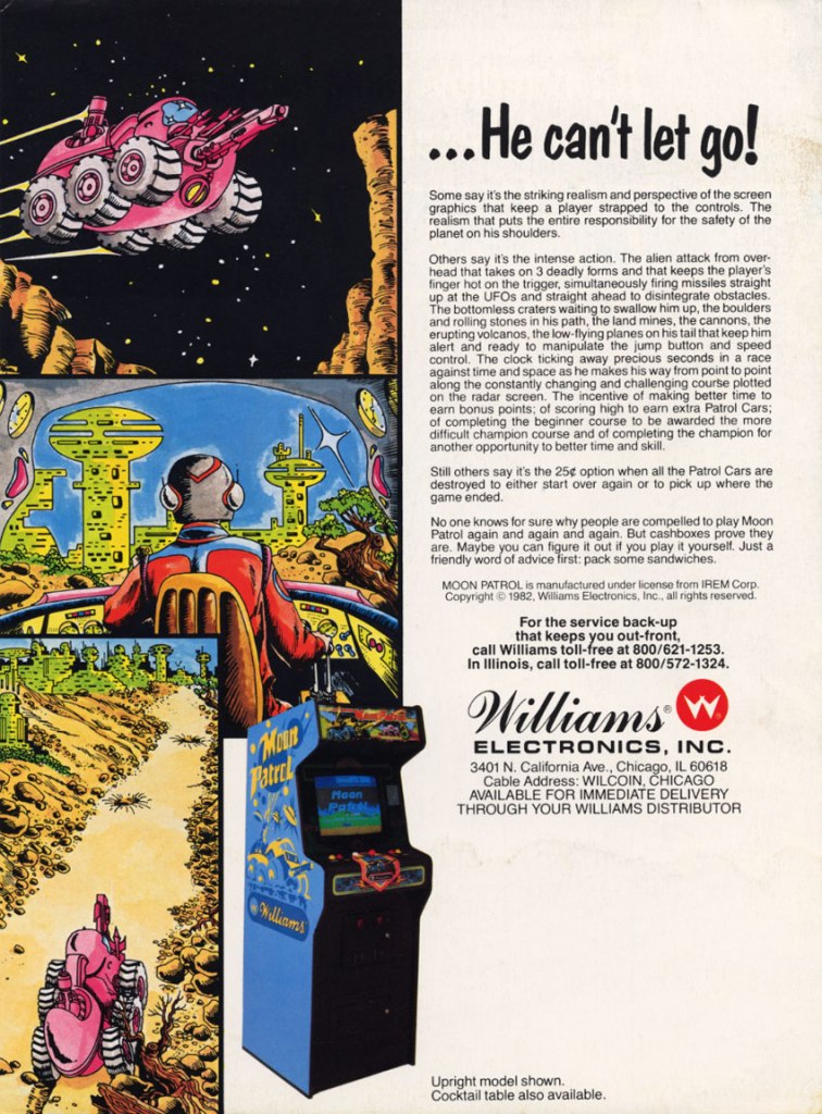
3. Moon Patrol arcade flyer
Front of the Moon Patrol flyer.
The other side of the arcade flyer.
Moon Patrol was a 2D sci-fi side-scrolling adventure game first released in the arcades in 1982. To sell the game to arcade operators, publisher Williams created the North American arcade flyer that heavily used hand-drawn comic book-style artworks on both sides while using available space on the other side for the descriptive text, contact details and the image of an arcade machine. What is very clear is that no screenshots of the game were shown to stand out which explains why a lot of hand-drawn art was used. The picture of the machine showing a screen of Moon Patrol was the closest thing to see a screenshot on this flyer. Personally, I really like the style and quality of the hand-drawn artwork as it made the flyer look lively.
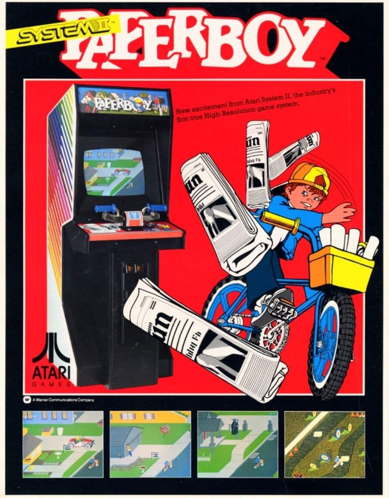
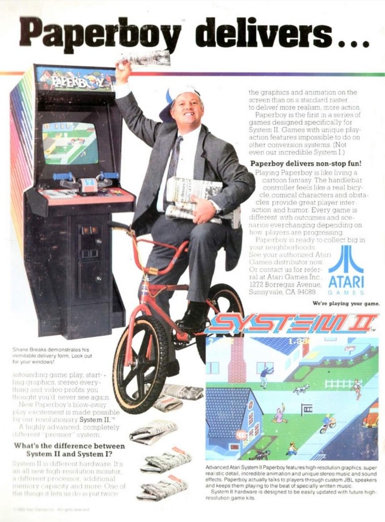
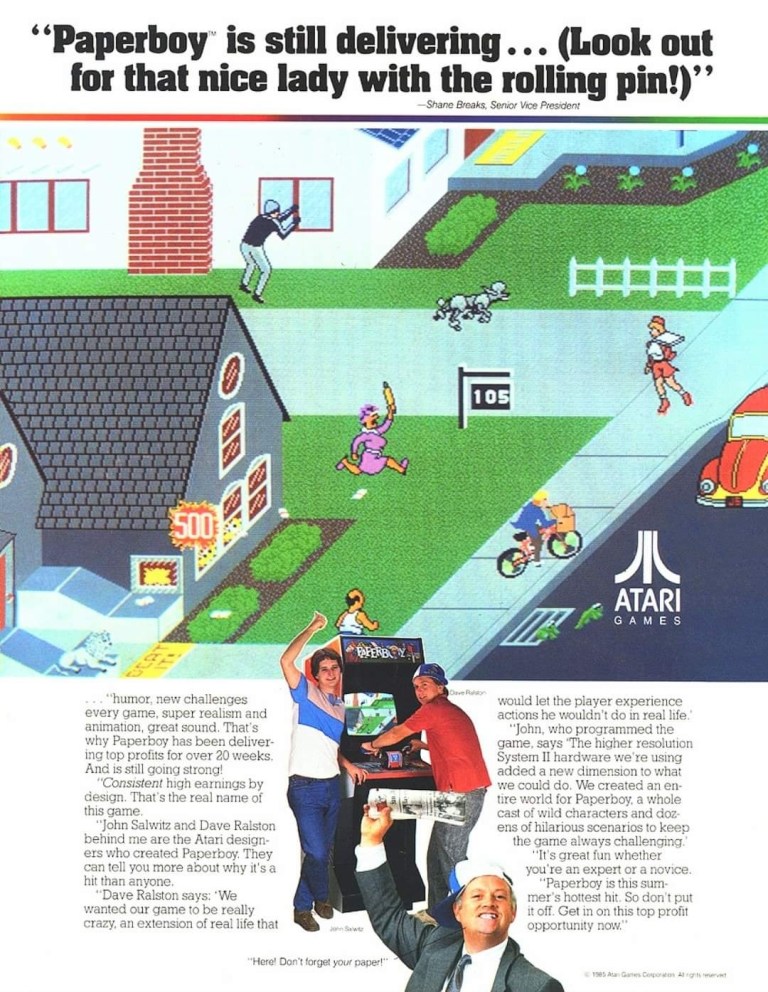
4. Paperboy arcade flyers
The arcade flyer showing the Paperboy machine and screenshots. The hand-drawn art is nice.
This one uses comedy showing a grown man riding a bike as a paper delivery “boy”.
I really like the stronger emphasis on the in-game graphics of Paperboy which dominates the space. What you see is what you get in the arcade.
The first time I ever played the classic Paperboy was in the arcade inside a Las Vegas hotel way back in 1989, and it sure was a challenging yet fun experience. Before its arcade debut in 1985, the developers took a lot of risks making the game which includes coming up with a bicycle handle bar for each machine to have. To promote the game, Atari made at least three arcade flyers that creatively emphasized what the game’s concept was about, how did it play, why does the machine have bicycle handlebars and why players can expect fun. Atari’s promotional efforts paid off as Paperboy became a huge hit in the arcades not only in America but also in Japan.
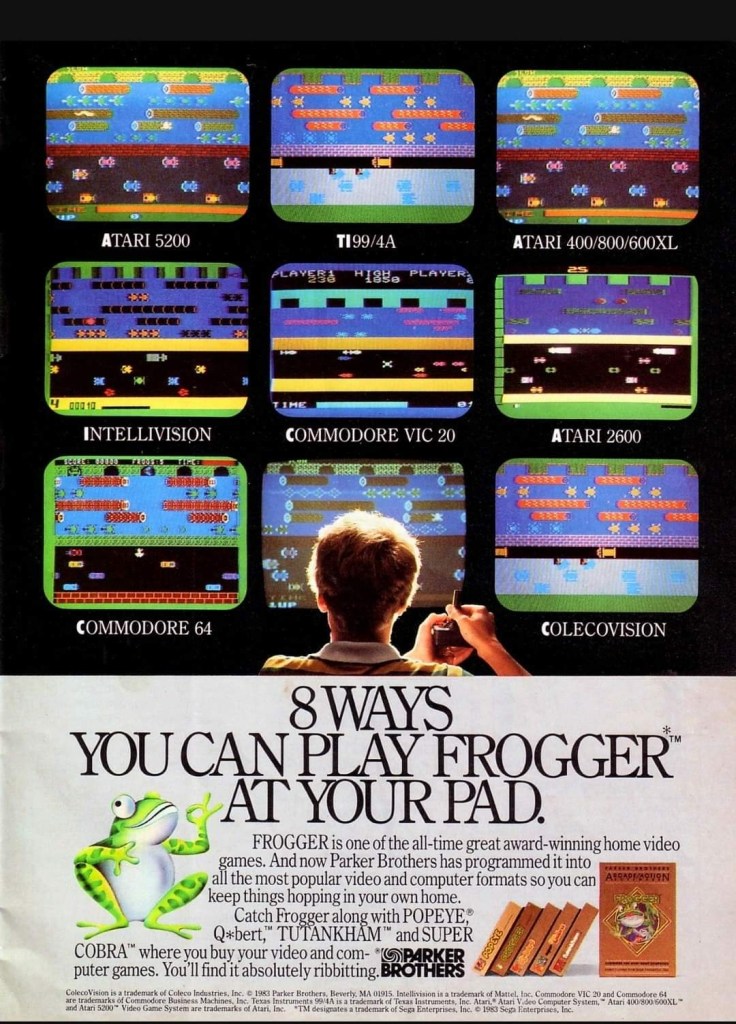
5. Frogger multi-platform print ad
This print ad is still amusing to look at.
After Frogger became a hit in the arcades, Parker Brothers secured the rights to port the game on Atari consoles, the Intellivision, TI-99/4A, vic-20, the Commodore computers and ColecoVision. To promote their Frogger ports, the single-page print ad was made showing a player in the foreground playing in front of screens that each showed what the game looked like on each platform. Parker Brothers found tremendous success selling 4 million copies of Atari 2600 version of Frogger at a time when there were only 13 million units of Atari 2600 in existence. By the year 2005, video game sales of Frogger reached 20 million worldwide across different platforms.
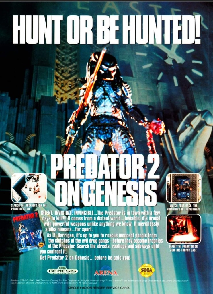
6. Predator 2 print ad
This is one very edgy print ad as used an official image from the movie.
If there is anything memorable about the 1990 film Predator 2, it is the fact that it had the story and the alien hunter itself within a metropolitan setting. That being said, the Sega Genesis Predator 2 video game had a suitable design of shooting and adventuring within the urban settings. This video game ad really captured the vibe of the movie (even showing the reddish human skull with spine on the Predator’s left hand) and clearly showed what gamers could expect. This old ad is still captivating to look at and its edgy approach is still intact.
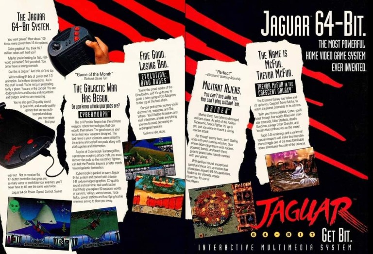
7. Atari Jaguar print ad
Did you ever own an Atari Jaguar console?
When I was reading video game magazines back in the 1990s, I always found print ads of the Atari Jaguar intriguing to look at. I was very young when I first played the Atari 2600 and its games at home, and later played some Atari games in the arcade. To me, seeing Atari Jaguar print ads like this one gave me moments of nostalgia and it made me wonder if Atari knew what it was doing with their so-called 64-bit game console. They did what they could to promote their console and the games within this 2-page print ad.
8. Vs. print ad
This print ad easily reminds me of the 1990s.
By 1997, both the arcades and the video game console market were filled with lots of 2D and 3D polygonal fighting games. Japan was the hot spot of the production of 3D polygon fighting games and the developer Polygon Magic (based in Japan) made Fighters’ Impact which Taito released in Japanese arcades and the PlayStation. The said game was picked up by THQ for a late-1997 release on the PlayStation in America under the title Vs. I never played this game but I heard that the game’s development included gang-oriented characters designed by Marvel Comics artist Kurtis Fujita. This Vs. ad is a lively reminder about the hip-hop fashion that made its way into video games.
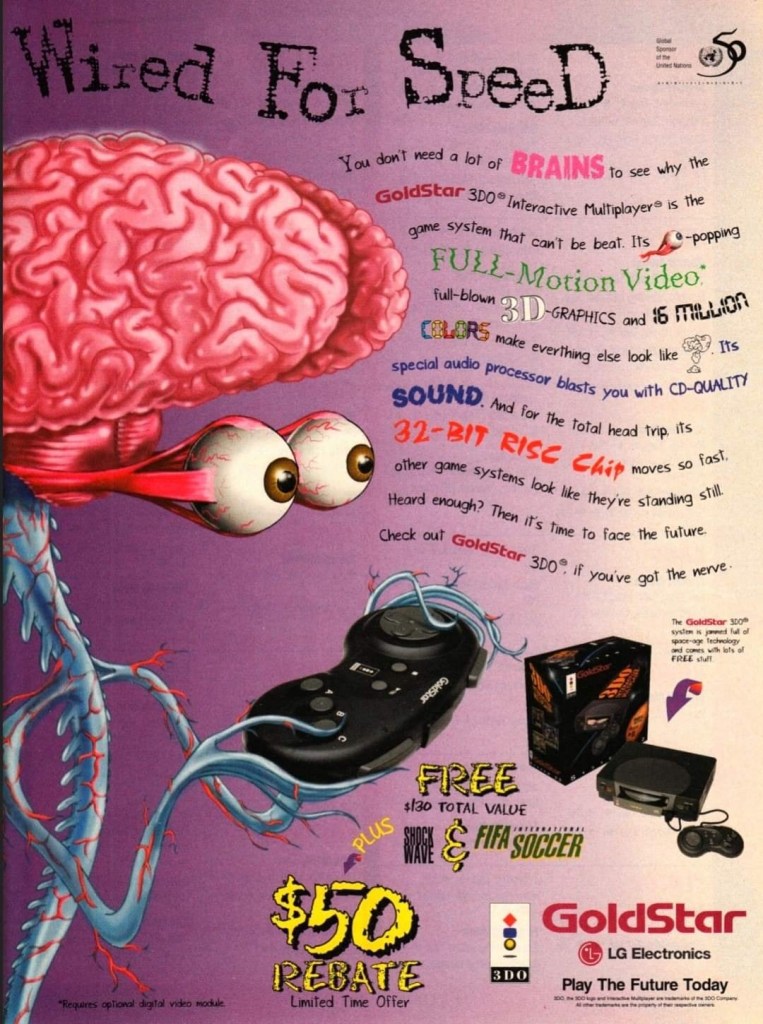
9. GoldStar/LG Electronics 3DO print ad
This is a very weird way to market a video game machine.
Back in the 1990s, the South Korean electronics company GoldStar (which was part of the umbrella of LG Electronics) had the license to produce 3DO game consoles with its own style. In some ways, the GoldStar 3DO console looked like a premium console on the outside. Unfortunately, the GoldStar 3DO print ad here had a very sloppy presentation as the ad makers used very weird art of a brain-with-eyes holding a 3DO controller leaving little space left to promote the console and games (without any screenshots). The text description was sloppily done. This is a bad example of promoting video game hardware and games.
10. Pandemonium 2 print ad
I saw this ad but never played the game.
Looking back at 1997, I find it strange that I never got to play Pandemonium 2 on the PlayStation even though I saw its print ad in magazines. I had a lot of fun playing Pandemonium! on the console in 1996 but somehow missed out on its sequel. Looking back at the Pandemonium 2 print ad, I was surprised with how the game developers redesigned the two playable protagonists, especially Nikki who was clearly made to look very sexy. The word “libido” (meaning sexual drive) was deliberately placed above Nikki. The ad also had a hypnotizing mix of colors which I believe was also deliberately done by the ad makers. I can only wonder how the game played.
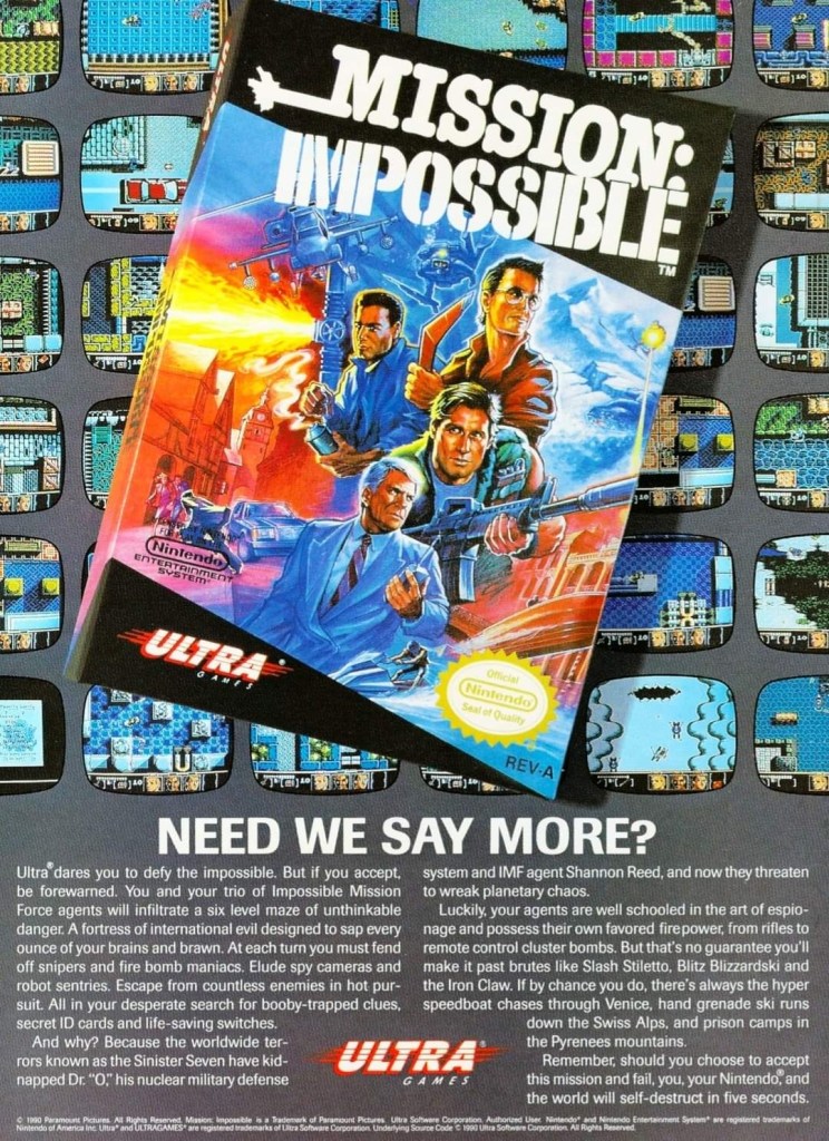
11. Mission: Impossible print ad
A captivating ad.
In 1990, Ultra Games (a label of Konami) released the Mission: Impossible video game on the Nintendo Entertainment System (NES) in America. Developed by Konami, the game was an adaptation of the 1988 TV series and it had an ambitious design with regards to level design and gameplay. To promote the game, the ad makers came up with a visual design showing the game’s box (which had a nice painted art on the cover) on the foreground and several screenshots resembling TV monitors on the background. Even by today’s standards, this print ad still looks good and captivating even if you are not too familiar with Mission: Impossible on TV.
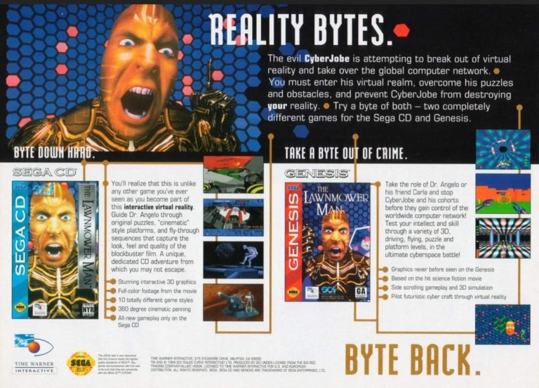
12. The Lawnmower Man Sega CD and Genesis print ad
Are you fan of The Lawnmower Man movie?
Back in 1992, there was a lot of buzz generated by the movie The Lawnmower Man as it had a disturbing concept that involved virtual reality and, more notably, author Stephen King sued the filmmakers to remove his name from the title because the film differed so much from the source material. Of course, those developments did not stop the production of video game adaptations of the movie. This print ad promoting the Sega CD and Sega Genesis versions of the game heavily used the images of CyberJobe which were among the most memorable images from the film. Looking at the ad, the ad makers could have made the screenshots look a little larger to really sell the games.
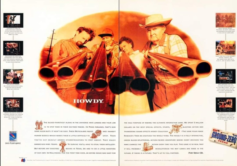
13. Ground Zero: Texas print ad
The shotguns really made this ad eye-catching.
I never played the Sega CD video game Ground Zero: Texas but I knew that it was one of those games that heavily relied on video footage while giving players moments to interact. Back in 1993, there was an increase in the number of video games that carried lots of live action footage to drive the narrative and players were given options in order to progress. What is very notable about the game is not the game design but the very 2-page ad used to promote it. The image showing four people pointing their shotguns towards the viewer was easily the most captivating part of the ad. Even though there was vacant space in between, the screenshots of the game were displayed to be really small.
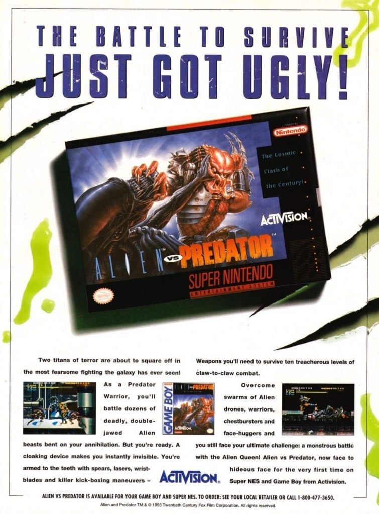
14. Alien vs. Predator for SNES and Game Boy print ad
This ad caught the attention of a lot of people back then.
Back in 1990, Dark Horse Comics launched the 4-issue mini-series of Aliens vs. Predator which turned out to be a very intriguing and engaging crossover comic book tale featuring two iconic sci-fi species of monsters. The success of the comic books led to the production of many video games which delighted both fans of Predator and Aliens. In 1993, Activision released Alien vs. Predator on the Super Nintendo Entertainment System (SNES) and the single-page print ad they came up with was engaging to look at. The SNES game box with the fine looking painted art was the main visual highlight leaving just enough space for the descriptive text, the Game Boy cover and two screenshots. Believe it or not, this video game was not related at all with the Alien vs. Predator arcade game and Atari Jaguar console game.
Disclaimer: This is my original work with details sourced from reading the comic book and doing personal research. Anyone who wants to use this article, in part or in whole, needs to secure first my permission and agree to cite me as the source and author. Let it be known that any unauthorized use of this article will constrain the author to pursue the remedies under R.A. No. 8293, the Revised Penal Code, and/or all applicable legal actions under the laws of the Philippines.
Welcome back superhero enthusiasts, 1980s culture enthusiasts and comic book collectors! Today we go back to the year 1982 to take a close look at one of the many tales of the Marvel Comics shared universe told through the monthly series of Uncanny X-Men.
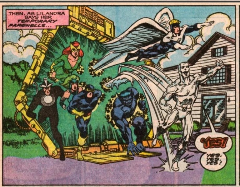
In my previous retro review, Charles Xavier got reunited with his beloved Lilandra, the empress of the Shi’ar Empire, as they were trapped temporarily by the Brood. Elsewhere, Corsair reveals to his son Cyclops what happened before they got separated on Earth twenty years prior. The X-Men and the Starjammers got captured by the Brood’s massive transport which turned out to be a massive organic creature. The conflict that followed saw another battle between the X-Men and the Brood but with the stakes raised higher.
With those details laid down, here is a look back at Uncanny X-Men #157 published in 1982 by Marvel Comics with a story written by Chris Claremont and drawn by Dave Cockrum.
The cover.
Early story
The story begins in space where the X-Men and the Starjammers worked together to repair the external parts of the Starjammer ship. An incident happens in which Wolverine starts to float away from the ship while Colossus loses consciousness. One of the Starjammers saved Wolverine.
Just as the Starjammers used their advanced technology to help the unconscious Colossus, Empress Lilandra tells Professor X and a few others that she used her imperial commlink and private code to each Chanellor Araki to confirm to him that she is free and unharmed. Supposedly, Lilandra’s move should compel Araki to call off the punitive strike against Earth.
As Lilandra starts communicating with the flagship that carries Araki, Admiral Lord Samedar takes control of the ship and declares that they will execute Araki’s orders to obliterate Earth…
Quality
Kitty Pryde on the move against all odds.
Following the events of the two previous issues, this story is another engaging pay-off to the established build-up but with the stakes raised higher as Earth becomes a target of the defiant Shi’ar officials who themselves turned out to be defiant towards their empress Lilandra all along. Not only that, there is a good amount of intrigue with the way the Shi’ar people are portrayed here.
The X-Men here continue to struggle not only because of Colossus’ weakness but also because something bad happened to their leader Professor X (a must-read scene). Far away from the rest of their teammates, Nightcrawler and Kitty Pryde became major players in this particular story and what happened with them was nicely structured by Chris Claremont. This is clearly a big pay-off to what was staged in issue #155 and it sure is worth anticipating!
If you have great interest with the Brood, you will be delighted to see more of the way they communicate and how they treat foreigners like Deathbird as they live on with their uncompromising belief that their race backs winners only.
Conclusion
How the Brood treats Deathbird.
Uncanny X-Men #157 (1982) is an action-packed sci-fi tale that continued Claremont’s direction of the X-Men while also emphasizing the Brood as well as the Starjammers and the Shi’ar as crucial players in this particular storyline. There is plenty of superhero spectacle to enjoy here, a few memorable character moments and if you are fond of Chris Claremont’s works, you will enjoy the twists and surprises he pulled off here.
Overall, Uncanny X-Men #157 (1982) is recommended!
Disclaimer: This is my original work with details sourced from reading the comic book and doing personal research. Anyone who wants to use this article, in part or in whole, needs to secure first my permission and agree to cite me as the source and author. Let it be known that any unauthorized use of this article will constrain the author to pursue the remedies under R.A. No. 8293, the Revised Penal Code, and/or all applicable legal actions under the laws of the Philippines.
Welcome back superhero enthusiasts, 1980s culture enthusiasts and comic book collectors! Today we go back to the year 1980 to take a close look at one of the many tales of the Marvel Comics shared universe told through the monthly series of Uncanny X-Men.
In my previous review, Dazzler was formally introduced as the X-Men encountered her. Along the way, the other newbie Kitty Pryde (Shadowcat) got involved with X-Men members Storm, Wolverine and Colossus and danger got to them. Brewing within the background were plot elements regarding the Hellfire Club and the Dark Phoenix.
With those details laid down, here is a look back at Uncanny X-Men #131 published in 1980 by Marvel Comics with a story written by Chris Claremont and drawn by John Byrne.
The cover.
Early story
The story begins on the streets of Chicago as the 13-year-old Kitty Pryde desperately runs away from a car that has been chasing her. Just as she trips, the Jean Grey (in her form as the Phoenix) suddenly appears right in front of the car (driven by two armed personnel of the Hellfire Club) and uses her immense power to stop and damage it. This spared Kitty Pryde’s life and made her more confused. Nightcrawler suddenly appears in front of Kitty, grabs her and leap off to a higher place to be safe.
Cyclops and Dazzler arrive to see Phoenix still observing the damaged car and the two Hellfire Club personnel knocked out cold. As Dazzler is amazed by what Phoenix did, Cyclops tells Jean that his instructions were to stop the car but not turning it into scrap. Jean responds by stating that he did not feel Kitty’s stark terror nor did he sense the thoughts of the men who were in the car.
After being called from above by Nightcrawler, Cyclops, Phoenix and Dazzler make their way up to the top of the building. Nightcrawler reveals that Kitty broke away from him and dove right through the roof…
Quality
Kitty Pryde took the risk to help the X-Men free Wolverine.
Upon close inspection, this is a richly layered tale that nicely paid off some of the build-up in the previous issue while consistently building up the plot elements for the events to follow (the eventual Hellfire Club encounter and the Dark Phoenix Saga). In this issue, you will get to see the X-Men in action with Dazzler (who just joined in to help them without fully committing to joining their team) on a series of events that involve encountering Miranda Frost and finding their captured teammates.
As this was written by Chris Claremont, you will see a lot of character development (aided a lot with the use of thought balloons) and key observations emphasized (clever exposition of details) as the plot moved forward. This tale has the classic elements of good-versus-evil backed with action and some twists that will definitely keep readers entertained. It is through the dramatization and observations of the characters that made the narrative deep and by the end of it, you will most likely get to know the characters a lot more.
Apart from witnessing Dazzler’s first unofficial mission (note: misadventure) with the X-Men, you will see Kitty Pryde shine as the fragile yet capable teenager do something heroic which symbolically justified her entry into the X-Men. This story also touches on the theme of immense power which was dramatized nicely through Jean Grey and Cyclops. Cyclops here was written to be very concerned about Jean Grey having god-like powers as the Phoenix which he sees as too risky and he hopes that she will maintain self-control. Even Storm expressed the same concern about the Phoenix. All of these dramatics combined with the superhero spectacle and steady way of presenting exposition were nicely pulled off by the Claremont-Byrne team.
Finally, I want to say that Emma Frost was portrayed as a ruthless, cold-hearted and elitist super villain who happens to be one of the central figures of the Hellfire Club (which itself was being built up by Claremont-Byrne as a dangerous force of opposition for the X-Men to face). Emma Frost is not just another evil figure…she is a telepath capable of overwhelming others and she has a very high ambition of accumulating power socially, economically and politically. Clearly she was created to be a recurring evil figure within Marvel’s shared comic book universe.
Conclusion
A scene showing a few X-Men members with Dazzler and Kitty Pryde as the clear newcomers.
Even if you see Uncanny X-Men #131 (1980) as simply a build-up tale for the inevitable Dark Phoenix Saga, it is clear that the comic book still stands out on its own as it strongly paid-off what was built up in the previous issue and the high quality on storytelling was successfully maintained. This is an entertaining read and, quite notably, it develops specific characters in very believable ways. So much so, you will get to know the characters better by the time you reach the end. As for the fans of Dazzler, there are things to enjoy in this X-Men tale and it definitely is a must-read before reading Dazzler #1 (1981).
Overall, Uncanny X-Men #131 (1980) is highly recommended!
Disclaimer: This is my original work with details sourced from reading the comic book and doing personal research. Anyone who wants to use this article, in part or in whole, needs to secure first my permission and agree to cite me as the source and author. Let it be known that any unauthorized use of this article will constrain the author to pursue the remedies under R.A. No. 8293, the Revised Penal Code, and/or all applicable legal actions under the laws of the Philippines.
Welcome back superhero enthusiasts, 1980s arts and culture enthusiasts, Marvel Comics fans and comic book collectors! Today we go back to the early 1980s and examine an alternate universe portrayal of the X-Men and the Dark Phoenix saga itself as told in one of the comic books of the first volume of the series What If.
So much has been discussed about the Dark Phoenix saga of the Uncanny X-Men series through the decades. A lot point to it as the greatest X-Men ever told while some called it the true X-Men epic story that Chris Claremont and John Byrne came up with. Considering its deep impact and significance on the Marvel Comics shared universe, it was only a matter of time before the publisher decided to revisit the said storyline but explore other outcomes through the What If series.
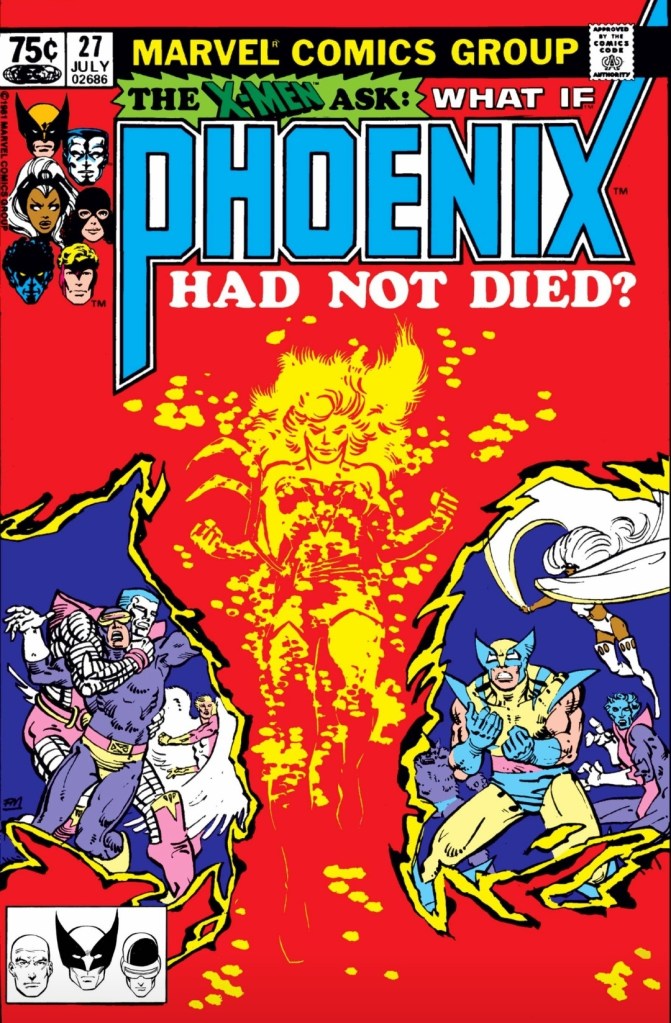
With those details laid down, here is a look back at What If #27 published in 1981 by Marvel Comics with a story written by Mary Jo Duffy and drawn by Jerry Bingham.
The cover.
Early story
The story begins with the Watcher looking back at the events that led to the Dark Phoenix saga, who got impacted and how Jean Grey used a weapon of alien origin to end her own life and prevent the Dark Phoenix from raging.
Suddenly, an alternate reality begins when Jean Grey survives and Cyclops reacts by using his optic blasts on incoming enemies until he got overwhelmed. The X-Men have been defeated and are brought to the imperial flagship of Lilandra’s grand fleet where the Shi’ar scientists prepare for the destruction of Phoenix.
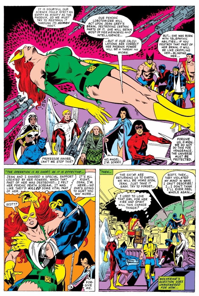
Jeay Grey remains alive, floating above the X-Men and the others as Lilandra’s people prepare to start the process of the psychic lobotomizer on her. Their intention is to act upon Jean Grey’s brain and destroy certain parts of it in order to neutralize the Phoenix power within her. The operation turned out successful and Jean Grey survives once more. She and her fellow X-Men return to Earth…
Quality
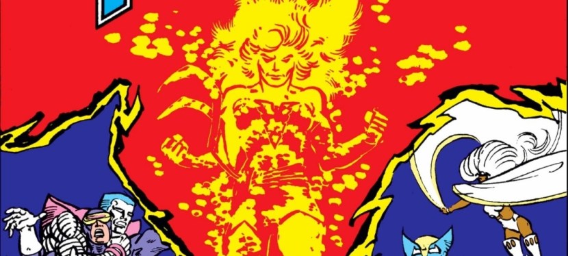
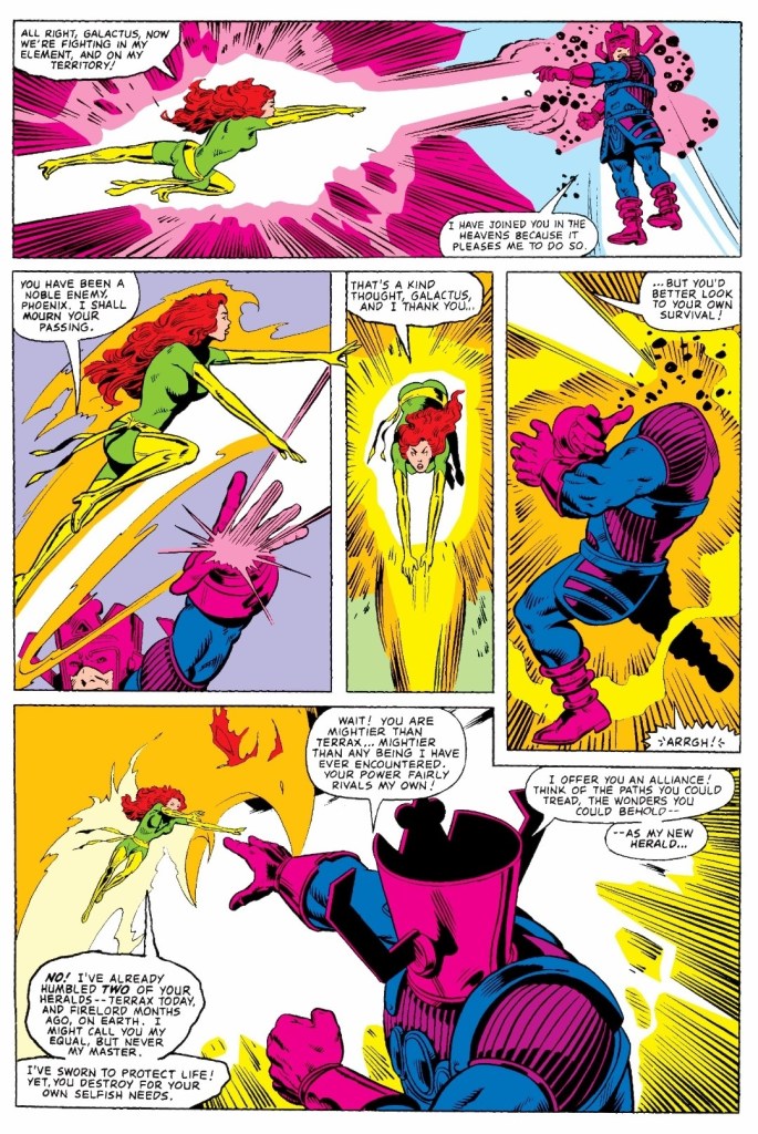
This conflict between Phoenix-powered Jean Grey and Galactus is a must-see.
This early, I can say that this is a very great exploration and portrayal of the concept about Phoenix (within Jean Grey) not dying during the Dark Phoenix saga. The script of this comic book is so great (note: solid plot structure, consistent portrayals of the characters, strong build-up with solid pay-off and more), it’s almost as if Mary Jo Duffy and Chris Claremont worked together behind the scenes.
The protagonist in this story is Jean Grey and this comic book examines her struggle with adjusting her personal life and her effort to fit in once again within the X-Men while remembering fully that as Dark Phoenix, she still remains guilty of destroying an entire solar system and committing the mass murder of five billion people.
Unsurprisingly, due to the emergence of a tremendous crisis deep in space, Jean Grey gets involved with her team going to the site on a mission. This easily puts her into a situation that makes her revive the power of the Phoenix deep within herself. While the use of the tremendous power of the Phoenix to help the X-Men looked sensible at first glance, it only signified the beginning of a chain of destruction and unfortunate developments. As expected, Jean Grey can only go so far with her good nature and her free will while having the magnificent powers of the Phoenix.
While the conflicts were portrayed well, Mary Jo Duffy’s script raises key questions about the red-head X-Men member: How can Jean Grey ever achieve a normal life and level with her X-Men teammates knowing that she carries powers that make her god-like? How can she ever forget the tragic fact that as Dark Phoenix, she murdered billions in deep space? What can Charles Xavier do to lead and guide the X-Men knowing that Jean is way too powerful? Could the love of Cyclops be helpful for Jean Grey’s personal efforts to control the Phoenix power within?
Another highlight of this story is the final seven pages. The ending is very impactful and definitely something you must see.
Conclusion
This happened after Jean Grey’s survival.
What If #27 (1981) is a classic alternate reality portrayal of the Marvel Comics universe and it surely works as a companion piece to what was established in the Dark Phoenix saga. Mary Jo Duffy’s script really captured the spirit of Claremont’s X-Men and the dramatic stuff and all the build-up led to a very tremendous ending that can disturb you or even satisfy you in the most unusual way. Most notably, this comic book really answered the question about what would happen had Phoenix did not die. The 2nd tale of this comic book – the Kree Encounter – is an interesting additive.
Overall, What If #27 (1981) is highly recommended.