A Look Back at Bloodshot #6 (1993)

Disclaimer: This is my original work with details sourced from reading the comic book and doing personal research. Anyone who wants to use this article, in part or in whole, needs to secure first my permission and agree to cite me as the source and author. Let it be known that any unauthorized use of this article will constrain the author to pursue the remedies under R.A. No. 8293, the Revised Penal Code, and/or all applicable legal actions under the laws of the Philippines.

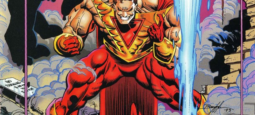
When I was still collecting comics back in 1993, I was more focused on the X-Men 30th anniversary celebration and the expansion of the Marvel 2099 universe organized by Marvel Comics, and the launch of the Ultraverse by Malibu Comics.

Along the way, I heard some buzz about Valiant Comics and Defiant Comics. That same year, Valiant Comics generated a lot of buzz among comic book collectors with the launch of Turok: Dinosaur Hunter and the release of Bloodshot . Why Bloodshot ? It’s because of the literary debut of a character who went on to become an one of Valiant’s icons.
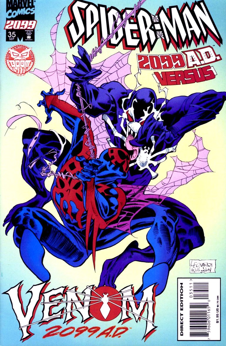
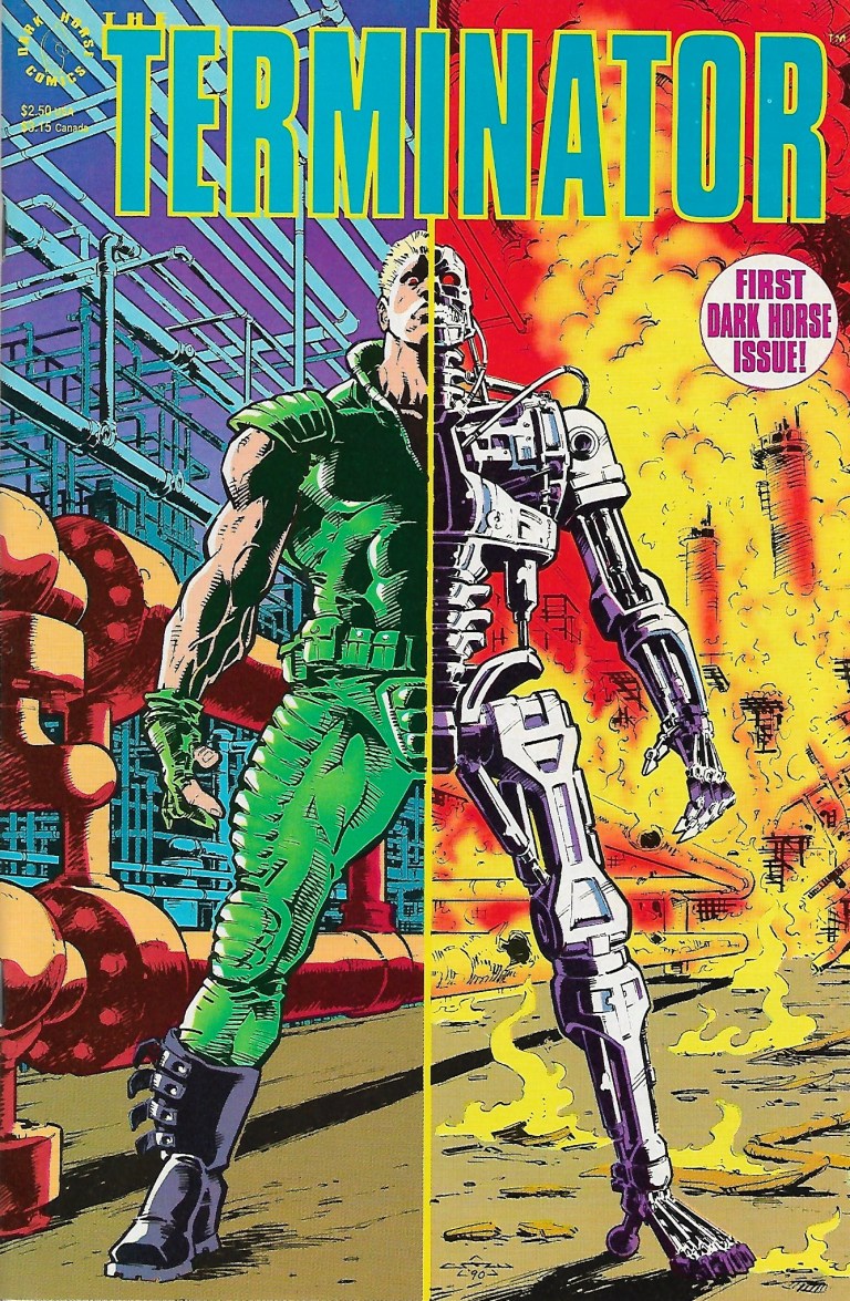
1
The cover.

Here’s a nice look back at Bloodshot published in 1993 by Valiant Comics with a story by Kevn VanHook drawn by Don Perlin.

Early story

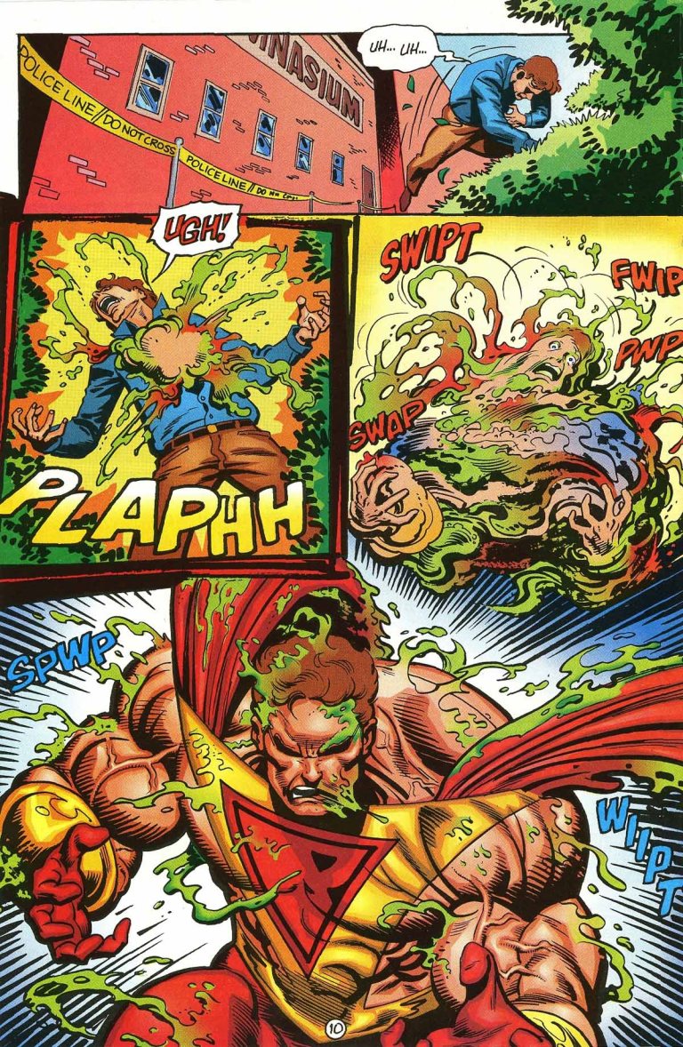
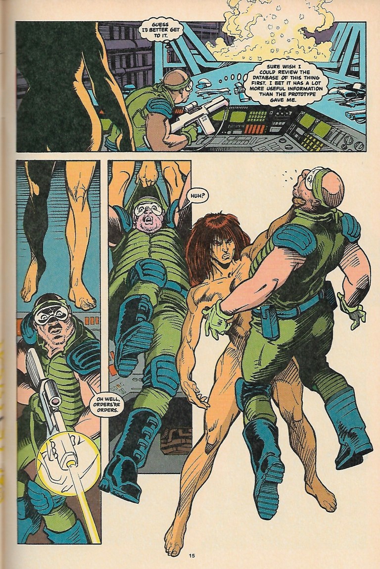
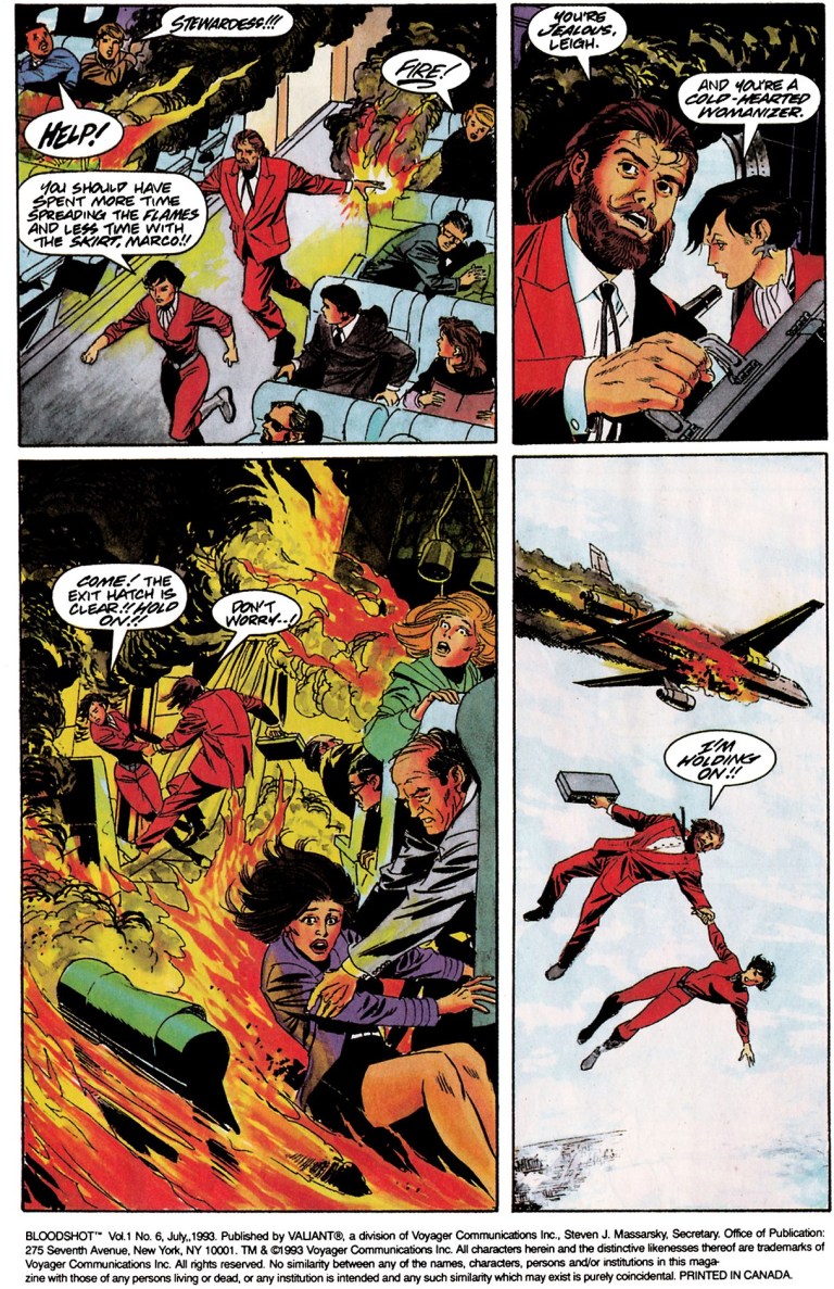
The story begins inside a commercial airplane flying over Sydney, Australia. There is a guy wearing reddish business attire socializing with a lady while standing. A lady in red approached him telling him that he should take his seat as they are in the glide path. The guy in red attire approaches a seat man wearing green business attire, asking him if the vacant seat near him was taken.

The seated man tells him to get away. The guy in red places his right hand on him causing a fire during the flight. What happened turned out to be an assassination. The guy and lady in red rush to the nearest emergency exit and it turned out their names are Marco and Leigh. They jump off the plane which explodes several feet away from them. Marco and Leigh left in the air not worried about falling down.

Meanwhile at the airport in London, Bloodshot arrives and is greeted by his pal Malcolm. They arrive back at their residence in London’s east end. Bloodshot has something to do. Over at France, Alicia Guerrero meets with Montblanc at his office and they discuss the courier assignments that involve acquiring a set of components and the three (of four) intercontinental flights that ended in tragedy.

Quality

7
Bloodshot shortly after arriving from the airport.

As far as storytelling goes, this comic book sure has a lot of intrigue and espionage leaving the title character Bloodshot with much less spotlight (in terms of narrative, not page appearance). It’s not a problem for me as a reader because the writer Kevin VanHook really took his time to emphasize what has been going on, what’s within the web of international secret operations (that involved killing and explosions) and what’s at stake. Of course, the deepening of the plot makes way for Bloodshot to get involved in a less action-oriented but more intelligent way. That being said, action scenes are subdued for the sake of storytelling. Along the way, illustrator Don Perlin did a good job visualizing the deep plot. Perlin also tried his best making the mission briefing of Bloodshot (which even for its time was cliched) look interesting.

Fans of Bloodshot who love action scenes of shooting and striking, as well as displays of his special abilities, won’t find much of such stuff here.

Conclusion

3
Tragedy high up in the sky.

To make things clear to those who are wondering, Bloodshot is significant for fans of Valiant Comics as it marked the first appearance of Colin King who is actually the iconic Ninjak. That fact, however, does not really define the overall quality of this comic book and Colin King’s literary debut is very brief. That way I look at Bloodshot , it’s a good comic book laced with a good amount of intrigue and espionage.

For those who are based in the Philippines, Bloodshot is one of the rare American comic books of the 1990s that mentions the Philippines (with Manila as a flight destination) and even showed a few images of it as a location.

If you are seriously planning to buy an existing hard copy of Bloodshot of 1993, be aware that as of this writing, MileHighComics.com shows that a near-mint copy costs $28.

Overall, Bloodshot is recommended for those looking for gripping, espionage storytelling with the title character. As a collector’s item, the comic book is a must-have for as long as Ninjak and Bloodshot remain popular.


Thank you for reading. If you find this article engaging, please click the like button below and also please consider sharing this article to others. If you are looking for a copywriter to create content for your special project or business, check out my services and my portfolio. Feel free to contact me as well. Also please feel free to visit my Facebook page Author Carlo Carrasco and follow me at HavenorFantasy@twitter.com

A Look Back at Prime #2

Disclaimer: This is my original work with details sourced from reading the comic book and doing personal research. Anyone who wants to use this article, in part or in whole, needs to secure first my permission and agree to cite me as the source and author. Let it be known that any unauthorized use of this article will constrain the author to pursue the remedies under R.A. No. 8293, the Revised Penal Code, and/or all applicable legal actions under the laws of the Philippines.

As seen many times in the history of American comic book publishing, there is the ever-present male superhero with the clean short hair, a muscular build, a tight body suit and a cape. Such a superhero has the so-called classic ability to fly and as well having superhuman strength. To put things in perspective, this is the so-called Superman influence on superhero comics. Superman is undoubtedly an icon of not just American pop culture but also of the United States culture in general.

Considering Superman’s iconic status, it is no surprise that many other publishers imitated the character to add some zest into their own superhero comic book franchise. For the Ultraverse of Malibu Comics, their own parallel to DC Comics’ Superman is none other than Prime (who is also inspired somewhat by Shazam/Captain Marvel).

Cover
A great looking cover by the late Norm Breyfogle.

For this retro comic book review, we’ll take a close look at Prime , the Ultraverse comic book published by Malibu Comics in 1993 with a story co-written by Gerard Jones and Len Strazewski, and art by the late Norm Breyfogle. Previously, I reviewed Prime which you can right here.

Early story

The story begins with teenager Kevin Green struggling heading home in the suburb at night completely naked. After Kevin falls down just outside the front door, his mother opens it and was shocked to see him naked (with some traces of green slim on his skin). Kevin could not recall what happened to him.

2
Imagine yourself being naked walking home in the middle of the night within the local community.

Shortly after, Kevin is in the hospital with his parents. The doctor could not figure out what’s wrong with Kevin and only stated that his failure to remember could be the result of psychological trauma. Alone in the room, Kevin watches TV news footage of Prime (himself under disguise) and his parents arrive. His mother tells him that he will be okay.

Meanwhile in a discreet location, two men are analyzing the recent appearance of Prime in Somalia. One of them orders the release of Organism 8….

Quality

Prime is clearly a strong follow-up to the launch issue. Co-writers Gerard Jones and Len Strazewski crafted a story that took its time to flesh out Kevin Green/Prime while simultaneously building up suspense and details regarding a sinister force that has links with the government, and they won’t stop until they get their target Prime.

On character development, this comic book takes a deeper look at the private life of Kevin (who only appeared as himself at the end of issue ) especially at his high school. Here, the school is still recovering from the damage Prime caused (including hurting the school’s coach).

The highlight in this comic book is the exploration of the friendship between Kevin and Kelly. As such, the suspense related to the two really started to build up given the fact that in issue , Kevin appeared in front of her not as himself but as his superhero form as Prime. Kelly found it cool that Prime talked to her although she’s disturbed to see him seriously injure their coach. Kevin himself is struggling with the weight of not only keeping his superhero identity secret but also with the consequences of the violence he caused as Prime. Even worse, many students in his school find him a freak but Kelly remains sympathetic to him.

5
At school…

Visually, this is still a very good looking comic book. Norm Breyfogle’s art is very lively whether he draws out the local community that Kevin belongs to, draws the action scenes, draws the monstrous Organism 8, and emphasizing more of Prime. I also love the way Breyfogle drew the facial expressions. For the newcomers reading this, Breyfogle’s style has a cartoonish look but never backs down with comic book-style spectacle.

The spectacle of this comic book, unsurprisingly, looks very good. The action scenes show a lot of power and seeing Prime and Organism 8 hit each other is no less brutal.

Conclusion

10
Norm Breyfogle’s great visuals on Kevin Green becoming Prime!

While Prime was a tremendous creative kick-off for its superhero and its own series, Prime is a very solid progression. This comic book marked the beginning of the build-up of suspense as well as the friendship between Kevin and Kelly, and ultimately it was a fun and compelling reading experience.

If you are seriously planning to buy an existing hard copy of Prime , be aware that as of this writing, MileHighComics.com shows that the near-mint copy of the regular edition costs $4 while the near-mint copy of the newsstand edition costs $8.

Overall, Prime is highly recommended.


Thank you for reading. If you find this article engaging, please click the like button below and also please consider sharing this article to others. If you are looking for a copywriter to create content for your special project or business, check out my services and my portfolio. Feel free to contact me as well. Also please feel free to visit my Facebook page Author Carlo Carrasco and follow me at HavenorFantasy@twitter.com

Kong VR Now Open at Festival Mall in Alabang

Among the shopping malls of South Metro Manila (specifically Muntinlupa, Parañaque and Las Piñas), Festival Mall in Filinvest City, Alabang, has been a hot spot for people who wish to immerse themselves with virtual reality by availing the services and facilities of VR entertainment joints in the said mall.

Recently a brand new virtual reality entertainment joint opened at the 2nd level of Festival Mall and it is called Kong VR. It is located just steps away from Decathlon.

20200226_122543.jpg
Kong VR occupies this spacious spot of Festival Mall. Lots of high-tech, amusement equipment inside.

Kong VR describes itself as Korea’s top virtual reality theme park. Their Festival Mall branch has a lot of staffers waiting for customers to come in, pay fees and enjoy the many VR amusement experiences (including a King Kong-related game that’s supposed to test players’ balance and perception) they are offering. They also have lots of high-tech equipment inside as well as some machines that remind me of the video arcade experience.

Their featured VR experiences include Top Adventure VR, Beat Saber, Top Vulcan, Z-Town, and Arabian Nights to name some.

While I’m not much of a fan of virtual reality, I find their joint and offers interesting. Perhaps someday I’ll try one or two of their amusement experiences.

Has anyone among you, my readers, experienced any of the VR experiences there at Kong VR at Festival Mall? Please post a comment below.

20200226_122603.jpg
Someone playing Beat Saber.

All others reading this….if you are interested in Kong VR, visit them at Festival Mall.


Thank you for reading. If you find this article engaging, please click the like button below and also please consider sharing this article to others. Also my fantasy book The World of Havenor is still available in paperback and e-book format. If you are looking for a copywriter to create content for your special project or business, check out my services and my portfolio. Feel free to contact me as well. Also please feel free to visit my Facebook page Author Carlo Carrasco and follow me at HavenorFantasy@twitter.com

For more South Metro Manila community news and developments, come back here soon. Also say NO to fake news, NO to irresponsible journalism, NO to misinformation, NO to plagiarists and NO to sinister propaganda when it comes to news and developments.


A Look Back at Aerobiz Supersonic

When it comes to playing economic simulation games, I enjoy playing them on the personal computer (PC) using the keyboard and mouse. Back in the mid-1990s, there was one particular economic simulation that I played on the Super Nintendo Entertainment System (Super NES or SNES) and found it to be very enjoyable and easily to play with using the console’s control pad.

That game was Aerobiz Supersonic, a simulation about the airline industry developed and published by Koei for both the Super NES and the Sega Genesis. Here is my look back at this old video game from the 1990s.

Screenshot_20200222-133557_Photos.jpg
The cover of the Super NES version of the game. Its art and style is really nice to look at.

Concept and Game Design

In the game, you get to play the Chief Executive Officer (CEO) of an airline and your goal is to beat your rivals in the global air travel industry. How to achieve the goal and succeed? There are tasks that need to be accomplished such as buying commercial airplanes (that include such real-life companies like Boeing and Airbus) for use, establishing flight routes, securing slots in airports worldwide, selling tickets and filling up each flight with as many passengers as possible, achieve profitability and finish the game’s imposed time period ranking . Adding zest to the game’s challenge is the selection of a certain era of world history that include 1955-1970 (the dawn of jets), 1970-1990 (the Cold War era), 1985-2005 (the present era) and 2000-2020 (the age of continued flight advancement).

Within the game, time passes by means of clicking a certain on-screen button that ends the player’s current turn. Of course, before pressing that, the player has to set things in motion like sending a representative to a certain overseas airport to negotiate and secure slots (which takes months to complete), set the ticket prices, buy a new airplane or two, etc. The game even allows players to micro-manage their airline like adjusting internal spending (salaries) or adjusting the quality of their airplane and services. Also nice is the option offered for players to buy a hotel or resort, a theme park or a travel agency that can bring in additional revenue.

Screenshot_20200222-132447_YouTube.jpg
The airport slots, local businesses, economic and tourism details per city displayed.
Screenshot_20200222-132508_YouTube.jpg
Visit an airline and choose from one of many models of airplanes to buy.

There are other small details that need paying attention to such as the economy and tourism meters of each city displayed (note: a higher tourism score means the city is more attractive to travelers), the population, etc. Also noteworthy is the current state of relations between your home nation with the nation of the city airport you are trying to establish routes with which can affect your business.

When the turn ends, a series of events will happen showing what happened around the world, how your company fared in the competition during the lapsed time period, and, occasionally, a random event will occur that most likely will affect your business (examples: the Olympics hosted by a city helps draw in additional passengers or the 1970s oil crisis raises the cost of your operation).

Regarding the game’s imposed time period for competing with the artificial intelligence (AI) opponents, the period is twenty in-game years.

Screenshot_20200214-195600_YouTube.jpg
This is part of micro-managing your business in the game.
Screenshot_20200214-195720_YouTube.jpg
After the end of each turn, news and updates not only about your company but also your competitors are flashed.

Quality

Being used to playing simulation games on PC, I found Aerobiz Supersonic to be very enjoyable, addicting and easy and efficient to play (in terms of controls). Considering the above-mentioned gameplay options (buying an airline, sending a representative, etc.), they are pretty easy to adjust using the Super NES controller although there were a few moments when I accidentally pressed the button putting into motion a different option.

Gameplay aside, this game has a whole lot of charm with its visual presentation. You launch a brand new flight route, the game shows a short animation sequence of the jet taking off. You buy an airplane, you will see a short animation of it entering your facility once it arrives (complete with a visual design reflecting the model). You conduct a board meeting, your company’s officials are present making reports to you and you get a series of choices to make on what to do next. A historical event or a global development occurs, you get to see original art reflecting them (example: a nation joins the EU with people wearing suits and neckties together in a formal ceremony). You make a move to buy slots at an airport overseas, a company official will have his or her face shown talking to you. When looking at the regional map, you see lines connected between cities (highlighting the establish flight route you made) and there are icons of airplanes flying between them.

Screenshot_20200214-195732_YouTube.jpg
Random tourist hot spots get highlighted as you keep playing.

More on the aspect of starting the game, I like the options offered for me to select which city shall serve as my airline headquarters. Among the many cities included, there are cities of my native Philippines namely Manila (the international destination) and the nearby city of Cebu. I still remember how delighted I was to see my native Philippines included in the game, complete with Asian character designs to reflect the company and its region.

Conclusion

Ultimately Aerobiz Supersonic (which was actually a sequel to Aerobiz) is a gem of a console economic simulation released at a time when 2D sprite gaming was still the standard and 3D polygonal gaming was just about to make an impact on the global video game console market. Back then, 2D side-scrolling action/adventure games, sports games and role-playing games (RPGs) were so common on the Super NES and Genesis combined and the idea of enjoying economic simulations on consoles was highly unusual. Aerobiz Supersonic is proof that economic simulations can come with a lot of depth, deliver a good amount of strategy and can be highly playable and enjoyable on consoles.

If you want to enjoy this game, it can be quite difficult to do because you need to acquire an existing copy of the game as well as a fully functioning Super NES or Sega Genesis. As of this writing, there has never been a re-release of Aerobiz Supersonic (note: in line with legitimacy, I will not consider those browser versions or file sharing of ROMs) and it is not even included on Nintendo’s Virtual Console. There’s not even a version made for smartphones.

Now if only the executives at Koei Tecmo Games would consider revisiting Aerobiz Supersonic with today’s consumers in mind.

Screenshot_20200222-132429_YouTube.jpg
You can choose what kind of plane, how many planes, how many flights and how much you set the ticket prices whenever you start a new flight route.

Thank you for reading. If you find this article engaging, please click the like button below and also please consider sharing this article to others. Also my fantasy book The World of Havenor is still available in paperback and e-book format. If you are looking for a copywriter to create content for your special project or business, check out my services and my portfolio. Feel free to contact me as well. Also please feel free to visit my Facebook page Author Carlo Carrasco and follow me at HavenorFantasy@twitter.com


A Look Back at Spider-Man 2099 #35 (1995)

Disclaimer: This is my original work with details sourced from reading the comic book and doing personal research. Anyone who wants to use this article, in part or in whole, needs to secure first my permission and agree to cite me as the source and author. Let it be known that any unauthorized use of this article will constrain the author to pursue the remedies under R.A. No. 8293, the Revised Penal Code, and/or all applicable legal actions under the laws of the Philippines.

When Marvel Comics first launched the 2099 imprint of comic books showcasing many futuristic versions of their present-day characters – like Spider-Man, Ravage and Dr. Doom – it was inevitable that the same treatment will be applied to their popular supervillains.

In 1993, the 2099 version of Vulture was introduced and he sure proved to be one tough opponent for Spider-Man 2099. Even back then, there already was clamor for a futuristic version of Venom which at the time was riding high with readers being the featured anti-hero in several limited series (starting with Lethal Protector) of comic books.

Then in 1995, after doing a creative teaser in issue , Marvel formally introduced Venom 2099 by releasing Spider-Man 2099 #35. This is my review of the comic book written by Peter David and drawn by Andrew Wildman (X-Men Adventures).

Cover
The cover drawn by Rick Leonardi.

Early story

Picking up from the events of issue , the story begins in Washington, DC with Dana freeing herself only to find out that Alchemax’s CEO Tyler Stone was down suffering from a gun shot and losing blood. Minutes later, emergency personnel take Stone’s body for immediate treatment.

Meanwhile, Spider-Man 2099 (Miguel O’Hara) encounters the SHIELD flyboys in New York. After almost getting into trouble together, Spidey gets informed that US President Doom 2099 ordered them to leave him alone for a period of seventy-two hours while he considers a cabinet offer. Back in Washington, Dana gets interrogated by one of the authorities. President Doom enters the scene telling Dana that she will join Tyler Stone immediately in the medical center.

3
Andrew Wildman’s take on Spider-Man 2099 and the future was really nice to look at.

In New York, two guys sitting on the sidewalk witness a moving black liquid coming out of the sewer. The thing turns out to be a living symbiote (or alien costume) forming into a human-like shape – Venom 2099!

Quality

As with other comic books of this particular series, the writing by Peter David is pretty deep and engaging. The usual balance between dramatization, character development, plotting and spectacle is here once again but with a slight touch of horror in relation to the introduction of Venom of 2099. Speaking of dramatization, the portrayal of Venom 2099 as a vicious villain is similar to the 20th century Venom (Eddie Brock) but with a very powerful obsession to kill Miguel O’Hara and Tyler Stone.

Here’s an excerpt from the dialogue of Venom of 2099: Miguel O’Hara…and Tyler Stone…together again. We…I get to kill you…at the same time…how awfully…awfully…considerate. To show my appreciation…I’ll kill you slowly.

What makes this comic book unique is the artwork by Andrew Wildman who temporarily replaced regular illustrator Rick Leonardi. For comparison, I find Wildman’s art style a welcome thing in this comic book mainly because he draws with a lot more detail per panel and per page than Leonardi ever could. Instead of seeing the usual sketch-like art style of Leonardi, Wildman’s style is livelier and more expressive to look at. I also enjoyed Wildman’s visual take on Spider-Man 2099/Miguel O’Hara, Lyla, Tyle Stone, and the other established characters. Their facial expressions are also livelier to see.

9
Venom 2099 appears! Take note of the “liquid” at the edges of the page.

More on visuals, Wildman’s take on Venom 2099 is unforgettable. Like 20th century Venom, he has a dark suit, elongated jaw with rows of sharp teeth and an elongated tongue but with green acid dripping all the time. There are also those tentacles-like things that stretch from his body until the arms. Also his white-colored mask with large eyes make him look horrific.

Conclusion

Despite being shorter than the usual 22-pages, Spider-Man 2099 #35 is still a very engaging and fun old comic book to read. Its purpose was to build-up anticipation leading to the introduction of Venom 2099 was achieved nicely and the respective qualities of the writing and visuals are very good even by today’s standards. More on the presentation of Venom of 2099, it seems like Peter David took inspiration from movie director James Cameron on building-up tension and suspense before showing the villain. That’s a move I enjoyed in this comic book.

Overall, Spider-Man 2099 #35 is highly recommended. If you plan to acquire an existing and legitimate hard copy, be aware that the near-mint copy of it is over $100 for the newsstand version while the Rich Leonardi-drawn “Venom 2099 AD” cover version is priced at over $80 at MileHighComics.com as of this writing.


Thank you for reading. If you find this article engaging, please click the like button below and also please consider sharing this article to others. Also my fantasy book The World of Havenor is still available in paperback and e-book format. If you are looking for a copywriter to create content for your special project or business, check out my services and my portfolio. Feel free to contact me as well. Also please feel free to visit my Facebook page Author Carlo Carrasco and follow me at HavenorFantasy@twitter.com

Carlo Carrasco’s Movie Review: Terminator: Dark Fate

I will just say it straight and clearly – the Terminator film franchise is truly unnecessary today and, having seen its debut in the year 1984 (written and directed by a very young James Cameron), I should say that the saga really ended with 1991’s Terminator 2: Judgment Day (Cameron’s masterpiece).

Out of curiosity, instead of anticipation, I got to watch Terminator: Dark Fate at the local cinema. Having been disappointed with Terminator 3: Rise of the Machines, Terminator: Salvation (a bad movie notorious for Christian Bale’s loss of self-control) and Terminator: Genisys (the most insulting and most screwed up film of the franchise), I had low expectations for Dark Fate.

Ultimately, I left the cinema disappointed yet again although the experience was not as bad as that of 2015 (with Genisys).

Screenshot_20191113-134912_YouTube.jpg
Clearly, the filmmakers took inspiration from Star Wars: The Force Awakens and mix the more established film franchise stars (in supporting roles) with the younger actors.

To put it short, Terminator: Dark Fate took creative inspiration from 2015’s Star Wars: The Force Awakens. This means it was made with recycled concepts, told the story through its new characters (played by actors who are much younger and who are supposed to appeal to younger viewers) and back them up with the old, more iconic actors (Arnold Schwarzenegger and Linda Hamilton) limited to supporting roles. When it comes to presentation, this new movie felt more like a roller coaster ride than an actual story laced with spectacle stage-by-stage.

That is pretty much how Terminator: Dark Fate turned out. It does not matter that this was directed by Tim Miller, the guy behind 2016’s Deadpool. It does not matter that the great James Cameron got involved with producing and story credit (he shared with a few other names). It does not matter that this movie was made with a large budget of $185 million and relied heavily on computers to generate the visuals (which look fake most of the time). Whatever the preparations made, they did not matter at all because Terminator: Dark Fate is a rushed and creative disappointment that does not deserve your time nor your money.

The movie opened with archived footage of Sarah Connor expressing the darkness of the future coming. This was immediately followed by a scene set in 1998 showing Sarah and her son John living in an age in which Judgment Day did NOT occur on August 29, 1997. Suddenly another Terminator T-800 Model 101 (another Schwarzenegger-type Terminator) appears and actually kills John Connor leaving Sarah in turmoil.

Screenshot_20191113-135025_YouTube.jpg
This is the protector sent through time by the human resistance.

John Connor, who has been a central story element in the 1984 and 1991 (memorably played by Edward Furlong) movies as he was destined to be the human resistance leader in the war with Skynet, was eliminated so quickly in the opening of this new movie very similar to how the character of Dwayne Hicks (played by Michael Biehn in the James Cameron-directed Aliens) got killed in a very dismissive way in the beginning of Alien 3. This move was nothing less than cynical, ill-conceived and even a daring disservice to Terminator fans.

From this point on, Terminator: Dark Fate turns into a “what if John Connor was dead and a new future war followed?” type of story.

Even though Judgment Day got prevented in relation to what Sarah and John achieved in Terminator 2, a new war between man and machines in the far future still occurs only this time Skynet is no more and the new enemy artificial intelligence (AI) this time is called Legion. This new story concept, by the way, is pretty insulting to any fan who loved the first two films directed by James Cameron as those flicks told a complete saga.

Screenshot_20191113-135131_YouTube.jpg
This is the new, future leader of the human resistance.

And then the plot of The Terminator got recycled. A human fighter is sent back through time to protect a person who is destined to become the leader of the human resistance. Also sent back through time is a Terminator designed to look human and infiltrate society with a mission to kill the future human resistance leader. This is essentially what Terminator: Dark Fate truly is and even though Sarah Connor returned (plus another Terminator T-800 played by Schwarzenegger), there really is nothing new, nothing fresh and nothing worth enjoying.

When it comes to quality, this movie does not have much standing for it. The new characters are not engaging at all and their respective performers really had nowhere to go to engage moviegoers. Mackenzie Davis playing the new combat-ready protector only served to beef the film with action and there is nothing compelling about her act, nor did the script provide anything to make her androgynous character memorable. The new human resistance leader played by Natalia Reyes is forgettable and unbelievable even though she tried hard being dramatic. Compared with Sarah Connor in 1984’s The Terminator, the chosen one Dani Ramos in the film was transformed from a struggling, working-class person into a brave fighter in a very rushed and unconvincing manner. Also, if you take a close look at Natalia Reyes, she is too short to be a figure of authority, too small to use weapons and her act is clearly sub-par in terms of quality making her big misfire in terms of casting. The performance, script and directing really had no depth when it comes to developing the characters.

The new Terminator (Rev-9) played by Gabriel Luna was nothing more than an uninspired attempt to outdo the T-1000 of Terminator 2. Luna was decent with playing cold and emotionless but when he acts human to infiltrate human society, he’s just generic at best.

Screenshot_20191113-135243_YouTube.jpg
This is the new cinematic villain that won’t stop to kill the future leader of the human resistance. Oh, the computer-generated visuals are often fake to look at.

As for Arnold Schwarzenegger and Linda Hamilton returning, it is sad for me to say that these two iconic performers of the film franchise got wasted. Sarah Connor in this movie was poorly written and this modern version ruins the legacy the character had since 1991. Schwarzenegger meanwhile played another T-800 Terminator whose adjustment into human society turned out to be unconvincing, even outlandish. A Terminator adjusting into domestic human life? Totally unbelievable!

If there is anything to admire in this ill-conceived movie, it is Schwarzenegger’s delivery of his lines as the Terminator. He was over 70-years-old at the time of filming and he no longer has the super fit, muscular build he was famous for but he still proved to be excellent in being robotic with the dialogue. Sadly, this good stuff from the ex-governor of California was not enough to save this movie from its dark fate.

The film has a lot of action and there is a notable variety of it here. Even though action-packed and the action quality is an improvement over Terminator 3, Salvation and Genisys, Terminator: Dark Fate is ultimately a ride that can only provide temporary relief from the pain of the weak script. Oh, the use of fake-looking CGI hurts the action and stunts

Conclusion

TermiDF
Let this be the LAST Terminator movie and let it fade away. How? By NOT spending your precious time and money on it.

Terminator: Dark Fate clearly failed to be a solid film and definitely it is NOT worthy of being the official follow-up (the “real Terminator 3”) to the first two films written and directed by James Cameron. Cameron’s involvement with this movie did not really improve the situation of the deteriorating Terminator film franchise and even worse, this big disappointment taints his record of excellence as a producer. Director Tim Miller, in my opinion, should go back to superhero film making or try directing a brand new project of science fiction that does not involve an established intellectual property.

Bottom line – Terminator: Dark Fate is absolutely not recommended. You definitely should NOT spend your money on this movie (the cinema, future release on streaming services, Blu-ray, DVD, etc.). The movie is also woke garbage and the product of DEI (diversity, equity and inclusion).

If you want to experience the cinematic greatness of the Terminator film franchise, go back to watching The Terminator and Terminator 2: Judgment Day instead.


Thank you for reading. If you find this article engaging, please click the like button below and also please consider sharing this article to others. Also my fantasy book The World of Havenor is still available in paperback and e-book format. If you are looking for a copywriter to create content for your special project or business, check out my services and my portfolio. Feel free to contact me as well. Also please feel free to visit my Facebook page Author Carlo Carrasco and follow me at HavenorFantasy@twitter.com

A Look Back At The Terminator #1 (1990)

Way back in 1984, a low-budget movie titled The Terminator became a hit with moviegoers which greatly helped the careers of Arnold Schwarzenegger, Linda Hamilton and writer-director James Cameron. Terminator 2: Judgment Day became a massive hit worldwide in 1991 establishing the Terminator franchise as an important one leading to more movies (released in 2003, 2009 and 2015), video games and even a TV series. Oh yes, the upcoming film Terminator: Dark Fate will be released very soon and it now involves James Cameron.

Way back in 1990, a follow-up to the 1984 classic was released that did NOT involve Schwarzenegger, Cameron and Hamilton at all. The follow-up was a 4-issue mini-series titled The Terminator and was published by Dark Horse Comics which back then was licensed to do comic books of the Terminator franchise.

This is my review of The Terminator , written by John Arcudi and drawn by Chris Warner with ink work by Paul Guinan.

2019-09-30_082047~2.jpg

Early story

The comic book opens in the year 2029. In the ruins of Los Angeles, a band armed humans struggle against the machines of Skynet during the night. They infiltrate a facility to find one of Skynet’s time displacement chambers which they learned previously from their leader John Connor. Thanks to Connor’s intervention, Skynet’s attempt to change history failed but the big catch is that only a prototype of the time displacement chamber was discovered. The final model of the chamber remains.

2019-09-30_082201~2.jpg

As the armed guys make their way through, a Terminator watches them secretly….

Quality

When it comes to the writing, I can clearly see that John Arcudi (best known for The Mask) exerted effort to make this comic book relevant to the 1984 movie using key details such as the humans operating on the field only at night time (because Skynet will easily detect them during the day). Arcudi, however, expanded a bit on the franchise’s cinematic elements by emphasizing the use specific machines (steel-and-chrome wombs or tissue-generating chambers) to cover Terminator units with flesh and blood, and most notably, the use electronic communication between Terminator units which resemble telepathy among humans.

Cyberdyne, the fictional corporation heavily emphasized in Terminator 2, made an appearance in this comic book. With regards to Skynet, Arcudi emphasized that the living network was a lot more resourceful than what the movies suggested. The comic book has a nice build-up and along the way, the use of expository dialogue was pretty efficient and they are quite helpful for readers to grasp the story and key details.

With regards to the art work, Warner’s art style has that somewhat cartoony aesthetic on not just the humans but even on the machines. There were several Terminator units displayed without the flesh and from the way they were drawn, I could not even tell if those units were the T-800 type. Warner’s drawings on the physical environments carry a good amount of detail.

2019-09-30_082306~2.jpg
Terminator stealthy approach captured nicely.

While Warner’s drawing has a cartoony aesthetic, the illustrated action is pretty violent and has quite an impact in some shots. There are some bloody images and implied nude shots as well.

Conclusion

What can I say? I bought The Terminator at the Hobby Con this past weekend out of pure curiosity. After reading it thrice, I should say that I found this comic book proving to be better than what I expected. It is a surprisingly good read and the fact that this was published roughly a year BEFORE the release of Terminator 2: Judgment Day, I found this to be a worthy follow-up to the 1984 movie. In fact, it’s so good a follow-up I’d rather read it than waste my time watching Terminator 3: Rise of the Machines, Terminator Salvation and the very awful Terminator: Genisys.

As such, I declare that The Terminator is recommended.


Thank you for reading. If you find this article engaging, please click the like button below and also please consider sharing this article to others. Also my fantasy book The World of Havenor is still available in paperback and e-book format. If you are looking for a copywriter to create content for your special project or business, check out my services and my portfolio. Feel free to contact me as well. Also please feel free to visit my Facebook page Author Carlo Carrasco and follow me at HavenorFantasy@twitter.com

A Look Back At Batman vs. The Incredible Hulk

Disclaimer: This is my original work with details sourced from reading the comic book and doing personal research. Anyone who wants to use this article, in part or in whole, needs to secure first my permission and agree to cite me as the source and author. Let it be known that any unauthorized use of this article will constrain the author to pursue the remedies under R.A. No. 8293, the Revised Penal Code, and/or all applicable legal actions under the laws of the Philippines.

I love reading a crossover comic book that was made by very talented creators to be a whole lot of fun from start to finish. Back in the early 1980s, rivals Marvel Comics and DC Comics collaborated temporarily with inter-company crossover comic books that were made to be entertaining to fans of their respective properties.

What I’m going to review here is the 3rd superhero crossover comic book between Marvel and DC titled Batman vs. The Incredible Hulk.

Cover
The cover.

Background

Before I start, let me clarify that this particular comic book was specifically published as issue number 27 of the DC Special Series which was a series of one-shot comic books. By comparison, the 1981 crossover comic book Superman and Spider-Man (which I reviewed previously) was published under the Marvel Treasury Edition line of Marvel Comics as issue number 28.

Going back to Batman vs. The Incredible Hulk, the comic book was the final issue of the DC Special Series line and it carried a cover price of $2.50 which was quite high for its time.

The people at DC Comics made sure that the crossover was handled by the best talents they had back then. The late Len Wein (best know for creating Wolverine) was assigned to write the script (and ensure that elements from both the Hulk and Batman would mix nicely) while José Luis García-López was hired to illustrate. Dick Giordano was the embellisher and editor while Allen Milgrom and then Marvel editor-in-chief Jim Shooter were the consulting editors. In return for their assistance, Marv Wolfman and Mike DeCarlo were acknowledged with thanks.

Now we can begin with this retro review of Batman vs. The Incredible Hulk.

The early story

The story begins when a few persons in Gotham City witness their dreams turning real beyond logic. A man dreamed he was in the arctic hunting and wakes up to discover his room was filled with snow. In a cinema where a horror movie was shown, a couple kissing each other discover, to their shock, that monsters of different sizes surrounded them out of thin air.

At the waterfront of the city, the Joker (accompanied by his gang members) talks to an unseen being (Shaper of Worlds). He gives his assurance to the being that he and his gang will acquire a specific item (needed by the being). For the Joker, what was discussed was a simple business arrangement.

A short time later inside a high-tech facility of Wayne Research, Bruce Banner (the Hulk) secretly works under the false identity as David Banks. He works along with the scientists but not on the scientific projects. Rather, he works odd tasks such as lifting hardware and putting them into places that need them. Of course, Banner did not get hired for a salary but for something much essential to him and his condition with Gamma Rays.

“I had to get a job here somehow so I could get close to the experimental Gamma-gun they’re working on,” he thought to himself.

Suddenly the facility gets filled with laughing gas incapacitating all the people inside. Banner fortunately manages to wear a radiation suit for protection. Moments later, the Joker and his gang enter searching for the Gamma-gun. From this point on, Banner decides to act.

Quality

When it comes to the selection of characters from Marvel and DC, having the mismatch of Batman and the Hulk was a very splendid idea. Not only was having the large green brute and the world’s greatest detective together as temporary rivals a fascinating concept, having them work together as a duo turned out to be a really great move. When it comes to the selected villains of the Joker and the Shaper of Worlds as the anti-hero figures of the story, the two looked like an odd pair but if you focus on the details of the story, you will realize that it made a lot of sense having them two together. The Shaper needs something which requires him to depend on the Joker who in turn brings his gang with him to cause chaos to acquire what the alien needs

All of the above details would not have worked had it not been for the excellent writing by Len Wein. Clearly Wein knew a whole lot about the defining elements of the Hulk and Batman (and the same with the Joker and Shaper), and he carefully blended those elements together to make a story that is thrilling, intriguing, engaging and at the same time still made sense. More on crossing over, there are other characters connected to Batman and the Hulk that made appearances and a few of them fit in nicely into the story.

As this was released in 1981, it was typical of the time for writers to use thought balloons to help readers understand what the characters were thinking. The use of thought balloons in this comic book truly defined Batman who not only had to fight the bad guys but also manage his way with the Hulk and do a lot of detective work.

Going back to the Hulk and Batman, this comic book has a lot of fun stuff. More than once did the two superheroes engage in action-packed encounters and their exchange of words was very nicely done. Their match-up (or mismatch) really works.

Prev1
A perfectly crafted action scene between the Hulk and Batman, complete with accurate depictions of each character! 

When it comes to the common complaint by some readers out there that the comic book was more of a Batman story and made the Hulk less prominent, I should say that the slight imbalance is not a problem at all. In fact, for me it makes perfect sense that Batman has more spotlight than the Hulk. Why? Because Batman is a detective and he performed a lot of researching, information gathering and other moves to solve problems. His detective work in the story made perfect sense for the narrative. As for the Hulk, his character really has very limited options other than causing destruction and disturbing the public. Since early on, the Hulk was best known for attracting the attention of the American military (led by General Ross) and huge destruction defined the encounters. For this crossover, the creators did not show the Hulk engaging with the military (save for the phonies) but rather he struggled to figure things out whenever he encountered Batman or the Joker. There is no way the Hulk could do detective work like Batman and having him fight the military would have weakened this comic book’s presentation. Clearly, having the story slightly slanted towards Batman is still the right move.

Prev2
Very highly imaginative and dynamic artwork by José Luis García-López.

The artwork done by José Luis García-López is excellent! He really captured the looks and details of each and every character Marvel and DC that appeared in this comic book. Back in the early 1980s, I got to read several comic books that showed Batman, the Hulk, the Joker and others and the way they appeared in this comic book was indeed accurate of the time. José Luis García-López also knew how to balance spectacle with character development and expository dialogue in terms of visual pacing and framing shots. Also his work becomes even more imaginative during the final conflict. Undoubtedly this is still a great looking comic book!

Conclusion

Overall, Batman vs. The Incredible Hulk is a great comic book and easily it is one of the greatest intercompany superhero crossover comic books ever published! From start to finish, this comic book proved to be highly engaging and there never was a single boring moment. The creators led by Len Wein (he is sorely missed) made the best possible story anyone can make involving Batman and the Hulk.

You can read a hard copy of this comic book by getting Volume 1 of Crossover Classics or, if you can afford to, hunt for a copy of this in its DC Special Series form which now sells for $280 for a very fine copy to as much as $400 for a near mint copy as of this writing according to MileHighComics.com

In ending this, I declare that Batman vs. The Incredible Hulk is highly recommended!


Thank you for reading. If you find this article engaging, please click the like button below and also please consider sharing this article to others. Also my fantasy book The World of Havenor is still available in paperback and e-book format. If you are looking for a copywriter to create content for your special project or business, check out my services and my portfolio. Feel free to contact me as well. Also please feel free to visit my Facebook page Author Carlo Carrasco and follow me at HavenorFantasy@twitter.com


A Look Back At Superman and Spider-Man

Disclaimer: This is my original work with details sourced from reading the comic book and doing personal research. Anyone who wants to use this article, in part or in whole, needs to secure first my permission and agree to cite me as the source and author. Let it be known that any unauthorized use of this article will constrain the author to pursue the remedies under R.A. No. 8293, the Revised Penal Code, and/or all applicable legal actions under the laws of the Philippines.

I miss the old times when big rivals Marvel and DC Comics would set aside competition temporarily to team up and rely on their respective comic creators to make superhero crossover comic books that the fans can enjoy.

Back in the 1970s, key developments related to the comic book adaptation of The Wizard of Oz brought the two rivals together as partners. In 1976, Marvel and DC’s first superhero crossover Superman vs. The Amazing Spider-Man got published and to this day many comic book collectors and geeks I encountered still enjoy it. A few of them even called it a classic.

The collaboration between Marvel and DC continued in 1981 with Superman and Spider-Man which was published as issue number 28 of the Marvel Treasury Edition series.

1
The cover.

This is my look back at Superman and Spider-Man.

The comic book

Scripted by then Marvel Comic editor-in-chief Jim Shooter (with Marv Wolfman mentioned for plot suggestions) with art drawn by John Buscema and inkwork done by Terry Austin, Al Milgrom, Steva Leialoha, Walt Simonson, Bob Layton, Joe Rubinstein and Bob Wiacek, the comic book begins when Spider-Man swings into a construction site where he encounters several armed men and stops them singlehandedly.

Even though he stopped the bad guys, Spider-Man’s spider sense bothers him making him speculate that, because there’s no clear danger around him, the construction site seemed to be a threat.

After Spider-Man swings away from the police who just arrived, classic Marvel supervillain Doctor Doom watches via surveillance video and he was bother by the way things turned out.

“I did not like the way Spider-Man paused and look around after subduing the thieves – – as if he sensed something unusual about the excavation! Those accursed spider instincts of his,” Doom said before proceeding with his master plan.

A day later, the Hulk arrives in Metropolis causing lots of damage. Separately Superman and Spider-Man arrive to contain the green guy. However, things are not what they seem. This is where the story description ends.

Quality

What this comic book lacked compared to the 1976 Superman-Spider-Man crossover is visual impact. Clearly John Buscema had to follow closely the script which called for multiple panels per page and that left him little room to draw scenes dynamically. That’s not to see the art is weak. In fact, Buscema’s art is pretty good and he has deep knowledge about how the characters (including those many supporting characters and other minor characters from both Marvel and DC Comics) really looked from the size of Hulk’s body, the details on Wonder Woman’s costume, the distinctive look of J. Jonah Jameson, Perry White, etc. In short, I recognized the characters very easily.

15
This remains fun to read.

24
Peter Parker in Metropolis along with the Superman supporting characters. This is one great element that made this comic book worth reading.

While the high number of panels per page limited him, Buscema managed to come up with some action shots that packed some impact.

When it comes to writing and storytelling, this comic book exceeds that of the 1976 Superman-Spider-Man crossover big time! To start with, the plot is much more elaborate, more detailed and yet consistently remained easy to follow.

While the 1976 crossover had the most popular villains of Superman and Spider-Man as the representation of evil, this one instead had Dr. Doom and Parasite. The great news is that these two super villains complement each other nicely and that itself adds good depth into the plot. Dr. Doom is a major schemer and Parasite fitted nicely within his master plan for global chaos.

Regarding dialogue, the script had a lot of strength and was also specific in capturing the personalities of the superheroes, the super villains and the supporting cast. I can easily identify J. Jonah Jameson, Perry White, Lois Lane and others through the dialogue.

Not to be outdone is the deeper approach to the crossover aspect of the story. Right from the start, the comic book creators expected us readers to suspend disbelief and start believing that while the story is non-canon, the respective universes of Marvel and DC Comics co-existed. Because there were TV shows of Wonder Woman and the Hulk playing, the two characters were included in the comic book adding depth to the crossover.

Speaking of crossovers, this comic book was not limited to Superman and Spider-Man. The encounter between the Hulk and Superman was a short but sweet spectacle to read. The encounter between Wonder Woman and Spider-Man meanwhile was short yet fun.

Adding more to the fun in this comic book was how Clark Kent interacted with the Spider-Man supporting characters while Peter Parker interacted with the Superman supporting characters. I enjoyed every moment of these scenes.

As far as narrative is concerned, this comic book is slightly slanted towards Superman. One factor behind this was the implementation of how local authorities interact with Superman and Spider-Man. Whenever he solves crime, Superman is highly respected by the public and the police. This is not the case with Spider-Man who is often perceived to be a social menace even though he helps solve crimes. Another factor was that Superman did more detective-type work (including a visit to Latveria) while Spidey hardly contributed anything to the plot’s development.

38
Nothing can be more frustrating than getting attacked by police officers when you try to help them solve their problems.

Regardless, the two icons got a fair share of the spotlight during the final stages of the story and there was enough spectacle to enjoy.

If there is any complaint I have, it would be the comic book creators’ reluctance on fully connecting itself to the 1976 crossover. In the scene wherein Peter Parker was guided into the film editing room by Jimmy Olsen, he recognized Lois Lane and remembered meeting her in the 1976 crossover (which ended with socializing). And yet when Spider-Man and Superman get together in this comic book, there was a noticeable lack of friendliness and personal cooperation between them even though they bonded nicely in the 1976 story.

Conclusion

Overall, Superman and Spider-Man is indeed a highly engaging, fun-filled superhero crossover comic book. For me, it is a true literary classic and definitely worth searching for out there. I read this crossover many times from start to finish and even though I knew the plot and the dialogue, I still had a lot of fun reading along the way. With the combined talents of Shooter, Buscema and many others, this superhero crossover was indeed one of the very best stories ever told by Marvel and DC Comics.

Given the current corporate climate Marvel and DC Comics are now in, it is very unlikely we will see another creatively fun superhero crossover collaboration between them happening soon. For the newcomers reading this, Marvel is owned by the Walt Disney Company while DC Comics is owned by Warner Bros.

Whether you search for the original comic book or its inclusion in a volume of The Marvel/DC Collection: Crossover Classics Volume 1, Superman and Spider-Man is highly recommended!


Thank you for reading. If you find this article engaging, please click the like button below and also please consider sharing this article to others. Also my fantasy book The World of Havenor is still available in paperback and e-book format. If you are looking for a copywriter to create content for your special project or business, check out my services and my portfolio. Feel free to contact me as well. Also please feel free to visit my Facebook page Author Carlo Carrasco and follow me at HavenorFantasy@twitter.com


A Look Back At The Strangers #1

Disclaimer: This is my original work with details sourced from reading the comic book and doing personal research. Anyone who wants to use this article, in part or in whole, needs to secure first my permission and agree to cite me as the source and author. Let it be known that any unauthorized use of this article will constrain the author to pursue the remedies under R.A. No. 8293, the Revised Penal Code, and/or all applicable legal actions under the laws of the Philippines.

When it comes to the Ultraverse, there is often something enjoyable to read. I enjoy reading about superhero teams, specifically X-Men from Marvel Comics and Justice League from DC Comics to name a few. I also enjoyed Freex and UltraForce from the Ultraverse. What I like about superhero teams is that I get to discover varied characters (the good, the evil and the ones in between), witness how they develop and act when something big or problematic happens.

With The Strangers , published by Malibu Comics in 1993 as one of the launch books of the Ultraverse, I experienced another bout of enjoyment and engagement but in a rather unique way.

FB_IMG_1564977426941.jpg
Cover of The Strangers with art by Rick Hoberg.

Written by Steven Englehart with illustration done by Rick Hoberg (whose work was inked by Tom Burgard), the story begins with a shot of life going on in San Francisco. Several characters riding a jammed cable car get distracted when a man and a pretty lady (both seated) do the “wild thang”.

Because of the disturbance, three guys grab the arrogant guy (separating him from the lady) threw him out of the cable car. Immediately after that, the cable car suddenly gets hit by a bolt of energy (perceived as lightning) from the clear sky causing the vehicle to start slipping downwards until it hits a car and its passenger.

FB_IMG_1564977649575.jpg
Bob and Hugh start to notice something strange.

Then a series of things begin to happen. Candy (the lady earlier) acted strangely as the arrogant guy called her attention. Art students Bob and Hugh witnessed the sudden formation of a bag of apples. The kid Leon discovers his new ability to run fast and make sudden turns. Dave witnesses a momentary transformation of himself. Fashion designer Elena gets inspired to create something heroic.

RCO013_1469678179.jpg
Leon’s ultra speed realized while Candy walks pretty.

You must be wondering – how is the quality of this old comic book?

In terms of storytelling and characterization, this is pretty good work done by Steve Englehart. The way I see it, this is a story about strangers (truly living up to the title) who got changed as a result of a single incident that affected them. Each of the members of The Strangers were nicely and efficiently introduced. A creative approach was used to present their respective abilities which made sense as the events unfolded. By the end of the comic book, I really felt very engaged and excited to anticipate the next issue.

When it comes to dialogue, I like this exchange between Bob and Hugh.

“You know what I think?”

“No, what do you think?”

“I think it must have something to do with the lightning that hit us!”

“Nonsense! Lightning does not work like that!”

“You got a better idea?”

As for the visuals, Rick Hoberg’s art (inked by Burgard) combined with the color design by Paul Mounts is still very wonderful to look at. The facial expressions are convincing, the action has impact, the visualization of the super powers is pretty creative and there are lots of small details on the backgrounds (people, city environment, etc.) that are worth examining.

Overall, The Strangers is a fun and engaging old comic book to read. Never mind the financial value it carries right now. Focus more on its story and art, as well as the other details that reflect the talents of its creators. More importantly, the experiences of discovering something fresh and getting to know brand new characters really defined this comic book.

The Strangers is highly recommended.


Thank you for reading. If you find this article engaging, please click the like button below and also please consider sharing this article to others. Also my fantasy book The World of Havenor is still available in paperback and e-book format. If you are looking for a copywriter to create content for your special project or business, check out my services and my portfolio. Feel free to contact me as well. Also please feel free to visit my Facebook page Author Carlo Carrasco and follow me at HavenorFantasy@twitter.com