Disclaimer: This is my original work with details sourced from reading the comic book and doing personal research. Anyone who wants to use this article, in part or in whole, needs to secure first my permission and agree to cite me as the source and author. Let it be known that any unauthorized use of this article will constrain the author to pursue the remedies under R.A. No. 8293, the Revised Penal Code, and/or all applicable legal actions under the laws of the Philippines.
Welcome back superhero enthusiasts, 1980s culture enthusiasts and comic book collectors! Today we go back to the mid-1980s to explore a part of the DC Comics shared universe through a tale of the iconic Superman.
Previously, I reviewed the first issue of The Man of Steel mini-series written and drawn by John Byrne. Using a unique structure for storytelling, Byrne gradually told how the post-Crisis version of Superman came to be while also retaining specific classic elements that made DC’s icon inspirational. That very comic book had its influences on other portrayals of Superman beyond comic books such as he Lois & Clark: The New Adventures of Superman TV series and even the very divisive Man of Steel movie.
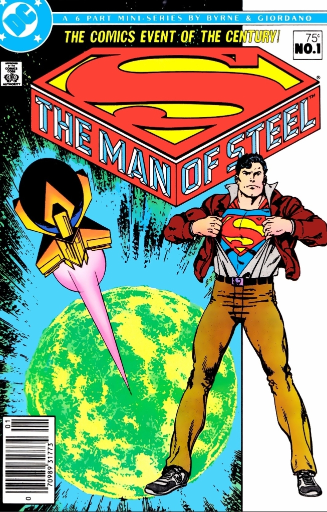
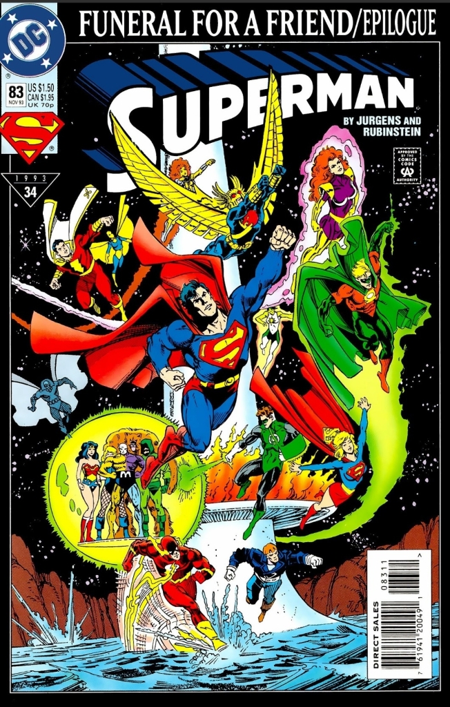
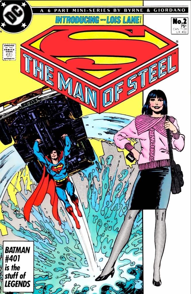
With those details laid down, here is a look back at The Man of Steel #2, published in 1986 by DC Comics with a story written and illustrated by John Byrne.
Early story
The story begins in the middle of Metropolis when the newly established hero Superman (now in full costume) flies just above the busy road which distracted Daily Planet editor-in-chief Perry White (who was having a coffee break with reported Lois Lane inside a coffee shop). Remembering how the space plane and its crew got saved by Superman (Clark Kent in civilian clothes) sometime prior, White tells Lane (who first encountered Superman immediately after the space plane was saved) to go after him to get the hot scoop.
While Lane crosses the road, a limousine’s opens with the driver telling her that Mister L (Lex Luthor the tycoon) wants to her. Lane declines and proceeds with her chase for Superman…
Quality

This story is set during the early days of Superman as the new, randomly appearing hero of Metropolis whose impact on local society is just growing stronger. At the same time, this shows Clark Kent being a very new resident of the city still looking for a job. This is inspired work by Byrne on building up the Man of Steel for what was back then the modern age.
That being said, the most intriguing fact here is that this Superman story has Lois Lane as the actual protagonist. While Lane’s literary presence here is slightly stronger than DC’s icon, this tale is clearly all about her unrelenting approach with newspaper journalism, her use of the Daily Planet’s valuable connections and resources, and how much risk she would take to get the facts, the statements and other details all for the sake of getting the hot story. This is Byrne’s modernization of Lois Lane highlighting the concept that Clark Kent will have serious competition with her within the Daily Planet.
That being said, there is no romance between Clark and Lois here. This is after all their 2nd encounter (the saving of the space plane in issue #1 was shown in flashback with Lois Lane already present) and Byrne took a careful approach on establishing the first lengthy encounter and interactions between the two. Their encounter here is really engaging.
More on Superman himself, the writer kept the pace of developing him flow smoothly and steadily. You will see how Superman keeps himself in control whenever he talks with normal people or when he encounters criminals who cause danger on others. While he has a priority to help others in need using his powers, he does not neglect his actual identity (and personal life) as Clark Kent and this includes moderating or limiting the use of his special abilities as he levels himself with the rest of the civilian population.
Conclusion

The Man of Steel #2 (1986) is clearly a very solid follow-up to issue #1. The continued development of Superman remains solid and the dramatization of Lois Lane as the strongly determined newspaper journalist is compelling to see. With regards to the build-up of the post-Crisis DC Comics shared universe, this particular Superman tale is one of essential parts of it.
Overall, The Man of Steel #2 (1986) is highly recommended!
+++++
Thank you for reading. If you find this article engaging, please click the like button below, share this article to others and also please consider making a donation to support my publishing. If you are looking for a copywriter to create content for your special project or business, check out my services and my portfolio. Feel free to contact me with a private message. Also please feel free to visit my Facebook page Author Carlo Carrasco and follow me on Twitter at @HavenorFantasy as well as on Tumblr at https://carlocarrasco.tumblr.com/ and on Instagram at https://www.instagram.com/authorcarlocarrasco