Disclaimer: This is my original work with details sourced from reading the comic book and doing personal research. Anyone who wants to use this article, in part or in whole, needs to secure first my permission and agree to cite me as the source and author. Let it be known that any unauthorized use of this article will constrain the author to pursue the remedies under R.A. No. 8293, the Revised Penal Code, and/or all applicable legal actions under the laws of the Philippines.
Welcome back superhero enthusiasts, 1990s arts and culture enthusiasts, Marvel Comics fans and comic book collectors! Today we go back to the year 1990 to take a close look at the comic book adaptation of the movie RoboCop 2 (1990).
Before getting to the new retro comic book review, I should state that my friends and I had a fun time watching RoboCop 2 in the cinema shortly after it opened here in the Philippines. Back then, I was not yet a comic book collector and I rarely visited comic book specialty stores. That being said, I was unaware that Marvel Comics actually published an adaptation in the form of a 3-issue mini-series.
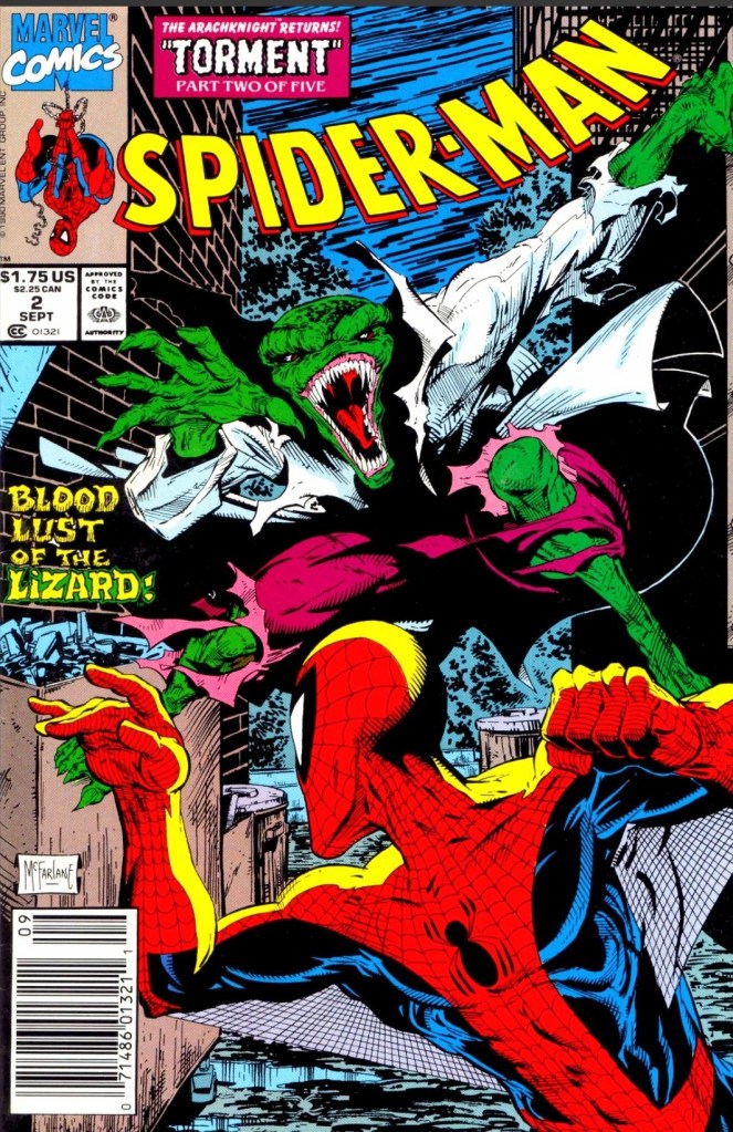
With those details laid down, here is a look back at RoboCop 2 #1, published in 1990 by Marvel with a story written by Alan Grant and drawn by Mark Bagley based on the movie screenplay by Frank Miller and Walon Green.

Early story
The story begins in Detroit where the cops are run by corporations and the streets have turned into red-alert war zones. Crime is overwhelming the city and the highly addictive narcotic poses the greatest threat facing societies. The surgeon general who made the public warning about nuke was killed and the crime boss Cain (leader of a cult of nuke addicts and pushers) claims responsibility. Through the news media, Cain tells the public that nuke will make people’s problems go away and people want its paradise.
Under the management of Omni Consumer Products (OCP), several of Detroit’s police officers go on strike demanding better terms from their employer. The City Government of Detroit under Mayor Kuzak missed a payment (in relation to them owing $37 million) and OCP begins to move to foreclose the city and its assets in accordance to the terms of the contract. Mayor Kuzak accuses OCP of engineering the police strike which made crime rampant.
Elsewhere in the evening, the cruel activities of the thugs got disrupted by the arrival of a police car. Even though the police car got destroyed by the thugs, RoboCop emerges and begins to fight back…
Quality

This opening issue of the mini-series sticks close the basic plot of the movie (right until after Cain’s gang dismantled RoboCop) although there were a few notable differences with the sequence of events and there were scenes that showed the creative team took liberties to make the story suitable with the literary format in mind. That being said, don’t expect to see the key moments of the movie look exactly the same in this comic book and don’t expect to see the characters here looking like the actors who played them on the big screen. In terms of visual and literary presentation, this adaptation has a lot in common with the Total Recall comic book adaptation which coincidentally was released the same year.
For me, this is indeed a really readable comic book that has its stylized approach on telling the movie’s concept. OCP is the most powerful entity in the story while Cain and his gang are clearly the force of evil that strongly pose danger not only to Detroit’s people but even to the very divided police force. Nuke as the dangerous object of the plot clearly was inspired from elements of the real life war against drugs in 1980s America which made this story socially relevant.
Like in the movie, RoboCop here performs his law enforcement duty in an uncompromising manner even though memories of his past life as officer Murphy re-emerged deep inside. That being said, there are a few moments in which you might sympathize with the titular hero as this comic book pays close attention to the conflict between humanity and technology.
The action scenes here are sufficient but clearly don’t come anywhere close to the intensity of the film in terms of violence. Still, there is enough action for readers to enjoy.
When it comes to the visuals, the artwork done by Mark Bagley eerily looks comparable with Tom Lyle’s art in the Total Recall comic book of 1990. For the newcomers read this, Bagley became a popular artist through the Amazing Spider-Man monthly series and the Venom: Lethal Protector comic books that were released after years after this one. Having seen many of Bagley’s works published in 1992 to 1995, I can hardly recognize his art style in this comic book adaptation. The way he drew people’s faces in this comic book looks very different from those seen in Amazing Spider-Man issues. At the same time, Bagley’s own take on RoboCop has that balanced approach on depicting humanity with machinery while also making the hero look less bulky compared to the movie’s version.
Conclusion

RoboCop 2 #1 (1990) is clearly not a faithful adaptation of selected parts of the movie but that’s not necessarily a bad thing. This is more about the Grant-Bagley team doing their own visual presentation of the movie script copy they had and ultimately they succeeded in making this comic book a stylized and worthy reading experience. This is indeed a surprisingly entertaining read and I can say that I am looking forward to reading the next issue.
Overall, RoboCop 2 #1 (1990) is recommended.
+++++
Thank you for reading. If you find this article engaging, please click the like button below, share this article to others and also please consider making a donation to support my publishing. If you are looking for a copywriter to create content for your special project or business, check out my services and my portfolio. Feel free to contact me with a private message. Also please feel free to visit my Facebook page Author Carlo Carrasco and follow me on Twitter at @HavenorFantasy as well as on Tumblr at https://carlocarrasco.tumblr.com/ and on Instagram at https://www.instagram.com/authorcarlocarrasco