Retro Gaming Ads Blast – Part 21

Welcome back readers, fellow geeks and electronic gaming fans!

In this edition of the Retro Gaming Ads Blast (RGAB) series, we will take a look at another batch of retro gaming print ads – including arcade flyers – from the 1980s and 1990s.

For the newcomers reading this, Retro Gaming Ads Blast (RGAB) looks back at the many print ads of games (console, arcade, computer and handheld) that were published in comic books, magazines, flyers, posters and newspapers long before smartphones, social media, the worldwide web and streaming became popular. To put things in perspective, people back in the 1980s and 1990s were more trusting of print media for information and images about electronic games and related products.

With those details laid down, here is the newest batch of retro gaming print ads for you to see and enjoy…

1. Galaxian for Atari print ad

A unique approach to the art done by the advertisers.

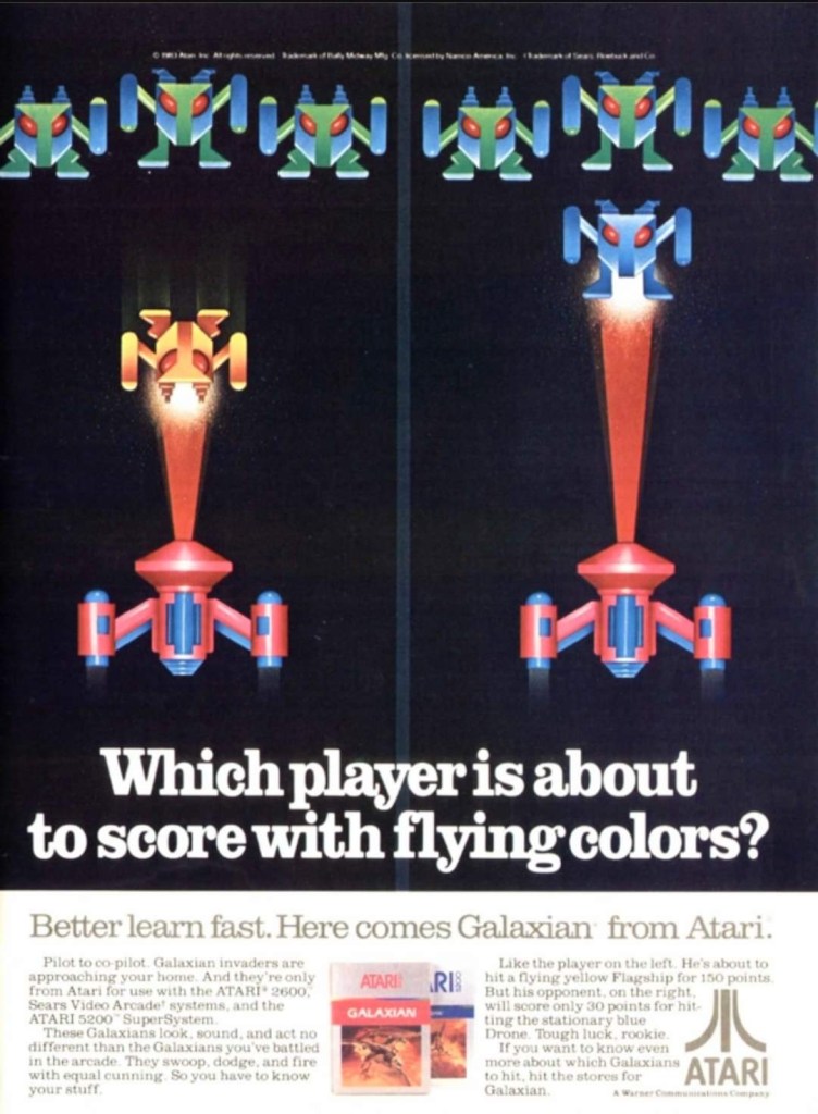
Developed by Namco, Galaxian was a 2D sci-fi shooter that debuted in arcades in 1979. It was so successful and widely acclaimed, it got ported to varied game consoles and home computers as the years passed by. For its release on the Atari 2600 and Atari 5200, this print ad was created to catch the attention of fans and gamers by utilizing artwork that resembled the look of 2D sprites from the game. That being said, no screenshots of Galaxian on the Atari consoles were shown because the artwork used looked detailed and were attention-grabbing already.

2. 1943: The Battle of Midway arcade flyer

This is a fine looking flyer.

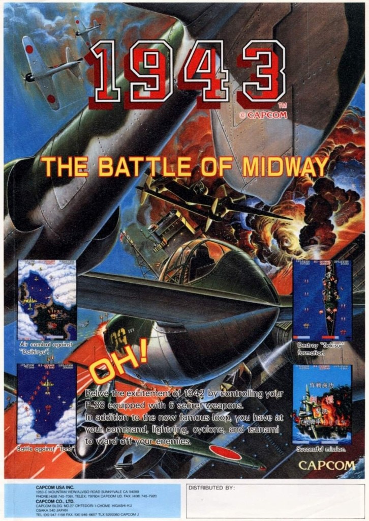
In 1987, Capcom released in the arcades 1943: The Battle of Midway which was their follow-up to 1942. The arcade flyer itself was designed to strongly promote the game using a combination of screenshots, short-but-clear text descriptions and the great looking piece of artwork which really emphasized the World War II concept. Behind it all, this game was made by Japanese developers with the Western markets in mind and the irony is that the game has players control Americans fighting the Japanese fleet.

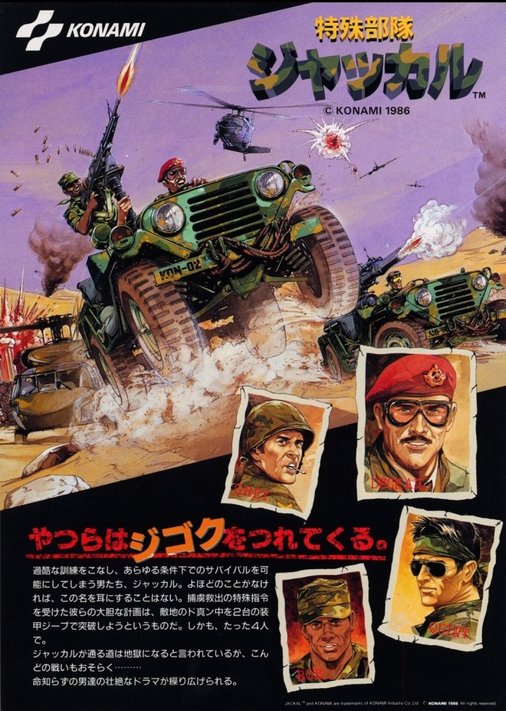
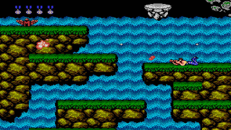
3. Top Gunner arcade conversion kit flyer

Show this nice looking image to the woke nut or modern day Communist near you. Watch and observe his or her reaction.

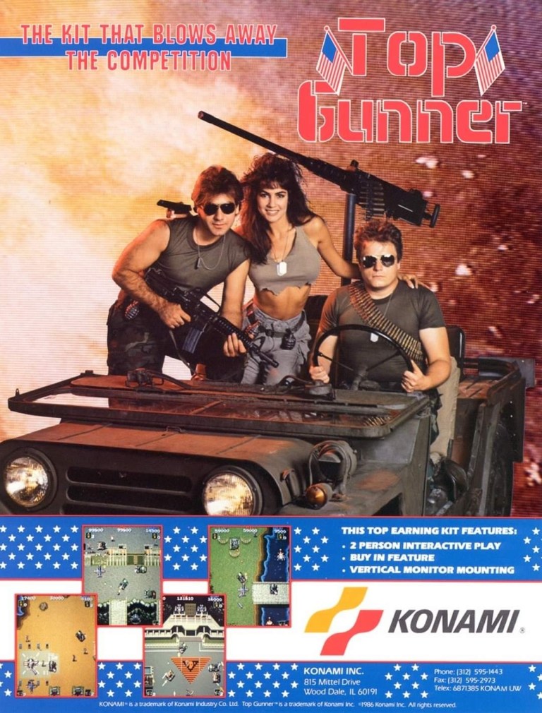
To make things clear, Top Gunner is actually the run-and-gun game Jackal and the alternative titles was mainly used in North American arcade distribution and also reflected Konami’s move of coming up with titles inspired by blockbuster movies of the time. To promote its 1986 arcade release in America as a conversion kit, the advertisers had three models playing soldiers on a military jeep to immerse gamers into the core concept of the game – moving armed military jeeps from one location to another while fighting bad guys. The approach used for the visual concept is indeed inspiring, especially during the Cold War. Top Gunner/Jackal became a hit in both arcades and consoles.

4. Joust for Atari print ad

While I played Joust on console, I don’t remember seeing this print ad before.

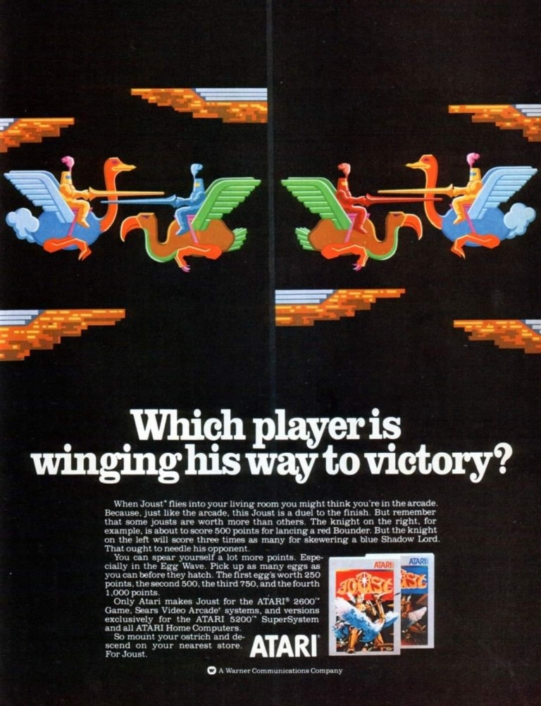
Made by Williams Electronics, Joust was one of those early 1980s arcade games that eventually made its way to the Atari 2600 console which was massively popular in North America. Strangely enough, the artistic approach Atari’s advertising came up with for the console version of Joust was similar with that of the ad of the Atari version of Galaxian (see item above) in which artwork was used to resemble the 2D sprites of the game. Regardless, the images of this ad showed what a joust looked like – a martial game between two armed combatants going against each other while riding an animal.  

5. Kid Chameleon print ad

Can you relate with Kid Chameleon’s identity crisis?

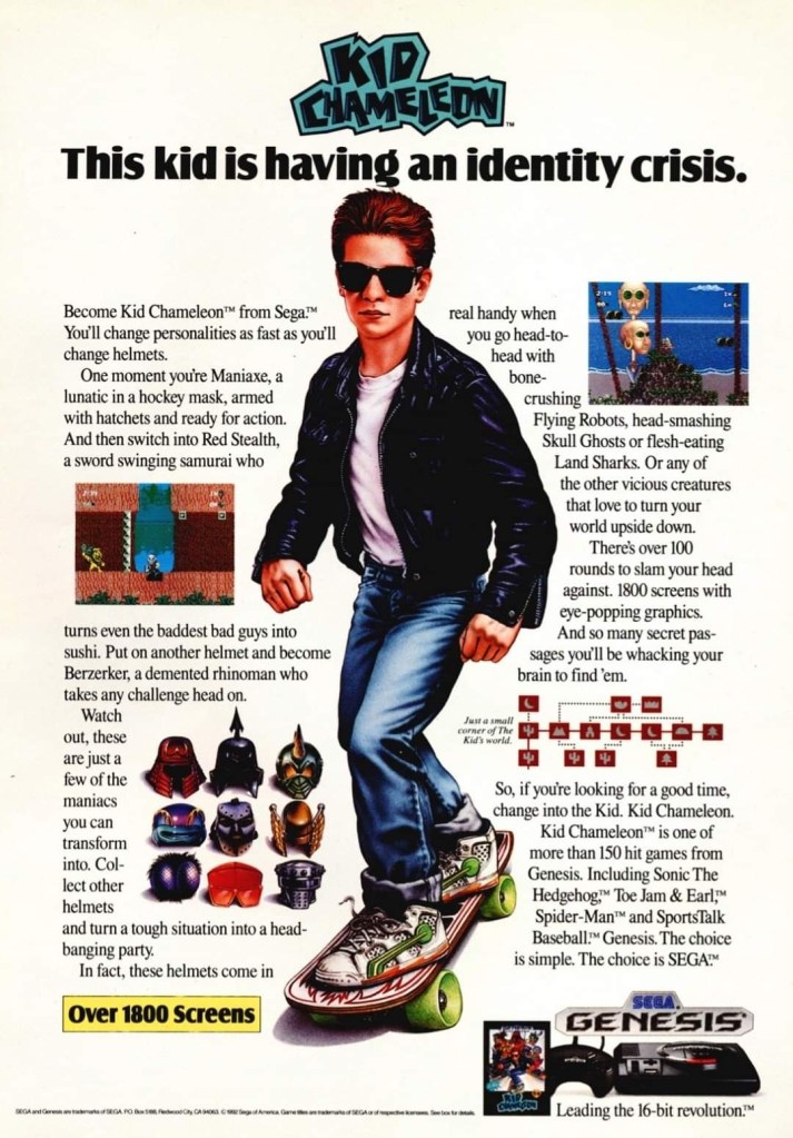
During the early years of the Sega Genesis, Sega of America exerted efforts to make new games that were not only exclusive to their console but also stand out among the many 2D side-scrolling adventure games by coming up with a protagonist with a unique personality that could somehow resonate with young kids and teenagers.

Developed by their internal experts (Sega Technical Institute), the company released Kid Chameleon in 1992 and they came up with the above print ad that had detailed hand-drawn art of the lead character as well as a wordy text description which was a clear attempt to help young gamers (including teenagers) get connected with both the game and the protagonist. The advertisers even had space to spare to accommodate two screenshots of the game.

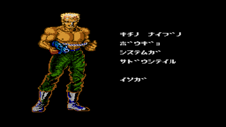
6. Terminator 2: Judgment Day (AKA T2: The Arcade Game) for Sega Genesis print ad

This print ad appeared on the many comic books I read long ago.

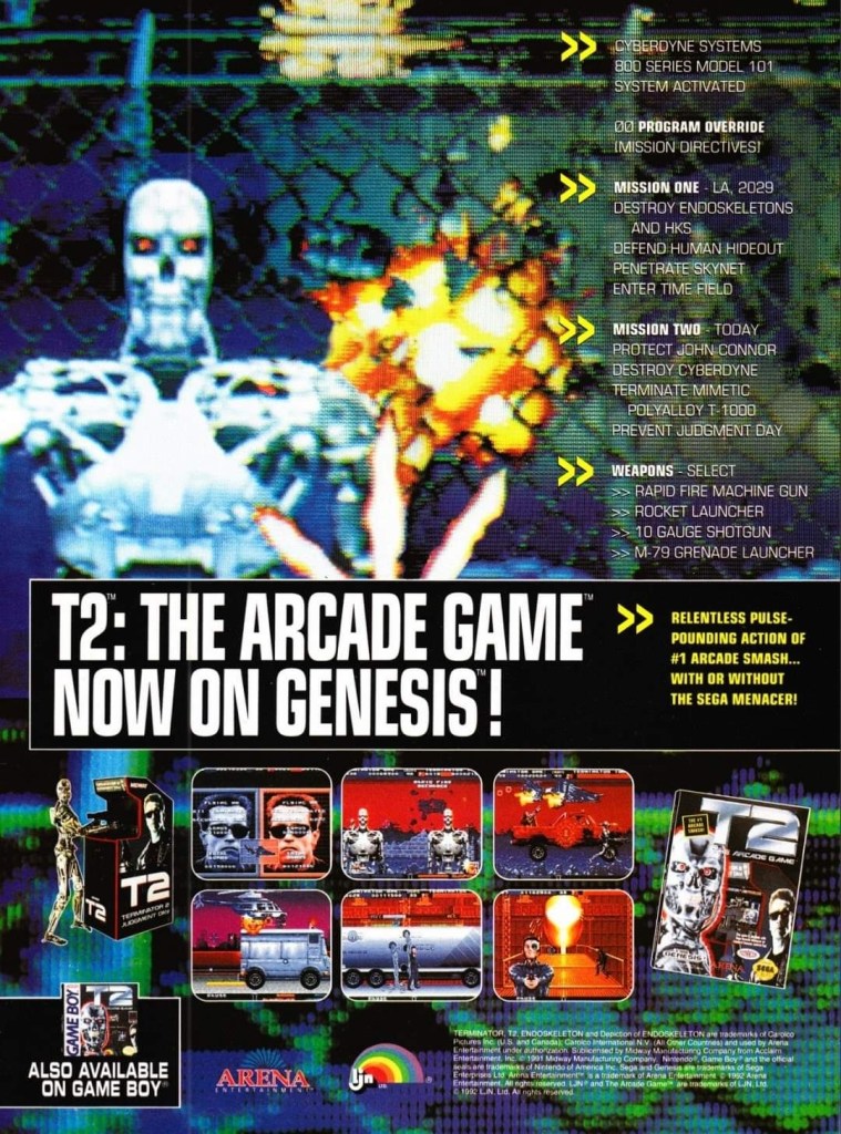
Back in the early 1990s, Terminator 2: Judgment Day was a massive success in the global box office and this resulted in Arnold Schwarzenegger’s popularity to soar very high while also establishing the Terminator as an essential pop culture figure. Apart from comic books and merchandise, video games based on the movie were made and the one that stood out the most was the arcade shooter game initially titled Terminator 2: Judgment Day (later retitled as T2: The Arcade Game).

The arcade mega hit eventually got ported to the Sega Genesis and this print ad really looked flashy with its visual presentation showing screenshots and a zoomed-in look at how the Terminator T-800 looked like in the Genesis version complete with a few explosions in the background. It should be noted that this flashy print ad cleverly concealed the visual downgrades and the redrawn images as the Genesis itself could never come close to matching the high quality visuals of the arcade version.

7. CYBERPad print ad

I never owned the CYBERPad, nor have I ever used one.

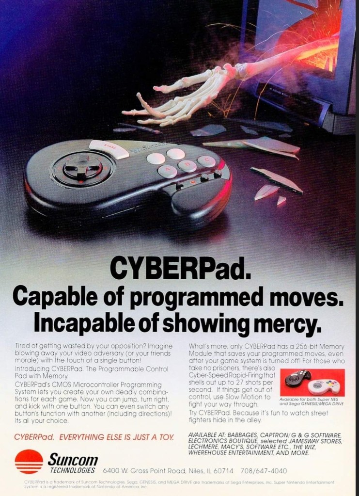
During the so-called 16-bit console generation (actually the 4th console generation), there were lots of licensed console peripherals made by independent companies in support of the Sega Genesis and Super Nintendo Entertainment System (SNES). The company Suncom Technologies came up with the CYBERPad controller for the two consoles and they boasted in their print ad that the product had a programmable control pad that allowed users to create combinations for each game with convenience in mind. The CYBERPad also allowed the saving of the programmable moves and it had a rapid-fire feature and even a slow-motion function. The CYBERPad was made to make the gameplay experience more user-friendly.

8. GamePro magazine sweepstakes print announcement

If you look closely, this print announcement by GamePro technically advertised the game consoles, the arcade game and Lara Croft to its readers.

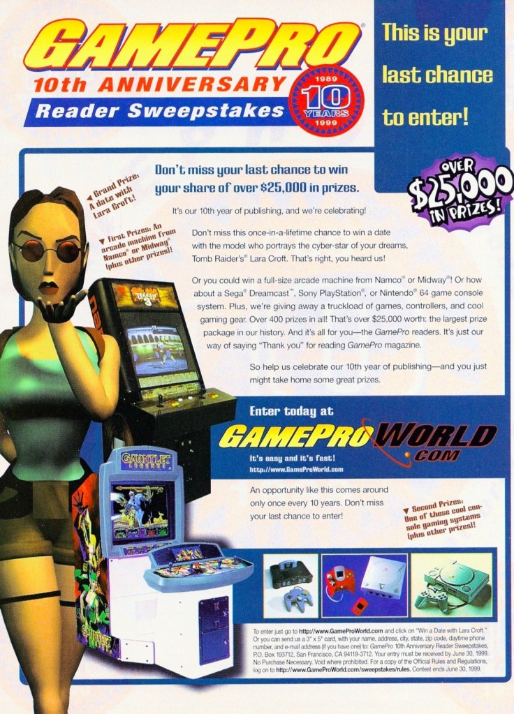
In 1999, GamePro magazine celebrated its 10th anniversary and to keep on resonating with gamers and maintaining the loyalty of their fans, they organized a reader sweepstakes with prizes worth over $25,000 to be won by the few winners. GamePro boasted a date with an unnamed model who played the iconic Lara Croft (Tomb Raider). Certain arcade machines plus the modern consoles of the time – including the brand-new Sega Dreamcast – were also at stake. The way it was presented, this GamePro print announcement was enticing to read.

9. Smash T.V. for SNES print ad

Smash T.V. was a lot of fun on both arcade and console.

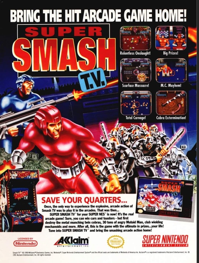
The arcade hit Smash T.V. made its way to the Super Nintendo Entertainment System (SNES) in 1992 and the publisher came up with a print ad that had captivating artwork, six screenshots and a text description that emphasized that a lot of fun awaits gamers on the console version. In my view, this old ad is still amusing to look at.

10. David Robinson’s Supreme Court print ad

It was a smart move by Sega to get NBA superstar David Robinson as the endorser of this basketball video game exclusive on the Sega Genesis. This ad was published many years before Robinson finally won an NBA championship.

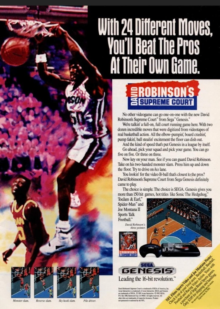
As part of its strategy in competing with Nintendo during the 4th console generation, Sega of America was focused on producing exclusive sports video games for the Genesis console backed by endorsements of sports professionals. In 1992, they released David Robinson’s Supreme Court on the Genesis and unsurprisingly their print ad used a large, stylized image of the NBA superstar dunking backed with an exciting text description plus screenshots showing the game’s use of the isometric view for gameplay. This is still worth looking at.

11. Taito’s “heat wave” print ad

An amusing and creative way to sell video games.

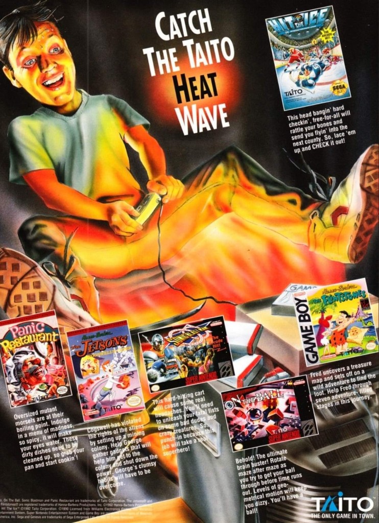
If your company lacks money to effectively market your video games individually, you can try making a single ad promoting them together. This is what Taito did in this print ad which showcases multiple games for different platforms and they used artwork of a player experiencing the so-called heat wave. This is a nice stroke of creativity on the part of Taito.

12. Jurassic Park Interactive print ad

This was a creepy print ad promoting the 3DO-exclusive Jurassic Park Interactive.

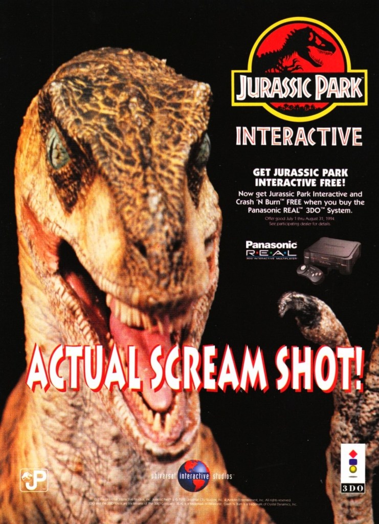
When it comes to video game consoles, having exclusive games is essential as long as they are of high quality, highly playable and enjoyable. The 3DO company acquired a license of the Jurassic Park movie and made the exclusive game Jurassic Park Interactive hoping it would sell a lot and lift up 3DO hardware sales.

This print ad, which features a zoomed-in image of the Raptor from the game, was more focused on selling the 3DO console than the video game as seen on the descriptive text. 3DO ran a promo selling the console which would entitle the buyer to get Jurassic Park Interactive and another game free. Nothing was done to describe the console’s multimedia capabilities of showing videos, images and graphics of the game (which was essentially a collection of mini-games). This print ad shows ignorance on the part of the 3DO company and the ad maker as it showed desperation happening really early in the console’s life. Notably, Jurassic Park Interactive was the only video game adaptation to use actual footage (note: the faces of the actors were edited out) and music from the film.

13. RoboCop 2 print ad

You want to become RoboCop to save the city of Detroit from criminals?

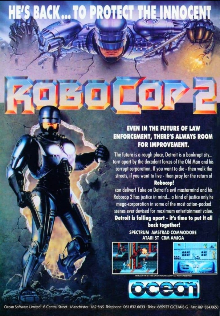
Way back in 1990, RoboCop 2 was a big hit in cinemas here in the Philippines and in some places around the world. As typical of the time, licenses to make video games based on the movie were released resulting in RoboCop 2 games for multiple platforms. The print ad featured two different images of RoboCop – one from the movie poster and the other from an official artwork. The descriptive text does a fine job to immerse readers into the story concept of the game but showing only two screenshots was a lackluster effort to sell the game.  

14. Star Trek: The Next Generation – Echoes from the Past print ad

Space…the final frontier waiting for Sega Genesis gamers.

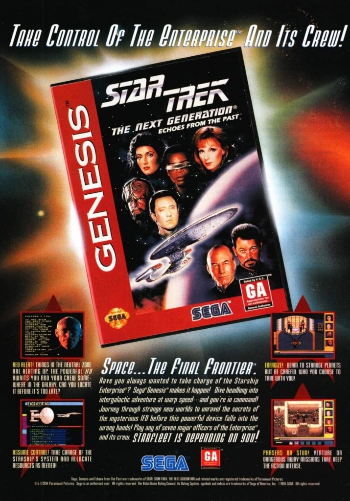
Released in 1994, Star Trek: The Next Generation – Echoes from the Past delivered the Star Trek TNG adventure experience to Sega Genesis gamers. In fact, it is the exact same experience that SNES gamers got the same year. In reality, Star Trek: The Next Generation – Echoes from the Past is actually a port of Star Trek: The Next Generation – Future’s Past on the SNES and the screenshots on the print ad are giveaways about it. In fairness to the ad makers, this print ad never attempted to deceive gamers that it promoted a totally different Star Trek TNG game.

15. Dinosaurs for Hire print ad

This print ad caught my attention and made me interested in the game and the comic book series. Even though it was small, Malibu Comics’ logo was still recognizable.

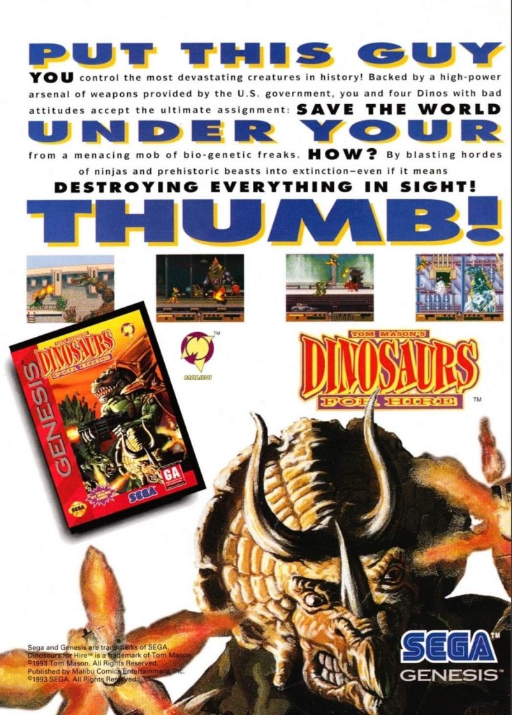
Dinosaurs for Hire (sometimes referred to as Tom Mason’s Dinosaurs for Hire) was a 2D side-scrolling platform adventure game based on the comic book series of Tom Mason. Published by Sega, it was a Genesis-exclusive game and this print ad had a catchy text description, a few screenshots and the eye-catching artwork of a triceratops facing the viewer. This print ad is still good to look at. If you’re thinking about searching for existing copies of the game, I encourage you to also read some Dinosaurs for Hire comic books before playing. By the way, Tom Mason also wrote several comic books of the Ultraverse.

+++++

Thank you for reading. If you find this article engaging, please click the like button below, share this article to others and also please consider making a donation to support my publishing. If you are looking for a copywriter to create content for your special project or business, check out my services and my portfolio. Feel free to contact me with a private message. Also please feel free to visit my Facebook page Author Carlo Carrasco and follow me on Twitter at  @HavenorFantasy as well as on Tumblr at https://carlocarrasco.tumblr.com/ and on Instagram at https://www.instagram.com/authorcarlocarrasco

Retro Gaming Ads Blast – Part 16

Welcome back readers, fellow geeks and electronic gaming fans!

In this edition of the Retro Gaming Ads Blast (RGAB) series, we will take a look at another batch of retro gaming print ads – including arcade flyers – from the 1980s and 1990s.

For the newcomers reading this, Retro Gaming Ads Blast (RGAB) looks back at the many print ads of games (console, arcade, computer and handheld) that were published in comic books, magazines, flyers and newspapers long before smartphones, social media, the worldwide web and streaming became popular. To put things in perspective, people back in the 1980s and 1990s were more trusting of print media for information and images about electronic games and related products.

With those details laid down, here is the newest batch of retro gaming print ads for you to see and enjoy…

1. A-Jax North American arcade flyer

Another one of Konami’s arcade flyers showing a pretty fashion model with a touch of militarism.

A-Jax (also referred to as Ajax) is another one of the many military themed games Konami released for the arcades in the 1980s. It was a 2D vertically scrolling shooter in which players use aircrafts to shoot enemies both in the air and on the ground. The game was a hit in Japanese arcades and Konami came up with the North American arcade flyer showing three screenshots, an archive footage shot of a military helicopter and a sexy lady (with a light military look) with a machine gun. The style of presentation was similar in style with the North American arcade flyers of Contra and M.I.A.: Missing in Action.

2. The Combatribes print ad

The short comic book approach was used to emphasize the setting and concept of the video game.

Technos, the Japanese company behind the wildly popular Double Dragon games franchise, proved to be successful with the arcade release of The Combatribes. In an attempt to keep the wave of success moving, Technos released The Combatribes on the Super Nintendo Entertainment System (SNES) in 1992 and someone involved with the North American marketing came up with the idea of creating a comic book-style presentation for the print ad. Creatively speaking, the comic book approach was done to emphasize the story and visual concepts of the game, and entice readers to play it. By today’s standards of video game marketing, this print ad’s approach is both unusual and notable.

3. Dead or Alive 2 Dreamcast port print ad

This was a wide print ad that appeared on magazines and it sure was eye-catching. It was an effective way to promote the game and inform people of the Sega Dreamcast’s presence in the market.

When Dead or Alive 2 was released in the arcades in 1999, a lot of gamers were astounded by it as developer Team Ninja (led by Tomonobu Itagaki) made it much bigger and a lot better than its 1996 predecessor. Team Ninja really went all out making the sequel utilizing Sega’s NAOMI arcade technology, inviting martial artists to do motion-capture, and having a very ambitious game design. Since the game was developed with the NAOMI hardware, porting the game for the Sega Dreamcast was reportedly convenient and smooth for the developers who went on to add more gameplay features and modes. Publisher Tecmo came up with this wide print ad (promoting the Dreamcast release) showcasing three characters, six screenshots and text descriptions emphasizing the universal acclaim the game received. The promotional approach was simple yet effective.  

4. Jet Moto (PC version) print ad

From PlayStation to PC.

In November 1996, the futuristic all-terrain hoverbikes racing game Jet Moto was released on the PlayStation which went on to sell well and attract mostly positive reviews. Sony Computer Entertainment eventually released a version of the game for the personal computer (PC) in November 1997. As seen in the above print ad, the network play option and compatibility with Direct3D video accelerators were emphasized as such features resonated with the interests of PC gamers of the era. This print ad showed how willing Sony was to release PlayStation hits on PC back then.

5. Elevator Action Returns Japanese arcade flyer

Great looking art on the front.
The rear of the flyer.

When Taito released Elevator Action Returns (also titled as Elevator Action II in other nations) in the arcades in 1994, it became a hit as gamers enjoyed its action-packed gameplay, ambitious 2D visual presentation and varied level designs that clearly went beyond its 1983 predecessor. The front of the Japanese arcade flyer has really nice art showing the three playable protagonists on an elevator on their way to do their mission. The back of the flyer shows screenshots (which emphasized the varied level designs), text descriptions explaining how the game played (English version printed), and what the features are. Another text description confirmed that terrorists are the antagonists that players will be dealing with which was reflective of the rise of Islamic terrorism in the 1990s. Oh yes, if you look closely you will the word “item” misspelled as “items”.

6. Sunset Riders print ads

The Sunset Riders arcade machine, the SNES version, screenshots and a can of pork-and-beans on this ad.
This print ad appeared in some comic books I read long ago.

After enjoying a lot of success in the arcades with their 1991 game Sunset Riders, Konami went on to release ports of it to the Sega Genesis in 1992 and the Super Nintendo Entertainment System (SNES) in 1993. With regards to conversions and procedural/artistic changes between the arcade and console ports, the SNES version had few changes implemented compared to the one released on the Genesis. As seen in one of the print ads of Sunset Riders on SNES, it came with 7 arcade levels, 2-player mode and additional shooter stages. What the print ads did not reveal were notable replacements of specific characters in key parts of the game such as the dynamite-tossing female bandits getting replaced by male bandits, North American Indian villains getting replaced with outlaws, etc.  

7. Jackal Japanese arcade flyer

Whoever was the artist Konami hired truly delivered great-looking art!

Konami’s military themed game Jackal (Japanese title: Tokushu Butai Jackal) debuted in Japanese arcades in October 1986 and became a hit. The Japanese market arcade flyer had great looking artwork on the front that strongly emphasized the very concept of the game (players move military jeeps to shoot at enemies as they move into enemy territory). One of the characters (the one wearing the red beret) somewhat resembles the late Sean Connery which only shows that someone within Konami’s development team took inspiration from movies. This arcade flyer’s front still looks great.

8. Aliens North American arcade flyer

A good amount of effort was done to truly capture Aliens’ concept using hired models (as Ripley and Newt), a Xenomorph physical model and a suitable background.
The key details presented on the rear of the flyer. The Xenomorph’s presence adds tension.

In 1990, Konami released their ambitious arcade game Aliens which was loosely based on the 1986 movie that starred Sigourney Weaver and was directed by James Cameron. As Konami’s Aliens license was only temporary and the movie was so highly regarded, the Japanese company’s marketing team really had to exert extra effort to truly capture the film’s sci-fi horror concept in order to make a strong presentation towards arcade operators and their paying customers (the gamers).

Apart from showing screenshots on the front, the creative team hired a blonde model as Ellen Ripley holding a gun and a young girl as the character Newt, and have them pose convincingly in front of a Xenomorph model (darkened in the foreground). On the back of the flyer, the team heavily revealed the details using the text description to emphasize the gaming experience and story concept. The technical details, meanwhile, were presented in simplistic, easy-to-follow fashion. Aliens was a smash hit in the arcades and there are long-time gamers who regard it as one of the best game adaptations of the 1986 movie. This arcade flyer is a strong reminder that the featured game was never ever ported to any game console nor to any personal computer.

+++++

Thank you for reading. If you find this article engaging, please click the like button below, share this article to others and also please consider making a donation to support my publishing. If you are looking for a copywriter to create content for your special project or business, check out my services and my portfolio. Feel free to contact me with a private message. Also please feel free to visit my Facebook page Author Carlo Carrasco and follow me on Twitter at  @HavenorFantasy as well as on Tumblr at https://carlocarrasco.tumblr.com/ and on Instagram at https://www.instagram.com/authorcarlocarrasco

Retro Gaming Ads Blast – Part 10

Welcome back readers, fellow geeks and electronic gaming fans!

In this edition of the Retro Gaming Ads Blast (RGAB) series, we will take a look at another batch of retro gaming print ads from the 1980s and 1990s.

For the newcomers reading this, Retro Gaming Ads Blast (RGAB) looks back at the many print ads of games (console, arcade, computer and handheld) that were published in comic books, magazines, flyers and newspapers long before smartphones, social media, the worldwide web and streaming became popular. To put things in perspective, people back in the 1980s and 1990s were more trusting of print media for information and images about electronic games and related products.

With those details laid down, here is the newest batch of retro gaming print ads for you to see and enjoy…

1. Double Dragon II: The Revenge print ad

Nice looking art used to promote the game.

The beat-them-up sub-genre of gaming was already popular in the 1980s and one of the most defining game franchises of this type of game was the Double Dragon series which proved to be popular with Nintendo Entertainment System (NES in America) and Family Computer (Famicom in Japan) gamers. As the first game was a very big hit on Nintendo’s consoles, the sequel Double Dragon II: The Revenge was promoted in America with strong confidence on the part of publisher Acclaim that it would become another massive hit. This print ad had a very nice looking comic books-style art that not only captured the concept of the game but also visualized the heroes Billy and Jimmy with enough details to focus on. I can say this was an eye-catching ad.

2. X-Men: Children of the Atom print ad

Great looking ad but the line “100% direct conversion” is not true at all.

Developed by Capcom in cooperation with Marvel, X-Men: Children of the Atom was a huge hit in the video arcades and it was not surprising that it got released on the Sega Saturn by Acclaim. Acclaim organized an aggressive promotional campaign by pouncing on the fans’ love and knowledge of the X-Men and the high fun factor of Capcom’s game. What this print ad got wrong, however, was the line “100% direct conversion of the arcade smash!” which was wrong and misleading. In reality, the Sega Saturn version of the game had about one-third of the animation frames cut due to the console’s smaller RAM capacity.

As the years passed by, the Sega Saturn became the more suitable console for home ports of Capcom’s further 2D fighting games as Sony’s PlayStation had even more severe limitations and a graphics processor that was not suitable for 2D graphics. By the end of 2000, Capcom’s 2D fighting games on PlayStation all were inferior to the Sega Saturn versions.

3. Sky Shark NES print ad

This is an effective looking ad.

Released in Japan as Flying Shark, Sky Shark was released on multiple platforms in 1988 and there was an NES version of it which this particular print ad promoted. The American branch of Taito wisely used positive quotes from media outlets to promote the game while coming up with an engaging text description and displayed NES screenshots. And then there was that very engaging painted cover art that gave this print ad a lot of punch. An effective ad overall.

4. Conflict print ad

This is a very captivating artwork for advertising.

There is no denying the fact that the Cold War was a strong influence on arcade games and video games. Titles like Contra, Jackal, Metal Gear, Operation Wolf, Cabal and Rush’n Attack were militaristic games that entertained millions of gamers from the young adults to the little children. In 1990, Vic Tokai released the game Conflict on the NES which had a military theme but an unusual game design composed of digital maps with hexagons in which gamers will play with strategy to win battles. That being said, this print ad’s visual concept was very captivating yet also misleading. If you see how the game is played, you will know what I mean.

5. College Slam print ad

Were you ever interested in college basketball video games?

This is one of the more eye-catching print ads I’ve seen due to the artist’s illustration of a basketball with a mouth biting the basketball rim which dominates the space. For the newcomers reading this, College Slam was a basketball video game that was actually a repacked version of the popular NBA Jam with focus on NCAA basketball players. With the biting basketball at the center, it was easily an attraction and the screenshots implemented were larger than usual which easily gave gamers a clear look at what the game looked like. While this print ad is eye-catching, it did not help sell College Slam and there never was a follow-up.

6. Tecmo Super Baseball print ad

From the time when Tecmo was prolific with video games about sports.

Long before it started the Dead or Alive game franchise, Tecmo was once heavily invested in making sports video games. Tecmo Super Baseball was their first American pro baseball video game released for Super Nintendo Entertainment System (SNES) and Sega Genesis, and it was notable that the publisher secured only the Major League Baseball Players Association (MLBPA) which resulted in the game featuring real-life players but the teams had no names and no logos. Regardless, this print ad showed how aggressive Tecmo was in trying to attract consumers’ attention by showing ten screenshots with short text descriptions each. The ad’s write-up boasted realism as well as the promise of gaming quality.

7. The Punisher print ad

Marvel’s vigilante firing at someone.

In the early 1990s, Capcom and Marvel Comics started their partnership resulting in the releasing of the arcade game The Punisher. Developed by Capcom, the said arcade game became a big hit with gamers as it featured fun gameplay, multiple enemies appearing on screen simultaneously and other fun elements. Unsurprisingly, the game was ported (note: Sculptured Software was the lead developer) to the Sega Genesis with significant downgrades in terms of graphics, sound, enemy variety and other related elements due to technical limitations. That being said, this print ad used detailed art of the Punisher (with Col. Fury in the background) in a clever way to promote the Sega Genesis version while keeping their attention away from the obvious visual downgrades of the two screenshots displayed. The Punisher on Genesis was poorly received.

8. Stargate print ad

If you did not enjoy the movie, were you able to play the video game adaptation on Sega Genesis or Super NES?

Remember the sci-fi movie Stargate (1994)? The film was a surprise box office hit and eventually video game adaptations of it were made for the SNES, Sega Genesis, Game Gear and the GameBoy. This particular print ad, however, showed screenshots of the SNES and Genesis versions which is made obvious with the side-scrolling adventure plus 3D flying sequence (one screenshot showed it). Combined with images sourced from the movie poster plus an insert of the movie in home video format (lower-right corner), this print ad was obviously an aggressive way to promote the film with the post-theatrical business in mind. In case you are wondering, the cinematic Stargate is not related at all with the early 1980s video game (a follow-up to the classic game Defender) of the same name.  

9. Aerobiz Supersonic print ad

For a simulation game released on consoles, Aerobiz Supersonic is pretty deep and a lot of fun to play.

The airline simulation game Aerobiz Supersonic is a highly addictive and surprisingly fun game that I enjoyed playing on the SNES (read my retro review by clicking here) and strangely enough I first learned about not through its print ad but by reading a preview published by Electronic Gaming Monthly (EGM) magazine. As for this print ad made by Koei’s American team, this is really odd to look at due to the ad makers’ choice of showing a not-so-attractive flight meal. In contrast to that, the ad makers did a good job describing the game creatively and showed three screenshots that were strategically selected in my view. Having played the game many times, I can say that this print ad is very truthful.

+++++

Thank you for reading. If you find this article engaging, please click the like button below, share this article to others and also please consider making a donation to support my publishing. If you are looking for a copywriter to create content for your special project or business, check out my services and my portfolio. Feel free to contact me with a private message. Also please feel free to visit my Facebook page Author Carlo Carrasco and follow me on Twitter at  @HavenorFantasy as well as on Tumblr at https://carlocarrasco.tumblr.com/ and on Instagram at https://www.instagram.com/authorcarlocarrasco

A Look Back at Contra (1988)

Welcome back retro gaming fans and readers!

Today, we will go back to the late 1980s to examine one of the most significant console games of the decade…Konami’s Contra. To put things in perspective, Contra started in the arcades in 1987 and went on to become a big hit. Konami went on to make a version of the game for Nintendo Entertainment System (NES) in the West and the Family Computer (Famicom) in Japan that resulted in different looking graphics (both artistically and technically), reworked stages, and different and extended level designs that were done within the consoles’ limitations. In short, the home version of Contra was pretty different from the arcade version but still was made to be fun and exciting on its own.

In my personal experience, my discovery of Contra has always been on the Famicom and some time later on the NES. For this retro review, I replayed Contra (both Famicom and NES versions) via the Contra Anniversary Collection on my Xbox Series X.

With those details laid down, here is a look back at Contra, developed and published by Konami for the NES and Famicom in 1988. The NES version was released one week ahead of the Famicom version in February 1988.

The start screen of the NES version of Contra. The commando with dark hair was deliberately made to resemble Sylvester Stallone somewhat.

Game concept

In the far future, an alien army from space – Red Falcon – arrived on Earth inside a meteorite that landed on the Galuga archipelago. There, Red Falcon established an extensive high-tech base for their operations and eventually brainwashed a local human army to do what they want. Red Falcon plots to wipe out human civilization on the planet.

With the information about Red Falcon collected, the Earth Marine Corps send Contra unit members Bill Rizer and Lance Bean to the island to destroy the opposition and find out what Red Falcon has been doing…

Gameplay and quality

Contra is an action-packed 2D side-scrolling game with strong sci-fi and military influences.

To begin with, Contra of 1988 was made to be a nicely-paced, action-packed, side-scrolling adventure game that has some 3D-like levels in between. The game design and levels Konami came up with was done to immerse gamers into actual participation in the military campaign against the aliens and their brainwashed human soldiers. This campaign not only includes battles through the forest of the Galuga archipelago but also through the interiors of Red Falcon’s high-tech facilities, going up an elevated location with waterfalls, the snowy area and further deep into the rest of the enemy’s mechanical base.

For the most part, you play as a commando armed with a rifle with unlimited ammunition. As you shoot enemies and make your way through the 2D side-scrolling level, there will be the occasional flying capsules that you can shoot down to gain new weapons/ammunition (S for Spread Shot, M for Machine Gun, L for Laser) or some power-up (temporary invincibility or the rare ability to eliminate all enemies present on-screen) to help yourself as the wave of opposition from Red Falcon is relentless (which is reason enough to compel you to keep progressing and fighting). There are also times when the mentioned enhancements suddenly pop out after killing an enemy.

To prevent the game from getting too old with side-scrolling, Konami implemented these stages in which players face the front to attack enemies, overcome obstacles and move forward with 3D-like effects going into the next place.

By default, this game is brutally hard. Not only do the enemies keep appearing (with some of their teammates being strategically placed to fire at you), the obstacles will compel you to take your time overcoming them. In this game, one-hit death is the norm and there are many moments in which falling to your death becomes a huge risk. You get hit, you not only lose one life, you will lose whatever powerful weapons you gained.

There are also stage bosses (powerful enemies that await you at the end of a level) that will challenge you so much, you will have to adjust your strategy, pay attention to the movements and timing of the enemy, and then adjust your way fighting.

Only the Famicom version of Contra has this sequence.
I really love the sci-fi elements the game developers came up with for this classic game. There are lots of high-tech stuff to see here and this robotic enemy is just one of them.

Fortunately for us players, the controls are really tight and very responsive. You can move your characters to overcome obstacles, avoid getting hit by enemies and even move down from one platform if the space below is safer. I still remember how precise and responsive the controls were on the NES and Famicom versions, and I can say that all the responsiveness made it on the Xbox controller when I replayed Contra on Xbox Series X with the Contra Anniversary Collection I downloaded. In fact, the high precision of the controls added to the fun of shooting enemies or obstacles with the Spread Shot while moving to the right as it was meant to be.

Considering the intense difficulty of the game, players who do the famous Konami Code (Up, Up, Down, Down, Left, Right, Left, Right, B, A, and Start) will be reward with 30 lives when they start playing Contra. For Xbox gamers reading this, there is a slight difference with the Konami Code when playing Contra on Xbox consoles.

Apart from shooting, there are lots of platform gaming elements to experience here. The difficulty is very brutal and the famous Konami Code will grant you 30 lives when you do the code correctly.
This cut-scene is only available in the Famicom version.

With regards to game design, the Konami developers did a really fine job creating the levels, placing the challenges and setting up memorable boss battles for action/adventure-hungry gamers to indulge in. The developers also cleverly implemented the fictional/fantasy concepts into the game design which resulted in me getting immersed in the Contra team’s mission against the Red Falcon at their secret base.

Another highlight with playing Contra is the 2-player option and the above-mentioned Konami Code added to the fun and accessibility of. I still remember the old days of playing in a 2-player session (cooperative play essentially) of Contra at a friend’s house on a Famicom. Since my friends and I were already enthusiasts of 1980s Hollywood action movies, playing Contra was enjoyable even though the difficulty was brutal.

This is one of the touch stage bosses you will encounter in the game.

If there are any notable differences between the two versions of Contra of 1988, it would be the fact that the Japanese (Famicom) version has storytelling emphasized through cutscenes (with Japanese text displayed), a technical overview of the Red Falcon base at Galuga with maps displayed before you start a new level, in-game art, an additional scene that spiced up the ending and, most notably, more background/environmental animation. The additional animation on the Famicom version made the adventuring look and feel more lively and this is most evident in the final stage (lair of the alien).

Conclusion

The Japanese cover art of Contra on Famicom. The Rambo-like character and the alien egg are obvious inspirations from Hollywood action movies of the 1980s.

There is no doubt in my view that after all the decades that passed since I first played it, Contra (1988) is still very engaging and a lot of fun to play whether you choose the Famicom version or the NES version. The developers who made this game succeeding in making something very enjoyable for millions of gamers and it is very clear that the makers were inspired by Hollywood action movies of the decade. In my view, the most obvious military inspirations are Aliens (1986), Commando (1985) and Rambo: First Blood Part II (1985).

Historically speaking, Contra (1988) was released at a time when militarism inspired many other game designers to come up with enjoyable games in different forms such as Cabal, Jackal, Rush’n Attack, Operation Wolf, Operation Thunderbolt to name some. Considering the overall quality and high fun factor Konami established, it is safe to say that this game is one of the finest among its militaristic gaming counterparts of its decade.

I had a grand time replaying Contra (1988) on my Xbox Series X in preparation for this review. Having played both NES and Famicom versions, I can say that the latter is the more complete and more immersive version to play. That does not necessarily mean the NES version is totally inferior. In fact, the NES version is more straightforward with the pick-up-and-play approach, and the gameplay itself is nearly identical (note: Famicom version is slightly more challenging) and very much fun to experience. If you are the player who really wants to be more immersed into the lore of Contra and absorb the military sci-fi concept Konami prepared, then the Famicom version is the one to play. That being said, now is a good time to purchase and download Contra Anniversary Collection.

Overall, Contra (1988) is highly recommended! It truly is a retro gaming gem!

+++++

Thank you for reading. If you find this article engaging, please click the like button below, share this article to others and also please consider making a donation to support my publishing. If you are looking for a copywriter to create content for your special project or business, check out my services and my portfolio. Feel free to contact me with a private message. Also please feel free to visit my Facebook page Author Carlo Carrasco and follow me on Twitter at  @HavenorFantasy as well as on Tumblr at https://carlocarrasco.tumblr.com/ and on Instagram at https://www.instagram.com/authorcarlocarrasco

Retro Gaming Ads Blast

Welcome back readers, fellow geeks and electronic gaming fans!

Today I am launching a brand-new series of articles titled Retro Gaming Ads Blast (RGAB) which will explore the many print ads and promotions of video games, computer games, arcade games and handheld games that were published through the decades.

For the newcomers reading this, print ads of games were widely popular and heavily relied on by gamers/players long before smartphones, social media, the worldwide web and online videos even started. Back in the old days, print media was the most common method for companies to market their games while also helping hardware (machines which played the games) reach potential buyers. Such ads appeared in magazines, comic books and newspapers. Not only that, there were several print ads of games that were made to look creative, compelling and even intriguing.

With those details laid down, here is the first batch of retro gaming print ads for you to see and enjoy…

1. Parker Brothers’ Spider-Man-led print ad

Does this ad look amusing?

Remember Parker Brothers? That was a company that started way back in 1883 founded with a strong focus on the enjoyment of games in the form of board games, cards and toys. In the late 1970s, Parker Brothers started making electronic versions of their popular board games and engaged in the video game development and publishing. They also went on to make home ports of popular arcade games in the early 1980 for several gaming platforms.

Parker Brothers was very active with making games for the Atari 2600 console which became the dominant machine for home gaming in North America in 1982. In the above print ad, their marketing heavily emphasize the Spider-Man video game for Atari 2600 and added two others games they also published – Tutankham and Amidar – which was a clever move to market multiple games. The ad’s focus on Spider-Man was amusing and even without showing a single screenshot of the game, it was enough to entice people to watch out for it. Be aware that the Spider-Man game’s development was done by Laura Nikolich who was hired by Parker Brothers at a job fair. Nikolich had full creative control on making the game and had no contact whatsoever with Marvel Comics.

2. Advanced Dungeons & Dragons: Cloudy Mountain print ad

An ad like this was strong enough to motivate gamers’ imagination and interest.

Back in 1982, Advanced Dungeons & Dragons: Cloudy Mountain was released on the Intellivision game console and I was fortunate enough to watch my next-door neighbor play it repeatedly. The above print ad – which simply referred to the game as Advanced Dungeons & Dragons – only had a few words which directly pointed to the main objective of the game…the golden crown. While only one screenshot of the game was displayed, the advertisers heavily relied on hand-drawn, comic book-style fantasy art work to sell the game.

For those who were born long after the 1980s, let me share with you that ads like these were really impressive for their time. It was common for advertisers to use art works (even though they may not accurately reflect the gameplay or game design) and post at least one screenshot to catch the viewer’s attention with the hope that it would even encourage him/her to anticipate the game. It should be noted that ads like these were strong enough to make gamers’ imagination or curiosity grow stronger.  

3. Konami’s collective military video games advertising

Print ad of four games for IBM, Amiga and Commodore.
Print ad of Jackal and Contra for the NES.

Konami, the Japanese company that has long been known for Metal Gear, Suikoden and the controversial sacking of famous game designer Hideo Kojima, was aggressive in the gaming business in the 1980s and arguably the aggressiveness was reflected in their publishing of several games that emphasized militarism during the late stages of the Cold War. In short, they made the military look cool and their activities fun to do in digital form.

While Konami has always been identified with console gaming, they actually released Rush’n Attack, Contra, Jackal and Boot Camp on IBM, Amiga and Commodore computers (as seen in the first print ad above) which were popular in the 1980s. The said ad also have a very amusing visual concept emphasizing the excitement and fun of military action games coming to gamers at home for their computers.

The 2nd print ad above – Jackal and Contra for the Nintendo Entertainment System (NES) – was very intriguing to see. It was very clear back in the 1980s that the NES always had a wholesome audience (note: a lot of buyers were parents who wanted to entertain their kids at home) and that includes a lot of very young players. To see the collective ad of Jackal and Contra (for the NES platform) having battle-hardened men in military gear holding guns was openly aggressive to perceive and instantly reminded people about the Cold War (and the menace of Communists, socialists, Marxists and terrorists) and the cultural impact of the mega blockbuster film Rambo: First Blood Part II. This is the kind of ad that would drive today’s woke-minded people crazy and even cause them to panic and pretend to be victims of militarism and patriotism. If you look at the ad closely, you will realize there is simply no room for the garbage of political correctness and wokeness.

Lastly, I myself had played Contra and Jackal with my friends on the Nintendo Family Computer (the Japanese counterpart of the NES) and both military games were a lot of fun to play from start to finish!

4. Batman Returns SNES game ad

This print ad appeared in some comic books I read in the early 1990s.

Way back in 1992, Batman Returns (the sequel to the mega blockbuster Batman movie of 1989) was released in cinemas with intense marketing and merchandising reflecting Warner Bros. intention to replicate the commercial success they had in 1989. Along the way, there were several video game adaptations of Batman Returns that were released on different platforms. Among those many video games was the Super Nintendo Entertainment System (SNES) game of Batman Returns which was developed and published by Konami in 1993 the form of a side-scrolling beat-them-up game.

The above ad was visually appealing with hand-drawn, comic book-style art dominating the spaces while leaving room for some screenshots and a written description of the game. Having seen this ad on multiple comic books I read back then, I can say that the ad was entertaining to see and was effective in making me interested in the game. I played Batman Returns on the SNES but never got to finish it. Oh yes, the game’s audio were really good and there were also digitized images from the movie for the in-game narrative.

5. Flashy Sonic the Hedgehog Japanese print ad

A dazzling approach by Sega on selling Sonic the Hedgehog.

1991 will always be remembered as the year of Sonic who eventually became not only Sega’s most defining mascot but also a video game industry icon. That same year, Sega released Sonic the Hedgehog on the Sega Genesis (referred to as Sega Megadrive in other parts of the world) console and it became a massive success with consumers and the game critics.

In the above Japanese print ad, a very captivating display of light and energy rays dominated the space leaving a minority share left for Sega’s console, screenshots and even a UFO Catcher arcade machine picture. While I could not understand the Japanese text, it seems to me that the flashy visual concept of the ad reflected Sega’s high ambitions with Sonic. How many gamers in Japan bought a copy of Sonic the Hedgehog because of this ad remains undetermined.

6. Japanese Super Star Wars print ad

A long time ago in a galaxy far, far away…

Before Nintendo released its 16-bit game console (referred to as Super Nintendo Entertainment System in America, and Super Famicom in Japan), there were lots of Star Wars video games released on varied platforms and the arcade.

With Nintendo’s 16-bit gaming platform realized, lots of game designers and business partners saw opportunities to make new games with gameplay concepts and designs using the technological advantages of the time. For LucasArts and its partners, taking Star Wars gaming into the next level was inevitable and they made it all come true in 1992’s Super Star Wars video game.

Published in Japan by JVC Musical Industries for the Super Famicom, Super Star Wars was a major leap forward in game design, visuals, sound and enjoyment. Apart from the 2D side-scrolling run-and-gun gameplay, gamers were deeply immersed into Star Wars’ universe with the Mode 7 landspeeder and X-Wing fighter sequences, as well as the first-person trench run sequence.

The Japanese print ad above cleverly presented screenshots from the game while using official imagery from the Star Wars movie poster of 1977 (look at how young Harrison Ford, Mark Hammill and the late Carrie Fisher were back then). The ad is a fine example of combining the greatness of the classic George Lucas-directed film with the highly enjoyable design of Super Star Wars. Lastly, these should remind you that there was a time when Star Wars was not yet tainted by wokeness and the garbage values of the Satanic Leftists (read: woke Disney).   

+++++

Thank you for reading. If you find this article engaging, please click the like button below, share this article to others and also please consider making a donation to support my publishing. If you are looking for a copywriter to create content for your special project or business, check out my services and my portfolio. Feel free to contact me with a private message. Also please feel free to visit my Facebook page Author Carlo Carrasco and follow me on Twitter at  @HavenorFantasy as well as on Tumblr at https://carlocarrasco.tumblr.com/ and on Instagram at https://www.instagram.com/authorcarlocarrasco

A Look Back at Amazing Spider-Man #129 (1974)

Welcome back superhero enthusiasts, 1970s arts and culture enthusiasts, Marvel Comics fans and comic book collectors! Today we go back to the year 1974 to examine a highly significant tale from Marvel Comics’ shared universe – the first appearance of the Punisher and his first-ever encounter with Spider-Man.

To put things in perspective, Punisher’s literary debut was told within the Amazing Spider-Man comic book series and it happened not too long after the legendary tragedy of Gwen Stacey. During the 1970s, Hollywood made and released several action movies and crime thrillers that were violent, gritty and highlighted vigilantes and assassins. Some of that influence somehow made it into Marvel’s shared universe which was symbolized creatively through the Punisher who debuted as an assassin.

With those details laid down, here is a look back at Amazing Spider-Man , published in 1974 by Marvel Comics with a story written by Gerry Conway and drawn by Ross Andru (the same creative duo behind Superman vs. The Amazing Spider-Man crossover).

The cover.

Early story

The story begins inside a private facility an assassin wearing black with a huge skull on his upper body heavily damages a solid statue of Spider-Man using a powerful rifle. This impresses the hideous villain called the Jackal who tells him that if he does well with the real Spider-Man, he would have performed a great service for the world. Knowing he impressed the Jackal, the Punisher states that he will only kill those who deserve killing and he expresses his belief that the webslinger deserves to die.

Elsewhere, Spider-Man swings into action and successfully stops an armed robbery from happening. Along the way he managed to capture photographs, changes into his civilian clothes and enters the Daily Bugle’s office ready to submit the roll of film as Peter Parker. Unfortunately, his superior J. Jonah Jameson disregards Parker’s submission and points out that the Punisher made waves with New York’s readers via the Bugle’s competitor The New York Star. For Jameson, the Punisher is only the most newsworthy thing to happen to New York and tells Parker he wants photos of the assassin…

Quality

This is a scene from the first of two encounters between Spider-Man and the Punisher who was introduced as an assassin.

To make things very clear about storytelling without spoiling plot details, this is a tale about intrigue and the darker side of society that involves vigilantes and murdering. The Punisher here did not debut as a crime-busting vigilante but rather an assassin who accepts assignments from clients as long as the jobs fall in line with his personal philosophy that focuses on taking the lives of those who deserved to be killed. That being said, it is clear that Hollywood’s vigilante flicks of the 1970s influenced the presentation and I can say that whenever the story focuses on the Punisher, there definitely is a grim tone which contradicts the tone of Spider-Man’s scenes.

Spider-Man here continues to struggle somewhat with his personal life having recently lost Gwen Stacey while remaining disturbed about the identity of the Green Goblin. The webslinger also has to live with the heavy situation in which a lot of people in New York were convinced that he killed Norman Osborne which was the result of his own boss’ handling of the Daily Bugle. These elements along with his civilian involvement with his newspaper creatively added to the build-up of Spider-Man’s eventual encounters with the Punisher. The build-up was structured nicely and the pay-off was worth it.

There was also the introduction of Jackal. While he has a hideous appearance, his participation was more about scheming than action which contrasted him with the Punisher. For the newcomers reading this, Jackal is actually Miles Warren in a more monstrous form. From this comic book, it was clear that Jackal was created to be a recurring for of Spider-Man and this was strongly executed in the controversial Clone Saga of the 1990s.

Going back to the Punisher, he symbolically uses guns with designs that were more grounded in reality (inspired by real-life guns in looks) instead of taking influence from science fiction. As an assassin living with a strong code, the Punisher is truly determined to eliminate Spider-Man whom he even referred to as a murderer. The perception of Spider-Man as a criminal on the part of the Punisher clearly reflected the defamation caused by the Daily Bugle on the webslinger. Gerry Conway established the assassin to be a strong believer in fighting evil by using violence and killing.

The build-up of the Punisher is very solid and the pay-off in the form of battles with Spider-Man is tremendous and very satisfying to read. There is a lot of action to enjoy here and most notably Gerry Conway maintained a strong narrative throughout.

Conclusion

Have you ever worked in a newspaper before?

I can say out loud that Amazing Spider-Man (1974) is truly a great read and a true illustrated literary classic of Marvel Comics. This tale alone added a touch of darkness and grit (in the form of vigilante and assassins cultures) into the Spider-Man legacy. Apart from its status as a comic book classic, this one paved the way for the rise of the Punisher in terms of more comic book appearances and the publishing of new comic book series featuring him. While the Punisher’s legacy as a killer is obviously not something worth believing in, Marvel Comics took the risk of having him as one of their primary characters in the decades that followed. This particular story is so significant, Marvel Comics revisited it with What If #58 (1994). Check out my other Punisher-related retro reviews by clicking here, here, here, here and here.

Overall, Amazing Spider-Man (1974) is highly recommended!

+++++

Thank you for reading. If you find this article engaging, please click the like button below, share this article to others and also please consider making a donation to support my publishing. If you are looking for a copywriter to create content for your special project or business, check out my services and my portfolio. Feel free to contact me with a private message. Also please feel free to visit my Facebook page Author Carlo Carrasco and follow me on Twitter at  @HavenorFantasy as well as on Tumblr at https://carlocarrasco.tumblr.com/ and on Instagram at https://www.instagram.com/authorcarlocarrasco