Disclaimer: This is my original work with details sourced from reading the comic book and doing personal research. Anyone who wants to use this article, in part or in whole, needs to secure first my permission and agree to cite me as the source and author. Let it be known that any unauthorized use of this article will constrain the author to pursue the remedies under R.A. No. 8293, the Revised Penal Code, and/or all applicable legal actions under the laws of the Philippines.
Welcome back, superhero enthusiasts, comic collectors, 1990s culture enthusiasts and fans of Marvel Comics! After a very fine start, things really went downhill with the story and presentation in Dazzler #2. That comic book had Dazzler (then a hot new property for Marvel Comics) completely overshadowed by the big mix of established Marvel superheroes fighting opposition elements. To say the least, Dazzler #2 was a major letdown, a very big disappointment and anyone who loves Dazzler should avoided it.
Will we see Dazzler presented much better in the next issue? We can find out in this look back at Dazzler #3, released in 1981 by Marvel Comics with a story written by Tom DeFalco and drawn by John Romita, Jr., and A. Kupperberg.
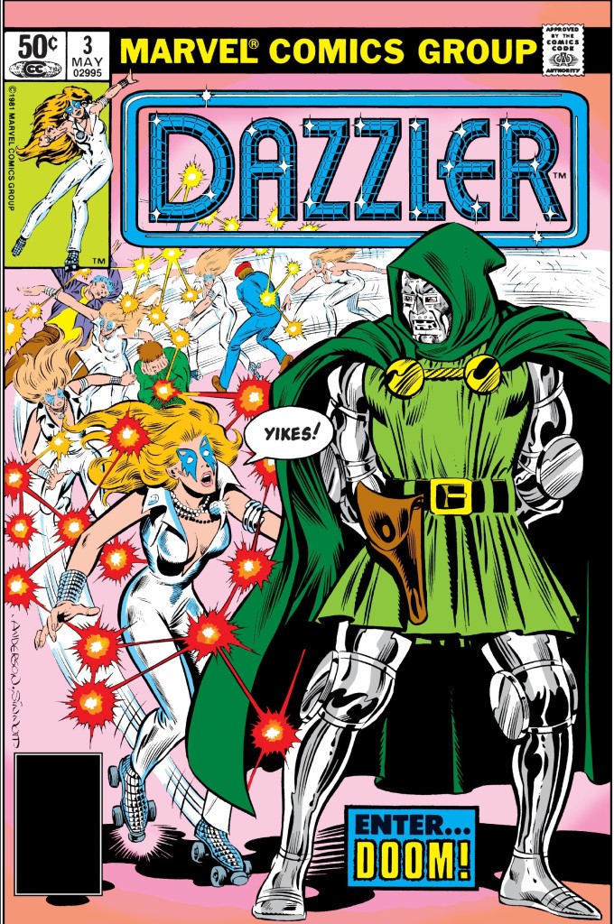
The cover.
Early story
The story begins with Dazzler (not wearing her face paint) participating scientific test conducted by Fantastic Four leader Reed Richards/Mr. Fantastic at his team’s headquarters in New York. Dazzler has been converting every nearby sound into radiance and she’s beginning to sense her limitations. The test was done to determine Alison Blaire’s mutant capabilities. Also present were Johnny Storm, Ben Grimm and Sue Richards. Johnny reads a newspaper report about the United Nations’ plan to display the crown jewels that once belonged to their deadliest enemy Dr. Doom.
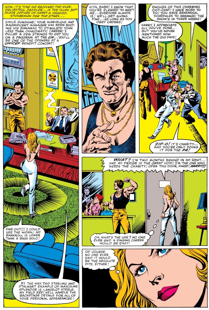
Afterwards, Dazzler meets her boss at his office and learns that she will be one of the openers at the benefit concert of UNICEF which is supposed to help her with her music career. The next morning, she decides to visit her old home where her father lives in. Over at the Bavarian Alps, Dr. Doom gets informed that among the jewels set to be displayed at the Unite Nations is the Merline stone. This compels him to make a move…
Quality
Dazzler versus Dr. Doom!
When compared to the disaster of issue #2, this comic book’s story is indeed an improvement as it has the expected superhero storytelling formula intact. The good news here is that the character development on Dazzler has returned and there is once again the strong emphasis on her relevance with the people of New York with regards to her being both a superhero and a musician.
The story moved at a moderate pace and it is clear that the creative team took the necessary steps to gradually build up the plot leading to the inevitable encounter between Dazzler and the Fantastic Four’s most definitive enemy (and Marvel Comics’ iconic villain). Take note, however, that the Dazzler-Dr. Doom conflict here is only the beginning.
As this story is more focused on Dazzler, you will get to see an early look at her tainted relationship with her father who desired her to become a lawyer like him, plus there is some focus on the behind-the-scenes development in one of the big events involving her. When it comes to spectacle, there is a right amount of it here which makes this comic book more fun to read than the previous issue.
Conclusion
A look at the business side of the music industry that Alison Blaire/Dazzler is involved with.
Dazzler #3 (1981) is indeed fun to read and the creators succeeded in developing Alison Blaire more while delivering the good stuff. While the match-up between her and Dr. Doom looks awkward from the surface, the strong writing justified it and all along Dazzler never looked like she was out of place being with Marvel’s iconic supervillain.
If you are seriously planning to buy an existing hard copy of Dazzler #3 (1981), be aware that as of this writing, MileHighComics.com shows that the near-mint copy of the regular edition costs $28 while the near-mint copy of the newsstand edition costs $60.
Overall, Dazzler #3 (1981) is recommended.
+++++
Thank you for reading. If you find this article engaging, please click the like button below and also please consider sharing this article to others. If you are looking for a copywriter to create content for your special project or business, check out my services and my portfolio. Feel free to contact me as well. Also please feel free to visit my Facebook page Author Carlo Carrasco and follow me at HavenorFantasy@twitter.com
Disclaimer: This is my original work with details sourced from reading the comic book and doing personal research. Anyone who wants to use this article, in part or in whole, needs to secure first my permission and agree to cite me as the source and author. Let it be known that any unauthorized use of this article will constrain the author to pursue the remedies under R.A. No. 8293, the Revised Penal Code, and/or all applicable legal actions under the laws of the Philippines.
Welcome back, superhero enthusiasts, comic collectors, 1990s culture enthusiasts and fans of Marvel Comics! Way back in 1981, Marvel Comics had a successful comic book series launch with Dazzler #1 (read my retro review by clicking here) which sold over 400,000 copies and further sealed Dazzler as an advantageous addition for the company’s superhero comics franchise. Dazzler, a creation of a deal between Marvel and a certain record company, debuted in Uncanny X-Men #130 and got involved with the X-Men until Uncanny X-Men #131. Dazzler appeared with Marvel’s famous webslinger in Amazing Spider-Man #203.
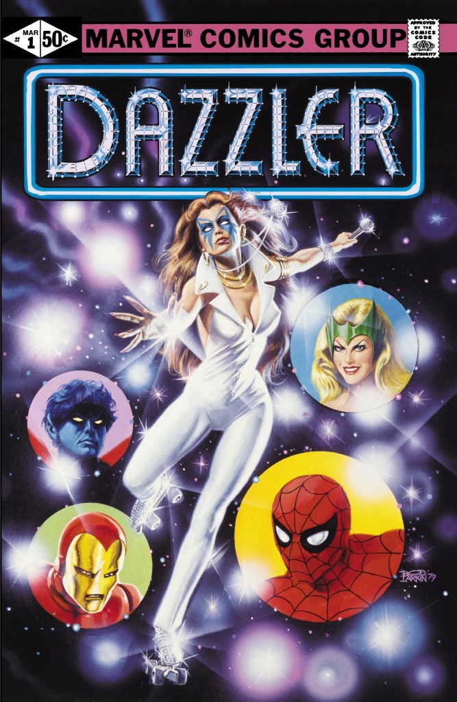
Dazzler #1 ended with a brewing rivalry between the title character and Enchantress. With those laid down, here is a look back at Dazzler #2, published in 1981 by Marvel Comics with a story written by Tom DeFalco and drawn by John Romita, Jr.
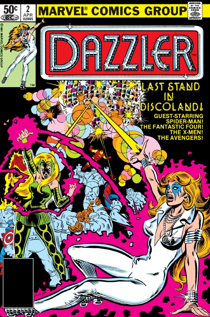
The cover.
Early story
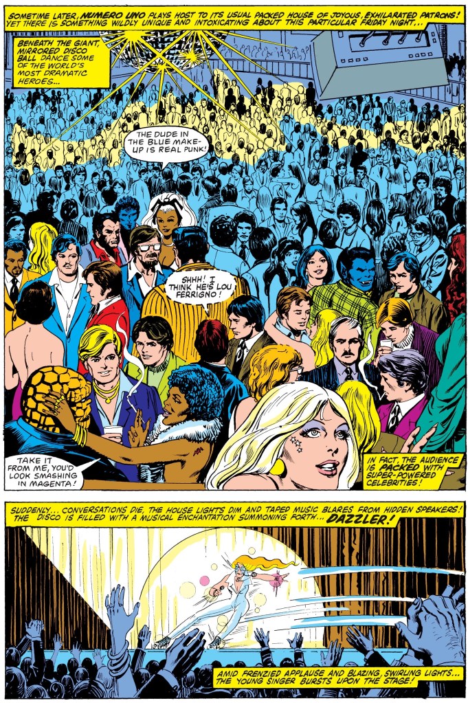
The story begins with Dazzler preparing for her big show at Numero Uno, a prestigious disco in the city of New York. Just before the show starts, a huge crowd of people are in attendance and among them are Wolverine, Peter Parker (Spider-Man), Captain America, Johnny Storm, Ben Grimm and Tony Stark (Iron Man) to name some.
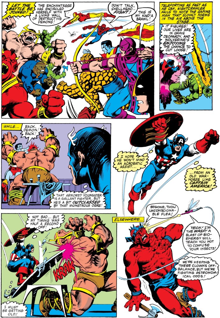
Just as Dazzler appears on-stage and draws a frenzied applause from the audience, the revenger-hungry Enchantress slowly makes her moves to ruin the lady who outclassed her to be the main attraction of the club. Even with her desire for revenge, the Enchantress decides to use her magic sparingly on Dazzler. In the audience, Peter Parker/Spider-Man begins to sense something is about to happen…
Quality
This shows what this comic book is really about.
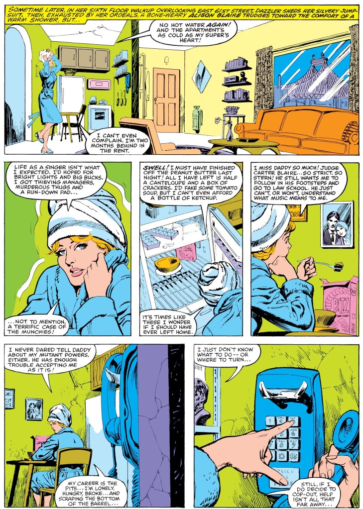
The way the story was told is disappointing. This is because the spotlight on Dazzler and her anticipated conflict with the Enchantress got overwhelmed by the amount of superhero filler on the narrative. To be clear, it is fun and interesting to see a mix of the varied superheroes of Marvel together but this comic book ended up being an all-star showcase (X-Men, Avengers and Fantastic Four members included) than a real, standalone Dazzler story. In fairness, Tom DeFalco showed how skilled he is with plot structuring and capturing the personalities and tropes of the different superheroes (note: unsurprisingly, DeFalco accurately captured Spider-Man’s personality and he went on to be a major force behind Spider-Man comic books) but that does not change the fact that this comic book should have been more about Dazzler.
When it comes to the conflict between Dazzler and the Enchantress, it was executed with no depth at all. Literally speaking, there is not enough meat to consume here and it the conflict really ended up looking very rushed. As if that was not bad enough, there is not enough justification to show Dazzler defeating a monster summoned by the Enchantress. Considering how shallow the Dazzler-Enchantress match-up turned out, it’s no wonder why there is so much Marvel all-star filler in the script.
As for the late-stage attempt to shift the narrative back to Dazzler, it is rather over-the-top and unsatisfying.
Conclusion
You recognize someone in the audience?
Dazzler #2 (1981) is an example about a creative team’s lack of confidence on crafting a decent story to develop a new superhero and ultimately resorting to fill it with a mix of other superheroes involved which itself symbolizes desperation. This comic book is not really a Dazzler story but an all-star showcase with Dazzler becoming a minor character in her own monthly series.
If you are seriously planning to buy an existing hard copy of Dazzler #2 (1981), be aware that as of this writing, MileHighComics.com shows that the near-mint copy of the regular edition costs $28 while the near-mint copy of the newsstand edition costs $60.
Overall, Dazzler #2 (1981) is unsatisfactory. Anyone who loves Dazzler or who wishes to discover more of her will be disappointed with this comic book.
+++++
Thank you for reading. If you find this article engaging, please click the like button below and also please consider sharing this article to others. If you are looking for a copywriter to create content for your special project or business, check out my services and my portfolio. Feel free to contact me as well. Also please feel free to visit my Facebook page Author Carlo Carrasco and follow me at HavenorFantasy@twitter.com
Disclaimer: This is my original work with details sourced from reading the comic book and doing personal research. Anyone who wants to use this article, in part or in whole, needs to secure first my permission and agree to cite me as the source and author. Let it be known that any unauthorized use of this article will constrain the author to pursue the remedies under R.A. No. 8293, the Revised Penal Code, and/or all applicable legal actions under the laws of the Philippines.
Welcome back, superhero enthusiasts, comic collectors, 1990s culture enthusiasts and fans of Marvel Comics! Previously, I reviewed Uncanny X-Men #130 which was the first appearance of Dazzler who went on to become one of the most notable new characters of Marvel Comics in the 1980s. After appearing in Uncanny X-Men #131 and Amazing Spider-Man #203, Dazzler became more prominent among all of Marvel’s superheroes as the publisher launched an all-new monthly series featuring her. There is more to that than meets the eye, however.
In his article titled “Dazzler and Me”, Danny Fingeroth wrote: Marvel decided to tray an experiment with the relatively new “direct market” – comic book shops. It was decided that Dazzler #1 would only be available in comic book shops, not at traditional newsstands.
Dazzler #1 sold over 400,000 copies.
Even the top-selling comics of the era sold perhaps 250,000 copies. So, the first issue, anyway, was a major hit.
Apart from the confirmed commercial success of the comic book, it is a wonder if it is still good to read by today’s standards. To find out, here is a look back at Dazzler #1, published in 1981 by Marvel Comics with a story written by Tom DeFalco and drawn by John Romita, Jr.
The cover.
Early story
The story begins with Dazzler running away from four armed men who had been following her since she left the disco. She finds herself corned at the dead end of an alley as the men approach her. While pretending to be reaching for her make-up in the bag, Dazzler grabs and activates her portable radio which plays music. With the music turned on, she uses her power to convert it all into a dazzling display of light and color which makes the men disoriented.
While swinging nearby, Spider-Man notices the display of light but before he begins his approach, Dazzler makes her move to knock two men out. Another man fires his gun and his bullet ricochets until it hits the portable radio stops the music and Dazzler’s lights altogether leaving her vulnerable once again…
Quality
This page alone establishes Dazzler as a person struggling to make ends meet.
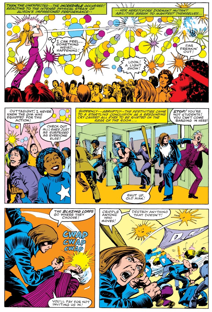
As far as telling a Dazzler story goes, this comic book is the complete package and it’s got very solid writing! Apart from showing what happened to her after her appearances in the Uncanny X-Men and Amazing Spider-Man series, this comic book formally introduces Dazzler in her civilian identity as Alison Blaire and thanks to efficient writing, it also reveals threads of her past and how her mutant powers manifested. Not only that, readers will get to see the title character as a typical person who is struggling to make ends meet even though she does her best with entertainment as a career.
Strangely, the focus on Dazzler is relatively light in content and the result is several pages of Marvel universe-related filler which shows several other characters like Captain America, Iron Man, Storm, Wolverine and others present with little to no connection with the title character. The X-Men scene is a nice touch as it will remind readers about Dazzler’s first interaction with them.
As a teenager, Alison Blaire’s power begins to manifest during this particular event in her life.
To build-up the first challenge for Dazzler, this comic book has the Enchantress as the villainess and ironically it also had some room of character development for her. Clearly this was done not only to build up anticipation for the next issue but to make readers root for Dazzler some more. In retrospect, the Enchantress would later emerge as an important figure in 1984’s crossover storyline Secret Wars.
Conclusion
The scene involving the X-Men is a nice touch as it connects with Dazzler’s previous interaction with them.
While it is indeed a product of the early 1980s carrying influences from the 1970s New York club scene, Dazzler #1 (1981) is still fun and engaging to read. Clearly this comic book is a must-have for anyone who loves Dazzler and it should be entertaining enough for geeks who love the 1980s and the Marvel-related crossovers of the time. Very clearly, this comic book succeeded in introducing and developing Dazzler as a person (as opposed to being a super hero) and the background story established fits in nicely with the character’s first appearance in Uncanny X-Men #130. Very clearly, there is a lot more to Dazzler than her unique super power and her disco look.
If you are seriously planning to buy an existing hard copy of Dazzler #1 (1981), be aware that as of this writing, MileHighComics.com shows that the near-mint copy of the comic book costs $70.
Overall, Dazzler #1 (1981) is highly recommended!
+++++
Thank you for reading. If you find this article engaging, please click the like button below and also please consider sharing this article to others. If you are looking for a copywriter to create content for your special project or business, check out my services and my portfolio. Feel free to contact me as well. Also please feel free to visit my Facebook page Author Carlo Carrasco and follow me at HavenorFantasy@twitter.com
Disclaimer: This is my original work with details sourced from reading the comic book and doing personal research. Anyone who wants to use this article, in part or in whole, needs to secure first my permission and agree to cite me as the source and author. Let it be known that any unauthorized use of this article will constrain the author to pursue the remedies under R.A. No. 8293, the Revised Penal Code, and/or all applicable legal actions under the laws of the Philippines.
Welcome back, superhero enthusiasts, 1980s culture enthusiasts, comic book collectors and fans of Marvel Comics! Previously I reviewed Uncanny X-Men #130 (1980) which was the first appearance of Dazzler who eventually became a popular figure for Marvel Comics in the 1980s. Before the company published a monthly comic book series featuring her, Dazzler made another appearance in an issue of the Amazing Spider-Man which was released just a few months after her debut. This, of course, led to a crossover with the iconic webslinger himself.
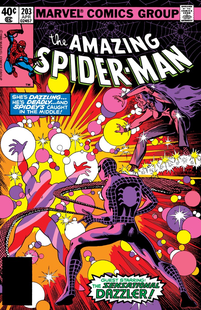
With those details laid down, here is a look back at Amazing Spider-Man #203, published in 1980 by Marvel Comics with a story written by Marv Wolfman and drawn by Keith Pollard.
The cover.
Early story
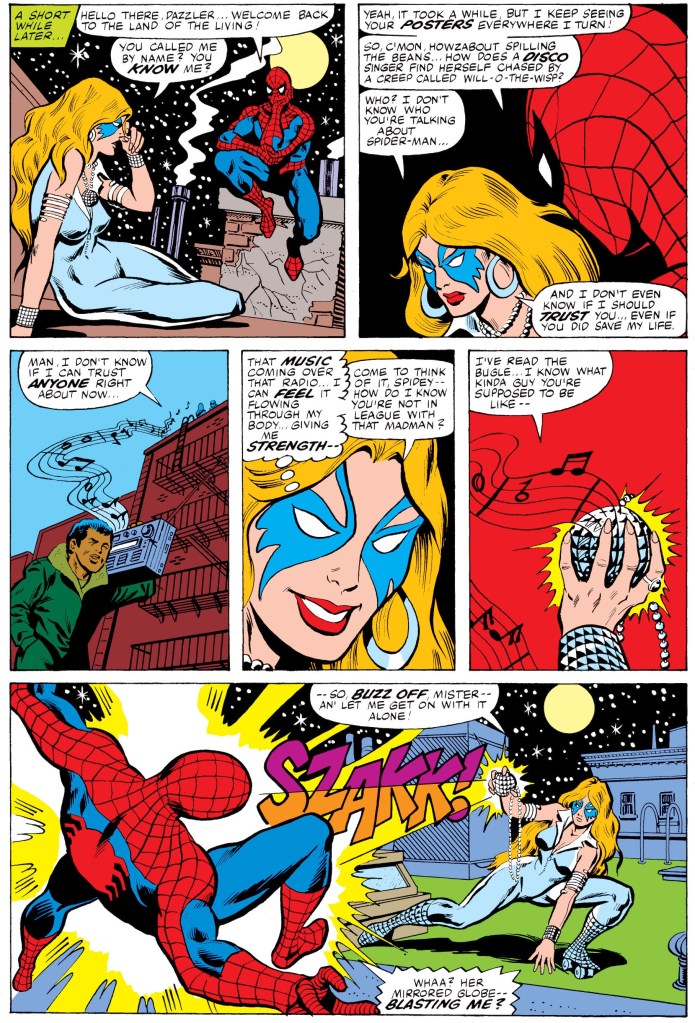
The story begins during a night in the city where a swinging Spider-Man gets distracted by fast skating Dazzler who is being followed closely by a streak of light. After Spider-Man speculates about the possible return of Will-o-the-Wisp, he decides to intervene and pulls Dazzler off the road and to himself above. Dazzler faints suddenly.
A short while afterward, Dazzler wakes up and starts talking with the webslinger. In response to the mention of Will-o-the-Wisp’s name, she claims to not knowing what he was talking about. As their talk goes on, Dazzler hears music from the street which strengthens her. Using the small mirror globe she is wearing, Dazzler hits Spider-Man with a blast of light pushing him off the building…
Quality
The crossover between Dazzler and Spider-Man is the main feature of this comic book.
This is one fun crossover between the iconic Spider-Man and the brand-new Dazzler. Marv Wolfman wrote a story that not only followed the further adventures of the webslinger, it also gave readers more to see and learn about Dazzler who just had her unexpected adventure with the X-Men months earlier (in Uncanny X-Men #130 and #131). By connecting this story with those two X-Men comic books, it really looked like just got back home in the city only to get chased by streaking light. The interactions between Dazzler and Spider-Man were entertaining. While Dazzler is a known entertainer among New Yorkers, it was the webslinger who remains the big, popular local figure which is clearly reflected in the singer’s verbal exchange with him.
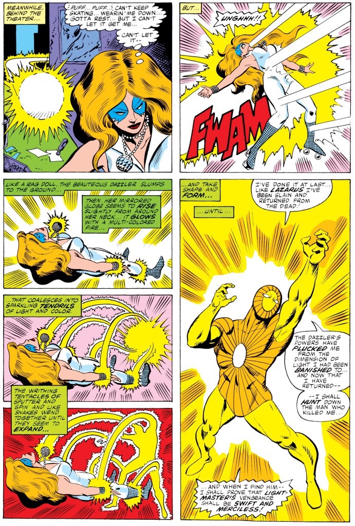
The villain in this comic book, Lightmaster, is pretty cartoonish visually but his super power and high intelligence do make him look threatening. I like the way the story was crafted with concepts that link Lightmaster with Dazzler. Both of them are connected with light and while Dazzler is able to absorb sound like a form of energy and create light beams, Lightmaster has the means to tap on her power and use it for his advantage. There is also another capability of Lightmaster’s which I will just leave unrevealed and you who read this should find out about it.
Conclusion
Lightmaster enters the scene.
Amazing Spider-Man #203 (1980) is a very old yet fun comic book that fans of Spider-Man and Dazzler will enjoy. Not only does it have a meaty encounter between the two, it also succeeds in chronicling Spider-Man’s life both in costume and as civilian Peter Parker. Going back to Dazzler, there is not much character development for her here but that is understandable as such emphasis was only waiting to happen in her own monthly comic book series.
If you are seriously planning to buy an existing hard copy of Amazing Spider-Man #203 (1980), be aware that as of this writing, MileHighComics.com shows that the near-mint copy of the regular edition costs $94 while the near-mint copy of the newsstand edition costs $150.
Overall, Amazing Spider-Man #203 (1980) is recommended.
+++++
Thank you for reading. If you find this article engaging, please click the like button below and also please consider sharing this article to others. If you are looking for a copywriter to create content for your special project or business, check out my services and my portfolio. Feel free to contact me as well. Also please feel free to visit my Facebook page Author Carlo Carrasco and follow me at HavenorFantasy@twitter.com
Disclaimer: This is my original work with details sourced from reading the comic book and doing personal research. Anyone who wants to use this article, in part or in whole, needs to secure first my permission and agree to cite me as the source and author. Let it be known that any unauthorized use of this article will constrain the author to pursue the remedies under R.A. No. 8293, the Revised Penal Code, and/or all applicable legal actions under the laws of the Philippines.
Welcome back, superhero enthusiasts, comic collectors, 1990s culture enthusiasts and fans of the X-Men! We go back to the year 1993 when the 30th anniversary of the X-Men was celebrated with the 6-part Fatal Attractions storyline. Already I reviewed Uncanny X-Men #304 (Part 3) which was not worthy of the X-Men’s 30th anniversary celebration. X-Men #25 (Part 4) meanwhile was not only great but also shocking and had a years-long impact on X-Men comics.
So now the focus is on the 5th chapter of the Fatal Attractions storyline handled by the Larry Hama-Adam Kubert team on the Wolverine monthly series of the time. With those details laid down, here is a look back at Wolverine #75, published by Marvel Comics in 1993 with a story written by Larry Hama and drawn by Adam Kubert.
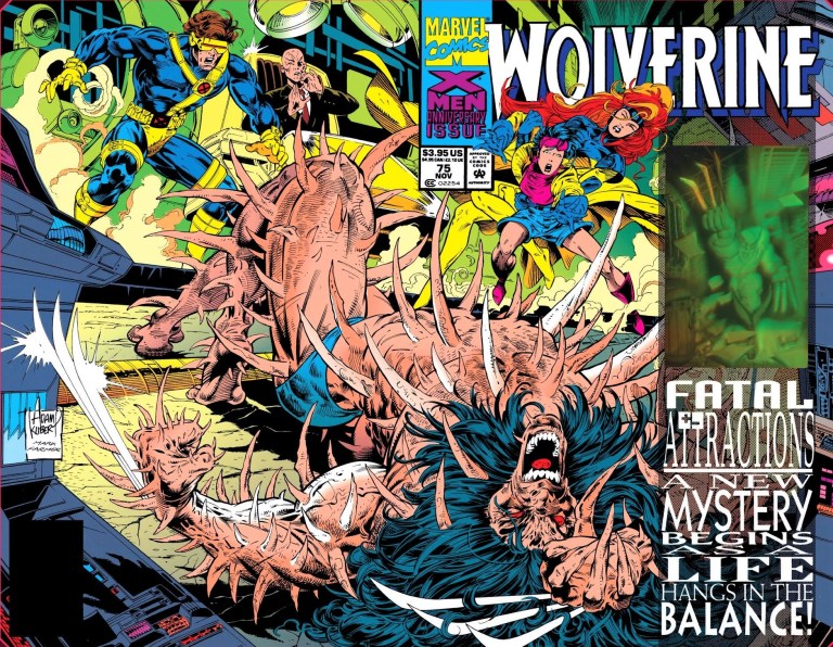
The cover.
Early story
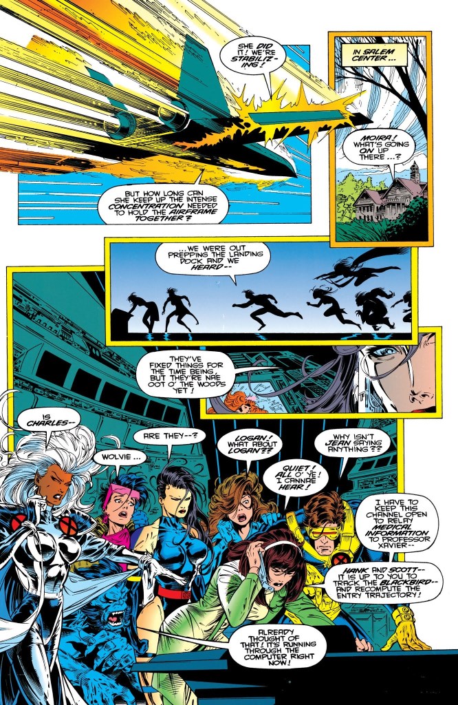
The story begins in outer space. Carrying Charles Xavier, Wolverine, Gambit, Jean Grey, Rogue and Quicksilver (who participated in the dangerous mission in X-Men #25), the X-Men’s jet (piloted by Bishop) struggles mechanically as it was not designed for space travel. Worse, Wolverine is under very serious condition and the medical unit has been operating in full capacity dealing with his intense trauma.
In an attempt to alleviate Wolverine’s psychic trauma, Charles Xavier and Jean Grey enter his mind and discover that there is a world full of pain and horror. They see visions of a restrained Wolverine (from his Weapon X days) being attacked by Sabretooth and Lady Deathstrike. Xavier explains that they are at the epicenter of Logan’s most suppressed cataclysmic memories which were clearly triggered by the physical damage Magneto inflicted on him (see X-Men #25).
As the X-Men’s jet attempts to enter Earth’s atmosphere, its exteriors heat up dramatically shaking everyone inside. This complicates the situation on stabilizing Wolverine…
Quality
The other X-Men team members at their headquarters expressing worry and concern about the situation of their teammates struggling to come back home from space.
To be clear, this story continues the events of Fatal Attractions but with a bit more focus on Wolverine (compared to the earlier chapters of the storyline that is). There is no real battle between good and evil at all. It’s really all about Wolverine struggling to survive just as his teammates struggle to arrive home.
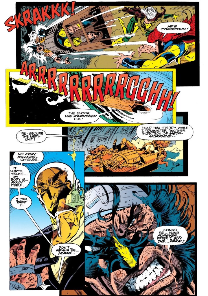
Before the stories of this comic book and X-Men #25 happened, Wolverine has often been portrayed to be very tough, brave and a walking machine of violence which has been reflected in other X-Men stories told in video games and movies. In this very comic book, Wolverine has been presented to coming close to death. This means Logan, at this particular stage of the history of the literary X-Men, was at his most vulnerable state. In my experience, this was both alienating and shocking to see.
With regards to the writing, Larry Hama did an excellent job with pacing the story from start to finish. Right from the beginning, the story pulls you into the X-Men’s tough situation and as each page gets turned, the tension as well as the suspense builds up until the execution of the climax. Along the way, the comic book not only portrays Wolverine struggling on the edge, it also works to make you care more or be more concerned towards him. Oh yes, the shocking moment near the end of this comic book remains very powerful and you who read this retro review should read Wolverine #75 and see it for yourselves.
Conclusion
Wolverine at his most vulnerable state.
By today’s standards, Wolverine #75 (1993) is still a very great comic book to read. In fact, I can say it is not only one of most defining chapters of the Fatal Attractions storyline as well as one of the most significant X-Men comic books of the 1990s, it is indeed a true illustrated literature classic ever published by Marvel Comics. In retrospect, this comic book marks a major turning point in the life of Wolverine who is still one of the most iconic characters in all of superhero literature. All of these were achieved thanks to the creative team of Larry Hama and Adam Kubert (whose are here was great and stylized at the same time). Hama succeeded in writing the continuation of the Fatal Attractions storyline while balancing all of the exposition and still putting Wolverine in the center. That itself is a very great work of writing.
If you are seriously planning to buy an existing hard copy of Wolverine #75 (1993), be aware that as of this writing, MileHighComics.com shows that the near-mint copy of the regular edition costs $60 while the near-mint copies of the signed-and-numbered edition and the newsstand edition cost $300 and $180 respectively.
Overall, Wolverine #75 (1993) is highly recommended!
+++++
Thank you for reading. If you find this article engaging, please click the like button below and also please consider sharing this article to others. If you are looking for a copywriter to create content for your special project or business, check out my services and my portfolio. Feel free to contact me as well. Also please feel free to visit my Facebook page Author Carlo Carrasco and follow me at HavenorFantasy@twitter.com
Disclaimer: This is my original work with details sourced from reading the comic book and doing personal research. Anyone who wants to use this article, in part or in whole, needs to secure first my permission and agree to cite me as the source and author. Let it be known that any unauthorized use of this article will constrain the author to pursue the remedies under R.A. No. 8293, the Revised Penal Code, and/or all applicable legal actions under the laws of the Philippines.
Welcome back, X-Men fans, superhero enthusiasts, 1980s culture enthusiasts and comic book collectors! Today, we look back at the year 1980 specifically the time when the Uncanny X-Men monthly series was spearheaded by legendary creators Chris Claremont and John Byrne. In fact, we will examine here the comic book debut of Dazzler, a mutant with the ability to convert the vibrations of sound into light and energy beams. Dazzler is quite unique among all superheroes as she has been portrayed as a singer, an actress, a model and got associated with other Marvel superheroes. Marvel Comics went on to actually publish a regular comic book series about Dazzler which lasted over forty issues.
To say the least, the creation of Dazzler is quite intriguing as it involved a commission by an American record label for a special project with a disco queen character as the core concept and that Marvel Comics itself would develop the superhero (in the form of a singer) and that an actual singer will be produced by the said record label. Then Marvel editor-in-chief Jim Shooter wrote a treatment for the project which turned from an animated special into a live-action film. As creative process for Dazzler went on at Marvel, Tom DeFalco (who later succeeded Shooter as editor-in-chief) wrote her creation while John Romita, Jr. did the character design. The name Dazzler was the result of a suggestion by Roger Stern. There also was some Bo Derek influence on the creation of Dazzler.
While the special project did not happen due to the financial problems of the record label, Marvel went on to formally introduce Dazzler in the pages of an Uncanny X-Men comic book handled by Claremont-Byrne team.
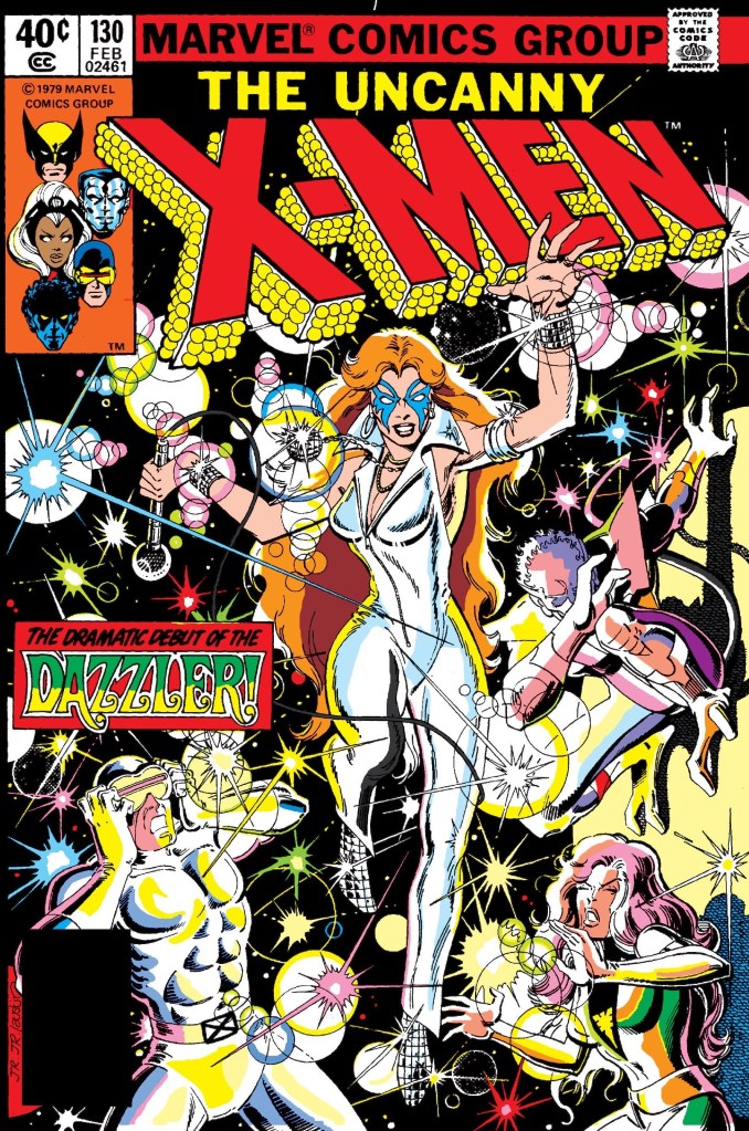
With those details laid down, here is a look back at Uncanny X-Men #130, published by Marvel Comics in 1980 with a story co-written by Chris Claremont and John Byrne. Byrne drew the art.
The cover.
Early story
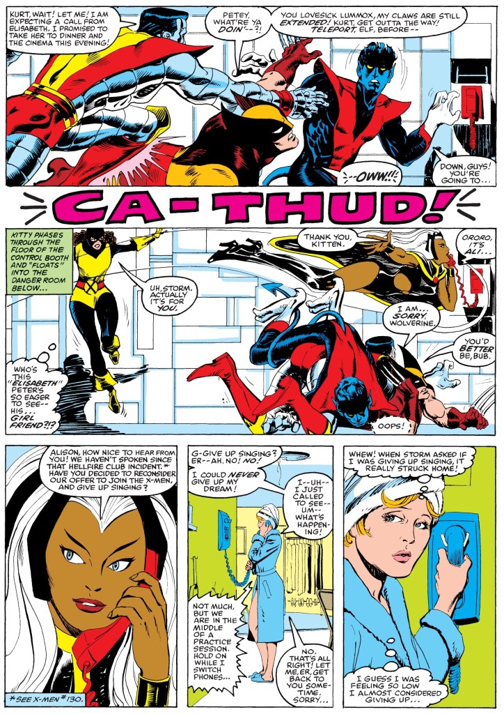
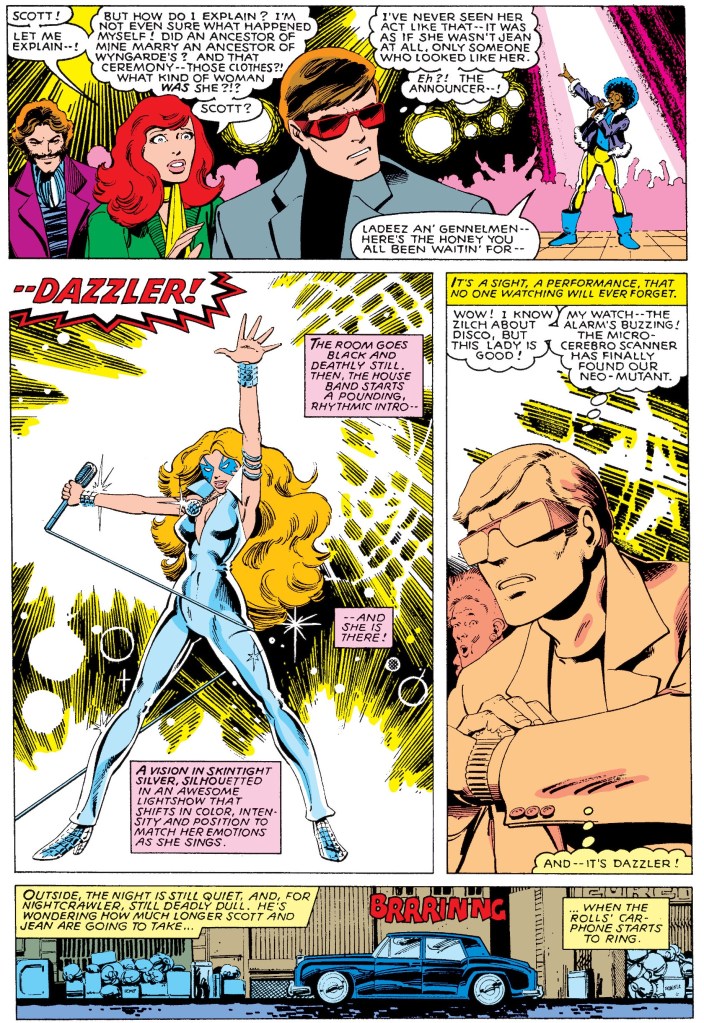
The story begins on Delano Street in Lower Manhattan. Scott Summers/Cyclops, Jean Grey and Nightcrawler had just arrived on a mission to locate a mutant (detected by Cerebro) not knowing that they themselves are bring monitored by a hidden sinister force. With Nightcrawler left in-charge of guarding their Rolls Royce, Scott and Jean enter a deteriorating building only to find a club on an upper level full of lights, loud music, dancing and a lot of people. They begin to start searching for the detected mutant.
Outside, a truck parks on the other side of the same street where the X-Men’s Rolls Royce was parked at. Inside the truck one of the operators communicates to a certain Mr. Shaw who states that the Hellfire Club is proud. Over at the Hellfire Club’s headquarters, Sebastian Shaw and Jason Wyngarde talk about the X-Men members searching the disco. Wyngarde moves on with his plan to subvert Jean Grey and gather her into their fold…
Quality
Dazzler’s very debut on this page.
The storytelling is great which is not surprising as this was done by Claremont and Byrne. It is clear that there was a good amount of preparation done which explains this comic book’s excellent ways on emphasizing the following story points: the build-up of the Hellfire Club as a potent force of evil that await the X-Men, Kitty Pryde/Shadowcat’s growing involvement, the vulnerability of Jean Grey, the build-up of the Phoenix, and the debut of Dazzler. Along the way, the creative team also ensure that the dialogue was rich (the same thing also with the thought balloons Claremont came up with), the emphasis of super powers made sense, the action scenes were satisfying and there was a good amount of suspense here.
I love the way Dazzler’s first-ever appearance was handled as it happened just after an intriguing scene about Jean Grey’s vulnerability took place. Her debut also occurred at a point when Jean and Scott seemed to be failing to find her. Of course, the 1970s disco vibe was very strong with Dazzler.
Conclusion
The plot thickens…
Without a doubt, Uncanny X-Men #130 (1980) is a classic X-Men tale by the Claremont-Byrne team who succeeded in not only introducing Dazzler into Marvel’s comic book universe but also with strongly emphasizing the Hellfire Club as a powerful opposition which went on to have a key part in the legendary Dark Phoenix storyline that followed. Dazzler meanwhile became a very popular superhero of Marvel’s going into the 1980s. For the modern-day comic book reader, this comic book can be quite challenging to read as it is very wordy (typical of Claremont).
If you are seriously planning to buy an existing hard copy of Uncanny X-Men #130 (1980), be aware that as of this writing, MileHighComics.com shows that the very fine copy of the regular edition costs $1,407 while the fine copy of the newsstand edition costs $1,013.
Overall, Uncanny X-Men #130 (1980) is highly recommended!
+++++
Thank you for reading. If you find this article engaging, please click the like button below and also please consider sharing this article to others. If you are looking for a copywriter to create content for your special project or business, check out my services and my portfolio. Feel free to contact me as well. Also please feel free to visit my Facebook page Author Carlo Carrasco and follow me at HavenorFantasy@twitter.com
Disclaimer: This is my original work with details sourced from reading the comic book and doing personal research. Anyone who wants to use this article, in part or in whole, needs to secure first my permission and agree to cite me as the source and author. Let it be known that any unauthorized use of this article will constrain the author to pursue the remedies under R.A. No. 8293, the Revised Penal Code, and/or all applicable legal actions under the laws of the Philippines.
Welcome back, superhero enthusiasts, fans of the 2099 universe of Marvel Comics, 1990s culture enthusiasts and comic book collectors! Today we revisit the X-Men 2099 comic book series by focusing on the 4th issue. Following the single storyline told in the first three issues (including the unexpected death of a certain member in issue #3) which ultimately made clear why the X-Men of 2099 exist and what their place is within an America that is totally different from what it used to be during the time of Charles Xavier and his X-Men. As such, the stage was set for more exploration and new creative directions with Xi’an and his band of nomadic mutants.
With those details laid down, here is a look back at X-Men 2099 #4, published by Marvel Comics in 1993 with a story written by John Francis Moore and drawn by Ron Lim.
The cover.
Early story
The story begins with Bloodhawk exploring a deserted, radioactive facility in the middle of New Mexico. Having a reptilian skin protects him from radiation which only adds to his personal obsession of waging a war against developers and corporate entities that he accuses of defiling the natural environment.
Suddenly, a tough female with white hair and white skin grabs Bloodhawk by the neck and by touching his head with her left hand, she triggers a bolt of agony on him. Bloodhawk then loses consciousness.
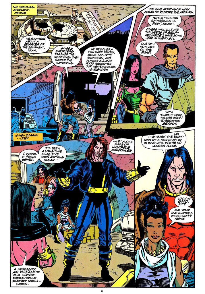
Meanwhile in Nevada, Xi’an and his X-Men salvaged whatever equipment they found at the Nueva Sol Arcology which was their haven before Synge’s enforcers invaded and ruined it. In response to Shakti’s comment that it would take months to restore the facility, Xi’an says that the time for gatherings has passed as he believes that their path lies on the road emphasizing travel to new places.
While his teammates are outside, Henri uses a computer inside the facility retrieving messages. He receives a video message from his old friend Jordan Boone who informs him about a major project called Valhalla and he was going to do something outrageous…
Quality
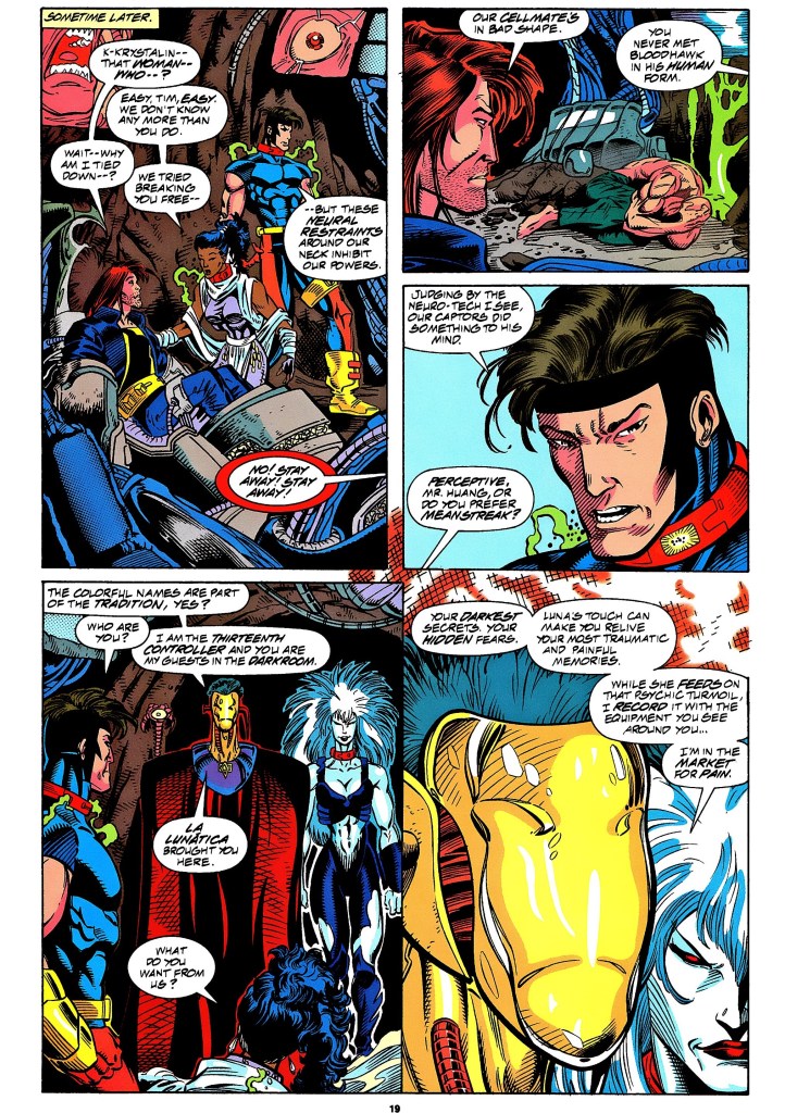
Neuro-tech, the captured X-Men, Luna and the Theater of Pain.
When it comes to narrative, I should point out that this comic book serves as a prelude to The Fall of the Hammer 2099 crossover storyline and it does a good job setting key members of the X-Men to get involved.
As an X-Men 2099 story, John Francis Moore further developed the personalities of most of the members (with Timothy Fitzgerald being the center as he slowly becomes Skullfire) and showed more of the culture within the team under Xi’an’s leadership and strict points.
Other than the focus on the mutants, a notable feature of the story is the introduction of the Theater of Pain which includes a radically intriguing masked villain who runs an operation that involves abducting people, using machines to feed on their minds and access the most painful personal memories which in turn is digitally channeled to an existing linked live audience feeding their minds. In essence, mental torture and intrusion of the mind are introduced. I should also state that the Theater of Pain here plays a major part in the story of X-Men 2099 #25. This issue also introduces Luna who eventually gets linked with Skullfire and becomes part of the X-Men.
More on the Theater of Pain concept, I found the painful flashback sequences a clever method used by the writer to emphasize selected moments from the past of Bloodhawk and Skullfire which added to the character development of this comic book.
Conclusion
One step showing Timothy slowly becoming Skullfire.
X-Men 2099 #4 (1993) is well-written and it is a significant part of the 35-issue monthly series. For one thing, it shows the start of the transformation of Skullfire’s personality, the direction Xi’an and his mutants are taking, and the start of a build-up that led to the significant events of X-Men 2099 #25. There is a lot here for X-Men 2099 fans to enjoy from start to finish.
If you are seriously planning to buy an existing hard copy of X-Men 2099 #4 (1993), be aware that as of this writing, MileHighComics.com shows that the near-mint copy of the regular edition costs $30 while the near-mint copy of the newsstand edition costs $90.
Overall, X-Men 2099 #4 (1993) is highly recommended!
+++++
Thank you for reading. If you find this article engaging, please click the like button below and also please consider sharing this article to others. If you are looking for a copywriter to create content for your special project or business, check out my services and my portfolio. Feel free to contact me as well. Also please feel free to visit my Facebook page Author Carlo Carrasco and follow me at HavenorFantasy@twitter.com
Disclaimer: This is my original work with details sourced from reading the comic book and doing personal research. Anyone who wants to use this article, in part or in whole, needs to secure first my permission and agree to cite me as the source and author. Let it be known that any unauthorized use of this article will constrain the author to pursue the remedies under R.A. No. 8293, the Revised Penal Code, and/or all applicable legal actions under the laws of the Philippines.
Welcome back, X-Men fans, superhero enthusiasts, 1990s culture enthusiasts and comic book collectors! It’s time to revisit the What If monthly series of comic books of Marvel Comics that lasted from 1989 until 1998. The old comic book I’m about to review involves the X-Men, Cable and more.
Before starting with this newest retro comic book review, I should state that I was never a fan of Cable even though I read lots of X-Men-related comic books that included him. When I think of Cable, I immediately think of the New Mutants and X-Force comic book series.
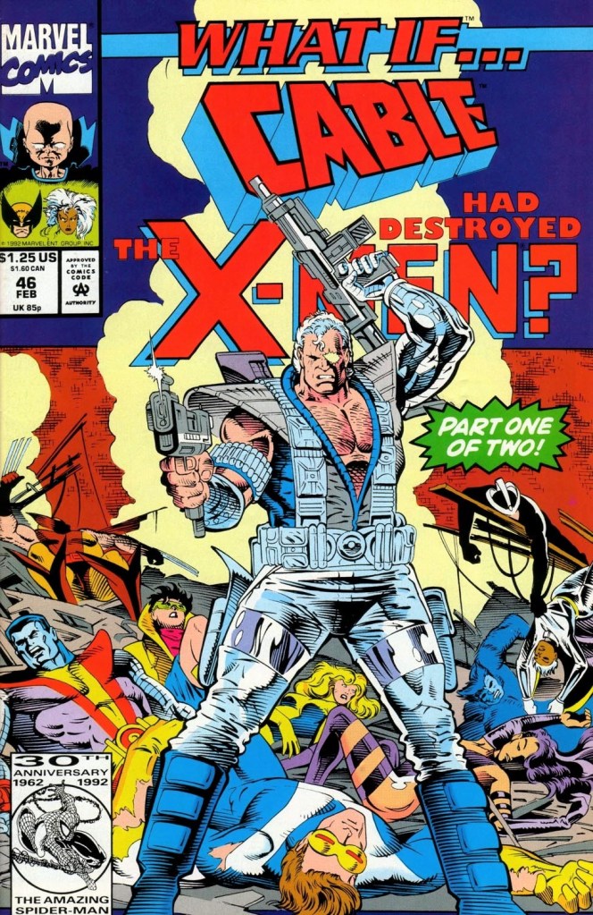
You must be wondering what has Cable and the X-Men have to do with the old What If issue I’m focusing on. We can all find out in this look back at What If #46, published by Marvel Comics in 1993 with a story written by Kurt Busiek and drawn by Tod Smith.
The cover.
Early story
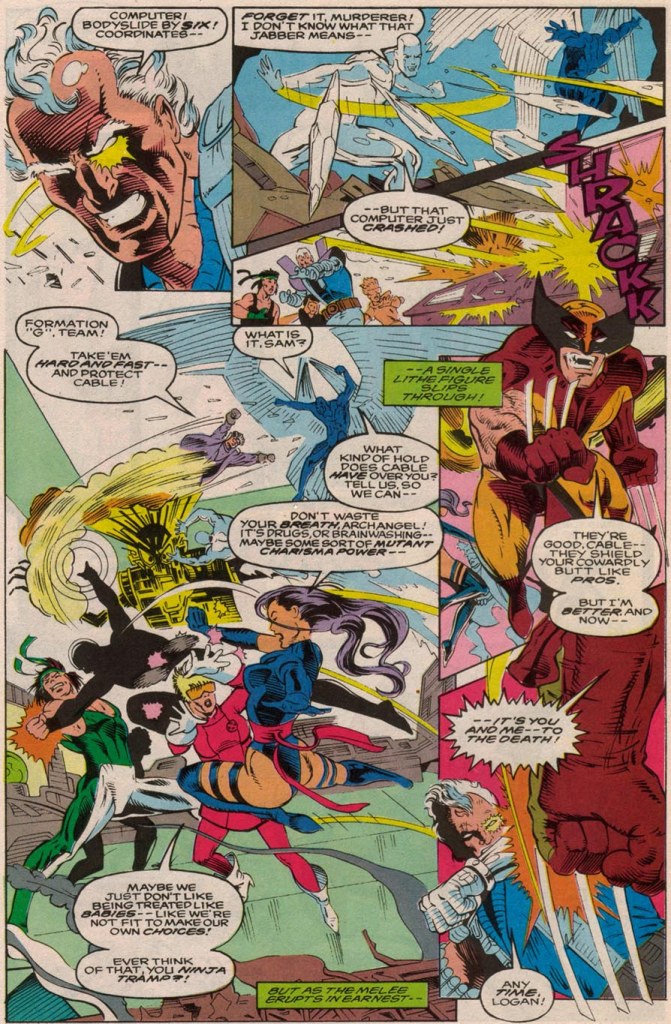
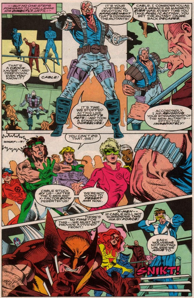
The story begins inside a tavern in New York’s famous Central Park. Inside, Charles Xavier, Scott Summers (Cyclops) and Jean Grey have a discussion about mutant matters until a small saucer-shaped device flies inside and disrupts everything with its sonic frequency. Suddenly a second flying saucer comes in, touches Scott’s shoe and explodes powerfully killing him, Jean and Xavier. Others got injured by the explosion and the tavern ends up burning.
Outside the tavern, Cable is seen running away and someone points at him as someone who must be responsible for the bombing. As it turns out, the deliberate killing of Xavier, Cyclops and Jean Grey was the result of a division between Cable’s New Mutants and the X-Men in connection to the recent return of Xavier from deep space.
Quality
A brawl between the mutants.
I’ll start with the story Kurt Busiek came up with. This one explores an alternate time in which Charles Xavier returned to Earth (after escaping from the Skrulls in deep space) only to find the X-Men in disarray which compelled him to restore things the way they were. This is not to be confused with his return in the canon storyline of the Muir Island Saga.
That being said, Busiek explored what would it be like had Xavier tried to resolve mutant matters not only with the team of mutants he founded but also with other teams such as the New Mutants (already led by Cable), X-Factor (Cyclops, Jean Grey, Iceman, Beast and Archangel) plus several other mutants. I really liked the way the mutants reacted to Xavier given his long absence from Earth, how his dream matters and turned out irrelevant to them as individual mutants, and if he still has what it takes to lead them. In some ways, Xavier looked like a politician trying to convince his constituents that his vision is still the best for them and their interests.
What really made the story running was the start of the division between the mutants when Cable rejects Xavier and points out that the X-Men founder’s devotion to appeasement is dooming mutants. All of these led to the shock opening scene and in terms of writing quality, it was all justified.
The scenes that happened AFTER the burial of Xavier, Cyclops and Jean Grey literally raised the stakes for the rest of the comic book. I don’t want to spoil further plot details but I can assure you all that Kurt Busiek’s script is very sold and there is so much to enjoy here especially if you are knowledgeable enough about the X-Men and the other parts of the Marvel Comics universe (note: the Avengers, Stryfe, Freedom Force and Fantastic Four also appeared).
Visually, the work of Tod Smith looks a bit rushed. His art here is not bad but I felt it could have been better had there been more time to polish his work. In fairness to Smith, his drawings on most of the characters still made them recognizable and he showed pacing with regards to the panels and angles used. I should say he does a decent job showing multiple characters fighting each other simultaneously.
Conclusion
If you were a mutant, would you follow Charles Xavier or Cable?
If you ask me, What If #46 (1993) is pretty entertaining and engaging to read thanks to the strong writing as well as the daring exploration of how the comic’s main story impacts others within the Marvel Comics universe. It has drama, action, intrigue and most notably it explores a new concept about how the X-Men would turn out after the death of their founder. It also raises questions on whether or not the X-Men are doomed without Charles Xavier’s presence.
If you are seriously planning to buy an existing hard copy of What If #46 (1993), be aware that as of this writing, MileHighComics.com shows that the near-mint copy of the regular edition costs $40 while the near-mint newsstand edition costs $120.
Overall, What If #46 (1993) is recommended.
+++++
Thank you for reading. If you find this article engaging, please click the like button below and also please consider sharing this article to others. If you are looking for a copywriter to create content for your special project or business, check out my services and my portfolio. Feel free to contact me as well. Also please feel free to visit my Facebook page Author Carlo Carrasco and follow me at HavenorFantasy@twitter.com
Disclaimer: This is my original work with details sourced from reading the comic book and doing personal research. Anyone who wants to use this article, in part or in whole, needs to secure first my permission and agree to cite me as the source and author. Let it be known that any unauthorized use of this article will constrain the author to pursue the remedies under R.A. No. 8293, the Revised Penal Code, and/or all applicable legal actions under the laws of the Philippines.
Welcome back, X-Men fans, superhero enthusiasts, 1990s culture enthusiasts and comic book collectors! Today, we take a look at the topic of slavery and its connection with the mutants within the universe of Marvel. To be more specific, slavery was emphasized in one of the episodes of the popular X-Men animated series which itself had a monthly series of comic book adaptations – X-Men Adventures!
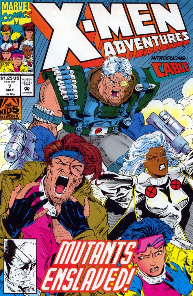
With those details laid down, here is a look back at X-Men Adventures #7, published by Marvel Comics in 1993 with a story written by Ralph Macchio and drawn by Chris Batista.
The cover.
Early story
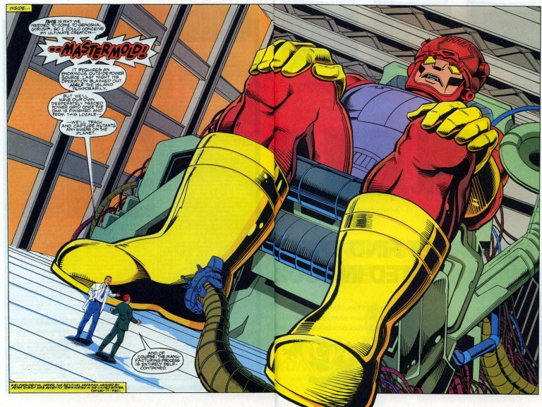
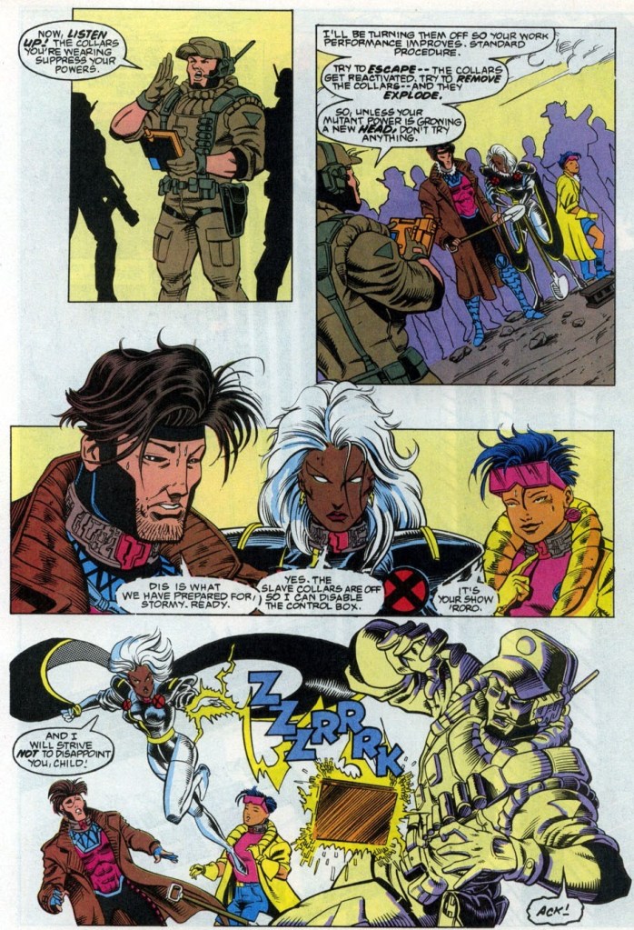
The story begins in Genosha, an island nation where mutants are designated as slaves constantly monitored by armed personnel of the state. X-Men team members Gambit, Storm and Jubilee are forced to do hard labor as they have been rendered powerless (with high-tech collars on their necks). Along with many other mutants, they are working on a key infrastructure project of the state.
As soon as the local authorities deactivated the collars of the slaves, Storm immediately attempts to escape by flying. Immediately, the collar on her neck got reactivated which neutralized her powers and caused her to fall down to the water below. As soon as she climbs up on a rock to rest, a cable wraps itself on her right leg. Suddenly, a huge Sentinel rises above the water and pulls her…
Quality
The money shot!
Like the TV episode it was based on, this comic book does a decent job of portraying slavery and oppression with mutants in mind while avoiding the very sensitive topic of racism. To see Gambit, Storm and Jubilee portrayed as much more vulnerable characters is a nice change from their usual portrayals. While the story has a strong slavery theme, it also sheds light on the ongoing, secretive development of the Sentinels program which clearly emphasizes the growing danger that await not only the X-Men (the prime target of Trask and his team) but mutants in general.
When it comes to the art, Chris Batista did a nice job drawing not only the characters (all recognizable) but also their surroundings, the Sentinels and the framing of action scenes.
Conclusion
Gambit, Storm and Jubilee as slaves on Genosha.
I personally find X-Men Adventures #7 (1993) somewhat fun and slightly engaging to read. As this is an adaptation of the X-Men animated series episode about Genosha and mutant slavery, it clearly has a strong wholesome approach to its presentation. That being said, its depth is actually limited as it presented its themes with younger readers and new X-Men readers in mind. Unsurprisingly, the action is limited and was portrayed to avoid violence. If you want a more serious and grittier portrayal of Genosha and mutant slavery, you should read Uncanny X-Men #235 to #238, and the X-tinction Agenda storyline.
If you are seriously planning to buy an existing hard copy of X-Men Adventures #7 (1993) be aware that as of this writing, MileHighComics.com shows that the near-mint copy of the regular edition costs $30, while the near-mint copies of the newsstand edition and the Greek edition cost $90 and $200 respectively.
Overall, X-Men Adventures #7 (1993) is satisfactory.
+++++
Thank you for reading. If you find this article engaging, please click the like button below and also please consider sharing this article to others. If you are looking for a copywriter to create content for your special project or business, check out my services and my portfolio. Feel free to contact me as well. Also please feel free to visit my Facebook page Author Carlo Carrasco and follow me at HavenorFantasy@twitter.com
Disclaimer: This is my original work with details sourced from reading the comic book and doing personal research. Anyone who wants to use this article, in part or in whole, needs to secure first my permission and agree to cite me as the source and author. Let it be known that any unauthorized use of this article will constrain the author to pursue the remedies under R.A. No. 8293, the Revised Penal Code, and/or all applicable legal actions under the laws of the Philippines.
Welcome back, X-Men fans, superhero enthusiasts, 1990s culture enthusiasts and comic book collectors! Today we go back to the 30th anniversary celebration of the X-Men which took place in 1993. Back then, Marvel Comics went full blast with the anniversary celebration of their mutants by releasing related merchandise, posters and comic books with gimmick covers (note: read my retro review of 1993’s X-Men #25) that came with high prices.
To put things in perspective regarding 1993, Marvel’s X-Men line of comics had monthly series of Uncanny X-Men, X-Men (Volume 2), X-Force, X-Factor, Excalibur, Wolverine and Cable. X-Factor #92 marked the start of the Fatal Attractions storyline which was the basis for the X-Men 30th anniversary celebration. X-Force #25 was released and it not only brought Cable back but also Magneto.
Then came the 3rd chapter of the Fatal Attractions storyline which was published in Uncanny X-Men #304. Not only did that particular comic book bring together many mutants and moved the storyline forward to a crucial stage (note: tension leading to it was built up in Uncanny X-Men #300, Uncanny X-Men #303 and also in X-Men Unlimited #1), it also served as the very celebration of the 30th anniversary of the X-Men (although it was not the storyline’s conclusion as the plot continued in X-Men #25, Wolverine #75 and Excalibur #71).
So did this particular, anniversary celebrating issue of the Uncanny X-Men succeed with its objectives? Has it aged well through the decades? We can all find out in this look back at Uncanny X-Men #304, published in 1993 by Marvel Comics with a story written by Scott Lobdell and drawn by John Romita, Jr., Jae Lee, Chris Sprouse, Brandon Peterson and Paul Smith.
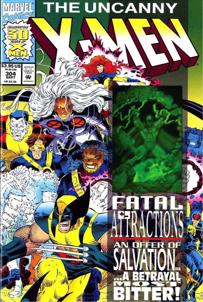
The cover.
Early story
The story begins with division among the Acolytes who learned that their lord Magneto actually survived (note: refer to 1991’s X-Men #3 by Chris Claremont and Jim Lee). They ganged up against their leader Fabian Cortez for betraying Magneto. After pushing his now rebellious team members away, Cortez reminds them that for several months already, they have been continuing Magneto’s work on behalf of mutantkind. Suddenly Exodus appears to them and describes himself as the voice of Magneto and will guide mutants to rise and mentions paradise for the faithful mutants. After subduing Cortez and tempering the tension among the Acolytes, Exodus tells them to prepare themselves for ascension. This frustrates Cortez who realizes that he no longer holds leadership.
Over at the X-Men’s headquarters, Charlez Xavier is personally disturbed over the death of Illyana Rasputin, the sister of Colossus. He starts questioning himself as Illyana’s death under his watch makes his years-long mission (of convincing his fellow mutants to leave their old lives to take risks to fight for a world that fears and hates them) doubtful and tries to figure out how he could present himself in front of them. A holographic image of Lilandra appears to him.
In outer space, inside the space station called Avalon, Magneto stares at planet Earth. With nobody around him, he speaks apologizing to his followers for he cannot save them all. He also mentions that he was wrong in previously believing that he could rescue each and every one of them from humanity as he recently realized that Earth, for the moment, is doomed.
After walking an unspecified distance inside Avalon, Magneto picks up his old helmet and wears it…
Quality
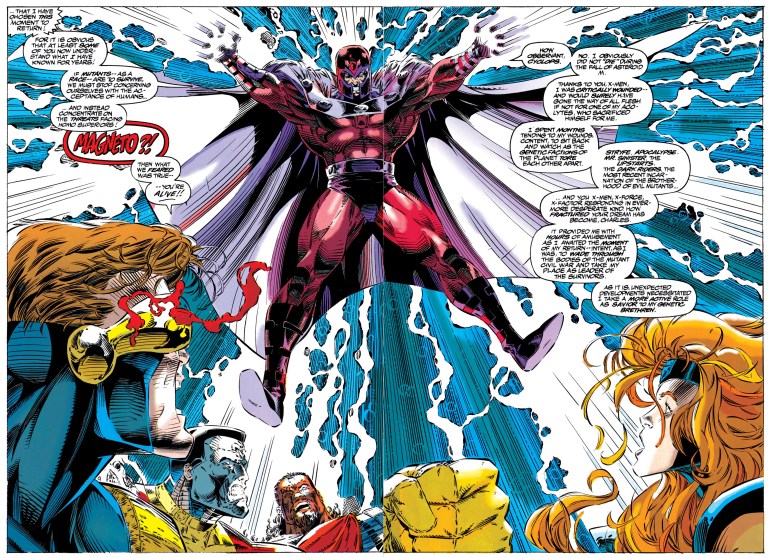
This 2-page art by Brandon Peterson is easily the best looking part of the comic book.
I will start with the visual aspect of this comic book. The artistic quality ranges from fine to weird which should not be surprising since this one involved five artists. The 4 pages drawn by Brandon Peterson (who was once a regular artist on Uncanny X-Men) made the X-Men, Magneto and the Acolytes look not only good but also intense. The Peterson art here is artistically similar to the respective styles of Marc Silvestri and Jim Lee of that particular time. Jae Lee’s art on the flashback of Magneto’s life (during the time of the Nazi occupation in Europe) is undoubtedly very stylized. While his art brings out the intensity of Magneto’s painful past, certain images can be a little challenging to understand especially to readers who focus strongly only following the plot and details. John Romita, Jr.’s art, for me personally, often looks rough and there were times I hardly recognized the characters. The other artworks by Paul Smith and Chris Sprouse have cartoonish aesthetics.
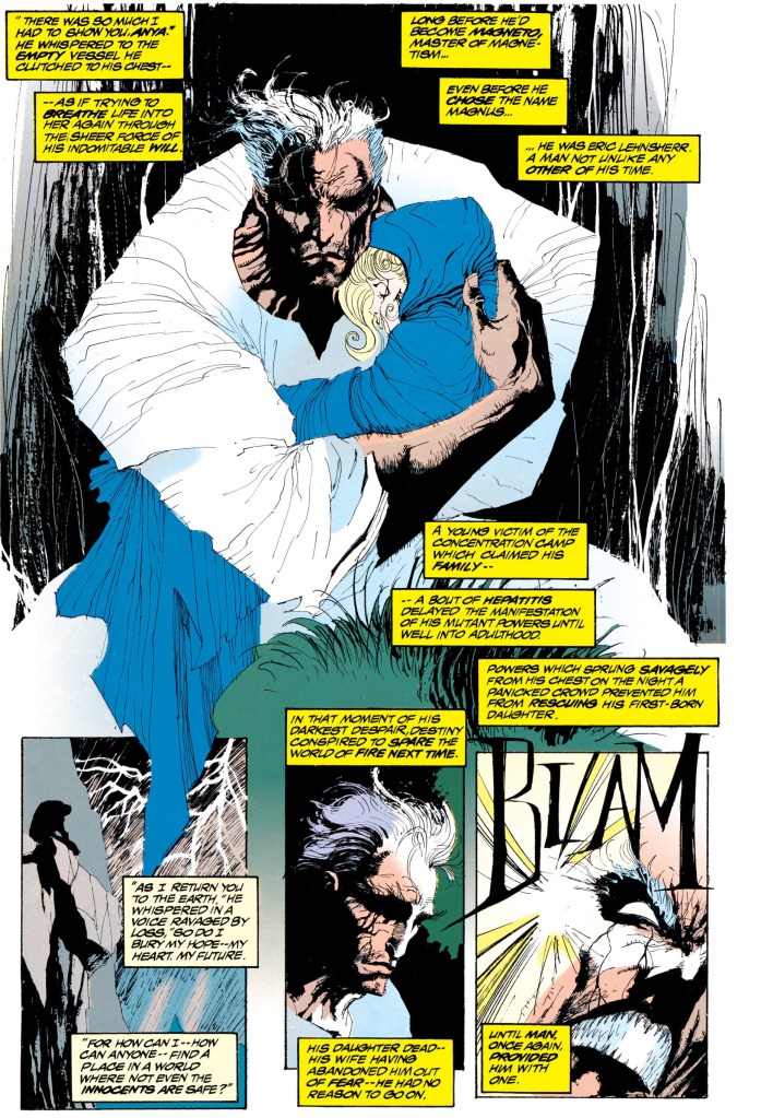
This is Jae Lee’s artistic contribution to the comic book. I found it weird that Magneto’s hair was shown as white during his past with the Nazis.
As for the plot, I can clearly see that a hard effort was made to compose a story that would push the Fatal Attractions storyline forward, establish a turning point and still become worthy of celebrating the 30th anniversary of the X-Men franchise. I can say that the storytelling is somewhat bloated. Early in the story, it was made clear that the respective sections showing Exodus with the Acolytes, Charles Xavier and Magneto pointed to an eventual confrontation that happened during the funeral of Illyana Rasputin.
As the build-up continued with the flashback of Magneto’s life, the fan service short scene of Kitty Pryde and the unfeeling Colossus (note: their romance was highlighted in Uncanny X-Men many years prior), and the talk scene between Bishop and Banshee, the pace of the story slowed down dramatically. By the time the attempt to move the narrative back to the core plot was made with the funeral scene (composed of the X-Men, X-Force and X-Factor), the pace was still really way down. By the time the conflict with Magneto, Exodus and the Acolytes stated, the pace recovery was incomplete and as such, seeing the scene unfold was very jarring (and not even the pages of Colossus’ frustration towards Professor X could solve the narrative pacing problem).
Unsurprisingly, the conflict was written to be overly dramatic complete with lengthy pieces of dialogue here and there. That being said, references to past comic books were established as Magneto once again emphasizes his beliefs about the human-mutant conflict using violence (while also side-stepping Jean Grey’s psionic powers to allow the Acolytes to come in undetected).
Human-mutant conflict aside, themes about faith, religion, idolatry salvation are clearly used. Magneto, who has a tremendous record of villainy and his previous leadership of the X-Men proved useless, was portrayed to be a walking wicked idol whose followers cannot do anything except idolize him and cause violence out of dedication to him. They really could not realize that idolatry is foolish and unholy which further adds to chaos on the world. As Magneto deceived himself to be the savior and lord of mutants, he further causes more pain and destruction to others around him. In short, Magneto will always be stuck with his wicked nature and clearly does not deserve heavenly authority no matter how hard he believes himself to be a savior.
The classic rivalry between Xavier and Magneto here was portrayed dramatically and yet I cannot help but think that their conflict was nothing more than a repeat of past encounters with the state and future of mutants at stake. To be fair, what happened here served as a logical build-up for the shocking encounter between Professor X and Magneto in X-Men #25.
Conclusion
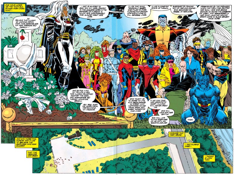
Nobody among the X-Men (except Charles Xavier), X-Force, Excalibur and X-Factor cared to dress properly for the funeral.
To be clear, even though I am an avid X-Men fan, I find Uncanny X-Men #304 (1993) hard to be engaged with and hard to enjoy. Efforts to make it a worthy celebration of the X-Men are very clear but it’s just not entertaining nor compelling to read. As for the X-Men traitor scene, the revelation was not that shocking as the foreshadowing made it too obvious. At best, this comic book served as a warm-up for X-Men #25 which itself paid-off nicely. Being more than sixty pages long (including the advertisement and bulletins), this comic book has too much creative baggage which ultimately hampered its storytelling. It’s not terrible. It’s really not that great to read. What I experienced way back in 1993 with this comic book is just the same as I re-read it. It has not aged well.
If you are seriously planning to buy an existing hard copy of Uncanny X-Men #304 (1993), be aware that as of this writing, MileHighComics.com shows that the near-mint copy of the regular edition costs $20, while the near-mint copies of the signed-and-numbered edition and the newsstand edition cost $120 and $60 respectively.
Overall, Uncanny X-Men #304 (1993) is satisfactory.
+++++
Thank you for reading. If you find this article engaging, please click the like button below and also please consider sharing this article to others. If you are looking for a copywriter to create content for your special project or business, check out my services and my portfolio. Feel free to contact me as well. Also please feel free to visit my Facebook page Author Carlo Carrasco and follow me at HavenorFantasy@twitter.com