A Look Back At The H.A.R.D. Corps #1

The 1990s was a decade of excess when it comes to superhero comic books. Apart from the persistent hoarding of comic books and the quest for profit, there were also these wide superhero franchises (or superhero universes) that popped up and even challenged Marvel Comics and DC Comics. Malibu Comics launched the Ultraverse while Valiant Comics came up with its own universe.

Valiant established itself nicely with popular characters like Bloodshot, X-O Manowar, Turok and Ninjak, and each one had its own regular series of comic books published. When it comes to teams, there was H.A.R.D. Corps (H.A.R.D. stood for Harbinger Active Resistance Division).

During the recent Hobby Con held at Las Piñas City, I luckily found myself a copy of The H.A.R.D. Corps #1 and read it for the first time ever. This is my review of the comic book which has a cover drawn by the great Jim Lee.

RCO002_1472443923.jpg
Cover with art by Jim Lee.

Early story

The story begins with the 5-member team in the middle of a mission inside the secured facility of the Harbinger Foundation. Under fire from the facility’s armed personnel, the team (riding a floating vehicle) struggle to find their way and evacuate. Along the way, an oversized man called Big Boy grabbed one of their members and separated him from the others. With the situation getting worse, the captured member got “brain popped” (a remote form of self-destruction via the neural flash implanted inside the person’s brain). The remaining four manage to get away by means of aerial transport provided by their company.

Then a section of the facility exploded causing financial damage to Mr. Harada who decided to visit and inspect the site.

RCO017_1472443923~2.jpg
Expository information done cleverly.

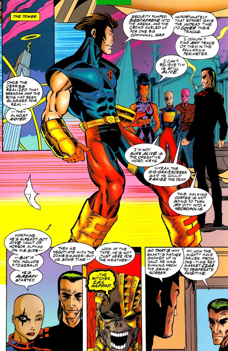
Some time later, the H.A.R.D. Corps enjoy the privacy and security at their headquarters in the Nevada desert. Team members Shakespeare, Major Palmer, Softcore, Hammerhead and Superstar wait for instructions at the debriefing room.

Quality

The H.A.R.D. Corps #1 is very well written by David Michelinie. Within twenty-two pages, Michelinie loaded enough details to explain the comic book’s core concept efficiently while at the same time he managed to tell an engaging story with a light touch on character development (note: there were many characters and there was not enough space for further personality emphasis). By the time the story ended, I really felt enlightened, entertained and wanting to find out what would happen next.

Michelinie’s handling of expository dialogue was done very efficiently. I’m talking about the private briefing done by an executive of the Cartel explaining to a recovering man named Kim (who was almost killed during the Los Angeles Riot) what H.A.R.D. Corps is, why the Cartel is in a race against Harada who has been manipulating Harbingers (persons with unique abilities). The Cartel opposes Harada with neural implants.

More on the team, H.A.R.D. Corps members are people who have gone through training programs and each of them had neural implants in their heads which enable them to mimic Harbinger powers (one at a time) through signals broadcast from a base station. Each of them was comatose and the use of the implants reversed the coma.

RCO007_1472443923~2.jpg
Some action for you.

When it comes to visuals, the art by David Lapham (inked by Bob Layton) was pretty good. I like the high amount of detail placed on the surroundings in most of the panels. Action shots had a good amount of impact.

Conclusion

This comic book from late 1992 is a good and engaging read. I really enjoyed it and I like its core concept about a team of enhanced individuals who are technically living properties of very business-minded people opposed to Harada. Even by today’s standards, H.A.R.D. Corps concept really stands out among all superhero team comic books.

The H.A.R.D. Corps #1 is recommended and you can acquire a near-mint copy of it for only $4 at MileHighComics.com (as of this writing).

A Look Back At The Terminator #1 (1990)

Way back in 1984, a low-budget movie titled The Terminator became a hit with moviegoers which greatly helped the careers of Arnold Schwarzenegger, Linda Hamilton and writer-director James Cameron. Terminator 2: Judgment Day became a massive hit worldwide in 1991 establishing the Terminator franchise as an important one leading to more movies (released in 2003, 2009 and 2015), video games and even a TV series. Oh yes, the upcoming film Terminator: Dark Fate will be released very soon and it now involves James Cameron.

Way back in 1990, a follow-up to the 1984 classic was released that did NOT involve Schwarzenegger, Cameron and Hamilton at all. The follow-up was a 4-issue mini-series titled The Terminator and was published by Dark Horse Comics which back then was licensed to do comic books of the Terminator franchise.

This is my review of The Terminator #1, written by John Arcudi and drawn by Chris Warner with ink work by Paul Guinan.

2019-09-30_082047~2.jpg

Early story

The comic book opens in the year 2029. In the ruins of Los Angeles, a band armed humans struggle against the machines of Skynet during the night. They infiltrate a facility to find one of Skynet’s time displacement chambers which they learned previously from their leader John Connor. Thanks to Connor’s intervention, Skynet’s attempt to change history failed but the big catch is that only a prototype of the time displacement chamber was discovered. The final model of the chamber remains.

2019-09-30_082201~2.jpg

As the armed guys make their way through, a Terminator watches them secretly….

Quality

When it comes to the writing, I can clearly see that John Arcudi (best known for The Mask) exerted effort to make this comic book relevant to the 1984 movie using key details such as the humans operating on the field only at night time (because Skynet will easily detect them during the day). Arcudi, however, expanded a bit on the franchise’s cinematic elements by emphasizing the use specific machines (steel-and-chrome wombs or tissue-generating chambers) to cover Terminator units with flesh and blood, and most notably, the use electronic communication between Terminator units which resemble telepathy among humans.

Cyberdyne, the fictional corporation heavily emphasized in Terminator 2, made an appearance in this comic book. With regards to Skynet, Arcudi emphasized that the living network was a lot more resourceful than what the movies suggested. The comic book has a nice build-up and along the way, the use of expository dialogue was pretty efficient and they are quite helpful for readers to grasp the story and key details.

With regards to the art work, Warner’s art style has that somewhat cartoony aesthetic on not just the humans but even on the machines. There were several Terminator units displayed without the flesh and from the way they were drawn, I could not even tell if those units were the T-800 type. Warner’s drawings on the physical environments carry a good amount of detail.

2019-09-30_082306~2.jpg
Terminator stealthy approach captured nicely.

While Warner’s drawing has a cartoony aesthetic, the illustrated action is pretty violent and has quite an impact in some shots. There are some bloody images and implied nude shots as well.

Conclusion

What can I say? I bought The Terminator #1 at the Hobby Con this past weekend out of pure curiosity. After reading it thrice, I should say that I found this comic book proving to be better than what I expected. It is a surprisingly good read and the fact that this was published roughly a year BEFORE the release of Terminator 2: Judgment Day, I found this to be a worthy follow-up to the 1984 movie. In fact, it’s so good a follow-up I’d rather read it than waste my time watching Terminator 3: Rise of the Machines, Terminator Salvation and the very awful Terminator: Genisys.

As such, I declare that The Terminator #1 is recommended.


Thank you for reading. If you find this article engaging, please click the like button below and also please consider sharing this article to others. Also my fantasy book The World of Havenor is still available in paperback and e-book format. If you are looking for a copywriter to create content for your special project or business, check out my services and my portfolio. Feel free to contact me as well. Also please feel free to visit my Facebook page Author Carlo Carrasco and follow me at HavenorFantasy@twitter.com

A Look Back At Batman vs. The Incredible Hulk

Disclaimer: This is my original work with details sourced from reading the comic book and doing personal research. Anyone who wants to use this article, in part or in whole, needs to secure first my permission and agree to cite me as the source and author. Let it be known that any unauthorized use of this article will constrain the author to pursue the remedies under R.A. No. 8293, the Revised Penal Code, and/or all applicable legal actions under the laws of the Philippines.

I love reading a crossover comic book that was made by very talented creators to be a whole lot of fun from start to finish. Back in the early 1980s, rivals Marvel Comics and DC Comics collaborated temporarily with inter-company crossover comic books that were made to be entertaining to fans of their respective properties.

What I’m going to review here is the 3rd superhero crossover comic book between Marvel and DC titled Batman vs. The Incredible Hulk.

Cover
The cover.

Background

Before I start, let me clarify that this particular comic book was specifically published as issue number 27 of the DC Special Series which was a series of one-shot comic books. By comparison, the 1981 crossover comic book Superman and Spider-Man (which I reviewed previously) was published under the Marvel Treasury Edition line of Marvel Comics as issue number 28.

Going back to Batman vs. The Incredible Hulk, the comic book was the final issue of the DC Special Series line and it carried a cover price of $2.50 which was quite high for its time.

The people at DC Comics made sure that the crossover was handled by the best talents they had back then. The late Len Wein (best know for creating Wolverine) was assigned to write the script (and ensure that elements from both the Hulk and Batman would mix nicely) while José Luis García-López was hired to illustrate. Dick Giordano was the embellisher and editor while Allen Milgrom and then Marvel editor-in-chief Jim Shooter were the consulting editors. In return for their assistance, Marv Wolfman and Mike DeCarlo were acknowledged with thanks.

Now we can begin with this retro review of Batman vs. The Incredible Hulk.

The early story

The story begins when a few persons in Gotham City witness their dreams turning real beyond logic. A man dreamed he was in the arctic hunting and wakes up to discover his room was filled with snow. In a cinema where a horror movie was shown, a couple kissing each other discover, to their shock, that monsters of different sizes surrounded them out of thin air.

At the waterfront of the city, the Joker (accompanied by his gang members) talks to an unseen being (Shaper of Worlds). He gives his assurance to the being that he and his gang will acquire a specific item (needed by the being). For the Joker, what was discussed was a simple business arrangement.

A short time later inside a high-tech facility of Wayne Research, Bruce Banner (the Hulk) secretly works under the false identity as David Banks. He works along with the scientists but not on the scientific projects. Rather, he works odd tasks such as lifting hardware and putting them into places that need them. Of course, Banner did not get hired for a salary but for something much essential to him and his condition with Gamma Rays.

“I had to get a job here somehow so I could get close to the experimental Gamma-gun they’re working on,” he thought to himself.

Suddenly the facility gets filled with laughing gas incapacitating all the people inside. Banner fortunately manages to wear a radiation suit for protection. Moments later, the Joker and his gang enter searching for the Gamma-gun. From this point on, Banner decides to act.

Quality

When it comes to the selection of characters from Marvel and DC, having the mismatch of Batman and the Hulk was a very splendid idea. Not only was having the large green brute and the world’s greatest detective together as temporary rivals a fascinating concept, having them work together as a duo turned out to be a really great move. When it comes to the selected villains of the Joker and the Shaper of Worlds as the anti-hero figures of the story, the two looked like an odd pair but if you focus on the details of the story, you will realize that it made a lot of sense having them two together. The Shaper needs something which requires him to depend on the Joker who in turn brings his gang with him to cause chaos to acquire what the alien needs

All of the above details would not have worked had it not been for the excellent writing by Len Wein. Clearly Wein knew a whole lot about the defining elements of the Hulk and Batman (and the same with the Joker and Shaper), and he carefully blended those elements together to make a story that is thrilling, intriguing, engaging and at the same time still made sense. More on crossing over, there are other characters connected to Batman and the Hulk that made appearances and a few of them fit in nicely into the story.

As this was released in 1981, it was typical of the time for writers to use thought balloons to help readers understand what the characters were thinking. The use of thought balloons in this comic book truly defined Batman who not only had to fight the bad guys but also manage his way with the Hulk and do a lot of detective work.

Going back to the Hulk and Batman, this comic book has a lot of fun stuff. More than once did the two superheroes engage in action-packed encounters and their exchange of words was very nicely done. Their match-up (or mismatch) really works.

Prev1
A perfectly crafted action scene between the Hulk and Batman, complete with accurate depictions of each character! 

When it comes to the common complaint by some readers out there that the comic book was more of a Batman story and made the Hulk less prominent, I should say that the slight imbalance is not a problem at all. In fact, for me it makes perfect sense that Batman has more spotlight than the Hulk. Why? Because Batman is a detective and he performed a lot of researching, information gathering and other moves to solve problems. His detective work in the story made perfect sense for the narrative. As for the Hulk, his character really has very limited options other than causing destruction and disturbing the public. Since early on, the Hulk was best known for attracting the attention of the American military (led by General Ross) and huge destruction defined the encounters. For this crossover, the creators did not show the Hulk engaging with the military (save for the phonies) but rather he struggled to figure things out whenever he encountered Batman or the Joker. There is no way the Hulk could do detective work like Batman and having him fight the military would have weakened this comic book’s presentation. Clearly, having the story slightly slanted towards Batman is still the right move.

Prev2
Very highly imaginative and dynamic artwork by José Luis García-López.

The artwork done by José Luis García-López is excellent! He really captured the looks and details of each and every character Marvel and DC that appeared in this comic book. Back in the early 1980s, I got to read several comic books that showed Batman, the Hulk, the Joker and others and the way they appeared in this comic book was indeed accurate of the time. José Luis García-López also knew how to balance spectacle with character development and expository dialogue in terms of visual pacing and framing shots. Also his work becomes even more imaginative during the final conflict. Undoubtedly this is still a great looking comic book!

Conclusion

Overall, Batman vs. The Incredible Hulk is a great comic book and easily it is one of the greatest intercompany superhero crossover comic books ever published! From start to finish, this comic book proved to be highly engaging and there never was a single boring moment. The creators led by Len Wein (he is sorely missed) made the best possible story anyone can make involving Batman and the Hulk.

You can read a hard copy of this comic book by getting Volume 1 of Crossover Classics or, if you can afford to, hunt for a copy of this in its DC Special Series form which now sells for $280 for a very fine copy to as much as $400 for a near mint copy as of this writing according to MileHighComics.com

In ending this, I declare that Batman vs. The Incredible Hulk is highly recommended!


Thank you for reading. If you find this article engaging, please click the like button below and also please consider sharing this article to others. Also my fantasy book The World of Havenor is still available in paperback and e-book format. If you are looking for a copywriter to create content for your special project or business, check out my services and my portfolio. Feel free to contact me as well. Also please feel free to visit my Facebook page Author Carlo Carrasco and follow me at HavenorFantasy@twitter.com


A Look Back At Superman and Spider-Man

Disclaimer: This is my original work with details sourced from reading the comic book and doing personal research. Anyone who wants to use this article, in part or in whole, needs to secure first my permission and agree to cite me as the source and author. Let it be known that any unauthorized use of this article will constrain the author to pursue the remedies under R.A. No. 8293, the Revised Penal Code, and/or all applicable legal actions under the laws of the Philippines.

I miss the old times when big rivals Marvel and DC Comics would set aside competition temporarily to team up and rely on their respective comic creators to make superhero crossover comic books that the fans can enjoy.

Back in the 1970s, key developments related to the comic book adaptation of The Wizard of Oz brought the two rivals together as partners. In 1976, Marvel and DC’s first superhero crossover Superman vs. The Amazing Spider-Man got published and to this day many comic book collectors and geeks I encountered still enjoy it. A few of them even called it a classic.

The collaboration between Marvel and DC continued in 1981 with Superman and Spider-Man which was published as issue number 28 of the Marvel Treasury Edition series.

1
The cover.

This is my look back at Superman and Spider-Man.

The comic book

Scripted by then Marvel Comic editor-in-chief Jim Shooter (with Marv Wolfman mentioned for plot suggestions) with art drawn by John Buscema and inkwork done by Terry Austin, Al Milgrom, Steva Leialoha, Walt Simonson, Bob Layton, Joe Rubinstein and Bob Wiacek, the comic book begins when Spider-Man swings into a construction site where he encounters several armed men and stops them singlehandedly.

Even though he stopped the bad guys, Spider-Man’s spider sense bothers him making him speculate that, because there’s no clear danger around him, the construction site seemed to be a threat.

After Spider-Man swings away from the police who just arrived, classic Marvel supervillain Doctor Doom watches via surveillance video and he was bother by the way things turned out.

“I did not like the way Spider-Man paused and look around after subduing the thieves – – as if he sensed something unusual about the excavation! Those accursed spider instincts of his,” Doom said before proceeding with his master plan.

A day later, the Hulk arrives in Metropolis causing lots of damage. Separately Superman and Spider-Man arrive to contain the green guy. However, things are not what they seem. This is where the story description ends.

Quality

What this comic book lacked compared to the 1976 Superman-Spider-Man crossover is visual impact. Clearly John Buscema had to follow closely the script which called for multiple panels per page and that left him little room to draw scenes dynamically. That’s not to see the art is weak. In fact, Buscema’s art is pretty good and he has deep knowledge about how the characters (including those many supporting characters and other minor characters from both Marvel and DC Comics) really looked from the size of Hulk’s body, the details on Wonder Woman’s costume, the distinctive look of J. Jonah Jameson, Perry White, etc. In short, I recognized the characters very easily.

15
This remains fun to read.
24
Peter Parker in Metropolis along with the Superman supporting characters. This is one great element that made this comic book worth reading.

While the high number of panels per page limited him, Buscema managed to come up with some action shots that packed some impact.

When it comes to writing and storytelling, this comic book exceeds that of the 1976 Superman-Spider-Man crossover big time! To start with, the plot is much more elaborate, more detailed and yet consistently remained easy to follow.

While the 1976 crossover had the most popular villains of Superman and Spider-Man as the representation of evil, this one instead had Dr. Doom and Parasite. The great news is that these two super villains complement each other nicely and that itself adds good depth into the plot. Dr. Doom is a major schemer and Parasite fitted nicely within his master plan for global chaos.

Regarding dialogue, the script had a lot of strength and was also specific in capturing the personalities of the superheroes, the super villains and the supporting cast. I can easily identify J. Jonah Jameson, Perry White, Lois Lane and others through the dialogue.

Not to be outdone is the deeper approach to the crossover aspect of the story. Right from the start, the comic book creators expected us readers to suspend disbelief and start believing that while the story is non-canon, the respective universes of Marvel and DC Comics co-existed. Because there were TV shows of Wonder Woman and the Hulk playing, the two characters were included in the comic book adding depth to the crossover.

Speaking of crossovers, this comic book was not limited to Superman and Spider-Man. The encounter between the Hulk and Superman was a short but sweet spectacle to read. The encounter between Wonder Woman and Spider-Man meanwhile was short yet fun.

Adding more to the fun in this comic book was how Clark Kent interacted with the Spider-Man supporting characters while Peter Parker interacted with the Superman supporting characters. I enjoyed every moment of these scenes.

As far as narrative is concerned, this comic book is slightly slanted towards Superman. One factor behind this was the implementation of how local authorities interact with Superman and Spider-Man. Whenever he solves crime, Superman is highly respected by the public and the police. This is not the case with Spider-Man who is often perceived to be a social menace even though he helps solve crimes. Another factor was that Superman did more detective-type work (including a visit to Latveria) while Spidey hardly contributed anything to the plot’s development.

38
Nothing can be more frustrating than getting attacked by police officers when you try to help them solve their problems.

Regardless, the two icons got a fair share of the spotlight during the final stages of the story and there was enough spectacle to enjoy.

If there is any complaint I have, it would be the comic book creators’ reluctance on fully connecting itself to the 1976 crossover. In the scene wherein Peter Parker was guided into the film editing room by Jimmy Olsen, he recognized Lois Lane and remembered meeting her in the 1976 crossover (which ended with socializing). And yet when Spider-Man and Superman get together in this comic book, there was a noticeable lack of friendliness and personal cooperation between them even though they bonded nicely in the 1976 story.

Conclusion

Overall, Superman and Spider-Man is indeed a highly engaging, fun-filled superhero crossover comic book. For me, it is a true literary classic and definitely worth searching for out there. I read this crossover many times from start to finish and even though I knew the plot and the dialogue, I still had a lot of fun reading along the way. With the combined talents of Shooter, Buscema and many others, this superhero crossover was indeed one of the very best stories ever told by Marvel and DC Comics.

Given the current corporate climate Marvel and DC Comics are now in, it is very unlikely we will see another creatively fun superhero crossover collaboration between them happening soon. For the newcomers reading this, Marvel is owned by the Walt Disney Company while DC Comics is owned by Warner Bros.

Whether you search for the original comic book or its inclusion in a volume of The Marvel/DC Collection: Crossover Classics Volume 1, Superman and Spider-Man is highly recommended!


Thank you for reading. If you find this article engaging, please click the like button below and also please consider sharing this article to others. Also my fantasy book The World of Havenor is still available in paperback and e-book format. If you are looking for a copywriter to create content for your special project or business, check out my services and my portfolio. Feel free to contact me as well. Also please feel free to visit my Facebook page Author Carlo Carrasco and follow me at HavenorFantasy@twitter.com


A Look Back At Uncanny X-Men #289

Released in 1992 by Marvel Comics, Uncanny X-Men #289 was written by Scott Lobdell and drawn by Whilce Portacio (with ink work by Scott Williams). Its concept focused on the Gold Team of the X-Men (composed of Jean Grey, Storm, Colossus, Ice Man and Archangel) dealing with Bishop who at the time was still a newcomer.

2019-07-11_095911~2.jpg
Cover of the comic book.

It begins when Bishop looks at a framed picture of the original X-Men followed by Storm telling him every student who graduated to the role of an X-Man remains dedicated to the ideal of peaceful coexistence between mutants and humans.

As the Gold Team X-Men enjoy their peaceful time at the mansion of Xavier, elsewhere someone spies on William and Maddy Drake who talk about Bobby (Iceman). Back at the mansion, Archangel encounters a spitting image of his younger self (as Angel and with normal skin color) which raises tension attracting the attention of Storm, Bishop and Forge.

2019-07-11_100038~2.jpg
A touching scene between Jean Grey and Charles Xavier.

To describe Uncanny X-Men #289 clearly, the comic book is more focused on character development as it lacks a strong conflict between good and evil. Anyone craving for superhero action will most likely feel unsatisfied here. However, if you want to know the X-Men more passionately and watch the romance between Storm and Forge develop, then this comic book will be engaging.

Scott Lobdell did a good job developing the characters through drama and Whilce Portacio’s art really brought the script to life. I enjoyed reading the interaction between Jean Grey and Charles Xavier who realizes that as he led the X-Men, he took a bit of something from their respective lives.

2019-07-11_100213~2.jpg
Nice layout and style by Whilce Portacio on the team.

Take note of the following exchange of dialogue.

Charles Xavier: Jean, did you ever hate me for having taken away your childhood?

Jean Grey: Professor, please. What child is given the opportunity to fly to the stars? How many children battle alongside Asgardian thunder gods or super soldiers? You gave me…all of us…more than you took away.

That was really nice writing there by Lobdell. There was drama and harmony between the two characters.

Overall, Uncanny X-Men #289 is recommended. Think of it as a comic book that will help you – the reader – get to know the characters more closely.


Thank you for reading. If you find this article engaging, please click the like button below and also please consider sharing this article to others. Also my fantasy book The World of Havenor is still available in paperback and e-book format. If you are looking for a copywriter to create content for your special project or business, check out my services and my portfolio. Feel free to contact me as well. Also please feel free to visit my Facebook page Author Carlo Carrasco and follow me at HavenorFantasy@twitter.com

A Look Back At The Strangers #1

Disclaimer: This is my original work with details sourced from reading the comic book and doing personal research. Anyone who wants to use this article, in part or in whole, needs to secure first my permission and agree to cite me as the source and author. Let it be known that any unauthorized use of this article will constrain the author to pursue the remedies under R.A. No. 8293, the Revised Penal Code, and/or all applicable legal actions under the laws of the Philippines.

When it comes to the Ultraverse, there is often something enjoyable to read. I enjoy reading about superhero teams, specifically X-Men from Marvel Comics and Justice League from DC Comics to name a few. I also enjoyed Freex and UltraForce from the Ultraverse. What I like about superhero teams is that I get to discover varied characters (the good, the evil and the ones in between), witness how they develop and act when something big or problematic happens.

With The Strangers #1, published by Malibu Comics in 1993 as one of the launch books of the Ultraverse, I experienced another bout of enjoyment and engagement but in a rather unique way.

FB_IMG_1564977426941.jpg
Cover of The Strangers #1 with art by Rick Hoberg.

Written by Steven Englehart with illustration done by Rick Hoberg (whose work was inked by Tom Burgard), the story begins with a shot of life going on in San Francisco. Several characters riding a jammed cable car get distracted when a man and a pretty lady (both seated) do the “wild thang”.

Because of the disturbance, three guys grab the arrogant guy (separating him from the lady) threw him out of the cable car. Immediately after that, the cable car suddenly gets hit by a bolt of energy (perceived as lightning) from the clear sky causing the vehicle to start slipping downwards until it hits a car and its passenger.

FB_IMG_1564977649575.jpg
Bob and Hugh start to notice something strange.

Then a series of things begin to happen. Candy (the lady earlier) acted strangely as the arrogant guy called her attention. Art students Bob and Hugh witnessed the sudden formation of a bag of apples. The kid Leon discovers his new ability to run fast and make sudden turns. Dave witnesses a momentary transformation of himself. Fashion designer Elena gets inspired to create something heroic.

RCO013_1469678179.jpg
Leon’s ultra speed realized while Candy walks pretty.

You must be wondering – how is the quality of this old comic book?

In terms of storytelling and characterization, this is pretty good work done by Steve Englehart. The way I see it, this is a story about strangers (truly living up to the title) who got changed as a result of a single incident that affected them. Each of the members of The Strangers were nicely and efficiently introduced. A creative approach was used to present their respective abilities which made sense as the events unfolded. By the end of the comic book, I really felt very engaged and excited to anticipate the next issue.

When it comes to dialogue, I like this exchange between Bob and Hugh.

“You know what I think?”

“No, what do you think?”

“I think it must have something to do with the lightning that hit us!”

“Nonsense! Lightning does not work like that!”

“You got a better idea?”

As for the visuals, Rick Hoberg’s art (inked by Burgard) combined with the color design by Paul Mounts is still very wonderful to look at. The facial expressions are convincing, the action has impact, the visualization of the super powers is pretty creative and there are lots of small details on the backgrounds (people, city environment, etc.) that are worth examining.

Overall, The Strangers #1 is a fun and engaging old comic book to read. Never mind the financial value it carries right now. Focus more on its story and art, as well as the other details that reflect the talents of its creators. More importantly, the experiences of discovering something fresh and getting to know brand new characters really defined this comic book.

The Strangers #1 is highly recommended.


Thank you for reading. If you find this article engaging, please click the like button below and also please consider sharing this article to others. Also my fantasy book The World of Havenor is still available in paperback and e-book format. If you are looking for a copywriter to create content for your special project or business, check out my services and my portfolio. Feel free to contact me as well. Also please feel free to visit my Facebook page Author Carlo Carrasco and follow me at HavenorFantasy@twitter.com

Carlo Carrasco’s Comic Book Review: True Believers: Absolute Carnage – Carnage #1

If there is anything I like most about Marvel Comics’ True Believers line of comic books, it’s that I get to read reprints of past stories without having to pay a whole lot of money to buy the original comic books or those pricey paperbacks.

A few years ago, out of curiosity, I bought a copy of True Believers which reprinted the first appearance of Deadpool in New Mutants #98.

This time around I got to check on the first-ever encounter between Spider-Man and the vicious supervillain Carnage with True Believers: Absolute Carnage – Carnage #1 which is currently available for for only $1.

2019-07-20_013045~2.jpg
The cover.
2019-07-20_013250~2.jpg
Hard-hitting action in the first encounter between Spidey and Carnage.

The comic book is a reprint of Amazing Spider-Man #361 which was released in 1992 just months before Marvel’s official celebration of the 30th anniversary of Spider-Man happened.

The story begins when Carnage causes trouble at the Agro-Lab Empire State University. He messes with a man named Chip (who claims to have done nothing wrong), cause property damage using his symbiote and eventually kills. This opening scene clearly shows that Carnage is a more troubling than Venom (who in turn was being turned into an anti-hero figure by Marvel’s creators).

Peter Parker/Spider-Man meanwhile spends quality time at home with his Aunt May. Unsurprisingly, a telephone call interrupts his private life causing him to go to the university to determine, secretly in costume, what happened. Peter personally knows Chip and the guy’s death only adds to his concern about the rise of brutal murders.

“Chip’s dead. And I’m worried that these serial killings may partly be my fault,” Peter told Mary Jane.

Using his access as a freelance photographer, Peter conducts computer research at the office of the Daily Bugle and discovers Cletus Kasady’s prison profile. Knowing that Kasady (Carnage) was a cellmate of Eddie Brock/Venom, he digs deeper and goes around the city to investigate. This sets up his first encounter with Carnage. What exactly happened between them? You just have to read to find out.

2019-07-20_013349~2.jpg
Tension builds up as Peter Parker researches Cletus Kasady.

Even by today’s standards, the story remains gripping, intriguing and entertaining at the same time. David Michelinie really knows how to balance spectacle, exposition and suspense with the Spidey-Carnage conflict as the highlight. Michelinie also showed Kasady’s insanity clearly and, even by his look, the villain is clearly a creative rip-off of DC Comics’ insane villain The Joker. Artist Mark Bagley’s art is still good to look at and he managed to pull off the daunting task of visualizing the present along with drawing images from Spidey’s past with original symbiote and Venom. The action scenes still have good visual impact.

Overall, if you are even a bit interested in Spider-Man, Carnage and 1990s comic book culture, then True Believers: Absolute Carnage – Carnage #1 is recommended. For only $1, this is one engaging and entertaining comic book to read.

Take note that there is a chance that Carnage will become the next popular supervillain in the movies once the character appears fully in the sequel to 2018’s Venom movie. Remember the mid-credits scene in Venom? Carnage could literally rise in pop culture.


Thank you for reading. If you find this article engaging, please click the like button below and also please consider sharing this article to others. Also my fantasy book The World of Havenor is still available in paperback and e-book format. If you are looking for a copywriter to create content for your special project or business, check out my services and my portfolio. Feel free to contact me as well. Also please feel free to visit my Facebook page Author Carlo Carrasco and follow me at HavenorFantasy@twitter.com


A Look Back At Spider-Man 2099 #25

Released in late 1994 by Marvel Comics, Spider-Man 2099 #25 had a double-sized issue with an embossed cover that shined as it was laced with foil. The number 25 on the edge of the cover was stylized to capture people’s attention on the shelves of comic book specialty stores.

20190617_075338.jpg
The cover of Spider-Man 2099 #25.

Back in the 1990s, Marvel had a “tradition” of releasing comic books with gimmick covers with anniversaries in mind. Notably the 25th, the 50th, the 75th and 100th issue and more got released with covers that came with foil or chromium or hologram or simply a hard embossed material. In other times, the anniversaries of the featured superhero/superheroes were celebrated with gimmick covers on comic books marking the celebration.

With regards to Spider-Man 2099 #25, the 2099 universe of Marvel had reached its 2nd year. By that point of time, the Marvel’s 2099 line of comics was already at full publishing blast with several monthly series (Spider-Man 2099, Ravage 2099, Punisher 2099, Doom 2099, X-Men 2099 and Ghost Rider 2099) plus a quarterly comic book (2099 Unlimited).

Written by Peter David and drawn by Rick Leonardi (with ink work by Al Williamson), the comic book begins with a short scene about Miguel O’Hara’s (Spider-Man 2099) mother moving on her way to meet someone. The spotlight then shifts into the heat of the rematch between Spider-Man and the cyborg Venture.

Later Miguel’s mother meets a certain tycoon at his mansion…

20190617_075448.jpg
Spider-Man of 2099 fights with Venture.

When it comes to quantity, this comic book has a Spider-Man story of 22 pages, a Hulk 2099 story with 8 pages (a prequel to Hulk 2099 #1 specifically) and a story called Net Loss with 10 pages. The first time I read this comic book back in 1994, I anticipated more Spider-Man 2099 content but got surprised with the other two being part of it. Marvel decided back then to use Spider-Man #25’s content to expand and emphasize the 2099 universe.

When it comes to quality, I find the Spider-Man 2099 story here a worthy read not simply because Peter David wrote it but because he crafted a story that connects and relates well with what happened in Spider-Man 2099 #1. When I reached the end of the story, I really felt compelled to go back to the very first issue to re-examine what happened.

As this was the 25th issue of the series, Peter David and Rick Leonardi were more proficient as a creative team. The aesthetics of Leonardi’s art (inked by Williamson) is pretty much the same but I noticed that the illustrator added more power on key moments of the action. Ultimately this story is worthy of the 25th issue anniversary treatment.

The Hulk 2099 short story by Gerard Jones and Malcolm Davis meanwhile serves only to build up the mean green monster for its monthly series. Hulk 2099 was never an interesting character to me and this one did not change my view of him.

The final short story Net Loss was rather weird. Even though I read a lot of 2099 comic books, the story by Peter David and Tom Grindberg just did not captivate me.

Overall, I find Spider-Man 2099 #25 a worthy comic book to add to your collection and Spidey’s story alone is worth it.

Spider-Man 2099 #25 is recommended.


Thank you for reading. If you find this article engaging, please click the like button below and also please consider sharing this article to others. Also my fantasy book The World of Havenor is still available in paperback and e-book format. If you are looking for a copywriter to create content for your special project or business, check out my services and my portfolio. Feel free to contact me as well. Also please feel free to visit my Facebook page Author Carlo Carrasco and follow me at HavenorFantasy@twitter.com

A Look Back At Prime #1

As a comic book collector, 1993 was a notable year. That year Marvel organized the 30th anniversary celebration of the Avengers and the X-Men (which I’m a fan of). Image Comics meanwhile released a lot more comics showcasing the works of many creators apart from the publisher’s Seven Founding Fathers. Over at DC Comics, Superman was brought back to life but after they started the Reign of the Superman storyline. Oh yes, there was Valiant which scored hits with Turok #1 and even partnered with some Image Comics creators to produce the Deathmate crossover comic books.

At one corner was Malibu Comics which made a brave entry into the highly competitive superhero genre of comic book publishing in America by launching the Ultraverse, a line of superhero comic books which was the result of brainstorming by several comic book creators (many who previously worked with Marvel and DC Comics).

They launched a lot of comics (all those with #1 on their covers) which made it on the walls and shelves of local comic book stores I visited. Among the many Ultraverse launch comic books displayed was Prime #1 which had a great cover drawn by the late Norm Breyfogle.

CoverPrime
The cover with nice art.

Co-written by Len Strazewski and Gerard Jones with art by Breyfogle, the comic book introduces readers to Prime, an overly muscular, caped man who tries to do something good but is quite flawed with his approach.

The story begins when Prime confronts a junior high school coach named Meyer accusing him of being a pervert. Meyer reacts surprised since he personally does not know Prime (“Who are you? What are you?”). He claims that he does not know what exactly the big guy knows. At the side were two high school girls witnessing the encounter.

And then Prime said his words, “I saw you, coach Meyer! I saw you on the basketball court in fifth period..touching those girls!”

Prime2

Prime3

The coach fought back causing Prime to react. Because the hero was not aware of his strength, he miscalculated with his grip on Meyer breaking his arm unintentionally. Prime’s reaction clearly showed his realizing his mistake.

The incident scared the one of the girls away and carelessly Prime tries to explain himself to the other girl standing by. He even called himself as the girl’s “protector and avenger”, telling her not to be afraid of him.

As it turned out, the incident was a recently past event within the narrative of the comic book which is a nice touch. The coach, already injured, gave his testimony expecting cash from a shadowy organization collecting information not only about Prime but the Ultras (the in-universe term referring to beings with super powers).

That’s as far as I will go with telling the plot details. Prime #1 should be read from start to finish and the good news is that old copies of it can be found online at affordable rates and there are lots of copies in overall good condition.

Other notable elements of Prime #1 worth discussing, without spoiling the plot, is the way the story was structured by Strazewski and Jones. At least for 1993, it somewhat defies the tradition of following the views of the protagonist. Instead, Prime is emphasized through the views of others from the injured coach to the soldiers and the media. This approach does not necessarily make Prime a supporting player in his own comic book but rather it was an efficient way of showing how he thinks and acts, what he is capable of doing and how he reacts to others. By the time the comic book ends (with a very intriguing ending no less), you will get to know Prime a lot.

I also liked the way the writers used corporate media as a key element on exploring the connecting elements of the Ultraverse. Hardcase is shown briefly while a reference was made on Prototype. Check out the page posted below on how corporate media looks at Prime.

Prime4
Corporate media exposure and conspiracy efficiently told in one page.

When it comes to the art, the late Norm Breyfogle (1960-2018) delivered visuals that had that cartoony look and yet the visual expressions are quite mature, even dark and gritty. It is a very nice approach and it is no surprise, looking back, that Breyfogle went on to draw a lot more issues of Prime for Malibu Comics. Breyfogle died on September 24, 2018 due to heart failure in Michigan. Before making his mark on the Ultraverse, the late artist drew a lot of comic books for DC Comics and is known for his contributions on Batman.

More on hero himself, Prime is a flagship character of the Ultraverse and the combined talents of the writers and artist were major factors behind it. On face value, Prime looks like the Ultraverse answer to DC Comics Superman but in reality he has a lot more common with Shazam/Captain Marvel. I can explain why but that means spoiling the plot more here.

Overall, Prime #1 is still a very good old superhero comic book to read. It is fun and intriguing from start to finish. Considering its very good quality and being a nice showcase of the talents of the creators, Prime #1 is one of the best Ultraverse launch comic books. It is too bad, however, that there are no signs from Marvel Entertainment (note: Marvel Comics acquired Malibu Comics in the mid-1990s) whatsoever on the possible revival of the Ultraverse which remains in limbo under them.

Even so, I still say that Prime #1 is highly recommended.


Thank you for reading. If you find this article engaging, please click the like button below and also please consider sharing this article to others. Also my fantasy book The World of Havenor is still available in paperback and e-book format. If you are looking for a copywriter to create content for your special project or business, check out my services and my portfolio. Feel free to contact me as well. Also please feel free to visit my Facebook page Author Carlo Carrasco and follow me at HavenorFantasy@twitter.com
Also if you are interested to join an Ultraverse-related community online, I recommend the Facebook group here.

A Look Back At Prototype #1

There is nothing like witnessing a superhero use technology to fly around with high speed, blast with energy, lift heavy objects using extra strength and use whatever special features to beat the bad guys and save people from harm. I’m not talking about Marvel Comics’ Iron Man here. I’m talking about the Ultraverse parallel to him called Prototype and here is my retrospective review about the 1993 superhero comic book Prototype #1 published by Malibu Comics.
Proto1
Prototype #1 cover.

Co-written by Tom Mason and Len Strazewski with art by David Ammerman and James Pascoe, Prototype #1 is the story of the armored figure called Prototype but there is one huge thing to take note here – the armored figure is actually a high-tech project of a corporation called Ultratech and it involves more than one person piloting it.

To put things in perspective, some time in the past the Prototype armor (which was very large and bulky) was piloted by Bob Campbell until a major incident happened during an aerial exhibition that cost him his right arm. Subsequently he got replaced by a much younger man named Jimmy Ruiz. In the present, Campbell is a PWD (person with disability) who was dismissed by the company which compelled him to sue them for age discrimination.

Then he attends the stockholders’ meeting of Ultratech which was organized to be lavish and showy. It is here where Prototype (piloted by Ruiz) makes an energetic appearance sporting a leaner looking armor that closely resembles a human being.

Ruiz says “Stand back, America…it’s showtime!”

Proto2
The leaner and meaner armor of Prototype.

While showing off, Ruiz encounters some problems. He has not fully gotten used to the technology and his head feels like exploding. During the stockholders’ meeting, Bob Campbell causes some trouble prompting private security to escort him away. It turns out that Ultratech really distanced themselves from him.

Of course, the company is very happy with the Ruiz-piloted Prototype and they are confident their major financial bets will yield great results. Their executive Stanley Leland stated, “He’s not just a showpiece, he’s a corporate asset!”

Proto4
Jimmy Ruiz in the Prototype suit with the Ultratech executives.

As this is a superhero story, life is not normal. As such an incident happens that, predictably, requires Prototype to take action (and entertain readers like you and I).

Technically the story was nicely told and its pacing flowed smoothly. There is a nice balance between spectacle, storytelling and character development. Ultimately by the time I reached the 24th page, I got a grasp of the comic book’s concept, the characters (especially the two pilots) and where the series was going.

Proto3
Action for you. Really nice job done by the artists.

How does this comic book compare with Iron Man? To say the least, the concept of a large corporation owning and controlling a high-tech suit of armor piloted by their employee is not only a nice alternative but a very engaging alternative to the Iron Man concept (super rich industrialist who wears a powered suit of armor and uses his special talent on technology).

The Ultraverse was the most interesting and most entertaining superhero line of comic books I read back in the 1990s and Prototype went on to become one of the major heroes of the franchise. Prototype went on to become part of UltraForce, a superhero team that had its short-lived comic book series (with famous artist George Perez doing the art in some issues) as well as a short-lived animated series based on the said comic book series.

Had the Ultraverse lasted longer, succeeded and profited, chances are Prototype would have been a major contender among all other superheroes from the different publishers  today and there would have been more merchandise and perhaps even video games based on the character.

If you plan to visit a local comic book store to buy old comic books, I highly recommend Prototype #1.


Thank you for reading. If you find this article to be engaging, please click the like button below and also please consider sharing this article to others. Also my fantasy book The World of Havenor is still available in paperback and e-book format. If you are looking for a copywriter to create content for your special project or business, check out my services and my portfolio. Feel free to contact me as well. Also please feel free to visit my Facebook page Author Carlo Carrasco.