Disclaimer: This is my original work with details sourced from reading the comic book and doing personal research. Anyone who wants to use this article, in part or in whole, needs to secure first my permission and agree to cite me as the source and author. Let it be known that any unauthorized use of this article will constrain the author to pursue the remedies under R.A. No. 8293, the Revised Penal Code, and/or all applicable legal actions under the laws of the Philippines.
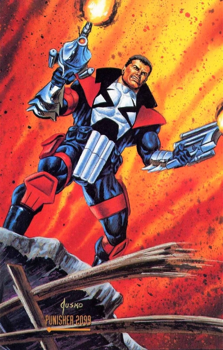
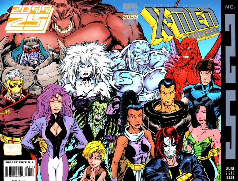
When X-Men 2099 #1 was released in 1993, it was an instant hit with comic book collectors and became one of the top-selling comic books in America during its month of release. That was no surprise not simply because the comic book speculator boom was still in effect back then, but also because the X-Men 2099 monthly series was launched at a time when Marvel Comics spent a lot of money promoting the 30th anniversary celebration of the X-Men franchise and, on the other hand, agreed to expand the Marvel 2099 universe apart from Spider-Man 2099, Ravage 2099, Doom 2099 and Punisher 2099.
And there I was eager to witness how the 2099 universe got expanded through the futuristic X-Men whose adventures took place far away from New York. After reading the first two issues, I was hooked already on X-Men 2099. And then X-Men 2099 #3 appeared at the shelves of the local comic book store with a rather intriguing cover.
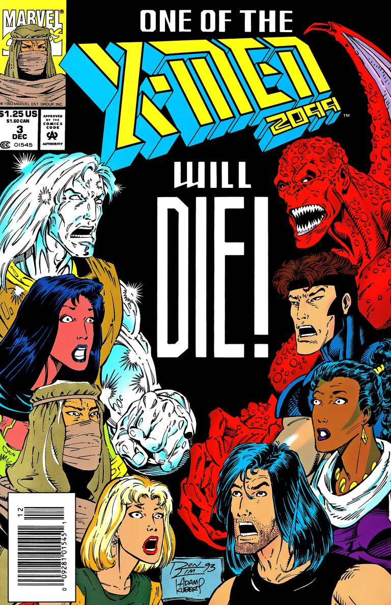
I admit that after seeing that cover, I became more eager to find out if anyone from the futuristic mutants would actually die. By that time, the story that started with issue #1 turned out to be a 3-part story with the objective of establishing X-Men 2099 to readers.
Anyway, let’s start with the retro comic book review of X-Men 2099 #3 published in 1993 by Marvel Comics with a story by John Francis Moore and illustrations by Ron Lim.
Early story
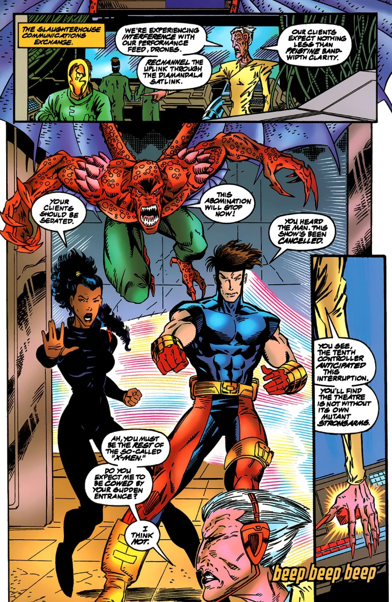
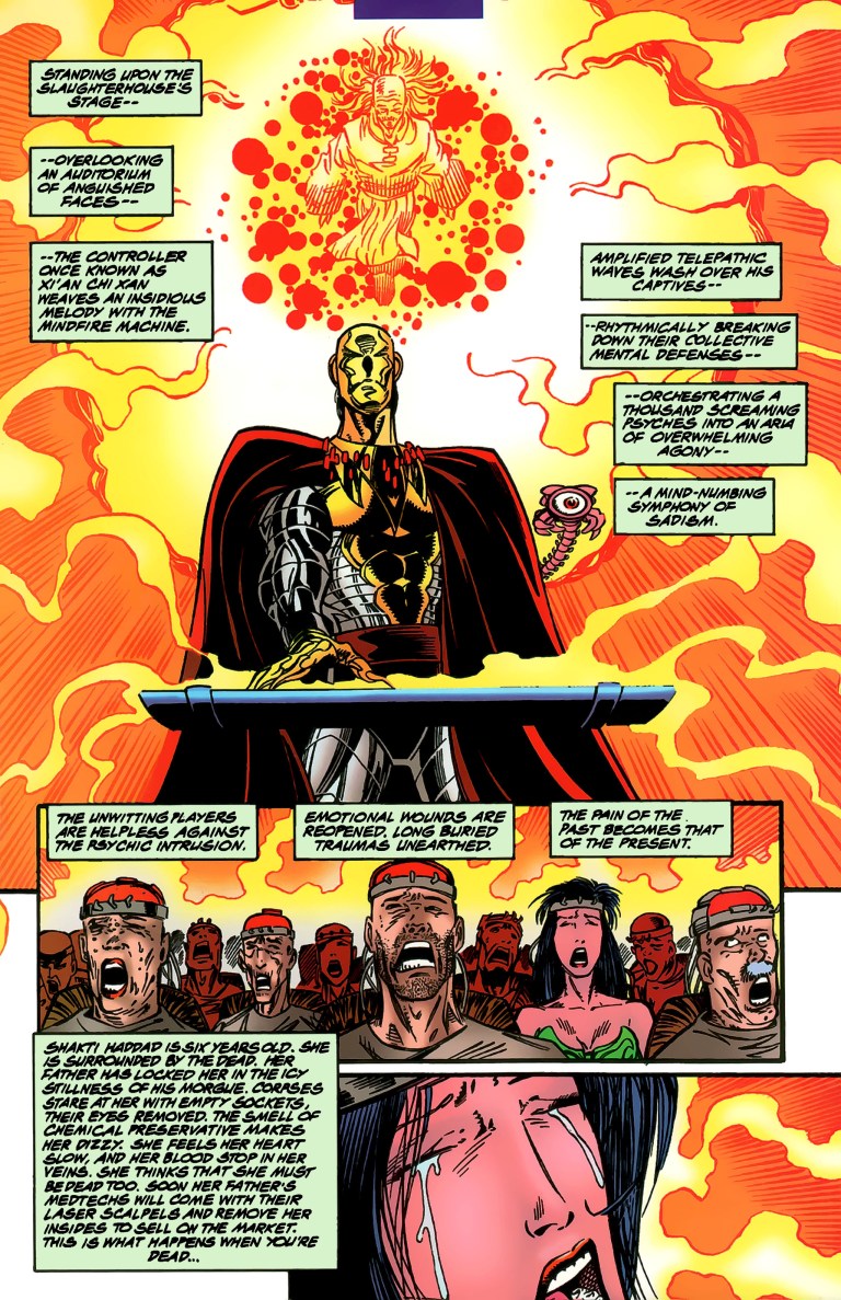
Picking up shortly after the events of issue #2, the comic book begins with Xi’an’s cocooned body being transported back to headquarters by Junkpile (who turned traitor on the X-Men) while captured X-Men team members Meanstreak and Metalhead were placed into liquid-filled chambers. Team member Krystalin managed to elude capture while her teammates Serpentina, Cerebra, Skullfire and Bloodhawk are temporarily free.
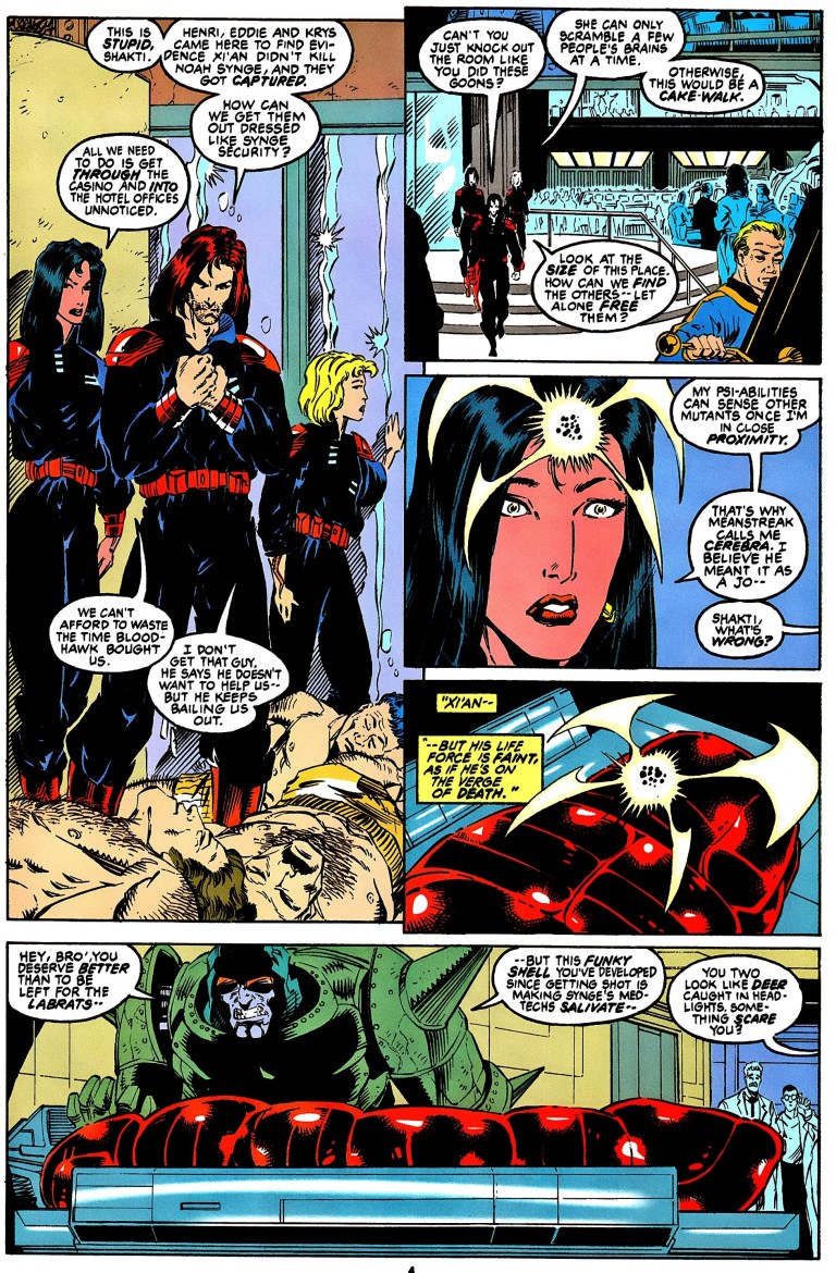
Lytton, who took over the family corporation since the death of his father Noah Synge, is running a brutal operation. His sister Desdemona does not fully trust him. Bloodhawk flies and breaks into a building in Las Vegas causing trouble for the Synge security personnel.
On the side of the chaos, Shakti/Cerebra, Tim/Skullfire and Tina/Serpentina quiet grab uniforms of Synge security personnel to infiltrate the place to rescue Meanstreak, Metalhead and their cocooned leader Xi’an…..
Quality
When it comes to storytelling, the creators delivered a satisfying ending to the 3-story arc complete with actually killing one of the X-Men 2099 members. John Francis Moore was successful in creating a 3-part story that ultimately gave me clear views of the respective personalities of each X-Men member (examples: Tim is the newcomer who is slowly finding his purpose, Shakti is the strong lady with leadership values who supports the leadership of the reformed Xi’an, Bloodhawk is a hard-headed rebel, etc.) while also succeeded in telling a cohesive story that placed the mutants in conflict with the Synge corporate family.
The twist regarding the murder of Noah Synge (the patriarch) was decently pulled off and the executed death of an X-Men 2099 member actually raised the stakes for the team. By the end of issue #3, the purpose of the futuristic X-Men became clear and was different enough from the mainstream X-Men. Unlike Charles Xavier’s mutants, Xi’an’s X-Men have to reclaim their heritage in a totally different America where corporations ruled the cities and outlaws ruled the wasteland and wilderness of the American southwest region. The X-Men of 2099 are nomadic and they don’t have the facilities nor a safe place to live in which Charles Xavier’s X-Men had.

When it comes to art, I noticed that Ron Lim exerted more effort not only with visualizing John Francis Moore’s script but added noticeable visual details on key moments in the comic book. Seeing Tim/Skullfire so enraged followed by a violent impact of action was unforgettable when compared to other highly charged, emotional scenes Lim drew in his other works. Lim also delivered good stuff with the action scenes and further visualized the look of Las Vegas of 2099. His design of Desdemona, however, really looks uninspired and generic.
Conclusion
On its own, X-Men 2099 #3 is a good and fun comic book to read complete with a good amount of characterization. To really know the X-Men on a personal level, you really have to buy issues #1 and #2. On the creative side of things, I like the fact that John Francis Moore kept references to Charles Xavier’s X-Men to a bare minimum which nicely kept a strong focus on the X-Men of 2099 and the world they live in.
For the comic collectors reading this, if you are seriously considering acquiring a hard copy of X-Men 2099 #3, be aware that according to Mile High Comics, a near-mint copy of the regular edition costs $4 while the near-mint copy of the newsstand edition is priced at $8.
Overall, X-Men 2099 #3 is recommended.
Thank you for reading. If you find this article engaging, please click the like button below and also please consider sharing this article to others. If you are looking for a copywriter to create content for your special project or business, check out my services and my portfolio. Feel free to contact me as well. Also please feel free to visit my Facebook page Author Carlo Carrasco and follow me at HavenorFantasy@twitter.com