A Look Back At Spider-Man 2099 Meets Spider-Man

When Marvel Comics launched its 2099 franchise back in 1992 with Spider-Man 2099, clamor for having the futuristic hero meet up with the classic Spider-Man (Peter Parker) quickly followed.

Back in those days, crossovers were already popular and sold nicely with collectors. The Infinity Gauntlet of 1991 was an epic, universe-wide crossover done nicely by Jim Starlin, George Perez and Ron Lim. That limited series sold well, Marvel followed it up with The Infinity War (1992) and The Infinity Crusade (1993).  Even the disjointed The X-cutioner’s Song crossover of the X-Men comic books of 1992 kept the fans coming back for more.

For the 2099 universe, the franchise had strong launches with the respective first issues of Spider-Man 2099, Doom 2099, Punisher 2099, Ravage 2099 and even the first latecomer series X-Men 2099. Back in 1993, having the said 2099 heroes mix together was realized in the 5-part crossover The Fall of the Hammer.
1
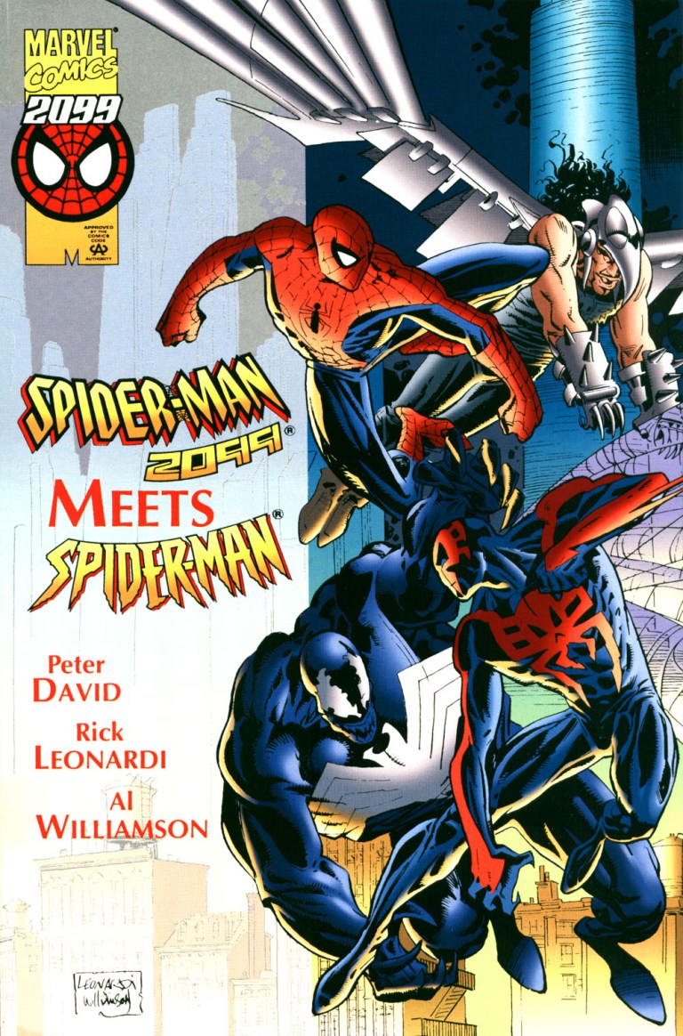
The cover by Rick Leonardi with ink work by Al Williamson. 

No matter what the trends back then, Spider-Man 2099 proved to be the most engaging series of the 2099 line of comic books arguably due to the in-depth storytelling of Peter David. Back in the 1980s, David worked at the direct sales team of Marvel Comics before moving into the editorial team as a writer. And, yes, he got to write for the Spectacular Spider-Man (originally titled Peter Parker, The Spectacular Spider-Man). Early on, Peter David made quite an impact with readers with the 4-part story The Death of Jean DeWolff in the said monthly series.

Many years later, David joined other comic book creators – including the late Stan Lee – on launching the 2099 franchise with Spider-Man 2099. He created a lot from scratch to establish the futuristic Spidey and made his mark on the 2099 universe.

“I don’t remember exactly which aspects of the 2099 were already part of the initial setup when I came aboard. I do know, though, that there was almost nothing specific for Spider-Man other than that he was, well, Spider-Man and (I think this was part of what I was handed) an employee of Alchemax. I was the one, though, who came up with his identity, the way his powers worked, the supporting cast, all of that. I even had a hand in designing the costume; not that I could draw a lick, but I sat there with Rick Leonardi during the first 2099 get together and described to him what I wanted, and he executed it perfectly, building upon what I suggested and improving it. I watched that costume come to life for the first time under Rick’s pencil. It was one of the single best collaborative moments in my life,” David said in a CBR.com interview.

This brings us back to the year 1995 when Marvel published the one-shot special crossover comic book designed to attract Spider-Man 2099 fans and the many millions of followers of the classic Peter Parker Spider-Man. That comic book was Spider-Man 2099 Meets Spider-Man written by Peter David and drawn by Rick Leonardi.

Let’s take a close look.

The comic book

The story begins in the far future of 2099 wherein Spider-Man (Peter Parker) from the 20th century finds himself lost in time and chased by the floating law enforcers who saw him as a danger to the public. Even though his costume is different, one of the law enforcers mistook him for Spider-Man 2099. Predictably, Spider-Man struggles to overcome and get away from them.

8
Spider-Man in 2099!
13
Spider-Man 2099 inside the Daily Bugle.

Meanwhile in the 20th century, Miguel O’Hara mistakenly arrives “home” only to find himself (naked no less) on the same bed as Mary Jane Parker (Spidey’s wife) who is also naked. This only confirms to him that he is lost in time. He immediately decides to get away from MJ and explore the city of New York which does not have the futuristic society he grew up with.

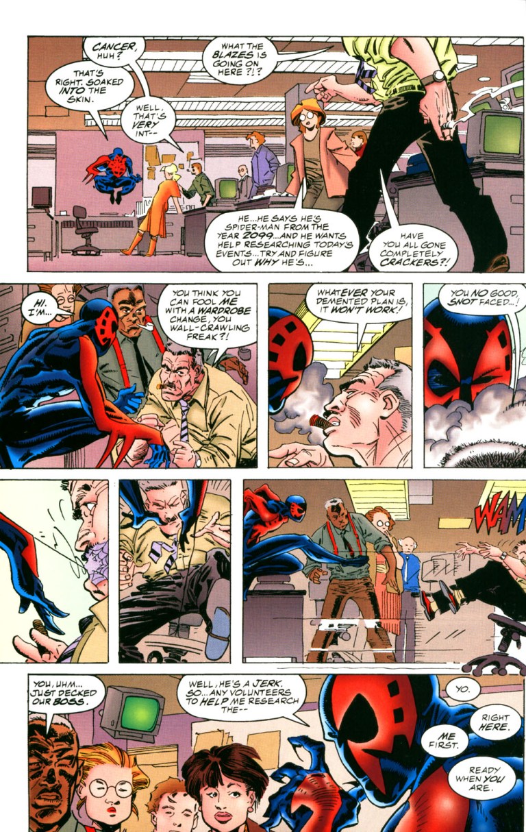
In an attempt to deal with the new reality, Spider-Man 2099 visits Peter Parker’s workplace – The Daily Bugle. He encounters Peter’s boss J. Jonah Jameson who mistook him as their time’s Spider-Man just wearing a new suit.

“You think you can fool me with a wardrobe change, you wall-crawling freak? Whatever your demented plan is, it won’t work,” Jameson told the disguised Miguel O’Hara who reacts by putting web on his mouth in front of the employees.

While the two superheroes struggle with being lost in time, Tyler Stone of Alchemax and Hikaru-Sama discuss something sinister.

Quality
25
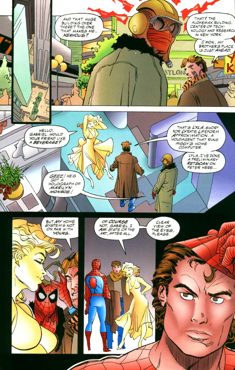
Spider-Man with Miguel O’Hara’s brother and Layla.

In terms of storytelling, Spider-Man 2099 Meets Spider-Man is messy even though there were efforts to have the two superheroes switch time settings that would allow them to explore different societies and mix up with their past supporting characters (example: Peter Parker Spidey meeting with Miguel’s brother and artificial intelligence Layla). What also hurt the storytelling was the lack of a very engaging antagonist. The futuristic Green Goblin the creators came up with was very lame.

The art by Rick Leonardi was barely satisfying and the sad thing is that none of his visuals – including the 2-page shot of the two superheroes together – delivered any impact. As Leonardi worked regularly on Spider-Man 2099, his art style of 20th century New York did not give me much immersion. J. Jonah Jameson was barely recognizable with Leonardi’s drawing.

To get straight to the point, this comic book is a major disappointment. It failed miserably to bring the two main characters together in a satisfying manner as there was an overabundance of build-up. By the time the two superheroes met, it was way too late for the comic book to be engaging and fun to read. With only seven pages available for the anticipated encounter, there was way too little of having Spider-Man and his 2099 counterpart together. So much could have been done to make the two superheroes interact and work together with a lot of impact but I suppose Marvel did not give the creative team enough time (and pages) to work with which resulted this disappointment.

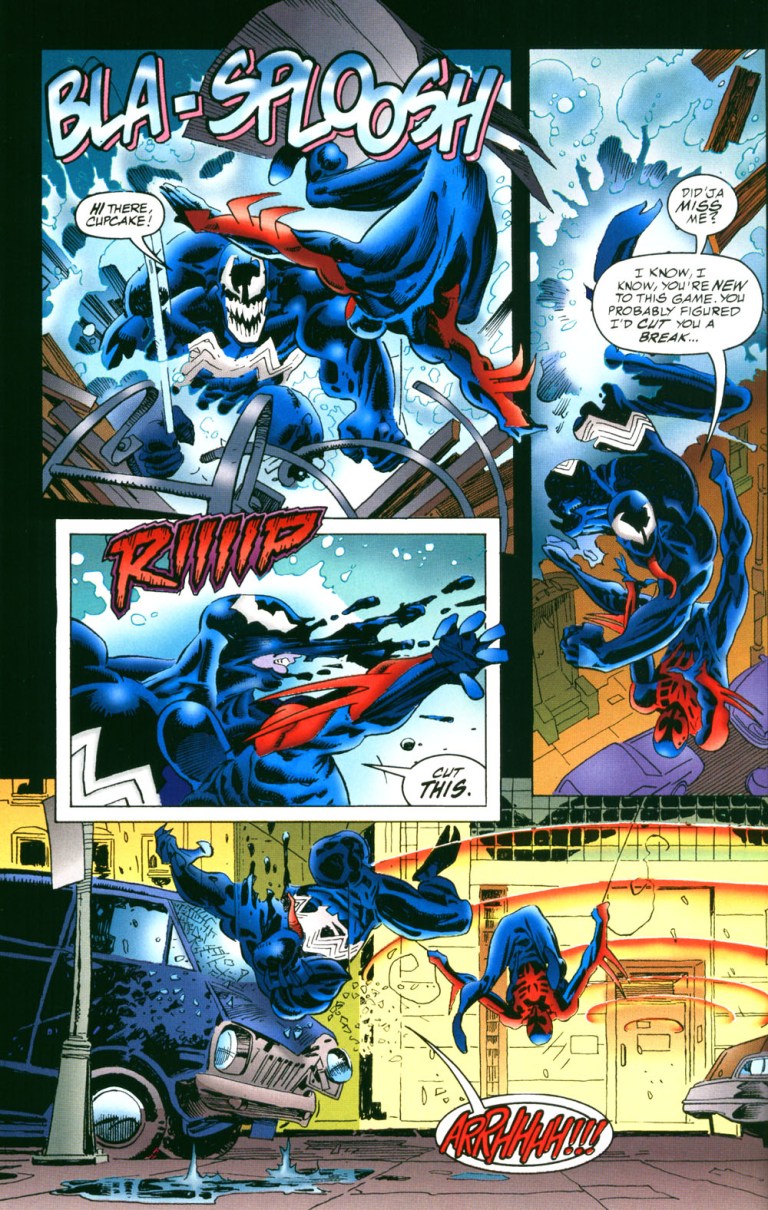
By comparison, I found Spider-Man 2099’s encounter with Venom much more satisfying to read. Spider-Man’s encounter with Vulture 2099, meanwhile, was satisfying. Sometimes I felt that it would have been better for Marvel to publish a Spider-Man 2099 versus Venom standalone crossover comic book than this 1995 crossover disappointment!
31
This is the BEST thing about this disappointing comic book. 

If you are determined to risk wasting your money by actually getting a physical copy, then be aware that a near-mint copy of Spider-Man 2099 Meets Spider-Man will cost you, believe it or not, over $40 at MileHighComics.com

Financial value aside, this comic book’s entertainment value is pretty low. It’s not a badly made crossover comic book but it sure remains a big disappointment considering its concept. Ultimately, Spider-Man 2099 Meets Spider-Man is not recommended. You have been warned.


Thank you for reading. If you find this article engaging, please click the like button below and also please consider sharing this article to others. Also my fantasy book The World of Havenor is still available in paperback and e-book format. If you are looking for a copywriter to create content for your special project or business, check out my services and my portfolio. Feel free to contact me as well. Also please feel free to visit my Facebook page Author Carlo Carrasco and follow me at HavenorFantasy@twitter.com
Carlo Carrasco’s Comic Book Review: 2099 Alpha #1

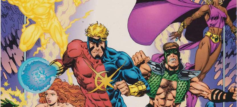
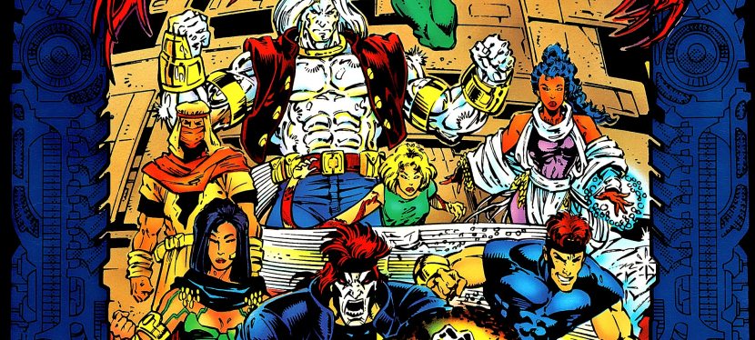
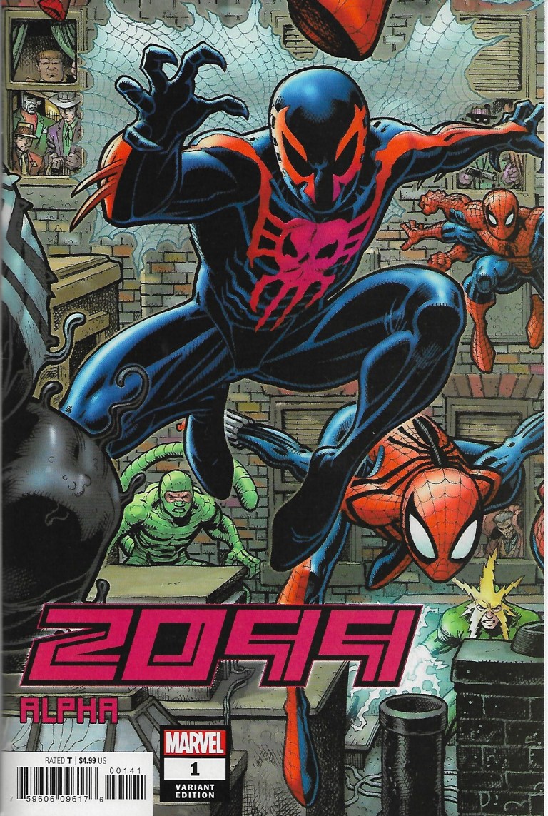
Hey comic book fans! It is finally official! The 2099 universe of Marvel Comics has been revived with the release of 2099 Alpha #1 which I bought at the local comic book store here in Alabang, Muntinlupa, Philippines. The comic book that was available had a Spider-Man 2099 variant cover and it carried a hefty $4.99 price!

So you must be wondering…is the comic book any good? Does it capture the look and feel of the 2099 universe that first appeared in comic books back in the 1990s? Any significant changes in terms of storytelling and visuals?

Here is my review of 2099 Alpha #1.

2019-11-21_100919~2.jpg
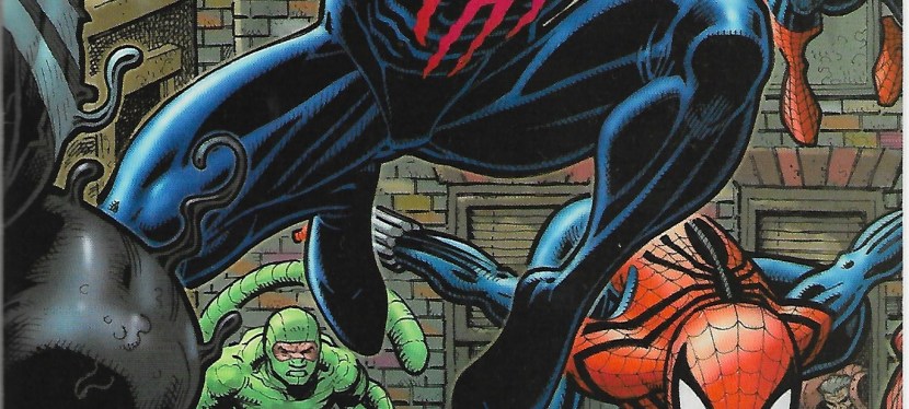
The variant cover showing Spider-Man 2099 with Spidey and related characters from the past.

Written by Nick Spencer with art by Viktor Bogdanovic (colors provided by Marte Garcia), the comic begins in The Ravage (note: this is NOT the failed 2099 hero of Stan Lee and Paul Ryan) where a little boy finds Thor’s hammer but abandons it as he saw some monsters coming. The story then shifts to Brooklyn where Jake Gallows (Punisher 2099) gets into a violent encounter with a man before finally meeting the backup he called for. Then they see a sign that their god, Thor, is now in a merciful mood.

In Nueva York, Miguel O’Hara (Spider-Man 2099) talks with Tyler Stone inside an Alchemax tower. Tyler examines what Miguel brought to them and he mentions an incoming threat. Elsewhere, Conan appears struggling in battle with some people. From a distance, Doom 2099 watches and he has the Watcher captive.

Quality

To put it short, 2099 Alpha #1 is really a set-up type of comic book designed to immerse readers into the 2099 universe which now looks darker, grittier and more twisted than the way it was first presented back in the 1990s. Because the spotlight shifts from one place to the next, showing multiple characters, there really is not much meat in the storytelling. Really, thirty pages of art and story were made but ultimately ended up being not so engaging.

The art of Viktor Bogdanovic shows the 2099 universe to be a depressing setting and his art on classic characters like Spider-Man 2099, Punisher 2099 and Doom 2099 make them look unrecognizable. I remember Jake Gallows being huge and buff but in this comic book, he looks like he lost a lot of muscle and ended up looking ordinary.

Conclusion

Overall, 2099 Alpha #1 is an expensive disappointment and it is easily the weakest new comic book I bought all year long. There is a lot of suspense, expository details and even some horrific imagery, but ultimately there is no real fun to experience here. At $4.99, this is too expensive and it is a waste as it failed to engage and entertain me. Let me add that I lowered my expectation for this revival of the 2099 universe since the teaser announcement was made months ago. Back then, I anticipated that the new guys handling the 2099 universe of comics will take it to a new direction (move far away from what made the 2099 universe in the 1990s memorable and distinct) and this overpriced comic book is an early confirmation of it.

2019-11-21_101114~2.jpg
Recognize any of these characters?

Of course, there are still several other 2099 comics from Marvel that will be launched next month, including Spider-Man 2099 #1, Venom 2099 #1, Ghost Rider 2099 #1 and more. We will find out soon enough if those comic books will share the same dark and gritty style of 2099 Alpha #1 or not.

Ultimately, 2099 Alpha #1 is not recommended. As long as it is sold at cover price, avoid it.

+++++

If you are nostalgic of the 1990s 2099 universe, check out my reviews of Spider-Man 2099 #1 and #25, Ravage 2099 #1 and X-Men 2099 #1.


Thank you for reading. If you find this article engaging, please click the like button below and also please consider sharing this article to others. Also my fantasy book The World of Havenor is still available in paperback and e-book format. If you are looking for a copywriter to create content for your special project or business, check out my services and my portfolio. Feel free to contact me as well. Also please feel free to visit my Facebook page Author Carlo Carrasco and follow me at HavenorFantasy@twitter.com


Crypto Comics Supported Me, Now I Urge You Readers to Support Crypto Comics

Hey everyone!

I am very pleased to announce to you all that my website and myself got a major boost of support from Crypto Comics, a YouTuber who specializes in comic book reviews and, at the same time, he is also a publisher of independently made comics.

Screenshot_20191019-160504_Facebook.jpg

I recently donated several old comic books to him in support of his franchise and YouTube channel. The good news here is that he not only received them, he recorded an unboxing video (opening the package) and went as far as calling for support for this website, my Facebook page Author Carlo Carrasco, the Geeks and Villagers Facebook page, the Havenor Fantasy Facebook page and myself.

You can watch the video right below.

Crypto Comics and I share common interests in comic books, specifically superhero stuff from the 1990s. We both admire the Ultraverse line of comic books that were published by Malibu Comics. He has published a whole lot of video reviews of comic books published by Marvel Comics, DC Comics and others. I personally enjoy watching his video reviews which come with reviewing the comic book, reading the dialogue and narration and providing some in-depth analysis.

As such, I encourage all of you to support Crypto Comics by visiting his YouTube channel at https://www.youtube.com/channel/UCER9IXmEANEu3c-LJBi_F9Q/featured

I also encourage you to visit the Crypto Comics FB page right here.

Screenshot_20191019-160515_Facebook.jpg
Recognize this on FB and you’ll find the FB page.

Thank you for your time. Please support Crypto Comics and enjoy all the good stuff about comic books he made available online.


Thank you for reading. If you find this article engaging, please click the like button below and also please consider sharing this article to others. Also my fantasy book The World of Havenor is still available in paperback and e-book format. If you are looking for a copywriter to create content for your special project or business, check out my services and my portfolio. Feel free to contact me as well. Also please feel free to visit my Facebook page Author Carlo Carrasco and follow me at HavenorFantasy@twitter.com


A Look Back At The H.A.R.D. Corps #1

The 1990s was a decade of excess when it comes to superhero comic books. Apart from the persistent hoarding of comic books and the quest for profit, there were also these wide superhero franchises (or superhero universes) that popped up and even challenged Marvel Comics and DC Comics. Malibu Comics launched the Ultraverse while Valiant Comics came up with its own universe.

Valiant established itself nicely with popular characters like Bloodshot, X-O Manowar, Turok and Ninjak, and each one had its own regular series of comic books published. When it comes to teams, there was H.A.R.D. Corps (H.A.R.D. stood for Harbinger Active Resistance Division).

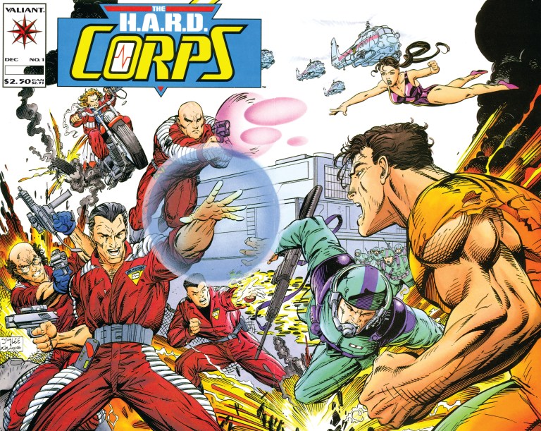
During the recent Hobby Con held at Las Piñas City, I luckily found myself a copy of The H.A.R.D. Corps #1 and read it for the first time ever. This is my review of the comic book which has a cover drawn by the great Jim Lee.

RCO002_1472443923.jpg
Cover with art by Jim Lee.

Early story

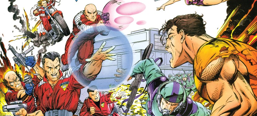
The story begins with the 5-member team in the middle of a mission inside the secured facility of the Harbinger Foundation. Under fire from the facility’s armed personnel, the team (riding a floating vehicle) struggle to find their way and evacuate. Along the way, an oversized man called Big Boy grabbed one of their members and separated him from the others. With the situation getting worse, the captured member got “brain popped” (a remote form of self-destruction via the neural flash implanted inside the person’s brain). The remaining four manage to get away by means of aerial transport provided by their company.

Then a section of the facility exploded causing financial damage to Mr. Harada who decided to visit and inspect the site.

RCO017_1472443923~2.jpg
Expository information done cleverly.

Some time later, the H.A.R.D. Corps enjoy the privacy and security at their headquarters in the Nevada desert. Team members Shakespeare, Major Palmer, Softcore, Hammerhead and Superstar wait for instructions at the debriefing room.

Quality

The H.A.R.D. Corps #1 is very well written by David Michelinie. Within twenty-two pages, Michelinie loaded enough details to explain the comic book’s core concept efficiently while at the same time he managed to tell an engaging story with a light touch on character development (note: there were many characters and there was not enough space for further personality emphasis). By the time the story ended, I really felt enlightened, entertained and wanting to find out what would happen next.

Michelinie’s handling of expository dialogue was done very efficiently. I’m talking about the private briefing done by an executive of the Cartel explaining to a recovering man named Kim (who was almost killed during the Los Angeles Riot) what H.A.R.D. Corps is, why the Cartel is in a race against Harada who has been manipulating Harbingers (persons with unique abilities). The Cartel opposes Harada with neural implants.

More on the team, H.A.R.D. Corps members are people who have gone through training programs and each of them had neural implants in their heads which enable them to mimic Harbinger powers (one at a time) through signals broadcast from a base station. Each of them was comatose and the use of the implants reversed the coma.

RCO007_1472443923~2.jpg
Some action for you.

When it comes to visuals, the art by David Lapham (inked by Bob Layton) was pretty good. I like the high amount of detail placed on the surroundings in most of the panels. Action shots had a good amount of impact.

Conclusion

This comic book from late 1992 is a good and engaging read. I really enjoyed it and I like its core concept about a team of enhanced individuals who are technically living properties of very business-minded people opposed to Harada. Even by today’s standards, H.A.R.D. Corps concept really stands out among all superhero team comic books.

The H.A.R.D. Corps #1 is recommended and you can acquire a near-mint copy of it for only $4 at MileHighComics.com (as of this writing).

A Look Back At Batman vs. The Incredible Hulk

Disclaimer: This is my original work with details sourced from reading the comic book and doing personal research. Anyone who wants to use this article, in part or in whole, needs to secure first my permission and agree to cite me as the source and author. Let it be known that any unauthorized use of this article will constrain the author to pursue the remedies under R.A. No. 8293, the Revised Penal Code, and/or all applicable legal actions under the laws of the Philippines.

I love reading a crossover comic book that was made by very talented creators to be a whole lot of fun from start to finish. Back in the early 1980s, rivals Marvel Comics and DC Comics collaborated temporarily with inter-company crossover comic books that were made to be entertaining to fans of their respective properties.

What I’m going to review here is the 3rd superhero crossover comic book between Marvel and DC titled Batman vs. The Incredible Hulk.

Cover
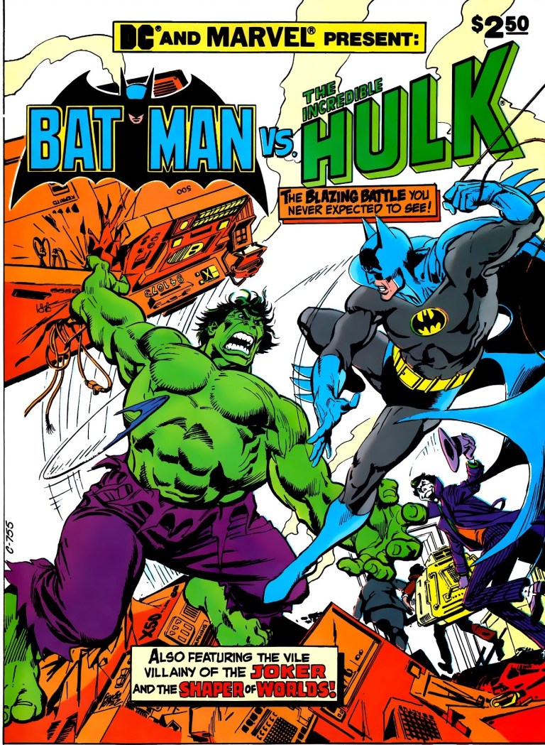
The cover.

Background

Before I start, let me clarify that this particular comic book was specifically published as issue number 27 of the DC Special Series which was a series of one-shot comic books. By comparison, the 1981 crossover comic book Superman and Spider-Man (which I reviewed previously) was published under the Marvel Treasury Edition line of Marvel Comics as issue number 28.

Going back to Batman vs. The Incredible Hulk, the comic book was the final issue of the DC Special Series line and it carried a cover price of $2.50 which was quite high for its time.

The people at DC Comics made sure that the crossover was handled by the best talents they had back then. The late Len Wein (best know for creating Wolverine) was assigned to write the script (and ensure that elements from both the Hulk and Batman would mix nicely) while José Luis García-López was hired to illustrate. Dick Giordano was the embellisher and editor while Allen Milgrom and then Marvel editor-in-chief Jim Shooter were the consulting editors. In return for their assistance, Marv Wolfman and Mike DeCarlo were acknowledged with thanks.

Now we can begin with this retro review of Batman vs. The Incredible Hulk.

The early story

The story begins when a few persons in Gotham City witness their dreams turning real beyond logic. A man dreamed he was in the arctic hunting and wakes up to discover his room was filled with snow. In a cinema where a horror movie was shown, a couple kissing each other discover, to their shock, that monsters of different sizes surrounded them out of thin air.

At the waterfront of the city, the Joker (accompanied by his gang members) talks to an unseen being (Shaper of Worlds). He gives his assurance to the being that he and his gang will acquire a specific item (needed by the being). For the Joker, what was discussed was a simple business arrangement.

A short time later inside a high-tech facility of Wayne Research, Bruce Banner (the Hulk) secretly works under the false identity as David Banks. He works along with the scientists but not on the scientific projects. Rather, he works odd tasks such as lifting hardware and putting them into places that need them. Of course, Banner did not get hired for a salary but for something much essential to him and his condition with Gamma Rays.

“I had to get a job here somehow so I could get close to the experimental Gamma-gun they’re working on,” he thought to himself.

Suddenly the facility gets filled with laughing gas incapacitating all the people inside. Banner fortunately manages to wear a radiation suit for protection. Moments later, the Joker and his gang enter searching for the Gamma-gun. From this point on, Banner decides to act.

Quality

When it comes to the selection of characters from Marvel and DC, having the mismatch of Batman and the Hulk was a very splendid idea. Not only was having the large green brute and the world’s greatest detective together as temporary rivals a fascinating concept, having them work together as a duo turned out to be a really great move. When it comes to the selected villains of the Joker and the Shaper of Worlds as the anti-hero figures of the story, the two looked like an odd pair but if you focus on the details of the story, you will realize that it made a lot of sense having them two together. The Shaper needs something which requires him to depend on the Joker who in turn brings his gang with him to cause chaos to acquire what the alien needs

All of the above details would not have worked had it not been for the excellent writing by Len Wein. Clearly Wein knew a whole lot about the defining elements of the Hulk and Batman (and the same with the Joker and Shaper), and he carefully blended those elements together to make a story that is thrilling, intriguing, engaging and at the same time still made sense. More on crossing over, there are other characters connected to Batman and the Hulk that made appearances and a few of them fit in nicely into the story.

As this was released in 1981, it was typical of the time for writers to use thought balloons to help readers understand what the characters were thinking. The use of thought balloons in this comic book truly defined Batman who not only had to fight the bad guys but also manage his way with the Hulk and do a lot of detective work.

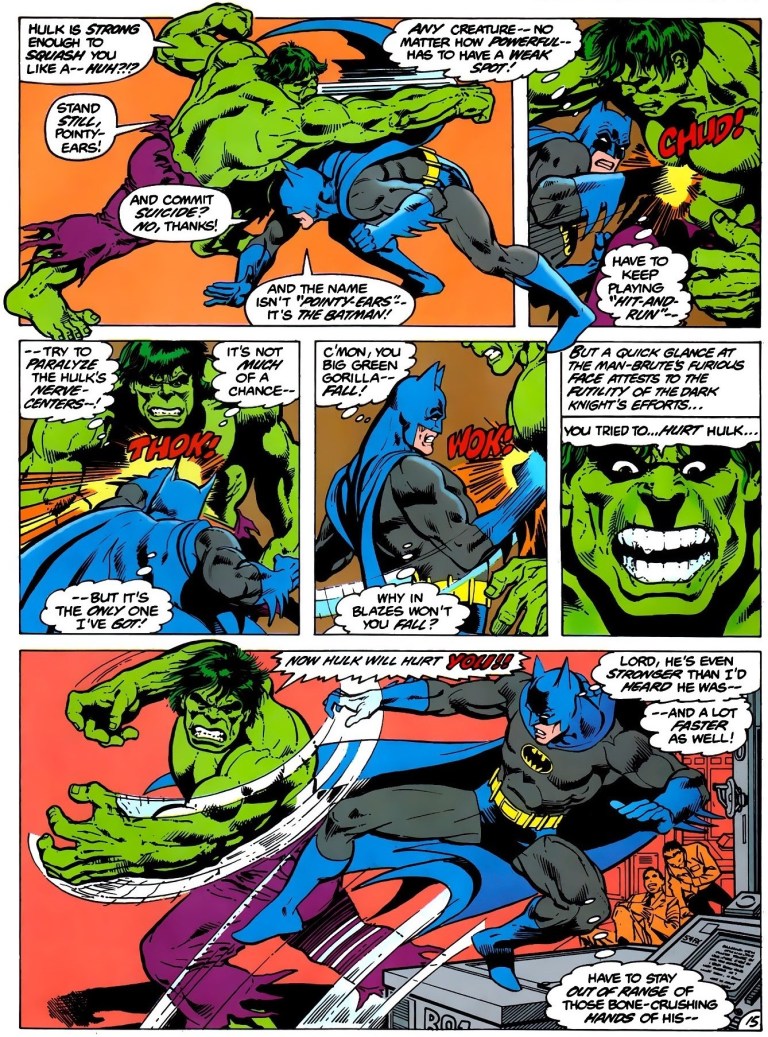
Going back to the Hulk and Batman, this comic book has a lot of fun stuff. More than once did the two superheroes engage in action-packed encounters and their exchange of words was very nicely done. Their match-up (or mismatch) really works.

Prev1
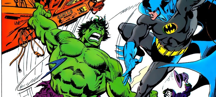
A perfectly crafted action scene between the Hulk and Batman, complete with accurate depictions of each character! 

When it comes to the common complaint by some readers out there that the comic book was more of a Batman story and made the Hulk less prominent, I should say that the slight imbalance is not a problem at all. In fact, for me it makes perfect sense that Batman has more spotlight than the Hulk. Why? Because Batman is a detective and he performed a lot of researching, information gathering and other moves to solve problems. His detective work in the story made perfect sense for the narrative. As for the Hulk, his character really has very limited options other than causing destruction and disturbing the public. Since early on, the Hulk was best known for attracting the attention of the American military (led by General Ross) and huge destruction defined the encounters. For this crossover, the creators did not show the Hulk engaging with the military (save for the phonies) but rather he struggled to figure things out whenever he encountered Batman or the Joker. There is no way the Hulk could do detective work like Batman and having him fight the military would have weakened this comic book’s presentation. Clearly, having the story slightly slanted towards Batman is still the right move.

Prev2
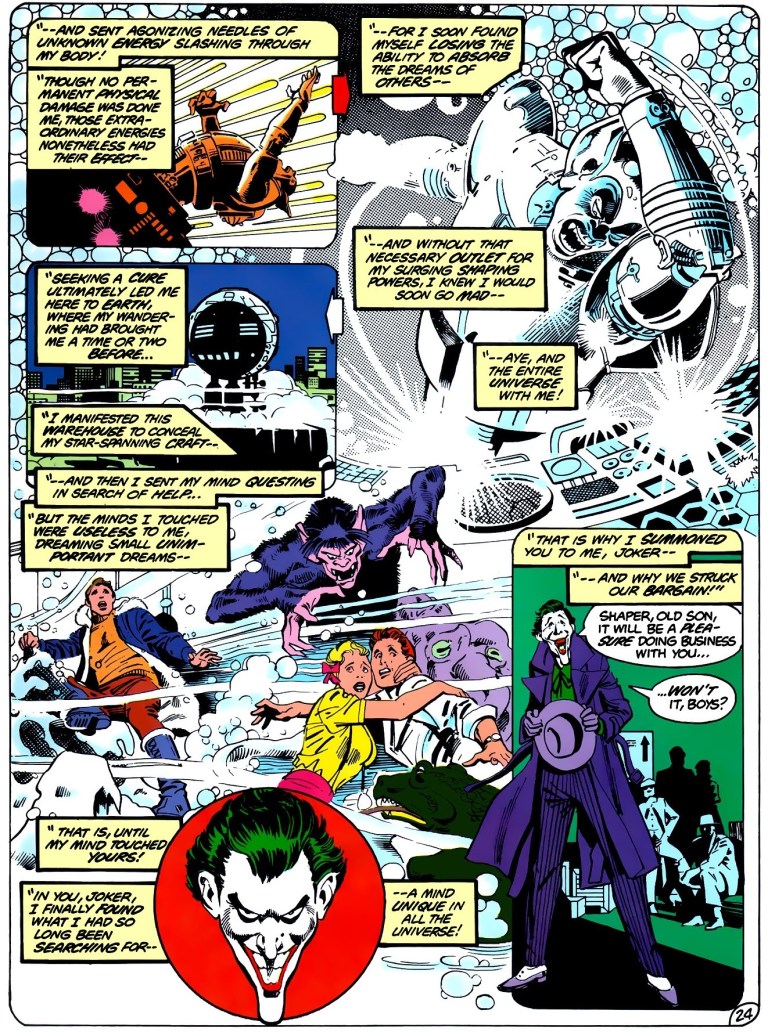
Very highly imaginative and dynamic artwork by José Luis García-López.

The artwork done by José Luis García-López is excellent! He really captured the looks and details of each and every character Marvel and DC that appeared in this comic book. Back in the early 1980s, I got to read several comic books that showed Batman, the Hulk, the Joker and others and the way they appeared in this comic book was indeed accurate of the time. José Luis García-López also knew how to balance spectacle with character development and expository dialogue in terms of visual pacing and framing shots. Also his work becomes even more imaginative during the final conflict. Undoubtedly this is still a great looking comic book!

Conclusion

Overall, Batman vs. The Incredible Hulk is a great comic book and easily it is one of the greatest intercompany superhero crossover comic books ever published! From start to finish, this comic book proved to be highly engaging and there never was a single boring moment. The creators led by Len Wein (he is sorely missed) made the best possible story anyone can make involving Batman and the Hulk.

You can read a hard copy of this comic book by getting Volume 1 of Crossover Classics or, if you can afford to, hunt for a copy of this in its DC Special Series form which now sells for $280 for a very fine copy to as much as $400 for a near mint copy as of this writing according to MileHighComics.com

In ending this, I declare that Batman vs. The Incredible Hulk is highly recommended!


Thank you for reading. If you find this article engaging, please click the like button below and also please consider sharing this article to others. Also my fantasy book The World of Havenor is still available in paperback and e-book format. If you are looking for a copywriter to create content for your special project or business, check out my services and my portfolio. Feel free to contact me as well. Also please feel free to visit my Facebook page Author Carlo Carrasco and follow me at HavenorFantasy@twitter.com
 

A Look Back At Superman and Spider-Man

Disclaimer: This is my original work with details sourced from reading the comic book and doing personal research. Anyone who wants to use this article, in part or in whole, needs to secure first my permission and agree to cite me as the source and author. Let it be known that any unauthorized use of this article will constrain the author to pursue the remedies under R.A. No. 8293, the Revised Penal Code, and/or all applicable legal actions under the laws of the Philippines.

I miss the old times when big rivals Marvel and DC Comics would set aside competition temporarily to team up and rely on their respective comic creators to make superhero crossover comic books that the fans can enjoy.

Back in the 1970s, key developments related to the comic book adaptation of The Wizard of Oz brought the two rivals together as partners. In 1976, Marvel and DC’s first superhero crossover Superman vs. The Amazing Spider-Man got published and to this day many comic book collectors and geeks I encountered still enjoy it. A few of them even called it a classic.

The collaboration between Marvel and DC continued in 1981 with Superman and Spider-Man which was published as issue number 28 of the Marvel Treasury Edition series.

1
The cover.

This is my look back at Superman and Spider-Man.

The comic book

Scripted by then Marvel Comic editor-in-chief Jim Shooter (with Marv Wolfman mentioned for plot suggestions) with art drawn by John Buscema and inkwork done by Terry Austin, Al Milgrom, Steva Leialoha, Walt Simonson, Bob Layton, Joe Rubinstein and Bob Wiacek, the comic book begins when Spider-Man swings into a construction site where he encounters several armed men and stops them singlehandedly.

Even though he stopped the bad guys, Spider-Man’s spider sense bothers him making him speculate that, because there’s no clear danger around him, the construction site seemed to be a threat.

After Spider-Man swings away from the police who just arrived, classic Marvel supervillain Doctor Doom watches via surveillance video and he was bother by the way things turned out.

“I did not like the way Spider-Man paused and look around after subduing the thieves – – as if he sensed something unusual about the excavation! Those accursed spider instincts of his,” Doom said before proceeding with his master plan.

A day later, the Hulk arrives in Metropolis causing lots of damage. Separately Superman and Spider-Man arrive to contain the green guy. However, things are not what they seem. This is where the story description ends.

Quality

What this comic book lacked compared to the 1976 Superman-Spider-Man crossover is visual impact. Clearly John Buscema had to follow closely the script which called for multiple panels per page and that left him little room to draw scenes dynamically. That’s not to see the art is weak. In fact, Buscema’s art is pretty good and he has deep knowledge about how the characters (including those many supporting characters and other minor characters from both Marvel and DC Comics) really looked from the size of Hulk’s body, the details on Wonder Woman’s costume, the distinctive look of J. Jonah Jameson, Perry White, etc. In short, I recognized the characters very easily.

15
This remains fun to read.
24
Peter Parker in Metropolis along with the Superman supporting characters. This is one great element that made this comic book worth reading.

While the high number of panels per page limited him, Buscema managed to come up with some action shots that packed some impact.

When it comes to writing and storytelling, this comic book exceeds that of the 1976 Superman-Spider-Man crossover big time! To start with, the plot is much more elaborate, more detailed and yet consistently remained easy to follow.

While the 1976 crossover had the most popular villains of Superman and Spider-Man as the representation of evil, this one instead had Dr. Doom and Parasite. The great news is that these two super villains complement each other nicely and that itself adds good depth into the plot. Dr. Doom is a major schemer and Parasite fitted nicely within his master plan for global chaos.

Regarding dialogue, the script had a lot of strength and was also specific in capturing the personalities of the superheroes, the super villains and the supporting cast. I can easily identify J. Jonah Jameson, Perry White, Lois Lane and others through the dialogue.

Not to be outdone is the deeper approach to the crossover aspect of the story. Right from the start, the comic book creators expected us readers to suspend disbelief and start believing that while the story is non-canon, the respective universes of Marvel and DC Comics co-existed. Because there were TV shows of Wonder Woman and the Hulk playing, the two characters were included in the comic book adding depth to the crossover.

Speaking of crossovers, this comic book was not limited to Superman and Spider-Man. The encounter between the Hulk and Superman was a short but sweet spectacle to read. The encounter between Wonder Woman and Spider-Man meanwhile was short yet fun.

Adding more to the fun in this comic book was how Clark Kent interacted with the Spider-Man supporting characters while Peter Parker interacted with the Superman supporting characters. I enjoyed every moment of these scenes.

As far as narrative is concerned, this comic book is slightly slanted towards Superman. One factor behind this was the implementation of how local authorities interact with Superman and Spider-Man. Whenever he solves crime, Superman is highly respected by the public and the police. This is not the case with Spider-Man who is often perceived to be a social menace even though he helps solve crimes. Another factor was that Superman did more detective-type work (including a visit to Latveria) while Spidey hardly contributed anything to the plot’s development.

38
Nothing can be more frustrating than getting attacked by police officers when you try to help them solve their problems.

Regardless, the two icons got a fair share of the spotlight during the final stages of the story and there was enough spectacle to enjoy.

If there is any complaint I have, it would be the comic book creators’ reluctance on fully connecting itself to the 1976 crossover. In the scene wherein Peter Parker was guided into the film editing room by Jimmy Olsen, he recognized Lois Lane and remembered meeting her in the 1976 crossover (which ended with socializing). And yet when Spider-Man and Superman get together in this comic book, there was a noticeable lack of friendliness and personal cooperation between them even though they bonded nicely in the 1976 story.

Conclusion

Overall, Superman and Spider-Man is indeed a highly engaging, fun-filled superhero crossover comic book. For me, it is a true literary classic and definitely worth searching for out there. I read this crossover many times from start to finish and even though I knew the plot and the dialogue, I still had a lot of fun reading along the way. With the combined talents of Shooter, Buscema and many others, this superhero crossover was indeed one of the very best stories ever told by Marvel and DC Comics.

Given the current corporate climate Marvel and DC Comics are now in, it is very unlikely we will see another creatively fun superhero crossover collaboration between them happening soon. For the newcomers reading this, Marvel is owned by the Walt Disney Company while DC Comics is owned by Warner Bros.

Whether you search for the original comic book or its inclusion in a volume of The Marvel/DC Collection: Crossover Classics Volume 1, Superman and Spider-Man is highly recommended!


Thank you for reading. If you find this article engaging, please click the like button below and also please consider sharing this article to others. Also my fantasy book The World of Havenor is still available in paperback and e-book format. If you are looking for a copywriter to create content for your special project or business, check out my services and my portfolio. Feel free to contact me as well. Also please feel free to visit my Facebook page Author Carlo Carrasco and follow me at HavenorFantasy@twitter.com


A Look Back At Youngblood #2 (1992)

During my high school days, I heard some buzz about the launch of Image Comics. The year was 1992 and public Internet access in the Philippines was still years away. The buzz of Image in the Philippines was produced through comic book industry magazines read by local geeks who mostly expressed their excitement.

Image Comics was the result of seven high-profile comic book illustrators who left Marvel Comics over issues such as low compensation, low royalties and the company’s immediate ownership of characters they created. Image officially launched with Rob Liefeld’s Youngblood #1.

I should say that I never had the opportunity to buy a copy of Youngblood #1 nor was I able to read a copy of it from a fellow comic reader. However I was fortunate enough to buy an existing old copy of Youngblood #2 which is the subject of this retro comic book review.

The story begins with a prologue introducing readers to a group called the Berzerkers fighting a group of metallic beings. The Berzerkers meet Kirby, a short muscular guy who seems to be inspired somewhat by the late comic book legend Jack Kirby (died in 1994). In fact, written on the lower part of page 1 was a message: Respectfully dedicated to Jack “The King” Kirby.

Then the spotlight finally moves to Youngblood who are discussing the newly discovered body of Prophet, a muscular man sleeping in suspended animation. Prophet was described as “the product of a groundbreaking bio-genetic experiment conducted under the supervision of Dr. Garnet Wells sometime around the Second World War.”

Soon enough, Prophet wakes up and then things really get moving. You just have to read the comic book to find out what happened.

When it comes to quality, I should say this comic book does not have much of a story. What I described above was pretty much it. The comic book had a descent build-up however mainly for Prophet and all the expository dialogue and visuals made clear that the character was designed to be important.

When it comes to art, Youngblood #2 clearly shows Rob Liefeld with a lot of heart and passion. The elements that defined not only his style but also 1990s superhero comic book culture are here – big futuristic guns, muscular bodies, pupil-less eyes, weird looking feet, disproportionate body parts, armor, shoulder pads and the like.

Superhero action? This comic book is heavily loaded and the action scenes drawn by Liefeld packed a lot of punch. Seeing Prophet getting punched by the giant guy looked exaggerated but it still had a lot of visual impact.

2019-08-23_093447~2.jpg
Hard hitting action, visceral looks, muscles, shoulder pads, pupil-less eyes and Prophet.
2019-08-23_093609~2.jpg
Really passionate work by Liefeld.

Adding more value to the comic book was a 5-page preview of Shadowhawk done by Image Comics co-founder Jim Valentino. Without spoiling the details, I should say that the preview does a good job selling ShadowHawk. Lastly, Youngblood #2 has two covers and one end has to be flipped to read the opening content properly.

Overall, Youngblood #2 is worth reading even though its story is very light. To say this comic book is terrible is just wrong. To say the least, it is a nice showcase of the talent and creativity of Rob Liefeld who not only illustrated and inked it, he also wrote the story! Youngblood 2 sure has a light story and heavy action content but ultimately it succeeded on introducing Prophet as well as setting up the excitement for the next issue.

I want to point out that it was recently revealed that Liefeld stayed clear off Youngblood in relation to a custody battle with a co-owner related to past deals made. This explains why he has not done Youngblood stuff for a long time. It’s too bad that we won’t see any more new Youngblood involving Liefeld’s passionate work.

Read Liefeld’s words from a long post he made in Facebook on August 2.

Youngblood represented some of my finest work, I’m proud of all the work that was produced. Sadly, film companies will be reluctant to invest the time and money in a venture without the support and blessing of its creator.

Youngblood #2 is recommended.


Thank you for reading. If you find this article engaging, please click the like button below and also please consider sharing this article to others. Also my fantasy book The World of Havenor is still available in paperback and e-book format. If you are looking for a copywriter to create content for your special project or business, check out my services and my portfolio. Feel free to contact me as well. Also please feel free to visit my Facebook page Author Carlo Carrasco and follow me at HavenorFantasy@twitter.com

A Look Back At Uncanny X-Men #289

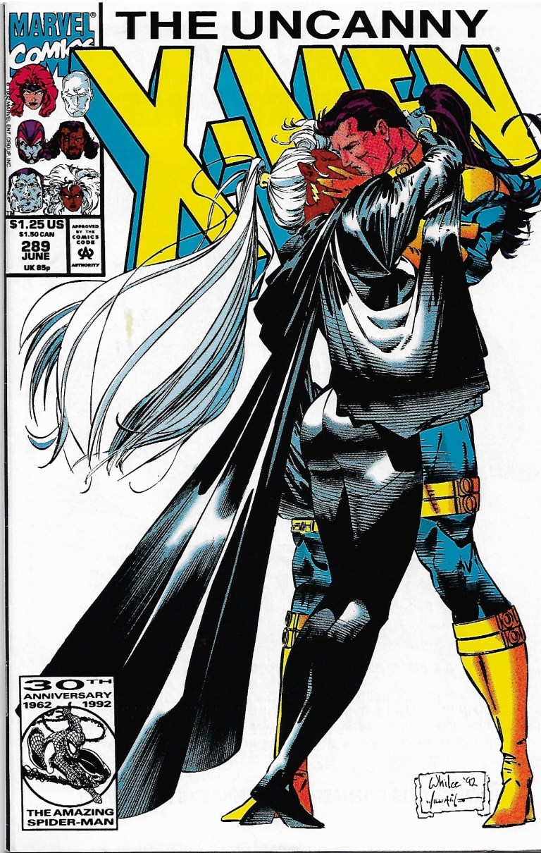
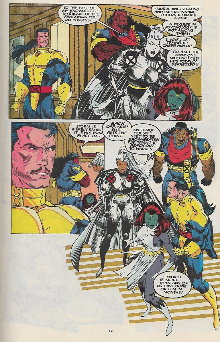
Released in 1992 by Marvel Comics, Uncanny X-Men #289 was written by Scott Lobdell and drawn by Whilce Portacio (with ink work by Scott Williams). Its concept focused on the Gold Team of the X-Men (composed of Jean Grey, Storm, Colossus, Ice Man and Archangel) dealing with Bishop who at the time was still a newcomer.

2019-07-11_095911~2.jpg
Cover of the comic book.

It begins when Bishop looks at a framed picture of the original X-Men followed by Storm telling him every student who graduated to the role of an X-Man remains dedicated to the ideal of peaceful coexistence between mutants and humans.

As the Gold Team X-Men enjoy their peaceful time at the mansion of Xavier, elsewhere someone spies on William and Maddy Drake who talk about Bobby (Iceman). Back at the mansion, Archangel encounters a spitting image of his younger self (as Angel and with normal skin color) which raises tension attracting the attention of Storm, Bishop and Forge.

2019-07-11_100038~2.jpg
A touching scene between Jean Grey and Charles Xavier.

To describe Uncanny X-Men #289 clearly, the comic book is more focused on character development as it lacks a strong conflict between good and evil. Anyone craving for superhero action will most likely feel unsatisfied here. However, if you want to know the X-Men more passionately and watch the romance between Storm and Forge develop, then this comic book will be engaging.

Scott Lobdell did a good job developing the characters through drama and Whilce Portacio’s art really brought the script to life. I enjoyed reading the interaction between Jean Grey and Charles Xavier who realizes that as he led the X-Men, he took a bit of something from their respective lives.

2019-07-11_100213~2.jpg
Nice layout and style by Whilce Portacio on the team.

Take note of the following exchange of dialogue.

Charles Xavier: Jean, did you ever hate me for having taken away your childhood?

Jean Grey: Professor, please. What child is given the opportunity to fly to the stars? How many children battle alongside Asgardian thunder gods or super soldiers? You gave me…all of us…more than you took away.

That was really nice writing there by Lobdell. There was drama and harmony between the two characters.

Overall, Uncanny X-Men #289 is recommended. Think of it as a comic book that will help you – the reader – get to know the characters more closely.


Thank you for reading. If you find this article engaging, please click the like button below and also please consider sharing this article to others. Also my fantasy book The World of Havenor is still available in paperback and e-book format. If you are looking for a copywriter to create content for your special project or business, check out my services and my portfolio. Feel free to contact me as well. Also please feel free to visit my Facebook page Author Carlo Carrasco and follow me at HavenorFantasy@twitter.com
A Look Back At The Strangers #1

Disclaimer: This is my original work with details sourced from reading the comic book and doing personal research. Anyone who wants to use this article, in part or in whole, needs to secure first my permission and agree to cite me as the source and author. Let it be known that any unauthorized use of this article will constrain the author to pursue the remedies under R.A. No. 8293, the Revised Penal Code, and/or all applicable legal actions under the laws of the Philippines.

When it comes to the Ultraverse, there is often something enjoyable to read. I enjoy reading about superhero teams, specifically X-Men from Marvel Comics and Justice League from DC Comics to name a few. I also enjoyed Freex and UltraForce from the Ultraverse. What I like about superhero teams is that I get to discover varied characters (the good, the evil and the ones in between), witness how they develop and act when something big or problematic happens.

With The Strangers #1, published by Malibu Comics in 1993 as one of the launch books of the Ultraverse, I experienced another bout of enjoyment and engagement but in a rather unique way.

FB_IMG_1564977426941.jpg
Cover of The Strangers #1 with art by Rick Hoberg.

Written by Steven Englehart with illustration done by Rick Hoberg (whose work was inked by Tom Burgard), the story begins with a shot of life going on in San Francisco. Several characters riding a jammed cable car get distracted when a man and a pretty lady (both seated) do the “wild thang”.

Because of the disturbance, three guys grab the arrogant guy (separating him from the lady) threw him out of the cable car. Immediately after that, the cable car suddenly gets hit by a bolt of energy (perceived as lightning) from the clear sky causing the vehicle to start slipping downwards until it hits a car and its passenger.

FB_IMG_1564977649575.jpg
Bob and Hugh start to notice something strange.

Then a series of things begin to happen. Candy (the lady earlier) acted strangely as the arrogant guy called her attention. Art students Bob and Hugh witnessed the sudden formation of a bag of apples. The kid Leon discovers his new ability to run fast and make sudden turns. Dave witnesses a momentary transformation of himself. Fashion designer Elena gets inspired to create something heroic.

RCO013_1469678179.jpg
Leon’s ultra speed realized while Candy walks pretty.

You must be wondering – how is the quality of this old comic book?

In terms of storytelling and characterization, this is pretty good work done by Steve Englehart. The way I see it, this is a story about strangers (truly living up to the title) who got changed as a result of a single incident that affected them. Each of the members of The Strangers were nicely and efficiently introduced. A creative approach was used to present their respective abilities which made sense as the events unfolded. By the end of the comic book, I really felt very engaged and excited to anticipate the next issue.

When it comes to dialogue, I like this exchange between Bob and Hugh.

“You know what I think?”

“No, what do you think?”

“I think it must have something to do with the lightning that hit us!”

“Nonsense! Lightning does not work like that!”

“You got a better idea?”

As for the visuals, Rick Hoberg’s art (inked by Burgard) combined with the color design by Paul Mounts is still very wonderful to look at. The facial expressions are convincing, the action has impact, the visualization of the super powers is pretty creative and there are lots of small details on the backgrounds (people, city environment, etc.) that are worth examining.

Overall, The Strangers #1 is a fun and engaging old comic book to read. Never mind the financial value it carries right now. Focus more on its story and art, as well as the other details that reflect the talents of its creators. More importantly, the experiences of discovering something fresh and getting to know brand new characters really defined this comic book.

The Strangers #1 is highly recommended.


Thank you for reading. If you find this article engaging, please click the like button below and also please consider sharing this article to others. Also my fantasy book The World of Havenor is still available in paperback and e-book format. If you are looking for a copywriter to create content for your special project or business, check out my services and my portfolio. Feel free to contact me as well. Also please feel free to visit my Facebook page Author Carlo Carrasco and follow me at HavenorFantasy@twitter.com
A Look Back at X-Men 2099 #1

1993 was a special year for X-Men fans. It was the year Marvel Comics celebrated what was back then the 30th anniversary of the X-Men which explains why they released not only a lot of X-Men-related comic books but also issues with hologram cards on the covers of specific issues of X-Force, X-Factor, X-Men, Uncanny X-Men and Excalibur. While superhero movies were not that many at the time, fans had the X-Men animated series to enjoy on TV.

Along the way, the comic book speculator boom continued and Marvel Comics exploited the trend as its creators worked to expand what was back then their still-young 2099 lineup of comic books. This led to the release of X-Men 2099 #1 in the 2nd half of 1993, the comic book of which I bought on a weekday during a short visit to the comic book store in BF Homes, Parañaque.

RCO001_1469507978.jpg
Cover of X-Men 2099 #1.

Before exploring a bit of the story, let me share that in my personal analysis, releasing X-Men 2099 #1 the same year as the 30th anniversary celebration of X-Men made sense even though the contemporary X comic books made no real story reference to the mutants of 2099. Back in 1993, an undisclosed amount of money was spent to promote, distribute and sell comics and merchandise in relation to the anniversary celebration. I’m confident someone behind the scenes at Marvel thought it was a smart idea to debut the X-Men 2099 series at a time when the X-Men brand was very strong among collectors.

Now on to the comic book.

Written by John Francis Moore and drawn by Ron Lim (with ink work by Adam Kubert), X-Men 2099 #1 opens with Timothy Fitzgerald/Skullfire alone and uncertain visiting a large, abandoned facility in the Nevada desert called Nuevo Sol. He stands in front of a large gate with an X marking. After a bumpy introduction with Junkpile, Tim enters and, to his surprise, there he finds a large gathering of people partying despite the deteriorating conditions of the place. He meets Tina/Serpentina who tells him that he is welcome and their gathering attracted mutants, and “nomads and fringers.”

“In Nuevo Sol, you’re not just some corporate bar code, sorted and filed like a product. Here, everyone has a name. Everyone’s equal–no matter where they’ve come from,” Tina tells him.

RCO007_1469507978~2.jpg
As Tim discovers Metalhead, so do the readers.

After the subsequent for-the-readers introductions of Eddie/Metalhead and Shakti/Cerebra, the narrative moves to Las Vegas where a horse-riding Noah Synge (an old man who “ruthlessly controls the greater Nevada syndicate”) gets confronted by Xi’an/Desert Ghost who tells him that his men (of Synge) continue to kidnap members of the nomad tribes for his decadent amusements. In other words, it’s an accusation about human trafficking.

After a harsh exchange of words, Xi’an shows to him his left, creepy looking fist telling him that the red market will fall, that the Synge empire will crumble and that if Synge seeks to hurt the affected people, he (Xi’an) will make him suffer.

Xi’an touches a short stone wall with his left hand which makes it crumble within seconds (as he walks away). This is all I have to share about the plot and if you want to know more, you better get and read this comic book.

So you must be wondering what I think about the quality of this 1993 comic book. When it comes to storytelling, it is well written, entertaining and engaging. John Francis Moore’s script really is good even by today’s standards. Moore managed to carefully introduce not only the X-Men of 2099 but also the supporting characters and the bad guys properly all within 23 story-and-art pages which is a very hard thing to achieve. While the writing was challenging, Moore managed to us symbolism to show “good versus evil”, especially with the conflict between Xi’an (representing the oppressed and the powerless) and Noah Synge (who, by today’s standards, is a caricature of the cruel and rich person).

Tim meanwhile symbolizes the reader’s perception. As he discovers Nuevo Sol, readers feel and see what he perceives. His discovery of the place, the culture and people serves as the eyes of us readers.

When it comes to the art work, this one shows that Ron Lim exerted a lot of effort to give the X-Men of 2099 a unique look of their own without taking any visual inspiration from the contemporary, mainstream X-Men of the 1990s. While it is easy to criticize Lim for the quality of art, we must remember that he worked on a whole lot of other comic book for Marvel back in 1993. During that year, he illustrated The Infinity Crusade which featured a whole bunch of Marvel’s superheroes and many other characters in each comic book. Could you imagine the headaches and stress an illustrator has to go through drawing so many characters in a comic book limited series?

Ron Lim also helped visualize what Nevada looks like in 2099 which is a nice change from the super futuristic, towers-filled New York City. In terms of society, the X-Men 2099 series further showed that America’s wilderness or the abandoned places are filled with outlaws and living there can be even more dangerous for people to do when compared with living in New York under the watch of Alchemax.

This old comic book, which has a solid cover with foil and a price of $1.75, also has a 15-page Marvel 2099 promo which includes a 2-page X-Men 2099 “coming at you” portrait by Lim. The promo includes short previews of the other 2099 feature characters and it also serves as a reminder that X-Men 2099 is part of the same universe with them.

Overall, I declare X-Men 2099 #1 is still a good, old comic book worthy of being added to your collection. Its financial value is not that high right now and the X-Men 2099 themselves pale in comparison to Spider-Man 2099 (easily the most popular 2099 feature character of them all) when it comes to today’s comic book environment.

What you have to keep in mind, however, is that X-Men 2099 #1 just might gain a boost in its financial value if ever the mutants of the future make a big comeback as part of Marvel’s official announcement that it will revive the 2099 line of comic books this November! Granted, X-Men of 2099 had appeared in X-Men comic books in the past few years but the revival of the 2099 line will be a more suitable place for readers to discover them in this age of social media and smartphones.

RCO026_1469507978~2.jpg
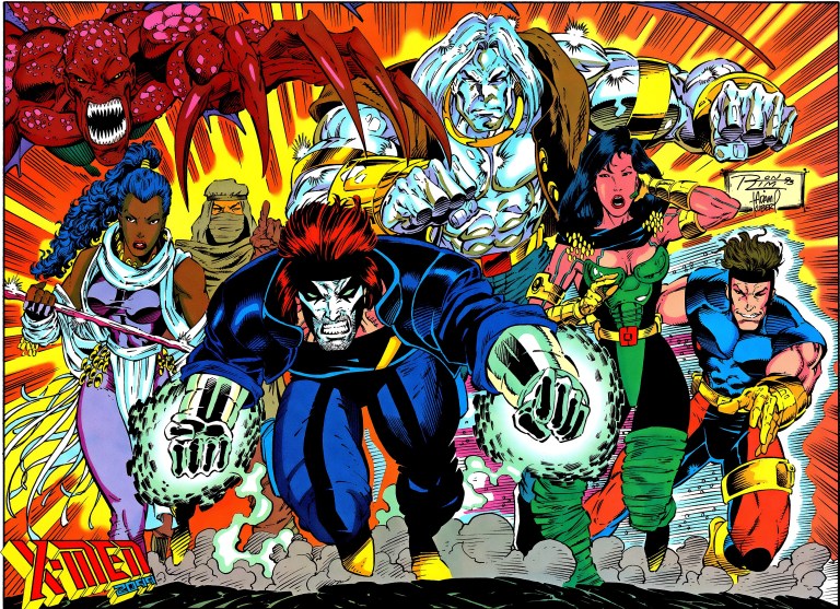
The X-Men of 2099.

Financial value aside, X-Men 2099 #1 is engaging and entertaining, and it has that 1990s charm to it.

X-Men 2099 #1 is highly recommended.


Thank you for reading. If you find this article engaging, please click the like button below and also please consider sharing this article to others. Also my fantasy book The World of Havenor is still available in paperback and e-book format. If you are looking for a copywriter to create content for your special project or business, check out my services and my portfolio. Feel free to contact me as well. Also please feel free to visit my Facebook page Author Carlo Carrasco and follow me at HavenorFantasy@twitter.com