A Look Back at Punisher 2099 #1 (1993)

Disclaimer: This is my original work with details sourced from reading the comic book and doing personal research. Anyone who wants to use this article, in part or in whole, needs to secure first my permission and agree to cite me as the source and author. Let it be known that any unauthorized use of this article will constrain the author to pursue the remedies under R.A. No. 8293, the Revised Penal Code, and/or all applicable legal actions under the laws of the Philippines.

As already established here on my website, I reviewed several comic books of the Marvel 2099 line of superhero comics. I reviewed the respective launch issues of X-Men 2099, Spider-Man 2099 and Ravage 2099 to name a few.

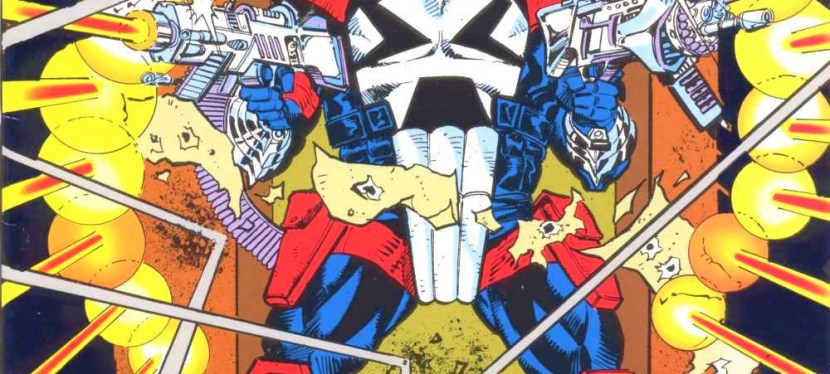
Some of you must be wondering what was the first-ever Marvel 2099 comic book I bought back in the 1990s. Believe it or not, it was not Spider-Man 2099 #1 (the one comic book that launched the Marvel 2099 line in late 1992). It was actually Punisher 2099 #1 which I bought in December 1992 (comic book was cover dated February 1993).

You read that right. I was a latecomer on discovering the Marvel 2099 universe in the late 1990s. Prior to the launch of Punisher 2099, comic books of Spider-Man 2099, Ravage 2099 and Doom 2099 were already on the shelves of comic book stores.

One day in Makati here in the Philippines, I passed by a comic book stall in a department store and saw Punisher 2099 #1 (which had a gimmick cover) and other 2099-related comic books displayed. After observing the available 2099 comics, I decided to buy Punisher 2099 #1 not simply because of its gimmick cover but because I wanted to discover the 2099 universe through the futuristic version of the Punisher (which I’m not even a fan of).

Here is my retro comic book review of Punisher 2099 #1 published by Marvel Comics in late 1992 with a story by Pat Mills and Tony Skinner with illustrations done by Tom Morgan.

Cover
The cover.

Early story

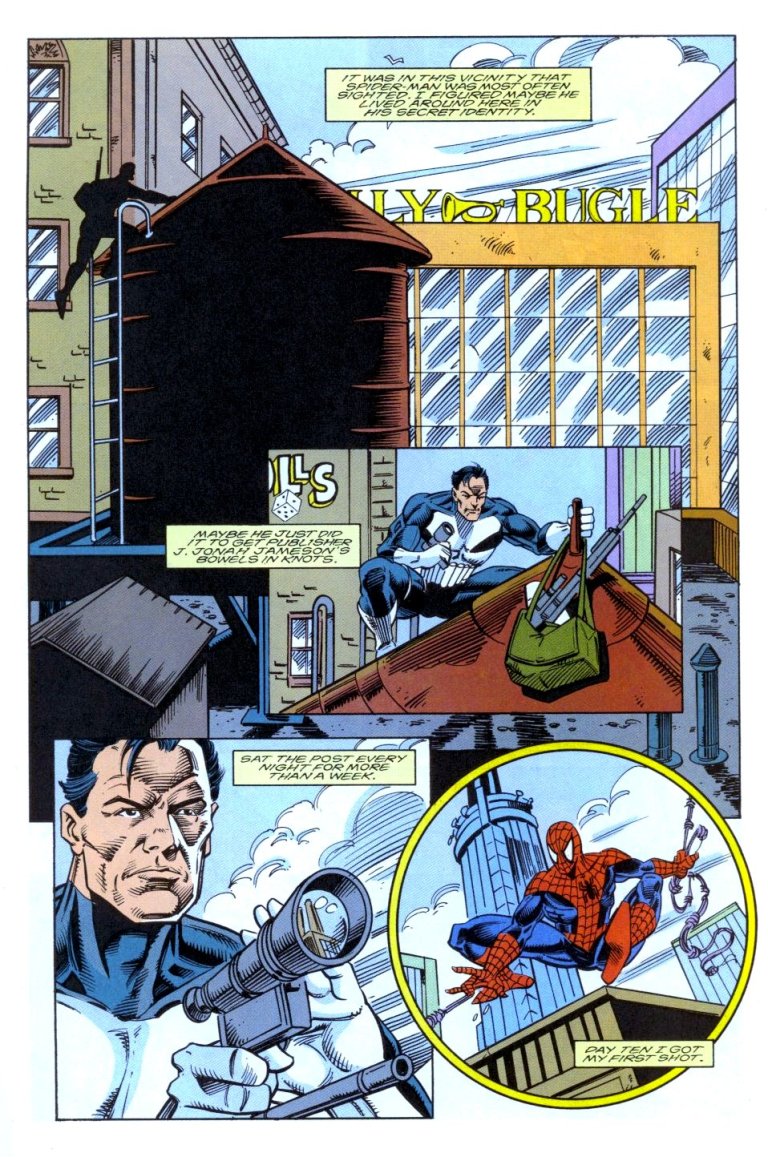
The story begins with a man running away from danger. Because he does not have enough money to summon law enforcement for protection (note: cities in 2099 are all run by corporations and even public services have been privatized), he easily gets ganged up and killed by crooks armed with surgical devices. They killed him to get his heart.

Shortly after, the Punisher of 2099 arrives and easily kills the crooks. His action caught the attention of Public Eye Police Force (note: a service of police protection that responds to transactions by paying clients) via the city surveillance system, the cameras of which are unable to identify him because his head is automatically covered digitally (the Punisher here has his own identity protection system).

86

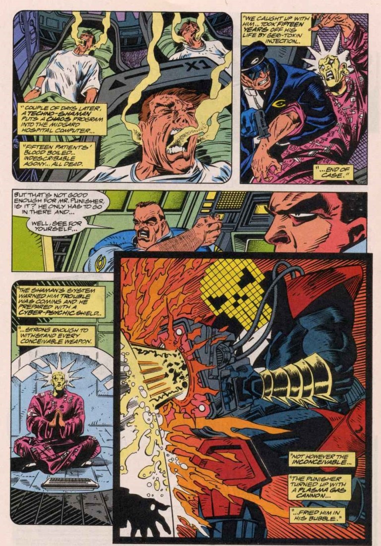
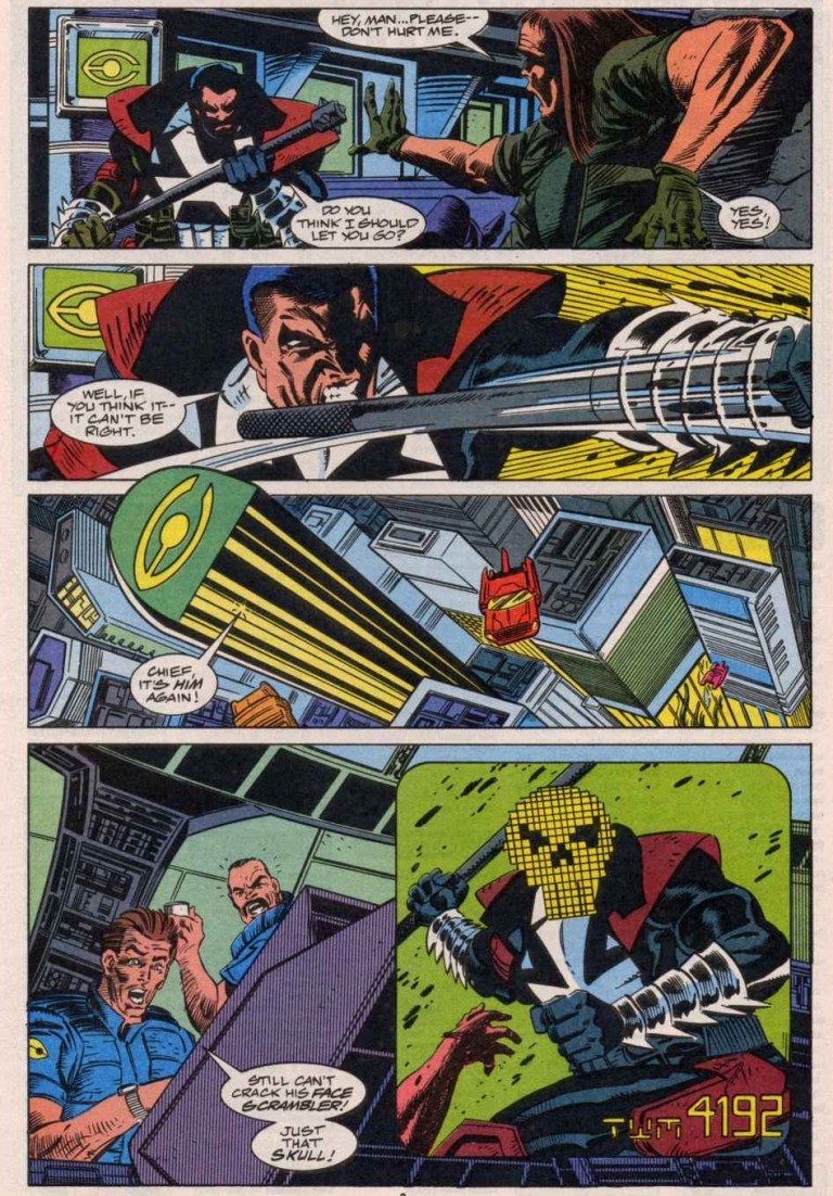
Jake Gallows, who is Punisher 2099 himself, enters the office of Public Eye. He is an employed enforcer of theirs and he notices that his employer has been watching his acts of violence against criminals…..

Quality

When it comes to establishing Punisher of 2099, the creators of this comic book pulled of a decent job. They not only introduced Marvel’s vigilante of the far future efficiently, they also made him look interesting temporarily. They also did a nice job with connecting Jake Gallows with Frank Castle, the 20th century Punisher.

Still, Punisher 2099 #1’s clear weak point in presentation was the back story of Jake Gallows who became the Punisher as a result of his family getting killed by group of armed, wicked people. In concept, this is too similar to the origin of the original Punisher who also lost his family.

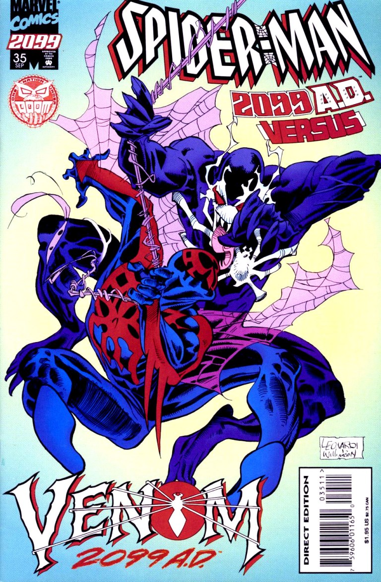
While the origin lacked creativity, the creative team at least tried something new by introducing Kron Stone as the first-ever villain for Punisher 2099. Kron Stone, if you know your 1990s Marvel 2099 history, was not only the son of Alchemax chief Tyler Stone (a key character in the Spider-Man 2099 series) but also went on to become Venom 2099 (who debuted fully in Spider-Man 2099 #35).

The creative team also made a nice move establishing Jake Gallows as an actual working law enforcer who took a huge risk as he also secretly made moves as a vigilante when he’s not working.

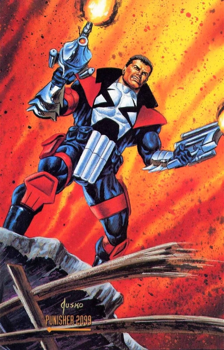
While the comic book writers did a decent job with the story and characterization even though they had less than 25 pages of storytelling, the art by Tom Morgan will only please readers who enjoy violent and gritty imagery. Personally, I’m not impressed with Morgan’s art and his work on the cover of this comic book is laughable. Punisher 2099’s character design (what’s with those three frontal tubes that formed the teeth of the skull design?) is really corny to look at and not even famous painter Joe Jusko could improve the character’s overall look.

JuskoCardPun2k99
Punisher 2099 as painted by Joe Jusko for the Marvel Masterpieces card series.

Conclusion

Given the fact that Punisher 2099 never became a significant character of Marvel Comics all these decades, I would suggest thinking very carefully before spending any money to buy or even rent Punisher 2099 #1. It’s not a terrible comic book, just flawed with some limited engaging stuff here and there. If you are really craving for early 1990s Marvel superhero stuff, then this one could be worth it.

If you are seriously considering acquiring an existing copy of Punisher 2099 #1, be aware that as of this writing, and according to the rates of Mile High Comics online, a near-mint copy of the regular edition costs $6 while a near-mint copy of the newsstand edition is priced at $16.

Overall, I say that it’s best to purchase a copy of Punisher 2099 #1 BELOW its cover price.


A Look Back at What If #58 (1994)

Disclaimer: This is my original work with details sourced from reading the comic book and doing personal research. Anyone who wants to use this article, in part or in whole, needs to secure first my permission and agree to cite me as the source and author. Let it be known that any unauthorized use of this article will constrain the author to pursue the remedies under R.A. No. 8293, the Revised Penal Code, and/or all applicable legal actions under the laws of the Philippines.

In early 1994, I was still in high-school. There was a time when I passed by a local comic book store that showed a new What If? comic book displayed among the many new titles. That particular comic book caught my attention because of its key question: What if the Punisher had killed Spider-Man?

That comic book was What If #58 published by Marvel Comics with a story by Chuck Dixon and art by Gordon Purcell. Check out the cover below.

Cover
The cover of this comic book took a lot of inspiration from that of Amazing Spider-Man #129.

To put things in perspective, Spider-Man and Punisher are both heroes in the universe of Marvel Comics but with very drastic differences between them. Spider-Man/Peter Parker fights crooks and other types of bad guys while maintaining a lawfully good nature even as he struggles to live a normal, personal life. Punisher, who is privately Frank Castle, is a killer who is driven to fight criminals beyond the boundaries of the law. The Punisher resorts to extreme forms of violence and guns are his main weapons. Due to the tragic loss of his wife and children, Punisher lives to wage a one-man war against criminals which only reflects the huge loss of his humanity.

Spider-Man and the Punisher first encountered each other in Amazing Spider-Man #129. Through the years, the two would face-off again and again. In the mid-1980s, the Punisher went on to rise in high popularity with comic book readers as Marvel Comics published three regular series: The Punisher, The Punisher War Journal and The Punisher War Zone.

That being said, we take a look back at What If #58.

Early story

Without involving Marvel’s galactic Watcher, the comic book begins with the Punisher aiming his gun at a man seated behind his desk. It turns out Punisher is waiting for the police to arrive at the place they are in.

From this point, the story is told in flashback with Punisher narrating. He is with the Jackal on the roof top of a building in New York City. Even as the Jackal pushes him to shoot a certain target already, the Punisher decides not to do it. He stressed he wants to study the target.

“It seemed right. Taking down a high profile outlaw like Spider-Man looked like the right way to go,” Punisher thought. “And Jackal promised unlimited funding of my war on crime if I succeeded.”

6
Punisher doing research.

Gradually, the Punisher prepares himself to kill Spider-Man…

Quality

Let me start with the concept of this comic book. Exploring what would happen had the Punisher actually killed Spider-Man (note: this is so obvious from the cover) is a bold and clever story to tell. To put things in perspective, the Punisher’s attempt to kill Marvel’s iconic superhero happened way back in Amazing Spider-Man #129 which was published way back in 1974. Very clearly, Punisher failed and Spider-Man went on to live and fight for good.

When it comes to storytelling, Chuck Dixon delivered a strong script and carefully crafted a standalone story that looks at the Punisher’s first-ever attempt to shoot Spider-Man but the narrative was more on the vigilante’s point-of-view. The dialogue was solid and the narration gives readers a good look at the personality of Frank Castle. I also liked the way the story was paced.

What also makes this comic book really good is that it shows in convincing fashion what else would have happened after the successful assassination of Spider-Man. Without spoiling the surprise, you can ask yourself how would Punisher react once he learned who Spider-Man really was, how would the many people who personally knew Spider-Man (whether good or evil) would react and what the state of crime in New York would be like.

10
The Punisher anticipating Spider-Man outside The Daily Bugle.

As for the art, Gordon Purcell did a decent job. He captured what was back then modern day 1990s look of the Punisher (completely rejecting the way the character looked in Amazing Spider-Man #129) and he knew how to present him from different angles regardless of what action was taken. On drawing Spider-Man, Purcell proved to be good. I noticed in some parts of the comic book, he tried hard to make Spidey look dynamic while traveling high above the streets of the city. The big money shot (in terms of illustration) for me was the moment Spider-Man got killed.

Conclusion

Overall, What If #58 is a good and fun comic book to read. Historically, this was released at a time when Spider-Man and the Punisher were both wildly popular. The decision to tell an alternate reality off Amazing Spider-Man #129 was inevitable and ultimately was nicely pulled off.

If you are thinking about acquiring What If #58, as of this writing MileHighComics.com shows that a near-mint copy of the regular edition is at $26 while the near-mint copy of the newsstand edition is at $77.

What If #58 is recommended.


Thank you for reading. If you find this article engaging, please click the like button below and also please consider sharing this article to others. If you are looking for a copywriter to create content for your special project or business, check out my services and my portfolio. Feel free to contact me as well. Also please feel free to visit my Facebook page Author Carlo Carrasco and follow me at HavenorFantasy@twitter.com

A Look Back at What If #9 (1990)

Disclaimer: This is my original work with details sourced from reading the comic book and doing personal research. Anyone who wants to use this article, in part or in whole, needs to secure first my permission and agree to cite me as the source and author. Let it be known that any unauthorized use of this article will constrain the author to pursue the remedies under R.A. No. 8293, the Revised Penal Code, and/or all applicable legal actions under the laws of the Philippines.

Long before the renaissance of Hollywood-produced superhero movies even started, the X-Men established itself as one of the most popular franchises of Marvel Comics. What some readers do not know was that while the X-Men indeed started in 1963 under Stan Lee and Jack Kirby, Marvel’s mutants actually started getting successful in the mid-1970s with the 2nd X-Men team (Cyclops, Wolverine, Storm, Sunfire, Nightcrawler, Colossus, Banshee and Thunderbird) handled by Len Wein and Dave Cockrum.

That new team literally made a splash with readers with the release of Giant-size X-Men #1 in 1975. That comic book, which is very valuable now, saw Charles Xavier recruiting new mutants to form a new team with Cyclops being the only pioneer remaining. Subsequently the X-Men monthly series of that era saw lots of stories of this particular team solving problems and fighting evil. Along the way, Chris Claremont got hired as the new writer and then the rest was history.

In this retro comic book review, we will take an interesting look at what would have happened had the 2nd team of the X-Men died on their first mission.

This is What If #9 written by Roy Thomas, drawn by Rich Buckler and published by Marvel Comics in 1990.

Cover
The cover.

Early story

The comic book begins with the Watcher of Marvel’s universe explaining what actually happened during the X-Men’s mission in Giant-size X-Men #1. Then he offers an alternate version of the events asking “What if…the new X-Men had died on their very first mission?”

The new reality begins in Scotland where Moira McTaggert receives a telegram from the United States. The message read that her friend Charles Xavier is ill which compels her to leave immediately. Before leaving, a little girl named Rahne comes to Moira followed by Craig who asserts his authority on her. Subsequently Moira and Rahne arrive at Salem Center, New York, greeted by Hank McCoy/Beast who confirmed that he was the one who sent the telegram to her.

Moira finally meets Xavier who expressed surprise to see her. As it turned out, Xavier had isolated himself in a room using Cerebro. After separating from Xavier, Beast explains to Moira what happened previously to Cyclops, Jean Grey, Havoc, Polaris and Ice Man on a far away island (read Giant-size X-Men #1). Cyclops was fortunate enough to survive and return to Xavier who was compelled to use Cerebro to trace mutants around the world (note: the 2nd X-Men team).

2
When trouble hits the world…

This leads to events told in Giant-size X-Men #1 but something drastic happened…

Quality

Storytelling is easily the strongest and most defining element of this comic book, especially if you are fortunate enough to read what happened in Giant-size X-Men #1 from 1975. The alternate plot by Roy Thomas is pretty intriguing and highly dramatic, and yet it still manages to add some spectacle to maintain balance.

What If #9 strongly delivered on what it promised what would have happened had the 2nd X-Men team died on their first mission complete with the narrative shifting dramatically through the eyes of Moira McTaggert, Xavier and Beast.

In terms of characterization, I really enjoyed the dramatization of the close friendship between Xavier and McTaggert. Having read lots of X-Men comic books through the decades, I should say that McTaggert was often limited to supporting roles or guest appearances. As seen in this comic book, she and Xavier made a solid pair of mentors. Lastly, the portrayal of Xavier being somewhat broken and regretful is wonderfully executed. Adding to that, the portrayal of McTaggert as a strong provider of direction and support for a fragile Xavier is memorable.

When it comes to the visuals, Rich Buckler scored nicely. The characters are all recognizable (with Beast looking a bit more visceral than how he actually appeared in the 1970s to 1980s) and their facial expressions were nice to see. Buckler also proved to be good with visualizing the action and the suspenseful parts.

Conclusion

1
Very nice artistic presentation by Rich Buckler. Readers of 1975’s Giant-size X-Men #1 will be able to relate with this.

Overall, What If #9 is a great comic book to read. It is the closest thing you can get when it comes to seeing Marvel’s mutants led by Xavier with McTaggert working behind the scenes together. Roy Thomas and Rich Buckler really scored a homerun with this non-canon X-Men story!

For the comic collectors reading this, based on the rates at MileHighComics.com as of this writing, a near-mint copy of this comic book’s regular version is $24 while the near-mint copy of the newsstand edition is priced at $51.

What If #9 (1990) is highly recommended!


Thank you for reading. If you find this article engaging, please click the like button below and also please consider sharing this article to others. If you are looking for a copywriter to create content for your special project or business, check out my services and my portfolio. Feel free to contact me as well. Also please feel free to visit my Facebook page Author Carlo Carrasco and follow me at HavenorFantasy@twitter.com

A Look Back at X-Men 2099 #25

Disclaimer: This is my original work with details sourced from reading the comic book and doing personal research. Anyone who wants to use this article, in part or in whole, needs to secure first my permission and agree to cite me as the source and author. Let it be known that any unauthorized use of this article will constrain the author to pursue the remedies under R.A. No. 8293, the Revised Penal Code, and/or all applicable legal actions under the laws of the Philippines.

Back in the 1990s, comic books with gimmick covers and higher cover prices were abundant and also were easy targets for collectors. In the case of Marvel Comics, the concept of the “anniversary issue” was important because it gave them a chance to sell comics at a higher price.

To put things in perspective, many times back then Marvel would produce comic books with slightly more pages and a gimmick cover in celebration of a so-called anniversary such as the comic book series reaching its 25th or 50th or 75th or 100th issue and so on. Other anniversary celebrations include a character specific anniversary such as Spider-Man’s 30th anniversary celebrated with the comic book Amazing Spider-Man #365 which had a lot of pages and a hologram cover.

Of course, such anniversary celebrations were implemented on the Marvel 2099 line of comic books. Check out my review of Spider-Man 2099 #25.

Right here we will take a look at the first-ever anniversary celebration issue of the X-Men of the far future with X-Men 2099 #25 written by John Francis Moore and drawn by Ron Lim. This comic book was released in 1995 and Marvel already published multiple series of other franchises of their 2099 line. Prior to X-Men 2099 #25, the team saw its members separated from each other and went through lots of misadventures and unfortunate events before finally getting back together.

Cover
The full cover drawn by Ron Lim.

Early story

X-Men 2099 #25 begins with a research of Xi’an and his band of mutants being presented by the Minister of Humanity (Morphine Somers) to the President in their airship flying above California.

“I see in this current generation of X-Men an untapped potential,” said the President. “Now, tell me you have finally relocated them.”

The story then shifts to the slaughterhouse of the Theater of Pain wherein a restrained Shakti/Cerebra is standing helpless next to Brimstone Love and a masked Xi’an who are about to execute a sinister plan. Shakti speaks out against them and tells Brimstone that they are parasites preying on the pain and vulnerability of innocent people. Brimstone insists that the weak and helpless provide sport for the rich and powerful, and that his group was founded for the select powerful few who crave for and pay a lot for performances. Xi’an, who had a sinister past before getting reformed to revive the X-Men (before reverting back to evil due to Zhao’s invasion of his mind), only emphasized the theater’s importance.

Defiant, Shakti tries to reach deep into Xi’an and turn him around.

Elsewhere, the former Theater of Pain member Luna (who by this time got close with Tim/Skullfire) is chained and is confronted by her sisters in the theater. Skullfire meanwhile is in the waste disposal center where he meets someone who betrayed their team. They both thought about setting aside their differences to do something before time runs out…

Quality

19
X-Men 2099’s Krystalin, Meanstreak and Bloodhawk get into the action.

In terms of visuals, I can say that Ron Lim’s art is pretty good and, most likely in tandem with the writer, took careful steps to control the pace enough to keep readers entertained without ever making things look disorienting. When there is action, the pace moves fast and the impact of the action done is always visible. As seen throughout the X-Men 2099 series, the look of the southwestern region of America is always striking and I like the fact that the wilderness setting comes with lesser presence of futuristic technology (compare this to what was seen in 2099’s New York) which gives this comic book a more laid-back concept.

When it comes to the storytelling, character development is nicely emphasized in this comic book. If you read enough of the early comic books (let’s say the first ten issues) and paid close attention to the futuristic X-Men, you will be able to relate with their struggles which add a lot of depth to the usual good-versus-evil storytelling here. Without spoiling the story, I should say that this comic book concluded with a believable new direction emphasized which in turn made me want to look to the next issue. It’s that strong of an ending!

16
It sure is intriguing to see Shakti, one of the most prominent X-Men 2099 members, really suffer along with others.

I also liked the way this comic book emphasized the connections between the Theater of Pain with the Chosen (another group of villains) and most notably with Zhao (a previous leader of the X-Men before Xi’an’s time).

As for in-universe crossing-over, this comic book nicely ties up with Doom 2099 which, at the time of publishing, was under the creative direction of Warren Ellis who is now one of the best comic book writers.

If there is anything I have an issue with, it’s the cover art. It has a few characters who appeared on the cover, most notably Desdemona, and yet were absent in this comic book’s story. They ended up looking like cover art filler. Not a problem but distracting and meaningless.

Conclusion

Let me make it clear here…I really like this comic book. It definitely has the best and most engaging story of the X-Men of 2099 ever and that’s because this particular monthly series had an extensive build-up on all the characters since issue #1 and issue #25 executed a great payoff.

In retrospect, the X-Men drastically changed since the start of issue #4 and this includes members who went far away or decided to exclude themselves. X-Men 2099 #25 tied up most the loose threads not only by having the team members back together but also emphasized how much they developed over the past few years (in real life, that is). This is also the kind of comic book that will make you want to revisit the very start of its series and rediscover the characters.

5
Luna in chains.

If you are seriously collecting comic books, be aware that based on the listings of MileHighComics.com as of this writing, as a near-mint copy of the comic book’s regular edition is $4 while a near-mint-copy of the deluxe edition (with gimmick cover) is at $6. X-Men 2099 #25’s newsstand edition is worth $8 for a near-mint copy.

Overall, X-Men 2099 #25 is highly recommended. The creators outdid themselves and made the best story of titled characters. Truly, this comic book is where the mutants of 2099 really got defined in their respectful place within the Marvel Comics universe of the 1990s.


Thank you for reading. If you find this article engaging, please click the like button below and also please consider sharing this article to others. If you are looking for a copywriter to create content for your special project or business, check out my services and my portfolio. Feel free to contact me as well. Also please feel free to visit my Facebook page Author Carlo Carrasco and follow me at HavenorFantasy@twitter.com


A Look Back At Freex #7

If there is any particular superhero comic book title I could compare Freex of the Ultraverse with, it’s Marvel’s famous X-Men. Similar to the mutants of the big M, Freex is a team of teenagers who each have different super powers or special abilities while struggling with being social outcasts. What makes them different is that the Ultraverse teenagers have no mature adult to look forward to for guidance. They don’t have a mansion to live in, and they have no choice but to move around constantly and survive the best way they could.

I took a look at the other existing back issues of Freex in my collection and what caught my attention was Freex #7.

CoverFreex7
The cover.

Let’s now take a look back at Freex #7 and see what makes it unique (if not special).

Early story

The story begins with the Freex hastily stealing clothes from a store in city. While the others are desperately grabbing what they could (note: the store’s glass window was shown smashed already), Angela/Sweetface looks scared. One of her male companions tell her to be tough like Valerie/Pressure.

Just as they start leaving the store behind, the alarm system goes off. The sudden rush only adds pressure to them, causing Lewis/Anything to confront Michael/Plug only because the latter said something about team leadership. As Angela separates Michael and Lewis using her fleshy tentacles, Valerie loses her cool when Ray/Boomboy calls her by her codename. Valerie hits Boomboy with a blast of plasma. With their momentum disrupted by division and tension, Lewis tries to calm his teammates down but Plug won’t have any of it as he desires to find out about the source of all of their powers referred to as Wetware Mary. Plug finds a telephone booth and instantly transfers himself into it in the form of energy.

Freex7a
Division between members of Freex is common.

As the Freex remain divided, a local resident living nearby watches them from a distance.

Quality

The story written by Gerard Jones is pretty engaging mainly due to characterization (as opposed to storytelling and structuring). Through the dialogue, you can really sense the thoughts and emotions of each member of Freex, especially Valerie since this particular comic book focused on her origin. Without spoiling Valerie’s background, her origin was efficiently emphasized and never, ever felt dragging. By the time her origin story concluded, I got to understand Valerie better and why is she so mean. After the conclusion of the Freex’ story, there is also an Aladdin Datafile on Valerie who turned out to be 16-years-old, 5 feet and 9 inches tall, and even has a low threat assessment by Aladdin.

Adding further value to this comic book is a 2-page quick feature of Hardcase which shows a nice look back at his past before the establishment of The Squad.

Conclusion

Freex7b

From the past of Pressure.

Freex #7 is a good read. The story about the teenage social outcasts of the Ultraverse is well balanced in terms of characterization and action. Anyone who is a fan of Valerie/Pressure or female superheroes who are mean, angry and rebellious will find a lot to enjoy in this comic book. A near-mint copy of Freex #7 is worth $4 at MileHighComics.com as of this writing.

Overall, Freex is recommended.

Meanwhile, check out my retro review of Freex #1 right here.


Thank you for reading. If you find this article engaging, please click the like button below and also please consider sharing this article to others. Also my fantasy book The World of Havenor is still available in paperback and e-book format. If you are looking for a copywriter to create content for your special project or business, check out my services and my portfolio. Feel free to contact me as well. Also please feel free to visit my Facebook page Author Carlo Carrasco and follow me at HavenorFantasy@twitter.com

A Look Back at Aerobiz Supersonic

When it comes to playing economic simulation games, I enjoy playing them on the personal computer (PC) using the keyboard and mouse. Back in the mid-1990s, there was one particular economic simulation that I played on the Super Nintendo Entertainment System (Super NES or SNES) and found it to be very enjoyable and easily to play with using the console’s control pad.

That game was Aerobiz Supersonic, a simulation about the airline industry developed and published by Koei for both the Super NES and the Sega Genesis. Here is my look back at this old video game from the 1990s.

Screenshot_20200222-133557_Photos.jpg
The cover of the Super NES version of the game. Its art and style is really nice to look at.

Concept and Game Design

In the game, you get to play the Chief Executive Officer (CEO) of an airline and your goal is to beat your rivals in the global air travel industry. How to achieve the goal and succeed? There are tasks that need to be accomplished such as buying commercial airplanes (that include such real-life companies like Boeing and Airbus) for use, establishing flight routes, securing slots in airports worldwide, selling tickets and filling up each flight with as many passengers as possible, achieve profitability and finish the game’s imposed time period ranking #1. Adding zest to the game’s challenge is the selection of a certain era of world history that include 1955-1970 (the dawn of jets), 1970-1990 (the Cold War era), 1985-2005 (the present era) and 2000-2020 (the age of continued flight advancement).

Within the game, time passes by means of clicking a certain on-screen button that ends the player’s current turn. Of course, before pressing that, the player has to set things in motion like sending a representative to a certain overseas airport to negotiate and secure slots (which takes months to complete), set the ticket prices, buy a new airplane or two, etc. The game even allows players to micro-manage their airline like adjusting internal spending (salaries) or adjusting the quality of their airplane and services. Also nice is the option offered for players to buy a hotel or resort, a theme park or a travel agency that can bring in additional revenue.

Screenshot_20200222-132447_YouTube.jpg
The airport slots, local businesses, economic and tourism details per city displayed.
Screenshot_20200222-132508_YouTube.jpg
Visit an airline and choose from one of many models of airplanes to buy.

There are other small details that need paying attention to such as the economy and tourism meters of each city displayed (note: a higher tourism score means the city is more attractive to travelers), the population, etc. Also noteworthy is the current state of relations between your home nation with the nation of the city airport you are trying to establish routes with which can affect your business.

When the turn ends, a series of events will happen showing what happened around the world, how your company fared in the competition during the lapsed time period, and, occasionally, a random event will occur that most likely will affect your business (examples: the Olympics hosted by a city helps draw in additional passengers or the 1970s oil crisis raises the cost of your operation).

Regarding the game’s imposed time period for competing with the artificial intelligence (AI) opponents, the period is twenty in-game years.

Screenshot_20200214-195600_YouTube.jpg
This is part of micro-managing your business in the game.
Screenshot_20200214-195720_YouTube.jpg
After the end of each turn, news and updates not only about your company but also your competitors are flashed.

Quality

Being used to playing simulation games on PC, I found Aerobiz Supersonic to be very enjoyable, addicting and easy and efficient to play (in terms of controls). Considering the above-mentioned gameplay options (buying an airline, sending a representative, etc.), they are pretty easy to adjust using the Super NES controller although there were a few moments when I accidentally pressed the button putting into motion a different option.

Gameplay aside, this game has a whole lot of charm with its visual presentation. You launch a brand new flight route, the game shows a short animation sequence of the jet taking off. You buy an airplane, you will see a short animation of it entering your facility once it arrives (complete with a visual design reflecting the model). You conduct a board meeting, your company’s officials are present making reports to you and you get a series of choices to make on what to do next. A historical event or a global development occurs, you get to see original art reflecting them (example: a nation joins the EU with people wearing suits and neckties together in a formal ceremony). You make a move to buy slots at an airport overseas, a company official will have his or her face shown talking to you. When looking at the regional map, you see lines connected between cities (highlighting the establish flight route you made) and there are icons of airplanes flying between them.

Screenshot_20200214-195732_YouTube.jpg
Random tourist hot spots get highlighted as you keep playing.

More on the aspect of starting the game, I like the options offered for me to select which city shall serve as my airline headquarters. Among the many cities included, there are cities of my native Philippines namely Manila (the international destination) and the nearby city of Cebu. I still remember how delighted I was to see my native Philippines included in the game, complete with Asian character designs to reflect the company and its region.

Conclusion

Ultimately Aerobiz Supersonic (which was actually a sequel to Aerobiz) is a gem of a console economic simulation released at a time when 2D sprite gaming was still the standard and 3D polygonal gaming was just about to make an impact on the global video game console market. Back then, 2D side-scrolling action/adventure games, sports games and role-playing games (RPGs) were so common on the Super NES and Genesis combined and the idea of enjoying economic simulations on consoles was highly unusual. Aerobiz Supersonic is proof that economic simulations can come with a lot of depth, deliver a good amount of strategy and can be highly playable and enjoyable on consoles.

If you want to enjoy this game, it can be quite difficult to do because you need to acquire an existing copy of the game as well as a fully functioning Super NES or Sega Genesis. As of this writing, there has never been a re-release of Aerobiz Supersonic (note: in line with legitimacy, I will not consider those browser versions or file sharing of ROMs) and it is not even included on Nintendo’s Virtual Console. There’s not even a version made for smartphones.

Now if only the executives at Koei Tecmo Games would consider revisiting Aerobiz Supersonic with today’s consumers in mind.

Screenshot_20200222-132429_YouTube.jpg
You can choose what kind of plane, how many planes, how many flights and how much you set the ticket prices whenever you start a new flight route.

Thank you for reading. If you find this article engaging, please click the like button below and also please consider sharing this article to others. Also my fantasy book The World of Havenor is still available in paperback and e-book format. If you are looking for a copywriter to create content for your special project or business, check out my services and my portfolio. Feel free to contact me as well. Also please feel free to visit my Facebook page Author Carlo Carrasco and follow me at HavenorFantasy@twitter.com


A Look Back at Spider-Man 2099 #35 (1995)

Disclaimer: This is my original work with details sourced from reading the comic book and doing personal research. Anyone who wants to use this article, in part or in whole, needs to secure first my permission and agree to cite me as the source and author. Let it be known that any unauthorized use of this article will constrain the author to pursue the remedies under R.A. No. 8293, the Revised Penal Code, and/or all applicable legal actions under the laws of the Philippines.

When Marvel Comics first launched the 2099 imprint of comic books showcasing many futuristic versions of their present-day characters – like Spider-Man, Ravage and Dr. Doom – it was inevitable that the same treatment will be applied to their popular supervillains.

In 1993, the 2099 version of Vulture was introduced and he sure proved to be one tough opponent for Spider-Man 2099. Even back then, there already was clamor for a futuristic version of Venom which at the time was riding high with readers being the featured anti-hero in several limited series (starting with Lethal Protector) of comic books.

Then in 1995, after doing a creative teaser in issue #34, Marvel formally introduced Venom 2099 by releasing Spider-Man 2099 #35. This is my review of the comic book written by Peter David and drawn by Andrew Wildman (X-Men Adventures).

Cover
The cover drawn by Rick Leonardi.

Early story

Picking up from the events of issue #34, the story begins in Washington, DC with Dana freeing herself only to find out that Alchemax’s CEO Tyler Stone was down suffering from a gun shot and losing blood. Minutes later, emergency personnel take Stone’s body for immediate treatment.

Meanwhile, Spider-Man 2099 (Miguel O’Hara) encounters the SHIELD flyboys in New York. After almost getting into trouble together, Spidey gets informed that US President Doom 2099 ordered them to leave him alone for a period of seventy-two hours while he considers a cabinet offer. Back in Washington, Dana gets interrogated by one of the authorities. President Doom enters the scene telling Dana that she will join Tyler Stone immediately in the medical center.

3
Andrew Wildman’s take on Spider-Man 2099 and the future was really nice to look at.

In New York, two guys sitting on the sidewalk witness a moving black liquid coming out of the sewer. The thing turns out to be a living symbiote (or alien costume) forming into a human-like shape – Venom 2099!

Quality

As with other comic books of this particular series, the writing by Peter David is pretty deep and engaging. The usual balance between dramatization, character development, plotting and spectacle is here once again but with a slight touch of horror in relation to the introduction of Venom of 2099. Speaking of dramatization, the portrayal of Venom 2099 as a vicious villain is similar to the 20th century Venom (Eddie Brock) but with a very powerful obsession to kill Miguel O’Hara and Tyler Stone.

Here’s an excerpt from the dialogue of Venom of 2099: Miguel O’Hara…and Tyler Stone…together again. We…I get to kill you…at the same time…how awfully…awfully…considerate. To show my appreciation…I’ll kill you slowly.

What makes this comic book unique is the artwork by Andrew Wildman who temporarily replaced regular illustrator Rick Leonardi. For comparison, I find Wildman’s art style a welcome thing in this comic book mainly because he draws with a lot more detail per panel and per page than Leonardi ever could. Instead of seeing the usual sketch-like art style of Leonardi, Wildman’s style is livelier and more expressive to look at. I also enjoyed Wildman’s visual take on Spider-Man 2099/Miguel O’Hara, Lyla, Tyle Stone, and the other established characters. Their facial expressions are also livelier to see.

9
Venom 2099 appears! Take note of the “liquid” at the edges of the page.

More on visuals, Wildman’s take on Venom 2099 is unforgettable. Like 20th century Venom, he has a dark suit, elongated jaw with rows of sharp teeth and an elongated tongue but with green acid dripping all the time. There are also those tentacles-like things that stretch from his body until the arms. Also his white-colored mask with large eyes make him look horrific.

Conclusion

Despite being shorter than the usual 22-pages, Spider-Man 2099 #35 is still a very engaging and fun old comic book to read. Its purpose was to build-up anticipation leading to the introduction of Venom 2099 was achieved nicely and the respective qualities of the writing and visuals are very good even by today’s standards. More on the presentation of Venom of 2099, it seems like Peter David took inspiration from movie director James Cameron on building-up tension and suspense before showing the villain. That’s a move I enjoyed in this comic book.

Overall, Spider-Man 2099 #35 is highly recommended. If you plan to acquire an existing and legitimate hard copy, be aware that the near-mint copy of it is over $100 for the newsstand version while the Rich Leonardi-drawn “Venom 2099 AD” cover version is priced at over $80 at MileHighComics.com as of this writing.


Thank you for reading. If you find this article engaging, please click the like button below and also please consider sharing this article to others. Also my fantasy book The World of Havenor is still available in paperback and e-book format. If you are looking for a copywriter to create content for your special project or business, check out my services and my portfolio. Feel free to contact me as well. Also please feel free to visit my Facebook page Author Carlo Carrasco and follow me at HavenorFantasy@twitter.com

Carlo Carrasco’s Comic Book Review: 2099 Alpha #1

Hey comic book fans! It is finally official! The 2099 universe of Marvel Comics has been revived with the release of 2099 Alpha #1 which I bought at the local comic book store here in Alabang, Muntinlupa, Philippines. The comic book that was available had a Spider-Man 2099 variant cover and it carried a hefty $4.99 price!

So you must be wondering…is the comic book any good? Does it capture the look and feel of the 2099 universe that first appeared in comic books back in the 1990s? Any significant changes in terms of storytelling and visuals?

Here is my review of 2099 Alpha #1.

2019-11-21_100919~2.jpg
The variant cover showing Spider-Man 2099 with Spidey and related characters from the past.

Written by Nick Spencer with art by Viktor Bogdanovic (colors provided by Marte Garcia), the comic begins in The Ravage (note: this is NOT the failed 2099 hero of Stan Lee and Paul Ryan) where a little boy finds Thor’s hammer but abandons it as he saw some monsters coming. The story then shifts to Brooklyn where Jake Gallows (Punisher 2099) gets into a violent encounter with a man before finally meeting the backup he called for. Then they see a sign that their god, Thor, is now in a merciful mood.

In Nueva York, Miguel O’Hara (Spider-Man 2099) talks with Tyler Stone inside an Alchemax tower. Tyler examines what Miguel brought to them and he mentions an incoming threat. Elsewhere, Conan appears struggling in battle with some people. From a distance, Doom 2099 watches and he has the Watcher captive.

Quality

To put it short, 2099 Alpha #1 is really a set-up type of comic book designed to immerse readers into the 2099 universe which now looks darker, grittier and more twisted than the way it was first presented back in the 1990s. Because the spotlight shifts from one place to the next, showing multiple characters, there really is not much meat in the storytelling. Really, thirty pages of art and story were made but ultimately ended up being not so engaging.

The art of Viktor Bogdanovic shows the 2099 universe to be a depressing setting and his art on classic characters like Spider-Man 2099, Punisher 2099 and Doom 2099 make them look unrecognizable. I remember Jake Gallows being huge and buff but in this comic book, he looks like he lost a lot of muscle and ended up looking ordinary.

Conclusion

Overall, 2099 Alpha #1 is an expensive disappointment and it is easily the weakest new comic book I bought all year long. There is a lot of suspense, expository details and even some horrific imagery, but ultimately there is no real fun to experience here. At $4.99, this is too expensive and it is a waste as it failed to engage and entertain me. Let me add that I lowered my expectation for this revival of the 2099 universe since the teaser announcement was made months ago. Back then, I anticipated that the new guys handling the 2099 universe of comics will take it to a new direction (move far away from what made the 2099 universe in the 1990s memorable and distinct) and this overpriced comic book is an early confirmation of it.

2019-11-21_101114~2.jpg
Recognize any of these characters?

Of course, there are still several other 2099 comics from Marvel that will be launched next month, including Spider-Man 2099 #1, Venom 2099 #1, Ghost Rider 2099 #1 and more. We will find out soon enough if those comic books will share the same dark and gritty style of 2099 Alpha #1 or not.

Ultimately, 2099 Alpha #1 is not recommended. As long as it is sold at cover price, avoid it.

+++++

If you are nostalgic of the 1990s 2099 universe, check out my reviews of Spider-Man 2099 #1 and #25, Ravage 2099 #1 and X-Men 2099 #1.


Thank you for reading. If you find this article engaging, please click the like button below and also please consider sharing this article to others. Also my fantasy book The World of Havenor is still available in paperback and e-book format. If you are looking for a copywriter to create content for your special project or business, check out my services and my portfolio. Feel free to contact me as well. Also please feel free to visit my Facebook page Author Carlo Carrasco and follow me at HavenorFantasy@twitter.com


A Look Back At The H.A.R.D. Corps #1

The 1990s was a decade of excess when it comes to superhero comic books. Apart from the persistent hoarding of comic books and the quest for profit, there were also these wide superhero franchises (or superhero universes) that popped up and even challenged Marvel Comics and DC Comics. Malibu Comics launched the Ultraverse while Valiant Comics came up with its own universe.

Valiant established itself nicely with popular characters like Bloodshot, X-O Manowar, Turok and Ninjak, and each one had its own regular series of comic books published. When it comes to teams, there was H.A.R.D. Corps (H.A.R.D. stood for Harbinger Active Resistance Division).

During the recent Hobby Con held at Las Piñas City, I luckily found myself a copy of The H.A.R.D. Corps #1 and read it for the first time ever. This is my review of the comic book which has a cover drawn by the great Jim Lee.

RCO002_1472443923.jpg
Cover with art by Jim Lee.

Early story

The story begins with the 5-member team in the middle of a mission inside the secured facility of the Harbinger Foundation. Under fire from the facility’s armed personnel, the team (riding a floating vehicle) struggle to find their way and evacuate. Along the way, an oversized man called Big Boy grabbed one of their members and separated him from the others. With the situation getting worse, the captured member got “brain popped” (a remote form of self-destruction via the neural flash implanted inside the person’s brain). The remaining four manage to get away by means of aerial transport provided by their company.

Then a section of the facility exploded causing financial damage to Mr. Harada who decided to visit and inspect the site.

RCO017_1472443923~2.jpg
Expository information done cleverly.

Some time later, the H.A.R.D. Corps enjoy the privacy and security at their headquarters in the Nevada desert. Team members Shakespeare, Major Palmer, Softcore, Hammerhead and Superstar wait for instructions at the debriefing room.

Quality

The H.A.R.D. Corps #1 is very well written by David Michelinie. Within twenty-two pages, Michelinie loaded enough details to explain the comic book’s core concept efficiently while at the same time he managed to tell an engaging story with a light touch on character development (note: there were many characters and there was not enough space for further personality emphasis). By the time the story ended, I really felt enlightened, entertained and wanting to find out what would happen next.

Michelinie’s handling of expository dialogue was done very efficiently. I’m talking about the private briefing done by an executive of the Cartel explaining to a recovering man named Kim (who was almost killed during the Los Angeles Riot) what H.A.R.D. Corps is, why the Cartel is in a race against Harada who has been manipulating Harbingers (persons with unique abilities). The Cartel opposes Harada with neural implants.

More on the team, H.A.R.D. Corps members are people who have gone through training programs and each of them had neural implants in their heads which enable them to mimic Harbinger powers (one at a time) through signals broadcast from a base station. Each of them was comatose and the use of the implants reversed the coma.

RCO007_1472443923~2.jpg
Some action for you.

When it comes to visuals, the art by David Lapham (inked by Bob Layton) was pretty good. I like the high amount of detail placed on the surroundings in most of the panels. Action shots had a good amount of impact.

Conclusion

This comic book from late 1992 is a good and engaging read. I really enjoyed it and I like its core concept about a team of enhanced individuals who are technically living properties of very business-minded people opposed to Harada. Even by today’s standards, H.A.R.D. Corps concept really stands out among all superhero team comic books.

The H.A.R.D. Corps #1 is recommended and you can acquire a near-mint copy of it for only $4 at MileHighComics.com (as of this writing).

Carlo Carrasco’s Movie Review: Joker

Let me make it clear to all of you readers. The movie Joker is NOT a superhero movie at all even though it is a cinematic adaptation focused on one of DC Comics’ biggest super villains. It is also not a movie to watch for fun and enjoyment, but it is still engaging in a very different way.

The truth is, Joker is a large art film made to shock viewers with darkness, deep grit and some graphic violence. The good news here is that the movie is very engaging and easily reminds me of two certain movies that Robert De Niro and director Martin Scorsese worked together on. It’s a victory for Warner Bros. and DC Comics.

Screenshot_20191010-172920_YouTube.jpg
Joaquin Phoenix as the new cinematic Joker will be remembered for a long time.

Joker follows the exploits and Arthur Fleck (Joaquin Phoenix), a struggling man who is hardly surviving working as an entertainer (a clown, specifically) supporting his mother and dealing with the hard life of Gotham City which was stylistically made to look like 1970s New York City. Arthur, who is living with a condition of uncontrolled laughter, looks up to TV show host Franklin Murray (played by Robert De Niro) as an inspiring figure to try out comedy and hopefully make it big to free himself and his mother from poverty.

While performing as a clown surrounded by children in a hospital, Arthur accidentally drops a gun he just received from a co-worker. Because of this, he gets fired and learns that the man who gave him the gun lied to their boss. While riding the subway still looking like a clown, he gets beaten up by three business executives who were drunk. In response, Arthur kills them with the gun and gets away. This incident starts a chain of events that causes friction between the upper class and the lower class, and then protesters wearing clown masks multiply.

On face value, Joker is clearly inspired by character-driven films of the 1970s. While it is not necessarily based on any particular comic book, it carried some slight elements from Batman: The Killing Joke. What is more obvious is that it took inspiration from De Niro-Scorsese films Taxi Driver and The King of Comedy.

As a psychological thriller, Joker is a great portrayal of how low a desperate man could go only to strive and survive. Arthur Fleck is greatly played by Joaquin Phoenix who carefully blends drama, anger, violence and even humor altogether. He really made the cinematic Joker his own and along the way, his Joker laught is more effective than that of Heath Ledger and the Joker physical appearance is almost as memorable as that of Jack Nicholson’s. The movie is indeed very violent but it is not overly violent. To be specific, there are a lot more deaths, acts of violence and shooting in Brian De Palma’s Scarface than this movie.

Joker also has a lively portrayal of the conflict between social classes. The scenes of the clown-masked protesters filling the trains and the streets still resonate with the socio-political rallies that happened in modern society. There is also the aspect of poor and desperate people depending on government for survival and they are easily vulnerable to getting cut off whenever resources run out.

Desperation is also a solid theme in the narrative. To see Arthur Fleck look up to Franklin Murray and imagine sharing the stage with him on TV reminds me a lot about some real-life people (who don’t have too much money) I encountered in Cebu City who can’t help but stop studying (even the older ones quit their legitimate jobs) and get into local entertainment hoping that fame and fortune will lift them up. Of course, when things get worse, desperate people would either get back to what they can live with or, worse, turn to a life of crime just to survive. With regards to Arthur’s attempt to become a comedian on screen, that easily reminds me of similar people in real life who thought they are very talented to be the next great superstars but ended up failing.

Conclusion

With its very solid direction by Todd Philips, great dramatic performances, nostalgic presentation and in-depth characterization, Joker is a must-watch movie mainly for moviegoers who want to be engaged with psychological thrills and bouts. As a DC Comics movie that is NOT connected with Warner Bros.’ current franchise of superhero movies (that started with Man of Steel in 2013), Joker works as an adulterated, standalone movie. To compare it with comic books published DC, I should say Joker is very much like an Elseworlds story. For the new comers reading this, Elseworlds was a franchise of comic books published by DC Comics that had stories using established characters but were told outside of DC universe canon.

Joker is highly recommended. Just don’t expect to see the usual superhero movie elements in this very solid DC Comics movie.


Thank you for reading. If you find this article engaging, please click the like button below and also please consider sharing this article to others. Also my fantasy book The World of Havenor is still available in paperback and e-book format. If you are looking for a copywriter to create content for your special project or business, check out my services and my portfolio. Feel free to contact me as well. Also please feel free to visit my Facebook page Author Carlo Carrasco and follow me at HavenorFantasy@twitter.com