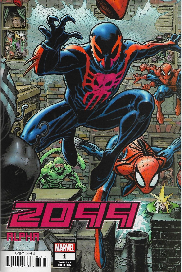
When Marvel Comics launched its 2099 franchise back in 1992 with Spider-Man 2099, clamor for having the futuristic hero meet up with the classic Spider-Man (Peter Parker) quickly followed.
Back in those days, crossovers were already popular and sold nicely with collectors. The Infinity Gauntlet of 1991 was an epic, universe-wide crossover done nicely by Jim Starlin, George Perez and Ron Lim. That limited series sold well, Marvel followed it up with The Infinity War (1992) and The Infinity Crusade (1993). Even the disjointed The X-cutioner’s Song crossover of the X-Men comic books of 1992 kept the fans coming back for more.
For the 2099 universe, the franchise had strong launches with the respective first issues of Spider-Man 2099, Doom 2099, Punisher 2099, Ravage 2099 and even the first latecomer series X-Men 2099. Back in 1993, having the said 2099 heroes mix together was realized in the 5-part crossover The Fall of the Hammer.
No matter what the trends back then, Spider-Man 2099 proved to be the most engaging series of the 2099 line of comic books arguably due to the in-depth storytelling of Peter David. Back in the 1980s, David worked at the direct sales team of Marvel Comics before moving into the editorial team as a writer. And, yes, he got to write for the Spectacular Spider-Man (originally titled Peter Parker, The Spectacular Spider-Man). Early on, Peter David made quite an impact with readers with the 4-part story The Death of Jean DeWolff in the said monthly series.
Many years later, David joined other comic book creators – including the late Stan Lee – on launching the 2099 franchise with Spider-Man 2099. He created a lot from scratch to establish the futuristic Spidey and made his mark on the 2099 universe.
“I don’t remember exactly which aspects of the 2099 were already part of the initial setup when I came aboard. I do know, though, that there was almost nothing specific for Spider-Man other than that he was, well, Spider-Man and (I think this was part of what I was handed) an employee of Alchemax. I was the one, though, who came up with his identity, the way his powers worked, the supporting cast, all of that. I even had a hand in designing the costume; not that I could draw a lick, but I sat there with Rick Leonardi during the first 2099 get together and described to him what I wanted, and he executed it perfectly, building upon what I suggested and improving it. I watched that costume come to life for the first time under Rick’s pencil. It was one of the single best collaborative moments in my life,” David said in a CBR.com interview.
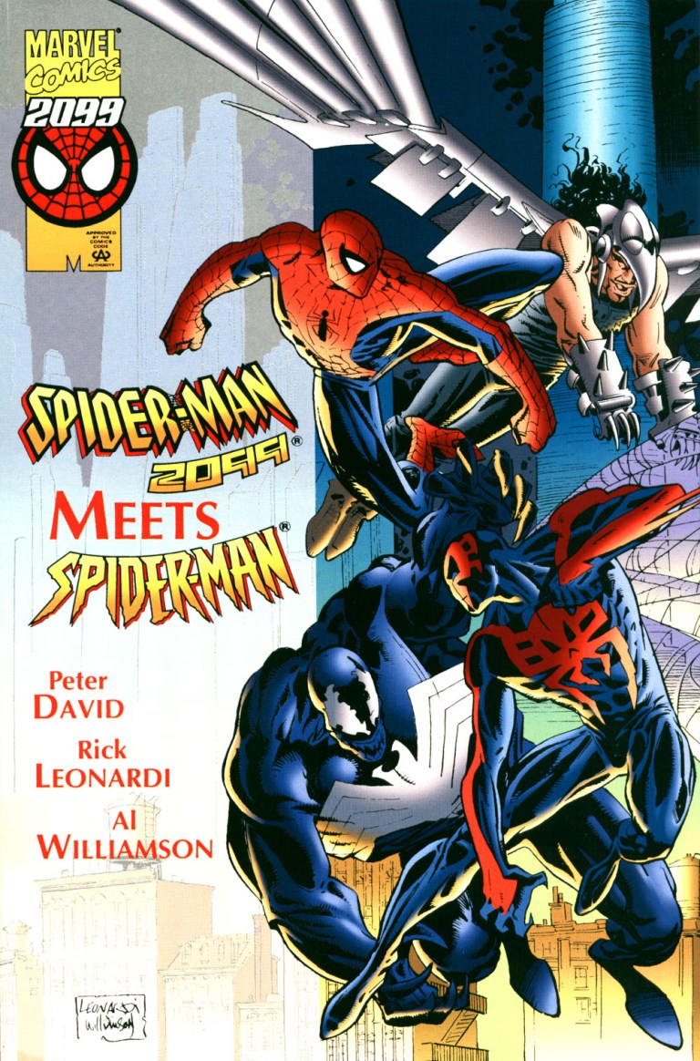
This brings us back to the year 1995 when Marvel published the one-shot special crossover comic book designed to attract Spider-Man 2099 fans and the many millions of followers of the classic Peter Parker Spider-Man. That comic book was Spider-Man 2099 Meets Spider-Man written by Peter David and drawn by Rick Leonardi.
Let’s take a close look.
The comic book
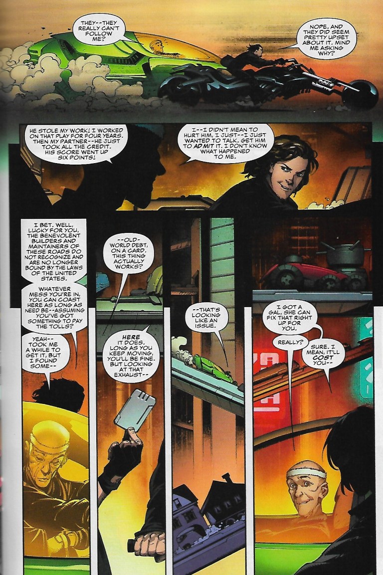
The story begins in the far future of 2099 wherein Spider-Man (Peter Parker) from the 20th century finds himself lost in time and chased by the floating law enforcers who saw him as a danger to the public. Even though his costume is different, one of the law enforcers mistook him for Spider-Man 2099. Predictably, Spider-Man struggles to overcome and get away from them.

Meanwhile in the 20th century, Miguel O’Hara mistakenly arrives “home” only to find himself (naked no less) on the same bed as Mary Jane Parker (Spidey’s wife) who is also naked. This only confirms to him that he is lost in time. He immediately decides to get away from MJ and explore the city of New York which does not have the futuristic society he grew up with.
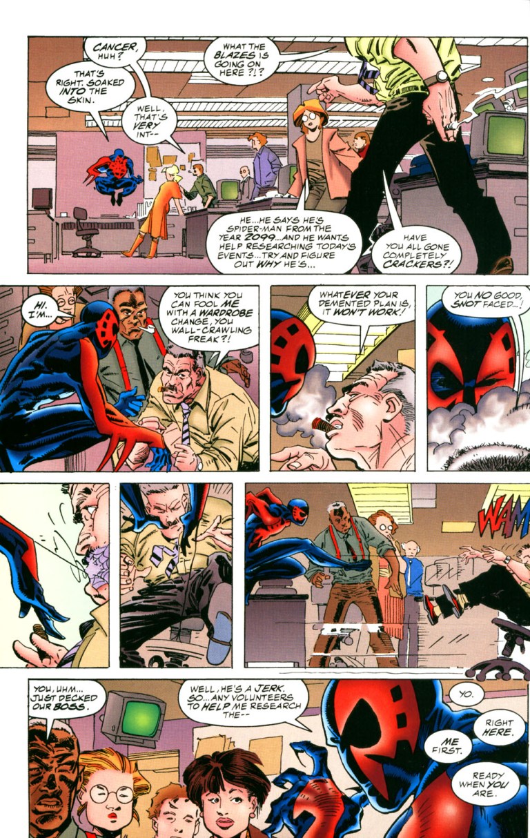
In an attempt to deal with the new reality, Spider-Man 2099 visits Peter Parker’s workplace – The Daily Bugle. He encounters Peter’s boss J. Jonah Jameson who mistook him as their time’s Spider-Man just wearing a new suit.
“You think you can fool me with a wardrobe change, you wall-crawling freak? Whatever your demented plan is, it won’t work,” Jameson told the disguised Miguel O’Hara who reacts by putting web on his mouth in front of the employees.
While the two superheroes struggle with being lost in time, Tyler Stone of Alchemax and Hikaru-Sama discuss something sinister.
Quality
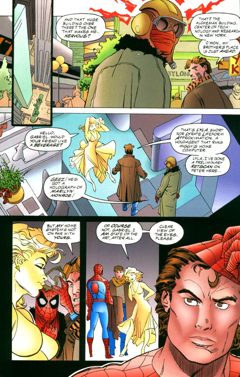
In terms of storytelling, Spider-Man 2099 Meets Spider-Man is messy even though there were efforts to have the two superheroes switch time settings that would allow them to explore different societies and mix up with their past supporting characters (example: Peter Parker Spidey meeting with Miguel’s brother and artificial intelligence Layla). What also hurt the storytelling was the lack of a very engaging antagonist. The futuristic Green Goblin the creators came up with was very lame.
The art by Rick Leonardi was barely satisfying and the sad thing is that none of his visuals – including the 2-page shot of the two superheroes together – delivered any impact. As Leonardi worked regularly on Spider-Man 2099, his art style of 20th century New York did not give me much immersion. J. Jonah Jameson was barely recognizable with Leonardi’s drawing.
To get straight to the point, this comic book is a major disappointment. It failed miserably to bring the two main characters together in a satisfying manner as there was an overabundance of build-up. By the time the two superheroes met, it was way too late for the comic book to be engaging and fun to read. With only seven pages available for the anticipated encounter, there was way too little of having Spider-Man and his 2099 counterpart together. So much could have been done to make the two superheroes interact and work together with a lot of impact but I suppose Marvel did not give the creative team enough time (and pages) to work with which resulted this disappointment.
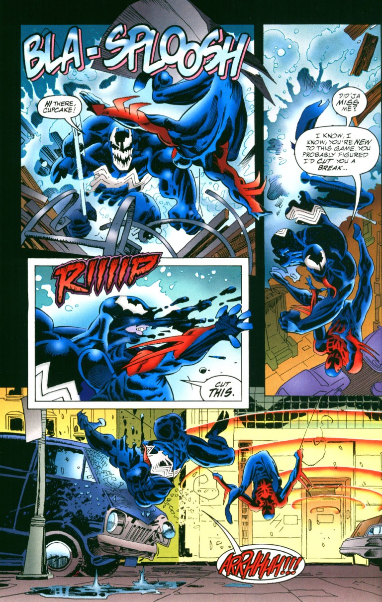
By comparison, I found Spider-Man 2099’s encounter with Venom much more satisfying to read. Spider-Man’s encounter with Vulture 2099, meanwhile, was satisfying. Sometimes I felt that it would have been better for Marvel to publish a Spider-Man 2099 versus Venom standalone crossover comic book than this 1995 crossover disappointment!
If you are determined to risk wasting your money by actually getting a physical copy, then be aware that a near-mint copy of Spider-Man 2099 Meets Spider-Man will cost you, believe it or not, over $40 at MileHighComics.com
Financial value aside, this comic book’s entertainment value is pretty low. It’s not a badly made crossover comic book but it sure remains a big disappointment considering its concept. Ultimately, Spider-Man 2099 Meets Spider-Man is not recommended. You have been warned.
Thank you for reading. If you find this article engaging, please click the like button below and also please consider sharing this article to others. Also my fantasy book The World of Havenor is still available in paperback and e-book format. If you are looking for a copywriter to create content for your special project or business, check out my services and my portfolio. Feel free to contact me as well. Also please feel free to visit my Facebook page Author Carlo Carrasco and follow me at HavenorFantasy@twitter.com