Disclaimer: This is my original work with details sourced from reading the comic book and doing personal research. Anyone who wants to use this article, in part or in whole, needs to secure first my permission and agree to cite me as the source and author. Let it be known that any unauthorized use of this article will constrain the author to pursue the remedies under R.A. No. 8293, the Revised Penal Code, and/or all applicable legal actions under the laws of the Philippines.
It’s funny how adaptations of adaptations turn out in real life. Long before the first live-action X-Men movie was released, an animated TV series (popularly referred to as X-Men: The Animated Series or X-Men TAS) was produced and arguably brought together the fans of both the X-Men comic books along with the animated X-Men followers.
Along the way, Marvel Comics went on to publish a monthly comic book series called X-Men Adventures which themselves were adaptations of the animated series (which itself adapted stories and concepts from the comic books).
The adaptation-of-an-adaptation approach went deep further when the animated series adapted loosely the story of the classic X-Men comic book storyline Days of Future Past (by legends Chris Claremont and John Byrne) which resulted a story told in two episodes on TV. And then there was also a comic book adaptation that followed starting with X-Men Adventures #13 which is the subject of this retro comic book review.
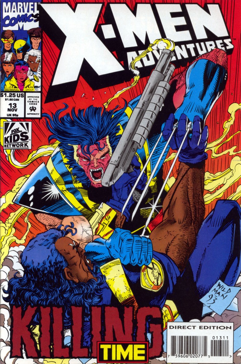
The cover.
Early story
Written by Ralph Macchio and drawn by Andrew Wildman, the comic book begins in the dark future of 2055 in New York. The city is in ruins and mutants on the loose are being hunted by Sentinels. A very old Wolverine appears to help two loose mutants but ends up getting stunned with them by Bishop who turns out to be helping the automated authority of the Sentinels.
As he turns over the captured mutants, the Sentinels betray Bishop telling him that they no longer required him. Afterwards, Bishop and Wolverine (who woke up) each carry a person under the watch of a Sentinel. Suddenly, the two other mutants use their powers to attack the Sentinel and Wolverine followed to back up their efforts. The Sentinel however grabbed Wolverine.
Quality
A very old Wolverine in the dark future of 2055.
With the exception of some liberties, this comic book closely followed what was told in the first of the 2-episode Days of Future Past animated adaptation. As a comic book story, the story was heavily loaded with details and exposition designed to orient readers about the setting and why the future became a time of darkness in relation to the rise of machines having ultimate power over people.
While the time travel concept of the literary classic involved the mind of Kitty Pryde going into the past, this comic book used the more common concept of having Bishop travel back through time physically which easily reminds me of Kyle Reese arriving from the future in 1984’s The Terminator.
The build-up leading to Bishop’s move to travel back through time was nicely done by the creative team. There was a lot of exposition followed by an incoming attack complete with explosions happening just as Bishop is about to leave. In short, the pay-off was worth it.
The engagement did not end there. In fact, it continued nicely as Bishop meets the X-Men in 1993 with the details of his mission carefully unveiled. Professor Charles Xavier’s reaction to future history (Sentinels taking control of the world) was dramatic and worth re-reading.
As with his other works in the X-Men Adventures comic book series, Andrew Wildman’s art is very good to look at and he knows how to make each scene look engaging whether it’s just an exchange of dialogue between characters or an action scene loaded with a lot of impact.
Conclusion
While it is only half of a 2-issue adaptation of a 2-episode animated adaptation of the Days of Future Past literary classic, X-Men Adventures #13 is still a fun-filled reading experience complete with a lot of engaging moments.
The money shot by Andrew Wildman!
If you are a serious collector of comic books, be aware that, as of this writing, a near-mint copy of X-Men Adventures #13 costs $6 while its newsstand edition copy is worth $21 in near-mint condition according to Mile High Comics.
Overall, X-Men Adventures #13 is highly recommended. Both dedicated X-Men fans as well as newcomers will have something a lot to enjoy with it.
Thank you for reading. If you find this article engaging, please click the like button below and also please consider sharing this article to others. If you are looking for a copywriter to create content for your special project or business, check out my services and my portfolio. Feel free to contact me as well. Also please feel free to visit my Facebook page Author Carlo Carrasco and follow me at HavenorFantasy@twitter.com
Disclaimer: This is my original work with details sourced by means of watching the movie and doing research. Anyone who wants to use this article, in part or in whole, needs to secure first my permission and agree to cite me as the source and author. Let it be known that any unauthorized use of this article will constrain the author to pursue the remedies under R.A. No. 8293, the Revised Penal Code, and/or all applicable legal actions under the laws of the Philippines.
I just love watching superhero movies, especially the ones that were well crafted by the filmmakers complete with solid storytelling, sufficient spectacle as well as memorable performances by the hired talents (both behind and in front of the camera).
Of all the superhero movies made by the forces of Hollywood starting with 1978’s Superman, I can clearly say that 2017’s Wonder Woman is my favorite. Don’t get me wrong. I did not limit myself to just DC Comics superhero movies. I saw all the X-Men movies and their spinoffs, almost all the Spider-Man flicks, almost all of the Marvel Cinematic Universe movies and even the obscure ones. Along the way, there were some great superhero flicks that became modern-day classics like Logan and Avengers: Infinity War.
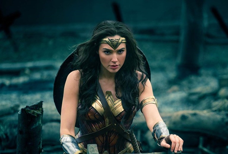
Still it is the Gal Gadot-led, Patty Jenkins-directed Wonder Woman that I loved watching the most.
Let’s start with my retro review of Wonder Woman, the one film that arguably saved the DC Comics Cinematic Universe for Warner Bros.
The Wonder Woman movie poster from 2017.
Early Story
The story begins sometime after the end of Batman v. Superman: Dawn of Justice during which Diana finds a long lost photograph recovered by Bruce Wayne. Then she remembers her past in Themyscira where she grew up as the only little girl among the women called the Amazons and her mother is none other than Queen Hippolyta. Concerned that the wicked Aries is still alive, Hippolyta’s sister Antiope trains Diana (initially in secret until they were discovered) to be strong, brave and more capable than their fellow Amazon warriors.
One day, Steve Trevor arrives in Themyscira becoming the first-ever man Diana ever met. Tension rises when the Germans (from World War I Earth) arrive on their island causing the Amazons to fight in defense. A lot of people lost their lives, including someone very close to Diana.
While interrogated with the Lasso of Truth, Steve reveals who he is and what he has been doing. He states that back in his world, World War I is ravaging the world costing many people their lives. This causes Diana to stand up and stop the war somehow (she believes Aries is responsible). Queen Hippolyta disapproves of Diana’s analysis. After privately meeting with Steve, Diana then starts her move for a mission to stop the war in Man’s World.
Quality
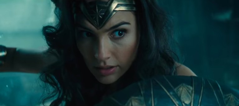
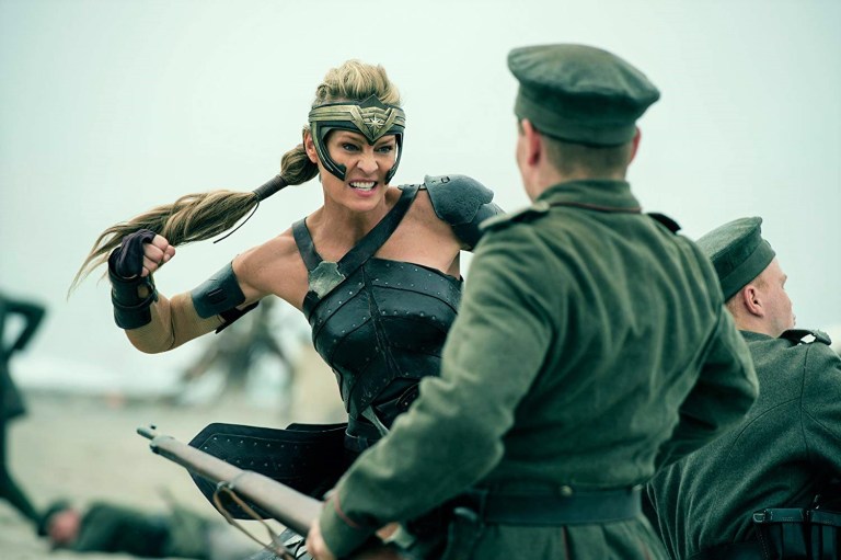
Gal Gadot as Wonder Woman in the middle of German soldiers.
Let me start with the performances. Gal Gadot definitely IS Wonder Woman in this movie. Regardless of how many versions of Wonder Woman there are in comics, the Israeli actress truly captured the essence of Diana’s early development which includes her special place among the Amazons (note: she is the only Amazon who was born in Themyscira and grew up from infant into a mature woman), her fateful meeting with Steve Trevor, her entry into Man’s World and how she adapts with the events and people outside of Themyscira. Wonder Woman’s purity on saving the world, doing what is right and emphasizing love and compassion were all nicely translated into cinematic art by Gal Gadot. From doing the action scenes to saving people, speaking her mind among her fellow Amazons and interacting with others as she adapts with Man’s World, I really love Gadot’s work on bringing Wonder Woman to life. As her cinematic work is great, there is no doubt that Gadot will always be iconic to fans of the Queen of Superheroes and superhero enthusiasts in general in the decades to come right beside Lynda Carter (who played the icon on TV), Christopher Reeve (Superman), Robert Downey, Jr. (Iron Man) and Chris Evans (Captain America). Meanwhile, the portrayals of Diana as an 8-year-old girl as well as a 12-year-old were perfectly done by Lilly Aspell (who is truly skilled with horse riding) and Emily Carey.
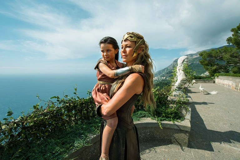
Lilly Aspell as young Diana with Connie Nielsen as Queen Hippolyta.
Chris Pine is excellent as Steve Trevor who is portrayed to be very dedicated to his work, brave in what he does and still shows compassion instead of arrogance towards others. He also has great chemistry with Gal Gadot and, like in the comic books, their relationship is nicely translated on the big screen. Pine’s performance here is, in my view, the best superhero movie supporting role to date.
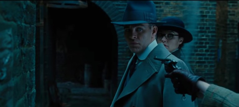
Chris Pine as Steve Trevor with Gal Gadot as Diana in disguise.
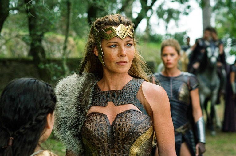
Connie Nielsen meanwhile is great in playing Queen Hippolyta and all throughout, there is always a sense of leadership complete with a touch of motherly love just like in the comic books. Her sister Antiope was nicely portrayed by Robin Wright as the one Amazon who taught Diana to be brave, strong and highly capable as an Amazon warrior.
Danny Huston, who played the lead villain in the 2009 movie X-Men Origins: Wolverine, played yet another military bad guy here but this time he’s a World War I German officer. He’s a villain with a purpose who not only fights for the glory of Germany but also strongly believes that war is natural and inevitable for humanity. In some ways, Huston’s Ludendorff reminds me Michael Shannon’s General Zod in Man of Steel.
Robin Wright is excellent as Antiope.
When it comes to presentation, this film is Patty Jenkins’ 2nd movie as director (her debut was way back in 2003) and the great turnout of Wonder Woman as a high quality movie (as opposed to being a critical and commercial success) only proved yet again that the old saying in Hollywood – The director’s second movie is his/her best movie – is true. Jenkins, who also worked on television, not only prepared a lot to make this movie but also researched Wonder Woman, developed ways to get the most out of the cast members, tweak the written story of the film (by Allan Heinberg, Zach Snyder and Jason Fuchs) and, most notably, she led the production with a lot of passion. To put it short, Wonder Woman is a labor of love (and the No Man’s Land scene is iconic) that not only resonated with fans of the Queen of Superheroes but also with the film critics and moviegoers.
Regarding storytelling, I noticed that a key story from Wonder Woman’s origin in the comics (the contest of the Amazons) did not happen at all in the film. While there were die-hard fans of the icon who complained about it, I felt that the contest of the Amazons would have made this movie more complicated and surely would have lessened the impact of World War I as a key story element. Since the purpose of this movie was to emphasize Diana’s origin and her entry into Man’s World with a major mission, I believe that the contest of the Amazons can be made cinematically later in a future movie.
The way the story was told cinematically, it also captured Diana’s reactions to the events that happened around her. The scene in which she saw the village destroyed showed how death and destruction compelled Wonder Woman to accomplish her mission even though others find ending the war impossible. Along the way, the actors – specifically Gal Gadot – really added life into the narrative with their strong performances.
When it comes to on-screen humor, which is popular among moviegoers and is almost a requirement for most new superhero movies that come out, having it done by supporting players Lucy Davis and Saïd Taghmaoui was a clever move since it allows Gal Gadot to portray Wonder Woman without any performance disruption. Considering her short screen time, Davis as Etta Candy is really funny. The amount of humor in this film, in my view, was just right and never annoying.
Spectacle? Wonder Woman is loaded with action, stunts and exciting stuff! The action involving Wonder Woman was brutal and satisfying to watch, and Patty Jenkins’ use of slow motion on key moments was great (even comparable to John Woo’s past work) and at the same time not too excessive. The Themyscira battle between the Germans and the Amazons at the beach was engaging and strategically filmed. Also, it was fitting that the action ramped up nicely starting with the iconic No Man’s Land sequence. The final battle in the film, unsurprisingly, had lots of computer-generated images (CGI) which is understandable considering the fantasy element of Wonder Woman.
More on the action, I love the way Patty Jenkins had Gal Gadot, Robin Wright, Connie Nielsen and Chris Pine perform the action themselves which all made their characters even more believable. Of course, there were certain moments in which stunt doubles were used to do the more dangerous moments on behalf of the actors.
This happened just before the iconic No Man’s Land scene.
Apart from the core cast, a lot of the actresses playing the Amazons trained for several months not just to look the part but also to perform action sequences using weapons with actual skill. The stunt coordinators and specialists hired by the filmmakers deserve praise for contributing nicely on making the cinematic Amazons highly believable. This alone not only makes Wonder Woman stand out nicely among all Hollywood superhero movies but also reflects nicely what was portrayed in the comic books.
The production design is also top-notch. I love the scenic locations of Italy used for scenes set in Themyscira. The filmmakers also did a great job recapturing the look of World War I Europe from the historical pictures to the big screen. The costume designs were fantastic, and the standout designs were, unsurprisingly, the costumes of the Amazons which really made their fantasy culture look believable. The filmmakers decided to have much more colorful visuals instead of following the look of Man of Steel, Batman v. Superman: Dawn of Justice and Suicide Squad.
On the music, the work by Rupert Gregson-Williams was great. His rendition of the Wonder Woman theme was very lively to listen to. The same can be said about the music he provided in the memorable No Man’s Land scene which had a nice build-up as Wonder Woman made her first full appearance in costume on the field. Other tunes played in the film suited the scenes well.
If there were any weak spots in this movie, it would be certain shots of action that were not filmed with precision. I’m talking about filming action scenes way too close to the camera combined with music video-style editing that’s supposed to make film look flashy. It’s not only disorienting, it also took me out of the movie.
Conclusion
Overall, Wonder Woman is one of the best-ever superhero movies ever made and easily my favorite of them all. It has an excellent balance between storytelling, character development and spectacle, and Gal Gadot gave the performance of a lifetime not only by bringing Wonder Woman into life in cinematic form but also emphasizing what the Queen of Superheroes stood for. As part of the current DC Comics Cinematic Universe, this movie stood out by having optimism and heroism as core themes (as opposed to the dark, gritty and even cynical approach of Man of Steel, Batman v. Superman: Dawn of Justice and Suicide Squad) and, more importantly, by focusing strongly on Wonder Woman instead of building up for the Justice League movie (which was released months after this one).
Apart from high-quality production values and a strong creative approach, the cast and cinematic performances are easily among the best in the superhero movie genre. Chris Pine’s Steve Trevor is an excellent example of a supporting role that is engaging without ever overshadowing the lead role. By the end of the film, you will realize the impact that Queen Hippolyta and Antiope had on Diana’s personal development.
Connie Nielsen made a great queen and mother in this movie.
Being strongly focused on heroism with optimism, director Patty Jenkins and her crew succeeded in making this film without ever succumbing to the extreme views of the Political Left in Hollywood and the loudmouth social feminists. When I see the battle between the Amazons and the German soldiers on the beach of Themyscira happen, I simply saw armed women defending their homeland not from men who intend to rape them but rather men who had no right to intrude in the first place. Even as there were scenes showing men in power in World War I Europe (putting Diana in a powerless position), there still was no feminist-inspired hatred towards men. Also the bond between Steve and Diana developing from friendship into a romantic relationship literally shut the door on extreme feminism.
As a Wonder Woman-focused story, this film succeeded on emphasizing the Queen of Superheroes to both long-time fans and mainstream moviegoers. This movie also had a nice mix of having a fantasy setting with Themyscira moving on to a historic setting with World War I Europe. On the origins of Wonder Woman herself, I don’t mind at all that the contest of Amazons was not told because this movie’s concept is already great to begin with and its running time of 141 minutes was just right.
Gal Gadot will be remembered for a very long time for her excellent portray of Wonder Woman in cinema.
With all the greatness it was made with, I kept coming back to Wonder Woman when replaying superhero movies here at the comfort of home. In the cinemas back in 2017, I saw the film three times. Ultimately, I can say out loud that Wonder Woman is highly recommended and it is truly essential!
Thank you for reading. If you find this article engaging, please click the like button below and also please consider sharing this article to others. Also my fantasy book The World of Havenoris still available in paperback and e-book format. If you are looking for a copywriter to create content for your special project or business, check out my services and my portfolio. Feel free to contact me as well. Also please feel free to visit my Facebook page Author Carlo Carrasco and follow me at HavenorFantasy@twitter.com
If there is any particular superhero comic book title I could compare Freex of the Ultraverse with, it’s Marvel’s famous X-Men. Similar to the mutants of the big M, Freex is a team of teenagers who each have different super powers or special abilities while struggling with being social outcasts. What makes them different is that the Ultraverse teenagers have no mature adult to look forward to for guidance. They don’t have a mansion to live in, and they have no choice but to move around constantly and survive the best way they could.
I took a look at the other existing back issues of Freex in my collection and what caught my attention was Freex #7.
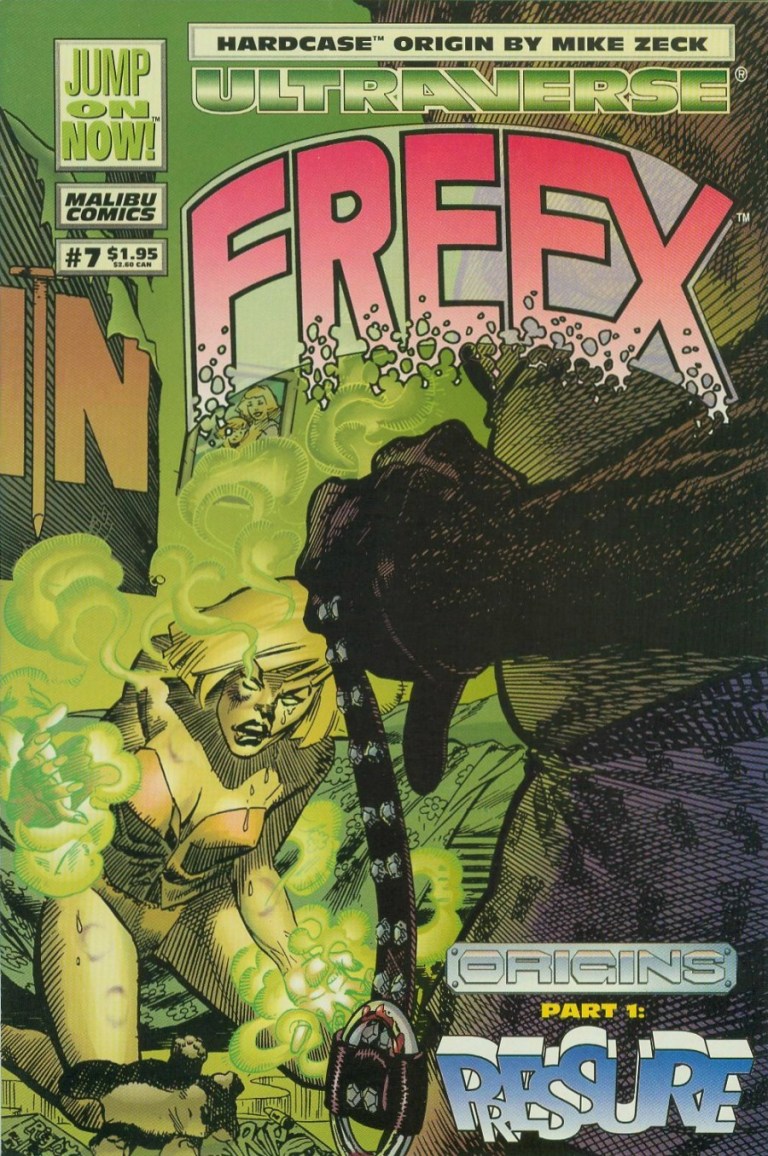
The cover.
Let’s now take a look back at Freex #7 and see what makes it unique (if not special).
Early story
The story begins with the Freex hastily stealing clothes from a store in city. While the others are desperately grabbing what they could (note: the store’s glass window was shown smashed already), Angela/Sweetface looks scared. One of her male companions tell her to be tough like Valerie/Pressure.
Just as they start leaving the store behind, the alarm system goes off. The sudden rush only adds pressure to them, causing Lewis/Anything to confront Michael/Plug only because the latter said something about team leadership. As Angela separates Michael and Lewis using her fleshy tentacles, Valerie loses her cool when Ray/Boomboy calls her by her codename. Valerie hits Boomboy with a blast of plasma. With their momentum disrupted by division and tension, Lewis tries to calm his teammates down but Plug won’t have any of it as he desires to find out about the source of all of their powers referred to as Wetware Mary. Plug finds a telephone booth and instantly transfers himself into it in the form of energy.
Division between members of Freex is common.
As the Freex remain divided, a local resident living nearby watches them from a distance.
Quality
The story written by Gerard Jones is pretty engaging mainly due to characterization (as opposed to storytelling and structuring). Through the dialogue, you can really sense the thoughts and emotions of each member of Freex, especially Valerie since this particular comic book focused on her origin. Without spoiling Valerie’s background, her origin was efficiently emphasized and never, ever felt dragging. By the time her origin story concluded, I got to understand Valerie better and why is she so mean. After the conclusion of the Freex’ story, there is also an Aladdin Datafile on Valerie who turned out to be 16-years-old, 5 feet and 9 inches tall, and even has a low threat assessment by Aladdin.
Adding further value to this comic book is a 2-page quick feature of Hardcase which shows a nice look back at his past before the establishment of The Squad.
Conclusion
From the past of Pressure.
Freex #7 is a good read. The story about the teenage social outcasts of the Ultraverse is well balanced in terms of characterization and action. Anyone who is a fan of Valerie/Pressure or female superheroes who are mean, angry and rebellious will find a lot to enjoy in this comic book. A near-mint copy of Freex #7 is worth $4 at MileHighComics.com as of this writing.
Overall, Freex is recommended.
Meanwhile, check out my retro review of Freex #1 right here.
Thank you for reading. If you find this article engaging, please click the like button below and also please consider sharing this article to others. Also my fantasy book The World of Havenoris still available in paperback and e-book format. If you are looking for a copywriter to create content for your special project or business, check out my services and my portfolio. Feel free to contact me as well. Also please feel free to visit my Facebook page Author Carlo Carrasco and follow me at HavenorFantasy@twitter.com
Disclaimer: This is my original work with details sourced from reading the comic book and doing personal research. Anyone who wants to use this article, in part or in whole, needs to secure first my permission and agree to cite me as the source and author. Let it be known that any unauthorized use of this article will constrain the author to pursue the remedies under R.A. No. 8293, the Revised Penal Code, and/or all applicable legal actions under the laws of the Philippines.
Long ago in the history of American comic book publishing, there was a time when superhero comic book storytelling were not told as dramatic serials but rather as standalone stories laced with outlandish ideas.
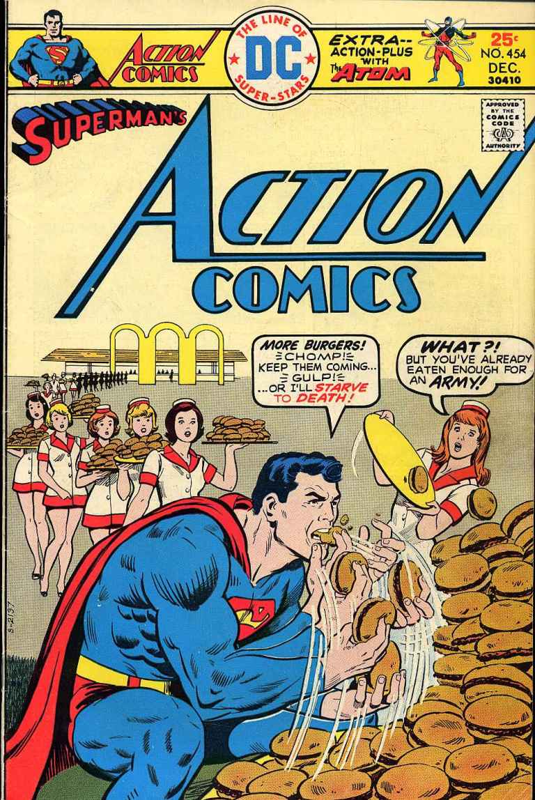
For this retro comic book review, we go back to the year 1977 as we focus on a Superman story that would not be told again in this day and age. To say the least, its cover art is, by today’s standard, over-the-top in terms of presentation. kapiHere is my look back at Action Comics #454 published by DC Comics with a story by Cary Bates and visuals by Curt Swan and Tex Blaisdell.
The cover.
Early Story
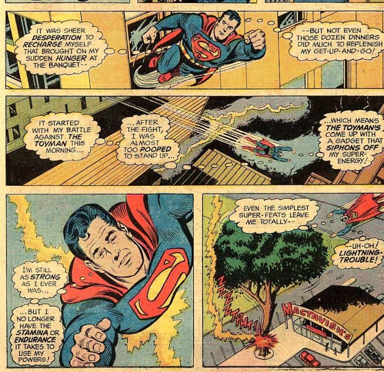
The comic book opens with a preview of things to come showing a weak Superman urged by a few people to fly and chase the Toyman.
And then there was the question: What good are super-powers without the stamina and endurance it takes to use them?
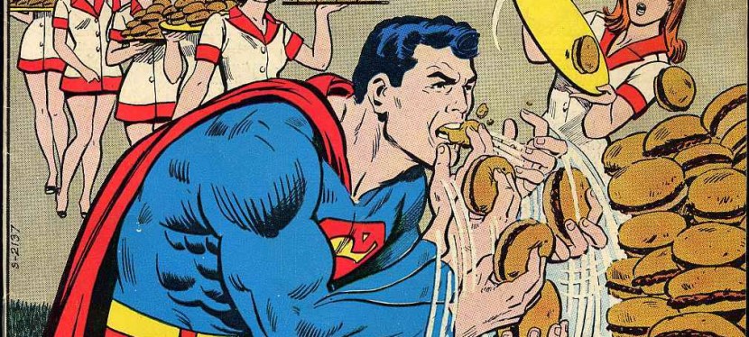
The story begins with the Toyman escaping after pulling off a bank robbery. As he flies higher, he sees Superman coming towards him. After using a trick to delay Superman, Toyman uses a special trick to twirl Superman at high speed and literally throws him away to an unknown destination. The villain escaped and, some time later, Clark Kent/Superman finds himself too tired and drained. Because of this, he becomes desperate to consume food and beverages just to keep going. This problem affects both his career and social life.
When was the last time you saw Clark Kent so exhausted?
Quality
Action Comics #454 explores what would happen if Superman lacks energy and requires a lot of rest and many meals to stay active. To see him eat as many as sixty hamburgers per minute is quite funny to see.
Being weak puts Superman at a disadvantage when it comes to stopping the criminal Toyman. As the Man of Steel flies at high speed to chase the bad guy flying in a personal aircraft, the chase drains him a lot.
When it comes to storytelling, this one is pretty short lasting only thirteen pages. What I find impressive is that the creators managed to tell a standalone story of good-versus-evil as well as answering the question as to what caused Superman to be so weak in the first place.
Superman flying tired.
Conclusion
To put it clearly, Action Comics #454 is definitely a very short literary escapade that still manages to be fun to read. It sure is outlandish and I strongly doubt DC Comics will want to put Superman through heavy eating in today’s age of comics. Is this comic book a classic? Not exactly but it sure is a satisfying, fun read from an era when outlandish superhero storytelling in comic books was the norm. If you are seeking this as a collector’s item, be aware that a near-mint copy of Action Comics #454 is worth $23 at MileHighComics.com as of this writing.
Overall, Action Comics #454 is recommended.
Thank you for reading. If you find this article engaging, please click the like button below and also please consider sharing this article to others. Also my fantasy book The World of Havenoris still available in paperback and e-book format. If you are looking for a copywriter to create content for your special project or business, check out my services and my portfolio. Feel free to contact me as well. Also please feel free to visit my Facebook page Author Carlo Carrasco and follow me at HavenorFantasy@twitter.com
As I mentioned before, I never read a single comic book about Birds of Prey. Apart from previously knowing Harley Quinn, Black Canary (from the 1980s specifically) and Huntress (from the 1990s), I had minimal knowledge of the DC Comics’ title as well as modest expectations entering the cinema yesterday to watch Birds of Prey: and the Fantabulous Emancipation of One Harley Quinn which is the latest superhero production from Warner Bros.
Right now, I’m happy to share to you that the R-rated movie proved to be a fun-filled watch and is proof that the DC Comics Cinematic Universe is still moving forward (in terms of engagement, enjoyment and creativity) towards greatness.
Here is my movie review of Birds of Prey.
Early Story
The story begins with a look into the past of Harley Quinn (Margot Robbie) moving forward until her breakup with the supervillain Joker (don’t expect to see Jared Leto’s image). Through narration and clever visuals, Harley is now living a new life. Along the way, there is a club within Gotham City bustling with life which Harley haves fun at and eventually she encounters the club owner Roman/Black Mask (Ewan McGregor) who is not what he seems. After getting drunk and becoming vulnerable to men with sinister intentions, Dinah/Black Canary (Jurnee Smollett-Bell), who sings at the club, comes to her rescue. After recovering, Harley moves on to destroy a huge facility of Ace Chemicals which further sets events off…
Quality
While the screenplay by Christina Hodson (Bumblebee) lacked storytelling depth and character development, director Cathy Yan and her team still managed to craft a superhero film that was fun, action-packed and, surprisingly, not too reliant on computer-generated visual effects.
To make up for the lack of story depth, the movie relied mainly on the performances of the actors to bring their characters to life. Margot Robbie really excelled in playing Harley Quinn inside and out. While this latest cinematic portrayal does not have Harley insane, she’s still crazier than in Suicide Squad. Robbie’s act this time is more creative, more adulterated (which is the way the go), more daring with action and also more comedic. From this point on, I should say that Warner Bros. should rehire Robbie to play Harley Quinn in even more DC Comics movies.
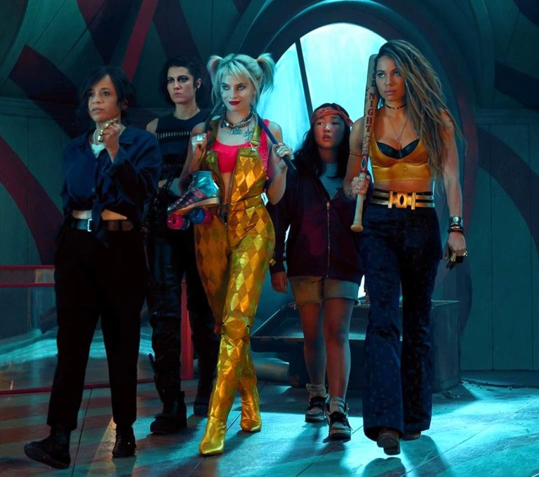
Here come the ladies: Renee Montoya, Huntress, Harley Quinn, Cassandra Cain and Black Canary.
Rosie Perez as Gotham City police officer Renee Montoya delivered a strong presence as the law enforcement element in the film and through her, we get to see the culture of the local police. Don’t expect her to have any links with police commissioner Gordon or Batman, though. Jurnee Smollet-Bell as the cinematic Black Canary is one of the stronger performers even though her version of the character is radically different from the one I read in the comic books long ago. Ella Jay Basco, an actress of Filipino and Korean heritage, as the orphan Cassandra Cain is clearly the movie’s representative (and attraction to) of the youth. Performance-wise, Basco delivered a nice performance even though her character (who in the comics is one of many who became Batgirl) lacks depth. Fortunately for us moviegoers, she is not the whiny teenager who annoy viewers and, more importantly, she delivered nicely in her part of the film’s plot. Mary Elizabeth Winstead is good as the cinematic Huntress. It’s too bad her on-screen presence is not long enough to be enjoyed, nor were moviegoers given better opportunities to know the Huntress better.
The most outstanding performance in the movie was delivered by Ewan McGregor as Black Mask. McGregor, who is a naturally artistic actor, is very colorful with his portrayal of a supervillain who, unlike many other such antagonists in other superhero movies, is charismatic, suave and yet cruel to the core. This cinematic Black Mask is not your generic action movie villain and, as such, hiring McGregor was one of the best moves made by Warner Bros. I honestly find McGregor a worthy adversary versus Margot Robbie when it comes to cinematic artistry.
When it comes to spectacle, Birds of Prey is heavily loaded with hard-hitting action plus some bloody shots that make it standout among the many superhero movies released in this current century. For one thing, the actresses themselves took an active part in doing action and the stunts they could pull of on their own (the harder stuff were understandably done by stunt doubles). Watching Harley Quinn beat up the bad guys with that large hammer, the baseball bat and other stuff were not only hard-hitting but also creative without ever looking choreographed. Black Canary’s high kicks were notable. Renee Montoya’s reliance on guns and hard action were symbolic throwbacks to the police movies of the past. Huntress meanwhile showed how deadly her small but powerful crossbow can be on-screen.
Late in the film is a certain long-take action sequence filled with the characters struggling with the bad guys simultaneously (without using computer-generated imagery) which was cleverly filmed with nice timing as the camera moved on very steadily. That sequence, even though short, is worth watching again and again. Oh yes, there are no shaky camera sequences shot!
The action scenes, in my opinion, came into play at the right time whenever I felt enough dialogue and exposition were made. This shows that the filmmakers pulled off the right moves with the pacing to ensure that people are kept entertained while still maintaining some storytelling sense which is quite an achievement since the film’s plot lacked depth. The stunts, meanwhile, are really nice to watch.
As for the brewing arguments and anticipation that Birds of Prey is a leftist and feminist piece of propaganda, I should say that such influences are more on the visual side than on the dialogue. Even though Ewan McGregor publicly said the movie is feminist, it’s not too strong. The feminism is more visible in images of the ladies fighting the bad guys who are varied with their looks – muscular, tall, big, beards, etc. The feminism is obvious with the ladies teaming up together and that is not surprising at all. Even though it has feminism elements, Birds of Prey is still pretty much a superhero movie on its own. You want a movie with stronger and more blatant feminism? Watch Star Wars: The Last Jedi instead. Maybe you want to try Elizabeth Banks’ failure Charlie’s Angels.
Conclusion
With strong and creative performances plus loads of fun stuff that more than made up for the lack of story depth and character development, Birds of Prey is an enjoyable superhero movie that is worthy of being part of the current DC Comics Cinematic Universe. Without relying on fan service, this movie expands the current cinematic universe’ presentation of Gotham City and shows the other parts of it away from Batman.
Even if you have not read any Birds of Prey comics, this movie will still prove to be entertaining. Just don’t expect to see the more iconic DC Comics characters and don’t expect to see heavy amounts of computer-generated images on-screen. Birds of Prey is more grounded and for a production of roughly $100 million, the production values still look high.
Overall, Birds of Prey is highly recommended and I encourage you to watch it in the cinemas as soon as possible. And if you have the extra money, watch it on an IMAX screen as the film was optimized for the format.
Thank you for reading. If you find this article engaging, please click the like button below and also please consider sharing this article to others. Also my fantasy book The World of Havenoris still available in paperback and e-book format. If you are looking for a copywriter to create content for your special project or business, check out my services and my portfolio. Feel free to contact me as well. Also please feel free to visit my Facebook page Author Carlo Carrasco and follow me at HavenorFantasy@twitter.com
As far as superhero movies go, 2020 is looking interesting as there is no new Avengers movie coming out this year. After the climax of last year’s Avengers: Endgame, Marvel Studios is gradually building up new anticipation of the Marvel Cinematic Universe with Black Widow. Sony Pictures has Bloodshot which is the first live-action film adaptation of any of Valiant’s comic book properties. Warner Bros. has the highly anticipated Wonder Woman 1984 set for June.
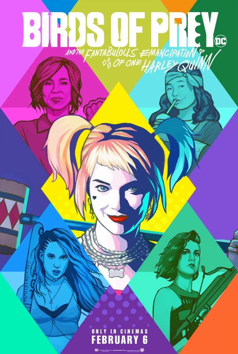
Before Wonder Woman 1984, Warner Bros. will start their 2020 superhero movie journey with Birds of Prey which will open in cinemas on February 5-6-7 in varied parts of the world. For your viewing pleasure, below are the movie poster and the first movie trailer.
According to the movie’s page at IMDB.com and the above movie trailer, the movie is set some time after the events of Suicide Squad as Harley Quinn left Joker..…looking for a fresh start. This leads her to encountering Black Canary, Huntress and Renee Montoya and they band together to save a young lady who has been targeted by Black Mask. This leads to a conflict between the ladies and Black Mask’s gang.
The gang with Harley Quinn.
In the United States, the review and classification board MPAA rated Birds of Prey with an R (restricted) for strong violence and language throughout, and some sexual and drug material. If the movie trailers are any indication, this movie is looking like it will have some really intense action scenes and harder acts of violence.
In my honest opinion, crafting a superhero movie that is more intense, more adulterated and more expressive than the usual Hollywood superhero movie can work wonders for as long as the film’s presentation is nicely done and makes the best out of its fantasy concept.
In the case of Birds of Prey, the trailers suggest that Harley Quinn is more insane (than being crazy in the Suicide Squad movie) not only with her personality but also with the way she fights others. I’m expecting to hear Harley and Black Mask say F-words in the movie. While so far nothing has been shown in the previews, I’m anticipating that there will be scenes showing Huntress fire her arrows and kill gang members violently.
Some of you may be wondering…what exactly are the Birds of Prey? Is that a popular comic book franchise? When did it start?
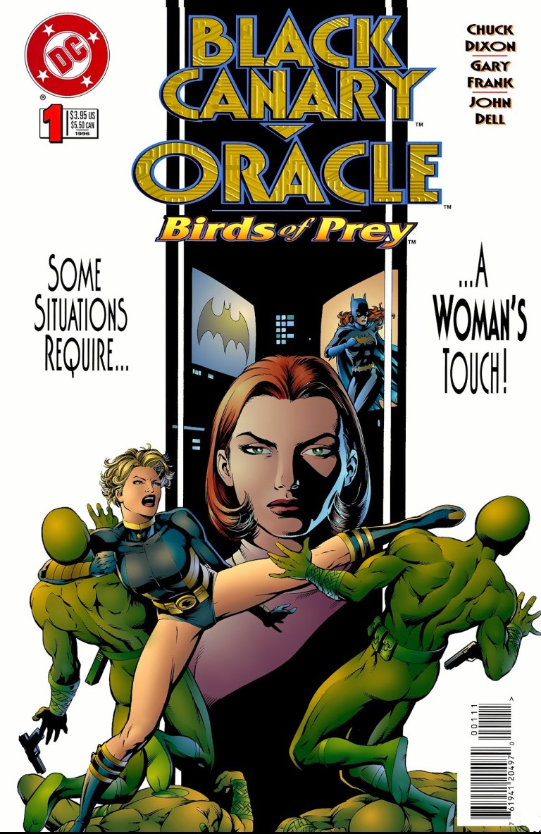
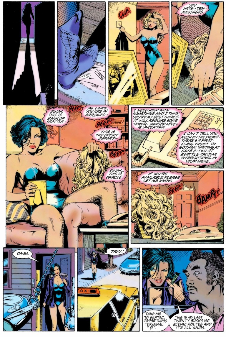
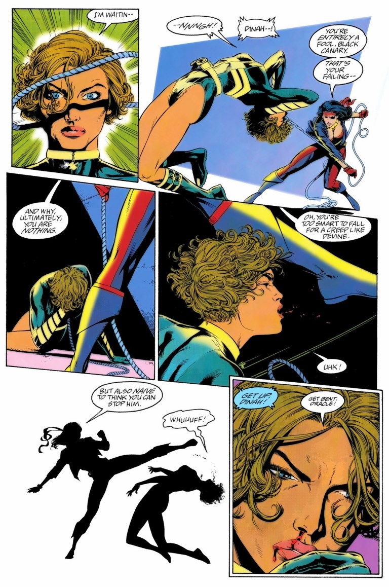
Historically, Birds of Prey started in the mid-1990s with the one-shot comic book Black Canary/Oracle: Birds of Prey #1 written by Chuck Dixon and drawn by Gary Frank. That comic book featured mainly Black Canary (specifically Dinah Lance) and Barbara Gordon. For your viewing pleasure, posted below are the front cover and two pages.
The cover.This is Dinah/Black Canary.Hard-hitting action!
I never read any Birds of Prey comic book before. I’m not exactly a fan of Harley Quinn and her performer Margot Robbie. Still, because Birds of Prey is the latest DC Comics Cinematic Universe entry, I plan to watch it and review it here. Also it has been a long time since the highly talented Ewan McGregor had a memorable cinematic performance. I really find its concept intriguing. Warner Bros. and the filmmakers (Walter Hamada and Suicide Squad director credited as Executive Producers, plus Margot Robbie is a producer) are taking a huge risk to sell this $100 million production with an R-rating.
In closing this, here is the 2nd trailer.
Thank you for reading. If you find this article engaging, please click the like button below and also please consider sharing this article to others. Also my fantasy book The World of Havenoris still available in paperback and e-book format. If you are looking for a copywriter to create content for your special project or business, check out my services and my portfolio. Feel free to contact me as well. Also please feel free to visit my Facebook page Author Carlo Carrasco and follow me at HavenorFantasy@twitter.com
Disclaimer: This is my original work with details sourced from reading the comic book and doing personal research. Anyone who wants to use this article, in part or in whole, needs to secure first my permission and agree to cite me as the source and author. Let it be known that any unauthorized use of this article will constrain the author to pursue the remedies under R.A. No. 8293, the Revised Penal Code, and/or all applicable legal actions under the laws of the Philippines.
When Marvel Comics first launched the 2099 imprint of comic books showcasing many futuristic versions of their present-day characters – like Spider-Man, Ravage and Dr. Doom – it was inevitable that the same treatment will be applied to their popular supervillains.
In 1993, the 2099 version of Vulture was introduced and he sure proved to be one tough opponent for Spider-Man 2099. Even back then, there already was clamor for a futuristic version of Venom which at the time was riding high with readers being the featured anti-hero in several limited series (starting with Lethal Protector) of comic books.
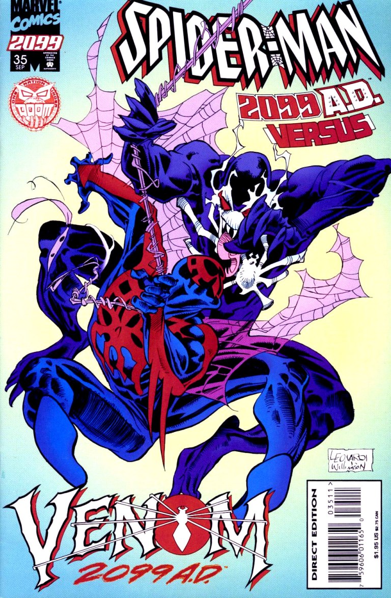
Then in 1995, after doing a creative teaser in issue #34, Marvel formally introduced Venom 2099 by releasing Spider-Man 2099 #35. This is my review of the comic book written by Peter David and drawn by Andrew Wildman (X-Men Adventures).
The cover drawn by Rick Leonardi.
Early story
Picking up from the events of issue #34, the story begins in Washington, DC with Dana freeing herself only to find out that Alchemax’s CEO Tyler Stone was down suffering from a gun shot and losing blood. Minutes later, emergency personnel take Stone’s body for immediate treatment.
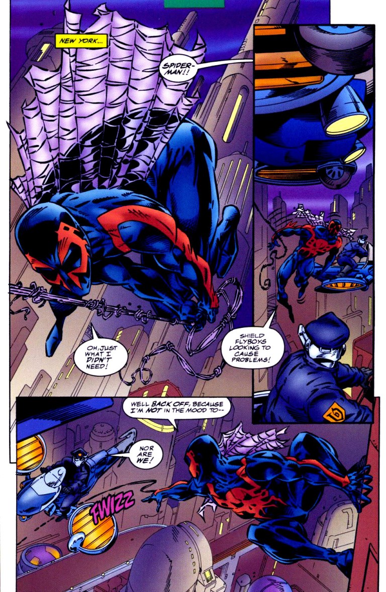
Meanwhile, Spider-Man 2099 (Miguel O’Hara) encounters the SHIELD flyboys in New York. After almost getting into trouble together, Spidey gets informed that US President Doom 2099 ordered them to leave him alone for a period of seventy-two hours while he considers a cabinet offer. Back in Washington, Dana gets interrogated by one of the authorities. President Doom enters the scene telling Dana that she will join Tyler Stone immediately in the medical center.
Andrew Wildman’s take on Spider-Man 2099 and the future was really nice to look at.
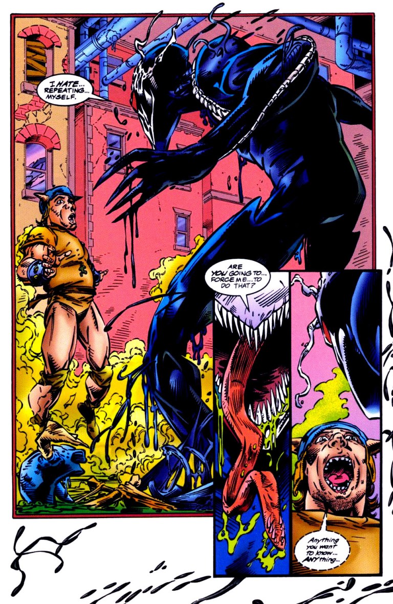
In New York, two guys sitting on the sidewalk witness a moving black liquid coming out of the sewer. The thing turns out to be a living symbiote (or alien costume) forming into a human-like shape – Venom 2099!
Quality
As with other comic books of this particular series, the writing by Peter David is pretty deep and engaging. The usual balance between dramatization, character development, plotting and spectacle is here once again but with a slight touch of horror in relation to the introduction of Venom of 2099. Speaking of dramatization, the portrayal of Venom 2099 as a vicious villain is similar to the 20th century Venom (Eddie Brock) but with a very powerful obsession to kill Miguel O’Hara and Tyler Stone.
Here’s an excerpt from the dialogue of Venom of 2099: Miguel O’Hara…and Tyler Stone…together again. We…I get to kill you…at the same time…how awfully…awfully…considerate. To show my appreciation…I’ll kill you slowly.
What makes this comic book unique is the artwork by Andrew Wildman who temporarily replaced regular illustrator Rick Leonardi. For comparison, I find Wildman’s art style a welcome thing in this comic book mainly because he draws with a lot more detail per panel and per page than Leonardi ever could. Instead of seeing the usual sketch-like art style of Leonardi, Wildman’s style is livelier and more expressive to look at. I also enjoyed Wildman’s visual take on Spider-Man 2099/Miguel O’Hara, Lyla, Tyle Stone, and the other established characters. Their facial expressions are also livelier to see.
Venom 2099 appears! Take note of the “liquid” at the edges of the page.
More on visuals, Wildman’s take on Venom 2099 is unforgettable. Like 20th century Venom, he has a dark suit, elongated jaw with rows of sharp teeth and an elongated tongue but with green acid dripping all the time. There are also those tentacles-like things that stretch from his body until the arms. Also his white-colored mask with large eyes make him look horrific.
Conclusion
Despite being shorter than the usual 22-pages, Spider-Man 2099 #35 is still a very engaging and fun old comic book to read. Its purpose was to build-up anticipation leading to the introduction of Venom 2099 was achieved nicely and the respective qualities of the writing and visuals are very good even by today’s standards. More on the presentation of Venom of 2099, it seems like Peter David took inspiration from movie director James Cameron on building-up tension and suspense before showing the villain. That’s a move I enjoyed in this comic book.
Overall, Spider-Man 2099 #35 is highly recommended. If you plan to acquire an existing and legitimate hard copy, be aware that the near-mint copy of it is over $100 for the newsstand version while the Rich Leonardi-drawn “Venom 2099 AD” cover version is priced at over $80 at MileHighComics.comas of this writing.
Thank you for reading. If you find this article engaging, please click the like button below and also please consider sharing this article to others. Also my fantasy book The World of Havenoris still available in paperback and e-book format. If you are looking for a copywriter to create content for your special project or business, check out my services and my portfolio. Feel free to contact me as well. Also please feel free to visit my Facebook page Author Carlo Carrasco and follow me at HavenorFantasy@twitter.com
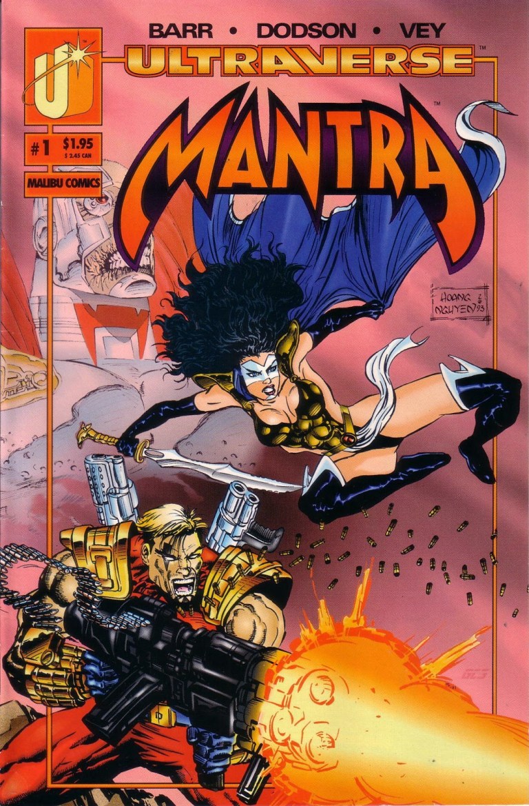
If there is any intriguing way of utilizing fantasy concepts to introduce a superhero (or superheroine) to readers, Mantra #1 from the Ultraverse published in 1993 by Malibu Comics is one fine example.
The cover of Mantra #1.
Early story
Written by Mike W. Barr with art by Terry Dodson, Mantra #1 was an Ultraverse launch comic book that follows Lukasz who is an eternal warrior belonging to a group of other warriors which had been fighting another group (led by eventual Ultraverse villain Boneyard) for several centuries.
How did that conflict last that long? As told through the views of Lukasz, any individual warrior who dies will eventually be placed in a new body (often that of an existing person) and take control of it effectively displacing the its soul. Behind it all, Archmage, the leader of the warriors’ group that includes Lukasz, uses magic to ensure that each member will be reincarnated after dying.
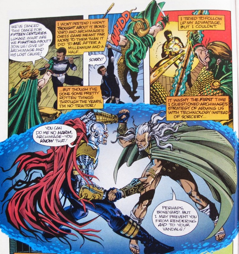
A page for your viewing pleasure.
The story takes a major turn for the shocking and intriguing when something unfortunate happens to Archmage and that the protagonist himself gets killed again. Fortunately for him, he gets to live one more time but there is one major difference – Lukasz occupies the body of a woman named Eden Blake (and the revealing scene remains shocking).
At this point, I don’t want to spoil the rest of the story. If you want to find out how Mantra came to be, you just have to read the comic book yourselves.
Quality
From an analytical view, I still find Mantra’s concept very intriguing to this day. In terms of mysticism, it reminds me a little bit of George Perez’s take on Wonder Woman in the mid-1980s and in some cases Mantra/Eden Blake herself reminds me bit of Wonder Woman/Diana albeit in a more motherly way.
When it comes to storytelling, Mike W. Barr’s script is very solid and made very good use of the twenty-eight (28) pages of the comic book. Unsurprisingly, there was a good amount of expository dialogue and narration but it was handled efficiently. The first-person views of Lukasz/Eden Blake are truly immersive to read. Along the way, there were several scenes that were intriguing to read and there were some nice moments of unintentional comedy which helped balance the overall tone of the story.
To say the least, Mantra’s concept about dead warriors’ souls entering bodies of existing people to live again sheds light on the moral or psychological implications of such events. If you were a warrior who just died and eventually got a new lease on life by occupying the body of let’s say a software company’s chief executive officer, would you not be concerned as to what happened to the soul (of the body) you displaced? Would you not think about how your control of that displaced soul’s body would affect not only the person’s established life but also the personal association with other people? Truly Mike Barr’s writing got me hooked and Terry Dodson’s art really brought his concepts to life.
Conclusion
So what else could I say? Mantra #1 is highly recommended not only because of its story and concepts but also because this particular series lasted several issues more and, for the most part, Mantra’s adventures and misadventures have often been fantastic and fun.
Even though it is fact that the Ultraverse remained in limbo and Marvel Entertainment showed no intention to revive the franchise, Mantra is still a fun and engaging comic book series to read and this comic book is the golden start of it. Mantra #1 itself is one of the most defining superhero comic books of the 1990s ever published and its mature themes combined with strong fantasy concepts made it stand out among all of those other superhero comic books I spotted on the shelf of a BF Homes comic book store that I visited in July 1993.
You guys can order copies Mantra #1 online at ComicCollectorLive.com, at MileHighComics.com (a near-mint holographic cover version of the comic book is worth over $40) or by visiting your local comic book retailer selling old issues.
Author’s Note: This article was originally published at my old Geeks and Villagers blog. What you just read on this website is the most definitive version.
Thank you for reading. If you find this article engaging, please click the like button below and also please consider sharing this article to others. Also my fantasy book The World of Havenoris still available in paperback and e-book format. If you are looking for a copywriter to create content for your special project or business, check out my services and my portfolio. Feel free to contact me as well. Also please feel free to visit my Facebook page Author Carlo Carrasco and follow me at HavenorFantasy@twitter.com
Are they revising the script to accommodate De Leon’s talent? Are they rendering the visual effects with computers ahead of time? Is the production team having trouble scheduling filming with the many actors they hired? Are the filmmakers consulting with local comic book artists and writers to find ways to make the Darna movie fun and engaging?
So far, nothing could be confirmed. And this leads me to the next point – what will be the best Darna costume design for Jane de Leon?
In this ABS-CBN news video posted on November 27, 2019, De Leon confirmed that she has been working out for the role, read the script and stated the costume was being arranged. No details about the design of the costume were revealed.
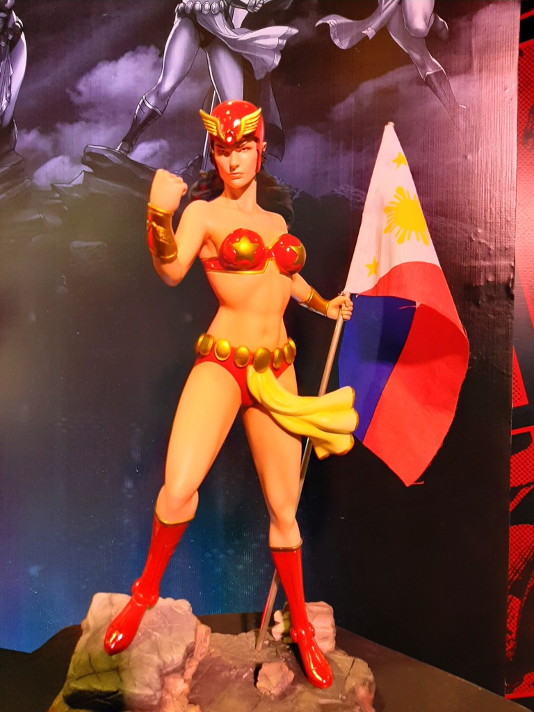
For starters, it is easy to imagine De Leon wear the traditional Darna costume which has always been a two-piece swimsuit with a head dress (in recent times, a helmet), superhero boots, arm braces and a frontal cloth. Check out the photo I took of a Darna statuette during the 2019 Toycon below.
I took this during last year’s Toycon.
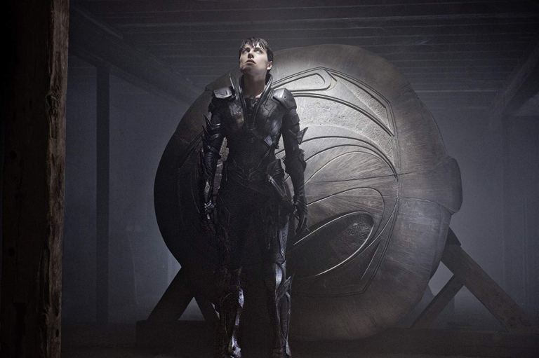
If the filmmakers prefer to show the cinematic Darna with a new look of much less skin exposed while still maintaining the feminine figure, the lady’s armor design could be a useful alternative. Take a look at the armor of Faora in Man of Steel.
The armored Faora in Man of Steel. (photo sourced from IMDB.com)
An armored Darna just might work in modernizing the look of the Philippine superhero icon with the 21st century in mind. While it can cover a lot of De Leon’s skin, it could use a little less metallic parts (compared to Faora’s armor in Man of Steel) to show more of the actress’ figure. Having the armor painted red with some parts in gold can help maintain the Darna look.
As of this writing, we don’t know yet what the filmmakers have in mind with the Darna costume for Jane de Leon. But once new updates about the costume and the film itself have been released, I’ll share and discuss them right here.
For the meantime, visit the Darna (2020) movie page right here.
For those of you who read this, what do you think is the best Darna costume design for Jane de Leon? How should it look? Feel free to post your answers with the comment tool below.
Thank you for reading. If you find this article engaging, please click the like button below and also please consider sharing this article to others. Also my fantasy book The World of Havenoris still available in paperback and e-book format. If you are looking for a copywriter to create content for your special project or business, check out my services and my portfolio. Feel free to contact me as well. Also please feel free to visit my Facebook page Author Carlo Carrasco and follow me at HavenorFantasy@twitter.com
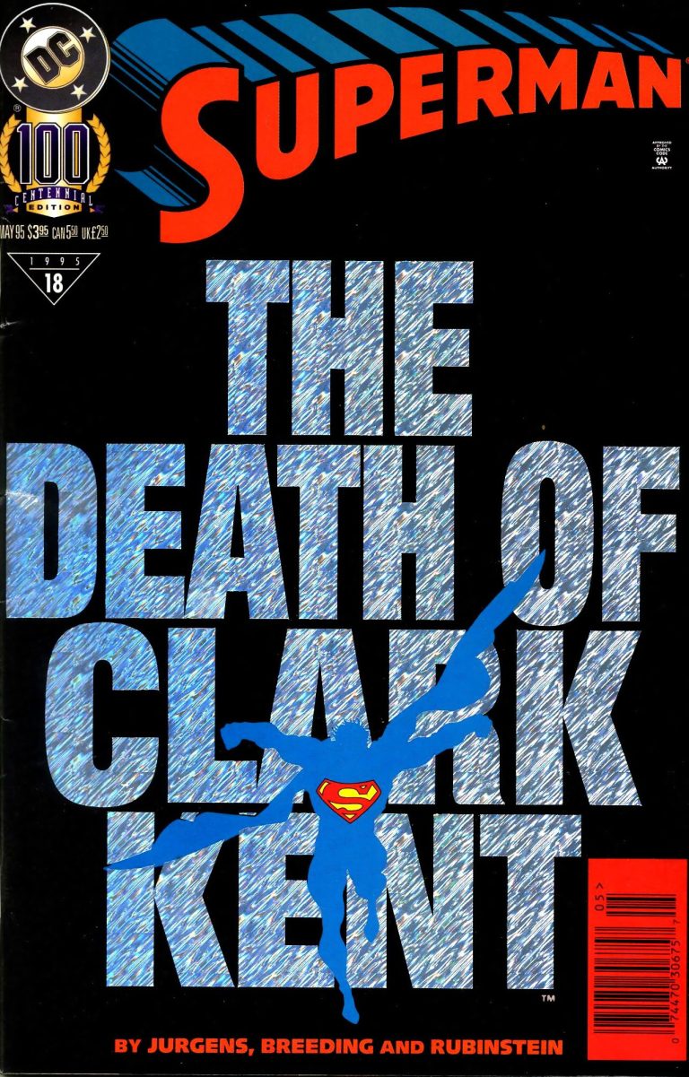
While this old comic book may not be the best-selling Superman story of the 1990s, it is for me the most significant one as well as creator Dan Jurgens’ best work ever on the Man of Steel. I’m talking about Superman #100.
The cover.
Released in 1995 by DC Comics, Superman #100 came out with a special cover that highlighted the title “The Death of Clark Kent”. It was released with a hefty cover price of $3.95 for the United States and was pretty thick. It was written and illustrated by Dan Jurgens, the same man who worked on the best-selling Superman #75 (The Death of Superman climax).
Early story
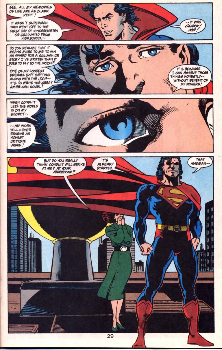
The story begins with Clark Kent carrying a deformed Superman object (with makeshift glasses and a knife “stabbing” the letter S) and just feet behind him was his officemate Jimmy Olsen. Hidden mostly from Olsen’s view, the object signifies that someone knows that Clark Kent and Superman are one and the same person. Carefully, Clark hides it away and starts chatting with Jimmy who is very concerned of him.
Clark recently has been struggling over the fact that someone knows his secret identity. After carefully dismissing Jimmy, he moves out as Superman to take of business before the madman (who knows his identity) makes his next move.
Superman visits his parents Jonathan and Martha Kent at their home in Smallville. He expresses to Jonathan that he believes that the madman is someone he knew from his past: Kenny Braverman (Conduit).
Quality
If there is anything that defines this comic book, it is the in-depth storytelling done by Dan Jurgens complete with intense character development as well as exploration of people from his past (all connected to Smallville).
The plot structure is quite simple. Conduit knows Superman/Clark Kent personally and is always at least a step ahead of the superhero complete with strategies mess with him personally. Superman, who came back from the dead and has been struggling to fit in with the times, finds himself at his most vulnerable state not as a super-powered guy but as a human being. To analyze things here, Superman is about to get suffer and lose a lot again but not with the temporary death he got from fighting Doomsday, but rather the demise of his personality as Clark Kent.
Truly one of the best Superman dialogue and characterizations ever thanks to Dan Jurgens.
Think about it. As Clark, Superman has a career, a social life, grew up the American way, intends to spend his life with Lois Lane and has ambitions of simple living that mean more to him than being with the Justice League America (note: writing the next great American novel).
The great thing here is that writer-artist Dan Jurgens humanized Superman a whole lot in this comic book and his work is excellent. Superman #100 opens up the discussion about what life would be like for the Man of Steel once his identity as Clark Kent gets ruined. The story also connects with Superman’s past (within the post-Crisis universe of DC Comics) and sheds light on his relationships with not only his parents but also with Pete Ross and Lana Lang (Clark’s ex-GF). When it comes to putting Superman in danger, Conduit’s approach is more convincing than Doomsday’s unstoppable power of destruction.
By the time I got immersed with Dan Jurgen’s storytelling and character development, the action scenes involving Superman felt justified. More importantly, this comic book shows the famous superhero being pushed to the limits in terms of personality tolerance and determination.
Conclusion
We live in an age in which established entertainment franchises get ruined by sequels or spin-offs or reboots which were mishandled by creators who tried to reinvent stuff only to fail and disappoint the fans.
Look at Star Wars Episode VIII: The Last Jedi. Director Rian Johnson had complete creative control on telling an engaging and fun Star Wars tale but ended up deforming it (disregarding Star Wars’ most defining elements), focused mainly on subverting people’s expectations and left many long-time fans disappointed and angry.
Superman going after Conduit.
Going back to Superman #100, Dan Jurgens succeeded in redefining the American icon while maintaining respect of the established past of the character and kept the elements that defined Superman. His story about the demise of Superman’s secret identity was a very fresh concept and, for a time, it paved the way for opportunities to take the Man of Steel into new creative directions without disappointing fans.
Personally, I would love to see Warner Bros. produce a new standalone Superman movie with Henry Cavill as the superhero and adapt the core elements of Jurgens’ work in Superman #100 into the screenplay. Cavill already proved he could portray Superman/Clark very humanly in Man of Steel.
Overall, Superman #100 is highly recommended.
Thank you for reading. If you find this article engaging, please click the like button below and also please consider sharing this article to others. Also my fantasy book The World of Havenoris still available in paperback and e-book format. If you are looking for a copywriter to create content for your special project or business, check out my services and my portfolio. Feel free to contact me as well. Also please feel free to visit my Facebook page Author Carlo Carrasco and follow me at HavenorFantasy@twitter.com