A Look Back at X-Men Adventures #2 (1992)

Disclaimer: This is my original work with details sourced from reading the comic book and doing personal research. Anyone who wants to use this article, in part or in whole, needs to secure first my permission and agree to cite me as the source and author. Let it be known that any unauthorized use of this article will constrain the author to pursue the remedies under R.A. No. 8293, the Revised Penal Code, and/or all applicable legal actions under the laws of the Philippines.

Having read lots of X-Men comic books, I should say that I always find the Sentinels (first appearance in The X-Men #14 in 1965) to be more memorable as enemies of Marvel’s mutants. On face value, they only look like oversized, human-like robots but I always find them to be formidable opponents of the X-Men. These machines are not only built with sophisticated technologies, they are able to push the X-Men to their limits during battle.

These anti-mutant robots, by the way, were ranked by IGN at #38 in their Greatest Comic Book Villains chart. Long before that, the Sentinels were the featured anti-heroes in the classic X-Men comic book storyline Days of Future Past and it was no surprise that they were also featured in the 2014 movie X-Men: Days of Future Past.

And then in the early 1990s, the Sentinels were shown in the first episode of the X-Men animated series on television. The said series was also adapted into an “as seen on TV” comic book series by Marvel called X-Men Adventures.

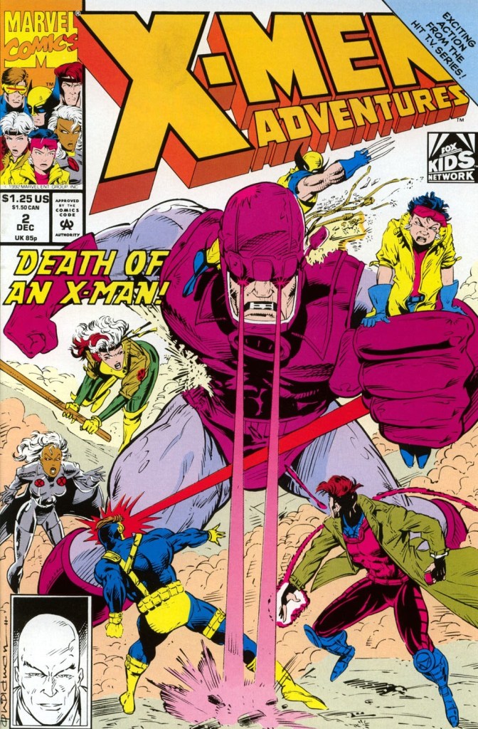
This brings me to this look back at X-Men Adventures #2, published in 1992 by Marvel Comics with a story by Ralph Macchio and drawn by Andrew Wildman.  

The cover.

Early story

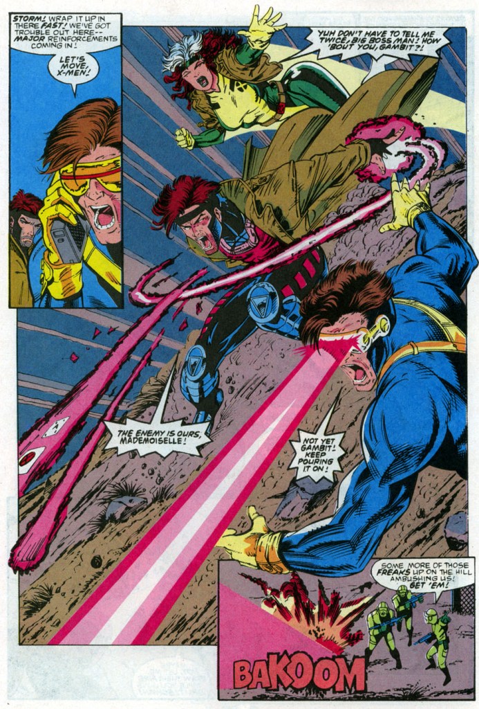
The story begins with Morph suffering from a nightmare. As he emerged from the vision, he finds himself with Storm, Beast and Wolverine. Together they work to infiltrate a federal government facility which houses the Mutant Affairs Department. Outside the walls of the facility, Rogue Gambit and Cyclops watch from a distance. Cyclops fires his optic blast at the vehicle that just dropped reinforcements that he believes were sent to stop their teammates.

Storm and her teammates break through a door instantly pushing off the security personnel followed by Beast knocking an additional guard. At the room containing the computer, Beast begins to access key information their team has been seeking…

Quality

The Sentinels and the X-Men!

Let me start with the storytelling. As an adaptation of one of the early episodes of the animated series, this comic book does a fine job of recapturing its essence complete with a nice balance between plot, exposition and spectacle. Considering the fact that the animated series was aimed for children, it’s quite intriguing to see the TV episode carrying really heavy themes – apart from the prejudice the mutants suffer from – like top federal government operations, expensive defense and weapons programs, government intrusion into people’s private lives, attempts to require minorities to get registered, etc. Those themes also made it in this comic book which made it feel like it was part of the mainstream X-Men comics of the time.

Compared to the first episode as well as its literary adaptation, this one emphasizes the Sentinels as tools of the government as part of their very expensive program to seek and monitor mutants among their citizens. Mutant Affairs director Peter Gyrich is clearly the villain who has no super powers but has the resources of the federal government and their authority to take action on mutants he perceived to be dangerous.

On the visuals, Andrew Wildman performed a solid job making each page look interesting and detailed enough. While his drawings made each character recognizable to me, it is in the spectacular scenes where he really shines. Wildman’s drawing of the Watcher on the final page of the comic book, however, looks laughable.

Conclusion

Andrew Wildman’s dynamic drawing of the X-Men in action.

While X-Men Adventures #2 is not exactly a literary classic, it is indeed a very solid adaptation of one of the earliest episodes of the animated series of the 1990s. It succeeded on telling a compelling and enjoyable story even though it emphasized the above-mentioned serious themes. As for the iconic Sentinels, this one succeeded in explaining what they are and their place in Marvel’s universe is.

If you are seriously planning to buy an existing hard copy of X-Men Adventures #2 (1992), be aware that as of this writing, MileHighComics.com shows that the near-mint copy of the regular edition costs $8 while the near-mint copy of the newsstand edition costs $26.

Overall, X-Men Adventures #2 (1992) is recommended.

+++++

Thank you for reading. If you find this article engaging, please click the like button below and also please consider sharing this article to others. If you are looking for a copywriter to create content for your special project or business, check out my services and my portfolio. Feel free to contact me as well. Also please feel free to visit my Facebook page Author Carlo Carrasco and follow me at HavenorFantasy@twitter.com

A Look Back at UltraForce #2 (1994)

Disclaimer: This is my original work with details sourced from reading the comic book and doing personal research. Anyone who wants to use this article, in part or in whole, needs to secure first my permission and agree to cite me as the source and author. Let it be known that any unauthorized use of this article will constrain the author to pursue the remedies under R.A. No. 8293, the Revised Penal Code, and/or all applicable legal actions under the laws of the Philippines.

Some time ago, I wrote and explored what would happen had superheroes been real and got involved with government leaders and the corporate media. Considering what has been going on for some time now, I hope that more readers would read the article and realize the conspiracy between political parties and corporate media is real and even dangerous. Did you even notice that in America, the Left-leaning media outlets have been distorting the facts about the riots involving the Marxist movement Black Lives Matter and the violent Antifa group? Also, did you notice that the liberal media distorted the meaning of the words peaceful protesters? Being a former local community print media publication journalist myself, I know why media outlets (whose owners and managers willingly get involved with those who wield power) would distort the news and insult the public’s intelligence. Really, the truth is that objective, truthful, responsible and professional journalism is shrinking.

Enough with the sickening news wave of negativity magnified by corporate media. It’s time to examine the superhero-government-media conspiracy followed by a fantastic conflict within the Ultraverse in this look back at UltraForce #2, published in 1994 by Malibu Comics with a story written by Gerard Jones and art by George Perez (breakdowns) and John Statema (finished pencils).  

The cover of the limited edition.

Early story

The story begins with UltraForce member Ghoul visiting a place within the woods. He stops at a huge grave site of the Exiles and tries to communicate with his former teammates but to no avail. He only got glimmers from them. After expressing himself to nobody, he walks away.

Shortly after, UltraForce composed of Hardcase, Prime, Prototype, Ghoul, Pixx, Contrary and Topaz meet with US President Bill Clinton, US Senator Bob Dole, UN’s secretary general Boutros-Ghali and Blackrock of the press in the Oval Office at the White House in Washington, DC. As they discuss important matters together, Atalon makes his move against the civilized world…

Quality

The interactions between the members of UltraForce are richly written.

To start with, this comic book is a build-up type of story containing lots dialogue, exposition and explanatory pieces with not too much spectacle. That’s not to say this is a boring issue, in fact it still remained quite engaging to read. The very wordy script for this comic book was written with care and there were efforts made to keep the story cohesive even as it grapples with all the details for explaining. What the writer presented not only explained what is happening and why the world is being threatened by Atalon and his forces from underneath, the script also took its time in presenting the characters struggling with each other’s views while providing key moments that add some development to the personality of some of the characters (example: Prime’s interest in Chelsea Clinton reflected not only his teenage self but also his first encounter with her during the Prime monthly series). As far as storytelling goes, it succeeded in helping me understand the huge event transpiring and justified why UltraForce as a team is needed. When you think about it, Prime, Hardcase and Prototype already have major affairs of their own (especially when you read their respective monthly series) but Atalon is a major threat that requires the three to work together (along with Pixx, Ghoul, Topaz and the ever scheming Contrary).

More on the conspiracy between the superheroes, the government leaders and the corporate press, this comic book is more relevant than ever today even though superheroes do not even exist in real life. I like the moments when Contrary wanted access to government files which drew a strong reaction from Bill Clinton who in turn is being watched carefully by opposition leader Bob Dole. For his part, Hardcase expressed that his team does not want any power struggle between ultras and the government. And then Bob Dole stressed to Prototype that he works for Ultratech and said: I take it that you are a defender of the rights of the private sector?

Of course, the highlight of the writing is the dynamic interactions between the UltraForce members when they are on their own and struggle to work together due to their respective differences. The dialogue is very rich.

When it comes to visuals, this one is rather unique because it has breakdowns by the legendary George Perez with finished pencil work by John Statema. It’s not a pure Perez art work which is obvious but still I recognized the characters and there is still a high level of visual detail all throughout. Still a solid looking comic book!

Conclusion

This is a clever way of doing exposition…Bill Clinton learns more about Topaz and Ghoul but only the readers get a visual presentation.

Never mind the fact that it lacked spectacle, UltraForce #2 is still compelling to read mainly due to its strong writing, the memorable interactions between the characters and emphasis of the crisis that justifies the presence of the team complete with impact on the world. Not only that, this comic book event went the extra mile to emphasize crossing-over within the Ultraverse by including The Strangers (check out The Strangers #4 and Hardcase #4 for reference).

If you are seriously planning to buy an existing hard copy of UltraForce #2 (1994), be aware that as of this writing, MileHighComics.com shows that the near-mint copy of the regular edition costs $8 while the near-mint copy of the limited edition costs $12.

Overall, UltraForce #2 (1994) is highly recommended!

+++++

Thank you for reading. If you find this article engaging, please click the like button below and also please consider sharing this article to others. If you are looking for a copywriter to create content for your special project or business, check out my services and my portfolio. Feel free to contact me as well. Also please feel free to visit my Facebook page Author Carlo Carrasco and follow me at HavenorFantasy@twitter.com

A Look Back at Prototype #11 (1994)

Disclaimer: This is my original work with details sourced from reading the comic book and doing personal research. Anyone who wants to use this article, in part or in whole, needs to secure first my permission and agree to cite me as the source and author. Let it be known that any unauthorized use of this article will constrain the author to pursue the remedies under R.A. No. 8293, the Revised Penal Code, and/or all applicable legal actions under the laws of the Philippines.

Hey fellow superhero comic book geeks and Ultraverse fans! Welcome back to my continuing retrospective of the Ultraverse through the Prototype series of comic books published by Malibu Comics. Last time around, Jimmy Ruiz (Prototype) was not prominent as the comic book focused more on Ranger (the previous Prototype piloy Bob Campbell actually) who took on a group of terrorists with some help.

As such, we can see what happens next with this look back at Prototype #11, published in 1994 by Malibu Comics with a story by Tom Mason and Len Strazewski and art by Roger Robinson.

The cover.

Early story

The story begins with Glare, an old nemesis of Prototype. As it turns out, he was revived by some scientists in a high-tech facility of the sinister group Aladdin. The green-skinned Glare breaks free from the restraints and starts causing some damage. He is driven by revenge against Stanley Leland, Ultratech and Ranger (Bob Campbell).

Meanwhile on the street of New York, Jimmy Ruiz (Prototype) and Bob Campbell are together. Jimmy, who is not even using the powered suit of armor, released a lot of energy while floating off the surface causing a major public disturbance. Afterwards, Bob decides to help his Prototype successor…

Quality

Bob Campbel in his Ranger powered suit of armor.

Let me start by confirming that the storytelling is very good. In fact, the high quality of writing was maintained and judging from the presentation of having Jimmy Ruiz and Bob Campbell together in a full issue (note: they got together only in the late stages of issue #10), it seems that Tom Mason and Len Strazewski had things planned out in an organized fashion. The result is having the two Prototype pilots not only together but getting involved (in a pretty believable way) in response to a rising danger. To make things clearer, this is NOT the anticipated superheroes-set-aside-their-differences-to-work-together-to-solve-the-problem type of story.

Bob Campbell still got plenty of the spotlight as Ranger and his battle with Glare is a lot of fun to read. Jimmy Ruiz meanwhile is developed even further. I also like the scenes that emphasized the difference between being an ultra and a tool of Ultratech which affects Jimmy.

Conclusion

Jimmy Ruiz and Bob Campbell together.

Prototype #11 is another enjoyable and compelling Ultraverse comic book to read. Its own story is indeed special and worthy of being an Ultraverse 1st birthday issue (as marked on the cover). Clearly this comic book marked a bold new direction of storytelling just as the two Prototype pilots are finally together.

If you are seriously planning to buy an existing hard copy of Prototype #11 (1994), be aware that as of this writing, MileHighComics.com shows that the near-mint copy of the comic book costs $8.

Overall, Prototype #11 (1994) is highly recommended!

+++++

Thank you for reading. If you find this article engaging, please click the like button below and also please consider sharing this article to others. If you are looking for a copywriter to create content for your special project or business, check out my services and my portfolio. Feel free to contact me as well. Also please feel free to visit my Facebook page Author Carlo Carrasco and follow me at HavenorFantasy@twitter.com

A Look Back at X-Men 2099: Oasis

Disclaimer: This is my original work with details sourced from reading the comic book and doing personal research. Anyone who wants to use this article, in part or in whole, needs to secure first my permission and agree to cite me as the source and author. Let it be known that any unauthorized use of this article will constrain the author to pursue the remedies under R.A. No. 8293, the Revised Penal Code, and/or all applicable legal actions under the laws of the Philippines.

According to the online edition of Merriam-Webster Dictionary, an oasis is something that provides refuge, relief, or pleasant contrast. In the case of X-Men 2099, the open areas of the southwestern region of the United States is a dangerous place to be in even though they are free from oppressive systems of control that dominate cities. As such, it is the southwestern region in 2099 can be compared to the Old West in history where there are lots of desolate places as well as lots outcasts and outlaws. Unlike their mainstream counterparts, the X-Men of the far future are nomads and they don’t have a long-term place of residence they could call home. Considering how dangerous the region is for the mutants, a haven of peace, security and prosperity is always ideal to them but only if it is indeed real.

That is what we will explore in the one-shot comic book X-Men 2099: Oasis here.

But before proceeding with the review, it has to be emphasized first that the one-shot comic book which was made special with the painted art of the Hilderbrandt brothers Greg and Tim. For long-time X-Men 2099 scribe John Francis Moore, Oasis was like a big dream come true. When asked during an online interview about his recollections on making X-Men 2099: Oasis and working with the Hildebrandt Brothers, Moore stated:

I was a fan of the Hildebrandt’s fantasy illustration, and I was blown away when Joey told me that they wanted to do an X-men 2099 project. I met with them in Joey’s office and they were both really great guys. I think they said they really liked Bloodhawk, so I knew he’d be a major player in whatever story we developed. They didn’t enter the project with a lot of conditions. They seemed genuinely happy to get to play in this corner of the Marvel universe.

I can’t remember ever writing a full script for any of my Marvel work. I gave them a plot and sometime later received Xeroxes of pencil art (Hildebrant art!) to dialogue. Then it went back for them to paint, and they did a phenomenal job. I only wish that it could’ve been published before the 2099 line was axed. It was a beautiful book that I think was sadly under promoted.

To find out if it is any good, here is a look back at X-Men 2099: Oasis published in 1996 by Marvel Comics with a story written by John Francis Moore and painted art done by Greg and Tim Hildebrandt.

Cover
The cover.

Early story

The comic book begins with a flashback set in Hong Kong in the year 2090. A much younger Shakti/Cerebra is on the loose trying to reach a ferry to Kowloon with a plan to hide in the back alleys of Tsimshatsui. Suddenly Lokjaw intercepts her and grabs her. They had a short history together and Lokjaw insists that Shakti should be grateful to her father who raised her to run his bio-shops. After a brief chase, something hits Lokjaw who fell into the water. It turns out Ryu Kobolt helped Shakti, and he has been instructed by his boss to offer her asylum.

11
Luna and Skullfire explore a place.

In the present day of 2099 in New Mexico, Bloodhawk flies to his desert home not knowing he is being monitored. Two people, an old man with white hair and a lady, work together to stun the X-Men member and take him with them. A short time later, inside a high-tech facility, Bloodhawk wakes up finding himself restrained and being watched over by the lady and the old man. They tell him he is in the Promised Land, a place where the sins of the old world will be washed away. Using her powers, she touches Bloodhawk’s head and slowly turns him into his normal human form.

Meanwhile outside a deserted town near the border between Colorado and Kansas, Shakti, Tim/Skullfire and Luna arrive riding motorcycles. They are checking the potential presence of a mutant nearby…

Quality

15
Really great visuals by the Hildebrandt brothers!

It is very safe to say that this is one very ambitious X-Men 2099 story ever told by John Francis Moore. It sure has an epic concept showing that Oasis in the open region not only exists, but also serves as the closest thing humanity in America has to imitating Heaven built on top of the land. Oasis is the indoor paradise where mutants and humans gather together, live in peace and work together in tremendous ways that the X-Men could only hope to achieve in Halo City (note: this story is set some time after X-Men 2099 #25).

The titular place is clearly the centerpiece of the story backed with characters and threads from the past that explain how it got established. Part of the creation of Oasis is connected with Ryu Kobolt whom Shakti got close with many years back. Of course, someone else got involved with Ryu which directly connects with the creation of Oasis.

While it is also clear that the story took some inspiration from Christianity, I should say that the approach was done by rehashing old storytelling concepts like emphasizing a charismatic person who looks godly or messianic, people getting converted with ways that are not holy, false prophets misleading those seeking salvation, etc. With the ages-old concept of the mad scientists added, then there is conflict here for the X-Men to engage with. The story touches on themes like destiny, conversion, having the power to judge people and committing genocide.

As for the characters, John Francis Moore made the right move to utilize Shakti, Bloodhawk, Skullfire and Luna of the X-Men, however the other new characters such as Memphis, Pandora and Ryu pale in comparison with regards to importance (even though Memphis and Ryu each had a good amount of the spotlight and even some character development).

When it comes to the artwork, this is one great looking superhero, sci-fi story in painted form thanks to the Hildebrandt brothers! Not only is their painted art beautiful to look at, there are also eye-catching shots of scenery, very detailed facial expressions and a very lively presentation of the action scenes and explosions! Each and every character painted – specifically Shakti, Skullfire, Bloodhawk, Luna, Memphis, Pandora and Ryu – has that touch of visual realism (note: not photo realism) that make them look more human to the eyes (especially the X-Men members when compared to how they were drawn by Ron Lim and Jan Duursema in the monthly series). This is one great looking comic book and easily one of the very best of the X-Men of 2099!

Conclusion

16
The Oasis!

X-Men 2099: Oasis is a one-shot comic book that did not match its high ambition. While it has some of the best painted superhero art of the 1990s ever, the storytelling just did not engage me that much. For one thing, its approach on taking inspiration from Christianity is very flawed not only due to rehashing storytelling concepts but also due to the fact that everything – including the titular Oasis – had to be concluded already. Even though there was a build-up leading to a final conflict, the payoff was not that great and ultimately there was a sense of rush in the 2nd half of the story.

What is also disappointing is the fact that the events told here did not really impact Shakti, Skullfire, Luna and Bloodhawk at all, nor was there anything added to the narrative of the X-Men 2099 monthly series. This is too bad because the existence of a haven where people can live in and be protected from the prejudice and violence in the region fits nicely with the concept of X-Men 2099 in the first place. Even though there was a reference to issue #25 during the first half, this comic book ended up looking like a dream story or a parallel universe tale with a $5.95 cover price! It seems to me like this was more like a cash-grab attempt to exploit comic collectors and the fans of X-Men 2099.

If you are seriously planning to buy an existing hard copy of X-Men 2099: Oasis, be aware that as of this writing, MileHighComics.com shows that the near-mint copy costs $14.

Overall, X-Men 2099: Oasis is a serviceable one-shot comic book. That being said, if you really intend to buy it, you should not pay more than $5 for it.


Thank you for reading. If you find this article engaging, please click the like button below and also please consider sharing this article to others. If you are looking for a copywriter to create content for your special project or business, check out my services and my portfolio. Feel free to contact me as well. Also please feel free to visit my Facebook page Author Carlo Carrasco and follow me at HavenorFantasy@twitter.com

A Look Back at The Solution #6 (1994)

Disclaimer: This is my original work with details sourced from reading the comic book and doing personal research. Anyone who wants to use this article, in part or in whole, needs to secure first my permission and agree to cite me as the source and author. Let it be known that any unauthorized use of this article will constrain the author to pursue the remedies under R.A. No. 8293, the Revised Penal Code, and/or all applicable legal actions under the laws of the Philippines.

As this is another retro  review of another Ultraverse comic book written by the late James Hudnall, I encourage you to take time to check out his background and other works via Comic Book Resource’s report of his death on April 2019.

In memory of James Hudnall, here are his words published near the end of The Solution #7:

The Solution is a dream team for me. I’ve been wanting to mix the genres of fantasy and cyberpunk science fiction with the super-hero genre for some time. Add my love of Japanese animation and Hong Kong cinema and you can see where I’m coming from here. This series is designed to show us some of the more bizarre and dark sectors of the Ultraverse without, hopefully, falling into the trap many similar books do where they lay it on too thick. The Ultraverse is a complex and multi-faceted universe and our books explore different sides. Here I want to delve deep into the criminal and espionage arenas as well as the magic sub-cultures that exist.

The characters themselves have a rich and interesting history that I plan to slowly unveil as the series progresses. When you first meet someone, you usually don’t know that much about the person. The characters are rather deep, as we will discover, and their personalities and more complex than you’re probably used to seeing in comics.

Now we can start this look back at The Solution #6, the Ultraverse comic book published in 1994 by Malibu Comics with a story written by James Hudnall and illustrated by John Statema (with ink work by Dennis Jensen and Mark Stegbauer).

Cover
The cover.

Early story

The story begins with Lela Cho (Tech) alone paying respect to her father at his grave. She tearfully recalls what happened right after he died.

The narrative then shifts to 1993, specifically the day her father was about to get buried with many guests involved. Even though she is mourning, a man with blonde hair approaches her. His name is Kyle Sanders and he tells her she wants to talk to her about the corporation called Hypersonic. After receiving his business card, Lela feels a strange sense of dread creeping up on her.

A few days later, Lela attends a Board of Directors meeting at the headquarters of Hypersonic. She reminds them that she inherited all of her father’s shares in the company that makes her a majority stockholder and it was written in his will that she will assume his post as Chairman of the Board. Even though she already earned her Master’s Degree in Business at Harvard, the BOD members rejected her on the grounds that she’s too young and has no previous practical experience. They expressed that it would be better for her to work within the company and climb her way up.

Even though she got rejected and found herself alone, she decided not to give up and move forward by visiting NuWare, a corporation in San Francisco, California, that specializes on bio-tech implants (Wetware) that can make a person an Ultra…

Quality

20
Lela Cho/Tech in action!

This is a very compelling, character-driven comic book, one of the best of the Ultraverse I read as of this writing. Clearly the late Hudnall achieved his goal of not only developing Lela Cho/Tech, but also defining her as a living part within the Ultraverse. Speaking of the Ultraverse, there is this nice and subtle connection with certain people regarding The Strangers.

Back to Lela Cho, her personality was very deeply defined by Hudnall. By the time you reach the end of this comic book, you should at least be caring about her even though her status as a super-rich lady trying to make her way up in business (while protecting herself) puts her on a different class. Ultimately her transformation into an Ultra is special to read and examine, even worthy of a cinematic adaptation.

Regarding the visuals, John Statema pulled of a great job. I love how the facial expressions he illustrated brought out the ranging emotions of the characters, specifically with Lela. When she’s mad, she really looks mad. When she is sad, you will see the sadness. Regarding action, Statema’s effort was decent.

Conclusion

11
Really nice art and good choice with the colors for the light effect.

I really liked The Solution #6. From start to finish, it kept me very engaged and ultimately it made me understand Lela Cho/Tech much better, which also made me go back to re-reading the first issue.

If you are seriously planning to buy an existing hard copy of The Solution #6, be aware that as of this writing, MileHighComics.com shows that the near-mint copy of the regular edition costs $4.

Overall, The Solution #6 is highly recommended.


Thank you for reading. If you find this article engaging, please click the like button below and also please consider sharing this article to others. If you are looking for a copywriter to create content for your special project or business, check out my services and my portfolio. Feel free to contact me with a private message. Also please feel free to visit my Facebook page Author Carlo Carrasco and follow me on Twitter at  @HavenorFantasy as well as on Tumblr at https://carlocarrasco.tumblr.com/

A Look Back At Bloodshot #1 (1993)

Disclaimer: This is my original work with details sourced from reading the comic book and doing personal research. Anyone who wants to use this article, in part or in whole, needs to secure first my permission and agree to cite me as the source and author. Let it be known that any unauthorized use of this article will constrain the author to pursue the remedies under R.A. No. 8293, the Revised Penal Code, and/or all applicable legal actions under the laws of the Philippines.

You must have heard about the live-action Bloodshot movie (starring Vin Diesel) that failed to make big bucks at the box office. Then you must have learned about Valiant Comics.

To understand Bloodshot before reviewing the early-1990s comic book Bloodshot #1, here’s a look at the history of Valiant Comics.

1
The cover with chromium and Bloodshot drawn by Barry Windsor-Smith.

In the late 1980s, a team composed of former Marvel Comics Editor-in-Chief, former Allman Brothers Band manager Steve Massarsky and some investors failed in their bid to acquire Marvel Enterprises. Instead of letting their failure stop them, they went on to establish Voyager Communications with the backing of Triumph Capital. Voyager then created the imprint Valiant Comics which went on to launch its first titles in 1991 with Magnus, Robot Fighter (which started in the 1960s in comics published by Gold Key) and Solar, Man of the Atom (also started in the 1960s through Gold Key comics).

Subsequently Valiant’s first original superhero Rai was introduced followed by other original properties like Harbinger and Eternal Warrior. It was within the pages of Eternal Warrior #4 Bloodshot made his first appearance followed by a first full appearance in Rai #0.

Then in November 1992, the same month DC Comics released Superman #75 (The Death of Superman, Valiant released Bloodshot #1 with a cover price of $3.50 (cover dated February 1993) and a very eye-catching chromium cover of Bloodshot drawn by Barry Windsor-Smith.

Now that the history lesson is done, we can finally explore Bloodshot #1 (written by Ken VanHook and drawn by Don Perlin) in this retro comic book review.

Early Story

The story begins at Heathrow Airport in the United Kingdom. Immediately after a man and a woman (both wearing coats and hats) performed an exchange with a briefcase, two other men (also wearing coats) reacted to them but Bloodshot jumps into the action firing his gun, taking a shot to his arm and grabbing the briefcase. Bloodshot escapes from the airport.

4
Adulterated action!

Behind the scenes, an old man meets with Thompson and Otomo informing them that Bloodshot was an experiment of theirs under Project Rising Spirit. The project was disrupted when a young blonde male got to Bloodshot and adjusted one of the devices. The young guy was caught by one of the operators until Bloodshot (still bald and naked) got up, attacked the personnel (freeing the young guy), gathered data from their computers and escape.

The old man noticed Bloodshot’s rampage at Heathrow Airport and was able to identify him. He issues orders to Thompson and Otomo.

“I want him returned—I do not care the condition,” he said.

Quality

Looking beyond the eye-catching chromium cover, Bloodshot #1 from the early 1990s is actually engaging and intriguing to read. While it is a superhero comic book, it sure has a dark and gritty tone as well as being noticeably grounded with reality.

With the spectacle, the action is violent and somewhat bloody. It may look tame by today’s standards but back in the 1990s, this was exceptional and it really aimed towards older comic book readers. To put things in perspective, comparing this comic book with the typical Marvel or DC Comics superhero comic book is like comparing an R-rated action film to a PG-13 action or adventure film. Don Perlin’s artwork has a nice flow when it comes to the action and the dialogue scenes.

The writing by Kevin VanHook is good even by today’s standards. I like the way he handled expository dialogue in the first half of the comic book and from that point on, the spotlight was on Bloodshot and his exploits.

There are some weak spots in this comic book. There really was no room for real character development with Bloodshot. The comic book eerily reflected the hero’s approach to doing things: no slowing down, time to take action from here.  That’s not to say it is a brainless read but rather the plotting is decent and relied on the spectacle to make up for the absence of character development. That being said, Bloodshot as a hero who was a victim under his handlers, is hard to like. Based on this comic book alone, he is a rampaging killer looking as evil as the bad guys. It does not help that he is very unstoppable (because of nanites in his blood system which worked to enhance and heal him) and, at least in this comic book, there’s no real sense of danger for him.

When it comes to supporting characters like Sinclair and Malcolm, I can’t help but keep remembering Commissioner Gordon and butler Alfred Pennyworth in the Batman comics.

Conclusion

While it has some flaws in its presentation, Bloodshot #1 is still good and fun to read. On face value, Bloodshot looks like a typical macho action hero with guns but he actually has an interesting personality even though character development was badly lacking in this particular comic book. I also enjoyed the creator’s approach on emphasizing realism by using gangs and secret sinister organizations (which conduct unethical scientific experiments on people) on the background showing that Bloodshot himself is small player in a dangerous game of secret operations.

11

As a standalone story, Bloodshot #1 has more than enough good stuff to make up for its flaws and it is worth reading by today’s standards. This is the true value of the comic book that its flashy chromium cover does not reflect. In other words, this comic book is more than just a gimmick.

If you are a collector, be aware that as of this writing, Bloodshot #1 is worth over $40 for a near-mint copy according to Mile High Comics.

Overall, Bloodshot #1 (1993) is recommended. As a piece of amusement, the comic book is so much better than the Vin Diesel Bloodshot movie. That says a lot!


Thank you for reading. If you find this article engaging, please click the like button below, share this article to others and also please consider making a donation to support my publishing. If you are looking for a copywriter to create content for your special project or business, check out my services and my portfolio. Feel free to contact me with a private message. Also please feel free to visit my Facebook page Author Carlo Carrasco and follow me on Twitter at  @HavenorFantasy as well as on Tumblr at https://carlocarrasco.tumblr.com/ and on Instagram at https://www.instagram.com/authorcarlocarrasco

A Look Back at Spider-Man 2099 #35 (1995)

Disclaimer: This is my original work with details sourced from reading the comic book and doing personal research. Anyone who wants to use this article, in part or in whole, needs to secure first my permission and agree to cite me as the source and author. Let it be known that any unauthorized use of this article will constrain the author to pursue the remedies under R.A. No. 8293, the Revised Penal Code, and/or all applicable legal actions under the laws of the Philippines.

When Marvel Comics first launched the 2099 imprint of comic books showcasing many futuristic versions of their present-day characters – like Spider-Man, Ravage and Dr. Doom – it was inevitable that the same treatment will be applied to their popular supervillains.

In 1993, the 2099 version of Vulture was introduced and he sure proved to be one tough opponent for Spider-Man 2099. Even back then, there already was clamor for a futuristic version of Venom which at the time was riding high with readers being the featured anti-hero in several limited series (starting with Lethal Protector) of comic books.

Then in 1995, after doing a creative teaser in issue #34, Marvel formally introduced Venom 2099 by releasing Spider-Man 2099 #35. This is my review of the comic book written by Peter David and drawn by Andrew Wildman (X-Men Adventures).

Cover
The cover drawn by Rick Leonardi.

Early story

Picking up from the events of issue #34, the story begins in Washington, DC with Dana freeing herself only to find out that Alchemax’s CEO Tyler Stone was down suffering from a gun shot and losing blood. Minutes later, emergency personnel take Stone’s body for immediate treatment.

Meanwhile, Spider-Man 2099 (Miguel O’Hara) encounters the SHIELD flyboys in New York. After almost getting into trouble together, Spidey gets informed that US President Doom 2099 ordered them to leave him alone for a period of seventy-two hours while he considers a cabinet offer. Back in Washington, Dana gets interrogated by one of the authorities. President Doom enters the scene telling Dana that she will join Tyler Stone immediately in the medical center.

3
Andrew Wildman’s take on Spider-Man 2099 and the future was really nice to look at.

In New York, two guys sitting on the sidewalk witness a moving black liquid coming out of the sewer. The thing turns out to be a living symbiote (or alien costume) forming into a human-like shape – Venom 2099!

Quality

As with other comic books of this particular series, the writing by Peter David is pretty deep and engaging. The usual balance between dramatization, character development, plotting and spectacle is here once again but with a slight touch of horror in relation to the introduction of Venom of 2099. Speaking of dramatization, the portrayal of Venom 2099 as a vicious villain is similar to the 20th century Venom (Eddie Brock) but with a very powerful obsession to kill Miguel O’Hara and Tyler Stone.

Here’s an excerpt from the dialogue of Venom of 2099: Miguel O’Hara…and Tyler Stone…together again. We…I get to kill you…at the same time…how awfully…awfully…considerate. To show my appreciation…I’ll kill you slowly.

What makes this comic book unique is the artwork by Andrew Wildman who temporarily replaced regular illustrator Rick Leonardi. For comparison, I find Wildman’s art style a welcome thing in this comic book mainly because he draws with a lot more detail per panel and per page than Leonardi ever could. Instead of seeing the usual sketch-like art style of Leonardi, Wildman’s style is livelier and more expressive to look at. I also enjoyed Wildman’s visual take on Spider-Man 2099/Miguel O’Hara, Lyla, Tyle Stone, and the other established characters. Their facial expressions are also livelier to see.

9
Venom 2099 appears! Take note of the “liquid” at the edges of the page.

More on visuals, Wildman’s take on Venom 2099 is unforgettable. Like 20th century Venom, he has a dark suit, elongated jaw with rows of sharp teeth and an elongated tongue but with green acid dripping all the time. There are also those tentacles-like things that stretch from his body until the arms. Also his white-colored mask with large eyes make him look horrific.

Conclusion

Despite being shorter than the usual 22-pages, Spider-Man 2099 #35 is still a very engaging and fun old comic book to read. Its purpose was to build-up anticipation leading to the introduction of Venom 2099 was achieved nicely and the respective qualities of the writing and visuals are very good even by today’s standards. More on the presentation of Venom of 2099, it seems like Peter David took inspiration from movie director James Cameron on building-up tension and suspense before showing the villain. That’s a move I enjoyed in this comic book.

Overall, Spider-Man 2099 #35 is highly recommended. If you plan to acquire an existing and legitimate hard copy, be aware that the near-mint copy of it is over $100 for the newsstand version while the Rich Leonardi-drawn “Venom 2099 AD” cover version is priced at over $80 at MileHighComics.com as of this writing.


Thank you for reading. If you find this article engaging, please click the like button below and also please consider sharing this article to others. Also my fantasy book The World of Havenor is still available in paperback and e-book format. If you are looking for a copywriter to create content for your special project or business, check out my services and my portfolio. Feel free to contact me as well. Also please feel free to visit my Facebook page Author Carlo Carrasco and follow me at HavenorFantasy@twitter.com

A Look Back At Batman vs. The Incredible Hulk

Disclaimer: This is my original work with details sourced from reading the comic book and doing personal research. Anyone who wants to use this article, in part or in whole, needs to secure first my permission and agree to cite me as the source and author. Let it be known that any unauthorized use of this article will constrain the author to pursue the remedies under R.A. No. 8293, the Revised Penal Code, and/or all applicable legal actions under the laws of the Philippines.

I love reading a crossover comic book that was made by very talented creators to be a whole lot of fun from start to finish. Back in the early 1980s, rivals Marvel Comics and DC Comics collaborated temporarily with inter-company crossover comic books that were made to be entertaining to fans of their respective properties.

What I’m going to review here is the 3rd superhero crossover comic book between Marvel and DC titled Batman vs. The Incredible Hulk.

Cover
The cover.

Background

Before I start, let me clarify that this particular comic book was specifically published as issue number 27 of the DC Special Series which was a series of one-shot comic books. By comparison, the 1981 crossover comic book Superman and Spider-Man (which I reviewed previously) was published under the Marvel Treasury Edition line of Marvel Comics as issue number 28.

Going back to Batman vs. The Incredible Hulk, the comic book was the final issue of the DC Special Series line and it carried a cover price of $2.50 which was quite high for its time.

The people at DC Comics made sure that the crossover was handled by the best talents they had back then. The late Len Wein (best know for creating Wolverine) was assigned to write the script (and ensure that elements from both the Hulk and Batman would mix nicely) while José Luis García-López was hired to illustrate. Dick Giordano was the embellisher and editor while Allen Milgrom and then Marvel editor-in-chief Jim Shooter were the consulting editors. In return for their assistance, Marv Wolfman and Mike DeCarlo were acknowledged with thanks.

Now we can begin with this retro review of Batman vs. The Incredible Hulk.

The early story

The story begins when a few persons in Gotham City witness their dreams turning real beyond logic. A man dreamed he was in the arctic hunting and wakes up to discover his room was filled with snow. In a cinema where a horror movie was shown, a couple kissing each other discover, to their shock, that monsters of different sizes surrounded them out of thin air.

At the waterfront of the city, the Joker (accompanied by his gang members) talks to an unseen being (Shaper of Worlds). He gives his assurance to the being that he and his gang will acquire a specific item (needed by the being). For the Joker, what was discussed was a simple business arrangement.

A short time later inside a high-tech facility of Wayne Research, Bruce Banner (the Hulk) secretly works under the false identity as David Banks. He works along with the scientists but not on the scientific projects. Rather, he works odd tasks such as lifting hardware and putting them into places that need them. Of course, Banner did not get hired for a salary but for something much essential to him and his condition with Gamma Rays.

“I had to get a job here somehow so I could get close to the experimental Gamma-gun they’re working on,” he thought to himself.

Suddenly the facility gets filled with laughing gas incapacitating all the people inside. Banner fortunately manages to wear a radiation suit for protection. Moments later, the Joker and his gang enter searching for the Gamma-gun. From this point on, Banner decides to act.

Quality

When it comes to the selection of characters from Marvel and DC, having the mismatch of Batman and the Hulk was a very splendid idea. Not only was having the large green brute and the world’s greatest detective together as temporary rivals a fascinating concept, having them work together as a duo turned out to be a really great move. When it comes to the selected villains of the Joker and the Shaper of Worlds as the anti-hero figures of the story, the two looked like an odd pair but if you focus on the details of the story, you will realize that it made a lot of sense having them two together. The Shaper needs something which requires him to depend on the Joker who in turn brings his gang with him to cause chaos to acquire what the alien needs

All of the above details would not have worked had it not been for the excellent writing by Len Wein. Clearly Wein knew a whole lot about the defining elements of the Hulk and Batman (and the same with the Joker and Shaper), and he carefully blended those elements together to make a story that is thrilling, intriguing, engaging and at the same time still made sense. More on crossing over, there are other characters connected to Batman and the Hulk that made appearances and a few of them fit in nicely into the story.

As this was released in 1981, it was typical of the time for writers to use thought balloons to help readers understand what the characters were thinking. The use of thought balloons in this comic book truly defined Batman who not only had to fight the bad guys but also manage his way with the Hulk and do a lot of detective work.

Going back to the Hulk and Batman, this comic book has a lot of fun stuff. More than once did the two superheroes engage in action-packed encounters and their exchange of words was very nicely done. Their match-up (or mismatch) really works.

Prev1
A perfectly crafted action scene between the Hulk and Batman, complete with accurate depictions of each character! 

When it comes to the common complaint by some readers out there that the comic book was more of a Batman story and made the Hulk less prominent, I should say that the slight imbalance is not a problem at all. In fact, for me it makes perfect sense that Batman has more spotlight than the Hulk. Why? Because Batman is a detective and he performed a lot of researching, information gathering and other moves to solve problems. His detective work in the story made perfect sense for the narrative. As for the Hulk, his character really has very limited options other than causing destruction and disturbing the public. Since early on, the Hulk was best known for attracting the attention of the American military (led by General Ross) and huge destruction defined the encounters. For this crossover, the creators did not show the Hulk engaging with the military (save for the phonies) but rather he struggled to figure things out whenever he encountered Batman or the Joker. There is no way the Hulk could do detective work like Batman and having him fight the military would have weakened this comic book’s presentation. Clearly, having the story slightly slanted towards Batman is still the right move.

Prev2
Very highly imaginative and dynamic artwork by José Luis García-López.

The artwork done by José Luis García-López is excellent! He really captured the looks and details of each and every character Marvel and DC that appeared in this comic book. Back in the early 1980s, I got to read several comic books that showed Batman, the Hulk, the Joker and others and the way they appeared in this comic book was indeed accurate of the time. José Luis García-López also knew how to balance spectacle with character development and expository dialogue in terms of visual pacing and framing shots. Also his work becomes even more imaginative during the final conflict. Undoubtedly this is still a great looking comic book!

Conclusion

Overall, Batman vs. The Incredible Hulk is a great comic book and easily it is one of the greatest intercompany superhero crossover comic books ever published! From start to finish, this comic book proved to be highly engaging and there never was a single boring moment. The creators led by Len Wein (he is sorely missed) made the best possible story anyone can make involving Batman and the Hulk.

You can read a hard copy of this comic book by getting Volume 1 of Crossover Classics or, if you can afford to, hunt for a copy of this in its DC Special Series form which now sells for $280 for a very fine copy to as much as $400 for a near mint copy as of this writing according to MileHighComics.com

In ending this, I declare that Batman vs. The Incredible Hulk is highly recommended!


Thank you for reading. If you find this article engaging, please click the like button below and also please consider sharing this article to others. Also my fantasy book The World of Havenor is still available in paperback and e-book format. If you are looking for a copywriter to create content for your special project or business, check out my services and my portfolio. Feel free to contact me as well. Also please feel free to visit my Facebook page Author Carlo Carrasco and follow me at HavenorFantasy@twitter.com


A Look Back At Superman and Spider-Man

Disclaimer: This is my original work with details sourced from reading the comic book and doing personal research. Anyone who wants to use this article, in part or in whole, needs to secure first my permission and agree to cite me as the source and author. Let it be known that any unauthorized use of this article will constrain the author to pursue the remedies under R.A. No. 8293, the Revised Penal Code, and/or all applicable legal actions under the laws of the Philippines.

I miss the old times when big rivals Marvel and DC Comics would set aside competition temporarily to team up and rely on their respective comic creators to make superhero crossover comic books that the fans can enjoy.

Back in the 1970s, key developments related to the comic book adaptation of The Wizard of Oz brought the two rivals together as partners. In 1976, Marvel and DC’s first superhero crossover Superman vs. The Amazing Spider-Man got published and to this day many comic book collectors and geeks I encountered still enjoy it. A few of them even called it a classic.

The collaboration between Marvel and DC continued in 1981 with Superman and Spider-Man which was published as issue number 28 of the Marvel Treasury Edition series.

1
The cover.

This is my look back at Superman and Spider-Man.

The comic book

Scripted by then Marvel Comic editor-in-chief Jim Shooter (with Marv Wolfman mentioned for plot suggestions) with art drawn by John Buscema and inkwork done by Terry Austin, Al Milgrom, Steva Leialoha, Walt Simonson, Bob Layton, Joe Rubinstein and Bob Wiacek, the comic book begins when Spider-Man swings into a construction site where he encounters several armed men and stops them singlehandedly.

Even though he stopped the bad guys, Spider-Man’s spider sense bothers him making him speculate that, because there’s no clear danger around him, the construction site seemed to be a threat.

After Spider-Man swings away from the police who just arrived, classic Marvel supervillain Doctor Doom watches via surveillance video and he was bother by the way things turned out.

“I did not like the way Spider-Man paused and look around after subduing the thieves – – as if he sensed something unusual about the excavation! Those accursed spider instincts of his,” Doom said before proceeding with his master plan.

A day later, the Hulk arrives in Metropolis causing lots of damage. Separately Superman and Spider-Man arrive to contain the green guy. However, things are not what they seem. This is where the story description ends.

Quality

What this comic book lacked compared to the 1976 Superman-Spider-Man crossover is visual impact. Clearly John Buscema had to follow closely the script which called for multiple panels per page and that left him little room to draw scenes dynamically. That’s not to see the art is weak. In fact, Buscema’s art is pretty good and he has deep knowledge about how the characters (including those many supporting characters and other minor characters from both Marvel and DC Comics) really looked from the size of Hulk’s body, the details on Wonder Woman’s costume, the distinctive look of J. Jonah Jameson, Perry White, etc. In short, I recognized the characters very easily.

15
This remains fun to read.

24
Peter Parker in Metropolis along with the Superman supporting characters. This is one great element that made this comic book worth reading.

While the high number of panels per page limited him, Buscema managed to come up with some action shots that packed some impact.

When it comes to writing and storytelling, this comic book exceeds that of the 1976 Superman-Spider-Man crossover big time! To start with, the plot is much more elaborate, more detailed and yet consistently remained easy to follow.

While the 1976 crossover had the most popular villains of Superman and Spider-Man as the representation of evil, this one instead had Dr. Doom and Parasite. The great news is that these two super villains complement each other nicely and that itself adds good depth into the plot. Dr. Doom is a major schemer and Parasite fitted nicely within his master plan for global chaos.

Regarding dialogue, the script had a lot of strength and was also specific in capturing the personalities of the superheroes, the super villains and the supporting cast. I can easily identify J. Jonah Jameson, Perry White, Lois Lane and others through the dialogue.

Not to be outdone is the deeper approach to the crossover aspect of the story. Right from the start, the comic book creators expected us readers to suspend disbelief and start believing that while the story is non-canon, the respective universes of Marvel and DC Comics co-existed. Because there were TV shows of Wonder Woman and the Hulk playing, the two characters were included in the comic book adding depth to the crossover.

Speaking of crossovers, this comic book was not limited to Superman and Spider-Man. The encounter between the Hulk and Superman was a short but sweet spectacle to read. The encounter between Wonder Woman and Spider-Man meanwhile was short yet fun.

Adding more to the fun in this comic book was how Clark Kent interacted with the Spider-Man supporting characters while Peter Parker interacted with the Superman supporting characters. I enjoyed every moment of these scenes.

As far as narrative is concerned, this comic book is slightly slanted towards Superman. One factor behind this was the implementation of how local authorities interact with Superman and Spider-Man. Whenever he solves crime, Superman is highly respected by the public and the police. This is not the case with Spider-Man who is often perceived to be a social menace even though he helps solve crimes. Another factor was that Superman did more detective-type work (including a visit to Latveria) while Spidey hardly contributed anything to the plot’s development.

38
Nothing can be more frustrating than getting attacked by police officers when you try to help them solve their problems.

Regardless, the two icons got a fair share of the spotlight during the final stages of the story and there was enough spectacle to enjoy.

If there is any complaint I have, it would be the comic book creators’ reluctance on fully connecting itself to the 1976 crossover. In the scene wherein Peter Parker was guided into the film editing room by Jimmy Olsen, he recognized Lois Lane and remembered meeting her in the 1976 crossover (which ended with socializing). And yet when Spider-Man and Superman get together in this comic book, there was a noticeable lack of friendliness and personal cooperation between them even though they bonded nicely in the 1976 story.

Conclusion

Overall, Superman and Spider-Man is indeed a highly engaging, fun-filled superhero crossover comic book. For me, it is a true literary classic and definitely worth searching for out there. I read this crossover many times from start to finish and even though I knew the plot and the dialogue, I still had a lot of fun reading along the way. With the combined talents of Shooter, Buscema and many others, this superhero crossover was indeed one of the very best stories ever told by Marvel and DC Comics.

Given the current corporate climate Marvel and DC Comics are now in, it is very unlikely we will see another creatively fun superhero crossover collaboration between them happening soon. For the newcomers reading this, Marvel is owned by the Walt Disney Company while DC Comics is owned by Warner Bros.

Whether you search for the original comic book or its inclusion in a volume of The Marvel/DC Collection: Crossover Classics Volume 1, Superman and Spider-Man is highly recommended!


Thank you for reading. If you find this article engaging, please click the like button below and also please consider sharing this article to others. Also my fantasy book The World of Havenor is still available in paperback and e-book format. If you are looking for a copywriter to create content for your special project or business, check out my services and my portfolio. Feel free to contact me as well. Also please feel free to visit my Facebook page Author Carlo Carrasco and follow me at HavenorFantasy@twitter.com


A Look Back At Spider-Man 2099 #25

Released in late 1994 by Marvel Comics, Spider-Man 2099 #25 had a double-sized issue with an embossed cover that shined as it was laced with foil. The number 25 on the edge of the cover was stylized to capture people’s attention on the shelves of comic book specialty stores.

20190617_075338.jpg
The cover of Spider-Man 2099 #25.

Back in the 1990s, Marvel had a “tradition” of releasing comic books with gimmick covers with anniversaries in mind. Notably the 25th, the 50th, the 75th and 100th issue and more got released with covers that came with foil or chromium or hologram or simply a hard embossed material. In other times, the anniversaries of the featured superhero/superheroes were celebrated with gimmick covers on comic books marking the celebration.

With regards to Spider-Man 2099 #25, the 2099 universe of Marvel had reached its 2nd year. By that point of time, the Marvel’s 2099 line of comics was already at full publishing blast with several monthly series (Spider-Man 2099, Ravage 2099, Punisher 2099, Doom 2099, X-Men 2099 and Ghost Rider 2099) plus a quarterly comic book (2099 Unlimited).

Written by Peter David and drawn by Rick Leonardi (with ink work by Al Williamson), the comic book begins with a short scene about Miguel O’Hara’s (Spider-Man 2099) mother moving on her way to meet someone. The spotlight then shifts into the heat of the rematch between Spider-Man and the cyborg Venture.

Later Miguel’s mother meets a certain tycoon at his mansion…

20190617_075448.jpg
Spider-Man of 2099 fights with Venture.

When it comes to quantity, this comic book has a Spider-Man story of 22 pages, a Hulk 2099 story with 8 pages (a prequel to Hulk 2099 #1 specifically) and a story called Net Loss with 10 pages. The first time I read this comic book back in 1994, I anticipated more Spider-Man 2099 content but got surprised with the other two being part of it. Marvel decided back then to use Spider-Man #25’s content to expand and emphasize the 2099 universe.

When it comes to quality, I find the Spider-Man 2099 story here a worthy read not simply because Peter David wrote it but because he crafted a story that connects and relates well with what happened in Spider-Man 2099 #1. When I reached the end of the story, I really felt compelled to go back to the very first issue to re-examine what happened.

As this was the 25th issue of the series, Peter David and Rick Leonardi were more proficient as a creative team. The aesthetics of Leonardi’s art (inked by Williamson) is pretty much the same but I noticed that the illustrator added more power on key moments of the action. Ultimately this story is worthy of the 25th issue anniversary treatment.

The Hulk 2099 short story by Gerard Jones and Malcolm Davis meanwhile serves only to build up the mean green monster for its monthly series. Hulk 2099 was never an interesting character to me and this one did not change my view of him.

The final short story Net Loss was rather weird. Even though I read a lot of 2099 comic books, the story by Peter David and Tom Grindberg just did not captivate me.

Overall, I find Spider-Man 2099 #25 a worthy comic book to add to your collection and Spidey’s story alone is worth it.

Spider-Man 2099 #25 is recommended.


Thank you for reading. If you find this article engaging, please click the like button below and also please consider sharing this article to others. Also my fantasy book The World of Havenor is still available in paperback and e-book format. If you are looking for a copywriter to create content for your special project or business, check out my services and my portfolio. Feel free to contact me as well. Also please feel free to visit my Facebook page Author Carlo Carrasco and follow me at HavenorFantasy@twitter.com