Retro Gaming Ads Blast – Part 24

Welcome back readers, fellow geeks and electronic gaming fans!

In this edition of the Retro Gaming Ads Blast (RGAB) series, we will take a look at another batch of retro gaming print ads – including arcade flyers – from the 1980s and 1990s.

For the newcomers reading this, Retro Gaming Ads Blast (RGAB) looks back at the many print ads of games (console, arcade, computer and handheld) that were published in comic books, magazines, flyers, posters and newspapers long before smartphones, social media, the worldwide web and streaming became popular. To put things in perspective, people back in the 1980s and 1990s were more trusting of print media for information and images about electronic games and related products.

With those details laid down, here is the newest batch of retro gaming print ads for you to see and enjoy…

1. Jangou Lady arcade flyer

If you were to play Mahjong digitally, does sex appeal motivate you to do so?

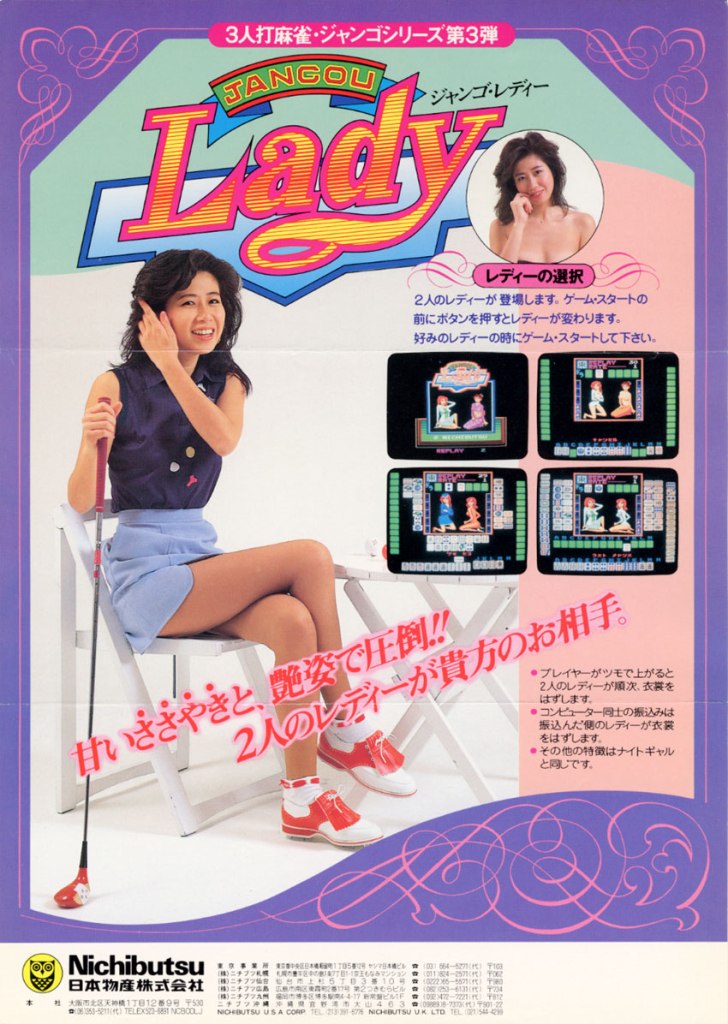
Are you fond of playing the tile-based game Mahjong? Believe it or not, there were indeed ways to play Mahjong in digital form inside the arcade or in gambling joints in Japan. The game Jangou Lady allows users to play rounds of Mahjong but with a notable additive – the digital art of women which serves as an attraction. In the sex appeal is clearly evident on this arcade flyer from the 1980s.

2. Star Wars: Return of the Jedi arcade flyer

Really nice art based on the movie.

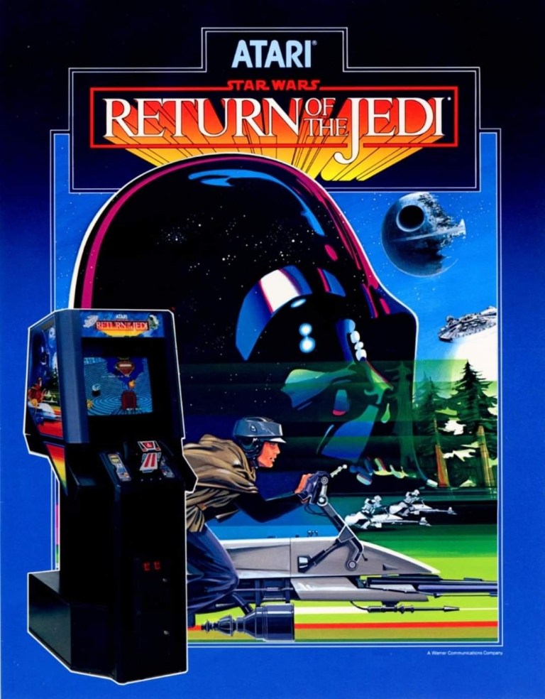
Way back in 1983, Return of the Jedi delighted moviegoers in the cinemas throughout America. Behind the scenes, video game giant Atari acquired the movie license to make the 1984 arcade game Star Wars: Return of the Jedi. The arcade flyer’s front featured a highly detailed hand-drawn art of Darth Vader, the Death Star, Luke Skywalker and Storm Troopers on hover bikes, and the Millennium Falcon which reflect the selected elements of the movie that were turned into playable sections. The image of the arcade machine was understandably inserted as it came with an unusual controller. This flyer is still captivating to look at.  

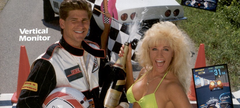
3. Over Drive arcade flyer

This arcade flyer is a reminder that Konami was notable for hiring pretty and sexy women for their print ads.

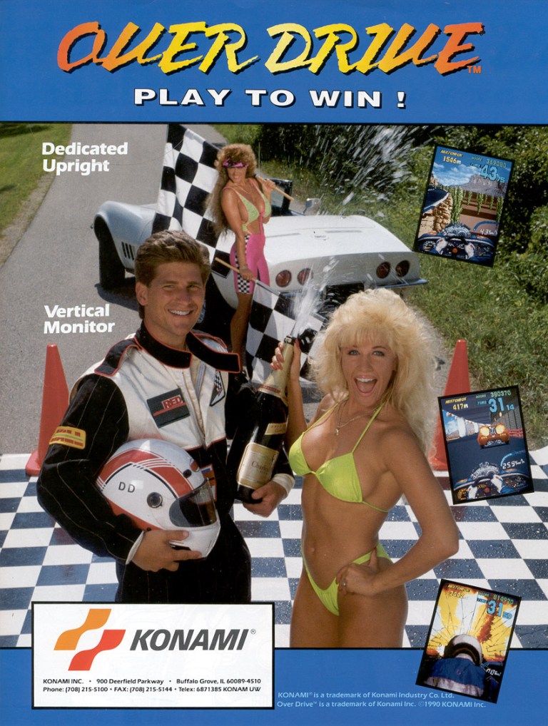
In 1990, Konami produced a racing game for the arcades with a unique style of presentation. That game was Over Drive and it stood out among the many racing games in the arcade mainly because of its first-person view (with a digital version of the steering wheel and driver’s hands at the bottom of the screen) and unique approach on sprite-scaling. To promote the game, Konami hired sexy models for photography for use in both the arcade flyer and the exterior images on the machine. Having sexy models posing with a winning driver added to the motorsport racing vibe needed to promote the game.

4. American Gladiators for NES print ad

I saw American Gladiators on TV but never played this game.

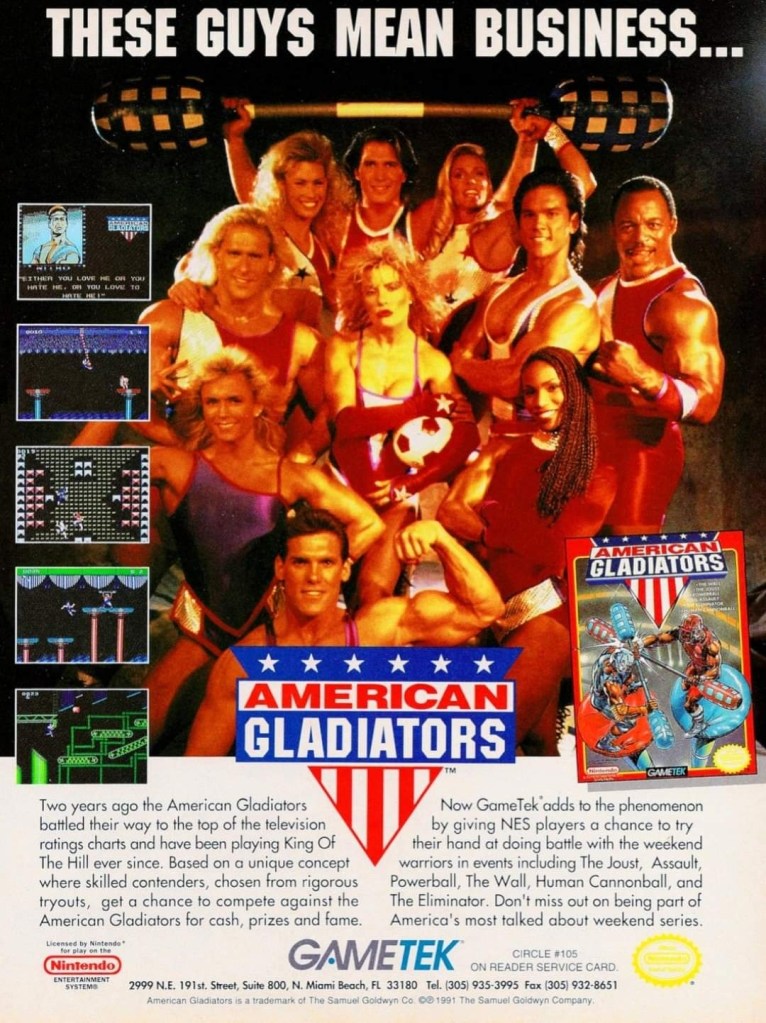
American Gladiators was a syndicated TV show that featured a variety of games in which amateur athletes compete with the established gladiators to succeed and become the next American Gladiator. Due to its success, it was not surprising that video game adaptations of the show were realized just a few years after its debut. In 1991, GameTek released the American Gladiators game on the Nintendo Entertainment System (NES) and promoted it with this print ad that showcased their established gladiators of the time. This ad’s design was made to catch the attention of the fans.

5. Arch Rivals for NES print ad

I remember seeing a lot of people crowding in front of an Arch Rivals machine in the local arcade long ago.

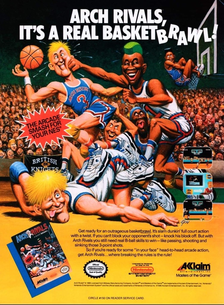
Years before NBA Jam, there was Arch Rivals. Arch Rivals was a full court basketball video game in which players are allowed to punch players from the opposition in order to steal the ball and score. Over a year after the game’s 1989 arcade debut, the NES version was released and the publisher came up with a print ad showcasing a hilarious and cartoony artwork (the same art used for the game’s box cover) which gave readers a clear idea of what to expect. The art used is timeless and it still is funny to see.

6. Sega Sports print ad

See any Sega Sports video game you like?

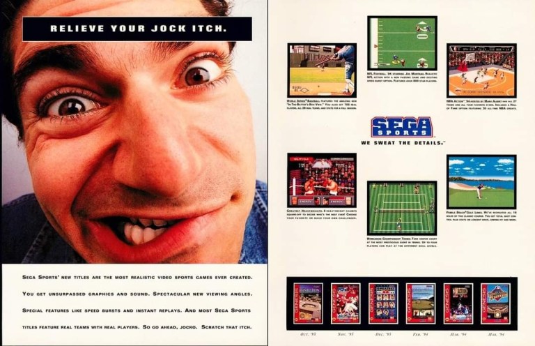
Back in the 1990s, Sega excelled with sports video games. They were so aggressive, they established their sub-brand Sega Sports and this particular print ad showed one page promoting assorted sports video games (basketball, golf, baseball, tennis, boxing and American football) for the Sega Genesis and the other page with an exaggerated image of a guy with the line “Relive your jock itch” posted. Historically, a lot of American players and owners of the Genesis are slightly older than those on NES and Super Nintendo Entertainment System (SNES) during the 1990s and the strong sports games approach is a key factor.  

7. Plumbers Don’t Wear Ties print ad

When I first saw this print ad, it did not interest me as the presentation is lousy.

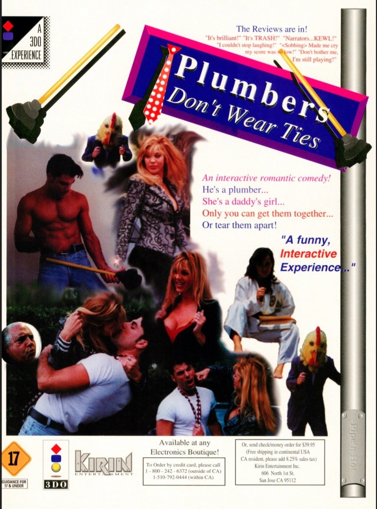
The 3DO console is remembered for having a lot of games that used full-motion videos and photo slides regardless of what game designs came with them. Back in the 1990s, games designed as visual novels or dating simulations were still new in console gaming in the West. Following the PC version’s release, a 3DO port of Plumbers Don’t Wear Ties came out in 1994 and it received overwhelmingly negative reviews. The print ad here promoted the game as “an interactive romantic comedy” and fake quotes were displayed to fool ignorant readers that the game was entertaining. The print ad’s visual design had a mess of poorly implemented images. Ironically, this ad accidentally gave readers the idea that it was a slideshow game.

8. Dragon: The Bruce Lee Story and Demolition Man games print ad

If you saw the movies, did you play their respective video game adaptations?

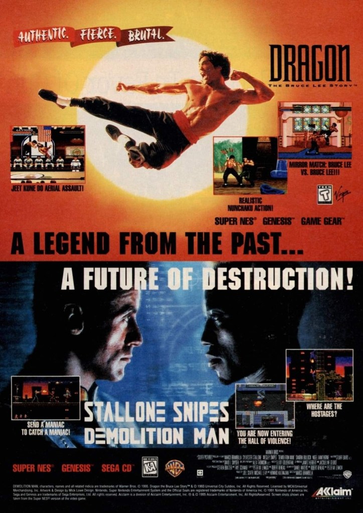
The 1990s is remembered for the many movie-based video games that got released. Back in those days, a lot of Hollywood movie productions had video game adaptations as part of the business process and this is evident with the Dragon: The Bruce Lee Story and Demolition Man games released by Acclaim. For this particular print ad, the marketing team came up with a single-page ad to promote the two games with heavy emphasis on movie imagery leaving little room left for screenshots and other details. The way I look at this old print ad, it seems that Acclaim was aiming for not just movie fans but also gamers who like 2D fighting games and 2D action-adventure games.

9. Army Men: Sarge’s Heroes print ad

This print ad by 3DO is still funny to see.

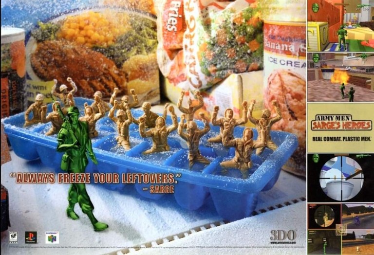
In the late 1990s, The 3DO Company focused mainly on producing video games on multiple platforms and they had their own video game franchise based on the green plastic figures with a military theme. In 1999, they released Army Men: Sarge’s Heroes for PlayStation and Nintendo 64 (N64). To market the game, they had a hilarious visual concept of several solders freezing on an ice tray as a long green soldier marching on. This print ad always caught my attention while reading game magazines and it still is funny to stare at.

10. Sega Ages print ad

I can only speculate that Sega accepted Working Design’s financial offer for the publishing rights in North America.

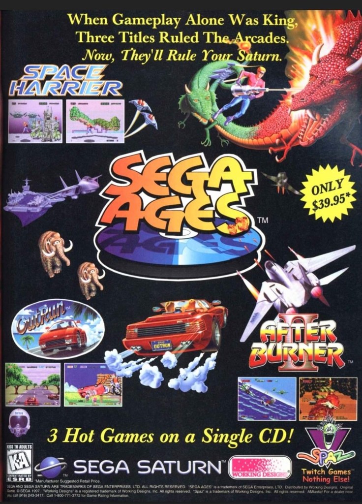
Sega Ages is a series of ports and remakes of Sega’s own games (arcade and console) bundled together as compilations released on the modern consoles of the time. While Sega itself published Sega Ages on their Saturn console and Europe, the North American compilation was published by Working Designs under their separate brand Spaz which this particular print ad showed. While the classic Sega games of After Burner II, OutRun and Space Harrier often caught my attention, this ad made me wonder why did not Sega publish this compilation on the Saturn in North America themselves. Looking at this ad now remains awkward.

11. Sega Saturn North American print ad

Did you ever own a Sega Saturn in 1995?

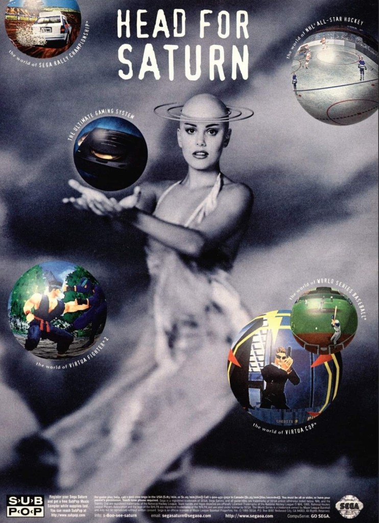
While a lot of gamers and retailers were caught off-guard by Sega’s surprise early launch of the Saturn console in America, they still went ahead aggressively marketing the machine knowing they have a few months’ head start before the American launch of PlayStation. This print ad was designed to intrigue readers showing a bald lady whose head was made to look like the planet Saturn and next to her were images of Sega’s hottest games of the time – Virtua Fighter 2 and Virtua Cop. Sega relied strongly on imagery to promote their console with this print ad. It was somewhat weird yet eye-catching.

12. NBA Action ’95: Starring David Robinson print ad

David Robinson was the MVP of the NBA in 1995 but he failed to lead his team to the NBA championship back then. He would late win the NBA championship in the shortened 1999 season.

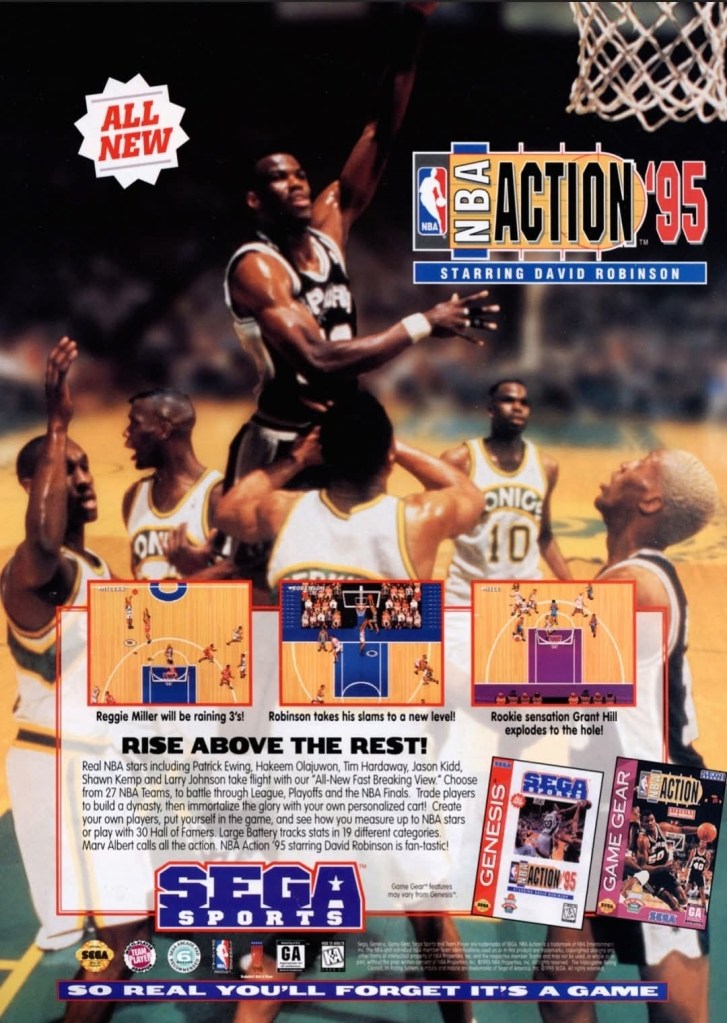
As mentioned early, Sega was aggressive the sports videos games and almost all of them were their own console exclusives. Their tradition of hiring professional athletes as endorsers continued during the age of the Genesis and Game Gear when they hired an NBA superstar as an endorser resulting in the Sega Sports basketball game titled as NBA Action ’95: Starring David Robinson. By the time the video game was released, Robinson was already the reigning Most Valuable Player (MVP) of the NBA. This print ad of Robinson in action still looks impressive but with a big catch – the superstar’s 1995 MVP achievement was arguably forgotten as he and his team (San Antonio Spurs) got eliminated by the Hakeem Olajuwon-led Houston Rockets in the Western Conference Finals. It did not help that Olajuwon outplayed Robinson a lot in that very playoff series. That is a sad reminder that also came with this Sega Sports print ad.

+++++

Thank you for reading. If you find this article engaging, please click the like button below, share this article to others and also please consider making a donation to support my publishing. If you are looking for a copywriter to create content for your special project or business, check out my services and my portfolio. Feel free to contact me with a private message. Also please feel free to visit my Facebook page Author Carlo Carrasco and follow me on Twitter at  @HavenorFantasy as well as on Tumblr at https://carlocarrasco.tumblr.com/ and on Instagram at https://www.instagram.com/authorcarlocarrasco

Retro Gaming Ads Blast – Part 23

Welcome back readers, fellow geeks and electronic gaming fans!

In this edition of the Retro Gaming Ads Blast (RGAB) series, we will take a look at another batch of retro gaming print ads – including arcade flyers – from the 1980s and 1990s.

For the newcomers reading this, Retro Gaming Ads Blast (RGAB) looks back at the many print ads of games (console, arcade, computer and handheld) that were published in comic books, magazines, flyers, posters and newspapers long before smartphones, social media, the worldwide web and streaming became popular. To put things in perspective, people back in the 1980s and 1990s were more trusting of print media for information and images about electronic games and related products.

With those details laid down, here is the newest batch of retro gaming print ads for you to see and enjoy…

1. Raiders of the Lost Ark game print ads

The print ad with strong Indiana Jones imagery.
The print ad with the movie theater exterior image and the small image of the Atari 2600 console.

Directed by Steven Spielberg, Raiders of the Lost Ark was one of the best adventure movies ever made as well as the start of the iconic character Indiana Jones. Given its huge commercial success, an official video game adaptation for the Atari 2600 was released in 1982 and game designer Howard Scott Warshaw even met with Spielberg during the game’s development.

To promote the game, Atari released two print ads – one ad had a movie theater exterior visual concept to emphasize they have the official video game adaptation based on the movie while the other ad showed the game’s official artwork and game box cover while emphasizing a savings offer. Atari really did what they could to sell a game while riding on the success of Raiders of the Lost Ark.

2. Phoenix print ad

Even without any screenshots, this print ad’s art still gives viewers a clear idea of what to expect.

Similar to what they did with Galaxian and Joust, Atari made this print ad promoting Phoenix which was a 2D sci-fi shooting game that was similar with Space Invaders in design. Colorized, hand-drawn artwork resembling the 2D sprites of the game was done to capture the attention of people. The art is so good, it made up for the lack screenshots of the game. 

3. Moon Patrol arcade flyer

Front of the Moon Patrol flyer.
The other side of the arcade flyer.

Moon Patrol was a 2D sci-fi side-scrolling adventure game first released in the arcades in 1982. To sell the game to arcade operators, publisher Williams created the North American arcade flyer that heavily used hand-drawn comic book-style artworks on both sides while using available space on the other side for the descriptive text, contact details and the image of an arcade machine. What is very clear is that no screenshots of the game were shown to stand out which explains why a lot of hand-drawn art was used. The picture of the machine showing a screen of Moon Patrol was the closest thing to see a screenshot on this flyer. Personally, I really like the style and quality of the hand-drawn artwork as it made the flyer look lively.

4. Paperboy arcade flyers

The arcade flyer showing the Paperboy machine and screenshots. The hand-drawn art is nice.
This one uses comedy showing a grown man riding a bike as a paper delivery “boy”.
I really like the stronger emphasis on the in-game graphics of Paperboy which dominates the space. What you see is what you get in the arcade.

The first time I ever played the classic Paperboy was in the arcade inside a Las Vegas hotel way back in 1989, and it sure was a challenging yet fun experience. Before its arcade debut in 1985, the developers took a lot of risks making the game which includes coming up with a bicycle handle bar for each machine to have. To promote the game, Atari made at least three arcade flyers that creatively emphasized what the game’s concept was about, how did it play, why does the machine have bicycle handlebars and why players can expect fun. Atari’s promotional efforts paid off as Paperboy became a huge hit in the arcades not only in America but also in Japan.

5. Frogger multi-platform print ad

This print ad is still amusing to look at.

After Frogger became a hit in the arcades, Parker Brothers secured the rights to port the game on Atari consoles, the Intellivision, TI-99/4A, vic-20, the Commodore computers and ColecoVision. To promote their Frogger ports, the single-page print ad was made showing a player in the foreground playing in front of screens that each showed what the game looked like on each platform. Parker Brothers found tremendous success selling 4 million copies of Atari 2600 version of Frogger at a time when there were only 13 million units of Atari 2600 in existence. By the year 2005, video game sales of Frogger reached 20 million worldwide across different platforms.

6. Predator 2 print ad

This is one very edgy print ad as used an official image from the movie.

If there is anything memorable about the 1990 film Predator 2, it is the fact that it had the story and the alien hunter itself within a metropolitan setting. That being said, the Sega Genesis Predator 2 video game had a suitable design of shooting and adventuring within the urban settings. This video game ad really captured the vibe of the movie (even showing the reddish human skull with spine on the Predator’s left hand) and clearly showed what gamers could expect. This old ad is still captivating to look at and its edgy approach is still intact.

7. Atari Jaguar print ad

Did you ever own an Atari Jaguar console?

When I was reading video game magazines back in the 1990s, I always found print ads of the Atari Jaguar intriguing to look at. I was very young when I first played the Atari 2600 and its games at home, and later played some Atari games in the arcade. To me, seeing Atari Jaguar print ads like this one gave me moments of nostalgia and it made me wonder if Atari knew what it was doing with their so-called 64-bit game console. They did what they could to promote their console and the games within this 2-page print ad.

8. Vs. print ad

This print ad easily reminds me of the 1990s.

By 1997, both the arcades and the video game console market were filled with lots of 2D and 3D polygonal fighting games. Japan was the hot spot of the production of 3D polygon fighting games and the developer Polygon Magic (based in Japan) made Fighters’ Impact which Taito released in Japanese arcades and the PlayStation. The said game was picked up by THQ for a late-1997 release on the PlayStation in America under the title Vs. I never played this game but I heard that the game’s development included gang-oriented characters designed by Marvel Comics artist Kurtis Fujita. This Vs. ad is a lively reminder about the hip-hop fashion that made its way into video games.

9. GoldStar/LG Electronics 3DO print ad

This is a very weird way to market a video game machine.

Back in the 1990s, the South Korean electronics company GoldStar (which was part of the umbrella of LG Electronics) had the license to produce 3DO game consoles with its own style. In some ways, the GoldStar 3DO console looked like a premium console on the outside. Unfortunately, the GoldStar 3DO print ad here had a very sloppy presentation as the ad makers used very weird art of a brain-with-eyes holding a 3DO controller leaving little space left to promote the console and games (without any screenshots). The text description was sloppily done. This is a bad example of promoting video game hardware and games.

10. Pandemonium 2 print ad

I saw this ad but never played the game.

Looking back at 1997, I find it strange that I never got to play Pandemonium 2 on the PlayStation even though I saw its print ad in magazines. I had a lot of fun playing Pandemonium! on the console in 1996 but somehow missed out on its sequel. Looking back at the Pandemonium 2 print ad, I was surprised with how the game developers redesigned the two playable protagonists, especially Nikki who was clearly made to look very sexy. The word “libido” (meaning sexual drive) was deliberately placed above Nikki. The ad also had a hypnotizing mix of colors which I believe was also deliberately done by the ad makers. I can only wonder how the game played.

11. Mission: Impossible print ad

A captivating ad.

In 1990, Ultra Games (a label of Konami) released the Mission: Impossible video game on the Nintendo Entertainment System (NES) in America. Developed by Konami, the game was an adaptation of the 1988 TV series and it had an ambitious design with regards to level design and gameplay. To promote the game, the ad makers came up with a visual design showing the game’s box (which had a nice painted art on the cover) on the foreground and several screenshots resembling TV monitors on the background. Even by today’s standards, this print ad still looks good and captivating even if you are not too familiar with Mission: Impossible on TV.  

12. The Lawnmower Man Sega CD and Genesis print ad

Are you fan of The Lawnmower Man movie?

Back in 1992, there was a lot of buzz generated by the movie The Lawnmower Man as it had a disturbing concept that involved virtual reality and, more notably, author Stephen King sued the filmmakers to remove his name from the title because the film differed so much from the source material. Of course, those developments did not stop the production of video game adaptations of the movie. This print ad promoting the Sega CD and Sega Genesis versions of the game heavily used the images of CyberJobe which were among the most memorable images from the film. Looking at the ad, the ad makers could have made the screenshots look a little larger to really sell the games.

13. Ground Zero: Texas print ad

The shotguns really made this ad eye-catching.

I never played the Sega CD video game Ground Zero: Texas but I knew that it was one of those games that heavily relied on video footage while giving players moments to interact. Back in 1993, there was an increase in the number of video games that carried lots of live action footage to drive the narrative and players were given options in order to progress. What is very notable about the game is not the game design but the very 2-page ad used to promote it. The image showing four people pointing their shotguns towards the viewer was easily the most captivating part of the ad. Even though there was vacant space in between, the screenshots of the game were displayed to be really small.

14. Alien vs. Predator for SNES and Game Boy print ad

This ad caught the attention of a lot of people back then.

Back in 1990, Dark Horse Comics launched the 4-issue mini-series of Aliens vs. Predator which turned out to be a very intriguing and engaging crossover comic book tale featuring two iconic sci-fi species of monsters. The success of the comic books led to the production of many video games which delighted both fans of Predator and Aliens. In 1993, Activision released Alien vs. Predator on the Super Nintendo Entertainment System (SNES) and the single-page print ad they came up with was engaging to look at. The SNES game box with the fine looking painted art was the main visual highlight leaving just enough space for the descriptive text, the Game Boy cover and two screenshots. Believe it or not, this video game was not related at all with the Alien vs. Predator arcade game and Atari Jaguar console game.

+++++

Thank you for reading. If you find this article engaging, please click the like button below, share this article to others and also please consider making a donation to support my publishing. If you are looking for a copywriter to create content for your special project or business, check out my services and my portfolio. Feel free to contact me with a private message. Also please feel free to visit my Facebook page Author Carlo Carrasco and follow me on Twitter at  @HavenorFantasy as well as on Tumblr at https://carlocarrasco.tumblr.com/ and on Instagram at https://www.instagram.com/authorcarlocarrasco

Retro Gaming Ads Blast – Part 20

Welcome back readers, fellow geeks and electronic gaming fans!

In this edition of the Retro Gaming Ads Blast (RGAB) series, we will take a look at another batch of retro gaming print ads – including arcade flyers – from the 1980s and 1990s.

For the newcomers reading this, Retro Gaming Ads Blast (RGAB) looks back at the many print ads of games (console, arcade, computer and handheld) that were published in comic books, magazines, flyers, posters and newspapers long before smartphones, social media, the worldwide web and streaming became popular. To put things in perspective, people back in the 1980s and 1990s were more trusting of print media for information and images about electronic games and related products.

With those details laid down, here is the newest batch of retro gaming print ads for you to see and enjoy…

1. River Raid print ad

This River Raid print ad appeared on comic books and magazines long ago.

Decades before it became an industry giant with the best-selling Call of Duty games, Activision became a standout publisher in the early 1980s with River Raid on the Atari 2600. Designed by Carol Shaw, River Raid was a huge success ending up as the 2nd best-seller on the Atari 2600 as well as Activision’s best-selling game for the year 1983. Apart from showing one screenshot and the box cover of the game, the print ad of River Raid had this mesmerizing 3D image that caught many gamers’ attention and helped them feel like they will pilot on dangerous missions. The 3D image was futuristic in its own style became forward-moving 3D sequences in video games became reality many years later.   

2. Galaga North American arcade flyer

The front of the flyer showing three Galaga machines that arcade operators can choose from.
Key details about Galaga were nicely presented on the rear of the flyer.

In the history of gaming, Namco’s Galaga was played by countless millions of gamers and it is still highly regarded as an arcade classic as well as one of the most enjoyable arcade games ever made. In preparation for the North American launch (October 1981), Midway prepared the arcade flyer showing the three types of machine on the front that arcade operators can choose from. On the rear is the really neat approach of explaining the details of the game, what kind of gameplay is to be expected, and how to play. Whether you are an individual player or the manager of an arcade joint, this flyer suits your needs.   

3. Area 51 arcade flyer and conversion kit flyer

The front of this Area 51 flyer had an enticing message for arcade operators as well as other business owners/managers who are interested in having a machine to add value to their business joints. Atari was already in deep money problems by the time they started making this game.
The Area 51 arcade conversion kit is a cheaper alternative for businesses who want the game.

Moving on to the 1990s, Atari was already struggling financially and desperately needed a hit to lift them up fast. A light gun shooter project was approved as arcade shooters were in good demand and after overcoming serious hurdles during production internally, Atari hired independent team Mesa Logic to take charge of development. After being granted extra time and more creative freedom, the project under Mesa Logic’s handling became a sci-fi shooter titled Area 51. The game became a huge hit in the arcades for Atari resulting in sales of more than 20,000 arcade cabinets as well as a major financial boost for the company (note: Atari still exists today). Atari went on to release Atari 51 versions for PlayStation, Sega Saturn and PC in America in 1996. The Atari 51 flyers you see here are still captivating to look at and were crucial in generating buzz among arcade operators, business joints that had space for arcade cabinets and gamers.

4. Panasonic 3DO print ad

The makers of this print ad forgot to mention the 3DO is also a game machine.

Back in 1993, the 3DO Interactive Multiplayer console manufactured by Panasonic (a licensee of the 3DO Company) was launched with a CD-ROM drive, multimedia features and gaming capabilities (with a 3-button control pad). This print ad strongly emphasized the 3DO’s ability to play high-quality sound and full-motion videos using the Sea of Cortez software which functioned as an interactive movie. Obviously, this did not resonate well with people who loved to play games and by the time the 3DO Company and its partners started marketing games, they could not save the 3DO console from fading to obscurity. The console shown in the ad is specifically model Panasonic FZ-1 R·E·A·L 3DO Interactive Multiplayer. Panasonic was one of five companies that were licensed by the 3DO Company.

5. MechWarrior 3050 SNES print ad

If you were unaware of the 1994 game BattleTech, then this ad would have fooled you into thinking it is promoting a brand new game.

In 1995, the popular BattleTech entertainment franchise arrived on the Super Nintendo Entertainment (SNES) system with MechWarrior 3050 and its print ad had a really blazing artwork of an armed mech in fire which gave readers the illusion of a new and original game. In reality, MechWarrior 3050 was actually a port of BattleTech which was released on the Sega Genesis in 1994. The Genesis game was published by Extreme Entertainment Group while the SNES game was published by the more famous Activision. If you look closely at the MechWarrior print ad, you can tell how hard they tried to sell the game like it was brand new and all-original.

6. Cliffhanger video game print ad

This print ad had Sylvester Stallone hanging on a cliff to be relevant with the title of both the film and the game. They could not show images of Stallone in hard action scenes.

For fans of Sylvester Stallone, 1993 was a big and exciting year as the Hollywood icon appeared in two major action films – Cliffhanger and Demolition Man. Cliffhanger was released first and there were video game adaptations of it released on game consoles, handhelds and computers. This print ad of the Cliffhanger video game had an image of Stallone hanging on a cliff to emphasize the title. The ad makers cleverly posted selected gameplay screenshots and quoted GamePro and Electronic Gaming Monthly (EGM) to make the game look credible and worthy of purchasing. The marketing led to nowhere as the game received mostly negative reviews from critics and it faded to obscurity. Lastly, the Cliffhanger game ad had a noticeable amount of space wasted. They could have made the screenshots and text look somewhat bigger to sell the game.

7. Ballz: The Director’s Cut print ad

I never got to play this game on the 3DO.

Here is another ad of the video game released on the failed 3DO console. As its title made obvious, Ballz: The Director’s Cut is an enhanced version of the original Ballz game of 1994 that was released on other consoles. The print ad had an eye-catching piece of artwork and posted beside it were selected shots of the gameplay. Strangely enough, the creative writing on the lower part of the ad does not make any sense and did nothing to convince gamers to play the game. As Ballz: The Director’s Cut was released in 1995, this ad shows the revised 3DO console from Panasonic (model: Panasonic FZ-10 R·E·A·L 3DO Interactive Multiplayer).

8. NFL GameDay 2000 print ad

Did you find this ad funny to look at in 1999?

To promote the PlayStation-exclusive NFL GameDay 2000, Sony publisher 989 Sports and the ad makers decided to implement a humorous look at football TV coverage by having two sportscasters wearing shorts in front of a TV camera that was only showing their heads and upper bodies. The TV sets on the side show screenshots from the game to emphasize the sports gaming experience. Ultimately the game scored mostly positive review from the critics.  

9. WildC.A.T.S: Covert Action Teams print ad

WildC.A.T.S. art by Jim Lee was used to promote the SNES video game.

When Image Comics launched in 1992, WildC.A.T.S: Covert Action Teams was Jim Lee’s creator-owned comic book franchise and its launch issue was a big seller. Years later, WildC.A.T.S. grew in popularity with comic book fans and the franchise achieved multi-media status by venturing into TV (with an animated series) and video games. This print ad promoting the video game adaptation had no screenshots to show which kept fans and gamers guessing how the game will turn out in terms of gameplay and game design. It was obvious that the people who made this print ad had to rely on the best WildC.A.T.S. artwork they could find drawn by Jim Lee. This ad made me laugh back in the old days because if you did not look closely, it might fool you into thinking it was more about comic books than the game on the SNES.

10. Cutthroat Island print ad

Exciting imagery without Geena Davis and Matthew Modine was used to promote the video game adaptation.

I never saw the Hollywood mega-flop Cutthroat Island nor have I ever played any of its multiple video game adaptations (released on SNES, Sega Genesis, Sega Game Gear and Game Boy). The video game print ad, however, caught my attention back in 1995 because the ad makers cleverly used a photograph from one the many expensive movie sequences filmed and the hard, physical work by the filmmakers was clearly visible. Then the ad makers had four screenshots placed on the lower-left part and inserted descriptive text that sounded exciting. Lastly, the ad mentioned a sweepstakes promo.

Without using any images of stars Geena Davis and Matthew Modine, this ad was a strong attempt to get gamers excited for the video game adaptation. Like the movie itself, this game flopped and has faded away to the land of the forgotten.

11. AH-3 Thunderstrike print ad

Captivating artwork, vibrant colors and orderly text descriptions made this an effective ad.

AH-3 Thunderstrike is one of the better games that was released on the Sega CD add-on (requires the Sega Genesis console) in 1993. Similar with MechWarrior 3050, the game was actually a port of Thunderhawk which itself was released on the Amiga and MS-DOS PC in 1992. The print ad showcased a captivating artwork (which was also used on the game’s box cover), a few screenshots and strategically placed text descriptions to sell the game. This ad still looks good.

12. James Bond 007 print ad

This print ad appeared in many comic books in 1984.

This is a print ad I saw many times while reading comic books in 1984. James Bond 007 for Atari 2600 was an ambitious licensed video game as it featured levels that were inspired by missions in the James Bond movies Diamonds are Forever, The Spy Who Loved Me, Moonraker and For Your Eyes Only. Keep in mind that programmers back then had to deal with memory limitations and primitive tools to make games.

To promote the game, original art of Agent 007 was used which did not resemble the James Bond star of the time – Roger Moore. Strangely enough, the illustrated James Bond slightly resembled Timothy Dalton whose debut as 007 happened in 1987. Adding further zest to the add was the use of fictionalized quotes pointing to fantasized critics as sources (example: Vincent Can’tbe is a reference to real life critic Vincent Canby). The use of a pink background made this catchy ad look really odd.

13. Choplifter III: Rescue Survive print ad

A captivating print ad that brought gamers’ attention to the Choplifter series again.

This print ad of Choplifter III: Rescue Survive has a striking look showing a military officer who needs your help as he has been stranded behind enemy lines. The presentation reflects the long-time tradition of the Choplifter game franchise which has been about piloting an armed helicopter to the opposition’s territory, shooting at bad guys and then rescuing the hostages or prisoners-of-war (POWs). The game eventually gathered mostly positive feedback from video game critics.

14. Defender of the Crown print ad

Cinemaware took a gamble with the visual concept of this print ad.

Released in 1986 for home computers, Defender of the Crown was made with a high level of quality backed with solid artistry. To capture gamers’ attention, Cinemaware came up with this print ad showcasing a pretty model looking somewhat seductive which reflects what happens in the game when players rescue a damsel in distress. The selected screenshots showed what the game looked like on different platforms, and the lower part of the ad made the game feel like it was a historical epic waiting to be discovered. Defender of the Crown eventually became a big hit with computer gamers.  

+++++

Thank you for reading. If you find this article engaging, please click the like button below, share this article to others and also please consider making a donation to support my publishing. If you are looking for a copywriter to create content for your special project or business, check out my services and my portfolio. Feel free to contact me with a private message. Also please feel free to visit my Facebook page Author Carlo Carrasco and follow me on Twitter at  @HavenorFantasy as well as on Tumblr at https://carlocarrasco.tumblr.com/ and on Instagram at https://www.instagram.com/authorcarlocarrasco

Lunar Remastered Collection coming to Xbox Series X|S and Xbox One in Spring 2025

Welcome back Xbox fans, geeks, retro gaming enthusiasts, RPG enthusiasts and gamers!

In case you missed the news, GungHo America announced that the remastered editions of the classic Japanese role-playing games (JRPGs) Lunar: The Silver Star and Lunar: Eternal Blue will be released together in a single package titled Lunar Remastered Collection which is set for a Sprint 2025 release window (release date to follow) for multiple platforms, including Xbox Series X|S and the aging Xbox One!

Feeling excited or curious? Watch and learn from the official trailer of Lunar Remastered Collection released by GungHo (which is the same publisher behind the Grandia HD Collection).

To put things in perspective, posted below is an excerpt from the official press release of GungHo. Some parts in boldface…

Gameplay shot from Lunar: Silver Star Story Complete which was supposedly remastered with high-definition in mind (which could explain the blurry upper and lower portions of the screen).
The trailer of Lunar Remastered Collection showed this sharp and lively looking image of an anime sequence. Here is hoping all the anime cutscenes in the two games will be of the highest quality possible with high-definition in mind.

The key features announced are as follows:

To read the entire press release, click https://www.gunghoonline.com/article/527/journey-back-to-the-stars-lunar-remastered-collection-breathes-new-life-into-timeless-jrpgs-arriving-spring-2025

The Lunar legacy of releases

For the newcomers reading this, Lunar: The Silver Star was developed by Game Arts (also the same team behind Grandia and Grandia II) and released on the Sega CD (Mega CD in other countries) add-on for the Genesis (Mega Drive) console in 1992. Years later, that game had a huge remake as Lunar: Silver Star Story Complete on Sega Saturn (1996), PlayStation (1998) and Windows PC (1999).

A similar approach of releases happened too with the sequel Lunar: Eternal Blue which started on Sega CD. Its remake was titled Lunar 2: Eternal Blue Complete which was released on Sega Saturn (1998) and PlayStation (1999).

Historically, Lunar: Silver Star Story Complete and Lunar 2: Eternal Blue Complete were published in America by Working Designs (closed down since 2005) with its very own stylized way of translating the Japanese content into English (note: localized as opposed to straightforward translation), in-depth approach to English dubbing, and elaborate packaging (with unique stuff) done with the fans and collectors in mind. Working Designs was also responsible for releasing the two Lunar RPGs’ original versions on Sega CD and the company established close ties not only with Sega of America but also Game Arts itself.

Lunar: Silver Star Story Complete for PlayStation print ad.
Lunar 2: Eternal Blue Complete for PlayStation print ad.

With regards to story concepts and characters, Lunar: The Silver Star tells the tale of Alex Noa – a young and resilient fighter who recently passed the White Dragon’s trial–as he embarks on his journey to become a Dragonmaster. As Alex revels in his success in passing the trial, a mysterious Magic Emperor unexpectedly enters the fold, aiming for world domination.

Lunar: Eternal Blue follows the story of Hiro, an inquisitive archaeologist, and friends as they journey to help a mysterious girl from the Blue Star, Lucia, to seek out the Goddess Althena and stop Zophar – a relentless and evil God of Destruction who plots the demise of Lunar – from wiping out their existence.

Watch out for the official 2025 release date of Lunar Remastered Collection.

As of this writing, Lunar Remastered Collection for Xbox Series X, Xbox Series S and Xbox One has yet to appear on the Xbox online store. For updates about the upcoming retro gaming collection of RPGs, visit https://www.lunarremastered.com/

+++++

Thank you for reading. If you find this article engaging, please click the like button below, share this article to others and also please consider making a donation to support my publishing. If you are looking for a copywriter to create content for your special project or business, check out my services and my portfolio. Feel free to contact me with a private message. Also please feel free to visit my Facebook page Author Carlo Carrasco and follow me on Twitter at  @HavenorFantasy as well as on Tumblr at https://carlocarrasco.tumblr.com/ and on Instagram athttps://www.instagram.com/authorcarlocarrasco

Retro Gaming Ads Blast – Part 18 (Fighting Games Special)

Welcome back readers, fellow geeks and electronic gaming fans!

In this edition of the Retro Gaming Ads Blast (RGAB) series, we will take a look at another batch of retro gaming print ads – including arcade flyers – specifically about fighting games that were released in the 1990s. The said decade marked the time when Street Fighter II became a massive hit in the video arcades (and on game consoles) which sparked a wave of new fighting games from business competitors. In that same decade, 3D polygonal fighting games were also released which added greater choices of fighting games at the arcades and on game consoles that players could choose from.

For the newcomers reading this, Retro Gaming Ads Blast (RGAB) looks back at the many print ads of games (console, arcade, computer and handheld) that were published in comic books, magazines, flyers, posters and newspapers long before smartphones, social media, the worldwide web and streaming became popular. To put things in perspective, people back in the 1980s and 1990s were more trusting of print media for information and images about electronic games and related products.

With those details laid down, here is the newest batch of retro gaming print ads for you to see and enjoy…

1. Dead or Alive Japanese arcade flyer

Dead or Alive was the start of new success that impacted the direction of Tecmo in the gaming industry.

The above arcade flyer of Dead or Alive gave Japanese arcade operators and gamers a taste of what to expect with the game. While the screenshots showed some resemblance with what gamers saw in Virtua Fighter 2, the character designs Tecmo and its developers came up with were unique.

Before Dead or Alive was released in Japanese arcades in 1996, company Tecmo was in financial trouble and they asked Tomonobu Itagaki to make a fighting game similar to Sega’s polygonal blockbuster Virtua Fighter. A breakthrough for Tecmo happened when Sega announced they were licensing their Model 2 arcade to third-party companies which paved the way for Itagaki’s team to make Dead or Alive with it. The game became a big hit and it paved the way for Tecmo to release it on Sega Saturn and PlayStation, and the sequels that followed years later.

2. North American Soulcalibur Dreamcast version print ad

Namco came up with a creative approach to emphasize heart-and-soul promoting their game and the Dreamcast.

On September 9, 1999, Sega launched their Dreamcast console in America. With a gap of around ten months between the Japanese launch (November 1998) and the American launch, Sega had time to prepare Dreamcast’s release to American gamers with a huge lineup of games (both Sega’s games and from other publishers). Fortunately for Sega, they had Namco (their rival on arcade games) supporting their console.

Behind the scenes, Namco’s developers worked hard to not only port their arcade hit Soulcalibur to the Dreamcast, but to enhance the graphics using the console’s more advanced technology. The visual enhancements include rendering all of the games stages (and backgrounds) into full 3D polygonal environments. Namco also implemented different game modes and added even more content to ensure satisfaction to Dreamcast gamers.

The above 3-page print ad of Soulcalibur on Dreamcast was undeniably strategic and captivating to look at. The ad described the console as the heart, showed Soulcalibur character Mitsurugi (one of the game’s most popular characters) in the middle and then described the game (with 3 screenshots of game rendered with Dreamcast graphics) as the soul. It was a strong way to promote both the game and the console. In the years that followed, Soulcalibur grew into a popular fighting game franchise and the Dreamcast version will always be remembered as the crucial turning point.

3. X-Men: Children of the Atom arcade flyer

Anyone who read lots of X-Men comic books in the 1990s should be able to tell which character was drawn by which artist.

When Capcom first released X-Men: Children of the Atom in the arcades in the mid-1990s, I was surprised because I did not anticipate the day would come when the company behind Street Fighter II would actually make a 2D fighting game showcasing the Marvel’s mutants. Even more intriguing was the X-Men art Capcom used for the arcade flyer to promote the game. I recognize Jim Lee’s artworks of Magneto, Cyclops and Colossus. The art of Wolverine shown was drawn by Andy Kubert. It was a wise move for Capcom (with Marvel as a business partner) to use established X-Men comic book artworks instead of having their internal illustrator draw the characters. That being said, this arcade flyer still looks great and captivating to look at.

4. North American Ranma ½: Hard Battle print ad

A print ad promoting the game while saving some space to promote the anime and comic books.

By 1993, Street Fighter II and its upgraded follow-ups were wildly popular both in the arcades and on game consoles around the world. At the same time, there were many other 2D fighting games released to compete with and cash-in on Street Fighter II’s success. Believe it or not, the established anime franchise Ranma ½ saw a video game adaptation in the form of a 2D fighting game – Ranma ½: Hard Battle.

The North American print ad above published by DTMC (in cooperation with Viz Communications) promoted the game (one screenshot, the SNES game box and images of the characters as they appeared in the game) as well as Ranma ½ on anime videos and comic books. The way it was presented, the print ad promoted Ranma ½: Hard Battle without much heart nor passion.

5. Fatal Fury: King of Fighters arcade flyer

An intriguing visual presentation on the front.
You get to know the characters and what the game features are.

There is no doubt that Fatal Fury: King of Fighters is the most significant game that SNK made. Apart from being the company’s first fighting game for the Neo Geo system, it established the fictional “king of fighters” tournament that became the core concept for The King of Fighters series of games in the years that followed. Fatal Fury itself is notable for being designed by Takashi Nishiyama, a former Capcom employee who created the original Street Fighter game. What Nishiyama could not do with Street Fighter, he accomplished while making SNK’s fighting game. Compared with the combo-oriented approach of Street Fighter II, Fatal Fury was designed to emphasize the timing of special moves, confrontational play, cooperative play and the 3D-like spacing between characters (background row and foreground row in each stage) while telling a story in a solid way.  

The above arcade flyer of Fatal Fury has this unique looking artwork on the front showing stylized rectangular shots of the major characters Terry Bogard, Andy Bogard and Joe Higashi. On the other side of the flyer are the details that emphasized the creative concept of the game, who the characters are and what they could expect with regards to gameplay features. This flyer is still captivating to look at and it could entice you to try playing the original Fatal Fury game before trying out the sequels and spin-offs.

6. Marvel vs. Capcom: Clash of Super Heroes arcade flyer

This is NOT a comic book crossover.

If there is anything that truly emphasizes the essence of a fictional crossover in terms of visuals, it’s the art that Capcom and Marvel agreed to for Marvel vs. Capcom: Clash of Superheroes which is evident on the front of the above arcade flyer. By looking at how the Marvel characters were drawn, it looks like someone at Capcom illustrated the artwork as the Capcom characters still maintained that particular art style seen in the artworks of the Japanese company’s other games like Street Fighter, Darkstalkers, Mega Man and Strider. Regardless, the artwork still is amusing to look at.

7. Art of Fighting arcade flyer

The front of the flyer.
The cast of characters showcased on the other side of the flyer.

Following the success of Fatal Fury, SNK went on to release Art of Fighting in arcades in 1992 and it became successful enough for the company to make sequels. With regards to the realm of fantasy, Art of Fighting was part of the same fictional universe as Fatal Fury and The King of Fighters, and there were times when its own characters appeared in other SNK games.

Art of Fighting’s arcade flyer had an energetic visual concept on the front with a rectangular lightning portion on the left balanced with five screenshots of the game itself. Once you get to the other side of the flyer, you will see really nice art of the characters with Ryo Sakazaki and Robert Garcia as the most dominating figures. Sakazaki and Garcia are the major characters of the Art of Fighting series. This flyer confidently introduced the characters and succeeded in making them look interesting.

8. Fighter’s History arcade flyer and print ad

Great looking front artwork showing the game’s characters, posing and some action.
If you look closely at the controls, you will see the six-button layout and functions which are the same with those used in Street Fighter II.
Data East offered two ways for gamers to enjoy Fighter’s History – pay a high price for the SNES version or gamers can go play the game in the arcade by dropping a few coins.

In 1993, Data East released their fighting game Fighter’s History in the arcades around the world. Along the way, the company released their arcade flyer which had a very captivating art work on the front featuring their characters and some action. The other side of the flyer showed the technical details on how to play, how the control works and who the characters are. Fighter’s History was nicely received in the arcades and the success led Data East into porting the game for the Super Nintendo Entertainment System (SNES). If you look at the print ad above, you can see how clever Data East was promoting the SNES version of the game while keeping an image of the arcade machine which serves like a subtle reminder that the same game is still available in video arcades.

Shortly after the release of Fighter’s History in the arcades, there were gamers who noticed that it had certain visual and gameplay elements that made it so familiar with what Street Fighter II had. When Capcom became aware of the similarities, they sued Data East claiming that Fighter’s History was too similar to their game and that copyright infringement was committed. Capcom lost the case ultimately and Data East went on to release two more Fighter’s History games.

9. Virtua Fighter 3 arcade flyer

Virtua Fighter 3 truly raised the standards for arcade game graphics back in 1996.

When it comes to gaming innovation and standing out among the rest, Sega did exactly those when they released Virtua Fighter 3 in arcades in 1996 and it had the best-looking and really mind-blowing graphics at the time. Developed by AM2 (led by Yu Suzuki) on the very expensive Model 3 arcade hardware, Virtua Fighter 3 broke new ground on graphics as it moved over 1 million polygons per second, had highly detailed visuals on the characters and surroundings, realistic reflection effects, detailed shining, parallel lighting and high-specular Gouraud shading to name some. Even the characters’ eyes followed the opponent’s position.

The Virtua Fighter 3 arcade flyer showcased their reflective, metallic character Dural who in turn was part of the graphical showcase (emphasizing reflections, smooth animation and liquid metal effects) when the game was previewed in the 1996 AOU event in Japan. The words “The New Standard” written on the lower-left corner of the front of the flyer was justified and truthful.

10. Teenage Mutant Ninja Turtles: Tournament Fighters print ad

This print ad had a nice visual presentation and was easily recognizable to the many TMNT fans.

In 1989, the Teenage Mutant Ninja Turtles (TMNT) franchise made quite a splash on video games which is not surprising as the multimedia franchise was already a popular in the West. More video game adaptation of TMNT were released in the early 1990s providing fans and gamers a lot of fun gameplay at the arcades (click here) and on consoles. Konami had the video game rights of TMNT and in a clear response to the sudden popularity of fighting games, they released Teenage Mutant Ninja Turtles: Tournament Fighters on the most popular game consoles of the time achieving varying levels of success critically and commercially (note: the SNES version stood out as the best). This print ad of the fighting game was effective in visually promoting the three console versions and the displayed text contained enough information to lure the attention of both fans and gamers.

+++++

Thank you for reading. If you find this article engaging, please click the like button below, share this article to others and also please consider making a donation to support my publishing. If you are looking for a copywriter to create content for your special project or business, check out my services and my portfolio. Feel free to contact me with a private message. Also please feel free to visit my Facebook page Author Carlo Carrasco and follow me on Twitter at  @HavenorFantasy as well as on Tumblr at https://carlocarrasco.tumblr.com/ and on Instagram at https://www.instagram.com/authorcarlocarrasco