Retro Gaming Ads Blast – Part 18 (Fighting Games Special)

Welcome back readers, fellow geeks and electronic gaming fans!

In this edition of the Retro Gaming Ads Blast (RGAB) series, we will take a look at another batch of retro gaming print ads – including arcade flyers – specifically about fighting games that were released in the 1990s. The said decade marked the time when Street Fighter II became a massive hit in the video arcades (and on game consoles) which sparked a wave of new fighting games from business competitors. In that same decade, 3D polygonal fighting games were also released which added greater choices of fighting games at the arcades and on game consoles that players could choose from.

For the newcomers reading this, Retro Gaming Ads Blast (RGAB) looks back at the many print ads of games (console, arcade, computer and handheld) that were published in comic books, magazines, flyers, posters and newspapers long before smartphones, social media, the worldwide web and streaming became popular. To put things in perspective, people back in the 1980s and 1990s were more trusting of print media for information and images about electronic games and related products.

With those details laid down, here is the newest batch of retro gaming print ads for you to see and enjoy…

1. Dead or Alive Japanese arcade flyer

Dead or Alive was the start of new success that impacted the direction of Tecmo in the gaming industry.

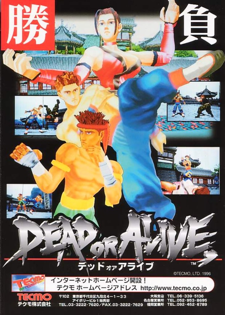
The above arcade flyer of Dead or Alive gave Japanese arcade operators and gamers a taste of what to expect with the game. While the screenshots showed some resemblance with what gamers saw in Virtua Fighter 2, the character designs Tecmo and its developers came up with were unique.

Before Dead or Alive was released in Japanese arcades in 1996, company Tecmo was in financial trouble and they asked Tomonobu Itagaki to make a fighting game similar to Sega’s polygonal blockbuster Virtua Fighter. A breakthrough for Tecmo happened when Sega announced they were licensing their Model 2 arcade to third-party companies which paved the way for Itagaki’s team to make Dead or Alive with it. The game became a big hit and it paved the way for Tecmo to release it on Sega Saturn and PlayStation, and the sequels that followed years later.

2. North American Soulcalibur Dreamcast version print ad

Namco came up with a creative approach to emphasize heart-and-soul promoting their game and the Dreamcast.

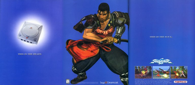
On September 9, 1999, Sega launched their Dreamcast console in America. With a gap of around ten months between the Japanese launch (November 1998) and the American launch, Sega had time to prepare Dreamcast’s release to American gamers with a huge lineup of games (both Sega’s games and from other publishers). Fortunately for Sega, they had Namco (their rival on arcade games) supporting their console.

Behind the scenes, Namco’s developers worked hard to not only port their arcade hit Soulcalibur to the Dreamcast, but to enhance the graphics using the console’s more advanced technology. The visual enhancements include rendering all of the games stages (and backgrounds) into full 3D polygonal environments. Namco also implemented different game modes and added even more content to ensure satisfaction to Dreamcast gamers.

The above 3-page print ad of Soulcalibur on Dreamcast was undeniably strategic and captivating to look at. The ad described the console as the heart, showed Soulcalibur character Mitsurugi (one of the game’s most popular characters) in the middle and then described the game (with 3 screenshots of game rendered with Dreamcast graphics) as the soul. It was a strong way to promote both the game and the console. In the years that followed, Soulcalibur grew into a popular fighting game franchise and the Dreamcast version will always be remembered as the crucial turning point.

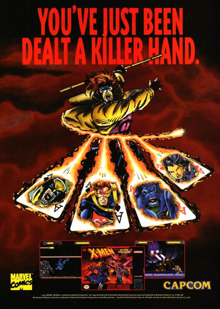
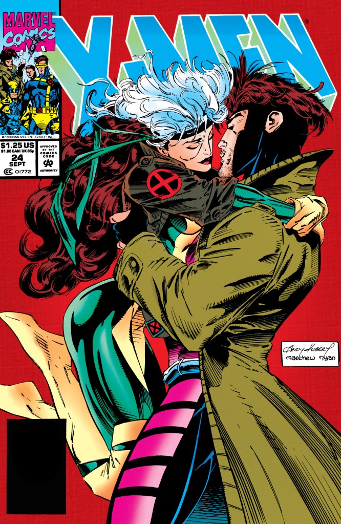
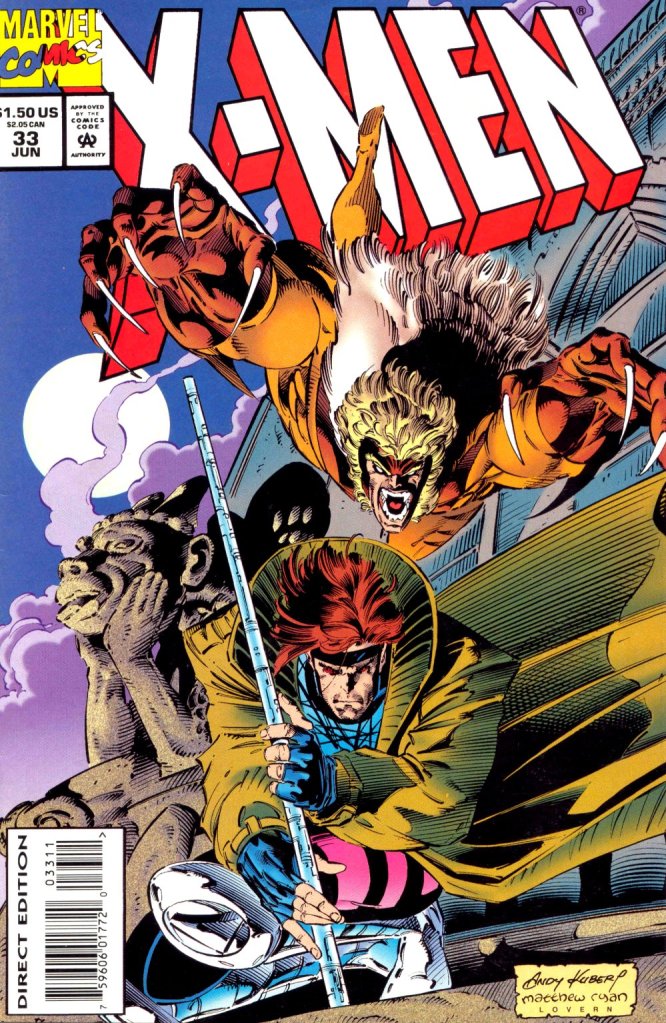
3. X-Men: Children of the Atom arcade flyer

Anyone who read lots of X-Men comic books in the 1990s should be able to tell which character was drawn by which artist.

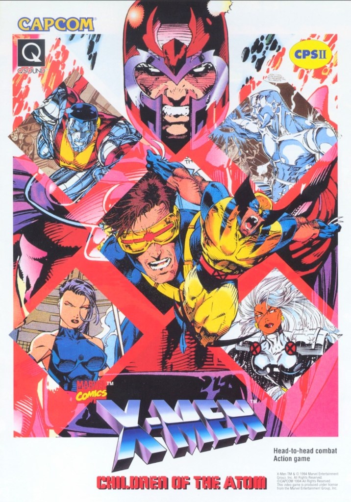
When Capcom first released X-Men: Children of the Atom in the arcades in the mid-1990s, I was surprised because I did not anticipate the day would come when the company behind Street Fighter II would actually make a 2D fighting game showcasing the Marvel’s mutants. Even more intriguing was the X-Men art Capcom used for the arcade flyer to promote the game. I recognize Jim Lee’s artworks of Magneto, Cyclops and Colossus. The art of Wolverine shown was drawn by Andy Kubert. It was a wise move for Capcom (with Marvel as a business partner) to use established X-Men comic book artworks instead of having their internal illustrator draw the characters. That being said, this arcade flyer still looks great and captivating to look at.

4. North American Ranma ½: Hard Battle print ad

A print ad promoting the game while saving some space to promote the anime and comic books.

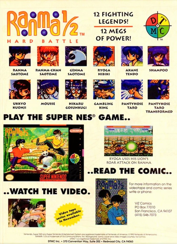
By 1993, Street Fighter II and its upgraded follow-ups were wildly popular both in the arcades and on game consoles around the world. At the same time, there were many other 2D fighting games released to compete with and cash-in on Street Fighter II’s success. Believe it or not, the established anime franchise Ranma ½ saw a video game adaptation in the form of a 2D fighting game – Ranma ½: Hard Battle.

The North American print ad above published by DTMC (in cooperation with Viz Communications) promoted the game (one screenshot, the SNES game box and images of the characters as they appeared in the game) as well as Ranma ½ on anime videos and comic books. The way it was presented, the print ad promoted Ranma ½: Hard Battle without much heart nor passion.

5. Fatal Fury: King of Fighters arcade flyer

An intriguing visual presentation on the front.
You get to know the characters and what the game features are.

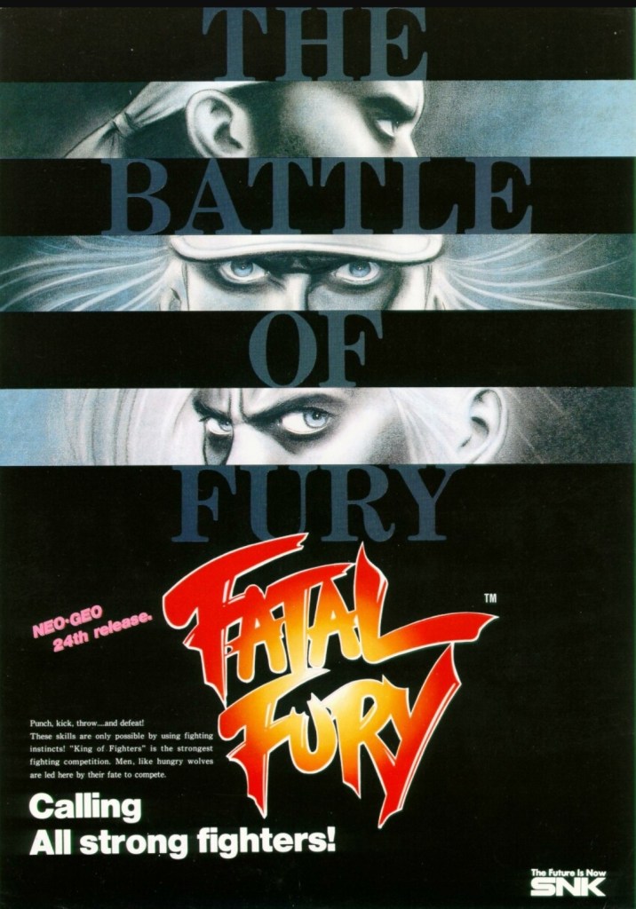
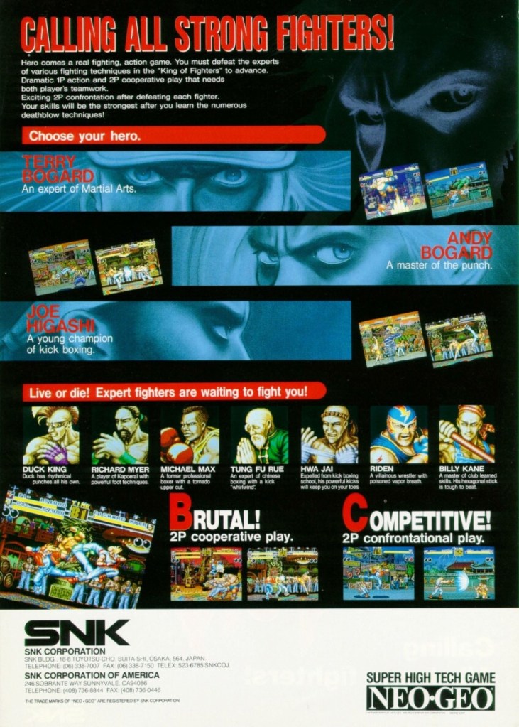
There is no doubt that Fatal Fury: King of Fighters is the most significant game that SNK made. Apart from being the company’s first fighting game for the Neo Geo system, it established the fictional “king of fighters” tournament that became the core concept for The King of Fighters series of games in the years that followed. Fatal Fury itself is notable for being designed by Takashi Nishiyama, a former Capcom employee who created the original Street Fighter game. What Nishiyama could not do with Street Fighter, he accomplished while making SNK’s fighting game. Compared with the combo-oriented approach of Street Fighter II, Fatal Fury was designed to emphasize the timing of special moves, confrontational play, cooperative play and the 3D-like spacing between characters (background row and foreground row in each stage) while telling a story in a solid way.  

The above arcade flyer of Fatal Fury has this unique looking artwork on the front showing stylized rectangular shots of the major characters Terry Bogard, Andy Bogard and Joe Higashi. On the other side of the flyer are the details that emphasized the creative concept of the game, who the characters are and what they could expect with regards to gameplay features. This flyer is still captivating to look at and it could entice you to try playing the original Fatal Fury game before trying out the sequels and spin-offs.

6. Marvel vs. Capcom: Clash of Super Heroes arcade flyer

This is NOT a comic book crossover.

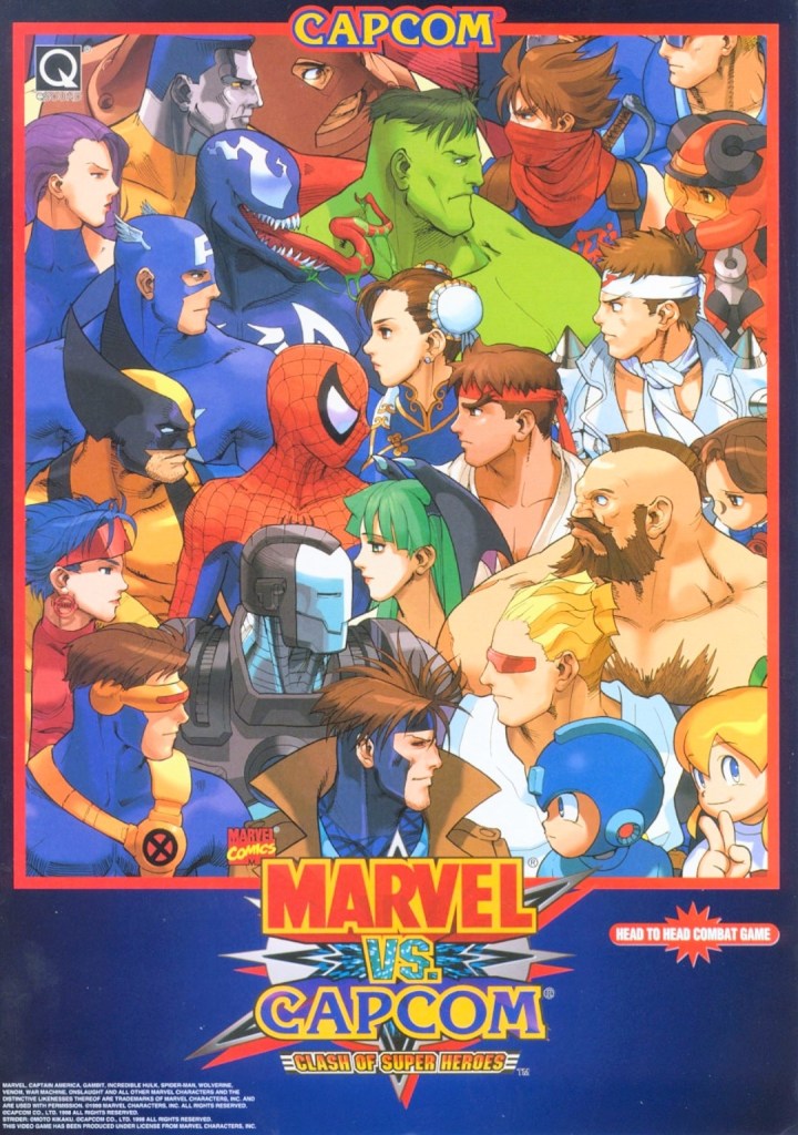
If there is anything that truly emphasizes the essence of a fictional crossover in terms of visuals, it’s the art that Capcom and Marvel agreed to for Marvel vs. Capcom: Clash of Superheroes which is evident on the front of the above arcade flyer. By looking at how the Marvel characters were drawn, it looks like someone at Capcom illustrated the artwork as the Capcom characters still maintained that particular art style seen in the artworks of the Japanese company’s other games like Street Fighter, Darkstalkers, Mega Man and Strider. Regardless, the artwork still is amusing to look at.

7. Art of Fighting arcade flyer

The front of the flyer.
The cast of characters showcased on the other side of the flyer.

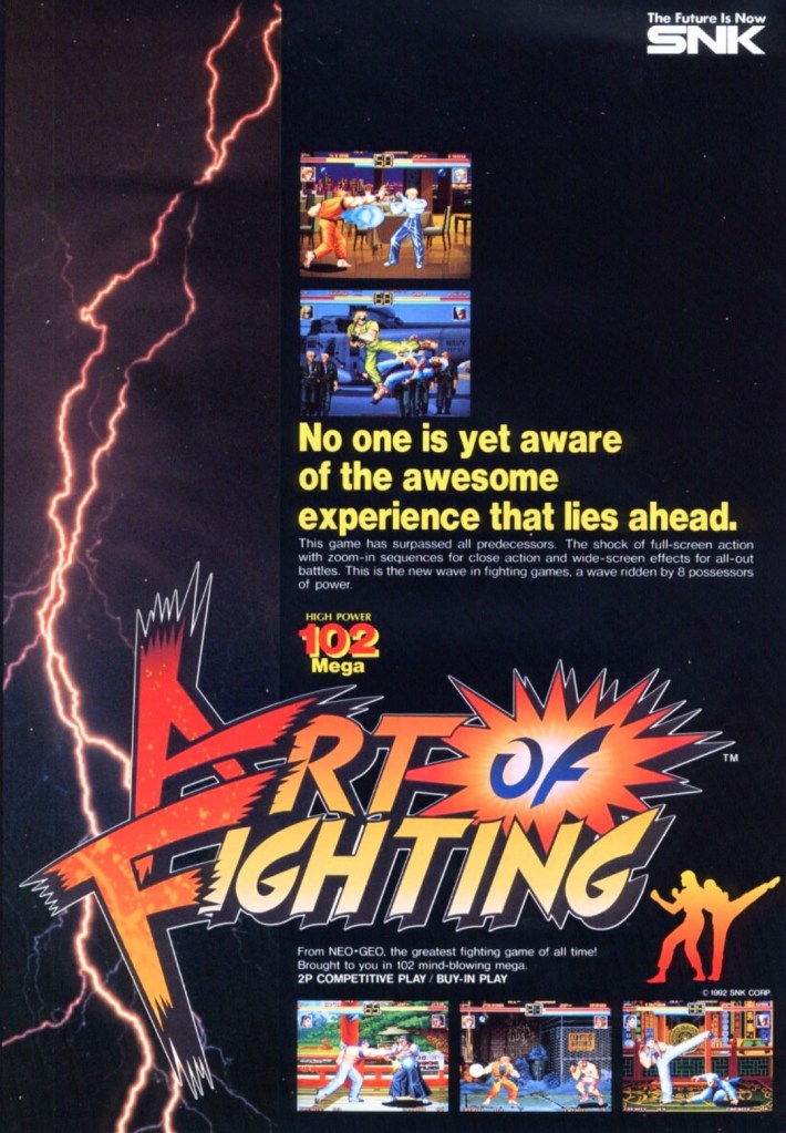
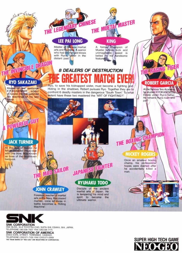
Following the success of Fatal Fury, SNK went on to release Art of Fighting in arcades in 1992 and it became successful enough for the company to make sequels. With regards to the realm of fantasy, Art of Fighting was part of the same fictional universe as Fatal Fury and The King of Fighters, and there were times when its own characters appeared in other SNK games.

Art of Fighting’s arcade flyer had an energetic visual concept on the front with a rectangular lightning portion on the left balanced with five screenshots of the game itself. Once you get to the other side of the flyer, you will see really nice art of the characters with Ryo Sakazaki and Robert Garcia as the most dominating figures. Sakazaki and Garcia are the major characters of the Art of Fighting series. This flyer confidently introduced the characters and succeeded in making them look interesting.

8. Fighter’s History arcade flyer and print ad

Great looking front artwork showing the game’s characters, posing and some action.
If you look closely at the controls, you will see the six-button layout and functions which are the same with those used in Street Fighter II.
Data East offered two ways for gamers to enjoy Fighter’s History – pay a high price for the SNES version or gamers can go play the game in the arcade by dropping a few coins.

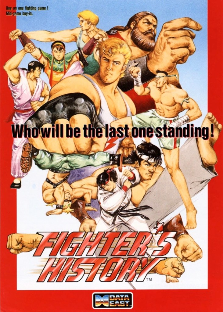
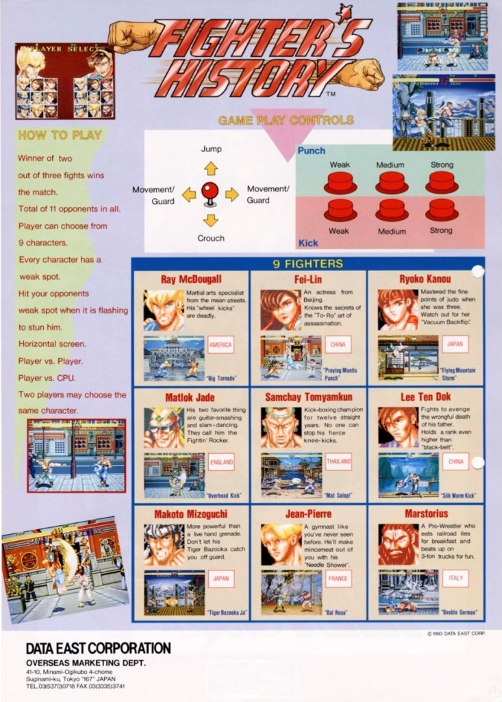
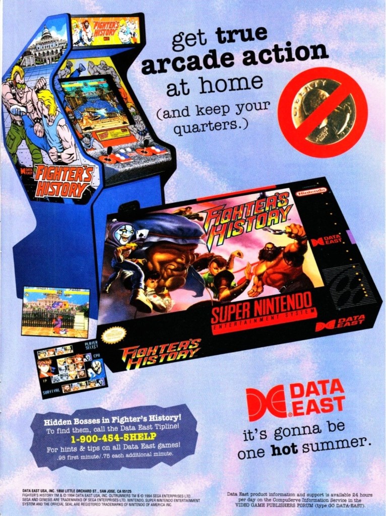
In 1993, Data East released their fighting game Fighter’s History in the arcades around the world. Along the way, the company released their arcade flyer which had a very captivating art work on the front featuring their characters and some action. The other side of the flyer showed the technical details on how to play, how the control works and who the characters are. Fighter’s History was nicely received in the arcades and the success led Data East into porting the game for the Super Nintendo Entertainment System (SNES). If you look at the print ad above, you can see how clever Data East was promoting the SNES version of the game while keeping an image of the arcade machine which serves like a subtle reminder that the same game is still available in video arcades.

Shortly after the release of Fighter’s History in the arcades, there were gamers who noticed that it had certain visual and gameplay elements that made it so familiar with what Street Fighter II had. When Capcom became aware of the similarities, they sued Data East claiming that Fighter’s History was too similar to their game and that copyright infringement was committed. Capcom lost the case ultimately and Data East went on to release two more Fighter’s History games.

9. Virtua Fighter 3 arcade flyer

Virtua Fighter 3 truly raised the standards for arcade game graphics back in 1996.

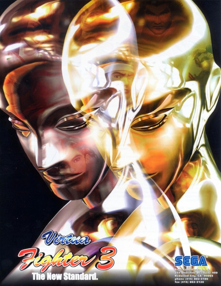
When it comes to gaming innovation and standing out among the rest, Sega did exactly those when they released Virtua Fighter 3 in arcades in 1996 and it had the best-looking and really mind-blowing graphics at the time. Developed by AM2 (led by Yu Suzuki) on the very expensive Model 3 arcade hardware, Virtua Fighter 3 broke new ground on graphics as it moved over 1 million polygons per second, had highly detailed visuals on the characters and surroundings, realistic reflection effects, detailed shining, parallel lighting and high-specular Gouraud shading to name some. Even the characters’ eyes followed the opponent’s position.

The Virtua Fighter 3 arcade flyer showcased their reflective, metallic character Dural who in turn was part of the graphical showcase (emphasizing reflections, smooth animation and liquid metal effects) when the game was previewed in the 1996 AOU event in Japan. The words “The New Standard” written on the lower-left corner of the front of the flyer was justified and truthful.

10. Teenage Mutant Ninja Turtles: Tournament Fighters print ad

This print ad had a nice visual presentation and was easily recognizable to the many TMNT fans.

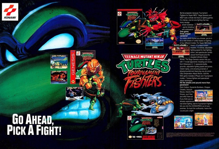
In 1989, the Teenage Mutant Ninja Turtles (TMNT) franchise made quite a splash on video games which is not surprising as the multimedia franchise was already a popular in the West. More video game adaptation of TMNT were released in the early 1990s providing fans and gamers a lot of fun gameplay at the arcades (click here) and on consoles. Konami had the video game rights of TMNT and in a clear response to the sudden popularity of fighting games, they released Teenage Mutant Ninja Turtles: Tournament Fighters on the most popular game consoles of the time achieving varying levels of success critically and commercially (note: the SNES version stood out as the best). This print ad of the fighting game was effective in visually promoting the three console versions and the displayed text contained enough information to lure the attention of both fans and gamers.

+++++

Thank you for reading. If you find this article engaging, please click the like button below, share this article to others and also please consider making a donation to support my publishing. If you are looking for a copywriter to create content for your special project or business, check out my services and my portfolio. Feel free to contact me with a private message. Also please feel free to visit my Facebook page Author Carlo Carrasco and follow me on Twitter at  @HavenorFantasy as well as on Tumblr at https://carlocarrasco.tumblr.com/ and on Instagram at https://www.instagram.com/authorcarlocarrasco

Retro Gaming Ads Blast – Part 14

Welcome back readers, fellow geeks and electronic gaming fans!

In this edition of the Retro Gaming Ads Blast (RGAB) series, we will take a look at another batch of retro gaming print ads – including arcade flyers – from the 1980s and 1990s.

For the newcomers reading this, Retro Gaming Ads Blast (RGAB) looks back at the many print ads of games (console, arcade, computer and handheld) that were published in comic books, magazines, flyers and newspapers long before smartphones, social media, the worldwide web and streaming became popular. To put things in perspective, people back in the 1980s and 1990s were more trusting of print media for information and images about electronic games and related products.

With those details laid down, here is the newest batch of retro gaming print ads for you to see and enjoy…

1. Lufia & The Fortress of Doom for Sega Genesis print ad

Considering the eventual scrapping of the Sega Genesis port of Lufia & The Fortress of Doom, this old print ad might as well serve like a tomb stone.

I want to start with this mostly black print ad about the Japanese role-playing game (JRPG) Lufia & The Fortress of Doom coming to the Sega Genesis console. This game was released on the Super Nintendo Entertainment System (SNES) in America and on the Super Famicom in Japan in 1993 and achieved commercial success for the Japan-based publisher Taito. In an attempt to keep on building up the success, a port of the game for the Sega Genesis (Sega Megadrive in other countries) was announced but ultimately it got canceled. It should be noted that Taito’s American division close down in 1995 and the sequel  Lufia II: Rise of the Sinistrals was released in America by a different publisher. That being said, this particular print ad is a sad reminder of a broken promise for Sega Genesis gamers as well as Lufia and JRPG fans who wanted to play the 1993 RPG on a different console.

2. Cloak & Dagger arcade flyer

The front of the arcade flyer. There is even a mention of the Cloak & Dagger movie.
Details of the game explained with arcade operators in mind. I find it odd that there is a vacant amount of blank space on this side of the flyer.

Cloak & Dagger, the Atari arcade game that appeared in the 1984 movie of the same name (read my retro movie review by clicking here), has always been an arcade conversion kit as this arcade flyer showed. For the newcomers reading this, an arcade conversion kit allows the arcade operator to replace an old game without having to buy a brand-new arcade machine. Very cleverly, Atari targeted arcade machines of Robotron: 2084, Defender, Stargate and Joust (all were from the competitor Williams Electronics) with Cloak & Dagger. The Cloak & Dagger flyer’s front shows a picture of the pieces of hardware (for insertion into the arcade cabinet plus some physical adjustments) plus decorations for the exterior of the arcade cabinet. The other side of the flyer contains the technical details that make it convenient for arcade operators to understand on how to convert the older games (limited to the above-mentioned Williams games).

3. NBA Live 95 for Sega Genesis print ad

This print ad is still exciting to look at, especially when you are still passionate with basketball.

Back in late 1994, Electronic Arts (EA) revamped their NBA-licensed basketball game franchise with NBA Live 95 which came with a major game redesign that includes the isometric on-court perspective, T-meter for free throw shooting and more. NBA Live 95 was also the first entry of the NBA Live franchise and brand which lasted for decades. This print ad of the Sega Genesis version of NBA Live 95 has the clever display of several screenshots along with pics of the shot clock emphasizing suspense. The basketball action images themselves are not only eye-catching but strong enough to get gamers excited. This is still a solid print ad to look at.

4. X-Men: Mutant Apocalypse print ad

An X-Men game by Capcom.

If there is anything significant about X-Men: Mutant Apocalypse, it is the fact that it was Capcom’s first-ever X-Men-based production that was also released a month before their own hit arcade game X-Men: Children of the Atom came out. Setting aside Capcom’s involvement, this game contains notable elements from the comic books that strongly resonated with dedicated X-Men fans. Apart from the two screenshots and the game box cover, this print ad has X-Men artwork by Andy Kubert who already was the regular artist of the X-Men monthly series.

5. Space Ace multi-platform print ad

Anyone who is a fan of Don Bluth’s works in animation should be able to recognize the art style of this ad.

First released in the mid-1980s, Space Ace was a LaserDisc video game that was designed and produced by the legendary animator Don Bluth (An American Tail, The Land Before Time, Anastasia). After achieving success in the arcades, new versions of Space Ace were subsequently released on many other platforms, including the consoles and computers that used disc drives in the mid-1990s which this print ad emphasized. By looking at the lower part of the print ad, you will see Sega CD, 3DO, Macintosh and PC as targeted platforms. The most notable visual feature of the ad was, unsurprisingly, official art of Space Ace.

6. BurgerTime arcade flyer

The front of this flyer could make you crave for burgers.
The technical and creative details on the rear of the flyer.

Bally/Midway came up with this arcade flyer of BurgerTime which itself went on to become a beloved classic game. The front showed a very enticing looking hamburger that looked like it could fill a person’s belly and tingle his or her taste buds. Then they showed the hand-drawn in-game characters looking like they really are interacting with the hamburger. The back of the flyer shows details that emphasize what the game is about, why it could be a fun arcade addition and what the specs are. This is an engaging arcade flyer.  

7. NCAA Final Four Basketball print ad

Do you know anyone who played this college basketball video game?

If there is anything notable about video gaming in the 1990s that is missing today, that would be the presence of multiple basketball video games released by different game publishers. Along the way, there were some college basketball video games such as NCAA Final Four Basketball developed by Bitmasters and published by Mindscape. This print ad had enough screenshots to show what the game looked like and how it played. The ad also mentioned that the game had 64 real NCAA teams and logos as well. This 1994 video game did not have a strong reception from game critics although it received a very high rating by GamePro magazine. NCAA Final Four Basketball has long been forgotten.

8. Indiana Jones’ Greatest Adventures print ad

An eye-catching print ad from a more memorable time when the Indiana Jones franchise was still under the full control of George Lucas and his enterprise.

Indiana Jones’ Greatest Adventures was an ambitious 2D side-scrolling adventure game that also served as an adaptation of the first three Indiana Jones movies (1981-1989) of Steven Spielberg and George Lucas. Like the Super Star Wars trilogy of games that preceded, this one was a challenging and lengthy game filled with lots of action. This print ad only showed Indy’s whip and hat but the screenshots, the text description and the game box cover (which has a young Harrison Ford as the iconic Jones) were more than enough to convince viewers that this was an Indiana Jones game.

+++++

Thank you for reading. If you find this article engaging, please click the like button below, share this article to others and also please consider making a donation to support my publishing. If you are looking for a copywriter to create content for your special project or business, check out my services and my portfolio. Feel free to contact me with a private message. Also please feel free to visit my Facebook page Author Carlo Carrasco and follow me on Twitter at  @HavenorFantasy as well as on Tumblr at https://carlocarrasco.tumblr.com/ and on Instagram at https://www.instagram.com/authorcarlocarrasco

A Look Back at X-Men #30 (1994)

Disclaimer: This is my original work with details sourced from reading the comic book and doing personal research. Anyone who wants to use this article, in part or in whole, needs to secure first my permission and agree to cite me as the source and author. Let it be known that any unauthorized use of this article will constrain the author to pursue the remedies under R.A. No. 8293, the Revised Penal Code, and/or all applicable legal actions under the laws of the Philippines.

Welcome back, superheo enthusiasts, 1990s culture enthusiasts, X-Men fans and comic book collectors! Today we revisit the X-Men monthly series of the 1990s and look back at one of its most significant events it ever published – the wedding of Scott Summers/Cyclops and Jean Grey. By the time this particular comic book was published, the 30th anniversary celebration of the X-Men (note: Read my Fatal Attractions storyline retro reviews by clicking here and here) had just been concluded and that includes a major change of direction for the iconic X-Men member Wolverine. It is also notable that the X-Men had Sabretooth contained within Charles Xavier’s mansion (for retro reviews, click here, here and here).

With those details laid down, here is a look back at X-Men , published by Marvel Comics in 1994 with a story written by Fabian Nicieza and drawn by Andy Kubert.

The cover.

Early story

The story begins inside Xavier’s mansion. Jean Grey reads a handwritten letter from Logan/Wolverine, who left the household after getting traumatized from their last encounter with Magneto. Logan refers to her and Scott Summers as special. While reading, Jean is already in her fancy wedding dress being assisted by her mother and storm as Rachel Summers looks on. For Jean, the wedding is about her dedication on spending the rest of her life with Scott as well as possibly gaining Rachel (who comes from one possible future) as a daughter.

Professor X with four of his original team members plus Alex Summers.

Elsewhere in the mansion, the groom Scott spends quality time with his original teammates Bobbdy Drake/Ice Man, Warren Worthington/Archangel and Hank McCoy/Beast. With them also is his brother Alex Summers/Havok. Alex tells Scott that the day of his wedding is the first day of the rest of his life which causes Bobby to say something inappropriate.

Suddenly, Professor X comes in to join them…

Quality

Jean Grey in her wedding dress with her mother, Storm and Rachel Summers present.

To get straight to the point here, this comic book serves two purposes: highlighting Scott and Jean’s relationship to an all new level with the wedding as the main event, and offering long-time or die-hard X-Men fans a whole lot of stuff to chew on. Very clearly, Fabian Nicieza wrote the script with X-Men fans in mind while also making references to the past with some creative touches or shortcuts so that the comic book would not be bloated with excessive fan service.

The wedding itself was executed nicely by the Nicieza-Kubert team and was clearly conceptualized to not only be memorable for the fans but also creatively serve as a major pay-off to all those years of Scott and Jean Grey being together early as teammates, getting separated temporarily and getting together again (note: they were also the original X-Factor team). Right after the wedding was executed, the visuals and words elevated the emotions higher and any long-time X-Men fan will find the moment sentimental.

Opposite the wedding are several scenes showing the other X-Men characters plus those from X-Factor and X-Force (with a not-so-recognizable Cable present). The dialogue written ranged from sentimental to comedic. And then there were also a few lines that I felt were just thrown in as fillers.

As far as visuals go, Andy Kubert’s art here are pretty good to look at. While he did his best to really make the story visually appealing and memorable, there were a few panels of art that look rushed.

Conclusion

So many guests. Can you recognize many of them?

Since it highlights the wedding of Scott and Jean Grey with several other X-Men-related characters mixed in, X-Men (1994) is clearly a commemorative story made with X-Men fans in mind. While a lot of work was done to make the story momentous on its own, readers who are unable to immerse themselves deeply into the X-Men mythos (plus X-Force, X-Factor and others) prior to reading this comic book won’t be able to relate to the wedding and the character moments very much. While it may not be significant to newcomers who find this comic book for the first time, it still marks a significant chapter in the history of X-Men within the Marvel Comics universe of the late 20th century. For the long-time fans who were able to read enough of Scott and Jean Grey’s times together from 1963 until the early 1990s, this is one X-Men tale that they can relate with deeply.

Overall, X-Men (1994) is recommended.

+++++

Thank you for reading. If you find this article engaging, please click the like button below and also please consider sharing this article to others as well as making a donation to support my publishing.. If you are looking for a copywriter to create content for your special project or business, check out my services and my portfolio. Feel free to contact me with a private message. Also please feel free to visit my Facebook page Author Carlo Carrasco and follow me on Twitter at  @HavenorFantasy as well as on Tumblr at https://carlocarrasco.tumblr.com/ and on Instagram at https://www.instagram.com/authorcarlocarrasco

A Look Back at X-Men #24 (1993)

Disclaimer: This is my original work with details sourced from reading the comic book and doing personal research. Anyone who wants to use this article, in part or in whole, needs to secure first my permission and agree to cite me as the source and author. Let it be known that any unauthorized use of this article will constrain the author to pursue the remedies under R.A. No. 8293, the Revised Penal Code, and/or all applicable legal actions under the laws of the Philippines.

Welcome back, superhero enthusiasts, 1990s culture enthusiasts, X-Men fans and comic book collectors! Today we revisit the X-Men monthly series of the 1990s and look back into the one of the comic books that was released in 1993 which was the year Marvel celebrated the 30th anniversary of the X-Men franchise. To be more specific, the comic book in this retro review took place right after the death of Colossus’ sister and just before the big Fatal Attractions stories in Uncanny X-Men #304 (1993) and X-Men #25 (1993).

With those details laid down, here is a look back at X-Men #24, published by Marvel Comics in 1993 with a story written by Fabian Nicieza and drawn by Andy Kubert.

The cover.

Early story

The story begins inside a high-end restaurant wherein Rogue and Gambit, both dressed in formal attire, have dinner and spend quality time together. Their private talk turns awkward when Rogue asks him about his silence about his wife (refer to X-Men ). Gambit, in his attempt to change the subject, asks Rogue why other people do not know her real name. This leads them into staring at each other in silence.

Over the mansion, Dr. Moira McTaggert and Banshee are reunited while Charles Xavier and Beast are inside the laboratory working and analyzing as to how Illyana Rasputin died. Over at a local airport, Jean Grey and Cyclops are reunited…

Quality

Psylocke and Revanche.

Have you heard about the expression “the calm before the storm”? That truly reflects what this comic book is all about. X-Men #24 (1993) was all about build-up of information and character developments, getting specific X-Men characters reunited, tying up some loose ends from the past while also building up tension for near-future events and more. There is no battle between good and evil here as this was written to set up the characters for specific storylines that were set to happen and Fatal Attractions was just a part of them. No superhero action here, just lots of dialogue plus romance, suspense and melodrama.

If there is anything notable here, it is the romantic time Rogue and Gambit have together. While their relationship got deeper, Fabian Nicieza also opened up the possibility that secrets between the two could still derail their romantic connection. Eventually, their relationship got strained as seen in X-Men #33 (1994).

This comic book also took time to explore further the mystery between Revanche and Psylocke, and also the negative impact Illyana’s death towards Jubilee. All throughout, Nicieza’s dialogue is solid and captured the personalities of each character.

To Andy Kubert…why did you draw Cyclops’ eyes like this?!

As for the art, I noticed there is a drop in the quality of Andy Kubert’s work in this comic book. The way I see it, his work looked rushed especially when compared to his more polished works in X-Men to 23, X-Men and others. As far as his X-Men works of 1993 are concerned, this is easily Kubert’s weakest work.

Conclusion

Banshee and Moira reunited.

X-Men #24 (1993) is easily the build-up comic book leading to the massive, highly dramatic events that took place in Uncanny X-Men , X-Men , the wedding of Cyclops and Jean Grey, the Phalanx Covenant storyline, and more. As the 30th anniversary was the most dominant event of the X-Men in 1993, this comic book served its purpose in getting key characters together as well as giving something meaningful (as opposed to being entertaining) for dedicated X-Men fans to enjoy and relate with. That being said, this comic book won’t resonate with newcomers or readers who decide to read this as their personal introduction into the lore of the X-Men within the Marvel Comics shared universe of the time.

If you are seriously planning to buy an existing hard copy of X-Men #24 (1993) be aware that as of this writing, MileHighComics.com shows that the near-mint copy of the regular edition costs $40 while the near-mint copy of the newsstand edition costs $120.

Overall, X-Men #24 (1993) is satisfactory.

+++++

Thank you for reading. If you find this article engaging, please click the like button below and also please consider sharing this article to others. If you are looking for a copywriter to create content for your special project or business, check out my services and my portfolio. Feel free to contact me with a private message. Also please feel free to visit my Facebook page Author Carlo Carrasco and follow me on Twitter at  @HavenorFantasy as well as on Tumblr at https://carlocarrasco.tumblr.com/

A Look Back at X-Men #33 (1994)

Disclaimer: This is my original work with details sourced from reading the comic book and doing personal research. Anyone who wants to use this article, in part or in whole, needs to secure first my permission and agree to cite me as the source and author. Let it be known that any unauthorized use of this article will constrain the author to pursue the remedies under R.A. No. 8293, the Revised Penal Code, and/or all applicable legal actions under the laws of the Philippines.

Welcome back, superhero enthusiasts, 1990s culture enthusiasts, X-Men fans and comic book collectors! Today we revisit the X-Men monthly series of the 1990s and look back into the past between Sabretooth and X-Men member Gambit which was hinted in X-Men #28 (1994). Within the context of that comic book I previously reviewed, Sabretooth was already living in a contained manner in the mansion of Professor X who views him as a patient who could be rehabilitated even though he has an established record of murder and damage. At that particular time, Gambit and Rogue were in a relationship but certain things from the Cajun’s past could negatively affect them both.

With those details laid down, here is a look back at X-Men , published by Marvel Comics in 1994 with a story written by Fabian Nicieza and drawn by Andy Kubert.

The cover.

Early story

The story begins in the past with a much younger Gambit (wearing a dark coat and holding a rod) traversing through the city of Paris in France. As he moves, Gambit spots a pretty lady in distress in the presence of a huge man with an unusual look. He kicks the man out of the way and tells him to back off. It turns out, the man was none other than Sabretooth (in his more classic comic book look) who responds saying that Gambit won’t score any points with the lady he just saved if he were dead and buried.

Gambit sticks close with the lady and says some words back to Sabretooth. He flashes a card and charges it, revealing his mutant power to the beastly man. Sabretooth leaves promising he will be back.

In the present day, it turns out the restrained Sabretooth has been recalling the past and sharing the details to Rogue standing some feet away from him inside the mansion. Using a highly advanced devise, images of Gambit and the lady from the past are displayed in the form of holograms right in the view of Rogue. She tells him to keep telling her more about what happened in Paris…

Quality

Andy Kubert’s own take on Sabretooth and his classic look remains impressive.

This comic book has a very rich script by Fabian Nicieza who smoothly transitions from the past to the present while succeeding in telling a very cohesive story. Without spoiling the plot, I can say that by reading this comic book as well as the earlier issues, you will question the state of the relationship of Gambit and Rogue, and you will also reflect about Sabretooth’s purpose in X-Men lore.

The tale from Gambit’s past was beautifully told and it really gave me a new look into the personality and mindset of the character. Long before he joined the X-Men, Gambit was an impulsive and cocky guy who became a member of a guild of thieves through adoption (meaning he has yet to earn his place). This version of the Cajun was undisciplined and did not take life seriously. Young Gambit also had a thing with ladies and he showed no signs of cleverly betraying a woman in favor of materialism.

Believe it or not, the most interesting character here is actually Sabretooth who appears in both the past and the present. The way he was portrayed here, young Sabretooth was cunning and knew how to be strategic and paced himself even though he had key physical advantages to overwhelm young Gambit. Sabretooth in the present day is more mature and more articulate, especially during his storytelling and interactions with Rogue. The way Sabretooth’s dialogue was structured in telling about the past was very engaging and you can see he clearly understood what happened between him and Gambit.

While the story is great, the art done by Andy Kubert is very good. However, I believe it was a missed opportunity for Kubert to redesign Gambit from the past because the famous X-Men member does not look any different from the other version. In the scenes about the past, Gambit does NOT look like a 17-year-old at all and his hair style and length are just the same! As for drawing the younger version of Sabretooth, Kubert made him more menacing and more detailed while sticking close to his original comic book look.

Conclusion

The 17-year-old Gambit with the pretty lady in France.

X-Men (1994) is one of the most intriguing X-Men stories I read that took place after the Fatal Attractions storyline and the wedding of Jean Grey and Cyclops. In fact, it is also the most memorable X-Men comic book I ever read in 1994 all thanks to the great work by Fabian Nicieza whose script was finely visualized by Andy Kubert. This is one very engaging read and by the time I finished it, I really felt the impact it had on Gambit and Rogue’s relationship. More notably, it made rethink about Gambit and his place with the X-Men.

If you are seriously planning to buy an existing hard copy of X-Men (1994) be aware that as of this writing, MileHighComics.com shows that the near-mint copy of the regular edition costs $30 while the near-mint copy of the newsstand edition costs $90.

Overall, X-Men (1994) is highly recommended!

+++++

Thank you for reading. If you find this article engaging, please click the like button below and also please consider sharing this article to others. If you are looking for a copywriter to create content for your special project or business, check out my services and my portfolio. Feel free to contact me with a private message. Also please feel free to visit my Facebook page Author Carlo Carrasco and follow me on Twitter at  @HavenorFantasy as well as on Tumblr at https://carlocarrasco.tumblr.com/

A Look Back at X-Men #29 (1994)

Disclaimer: This is my original work with details sourced from reading the comic book and doing personal research. Anyone who wants to use this article, in part or in whole, needs to secure first my permission and agree to cite me as the source and author. Let it be known that any unauthorized use of this article will constrain the author to pursue the remedies under R.A. No. 8293, the Revised Penal Code, and/or all applicable legal actions under the laws of the Philippines.

Welcome back, superhero enthusiasts, 1990s culture enthusiasts, X-Men fans and comic book collectors! Today we revisit the X-Men monthly series of the 1990s and look back at what happened after the ending of X-Men #28 (1994). For those who missed out on my previous X-Men retro review, issue showed the X-Men being disturbed by the presence of Sabretooth living as a prisoner/patient in the mansion under the authority of Charles Xavier. Along the way, the wedding of Jean Grey and Cyclops is nearing.

With those details laid down, here is a look back at X-Men #29, published by Marvel Comics in 1994 with a story written by the Fabian Nicieza and drawn by Andy Kubert.

The cover.

Early story

The story begins inside the danger room wherein Psylocke and Sabretooth (wearing cybernetic restraints on his arms as well as a mask) engage in a sparring session while being monitored by Professor X, Warren Worthington/Archangel and Hank McCoy/Beast. Warren expresses concern about the session and Xavier replies by saying that they could not have Sabretooth develop the control he needs over his violent tendencies by having him contained in a cell every day.

After some struggle, Psylocke gains the upper hand and tells Sabretooth that she sparred without using her mutant abilities (solely out of deference to his reduced capabilities caused by the restraints) and insisted she still fought to win.

After the danger room session, Warren leaves and thinks a lot as he takes time out to watch Cyclops and Jean Grey leading the wedding preparations outdoors. Jubilee passes by with lots of mail, hands over to Warren an unusual looking envelope, then leaves. As he opens the envelope, Psylocke arrives hearing Warren talking to himself as he reads the letter. It turns out to be an invitation from the Hellfire Club…

Quality

Expository dialogue and details laid down to help readers understand the Hellfire Club.

To put things in perspective, the Hellfire Club within the Marvel Comics universe is a fictional high-class society which became a formidable force of opposition for the X-Men. Their debut during the Dark Phoenix Saga is very memorable and since that time, varied comic books – specifically X-Men comics – revisited the club from time to time.

Within the pages of this particular comic book, the Hellfire Club itself went through some changes in terms of membership and organizational structure kind of similar to the X-Men themselves. In this case, the son of Sebastian Shaw – Shinobi – gains tremendous power and even went as far as revealing to Warren/Archangel his ambitious plan to re-establish the Inner Circle and have the mentioned X-Men member (one of the pioneering students of Charles Xavier) part of it as the White King.

A key element in this story is self-pity which Archangel and Shinobi Shaw both share. For these two, there are key parts of their past that are so hurtful they respectively question their existence and purpose. Quite symbolically, Archangel and Shinobi both have fathers involved with the Hellfire Club and Psylocke herself was familiar with the club’s presence in London. More on Archangel himself, his self-pity really puts him in a very awkward place among the X-Men, especially at a time when he is supposed to be happy for his long-time teammates Jean Grey and Cyclops about to get married.

In a way, X-Men #29 was an inspired attempt to reconnect the past with the contemporary times with the Hellfire Club as the enduring factor. In my opinion, Fabian Nicieza’s work here is solid.

Conclusion

Easily the best-looking images in the comic book. Andy Kubert really rocked with this!

X-Men #29 (1994) is symbolically a quick and yet inspired way of updating readers about the state of the Hellfire Club and hint what potential conflicts they could have with the X-Men of the 1990s. Psylocke and Archangel are the most prominent X-Men members to follow here and they both have past connections with the Hellfire Club which itself is changing as Shinobi Shaw gained power. Its story is pretty intriguing and there is a descent amount of spectacle to be enjoyed. The selling point here is the story concept itself backed with solid writing by Nicieza who seem to have researched the Hellfire Club carefully. Given the legacy behind the X-Men and the fictional club, this comic book will appeal more to long-time fans of the X-Men. Reading this as a first-time discovery of the club will surely challenge newcomers.

If you are seriously planning to buy an existing hard copy of X-Men #29 (1994) be aware that as of this writing, MileHighComics.com shows that the near-mint copy of the regular edition costs $30 while the near-mint copy of the newsstand edition costs $90.

Overall, X-Men #29 (1994) is recommended.

+++++

Thank you for reading. If you find this article engaging, please click the like button below and also please consider sharing this article to others. If you are looking for a copywriter to create content for your special project or business, check out my services and my portfolio. Feel free to contact me with a private message. Also please feel free to visit my Facebook page Author Carlo Carrasco and follow me on Twitter at  @HavenorFantasy as well as on Tumblr at https://carlocarrasco.tumblr.com/

A Look Back at X-Men #28 (1994)

Disclaimer: This is my original work with details sourced from reading the comic book and doing personal research. Anyone who wants to use this article, in part or in whole, needs to secure first my permission and agree to cite me as the source and author. Let it be known that any unauthorized use of this article will constrain the author to pursue the remedies under R.A. No. 8293, the Revised Penal Code, and/or all applicable legal actions under the laws of the Philippines.

Welcome back, superhero enthusiasts, 1990s culture enthusiasts and comic book collectors! Today we revisit the X-Men monthly series of the said decade, specifically on the 28th issue which takes place after the events highlighted by the 30th anniversary the X-Men (read my retro reviews of Uncanny X-Men #304 and X-Men #25), and before the wedding of Scott/Cyclops and Jean Grey (X-Men ).

With those details laid down, here is a look back at X-Men , published by MarvelComics in 1994 with a story written by the Fabian Nicieza and drawn by Andy Kubert.

The cover.

Early story

The story begins with Jubilee running through the woods desperately. She suddenly finds Wolverine on the ground. As she turns, she sees Sabretooth moving directly at her for the kill.

Jubilee suddenly wakes up from her nightmare. Jean arrives to comfort her and gets told that within the nightmare, all the X-Men were killed. Jean telepathically reaches out to Scott, Ororo/Storm and Hank/Beast and calls for an immediate private meeting outside Charles Xavier’s mansion.

Shortly after, Jean, Cyclops, Storm and Beast meet at a local pub to discuss a very questionable move recently made by their leader Charles Xavier…accepting Sabretooth into the mansion as a patient…

Quality

I really liked this scene between Professor X and two of his original X-Men members.

Let me start by confirming that this is one of the best X-Men scripts I have read from Fabian Nicieza as X-Men strongly tackled the issues it raised regarding the disturbing presence of Sabretooth on the established team of mutants. For one thing, it is dramatic to read how Jean Grey, Cyclops, Beast and Storm expressed their opinions about their boss Charles Xavier who decided to take an established animalistic killer like Sabretooth into their shared place of residence. Even though they have high-tech measures to ensure security and containment, Sabretooth is still a constant emotional problem to the X-Men.

The presence of Sabretooth brings to light Xavier’s legacy of bringing Wolverine and Rogue into the X-Men many years prior, as well as sensible questions about the X-Men founder himself. How much impact did Ilyana’s death and Colossus’ departure have on Xavier? Is Xavier losing his sanity since he erased Magneto’s mind? Is Professor X really in control with leading the team while working on several other things at the same time?

More on Sabretooth, apart from being a major disturbance, he was shown to have known Gambit from some time in the past and if you read his dialogue (while in the presence of Rogue and Gambit) closely, the French city of Paris is mentioned and it has something to do with Gambit and Sabretooth’s previous encounter. This was a build-up to a big revelation a few issues later.

Conclusion

Psylocke was no match for Sabretooth.

X-Men (1994) is not your typical good-versus-evil X-Men story but rather a dramatized look at the team feeling very uneasy mainly because of the presence of an animalistic killer within their household. In retrospect, the concept of having Sabretooth in the Xavier mansion is daring and also refreshing as it opened up opportunities for the creative team to explore new dimensions on many of the affected X-Men members. In relation to that, this comic book was published just months after Marvel published a Sabretooth comic book mini-series.

If you are seriously planning to buy an existing hard copy of X-Men (1994) be aware that as of this writing, MileHighComics.com shows that the near-mint copy of the regular edition costs $30 while the near-mint copies of the signed-and-numbered edition and the newsstand edition cost $200 and $90 respectively.

Overall, X-Men (1994) is highly recommended.

+++++

Thank you for reading. If you find this article engaging, please click the like button below and also please consider sharing this article to others. If you are looking for a copywriter to create content for your special project or business, check out my services and my portfolio. Feel free to contact me with a private message. Also please feel free to visit my Facebook page Author Carlo Carrasco and follow me on Twitter at  @HavenorFantasy as well as on Tumblr at https://carlocarrasco.tumblr.com/

A Look Back at X-Men #25 (1993)

Disclaimer: This is my original work with details sourced from reading the comic book and doing personal research. Anyone who wants to use this article, in part or in whole, needs to secure first my permission and agree to cite me as the source and author. Let it be known that any unauthorized use of this article will constrain the author to pursue the remedies under R.A. No. 8293, the Revised Penal Code, and/or all applicable legal actions under the laws of the Philippines.

As an X-Men fan, 1993 was a memorable year for me during my time of collecting comic books and enjoying what was believed to be the modernization of superhero comics in America. Gimmick covers of comic books, the post-event effects of the Death of Superman, the launch of the Ultraverse and then there was the 30th anniversary celebration of the X-Men which was wild.

To put things in perspective, Marvel Comics organized the celebration of the 30th anniversary of Spider-Man releasing lots of merchandise and, most notably, special issues of comic books that came with covers with holograms, more pages for content and a cover price that was more than double than what was normal (note: read my review of one of them). Such comic books were hot stuff for not only Spider-Man fans but also comic collectors who were often hunting for the next great collector’s item that would ensure them great wealth.

Marvel had the same business approach with the 30th anniversary of the X-Men, and there were multiple X-Men-related monthly series of comic book back then. X-Factor , X-Force , Uncanny X-Men , Wolverine and Excalibur all were released with covers with hologram cards on the front, more pages of content and inflated cover prices.

The one 30th anniversary celebration comic book of the X-Men that was most memorable to me was X-Men (Volume 2) and to this day, its plot remains very memorable for its shock value. I bought my copy of this comic book at a store in BF Homes. With the history lesson over, he is my retro review of X-Men , published in 1993 by Marvel Comics with a story written by Fabian Nicieza and drawn by Andy Kubert.

The cover.

Early story

The story begins with the United Nations Security Council’s approval to initiate the alpha and beta parameters of the Magneto Protocols which literally sent waves from the White House to the Kremlin. A short time later, several satellites orbiting the Earth activate and linked with each other to form a protective mesh of electro-magnetic fire. This provokes Magneto (accompanied by Acolytes and Exodus at Avalon) to react by generating a massive pulse wave that affects the entire world. Even the Fantastic Four and Excalibur were not spared.

At the School of Gifted Children, Charles Xavier organizes an urgent meeting with the X-Men. Together they discussed the impact of Magneto’s pulse wave which not only rendered world’s mechanical and technological resources useless but also caused trouble (plane crashes, medical equipment failure, etc.) and deaths. For Xavier, the mere fact their team survived (aided by Shi’ar technology) is a mistake on the part of Magneto considering his capability to wipe out life around the world.

In response to Wolverine’s question, Xavier stated, “We do not have the luxury of time, nor the occasion for nobility…at this point, we are not fighting for the philosophy of a cause, a hope, or a dream, we are fighting for our very survival and if we do not win this fight, this planet will be irrevocably lost to us!”

Quality

The X-Men during their daring mission.

I can clearly declare that when it comes to the combined works done by Fabian Nicieza and Andy Kubert with the X-Men, this particularly story was not only the most ambitious collaboration of theirs but also their most compelling and finest work at the time of publishing. Very strong writing (top-notch characterization, plotting and pacing) and great art really defined this comic book!

Characterization is spot-on! Wolverine is arrogant and gritty as usual, Gambit is still the smooth-talker, Cyclops is the focused leader serving under Xavier, etc.

Without spoiling the major details, I can say that the shocking moments executed were greatly done not for the mere intention of shocking but to break new ground with regards to the characters of Wolverine and Charles Xavier. The first time I read this comic book back in 1993, I was really stunned with those particular scenes and I started to question Wolverine’s durability as well as Xavier’s sanity. And then there was the state of Magneto at the end of the story. The thing about the shocking moments was that there was an adequate amount of build-up leading to them and the pay-off was excellently done.

Conclusion

The immense power of Magneto.

There is no doubt in my mind that X-Men (1993) is the true gem of the entire X-Men 30th anniversary celebration. The creative team led by Nicieza and Kubert really outdid themselves and what happened in this comic book had consequences that lasted for a good number of years. The creative team took big risks and pulled them off nicely as the impact of the story was eventually felt in the years that followed. Lastly, unlike Uncanny X-Men (supposed to be the highlight of X-Men’s 30th anniversary celebration), this comic book is more focused and really had no creative baggage nor filler that got in the way of the storytelling.

If you are seriously planning to buy an existing hard copy of X-Men (1993), be aware that as of this writing, MileHighComics.com shows that the near-mint copy of the regular edition costs $50 while the near-mint copy of the newsstand edition is priced at $150. The near-mint copies of the signed-and-numbered edition and the gold edition cost $210 and $368 respectively.

Overall, X-Men (1993) is highly recommended!

+++++

Thank you for reading. If you find this article engaging, please click the like button below and also please consider sharing this article to others. If you are looking for a copywriter to create content for your special project or business, check out my services and my portfolio. Feel free to contact me as well. Also please feel free to visit my Facebook page Author Carlo Carrasco and follow me at HavenorFantasy@twitter.com