A Look Back at Independence Day #0 (1996)

Welcome back science fiction enthusiasts, 1990s arts and culture enthusiasts, Marvel Comics fans and comic book collectors! Today we go back to the year 1996 to take a close look at one of the licensed comic books Marvel Comics published which was part of the release of the movie Independence Day (also referred to as ID4).

Back in 1996, there was a considerable amount of hype and anticipation for Independence Day’s release in cinemas not just in America but also in other parts of the world. Following the success they achieved together in Stargate (1994), producer Dean Devlin and director Roland Emmerich teamed up again to make Independence Day which was back then the most modern cinematic portrayal of aliens invading Earth causing the people to fight back. The film creatively was also a disaster movie of its own backed with science fiction concepts and the latest special effects of the era. Independence Day went on to gross almost $820 million worldwide and I myself saw it in a fully packed cinema here in the Philippines.

As I saw the movie, I noticed details about events that took place sometime in the past and they were presented not as flashbacks but only as spoken words. There is that verbal reference about Jeff Goldblum’s character punching Bill Pullman’s character some time before the latter became US President. There are also spoken words about Randy Quaid’s character being previously abducted by aliens. As part of the marketing and publicity of the movie, Marvel Comics was licensed to publish not only a 2-part comic book adaptation but also a prequel comic book.

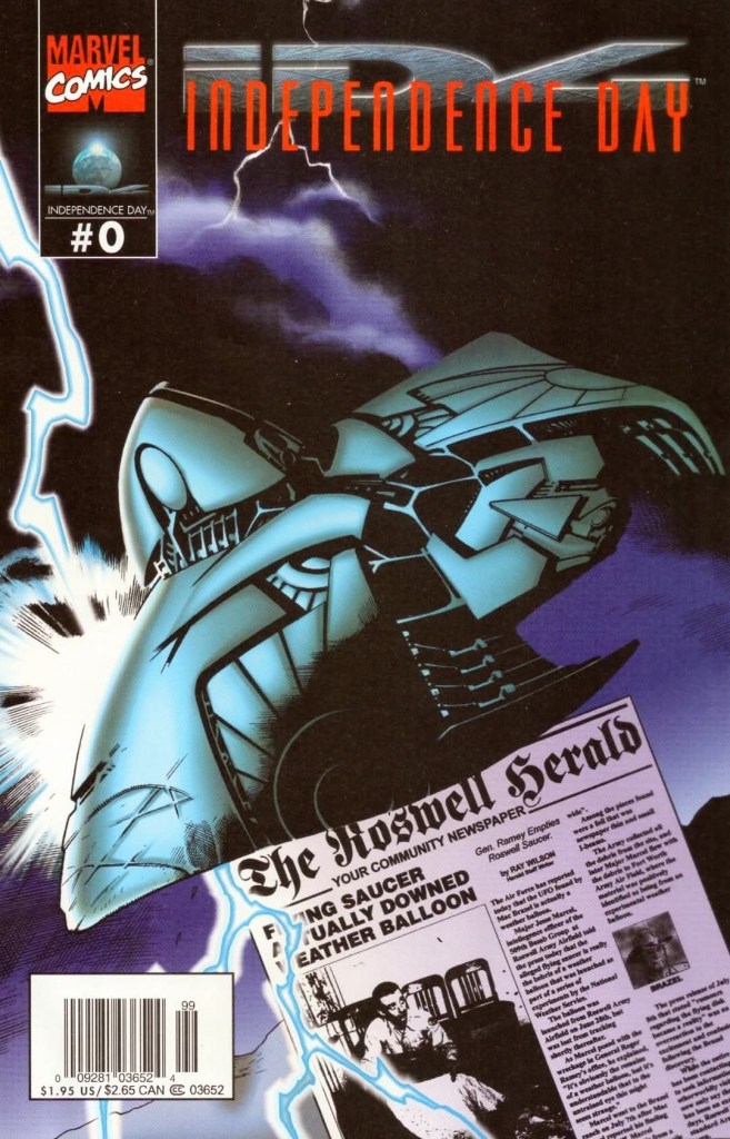
With those details laid down, here is a look back at Independence Day #0, published in 1996 by Marvel Comics with a story written by Phil Crain (based on ideas by Dean Devlin and Roland Emmerih) and drawn by Terry Pallot, Steve Erwin, Rod Whigham and Gabriel Gecko.

The cover.

Early story

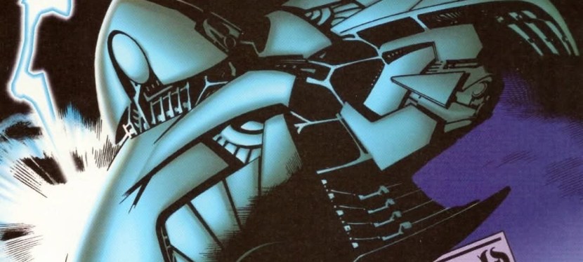
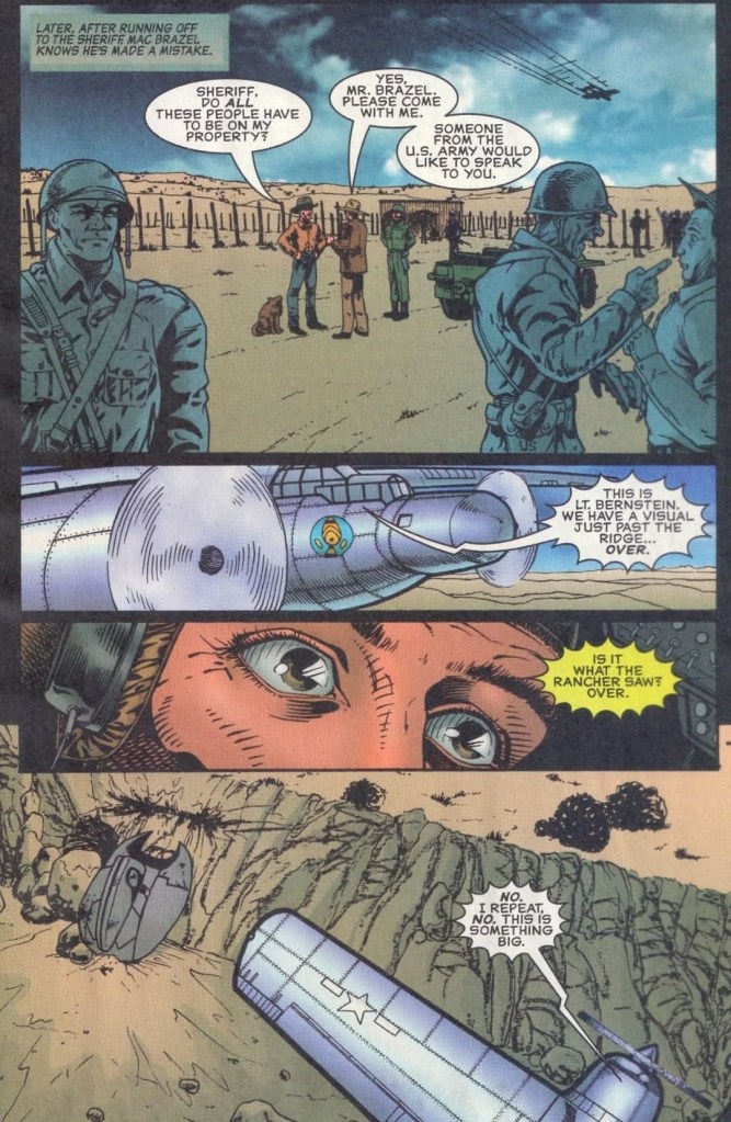
The story begins on July 4, 1947 in Roswell, New Mexico. A thunderstorm took place in the evening compelling residents to stay inside their respective homes. As the storm went on, an unidentified flying object (UFO) of alien origin got struck by thunder causing it to crash on the field of someone’s property with a huge impact that disturbed local residents. The alien ship opens and one of its passengers (alien) ventures out into the stormy night. Injured and still in shock, the passenger slowly moves away from the ship.

The next evening, the property owner arrives and finds several pieces of debris of the crashed ship scattered on the field. He notices the metal are lighter than anything he touched, and he could see the writings were not man-made. The property owner informed the local sheriff of what he found which led to the American army sending troops to the field. The American military plane flies over them and finds the crashed alien ship.  

Quality

When Whitmore was still a US Senator and candidate for US President, he got punched by David Levinson who thought that he was having an affair with his wife Constance “Connie” Spano. This later led to the “You punched the President,” line in the movie.

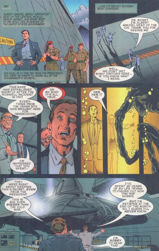
As described above, this prequel comic book visually dramatizes the past events that were only mentioned in the movie particularly with regards to the Roswell UFO incident as well as Area 51 and how the government handled findings about aliens from outer space. In fact, the story here was scripted to move from one significant event to the next through the decades, and the good news here is that the exposition is not too heavy (when compared to Jurassic Park comic books of 1993) and the pacing moved at a medium pace. The result is a reading experience that is intriguing and entertaining.

The creators really went all in with their fictional portrayal of the movie’s aliens being involved in Roswell and Area 51, and the notable thing is that they really took the presentation seriously. It’s as if they were trying to tell a factual story which smoothly connects with the movie.

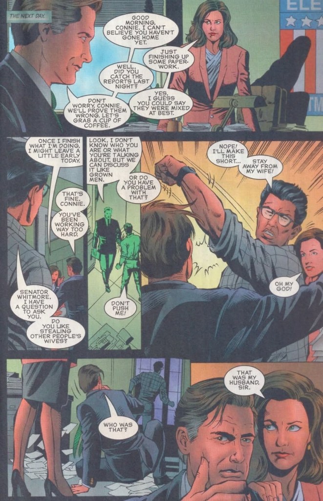
When it comes to the characters from the movie, you will find them in this comic book depending on the stage of the narrative and the time setting. While the characters of Pullman, Goldblum, Robert Loggia, Will Smith, Brent Spiner, James Rebhorn, Viveca A. Fox and Margaret Colin are dramatized in the 1990s scenes, you will see the younger versions of a few of them set in the 1960s scenes. The abduction scene of Randy Quaid’s character is set in the 1980s.

The Area 51 scene set in the 1960s.

As for the script written by Phil Crain, the narrative of this comic book surprisingly has a more serious and dramatic tone when compared to what was expressed in the movie. There were even a few horror elements and no comedic stuff at all. Again, this should not be surprising because this comic book was meant to dramatize past events to not only connect with the movie’s core concept but also show why certain characters acted the way they did in the film.

As this comic book involved multiple artists, it should not be a surprise that the result is of varying quality from one scene to another. In fairness, the illustrator (or illustrators) who drew the Area 51 scenes and the crashed alien ship did a good job with the details. As for the characters, pilot Steven Hiller resembled Will Smith enough, and the same can be said about Thomas Whitmore somewhat looking like Bill Pullman, David Levinson looking somewhat like Jeff Goldblum, and General Grey slightly looking like Robert Loggia. Meanwhile, Constance Pano resembled Margaret Colin more while the 1990s Dr. Okun resembled Brent Spiner in a few shots.

Conclusion

The creators went all-in to make the 1947 Roswell UFO incident a history of Independence Day.

To get straight to the point, Independence Day #0 (1996) succeeded with its main objective of establishing visually the past and emphasizing developments connecting with the blockbuster movie of 1996. It was made with a strong appeal to fans of Independence Day as well as people who simply are fond of UFOs and conspiracy theories regarding Roswell and Area 51. People who are not too interested in the movie and UFOs might not be impressed with this comic book. In my view, this prequel comic book has good enough qualities that make it worth reading and its serious narrative is both surprising and enjoyable. Ultimately, it is a worthy companion piece to the movie.

Overall, Independence Day #0 (1996) is recommended.

+++++

Thank you for reading. If you find this article engaging, please click the like button below, share this article to others and also please consider making a donation to support my publishing. If you are looking for a copywriter to create content for your special project or business, check out my services and my portfolio. Feel free to contact me with a private message. Also please feel free to visit my Facebook page Author Carlo Carrasco and follow me on Twitter at  @HavenorFantasy as well as on Tumblr at https://carlocarrasco.tumblr.com/ and on Instagram at https://www.instagram.com/authorcarlocarrasco

Retro Gaming Ads Blast – Part 21

Welcome back readers, fellow geeks and electronic gaming fans!

In this edition of the Retro Gaming Ads Blast (RGAB) series, we will take a look at another batch of retro gaming print ads – including arcade flyers – from the 1980s and 1990s.

For the newcomers reading this, Retro Gaming Ads Blast (RGAB) looks back at the many print ads of games (console, arcade, computer and handheld) that were published in comic books, magazines, flyers, posters and newspapers long before smartphones, social media, the worldwide web and streaming became popular. To put things in perspective, people back in the 1980s and 1990s were more trusting of print media for information and images about electronic games and related products.

With those details laid down, here is the newest batch of retro gaming print ads for you to see and enjoy…

1. Galaxian for Atari print ad

A unique approach to the art done by the advertisers.

Developed by Namco, Galaxian was a 2D sci-fi shooter that debuted in arcades in 1979. It was so successful and widely acclaimed, it got ported to varied game consoles and home computers as the years passed by. For its release on the Atari 2600 and Atari 5200, this print ad was created to catch the attention of fans and gamers by utilizing artwork that resembled the look of 2D sprites from the game. That being said, no screenshots of Galaxian on the Atari consoles were shown because the artwork used looked detailed and were attention-grabbing already.

2. 1943: The Battle of Midway arcade flyer

This is a fine looking flyer.

In 1987, Capcom released in the arcades 1943: The Battle of Midway which was their follow-up to 1942. The arcade flyer itself was designed to strongly promote the game using a combination of screenshots, short-but-clear text descriptions and the great looking piece of artwork which really emphasized the World War II concept. Behind it all, this game was made by Japanese developers with the Western markets in mind and the irony is that the game has players control Americans fighting the Japanese fleet.

3. Top Gunner arcade conversion kit flyer

Show this nice looking image to the woke nut or modern day Communist near you. Watch and observe his or her reaction.

To make things clear, Top Gunner is actually the run-and-gun game Jackal and the alternative titles was mainly used in North American arcade distribution and also reflected Konami’s move of coming up with titles inspired by blockbuster movies of the time. To promote its 1986 arcade release in America as a conversion kit, the advertisers had three models playing soldiers on a military jeep to immerse gamers into the core concept of the game – moving armed military jeeps from one location to another while fighting bad guys. The approach used for the visual concept is indeed inspiring, especially during the Cold War. Top Gunner/Jackal became a hit in both arcades and consoles.

4. Joust for Atari print ad

While I played Joust on console, I don’t remember seeing this print ad before.

Made by Williams Electronics, Joust was one of those early 1980s arcade games that eventually made its way to the Atari 2600 console which was massively popular in North America. Strangely enough, the artistic approach Atari’s advertising came up with for the console version of Joust was similar with that of the ad of the Atari version of Galaxian (see item above) in which artwork was used to resemble the 2D sprites of the game. Regardless, the images of this ad showed what a joust looked like – a martial game between two armed combatants going against each other while riding an animal.  

5. Kid Chameleon print ad

Can you relate with Kid Chameleon’s identity crisis?

During the early years of the Sega Genesis, Sega of America exerted efforts to make new games that were not only exclusive to their console but also stand out among the many 2D side-scrolling adventure games by coming up with a protagonist with a unique personality that could somehow resonate with young kids and teenagers.

Developed by their internal experts (Sega Technical Institute), the company released Kid Chameleon in 1992 and they came up with the above print ad that had detailed hand-drawn art of the lead character as well as a wordy text description which was a clear attempt to help young gamers (including teenagers) get connected with both the game and the protagonist. The advertisers even had space to spare to accommodate two screenshots of the game.

6. Terminator 2: Judgment Day (AKA T2: The Arcade Game) for Sega Genesis print ad

This print ad appeared on the many comic books I read long ago.

Back in the early 1990s, Terminator 2: Judgment Day was a massive success in the global box office and this resulted in Arnold Schwarzenegger’s popularity to soar very high while also establishing the Terminator as an essential pop culture figure. Apart from comic books and merchandise, video games based on the movie were made and the one that stood out the most was the arcade shooter game initially titled Terminator 2: Judgment Day (later retitled as T2: The Arcade Game).

The arcade mega hit eventually got ported to the Sega Genesis and this print ad really looked flashy with its visual presentation showing screenshots and a zoomed-in look at how the Terminator T-800 looked like in the Genesis version complete with a few explosions in the background. It should be noted that this flashy print ad cleverly concealed the visual downgrades and the redrawn images as the Genesis itself could never come close to matching the high quality visuals of the arcade version.

7. CYBERPad print ad

I never owned the CYBERPad, nor have I ever used one.

During the so-called 16-bit console generation (actually the 4th console generation), there were lots of licensed console peripherals made by independent companies in support of the Sega Genesis and Super Nintendo Entertainment System (SNES). The company Suncom Technologies came up with the CYBERPad controller for the two consoles and they boasted in their print ad that the product had a programmable control pad that allowed users to create combinations for each game with convenience in mind. The CYBERPad also allowed the saving of the programmable moves and it had a rapid-fire feature and even a slow-motion function. The CYBERPad was made to make the gameplay experience more user-friendly.

8. GamePro magazine sweepstakes print announcement

If you look closely, this print announcement by GamePro technically advertised the game consoles, the arcade game and Lara Croft to its readers.

In 1999, GamePro magazine celebrated its 10th anniversary and to keep on resonating with gamers and maintaining the loyalty of their fans, they organized a reader sweepstakes with prizes worth over $25,000 to be won by the few winners. GamePro boasted a date with an unnamed model who played the iconic Lara Croft (Tomb Raider). Certain arcade machines plus the modern consoles of the time – including the brand-new Sega Dreamcast – were also at stake. The way it was presented, this GamePro print announcement was enticing to read.

9. Smash T.V. for SNES print ad

Smash T.V. was a lot of fun on both arcade and console.

The arcade hit Smash T.V. made its way to the Super Nintendo Entertainment System (SNES) in 1992 and the publisher came up with a print ad that had captivating artwork, six screenshots and a text description that emphasized that a lot of fun awaits gamers on the console version. In my view, this old ad is still amusing to look at.

10. David Robinson’s Supreme Court print ad

It was a smart move by Sega to get NBA superstar David Robinson as the endorser of this basketball video game exclusive on the Sega Genesis. This ad was published many years before Robinson finally won an NBA championship.

As part of its strategy in competing with Nintendo during the 4th console generation, Sega of America was focused on producing exclusive sports video games for the Genesis console backed by endorsements of sports professionals. In 1992, they released David Robinson’s Supreme Court on the Genesis and unsurprisingly their print ad used a large, stylized image of the NBA superstar dunking backed with an exciting text description plus screenshots showing the game’s use of the isometric view for gameplay. This is still worth looking at.

11. Taito’s “heat wave” print ad

An amusing and creative way to sell video games.

If your company lacks money to effectively market your video games individually, you can try making a single ad promoting them together. This is what Taito did in this print ad which showcases multiple games for different platforms and they used artwork of a player experiencing the so-called heat wave. This is a nice stroke of creativity on the part of Taito.

12. Jurassic Park Interactive print ad

This was a creepy print ad promoting the 3DO-exclusive Jurassic Park Interactive.

When it comes to video game consoles, having exclusive games is essential as long as they are of high quality, highly playable and enjoyable. The 3DO company acquired a license of the Jurassic Park movie and made the exclusive game Jurassic Park Interactive hoping it would sell a lot and lift up 3DO hardware sales.

This print ad, which features a zoomed-in image of the Raptor from the game, was more focused on selling the 3DO console than the video game as seen on the descriptive text. 3DO ran a promo selling the console which would entitle the buyer to get Jurassic Park Interactive and another game free. Nothing was done to describe the console’s multimedia capabilities of showing videos, images and graphics of the game (which was essentially a collection of mini-games). This print ad shows ignorance on the part of the 3DO company and the ad maker as it showed desperation happening really early in the console’s life. Notably, Jurassic Park Interactive was the only video game adaptation to use actual footage (note: the faces of the actors were edited out) and music from the film.

13. RoboCop 2 print ad

You want to become RoboCop to save the city of Detroit from criminals?

Way back in 1990, RoboCop 2 was a big hit in cinemas here in the Philippines and in some places around the world. As typical of the time, licenses to make video games based on the movie were released resulting in RoboCop 2 games for multiple platforms. The print ad featured two different images of RoboCop – one from the movie poster and the other from an official artwork. The descriptive text does a fine job to immerse readers into the story concept of the game but showing only two screenshots was a lackluster effort to sell the game.  

14. Star Trek: The Next Generation – Echoes from the Past print ad

Space…the final frontier waiting for Sega Genesis gamers.

Released in 1994, Star Trek: The Next Generation – Echoes from the Past delivered the Star Trek TNG adventure experience to Sega Genesis gamers. In fact, it is the exact same experience that SNES gamers got the same year. In reality, Star Trek: The Next Generation – Echoes from the Past is actually a port of Star Trek: The Next Generation – Future’s Past on the SNES and the screenshots on the print ad are giveaways about it. In fairness to the ad makers, this print ad never attempted to deceive gamers that it promoted a totally different Star Trek TNG game.

15. Dinosaurs for Hire print ad

This print ad caught my attention and made me interested in the game and the comic book series. Even though it was small, Malibu Comics’ logo was still recognizable.

Dinosaurs for Hire (sometimes referred to as Tom Mason’s Dinosaurs for Hire) was a 2D side-scrolling platform adventure game based on the comic book series of Tom Mason. Published by Sega, it was a Genesis-exclusive game and this print ad had a catchy text description, a few screenshots and the eye-catching artwork of a triceratops facing the viewer. This print ad is still good to look at. If you’re thinking about searching for existing copies of the game, I encourage you to also read some Dinosaurs for Hire comic books before playing. By the way, Tom Mason also wrote several comic books of the Ultraverse.

+++++

Thank you for reading. If you find this article engaging, please click the like button below, share this article to others and also please consider making a donation to support my publishing. If you are looking for a copywriter to create content for your special project or business, check out my services and my portfolio. Feel free to contact me with a private message. Also please feel free to visit my Facebook page Author Carlo Carrasco and follow me on Twitter at  @HavenorFantasy as well as on Tumblr at https://carlocarrasco.tumblr.com/ and on Instagram at https://www.instagram.com/authorcarlocarrasco

A Look Back at Star Trek: Generations comic book adaptation (1994)

Welcome back superhero enthusiasts, 1990s culture enthusiasts and comic book collectors! Today we go back to the year 1994 to explore the official comic book adaptation of the movie Star Trek: Generations.

Star Trek: Generations was a cinematic production that symbolically served as the passing-of-the-torch from the original Star Trek crew (led by Captain Kirk) to the Star Trek: The Next Generation crew (led by Captain Picard). The most highlighted feature of the movie was the crossover between Kirk and Picard followed by working together to stop the villain. It was a crossover that fans wanted for some time prior to the film’s release.

In my experience, Star Trek: Generations was a disappointing movie as there were lots of flaws here and there. Most notably, the Kirk-Picard crossover (with William Shatner and Patrick Stewart in their most iconic roles) was nothing special as its payoff to all the build-up that preceded it was so small.

Unsurprisingly, there was comic book adaptation of Star Trek: Generations that appeared in the local comic book stores which I intentionally avoided reading back in 1994 as I anticipated the movie. Recently, I finally got to read it.

With those details laid down, here is a look back at the Star Trek: Generations comic book adaptation, published in 1994 by DC Comics with a story written by Michael Jan Friedman and drawn by Gordon Purcell based on the cinematic story by Rick Berman, Ronald D. Moore and Brannon Braga.

The cover.

Early story

The story begins with a retired James T. Kirk landing from his orbital skydiving activity in the presence of his long-time crew members and friends Pavel Chekov and Montgomery “Scotty” Scott. In response to Chekov’s reminder that they are to attend the launch ceremony of the USS Enterprise B (NCC-1701-B), Kirk as he is enjoying retirement and prefers to do other things like tri-elliptical jumping. Kirk also states that he swore he would never set foot on a starship again.

The next day, Kirk, Scotty and Chekov attend the ceremony at the Enterprise B greeted by journalists. Captain John Harriman personally tells Kirk that he read about his missions when he was in grade school.

Not so long after the Enterprise B launched into space, a distress call was received from a transport ship helplessly caught in some kind of energy distortion (with one other ship near it)…    

Quality

The crossover encounter between Star Trek’s two most iconic captains – Kirk and Picard.

As an adaptation, this comic book is surprisingly faithful to the source material for the most part. While this adaptation does not contain 100% of all the details and scenes of the movie and there were some scenes that were shortened for brevity but it certainly has quite a lot of content for readers to absorb. In fact, it will take two full readings to truly grasp the story, get to know the characters and understand the sci-fi details that Michael Jan Friedman brought from the movie script into literary format.

Like the movie, this adaptation tackles the themes of destiny, time and loss which were emphasized through Picard and Soran. While Picard would not dare to make alterations to cope with the deaths of two relatives he loved, Soran (who previously lost family members in a tragedy and temporarily made it to the a very desired realm) willingly makes tremendous acts to fulfill his goal even it means costing tremendous death and destruction along the way.

Worf, Riker, Troi and Data on the bridge of the Enterprise during their encounter with the Klingons’ Bird of Prey.

When it comes to storytelling, this one is more about the Star Trek: The Next Generation crew facing a crisis. The scenes of Kirk and his original crew members served as a glorified prologue designed to give moviegoers (as opposed to readers) one final act of heroism by the iconic captain. Kirk doing the heroic stuff early in the story was pretty much a tribute to his past while conveniently serving as a subtle build-up for the Picard-Soran conflict and the Nexus (Star Trek’s distorted version of Heaven) leaving not much left for the Kirk-Picard crossover.   

Anyone who loves Star Trek: TNG will be delighted to see their favorite characters like Picard, Data, Riker, Deanna Troi, Dr. Beverly Crusher,  Geordi La Forge and Worf here as they each had good chunks of the spotlight. If you saw the movie before reading this comic book adaptation, you will be able to spot the notable lines of dialogue they said on the big screen. As details from the movie had to be compressed for this adaptation, those who got turned off by the excessive screen comedy by Brent Spiner as Data (note: this reflects the emotion chip activated in the character) will be delighted to see the funny acts were heavily toned down in favor of maintaining the narrative. 

More on the quality, this adaptation also exposes many of the weakness and flaws of the movie itself. I am talking about the film’s lack of consistency when it comes to emphasizing the most important concepts of the story. Throughout the story, Kirk’s early heroic act had no real impact when the narrative focused on Star Trek: TNG nor was it a solid build-up for the crossover with Picard. The script emphasized the Nexus quite a lot but in different points as the narrative switched between focusing on Picard and Soran. That being said, the way the story was told made it easy to forget about Kirk and Picard coming together. Like in the movie, the Kirk-Picard crossover failed here too.

While the movie is indeed a very flawed source for this comic book, the adaptation spared readers from the monotony of the many pointless moments and sequences that moviegoers went through. This is understandable because brevity was needed to capture the cinematic story into literary format with the limited number of pages allocated.

If there is anything consistently good here, it is the art of Gordon Purcell who proved to be capable of capturing enough of the actors’ likenesses to make the characters recognizable. To be clear, the replication of the actors’ unique looks happened from time to time only.  

Purcell did a great job making Scotty (close-up at right) look so much like actor James Doohan.

You will see certain parts of the comic book showing Captain James T. Kirk looking like William Shatner and Captain Picard looking like Patrick Stewart. There were certain pages in which Soran had Malcolm McDowell’s face, Scotty looked so much like James Doohan and more. Ironically, Purcell fell short of capturing likenesses of Marina Sirtis as Troi and Gates McFadden as Dr. Crusher.

Apart from drawing the characters, Purcell nicely visualized the look of the film and his own take of the memorable saucer crash of the TNG crew’s Enterprise had a of power and impact worth seeing. Lastly, he the artist did a good job drawing the starships.

At the very end of this adaptation were a few pages that emphasized the challenges of adapting the movie into literary format which was worth reading. 

Conclusion

The scene of Picard revealing to Deanna Troi the deaths of his two relatives (obviously without Patrick Stewart’s emotional moment).

The Star Trek: Generations (1994) comic book adaptation is clearly flawed like the movie it was based on. Many of the movie’s weaknesses (including the ever disappointing Kirk-Picard crossover) made it in this comic book but the ironic thing is that the story in literary format flowed with a better pace and Gordon Purcell’s art was really attractive to look at. In fact, I can clearly say that Star Trek: Generations works better as a comic book than as a film.

Overall, the Star Trek: Generations (1994) comic book adaptation is satisfactory.

+++++

Thank you for reading. If you find this article engaging, please click the like button below, share this article to others and also please consider making a donation to support my publishing. If you are looking for a copywriter to create content for your special project or business, check out my services and my portfolio. Feel free to contact me with a private message. Also please feel free to visit my Facebook page Author Carlo Carrasco and follow me on Twitter at  @HavenorFantasy as well as on Tumblr at https://carlocarrasco.tumblr.com/ and on Instagram at https://www.instagram.com/authorcarlocarrasco