Disclaimer: This is my original work with details sourced from reading the comic book and doing personal research. Anyone who wants to use this article, in part or in whole, needs to secure first my permission and agree to cite me as the source and author. Let it be known that any unauthorized use of this article will constrain the author to pursue the remedies under R.A. No. 8293, the Revised Penal Code, and/or all applicable legal actions under the laws of the Philippines.
Welcome back, X-Men fans, superhero enthusiasts, 1990s culture enthusiasts and comic book collectors! Today we go back to the 30th anniversary celebration of the X-Men which took place in 1993. Back then, Marvel Comics went full blast with the anniversary celebration of their mutants by releasing related merchandise, posters and comic books with gimmick covers (note: read my retro review of 1993’s X-Men #25) that came with high prices.
To put things in perspective regarding 1993, Marvel’s X-Men line of comics had monthly series of Uncanny X-Men, X-Men (Volume 2), X-Force, X-Factor, Excalibur, Wolverine and Cable. X-Factor #92 marked the start of the Fatal Attractions storyline which was the basis for the X-Men 30th anniversary celebration. X-Force #25 was released and it not only brought Cable back but also Magneto.
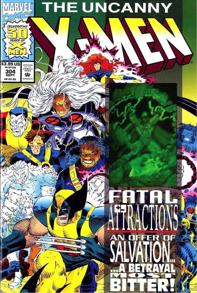
Then came the 3rd chapter of the Fatal Attractions storyline which was published in Uncanny X-Men #304. Not only did that particular comic book bring together many mutants and moved the storyline forward to a crucial stage (note: tension leading to it was built up in Uncanny X-Men #300, Uncanny X-Men #303 and also in X-Men Unlimited #1), it also served as the very celebration of the 30th anniversary of the X-Men (although it was not the storyline’s conclusion as the plot continued in X-Men #25, Wolverine #75 and Excalibur #71).
So did this particular, anniversary celebrating issue of the Uncanny X-Men succeed with its objectives? Has it aged well through the decades? We can all find out in this look back at Uncanny X-Men #304, published in 1993 by Marvel Comics with a story written by Scott Lobdell and drawn by John Romita, Jr., Jae Lee, Chris Sprouse, Brandon Peterson and Paul Smith.
Early story
The story begins with division among the Acolytes who learned that their lord Magneto actually survived (note: refer to 1991’s X-Men #3 by Chris Claremont and Jim Lee). They ganged up against their leader Fabian Cortez for betraying Magneto. After pushing his now rebellious team members away, Cortez reminds them that for several months already, they have been continuing Magneto’s work on behalf of mutantkind. Suddenly Exodus appears to them and describes himself as the voice of Magneto and will guide mutants to rise and mentions paradise for the faithful mutants. After subduing Cortez and tempering the tension among the Acolytes, Exodus tells them to prepare themselves for ascension. This frustrates Cortez who realizes that he no longer holds leadership.
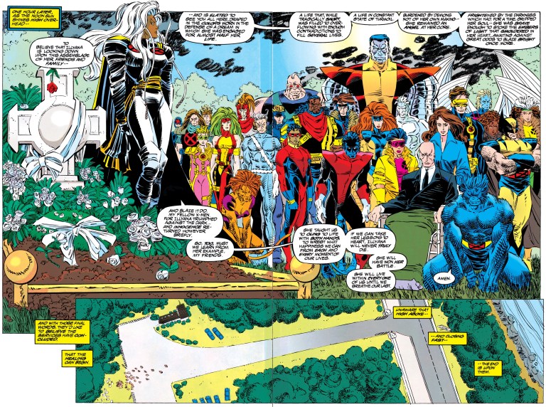
Over at the X-Men’s headquarters, Charlez Xavier is personally disturbed over the death of Illyana Rasputin, the sister of Colossus. He starts questioning himself as Illyana’s death under his watch makes his years-long mission (of convincing his fellow mutants to leave their old lives to take risks to fight for a world that fears and hates them) doubtful and tries to figure out how he could present himself in front of them. A holographic image of Lilandra appears to him.
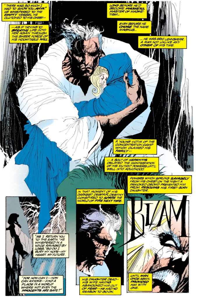
In outer space, inside the space station called Avalon, Magneto stares at planet Earth. With nobody around him, he speaks apologizing to his followers for he cannot save them all. He also mentions that he was wrong in previously believing that he could rescue each and every one of them from humanity as he recently realized that Earth, for the moment, is doomed.
After walking an unspecified distance inside Avalon, Magneto picks up his old helmet and wears it…
Quality
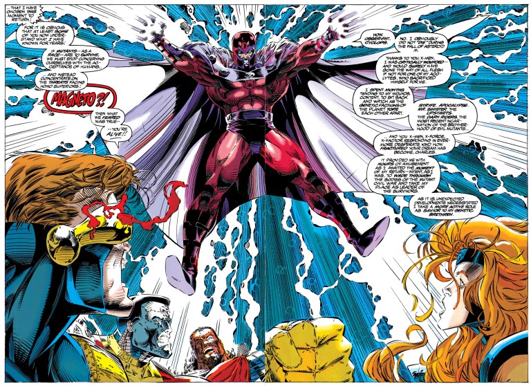
I will start with the visual aspect of this comic book. The artistic quality ranges from fine to weird which should not be surprising since this one involved five artists. The 4 pages drawn by Brandon Peterson (who was once a regular artist on Uncanny X-Men) made the X-Men, Magneto and the Acolytes look not only good but also intense. The Peterson art here is artistically similar to the respective styles of Marc Silvestri and Jim Lee of that particular time. Jae Lee’s art on the flashback of Magneto’s life (during the time of the Nazi occupation in Europe) is undoubtedly very stylized. While his art brings out the intensity of Magneto’s painful past, certain images can be a little challenging to understand especially to readers who focus strongly only following the plot and details. John Romita, Jr.’s art, for me personally, often looks rough and there were times I hardly recognized the characters. The other artworks by Paul Smith and Chris Sprouse have cartoonish aesthetics.
As for the plot, I can clearly see that a hard effort was made to compose a story that would push the Fatal Attractions storyline forward, establish a turning point and still become worthy of celebrating the 30th anniversary of the X-Men franchise. I can say that the storytelling is somewhat bloated. Early in the story, it was made clear that the respective sections showing Exodus with the Acolytes, Charles Xavier and Magneto pointed to an eventual confrontation that happened during the funeral of Illyana Rasputin.
As the build-up continued with the flashback of Magneto’s life, the fan service short scene of Kitty Pryde and the unfeeling Colossus (note: their romance was highlighted in Uncanny X-Men many years prior), and the talk scene between Bishop and Banshee, the pace of the story slowed down dramatically. By the time the attempt to move the narrative back to the core plot was made with the funeral scene (composed of the X-Men, X-Force and X-Factor), the pace was still really way down. By the time the conflict with Magneto, Exodus and the Acolytes stated, the pace recovery was incomplete and as such, seeing the scene unfold was very jarring (and not even the pages of Colossus’ frustration towards Professor X could solve the narrative pacing problem).
Unsurprisingly, the conflict was written to be overly dramatic complete with lengthy pieces of dialogue here and there. That being said, references to past comic books were established as Magneto once again emphasizes his beliefs about the human-mutant conflict using violence (while also side-stepping Jean Grey’s psionic powers to allow the Acolytes to come in undetected).
Human-mutant conflict aside, themes about faith, religion, idolatry salvation are clearly used. Magneto, who has a tremendous record of villainy and his previous leadership of the X-Men proved useless, was portrayed to be a walking wicked idol whose followers cannot do anything except idolize him and cause violence out of dedication to him. They really could not realize that idolatry is foolish and unholy which further adds to chaos on the world. As Magneto deceived himself to be the savior and lord of mutants, he further causes more pain and destruction to others around him. In short, Magneto will always be stuck with his wicked nature and clearly does not deserve heavenly authority no matter how hard he believes himself to be a savior.
The classic rivalry between Xavier and Magneto here was portrayed dramatically and yet I cannot help but think that their conflict was nothing more than a repeat of past encounters with the state and future of mutants at stake. To be fair, what happened here served as a logical build-up for the shocking encounter between Professor X and Magneto in X-Men #25.
Conclusion
To be clear, even though I am an avid X-Men fan, I find Uncanny X-Men #304 (1993) hard to be engaged with and hard to enjoy. Efforts to make it a worthy celebration of the X-Men are very clear but it’s just not entertaining nor compelling to read. As for the X-Men traitor scene, the revelation was not that shocking as the foreshadowing made it too obvious. At best, this comic book served as a warm-up for X-Men #25 which itself paid-off nicely. Being more than sixty pages long (including the advertisement and bulletins), this comic book has too much creative baggage which ultimately hampered its storytelling. It’s not terrible. It’s really not that great to read. What I experienced way back in 1993 with this comic book is just the same as I re-read it. It has not aged well.
If you are seriously planning to buy an existing hard copy of Uncanny X-Men #304 (1993), be aware that as of this writing, MileHighComics.com shows that the near-mint copy of the regular edition costs $20, while the near-mint copies of the signed-and-numbered edition and the newsstand edition cost $120 and $60 respectively.
Overall, Uncanny X-Men #304 (1993) is satisfactory.
+++++
Thank you for reading. If you find this article engaging, please click the like button below and also please consider sharing this article to others. If you are looking for a copywriter to create content for your special project or business, check out my services and my portfolio. Feel free to contact me as well. Also please feel free to visit my Facebook page Author Carlo Carrasco and follow me at HavenorFantasy@twitter.com