Disclaimer: This is my original work with details sourced from reading the comic book and doing personal research. Anyone who wants to use this article, in part or in whole, needs to secure first my permission and agree to cite me as the source and author. Let it be known that any unauthorized use of this article will constrain the author to pursue the remedies under R.A. No. 8293, the Revised Penal Code, and/or all applicable legal actions under the laws of the Philippines.
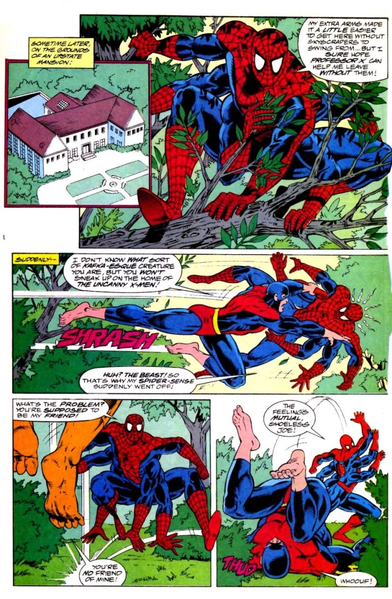
Believe it or not, there was a time when the iconic superhero Spider-Man had additional arms on both sides of his body which made him even more like a spider. Such a story was told in Amazing Spider-Man #100 and #101 published decades ago by Marvel Comics.
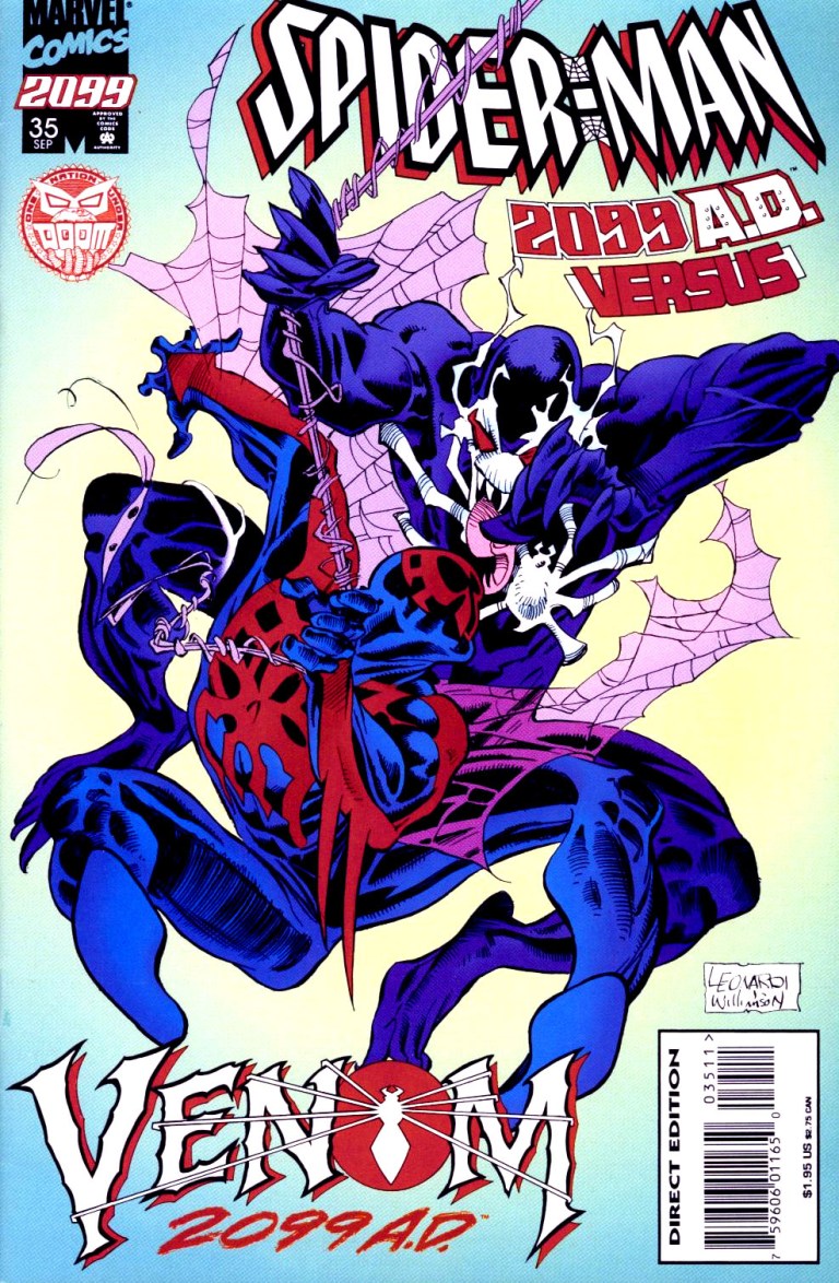
In 1992, Marvel Comics published What If #42 to revisit the old crazy story and tell an alternate reality of it. Take note that this comic book we’re about to examine together was released the same year Marvel celebrated the 30th anniversary of Spider-Man.

Here’s a look back at What If #42 written by Michael Gallagher and drawn by Kevin West. The hot question: What if Spider-Man had kept his six arms?
Early story
The comic book begins with the Watcher telling readers a recap of what happened to Spider-Man in Amazing Spider-Man #100 and #101. It is recalled that Peter Parker got fed up with being Spider-Man as it complicated his personal life with a bunch of problems. After he attempted to eliminate his super powers by creating and using a potion, Peter Parker suddenly grew four additional arms instead.
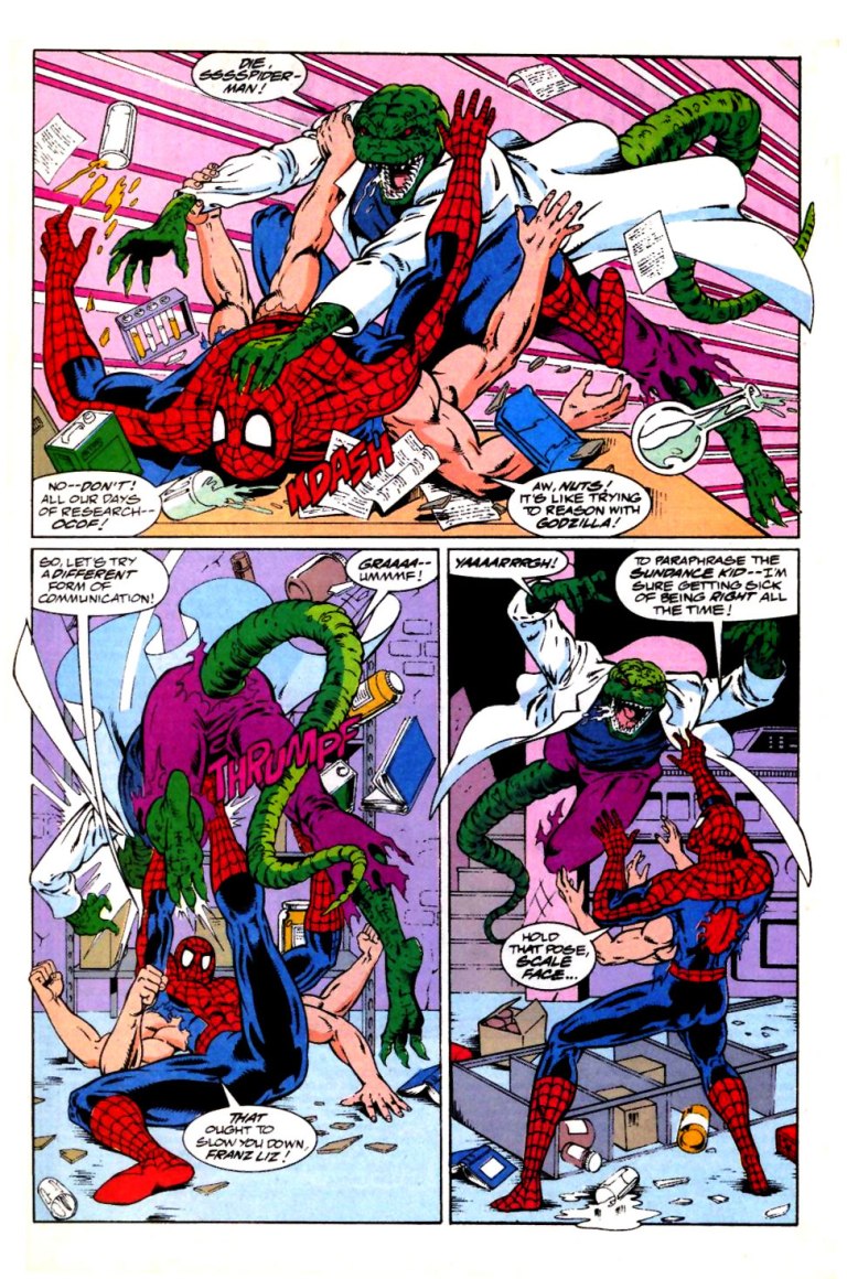
In reaction, Parker reached out to his friend Dr. Connors/Lizard (who was in Florida) who granted him access to his laboratory in Long Island. Tried as hard as he could, Parker could not come up with a solution.
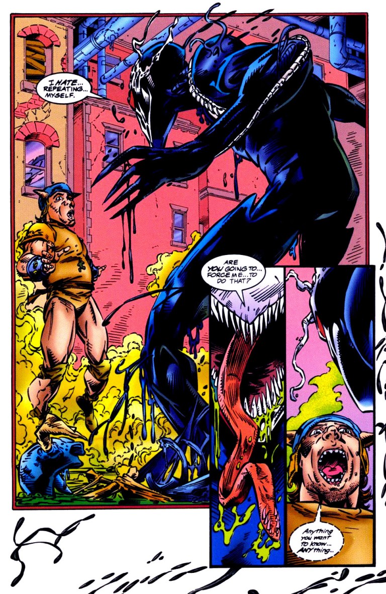
Meanwhile, many miles away, the vampire Morbius harms the crew of a ship on the sea before diving into the water. Morbius gets overwhelmed by multiple sharks and dies. His death, as it turns out, marked the end of the solution to Spider-Man’s extra arms problem. Morbius had an enzyme unique only to vampire body chemistry which would have cured Spider-Man’s condition.
This leaves Spider-Man with an even longer lasting problem leading to a new reality.
Quality
The story is well written and nicely paced. There is a nice balance between storytelling, characterization and action here. As far as the alternate reality of events go, What If #42 is a smash in the sense that it nicely explores what would happen not only to Peter Parker had he actually kept those extra arms of his, but also what would happen to the people around him as well as balance of superheroes in the state of New York. If you just imagine yourself as Peter Parker having four extra arms, try visualizing how your personal life got destroyed and your connections with people you care about getting strained or even cut off. Nobody in real life would want to end up living like a freak, and this concept is well emphasized with Spider-Man.
Character development on Spider-Man is well done. As you read his lines and thoughts, you will feel the pressure and hassle he is experiencing with the extra arms. You’ll wonder how his Aunt May would react not only to those new arms but also his prolonged absence. As Peter Parker becomes very determined to find a solution in the absence of Morbius, you’ll even relate with his struggle. On top of these, the dialogue was well written and there were even a few intriguing moments.
I also enjoyed the way the comic book creators emphasized the shared universe of Marvel Comics here. You will see the X-Men and Fantastic Four plus several more Marvel characters make appearances.
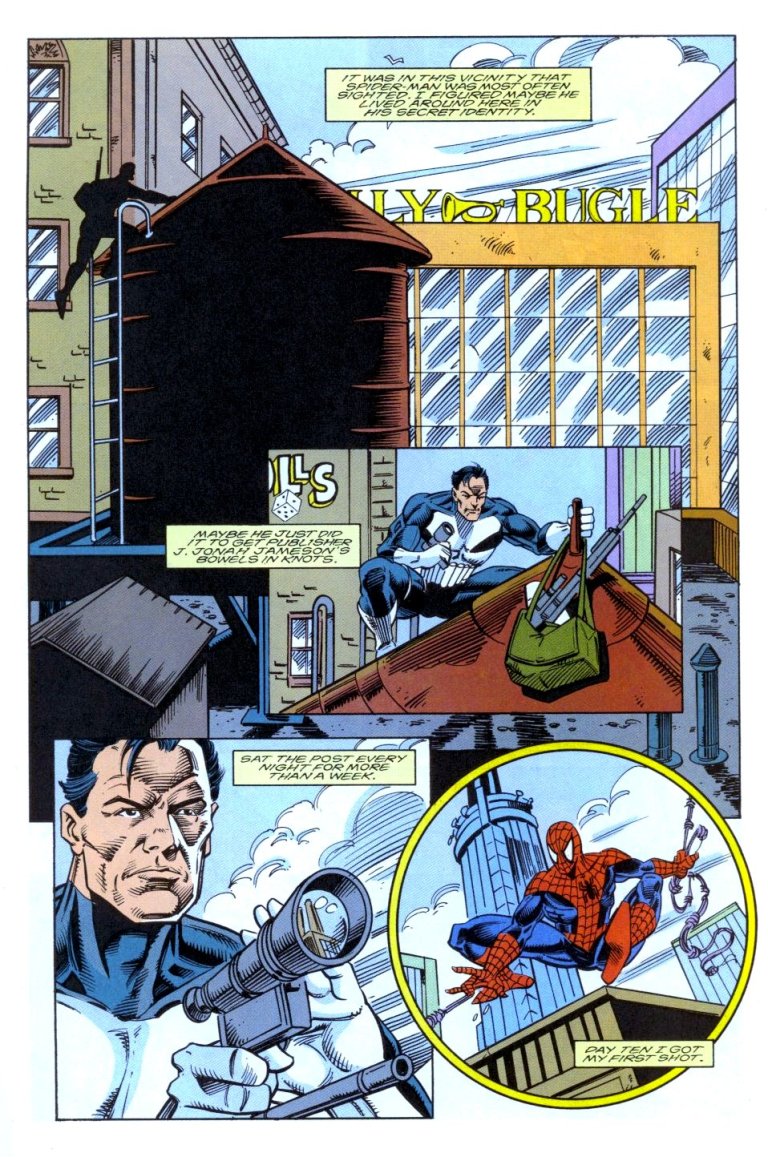
Along the way, there is a nice scene at the Daily Bugle (the newspaper where Peter Parker works as a photographer) showing how sinister and abusive J. Jonah Jameson really is as he remains obsessed with destroying Spider-Man by means of distorted presentation of news. In this age of fake news, sinister propaganda, distorted views and local community print media publications being operated by people who don’t really know journalism, the Daily Bugle scene is pretty relevant by today’s standards.
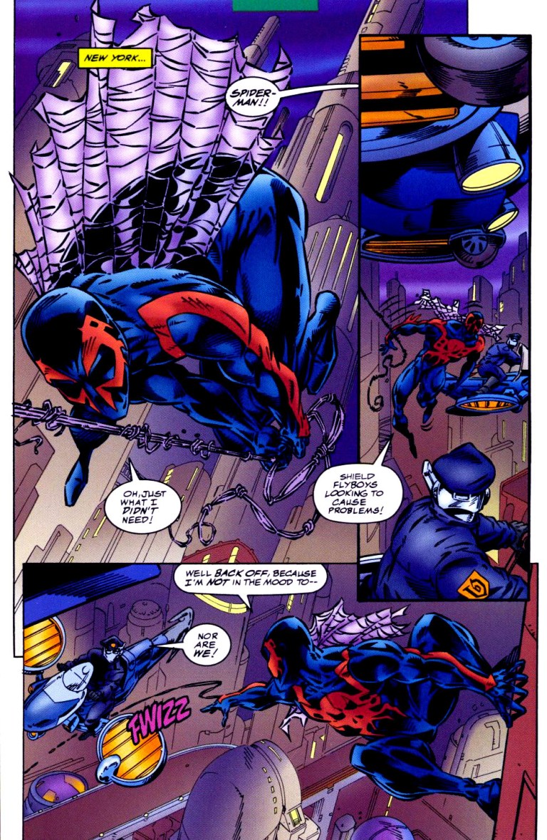
As such, Michael Gallagher’s script and story structure here are very strong. For the art, Kevin West did good work. Not only was I able to recognize the Spider-Man-related characters and other Marvel superheroes, West’s notably made the Lizard look visceral enough and the same can be said of his take on Venom. The comic book art had a nice flow as the story was told and West provided enough impact on the action scenes.
Conclusion
What If #42 is a pretty good comic book to read exploring how things would have been had Spider-Man kept those extra arms and really looked truly spider-like. Apart from the good quality of storytelling and visuals, the presence of other Marvel Comics universe characters further add some depth into the story as Peter Parker struggled to find a solution to his problem.
This is the kind of story that I don’t believe we will ever see happen on the big screen. It’s just too jarring and even shocking for Sony Pictures and Marvel Studios to actually show Tom Holland as Spider-Man with extra arms. Such a cinematic move will surely outrage fans and might even put a dent on the credibility and believability of the Marvel Cinematic Universe.
If you are seriously considering buying an existing hard copy of What If #42, be aware that as of this writing based on the ratings of MileHighComics.com, a near-mint copy of the regular edition is at $12 while the near-mint copy of the newsstand edition is priced at $39.
Overall, What If #42 is recommended.
Thank you for reading. If you find this article engaging, please click the like button below and also please consider sharing this article to others. If you are looking for a copywriter to create content for your special project or business, check out my services and my portfolio. Feel free to contact me as well. Also please feel free to visit my Facebook page Author Carlo Carrasco and follow me at HavenorFantasy@twitter.com