Welcome back readers, fellow geeks and electronic gaming fans!
In this edition of the Retro Gaming Ads Blast (RGAB) series, we will take a look at another batch of retro gaming print ads – including arcade flyers – from the 1980s to the 1990s.
For the newcomers reading this, Retro Gaming Ads Blast (RGAB) looks back at the many print ads of games (console, arcade, computer and handheld) that were published in comic books, magazines, flyers, posters and newspapers long before smartphones, social media, the worldwide web and streaming became popular. To put things in perspective, people back in the 1980s to the 1990s were more trusting of print media for information and images about electronic games and related products.
With those details laid down, here is the newest batch of retro gaming print ads for you to see and enjoy…
1. Starflight Sega Genesis Print Ad
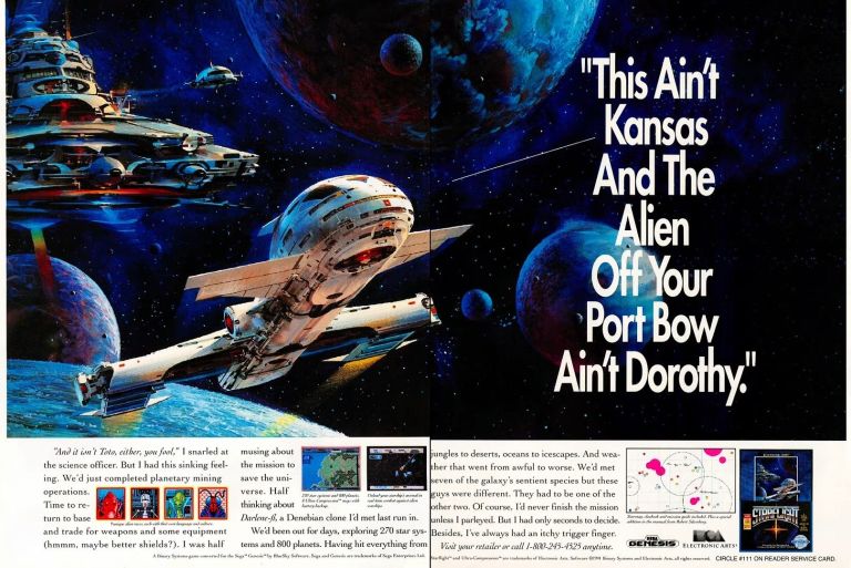
By the time it was released on the Sega Genesis in 1991, Starflight was already popular as it was released on varied computer systems and entertained a lot of gamers several years prior. To promote the Sega Genesis version, a 2-page print ad of Starflight was made with a grand-looking artwork of space, spaceships and planets dominating the space. The ad makers managed to utilize the remaining space below the artwork to show selected images, the descriptive text and the game’s box cover to make it clear to gamers that Starflight on Genesis is real and made to be playable. The artwork itself remains a powerful grabber of attention even to this day.
2. Defender Japanese Arcade Flyer
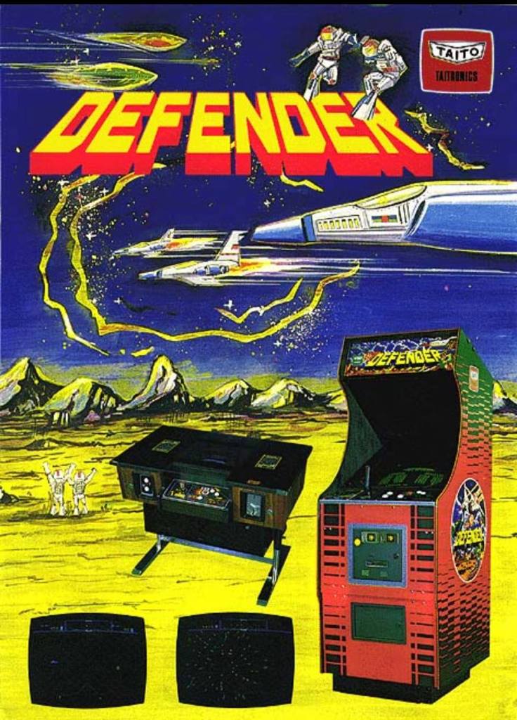
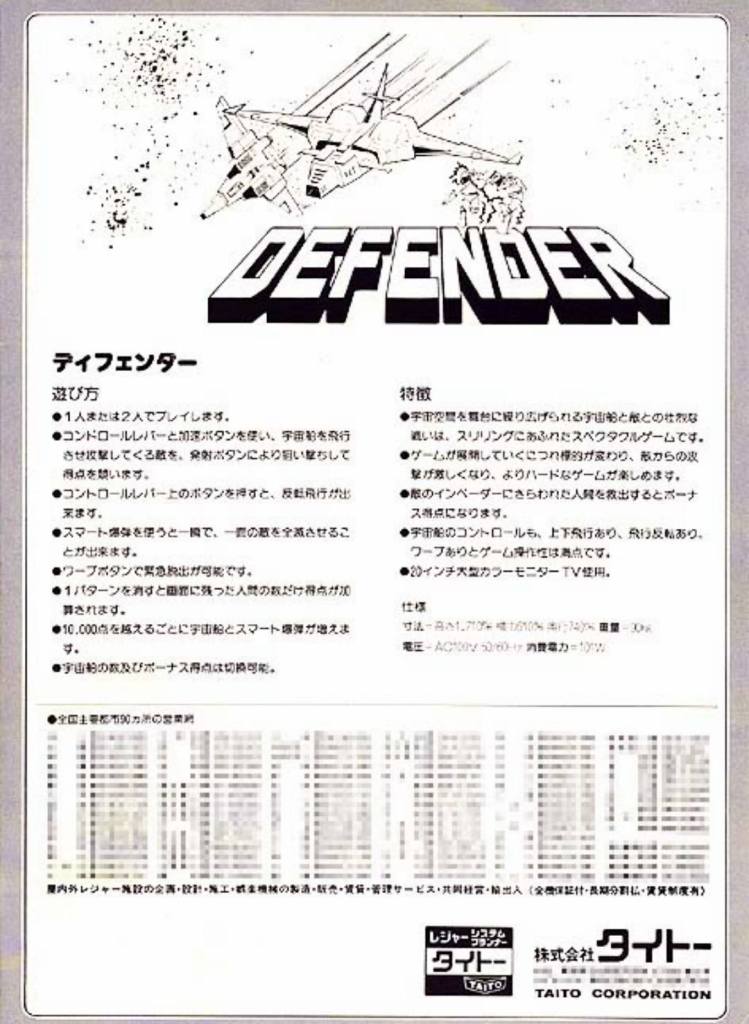
Defender is one of my favorites among the many games of Midway. In recent times, I’ve been playing the arcade version of Defender on my Xbox Series X using the Midway Arcade Origins digital copy I purchased online. As Defender became a massive hit in America, it was released in Japanese arcades with Taito handling the distribution. The arcade flyer Taito came up with used hand-drawn art for the background on the front along with pictures of the arcade cabinet and the arcade cocktail table versions of the game. While the rear of the flyer looks very simplistic, the front remains attractive to look at.
3. Castlevania III: Dracula’s Curse Print Ad
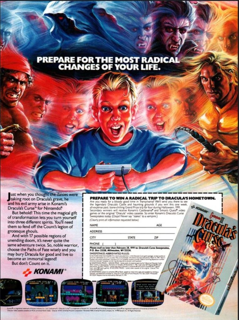
By the year 1990, the Nintendo Entertainment System (NES) was present in several millions of households all over America and there were lots of great games available. Among the NES gamers were fans of the Castlevania game series and Konami went on to release Castlevania III: Dracula’s Curse in America. As part of the company’s aggressive promotion, a single-page ad featuring a detailed looking artwork of a gamer getting immersed with the game’s fantasy elements (look at the creepy looking characters, monsters and the game’s hero present) was done. While the artwork was a strong attention grabber, what stood out was the sweepstakes form for gamers to cut out, fill it with their information and mail it for the chance to win a trip to the hometown of Dracula. Do you personally know anyone who won in the sweepstakes?
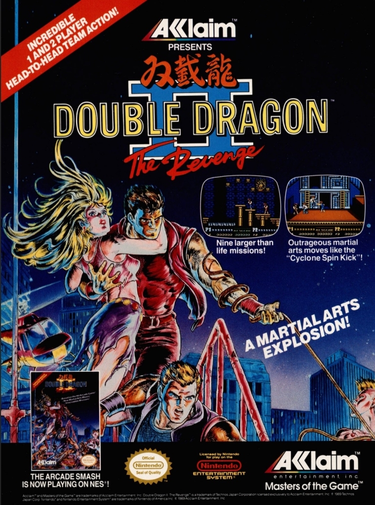
4. Double Dragon Games Print Ad
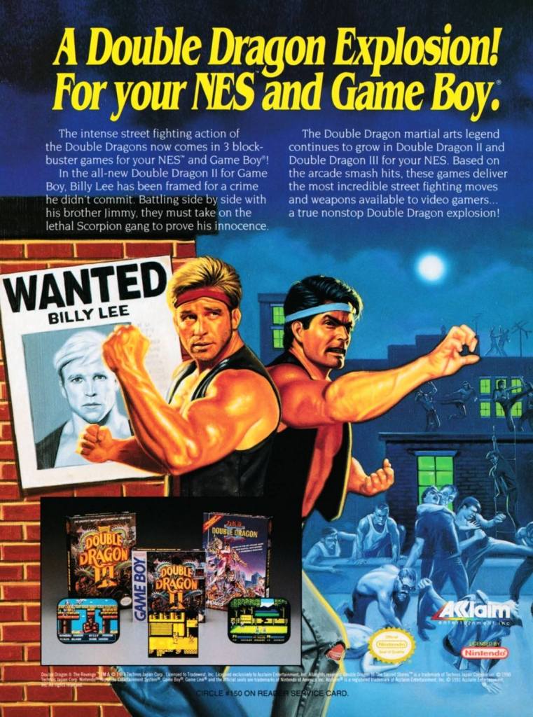
When it comes to the console and handheld presence of the Double Dragon games franchise, it was on Nintendo hardware – specifically the NES and the Game Boy – where gamers and the fans could find them. Acclaim Entertainment knew how popular Double Dragon games were with Nintendo gamers and they aggressively marketed Double Dragon III: The Sacred Stones and Double Dragon II with a single-page print ad that had great looking painted artwork. Very clearly, this early 1990s ad was made to connect strongly with Double Dragon fans and its presentation still looks very solid even with today’s standards.
5. Konami 3-in-1 Game Boy Games Print Ad
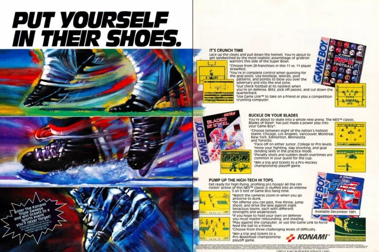
From the mid-1980s to the early 1990s, Konami published a lot of games on Nintendo’s wildly popular platform the NES and among them were classics like Contra, Castlevania and Metal Gear. Konami’s support also made it to Nintendo’s Game Boy handheld device (first released in 1989) which itself sold strongly and became the leading platform for portable gaming. As such, Konami made a 2-page print ad promoting NFL Football, Blades of Steel and Double Dribble: 5 on 5 for Game Boy. Cleverly, the ad makers used fancy artworks on the left (reflecting the different sports) side while using the space on the right side for descriptive text, screenshots and game box covers. This fine looking ad has a strong appeal towards Game Boy users and sports enthusiasts.
6. Tengen 6-in-1 Print Ad
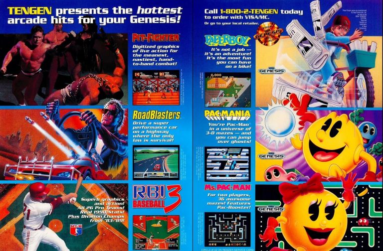
Back in the 1980s, Atari formed the company Tengen to not only develop games but also publish game for computers and game consoles. During that decade, Tengen published games on the NES but they had trouble working within the strict licensing terms of Nintendo. The two companies would later get into court battles over a series of events within the gaming business. Eventually, Tengen started doing business with Sega and published games on the Genesis console. As part of their aggressive publishing of games on Sega’s console, Tengen came up with this 2-page print ad promoting six different games emphasizing that the fun arcade experiences are coming to gamers’ homes.
7. Dig Dug Print Ad

When Atari opened its branch in Japan – called Atari Japan – in the 1970s, they established a partnership with Namco to distribute arcade games there. As they experienced trouble penetrating the Japanese market, Atari eventually sold Atari Japan to Namco which paved the way for their Japanese partner to get into video games. Just a few years later, Namco developed its own original arcade game Dig Dug which became a massive hit in Japan. As a licensing deal was already in effect, Atari distributed Dig Dug in American arcades which the above magazine print ad clearly shows.
8. Sega Genesis Over SNES Print Ad

By the time Nintendo released the Super Nintendo Entertainment System (SNES) in 1991, the Sega Genesis console has been in the video game market for a few years already. In America, Tom Kalinske led Sega and his approach to marketing and resonating with gamers was essentially aggressive. The aggressive approach includes naming their competition and showing why Sega is superior. Given the lead time they had on the North American market, Sega came up with this print ad showing their Genesis consoles having a lot more games than the SNES. Competitive console gaming was very different back then.
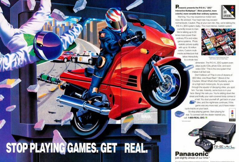
9. Atari Jaguar Print Ad
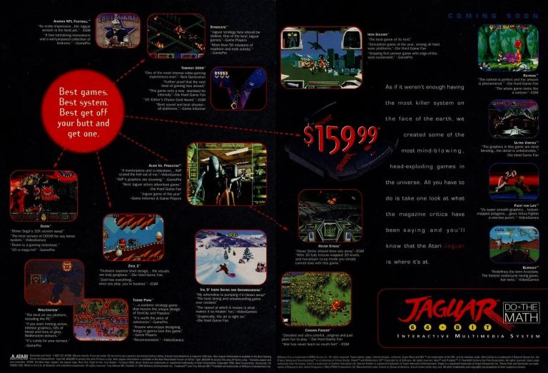
In the 1990s, Atari attempted a comeback in console gaming with the Atari Jaguar console. Early on, their marketing emphasized the so-called 64-bit capabilities of the Jaguar to convince gamers theirs is the most powerful console on the market. Sadly, the console failed to achieve strong sales and a huge price cut was executed. To attract customers, Atari came up with this 2-page print ad to inform them of the cheaper $159.99 price while reminding them of the “most mind-blowing, head-exploding games” they can have with the Jaguar. Obviously this ad campaign failed as the Atari Jaguar never achieved commercial success.
10. Side Pocket Print Ad
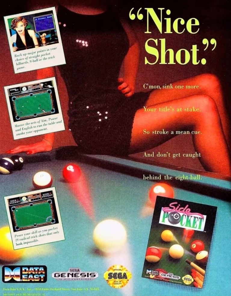
After its original release in the arcades in 1986, Side Pocket was ported by Data East to many consoles and handheld devices in the 1990s. When it comes to promoting the Sega Genesis version, Data East came up with this print ad showing a lady in a sexy dress in the background (head hidden) which instantly created a sexy aesthetic. The large text displayed emphasized the game of billiards supported by the screenshots shown. The screenshot at the upper-left corner shows artwork of a pretty lady smiling at the viewer which added to the sexy aesthetic of the ad.
+++++
Thank you for reading. If you find this article engaging, please click the like button below, share this article to others and also please consider making a donation to support my publishing. If you are looking for a copywriter to create content for your special project or business, check out my services and my portfolio. Feel free to contact me with a private message. Also please feel free to visit my Facebook page Author Carlo Carrasco and follow me on Twitter at @HavenorFantasy as well as on Tumblr at https://carlocarrasco.tumblr.com/ and on Instagram at https://www.instagram.com/authorcarlocarrasco