Burgers have long been popular here in the Philippines and they can be bought from several makers like the fast food joints which are quite numerous.
At the expanded area of Festival Mall, Filinvest City, Alabang, Muntinlupa City, Union Jack Tavern has been selling and serving burgers to customers. Just open the menu when you visit them and then you will find the UJT Burger.
The UJT Burger served to me in open sandwich fashion.
Sold for less than P300 as of this writing, the UJT Burger comes with a large plate filled with fries (which are thicker and less greasy compared to the fries sold by others) and the open sandwich with one half of the bun with the vegetables on top and the other half with the onions and beef covered with melted cheese.
In my recent stop at Union Jack Tavern, I had the UJT Burger and I started first with the fries which are quite filling and I like the fact that they are not too greasy to handle.
With the burger itself, considering the size, I took me a little effort to put the two buns (with their respective toppings) on top of each other to form the burger.
Then I took a bite on what parts are suitable for biting because this one is not the usual burger. The burger patty itself is quite thick and certainly not flat. After biting down the bread with the vegetables, I finally got to bite the cheese-covered burger patty. The result? The burger patty was quite tasty on its own and definitely worth going for. Then there is also that nice taste when biting the bread, the burger patty, the cheese and the vegetables altogether.
The UJT Burger in its full form.
It may not be too visible for those who like burgers but failed to check Union Jack Tavern’s menu, but there is no doubt that the UJT Burger is a delicious and filling burger meal just waiting to be discovered.
The UJT Burger is highly recommended and I encourage you visit Union Jack Tavern at Festival Mall.
Thank you for reading. If you find this article engaging, please click the like button below and also please consider sharing this article to others. Also my fantasy book The World of Havenoris still available in paperback and e-book format. If you are looking for a copywriter to create content for your special project or business, check out my services and my portfolio. Feel free to contact me as well. Also please feel free to visit my Facebook page Author Carlo Carrasco and follow me at HavenorFantasy@twitter.com
Every great movie franchise starts small and as the decades pass by, its place in history will be marked and revisited.
This is my review of the first-ever James Bond movie Dr. No.
Ursula Andress and Sean Connery as Honey Ryder and James Bond respectively.
Released in 1962 based on the sixth novel written by James Bond creator Ian Fleming, Dr. No brought Agent 007 to the big screen worldwide and its success led to a series of big moneymaking sequels, merchandise, novels, comic books, video games and other forms of contributions to pop culture. This movie also marked the beginning of Sean Connery’s journey towards becoming a cinematic icon as, arguably, the best cinematic James Bond ever.
The movie begins when British agents in Jamaica get killed off by henchmen who eventually retrieved highly confidential files. In England, the secret service sends Agent 007 to Jamaica to do detective work and he gets armed with a Walter PPK. Once in Jamaica, Bond starts talking to people, gathering clues and traveled to different places to find out who is responsible for killing his fellow British intelligence operatives. If you want to know more, you just have to watch the movie.
If you are a newcomer to the James Bond franchise or if you never saw this movie before, then you have to keep in mind that this very old movie is NOT an action film but rather it is a detective story laced with suspense and some action that follows James Bond performing his mission for Queen and Country.
Chances are, you must have seen many other James Bond movies that are heavy on action, stunts and explosions. As it was the first of the film franchise, Dr. No is nothing like those other movies of Agent 007.
Being a detective story, Dr. No is character-driven and laced with mystery and suspense. To describe it without spoiling the story, the narrative shows Bond searching for answers and as the suspense builds up, something or someone gets revealed which adds to the deepening of the plot. There is some action, stunts and explosions to spice up the movie which were pretty enjoyable for the early 1960s. However the car chase is very outdated and never believable. Naturally, the spectacle is tame by today’s standards but still, this movie is not boring at all for me.
The movie is nicely paced and makes clear what is going on. There is sufficient build-up leading to the next revelation or the next part of the chain of mystery or the next twist. By the time James Bond encounters Dr. No himself well after the 60-minute mark into the movie, I became oriented with both characters as their conflict finally starts. This will work for you if you take time with the movie’s pace and pay close attention to details.
Sean Connery as Agent 007 is charming, cool and cruel. The filmmakers and Ian Fleming himself really oriented the actor on how to portray the literary Bond in cinematic form. Connery’s Bond is charming and the filmmakers make it very believable on-screen that ladies would fall for his charm which in turn would give him the opportunity to advance in his pursuit of accomplishing his goals in the line of duty.
Ursula Andress, who had to be dubbed in post-production due to her accent, caught the world’s attention wearing the bikini on the big screen (in color, no less) as Honey Ryder who came out from the water with her equipment and sea shells. This was a daring scene to show back in the early 1960s. Of course, Honey is not just a pretty face but also a brave lady with a history of adventure and exploring. This makes her believable as a Bond girl who has what it takes to keep up with Agent 007 in the story, even going face to face with Dr. No.
Joseph Wiseman as Dr. No.
Joseph Wiseman‘s performance as Dr. No is subtle and yet he remains creepy as a cinematic villain. When compared to other villains in the James Bond film franchise, he does not do much action but his portrayal as a very powerful sinister human being who controls a loyal group of personnel still makes him a competent franchise villain in by today’s standards. Having seen all the James Bond movies, I find Wiseman’s Dr. No a more engaging villain compared to Col. Moon (the dreadful Die Another Day), Hugo Drax (Moonraker), Kamal Khan (Octopussy), Alec Trevelyan (GoldenEye) and the 21st century Ernst Blofeld (Spectre) to name some.
In terms of production values, Dr. No is a mixed bag. There are some props that looked fake and cheap. The rear projection in the car chase is so fake looking. Ironically, the film shines with the sets designed by Ken Adams. The big room visited by Professor Dent to communicate with Dr. No, the hotel-like lair of the villain (where Honey and Bond are treated like special guests) and the elaborate room of the table meeting with Dr. No all are visually striking.
When it comes to presentation, Dr. No marked the beginning of many things that would later become cinematic traditions – the gun barrel opening, “Bond, James Bond”, the James Bond theme music, the mission meeting between Bond and M. (plus the nice chat between Bond and Moneypenny), the appearance of Felix Leiter during the mission etc.
The screenplay written by Richard Maibaum, Johanna Harwood and Berkley Mather has quality in it not just with the narrative but also with the dialogue.
I love this exchange of words between Bond and Dr. No.
Dr. No: I’m a member of SPECTRE.
James Bond: SPECTRE?
Dr. No: SPECTRE – Special Executive for Counter Intelligence, Terrorism, Revenge, Extortion. The four great cornerstones of power headed by the greatest brains in the world.
James Bond: Correction – criminal brains.
And there was also this exchange.
Dr. No: The Americans are fools. I offered my services; they refused. So did the East. Now they can both pay for their mistake.
James Bond: World domination. The same old dream. Our asylums are full of people who think they’re Naploeon. Or God.
Overall, Dr. No is a classic movie and it is the kind of film that filmmakers today don’t make anymore because they know people won’t be satisfied without excessive action and spectacle. It is a James Bond flick in the form of a detective story which has a good amount of mystery, suspense and some action.
For sure, people who have gotten used to action-heavy James Bond movies won’t feel engaged with Dr. No. The best way to enjoy this film is to treat it the way it is meant to be – a piece of cinematic history that built the James Bond film franchise in the very first place.
Thank you for reading. If you find this article engaging, please click the like button below and also please consider sharing this article to others. Also my fantasy book The World of Havenoris still available in paperback and e-book format. If you are looking for a copywriter to create content for your special project or business, check out my services and my portfolio. Feel free to contact me as well. Also please feel free to visit my Facebook page Author Carlo Carrasco and follow me at HavenorFantasy@twitter.com
Disclaimer: This is my original work with details sourced from reading the comic book and doing personal research. Anyone who wants to use this article, in part or in whole, needs to secure first my permission and agree to cite me as the source and author. Let it be known that any unauthorized use of this article will constrain the author to pursue the remedies under R.A. No. 8293, the Revised Penal Code, and/or all applicable legal actions under the laws of the Philippines.
When it comes to the Ultraverse, there is often something enjoyable to read. I enjoy reading about superhero teams, specifically X-Men from Marvel Comics and Justice League from DC Comics to name a few. I also enjoyed Freex and UltraForce from the Ultraverse. What I like about superhero teams is that I get to discover varied characters (the good, the evil and the ones in between), witness how they develop and act when something big or problematic happens.
With The Strangers #1, published by Malibu Comics in 1993 as one of the launch books of the Ultraverse, I experienced another bout of enjoyment and engagement but in a rather unique way.
Cover of The Strangers #1 with art by Rick Hoberg.
Written by Steven Englehart with illustration done by Rick Hoberg (whose work was inked by Tom Burgard), the story begins with a shot of life going on in San Francisco. Several characters riding a jammed cable car get distracted when a man and a pretty lady (both seated) do the “wild thang”.
Because of the disturbance, three guys grab the arrogant guy (separating him from the lady) threw him out of the cable car. Immediately after that, the cable car suddenly gets hit by a bolt of energy (perceived as lightning) from the clear sky causing the vehicle to start slipping downwards until it hits a car and its passenger.
Bob and Hugh start to notice something strange.
Then a series of things begin to happen. Candy (the lady earlier) acted strangely as the arrogant guy called her attention. Art students Bob and Hugh witnessed the sudden formation of a bag of apples. The kid Leon discovers his new ability to run fast and make sudden turns. Dave witnesses a momentary transformation of himself. Fashion designer Elena gets inspired to create something heroic.
Leon’s ultra speed realized while Candy walks pretty.
You must be wondering – how is the quality of this old comic book?
In terms of storytelling and characterization, this is pretty good work done by Steve Englehart. The way I see it, this is a story about strangers (truly living up to the title) who got changed as a result of a single incident that affected them. Each of the members of The Strangers were nicely and efficiently introduced. A creative approach was used to present their respective abilities which made sense as the events unfolded. By the end of the comic book, I really felt very engaged and excited to anticipate the next issue.
When it comes to dialogue, I like this exchange between Bob and Hugh.
“You know what I think?”
“No, what do you think?”
“I think it must have something to do with the lightning that hit us!”
“Nonsense! Lightning does not work like that!”
“You got a better idea?”
As for the visuals, Rick Hoberg’s art (inked by Burgard) combined with the color design by Paul Mounts is still very wonderful to look at. The facial expressions are convincing, the action has impact, the visualization of the super powers is pretty creative and there are lots of small details on the backgrounds (people, city environment, etc.) that are worth examining.
Overall, The Strangers #1 is a fun and engaging old comic book to read. Never mind the financial value it carries right now. Focus more on its story and art, as well as the other details that reflect the talents of its creators. More importantly, the experiences of discovering something fresh and getting to know brand new characters really defined this comic book.
The Strangers #1 is highly recommended.
Thank you for reading. If you find this article engaging, please click the like button below and also please consider sharing this article to others. Also my fantasy book The World of Havenoris still available in paperback and e-book format. If you are looking for a copywriter to create content for your special project or business, check out my services and my portfolio. Feel free to contact me as well. Also please feel free to visit my Facebook page Author Carlo Carrasco and follow me at HavenorFantasy@twitter.com
1993 was a special year for X-Men fans. It was the year Marvel Comics celebrated what was back then the 30th anniversary of the X-Men which explains why they released not only a lot of X-Men-related comic books but also issues with hologram cards on the covers of specific issues of X-Force, X-Factor, X-Men, Uncanny X-Men and Excalibur. While superhero movies were not that many at the time, fans had the X-Men animated series to enjoy on TV.
Along the way, the comic book speculator boom continued and Marvel Comics exploited the trend as its creators worked to expand what was back then their still-young 2099 lineup of comic books. This led to the release of X-Men 2099 #1 in the 2nd half of 1993, the comic book of which I bought on a weekday during a short visit to the comic book store in BF Homes, Parañaque.
Cover of X-Men 2099 #1.
Before exploring a bit of the story, let me share that in my personal analysis, releasing X-Men 2099 #1 the same year as the 30th anniversary celebration of X-Men made sense even though the contemporary X comic books made no real story reference to the mutants of 2099. Back in 1993, an undisclosed amount of money was spent to promote, distribute and sell comics and merchandise in relation to the anniversary celebration. I’m confident someone behind the scenes at Marvel thought it was a smart idea to debut the X-Men 2099 series at a time when the X-Men brand was very strong among collectors.
Now on to the comic book.
Written by John Francis Moore and drawn by Ron Lim (with ink work by Adam Kubert), X-Men 2099 #1 opens with Timothy Fitzgerald/Skullfire alone and uncertain visiting a large, abandoned facility in the Nevada desert called Nuevo Sol. He stands in front of a large gate with an X marking. After a bumpy introduction with Junkpile, Tim enters and, to his surprise, there he finds a large gathering of people partying despite the deteriorating conditions of the place. He meets Tina/Serpentina who tells him that he is welcome and their gathering attracted mutants, and “nomads and fringers.”
“In Nuevo Sol, you’re not just some corporate bar code, sorted and filed like a product. Here, everyone has a name. Everyone’s equal–no matter where they’ve come from,” Tina tells him.
As Tim discovers Metalhead, so do the readers.
After the subsequent for-the-readers introductions of Eddie/Metalhead and Shakti/Cerebra, the narrative moves to Las Vegas where a horse-riding Noah Synge (an old man who “ruthlessly controls the greater Nevada syndicate”) gets confronted by Xi’an/Desert Ghost who tells him that his men (of Synge) continue to kidnap members of the nomad tribes for his decadent amusements. In other words, it’s an accusation about human trafficking.
After a harsh exchange of words, Xi’an shows to him his left, creepy looking fist telling him that the red market will fall, that the Synge empire will crumble and that if Synge seeks to hurt the affected people, he (Xi’an) will make him suffer.
Xi’an touches a short stone wall with his left hand which makes it crumble within seconds (as he walks away). This is all I have to share about the plot and if you want to know more, you better get and read this comic book.
So you must be wondering what I think about the quality of this 1993 comic book. When it comes to storytelling, it is well written, entertaining and engaging. John Francis Moore’s script really is good even by today’s standards. Moore managed to carefully introduce not only the X-Men of 2099 but also the supporting characters and the bad guys properly all within 23 story-and-art pages which is a very hard thing to achieve. While the writing was challenging, Moore managed to us symbolism to show “good versus evil”, especially with the conflict between Xi’an (representing the oppressed and the powerless) and Noah Synge (who, by today’s standards, is a caricature of the cruel and rich person).
Tim meanwhile symbolizes the reader’s perception. As he discovers Nuevo Sol, readers feel and see what he perceives. His discovery of the place, the culture and people serves as the eyes of us readers.
When it comes to the art work, this one shows that Ron Lim exerted a lot of effort to give the X-Men of 2099 a unique look of their own without taking any visual inspiration from the contemporary, mainstream X-Men of the 1990s. While it is easy to criticize Lim for the quality of art, we must remember that he worked on a whole lot of other comic book for Marvel back in 1993. During that year, he illustrated The Infinity Crusade which featured a whole bunch of Marvel’s superheroes and many other characters in each comic book. Could you imagine the headaches and stress an illustrator has to go through drawing so many characters in a comic book limited series?
Ron Lim also helped visualize what Nevada looks like in 2099 which is a nice change from the super futuristic, towers-filled New York City. In terms of society, the X-Men 2099 series further showed that America’s wilderness or the abandoned places are filled with outlaws and living there can be even more dangerous for people to do when compared with living in New York under the watch of Alchemax.
This old comic book, which has a solid cover with foil and a price of $1.75, also has a 15-page Marvel 2099 promo which includes a 2-page X-Men 2099 “coming at you” portrait by Lim. The promo includes short previews of the other 2099 feature characters and it also serves as a reminder that X-Men 2099 is part of the same universe with them.
Overall, I declare X-Men 2099 #1 is still a good, old comic book worthy of being added to your collection. Its financial value is not that high right now and the X-Men 2099 themselves pale in comparison to Spider-Man 2099 (easily the most popular 2099 feature character of them all) when it comes to today’s comic book environment.
What you have to keep in mind, however, is that X-Men 2099 #1 just might gain a boost in its financial value if ever the mutants of the future make a big comeback as part of Marvel’s official announcement that it will revive the 2099 line of comic books this November! Granted, X-Men of 2099 had appeared in X-Men comic books in the past few years but the revival of the 2099 line will be a more suitable place for readers to discover them in this age of social media and smartphones.
The X-Men of 2099.
Financial value aside, X-Men 2099 #1 is engaging and entertaining, and it has that 1990s charm to it.
X-Men 2099 #1 is highly recommended.
Thank you for reading. If you find this article engaging, please click the like button below and also please consider sharing this article to others. Also my fantasy book The World of Havenoris still available in paperback and e-book format. If you are looking for a copywriter to create content for your special project or business, check out my services and my portfolio. Feel free to contact me as well. Also please feel free to visit my Facebook page Author Carlo Carrasco and follow me at HavenorFantasy@twitter.com
Back in the 1990s, there was a flood of superhero comic books that introduced brand new heroes, teams and even anti-heroes. A strong contributor to this was the market presence of Image Comics, Valiant Comics, Malibu Comics and other smaller publishers that tried their best to gain shares in what was back then the highly lucrative superhero comic book market which was long dominated by Marvel Comics and DC Comics.
With Malibu Comics, their Ultraverse franchise of superhero comics was a blast and I had a lot of fun reading comic books of The Strangers, Prime, Hardcase, UltraForce, Mantra, etc.
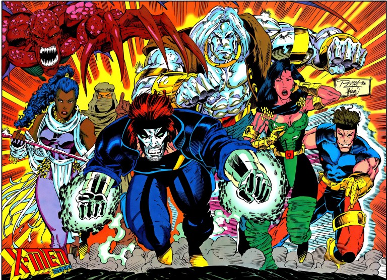
For this review, here is my look back at the Ultraverse team comic book The Solution #1 (September 1993).
The front cover.
Written by the late James Hudnall and drawn by Darick Robertson (inked by John Lowe), the story begins when Russian personnel get killed by a team of deadly people whose purpose is to raid the nuclear storage buildings.
As a result, several nuclear warheads were taken away without a trace. A KGB agent discusses the tragedy with an Aladdin agent and seeks help. In response, the Aladdin agent recommends to him The Solution.
“We’d like to (help) but our agency can’t give you any direct assistance. You know how it is. However these people might be what you need. Just remember…I never told you about them,” the Aladdin agent said.
Meet The Solution.
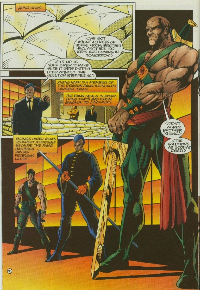
In Hong Kong, a member of the triad instructs his hired assassins to distribute a shipment of illegal substances without getting any interference from The Solution. Predictably, the said team happens to be with them in their secret venue which starts a wave of martial arts, shooting and use of magic.
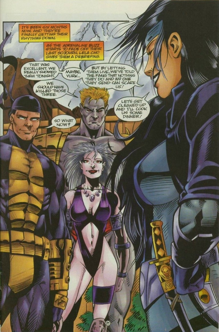
Enough with the plot. The Solution is a team of super-human mercenaries composed of Lela Cho/Tech (the leader), Eara/Shadowmage, Vurk/Outrage and Dropkick. Quite literally, whenever a major problem happens someone will call The Solution (the answer) to solve it for a fee.
In terms of character design, The Solution has a rather visceral look which was clearly emphasized on the cover art. Outrage, for example, looks very monstrous and one could easily mistake him for an evil figure.
Obvious antagonists.
Illustrator Darick Robertson’s art is nice to look at and when the action happens, he sure delivers the goods making the hard action moves look intense. Even showing characters firing their guns look intense. The violence in this comic book is quite bloody and the opening scenes really show that.
Even with the non-action, talking scenes, Robertson’s art makes the members of The Solution look believably human. Facial expressions are good and they quite match the dialogue written. The team shot on page 21, which shows Lela Cho in the foreground talking to her teammates in the background, really looks nice.
In terms of writing, I found this comic book to be a bit bloated in terms of details and plot. Most notably, the pace of the story moves very fast and while it does its job establishing The Solution (and part of its purpose as a team-for-hire), the circumstances and the team’s place within the Ultraverse, the story felt really crammed even though there were 28 pages of story and art. I noticed that while the comic book is about The Solution, it ended up showing a total of three different teams (including the hired assassins).
In terms of character development, there was clear focus on Lela Cho which is not a surprise since she is the team leader. It turns out Lela has lots of vested interests in the corporate world and instead of being in a fancy office, she goes out in the field to get things done. She has a very direct, personal access to information online by means of wetware embedded in her skull. She also has a touch of business in her approach with leading The Solution.
“Our potential client has a problem with some Ultras. They want us to take care of it,” Lela Cho said on page 23.
You got a problem? Call The Solution!
While it may not look as prominent as The Strangers or UltraForce as far as Ultraverse superhero teams go, The Solution stands out nicely for it is unique and its team-for-hire concept is very interesting. When I first read this comic book long ago, I was convinced to pursue the succeeding issues. Even by today’s standards, this old comic book remains fun and engaging.
The Solution #1 is recommended.
Thank you for reading. If you find this article engaging, please click the like button below and also please consider sharing this article to others. Also my fantasy book The World of Havenoris still available in paperback and e-book format. If you are looking for a copywriter to create content for your special project or business, check out my services and my portfolio. Feel free to contact me as well. Also please feel free to visit my Facebook page Author Carlo Carrascoand follow me at HavenorFantasy@twitter.com
If there is anything I like most about Marvel Comics’ True Believers line of comic books, it’s that I get to read reprints of past stories without having to pay a whole lot of money to buy the original comic books or those pricey paperbacks.
A few years ago, out of curiosity, I bought a copy of True Believers which reprinted the first appearance of Deadpool in New Mutants #98.
This time around I got to check on the first-ever encounter between Spider-Man and the vicious supervillain Carnage with True Believers: Absolute Carnage – Carnage #1 which is currently available for for only $1.
The cover.Hard-hitting action in the first encounter between Spidey and Carnage.
The comic book is a reprint of Amazing Spider-Man #361 which was released in 1992 just months before Marvel’s official celebration of the 30th anniversary of Spider-Man happened.
The story begins when Carnage causes trouble at the Agro-Lab Empire State University. He messes with a man named Chip (who claims to have done nothing wrong), cause property damage using his symbiote and eventually kills. This opening scene clearly shows that Carnage is a more troubling than Venom (who in turn was being turned into an anti-hero figure by Marvel’s creators).
Peter Parker/Spider-Man meanwhile spends quality time at home with his Aunt May. Unsurprisingly, a telephone call interrupts his private life causing him to go to the university to determine, secretly in costume, what happened. Peter personally knows Chip and the guy’s death only adds to his concern about the rise of brutal murders.
“Chip’s dead. And I’m worried that these serial killings may partly be my fault,” Peter told Mary Jane.
Using his access as a freelance photographer, Peter conducts computer research at the office of the Daily Bugle and discovers Cletus Kasady’s prison profile. Knowing that Kasady (Carnage) was a cellmate of Eddie Brock/Venom, he digs deeper and goes around the city to investigate. This sets up his first encounter with Carnage. What exactly happened between them? You just have to read to find out.
Tension builds up as Peter Parker researches Cletus Kasady.
Even by today’s standards, the story remains gripping, intriguing and entertaining at the same time. David Michelinie really knows how to balance spectacle, exposition and suspense with the Spidey-Carnage conflict as the highlight. Michelinie also showed Kasady’s insanity clearly and, even by his look, the villain is clearly a creative rip-off of DC Comics’ insane villain The Joker. Artist Mark Bagley’s art is still good to look at and he managed to pull off the daunting task of visualizing the present along with drawing images from Spidey’s past with original symbiote and Venom. The action scenes still have good visual impact.
Overall, if you are even a bit interested in Spider-Man, Carnage and 1990s comic book culture, then True Believers: Absolute Carnage – Carnage #1 is recommended. For only $1, this is one engaging and entertaining comic book to read.
Take note that there is a chance that Carnage will become the next popular supervillain in the movies once the character appears fully in the sequel to 2018’s Venom movie. Remember the mid-credits scene in Venom? Carnage could literally rise in pop culture.
Thank you for reading. If you find this article engaging, please click the like button below and also please consider sharing this article to others. Also my fantasy book The World of Havenoris still available in paperback and e-book format. If you are looking for a copywriter to create content for your special project or business, check out my services and my portfolio. Feel free to contact me as well. Also please feel free to visit my Facebook page Author Carlo Carrascoand follow me at HavenorFantasy@twitter.com
Back in 1991, Marvel Comics successfully launched X-Men #1 (Volume 2) which arguably marked what was back then a new era of the X-Men. That comic book was written by Chris Claremont and the art was done by Jim Lee with ink work by Scott Williams.
Lee was granted a lot of creative freedom and that could be seen in the way he redesigned and modernized the looks of the X-Men, especially with Cyclops (with that suspender), Rogue (that yellow-green tight suit plus brown jacket), Jean Grey (technically a swimsuit with those padding on the legs), etc.
Those re-designs were eventually adapted by the producers behind the memorable X-Men animated series of the decade which lasted five seasons.
Of course, Marvel Comics itself wanted to make more money as the said animated series launched. Alongside it, they launched a new comic book series that adapted stories from the animated series (which itself were adaptated stories from the past comic books, mainly Uncanny X-Men). This resulted the X-Men Adventures comic book series and here, I review the launch issue.
X-Men Adventures #1’s cover.
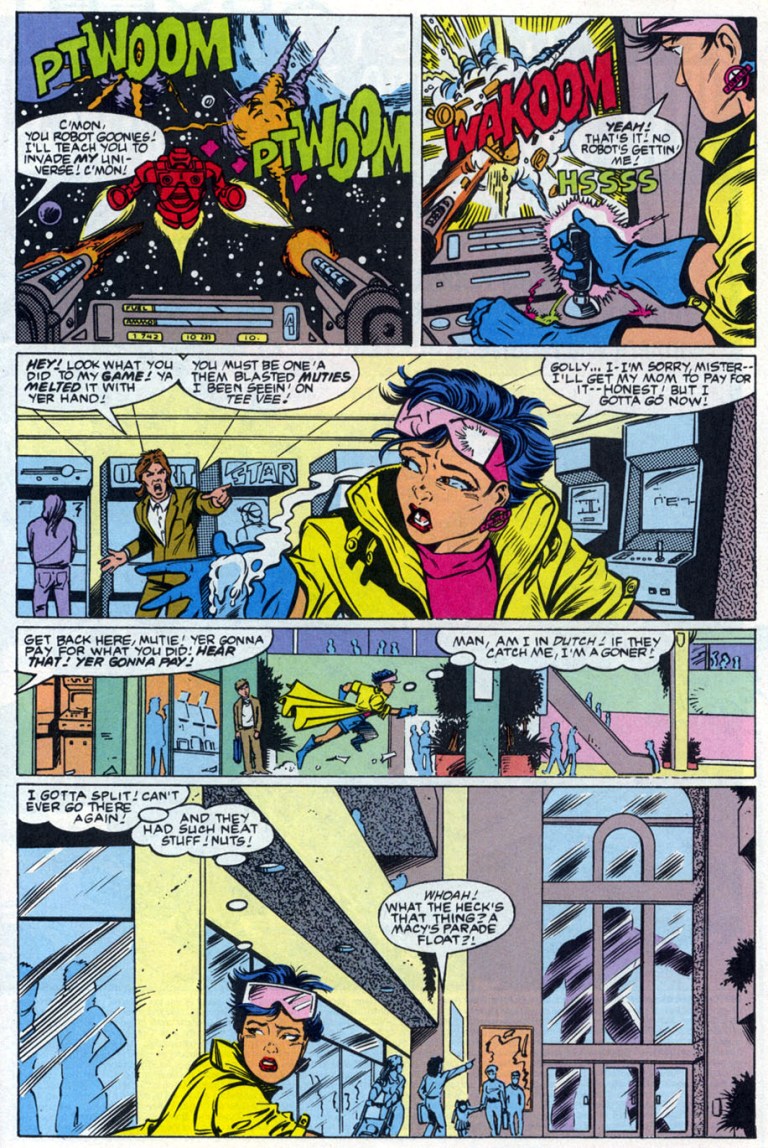
Released in 1992, X-Men Adventures #1 adapted the memorable launch episode of the animated series. The story begins with the Watcher doing some expository dialogue as Sabretooth causes some destruction in a city. As it turned out, it was a TV news feed of him as the narrative shifts into a home in suburbs wherein a married couple talk about Jubilee. The husband Martin thought about registering Jubilee with the government which turns off wife Martha. Jubilee overheard them and predictably agonizes over her situation (note: she melted the VCR and mutants like her have been viewed negatively).
Then a Sentinel arrives in the neighborhood searching for her. Strangely enough, the Sentinel simply crushes the bedroom of Jubilee only to find out she was not there and registered an “identification error.”
Jubilee in trouble at the mall.
Jubilee then spends time in the shopping mall only to discover the Sentinel crashing in to find her. Within that place, X-Men members Storm, Gambit and Rogue decide to take action against the Sentinel. This is where the story really takes off.
Creatively, this comic book retells the events of the launch episode of the animated series. Writer Ralph Macchio did a serviceable job translating the episode into a decent flowing comic book. Like the animated episode, the aspect of mutants living in fear (expressed through Jubilee) was nicely captured.
What really stands out here is the artwork by Andrew Wildman. Not only did he do a good job drawing so many characters and giving them nice facial expressions, he pulled off a good effort to insert spectacle into the comic book. The Sentinel’s crashing into the shopping mall, Rogue’s punch on the Sentinel’s head, and Wolverine’s strike against a wall using his claws all have that strong impact.
Andrew Wildman’s approach to action had a lot of impact.Team interaction of the X-Men.
I also like Wildman’s way of capturing the spirit and look of the X-Men, especially during the Danger Room sequence showing Beast, Morph and Gambit doing exercises. Even the scenes that feature no action but lots of talk had an interesting look and Wildman did not even rely on the method of making the characters beautiful. No single boring moment with the art here.
Overall, X-Men Adventures #1 is a fun read. As of now, this old comic book from 1992 is not really valuable but that just might change if ever the Walt Disney Company (which now has the other media rights to X-Men due to their acquisition of 20th Century Fox) decides to have Marvel Entertainment revive or even continue the X-Men animated series.
Whether there will be a significant development or not, X-Men Adventures #1 is recommended.
Thank you for reading. If you find this article engaging, please click the like button below and also please consider sharing this article to others. Also my fantasy book The World of Havenoris still available in paperback and e-book format. If you are looking for a copywriter to create content for your special project or business, check out my services and my portfolio. Feel free to contact me as well. Also please feel free to visit my Facebook page Author Carlo Carrascoand follow me at HavenorFantasy@twitter.com
Back in the mid-1980s, the Marvel Comics universe had revisions as a result of the best-selling series Secret Wars. As a result of that series, Spider-Man went home with the alien costume or symbiote (read: Venom), Colossus’ feelings for Kitty Pryde weakened and the Thing decided not to go home yet with the Fantastic Four.
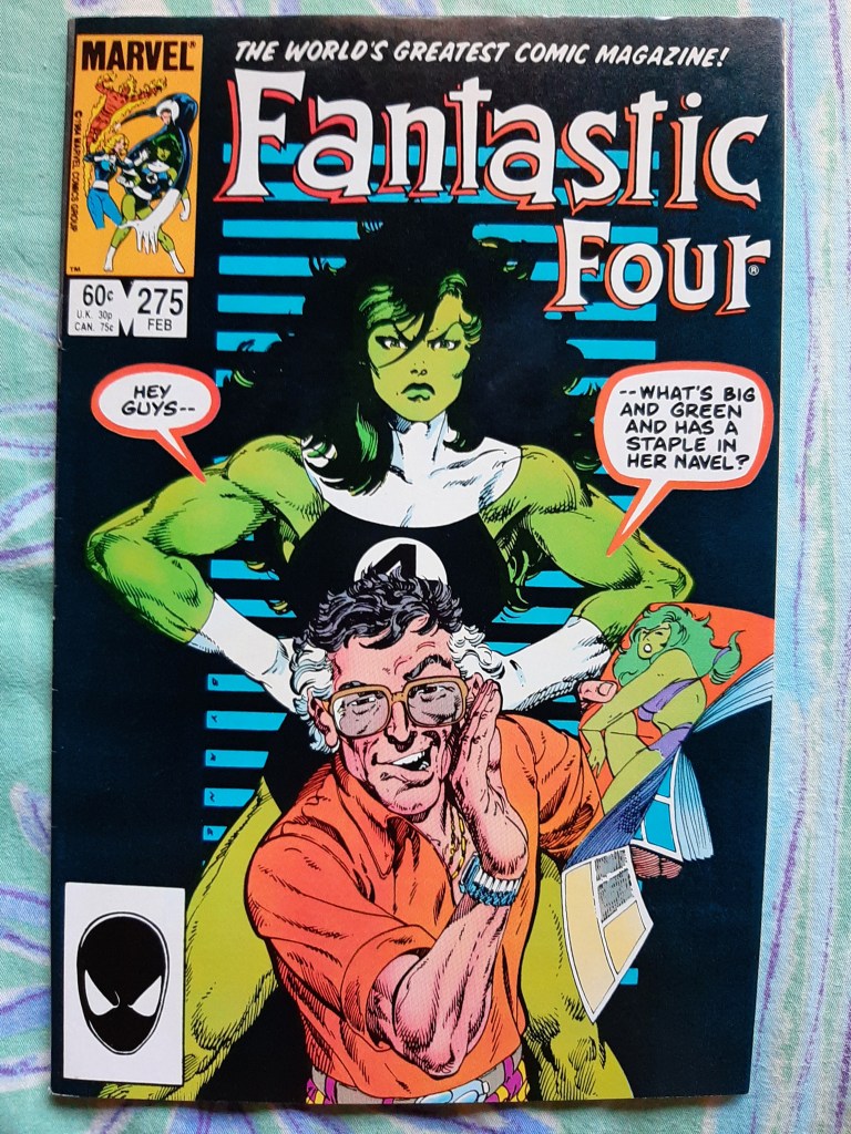
This resulted a temporary change in the lineup of the Fantastic Four. To make up for the loss (and strength) of the Thing, She-Hulk came in as the replacement. Reflecting this particular change, here is my retro review of Fantastic Four #275.
The cover.
Released in 1985 with a story written and drawn by the legendary John Byrne, Fantastic Four #275 begins when a sun-bathing She-Hulk got photographed by a man riding a helicopter flying at the top of the Baxter Building in New York. The sheer force of air from the helicopter’s blades temporarily causes She-Hulk’s cover to loosen which exposes her body to the photographer.
“Here I was all braced for a super-baddie, and I end up getting photographed deshabillee by an airborne peeping-tom,” She-Hulk said during the encounter.
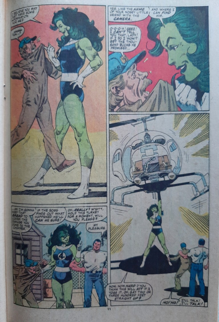
The green-skinned lady then decides to take a huge risk by leaping off the building and grab on to the helicopter.
While this is indeed a Fantastic Four comic book, it is very focused on She-Hulk. There is a short scene about Johnny Storm as well as an epilogue at the end of the comic book showing Reed and Sue Richards however.
In terms of storytelling, John Byrne did not tell the usual good-versus-evil story rather he focused more on how being a superhero can be challenging when it comes to personal privacy. This was emphasized through She-Hulk who became the object of a magazine whose editor-in-chief views her as a public figure and that puts her in the public domain along with other famous public figures whose faces and even their private lives got exposed to the masses.
From page 11.
If you are looking for superhero action, you won’t find much. There are some incidental forms of action in the form of collateral damage as She-Hulk crashes through walls.
Overall, Fantastic Four #275 is a fun read and its focus on how the print media treats superheroes viewed as public figures is a nice break from the typical good-versus-evil type of story. No clear villain here. Just the She-Hulk dealing with a magazine that violated her privacy.
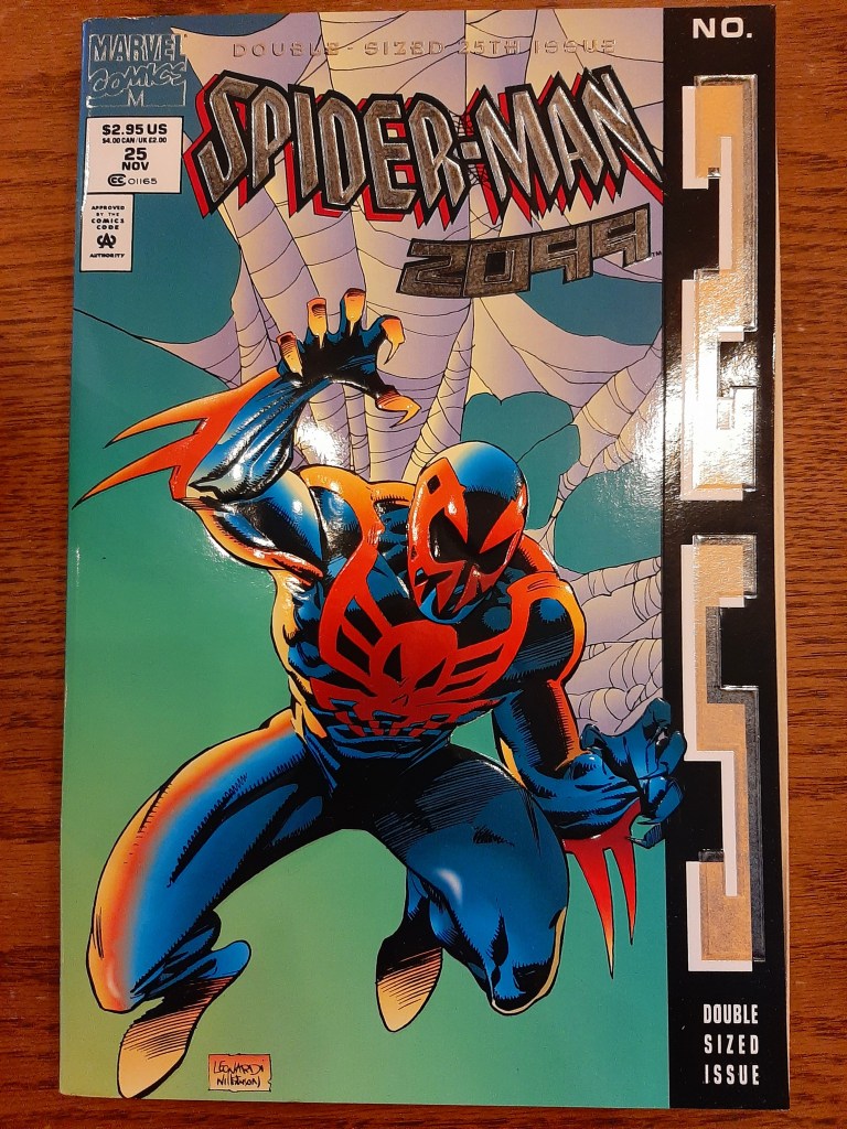
Released in late 1994 by Marvel Comics, Spider-Man 2099 #25 had a double-sized issue with an embossed cover that shined as it was laced with foil. The number 25 on the edge of the cover was stylized to capture people’s attention on the shelves of comic book specialty stores.
The cover of Spider-Man 2099 #25.
Back in the 1990s, Marvel had a “tradition” of releasing comic books with gimmick covers with anniversaries in mind. Notably the 25th, the 50th, the 75th and 100th issue and more got released with covers that came with foil or chromium or hologram or simply a hard embossed material. In other times, the anniversaries of the featured superhero/superheroes were celebrated with gimmick covers on comic books marking the celebration.
With regards to Spider-Man 2099 #25, the 2099 universe of Marvel had reached its 2nd year. By that point of time, the Marvel’s 2099 line of comics was already at full publishing blast with several monthly series (Spider-Man 2099, Ravage 2099, Punisher 2099, Doom 2099, X-Men 2099 and Ghost Rider 2099) plus a quarterly comic book (2099 Unlimited).
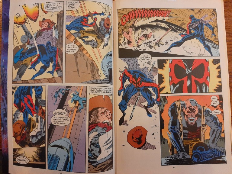
Written by Peter David and drawn by Rick Leonardi (with ink work by Al Williamson), the comic book begins with a short scene about Miguel O’Hara’s (Spider-Man 2099) mother moving on her way to meet someone. The spotlight then shifts into the heat of the rematch between Spider-Man and the cyborg Venture.
Later Miguel’s mother meets a certain tycoon at his mansion…
Spider-Man of 2099 fights with Venture.
When it comes to quantity, this comic book has a Spider-Man story of 22 pages, a Hulk 2099 story with 8 pages (a prequel to Hulk 2099 #1 specifically) and a story called Net Loss with 10 pages. The first time I read this comic book back in 1994, I anticipated more Spider-Man 2099 content but got surprised with the other two being part of it. Marvel decided back then to use Spider-Man #25’s content to expand and emphasize the 2099 universe.
When it comes to quality, I find the Spider-Man 2099 story here a worthy read not simply because Peter David wrote it but because he crafted a story that connects and relates well with what happened in Spider-Man 2099 #1. When I reached the end of the story, I really felt compelled to go back to the very first issue to re-examine what happened.
As this was the 25th issue of the series, Peter David and Rick Leonardi were more proficient as a creative team. The aesthetics of Leonardi’s art (inked by Williamson) is pretty much the same but I noticed that the illustrator added more power on key moments of the action. Ultimately this story is worthy of the 25th issue anniversary treatment.
The Hulk 2099 short story by Gerard Jones and Malcolm Davis meanwhile serves only to build up the mean green monster for its monthly series. Hulk 2099 was never an interesting character to me and this one did not change my view of him.
The final short story Net Loss was rather weird. Even though I read a lot of 2099 comic books, the story by Peter David and Tom Grindberg just did not captivate me.
Overall, I find Spider-Man 2099 #25 a worthy comic book to add to your collection and Spidey’s story alone is worth it.
Spider-Man 2099 #25 is recommended.
Thank you for reading. If you find this article engaging, please click the like button below and also please consider sharing this article to others. Also my fantasy book The World of Havenoris still available in paperback and e-book format. If you are looking for a copywriter to create content for your special project or business, check out my services and my portfolio. Feel free to contact me as well. Also please feel free to visit my Facebook page Author Carlo Carrascoand follow me at HavenorFantasy@twitter.com
Released in 2006, X-Men: The Last Stand was the third movie of Marvel’s mutants which made $459,359,555 worldwide establishing new box office records at the time including the Memorial Day weekend opening and a single-day record for Friday openings. It was also the highest grossing X-Men movie until X-Men: Days of Future Past exceeded it in 2014.
While the first two flicks were directed by Bryan Singer (who literally abandoned this movie in favor of the big letdown Superman: Returns), this one was done by Brett Ratner who is best known for Rush Hour films. For the superhero concept of the film, Ratner clearly depended on the script by Simon Kinberg (who directed X-Men: Dark Phoenix) and Zak Pen (X2: X-Men United).
The story begins some time in the past with Charles Xavier and Magneto visiting the house of a little girl named Jean Grey whose power of telepathy and telekinesis make her dangerous. Her own father thinks she has an illness. In another scene, a young boy desperately tries shaving off something on his back which turned out to be a mutation. To put it short, the prologue establishes the two concepts this movie tried to emphasize – the Dark Phoenix (from the classic comic book storyline by Chris Claremont and John Byrne) and the Mutant Cure (in reference to one particular episode of the 1990s X-Men animated series).
The result? A rather unfocused narrative that bogged the movie throughout. In the present day, Charles Xavier and the X-Men are no longer hiding from the federal government (which in turn has Hank McCoy/Beast as part of the US President’s cabinet). A cure that can neutralize the mutant gene has been revealed and eventually Jean Grey suddenly returns back to life in front of Scott Summers/Cyclops. Then trouble in the story (and for this film in particular) sets in.
Dark Phoenix and Professor X.
On storytelling, the lack of focus on a central concept really dragged this movie down even though the filmmakers made attempts to link them together. This is a very unfaithful adaptation of the Dark Phoenix Saga – instead of showing the Phoenix Force as a cosmic entity the filmmakers used the dual-personality concept in Jean Grey. There are no alien civilizations (read: no Lilandra) involved nor anything related to outer space (a key element in the comic book storyline). With regards to the cure concept, Rogue in this film makes a move to be cured loosely following what was shown in the animated series.
Having these two concepts connect to each other showed Magneto getting motivated to rally the mutants to oppose the humans. Jean Grey meanwhile gets controlled by the Phoenix personality and gets very destructive with power which makes her an asset to Magneto and his brotherhood of evil mutants.
As the filmmakers struggled to tell the story, the social relevance and symbolism emphasized in the first two films got weakened. The core concept of mutants getting isolated and discriminated by humanity simply because they are so different became much less relevant here.
As if that was not bad enough, the characterization also changed for the worse. Magneto here became one-dimensional as a villain and the way he reacted to Charles Xavier’s destruction in front of him and Jean Grey reflected bad screen writing. Any true X-Men fan would know that even though he and Xavier were adversaries with a past friendship, Magneto should have been outraged over his old rival’s destruction and strike at Jean Grey (even if it is suicidal for him to fight a more powerful entity, the Phoenix).
For his part, Charles Xavier turned out to be a manipulator of Jean Grey’s mind making him look as evil and manipulative as Magneto. Jean Grey, despite actress Famke Jansen getting more screen time than before, ended up as a visual tool and was clearly NOT the central figure of the story rather she ended up being a tool of power by Magneto. By today’s standards, Jansen’s portrayal of Jean Grey/Dark Phoenix pales in comparison with Sophie Turner’s performance in X-Men: Dark Phoenix.
More on characterization, the triangle between Iceman, Rogue and Kitty Pryde was executed with no real depth and only served to show Anna Paquin’s character search for the means to be normal (because Rogue absorbs the power and life of people she touches) which ended up being not so meaningful for viewing. Young adult Angel’s (one of the original X-Men in the comics) minutes-long presence in the movie only served to showcase special effects. Storm’s prospect of succeeding Xavier as leader of the X-Men and the school was sloppily done. Oh yes, the showing of multiple mutants (in supporting roles, non-speaking roles or as mere background characters) that weakened the narrative of the first two films was even worse here. As a result, there’s quite a lot of fan service in this movie.
Going back to storytelling, I should say that the early demise of Cyclops (played by James Marsden for too little screen time due to his work with Bryan Singer on Superman Returns) and Charles Xavier were attempts by the filmmakers to raise the stakes and even shock viewers. The problem is that the third act of the film became more of an action and CGI bonanza ultimately failing to justify the loss of Cyclops and Xavier. The story ended with not much impact on me as a viewer and the late scenes showing Magneto recovering a little of his power (plus the post-credit scene about Xavier’s survival) were unsatisfactory. By comparison, X-Men: Dark Phoenix concluded with satisfaction.
Performances? The actors did what they could with the weak screenplay. Patrick Stewart played Charles Xavier managing his school but gets burdened heavily as Jean Grey returns with the Phoenix in her (which makes Xavier feeling guilty over his past manipulation of Jean’s mind). Ian McKellen played a one-dimensional Magneto (forget about the reasonable fighter for mutants you saw in the first two films) and really had little room to flesh him out. Clearly this version of Magneto, even though he has a lot of screen time here, is rubbish when compared to the cinematic Magneto in X-Men: Dark Phoenix.
Hugh Jackman as Wolverine is clearly the hero of this movie and was given a lot to do showing a deeply concerned Wolverine as well as showing him with lots of action on-screen. His emotional reaction towards Jean Grey near the end of the movie was believable. Halle Berry meanwhile failed yet again to capture the leader in Storm from the comic books.
Another thing to mention regarding the weak script is the lame attempt at humor in the film. Just look at the exchanges of words between Wolverine and Beast which only made me frown instead of laughing.
Exchange 1
Dr. Hank McCoy: Wolverine. I hear you are quite an animal.
Logan: Look who’s talkin’.
Exchange 2
Logan: Well, for all we know, the government helped cook this up.
Dr. Hank McCoy: I can assure you, the government had nothing to do with this.
Logan: I’ve heard that before.
Dr. Hank McCoy: My boy, I have been fighting for mutant rights since before you had claws.
Logan: [to the Professor] Did he just call me boy?
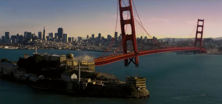
If there is anything positive at all with this movie, it is the spectacle (action, stunts and special effects). If you want to watch an X-Men movie without thinking too much and just enjoy the spectacle, The Last Stand is heavily loaded! The scope of destruction (including the major showcase of Magneto’s power with the Golden Gate Bridge) is also great and helped this weak movie look epic (even more epic than the better film X-Men: Dark Phoenix). There is also a big battle of multiple members of Magneto’s brotherhood attacking the soldiers at the Alcatraz facility. Action is where director Brett Ratner is good at and it temporarily helped this film feel fun to watch. The visual design and special effects are of good quality as well.
One last positive thing to mention here is the casting of Kelsey Grammer as Hank McCoy/Beast and his performance was, indeed, superb. I really saw the scientist, the intellect and the fighter of Beast from the comics translated nicely in cinematic form.
A striking shot as a result of Magneto’s power.
By today’s standards of superhero movies, X-Men: The Last Stand unsurprisingly went from big-budget disappointment to what is now an overall bad movie that just happens to have some fun action sequences. As far as adapting the Dark Phoenix Saga from the comics, this film is definitely inferior to X-Men: Dark Phoenix. X-Men: The Stand does look good when compared to the terrible X-Men Origins: Wolverine.
If you are a true fan of the X-Men or if you are moviegoer who wants the best superhero cinematic experience, I won’t recommend watching X-Men: The Last Stand.
But then if you are a moviegoer who cannot do anything except hate and uncontrollably bash the new movie X-Men: Dark Phoenix, then maybe The Last Stand will be your bout of fun.
Thank you for reading. If you find this article engaging, please click the like button below and also please consider sharing this article to others. Also my fantasy book The World of Havenoris still available in paperback and e-book format. If you are looking for a copywriter to create content for your special project or business, check out my services and my portfolio. Feel free to contact me as well. Also please feel free to visit my Facebook page Author Carlo Carrascoand follow me at HavenorFantasy@twitter.com