Disclaimer: This is my original work with details sourced from reading the comic book and doing personal research. Anyone who wants to use this article, in part or in whole, needs to secure first my permission and agree to cite me as the source and author. Let it be known that any unauthorized use of this article will constrain the author to pursue the remedies under R.A. No. 8293, the Revised Penal Code, and/or all applicable legal actions under the laws of the Philippines.
In early 1994, I was still in high-school. There was a time when I passed by a local comic book store that showed a new What If? comic book displayed among the many new titles. That particular comic book caught my attention because of its key question: What if the Punisher had killed Spider-Man?
That comic book was What If #58published by Marvel Comics with a story by Chuck Dixon and art by Gordon Purcell. Check out the cover below.
The cover of this comic book took a lot of inspiration from that of Amazing Spider-Man #129.
To put things in perspective, Spider-Man and Punisher are both heroes in the universe of Marvel Comics but with very drastic differences between them. Spider-Man/Peter Parker fights crooks and other types of bad guys while maintaining a lawfully good nature even as he struggles to live a normal, personal life. Punisher, who is privately Frank Castle, is a killer who is driven to fight criminals beyond the boundaries of the law. The Punisher resorts to extreme forms of violence and guns are his main weapons. Due to the tragic loss of his wife and children, Punisher lives to wage a one-man war against criminals which only reflects the huge loss of his humanity.
Spider-Man and the Punisher first encountered each other in Amazing Spider-Man #129. Through the years, the two would face-off again and again. In the mid-1980s, the Punisher went on to rise in high popularity with comic book readers as Marvel Comics published three regular series: The Punisher, The Punisher War Journal and The Punisher War Zone.
That being said, we take a look back at What If #58.
Early story
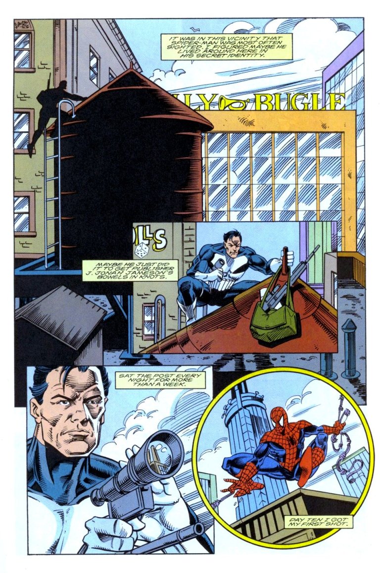
Without involving Marvel’s galactic Watcher, the comic book begins with the Punisher aiming his gun at a man seated behind his desk. It turns out Punisher is waiting for the police to arrive at the place they are in.
From this point, the story is told in flashback with Punisher narrating. He is with the Jackal on the roof top of a building in New York City. Even as the Jackal pushes him to shoot a certain target already, the Punisher decides not to do it. He stressed he wants to study the target.
“It seemed right. Taking down a high profile outlaw like Spider-Man looked like the right way to go,” Punisher thought. “And Jackal promised unlimited funding of my war on crime if I succeeded.”
Punisher doing research.
Gradually, the Punisher prepares himself to kill Spider-Man…
Quality
Let me start with the concept of this comic book. Exploring what would happen had the Punisher actually killed Spider-Man (note: this is so obvious from the cover) is a bold and clever story to tell. To put things in perspective, the Punisher’s attempt to kill Marvel’s iconic superhero happened way back in Amazing Spider-Man #129 which was published way back in 1974. Very clearly, Punisher failed and Spider-Man went on to live and fight for good.
When it comes to storytelling, Chuck Dixon delivered a strong script and carefully crafted a standalone story that looks at the Punisher’s first-ever attempt to shoot Spider-Man but the narrative was more on the vigilante’s point-of-view. The dialogue was solid and the narration gives readers a good look at the personality of Frank Castle. I also liked the way the story was paced.
What also makes this comic book really good is that it shows in convincing fashion what else would have happened after the successful assassination of Spider-Man. Without spoiling the surprise, you can ask yourself how would Punisher react once he learned who Spider-Man really was, how would the many people who personally knew Spider-Man (whether good or evil) would react and what the state of crime in New York would be like.
The Punisher anticipating Spider-Man outside The Daily Bugle.
As for the art, Gordon Purcell did a decent job. He captured what was back then modern day 1990s look of the Punisher (completely rejecting the way the character looked in Amazing Spider-Man #129) and he knew how to present him from different angles regardless of what action was taken. On drawing Spider-Man, Purcell proved to be good. I noticed in some parts of the comic book, he tried hard to make Spidey look dynamic while traveling high above the streets of the city. The big money shot (in terms of illustration) for me was the moment Spider-Man got killed.
Conclusion
Overall, What If #58 is a good and fun comic book to read. Historically, this was released at a time when Spider-Man and the Punisher were both wildly popular. The decision to tell an alternate reality off Amazing Spider-Man #129 was inevitable and ultimately was nicely pulled off.
If you are thinking about acquiring What If #58, as of this writing MileHighComics.com shows that a near-mint copy of the regular edition is at $26 while the near-mint copy of the newsstand edition is at $77.
What If #58 is recommended.
Thank you for reading. If you find this article engaging, please click the like button below and also please consider sharing this article to others. If you are looking for a copywriter to create content for your special project or business, check out my services and my portfolio. Feel free to contact me as well. Also please feel free to visit my Facebook page Author Carlo Carrasco and follow me at HavenorFantasy@twitter.com
Disclaimer: This is my original work with details sourced from reading the comic book and doing personal research. Anyone who wants to use this article, in part or in whole, needs to secure first my permission and agree to cite me as the source and author. Let it be known that any unauthorized use of this article will constrain the author to pursue the remedies under R.A. No. 8293, the Revised Penal Code, and/or all applicable legal actions under the laws of the Philippines.
As already mentioned in my retro review of X-Men 2099 #25, a new creative direction was taken for the futuristic mutants of Marvel (who got back together after being apart for long) and the monthly series itself while still maintaining connection with the rule of Doom 2099 (already driven by Warren Ellis as the writer) as the US President. That story ended with noticeable changes on the characters, especially on Xi’an who ended up nothing like the strong and driven X-Men leader he was in X-Men 2099 #1. As such Tim Fitzgerald/Skullfire, who went through a lot of emotional struggles and confusion, finally learned to be strong to become the mutants’ new leader.
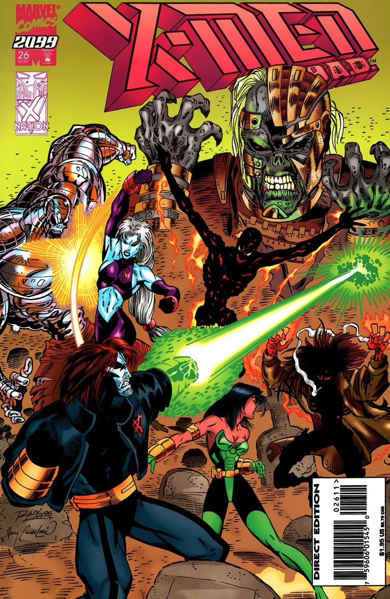
In this review, we will take a look at the aftermath of the events that happened in the above-mentioned anniversary celebration issue. Series lead creators John Francis Moore and Ron Lim took another shot heading towards the new direction in X-Men 2099 #26 published by Marvel Comics in 1995.
The cover by Ron Lim.
Early story
The comic book opens with Doom 2099’s Minister for Humanity Morphine Somers waking up and learns from his digital assistant that disaster happened in the White House (refer to Doom 2099 #33).
The story then shifts to Halo City which is the walled mecca which continues to attract some hundreds of thousands of misfits, mutants and refugees who seek sanctuary from the mega corporations which have dominated societies in most cities around the United States. In the middle of the traffic jam going into the city, a man decides to get out of the taxi and head on by foot.
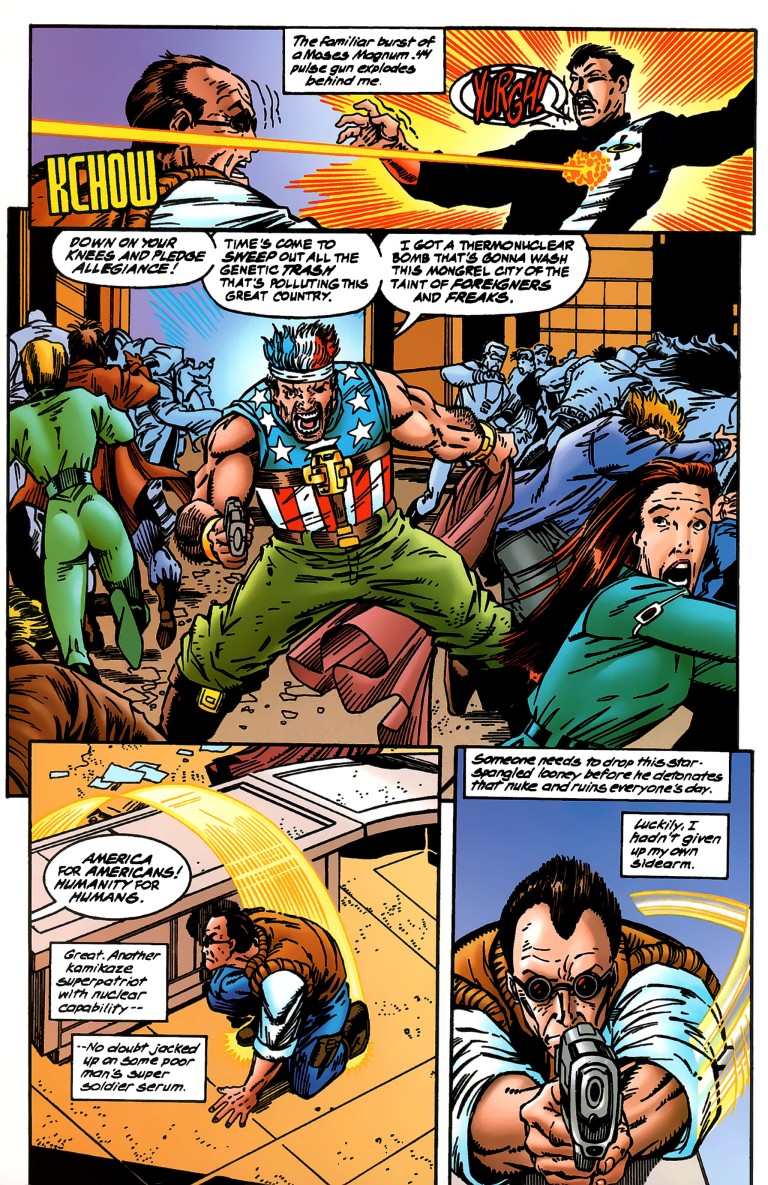
The man is identified as Gunnar Tristan, an entertainment journalist. As the city authorities examines Gunnar, a man wearing a shirt looking like the American flag fires a shot at one of the security personnel.
“Down on your knees and pledge allegiance! The time’s come to sweep out all the genetic trash that’s polluting this great country. I got a thermonuclear bomb that’s gonna wash this mongrel city of the taint of foreigners and freaks,” said the armed man.
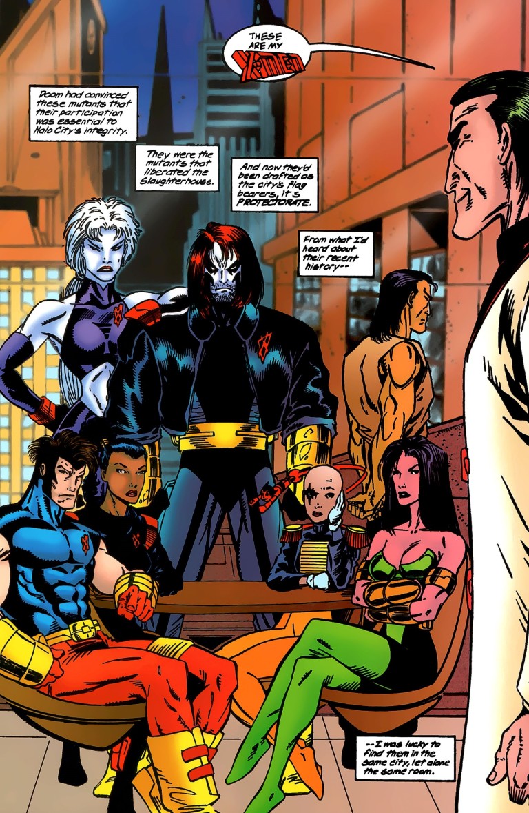
Just as Gunnar is about to fire, Henri Huang/Meanstreak of X-Men 2099 intervenes to prevent anymore danger from happening. Meanstreak is with teammate Krystalin and seen on their clothes are V-like symbols. They are now officially working for the city authorities as the mutant protectorate….
Quality
Clearly following up on the ending of X-Men 2099 #25, this story delivered strongly on showing the futuristic X-Men as Halo City authority members which is a drastic change from their past as outlaws and misadventure participants.
The X-Men as members working for the authorities.
A strong element in this comic book is character development and it shows the former X-Men leader Xi’ian feeling guilty and has gotten obsessed with healing sick people as a way to atone for his sins. At this point of time, Xi’an went from a bag guy into a reformed man (X-Men leader) into a bad guy again before ending up weak and confused. This puts him yet again into conflict with his long-time trustee Shakti/Cerebra (who by this time can be seen as a suitable team leader with a very strong moral direction). Skullfire meanwhile is feeling uneasy with his team working for an administration and it can be seen that the time he spent in the wilderness took its toll on him.
When it comes to art, Ron Lim pushed his creativity hard this time by establishing the overall look of Halo City and how it is transforming into a hot bed for people who don’t want to live in a place monitored always by mega corporations. On characters, I should say that Lim’s designs for the new villain group The Undead is not very captivating although one of them really looked horrifying. On action scenes, Lim continued to deliver the goods.
Conclusion
I should say that I like this comic book a lot. It’s got more character development scenes and story build-up with noticeably lesser spectacle (which is not a problem at all). Being the 26th issue of the X-Men 2099 monthly series, characterization really had to be prioritized by the creative team to emphasize the bold, new direction taken. Just to see the X-Men become authority members even though they are not really qualified is just intriguing!
What makes this particular old comic book special in a rather bizarre and accidental manner is the raging debate about how America of today should handle its immigration problems especially with hot topics like securing the borders, building the wall along the south border with Mexico, and deporting as many illegal immigrants (even those who have families in America, established business and paid taxes) as possible. Back in the year this old comic book was published, immigration was not such a hot topic and there were even more Democrats (including then US President Bill Clinton) who favored stricter moves to curb illegal immigration.
The presence of the armed man who despises foreigners and mutants is now more socially relevant to see. It’s so symbolic, you should look at the page below.
I wonder if anyone from the Democratic Party or the Political Left in America who support open borders had seen this page.
If you are seriously collecting comic books, be aware that as of this writing, MileHighComics.com shows that a near-mint copy of X-Men 2099 #26 regular edition is worth $4 while the near-mint copy of the newsstand edition is worth $8.
Overall, X-Men 2099 #26 is highly recommended.
Thank you for reading. If you find this article engaging, please click the like button below and also please consider sharing this article to others. If you are looking for a copywriter to create content for your special project or business, check out my services and my portfolio. Feel free to contact me as well. Also please feel free to visit my Facebook page Author Carlo Carrasco and follow me at HavenorFantasy@twitter.com
Disclaimer: This is my original work with details sourced from reading the comic book and doing personal research. Anyone who wants to use this article, in part or in whole, needs to secure first my permission and agree to cite me as the source and author. Let it be known that any unauthorized use of this article will constrain the author to pursue the remedies under R.A. No. 8293, the Revised Penal Code, and/or all applicable legal actions under the laws of the Philippines.
Back in the 1990s, comic books with gimmick covers and higher cover prices were abundant and also were easy targets for collectors. In the case of Marvel Comics, the concept of the “anniversary issue” was important because it gave them a chance to sell comics at a higher price.
To put things in perspective, many times back then Marvel would produce comic books with slightly more pages and a gimmick cover in celebration of a so-called anniversary such as the comic book series reaching its 25th or 50th or 75th or 100th issue and so on. Other anniversary celebrations include a character specific anniversary such as Spider-Man’s 30th anniversary celebrated with the comic book Amazing Spider-Man #365 which had a lot of pages and a hologram cover.
Of course, such anniversary celebrations were implemented on the Marvel 2099 line of comic books. Check out my review of Spider-Man 2099 #25.
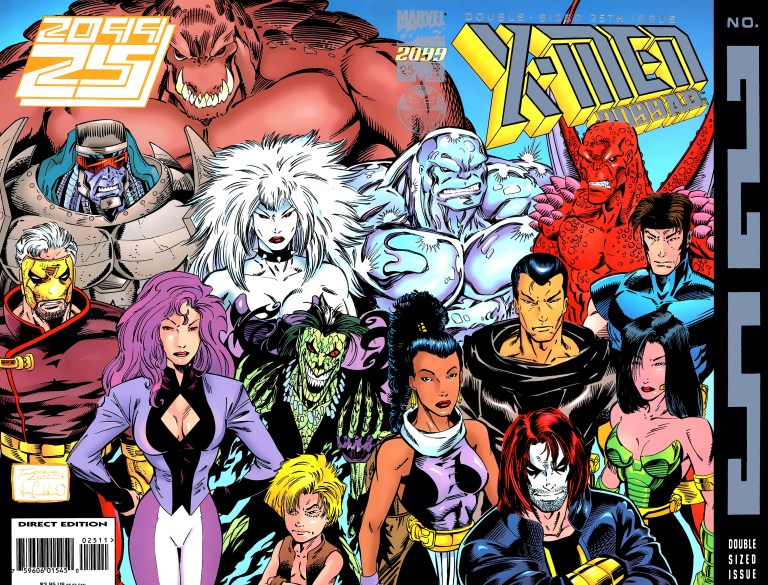
Right here we will take a look at the first-ever anniversary celebration issue of the X-Men of the far future with X-Men 2099 #25 written by John Francis Moore and drawn by Ron Lim. This comic book was released in 1995 and Marvel already published multiple series of other franchises of their 2099 line. Prior to X-Men 2099 #25, the team saw its members separated from each other and went through lots of misadventures and unfortunate events before finally getting back together.
The full cover drawn by Ron Lim.
Early story
X-Men 2099 #25 begins with a research of Xi’an and his band of mutants being presented by the Minister of Humanity (Morphine Somers) to the President in their airship flying above California.
“I see in this current generation of X-Men an untapped potential,” said the President. “Now, tell me you have finally relocated them.”
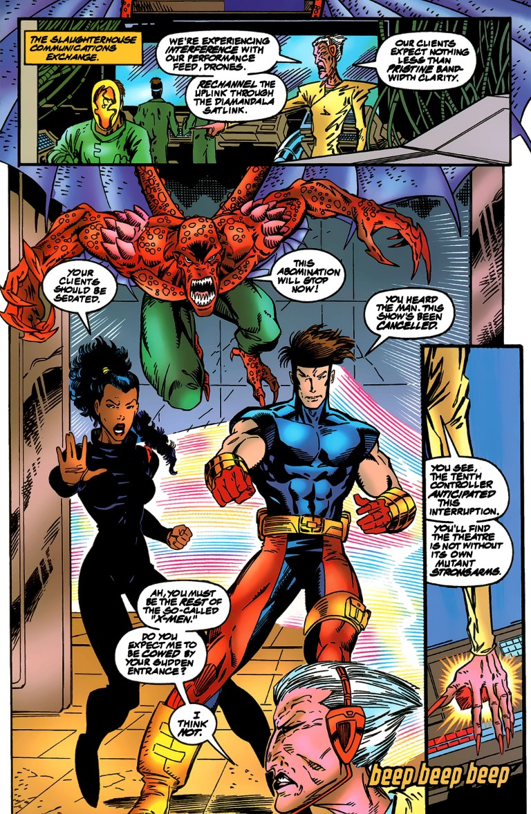
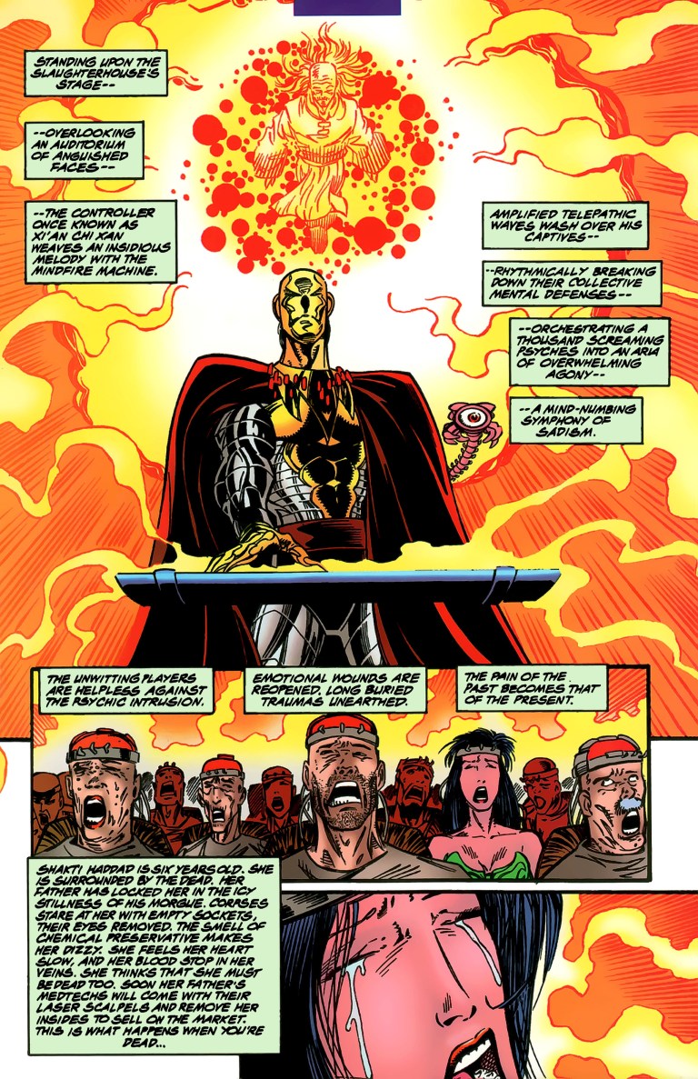
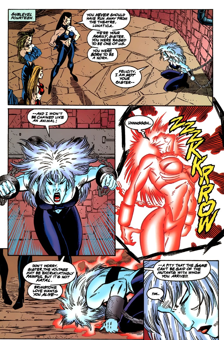
The story then shifts to the slaughterhouse of the Theater of Pain wherein a restrained Shakti/Cerebra is standing helpless next to Brimstone Love and a masked Xi’an who are about to execute a sinister plan. Shakti speaks out against them and tells Brimstone that they are parasites preying on the pain and vulnerability of innocent people. Brimstone insists that the weak and helpless provide sport for the rich and powerful, and that his group was founded for the select powerful few who crave for and pay a lot for performances. Xi’an, who had a sinister past before getting reformed to revive the X-Men (before reverting back to evil due to Zhao’s invasion of his mind), only emphasized the theater’s importance.
Defiant, Shakti tries to reach deep into Xi’an and turn him around.
Elsewhere, the former Theater of Pain member Luna (who by this time got close with Tim/Skullfire) is chained and is confronted by her sisters in the theater. Skullfire meanwhile is in the waste disposal center where he meets someone who betrayed their team. They both thought about setting aside their differences to do something before time runs out…
Quality
X-Men 2099’s Krystalin, Meanstreak and Bloodhawk get into the action.
In terms of visuals, I can say that Ron Lim’s art is pretty good and, most likely in tandem with the writer, took careful steps to control the pace enough to keep readers entertained without ever making things look disorienting. When there is action, the pace moves fast and the impact of the action done is always visible. As seen throughout the X-Men 2099 series, the look of the southwestern region of America is always striking and I like the fact that the wilderness setting comes with lesser presence of futuristic technology (compare this to what was seen in 2099’s New York) which gives this comic book a more laid-back concept.
When it comes to the storytelling, character development is nicely emphasized in this comic book. If you read enough of the early comic books (let’s say the first ten issues) and paid close attention to the futuristic X-Men, you will be able to relate with their struggles which add a lot of depth to the usual good-versus-evil storytelling here. Without spoiling the story, I should say that this comic book concluded with a believable new direction emphasized which in turn made me want to look to the next issue. It’s that strong of an ending!
It sure is intriguing to see Shakti, one of the most prominent X-Men 2099 members, really suffer along with others.
I also liked the way this comic book emphasized the connections between the Theater of Pain with the Chosen (another group of villains) and most notably with Zhao (a previous leader of the X-Men before Xi’an’s time).
As for in-universe crossing-over, this comic book nicely ties up with Doom 2099 which, at the time of publishing, was under the creative direction of Warren Ellis who is now one of the best comic book writers.
If there is anything I have an issue with, it’s the cover art. It has a few characters who appeared on the cover, most notably Desdemona, and yet were absent in this comic book’s story. They ended up looking like cover art filler. Not a problem but distracting and meaningless.
Conclusion
Let me make it clear here…I really like this comic book. It definitely has the best and most engaging story of the X-Men of 2099 ever and that’s because this particular monthly series had an extensive build-up on all the characters since issue #1 and issue #25 executed a great payoff.
In retrospect, the X-Men drastically changed since the start of issue #4 and this includes members who went far away or decided to exclude themselves. X-Men 2099 #25 tied up most the loose threads not only by having the team members back together but also emphasized how much they developed over the past few years (in real life, that is). This is also the kind of comic book that will make you want to revisit the very start of its series and rediscover the characters.
Luna in chains.
If you are seriously collecting comic books, be aware that based on the listings of MileHighComics.com as of this writing, as a near-mint copy of the comic book’s regular edition is $4 while a near-mint-copy of the deluxe edition (with gimmick cover) is at $6. X-Men 2099 #25’s newsstand edition is worth $8 for a near-mint copy.
Overall, X-Men 2099 #25 is highly recommended. The creators outdid themselves and made the best story of titled characters. Truly, this comic book is where the mutants of 2099 really got defined in their respectful place within the Marvel Comics universe of the 1990s.
Thank you for reading. If you find this article engaging, please click the like button below and also please consider sharing this article to others. If you are looking for a copywriter to create content for your special project or business, check out my services and my portfolio. Feel free to contact me as well. Also please feel free to visit my Facebook page Author Carlo Carrasco and follow me at HavenorFantasy@twitter.com
Disclaimer: This is my original work with details sourced from reading the comic book and doing personal research. Anyone who wants to use this article, in part or in whole, needs to secure first my permission and agree to cite me as the source and author. Let it be known that any unauthorized use of this article will constrain the author to pursue the remedies under R.A. No. 8293, the Revised Penal Code, and/or all applicable legal actions under the laws of the Philippines.
Very recently, Warner Bros. announced that due to the ongoing coronavirus disease COVID-19 pandemic, it has decided to reschedule the release of Wonder Woman 1984 to August 2020.
While fans, geeks and moviegoers have to wait a bit longer for the much-awaited movie, we can take time out to look back to the year 1987 when DC Comics published the comic book Wonder Woman #9 written (plot) and illustrated by the legendary George Perez with scripting done by the late Len Wein.
Remember seeing Dr. Barbara Minerva (Cheetah) played by Kristen Wiig in Wonder Woman 1984? This comic book marked the debut of the post-Crisis Cheetah whose civilian personality is Dr. Barbara Minerva (her literary debut was in Wonder Woman #7). To make history short, the original Cheetah that appeared in 1943’s Wonder Woman #6 was Priscilla Rich while the second Cheetah was Deborah Domaine (Priscilla Rich’s niece). Dr. Minerva is the third and arguably the most modernized and most popular Cheetah.
With the history talk over, here we go with Wonder Woman #9!
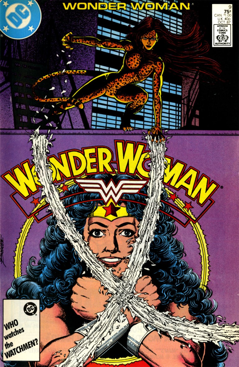
The cover drawn by George Perez.
Early Story
The story begins with a ritual performed by a short, old man with a knife. He cuts the skin of a naked woman and collects some of her blood. He uses the blood to feed a plant he believes to be a god (the plant-god). Afterwards he returns to the naked woman and covers her with the cloth.
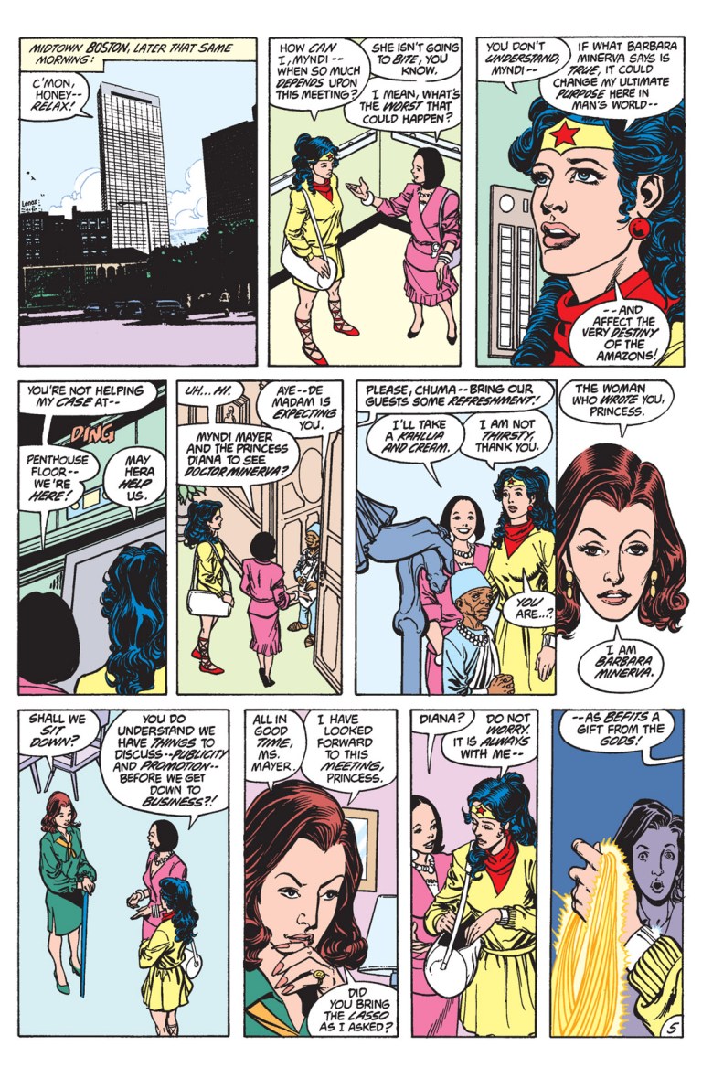
The next morning, at another location, Wonder Woman flies happily in the air. Below her were publicist Myndi Mayer, Julia (Diana’s host and personal educator) and teenager Vanessa.
It turns out, Wonder Woman, who strongly values honor, was happy to have received a letter from Dr. Barbara Minerva. Julia however is not confident and based on her research, she described Minerva as “shady as your average weeping willow.”
Myndi, who is looking for the next great scoop, dismisses Julia’s concern and remains focused on accompanying Wonder Woman to meeting Minerva.
Quality
Apart from marking the first appearance of Cheetah (no longer a lady wearing a silly costume) in the post-Crisis era of DC Comics, Wonder Woman #9 is still a very compelling and fun comic book to read. Its great quality combined with a solid concept can be attributed to George Perez.
On storytelling, Perez and Wein delivered a solid balance between spectacle, characterization, plotting and mystery. The presentation of Dr. Minerva as an accomplished yet arrogant archaeologist is a clever concept of having her involved with Wonder Woman who in turn also has a personal interest in relics and evidences of established cultures and societies (given the Amazonian society Diana came from). Minerva’s transformation and first action as Cheetah is indeed excellent to read.
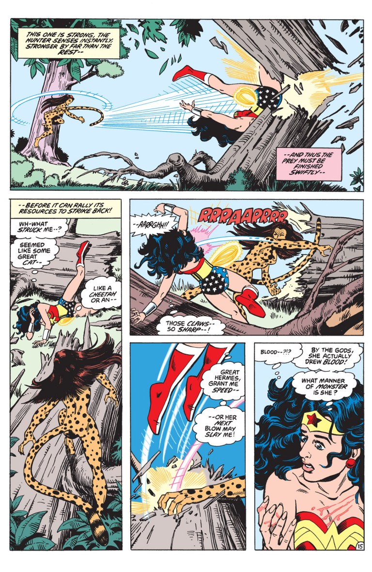
Diana/Wonder Woman and Dr. Minerva/Cheetah meet for the first time ever.
Being one of the greatest comic book illustrators ever, it is no surprise that this comic book still looks great! Even though Perez used a lot of panels per page, the amount of visual details as well as the maintenance of his art style remain high.
When it comes to the first-ever battle between Cheetah and Wonder Woman, Perez pulled no punches back with the spectacle. There is a good amount of brutal action which so enjoyable to see and I can only hope that director Patty Jenkins took inspiration from the comic’s action scenes for Wonder Woman 1984 (a conflict between the Queen of Superheroes and the animalistic villainess on the big screen is inevitable).
Brutal action between Cheetah and Wonder Woman!
On characterization, this comic book continued to deliver the good and believable development of Wonder Woman who is still adjusting to Man’s World. To put it short, it is not exclusively focused on Cheetah and Wonder Woman (whose encounters were the highlights). You will get to see how much Diana adjusted with modern society, what she thought about how modern society’s members perceived her and how close she got with Julia and Vanessa while still keeping strong with her Amazonian values.
Going back to Cheetah, the development of Dr. Minerva changing into her animalistic form is very well handled by the creators. There are enough details that explained her physical transformation and her uncanny abilities, not to mention showing her being able to give Wonder Woman a good amount of trouble. This way of modernizing the literary Cheetah is, indeed, very compelling and definitive. By reading this comic book, you will realize why this particular version of Cheetah was chosen to be part of Wonder Woman 1984.
For the collectors reading this, if you are serious on getting an existing copy of Wonder Woman #9, be aware that, as of this writing, a near-mint copy costs $77 according to MileHighComics.com
Overall, Wonder Woman #9 (1987) is highly recommended! It’s a great collector’s item too!
In ending this, watch this first official movie trailer of Wonder Woman 1984.
Thank you for reading. If you find this article engaging, please click the like button below and also please consider sharing this article to others. If you are looking for a copywriter to create content for your special project or business, check out my services and my portfolio. Feel free to contact me as well. Also please feel free to visit my Facebook page Author Carlo Carrasco and follow me at HavenorFantasy@twitter.com
Disclaimer: This is my original work with details sourced from reading the comic book and doing personal research. Anyone who wants to use this article, in part or in whole, needs to secure first my permission and agree to cite me as the source and author. Let it be known that any unauthorized use of this article will constrain the author to pursue the remedies under R.A. No. 8293, the Revised Penal Code, and/or all applicable legal actions under the laws of the Philippines.
I just love it when comic book creators really pushed their creativity and bold concepts to make an anniversary celebration comic book fun, engaging and memorable. As seen in the history of American superhero comics, such great comic books become essential when their concept sets a new standard of quality or when it sets its series (and its featured superhero) to a new and well accepted direction (which then opens up many opportunities to keep the series and the superhero fresh creatively).
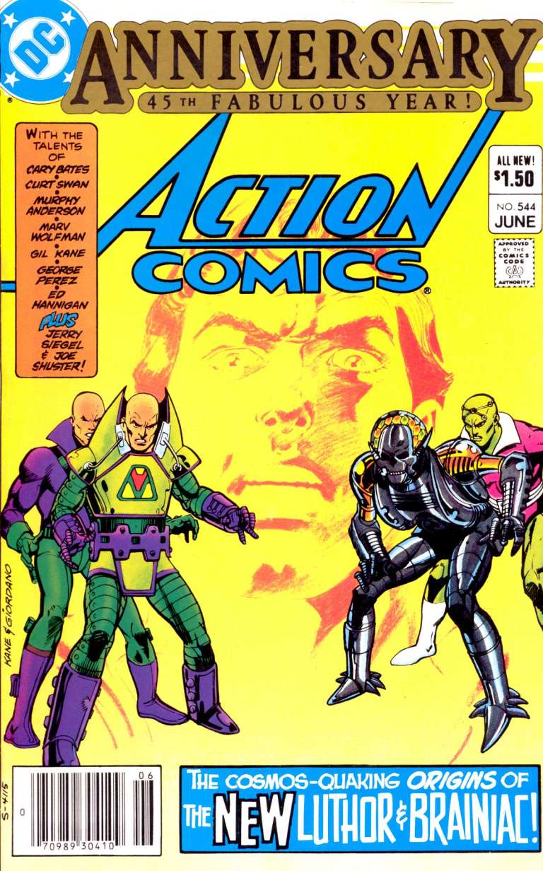
Such greatness was achieved by DC Comics and its creators with Action Comics #544 published in 1983.
The cover.
As seen in the cover above done by artists Gil Kane and Dick Giordano, Superman in the background could do nothing but be surprised to see his two foes Lex Luthor and Braniac presented in doubles reflecting a change of design – Luthor getting his now iconic powered suit of armor and Brainiac having a more robotic design.
So you must be wondering…how is the quality of the story and art of this particular comic book that celebration Superman’s 45th anniversary?
We can now start with my retro comic book review of Action Comics #544.
Early Stories
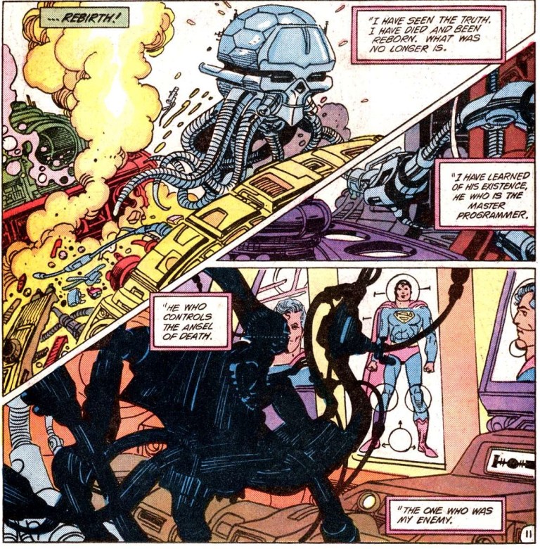
This special-sized comic book features not one but two separate Superman stories titled “Luthor Unleashed!” (written by Cary Bates and drawn by Curt Swan) and “Rebirth” (by Marv Wolfman and Gil Kane).
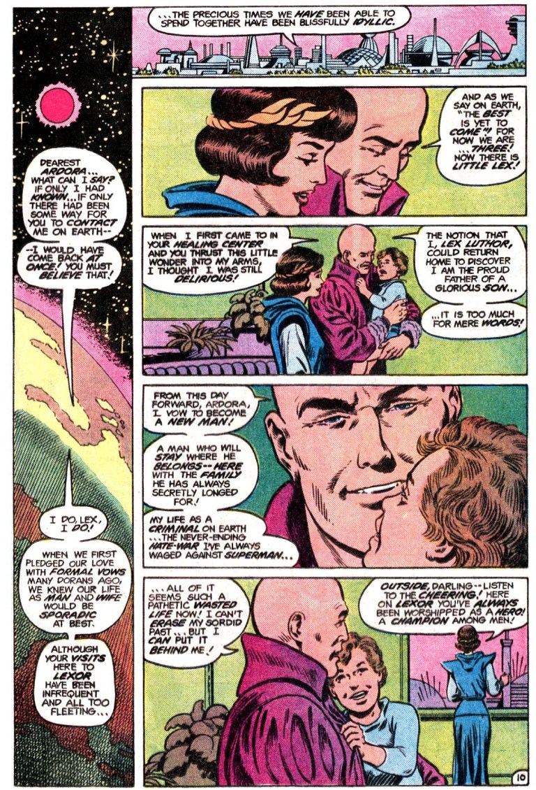
“Luthor Unleashed!” begins with Luthor already down on the ground hurting from the crash of his aircraft and with Superman present. Even though Luthor’s already helpless, Superman flies away to an unknow destination confident that the super villain will still be there once he returns. However, Luthor got assisted by a robot of his who took him to a secret lair and rode a spacecraft going into deep space. Luthor arrives on the planet called Lexor.
“Rebirth” begins with Superman saving a lady and dog from getting hit by a car on the city street. Afterwards, he flies into space and arrives at a computerized planet that Brainiac created. Just nearby, the star of Epsilon 4 is about to go supernova which prompts him to do something so that many lives will be saved.
Quality
Visually, the art of both stories, respectively done by Curt Swan (arguably the most memorable artist to draw Superman during the pre-Crisis age) and Gil Kane is still good to look at. Both artists knew how to frame the action in interesting ways, put enough details on the people and environment surrounding Superman or Luthor or Brainiac.
When it comes to the storytelling and characterization, not only were both stories really well written, they succeeded in humanizing Luthor and Brainiac. In “Luthor Unleashed!”, the portrayal of Lex Luthor as a family man (he has a wife and a child) as well as a highly revered leader among the citizens of Lexor was excellently done. By just reading that story, it really looked like Luthor could have been a great contributor for the good of the DC Multiverse had he not been a super villain. What writer Cary Bates made clear was that Luthor’s hatred for Supermen was deeply embedded within him.
Lex Luthor the husband and father.
The story of Brainiac meanwhile was very engaging. Marv Wolfman really went all-out on portraying the death and rebirth of Brainiac who got reshaped in the form of a futuristic robot armed with his own octopus-like spaceship. What is great about this cybernetic form of Brainiac was that he not only looked more sinister but also proved to be a more dangerous super villain than before. Also, Superman’s first encounter with Brainiac in his new form is very memorable.
A great debut for Brainiac in his new form.
Conclusion
While Action Comics #544 is a celebration of Superman’s 45th anniversary, it is truly a showcase of the two classic super villains who not only got new looks but also went on to become more challenging to Superman on a new and higher level. Before he got his iconic powered suit of armor (designed by the great George Perez), Luthor was not much of a physical challenge to Superman. Before he got his robotic body, Brainiac was not as deadly and had much less resources to be cause chaos to Superman and others. To say the least, this comic book is a true classic of superhero literature!
If you are a collector, be aware that as of this writing, a near-mint copy of the newsstand edition of Action Comics #544 is now worth $77 while its other edition’s near-mint copy is worth $39 at MileHighComics.com.
Overall, Action Comics #544 is highly recommended. This great comic book also has another thing of value: great inspiration and references that Warner Bros. should use when making a new Superman movie with Luthor and Brainiac as the super villains.
Thank you for reading. If you find this article engaging, please click the like button below and also please consider sharing this article to others. If you are looking for a copywriter to create content for your special project or business, check out my services and my portfolio. Feel free to contact me as well. Also please feel free to visit my Facebook page Author Carlo Carrasco and follow me at HavenorFantasy@twitter.com
If there is any particular superhero comic book title I could compare Freex of the Ultraverse with, it’s Marvel’s famous X-Men. Similar to the mutants of the big M, Freex is a team of teenagers who each have different super powers or special abilities while struggling with being social outcasts. What makes them different is that the Ultraverse teenagers have no mature adult to look forward to for guidance. They don’t have a mansion to live in, and they have no choice but to move around constantly and survive the best way they could.
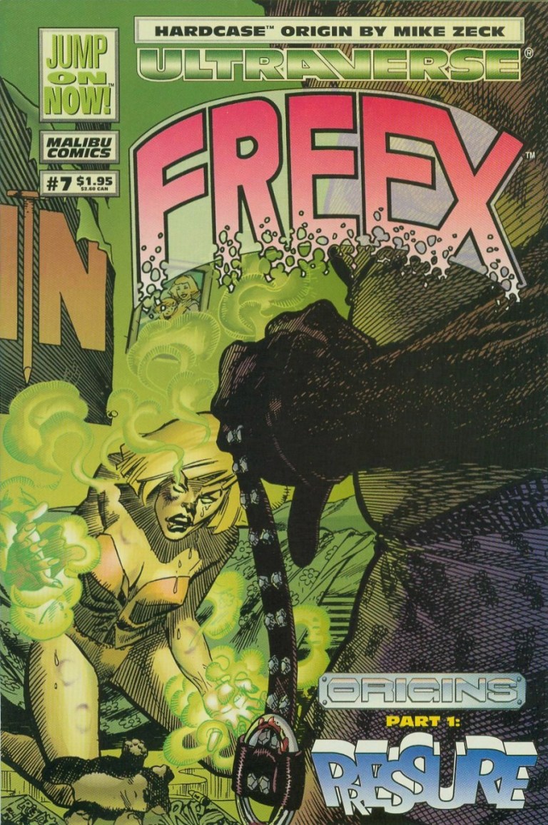
I took a look at the other existing back issues of Freex in my collection and what caught my attention was Freex #7.
The cover.
Let’s now take a look back at Freex #7 and see what makes it unique (if not special).
Early story
The story begins with the Freex hastily stealing clothes from a store in city. While the others are desperately grabbing what they could (note: the store’s glass window was shown smashed already), Angela/Sweetface looks scared. One of her male companions tell her to be tough like Valerie/Pressure.
Just as they start leaving the store behind, the alarm system goes off. The sudden rush only adds pressure to them, causing Lewis/Anything to confront Michael/Plug only because the latter said something about team leadership. As Angela separates Michael and Lewis using her fleshy tentacles, Valerie loses her cool when Ray/Boomboy calls her by her codename. Valerie hits Boomboy with a blast of plasma. With their momentum disrupted by division and tension, Lewis tries to calm his teammates down but Plug won’t have any of it as he desires to find out about the source of all of their powers referred to as Wetware Mary. Plug finds a telephone booth and instantly transfers himself into it in the form of energy.
Division between members of Freex is common.
As the Freex remain divided, a local resident living nearby watches them from a distance.
Quality
The story written by Gerard Jones is pretty engaging mainly due to characterization (as opposed to storytelling and structuring). Through the dialogue, you can really sense the thoughts and emotions of each member of Freex, especially Valerie since this particular comic book focused on her origin. Without spoiling Valerie’s background, her origin was efficiently emphasized and never, ever felt dragging. By the time her origin story concluded, I got to understand Valerie better and why is she so mean. After the conclusion of the Freex’ story, there is also an Aladdin Datafile on Valerie who turned out to be 16-years-old, 5 feet and 9 inches tall, and even has a low threat assessment by Aladdin.
Adding further value to this comic book is a 2-page quick feature of Hardcase which shows a nice look back at his past before the establishment of The Squad.
Conclusion
From the past of Pressure.
Freex #7 is a good read. The story about the teenage social outcasts of the Ultraverse is well balanced in terms of characterization and action. Anyone who is a fan of Valerie/Pressure or female superheroes who are mean, angry and rebellious will find a lot to enjoy in this comic book. A near-mint copy of Freex #7 is worth $4 at MileHighComics.com as of this writing.
Overall, Freex is recommended.
Meanwhile, check out my retro review of Freex #1 right here.
Thank you for reading. If you find this article engaging, please click the like button below and also please consider sharing this article to others. Also my fantasy book The World of Havenoris still available in paperback and e-book format. If you are looking for a copywriter to create content for your special project or business, check out my services and my portfolio. Feel free to contact me as well. Also please feel free to visit my Facebook page Author Carlo Carrasco and follow me at HavenorFantasy@twitter.com
Disclaimer: This is my original work with details sourced from reading the comic book and doing personal research. Anyone who wants to use this article, in part or in whole, needs to secure first my permission and agree to cite me as the source and author. Let it be known that any unauthorized use of this article will constrain the author to pursue the remedies under R.A. No. 8293, the Revised Penal Code, and/or all applicable legal actions under the laws of the Philippines.
When Marvel Comics first launched the 2099 imprint of comic books showcasing many futuristic versions of their present-day characters – like Spider-Man, Ravage and Dr. Doom – it was inevitable that the same treatment will be applied to their popular supervillains.
In 1993, the 2099 version of Vulture was introduced and he sure proved to be one tough opponent for Spider-Man 2099. Even back then, there already was clamor for a futuristic version of Venom which at the time was riding high with readers being the featured anti-hero in several limited series (starting with Lethal Protector) of comic books.
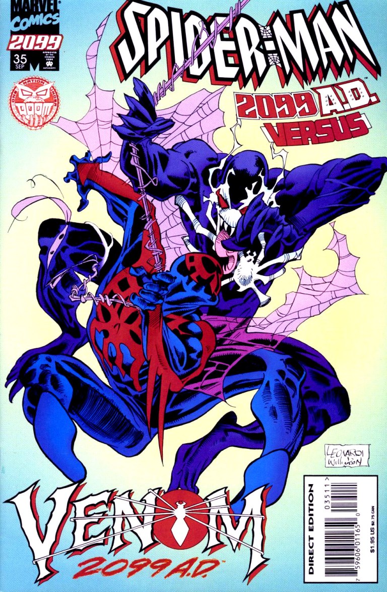
Then in 1995, after doing a creative teaser in issue #34, Marvel formally introduced Venom 2099 by releasing Spider-Man 2099 #35. This is my review of the comic book written by Peter David and drawn by Andrew Wildman (X-Men Adventures).
The cover drawn by Rick Leonardi.
Early story
Picking up from the events of issue #34, the story begins in Washington, DC with Dana freeing herself only to find out that Alchemax’s CEO Tyler Stone was down suffering from a gun shot and losing blood. Minutes later, emergency personnel take Stone’s body for immediate treatment.
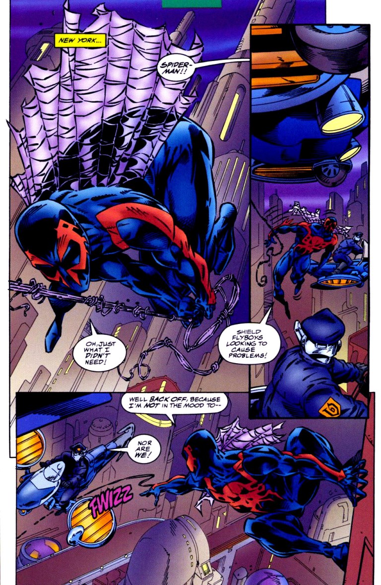
Meanwhile, Spider-Man 2099 (Miguel O’Hara) encounters the SHIELD flyboys in New York. After almost getting into trouble together, Spidey gets informed that US President Doom 2099 ordered them to leave him alone for a period of seventy-two hours while he considers a cabinet offer. Back in Washington, Dana gets interrogated by one of the authorities. President Doom enters the scene telling Dana that she will join Tyler Stone immediately in the medical center.
Andrew Wildman’s take on Spider-Man 2099 and the future was really nice to look at.
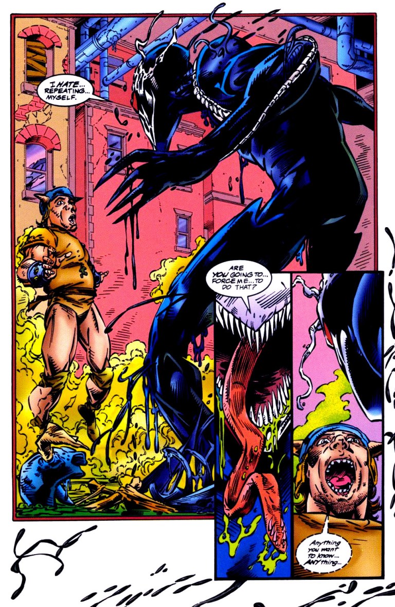
In New York, two guys sitting on the sidewalk witness a moving black liquid coming out of the sewer. The thing turns out to be a living symbiote (or alien costume) forming into a human-like shape – Venom 2099!
Quality
As with other comic books of this particular series, the writing by Peter David is pretty deep and engaging. The usual balance between dramatization, character development, plotting and spectacle is here once again but with a slight touch of horror in relation to the introduction of Venom of 2099. Speaking of dramatization, the portrayal of Venom 2099 as a vicious villain is similar to the 20th century Venom (Eddie Brock) but with a very powerful obsession to kill Miguel O’Hara and Tyler Stone.
Here’s an excerpt from the dialogue of Venom of 2099: Miguel O’Hara…and Tyler Stone…together again. We…I get to kill you…at the same time…how awfully…awfully…considerate. To show my appreciation…I’ll kill you slowly.
What makes this comic book unique is the artwork by Andrew Wildman who temporarily replaced regular illustrator Rick Leonardi. For comparison, I find Wildman’s art style a welcome thing in this comic book mainly because he draws with a lot more detail per panel and per page than Leonardi ever could. Instead of seeing the usual sketch-like art style of Leonardi, Wildman’s style is livelier and more expressive to look at. I also enjoyed Wildman’s visual take on Spider-Man 2099/Miguel O’Hara, Lyla, Tyle Stone, and the other established characters. Their facial expressions are also livelier to see.
Venom 2099 appears! Take note of the “liquid” at the edges of the page.
More on visuals, Wildman’s take on Venom 2099 is unforgettable. Like 20th century Venom, he has a dark suit, elongated jaw with rows of sharp teeth and an elongated tongue but with green acid dripping all the time. There are also those tentacles-like things that stretch from his body until the arms. Also his white-colored mask with large eyes make him look horrific.
Conclusion
Despite being shorter than the usual 22-pages, Spider-Man 2099 #35 is still a very engaging and fun old comic book to read. Its purpose was to build-up anticipation leading to the introduction of Venom 2099 was achieved nicely and the respective qualities of the writing and visuals are very good even by today’s standards. More on the presentation of Venom of 2099, it seems like Peter David took inspiration from movie director James Cameron on building-up tension and suspense before showing the villain. That’s a move I enjoyed in this comic book.
Overall, Spider-Man 2099 #35 is highly recommended. If you plan to acquire an existing and legitimate hard copy, be aware that the near-mint copy of it is over $100 for the newsstand version while the Rich Leonardi-drawn “Venom 2099 AD” cover version is priced at over $80 at MileHighComics.comas of this writing.
Thank you for reading. If you find this article engaging, please click the like button below and also please consider sharing this article to others. Also my fantasy book The World of Havenoris still available in paperback and e-book format. If you are looking for a copywriter to create content for your special project or business, check out my services and my portfolio. Feel free to contact me as well. Also please feel free to visit my Facebook page Author Carlo Carrasco and follow me at HavenorFantasy@twitter.com
The 1990s was a decade of excess when it comes to superhero comic books. Apart from the persistent hoarding of comic books and the quest for profit, there were also these wide superhero franchises (or superhero universes) that popped up and even challenged Marvel Comics and DC Comics. Malibu Comics launched the Ultraverse while Valiant Comics came up with its own universe.
Valiant established itself nicely with popular characters like Bloodshot, X-O Manowar, Turok and Ninjak, and each one had its own regular series of comic books published. When it comes to teams, there was H.A.R.D. Corps (H.A.R.D. stood for Harbinger Active Resistance Division).
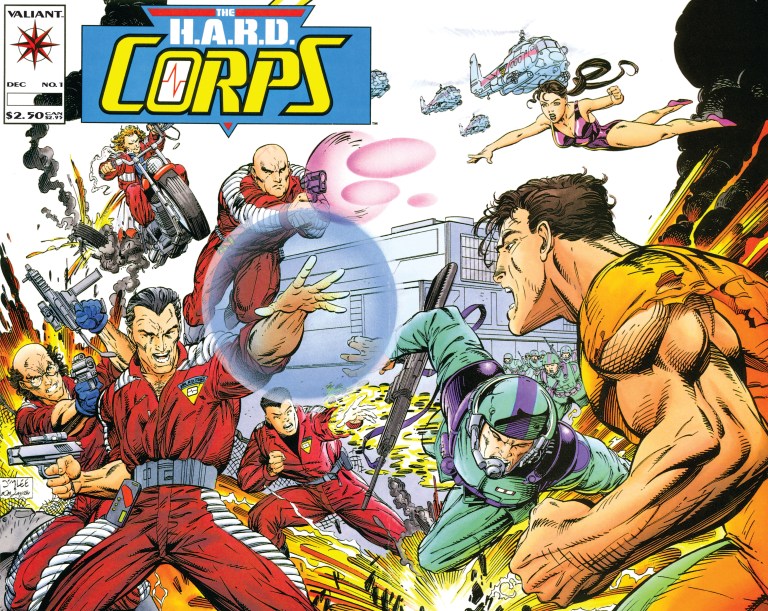
During the recent Hobby Con held at Las Piñas City, I luckily found myself a copy of The H.A.R.D. Corps #1 and read it for the first time ever. This is my review of the comic book which has a cover drawn by the great Jim Lee.
Cover with art by Jim Lee.
Early story
The story begins with the 5-member team in the middle of a mission inside the secured facility of the Harbinger Foundation. Under fire from the facility’s armed personnel, the team (riding a floating vehicle) struggle to find their way and evacuate. Along the way, an oversized man called Big Boy grabbed one of their members and separated him from the others. With the situation getting worse, the captured member got “brain popped” (a remote form of self-destruction via the neural flash implanted inside the person’s brain). The remaining four manage to get away by means of aerial transport provided by their company.
Then a section of the facility exploded causing financial damage to Mr. Harada who decided to visit and inspect the site.
Expository information done cleverly.
Some time later, the H.A.R.D. Corps enjoy the privacy and security at their headquarters in the Nevada desert. Team members Shakespeare, Major Palmer, Softcore, Hammerhead and Superstar wait for instructions at the debriefing room.
Quality
The H.A.R.D. Corps #1 is very well written by David Michelinie. Within twenty-two pages, Michelinie loaded enough details to explain the comic book’s core concept efficiently while at the same time he managed to tell an engaging story with a light touch on character development (note: there were many characters and there was not enough space for further personality emphasis). By the time the story ended, I really felt enlightened, entertained and wanting to find out what would happen next.
Michelinie’s handling of expository dialogue was done very efficiently. I’m talking about the private briefing done by an executive of the Cartel explaining to a recovering man named Kim (who was almost killed during the Los Angeles Riot) what H.A.R.D. Corps is, why the Cartel is in a race against Harada who has been manipulating Harbingers (persons with unique abilities). The Cartel opposes Harada with neural implants.
More on the team, H.A.R.D. Corps members are people who have gone through training programs and each of them had neural implants in their heads which enable them to mimic Harbinger powers (one at a time) through signals broadcast from a base station. Each of them was comatose and the use of the implants reversed the coma.
Some action for you.
When it comes to visuals, the art by David Lapham (inked by Bob Layton) was pretty good. I like the high amount of detail placed on the surroundings in most of the panels. Action shots had a good amount of impact.
Conclusion
This comic book from late 1992 is a good and engaging read. I really enjoyed it and I like its core concept about a team of enhanced individuals who are technically living properties of very business-minded people opposed to Harada. Even by today’s standards, H.A.R.D. Corps concept really stands out among all superhero team comic books.
The H.A.R.D. Corps #1 is recommended and you can acquire a near-mint copy of it for only $4 at MileHighComics.com (as of this writing).
There is nothing like seeing squabbling individuals (each with a unique talent or two) realize that they have to end the division between them and work together to solve a problem that affects everyone.
Tropes like that are common in superhero comic books, animation, movies and other forms of media. The concept of having superheroes is precisely the key element behind the UltraForce of the Ultraverse.
To put things in perspective, UltraForce is a team of superheroes (called Ultras in the Ultraverse) composed of Prime, Hardcase, Prototype, Topaz, Ghoul, Pixx and Contrary. The team was formed to protect the public while, at the same time, keep their fellow Ultras (examples: Mantra, The Strangers, Night Man, etc.) from getting out of line with the general public and their government leaders.
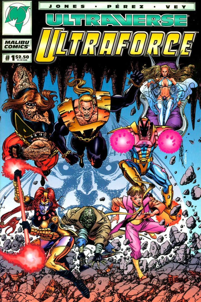
Previously, I discussed what would it be like had superheroes conspired with government officials and corporate media as told in UltraForce #2. For this article, we take a look back at the formation of the team in UltraForce #1, published by Malibu Comics in August 1994 with a story by Gerard Jones and art by the legendary George Perez.
Great cover by George Perez.
Early story
The story begins with a disaster as fighter planes get pulled down to the ground by an unknown force. A pilot who ejected and flew by parachute finds himself pulled down as well. Down on his back, he feels intense pain and could not get himself up. His body begins to get destroyed when a voice is heard.
“You thought your little flying toys would stop me. You thought your mastery of light and air made you invincible. And no creature of the dark, hidden places could possibly beat you. Now feel the weight. Feel what we feel. The weight of the core of the Earth. The weight of eons of darkness. The age of light and air is done. Prepare for a new age. The age of Atalon!”
Inside a ship above the desert, Hardcase reacts as he watches multiple monitors showing current events highlighting people’s fear of the Ultras, citizen demanding controls, Hardcase reported as saying “only Ultras can control Ultras”, plus an image of Prime and Prototype in action. With him were Contrary, Pixx and Ghoul.
“No!” said Hardcase. “I won’t go through that again!”
Harcase clarifies to his companions that, due to his past with The Squad ending in tragedy, he won’t join a group and end up counting friends’ bodies again. Regarding his reported quote in the media, he stated that he specifically said that government could never control Ultras plus he did not say an UltraForce should try to do it. Being an actor in Hollywood, he decides to go to the media and wash his hands of this.
Contrary, who is the schemer in the team, asked him, “Won’t the public fear Ultras more and more…unless someone steps up to teach Ultras how to function in the world?”
Hardcase asked if she was the one to do the teaching.
Pixx butts into the conversation telling them that Prime and Prototype are about to approach the press. After calling Pixx an attentive student, Contrary tells Hardcase she is the to teach the Ultras which she claims is her business.
In front of the press, Prime (who is a kid inside that overly muscular body) talks impulsively to them and Prototype (who is receiving communication feed from Ultratech which seeks a public coup with the idea of him gathering the team) who states that an UltraForce is needed and that he will recruit one.
This sets off Prime to act even more impulsively over who has credit over the UltraForce idea. Behind the scenes, Ultratech’s Leland and Hardcase watch as things turn wrong (between Prime and Prototype) in front of the press.
An incident like that in front of the media is enough to mislead the public into thinking negatively about who got covered in the press. There are those who acted badly in front of the press and there are media operators who practice journalism wrongly.
“They’re going to force the government to crack down on Ultras!” – Hardcase.
Concerned that the embarrassment could start a civil war between Ultras and Normals (the people), Hardcase tells Contrary he wants to leave the ship to prevent things from getting worse. Contrary gets on his way saying she was going to talk to Prime and Prototype and even have their ship fly after them.
Hardcase disagrees with her idea and insisted she should not be near the mess (about Ultras and the public) until she comes clean with all her secrets and explain what her academy for Ultras is about.
“Is this the same Hardcase who didn’t want responsibility of leading other Ultras…laying down the law for me?” – Contrary
Eventually Contrary sends Hardcase away and tells Pixx to bring their ship to the Redstone Arsenal.
Meanwhile, in Los Angeles, Topaz appears suddenly in the middle of a football game causing confusion to the players and the spectators.
The power of Prime!
Quality
I absolutely enjoyed reading UltraForce #1for the fact that it has a very engaging story, great art, in-depth characterization and a great presentation of superheroes banding together for a higher cause. It is the complete package of what a fun yet thoughtful superhero comic book should be!
The story written by Gerard Jones shows lots of signs that things were carefully planned not just for the comic book but for the Ultraverse as a whole as it focused on the concept about the Ultras being on the edge of getting misunderstood by the general public (the people who don’t have powers) who in turn relied on the news coverage of corporate media (which itself has lapses or made deliberate moves that did not give the viewers an accurate look at the events that happened) to take a look at beings with powers.
This concept kinda reminds me of the traditional concept behind the X-Men. Charles Xavier founded the X-Men to train mutants to use their gifts for good while trying to establish a bond of understanding and tolerance between mutants and humans.
UltraForce’s concept of the fragile link between Ultras and ordinary people really went deep as it involved not only the media but also the private sector, the government leaders and the armed forces. Heck, in Prototype #1 the corporation Ultratech made its move with Ultras by having a flying, armored guy representing them. In Prime #1, the element of militarism was involved.
The comic book’s concept is nicely reflected in Hardcases thoughts below.
“Great. The military, the media, the eyes of the world…dying for a sign. Are Ultras for them or against them? And what sign are we giving them?”
Gerard Jones also achieved a great job with the characterization. Prime is the impulsive powerful superhero who is also a loose canon because he’s really a kind inside the large, muscular body of a man. Prototype is piloted by a young guy working for a corporation and along the way, he has trouble balancing himself between duty and personal interest. Hardcase, who has been living with guilt as one of two surviving members of The Squad, struggles between his internal struggle and keeping the peace between humans and Ultras. The way I remember these three notable Ultraverse lead characters from their respective comic book series, their personalities were successfully replicated and developed in this comic book.
Contrary meanwhile is subtle yet brainy and strategic figure of the team. For the most part, she is mysterious and yet already has a clear vision about mentoring people with super powers. She is easily the most defining member of UltraForce who does not have her own comic book series. Topaz, who comes from a society of women, is clearly the Ultraverse parallel to DC Comics’ Wonder Woman. She appeared in prior issues of Mantra and her addition to UltraForce added more depth and variety. Of course, given her background, working alongside men is a challenge for her personally. Pixx and Ghoul, meanwhile, contributed nicely as supporting characters in this comic book. For the villain King Atalon, he succeeded in presenting himself and his group as a credible threat to the world. Not only is he powerful in combat, he is very driven with a mission for his kingdom and his people strongly love him and support him.
Even though this was just the first story, UltraForce #1 is already a nice exploration of each member’s personality and the personal relationships between them. How these characters formed a team was not only convincing but was done with a lot of depth and focus. At the same time, the dialogue written for each character is lively to read. Take note how Atalon reacted to Prototype’s attack on him.
“Didn’t your Dr. Einstein tell your people decades ago that great gravity could bend even energy? But you never do listen to your own wise men, do you? Just like my people. We wise ones must find ways to make you listen.”
Spectacle and action? There’s lot of them in this comic book. More than enough to satisfy anyone who enjoys reading superhero stories that pack a lot of hard-hitting action, intense moments of damage on the surrounding made only possible by superheroes, energy blasts and the like.
This bring me to the next aspect of the comic book….George Perez’s great art! I should say that Malibu Comics made the best decision to hire Perez for UltraForce #1 given his established talent of drawing multiple superheroes in high detail (with that distinct style on drawing human faces) and ensuring that what was written on Gerard Jones’ script would come out not only looking great but also always look very lively. I love the way Perez drew the facial expressions of Hardcase, the visualization of Prime’s immense strength, Pixx looking really like a teenager, the high level of detail on the backgrounds, Ghoul’s creepy look and much more. No doubt about it, each and every panel drawn by Perez is great to look at!
Conclusion
I really love reading and re-reading UltraForce #1. It succeeded in its goal of getting the divided superheroes together to form a team in convincing fashion complete with a clear and present danger (Atalon and his people) that justifies the events. It’s got great writing and art, very engaging characters, heavy action and a good amount of characterization. The good news about this comic book is that it can be found in good supply online and you don’t have to worry about paying high prices for it. As of this writing, you can order a near-mint copy of UltraForce #1 for only $4 at the website of Mile High Comics. Apart from comic books, there were some action figures of UltraForce released and there was a short-lived animated series of it on TV.
If you are a comic book reader who is dissatisfied with today’s comic books (and even superhero movies), if you are reader looking for a great superhero team reading experience, or if you want the best superhero comic book experiences of not only the Ultraverse but of the 1990s as a whole, then UltraForce #1 is highly recommended! This comic book is a classic of its decade!
Thank you for reading. If you find this article engaging, please click the like button below and also please consider sharing this article to others. Also my fantasy book The World of Havenoris still available in paperback and e-book format. If you are looking for a copywriter to create content for your special project or business, check out my services and my portfolio. Feel free to contact me as well. Also please feel free to visit my Facebook page Author Carlo Carrascoand follow me at HavenorFantasy@twitter.com