Disclaimer: This is my original work with details sourced from reading the comic book and doing personal research. Anyone who wants to use this article, in part or in whole, needs to secure first my permission and agree to cite me as the source and author. Let it be known that any unauthorized use of this article will constrain the author to pursue the remedies under R.A. No. 8293, the Revised Penal Code, and/or all applicable legal actions under the laws of the Philippines.
Welcome back, X-Men fans, superhero enthusiasts and comic book collectors! Today I’m about to review another Chris Claremont-Jim Lee comic book of the X-Men from 1991.
Before getting to the retro comic book review, let’s take a look back at history. Marvel Comics started publishing comic book of the X-Men in 1963 which involved the combined talents of Stan Lee and Jack Kirby. The original X-Men members were Cyclops, Beast, Marvel Girl, Angel and Iceman all under the mentorship of Charles Xavier (AKA Professor X). That monthly series was not a strong seller and was weak compared to the other monthly titles of Marvel. Although Roy Thomas and Neal Adams were brought in to reinvigorate the X-Men series with new characters, success in sales did not materialize and eventually the series was turned into a reprint series (from issues #67 to #93).
In 1975, Len Wein and Dave Cockrum made Giant-Size X-Men #1 which introduced a new team. Along the way, Wein (who was also the editor-in-chief of Marvel at the time) hired Chris Claremont to become the lead writer of the X-Men series starting issue #94 which was released that same year. Claremont redefined the X-Men by developing the characters deep inside and emphasized their respective personalities. As the years passed by, Claremont wrote notable X-Men storylines such as The Dark Phoenix Saga, Days of Future Past, Mutant Massacre, and Fall of the Mutants to name some. Not only did Claremont write The New Mutants, he also co-created many other characters that became part of the X-Men franchise.
Then came the year 1991. The launch of the new X-Men monthly series (focused on the Blue Team led by Cyclops) saw sales tremendous success with issue #1 and by that time Jim Lee was established as one hot new creators under Marvel. Behind the scenes, however, Claremont clashed with then X-Men books editor Bob Harras. Eventually, issue #3 of the 2nd X-Men monthly series marked the end of the X-Men era of 1975-1991.
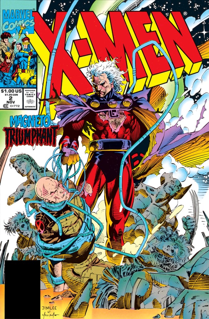
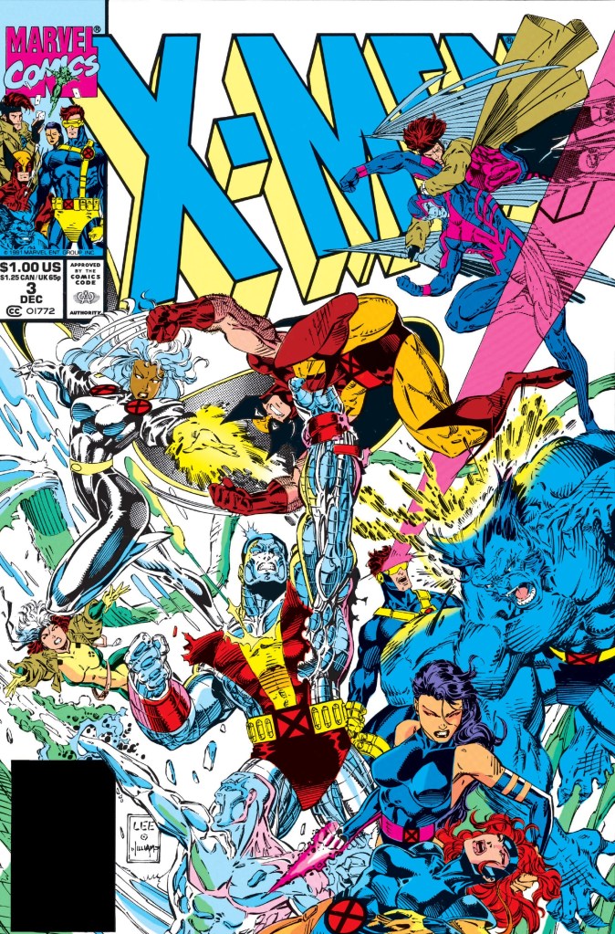
I should say that I enjoyed reading issue #2 in which Claremont wrote a story that not only raised the stakes but also pushed the entire group of mutants to the edge. We will find out soon enough if Claremont’s X-Men era of 1975-1991 will end strongly in this retro review of X-Men #3, published in 1991 by Marvel Comics with a story by Claremont and Jim Lee (who also illustrated).
Early story
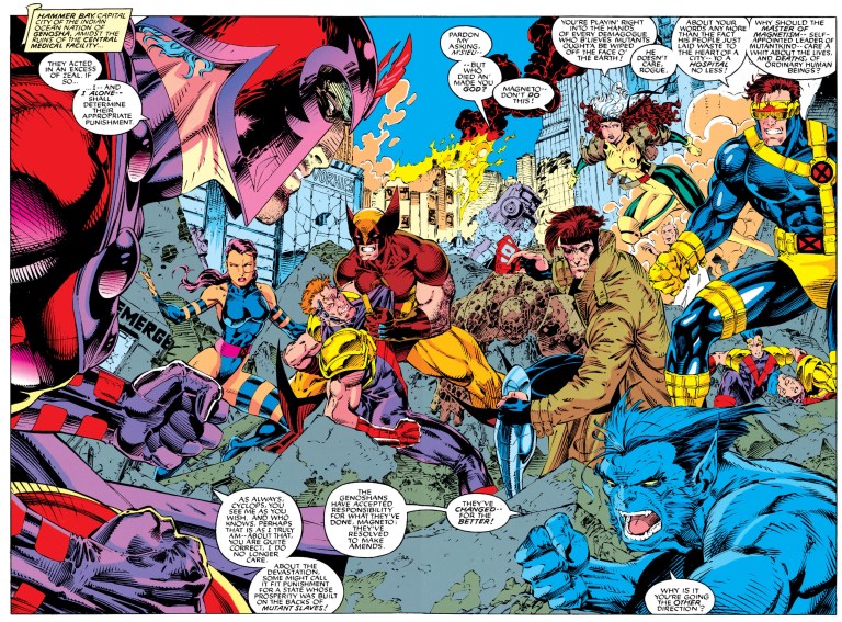
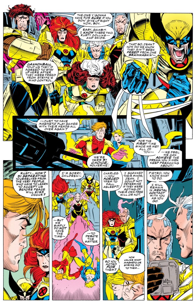
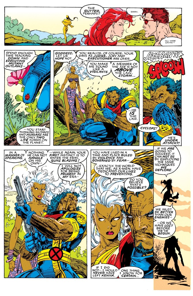
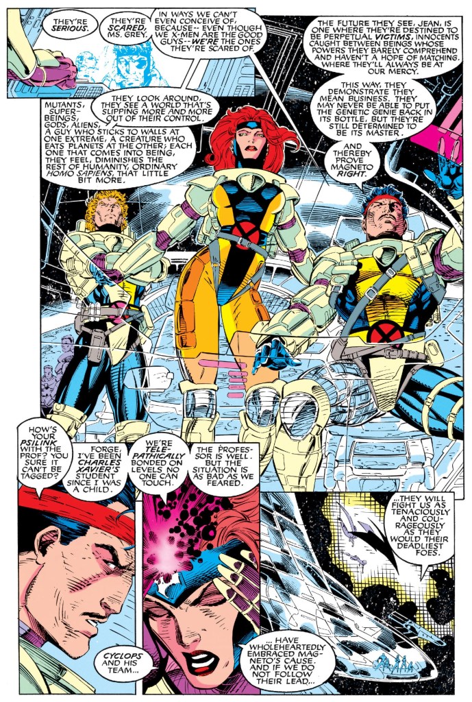
The story begins in outer space. Members of X-Men’s Gold Team (composed of Archangel, Storm, Jean Grey, Forge, Iceman, Colossus and Banshee) fly stealthily towards Asteroid M where Magneto and his Acolytes are with Charles Xavier and Moira MacTaggert held captive. With the exception of a few, members of the X-Men Blue Team were brainwashed by MacTaggert to follow Magneto.
On Earth, the plasma cannon is being prepared to destroy Asteroid M. Nick Fury warns his colleagues about the possibility of tremendous damage if ever Asteroid M hits the surface of the planet. Valerie Cooper tells him that the firing trajectory has been calculated to blast the target away and into deep space. An exchange of words follows over diplomacy and following orders issued by the leaders.
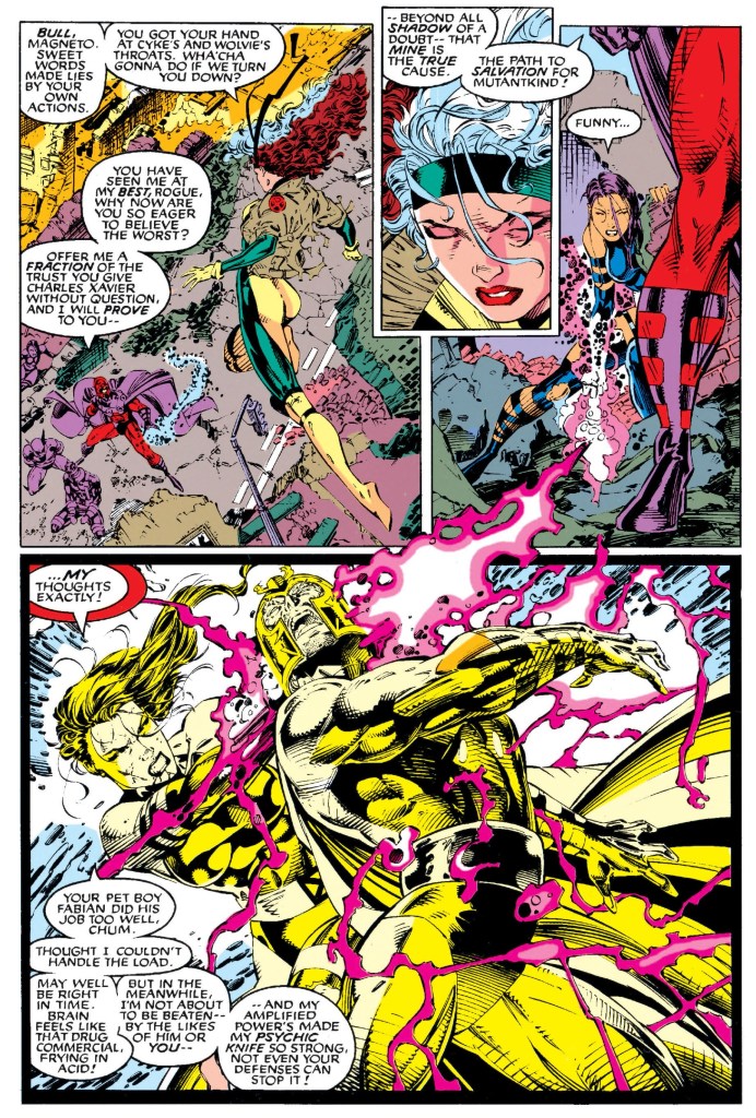
Over at Asteroid M, Charles Xavier is alone in a room with a wide view of the Earth and space. Behind the scenes, Fabian Cortez points to Xavier as Magneto’s deadliest enemy. He asked his master why not use Moira MacTaggert’s procedure (to brainwash and turn) on Xavier. Magneto, already suffering physically, does not want Xavier turned but be broken…
Quality
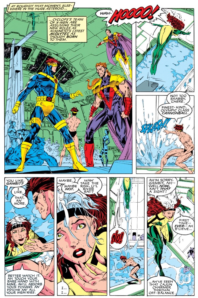
Like in issue #2, the story here is very engaging and highly dramatic. While it paid close attention to Magneto’s ruthlessness as well as his rage towards Moira who committed something unethical to him in the past, the story managed to focus enough on the X-Men which involves both the Blue Team and Gold Team mixed up. While this comic book’s cover shows a battle royale between the Blue and Gold teams, there is a lot of substance beyond the action. I’m talking about moments spent on the mutants of Xavier which was done in a satisfying manner (never felt crammed nor forced) considering the page limits of this comic book. Not only were the X-Men moments executed smoothly, there were pulled off efficiently and orderly.
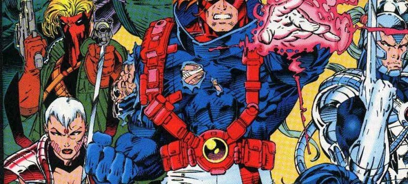
More on the story, what adds intrigue is the group of Acolytes whose field leader Fabian Cortez has not only gotten very close with Magneto but also does something significant to him along the way. By this issue, the Acolytes led by the master of magnetism have gotten more established as a worthy opposition against Xavier’s mutants. This story also showed that the Acolytes were here to stay, and Fabian Cortez himself is very led by wickedness and ambition. Cortez is also an example about the distortion of righteousness
When it comes to defining the characters, Xavier and Magneto clashing together about their respective dreams about mutants is unsurprisingly epic to read. In this particular conflict, both Marvel icons were portrayed very dramatically and their respective expressions were indeed intense. Adding further intrigue to their clash is Moira’s long-past act of manipulating the very genetics of Magneto which itself raises serious questions about her perception, decision-making and ethics. In some ways, Moira looked more villain-like.
As expected, the art of Jim Lee is great to look at. There were some signs, however, that the very wordy script resulted an increased numbers of panels per page. Fortunately, the art did not look rushed and maintained a clear narrative. Also the action scenes are great to look at which is not surprising.
Conclusion
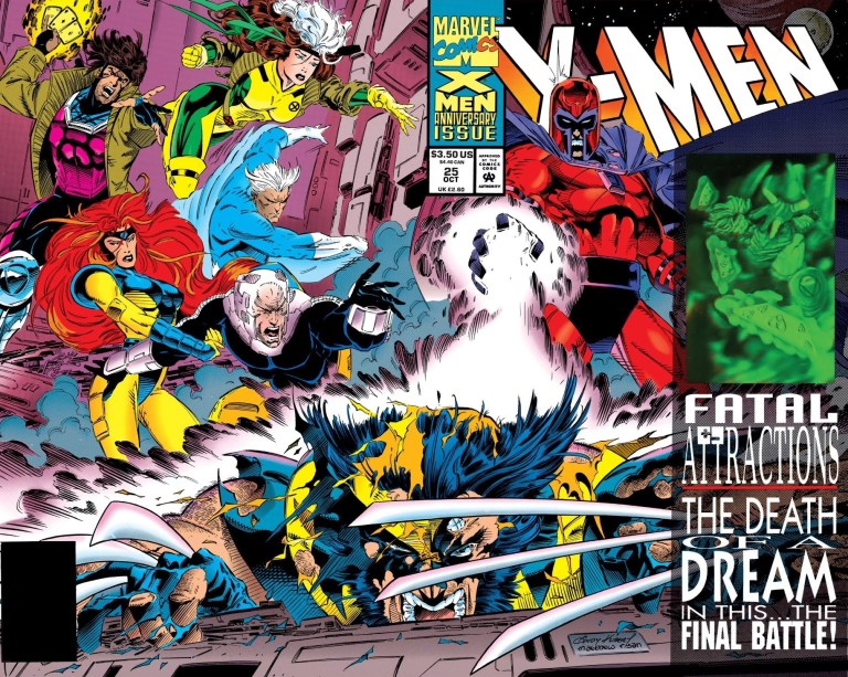
To put it straight, X-Men #3 (1991) is an epic read highlighting the very conflict between Magneto and Xavier over the course of mutants and their place in the world of humans. This comic book, which has a very powerful ending, was indeed a very satisfying way to conclude the Xavier-Magneto conflict as well as Chris Claremont’s long-term stint with the X-Men comic book franchise. Back in 1991, this one really looked like the end of an era both in-story and in real life. Of course, what this comic book achieved ultimately became temporary because Magneto was revived for the Fatal Attractions storyline in 1993 (celebrating X-Men’s 30th anniversary) and Chris Claremont himself returned to Marvel Comics some years later. Still, on its own, this comic book is worth reading and adding to your collection, even if you are not an X-Men fan. It is significant enough as a piece of X-Men history from the time when Jim Lee was with Marvel.
If you are seriously planning to buy an existing hard copy of X-Men #3 (1991), be aware that as of this writing, MileHighComics.com shows that the near-mint copy of the regular edition costs $9 while the near-mint copies of the Chris Claremont-signed edition, the signed newsstand edition, the newsstand edition and the Toy Biz edition cost $16, $26, $16 and $21 respectively.
Overall, X-Men #3 (1991) is highly recommended!
+++++
Thank you for reading. If you find this article engaging, please click the like button below and also please consider sharing this article to others. If you are looking for a copywriter to create content for your special project or business, check out my services and my portfolio. Feel free to contact me as well. Also please feel free to visit my Facebook page Author Carlo Carrasco and follow me at HavenorFantasy@twitter.com