Disclaimer: This is my original work with details sourced from reading the comic book and doing personal research. Anyone who wants to use this article, in part or in whole, needs to secure first my permission and agree to cite me as the source and author. Let it be known that any unauthorized use of this article will constrain the author to pursue the remedies under R.A. No. 8293, the Revised Penal Code, and/or all applicable legal actions under the laws of the Philippines.
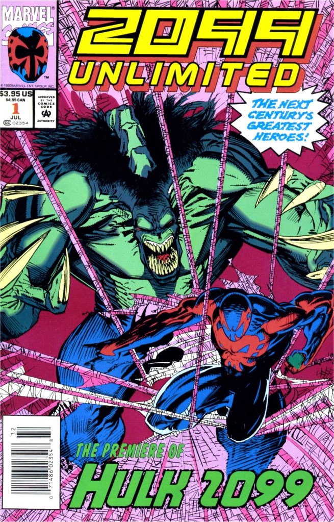
Welcome back, superhero enthusiasts, comic book collectors, pop culture geeks and fans of Marvel Comics! Today, we will revisit the 2099 universe that Marvel established in the 1990s through another issue of Ravage 2099 which featured the writing and imagination of the late Stan Lee. Lee wrote the first eight issues of the said series.
For the newcomers reading this, Ravage is a co-creation of Lee and illustrator Paul Ryan. Compared to the other major characters of the 2099 universe of Marvel, Ravage is an all-original character who went from being a corporate executive to a hard-hitting rebel. Last time around, Ravage struggled with his new found power (energy within his fists) while still being hunted by Dethstryk’s thugs.
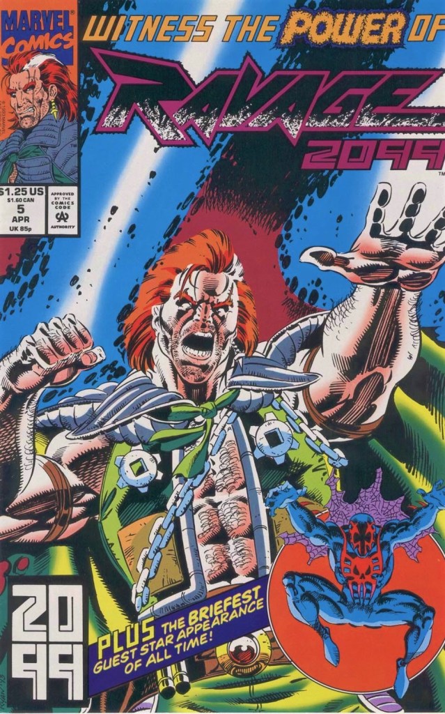
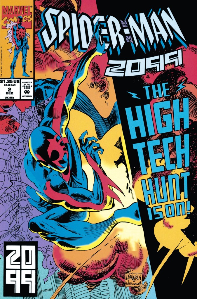
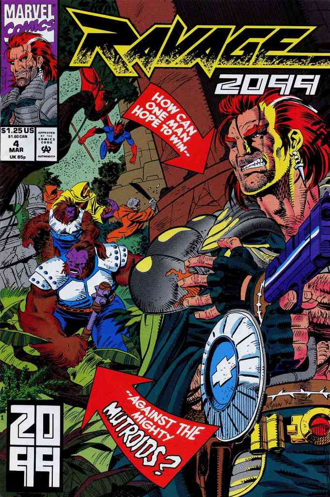
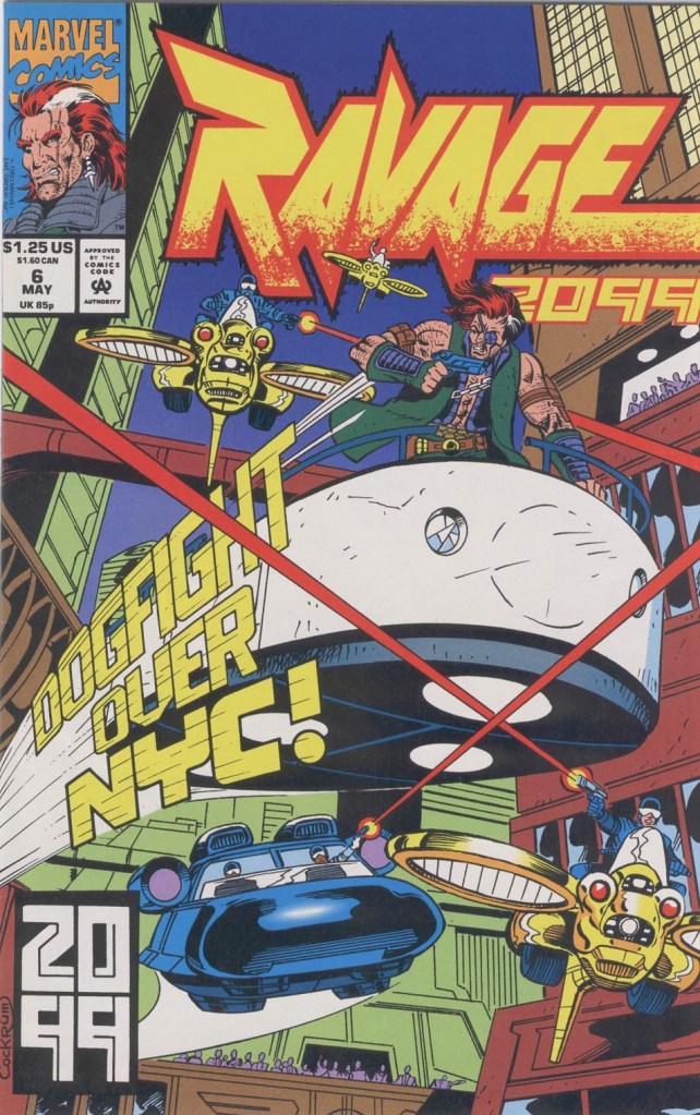
With those details laid down, here is a look back at Ravage 2099 #6, published by Marvel Comics in 1993 with a story written by Stan Lee and drawn by Paul Ryan.
Early story
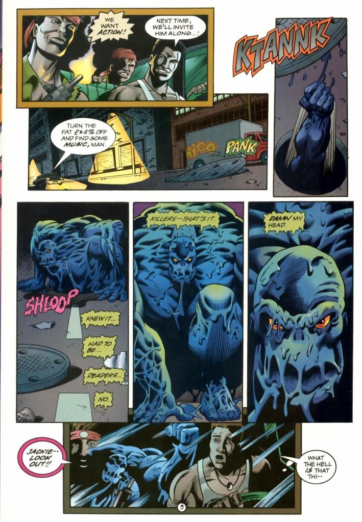
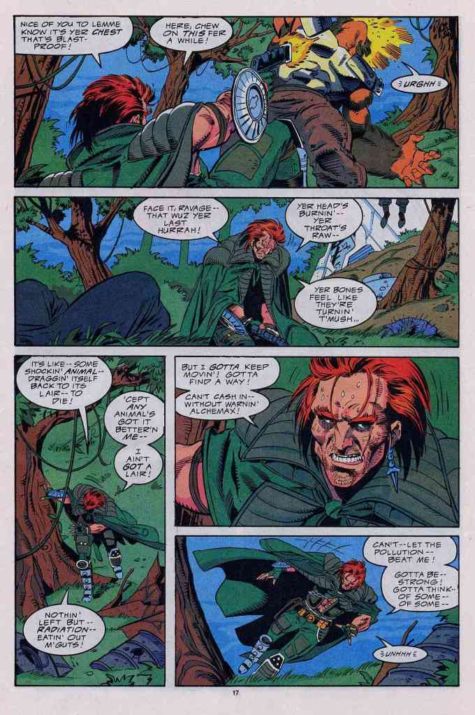
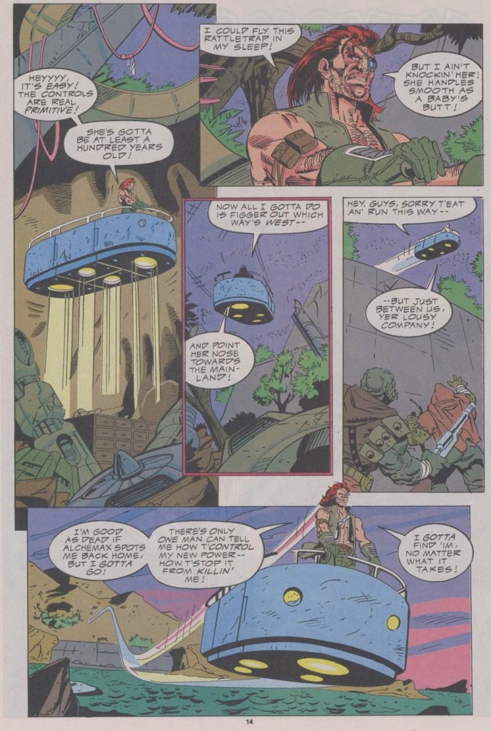
The story begins at a far-away island. Dethstryk’s thugs just attacked Ravage and his native companion in a cave, destroying the interior and causing a cave-in. Believing that Ravage is dead, the last of the thugs left the rubble behind. As it turned out, Ravage is still alive and uses his newfound power to free himself, pushing all the rocks off as if they were like pebbles. He realizes that the more he uses his power, the weaker he gets. Due to his being exposed to the island’s toxic environment, his condition continues to deteriorate. He uses one of the gadgets to aid him in seeing.
After looking around further in the ruined cave, he discovers a relic from the past – the Fantastic Four’s Fantasticar…
Quality
If you are looking for something adventurous or fun while following Ravage, you won’t find much here. Without spoiling the plot, this one has Ravage preparing himself for survival and moving back to civilization. There is not much heroic acts from the title character here and I noticed that Stan Lee’s script is filled with lots of filler-type dialogue designed to prolong scenes (that were meant to be short but had to be stretched) and fill the page. Really, there is not much stuff to engage you with here.
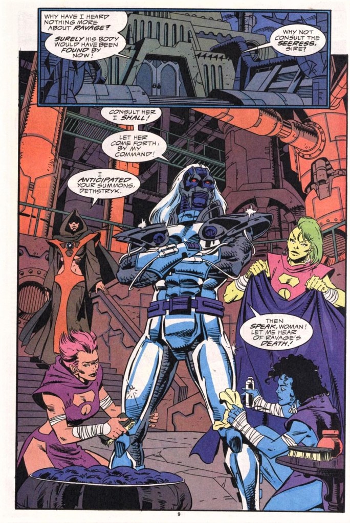
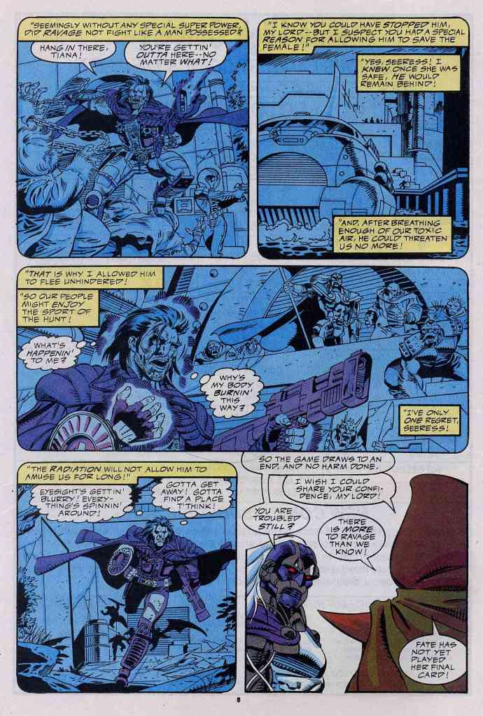
The build-up in issue #5 regarding the sub-plots for Tiana, Dack and the invaders from the sea had too little pay-off here but, in fairness, it does set up something for the next issue. I should also state that Stan Lee did not really do much with the villains – Dethstryk and Anderthorp Henton – and ended up recycling ways to show how cruel, cold-blooded and evil they are WITHOUT ever raising the stakes in their conflict with Ravage.
Conclusion
Once again, the Ravage 2099 series at this point only showed the lack of consistency in terms of quality and reader engagement. Ravage 2099 #6 has a story that is actually hollow and the creators resorted to stretching sequences to create the illusion that there is depth throughout. Clearly this is a step down from the previous issue.
If you are seriously planning to buy an existing hard copy of Ravage 2099 #6 (1993), be aware that as of this writing, MileHighComics.com shows that the near-mint copy of the regular edition costs $8 while the near-mint copy of the newsstand edition costs $26.
Overall, Ravage 2099 #6 (1993) is not recommended but if you really want to acquire a copy of it, better wait until the price reaches fifty cents.
+++++
Thank you for reading. If you find this article engaging, please click the like button below and also please consider sharing this article to others. If you are looking for a copywriter to create content for your special project or business, check out my services and my portfolio. Feel free to contact me as well. Also please feel free to visit my Facebook page Author Carlo Carrasco and follow me at HavenorFantasy@twitter.com