Disclaimer: This is my original work with details sourced from reading the comic book and doing personal research. Anyone who wants to use this article, in part or in whole, needs to secure first my permission and agree to cite me as the source and author. Let it be known that any unauthorized use of this article will constrain the author to pursue the remedies under R.A. No. 8293, the Revised Penal Code, and/or all applicable legal actions under the laws of the Philippines.
After reviewing the first ten issues of the Hardcase monthly series, I should say that the title character is one of the most defining lead characters of not only the Ultraverse but also 1990s superhero comics in general. The late James Hudnall really defined the character Tom Hawke/Hardcase and established his rightful spot in the Ultraverse.
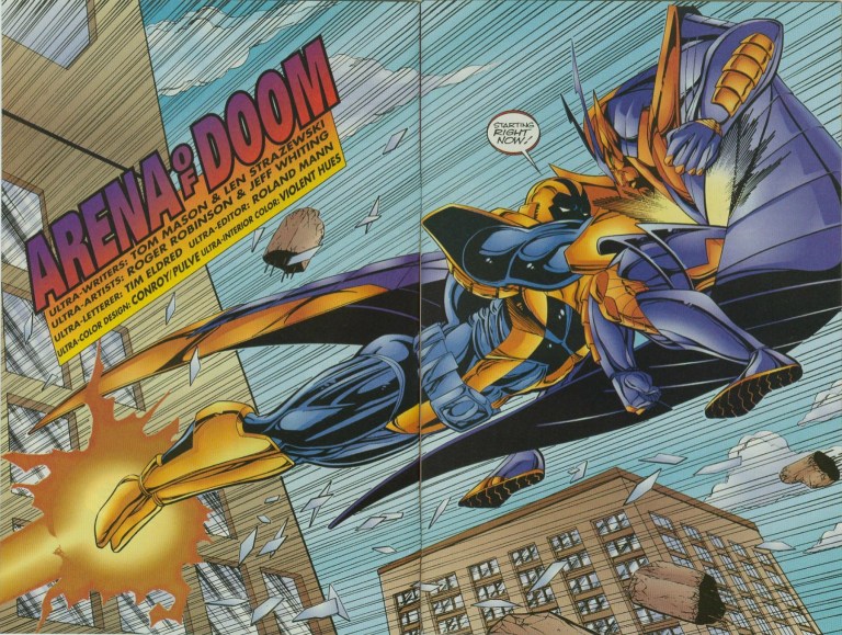
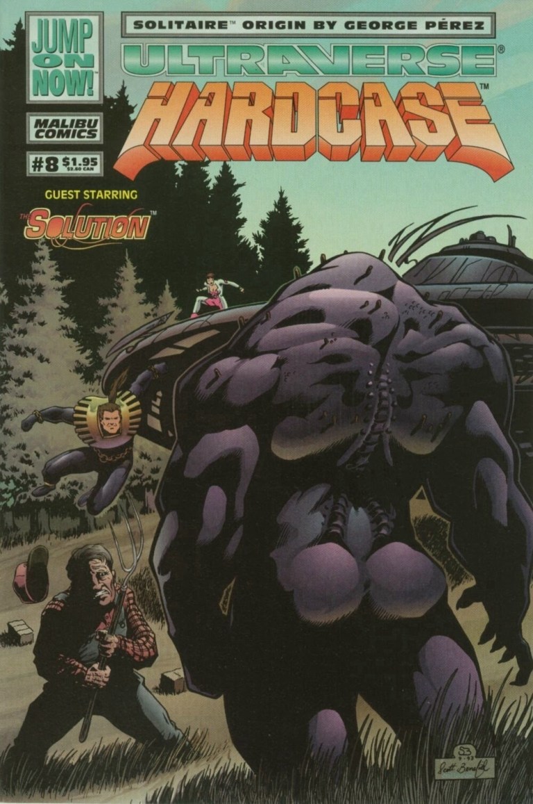
Now is time to take a look back at Hardcase #11 published in 1994 by Malibu Comics with a story written by James Hudnall and drawn by Scott Benefiel.

Early story
The story begins with Hardcase and Choice riding a car in high speed going to Nevada to uncover a mystery. Their destination is Aladdin base, a top secret facility that the two believe contains the answers to Choice’s past.
Suddenly Hardcase slammed the brakes of the car as they encounter a helicopter in front of them. Worse than that, four powerful adversaries – Foxfire, Head Knocker, War Eagle and Hardwire – jointly confront them ready to fight to the death…
Quality

As before, James Hudnall delivered yet another compelling story and artist Scott Benefiel nailed it visually. To begin with, this comic book is packed with a lot of action and the blows and hard hits can be felt. As it is loaded with action, the narrative never felt brainless nor dumb. Rather, there was nice variety mixed with the spectacle as Hudnall made solid efforts to make each bad guy express himself respectively when fighting with Choice or Hardcase. Take for example, Hardwire is creepy and ruthless. Along the way, the coordination between Hardcase and Choice as well as between the bad guys themselves was well executed literally and visually.
As the conflicts went on, Aladdin’s presence was also felt even though there were no images used. In fact, the sudden involvement of the bad guys reflected what Aladdin does whenever it captures and uses individuals with special abilities or talents for its own gain.
More on Hardcase and Choice, I like the fact that the creators explained that Choice’s powers could only last 60 minutes and will take two hours to recharge. This adds weight to their mission of finding and infiltrating Aladdin’s base. How Choice and Hardcase deal with the challenge is worth reading.
Conclusion

Hardcase #11 is not only a really great comic book to read, it is also a clear attempt by the creators to build up something and conclude the first year of the monthly series with something strong. If course, this issue marked the 2nd part of The Angry Past storyline. We will find that out soon enough what will turn out next in Hardcase #12.
If you are seriously planning to buy an existing hard copy of Hardcase #11 (1994), be aware that as of this writing, MileHighComics.com shows that the near-mint copy of the regular edition costs $4.
Overall, Hardcase #11 (1994) is highly recommended!
Thank you for reading. If you find this article engaging, please click the like button below and also please consider sharing this article to others. If you are looking for a copywriter to create content for your special project or business, check out my services and my portfolio. Feel free to contact me as well. Also please feel free to visit my Facebook page Author Carlo Carrasco and follow me at HavenorFantasy@twitter.com